paper 90-30 tips and tricks: using sas/graph … · 1 paper 90-30 tips and tricks: using...
TRANSCRIPT
1
Paper 90-30
Tips and Tricks: Using SAS/GRAPH® Effectively A. Darrell Massengill, SAS Institute, Cary, NC
ABSTRACT
SAS/GRAPH is a powerful data visualization tool. This paper examines the powerful components of SAS/GRAPH and highlights techniques for harnessing that power to create effective and attention-grabbing graphs. The components examined include the SAS/GRAPH procedures, graphical global statements, the Output Delivery System (ODS), graph styles, client-rendered graphs, and the Annotate facility. Complete programs using these components and techniques are provided and examined in detail.
INTRODUCTION
Many SAS® products and solutions use SAS/GRAPH to produce graphs, but certain components might be unavailable to SAS programmers who want to customize their graphs. Although there are many programmable components in SAS/GRAPH, this paper focuses on components in SAS/GRAPH procedures (PROCs). The key to building effective graphs is to understand all the graph construction components that are available to you. With this understanding, you can choose the most appropriate components to construct your graph. This paper gives an overview of SAS/GRAPH components, and highlights specific options used to build a few attention-grabbing graphs. Finally, the paper examines the completed graphs and the tricks used in their construction.
GRAPH CONSTRUCTION COMPONENTS
Graph construction components can be divided into two categories—foundation and building blocks. SAS/GRAPH PROCs and global statements make up the foundation. Options used with PROCs to enhance output appearance, including ODS, graph styles, and the Annotate facility, make up the building blocks.
THE FOUNDATION
The foundation includes SAS/GRAPH PROCs, global statements, and Java graph macros. SAS/GRAPH PROCs generate the different types of graphical output. SAS/GRAPH PROCs use global statements to control and adjust output appearance. The foundation also includes a few Java graphs that are created by SAS macros, and are not associated with SAS/GRAPH PROCs. SAS/GRAPH PROCs, global statements, and Java graph macros are grouped and defined in the following tables. Appendix A: Samples from SAS/GRAPH Procedures includes graphical output for the procedures in the tables.
Charting and Plotting Procedures
GAREABAR Produces an area bar chart showing the magnitude of two variables for each category of data (Figure 1 in Appendix A)
GBARLINE Produces a vertical bar chart with a plot overlay (Figure 2 in Appendix A)
GCHART Produces a block chart, horizontal and vertical bar chart, pie and donut chart, and star chart (Figure 3 in Appendix A)
GCONTOUR Produces a plot representing three-dimensional relationships (Figure 4 in Appendix A)
GPLOT Produces a plot of two or more variables on a set of coordinate axes (Figure 5 in Appendix A)
GRADAR Produces a radar or star chart showing the relative frequency of data measures (Figure 6 in Appendix A)
G3D Produces three-dimensional graphs plotting one vertical variable on two horizontal variables (Figure 7 in Appendix A)
G3GRID Processes a data set for use with the G3D procedure or the GCONTOUR procedure

2
Mapping Procedures
GMAP Produces two- and three-dimensional color maps (Figure 8 in Appendix A) GPROJECT Processes map data by converting spherical coordinates into Cartesian coordinates GREDUCE Processes a map data set so that it can be reduced to have fewer points in the boundaries GREMOVE Processes map data to combine some areas into larger areas and remove shared borders MAPIMPORT Imports ESRI shapefiles into traditional SAS/GRAPH map data sets
Note: Several SUGI presentations on mapping tips and tricks are available. Information and examples can be found at http://support.sas.com/rnd/papers/.
Presentation Procedures
GANNO Displays graphs created with Annotate data sets GPRINT Converts a text file into graphics output GREPLAY Displays and manages graphic output stored in SAS catalogs GSLIDE Creates text slides for presentations
Utility Procedures
GDEVICE Examines and changes the parameters of graphics device driver entries GFONT Displays new and existing SAS/GRAPH fonts and creates user-generated fonts GIMPORT Imports graphic output from other software or other machines GKEYMAP Creates key maps and device maps to compensate for differences in characters on different
systems GOPTIONS Displays graphics option settings and values GTESTIT Provides a diagnostic tool for installation of SAS/GRAPH software and configuration of your
device
Global Statements
GOPTIONS Sets default values for many graphics attributes and device parameters AXIS Controls the location, values, and appearance of the axes in plots and charts LEGEND Controls the location and appearance of legends on plots, maps, and charts PATTERN Defines the characteristics of patterns used in graphs SYMBOL Defines the characteristics of symbols used with the GBARLINE, GCONTOUR, and GPLOT
procedures FOOTNOTE Controls the context, appearance, and placement footnote text NOTE Controls the context, appearance, and placement of note text TITLE Controls the context, appearance, and placement of title text
Java Graph Macros
DS2CONT Generates HTML for the Constellation applet that shows interactive node/link diagrams DS2CSF Generates HTML for the Rangeview applet that shows a critical success factor diagram DS2TREE Generates HTML for the Treeview applet that shows interactive node/link diagrams
Note: Additional information on these macros is found in online help. SAS 9.1.3 contains three sample programs for these macros (gwbconst.sas, gwbcsf.sas, and gwbtree.sas).

3
KEY OPTIONS
In order to build a graph, you must first choose which SAS/GRAPH procedure meets your needs. After choosing the procedure, you must decide which options are needed. Finally, you must choose the proper global statements. The completed examples in the section Building Your Graph: Putting It All Together focus on the GCHART and GPLOT procedures. In the following code, the procedure and global options needed to produce the completed examples are shown. This code provides the important options and their syntax; the code cannot be run as is because it might contain conflicting options. PROC GPLOT
proc gplot data=mydata anno=myanno; plot var1*var2=var3 / anno=myanno2 autovref cframe=black chref=(black black white black black) desc=”My Plot of Var1 and Var2” noframe haxis=axis1 nolegend name=’plot1’ skipmiss vaxis=axis2 vzero;
anno specifies an Annotate data set for plots autovref draws reference lines at major tick marks on vertical axis cframe fills axis and frame area with specified color chref specifies the color of reference lines from horizontal axis desc specifies the description of the catalog entry (and the HTML description) frame/noframe specifies if a frame is drawn around the axis area or not haxis specifies major tick marks for horizontal axis or assigns an axis statement legend/nolegend specifies a legend or turns the legend off name specifies the name of the catalog entry skipmiss breaks a plot line when encountering a missing value vaxis specifies major tick marks for vertical axis or assigns an axis statement vzero specifies that tick marks begin at zero on the vertical axis
PROC GCHART
proc gchart data=mydata anno=myanno; pie3d var1 / desc=”My Pie of Var1” discrete explode noheading name=”pie3d” slice=outside sumvar=var2 value=inside; hvar var / anno=myanno coutline=black descending description=”Hbar Chart” discrete noframe gaxis=axis4 group=var5 gspace=3 html=htmlvar nolegend maxis=axis1 name=’hbar1’ raxis=axis2 ref=(1 2 3 4 5) space=5 nostats subgroup=var3 sumvar=var4 width=20;
pie3d Options desc specifies the description of the catalog entry (and the HTML description) discrete treats chart variable as discrete, rather than continuous explode pulls specified slices out for emphasis noheading suppresses the heading printed at the top of each page name specifies the name of the catalog entry slice controls the position and style of the name for each slice sumvar specifies the numeric variable for sum or mean calculations value controls the position and style of the value (chart statistic) for each slice
4
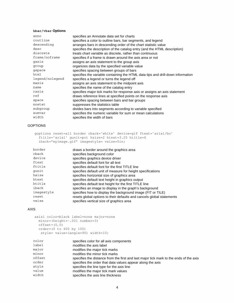
hbar/vbar Options anno specifies an Annotate data set for charts coutline specifies a color to outline bars, bar segments, and legend descending arranges bars in descending order of the chart statistic value desc specifies the description of the catalog entry (and the HTML description) discrete treats chart variable as discrete, rather than continuous frame/noframe specifies if a frame is drawn around the axis area or not gaxis assigns an axis statement to the group axis group organizes data by the specified variable value gspace specifies spacing between groups of bars html specifies the variable containing the HTML data tips and drill-down information legend/nolegend specifies a legend or turns the legend off maxis assigns an axis statement to the midpoint axis name specifies the name of the catalog entry raxis specifies major tick marks for response axis or assigns an axis statement ref draws reference lines at specified points on the response axis space specifies spacing between bars and bar groups nostat suppresses the statistics table subgroup divides bars into segments according to variable specified sumvar specifies the numeric variable for sum or mean calculations width specifies the width of bars
GOPTIONS
goptions reset=all border cback=’white’ device=gif ftext=’arial/bo’ ftitle=’arial’ gunit=pct hsize=2 htext=3.25 htitle=6 iback=”myimage.gif” imagestyle= vsize=5in;
border draws a border around the graphics area cback specifies background color device specifies graphics device driver ftext specifies default font for all text ftitle specifies default font for the first TITLE line gunit specifies default unit of measure for height specifications hsize specifies horizontal size of graphics area htext specifies default text height in graphics output htitle specifies default text height for the first TITLE line iback specifies an image to display in the graph’s background imagestyle specifies how to display the background image (FIT or TILE) reset resets global options to their defaults and cancels global statements vsize specifies vertical size of graphics area
AXIS
axis1 color=black label=none major=none minor=(height=-.001 number=3) offset=(0,0) order=(0 to 600 by 100) style= value=(angle=90) width=10;
color specifies color for all axis components label modifies the axis label major modifies the major tick marks minor modifies the minor tick marks offset specifies the distance from the first and last major tick mark to the ends of the axis order specifies the order that data values appear along the axis style specifies the line type for the axis line value modifies the major tick mark values width specifies the axis line thickness

5
LEGEND
legend1 across=4 frame label=none position=(bottom) shape=bar(2,.5);
across specifies the number of columns in the legend entries frame draws a frame around the legend label modifies a legend label position positions the legend on the graph shape specifies the size and shape of the legend entries
PATTERN
pattern1 value=s color=CX2444c7 value=s;
color specifies the pattern color value specifies the pattern (SOLID, EMPTY, or style number)
SYMBOL
symbol1 color=CX2554c7 height=1 interpol=join line=1 value=none width=5;
color specifies the color for all symbol items height specifies the plot symbol height interpol specifies how plot points are connected line specifies the plot line type for the GPLOT procedure value specifies the plot symbol for data points width specifies the thickness of interpolated lines for the GPLOT procedure
FOOTNOTE, NOTE, and TITLE
title1 angle=90 bcolor=black box=1 color=white font=”arial/bo” height=5pct justify=L “My title”;
angle specifies the baseline angle of the text bcolor specifies the box background color if BOX= used box specifies which box to draw around text color specifies the color for all statement items font specifies the text font height specifies the text character height justify specifies the text string alignment
THE BUILDING BLOCKS
The building blocks enable you to build on the output generated by the PROCs. The building blocks extend output and create dynamic, effective graphs. The building blocks include the Annotate facility, graphics devices, ODS, graph styles, and Web interactivity.
The Annotate Facility
The Annotate facility is one of the most powerful building blocks for enhancing your output. The Annotate facility enables you to generate a special data set of graphics commands from which you can create additional graphics output. This ability enables you to add symbols, colors, labels, images, and other visual enhancements to your graphs. Output from the Annotate facility is combined with SAS/GRAPH procedure output to create custom graphs. Some of the completed examples in the section Building Your Graph: Putting It All Together heavily use the Annotate facility.

6
Following is a simple code fragment that adds three labels and inserts an image into the graph.
data work.other_anno; length text $ 40 function color style $ 12; retain style '"arial/bo"' position '4' when 'a' xsys '3' ysys '3' size 2.5; /* create 3 labels */ function=’label’; x=11; y=55; color='red'; text='HIGH'; output; y=40; color='orange'; text='MED'; output; y=25; color='green'; text='LOW'; output; /* annotate the logo/image */ function='move'; x=3; y=75; output; function='image'; x=87; y=90; imgpath='pollenbar.gif'; style='fit'; output; run;
SAS/GRAPH Output
How you decide to deliver your graphics output influences its appearance. ODS is one powerful and flexible way. Graph styles and graphics devices are important elements in the appearance of your ODS output. Non-ODS graphics devices provide another important way to impact the appearance of your graphics output.
ODS
ODS provides incredible flexibility in generating SAS/GRAPH output with a wide range of formatting options, including generating HTML output with GIF, JAVA, JAVAIMG, ACTIVEX, ACTXIMG, and JAVAMETA devices. The first example uses basic ODS syntax and creates an HTML output file.
goptions device=gif; /*Specify the device to use*/ ods listing close; /*Close in case of back-to-back programs*/ ods html path=”c:\mydir” /*Specify the directory path for the output file*/ body=”graph.html” /*Specify the HTML file to be created*/ style=banker; /*Specify the ODS Style to use*/ proc gplot data=mydata; plot x*y; run; quit; ods html close; /*Close the output files*/ ods listing;
The second example creates an RTF output file.
goptions device=activex; /*Specify the device to use*/ ods rtf file=’test.rtf’; /*Specify the RTF file to be created*/ proc gplot data=mydata; plot x*y; run; quit; ods rtf close; /*Close the output files*/
Graph Styles
Graph styles are only available on newer devices. A graph style combines graph colors, background colors, images, and fonts into a package with a particular theme, and provides a consistent look for your entire ODS output. A graph style can replace some global statements. To see the list of all graph styles, type the command odstemplates on the SAS command line. In the next window, open sashelp.tmplmst and open the Styles folder. Some examples of redefined graph styles include Analysis, Banker, Curve, Gears, Money, and Science (see Figure 10 in Appendix A). The TEMPLATE procedure can be used to modify these predefined graph styles or to create your own styles.
Graphics Device Drivers
Which device driver you choose impacts output appearance. This paper includes examples of six device drivers—GIF, METAJAVA, JAVA, JAVAIMG, ACTIVEX, and ACTXIMG. GIF and METAJAVA produce output that looks like default, non-client output in SAS. The other devices produce newer style output and have newer features available.

7
Currently, ODS styles is a feature that is only available with client devices, but this could change in a future release. JAVA and ACTIVEX create interactive graphs that run the Java applet or ActiveX control to view the graph. JAVAIMAG and ACTXIMG create a static image of the graph through JAVA or ACTIVEX and can be used with ODS RTF and ODS PDF output.
Non-ODS Device Drivers
Some devices do not work with ODS—GIFANIM is one such device driver. GIFANIM creates animated graphics output. The following code shows how GIFANIM is used:
goptions device=gif gsfmode=replace=gsfname=animap hsize=8 vsize=6 Iteration=2 delay=150 disposal=background; <insert graphics proc code for first plot> goptions gsfmode=append; <insert graphics proc code for second plot> goptions gepilog=’3B’x; <insert graphics proc code for final plot>
Web Interactivity
In some cases, a graph needs a level of interactivity in a Web browser. The following code creates graphs that have drill-down capabilities and pop-up data tips. By clicking on the graph bars or slices, the drill-down functionality sends you to another Web page. When the pointer hovers over the graph, data tips that pop up to show pertinent information.
Drill-down
The following code provides drill-down capability:
data x; do age=1 to 10; htmlvar=’href=”http://www.sas.com”’; /*this could be different links*/ output; end; run; ods html file=’c:\test.html’ parameters=(“DRILLDOWNMODE”=”URL”); /*set URL drill-down on*/ goptions dev=activex; proc gchart data=x; pie age / html=htmlvar; run; /*set the html var for drill-down*/ ods html close;
Data Tips
The following code defines data tips: data x; do age=1 to 10; htmlvar='alt='||quote( 'age='||trim(left(age)) ); end; run; ods html file='c:\test.html'; goptions dev=activex; proc gchart data=x; pie age / discrete html=htmlvar; run; ods html close;
BUILDING YOUR GRAPH: PUTTING IT ALL TOGETHER
Now that you are familiar with the construction components, you can build effective and attention-grabbing graphs. The following graphs use the foundation and building blocks that were discussed in previous sections of this paper. Highlights of each graph are discussed after the graph; however, the best way to fully understand them is to run the program that produced the graph. Programs are available for download at: http://support.sas.com/rnd/papers/.
8
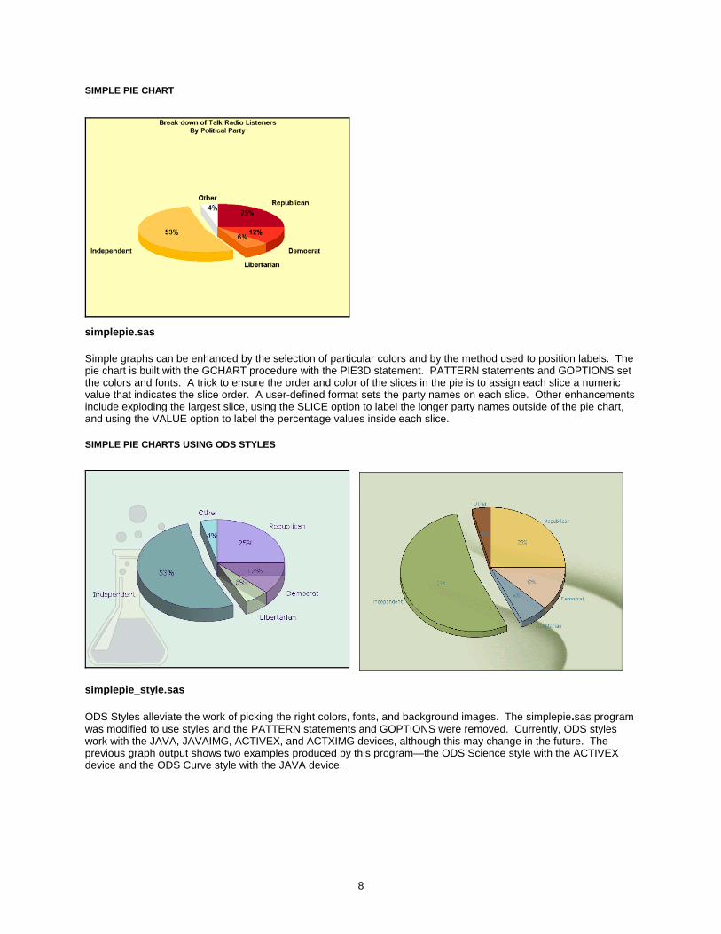
SIMPLE PIE CHART
simplepie.sas Simple graphs can be enhanced by the selection of particular colors and by the method used to position labels. The pie chart is built with the GCHART procedure with the PIE3D statement. PATTERN statements and GOPTIONS set the colors and fonts. A trick to ensure the order and color of the slices in the pie is to assign each slice a numeric value that indicates the slice order. A user-defined format sets the party names on each slice. Other enhancements include exploding the largest slice, using the SLICE option to label the longer party names outside of the pie chart, and using the VALUE option to label the percentage values inside each slice.
SIMPLE PIE CHARTS USING ODS STYLES
simplepie_style.sas ODS Styles alleviate the work of picking the right colors, fonts, and background images. The simplepie.sas program was modified to use styles and the PATTERN statements and GOPTIONS were removed. Currently, ODS styles work with the JAVA, JAVAIMG, ACTIVEX, and ACTXIMG devices, although this may change in the future. The previous graph output shows two examples produced by this program—the ODS Science style with the ACTIVEX device and the ODS Curve style with the JAVA device.

9
TALLY CHART
tally.sas The tally chart uses old-fashioned tally marks to create a visually interesting way of showing a simple score. A simple GPLOT procedure generates the basic graph, but the symbol is hidden and an Annotate data set draws the tally marks.
ANNOTATED CHART
annotate.sas The Annotate facility can significantly improve the WOW factor of any graph. The annotated chart starts with a PROC GCHART VBAR chart and annotates the visuals in the graph. The Annotate facility generates the numbers in the circles on each bar, the HIGH, MED, and LOW axis labels, and the days of the week over the bars. The image at the top is added using the Annotate facility. Special AXIS statements create the bold blue axis and turn off the vertical axis. The REF= option generates the bold horizontal lines. The annotated chart includes pop-up data tips over the bars.

10
CHART WITH BACKGROUND IMAGE
imageback.sas Background images are important visual elements that can convey a message or make the graph fit into a themed presentation or report. The chart starts with a PROC GCHART VBAR chart that uses the GROUP and SUBGROUP options to group the bars. The GOPTIONS IBACK option adds the background image. The PATTERN statement sets colors that blend with the background, and a LEGEND statement identifies the values on the bars. In addition, the chart includes pop-up data tips and drill-down functionality.
SPECTRUM CHART
spectrum.sas Packing a lot of information into a single chart is one way to create very effective graphs. The spectrum chart displays one week of CPU usage for seven machines. Tiny line segments show the average hourly CPU usage for each day on each machine. The chart is created with the GPLOT procedure. The trick to creating this chart is the manipulation of the data, along with the use of the GPLOT procedure’s SKIPMISS option. Each machine has a location on the chart that relates to a position on the vertical axis. Three observations are created for each hour on each machine. The response variable is set to a plus and minus offset around the position assigned to the machine. The third value is set to missing. The first two values cause the plot to draw a line segment up and down. The third value (missing) and the SKIPMISS option cause the plot to stop drawing and skip to the next line segment. Graduated colors are chosen for the line segments and footnote text that replaces the legend. Because the vertical axis values are numeric, the Annotate facility places the machine names along the axis.

11
GRAPHIC TABLE AND CHART
gtable.sas Coupling a table and a graph can emphasize a point. The graph starts with a PROC GCHART HBAR chart and the table is created with the Annotate facility. The graph has data tips and drill-down. The AXIS statement manipulates the graph to accommodate the table.
CONCLUSION
SAS/GRAPH is a powerful data visualization tool and the information in this paper only scratches the surface of its power. By utilizing the construction components discussed, you will discover that effective and attention-grabbing graphs can be built with very little extra effort.
APPENDIX A: SAMPLES FROM SAS/GRAPH PROCEDURES
Horizontal Area Bar Chart
Figure 1. GAREABAR

12
GBARLINE
Figure 2. GBARLINE
Vertical Bar Chart Pie Chart Pie Chart with Detailed Slices
Figure 3. CCHART
Contour Plot
Figure 4. GCONTOUR

13
Bubble Plot Area Plot Scatter Plot
Figure 5. GPLOT Radar Chart with Filled Polygons
Figure 6. GRADAR Surface Plot
Figure 7. G3D

14
Prism Map Block Map with Two Variables Wafer Map
Figure 8. GMAP Constellation Chart (DS2CONT) Critical Success Factor (DS2CSF) Treeview (DS2TREE)
Figure 9. Java Graphs from Macros Science Gears Curve
Figure 10. ODS Styles
ACKNOWLEDGMENTS
A special thanks to Robert Allison of SAS for letting me borrow from creative examples that he had already built.
RESOURCES
Code Samples and Technical Tips (http://support.sas.com/sassamples/index.html).
Massengill, Darrell. 2003. “SAS Mapping: Technologies, Techniques, Tips and Tricks.” SUGI 28 SAS Presents Handout and Example Source Code Download. SAS Institute Inc. Available http://support.sas.com/rnd/papers/.

15
Massengill, Darrell. 2004. “Tips and Tricks II: Getting the most from your SAS/GRAPH maps.” SUGI 29 SAS Presents Handout and Example SAS Programs Download. SAS Institute Inc. Available http://support.sas.com/rnd/papers/.
Massengill, Darrell. 2005. “Tips and Tricks III: More Unique SAS/GRAPH Maps.” SUGI 30 SAS Presents Handout and Examples Download. SAS Institute Inc. Available http://support.sas.com/rnd/papers/.
SAS Customer Support (http://support.sas.com).
SAS Institute Inc. 1999. SAS 8 Online Doc® Version Eight. Available http://v8doc.sas.com.
SAS Institute Inc. 2002. SAS Online Doc®9. Available http://v9doc.sas.com/sasdoc/.
SAS Technical Support Downloads (http://support.sas.com/techsup/ftp/download.html).
SAS Graphing Components, SAS Data Visualization R&D Communities Web site (http://support.sas.com/rnd/datavisualization).
SAS/GRAPH Information (http://www.sas.com/technologies/bi/visualization/index.html)
SAS/GRAPH Software Downloads (http://support.sas.com/download).
CONTACT INFORMATION
A. Darrell Massengill SAS Institute SAS Campus Dr Cary, NC 27513 919 531-7658 [email protected]
SAS and all other SAS Institute Inc. product or service names are registered trademarks or trademarks of SAS Institute Inc. in the USA and other countries. ® indicates USA registration. Other brand and product names are trademarks of their respective companies.