oracle® fusion middleware - oracle help center · pdf fileoracle® fusion middleware...
TRANSCRIPT

Oracle® Fusion MiddlewareDeveloping ADF Skins with Oracle ADF Skin Editor
12c (12.1.3)
E41275-01
May 2014
Documentation for Oracle Application Development Framework (Oracle ADF) developers and user interface designers that describes how to create and apply skins to an application using the ADF Skin Editor.
Oracle Fusion Middleware Developing ADF Skins with Oracle ADF Skin Editor 12c (12.1.3)
E41275-01
Copyright © 2014, Oracle and/or its affiliates. All rights reserved.
Primary Author: Walter Egan
Contributing Author: Laura Akel
This software and related documentation are provided under a license agreement containing restrictions on use and disclosure and are protected by intellectual property laws. Except as expressly permitted in your license agreement or allowed by law, you may not use, copy, reproduce, translate, broadcast, modify, license, transmit, distribute, exhibit, perform, publish, or display any part, in any form, or by any means. Reverse engineering, disassembly, or decompilation of this software, unless required by law for interoperability, is prohibited.
The information contained herein is subject to change without notice and is not warranted to be error-free. If you find any errors, please report them to us in writing.
If this is software or related documentation that is delivered to the U.S. Government or anyone licensing it on behalf of the U.S. Government, the following notice is applicable:
U.S. GOVERNMENT END USERS: Oracle programs, including any operating system, integrated software, any programs installed on the hardware, and/or documentation, delivered to U.S. Government end users are "commercial computer software" pursuant to the applicable Federal Acquisition Regulation and agency-specific supplemental regulations. As such, use, duplication, disclosure, modification, and adaptation of the programs, including any operating system, integrated software, any programs installed on the hardware, and/or documentation, shall be subject to license terms and license restrictions applicable to the programs. No other rights are granted to the U.S. Government.
This software or hardware is developed for general use in a variety of information management applications. It is not developed or intended for use in any inherently dangerous applications, including applications that may create a risk of personal injury. If you use this software or hardware in dangerous applications, then you shall be responsible to take all appropriate fail-safe, backup, redundancy, and other measures to ensure its safe use. Oracle Corporation and its affiliates disclaim any liability for any damages caused by use of this software or hardware in dangerous applications.
Oracle and Java are registered trademarks of Oracle and/or its affiliates. Other names may be trademarks of their respective owners.
Intel and Intel Xeon are trademarks or registered trademarks of Intel Corporation. All SPARC trademarks are used under license and are trademarks or registered trademarks of SPARC International, Inc. AMD, Opteron, the AMD logo, and the AMD Opteron logo are trademarks or registered trademarks of Advanced Micro Devices. UNIX is a registered trademark of The Open Group.
This software or hardware and documentation may provide access to or information on content, products, and services from third parties. Oracle Corporation and its affiliates are not responsible for and expressly disclaim all warranties of any kind with respect to third-party content, products, and services. Oracle Corporation and its affiliates will not be responsible for any loss, costs, or damages incurred due to your access to or use of third-party content, products, or services.
iii
Contents
Preface ................................................................................................................................................................ vii
Audience...................................................................................................................................................... viiDocumentation Accessibility .................................................................................................................... viiRelated Documents .................................................................................................................................... viiConventions ................................................................................................................................................ vii
What's New in This Guide ........................................................................................................................ ix
New and Changed Features for 12c (12.1.3) ............................................................................................ ix
1 About Skinning a Web Application
1.1 Introduction to Skinning a Web Application ................................................................... 1-11.2 Overview of Developing an ADF Skin ............................................................................. 1-21.3 Taking a Look at an ADF Skin .......................................................................................... 1-41.4 Inheritance Relationship of the ADF Skins Provided by Oracle ADF .............................. 1-5
2 Working with ADF Skin Selectors
2.1 About ADF Skin Selectors ................................................................................................ 2-12.1.1 ADF Skin Selectors and Pseudo-Elements ................................................................. 2-32.1.2 ADF Skin Selectors and Icon Images .......................................................................... 2-42.1.3 Grouped ADF Skin Selectors ..................................................................................... 2-62.1.4 Descendant ADF Skin Selectors ................................................................................. 2-72.2 Pseudo-Classes in the ADF Skinning Framework ............................................................ 2-82.3 Properties in the ADF Skinning Framework .................................................................. 2-112.4 Accessing Selector Information from Within the ADF Skin Editor ................................ 2-13
3 Working with the ADF Skin Editor
3.1 About the ADF Skin Editor .............................................................................................. 3-13.2 Working with the ADF Skin Design Editor ...................................................................... 3-23.2.1 How to Change the Browser that Renders the Design Editor's Sample Pages ........... 3-33.3 Working with the ADF Skin Selectors Editor ................................................................... 3-33.3.1 About the Selector Tree .............................................................................................. 3-63.3.2 Interactive Preview in the Selectors Editor ................................................................ 3-73.4 Working with the Properties Window ............................................................................. 3-83.5 Navigating ADF Skins .................................................................................................... 3-10
iv
3.6 Customizing the ADF Skin Editor .................................................................................. 3-123.6.1 How to Change the Look and Feel of the ADF Skin Editor ..................................... 3-123.6.2 How to Customize the General Environment for the ADF Skin Editor ................... 3-133.7 Searching the Source Files of ADF Skins ........................................................................ 3-133.7.1 How to Search the Source Files of ADF Skins .......................................................... 3-133.8 Working with Extensions ............................................................................................... 3-143.8.1 How to Install Extensions with Check for Updates ................................................. 3-143.9 Adding External Tools to the ADF Skin Editor .............................................................. 3-143.9.1 How to Add External Tools to the ADF Skin Editor ................................................ 3-143.10 Navigating the ADF Skin Editor .................................................................................... 3-153.10.1 How to Work With Shortcut Keys In the ADF Skin Editor ...................................... 3-153.10.2 Keyboard Navigation In the ADF Skin Editor ......................................................... 3-163.10.2.1 Common Navigation Keys ................................................................................ 3-173.10.2.2 Navigation In Standard Components ................................................................ 3-173.10.2.3 Navigating Complex Controls .......................................................................... 3-223.10.2.4 Navigation in Specific Components .................................................................. 3-273.11 Working with the Resources Window ........................................................................... 3-303.11.1 Working with IDE Connections ............................................................................... 3-303.11.2 How to Search the Resources Window .................................................................... 3-313.11.3 Filtering Resources Window Contents .................................................................... 3-333.11.4 Importing and Exporting Catalogs and Connections .............................................. 3-333.11.5 Working with Resources Window Catalogs ............................................................ 3-333.11.5.1 Creating Catalogs .............................................................................................. 3-343.11.5.2 Renaming Catalogs ........................................................................................... 3-343.11.6 Working with Catalog Folders ................................................................................. 3-343.11.6.1 How to Create Folders ...................................................................................... 3-343.11.6.2 How to Create Dynamic Folders ....................................................................... 3-343.11.6.3 How to Add Resources to a Catalog ................................................................. 3-343.12 Working with the Issues Window .................................................................................. 3-35
4 Creating the Source Files for an ADF Skin
4.1 About Creating an ADF Skin ........................................................................................... 4-14.2 Creating ADF Skin Applications and ADF Skin Projects ................................................. 4-14.2.1 How to Create an ADF Skin Application ................................................................... 4-14.2.2 How to Create a New ADF Skin Project .................................................................... 4-24.3 Creating an ADF Skin File ................................................................................................ 4-24.3.1 How to Create an ADF Skin in the ADF Skin Editor ................................................. 4-34.3.2 How to Create an ADF Skin in JDeveloper ................................................................ 4-44.3.3 What Happens When You Create an ADF Skin ......................................................... 4-54.4 Importing One or More ADF Skins Into the Current ADF Skin ....................................... 4-84.5 Importing ADF Skins from an ADF Library JAR ............................................................. 4-84.5.1 How to Import an ADF Skin from an ADF Library JAR ............................................ 4-94.5.2 What Happens When You Import an ADF Skin from an ADF Library JAR .............. 4-94.6 Opening an Application Created Outside of the ADF Skin Editor ................................. 4-10
5 Working with Component-Specific Selectors
5.1 About Working with Component-Specific Selectors ....................................................... 5-1
v
5.2 Changing ADF Faces Components' Selectors ................................................................... 5-35.3 Changing ADF Data Visualization Components' Selectors .............................................. 5-45.4 Changing a Component-Specific Selector ......................................................................... 5-75.4.1 How to Change a Component-Specific Selector ......................................................... 5-85.4.2 What Happens When You Change a Component-Specific Selector .......................... 5-85.5 Configuring ADF Skin Properties to Apply to Messages ................................................ 5-95.5.1 How to Configure an ADF Skin Property to Apply to a Message ............................ 5-115.5.2 What Happens When You Configure ADF Skin Properties to Apply to Messages 5-125.6 Applying Themes to ADF Faces Pages ........................................................................... 5-125.6.1 How to Style a Component with a Theme ............................................................... 5-145.7 Configuring an ADF Skin for Accessibility .................................................................... 5-155.7.1 How to Configure an ADF Skin for Accessibility .................................................... 5-16
6 Working with Images and Color in Your ADF Skin
6.1 About Working with Images and Color in Your ADF Skin .............................................. 6-16.2 Changing Images and Colors in the ADF Skin Design Editor .......................................... 6-36.3 Working with Color in a Skyros-Extended ADF Skin ...................................................... 6-46.4 Changing an Image for a Component Selector ................................................................. 6-86.4.1 How to Copy an Image into the Project ..................................................................... 6-96.4.2 What Happens When You Copy an Image into the Project .................................... 6-106.5 Working with the Images Editor .................................................................................... 6-116.5.1 How to Generate Images Using the Images Editor .................................................. 6-146.5.2 What Happens When You Generate Images Using the Images Editor .................... 6-156.6 Providing a Simple Border Style for ADF Skins ............................................................. 6-16
7 Working With Text in an ADF Skin
7.1 About Working with Text in an ADF Skin ....................................................................... 7-17.2 Using Text From Your Own Resource Bundle ................................................................. 7-27.2.1 How to Specify an Additional Resource Bundle for an ADF Skin ............................. 7-37.2.2 What Happens When You Specify an Additional Resource Bundle for an ADF Skin 7-3
8 Working With Global Selector Aliases
8.1 About Global Selector Aliases .......................................................................................... 8-18.2 Creating a Global Selector Alias ....................................................................................... 8-58.2.1 How to Create a Global Selector Alias ...................................................................... 8-58.2.2 What Happens When You Create a Global Selector Alias ........................................ 8-58.3 Modifying a Global Selector Alias .................................................................................... 8-68.3.1 How to Modify a Global Selector Alias ...................................................................... 8-68.4 Applying a Global Selector Alias ..................................................................................... 8-78.4.1 How to Apply a Global Selector Alias ...................................................................... 8-78.4.2 What Happens When You Apply a Global Selector Alias ......................................... 8-88.4.3 What You May Need to Know About Applying a Global Selector Alias ................... 8-98.5 Referencing a Property Value from Another Selector .................................................... 8-108.5.1 How to Reference a Property Value from Another Selector ..................................... 8-118.5.2 What Happens When You Reference a Property Value from Another Selector ....... 8-11
vi
9 Working with Style Classes
9.1 About Style Classes .......................................................................................................... 9-19.2 Creating a Style Class ....................................................................................................... 9-29.2.1 How to Create a Style Class ....................................................................................... 9-29.2.2 What Happens When You Create a Style Class ......................................................... 9-39.3 Modifying a Style Class .................................................................................................... 9-39.3.1 How to Modify a Style Class ..................................................................................... 9-39.4 Configuring a Style Class for a Specific Instance of a Component ................................... 9-49.4.1 How to Configure a Style Class for a Specific Instance of a Component ................... 9-49.4.2 What Happens When You Configure a Style Class for a Specific Instance of a
Component ................................................................................................................ 9-5
10 Working with At-Rules
10.1 About At-Rules in the ADF Skinning Framework ......................................................... 10-110.2 Working with Server-Side At-Rules ............................................................................... 10-210.3 Working with Client-Side At-Rules ................................................................................ 10-510.4 Creating At-Rules in an ADF Skin ................................................................................. 10-710.4.1 How to Create an At-Rule ....................................................................................... 10-710.4.2 What Happens When You Create an At-Rule .......................................................... 10-810.4.3 What Happens at Runtime: How the ADF Skinning Framework Applies At-Rules 10-9
11 Applying the Finished ADF Skin to Your Web Application
11.1 About Applying a Finalized ADF Skin to an Application .............................................. 11-111.2 Testing Changes in Your ADF Skin ............................................................................... 11-111.2.1 How to Set Parameters for Testing Your ADF Skin ................................................. 11-411.2.2 What Happens When You Set Parameter for Testing Your ADF Skin ..................... 11-411.3 Packaging an ADF Skin into an ADF Library JAR ......................................................... 11-411.3.1 How to Package an ADF Skin into an ADF Library JAR ......................................... 11-511.3.2 What Happens When You Package an ADF Skin into an ADF Library JAR ........... 11-511.4 Applying an ADF Skin to Your Web Application .......................................................... 11-611.4.1 How to Apply an ADF Skin to an Application ........................................................ 11-711.4.2 What Happens When You Apply an ADF Skin to an Application .......................... 11-711.5 Applying an ADF Skin to a Running Web Application ................................................ 11-711.5.1 How to Configure your Fusion Web Application to Accept an Updated ADF Skin 11-711.5.2 How to Deploy an ADF Library JAR to an MBean Server ....................................... 11-811.5.3 What Happens When You Apply an ADF Skin to a Running Application ............. 11-9
12 Advanced Topics
12.1 Referring to URLs in an ADF Skin's CSS File ................................................................. 12-112.2 Configuration Files for an ADF Skin .............................................................................. 12-212.3 ADF Skins Provided by Oracle ADF .............................................................................. 12-312.4 Versioning ADF Skins .................................................................................................... 12-612.4.1 How to Version an ADF Skin .................................................................................. 12-712.4.2 What Happens When You Version ADF Skins ........................................................ 12-7
vii
Preface
Welcome to Developing ADF Skins with Oracle ADF Skin Editor.
AudienceThis document is intended for application developers and user interface designers who want to change the look and feel of their application by skinning ADF Faces Rich Client components.
Documentation AccessibilityFor information about Oracle's commitment to accessibility, visit the Oracle Accessibility Program website at http://www.oracle.com/pls/topic/lookup?ctx=acc&id=docacc.
Access to Oracle SupportOracle customers have access to electronic support through My Oracle Support. For information, visit http://www.oracle.com/pls/topic/lookup?ctx=acc&id=info or visit http://www.oracle.com/pls/topic/lookup?ctx=acc&id=trs if you are hearing impaired.
Related DocumentsFor more information, see the following documents for the release that pertains to the application that you are skinning:
■ Installing Oracle ADF Skin Editor
■ Developing Web User Interfaces with Oracle ADF Faces
■ Tag Reference for Oracle ADF Faces
■ Tag Reference for Oracle ADF Faces Skin Selectors
■ Tag Reference for Oracle ADF Faces Data Visualization Tools
■ Tag Reference for Oracle ADF Data Visualization Tools Skin Selectors
ConventionsThe following text conventions are used in this document:
viii
Convention Meaning
boldface Boldface type indicates graphical user interface elements associated with an action, or terms defined in text or the glossary.
italic Italic type indicates book titles, emphasis, or placeholder variables for which you supply particular values.
monospace Monospace type indicates commands within a paragraph, URLs, code in examples, text that appears on the screen, or text that you enter.
ix
What's New in This Guide
The following topics introduce the new and changed features of the ADF Skin Editor and other significant changes that are described in this guide, and provides pointers to additional information. This document is the new edition of the document formerly titled Creating ADF Skins with Oracle ADF Skin Editor.
New and Changed Features for 12c (12.1.3)The ADF Skin Editor 12c (12.1.3) includes the following new and changed features:
■ You can now use the Issues window in the ADF Skin Editor to view information about the tasks the ADF Skin Editor has been or is currently performing. For more information, see Section 3.12, "Working with the Issues Window."
■ You can now specify a number of at-rules (including @media) that the ADF skinning framework passes directly to the user agent. For more information, see Section 10.1, "About At-Rules in the ADF Skinning Framework."
For other changes made to the Oracle Application Development Framework (Oracle ADF) for this release, see the What's New page on the Oracle Technology Network at http://www.oracle.com/technetwork/developer-tools/jdev/documentation/index.html.

x
1
About Skinning a Web Application 1-1
1About Skinning a Web Application
This chapter introduces you to creating an ADF skin with the ADF Skin Editor. It provides an overview of the process of creating an ADF skin, takes a look at some of the changes that an ADF skin can implement, and describes the inheritance relationship of the ADF skins that Oracle ADF provides for you to extend.
This chapter includes the following sections:
■ Section 1.1, "Introduction to Skinning a Web Application"
■ Section 1.2, "Overview of Developing an ADF Skin"
■ Section 1.3, "Taking a Look at an ADF Skin"
■ Section 1.4, "Inheritance Relationship of the ADF Skins Provided by Oracle ADF"
For definitions of unfamiliar terms found in this and other books, see the Glossary.
1.1 Introduction to Skinning a Web Application Skinning refers to the task of developing an ADF skin to apply to a web application that uses ADF Faces and ADF Data Visualization components in the user interface. An ADF skin uses the format, properties, and selectors of cascading style sheets (CSS) to allow you to customize the appearance of these components. Instead of providing a CSS file for each component, or inserting a style sheet on each page of the application, you create one ADF skin for the web application. Every component that renders in the user interface automatically uses the styles defined by the ADF skin. This means you do not have to make design-time changes to individual pages to change their appearance when you use an ADF skin.
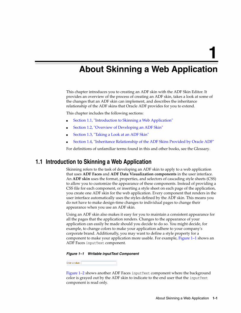
Using an ADF skin also makes it easy for you to maintain a consistent appearance for all the pages that the application renders. Changes to the appearance of your application can easily be made should you decide to do so. You might decide, for example, to change colors to make your application adhere to your company's corporate brand. Additionally, you may want to define a style property for a component to make your application more usable. For example, Figure 1–1 shows an ADF Faces inputText component.
Figure 1–1 Writable inputText Component
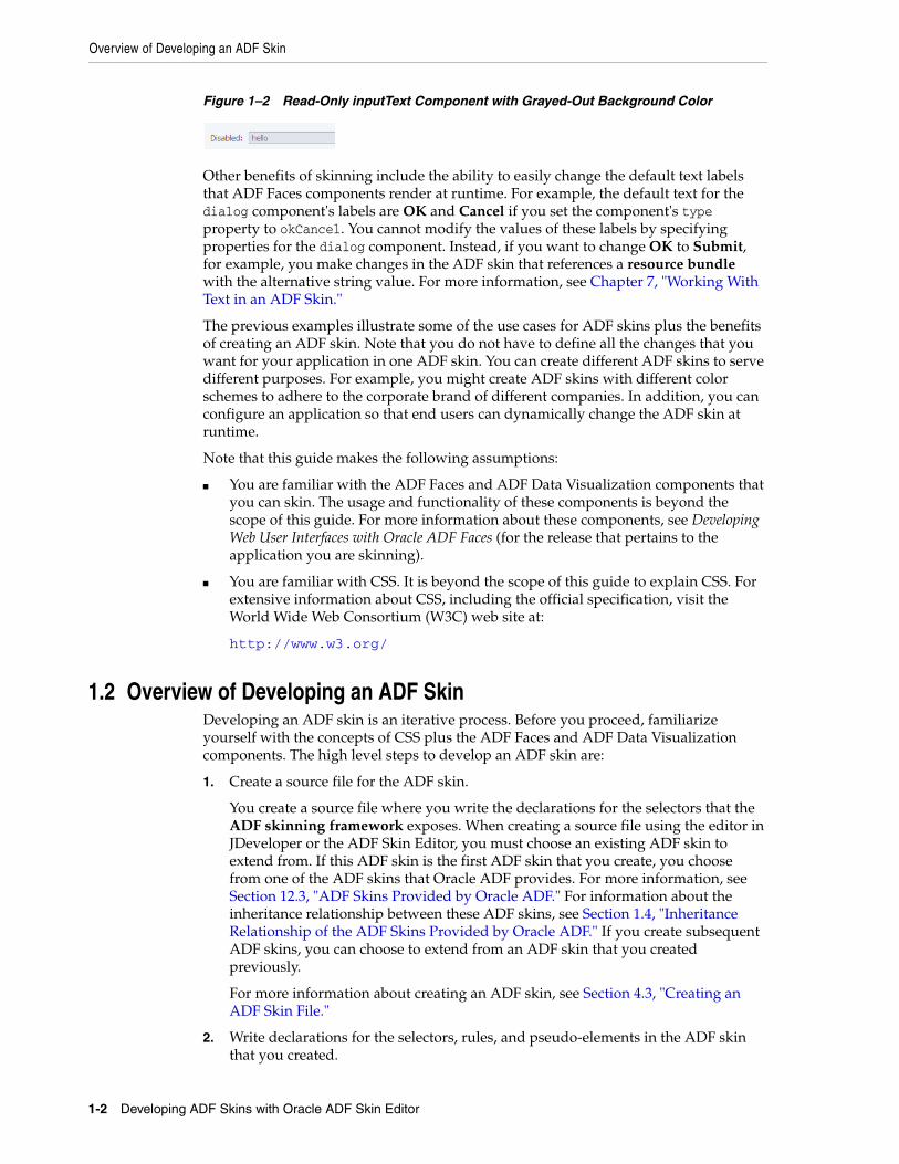
Figure 1–2 shows another ADF Faces inputText component where the background color is grayed out by the ADF skin to indicate to the end user that the inputText component is read only.
Overview of Developing an ADF Skin
1-2 Developing ADF Skins with Oracle ADF Skin Editor
Figure 1–2 Read-Only inputText Component with Grayed-Out Background Color
Other benefits of skinning include the ability to easily change the default text labels that ADF Faces components render at runtime. For example, the default text for the dialog component's labels are OK and Cancel if you set the component's type property to okCancel. You cannot modify the values of these labels by specifying properties for the dialog component. Instead, if you want to change OK to Submit, for example, you make changes in the ADF skin that references a resource bundle with the alternative string value. For more information, see Chapter 7, "Working With Text in an ADF Skin."
The previous examples illustrate some of the use cases for ADF skins plus the benefits of creating an ADF skin. Note that you do not have to define all the changes that you want for your application in one ADF skin. You can create different ADF skins to serve different purposes. For example, you might create ADF skins with different color schemes to adhere to the corporate brand of different companies. In addition, you can configure an application so that end users can dynamically change the ADF skin at runtime.
Note that this guide makes the following assumptions:
■ You are familiar with the ADF Faces and ADF Data Visualization components that you can skin. The usage and functionality of these components is beyond the scope of this guide. For more information about these components, see Developing Web User Interfaces with Oracle ADF Faces (for the release that pertains to the application you are skinning).
■ You are familiar with CSS. It is beyond the scope of this guide to explain CSS. For extensive information about CSS, including the official specification, visit the World Wide Web Consortium (W3C) web site at:
http://www.w3.org/
1.2 Overview of Developing an ADF SkinDeveloping an ADF skin is an iterative process. Before you proceed, familiarize yourself with the concepts of CSS plus the ADF Faces and ADF Data Visualization components. The high level steps to develop an ADF skin are:
1. Create a source file for the ADF skin.
You create a source file where you write the declarations for the selectors that the ADF skinning framework exposes. When creating a source file using the editor in JDeveloper or the ADF Skin Editor, you must choose an existing ADF skin to extend from. If this ADF skin is the first ADF skin that you create, you choose from one of the ADF skins that Oracle ADF provides. For more information, see Section 12.3, "ADF Skins Provided by Oracle ADF." For information about the inheritance relationship between these ADF skins, see Section 1.4, "Inheritance Relationship of the ADF Skins Provided by Oracle ADF." If you create subsequent ADF skins, you can choose to extend from an ADF skin that you created previously.
For more information about creating an ADF skin, see Section 4.3, "Creating an ADF Skin File."
2. Write declarations for the selectors, rules, and pseudo-elements in the ADF skin that you created.
Overview of Developing an ADF Skin
About Skinning a Web Application 1-3
The ADF Skin Editor provides a number of tabs that facilitate this task. Choose the appropriate tab. For example, the Design tab (if available) provides you with controls in a design editor where you can quickly change the most commonly styled parts of applications that use ADF Faces components. A number of sample pages in the lower part of the tab refresh to display the changes you make using the provided controls. In contrast, use the Selectors tab for more advanced changes as this latter tab displays a selectors editor for all the selectors exposed by the ADF skinning framework in a Selector Tree and provides a Properties window and a number of other controls where you can modify these selectors.
The design editor appears if you extend your ADF skin from the Skyros and Fusion Simple families of ADF skin. The selectors editor appears irrespective of the skin family that you extend from. For more information, see Section 3.2, "Working with the ADF Skin Design Editor" and Section 3.3, "Working with the ADF Skin Selectors Editor."
For a description of the different categories of selectors, rules, and pseudo-elements, see Chapter 2, "Working with ADF Skin Selectors."
3. If applicable, import images that you want your ADF skin to reference at runtime in the Fusion web application. For more information, see Chapter 6, "Working with Images and Color in Your ADF Skin."
4. If applicable, override the default text labels defined for the ADF Faces and ADF Data Visualization components by entering new values in a resource bundle. For more information, see Chapter 7, "Working With Text in an ADF Skin."
5. If applicable, edit or create a theme in your ADF skin. A theme are a way of implementing a look and feel at a component level. For more information, see Section 5.6, "Applying Themes to ADF Faces Pages."
6. Preview and test the changes that you made to the ADF skin to verify that the results are what you want. Modify the ADF skin as necessary. The design editor described in Step 2 provides a number of sample pages where you can view your changes within the ADF Skin Editor or within a browser by clicking the Preview in Browser icon, as described in Section 3.2, "Working with the ADF Skin Design Editor." For information about previewing and testing an ADF skin in a running Fusion web application, see Section 11.2, "Testing Changes in Your ADF Skin."
7. Once you complete development of the ADF skin, you may want to package it for distribution. For more information, see Section 11.3, "Packaging an ADF Skin into an ADF Library JAR."
8. Having completed the ADF skin and distributed it, you configure your Fusion web application so that it uses it. For more information, see Section 11.4, "Applying an ADF Skin to Your Web Application."
Tip: The design editor described in Step 2 provides controls that enable you to export and import all images that the ADF skin references. Once exported, you can edit the images using your preferred software program before you import them back into your ADF skin project. The same tab also provides controls to replace individual images. Finally, an Images tab appears if your ADF skin extends from the Fusion Simple family. This tab provides controls to edit images in your ADF skin. For more information about the images editor, see Section 6.5, "Working with the Images Editor."
Taking a Look at an ADF Skin
1-4 Developing ADF Skins with Oracle ADF Skin Editor
1.3 Taking a Look at an ADF SkinAn ADF skin is a type of cascading style sheet. It differs from a cascading style sheet in a number of ways. One way it differs is that you can specify properties for the selectors that the ADF skinning framework exposes in the source file for the ADF skin. A selector exposed by the ADF skinning framework is similar to a CSS selector in that it identifies the ADF Faces and ADF Data Visualization components for which you want to change the appearance and allows you to specify one or more style properties for the component.
A selector exposed by the ADF skinning framework differs from a CSS selector in that it allows you to set values both for CSS properties and ADF skin properties exposed by the ADF skinning framework. CSS properties are interpreted directly by the end user's browser. ADF skin properties are prefaced by the characters -tr-. Some of these ADF skin properties are read and interpreted by the Fusion web application. These properties are also known as server-side properties. A component that renders in the user interface may read these properties before it decides what to render. Other types of ADF skin properties, for example -tr-rule-ref or -tr-property-ref, enhance the capabilities of the ADF skinning framework, as described in Section 2.3, "Properties in the ADF Skinning Framework."
Example 1–1 shows the selector for the gauge component that sets values for the ADF skin properties -tr-graphic-antialiasing and -tr-animation-indicators, plus the CSS properties background-color and font-family.
Example 1–1 Gauge Component's Selector with ADF Skin and CSS Properties
af|dvt-gauge{ /** ADF skin properties */ -tr-graphic-antialiasing: false; -tr-animation-indicators: none; /** CSS properties */ font-family: Geneva, Arial, Helvetica, sans-serif; background-color: rgb(243,255,185);}
As Example 1–1 demonstrates, you can set values for CSS properties and ADF skin properties within the declaration of a selector exposed by the ADF skinning framework. The ADF skinning framework exposes the ADF skin properties that you can define. In addition to ADF skin properties, the ADF skinning framework defines a number of pseudo classes and at-rules that you can specify in an ADF skin. Examples of supported at-rules and pseudo classes include @platform, @agent, @accessibility-profile, :rtl, and @locale. For more information, see Chapter 2, "Working with ADF Skin Selectors."
At runtime, the Fusion web application creates a browser-specific CSS file from the ADF skin. The application then references this browser-specific CSS file as it would any CSS file.
Figure 1–3 demonstrates the impact that an ADF skin can have on the appearance of an application's page. The page on the left renders using the skyros ADF skin. The page on the right renders using the simple ADF skin. Each ADF skin defines values for colors and fonts. The skyros ADF skin uses many more colors, in addition to referencing an image for the Oracle logo. The simple ADF skin uses fewer colors and does not reference an image for a logo.

Inheritance Relationship of the ADF Skins Provided by Oracle ADF
About Skinning a Web Application 1-5
Figure 1–3 File Explorer Application Using the Skyros ADF Skin and the Simple ADF Skin
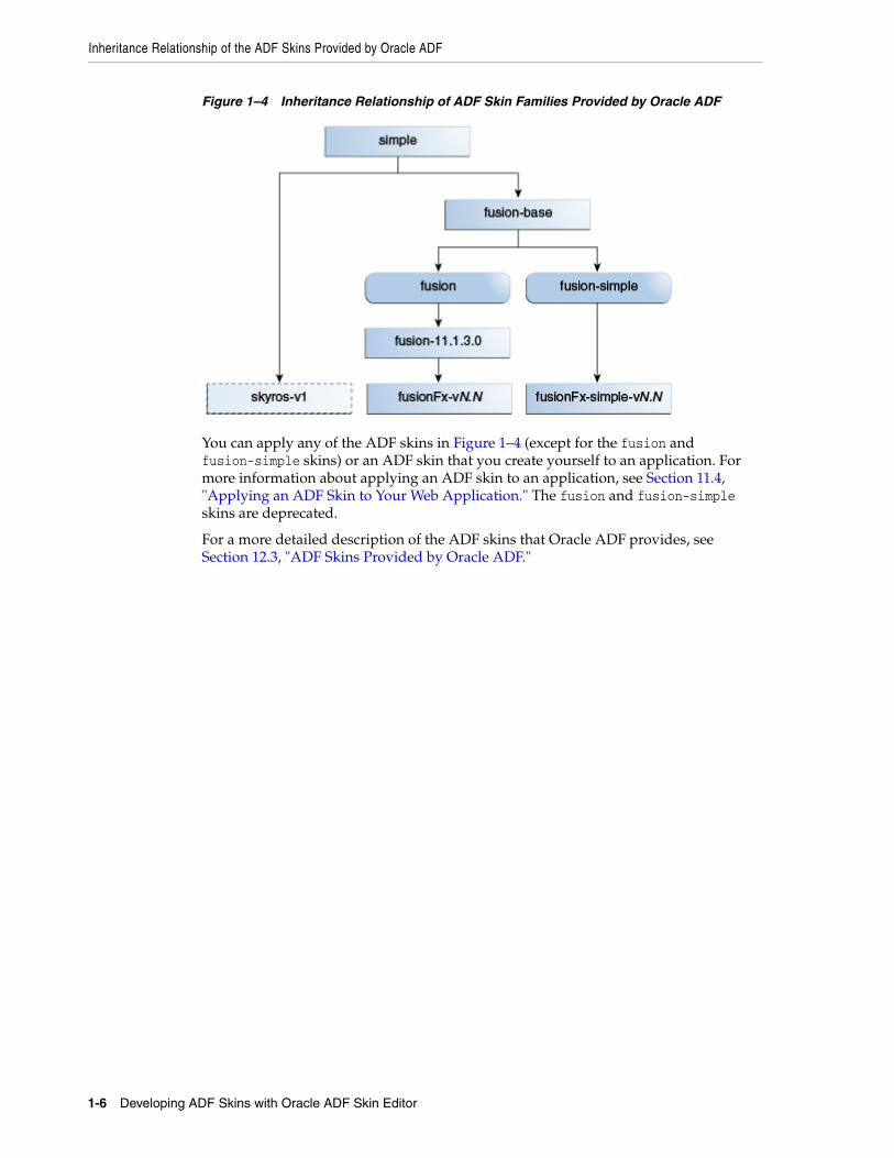
1.4 Inheritance Relationship of the ADF Skins Provided by Oracle ADF Oracle ADF provides a number of ADF skin families that you can use in your application or extend when you create an ADF skin. The ADF skins provided by Oracle ADF offer increasing levels of customization for the appearance rendered by ADF Faces and ADF Data Visualization components at runtime.
Figure 1–4 shows the inheritance relationship between the different ADF skin families. The fusion-base ADF skin inherits the style properties defined in the simple ADF skin. The fusion and fusion-simple ADF skins extend from the fusion-base ADF skin. The fusion-11.1.1.3.0 ADF skin extends from the fusion skin while a number of versions of the fusionFx ADF skin extend from the fusion-11.1.1.3.0 ADF skin. A number of versions of the fusionFx-simple ADF skin extend from the fusion-simple ADF skin. The skyros-v1 ADF skin extends from the simple ADF skin.
All ADF Faces components use, at a minimum, styles defined in the simple ADF skin as this is the skin from which all the other ADF skins extend. The simple ADF skin defines the minimum style properties that ADF Faces components require to render in a Fusion web application. If you want to create an ADF skin with a minimal amount of customization, you create an ADF skin that extends from the simple ADF skin.
If you want an ADF skin with more customization than the simple ADF skin but one that is easier to modify relative to other ADF skin families, consider extending from the Skyros or Fusion Simple families. A design editor is available to you when you extend from these ADF skin families. This editor provides controls (for example, color pickers) to change your ADF skin and sample pages where you can view immediately view the effect of the changes you make.
Note: An ADF skin can affect the time it takes a client to render the user interface. The more styles that an ADF skin uses, the more the client has to load. This can affect performance in low bandwidth or high latency environments.
Inheritance Relationship of the ADF Skins Provided by Oracle ADF
1-6 Developing ADF Skins with Oracle ADF Skin Editor
Figure 1–4 Inheritance Relationship of ADF Skin Families Provided by Oracle ADF
You can apply any of the ADF skins in Figure 1–4 (except for the fusion and fusion-simple skins) or an ADF skin that you create yourself to an application. For more information about applying an ADF skin to an application, see Section 11.4, "Applying an ADF Skin to Your Web Application." The fusion and fusion-simple skins are deprecated.
For a more detailed description of the ADF skins that Oracle ADF provides, see Section 12.3, "ADF Skins Provided by Oracle ADF."
2
Working with ADF Skin Selectors 2-1
2Working with ADF Skin Selectors
This chapter describes the ADF skin selectors. These selectors along with pseudo-elements, pseudo-classes, ADF skin properties and ADF skinning framework rules allow you to customize the appearance of ADF Faces and ADF Data Visualization components.
This chapter includes the following sections:
■ Section 2.1, "About ADF Skin Selectors"
■ Section 2.2, "Pseudo-Classes in the ADF Skinning Framework"
■ Section 2.3, "Properties in the ADF Skinning Framework"
■ Section 2.4, "Accessing Selector Information from Within the ADF Skin Editor"
2.1 About ADF Skin SelectorsCSS uses selectors to determine the elements in a HTML page you that you define rules for. For example, in CSS the following selector defines a rule that determines the appearance of the content that renders in a <p> tag:
p { color: red }
Likewise, the ADF skinning framework defines selectors that allow you to specify rules with the style properties to render at runtime when the rule encounters the specified tag. The ADF skinning framework provides two types of selector: global selectors and component-specific selectors. A global selector defines style properties that you apply to one or more selectors. A component-specific selector defines style properties that apply to one component.
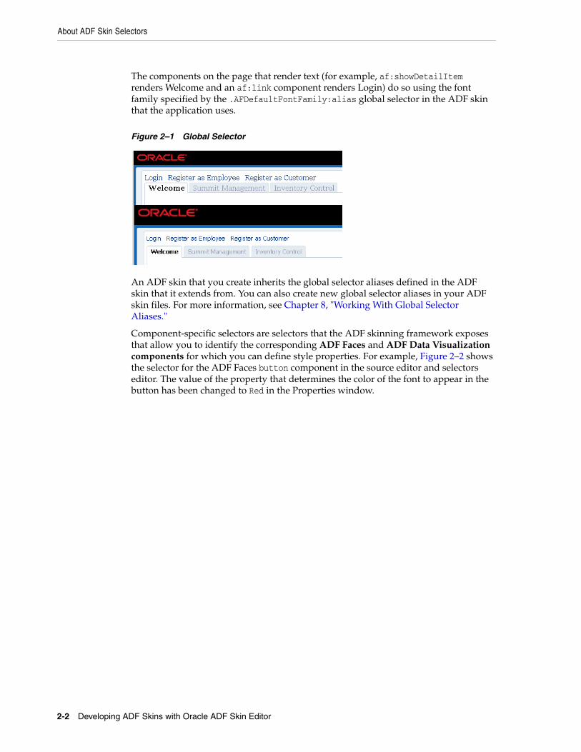
The ADF skins provided by Oracle ADF define many global selectors (Global Selector Aliases in the user interface of the selectors editor) that many ADF Faces components inherit. For example, many ADF Faces components use the .AFDefaultFontFamily:alias global selector to specify the font family. If you create an ADF skin that overrides this selector by specifying a different font family, that change affects all the components that have included the .AFDefaultFontFamily:alias selector in their selector definition.
Figure 2–1 shows two instances of the same page. The instance of the page in the lower part of Figure 2–1 renders using the default values specified for the .AFDefaultFontFamily:alias global selector in the skyros skin. The instance of the page in the upper part of Figure 2–1 renders using an ADF skin that modifies the .AFDefaultFontFamily:alias and .AFDefaultFont global selectors as follows:
.AFDefaultFontFamily:alias {font-family: Georgia;}
.AFDefaultFont:alias {font-size: 12pt;}
About ADF Skin Selectors
2-2 Developing ADF Skins with Oracle ADF Skin Editor
The components on the page that render text (for example, af:showDetailItem renders Welcome and an af:link component renders Login) do so using the font family specified by the .AFDefaultFontFamily:alias global selector in the ADF skin that the application uses.
Figure 2–1 Global Selector
An ADF skin that you create inherits the global selector aliases defined in the ADF skin that it extends from. You can also create new global selector aliases in your ADF skin files. For more information, see Chapter 8, "Working With Global Selector Aliases."
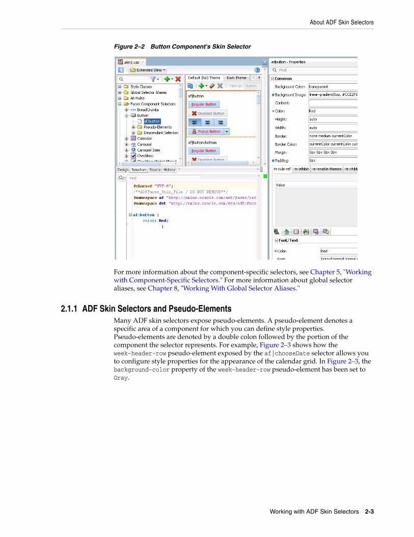
Component-specific selectors are selectors that the ADF skinning framework exposes that allow you to identify the corresponding ADF Faces and ADF Data Visualization components for which you can define style properties. For example, Figure 2–2 shows the selector for the ADF Faces button component in the source editor and selectors editor. The value of the property that determines the color of the font to appear in the button has been changed to Red in the Properties window.
About ADF Skin Selectors
Working with ADF Skin Selectors 2-3
Figure 2–2 Button Component's Skin Selector
For more information about the component-specific selectors, see Chapter 5, "Working with Component-Specific Selectors." For more information about global selector aliases, see Chapter 8, "Working With Global Selector Aliases."
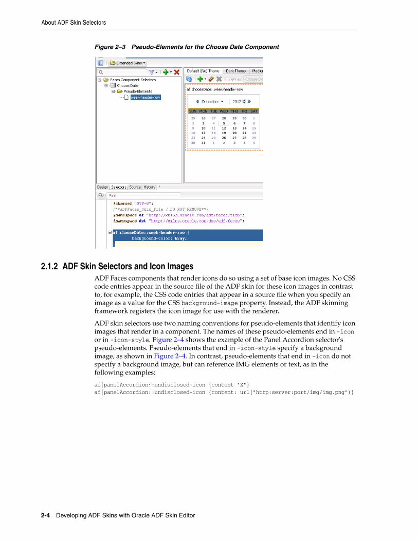
2.1.1 ADF Skin Selectors and Pseudo-ElementsMany ADF skin selectors expose pseudo-elements. A pseudo-element denotes a specific area of a component for which you can define style properties. Pseudo-elements are denoted by a double colon followed by the portion of the component the selector represents. For example, Figure 2–3 shows how the week-header-row pseudo-element exposed by the af|chooseDate selector allows you to configure style properties for the appearance of the calendar grid. In Figure 2–3, the background-color property of the week-header-row pseudo-element has been set to Gray.
About ADF Skin Selectors
2-4 Developing ADF Skins with Oracle ADF Skin Editor
Figure 2–3 Pseudo-Elements for the Choose Date Component
2.1.2 ADF Skin Selectors and Icon ImagesADF Faces components that render icons do so using a set of base icon images. No CSS code entries appear in the source file of the ADF skin for these icon images in contrast to, for example, the CSS code entries that appear in a source file when you specify an image as a value for the CSS background-image property. Instead, the ADF skinning framework registers the icon image for use with the renderer.
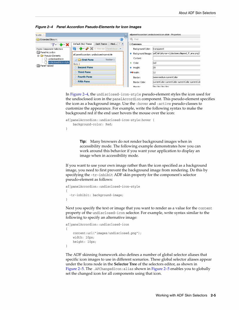
ADF skin selectors use two naming conventions for pseudo-elements that identify icon images that render in a component. The names of these pseudo-elements end in -icon or in -icon-style. Figure 2–4 shows the example of the Panel Accordion selector's pseudo-elements. Pseudo-elements that end in -icon-style specify a background image, as shown in Figure 2–4. In contrast, pseudo-elements that end in -icon do not specify a background image, but can reference IMG elements or text, as in the following examples:
af|panelAccordion::undisclosed-icon {content "X"} af|panelAccordion::undisclosed-icon {content: url("http:server:port/img/img.png")}
About ADF Skin Selectors
Working with ADF Skin Selectors 2-5
Figure 2–4 Panel Accordion Pseudo-Elements for Icon Images
In Figure 2–4, the undisclosed-icon-style pseudo-element styles the icon used for the undisclosed icon in the panelAccordion component. This pseudo-element specifies the icon as a background image. Use the :hover and :active pseudo-classes to customize the appearance. For example, write the following syntax to make the background red if the end user hovers the mouse over the icon:
af|panelAccordion::undisclosed-icon-style:hover { background-color: Red; }
If you want to use your own image rather than the icon specified as a background image, you need to first prevent the background image from rendering. Do this by specifying the -tr-inhibit ADF skin property for the component's selector pseudo-element as follows:
af|panelAccordion::undisclosed-icon-style{ -tr-inhibit: background-image; }
Next you specify the text or image that you want to render as a value for the content property of the undisclosed-icon selector. For example, write syntax similar to the following to specify an alternative image:
af|panelAccordion::undisclosed-icon{ content:url("images/undisclosed.png"); width: 10px; height: 10px; }
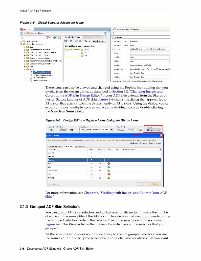
The ADF skinning framework also defines a number of global selector aliases that specific icon images to use in different scenarios. These global selector aliases appear under the Icons node in the Selector Tree of the selectors editor, as shown in Figure 2–5. The .AFChangedIcon:alias shown in Figure 2–5 enables you to globally set the changed icon for all components using that icon.
Tip: Many browsers do not render background images when in accessibility mode. The following example demonstrates how you can work around this behavior if you want your application to display an image when in accessibility mode.
About ADF Skin Selectors
2-6 Developing ADF Skins with Oracle ADF Skin Editor
Figure 2–5 Global Selector Aliases for Icons
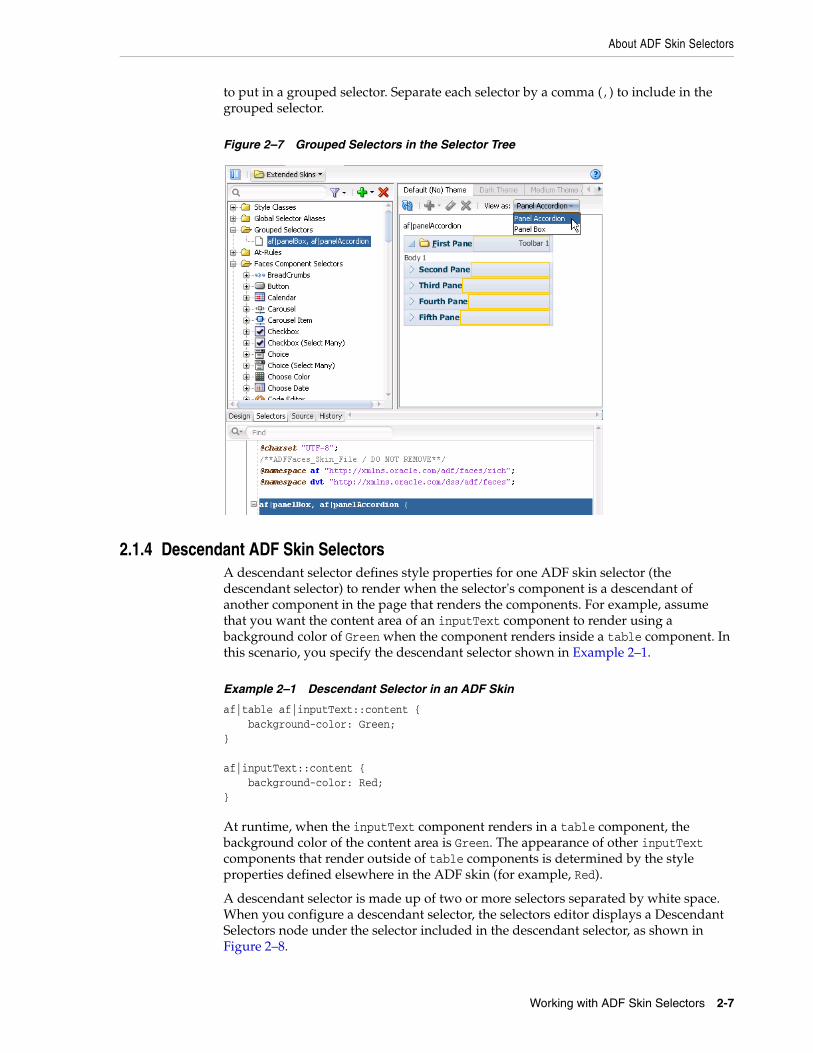
These icons can also be viewed and changed using the Replace Icons dialog that you invoke from the design editor, as described in Section 6.2, "Changing Images and Colors in the ADF Skin Design Editor," if your ADF skin extends from the Skyros or Fusion Simple families of ADF skin. Figure 2–6 shows the dialog that appears for an ADF skin that extends from the Skyros family of ADF skins. Using the dialog, you can export or import multiple icons or replace an individual icons by double-clicking in the New Icon Source field.
Figure 2–6 Design Editor's Replace Icons Dialog for Status Icons
For more information, see Chapter 6, "Working with Images and Color in Your ADF Skin."
2.1.3 Grouped ADF Skin SelectorsYou can group ADF skin selectors and global selector aliases to minimize the number of entries in the source file of the ADF skin. The selectors that you group render under the Grouped Selectors node in the Selector Tree of the selectors editor, as shown in Figure 2–7. The View as list in the Preview Pane displays all the selectors that you grouped.
As the selectors editor does not provide a way to specify grouped selectors, you use the source editor to specify the selectors and/or global selector aliases that you want
About ADF Skin Selectors
Working with ADF Skin Selectors 2-7
to put in a grouped selector. Separate each selector by a comma (,) to include in the grouped selector.
Figure 2–7 Grouped Selectors in the Selector Tree
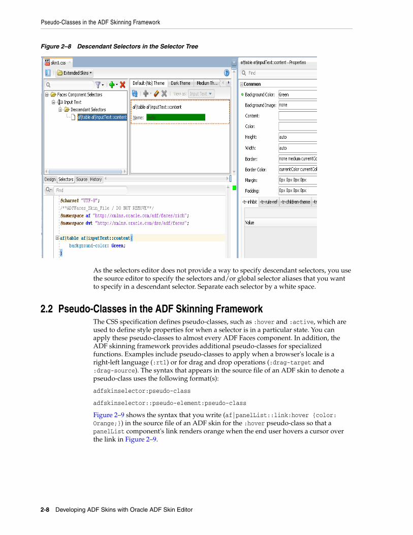
2.1.4 Descendant ADF Skin SelectorsA descendant selector defines style properties for one ADF skin selector (the descendant selector) to render when the selector's component is a descendant of another component in the page that renders the components. For example, assume that you want the content area of an inputText component to render using a background color of Green when the component renders inside a table component. In this scenario, you specify the descendant selector shown in Example 2–1.
Example 2–1 Descendant Selector in an ADF Skin
af|table af|inputText::content { background-color: Green;} af|inputText::content { background-color: Red;}
At runtime, when the inputText component renders in a table component, the background color of the content area is Green. The appearance of other inputText components that render outside of table components is determined by the style properties defined elsewhere in the ADF skin (for example, Red).
A descendant selector is made up of two or more selectors separated by white space. When you configure a descendant selector, the selectors editor displays a Descendant Selectors node under the selector included in the descendant selector, as shown in Figure 2–8.
Pseudo-Classes in the ADF Skinning Framework
2-8 Developing ADF Skins with Oracle ADF Skin Editor
Figure 2–8 Descendant Selectors in the Selector Tree
As the selectors editor does not provide a way to specify descendant selectors, you use the source editor to specify the selectors and/or global selector aliases that you want to specify in a descendant selector. Separate each selector by a white space.
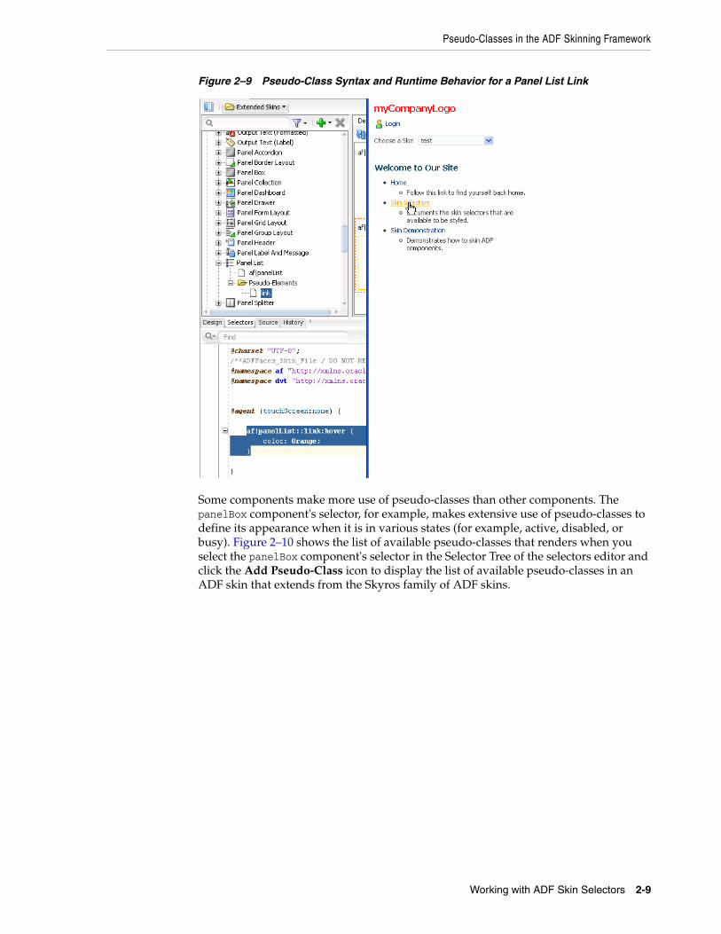
2.2 Pseudo-Classes in the ADF Skinning FrameworkThe CSS specification defines pseudo-classes, such as :hover and :active, which are used to define style properties for when a selector is in a particular state. You can apply these pseudo-classes to almost every ADF Faces component. In addition, the ADF skinning framework provides additional pseudo-classes for specialized functions. Examples include pseudo-classes to apply when a browser's locale is a right-left language (:rtl) or for drag and drop operations (:drag-target and :drag-source). The syntax that appears in the source file of an ADF skin to denote a pseudo-class uses the following format(s):
adfskinselector:pseudo-class
adfskinselector::pseudo-element:pseudo-class
Figure 2–9 shows the syntax that you write (af|panelList::link:hover {color: Orange;}) in the source file of an ADF skin for the :hover pseudo-class so that a panelList component's link renders orange when the end user hovers a cursor over the link in Figure 2–9.
Pseudo-Classes in the ADF Skinning Framework
Working with ADF Skin Selectors 2-9
Figure 2–9 Pseudo-Class Syntax and Runtime Behavior for a Panel List Link
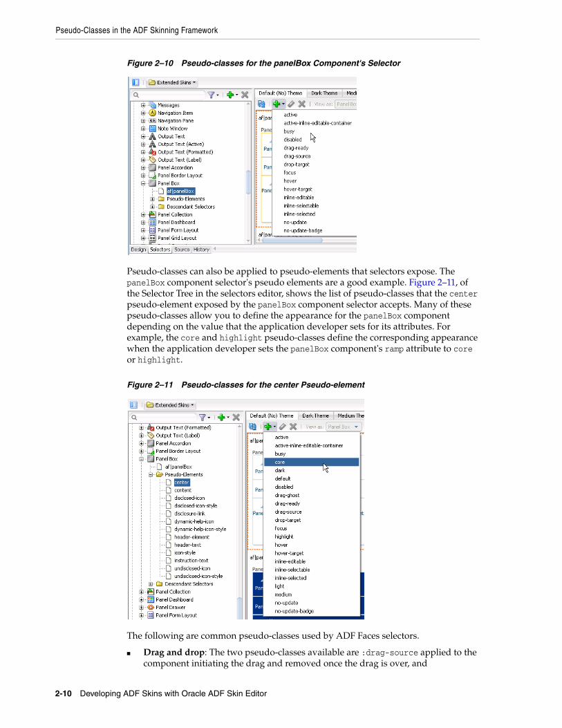
Some components make more use of pseudo-classes than other components. The panelBox component's selector, for example, makes extensive use of pseudo-classes to define its appearance when it is in various states (for example, active, disabled, or busy). Figure 2–10 shows the list of available pseudo-classes that renders when you select the panelBox component's selector in the Selector Tree of the selectors editor and click the Add Pseudo-Class icon to display the list of available pseudo-classes in an ADF skin that extends from the Skyros family of ADF skins.
Pseudo-Classes in the ADF Skinning Framework
2-10 Developing ADF Skins with Oracle ADF Skin Editor
Figure 2–10 Pseudo-classes for the panelBox Component's Selector
Pseudo-classes can also be applied to pseudo-elements that selectors expose. The panelBox component selector's pseudo elements are a good example. Figure 2–11, of the Selector Tree in the selectors editor, shows the list of pseudo-classes that the center pseudo-element exposed by the panelBox component selector accepts. Many of these pseudo-classes allow you to define the appearance for the panelBox component depending on the value that the application developer sets for its attributes. For example, the core and highlight pseudo-classes define the corresponding appearance when the application developer sets the panelBox component's ramp attribute to core or highlight.
Figure 2–11 Pseudo-classes for the center Pseudo-element
The following are common pseudo-classes used by ADF Faces selectors.
■ Drag and drop: The two pseudo-classes available are :drag-source applied to the component initiating the drag and removed once the drag is over, and

Properties in the ADF Skinning Framework
Working with ADF Skin Selectors 2-11
:drop-target applied to a component willing to accept the drop of the current drag.
■ Standard: In CSS, pseudo-classes like :hover, :active, and :focus are considered states of the component. This same concept is used in applying skins to components. Components can have states like read-only or disabled. When states are combined in the same selector, the selector applies only when all states are satisfied.
■ Right-to-left: Use this pseudo-class to set a style or icon definition when the browser is in a right-to-left language. Another typical use case is asymmetrical images. You will want the image to be flipped when setting skin selectors that use the image in a right-to-left reading direction. Be sure to append the :rtl pseudo-class to the very end of the selector and point it to a flipped image file. The skin editor's preview pane does not render changes that you make to a flipped image file. The following example from the Skyros skin shows the image that the calendar component's toolbar-day-hover-icon pseudo-element references when it renders in a browser that uses a right-to-left language:
af|calendar::toolbar-day-hover-icon:rtl { content: url(/afr/cal_day_ovr_rtl.png); width: 16px; height: 16px;}
You can also use :rtl to apply to skin icons. For more information, see Chapter 6, "Working with Images and Color in Your ADF Skin."
■ Inline editing: This pseudo-class is applied when the application activates a component subtree for editing in the browser. For example, :inline-selected is a pseudo-class applied to currently selected components in the active inline-editable subtree.
■ Message: This pseudo-class is used to set component-level message styles using CSS pseudo-classes of :fatal, :error, :warning, :confirmation, and :info. For more information, see Section 5.5, "Configuring ADF Skin Properties to Apply to Messages."
2.3 Properties in the ADF Skinning FrameworkThe ADF skinning framework defines a number of ADF skin properties. The Fusion web application, rather than the user's browser, interprets ADF skin properties. When configured, ADF skin properties enable you to do the following:
■ Reference styles from other selectors with the -tr-rule-ref property.
Create your own global selector alias and combine it with other selectors using the -tr-rule-ref property. For more information, see Section 8.2, "Creating a Global Selector Alias," Section 8.3, "Modifying a Global Selector Alias," and Section 8.4, "Applying a Global Selector Alias."
■ Suppress styles defined in an ADF skin with the -tr-inhibit skin property.
Suppress or reset CSS properties inherited from a base skin with the -tr-inhibit skin property. For example, the -tr-inhibit:padding property removes any
Note: The global selector aliases that appear in the Selector Tree are a special type of pseudo-class (:alias). For more information, see Chapter 8, "Working With Global Selector Aliases."

Properties in the ADF Skinning Framework
2-12 Developing ADF Skins with Oracle ADF Skin Editor
inherited padding. Remove (clear) all inherited properties with the -tr-inhibit:all property. The suppressed property name must be matched exactly with the property name in the base skin.
■ Reference the value of a property defined in another selector using the -tr-property-ref property.
For more information, see Section 8.5, "Referencing a Property Value from Another Selector."
■ Configure a theme for child components with the -tr-children-theme property.
For more information, see Section 5.6, "Applying Themes to ADF Faces Pages."
■ ADF skin selectors with style properties.
Skin style properties allow you to customize the rendering of a component throughout the application. A CSS property is stored with a value in the Skin object and is available when the component is being rendered. For example, in af|breadCrumbs{-tr-show-last-item: false}, the skin property -tr-show-last-item is set to hide the last item in the breadCrumbs component's navigation path.
The ADF skinning framework also provides the + and - operators that allow you to set a selector's color or font properties relative to the value that you specify for the color or font properties of another selector. This is useful if you want to apply a range of colors to selectors or maintain a relative size between fonts.
Example 2–2 demonstrates the syntax that you write to make use of this feature for a color property. A global selector alias defines the background color that another global selector alias (.fooBackgroundColorTest) applies using the - operator. Example 2–2 also demonstrates the syntax that you write to make use of this feature for a font property. A global selector alias (.FontSizeTest:alias) defines the font size and .fooFontTestIncrease increases this font size by using the + operator.
Example 2–2 Using Operators to Apply Color and Change Font Size
.FontSizeTest:alias { font-size: 30px;}
.BaseBackgroundColor:alias { background-color: #0099ff;}
.fooFontTestIncrease { -tr-rule-ref: selector(".FontSizeTest:alias"); font-size: +20px;}
.fooBackgroundColorTest { -tr-rule-ref: selector(".BaseBackgroundColor:alias"); background-color: -#333333;}
af|outputLabel { -tr-rule-ref: selector(".BaseBackgroundColor:alias"); -tr-rule-ref: selector(".FontSizeTest:alias"); color: Red; }
Accessing Selector Information from Within the ADF Skin Editor
Working with ADF Skin Selectors 2-13
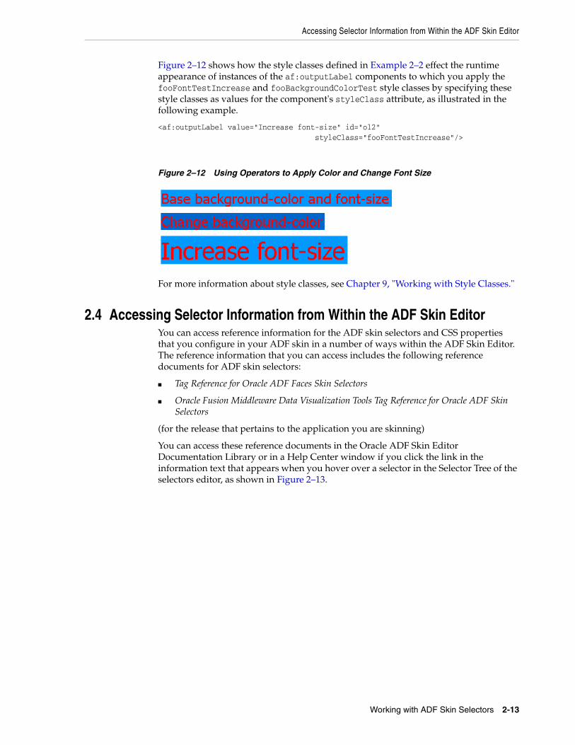
Figure 2–12 shows how the style classes defined in Example 2–2 effect the runtime appearance of instances of the af:outputLabel components to which you apply the fooFontTestIncrease and fooBackgroundColorTest style classes by specifying these style classes as values for the component's styleClass attribute, as illustrated in the following example.
<af:outputLabel value="Increase font-size" id="ol2" styleClass="fooFontTestIncrease"/>
Figure 2–12 Using Operators to Apply Color and Change Font Size
For more information about style classes, see Chapter 9, "Working with Style Classes."
2.4 Accessing Selector Information from Within the ADF Skin EditorYou can access reference information for the ADF skin selectors and CSS properties that you configure in your ADF skin in a number of ways within the ADF Skin Editor. The reference information that you can access includes the following reference documents for ADF skin selectors:
■ Tag Reference for Oracle ADF Faces Skin Selectors
■ Oracle Fusion Middleware Data Visualization Tools Tag Reference for Oracle ADF Skin Selectors
(for the release that pertains to the application you are skinning)
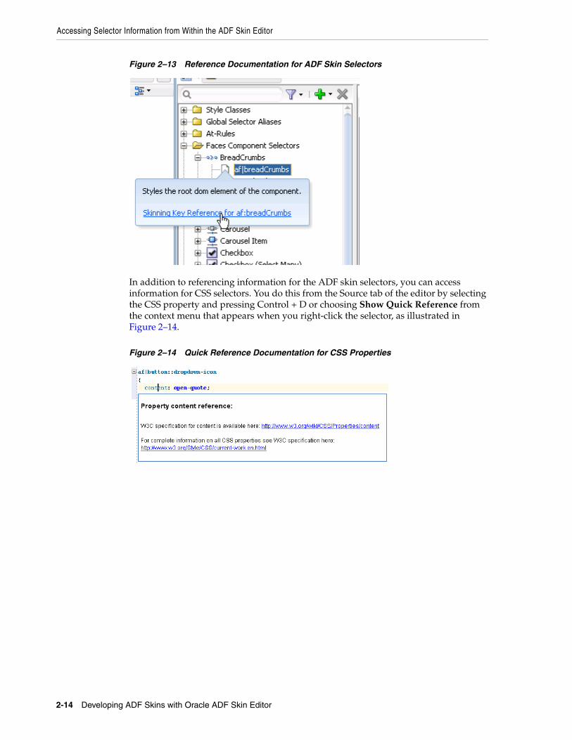
You can access these reference documents in the Oracle ADF Skin Editor Documentation Library or in a Help Center window if you click the link in the information text that appears when you hover over a selector in the Selector Tree of the selectors editor, as shown in Figure 2–13.
Accessing Selector Information from Within the ADF Skin Editor
2-14 Developing ADF Skins with Oracle ADF Skin Editor
Figure 2–13 Reference Documentation for ADF Skin Selectors
In addition to referencing information for the ADF skin selectors, you can access information for CSS selectors. You do this from the Source tab of the editor by selecting the CSS property and pressing Control + D or choosing Show Quick Reference from the context menu that appears when you right-click the selector, as illustrated in Figure 2–14.
Figure 2–14 Quick Reference Documentation for CSS Properties
3
Working with the ADF Skin Editor 3-1
3Working with the ADF Skin Editor
This chapter describes the editors that the ADF Skin Editor provides to create ADF skins. Key features of these editors, such as the Selector Tree that you use to browse the selectors that you can configure in an ADF skin, the Properties window that you use to set properties, and how you navigate to an ADF skin that you extend, are also described.
This chapter includes the following sections:
■ Section 3.1, "About the ADF Skin Editor"
■ Section 3.2, "Working with the ADF Skin Design Editor"
■ Section 3.3, "Working with the ADF Skin Selectors Editor"
■ Section 3.4, "Working with the Properties Window"
■ Section 3.5, "Navigating ADF Skins"
■ Section 3.6, "Customizing the ADF Skin Editor"
■ Section 3.7, "Searching the Source Files of ADF Skins"
■ Section 3.8, "Working with Extensions"
■ Section 3.9, "Adding External Tools to the ADF Skin Editor"
■ Section 3.10, "Navigating the ADF Skin Editor"
■ Section 3.11, "Working with the Resources Window"
■ Section 3.12, "Working with the Issues Window"
3.1 About the ADF Skin EditorThe ADF Skin Editor is a tool that creates ADF skins for applications built using various releases of Oracle ADF. It provides a number of visual and source editors where you edit the selectors exposed by the ADF Faces framework, preview your changes, and package the final ADF skin into an ADF Library JAR.
Key features of the ADF Skin Editor include the:
■ ADF Skin Design Editor (design editor) where you can declaratively modify an ADF skin that extends from the Skyros or Fusion Simple families of ADF skin using the provided controls.
■ ADF Skin Selector Editor (selectors editor) where you can view all of the selectors exposed by the ADF Faces framework in the Selector Tree.
■ Properties window where you can modify the properties of the selectors that you choose in the Selector Tree.
Working with the ADF Skin Design Editor
3-2 Developing ADF Skins with Oracle ADF Skin Editor
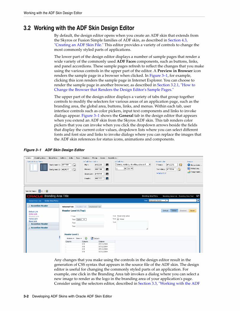
3.2 Working with the ADF Skin Design EditorBy default, the design editor opens when you create an ADF skin that extends from the Skyros or Fusion Simple families of ADF skin, as described in Section 4.3, "Creating an ADF Skin File." This editor provides a variety of controls to change the most commonly styled parts of applications.
The lower part of the design editor displays a number of sample pages that render a wide variety of the commonly used ADF Faces components, such as buttons, links, and panel accordions. These sample pages refresh to reflect the changes that you make using the various controls in the upper part of the editor. A Preview in Browser icon renders the sample page in a browser when clicked. In Figure 3–1, for example, clicking this icon renders the sample page in Internet Explorer. You can choose to render the sample page in another browser, as described in Section 3.2.1, "How to Change the Browser that Renders the Design Editor's Sample Pages."
The upper part of the design editor displays a variety of tabs that group together controls to modify the selectors for various areas of an application page, such as the branding area, the global area, buttons, links, and menus. Within each tab, user interface controls such as color pickers, input text components and links to invoke dialogs appear. Figure 3–1 shows the General tab in the design editor that appears when you extend an ADF skin from the Skyros ADF skin. This tab renders color pickers that you can invoke when you click the dropdown arrows beside the fields that display the current color values, dropdown lists where you can select different fonts and font size and links to invoke dialogs where you can replace the images that the ADF skin references for status icons, animations and components.
Figure 3–1 ADF Skin Design Editor
Any changes that you make using the controls in the design editor result in the generation of CSS syntax that appears in the source file of the ADF skin. The design editor is useful for changing the commonly styled parts of an application. For example, one click in the Branding Area tab invokes a dialog where you can select a new image to render as the logo in the branding area of your application's page. Consider using the selectors editor, described in Section 3.3, "Working with the ADF

Working with the ADF Skin Selectors Editor
Working with the ADF Skin Editor 3-3
Skin Selectors Editor," when you need to go beyond changing the most commonly styled parts.
For more information about how you can use the design editor to change colors and images, see Section 6.2, "Changing Images and Colors in the ADF Skin Design Editor."
3.2.1 How to Change the Browser that Renders the Design Editor's Sample PagesYou can change the browser that renders the design editor's sample pages when you click the Preview in Browser icon.
To change the browser that renders the design editor's sample pages:1. From the main menu, choose Tools > Preferences.
2. In the Preferences dialog, select the Web Browser and Proxy page.
3. Choose the browser that you want to use in the Web Browsers list.
4. Click OK.
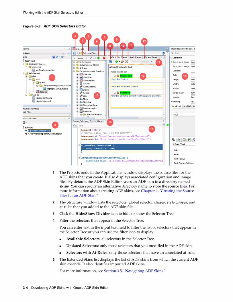
3.3 Working with the ADF Skin Selectors EditorFigure 3–2 shows the selectors editor. Each label number corresponds to a description in the list that follows Figure 3–2. The selectors editor opens by default if the ADF skin that you create extends from a skin family that is not Skyros or Fusion Simple. If your ADF skin extends one of these two skin families, you can access the selectors editor by clicking the Selectors tab.
Working with the ADF Skin Selectors Editor
3-4 Developing ADF Skins with Oracle ADF Skin Editor
Figure 3–2 ADF Skin Selectors Editor
1. The Projects node in the Applications window displays the source files for the ADF skins that you create. It also displays associated configuration and image files. By default, the ADF Skin Editor saves an ADF skin to a directory named skins. You can specify an alternative directory name to store the source files. For more information about creating ADF skins, see Chapter 4, "Creating the Source Files for an ADF Skin."
2. The Structure window lists the selectors, global selector aliases, style classes, and at-rules that you added to the ADF skin file.
3. Click the Hide/Show Divider icon to hide or show the Selector Tree.
4. Filter the selectors that appear in the Selector Tree.
You can enter text in the input text field to filter the list of selectors that appear in the Selector Tree or you can use the filter icon to display:
■ Available Selectors: all selectors in the Selector Tree.
■ Updated Selectors: only those selectors that you modified in the ADF skin.
■ Selectors with At-Rules: only those selectors that have an associated at-rule.
5. The Extended Skins list displays the list of ADF skins from which the current ADF skin extends. It also identifies imported ADF skins.
For more information, see Section 3.5, "Navigating ADF Skins."
Working with the ADF Skin Selectors Editor
Working with the ADF Skin Editor 3-5
6. Use the Add icon to create a new style class, alias selector, or at-rule.
For information about creating a new style class, see Chapter 9, "Working with Style Classes." For information about creating an alias selector, see Chapter 8, "Working With Global Selector Aliases." For information about creating an at-rule, see Chapter 10, "Working with At-Rules."
7. Use the Delete icon to remove a selector that you added to the ADF skin.
8. Click the Refresh icon to update the Preview Pane after you make changes to the properties of a selector in the Properties window.
9. Click the Add Pseudo-Class icon to apply a pseudo-class to the item that you selected in the Selector Tree.
For more information about pseudo-classes, see Section 2.2, "Pseudo-Classes in the ADF Skinning Framework."
10. Click the Clear Property Settings icon to undo any change that you made to the item selected in the Selector Tree.
11. Click the Delete Pseudo-Class from Skin File icon to delete any pseudo-classes that you specified in the ADF Skin.
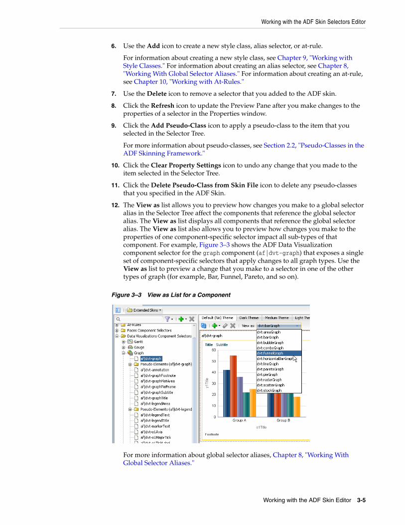
12. The View as list allows you to preview how changes you make to a global selector alias in the Selector Tree affect the components that reference the global selector alias. The View as list displays all components that reference the global selector alias. The View as list also allows you to preview how changes you make to the properties of one component-specific selector impact all sub-types of that component. For example, Figure 3–3 shows the ADF Data Visualization component selector for the graph component (af|dvt-graph) that exposes a single set of component-specific selectors that apply changes to all graph types. Use the View as list to preview a change that you make to a selector in one of the other types of graph (for example, Bar, Funnel, Pareto, and so on).
Figure 3–3 View as List for a Component
For more information about global selector aliases, Chapter 8, "Working With Global Selector Aliases."
Working with the ADF Skin Selectors Editor
3-6 Developing ADF Skins with Oracle ADF Skin Editor
13. The Selector Tree displays the list of selectors, global selector aliases, style classes, and at-rules that you can configure values for in an ADF skin.
For more information, see Section 3.3, "Working with the ADF Skin Selectors Editor."
14. The Preview Pane renders a preview of the changes that you make to a selector in an ADF skin after you click the Refresh icon (8).
15. You can also view the source of an ADF skin file.
16. The Properties window identifies properties that you can configure for the ADF skin.
For more information, see Section 3.4, "Working with the Properties Window."
17. The tabs for themes allow you to preview changes that you make for supported themes.
For more information, see Section 5.6, "Applying Themes to ADF Faces Pages."
18. The images editor helps you manage the images that you want to use with an ADF skin. This tab appears if the ADF skin you create extends from the Fusion Simple family of ADF skin.
For more information, see Section 6.5, "Working with the Images Editor."
3.3.1 About the Selector TreeThe Selector Tree displays a list of the style classes, global selector aliases, and selectors for which you can configure properties to change the appearance of ADF Faces and ADF Data Visualization components.
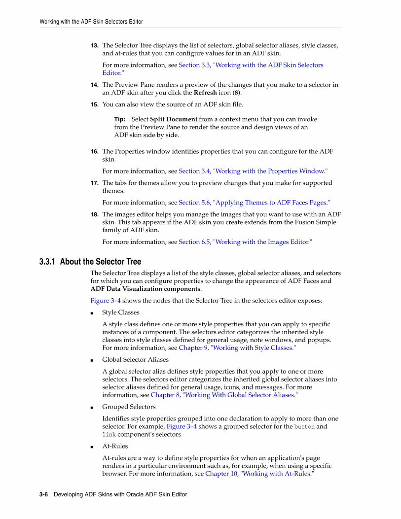
Figure 3–4 shows the nodes that the Selector Tree in the selectors editor exposes:
■ Style Classes
A style class defines one or more style properties that you can apply to specific instances of a component. The selectors editor categorizes the inherited style classes into style classes defined for general usage, note windows, and popups. For more information, see Chapter 9, "Working with Style Classes."
■ Global Selector Aliases
A global selector alias defines style properties that you apply to one or more selectors. The selectors editor categorizes the inherited global selector aliases into selector aliases defined for general usage, icons, and messages. For more information, see Chapter 8, "Working With Global Selector Aliases."
■ Grouped Selectors
Identifies style properties grouped into one declaration to apply to more than one selector. For example, Figure 3–4 shows a grouped selector for the button and link component's selectors.
■ At-Rules
At-rules are a way to define style properties for when an application's page renders in a particular environment such as, for example, when using a specific browser. For more information, see Chapter 10, "Working with At-Rules."
Tip: Select Split Document from a context menu that you can invoke from the Preview Pane to render the source and design views of an ADF skin side by side.
Working with the ADF Skin Selectors Editor
Working with the ADF Skin Editor 3-7
■ Faces Component Selector
Selectors identify the ADF Faces components for which you can configure properties. The selectors editor displays subcategories for pseudo-elements, component selector aliases, and descendant selectors. For brevity, the ADF Faces components node is not expanded. For more information, see Chapter 5, "Working with Component-Specific Selectors."
■ Data Visualizations Component Selectors
Selectors identify the ADF Data Visualization components for which you can configure properties. The selectors editor displays subcategories for pseudo-elements, component selector aliases, and descendant selectors. For more information, see Chapter 5, "Working with Component-Specific Selectors."
Figure 3–4 Selector Tree
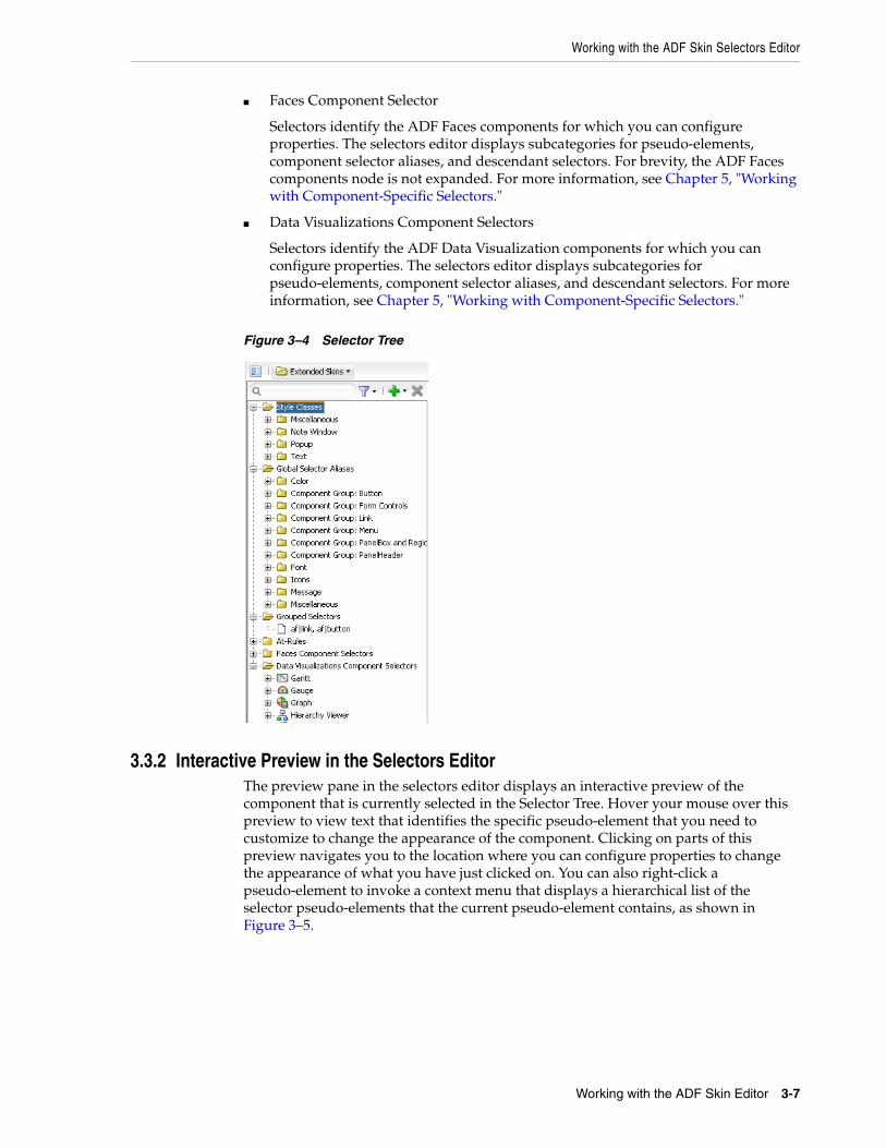
3.3.2 Interactive Preview in the Selectors EditorThe preview pane in the selectors editor displays an interactive preview of the component that is currently selected in the Selector Tree. Hover your mouse over this preview to view text that identifies the specific pseudo-element that you need to customize to change the appearance of the component. Clicking on parts of this preview navigates you to the location where you can configure properties to change the appearance of what you have just clicked on. You can also right-click a pseudo-element to invoke a context menu that displays a hierarchical list of the selector pseudo-elements that the current pseudo-element contains, as shown in Figure 3–5.
Working with the Properties Window
3-8 Developing ADF Skins with Oracle ADF Skin Editor
Figure 3–5 Interactive Preview for the Calendar Component
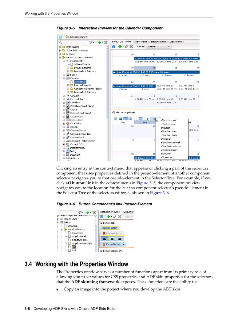
Clicking an entry in the context menu that appears or clicking a part of the calendar component that uses properties defined in the pseudo-element of another component selector navigates you to that pseudo-element in the Selector Tree. For example, if you click af|button::link in the context menu in Figure 3–5, the component preview navigates you to the location for the button component selector's pseudo-element in the Selector Tree of the selectors editor, as shown in Figure 3–6.
Figure 3–6 Button Component's link Pseudo-Element
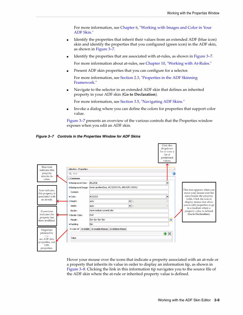
3.4 Working with the Properties WindowThe Properties window serves a number of functions apart from its primary role of allowing you to set values for CSS properties and ADF skin properties for the selectors that the ADF skinning framework exposes. These functions are the ability to:
■ Copy an image into the project where you develop the ADF skin.
Working with the Properties Window
Working with the ADF Skin Editor 3-9
For more information, see Chapter 6, "Working with Images and Color in Your ADF Skin."
■ Identify the properties that inherit their values from an extended ADF (blue icon) skin and identify the properties that you configured (green icon) in the ADF skin, as shown in Figure 3–7.
■ Identify the properties that are associated with at-rules, as shown in Figure 3–7.
For more information about at-rules, see Chapter 10, "Working with At-Rules."
■ Present ADF skin properties that you can configure for a selector.
For more information, see Section 2.3, "Properties in the ADF Skinning Framework."
■ Navigate to the selector in an extended ADF skin that defines an inherited property in your ADF skin (Go to Declaration).
For more information, see Section 3.5, "Navigating ADF Skins."
■ Invoke a dialog where you can define the colors for properties that support color value.
Figure 3–7 presents an overview of the various controls that the Properties window exposes when you edit an ADF skin.
Figure 3–7 Controls in the Properties Window for ADF Skins
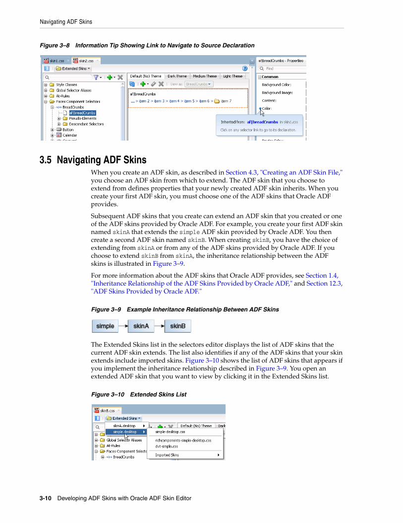
Hover your mouse over the icons that indicate a property associated with an at-rule or a property that inherits its value in order to display an information tip, as shown in Figure 3–8. Clicking the link in this information tip navigates you to the source file of the ADF skin where the at-rule or inherited property value is defined.
Navigating ADF Skins
3-10 Developing ADF Skins with Oracle ADF Skin Editor
Figure 3–8 Information Tip Showing Link to Navigate to Source Declaration
3.5 Navigating ADF SkinsWhen you create an ADF skin, as described in Section 4.3, "Creating an ADF Skin File," you choose an ADF skin from which to extend. The ADF skin that you choose to extend from defines properties that your newly created ADF skin inherits. When you create your first ADF skin, you must choose one of the ADF skins that Oracle ADF provides.
Subsequent ADF skins that you create can extend an ADF skin that you created or one of the ADF skins provided by Oracle ADF. For example, you create your first ADF skin named skinA that extends the simple ADF skin provided by Oracle ADF. You then create a second ADF skin named skinB. When creating skinB, you have the choice of extending from skinA or from any of the ADF skins provided by Oracle ADF. If you choose to extend skinB from skinA, the inheritance relationship between the ADF skins is illustrated in Figure 3–9.
For more information about the ADF skins that Oracle ADF provides, see Section 1.4, "Inheritance Relationship of the ADF Skins Provided by Oracle ADF," and Section 12.3, "ADF Skins Provided by Oracle ADF."
Figure 3–9 Example Inheritance Relationship Between ADF Skins
The Extended Skins list in the selectors editor displays the list of ADF skins that the current ADF skin extends. The list also identifies if any of the ADF skins that your skin extends include imported skins. Figure 3–10 shows the list of ADF skins that appears if you implement the inheritance relationship described in Figure 3–9. You open an extended ADF skin that you want to view by clicking it in the Extended Skins list.
Figure 3–10 Extended Skins List

Navigating ADF Skins
Working with the ADF Skin Editor 3-11
Using the Go to Declaration menu that the Properties window exposes, you can navigate to the location in an extended ADF skin where the extended ADF skin declares style properties inherited by other ADF skins. For example, assume that the skinA ADF skin defines a background color of Red for the af|button selector's access-key pseudo-element, as shown in Figure 3.5.
Figure 3–11 Declaration of a Property Value
The skinB ADF skin that extends from skinA ADF skin inherits the property values that are defined in the skinA ADF skin. Figure 3.5 shows the skinB ADF skin in the selectors editor with a value of Red for the background-color property.
Figure 3–12 Inheriting a Property Value from an Extended Skin
To go to the declaration of a property:1. Identify a property in your ADF skin that inherits its values from an extended
ADF skin. A blue upward-pointing arrow, as shown in Figure 3–12, identifies these properties.
2. Click the icon that appears when you hover over the property field to invoke a context menu where you select Go to Declaration, as shown in Figure 3–13.
Note: You cannot edit the properties of the selectors in the ADF skins provided by Oracle ADF. You can only edit the properties of selectors in extended ADF skins that you created.
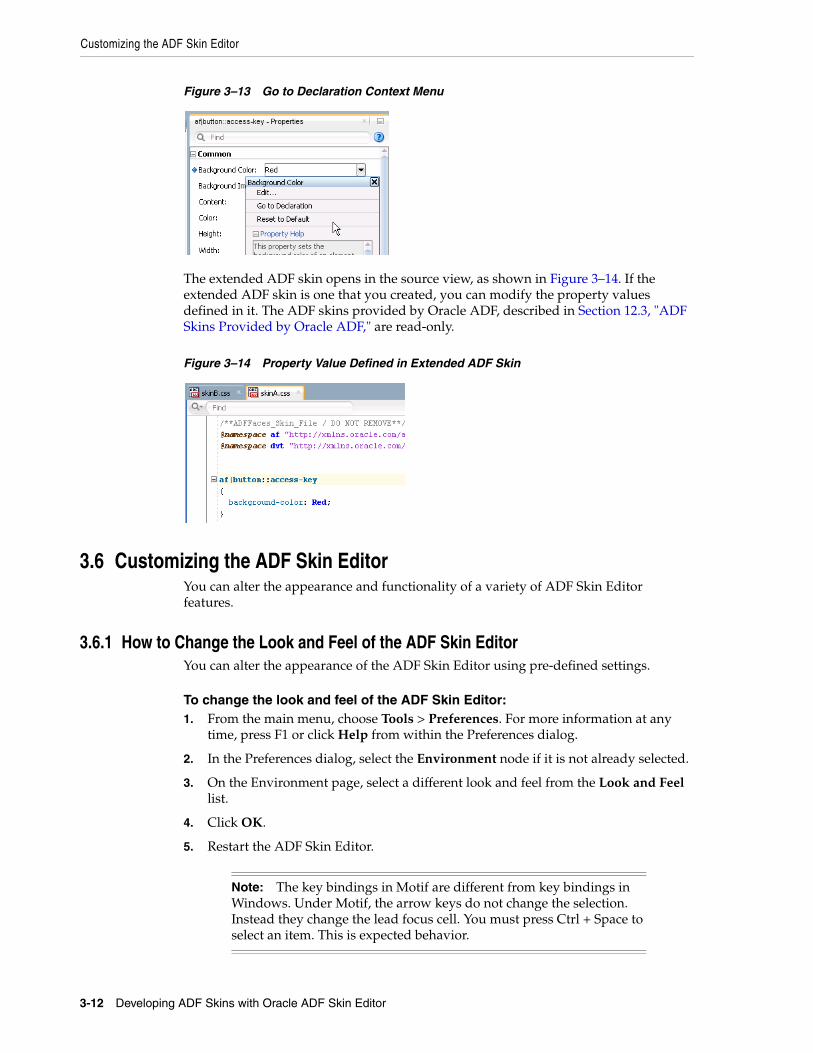
Customizing the ADF Skin Editor
3-12 Developing ADF Skins with Oracle ADF Skin Editor
Figure 3–13 Go to Declaration Context Menu
The extended ADF skin opens in the source view, as shown in Figure 3–14. If the extended ADF skin is one that you created, you can modify the property values defined in it. The ADF skins provided by Oracle ADF, described in Section 12.3, "ADF Skins Provided by Oracle ADF," are read-only.
Figure 3–14 Property Value Defined in Extended ADF Skin
3.6 Customizing the ADF Skin EditorYou can alter the appearance and functionality of a variety of ADF Skin Editor features.
3.6.1 How to Change the Look and Feel of the ADF Skin EditorYou can alter the appearance of the ADF Skin Editor using pre-defined settings.
To change the look and feel of the ADF Skin Editor:1. From the main menu, choose Tools > Preferences. For more information at any
time, press F1 or click Help from within the Preferences dialog.
2. In the Preferences dialog, select the Environment node if it is not already selected.
3. On the Environment page, select a different look and feel from the Look and Feel list.
4. Click OK.
5. Restart the ADF Skin Editor.
Note: The key bindings in Motif are different from key bindings in Windows. Under Motif, the arrow keys do not change the selection. Instead they change the lead focus cell. You must press Ctrl + Space to select an item. This is expected behavior.
Searching the Source Files of ADF Skins
Working with the ADF Skin Editor 3-13
3.6.2 How to Customize the General Environment for the ADF Skin EditorYou can customize the default display options (for example, always display dockable windows on top), as well as other general behavior, such as whether the ADF Skin Editor will automatically reload externally modified files and whether output to the Log window is automatically saved to a file.
To change the general environment settings for the ADF Skin Editor:1. From the main menu, choose Tools > Preferences. For more information at any
time, press F1 or click Help from within the Preferences dialog.
2. In the Preferences dialog, select the Environment node if it is not already selected.
3. On the Environment page, select the options and set the fields as appropriate.
4. Click OK.
5. Restart the ADF Skin Editor.
For information about how to start the ADF Skin Editor, see Installing Oracle ADF Skin Editor (for the release that pertains to the application you are skinning).
3.7 Searching the Source Files of ADF SkinsThe ADF Skin Editor provides a source editor where you can view, edit, and search the syntax that the design and selectors editors generate for an ADF skin.
3.7.1 How to Search the Source Files of ADF SkinsYou can search the source files of an ADF skin in a number of ways.
To search a source file currently open in the source editor, with the option to replace text:1. With the file open in the source editor, make sure that the editor has focus.
2. Optionally, if an instance of the text you want to search for is easily found, you can highlight it now.
3. From the main menu, choose Search > Find. Alternatively, press Ctrl+F.
4. In the Find Text Dialog, enter or select the text to locate.
Text previously searched for in this session of the ADF Skin Editor appears in the Text to Search For list.
5. Select other search parameters accordingly.
For more information, press F1 or click Help from within the dialog.
6. Click OK.
To do a simple search in the open source file for a single text string:1. With the file open in the editor, ensure that the editor has focus.
2. Place the cursor in the file at the point you wish to search from.
3. From the main menu, choose Search > Incremental Find Forward or Search > Incremental Find Backwards.
4. In the dialog, enter the search text.
Working with Extensions
3-14 Developing ADF Skins with Oracle ADF Skin Editor
As you type, the cursor jumps to the next instance of the group of letters displayed.
Alternatively, enter the text string in the search box. As you type, the cursor jumps to the next instance of the group of letters displayed. Use the Previous or Next buttons to search up and down the file. Click in the search box to set Match Case, Whole Word, or Highlight Occurrences.
3.8 Working with ExtensionsExtensions are components that are loaded and integrated with the ADF Skin Editor after it starts. Extensions can access the editor and perform many useful tasks. You can add existing extensions into the ADF Skin Editor.
This section contains information on finding and installing extensions. The simplest way to find and download extensions is through the Check for Updates wizard.
If you need additional capabilities, such as integration with a version control system or a special editor, you can add external tools to the ADF Skin Editor. For more information, see Section 3.9, "Adding External Tools to the ADF Skin Editor."
If you want to create a new extension, you can do so in JDeveloper using the Extension JDK from the Oracle Technology Network web page. You can download the completed extension to the ADF Skin Editor.
3.8.1 How to Install Extensions with Check for UpdatesThe easiest way to find and install extensions is to use the Check for Updates wizard.
To install extensions using the Check for Updates wizard:1. From the Help menu, select Check for Updates.
2. Follow the steps in the wizard to browse, download, and install patches and extensions.
3.9 Adding External Tools to the ADF Skin EditorExternal tools are custom ADF Skin Editor menu items and toolbar buttons that launch applications installed on your system, applications that are not packaged as part of the ADF Skin Editor.
3.9.1 How to Add External Tools to the ADF Skin EditorYou find and add available external tools to the ADF Skin Editor using the External Tools menu.
To find all external programs that the ADF Skin Editor is preconfigured to support:1. From the main menu, choose Tools > External Tools.
2. In the External Tools dialog, click Find Tools.
Note: Any time an extension is added or upgraded, the migration dialog appears at startup in case you need to migrate any previous settings related to that extension.
Navigating the ADF Skin Editor
Working with the ADF Skin Editor 3-15
To add access to an external program from the ADF Skin Editor:1. From the main menu, choose Tools > External Tools.
2. In the External Tools dialog, click New. Follow the instructions in the wizard.
To change how an external program appears, or remove access to an external program from the ADF Skin Editor:1. From the main menu, choose Tools > External Tools.
2. In the External Tools dialog, click Edit or Delete. If you are editing the options, display, integration or availability of an external tool from the ADF Skin Editor, select the corresponding tab and change the values. Click Help for help choosing valid values.
3. Click OK. Your changes are reflected immediately.
3.10 Navigating the ADF Skin EditorYou can accomplish any task in the ADF Skin Editor using the keyboard as you use the mouse.
3.10.1 How to Work With Shortcut Keys In the ADF Skin EditorThe ADF Skin Editor comes with several predefined keyboard schemes. You can choose to use one of these, or customize an existing set to suit your own coding style by changing which keyboard shortcuts map to which actions.
To load preset keyboard schemes:1. From the main menu, choose Tools > Preferences.
2. In the Preferences dialog, select the Shortcut Keys node. For more information at any time, press F1 or click Help from within the Preferences dialog.
3. On the shortcut keys page, click More Actions and then select Load Keyboard Scheme. The Load Keyboard Scheme dialog appears, with the currently loaded keyboard scheme highlighted.
4. In the Load Keyboard Scheme dialog, select the scheme you wish to load and click OK.
5. On the Shortcut Keys page, if you have finished, click OK.
To view the ADF Skin Editor commands and their associated keyboard shortcuts (if assigned):1. From the main menu, choose Tools > Preferences.
2. In the Preferences dialog, select the Shortcut Keys node.
3. On the Shortcut Keys page, under Available Commands, you can view the complete set of the ADF Skin Editor commands, and what keyboards shortcuts (if any) are assigned to each. If you are looking for a particular command or shortcut, or want to look at shortcuts for a particular category of commands only, enter a filtering expression in the Search field.
4. You can also define new shortcuts, or change existing ones.
Navigating the ADF Skin Editor
3-16 Developing ADF Skins with Oracle ADF Skin Editor
To define a new keyboard shortcut for a command within a given keyboard scheme:1. From the main menu, choose Tools > Preferences.
2. In the Preferences dialog, select the Shortcut Keys node. For more information at any time, press F1 or click Help from within the preferences dialog.
3. On the Shortcut Keys page, under Available Commands, select the command that you wish to define a new shortcut for.
4. To define a new shortcut for this action, place focus on the New Shortcut field, and then press the key combination on the keyboard.
If this proposed shortcut already has a command associated with it, that command will now appear in the Conflicts field. Any conflicting shortcuts are overwritten when a new shortcut is assigned.
5. To assign this shortcut to the action selected, click Assign. If you want to delete an already-assigned shortcut, click the Delete button in the toolbar.
If you want to assign more than one shortcut to a command, select the command and click the Duplicate button. Then, type the shortcut key in the New Shortcut field and click Assign.
6. When you are finished, click OK.
To import or export keyboard schemes:1. From the main menu, select Tools > Preferences to open the Preferences dialog.
2. Click More Actions > Export or Import. Keyboard schemes are stored as XML files.
3.10.2 Keyboard Navigation In the ADF Skin EditorFor any action that can be accomplished with a mouse, including selection, there is a way to accomplish the action solely from the keyboard. You can accomplish any task in the ADF Skin Editor using the keyboard as you can using the mouse.
The shortcut keys defined in the Java Look and Feel guidelines provide the base set for the ADF Skin Editor. The various predefined keyboard schemes available in the ADF Skin Editor are then overlaid upon this base set. If the same shortcut key exists in both the look and feel guidelines and the ADF Skin Editor keyboard scheme, the ADF Skin Editor scheme prevails. If a shortcut key defined by the look and feel guidelines does not appear in the ADF Skin Editor scheme, then it is the original look and feel definition that remains in effect when the scheme in question is enabled.
At any given time, then, the shortcut keys enabled in the ADF Skin Editor depend upon the interaction of the currently enabled scheme with the Java look and feel guidelines. When you first open the ADF Skin Editor, the default scheme is enabled. You can change this scheme whenever you wish, and within each scheme, you can customize any of the shortcut key assignments that you would like. Note that any customized shortcuts you create in a scheme are not retained when another predefined keyboard scheme is activated (or even if the same scheme is reloaded).
To load predefined keyboard schemes, view current shortcut assignments within a scheme, and customize those assignments, you will need to open the preferences dialog. To open the dialog, choose Tools > Preferences (or on the keyboard, press Alt+T+P) from the main menu and then, using the arrow keys in the left-hand pane, navigate to the Shortcut Keys node. For details on working with the dialog, with the page displayed, click Help (or on the keyboard press H).
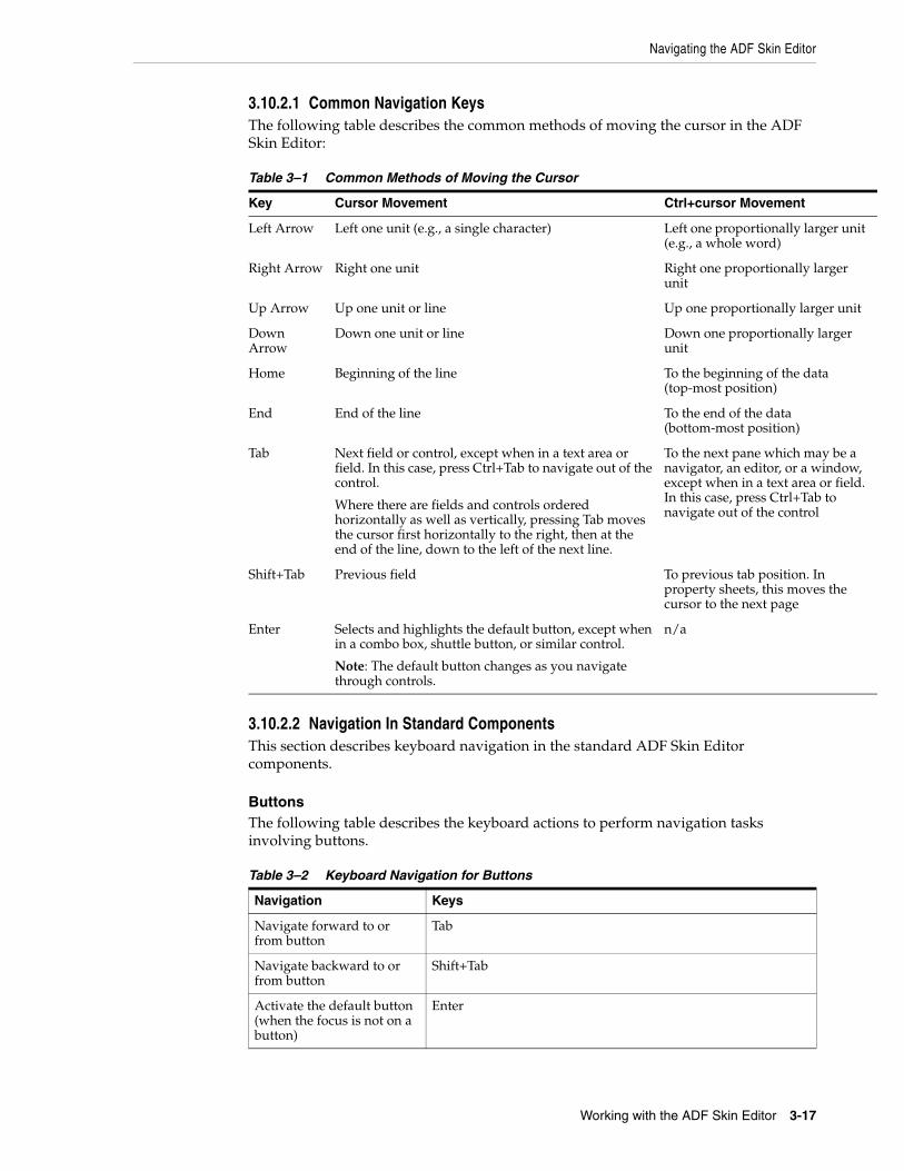
Navigating the ADF Skin Editor
Working with the ADF Skin Editor 3-17
3.10.2.1 Common Navigation KeysThe following table describes the common methods of moving the cursor in the ADF Skin Editor:
3.10.2.2 Navigation In Standard ComponentsThis section describes keyboard navigation in the standard ADF Skin Editor components.
ButtonsThe following table describes the keyboard actions to perform navigation tasks involving buttons.
Table 3–1 Common Methods of Moving the Cursor
Key Cursor Movement Ctrl+cursor Movement
Left Arrow Left one unit (e.g., a single character) Left one proportionally larger unit (e.g., a whole word)
Right Arrow Right one unit Right one proportionally larger unit
Up Arrow Up one unit or line Up one proportionally larger unit
Down Arrow
Down one unit or line Down one proportionally larger unit
Home Beginning of the line To the beginning of the data (top-most position)
End End of the line To the end of the data (bottom-most position)
Tab Next field or control, except when in a text area or field. In this case, press Ctrl+Tab to navigate out of the control.
Where there are fields and controls ordered horizontally as well as vertically, pressing Tab moves the cursor first horizontally to the right, then at the end of the line, down to the left of the next line.
To the next pane which may be a navigator, an editor, or a window, except when in a text area or field. In this case, press Ctrl+Tab to navigate out of the control
Shift+Tab Previous field To previous tab position. In property sheets, this moves the cursor to the next page
Enter Selects and highlights the default button, except when in a combo box, shuttle button, or similar control.
Note: The default button changes as you navigate through controls.
n/a
Table 3–2 Keyboard Navigation for Buttons
Navigation Keys
Navigate forward to or from button
Tab
Navigate backward to or from button
Shift+Tab
Activate the default button (when the focus is not on a button)
Enter
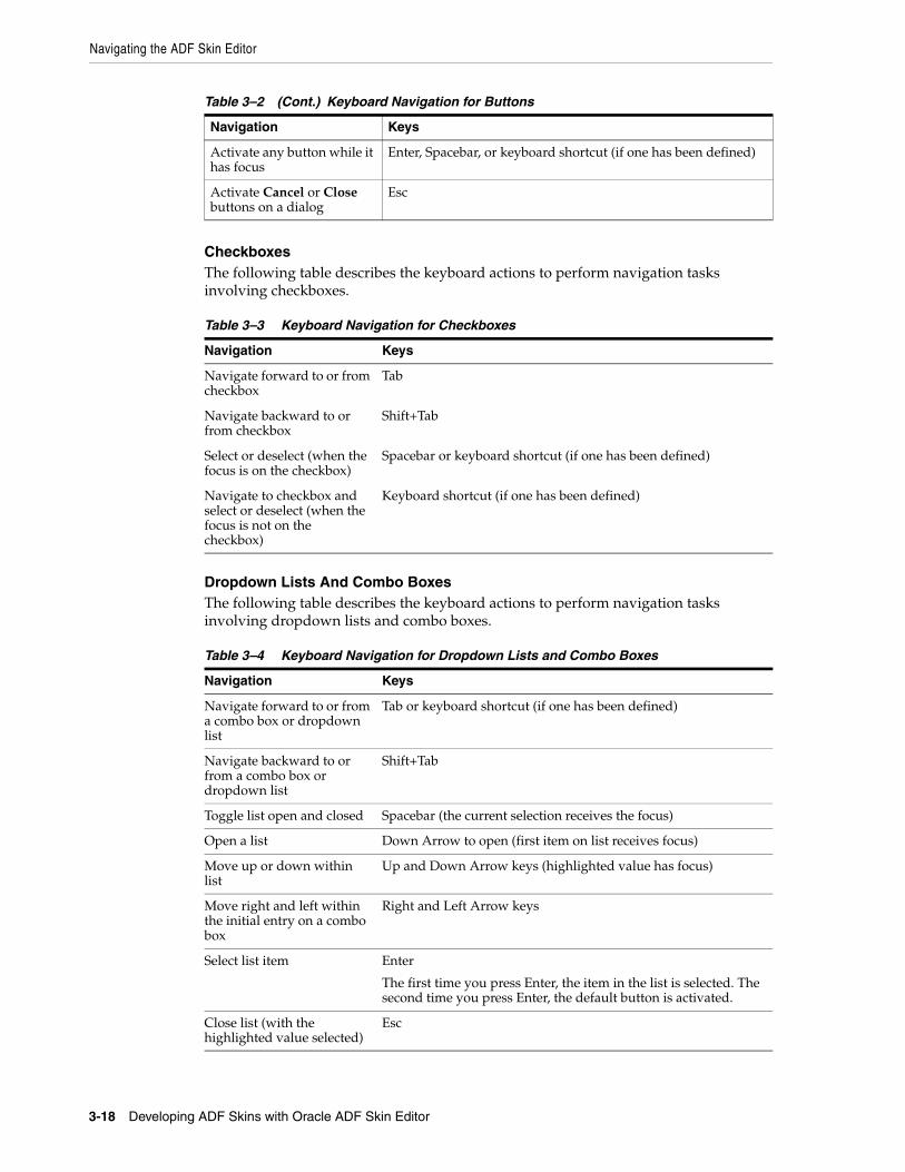
Navigating the ADF Skin Editor
3-18 Developing ADF Skins with Oracle ADF Skin Editor
CheckboxesThe following table describes the keyboard actions to perform navigation tasks involving checkboxes.
Dropdown Lists And Combo BoxesThe following table describes the keyboard actions to perform navigation tasks involving dropdown lists and combo boxes.
Activate any button while it has focus
Enter, Spacebar, or keyboard shortcut (if one has been defined)
Activate Cancel or Close buttons on a dialog
Esc
Table 3–3 Keyboard Navigation for Checkboxes
Navigation Keys
Navigate forward to or from checkbox
Tab
Navigate backward to or from checkbox
Shift+Tab
Select or deselect (when the focus is on the checkbox)
Spacebar or keyboard shortcut (if one has been defined)
Navigate to checkbox and select or deselect (when the focus is not on the checkbox)
Keyboard shortcut (if one has been defined)
Table 3–4 Keyboard Navigation for Dropdown Lists and Combo Boxes
Navigation Keys
Navigate forward to or from a combo box or dropdown list
Tab or keyboard shortcut (if one has been defined)
Navigate backward to or from a combo box or dropdown list
Shift+Tab
Toggle list open and closed Spacebar (the current selection receives the focus)
Open a list Down Arrow to open (first item on list receives focus)
Move up or down within list
Up and Down Arrow keys (highlighted value has focus)
Move right and left within the initial entry on a combo box
Right and Left Arrow keys
Select list item Enter
The first time you press Enter, the item in the list is selected. The second time you press Enter, the default button is activated.
Close list (with the highlighted value selected)
Esc
Table 3–2 (Cont.) Keyboard Navigation for Buttons
Navigation Keys
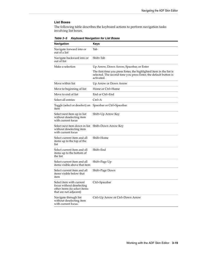
Navigating the ADF Skin Editor
Working with the ADF Skin Editor 3-19
List BoxesThe following table describes the keyboard actions to perform navigation tasks involving list boxes.
Table 3–5 Keyboard Navigation for List Boxes
Navigation Keys
Navigate forward into or out of a list
Tab
Navigate backward into or out of list
Shift+Tab
Make a selection Up Arrow, Down Arrow, Spacebar, or Enter
The first time you press Enter, the highlighted item in the list is selected. The second time you press Enter, the default button is activated.
Move within list Up Arrow or Down Arrow
Move to beginning of list Home or Ctrl+Home
Move to end of list End or Ctrl+End
Select all entries Ctrl+A
Toggle (select or deselect) an item
Spacebar or Ctrl+Spacebar
Select next item up in list without deselecting item with current focus
Shift+Up Arrow Key
Select next item down in list without deselecting item with current focus
Shift+Down Arrow Key
Select current item and all items up to the top of the list
Shift+Home
Select current item and all items up to the bottom of the list
Shift+End
Select current item and all items visible above that item
Shift+Page Up
Select current item and all items visible below that item
Shift+Page Down
Select item with current focus without deselecting other items (to select items that are not adjacent)
Ctrl+Spacebar
Navigate through list without deselecting item with current focus.
Ctrl+Up Arrow or Ctrl+Down Arrow
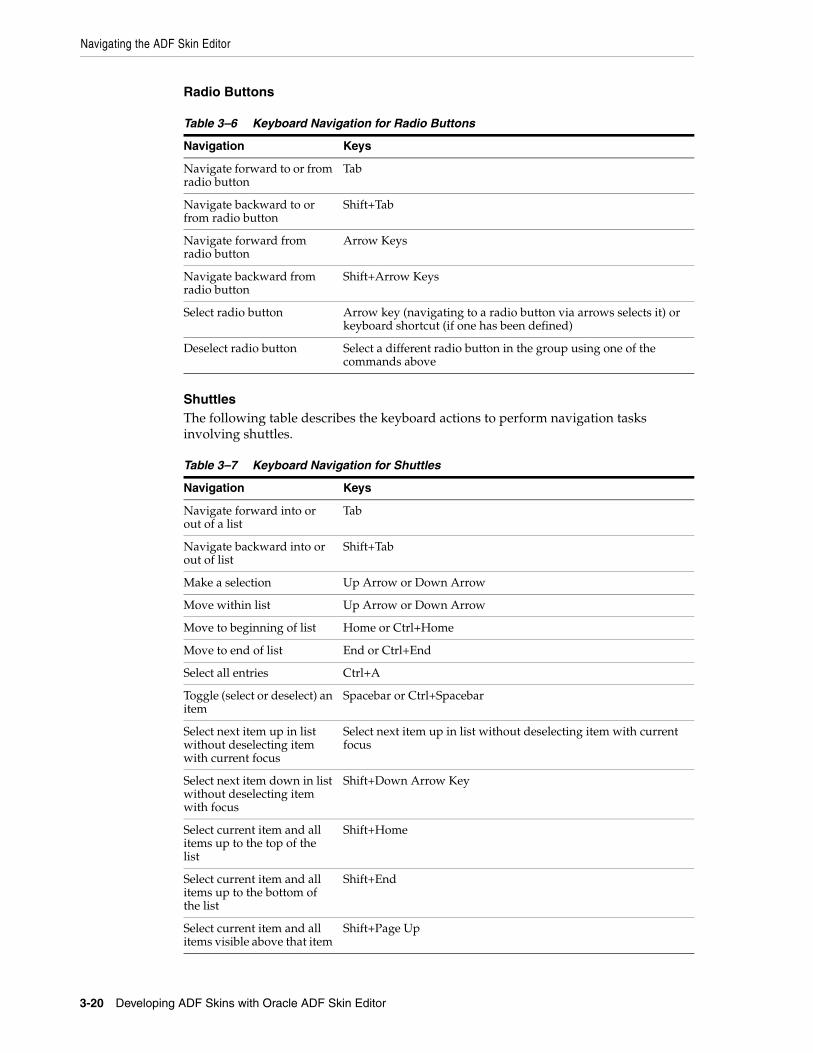
Navigating the ADF Skin Editor
3-20 Developing ADF Skins with Oracle ADF Skin Editor
Radio Buttons
ShuttlesThe following table describes the keyboard actions to perform navigation tasks involving shuttles.
Table 3–6 Keyboard Navigation for Radio Buttons
Navigation Keys
Navigate forward to or from radio button
Tab
Navigate backward to or from radio button
Shift+Tab
Navigate forward from radio button
Arrow Keys
Navigate backward from radio button
Shift+Arrow Keys
Select radio button Arrow key (navigating to a radio button via arrows selects it) or keyboard shortcut (if one has been defined)
Deselect radio button Select a different radio button in the group using one of the commands above
Table 3–7 Keyboard Navigation for Shuttles
Navigation Keys
Navigate forward into or out of a list
Tab
Navigate backward into or out of list
Shift+Tab
Make a selection Up Arrow or Down Arrow
Move within list Up Arrow or Down Arrow
Move to beginning of list Home or Ctrl+Home
Move to end of list End or Ctrl+End
Select all entries Ctrl+A
Toggle (select or deselect) an item
Spacebar or Ctrl+Spacebar
Select next item up in list without deselecting item with current focus
Select next item up in list without deselecting item with current focus
Select next item down in list without deselecting item with focus
Shift+Down Arrow Key
Select current item and all items up to the top of the list
Shift+Home
Select current item and all items up to the bottom of the list
Shift+End
Select current item and all items visible above that item
Shift+Page Up
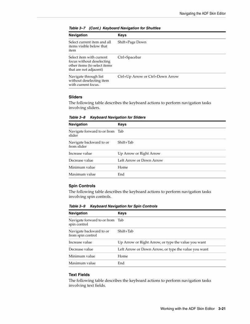
Navigating the ADF Skin Editor
Working with the ADF Skin Editor 3-21
SlidersThe following table describes the keyboard actions to perform navigation tasks involving sliders.
Spin ControlsThe following table describes the keyboard actions to perform navigation tasks involving spin controls.
Text FieldsThe following table describes the keyboard actions to perform navigation tasks involving text fields.
Select current item and all items visible below that item
Shift+Page Down
Select item with current focus without deselecting other items (to select items that are not adjacent)
Ctrl+Spacebar
Navigate through list without deselecting item with current focus.
Ctrl+Up Arrow or Ctrl+Down Arrow
Table 3–8 Keyboard Navigation for Sliders
Navigation Keys
Navigate forward to or from slider
Tab
Navigate backward to or from slider
Shift+Tab
Increase value Up Arrow or Right Arrow
Decrease value Left Arrow or Down Arrow
Minimum value Home
Maximum value End
Table 3–9 Keyboard Navigation for Spin Controls
Navigation Keys
Navigate forward to or from spin control
Tab
Navigate backward to or from spin control
Shift+Tab
Increase value Up Arrow or Right Arrow, or type the value you want
Decrease value Left Arrow or Down Arrow, or type the value you want
Minimum value Home
Maximum value End
Table 3–7 (Cont.) Keyboard Navigation for Shuttles
Navigation Keys
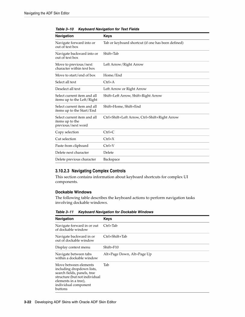
Navigating the ADF Skin Editor
3-22 Developing ADF Skins with Oracle ADF Skin Editor
3.10.2.3 Navigating Complex ControlsThis section contains information about keyboard shortcuts for complex UI components.
Dockable WindowsThe following table describes the keyboard actions to perform navigation tasks involving dockable windows.
Table 3–10 Keyboard Navigation for Text Fields
Navigation Keys
Navigate forward into or out of text box
Tab or keyboard shortcut (if one has been defined)
Navigate backward into or out of text box
Shift+Tab
Move to previous/next character within text box
Left Arrow/Right Arrow
Move to start/end of box Home/End
Select all text Ctrl+A
Deselect all text Left Arrow or Right Arrow
Select current item and all items up to the Left/Right
Shift+Left Arrow, Shift+Right Arrow
Select current item and all items up to the Start/End
Shift+Home, Shift+End
Select current item and all items up to the previous/next word
Ctrl+Shift+Left Arrow, Ctrl+Shift+Right Arrow
Copy selection Ctrl+C
Cut selection Ctrl+X
Paste from clipboard Ctrl+V
Delete next character Delete
Delete previous character Backspace
Table 3–11 Keyboard Navigation for Dockable Windows
Navigation Keys
Navigate forward in or out of dockable window
Ctrl+Tab
Navigate backward in or out of dockable window
Ctrl+Shift+Tab
Display context menu Shift+F10
Navigate between tabs within a dockable window
Alt+Page Down, Alt+Page Up
Move between elements including dropdown lists, search fields, panels, tree structure (but not individual elements in a tree), individual component buttons
Tab
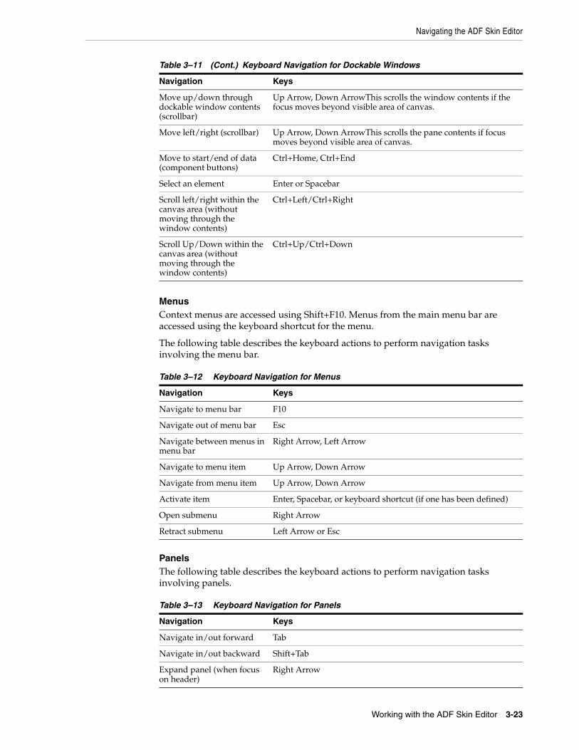
Navigating the ADF Skin Editor
Working with the ADF Skin Editor 3-23
MenusContext menus are accessed using Shift+F10. Menus from the main menu bar are accessed using the keyboard shortcut for the menu.
The following table describes the keyboard actions to perform navigation tasks involving the menu bar.
PanelsThe following table describes the keyboard actions to perform navigation tasks involving panels.
Move up/down through dockable window contents (scrollbar)
Up Arrow, Down ArrowThis scrolls the window contents if the focus moves beyond visible area of canvas.
Move left/right (scrollbar) Up Arrow, Down ArrowThis scrolls the pane contents if focus moves beyond visible area of canvas.
Move to start/end of data (component buttons)
Ctrl+Home, Ctrl+End
Select an element Enter or Spacebar
Scroll left/right within the canvas area (without moving through the window contents)
Ctrl+Left/Ctrl+Right
Scroll Up/Down within the canvas area (without moving through the window contents)
Ctrl+Up/Ctrl+Down
Table 3–12 Keyboard Navigation for Menus
Navigation Keys
Navigate to menu bar F10
Navigate out of menu bar Esc
Navigate between menus in menu bar
Right Arrow, Left Arrow
Navigate to menu item Up Arrow, Down Arrow
Navigate from menu item Up Arrow, Down Arrow
Activate item Enter, Spacebar, or keyboard shortcut (if one has been defined)
Open submenu Right Arrow
Retract submenu Left Arrow or Esc
Table 3–13 Keyboard Navigation for Panels
Navigation Keys
Navigate in/out forward Tab
Navigate in/out backward Shift+Tab
Expand panel (when focus on header)
Right Arrow
Table 3–11 (Cont.) Keyboard Navigation for Dockable Windows
Navigation Keys
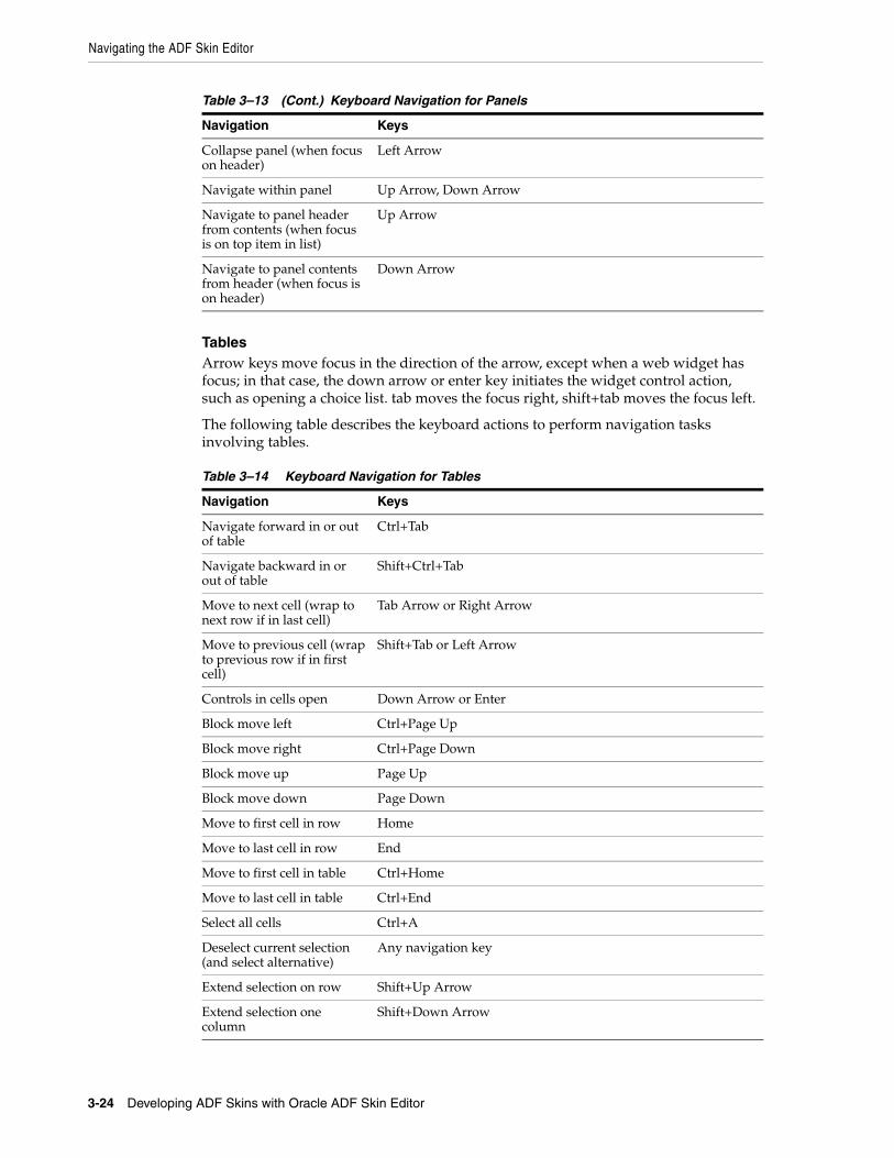
Navigating the ADF Skin Editor
3-24 Developing ADF Skins with Oracle ADF Skin Editor
TablesArrow keys move focus in the direction of the arrow, except when a web widget has focus; in that case, the down arrow or enter key initiates the widget control action, such as opening a choice list. tab moves the focus right, shift+tab moves the focus left.
The following table describes the keyboard actions to perform navigation tasks involving tables.
Collapse panel (when focus on header)
Left Arrow
Navigate within panel Up Arrow, Down Arrow
Navigate to panel header from contents (when focus is on top item in list)
Up Arrow
Navigate to panel contents from header (when focus is on header)
Down Arrow
Table 3–14 Keyboard Navigation for Tables
Navigation Keys
Navigate forward in or out of table
Ctrl+Tab
Navigate backward in or out of table
Shift+Ctrl+Tab
Move to next cell (wrap to next row if in last cell)
Tab Arrow or Right Arrow
Move to previous cell (wrap to previous row if in first cell)
Shift+Tab or Left Arrow
Controls in cells open Down Arrow or Enter
Block move left Ctrl+Page Up
Block move right Ctrl+Page Down
Block move up Page Up
Block move down Page Down
Move to first cell in row Home
Move to last cell in row End
Move to first cell in table Ctrl+Home
Move to last cell in table Ctrl+End
Select all cells Ctrl+A
Deselect current selection (and select alternative)
Any navigation key
Extend selection on row Shift+Up Arrow
Extend selection one column
Shift+Down Arrow
Table 3–13 (Cont.) Keyboard Navigation for Panels
Navigation Keys
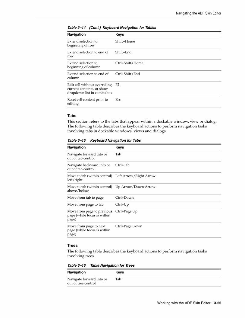
Navigating the ADF Skin Editor
Working with the ADF Skin Editor 3-25
TabsThis section refers to the tabs that appear within a dockable window, view or dialog. The following table describes the keyboard actions to perform navigation tasks involving tabs in dockable windows, views and dialogs.
TreesThe following table describes the keyboard actions to perform navigation tasks involving trees.
Extend selection to beginning of row
Shift+Home
Extend selection to end of row
Shift+End
Extend selection to beginning of column
Ctrl+Shift+Home
Extend selection to end of column
Ctrl+Shift+End
Edit cell without overriding current contents, or show dropdown list in combo box
F2
Reset cell content prior to editing
Esc
Table 3–15 Keyboard Navigation for Tabs
Navigation Keys
Navigate forward into or out of tab control
Tab
Navigate backward into or out of tab control
Ctrl+Tab
Move to tab (within control) left/right
Left Arrow/Right Arrow
Move to tab (within control) above/below
Up Arrow/Down Arrow
Move from tab to page Ctrl+Down
Move from page to tab Ctrl+Up
Move from page to previous page (while focus is within page)
Ctrl+Page Up
Move from page to next page (while focus is within page)
Ctrl+Page Down
Table 3–16 Table Navigation for Trees
Navigation Keys
Navigate forward into or out of tree control
Tab
Table 3–14 (Cont.) Keyboard Navigation for Tables
Navigation Keys
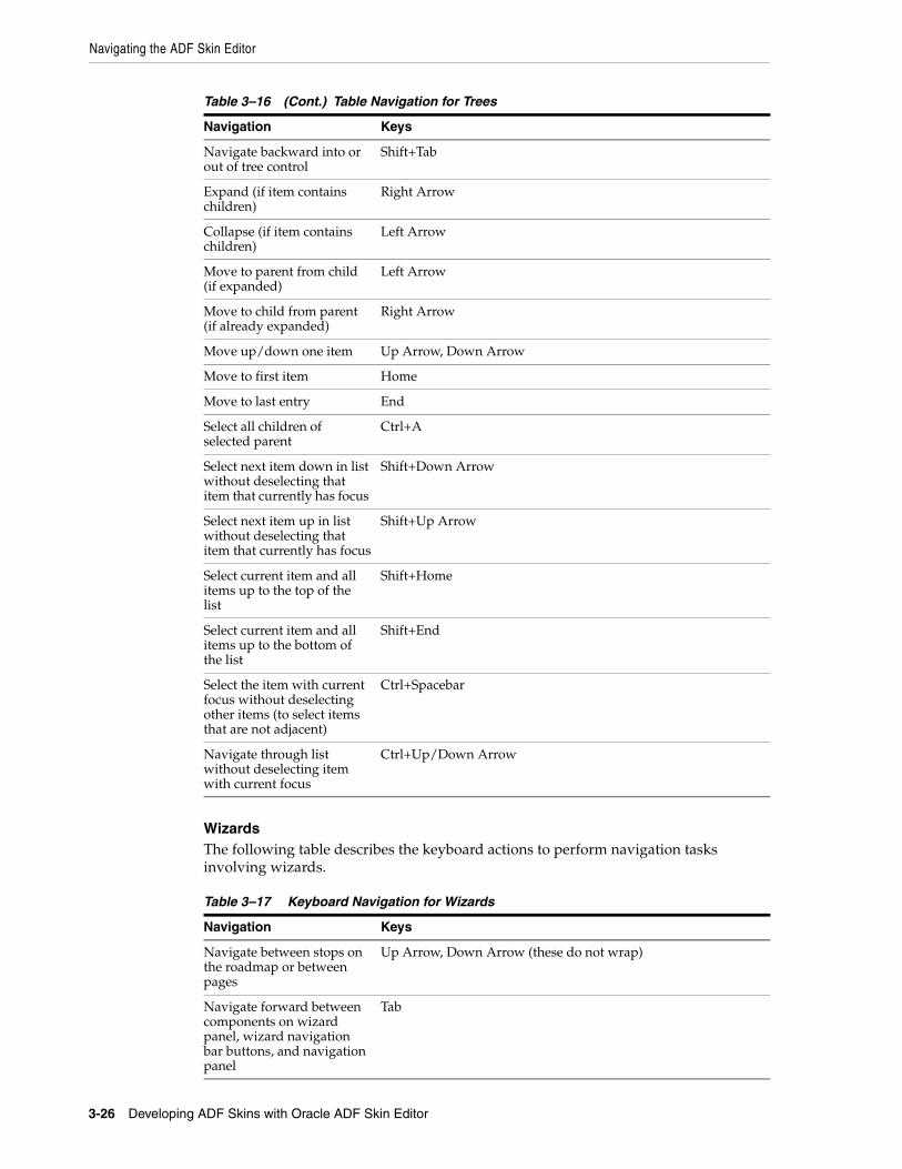
Navigating the ADF Skin Editor
3-26 Developing ADF Skins with Oracle ADF Skin Editor
WizardsThe following table describes the keyboard actions to perform navigation tasks involving wizards.
Navigate backward into or out of tree control
Shift+Tab
Expand (if item contains children)
Right Arrow
Collapse (if item contains children)
Left Arrow
Move to parent from child (if expanded)
Left Arrow
Move to child from parent (if already expanded)
Right Arrow
Move up/down one item Up Arrow, Down Arrow
Move to first item Home
Move to last entry End
Select all children of selected parent
Ctrl+A
Select next item down in list without deselecting that item that currently has focus
Shift+Down Arrow
Select next item up in list without deselecting that item that currently has focus
Shift+Up Arrow
Select current item and all items up to the top of the list
Shift+Home
Select current item and all items up to the bottom of the list
Shift+End
Select the item with current focus without deselecting other items (to select items that are not adjacent)
Ctrl+Spacebar
Navigate through list without deselecting item with current focus
Ctrl+Up/Down Arrow
Table 3–17 Keyboard Navigation for Wizards
Navigation Keys
Navigate between stops on the roadmap or between pages
Up Arrow, Down Arrow (these do not wrap)
Navigate forward between components on wizard panel, wizard navigation bar buttons, and navigation panel
Tab
Table 3–16 (Cont.) Table Navigation for Trees
Navigation Keys
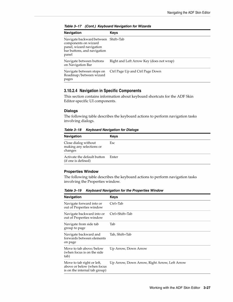
Navigating the ADF Skin Editor
Working with the ADF Skin Editor 3-27
3.10.2.4 Navigation in Specific ComponentsThis section contains information about keyboard shortcuts for the ADF Skin Editor-specific UI components.
DialogsThe following table describes the keyboard actions to perform navigation tasks involving dialogs.
Properties WindowThe following table describes the keyboard actions to perform navigation tasks involving the Properties window.
Navigate backward between components on wizard panel, wizard navigation bar buttons, and navigation panel
Shift+Tab
Navigate between buttons on Navigation Bar
Right and Left Arrow Key (does not wrap)
Navigate between stops on Roadmap/between wizard pages
Ctrl Page Up and Ctrl Page Down
Table 3–18 Keyboard Navigation for Dialogs
Navigation Keys
Close dialog without making any selections or changes
Esc
Activate the default button (if one is defined)
Enter
Table 3–19 Keyboard Navigation for the Properties Window
Navigation Keys
Navigate forward into or out of Properties window
Ctrl+Tab
Navigate backward into or out of Properties window
Ctrl+Shift+Tab
Navigate from side tab group to page
Tab
Navigate backward and forwards between elements on page
Tab, Shift+Tab
Move to tab above/below (when focus is on the side tab)
Up Arrow, Down Arrow
Move to tab right or left, above or below (when focus is on the internal tab group)
Up Arrow, Down Arrow, Right Arrow, Left Arrow
Table 3–17 (Cont.) Keyboard Navigation for Wizards
Navigation Keys
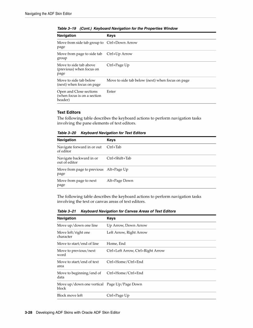
Navigating the ADF Skin Editor
3-28 Developing ADF Skins with Oracle ADF Skin Editor
Text EditorsThe following table describes the keyboard actions to perform navigation tasks involving the pane elements of text editors.
The following table describes the keyboard actions to perform navigation tasks involving the text or canvas areas of text editors.
Move from side tab group to page
Ctrl+Down Arrow
Move from page to side tab group
Ctrl+Up Arrow
Move to side tab above (previous) when focus on page
Ctrl+Page Up
Move to side tab below (next) when focus on page
Move to side tab below (next) when focus on page
Open and Close sections (when focus is on a section header)
Enter
Table 3–20 Keyboard Navigation for Text Editors
Navigation Keys
Navigate forward in or out of editor
Ctrl+Tab
Navigate backward in or out of editor
Ctrl+Shift+Tab
Move from page to previous page
Alt+Page Up
Move from page to next page
Alt+Page Down
Table 3–21 Keyboard Navigation for Canvas Areas of Text Editors
Navigation Keys
Move up/down one line Up Arrow, Down Arrow
Move left/right one character
Left Arrow, Right Arrow
Move to start/end of line Home, End
Move to previous/next word
Ctrl+Left Arrow, Ctrl+Right Arrow
Move to start/end of text area
Ctrl+Home/Ctrl+End
Move to beginning/end of data
Ctrl+Home/Ctrl+End
Move up/down one vertical block
Page Up/Page Down
Block move left Ctrl+Page Up
Table 3–19 (Cont.) Keyboard Navigation for the Properties Window
Navigation Keys

Navigating the ADF Skin Editor
Working with the ADF Skin Editor 3-29
Graphical EditorsThe following table describes the keyboard actions to perform navigation tasks involving graphical editors.
The following table describes the keyboard actions to perform navigation tasks involving the canvas areas of graphical editors.
Block move right Ctrl+Page Down
Block extend up Shift+Page Up
Block extend down Shift+Page Down
Block extend left Ctrl+Shift+Page Up
Block extend right Ctrl+Shift+Page Down
Select all Ctrl+A
Deselect all Up Arrow, Down Arrow, Left Arrow, Right Arrow
Extend selection up/down one line
Shift+Up Arrow/Shift+Down Arrow
Extend selection left/right one component or char
Shift+Left Arrow/Shift+Right Arrow
Extend selection to start/end of line
Shift+Home/Shift+End
Extend selection to start/end of data
Ctrl+Shift+Home/Ctrl+Shift+End
Extend selection up/down one vertical block
Shift+Page Up/Shift+Page Down
Extend selection to previous/next word
Ctrl+Shift+Left Arrow /Ctrl+Shift+Right Arrow
Extend selection left/right one block
Ctrl+Shift+Page Up/Ctrl+Shift+Page Down
Copy selection Ctrl-C
Cut selection Ctrl-X
Paste selected text Ctrl-V
Table 3–22 Keyboard Navigation for Graphical Editors
Navigation Keys
Navigate forward in or out of editor
Ctrl-Tab
Navigate backward in or out of editor
Ctrl+Shift+Tab
Move from page to previous page
Alt+Page Up
Move from page to next page
Alt+Page Down
Table 3–21 (Cont.) Keyboard Navigation for Canvas Areas of Text Editors
Navigation Keys
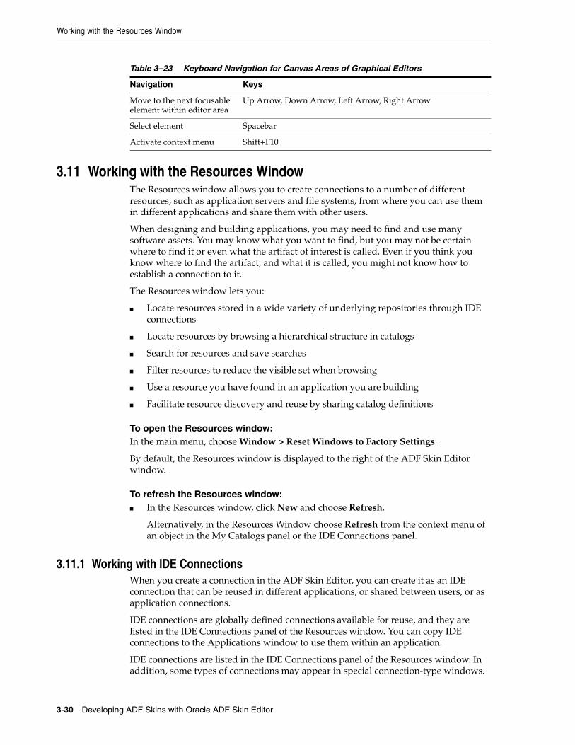
Working with the Resources Window
3-30 Developing ADF Skins with Oracle ADF Skin Editor
3.11 Working with the Resources WindowThe Resources window allows you to create connections to a number of different resources, such as application servers and file systems, from where you can use them in different applications and share them with other users.
When designing and building applications, you may need to find and use many software assets. You may know what you want to find, but you may not be certain where to find it or even what the artifact of interest is called. Even if you think you know where to find the artifact, and what it is called, you might not know how to establish a connection to it.
The Resources window lets you:
■ Locate resources stored in a wide variety of underlying repositories through IDE connections
■ Locate resources by browsing a hierarchical structure in catalogs
■ Search for resources and save searches
■ Filter resources to reduce the visible set when browsing
■ Use a resource you have found in an application you are building
■ Facilitate resource discovery and reuse by sharing catalog definitions
To open the Resources window: In the main menu, choose Window > Reset Windows to Factory Settings.
By default, the Resources window is displayed to the right of the ADF Skin Editor window.
To refresh the Resources window: ■ In the Resources window, click New and choose Refresh.
Alternatively, in the Resources Window choose Refresh from the context menu of an object in the My Catalogs panel or the IDE Connections panel.
3.11.1 Working with IDE ConnectionsWhen you create a connection in the ADF Skin Editor, you can create it as an IDE connection that can be reused in different applications, or shared between users, or as application connections.
IDE connections are globally defined connections available for reuse, and they are listed in the IDE Connections panel of the Resources window. You can copy IDE connections to the Applications window to use them within an application.
IDE connections are listed in the IDE Connections panel of the Resources window. In addition, some types of connections may appear in special connection-type windows.
Table 3–23 Keyboard Navigation for Canvas Areas of Graphical Editors
Navigation Keys
Move to the next focusable element within editor area
Up Arrow, Down Arrow, Left Arrow, Right Arrow
Select element Spacebar
Activate context menu Shift+F10
Working with the Resources Window
Working with the ADF Skin Editor 3-31
The different types of connections that can be made depends on the technologies and extensions available to you. To see what you can create a connection to, choose IDE Connection from the New button in the Resources window. The specific types of connection you can make depend on the technologies and extensions available to you.
The file system location for Resources connection descriptor definition information is
system-dir/jdeveloper/system12.1.2.n.nn.nn.nn/o.jdeveloper.rescat2.model/connections/connections.xml
To create an IDE connection: 1. In the IDE Connections panel of the Resources window, choose IDE Connection
from the New button.
2. Choose the type of connection you want to create, and enter the appropriate information in the Create Connection dialog. For more information at any time, press F1 or click Help from within the dialog.
Once you have created a connection in the Resources window, you can edit details of the connection, but you cannot change the connection name.
To edit an IDE connection: 1. In the IDE Connections panel of the Resources window, choose Properties from
the context menu of a connection.
2. The Edit Connection dialog opens where you can change the connection details. For more information at any time, press F1 or click Help from within the Edit Connection dialog.
You can use connections in the Resources window in an application.
The connection can be added to the application currently open in the ADF Skin Editor, and it is listed in the Application Resources pane of the Applications window, under the Connections node.
To add a connection to an application: In the IDE Connections panel of the Resources window, choose Add to Application from the context menu of a connection.
Alternatively, drag the resource from the Resources window and drop it onto an application page.
Alternatively, drag the connection from IDE Connections in the Resources window and drop it onto the Application Resources pane in the Applications window.
3.11.2 How to Search the Resources WindowThere are two ways of searching in the Resources window:
■ Performing a simple search
■ Performing an advanced search, where you enter parameters in a dialog
In addition, you can define a dynamic folder in a catalog where the content of the folder is defined by a query expression that is executed when the folder is opened.
The time the search takes depends on how many resources there are in the Resources window, and how long it takes to connect to them, and the results are displayed in the Search Results panel.

Working with the Resources Window
3-32 Developing ADF Skins with Oracle ADF Skin Editor
When you perform a simple search, the search is performed across all the contents of the Resources window, and it may take some time because the ADF Skin Editor connects to remote resources during the search.
To perform a simple search: 1. In the Resources window, click the Search Options button to choose whether the
search is performed against the Name, Type or Description of the resource. For more information at any time, press F1 or click Help from within the Resources window.
2. Enter a search string in the field. For example, if you want to find every resource that contains dep in the name, choose Name in Step 1, and enter dep. Every resource that contains the string dep will be listed in the search results.
3. Click the Start Search button to start the search.
Alternatively, you can perform an advanced search where you specify a series of search criteria, and choose where to start the search from.
To perform an advanced search: 1. In the Resources window, choose Advanced Search from the context menu of an
object in the My Catalogs panel or the IDE Connections panel. For more information at any time, press F1 or click Help from within the Advanced Search dialog.
2. Define where the search starts. Either select from Search in, or click Show Hierarchy which allows you choose within a hierarchical list of the Resources window contents.
3. Enter search criteria to return the resources you want, and click Search.
You can stop a search before it has completed by clicking the Stop Search button.
You can save a search and reuse it. There are two ways of saving a search in order to reuse it:
■ As a dynamic folder, where the contents of the folder are created dynamically based on the search criteria when the folder is opened.
■ As a static folder containing the results of the search.
Dynamic folders can also be created directly in a catalog.
To save a search: 1. In the Search Results panel of the Resources window, choose Save Search from the
context menu.
2. In the Save Search dialog, choose:
■ Save Search Criteria, to create a dynamic folder.
■ Save Search Results, to create a static folder of results.
For more information at any time, press F1 or click Help from within the Resources window.
3. Enter a name for the folder.
4. Choose the catalog to contain the folder, either from the dropdown list, or from the hierarchical list displayed when you click Show Hierarchy.
Working with the Resources Window
Working with the ADF Skin Editor 3-33
3.11.3 Filtering Resources Window ContentsFilters allow you fine-tune the contents of catalog folders.
To filter the contents of My Catalogs: 1. In the Resources window, choose Filter from the context menu of an object in the
My Catalogs panel or the IDE Connections panel. For more information at any time, press F1 or click Help from within the Filter dialog.
2. Enter a string to define the filtering. Only entries in the folder that contain the string will be shown.
3.11.4 Importing and Exporting Catalogs and ConnectionsCatalogs and connections are shared by importing Resource catalog archive (.rcx) files that have been exported by another user.
To export a catalog:
1. In the Resources window, choose Export from the context menu of an object in the My Catalogs panel or the IDE Connections panel.
2. In the Export Catalog and Connections dialog, select the catalogs and connections to be exported, and decide how errors will be handled. For more information at any time, press F1 or click Help from within the Export Catalog and Connections dialog.
To import a catalog: 1. In the Resources window, choose Import from (New).
2. In the Import Catalog and Connections dialog, specify or browse to the path and name of the Resource catalog archive file (.rcx). For more information at any time, press F1 or click Help from within the Import Catalog and Connections dialog.
3. Choose the catalogs and connections you want to import, and determine how to handle errors.
3.11.5 Working with Resources Window CatalogsA catalog is a user-defined construct for organizing resources from multiple underlying repositories. The contents of a catalog and its associated folder structure can be designed to be used by an individual developer, or they can be targeted towards specific groups of users such as the UI designers for a development project.
Catalog folders organize resources in a catalog. You use catalog folders in the same way you would to organize files in a file system or bookmarks in a Web browser. Each catalog folder can contain any combination of:
■ Folders.
■ Dynamic folders, which are populated using a query.
■ Filters, which are used to fine-tune the content of a folder or subtree.
Note: When you select a catalog to export, any connections in the catalog are also selected. If you deselect the catalog before exporting, you must be sure to also deselect the connections that are not wanted in the archive file.
Working with the Resources Window
3-34 Developing ADF Skins with Oracle ADF Skin Editor
3.11.5.1 Creating CatalogsYou can organize the information in the Resources window in catalogs.
To create a catalog:
1. In the Resources window, choose New Catalog from the New button.
2. In the Create Catalog dialog, specify a name for the catalog. For more information at any time, press F1 or click Help from within the Create Catalog dialog.
3. (Optional) Provide a description for the catalog, and the email of the catalog administrator.
3.11.5.2 Renaming CatalogsYou can rename catalogs.
To rename a catalog:
1. In the Resources window, right-click the catalog, and choose Rename from the context menu.
2. In the Rename dialog, specify a new name for the catalog. For more information at any time, press F1 or click Help from within the Rename dialog.
3.11.6 Working with Catalog FoldersYou can create folders to organize the contents of catalogs.
3.11.6.1 How to Create FoldersYou can organize the information within catalogs in folders.
To create a catalog folder:1. In the Resources window, choose New Folder from the context menu of a catalog
in the My Catalogs panel or the IDE Connections panel. For more information at any time, press F1 or click Help from within the Create Folder dialog.
2. Enter a name for the folder.
3.11.6.2 How to Create Dynamic FoldersDynamic Folders provide a powerful way to dynamically populate a catalog folder with resources. The content of the folder is defined by a query expression that is executed when the folder is opened. The results of the query appear as the contents of the folder.
To create a dynamic folder: 1. In the Resources window, choose New Dynamic Folder from the context menu of
a catalog in the My Catalogs panel or the IDE Connections panel. For more information at any time, press F1 or click Help from within the Create Dynamic Folder dialog.
2. Define the search criteria that will be used to populate this folder when it is opened.
3.11.6.3 How to Add Resources to a CatalogYou can add a connection from the IDE Connections panel or a resource from the Search panel in the Resources window to a catalog in My Catalogs.
Working with the Issues Window
Working with the ADF Skin Editor 3-35
To add a resource to a catalog:1. In the Resources window, right click a connection in the IDE Connections panel, or
the result of a search in the Search panel and choose Add to Catalog from the context menu.
2. The Add to Catalog dialog opens for you to specify the name for the resource in the catalog, and the catalog to add it to. For more information at any time, press F1 or click Help from within the Create Connection dialog.
Alternatively, you can drag an item from under IDE Connections and drop it on a catalog or catalog folder.
You can reorganize a catalog by selecting an item or folder in the catalog and dragging it to another folder in the same catalog, or to another catalog.
3.12 Working with the Issues WindowThe Issues window enables you to view and manage application issues. It has the following features:
■ Displays audit violations in file, project, working set, or application and provides information to help you resolve the issues. The Code Assist audit profile determines the audit violations that are reported.
■ Displays a list of all warnings and errors encountered by the compiler after Make or Rebuild is executed.
You can pin the information tab for a compiler operation and view the results of multiple Make or Rebuild operations by switching between tabs.
■ Double-clicking on any item in the Issues window takes you to the corresponding source code.
The following table describes the Issues window toolbar.
Element Description
ErrorToggle to show just errors in the selected scope.
WarningToggle to just show warning issues in the selected scope.
IncompleteToggle to show just incomplete issues in the selected scope.
InfoToggle to show just the number of advisory issues in the selected file, or to list the advisory issues in the file.
TasksToggle to show just tasks.
Configure View Options
Toggle to configure the following view options:
■ Table View: Select to view items in a flat tabular structure.
■ Tree View: Select to view items in a nodal tree structure. In this view, items are sorted first by project, and then by file.
■ Current Issues Scope: Select to determine the scope of issues to be displayed.
■ Preferences: Select to open the Issues page of the Preferences dialog, where you can configure Issues window behavior.

Working with the Issues Window
3-36 Developing ADF Skins with Oracle ADF Skin Editor
4
Creating the Source Files for an ADF Skin 4-1
4Creating the Source Files for an ADF Skin
This chapter describes how to create the source files for an ADF skin in the ADF Skin Editor and in JDeveloper. Information on how to open an application or project in the ADF Skin Editor that was created in a prior release of JDeveloper and how to import an ADF skin from an ADF Library JAR file is also provided.
This chapter includes the following sections:
■ Section 4.1, "About Creating an ADF Skin"
■ Section 4.2, "Creating ADF Skin Applications and ADF Skin Projects"
■ Section 4.3, "Creating an ADF Skin File"
■ Section 4.4, "Importing One or More ADF Skins Into the Current ADF Skin"
■ Section 4.5, "Importing ADF Skins from an ADF Library JAR"
■ Section 4.6, "Opening an Application Created Outside of the ADF Skin Editor"
4.1 About Creating an ADF SkinAn ADF skin defines the properties for the selectors that ADF Faces and ADF Data Visualization components expose. Using the editor in JDeveloper or the ADF Skin Editor, you can create a source file for an ADF skin. As a source file for an ADF skin is a type of CSS file, you could create it without using an editor. However, when you use the editor, associated configuration files get created (the first time that you create an ADF skin) or modified (when you create subsequent ADF skins). For more information about these configuration files, see Section 12.2, "Configuration Files for an ADF Skin."
4.2 Creating ADF Skin Applications and ADF Skin ProjectsNew ADF skin applications and ADF skin projects can be created in the ADF Skin Editor.
4.2.1 How to Create an ADF Skin ApplicationThis section describes how to create an ADF skin application and a project within the application in the ADF Skin Editor.
To create a new ADF skin application:1. From the main menu, choose File > New > ADF Skin Application.
2. In the Create ADF Skin Application dialog, enter application details like the name and directory. For help with the wizard, press F1.
Creating an ADF Skin File
4-2 Developing ADF Skins with Oracle ADF Skin Editor
3. Click Next to open the ADF Skin Project page where you specify the name of your ADF skin project and the directory to store it.
4. In the Target Application Release list, select the release of Oracle ADF that the application you want to skin uses.
The ADF Skin Editor configures your ADF skin project appropriately for the release you specify. For example, the ADF Skin Editor filters the list of ADF skins that you can extend from, as described in Section 4.3.1, "How to Create an ADF Skin in the ADF Skin Editor." The ADF Skin Editor also filters the list of skin selectors to display only those that the release you target supports. It will not display a skin selector introduced in a later release if you target your ADF skin project at an earlier release.
5. When you are done, click Finish.
4.2.2 How to Create a New ADF Skin ProjectYou use the Applications window to keep track of the ADF skin projects (collections of source files for ADF skins, images, and related files) you use while developing your ADF skin application.
You can create a new empty ADF skin project in an ADF skin application.
All ADF skin projects inherit the settings specified in the Default Project Properties dialog. As soon as you create the ADF skin project, it is added to the active ADF skin application.
To create a new ADF skin project:1. In the Applications window, select the ADF skin application within which the
project will appear.
2. Open the Create ADF Skin Project dialog by choosing File > New > ADF Skin Project.
3. In the Create ADF Skin Project dialog, enter project details like the name and directory.
4. In the Target Application Release list, select the release of Oracle ADF that the application you want to skin uses.
The ADF Skin Editor configures your ADF skin project appropriately for the release you specify. For example, the ADF Skin Editor filters the list of ADF skins that you can extend from, as described in Section 4.3.1, "How to Create an ADF Skin in the ADF Skin Editor." The ADF Skin Editor also filters the list of skin selectors to display only those that the release you target supports. It will not display a skin selector introduced in a later release if you target your ADF skin project at an earlier release.
5. When you are done, click Finish.
The new ADF skin project appears in the Applications window. It inherits whatever default properties you have already set. To alter project properties for this project, either double-click the project node or right-click and choose Project Properties.
4.3 Creating an ADF Skin FileYou can create an ADF skin file in the ADF Skin Editor or in JDeveloper that defines how ADF Faces and ADF Data Visualization components render at runtime. The ADF skin that you create must extend either one of the ADF skins that Oracle ADF provides
Creating an ADF Skin File
Creating the Source Files for an ADF Skin 4-3
or from an existing ADF skin that you created. The ADF skins that Oracle ADF provides vary in the level of customization that they define for ADF Faces and ADF Data Visualization components. For information about the inheritance relationship between the ADF skins that Oracle ADF provides, see Section 1.4, "Inheritance Relationship of the ADF Skins Provided by Oracle ADF." For information about the levels of customization in the ADF skins provided by Oracle ADF and for a recommendation about the ADF skin to extend, see Section 12.3, "ADF Skins Provided by Oracle ADF."
By default, the design and selectors editors in the ADF Skin Editor and in JDeveloper create ADF skins for the org.apache.myfaces.trinidad.desktop render kit. A render kit defines how ADF Faces components map to component tags that are appropriate for a particular client.
After you create an ADF skin, you can use the design editor and the other provided editors to modify the values for the selectors that the ADF Faces and ADF Data Visualization components expose. Otherwise, the ADF skin that you create defines the same appearance as the ADF skin from which it extends. For more information, see Chapter 5, "Working with Component-Specific Selectors."
If you create an ADF skin that extends from the Skyros or Fusion Simple families of ADF skins, you enable the design editor. This tab provides an overview pane where you can use controls to set properties for many frequently-used selectors. If the ADF skin that you create extends from the Fusion Simple family of ADF skins, you enable the images editor in addition to the design editor. The images editor provides extra functionality to manage the images associated with the Fusion Simple family of ADF skins. The images editor does not appear if your ADF skin extends from the Skyros family of ADF skins. For more information about using the images editor, see Section 6.5, "Working with the Images Editor." For more information about using the design editor, see Section 3.2, "Working with the ADF Skin Design Editor."
4.3.1 How to Create an ADF Skin in the ADF Skin EditorYou can create an ADF skin in the ADF Skin Editor.
To create an ADF skin in the ADF Skin Editor:1. In the Applications window, right-click the project where you want to create the
new ADF skin and choose New > ADF Skin File.
2. In the Skin File page of the Create ADF Skin dialog, enter the following:
■ File Name: Enter a file name for the new ADF skin.
■ Directory: Enter the path to the directory where you store the CSS source file for the ADF skin or accept the default directory proposed by the editor.
■ Family: Enter a value for the family name of your skin.
You can enter a new name or specify an existing family name. If you specify an existing value, you may need to version ADF skins, as described in Section 12.4, "Versioning ADF Skins," to distinguish between ADF skins that have the same value for family.
The value you enter is set as the value for the <family> element in the trinidad-skins.xml where you register the ADF skin that you create. At runtime, the <skin-family> element in an application's trinidad-config.xml file uses this value to identify the ADF skin that an application uses. For more information, see Section 11.4, "Applying an ADF Skin to Your Web Application."
Creating an ADF Skin File
4-4 Developing ADF Skins with Oracle ADF Skin Editor
■ Use as the default skin family for this project: Clear this checkbox if you do not want to make the ADF skin the default for your project immediately.
3. In the Base Skin page of the Create ADF Skin dialog, specify the following:
■ Show Latest Versions Only: Clear this checkbox to show all available versions of ADF skins.
■ Available Skins: Select the ADF skin that you want to extend. ADF Faces provides a number of ADF skins that you can extend. The list also includes any ADF skins that you created previously in this project. For more information and a recommendation on the ADF skin to extend, see Section 12.3, "ADF Skins Provided by Oracle ADF."
■ Skin Id: A read-only field that displays a concatenation of the value you enter in File Name and the ID of the render kit (desktop) for which you create your ADF skin. You select this value from the Extends list if you want to create another ADF skin that extends from this one.
The ADF Skin Editor writes the value to the <id> element in the trinidad-skins.xml file.
4. Click Finish.
4.3.2 How to Create an ADF Skin in JDeveloperYou can create an ADF skin in JDeveloper.
To create an ADF skin in JDeveloper:1. In the Applications window, right-click the project that contains the code for the
user interface and choose New.
2. In the New Gallery, expand Web Tier, select JSF/Facelets and then ADF Skin, and click OK.
3. In the Skin File page of the Create ADF Skin dialog, enter the following:
■ File Name: Enter a file name for the new ADF skin.
■ Directory: Enter the path to the directory where you store the CSS source file for the ADF skin or accept the default directory proposed by the editor.
■ Family: Enter a value for the family name of your skin.
You can enter a new name or specify an existing family name. If you specify an existing value, you may need to version ADF skins, as described in Section 12.4, "Versioning ADF Skins," to distinguish between ADF skins that have the same value for family.
The value you enter is set as the value for the <family> element in the trinidad-skins.xml where you register the ADF skin that you create. At runtime, the <skin-family> element in an application's trinidad-config.xml file uses this value to identify the ADF skin that an application uses. For more information, see Section 11.4, "Applying an ADF Skin to Your Web Application."
Note: The value you select for Target Application Release, as described in Section 4.2, "Creating ADF Skin Applications and ADF Skin Projects," determines the list of ADF skins from which you can extend.
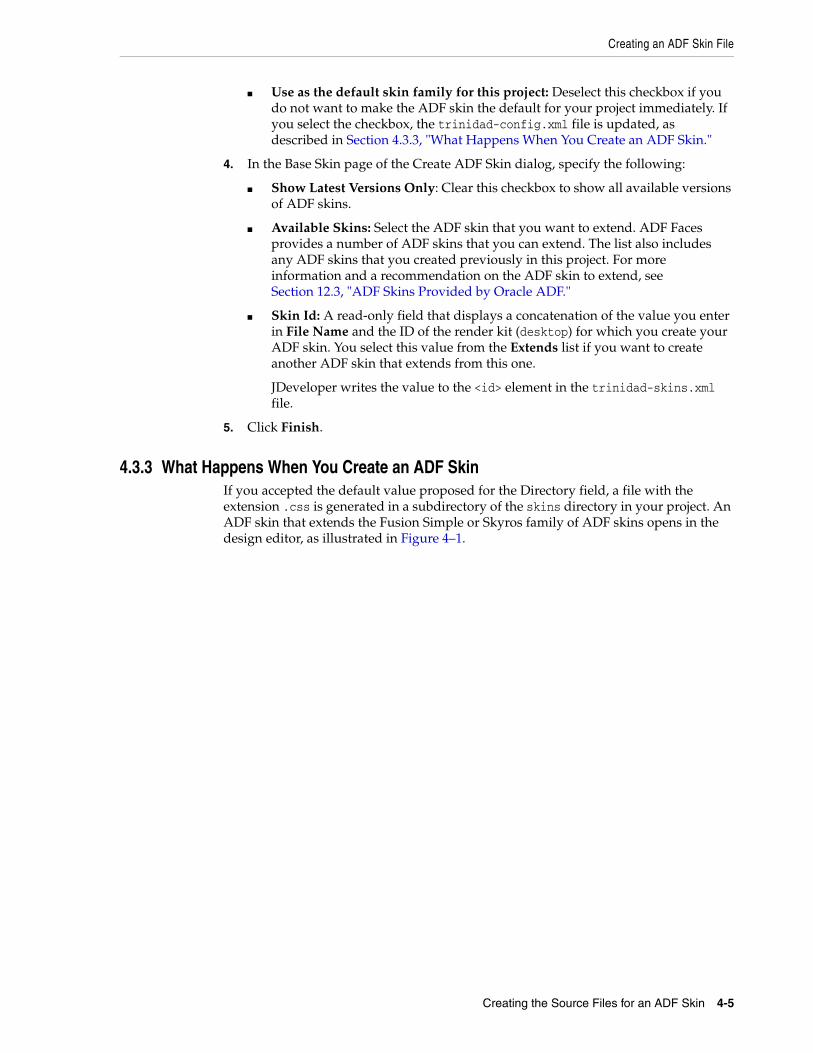
Creating an ADF Skin File
Creating the Source Files for an ADF Skin 4-5
■ Use as the default skin family for this project: Deselect this checkbox if you do not want to make the ADF skin the default for your project immediately. If you select the checkbox, the trinidad-config.xml file is updated, as described in Section 4.3.3, "What Happens When You Create an ADF Skin."
4. In the Base Skin page of the Create ADF Skin dialog, specify the following:
■ Show Latest Versions Only: Clear this checkbox to show all available versions of ADF skins.
■ Available Skins: Select the ADF skin that you want to extend. ADF Faces provides a number of ADF skins that you can extend. The list also includes any ADF skins that you created previously in this project. For more information and a recommendation on the ADF skin to extend, see Section 12.3, "ADF Skins Provided by Oracle ADF."
■ Skin Id: A read-only field that displays a concatenation of the value you enter in File Name and the ID of the render kit (desktop) for which you create your ADF skin. You select this value from the Extends list if you want to create another ADF skin that extends from this one.
JDeveloper writes the value to the <id> element in the trinidad-skins.xml file.
5. Click Finish.
4.3.3 What Happens When You Create an ADF SkinIf you accepted the default value proposed for the Directory field, a file with the extension .css is generated in a subdirectory of the skins directory in your project. An ADF skin that extends the Fusion Simple or Skyros family of ADF skins opens in the design editor, as illustrated in Figure 4–1.
Creating an ADF Skin File
4-6 Developing ADF Skins with Oracle ADF Skin Editor
Figure 4–1 Newly-Created ADF Skin in the Design Tab
An ADF skin that extends an ADF skin not from the Skyros or Fusion Simple families of ADF skin opens in the selectors editor, as illustrated in Figure 4–2. This selectors editor is also available if you create an ADF skin that extends from the Skyros or Fusion Simple family of ADF skin.
Creating an ADF Skin File
Creating the Source Files for an ADF Skin 4-7
Figure 4–2 Newly-Created ADF Skin in the Selectors Editor
The trinidad-skins.xml file is modified to include metadata for the ADF skin that you create, as illustrated in Example 4–1, which shows entries for an ADF skin that extends from the Skyros family of ADF skins. Example 4–1 also contains values that specify the render kit and the resource bundle associated with this ADF skin. For more information about resource bundles, see Chapter 7, "Working With Text in an ADF Skin."
Example 4–1 trinidad-skins.xml File
<?xml version="1.0" encoding="windows-1252"?><skins xmlns="http://myfaces.apache.org/trinidad/skin"> .... <skin> <id>skin2.desktop</id> <family>skin2</family> <extends>skyros-v1.desktop</extends> <render-kit-id>org.apache.myfaces.trinidad.desktop</render-kit-id> <style-sheet-name>skins/skin2/skin2.css</style-sheet-name> <bundle-name>resources.skinBundle</bundle-name> </skin></skins>
If you select the Use as the default skin family for this project check box in the Create ADF Skin dialog, the trinidad-config.xml file is modified to make the new ADF skin the default skin for your application. This means that if you run the application from JDeveloper, the application uses the newly-created ADF skin. For more information, see Section 11.4, "Applying an ADF Skin to Your Web Application." Example 4–2 shows a trinidad-config.xml file that makes the ADF skin in Example 4–1 the default for an application.
Example 4–2 trinidad-config.xml File
<?xml version="1.0" encoding="windows-1252"?><trinidad-config xmlns="http://myfaces.apache.org/trinidad/config"> <skin-family>skin2</skin-family></trinidad-config>
Importing One or More ADF Skins Into the Current ADF Skin
4-8 Developing ADF Skins with Oracle ADF Skin Editor
The source file for the ADF skin contains a comment and namespace references, as illustrated in Example 4–3. These entries in the source file for the ADF skin distinguish the file from non-ADF skin files with the .css file extension. A source file for an ADF skin requires these entries in order to open in the design or selectors editors for the ADF skin.
Example 4–3 Default Entries for a Newly-Created ADF Skin File
/**ADFFaces_Skin_File / DO NOT REMOVE**/@namespace af "http://xmlns.oracle.com/adf/faces/rich";@namespace dvt "http://xmlns.oracle.com/dss/adf/faces";
The first time that you create an ADF skin in your project, a resource bundle file (skinBundle.properties) is generated, as illustrated in Figure 4–2. For more information about using resource bundles, see Chapter 7, "Working With Text in an ADF Skin."
4.4 Importing One or More ADF Skins Into the Current ADF SkinYou can import another ADF skin that is in your ADF skin project into your ADF skin using the @import rule. This makes the style properties defined in the latter ADF skin available to your ADF skin. The following examples demonstrate the valid syntax to import an ADF skin (skinA) into the current ADF skin:
/** Use the following syntax if skinA.css is in the same directory **/@import "skinA.css";@import url("skinA.css");
/** Use the following syntax if skinA.css is in another directory **/@import "../skinA/skinA.css";@import url("../skinA/skinA.css");
The @import rule(s) must follow all @charset rules and precede all other at-rules and rule sets in an ADF skin, as shown in the following example that imports two ADF skins into the current ADF skin:
@charset "UTF-8";
@import url("../skinA/skinA.css");@import url("../skinB/skinB.css");
/**ADFFaces_Skin_File / DO NOT REMOVE**/@namespace af "http://xmlns.oracle.com/adf/faces/rich";@namespace dvt "http://xmlns.oracle.com/dss/adf/faces";
af|inputText{ background-color: Green;}...
4.5 Importing ADF Skins from an ADF Library JARYou can import ADF skins that have been packaged in a JAR file into your ADF skin project. When you import an ADF skin from a JAR file into your project, the imported ADF skin is available to extend from when you create a new ADF skin, as described in Section 4.3, "Creating an ADF Skin File."

Importing ADF Skins from an ADF Library JAR
Creating the Source Files for an ADF Skin 4-9
The recommended type of JAR file to use to package an ADF skin is an ADF Library JAR file. For information about how to package an ADF skin into this type of JAR file, see Section 11.3, "Packaging an ADF Skin into an ADF Library JAR."
4.5.1 How to Import an ADF Skin from an ADF Library JARYou can import ADF skins into your project that have been packaged in a JAR file.
To import an ADF skin from an ADF Library JAR:1. From the main menu, choose Application > Project Properties.
2. In the Project Properties dialog, select the Libraries and Classpath page and click Add JAR/Directory.
3. In the Add Archive or Directory dialog, navigate to the JAR file that contains the ADF skin you want to import and click Select.
The JAR file appears in the Classpath Entries list.
4. When finished, click OK.
4.5.2 What Happens When You Import an ADF Skin from an ADF Library JARThe ADF skin(s) that you import from the JAR file appear in the Extends list when you create a new ADF skin, as described in Section 4.3, "Creating an ADF Skin File." After you create a new ADF skin by extending an ADF skin that you imported from a JAR file, the Extended Skins list in the selectors editor's Preview Pane displays the name of the ADF skin that you imported. For example, in Figure 4–3 the skin2.css ADF skin has been created by extending the ADF skin, jarredskin.css, that was imported into the project from a JAR file.
Figure 4–3 Imported ADF Skin in the Extended Skins List
Properties that have been defined in the ADF skin that you imported appear with a blue upward pointing arrow in the Properties window. An information tip about the inheritance relationship displays when you hover the mouse over the property, as illustrated in Figure 4–4.
Figure 4–4 Property Inherited from an Imported ADF Skin

Opening an Application Created Outside of the ADF Skin Editor
4-10 Developing ADF Skins with Oracle ADF Skin Editor
4.6 Opening an Application Created Outside of the ADF Skin EditorWhen you open an application or project that was created in a prior release of JDeveloper, the ADF Skin Editor prompts you to migrate the project to JDeveloper 12c format. Depending on the content of the project, the ADF Skin Editor may display additional prompts to migrate some specific source files as well. Oracle recommends that you make a backup copy of your projects before you open them in the ADF Skin Editor or migrate them using the ADF Skin Editor.
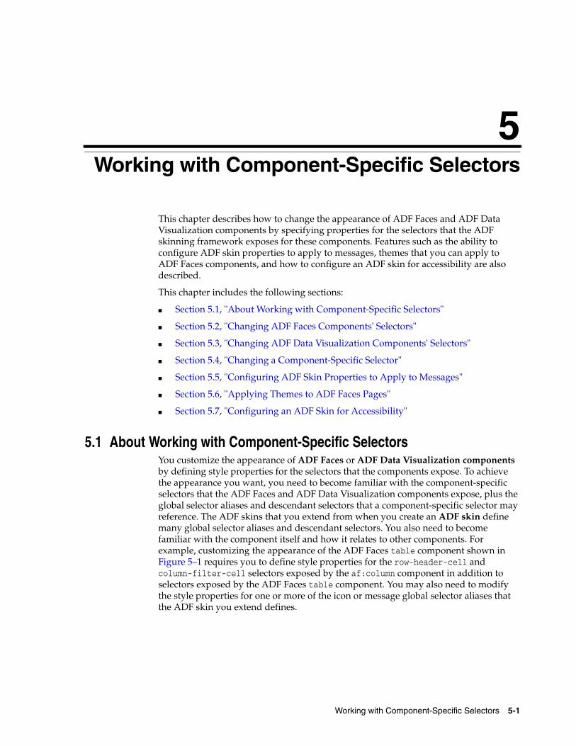
5
Working with Component-Specific Selectors 5-1
5Working with Component-Specific Selectors
This chapter describes how to change the appearance of ADF Faces and ADF Data Visualization components by specifying properties for the selectors that the ADF skinning framework exposes for these components. Features such as the ability to configure ADF skin properties to apply to messages, themes that you can apply to ADF Faces components, and how to configure an ADF skin for accessibility are also described.
This chapter includes the following sections:
■ Section 5.1, "About Working with Component-Specific Selectors"
■ Section 5.2, "Changing ADF Faces Components' Selectors"
■ Section 5.3, "Changing ADF Data Visualization Components' Selectors"
■ Section 5.4, "Changing a Component-Specific Selector"
■ Section 5.5, "Configuring ADF Skin Properties to Apply to Messages"
■ Section 5.6, "Applying Themes to ADF Faces Pages"
■ Section 5.7, "Configuring an ADF Skin for Accessibility"
5.1 About Working with Component-Specific Selectors You customize the appearance of ADF Faces or ADF Data Visualization components by defining style properties for the selectors that the components expose. To achieve the appearance you want, you need to become familiar with the component-specific selectors that the ADF Faces and ADF Data Visualization components expose, plus the global selector aliases and descendant selectors that a component-specific selector may reference. The ADF skins that you extend from when you create an ADF skin define many global selector aliases and descendant selectors. You also need to become familiar with the component itself and how it relates to other components. For example, customizing the appearance of the ADF Faces table component shown in Figure 5–1 requires you to define style properties for the row-header-cell and column-filter-cell selectors exposed by the af:column component in addition to selectors exposed by the ADF Faces table component. You may also need to modify the style properties for one or more of the icon or message global selector aliases that the ADF skin you extend defines.
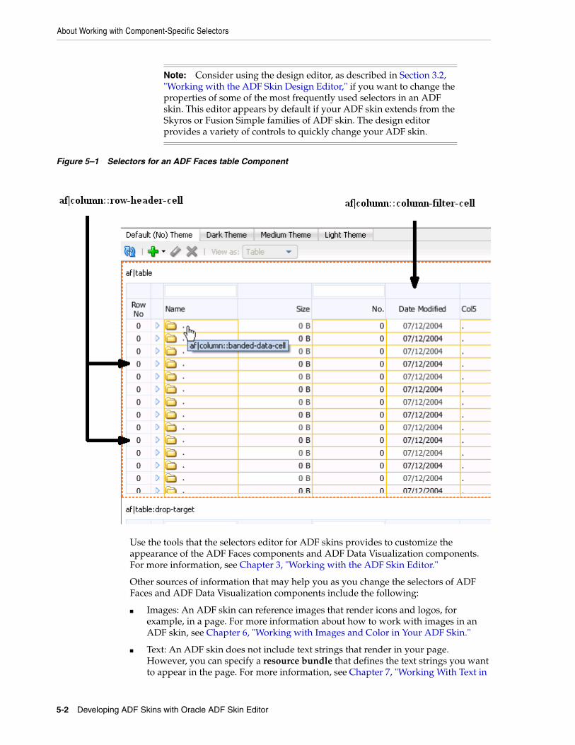
About Working with Component-Specific Selectors
5-2 Developing ADF Skins with Oracle ADF Skin Editor
Figure 5–1 Selectors for an ADF Faces table Component
Use the tools that the selectors editor for ADF skins provides to customize the appearance of the ADF Faces components and ADF Data Visualization components. For more information, see Chapter 3, "Working with the ADF Skin Editor."
Other sources of information that may help you as you change the selectors of ADF Faces and ADF Data Visualization components include the following:
■ Images: An ADF skin can reference images that render icons and logos, for example, in a page. For more information about how to work with images in an ADF skin, see Chapter 6, "Working with Images and Color in Your ADF Skin."
■ Text: An ADF skin does not include text strings that render in your page. However, you can specify a resource bundle that defines the text strings you want to appear in the page. For more information, see Chapter 7, "Working With Text in
Note: Consider using the design editor, as described in Section 3.2, "Working with the ADF Skin Design Editor," if you want to change the properties of some of the most frequently used selectors in an ADF skin. This editor appears by default if your ADF skin extends from the Skyros or Fusion Simple families of ADF skin. The design editor provides a variety of controls to quickly change your ADF skin.
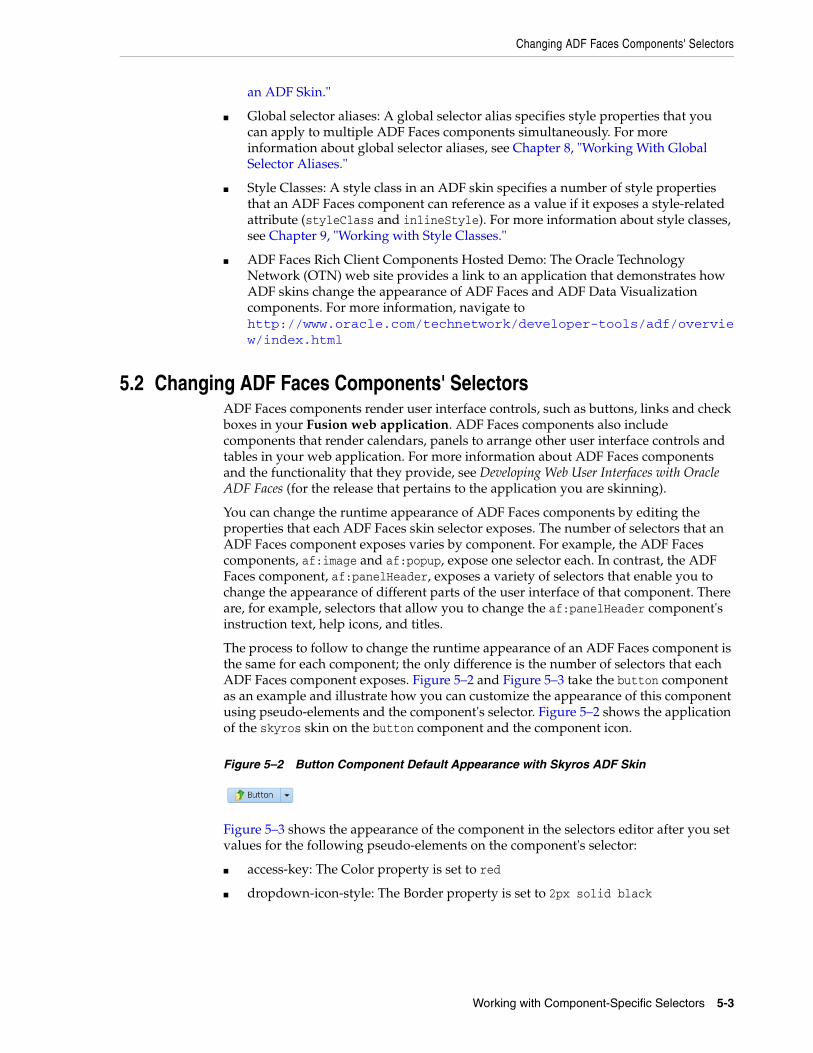
Changing ADF Faces Components' Selectors
Working with Component-Specific Selectors 5-3
an ADF Skin."
■ Global selector aliases: A global selector alias specifies style properties that you can apply to multiple ADF Faces components simultaneously. For more information about global selector aliases, see Chapter 8, "Working With Global Selector Aliases."
■ Style Classes: A style class in an ADF skin specifies a number of style properties that an ADF Faces component can reference as a value if it exposes a style-related attribute (styleClass and inlineStyle). For more information about style classes, see Chapter 9, "Working with Style Classes."
■ ADF Faces Rich Client Components Hosted Demo: The Oracle Technology Network (OTN) web site provides a link to an application that demonstrates how ADF skins change the appearance of ADF Faces and ADF Data Visualization components. For more information, navigate to http://www.oracle.com/technetwork/developer-tools/adf/overview/index.html
5.2 Changing ADF Faces Components' SelectorsADF Faces components render user interface controls, such as buttons, links and check boxes in your Fusion web application. ADF Faces components also include components that render calendars, panels to arrange other user interface controls and tables in your web application. For more information about ADF Faces components and the functionality that they provide, see Developing Web User Interfaces with Oracle ADF Faces (for the release that pertains to the application you are skinning).
You can change the runtime appearance of ADF Faces components by editing the properties that each ADF Faces skin selector exposes. The number of selectors that an ADF Faces component exposes varies by component. For example, the ADF Faces components, af:image and af:popup, expose one selector each. In contrast, the ADF Faces component, af:panelHeader, exposes a variety of selectors that enable you to change the appearance of different parts of the user interface of that component. There are, for example, selectors that allow you to change the af:panelHeader component's instruction text, help icons, and titles.
The process to follow to change the runtime appearance of an ADF Faces component is the same for each component; the only difference is the number of selectors that each ADF Faces component exposes. Figure 5–2 and Figure 5–3 take the button component as an example and illustrate how you can customize the appearance of this component using pseudo-elements and the component's selector. Figure 5–2 shows the application of the skyros skin on the button component and the component icon.
Figure 5–2 Button Component Default Appearance with Skyros ADF Skin
Figure 5–3 shows the appearance of the component in the selectors editor after you set values for the following pseudo-elements on the component's selector:
■ access-key: The Color property is set to red
■ dropdown-icon-style: The Border property is set to 2px solid black
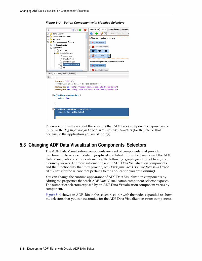
Changing ADF Data Visualization Components' Selectors
5-4 Developing ADF Skins with Oracle ADF Skin Editor
Figure 5–3 Button Component with Modified Selectors
Reference information about the selectors that ADF Faces components expose can be found in the Tag Reference for Oracle ADF Faces Skin Selectors (for the release that pertains to the application you are skinning).
5.3 Changing ADF Data Visualization Components' SelectorsThe ADF Data Visualization components are a set of components that provide functionality to represent data in graphical and tabular formats. Examples of the ADF Data Visualization components include the following: graph, gantt, pivot table, and hierarchy viewer. For more information about ADF Data Visualization components and the functionality that they provide, see Developing Web User Interfaces with Oracle ADF Faces (for the release that pertains to the application you are skinning).
You can change the runtime appearance of ADF Data Visualization components by editing the properties that each ADF Data Visualization component selector exposes. The number of selectors exposed by an ADF Data Visualization component varies by component.
Figure 5–4 shows an ADF skin in the selectors editor with the nodes expanded to show the selectors that you can customize for the ADF Data Visualization gauge component.
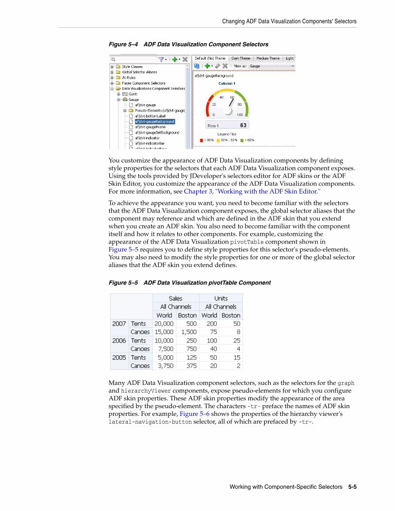
Changing ADF Data Visualization Components' Selectors
Working with Component-Specific Selectors 5-5
Figure 5–4 ADF Data Visualization Component Selectors
You customize the appearance of ADF Data Visualization components by defining style properties for the selectors that each ADF Data Visualization component exposes. Using the tools provided by JDeveloper's selectors editor for ADF skins or the ADF Skin Editor, you customize the appearance of the ADF Data Visualization components. For more information, see Chapter 3, "Working with the ADF Skin Editor."
To achieve the appearance you want, you need to become familiar with the selectors that the ADF Data Visualization component exposes, the global selector aliases that the component may reference and which are defined in the ADF skin that you extend when you create an ADF skin. You also need to become familiar with the component itself and how it relates to other components. For example, customizing the appearance of the ADF Data Visualization pivotTable component shown in Figure 5–5 requires you to define style properties for this selector's pseudo-elements. You may also need to modify the style properties for one or more of the global selector aliases that the ADF skin you extend defines.
Figure 5–5 ADF Data Visualization pivotTable Component
Many ADF Data Visualization component selectors, such as the selectors for the graph and hierarchyViewer components, expose pseudo-elements for which you configure ADF skin properties. These ADF skin properties modify the appearance of the area specified by the pseudo-element. The characters -tr- preface the names of ADF skin properties. For example, Figure 5–6 shows the properties of the hierarchy viewer's lateral-navigation-button selector, all of which are prefaced by -tr-.

Changing ADF Data Visualization Components' Selectors
5-6 Developing ADF Skins with Oracle ADF Skin Editor
Figure 5–6 Properties for the hierarchyViewer Component lateral-navigation-button Pseudo-Element
In contrast, the gantt component's summary-task-left selector, shown in Figure 5–7, exposes only four ADF skin properties (-tr-rule-ref, -tr-inhibit-, -tr-enable-themes, and -tr-children-theme) as the majority of the properties that you configure for this selector are CSS properties.
For more information about ADF skin properties, see Section 2.3, "Properties in the ADF Skinning Framework."
Figure 5–7 Properties for the gantt Component summary-task-left Pseudo-Element
Reference information about the selectors, pseudo-elements, and pseudo-classes that ADF Data Visualization components expose can be found in the Oracle Fusion
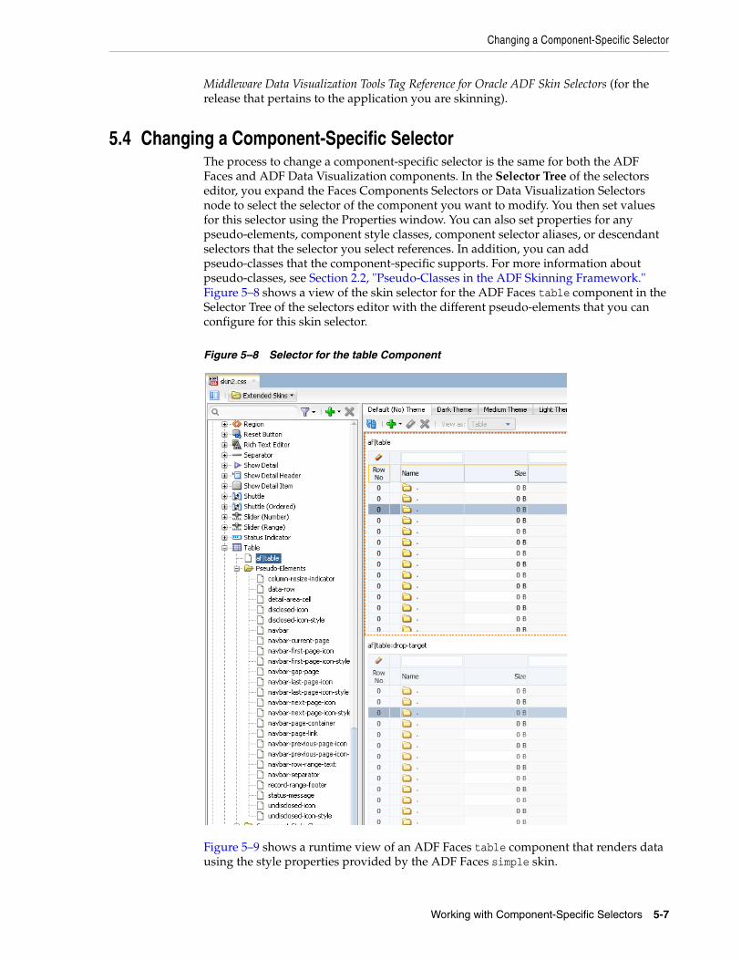
Changing a Component-Specific Selector
Working with Component-Specific Selectors 5-7
Middleware Data Visualization Tools Tag Reference for Oracle ADF Skin Selectors (for the release that pertains to the application you are skinning).
5.4 Changing a Component-Specific SelectorThe process to change a component-specific selector is the same for both the ADF Faces and ADF Data Visualization components. In the Selector Tree of the selectors editor, you expand the Faces Components Selectors or Data Visualization Selectors node to select the selector of the component you want to modify. You then set values for this selector using the Properties window. You can also set properties for any pseudo-elements, component style classes, component selector aliases, or descendant selectors that the selector you select references. In addition, you can add pseudo-classes that the component-specific supports. For more information about pseudo-classes, see Section 2.2, "Pseudo-Classes in the ADF Skinning Framework." Figure 5–8 shows a view of the skin selector for the ADF Faces table component in the Selector Tree of the selectors editor with the different pseudo-elements that you can configure for this skin selector.
Figure 5–8 Selector for the table Component
Figure 5–9 shows a runtime view of an ADF Faces table component that renders data using the style properties provided by the ADF Faces simple skin.

Changing a Component-Specific Selector
5-8 Developing ADF Skins with Oracle ADF Skin Editor
Figure 5–9 ADF Faces table Component Rendered By the simple Skin
5.4.1 How to Change a Component-Specific SelectorYou change a component-specific selector by selecting the selector in the Selector Tree and setting values for the selector, its pseudo-elements, or descendant selectors in the Properties window. In addition, you can add a pseudo-class if the component-specific selector supports one.
To change a component-specific selector:1. In the Selector Tree of the selectors editor, choose the appropriate option:
■ Expand the Faces Component Selectors node if you want change a selector for an ADF Faces component.
■ Expand the Data Visualization Selectors node if you want to change a selector for an ADF Data Visualization component.
For example, expand the Faces Component Selectors node, the Column node, the Pseudo-Elements node, and select the column-header-cell selector.
2. In the Properties window, specify values for the properties that the selector you selected in Step 1 supports.
For example, in the Common section of the Properties window, specify values for the following attributes:
■ Background Color: Specify the background color that you want to appear in the header row of the table.
■ Color: Specify the color that you want to apply to text that appears in the header row of the table's column.
3. In the Preview Pane, click the Add Pseudo-Class icon to choose a supported pseudo-class from the displayed list of supported pseudo-classes that appears.
5.4.2 What Happens When You Change a Component-Specific Selector The selectors editor displays the changes that you make to the selector after you click the Refresh icon in the Preview Pane. If you add a pseudo-class to the selector, the Preview Pane also displays an entry for the selector with the added pseudo-class. For example, Figure 5–10 shows an entry for a selector with the :hover pseudo-class added.
Note: The Preview Pane for the af|document selector only displays one entry even if you add a pseudo-class to this selector.

Configuring ADF Skin Properties to Apply to Messages
Working with Component-Specific Selectors 5-9
Figure 5–10 Preview Pane with a Component Specific Selector and a Pseudo-Class
The selectors editor also writes the values that you specify for the selectors in the Properties window to the source file for the ADF skin. Example 5–1 shows the changes that appear in the source file after making some of the changes described in Section 5.4.1, "How to Change a Component-Specific Selector."
Example 5–1 Selector Values to Skin the Header Row in a Column
af|column::column-header-cell{ color: Black; background-color: Olive; font-weight: bold;}
When a web application uses an ADF skin that contains the values shown in Example 5–1, header rows in the columns of a table rendered by the ADF Faces table component appear as illustrated by Figure 5–11 where the table uses a skin that extends the simple skin.
Figure 5–11 ADF Faces table with a Header Row Skinned
5.5 Configuring ADF Skin Properties to Apply to Messages You can apply styles to ADF Faces input components based on whether or not the input components have certain types of message associated with them. When a
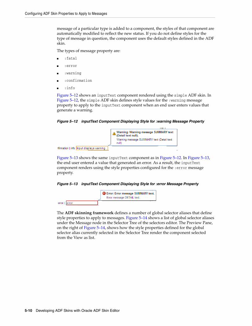
Configuring ADF Skin Properties to Apply to Messages
5-10 Developing ADF Skins with Oracle ADF Skin Editor
message of a particular type is added to a component, the styles of that component are automatically modified to reflect the new status. If you do not define styles for the type of message in question, the component uses the default styles defined in the ADF skin.
The types of message property are:
■ :fatal
■ :error
■ :warning
■ :confirmation
■ :info
Figure 5–12 shows an inputText component rendered using the simple ADF skin. In Figure 5–12, the simple ADF skin defines style values for the :warning message property to apply to the inputText component when an end user enters values that generate a warning.
Figure 5–12 inputText Component Displaying Style for :warning Message Property
Figure 5–13 shows the same inputText component as in Figure 5–12. In Figure 5–13, the end user entered a value that generated an error. As a result, the inputText component renders using the style properties configured for the :error message property.
Figure 5–13 inputText Component Displaying Style for :error Message Property
The ADF skinning framework defines a number of global selector aliases that define style properties to apply to messages. Figure 5–14 shows a list of global selector aliases under the Message node in the Selector Tree of the selectors editor. The Preview Pane, on the right of Figure 5–14, shows how the style properties defined for the global selector alias currently selected in the Selector Tree render the component selected from the View as list.
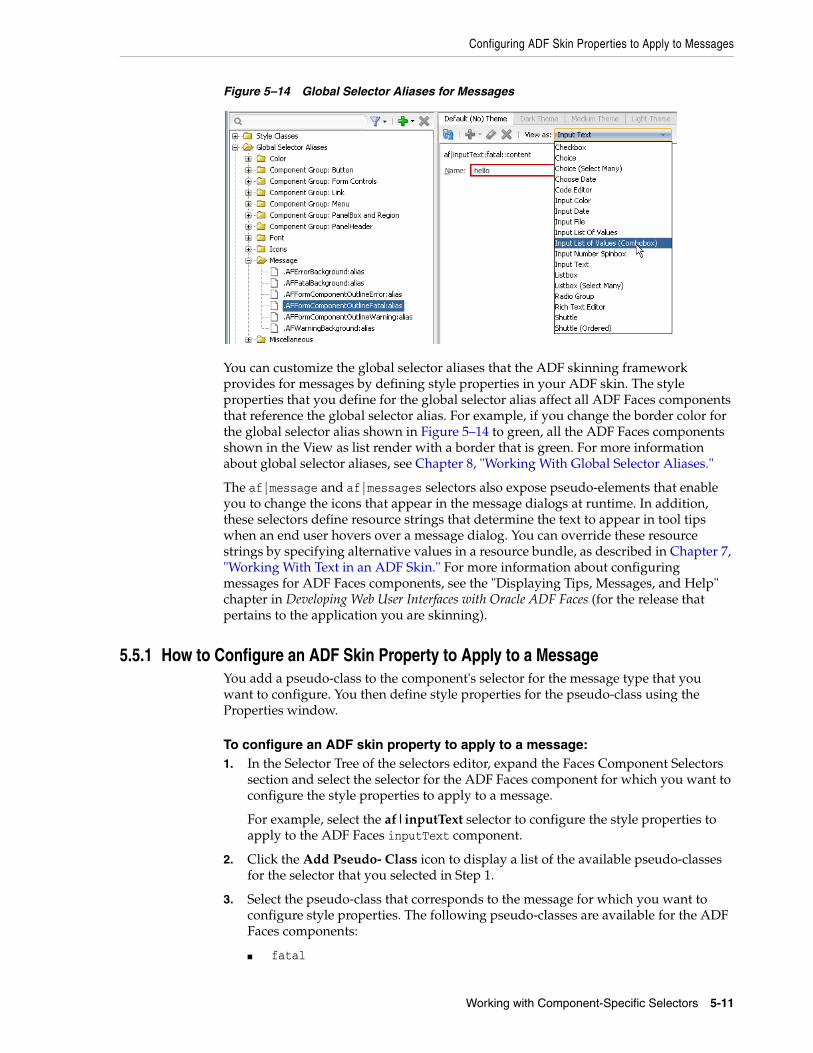
Configuring ADF Skin Properties to Apply to Messages
Working with Component-Specific Selectors 5-11
Figure 5–14 Global Selector Aliases for Messages
You can customize the global selector aliases that the ADF skinning framework provides for messages by defining style properties in your ADF skin. The style properties that you define for the global selector alias affect all ADF Faces components that reference the global selector alias. For example, if you change the border color for the global selector alias shown in Figure 5–14 to green, all the ADF Faces components shown in the View as list render with a border that is green. For more information about global selector aliases, see Chapter 8, "Working With Global Selector Aliases."
The af|message and af|messages selectors also expose pseudo-elements that enable you to change the icons that appear in the message dialogs at runtime. In addition, these selectors define resource strings that determine the text to appear in tool tips when an end user hovers over a message dialog. You can override these resource strings by specifying alternative values in a resource bundle, as described in Chapter 7, "Working With Text in an ADF Skin." For more information about configuring messages for ADF Faces components, see the "Displaying Tips, Messages, and Help" chapter in Developing Web User Interfaces with Oracle ADF Faces (for the release that pertains to the application you are skinning).
5.5.1 How to Configure an ADF Skin Property to Apply to a MessageYou add a pseudo-class to the component's selector for the message type that you want to configure. You then define style properties for the pseudo-class using the Properties window.
To configure an ADF skin property to apply to a message:1. In the Selector Tree of the selectors editor, expand the Faces Component Selectors
section and select the selector for the ADF Faces component for which you want to configure the style properties to apply to a message.
For example, select the af|inputText selector to configure the style properties to apply to the ADF Faces inputText component.
2. Click the Add Pseudo- Class icon to display a list of the available pseudo-classes for the selector that you selected in Step 1.
3. Select the pseudo-class that corresponds to the message for which you want to configure style properties. The following pseudo-classes are available for the ADF Faces components:
■ fatal
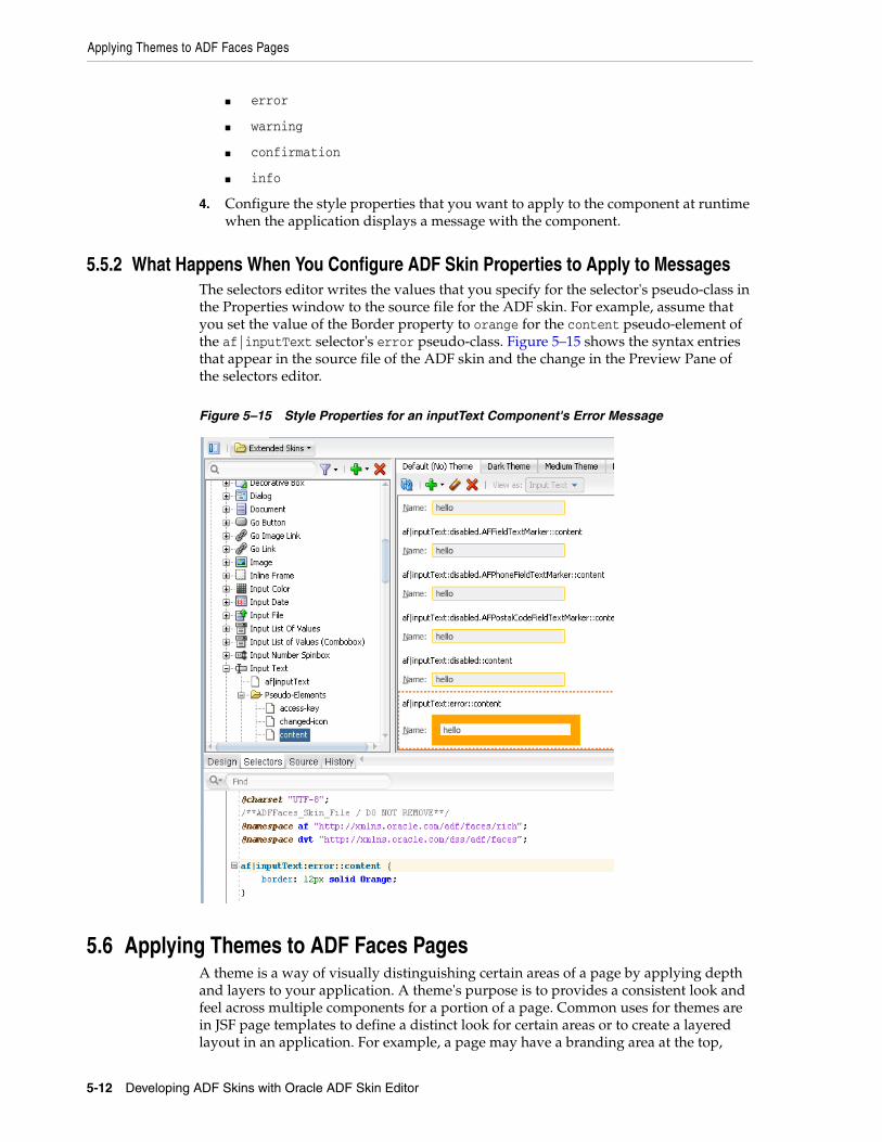
Applying Themes to ADF Faces Pages
5-12 Developing ADF Skins with Oracle ADF Skin Editor
■ error
■ warning
■ confirmation
■ info
4. Configure the style properties that you want to apply to the component at runtime when the application displays a message with the component.
5.5.2 What Happens When You Configure ADF Skin Properties to Apply to Messages The selectors editor writes the values that you specify for the selector's pseudo-class in the Properties window to the source file for the ADF skin. For example, assume that you set the value of the Border property to orange for the content pseudo-element of the af|inputText selector's error pseudo-class. Figure 5–15 shows the syntax entries that appear in the source file of the ADF skin and the change in the Preview Pane of the selectors editor.
Figure 5–15 Style Properties for an inputText Component's Error Message
5.6 Applying Themes to ADF Faces PagesA theme is a way of visually distinguishing certain areas of a page by applying depth and layers to your application. A theme's purpose is to provides a consistent look and feel across multiple components for a portion of a page. Common uses for themes are in JSF page templates to define a distinct look for certain areas or to create a layered layout in an application. For example, a page may have a branding area at the top,
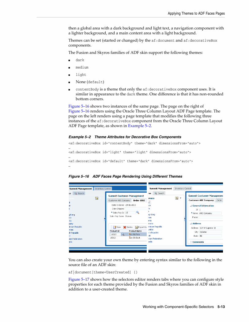
Applying Themes to ADF Faces Pages
Working with Component-Specific Selectors 5-13
then a global area with a dark background and light text, a navigation component with a lighter background, and a main content area with a light background.
Themes can be set (started or changed) by the af:document and af:decorativeBox components.
The Fusion and Skyros families of ADF skin support the following themes:
■ dark
■ medium
■ light
■ None (default)
■ contentBody is a theme that only the af:decorativeBox component uses. It is similar in appearance to the dark theme. One difference is that it has non-rounded bottom corners.
Figure 5–16 shows two instances of the same page. The page on the right of Figure 5–16 renders using the Oracle Three Column Layout ADF Page template. The page on the left renders using a page template that modifies the following three instances of the af:decorativeBox component from the Oracle Three Column Layout ADF Page template, as shown in Example 5–2.
Example 5–2 Theme Attributes for Decorative Box Components
<af:decorativeBox id="contentBody" theme="dark" dimensionsFrom="auto">…<af:decorativeBox id="light" theme="light" dimensionsFrom="auto">…<af:decorativeBox id="default" theme="dark" dimensionsFrom="auto">…
Figure 5–16 ADF Faces Page Rendering Using Different Themes
You can also create your own theme by entering syntax similar to the following in the source file of an ADF skin:
af|document[theme=UserCreated] {}
Figure 5–17 shows how the selectors editor renders tabs where you can configure style properties for each theme provided by the Fusion and Skyros families of ADF skin in addition to a user-created theme.
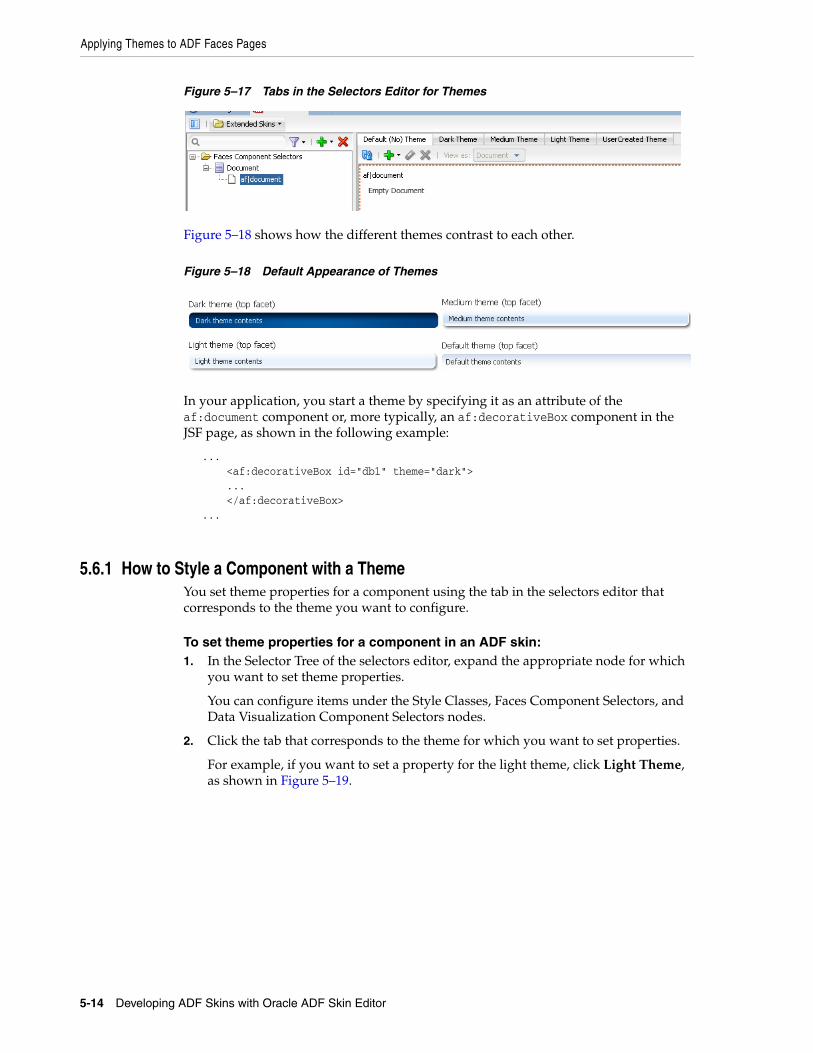
Applying Themes to ADF Faces Pages
5-14 Developing ADF Skins with Oracle ADF Skin Editor
Figure 5–17 Tabs in the Selectors Editor for Themes
Figure 5–18 shows how the different themes contrast to each other.
Figure 5–18 Default Appearance of Themes
In your application, you start a theme by specifying it as an attribute of the af:document component or, more typically, an af:decorativeBox component in the JSF page, as shown in the following example:
... <af:decorativeBox id="db1" theme="dark"> ... </af:decorativeBox> ...
5.6.1 How to Style a Component with a ThemeYou set theme properties for a component using the tab in the selectors editor that corresponds to the theme you want to configure.
To set theme properties for a component in an ADF skin:1. In the Selector Tree of the selectors editor, expand the appropriate node for which
you want to set theme properties.
You can configure items under the Style Classes, Faces Component Selectors, and Data Visualization Component Selectors nodes.
2. Click the tab that corresponds to the theme for which you want to set properties.
For example, if you want to set a property for the light theme, click Light Theme, as shown in Figure 5–19.
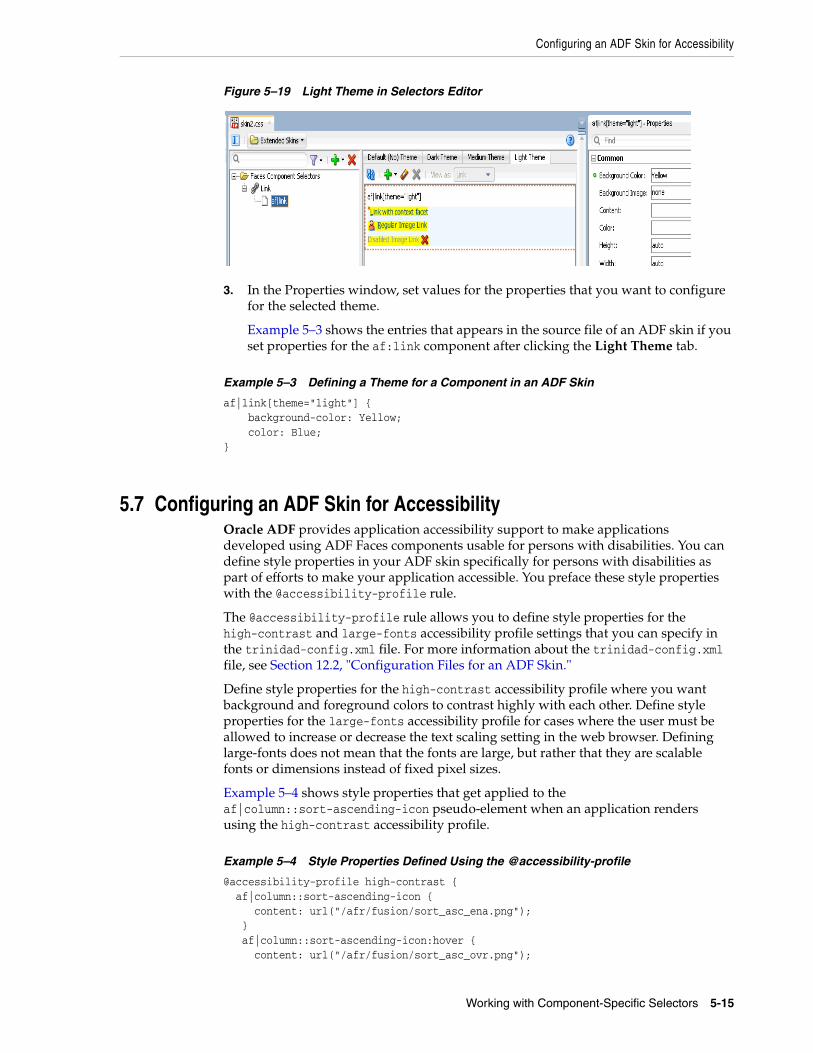
Configuring an ADF Skin for Accessibility
Working with Component-Specific Selectors 5-15
Figure 5–19 Light Theme in Selectors Editor
3. In the Properties window, set values for the properties that you want to configure for the selected theme.
Example 5–3 shows the entries that appears in the source file of an ADF skin if you set properties for the af:link component after clicking the Light Theme tab.
Example 5–3 Defining a Theme for a Component in an ADF Skin
af|link[theme="light"] { background-color: Yellow; color: Blue; }
5.7 Configuring an ADF Skin for AccessibilityOracle ADF provides application accessibility support to make applications developed using ADF Faces components usable for persons with disabilities. You can define style properties in your ADF skin specifically for persons with disabilities as part of efforts to make your application accessible. You preface these style properties with the @accessibility-profile rule.
The @accessibility-profile rule allows you to define style properties for the high-contrast and large-fonts accessibility profile settings that you can specify in the trinidad-config.xml file. For more information about the trinidad-config.xml file, see Section 12.2, "Configuration Files for an ADF Skin."
Define style properties for the high-contrast accessibility profile where you want background and foreground colors to contrast highly with each other. Define style properties for the large-fonts accessibility profile for cases where the user must be allowed to increase or decrease the text scaling setting in the web browser. Defining large-fonts does not mean that the fonts are large, but rather that they are scalable fonts or dimensions instead of fixed pixel sizes.
Example 5–4 shows style properties that get applied to the af|column::sort-ascending-icon pseudo-element when an application renders using the high-contrast accessibility profile.
Example 5–4 Style Properties Defined Using the @accessibility-profile
@accessibility-profile high-contrast { af|column::sort-ascending-icon { content: url("/afr/fusion/sort_asc_ena.png"); } af|column::sort-ascending-icon:hover { content: url("/afr/fusion/sort_asc_ovr.png");

Configuring an ADF Skin for Accessibility
5-16 Developing ADF Skins with Oracle ADF Skin Editor
} af|column::sort-ascending-icon:active { content: url("/afr/fusion/sort_asc_selected.png"); } af|column::sort-descending-icon { content: url("/afr/fusion/sort_des_ena.png"); } af|column::sort-descending-icon:hover { content: url("/afr/fusion/sort_des_ovr.png"); } af|column::sort-descending-icon:active { content: url("/afr/fusion/sort_des_selected.png"); } af|column::sorted-ascending-icon { content: url("/afr/fusion/sort_asc_selected.png"); } af|column::sorted-descending-icon { content: url("/afr/fusion/sort_des_selected.png"); }
For more information about developing accessible ADF Faces pages and accessibility profiles, see the "Developing Accessible ADF Faces Pages" chapter in Developing Web User Interfaces with Oracle ADF Faces (for the release that pertains to the application you are skinning).
5.7.1 How to Configure an ADF Skin for AccessibilityYou define style properties for the selector or selector´s pseudo-elements that you want to configure and preface these style properties with the @accessibility-profile rule.
To configure an ADF skin for accessibility:1. Define style properties for the selectors and selectors' pseudo-elements that you
want to configure, as described in Section 5.4, "Changing a Component-Specific Selector."
2. In the source file for the ADF skin, preface the skinning keys that you configured with the @accessibility-profile rule, as illustrated in Example 5–4.
6
Working with Images and Color in Your ADF Skin 6-1
6Working with Images and Color in Your ADFSkin
This chapter describes how to work with images and color in an ADF skin. Features, such as how you change images using the provided editors, are described in addition to how to work with the color categories in a Skyros-extended skin to quickly change the color palette that your ADF skin defines.
This chapter includes the following sections:
■ Section 6.1, "About Working with Images and Color in Your ADF Skin"
■ Section 6.2, "Changing Images and Colors in the ADF Skin Design Editor"
■ Section 6.3, "Working with Color in a Skyros-Extended ADF Skin"
■ Section 6.4, "Changing an Image for a Component Selector"
■ Section 6.5, "Working with the Images Editor"
■ Section 6.6, "Providing a Simple Border Style for ADF Skins"
6.1 About Working with Images and Color in Your ADF SkinApart from the simple skin which contains only minimal formatting, the ADF skins provided by Oracle ADF define color schemes and reference images to provide a colorful look and feel for applications. Changing these colors and the images that your ADF skin references is a task that will make a significant difference to the appearance of the application that uses your ADF skin. Figure 6–1 illustrates this point by showing the same page from an application that renders using two different ADF skins (skyros and simple). The skyros skin defines the look and feel of the application page in the upper part of Figure 6–1. It uses more color and images than the application page in the lower part that uses the simple skin.
About Working with Images and Color in Your ADF Skin
6-2 Developing ADF Skins with Oracle ADF Skin Editor
Figure 6–1 ADF Skin Using Images and Color
Among the selectors in the ADF skins provided by Oracle ADF that reference images are those in the following list. A short description of the role that the referenced images performs in skinning the Fusion web application also appears.
■ af|document::splash-screen-icon
This component-specific selector specifies the icon that appears within a splash screen when a Fusion web applications loads in a browser.
■ af|column::sorted-descending-icon-style
This component-specific selector specifies the icon that renders for the sorted descending indicator in a column.
■ .AFFatalIcon:alias
This global selector alias specifies the icon to appear if a fatal error occurs on a page
Examples of colors that the ADF skins provided by Oracle ADF define include the .AFBrightBackground:alias (used only by Fusion Simple skins) and .AFHoverPrimaryColor:alias (used only by Skyros skins) global selector aliases. These global selector aliases define the background color when, for example, a user hovers a cursor over a button component. Another example is the .AFBackgroundColor:alias global selector alias used by Skyros skins to define the background color used for the main content area of your page.
The ADF Skin Editor provides features to help change the colors and images that your ADF skin uses. The availability of some or all of these features depends on the family of ADF skin that you extend, as described in the following list:
■ If your ADF skin extends the Skyros or Fusion Simple families of skin
The ADF Skin Editor enables the design editor where you can use various color pickers and other controls to change some of the more frequently used colors and images in an ADF skin. For more information, see Section 6.2, "Changing Images and Colors in the ADF Skin Design Editor."
■ If your ADF skin extends from the Fusion Simple family of skin
Changing Images and Colors in the ADF Skin Design Editor
Working with Images and Color in Your ADF Skin 6-3
The ADF Skin Editor enables the images editor that provides additional tools to manage colors and images. For more information, see Section 6.5, "Working with the Images Editor."
■ If your ADF Skin extends from the Fusion or Simple families of skin
Use the selectors editor to change images, as described in Section 6.4, "Changing an Image for a Component Selector."
6.2 Changing Images and Colors in the ADF Skin Design EditorThe design editor appears when you create an ADF skin that extends from the Skyros or Fusion Simple families of ADF skins. You access it by clicking the Design tab of the open ADF skin. For an overview of the design editor, see Section 3.3, "Working with the ADF Skin Selectors Editor."
Examples of tasks that you can carry out using this editor include the following:
■ Change the default text color in ADF skins that extend from Skyros
■ Change the background color that appears to highlight when you hover over components such as the button component
■ Replace icons
You can change all or individual icons for components, status, and animation icons using the Replace Icons dialog that you invoke when you click one of the Status Icon, Animations, or Component buttons in the Images area of the General tab. For more information, click Help on the Replace Icons dialog.
Figure 6–2 shows an ADF skin that extends from the Skyros family of ADF skin where the following changes have been made:
■ In the General tab
– Change the main default text color to Fuchsia
This changes the color value of the AFTextColor global selector alias which is an anchor color. This change also affects the global selector aliases (for example, AFTextPrimaryColor and AFTextSecondaryColor) that set color properties which derive their hue value from the AFTextColor global selector alias. For more information about this relationship, see Section 6.3, "Working with Color in a Skyros-Extended ADF Skin."
– Change the primary accent color to Black
This changes the color that renders when a cursor hovers over a component such as a button component. The global selector aliases that sets this color property are AFHoverPrimaryColor and AFButtonGradientStartHoverColor. Other global selector aliases use the AFButtonGradientStartHoverColor
Note: The Component button and the associated dialog to replace component icons does not appear if your ADF skin extends from the Fusion Simple family.
Note: Red rectangles in Figure 6–2 identify the controls used to make the changes in the General tab. Red arrows point to a corresponding result in the sample page.
Working with Color in a Skyros-Extended ADF Skin
6-4 Developing ADF Skins with Oracle ADF Skin Editor
global selector alias to derive the hue value of the color properties that they set. Examples of global selector aliases that derive their color property from the AFButtonGradientStartHoverColor global selector alias include AFButtonBorderBottomHoverColor and AFButtonBorderHoverColor. For more information about this relationship, see Section 6.3, "Working with Color in a Skyros-Extended ADF Skin."
– Change one of the animated icons that indicate connection status
In this example, the animation icon referenced by the af|statusIndicator::idle-icon was changed.
■ In the Branding Area tab
– Change the color property that determines the background color for the branding area (AFBrandingBackgroundColor global selector alias) to transparent.
– Change the image file that is used to render the logo in the branding area.
Figure 6–2 Changing Colors and Icons in ADF Skin Design Editor
6.3 Working with Color in a Skyros-Extended ADF SkinAn ADF skin that extends from the Skyros family of ADF skin defines global selector aliases that group colors into one of three categories, as illustrated in Figure 6–3. Changing the value of color properties for global selector aliases categorized as anchor colors can help you to quickly change the color palette that your ADF skin defines.
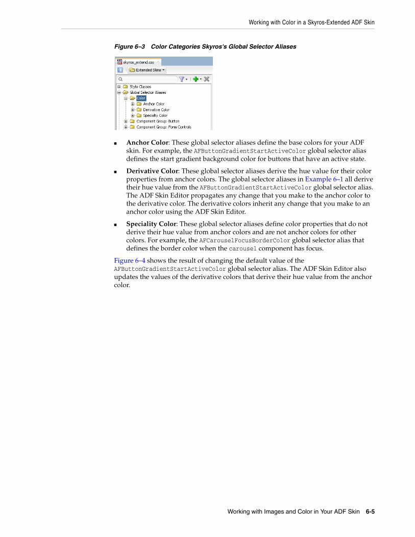
Working with Color in a Skyros-Extended ADF Skin
Working with Images and Color in Your ADF Skin 6-5
Figure 6–3 Color Categories Skyros's Global Selector Aliases
■ Anchor Color: These global selector aliases define the base colors for your ADF skin. For example, the AFButtonGradientStartActiveColor global selector alias defines the start gradient background color for buttons that have an active state.
■ Derivative Color: These global selector aliases derive the hue value for their color properties from anchor colors. The global selector aliases in Example 6–1 all derive their hue value from the AFButtonGradientStartActiveColor global selector alias. The ADF Skin Editor propagates any change that you make to the anchor color to the derivative color. The derivative colors inherit any change that you make to an anchor color using the ADF Skin Editor.
■ Speciality Color: These global selector aliases define color properties that do not derive their hue value from anchor colors and are not anchor colors for other colors. For example, the AFCarouselFocusBorderColor global selector alias that defines the border color when the carousel component has focus.
Figure 6–4 shows the result of changing the default value of the AFButtonGradientStartActiveColor global selector alias. The ADF Skin Editor also updates the values of the derivative colors that derive their hue value from the anchor color.
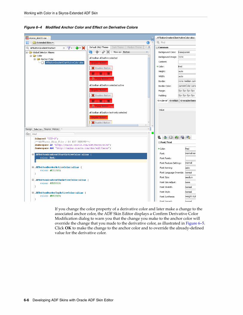
Working with Color in a Skyros-Extended ADF Skin
6-6 Developing ADF Skins with Oracle ADF Skin Editor
Figure 6–4 Modified Anchor Color and Effect on Derivative Colors
If you change the color property of a derivative color and later make a change to the associated anchor color, the ADF Skin Editor displays a Confirm Derivative Color Modification dialog to warn you that the change you make to the anchor color will override the change that you made to the derivative color, as illustrated in Figure 6–5. Click OK to make the change to the anchor color and to override the already-defined value for the derivative color.
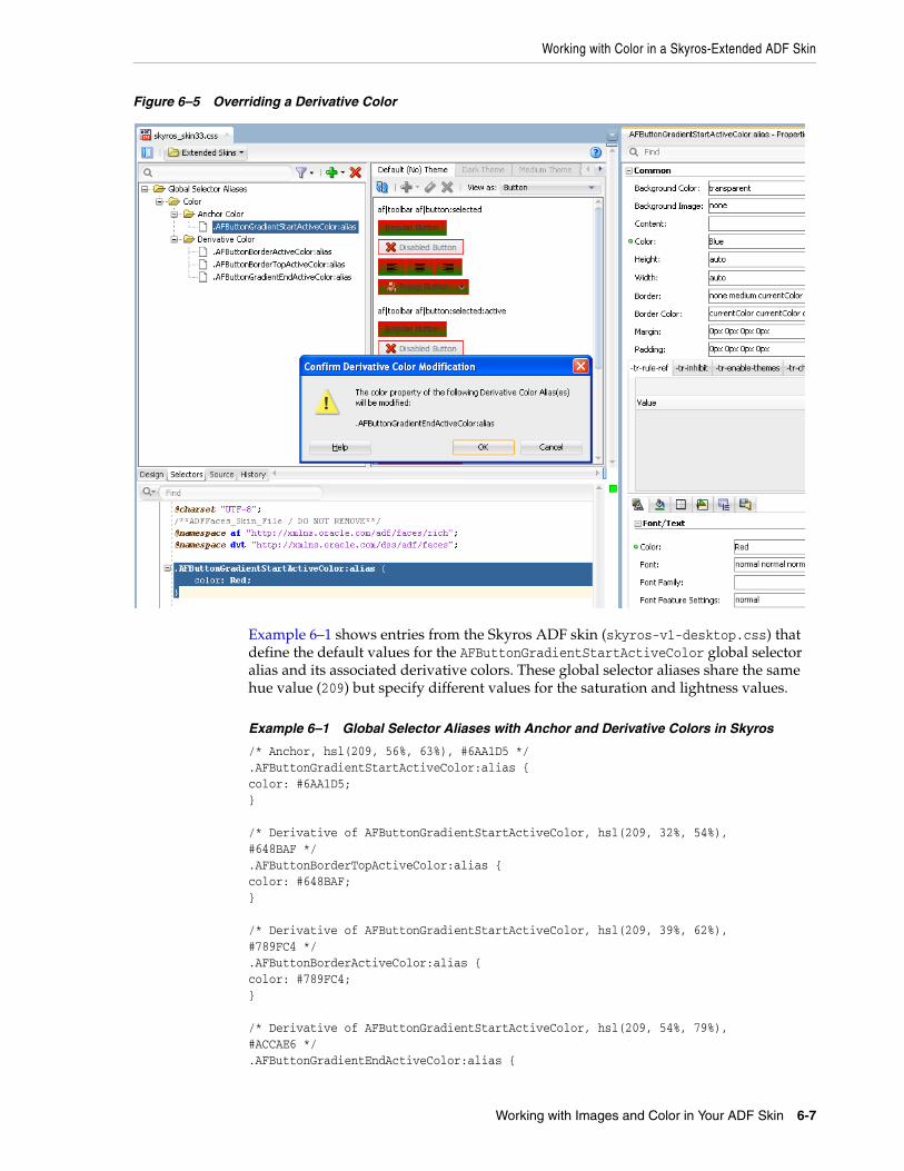
Working with Color in a Skyros-Extended ADF Skin
Working with Images and Color in Your ADF Skin 6-7
Figure 6–5 Overriding a Derivative Color
Example 6–1 shows entries from the Skyros ADF skin (skyros-v1-desktop.css) that define the default values for the AFButtonGradientStartActiveColor global selector alias and its associated derivative colors. These global selector aliases share the same hue value (209) but specify different values for the saturation and lightness values.
Example 6–1 Global Selector Aliases with Anchor and Derivative Colors in Skyros
/* Anchor, hsl(209, 56%, 63%), #6AA1D5 */.AFButtonGradientStartActiveColor:alias {color: #6AA1D5;} /* Derivative of AFButtonGradientStartActiveColor, hsl(209, 32%, 54%),#648BAF */.AFButtonBorderTopActiveColor:alias {color: #648BAF;} /* Derivative of AFButtonGradientStartActiveColor, hsl(209, 39%, 62%),#789FC4 */.AFButtonBorderActiveColor:alias {color: #789FC4;} /* Derivative of AFButtonGradientStartActiveColor, hsl(209, 54%, 79%),#ACCAE6 */.AFButtonGradientEndActiveColor:alias {
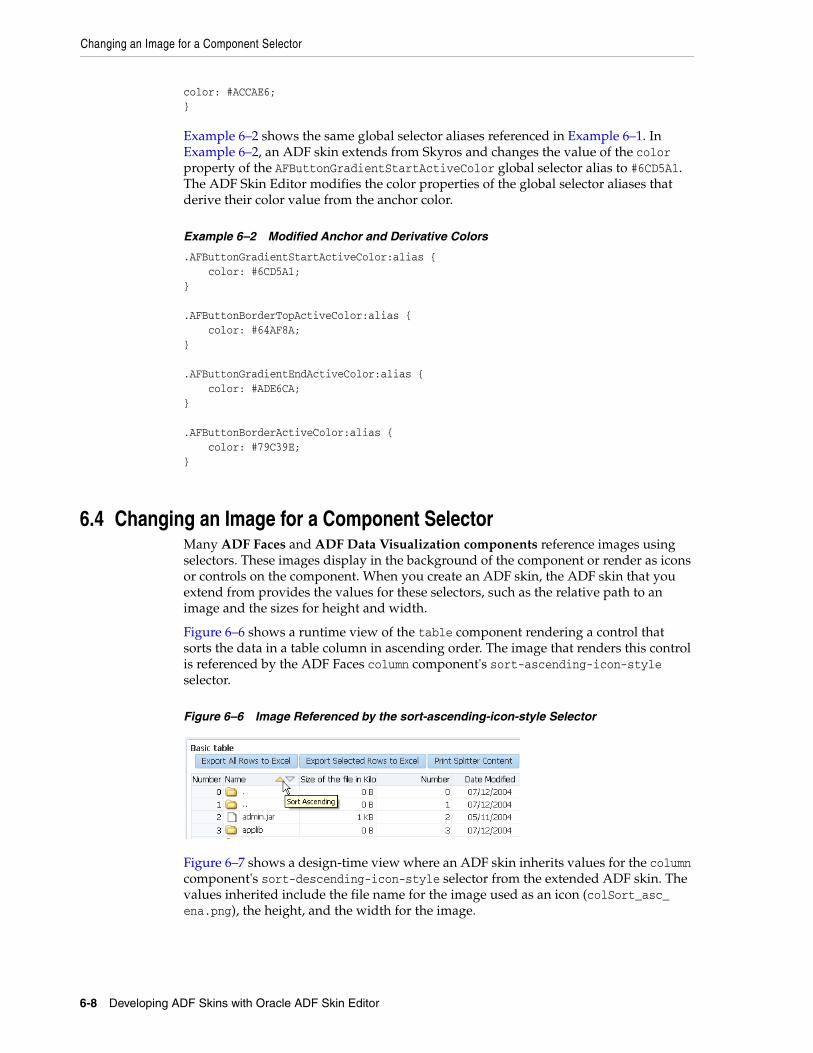
Changing an Image for a Component Selector
6-8 Developing ADF Skins with Oracle ADF Skin Editor
color: #ACCAE6;}
Example 6–2 shows the same global selector aliases referenced in Example 6–1. In Example 6–2, an ADF skin extends from Skyros and changes the value of the color property of the AFButtonGradientStartActiveColor global selector alias to #6CD5A1. The ADF Skin Editor modifies the color properties of the global selector aliases that derive their color value from the anchor color.
Example 6–2 Modified Anchor and Derivative Colors
.AFButtonGradientStartActiveColor:alias { color: #6CD5A1; } .AFButtonBorderTopActiveColor:alias { color: #64AF8A; } .AFButtonGradientEndActiveColor:alias { color: #ADE6CA; } .AFButtonBorderActiveColor:alias { color: #79C39E; }
6.4 Changing an Image for a Component SelectorMany ADF Faces and ADF Data Visualization components reference images using selectors. These images display in the background of the component or render as icons or controls on the component. When you create an ADF skin, the ADF skin that you extend from provides the values for these selectors, such as the relative path to an image and the sizes for height and width.
Figure 6–6 shows a runtime view of the table component rendering a control that sorts the data in a table column in ascending order. The image that renders this control is referenced by the ADF Faces column component's sort-ascending-icon-style selector.
Figure 6–6 Image Referenced by the sort-ascending-icon-style Selector
Figure 6–7 shows a design-time view where an ADF skin inherits values for the column component's sort-descending-icon-style selector from the extended ADF skin. The values inherited include the file name for the image used as an icon (colSort_asc_ena.png), the height, and the width for the image.
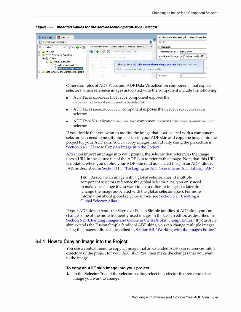
Changing an Image for a Component Selector
Working with Images and Color in Your ADF Skin 6-9
Figure 6–7 Inherited Values for the sort-descending-icon-style Selector
Other examples of ADF Faces and ADF Data Visualization components that expose selectors which reference images associated with the component include the following:
■ ADF Faces progressIndicator component exposes the determinate-empty-icon-style selector.
■ ADF Faces panelAccordion component exposes the disclosed-icon-style selector.
■ ADF Data Visualization mapToolbar component exposes the zoomin-enable-icon selector.
If you decide that you want to modify the image that is associated with a component selector, you need to modify the selector in your ADF skin and copy the image into the project for your ADF skin. You can copy images individually using the procedure in Section 6.4.1, "How to Copy an Image into the Project."
After you import an image into your project, the selector that references the image uses a URL in the source file of the ADF skin to refer to this image. Note that this URL is updated when you deploy your ADF skin (and associated files) in an ADF Library JAR, as described in Section 11.3, "Packaging an ADF Skin into an ADF Library JAR."
If your ADF skin extends the Skyros or Fusion Simple families of ADF skin, you can change some of the more frequently used images in the design editor, as described in Section 6.2, "Changing Images and Colors in the ADF Skin Design Editor." If your ADF skin extends the Fusion Simple family of ADF skins, you can change multiple images using the images editor, as described in Section 6.5, "Working with the Images Editor."
6.4.1 How to Copy an Image into the ProjectYou use a context menu to copy an image that an extended ADF skin references into a directory of the project for your ADF skin. You then make the changes that you want to the image.
To copy an ADF skin image into your project:1. In the Selector Tree of the selectors editor, select the selector that references the
image you want to change.
Tip: Associate an image with a global selector alias. If multiple component selectors reference the global selector alias, you only need to make one change if you want to use a different image at a later time (change the image associated with the global selector alias). For more information about global selector aliases, see Section 8.2, "Creating a Global Selector Alias."

Changing an Image for a Component Selector
6-10 Developing ADF Skins with Oracle ADF Skin Editor
For example, select the ADF Faces column component's sort-descending-icon-style selector to change the sort ascending icon, as shown in Figure 6–8.
Figure 6–8 Column Component's sort-descending-icon-style Selector
2. In the Properties window, expand the Common section and select Copy Image from the Background Image list, as shown in Figure 6–9.
Figure 6–9 Copy Image Menu to Import an Image into ADF Skin Project
This copies the image into the project for your ADF skin.
6.4.2 What Happens When You Copy an Image into the Project The image is copied into a subdirectory that is generated in the project of your ADF skin. For example, if you decided to copy the image that the ADF Faces column component's sort-ascending-icon-style selector references, the colSort_asc_ena.png file is copied to the following directory:
/public_html/skins/skin1/images/af_column
where af_column refers to the ADF Faces column component.
The relative URL value of the property in the Properties window is modified to reference the new location of the image. Figure 6–10 shows an example.
In addition, the Properties window indicates that the selector no longer inherits the image from the extended ADF skin by displaying a green icon to the left of the property label. Figure 6–10 shows the Properties window after importing the colSort_asc_ena.png file into the project for the ADF skin. Note that the ADF skin still inherits the values for the Height and Width properties from the extended ADF skin.
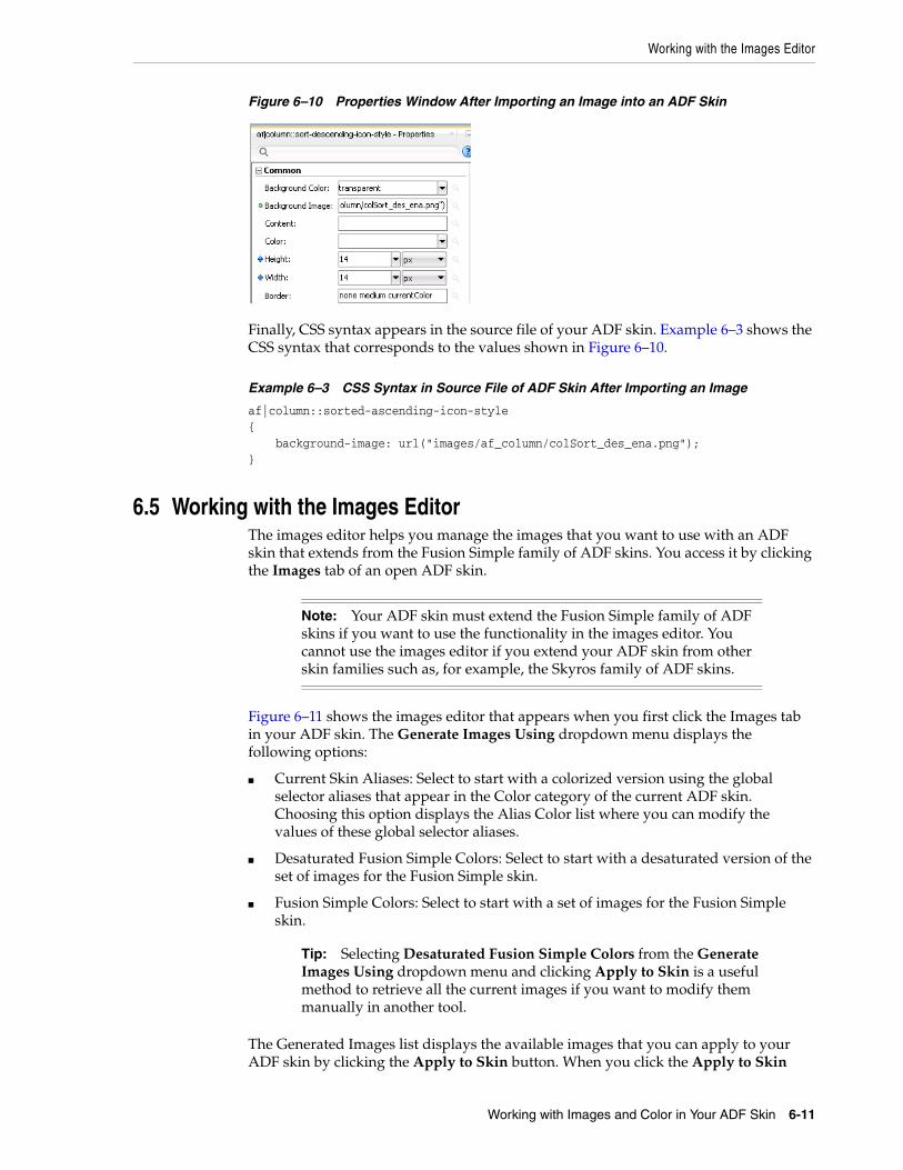
Working with the Images Editor
Working with Images and Color in Your ADF Skin 6-11
Figure 6–10 Properties Window After Importing an Image into an ADF Skin
Finally, CSS syntax appears in the source file of your ADF skin. Example 6–3 shows the CSS syntax that corresponds to the values shown in Figure 6–10.
Example 6–3 CSS Syntax in Source File of ADF Skin After Importing an Image
af|column::sorted-ascending-icon-style{ background-image: url("images/af_column/colSort_des_ena.png");}
6.5 Working with the Images EditorThe images editor helps you manage the images that you want to use with an ADF skin that extends from the Fusion Simple family of ADF skins. You access it by clicking the Images tab of an open ADF skin.
Figure 6–11 shows the images editor that appears when you first click the Images tab in your ADF skin. The Generate Images Using dropdown menu displays the following options:
■ Current Skin Aliases: Select to start with a colorized version using the global selector aliases that appear in the Color category of the current ADF skin. Choosing this option displays the Alias Color list where you can modify the values of these global selector aliases.
■ Desaturated Fusion Simple Colors: Select to start with a desaturated version of the set of images for the Fusion Simple skin.
■ Fusion Simple Colors: Select to start with a set of images for the Fusion Simple skin.
The Generated Images list displays the available images that you can apply to your ADF skin by clicking the Apply to Skin button. When you click the Apply to Skin
Note: Your ADF skin must extend the Fusion Simple family of ADF skins if you want to use the functionality in the images editor. You cannot use the images editor if you extend your ADF skin from other skin families such as, for example, the Skyros family of ADF skins.
Tip: Selecting Desaturated Fusion Simple Colors from the Generate Images Using dropdown menu and clicking Apply to Skin is a useful method to retrieve all the current images if you want to modify them manually in another tool.
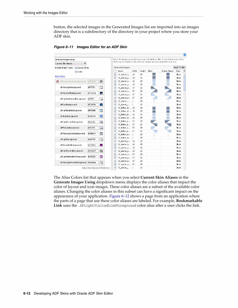
Working with the Images Editor
6-12 Developing ADF Skins with Oracle ADF Skin Editor
button, the selected images in the Generated Images list are imported into an images directory that is a subdirectory of the directory in your project where you store your ADF skin.
Figure 6–11 Images Editor for an ADF Skin
The Alias Colors list that appears when you select Current Skin Aliases in the Generate Images Using dropdown menu displays the color aliases that impact the color of layout and icon images. These color aliases are a subset of the available color aliases. Changing the color aliases in this subset can have a significant impact on the appearance of your application. Figure 6–12 shows a page from an application where the parts of a page that use these color aliases are labeled. For example, Bookmarkable Link uses the .AFLightVisitedLinkForeground color alias after a user clicks the link.
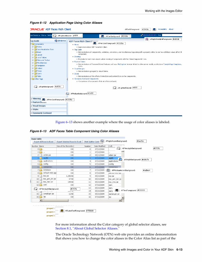
Working with the Images Editor
Working with Images and Color in Your ADF Skin 6-13
Figure 6–12 Application Page Using Color Aliases
Figure 6–13 shows another example where the usage of color aliases is labeled.
Figure 6–13 ADF Faces Table Component Using Color Aliases
For more information about the Color category of global selector aliases, see Section 8.1, "About Global Selector Aliases."
The Oracle Technology Network (OTN) web site provides an online demonstration that shows you how to change the color aliases in the Color Alias list as part of the
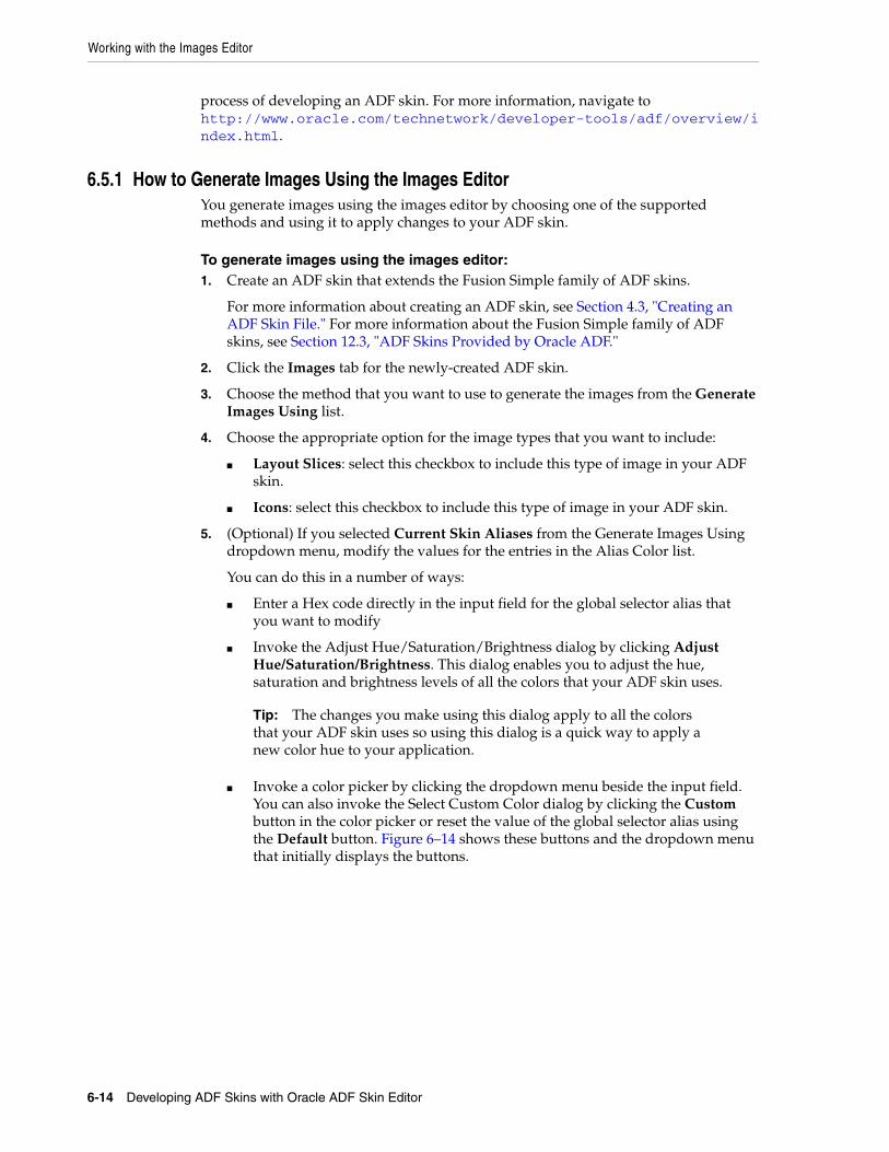
Working with the Images Editor
6-14 Developing ADF Skins with Oracle ADF Skin Editor
process of developing an ADF skin. For more information, navigate to http://www.oracle.com/technetwork/developer-tools/adf/overview/index.html.
6.5.1 How to Generate Images Using the Images EditorYou generate images using the images editor by choosing one of the supported methods and using it to apply changes to your ADF skin.
To generate images using the images editor:1. Create an ADF skin that extends the Fusion Simple family of ADF skins.
For more information about creating an ADF skin, see Section 4.3, "Creating an ADF Skin File." For more information about the Fusion Simple family of ADF skins, see Section 12.3, "ADF Skins Provided by Oracle ADF."
2. Click the Images tab for the newly-created ADF skin.
3. Choose the method that you want to use to generate the images from the Generate Images Using list.
4. Choose the appropriate option for the image types that you want to include:
■ Layout Slices: select this checkbox to include this type of image in your ADF skin.
■ Icons: select this checkbox to include this type of image in your ADF skin.
5. (Optional) If you selected Current Skin Aliases from the Generate Images Using dropdown menu, modify the values for the entries in the Alias Color list.
You can do this in a number of ways:
■ Enter a Hex code directly in the input field for the global selector alias that you want to modify
■ Invoke the Adjust Hue/Saturation/Brightness dialog by clicking Adjust Hue/Saturation/Brightness. This dialog enables you to adjust the hue, saturation and brightness levels of all the colors that your ADF skin uses.
■ Invoke a color picker by clicking the dropdown menu beside the input field. You can also invoke the Select Custom Color dialog by clicking the Custom button in the color picker or reset the value of the global selector alias using the Default button. Figure 6–14 shows these buttons and the dropdown menu that initially displays the buttons.
Tip: The changes you make using this dialog apply to all the colors that your ADF skin uses so using this dialog is a quick way to apply a new color hue to your application.
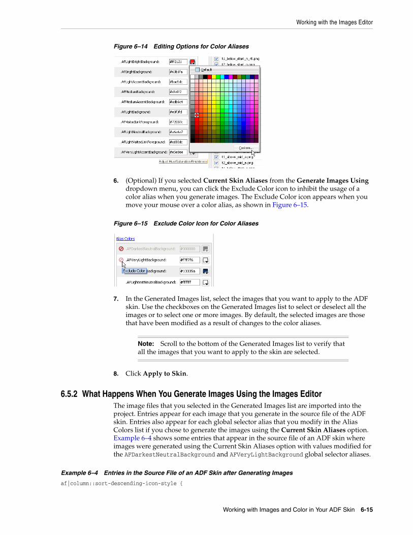
Working with the Images Editor
Working with Images and Color in Your ADF Skin 6-15
Figure 6–14 Editing Options for Color Aliases
6. (Optional) If you selected Current Skin Aliases from the Generate Images Using dropdown menu, you can click the Exclude Color icon to inhibit the usage of a color alias when you generate images. The Exclude Color icon appears when you move your mouse over a color alias, as shown in Figure 6–15.
Figure 6–15 Exclude Color Icon for Color Aliases
7. In the Generated Images list, select the images that you want to apply to the ADF skin. Use the checkboxes on the Generated Images list to select or deselect all the images or to select one or more images. By default, the selected images are those that have been modified as a result of changes to the color aliases.
8. Click Apply to Skin.
6.5.2 What Happens When You Generate Images Using the Images EditorThe image files that you selected in the Generated Images list are imported into the project. Entries appear for each image that you generate in the source file of the ADF skin. Entries also appear for each global selector alias that you modify in the Alias Colors list if you chose to generate the images using the Current Skin Aliases option. Example 6–4 shows some entries that appear in the source file of an ADF skin where images were generated using the Current Skin Aliases option with values modified for the AFDarkestNeutralBackground and AFVeryLightBackground global selector aliases.
Example 6–4 Entries in the Source File of an ADF Skin after Generating Images
af|column::sort-descending-icon-style {
Note: Scroll to the bottom of the Generated Images list to verify that all the images that you want to apply to the skin are selected.

Providing a Simple Border Style for ADF Skins
6-16 Developing ADF Skins with Oracle ADF Skin Editor
background-image: url("images/generated/META-INF/adf/images/fusion/sort_des_ena.png"); } af|dvt-map::overview-window-maximize-active-icon { content: url("images/generated/bi/images/geoMap/panel_close_dwn.png"); }
.AFDarkestNeutralBackground:alias{ background-color: #00ff00; }.AFVeryLightBackground:alias{ background-color: #00ff00; }
6.6 Providing a Simple Border Style for ADF SkinsYou can specify a simple border style for ADF skins that extend the simple skin. This reduces the number of selectors that components, such as the decorativeBox component and panel components (for example, panelBox and panelAccordion), render at runtime and, as a result, simplifies the DOM structure.
This capability is available in Release 11.1.1.7.0 or later and 12.1.2 or later of Oracle ADF. By default, the Skyros skin and ADF skins that extend from Skyros specify a simple border style. If your ADF skin extends from one of the other ADF skins provided by Oracle ADF, as described in Section 12.3, "ADF Skins Provided by Oracle ADF," you need to configure the trinidad-skins.xml file.
You configure the <feature> element of the trinidad-skins.xml file where you register your ADF skin. Example 6–5 demonstrates how to enable a simple border style for the mySkin ADF skin in the trinidad-skins.xml file.
Example 6–5 Enabling a Simple Border Style in the trinidad-skins.xml File
<?xml version="1.0" encoding="ISO-8859-1"?><skins xmlns="http://myfaces.apache.org/trinidad/skin"> <skin> <id> mySkin.desktop </id> <family> mySkin </family> <extends>simple.desktop</extends> <render-kit-id> org.apache.myfaces.trinidad.desktop </render-kit-id> <style-sheet-name> skins/mySkin/mySkin.css </style-sheet-name> <bundle-name> myBundle </bundle-name> <translation-source></translation-source> <features> <feature name="BORDER_STYLE">simple</feature> </features> </skin>

Providing a Simple Border Style for ADF Skins
Working with Images and Color in Your ADF Skin 6-17
</skins>

Providing a Simple Border Style for ADF Skins
6-18 Developing ADF Skins with Oracle ADF Skin Editor
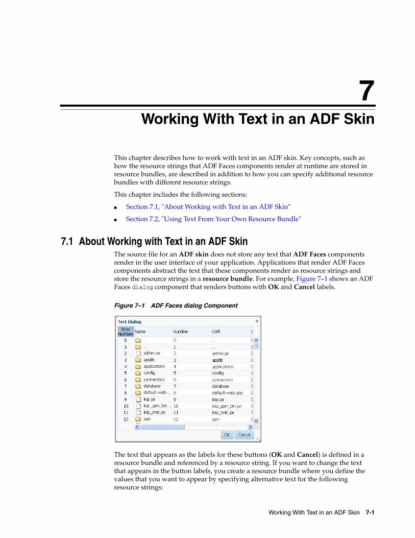
7
Working With Text in an ADF Skin 7-1
7Working With Text in an ADF Skin
This chapter describes how to work with text in an ADF skin. Key concepts, such as how the resource strings that ADF Faces components render at runtime are stored in resource bundles, are described in addition to how you can specify additional resource bundles with different resource strings.
This chapter includes the following sections:
■ Section 7.1, "About Working with Text in an ADF Skin"
■ Section 7.2, "Using Text From Your Own Resource Bundle"
7.1 About Working with Text in an ADF SkinThe source file for an ADF skin does not store any text that ADF Faces components render in the user interface of your application. Applications that render ADF Faces components abstract the text that these components render as resource strings and store the resource strings in a resource bundle. For example, Figure 7–1 shows an ADF Faces dialog component that renders buttons with OK and Cancel labels.
Figure 7–1 ADF Faces dialog Component
The text that appears as the labels for these buttons (OK and Cancel) is defined in a resource bundle and referenced by a resource string. If you want to change the text that appears in the button labels, you create a resource bundle where you define the values that you want to appear by specifying alternative text for the following resource strings:
Using Text From Your Own Resource Bundle
7-2 Developing ADF Skins with Oracle ADF Skin Editor
■ af_dialog.LABEL_OK
■ af_dialog.LABEL_CANCEL
In addition to the resource strings that define the text to appear in the user interface for specific components, there are a range of resource strings that define text to appear that is not specific to any particular component. These resource strings are referred to as global resource strings. For more information about the resource strings for ADF Faces components and global resource strings, see the Tag Reference for Oracle ADF Faces Skin Selectors (for the release that pertains to the application you are skinning).
ADF Faces components provide automatic translation. The resource bundle used for the ADF Faces components' skin is translated into 28 languages. If, for example, an end user sets the browser to use the German (Germany) language, any text contained within the components automatically displays in German. For this reason, if you create a resource bundle for a new ADF skin, you must also create localized versions of that resource bundle for any other languages your web application supports.
For more information about creating resource bundles, resource strings, and localizing ADF Faces components, see the "Internationalizing and Localizing Pages" chapter in Developing Web User Interfaces with Oracle ADF Faces (for the release that pertains to the application you are skinning).
7.2 Using Text From Your Own Resource BundleIf you enter alternative text in a resource bundle to override the default text values that render in the user interface of the ADF Faces components in your application, you need to specify this resource bundle for your application. At runtime, the application renders the alternative text in your resource bundle for the resource strings that you override. For resource strings that you do not override, the application renders the text defined in the base resource bundle. For example, Figure 7–4 shows an ADF Faces dialog component where the application developer overrides the default value for the af_dialog.LABEL_OK resource string from OK to Yay while the default value for the af_dialog.LABEL_CANCEL resource string remains unchanged. That is, the application developer did not define a value for the af_dialog.LABEL_CANCEL resource string in a resource bundle; the application references the base resource bundle for this resource string's value.
Figure 7–2 Overridden and Default Values Resource Strings
For more information about how to create a resource bundle and how to define string key values, see the "Internationalizing and Localizing Pages" chapter in Developing Web User Interfaces with Oracle ADF Faces (for the release that pertains to the application you are skinning).
Note: By default, a resource bundle (skinBundle.properties) is created in your project when you create a new ADF skin, as described in Section 4.3, "Creating an ADF Skin File."
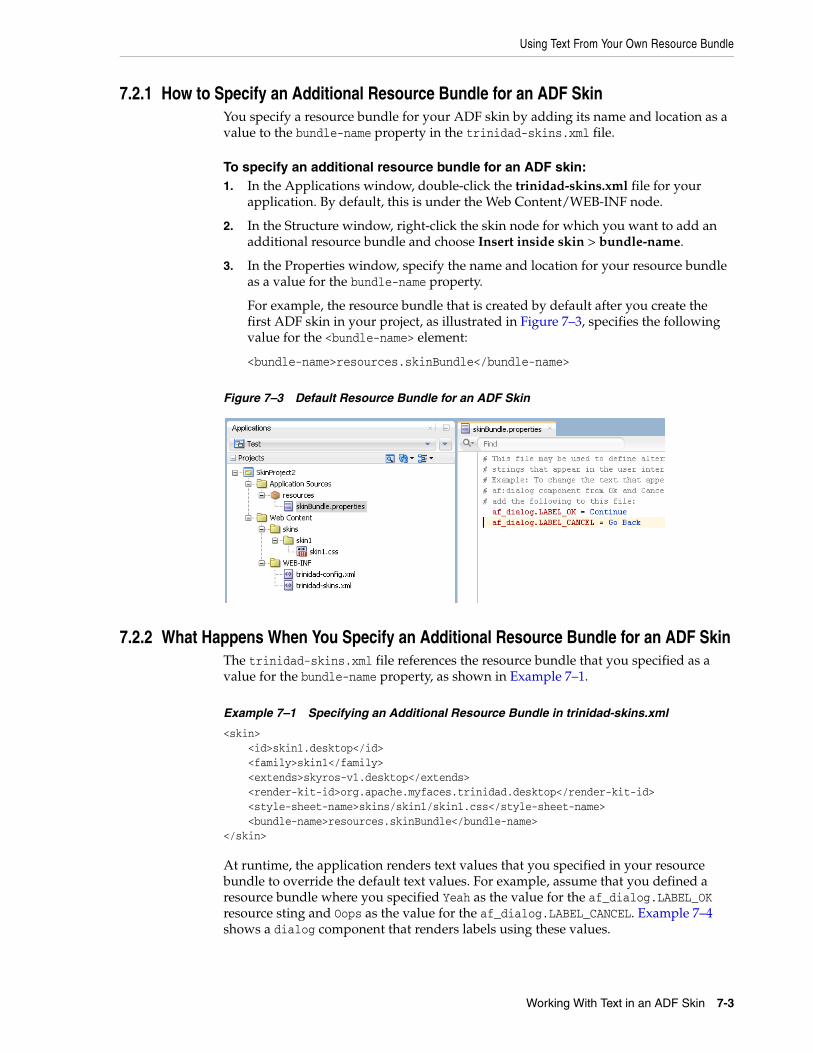
Using Text From Your Own Resource Bundle
Working With Text in an ADF Skin 7-3
7.2.1 How to Specify an Additional Resource Bundle for an ADF SkinYou specify a resource bundle for your ADF skin by adding its name and location as a value to the bundle-name property in the trinidad-skins.xml file.
To specify an additional resource bundle for an ADF skin:1. In the Applications window, double-click the trinidad-skins.xml file for your
application. By default, this is under the Web Content/WEB-INF node.
2. In the Structure window, right-click the skin node for which you want to add an additional resource bundle and choose Insert inside skin > bundle-name.
3. In the Properties window, specify the name and location for your resource bundle as a value for the bundle-name property.
For example, the resource bundle that is created by default after you create the first ADF skin in your project, as illustrated in Figure 7–3, specifies the following value for the <bundle-name> element:
<bundle-name>resources.skinBundle</bundle-name>
Figure 7–3 Default Resource Bundle for an ADF Skin
7.2.2 What Happens When You Specify an Additional Resource Bundle for an ADF SkinThe trinidad-skins.xml file references the resource bundle that you specified as a value for the bundle-name property, as shown in Example 7–1.
Example 7–1 Specifying an Additional Resource Bundle in trinidad-skins.xml
<skin> <id>skin1.desktop</id> <family>skin1</family> <extends>skyros-v1.desktop</extends> <render-kit-id>org.apache.myfaces.trinidad.desktop</render-kit-id> <style-sheet-name>skins/skin1/skin1.css</style-sheet-name> <bundle-name>resources.skinBundle</bundle-name></skin>
At runtime, the application renders text values that you specified in your resource bundle to override the default text values. For example, assume that you defined a resource bundle where you specified Yeah as the value for the af_dialog.LABEL_OK resource sting and Oops as the value for the af_dialog.LABEL_CANCEL. Example 7–4 shows a dialog component that renders labels using these values.
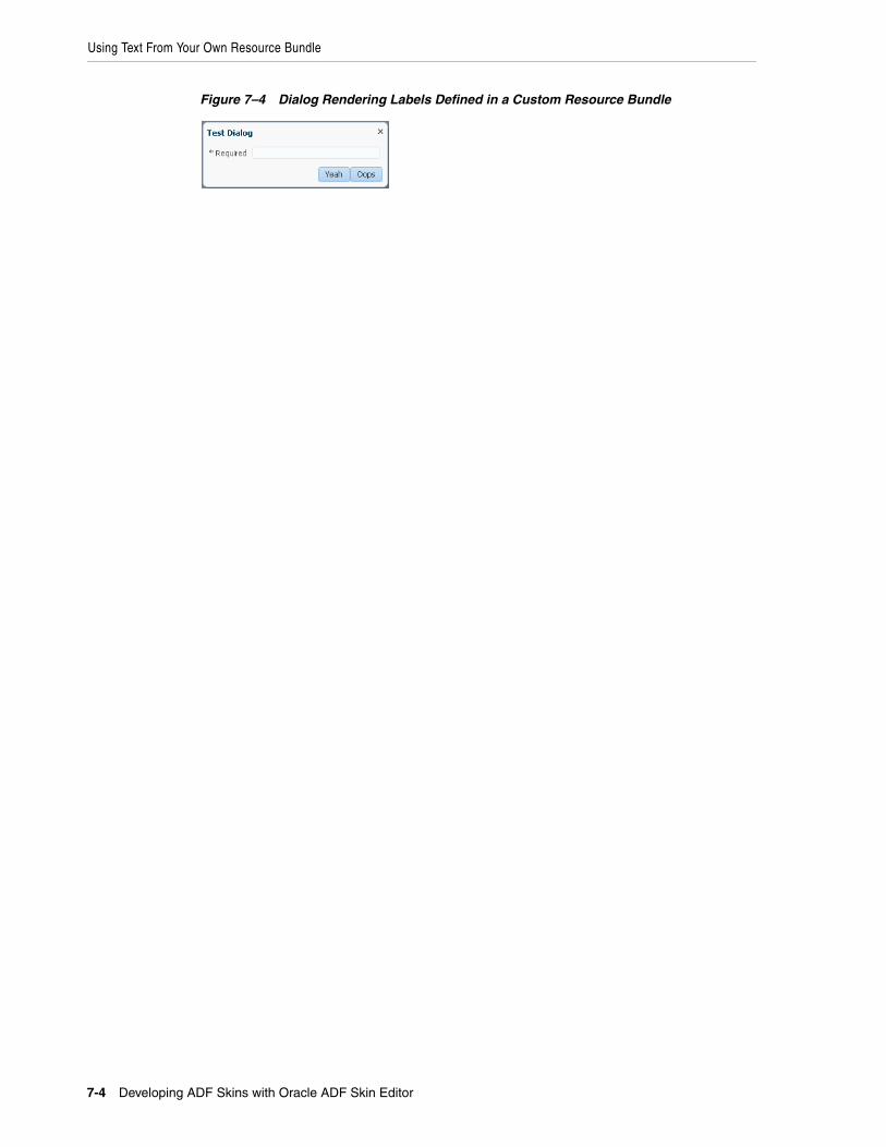
Using Text From Your Own Resource Bundle
7-4 Developing ADF Skins with Oracle ADF Skin Editor
Figure 7–4 Dialog Rendering Labels Defined in a Custom Resource Bundle
8
Working With Global Selector Aliases 8-1
8Working With Global Selector Aliases
This chapter describes how to work with global selector aliases. Information on how to create, modify, and apply a global selector alias is provided in addition to describing how to reference a property value from another selector.
This chapter includes the following sections:
■ Section 8.1, "About Global Selector Aliases"
■ Section 8.2, "Creating a Global Selector Alias"
■ Section 8.3, "Modifying a Global Selector Alias"
■ Section 8.4, "Applying a Global Selector Alias"
■ Section 8.5, "Referencing a Property Value from Another Selector"
8.1 About Global Selector AliasesA global selector alias defines style properties in one location in the ADF skin that you can apply to multiple ADF Faces and ADF Data Visualization components. A global selector alias may also be referred to as a selector alias, or simply a selector. The ADF skins provided by Oracle ADF, described in Section 1.4, "Inheritance Relationship of the ADF Skins Provided by Oracle ADF" and Section 12.3, "ADF Skins Provided by Oracle ADF" make extensive use of global selector aliases to define common style properties for text, messages, icons, colors and different groups of components. Many component-specific selectors inherit the styles defined for these global selector aliases. For example, the.AFDefaultFontFamily:alias global selector alias defines a default font family for all ADF Faces components in your application that display text. Any ADF skin that you create by extending from one of the ADF skins provided by Oracle ADF inherits the properties defined in the .AFDefaultFontFamily:alias global selector alias. Figure 8–1 shows how the selectors editor displays that the af|button selector inherits the value for font family from the.AFDefaultFontFamily:alias global selector alias.
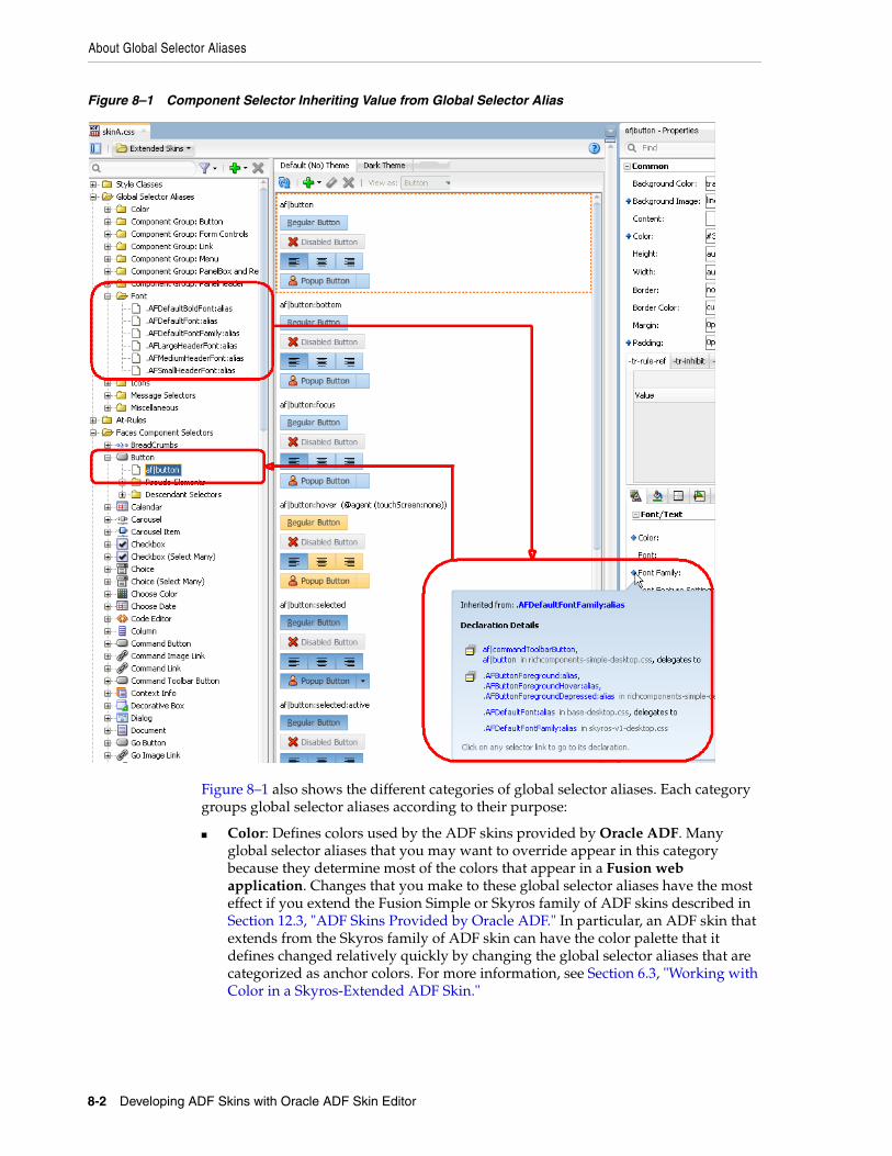
About Global Selector Aliases
8-2 Developing ADF Skins with Oracle ADF Skin Editor
Figure 8–1 Component Selector Inheriting Value from Global Selector Alias
Figure 8–1 also shows the different categories of global selector aliases. Each category groups global selector aliases according to their purpose:
■ Color: Defines colors used by the ADF skins provided by Oracle ADF. Many global selector aliases that you may want to override appear in this category because they determine most of the colors that appear in a Fusion web application. Changes that you make to these global selector aliases have the most effect if you extend the Fusion Simple or Skyros family of ADF skins described in Section 12.3, "ADF Skins Provided by Oracle ADF." In particular, an ADF skin that extends from the Skyros family of ADF skin can have the color palette that it defines changed relatively quickly by changing the global selector aliases that are categorized as anchor colors. For more information, see Section 6.3, "Working with Color in a Skyros-Extended ADF Skin."
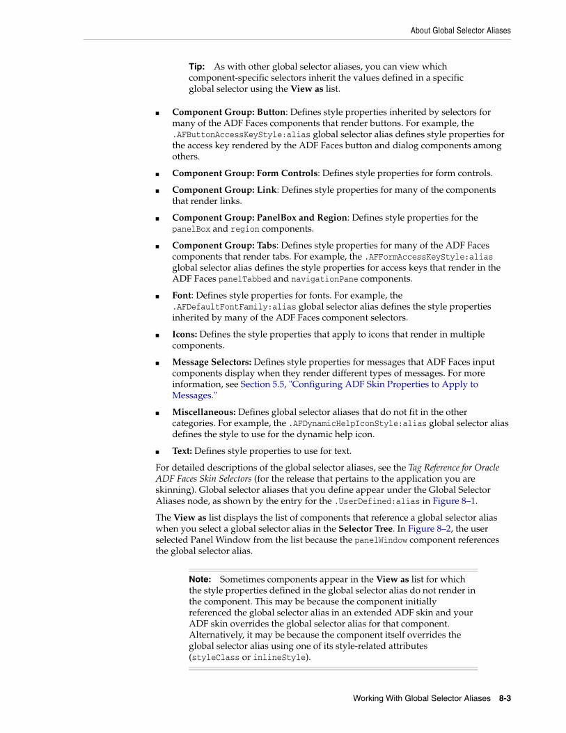
About Global Selector Aliases
Working With Global Selector Aliases 8-3
■ Component Group: Button: Defines style properties inherited by selectors for many of the ADF Faces components that render buttons. For example, the .AFButtonAccessKeyStyle:alias global selector alias defines style properties for the access key rendered by the ADF Faces button and dialog components among others.
■ Component Group: Form Controls: Defines style properties for form controls.
■ Component Group: Link: Defines style properties for many of the components that render links.
■ Component Group: PanelBox and Region: Defines style properties for the panelBox and region components.
■ Component Group: Tabs: Defines style properties for many of the ADF Faces components that render tabs. For example, the .AFFormAccessKeyStyle:alias global selector alias defines the style properties for access keys that render in the ADF Faces panelTabbed and navigationPane components.
■ Font: Defines style properties for fonts. For example, the .AFDefaultFontFamily:alias global selector alias defines the style properties inherited by many of the ADF Faces component selectors.
■ Icons: Defines the style properties that apply to icons that render in multiple components.
■ Message Selectors: Defines style properties for messages that ADF Faces input components display when they render different types of messages. For more information, see Section 5.5, "Configuring ADF Skin Properties to Apply to Messages."
■ Miscellaneous: Defines global selector aliases that do not fit in the other categories. For example, the .AFDynamicHelpIconStyle:alias global selector alias defines the style to use for the dynamic help icon.
■ Text: Defines style properties to use for text.
For detailed descriptions of the global selector aliases, see the Tag Reference for Oracle ADF Faces Skin Selectors (for the release that pertains to the application you are skinning). Global selector aliases that you define appear under the Global Selector Aliases node, as shown by the entry for the .UserDefined:alias in Figure 8–1.
The View as list displays the list of components that reference a global selector alias when you select a global selector alias in the Selector Tree. In Figure 8–2, the user selected Panel Window from the list because the panelWindow component references the global selector alias.
Tip: As with other global selector aliases, you can view which component-specific selectors inherit the values defined in a specific global selector using the View as list.
Note: Sometimes components appear in the View as list for which the style properties defined in the global selector alias do not render in the component. This may be because the component initially referenced the global selector alias in an extended ADF skin and your ADF skin overrides the global selector alias for that component. Alternatively, it may be because the component itself overrides the global selector alias using one of its style-related attributes (styleClass or inlineStyle).
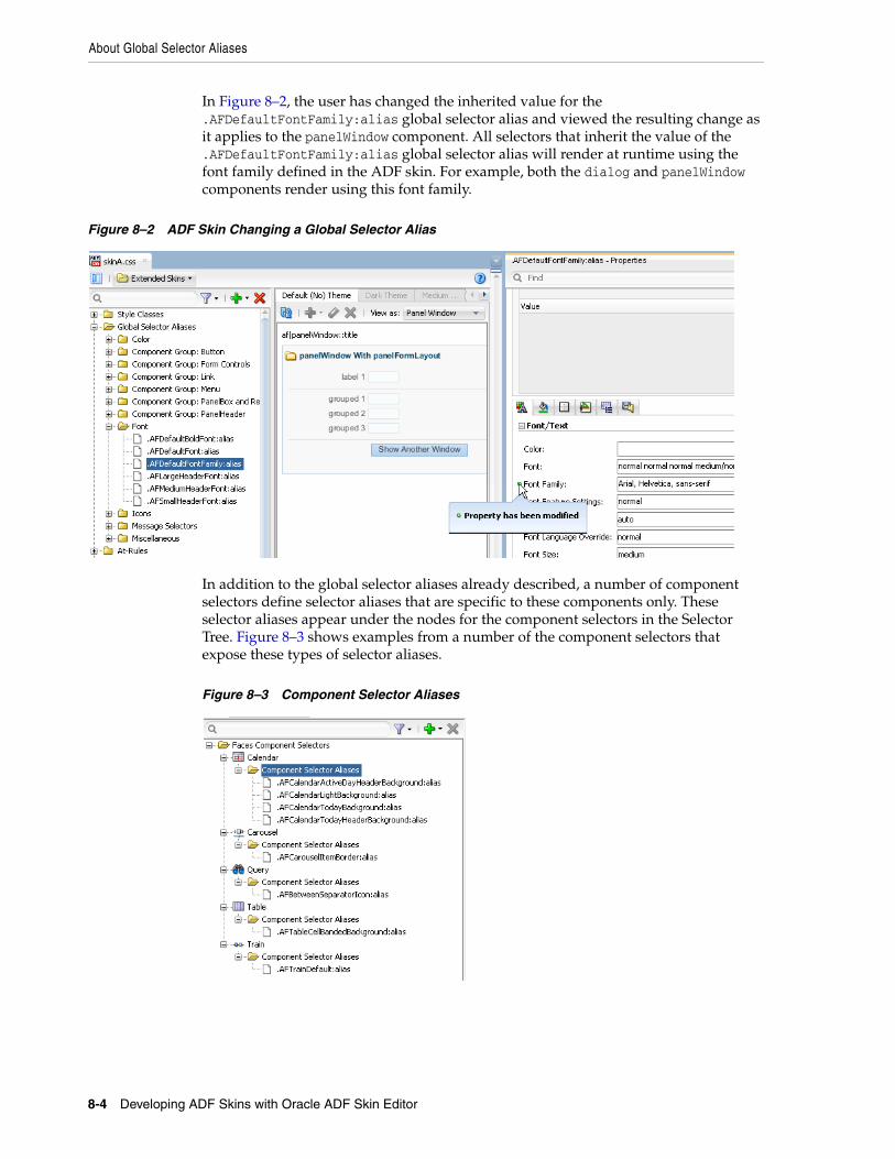
About Global Selector Aliases
8-4 Developing ADF Skins with Oracle ADF Skin Editor
In Figure 8–2, the user has changed the inherited value for the .AFDefaultFontFamily:alias global selector alias and viewed the resulting change as it applies to the panelWindow component. All selectors that inherit the value of the .AFDefaultFontFamily:alias global selector alias will render at runtime using the font family defined in the ADF skin. For example, both the dialog and panelWindow components render using this font family.
Figure 8–2 ADF Skin Changing a Global Selector Alias
In addition to the global selector aliases already described, a number of component selectors define selector aliases that are specific to these components only. These selector aliases appear under the nodes for the component selectors in the Selector Tree. Figure 8–3 shows examples from a number of the component selectors that expose these types of selector aliases.
Figure 8–3 Component Selector Aliases
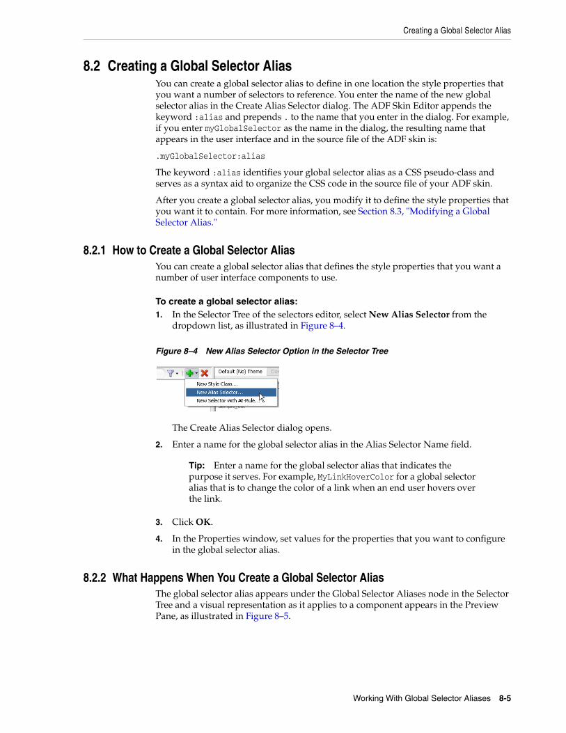
Creating a Global Selector Alias
Working With Global Selector Aliases 8-5
8.2 Creating a Global Selector AliasYou can create a global selector alias to define in one location the style properties that you want a number of selectors to reference. You enter the name of the new global selector alias in the Create Alias Selector dialog. The ADF Skin Editor appends the keyword :alias and prepends . to the name that you enter in the dialog. For example, if you enter myGlobalSelector as the name in the dialog, the resulting name that appears in the user interface and in the source file of the ADF skin is:
.myGlobalSelector:alias
The keyword :alias identifies your global selector alias as a CSS pseudo-class and serves as a syntax aid to organize the CSS code in the source file of your ADF skin.
After you create a global selector alias, you modify it to define the style properties that you want it to contain. For more information, see Section 8.3, "Modifying a Global Selector Alias."
8.2.1 How to Create a Global Selector Alias You can create a global selector alias that defines the style properties that you want a number of user interface components to use.
To create a global selector alias:1. In the Selector Tree of the selectors editor, select New Alias Selector from the
dropdown list, as illustrated in Figure 8–4.
Figure 8–4 New Alias Selector Option in the Selector Tree
The Create Alias Selector dialog opens.
2. Enter a name for the global selector alias in the Alias Selector Name field.
3. Click OK.
4. In the Properties window, set values for the properties that you want to configure in the global selector alias.
8.2.2 What Happens When You Create a Global Selector Alias The global selector alias appears under the Global Selector Aliases node in the Selector Tree and a visual representation as it applies to a component appears in the Preview Pane, as illustrated in Figure 8–5.
Tip: Enter a name for the global selector alias that indicates the purpose it serves. For example, MyLinkHoverColor for a global selector alias that is to change the color of a link when an end user hovers over the link.

Modifying a Global Selector Alias
8-6 Developing ADF Skins with Oracle ADF Skin Editor
Figure 8–5 Newly-Created Global Selector Alias
CSS syntax for the global selector alias that you create appears in the source file of the ADF skin. Example 8–1 shows the entries that appear in the source file of the ADF skin in Figure 8–5.
Example 8–1 CSS Syntax for a Newly-Created Global Selector Alias
.MyLinkHoverColor:alias{}
8.3 Modifying a Global Selector AliasYou can modify any of the categories of global selector alias described in Section 8.1, "About Global Selector Aliases." Modifying a global selector alias that appears under the Global Selector Aliases node in the Selector Tree when you first create the ADF skin means that you override the inherited style properties defined in the parent ADF skin of your ADF skin. The parent ADF skin is the ADF skin from which your ADF skin extends. You chose the ADF skin from which to extend when you created an ADF skin, as described in Section 4.3, "Creating an ADF Skin File." After you modify a global selector alias, the component-specific selectors that inherit the style properties defined in the global selector alias use the modified values.
Modifying a global selector alias that you create in your ADF skin does not override any style properties inherited from the parent ADF skin.
8.3.1 How to Modify a Global Selector AliasYou modify a global selector alias by setting values for it in the Properties window. You then verify that the changes you make apply to the component-specific selectors as you intend.
To modify a global selector alias:1. In the Selector Tree of the selectors editor, select the global selector alias that you
want to modify.
For example, if you want to modify the global selector alias that defines the default font family, select it as illustrated in Figure 8–6.

Applying a Global Selector Alias
Working With Global Selector Aliases 8-7
Figure 8–6 Modifying a Global Selector Alias
2. In the Properties window, set values for the properties that you want to modify.
3. In the selectors editor, click the View as list to select a component-specific selector that inherits the property values defined in the global selector alias that you have just modified.
4. In the selectors editor, verify that the changes render for the component-specific selector as you intend. Repeat Steps 1 to 3 until you achieve the changes you want for the component-specific selectors that inherit from the global selector alias.
8.4 Applying a Global Selector Alias After you create a global selector alias in your ADF skin, you need to specify the ADF Faces and ADF Data Visualization components that you want to render at runtime using the style properties that you defined in the global selector alias.
Applying a global selector alias to an ADF Faces or ADF Data Visualization component requires you to:
■ Select the selector, pseudo-element, or pseudo-class for each component that you want to apply the style properties defined in the global selector alias. If you want to apply the style properties defined in your global selector alias to another global selector alias, select the target global selector alias.
■ Set the global selector alias as a value for the -tr-rule-ref- ADF skin property.
8.4.1 How to Apply a Global Selector Alias You apply a global selector alias by specifying it as a value for the -tr-rule-ref- ADF skin property.
To apply a global selector alias:1. In the Selector Tree of the selectors editor, select the item to which you want to
apply the global selector alias.
For example, select the inputText component's content pseudo-element if you want to apply the style properties defined in your global selector alias to the label for that component, as shown in Figure 8–7.
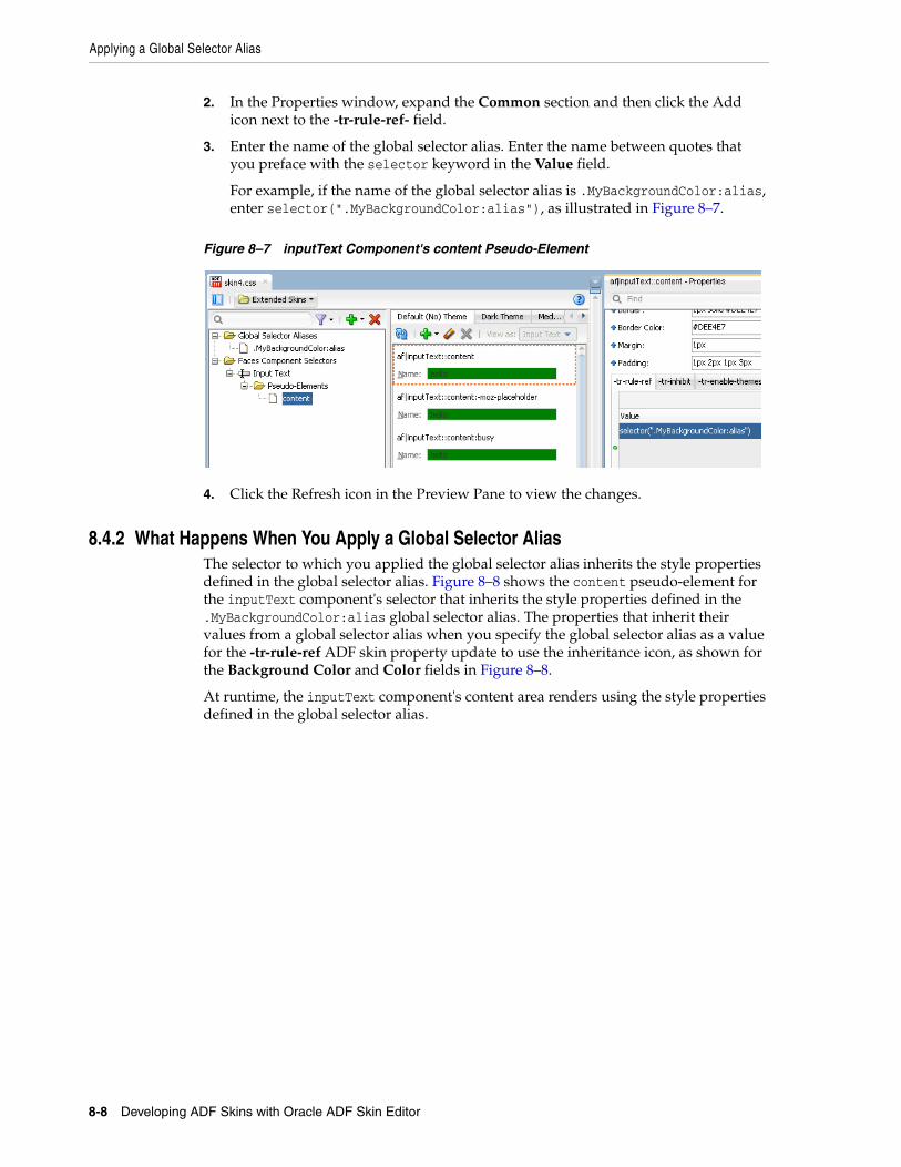
Applying a Global Selector Alias
8-8 Developing ADF Skins with Oracle ADF Skin Editor
2. In the Properties window, expand the Common section and then click the Add icon next to the -tr-rule-ref- field.
3. Enter the name of the global selector alias. Enter the name between quotes that you preface with the selector keyword in the Value field.
For example, if the name of the global selector alias is .MyBackgroundColor:alias, enter selector(".MyBackgroundColor:alias"), as illustrated in Figure 8–7.
Figure 8–7 inputText Component's content Pseudo-Element
4. Click the Refresh icon in the Preview Pane to view the changes.
8.4.2 What Happens When You Apply a Global Selector Alias The selector to which you applied the global selector alias inherits the style properties defined in the global selector alias. Figure 8–8 shows the content pseudo-element for the inputText component's selector that inherits the style properties defined in the .MyBackgroundColor:alias global selector alias. The properties that inherit their values from a global selector alias when you specify the global selector alias as a value for the -tr-rule-ref ADF skin property update to use the inheritance icon, as shown for the Background Color and Color fields in Figure 8–8.
At runtime, the inputText component's content area renders using the style properties defined in the global selector alias.
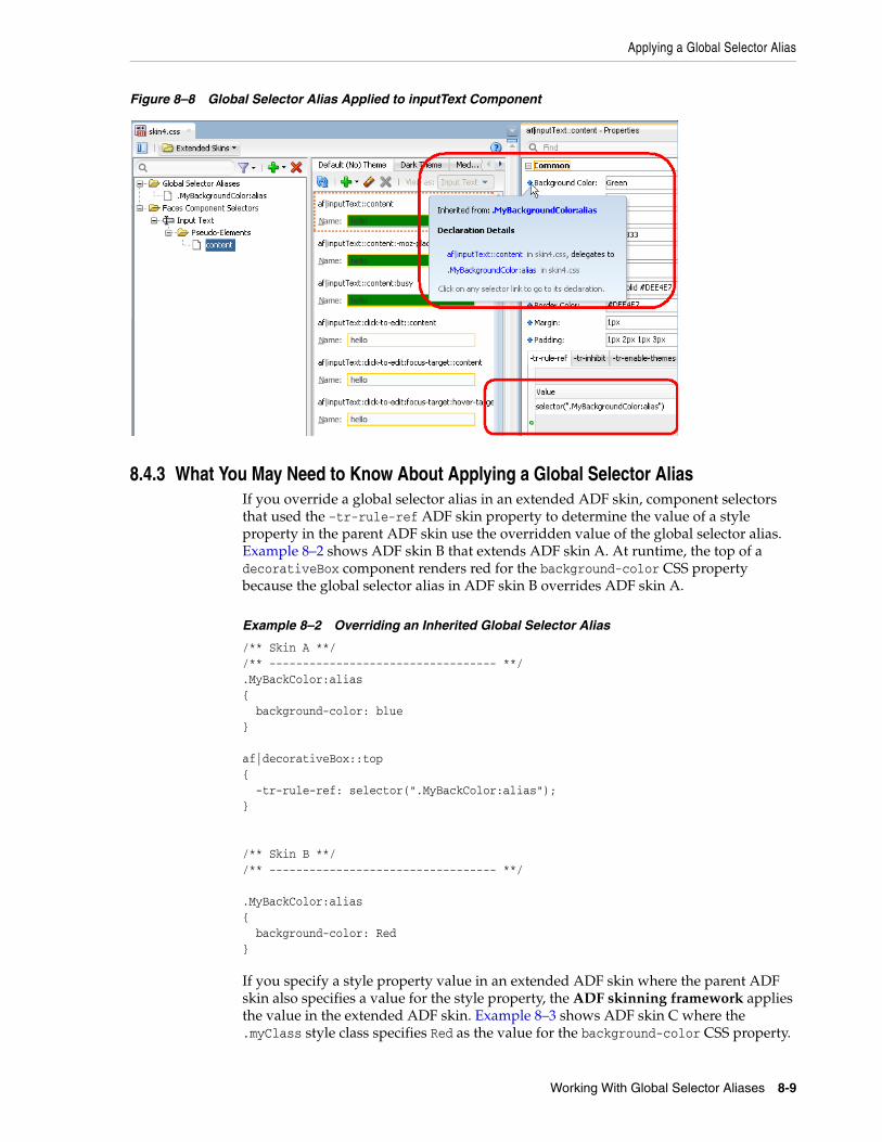
Applying a Global Selector Alias
Working With Global Selector Aliases 8-9
Figure 8–8 Global Selector Alias Applied to inputText Component
8.4.3 What You May Need to Know About Applying a Global Selector AliasIf you override a global selector alias in an extended ADF skin, component selectors that used the –tr-rule-ref ADF skin property to determine the value of a style property in the parent ADF skin use the overridden value of the global selector alias. Example 8–2 shows ADF skin B that extends ADF skin A. At runtime, the top of a decorativeBox component renders red for the background-color CSS property because the global selector alias in ADF skin B overrides ADF skin A.
Example 8–2 Overriding an Inherited Global Selector Alias
/** Skin A **//** ---------------------------------- **/.MyBackColor:alias { background-color: blue} af|decorativeBox::top { -tr-rule-ref: selector(".MyBackColor:alias");} /** Skin B **//** ---------------------------------- **/
.MyBackColor:alias { background-color: Red}
If you specify a style property value in an extended ADF skin where the parent ADF skin also specifies a value for the style property, the ADF skinning framework applies the value in the extended ADF skin. Example 8–3 shows ADF skin C where the .myClass style class specifies Red as the value for the background-color CSS property.
Referencing a Property Value from Another Selector
8-10 Developing ADF Skins with Oracle ADF Skin Editor
If an application uses ADF skin D (that extends ADF skin C), components that apply the .myClass style class apply Lime for the background-color CSS property. This is because the ADF skinning framework calculates the values of statements that include values in an ADF skin (like –tr-rule-ref) first. The ADF skinning framework then calculates specific properties (for example, background-color) next. As a result, the value for the background-color CSS property in ADF skin D (Lime) overrides the value for the –tr-rule-ref ADF skin property (Blue) or inherited values from ADF skin C (Red).
Example 8–3 Overriding a Local Global Selector Alias
/** ADF skin C **//** ---------------------------------- **/.myClass { background-color: Red} /** ADF skin D **//** ---------------------------------- **/.MyBackColor:alias { background-color: Blue;}
.myClass { background-color: Lime; -tr-rule-ref: selector(".MyBackColor:alias")}
Consider using tools, such as Firebug for the Mozilla Firefox browser (or similar for your browser), when you run your application to determine what style property value the ADF skinning framework applies to a component selector at runtime. For more information, see Section 11.2, "Testing Changes in Your ADF Skin."
8.5 Referencing a Property Value from Another SelectorRather than set a specific style property for each selector to which you want to apply the style property, you can reference the value of a property using the -tr-property-ref ADF skin property. You can configure this ADF skin property for global selector aliases and component-specific selectors. For example, you could define a value for the background-color property in a global selector alias and reference this value from multiple other selectors. If you decide at a later time to change the value of the background-color property, you change the value in the global selector alias. All selectors that reference the background-color property using the -tr-property-ref ADF skin property update to use the change you make. The -tr-property-ref ADF skin property can also be used with compact CSS properties like, for example, border.
Note: If you subsequently override the .myClass style class as follows in ADF skin D, the value that the ADF skinning framework applies for the background-color CSS property is Blue:
.myClass {-tr-rule-ref: selector(".MyBlueColor:alias")}
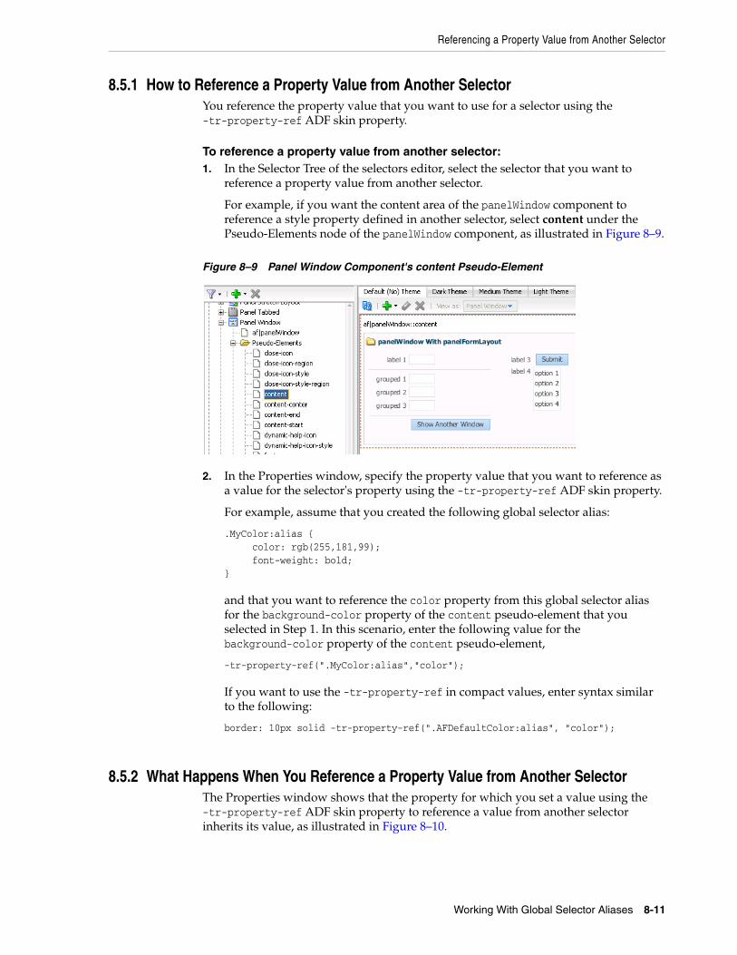
Referencing a Property Value from Another Selector
Working With Global Selector Aliases 8-11
8.5.1 How to Reference a Property Value from Another SelectorYou reference the property value that you want to use for a selector using the -tr-property-ref ADF skin property.
To reference a property value from another selector:1. In the Selector Tree of the selectors editor, select the selector that you want to
reference a property value from another selector.
For example, if you want the content area of the panelWindow component to reference a style property defined in another selector, select content under the Pseudo-Elements node of the panelWindow component, as illustrated in Figure 8–9.
Figure 8–9 Panel Window Component's content Pseudo-Element
2. In the Properties window, specify the property value that you want to reference as a value for the selector's property using the -tr-property-ref ADF skin property.
For example, assume that you created the following global selector alias:
.MyColor:alias { color: rgb(255,181,99); font-weight: bold;}
and that you want to reference the color property from this global selector alias for the background-color property of the content pseudo-element that you selected in Step 1. In this scenario, enter the following value for the background-color property of the content pseudo-element,
-tr-property-ref(".MyColor:alias","color");
If you want to use the -tr-property-ref in compact values, enter syntax similar to the following:
border: 10px solid -tr-property-ref(".AFDefaultColor:alias", "color");
8.5.2 What Happens When You Reference a Property Value from Another SelectorThe Properties window shows that the property for which you set a value using the -tr-property-ref ADF skin property to reference a value from another selector inherits its value, as illustrated in Figure 8–10.
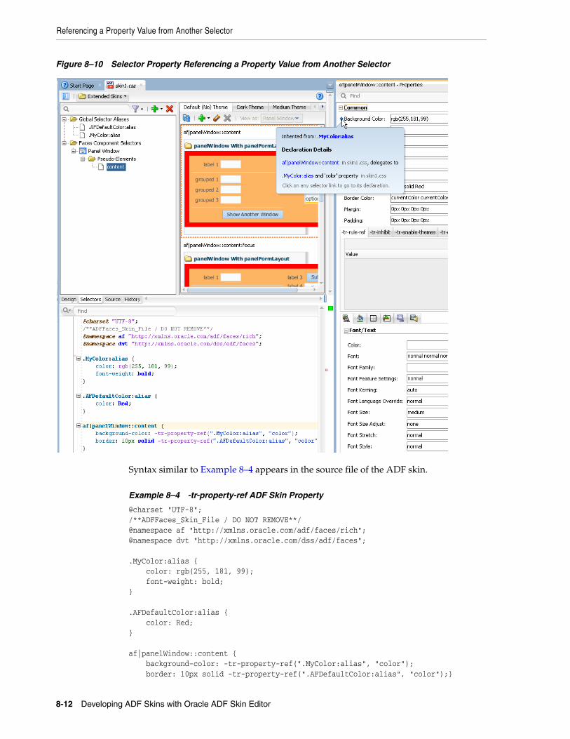
Referencing a Property Value from Another Selector
8-12 Developing ADF Skins with Oracle ADF Skin Editor
Figure 8–10 Selector Property Referencing a Property Value from Another Selector
Syntax similar to Example 8–4 appears in the source file of the ADF skin.
Example 8–4 -tr-property-ref ADF Skin Property
@charset "UTF-8";/**ADFFaces_Skin_File / DO NOT REMOVE**/@namespace af "http://xmlns.oracle.com/adf/faces/rich";@namespace dvt "http://xmlns.oracle.com/dss/adf/faces"; .MyColor:alias { color: rgb(255, 181, 99); font-weight: bold;} .AFDefaultColor:alias { color: Red;} af|panelWindow::content { background-color: -tr-property-ref(".MyColor:alias", "color"); border: 10px solid -tr-property-ref(".AFDefaultColor:alias", "color");}
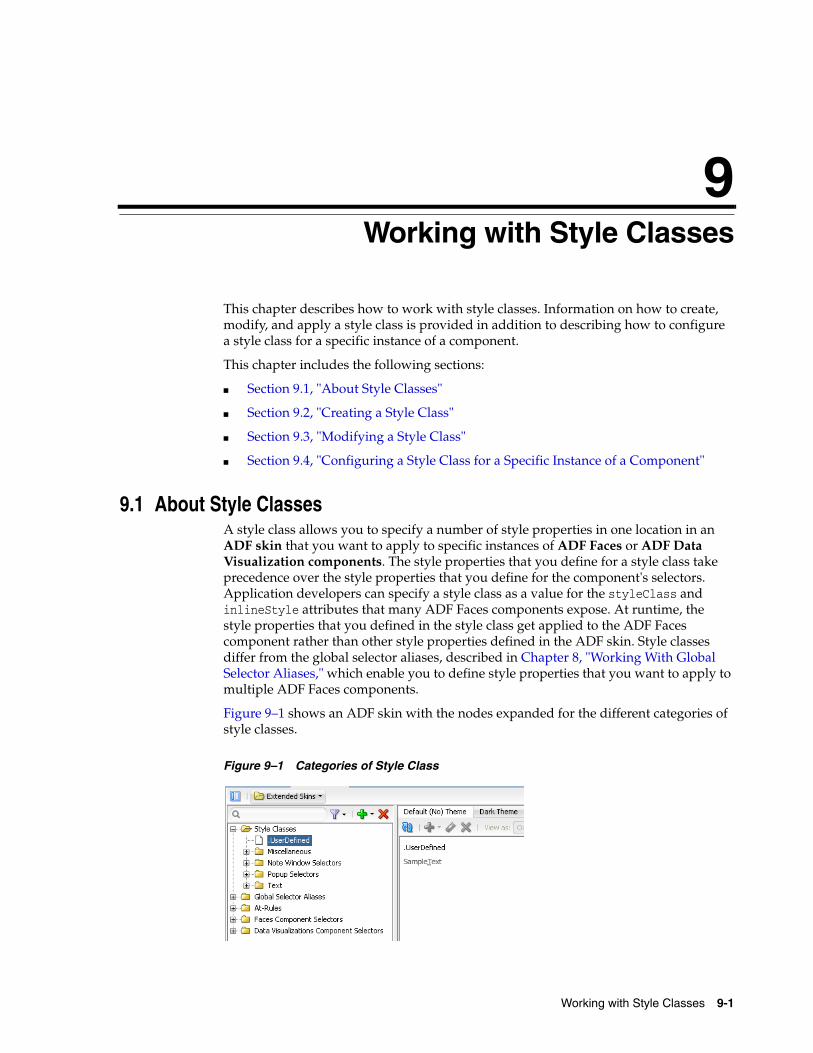
9
Working with Style Classes 9-1
9Working with Style Classes
This chapter describes how to work with style classes. Information on how to create, modify, and apply a style class is provided in addition to describing how to configure a style class for a specific instance of a component.
This chapter includes the following sections:
■ Section 9.1, "About Style Classes"
■ Section 9.2, "Creating a Style Class"
■ Section 9.3, "Modifying a Style Class"
■ Section 9.4, "Configuring a Style Class for a Specific Instance of a Component"
9.1 About Style ClassesA style class allows you to specify a number of style properties in one location in an ADF skin that you want to apply to specific instances of ADF Faces or ADF Data Visualization components. The style properties that you define for a style class take precedence over the style properties that you define for the component's selectors. Application developers can specify a style class as a value for the styleClass and inlineStyle attributes that many ADF Faces components expose. At runtime, the style properties that you defined in the style class get applied to the ADF Faces component rather than other style properties defined in the ADF skin. Style classes differ from the global selector aliases, described in Chapter 8, "Working With Global Selector Aliases," which enable you to define style properties that you want to apply to multiple ADF Faces components.
Figure 9–1 shows an ADF skin with the nodes expanded for the different categories of style classes.
Figure 9–1 Categories of Style Class
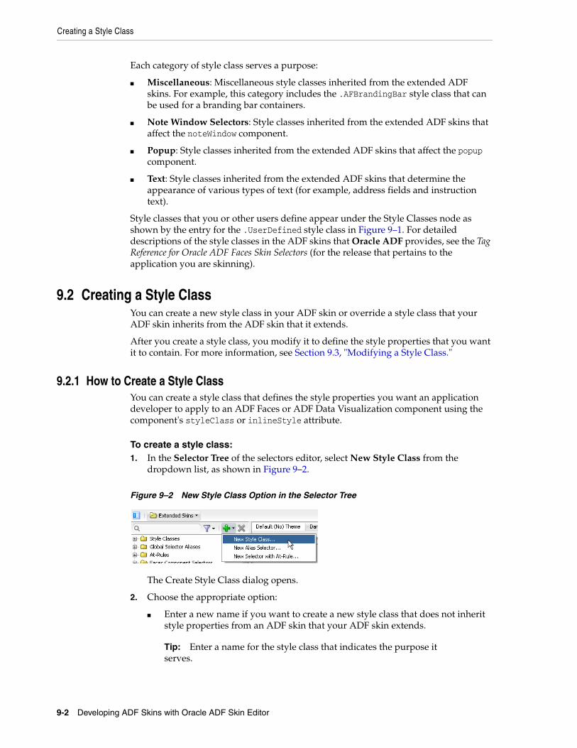
Creating a Style Class
9-2 Developing ADF Skins with Oracle ADF Skin Editor
Each category of style class serves a purpose:
■ Miscellaneous: Miscellaneous style classes inherited from the extended ADF skins. For example, this category includes the .AFBrandingBar style class that can be used for a branding bar containers.
■ Note Window Selectors: Style classes inherited from the extended ADF skins that affect the noteWindow component.
■ Popup: Style classes inherited from the extended ADF skins that affect the popup component.
■ Text: Style classes inherited from the extended ADF skins that determine the appearance of various types of text (for example, address fields and instruction text).
Style classes that you or other users define appear under the Style Classes node as shown by the entry for the .UserDefined style class in Figure 9–1. For detailed descriptions of the style classes in the ADF skins that Oracle ADF provides, see the Tag Reference for Oracle ADF Faces Skin Selectors (for the release that pertains to the application you are skinning).
9.2 Creating a Style ClassYou can create a new style class in your ADF skin or override a style class that your ADF skin inherits from the ADF skin that it extends.
After you create a style class, you modify it to define the style properties that you want it to contain. For more information, see Section 9.3, "Modifying a Style Class."
9.2.1 How to Create a Style ClassYou can create a style class that defines the style properties you want an application developer to apply to an ADF Faces or ADF Data Visualization component using the component's styleClass or inlineStyle attribute.
To create a style class:1. In the Selector Tree of the selectors editor, select New Style Class from the
dropdown list, as shown in Figure 9–2.
Figure 9–2 New Style Class Option in the Selector Tree
The Create Style Class dialog opens.
2. Choose the appropriate option:
■ Enter a new name if you want to create a new style class that does not inherit style properties from an ADF skin that your ADF skin extends.
Tip: Enter a name for the style class that indicates the purpose it serves.
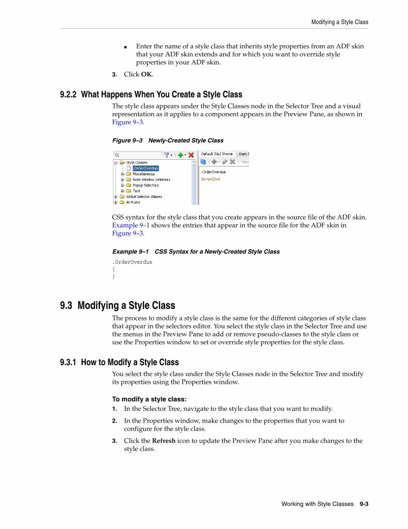
Modifying a Style Class
Working with Style Classes 9-3
■ Enter the name of a style class that inherits style properties from an ADF skin that your ADF skin extends and for which you want to override style properties in your ADF skin.
3. Click OK.
9.2.2 What Happens When You Create a Style ClassThe style class appears under the Style Classes node in the Selector Tree and a visual representation as it applies to a component appears in the Preview Pane, as shown in Figure 9–3.
Figure 9–3 Newly-Created Style Class
CSS syntax for the style class that you create appears in the source file of the ADF skin. Example 9–1 shows the entries that appear in the source file for the ADF skin in Figure 9–3.
Example 9–1 CSS Syntax for a Newly-Created Style Class
.OrderOverdue{}
9.3 Modifying a Style ClassThe process to modify a style class is the same for the different categories of style class that appear in the selectors editor. You select the style class in the Selector Tree and use the menus in the Preview Pane to add or remove pseudo-classes to the style class or use the Properties window to set or override style properties for the style class.
9.3.1 How to Modify a Style ClassYou select the style class under the Style Classes node in the Selector Tree and modify its properties using the Properties window.
To modify a style class:1. In the Selector Tree, navigate to the style class that you want to modify.
2. In the Properties window, make changes to the properties that you want to configure for the style class.
3. Click the Refresh icon to update the Preview Pane after you make changes to the style class.
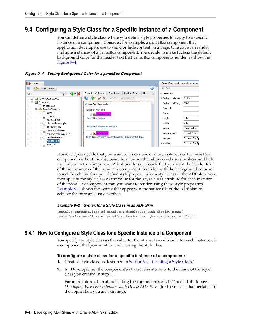
Configuring a Style Class for a Specific Instance of a Component
9-4 Developing ADF Skins with Oracle ADF Skin Editor
9.4 Configuring a Style Class for a Specific Instance of a ComponentYou can define a style class where you define style properties to apply to a specific instance of a component. Consider, for example, a panelBox component that application developers use to show or hide content on a page. One page can render multiple instances of a panelBox component. You decide to make fuchsia the default background color for the header text that panelBox components render, as shown in Figure 9–4.
Figure 9–4 Setting Background Color for a panelBox Component
However, you decide that you want to render one or more instances of the panelBox component without the disclosure link control that allows end users to show and hide the content in the component. Additionally, you decide that you want the header text of these instances of the panelBox component to render with the background color set to red. To achieve this, you define style properties for a style class in the ADF skin. You then specify the style class as the value for the styleClass attribute for each instance of the panelBox component that you want to render using these style properties. Example 9–2 shows the syntax that appears in the source file of the ADF skin to achieve the outcome just described.
Example 9–2 Syntax for a Style Class in an ADF Skin
.panelBoxInstanceClass af|panelBox::disclosure-link{display:none;}
.panelBoxInstanceClass af|panelBox::header-text {background-color: Red;}
9.4.1 How to Configure a Style Class for a Specific Instance of a ComponentYou specify the style class as the value for the styleClass attribute for each instance of a component that you want to render using the style class.
To configure a style class for a specific instance of a component:1. Create a style class, as described in Section 9.2, "Creating a Style Class."
2. In JDeveloper, set the component's styleClass attribute to the name of the style class you created in step 1.
For more information about setting the component's styleClass attribute, see Developing Web User Interfaces with Oracle ADF Faces (for the release that pertains to the application you are skinning).
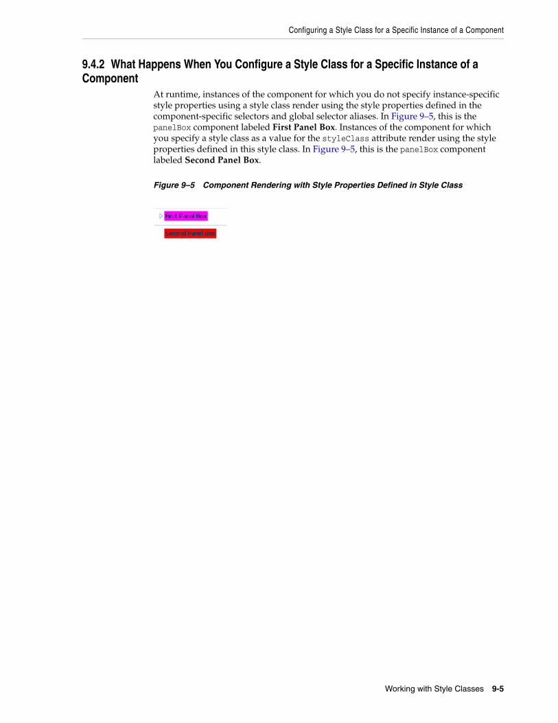
Configuring a Style Class for a Specific Instance of a Component
Working with Style Classes 9-5
9.4.2 What Happens When You Configure a Style Class for a Specific Instance of a Component
At runtime, instances of the component for which you do not specify instance-specific style properties using a style class render using the style properties defined in the component-specific selectors and global selector aliases. In Figure 9–5, this is the panelBox component labeled First Panel Box. Instances of the component for which you specify a style class as a value for the styleClass attribute render using the style properties defined in this style class. In Figure 9–5, this is the panelBox component labeled Second Panel Box.
Figure 9–5 Component Rendering with Style Properties Defined in Style Class

Configuring a Style Class for a Specific Instance of a Component
9-6 Developing ADF Skins with Oracle ADF Skin Editor
10
Working with At-Rules 10-1
10Working with At-Rules
This chapter describes how to work with at-rules. Information on how to create, modify, and apply an at-rule is provided in addition to describing the various types of at-rule that the ADF skinning framework supports.
This chapter includes the following sections:
■ Section 10.1, "About At-Rules in the ADF Skinning Framework"
■ Section 10.2, "Working with Server-Side At-Rules"
■ Section 10.3, "Working with Client-Side At-Rules"
■ Section 10.4, "Creating At-Rules in an ADF Skin"
10.1 About At-Rules in the ADF Skinning FrameworkCSS at-rules (at-rules) are a way to define style properties for when an application's page renders in a particular environment such as, for example, a browser, platform, locale or device. The ADF skinning framework supports a number of at-rules that allow you to define properties for selectors that you want to apply to a particular environment. For example, you may need to add some padding in Internet Explorer that you do not need on any other browser or perhaps you want to increase the size of icons if a page renders on a touch device. To style a selector for these scenarios, put the style properties inside an at-rule.
The ADF skinning framework divides the at-rules that it supports into two categories. It categorizes any at-rules that it passes directly to the user agent to interpret as a client-side at-rule and any at-rules that the ADF skinning framework itself interprets as a server-side at-rule. For more information about these categories, see Section 10.2, "Working with Server-Side At-Rules" and Section 10.3, "Working with Client-Side At-Rules."
You can use the selectors editor in the ADF Skin Editor and in JDeveloper to create at-rules in your ADF skin, as described in Section 10.4, "Creating At-Rules in an ADF Skin." At-rules that your ADF skin inherits or at-rules that you define in your ADF skin appear in the Selector Tree under the At-Rules node, as illustrated in Figure 10–5.
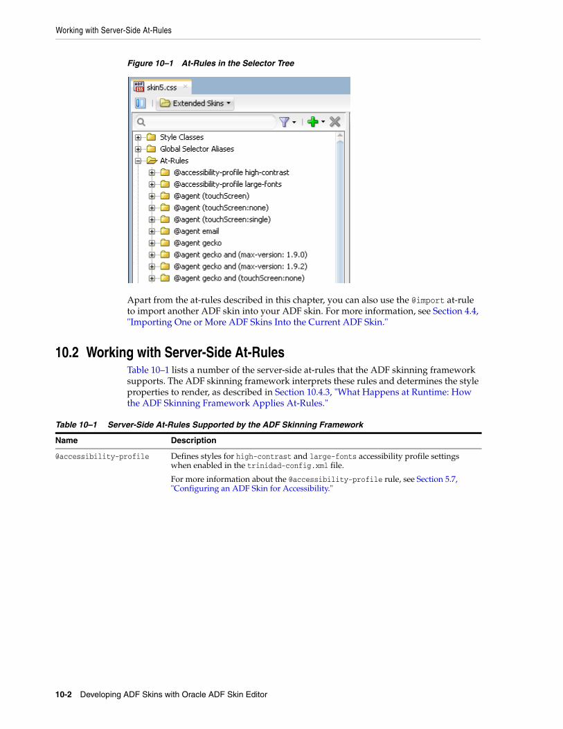
Working with Server-Side At-Rules
10-2 Developing ADF Skins with Oracle ADF Skin Editor
Figure 10–1 At-Rules in the Selector Tree
Apart from the at-rules described in this chapter, you can also use the @import at-rule to import another ADF skin into your ADF skin. For more information, see Section 4.4, "Importing One or More ADF Skins Into the Current ADF Skin."
10.2 Working with Server-Side At-RulesTable 10–1 lists a number of the server-side at-rules that the ADF skinning framework supports. The ADF skinning framework interprets these rules and determines the style properties to render, as described in Section 10.4.3, "What Happens at Runtime: How the ADF Skinning Framework Applies At-Rules."
Table 10–1 Server-Side At-Rules Supported by the ADF Skinning Framework
Name Description
@accessibility-profile Defines styles for high-contrast and large-fonts accessibility profile settings when enabled in the trinidad-config.xml file.
For more information about the @accessibility-profile rule, see Section 5.7, "Configuring an ADF Skin for Accessibility."

Working with Server-Side At-Rules
Working with At-Rules 10-3
Apart from the rules listed in Table 10–1, one of the most frequently used server-side at-rules is @agent. The @agent at-rule enables you to define styles to apply to one or more user agents. Table 10–2 describes the supported values to set an agent-specific style using the @agent at-rule.
Using the @agent at-rule, you can:
■ Specify styles for any version of Internet Explorer:
@agent ie
■ Optionally, specify a specific version of the agent using the and keyword. For example, to specify version 9 of Internet Explorer:
@agent ie and (version: 9)
■ Use comma-separated rules to specify styles for a number of agents. For example, use the following rule to specify styles for Versions 15 and 17 of Mozilla Firefox and for Internet Explorer 8.x:
@locale Specify a locale to define styles only for a particular language and country. You can specify either only the language or both the language and the country.
Note that the ADF skinning framework does not support the :lang pseudo class.
@mode Defines styles for when a page renders in a particular mode. This at-rule supports the following values:
■ quirks
■ standards
@platform Define platform styles. Supported values are:
■ android
■ blackberry
■ genericpda
■ iphone
■ linux
■ macos
■ nokia_s60
■ ppc (Pocket PC)
■ solaris
■ unix
■ windows
Table 10–2 Supported Values for the @agent At-Rule
blackberry googlebot nokia_s60
email ie opera
gecko konqueror oracle_ses
genericDesktop mozilla unknown
genericpda msnbot webkit (maps to Safari and Google Chrome)
Table 10–1 (Cont.) Server-Side At-Rules Supported by the ADF Skinning Framework
Name Description
Working with Server-Side At-Rules
10-4 Developing ADF Skins with Oracle ADF Skin Editor
@agent mozilla and (version: 15.*), mozilla and (version: 17.*), ie and (version: 8.*)
■ Note that the following two syntax examples specify the same rule:
@agent ie and (version: 8.*)
@agent ie and (version: 8)
To specify a rule for styles to apply only to Internet Explorer 8.0.x, write the following:
@agent ie and (version: 8.0.*)
■ Use the max-version and min-version keywords to specify a range of versions. For example, you can rewrite the following rule:
@agent ie and (version: 8), ie and (version: 9)
as:
@agent ie and (min-version: 8) and (max-version: 9)
to apply styles that you define to all versions of Internet Explorer 8 and 9.
You can also use the @agent rule to determine styles to apply to agents that are touch devices. The following examples show the syntax that you write in an ADF skin file to configure this capability.
@agent (touchScreen) { /* Touchscreen specific styles for all touch devices: both single and multiple touch. */}
@agent (touchScreen:single) { /* Styles specific for a touch device with single touch. */} @agent (touchScreen:multiple) { /* Styles specific for a touch device with multiple touch. */} Use the @agent (touchScreen:none) at-rule to specify styles that you do not want to render on a touch device. For example, the Fusion Simple family of ADF skin (fusionFx-simple-v1.2 and later) applies this at-rule to selectors configured to use the :hover pseudo class. This is because the :hover pseudo-class is not appropriate for use on a touch device. The @agent (touchScreen:none) at-rule wraps selectors that use the :hover pseudo-class, as in the following example:
@agent (touchScreen:none){
af|breadCrumbs:step:hover{
text-decoration:underline;
}
}
Figure 10–2 shows how the Selector Tree displays selectors to which the @agent (touchScreen:none) at-rule is applied.
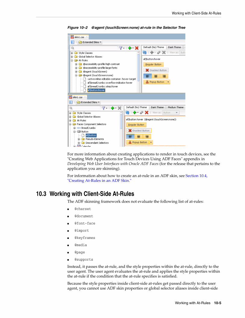
Working with Client-Side At-Rules
Working with At-Rules 10-5
Figure 10–2 @agent (touchScreen:none) at-rule in the Selector Tree
For more information about creating applications to render in touch devices, see the "Creating Web Applications for Touch Devices Using ADF Faces" appendix in Developing Web User Interfaces with Oracle ADF Faces (for the release that pertains to the application you are skinning).
For information about how to create an at-rule in an ADF skin, see Section 10.4, "Creating At-Rules in an ADF Skin."
10.3 Working with Client-Side At-RulesThe ADF skinning framework does not evaluate the following list of at-rules:
■ @charset
■ @document
■ @font-face
■ @import
■ @keyframes
■ @media
■ @page
■ @supports
Instead, it passes the at-rule, and the style properties within the at-rule, directly to the user agent. The user agent evaluates the at-rule and applies the style properties within the at-rule if the condition that the at-rule specifies is satisfied.
Because the style properties inside client-side at-rules get passed directly to the user agent, you cannot use ADF skin properties or global selector aliases inside client-side
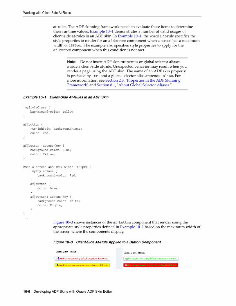
Working with Client-Side At-Rules
10-6 Developing ADF Skins with Oracle ADF Skin Editor
at-rules. The ADF skinning framework needs to evaluate these items to determine their runtime values. Example 10–1 demonstrates a number of valid usages of client-side at-rules in an ADF skin. In Example 10–1, the @media at-rule specifies the style properties to render for an af:button component when a screen has a maximum width of 1680px. The example also specifies style properties to apply for the af:button component when this condition is not met.
Example 10–1 Client-Side At-Rules in an ADF Skin
...
.myStyleClass { background-color: Yellow;} af|button { -tr-inhibit: background-image; color: Red;} af|button::access-key { background-color: Blue; color: Yellow;} @media screen and (max-width:1680px) { .myStyleClass { background-color: Red; } af|button { color: Lime; } af|button::access-key { background-color: White; color: Purple; }}...
Figure 10–3 shows instances of the af:button component that render using the appropriate style properties defined in Example 10–1 based on the maximum width of the screen where the components display.
Figure 10–3 Client-Side At-Rule Applied to a Button Component
Note: Do not insert ADF skin properties or global selector aliases inside a client-side at-rule. Unexpected behavior may result when you render a page using the ADF skin. The name of an ADF skin property is prefaced by -tr- and a global selector alias appends :alias. For more information, see Section 2.3, "Properties in the ADF Skinning Framework" and Section 8.1, "About Global Selector Aliases."
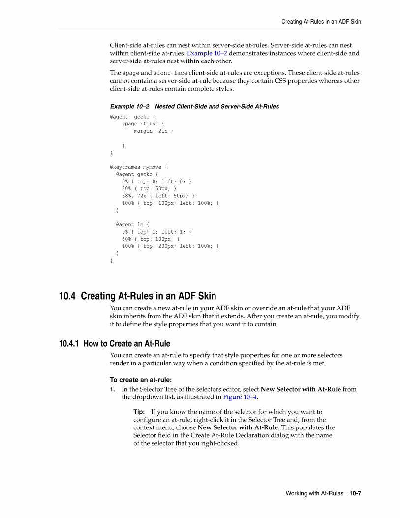
Creating At-Rules in an ADF Skin
Working with At-Rules 10-7
Client-side at-rules can nest within server-side at-rules. Server-side at-rules can nest within client-side at-rules. Example 10–2 demonstrates instances where client-side and server-side at-rules nest within each other.
The @page and @font-face client-side at-rules are exceptions. These client-side at-rules cannot contain a server-side at-rule because they contain CSS properties whereas other client-side at-rules contain complete styles.
Example 10–2 Nested Client-Side and Server-Side At-Rules
@agent gecko { @page :first { margin: 2in ; }} @keyframes mymove { @agent gecko { 0% { top: 0; left: 0; } 30% { top: 50px; } 68%, 72% { left: 50px; } 100% { top: 100px; left: 100%; } } @agent ie { 0% { top: 1; left: 1; } 30% { top: 100px; } 100% { top: 200px; left: 100%; } }}
10.4 Creating At-Rules in an ADF SkinYou can create a new at-rule in your ADF skin or override an at-rule that your ADF skin inherits from the ADF skin that it extends. After you create an at-rule, you modify it to define the style properties that you want it to contain.
10.4.1 How to Create an At-Rule You can create an at-rule to specify that style properties for one or more selectors render in a particular way when a condition specified by the at-rule is met.
To create an at-rule:1. In the Selector Tree of the selectors editor, select New Selector with At-Rule from
the dropdown list, as illustrated in Figure 10–4.
Tip: If you know the name of the selector for which you want to configure an at-rule, right-click it in the Selector Tree and, from the context menu, choose New Selector with At-Rule. This populates the Selector field in the Create At-Rule Declaration dialog with the name of the selector that you right-clicked.
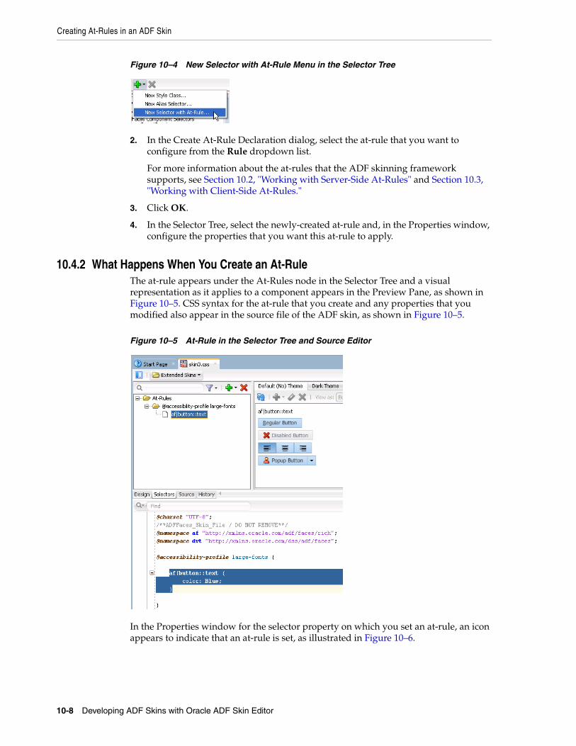
Creating At-Rules in an ADF Skin
10-8 Developing ADF Skins with Oracle ADF Skin Editor
Figure 10–4 New Selector with At-Rule Menu in the Selector Tree
2. In the Create At-Rule Declaration dialog, select the at-rule that you want to configure from the Rule dropdown list.
For more information about the at-rules that the ADF skinning framework supports, see Section 10.2, "Working with Server-Side At-Rules" and Section 10.3, "Working with Client-Side At-Rules."
3. Click OK.
4. In the Selector Tree, select the newly-created at-rule and, in the Properties window, configure the properties that you want this at-rule to apply.
10.4.2 What Happens When You Create an At-RuleThe at-rule appears under the At-Rules node in the Selector Tree and a visual representation as it applies to a component appears in the Preview Pane, as shown in Figure 10–5. CSS syntax for the at-rule that you create and any properties that you modified also appear in the source file of the ADF skin, as shown in Figure 10–5.
Figure 10–5 At-Rule in the Selector Tree and Source Editor
In the Properties window for the selector property on which you set an at-rule, an icon appears to indicate that an at-rule is set, as illustrated in Figure 10–6.
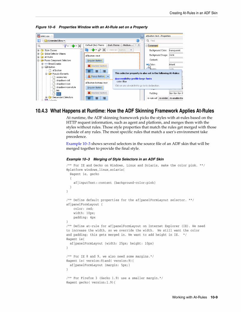
Creating At-Rules in an ADF Skin
Working with At-Rules 10-9
Figure 10–6 Properties Window with an At-Rule set on a Property
10.4.3 What Happens at Runtime: How the ADF Skinning Framework Applies At-RulesAt runtime, the ADF skinning framework picks the styles with at-rules based on the HTTP request information, such as agent and platform, and merges them with the styles without rules. Those style properties that match the rules get merged with those outside of any rules. The most specific rules that match a user's environment take precedence.
Example 10–3 shows several selectors in the source file of an ADF skin that will be merged together to provide the final style.
Example 10–3 Merging of Style Selectors in an ADF Skin
/** For IE and Gecko on Windows, Linux and Solaris, make the color pink. **/@platform windows,linux,solaris{ @agent ie, gecko { af|inputText::content {background-color:pink} }} /** Define default properties for the af|panelFormLayout selector. **/af|panelFormLayout { color: red; width: 10px; padding: 4px}/** Define at-rule for af|panelFormLayout on Internet Explorer (IE). We need to increase the width, so we override the width. We still want the color and padding; this gets merged in. We want to add height in IE. */@agent ie{ af|panelFormLayout {width: 25px; height: 10px}} /** For IE 8 and 9, we also need some margins.*/@agent ie( version:8)and( version:9){ af|panelFormLayout {margin: 5px;}} /** For Firefox 3 (Gecko 1.9) use a smaller margin.*/@agent gecko( version:1.9){
Creating At-Rules in an ADF Skin
10-10 Developing ADF Skins with Oracle ADF Skin Editor
af|panelFormLayout {margin: 4px;}}
11
Applying the Finished ADF Skin to Your Web Application 11-1
11Applying the Finished ADF Skin to Your WebApplication
This chapter describes how to complete tasks that you need to do once you finish your ADF skin. Information is provided on how to test your ADF skin, package the completed ADF skin in an ADF Library JAR, and configure a Fusion web application so that it uses the completed ADF skin.
This chapter includes the following sections:
■ Section 11.1, "About Applying a Finalized ADF Skin to an Application"
■ Section 11.2, "Testing Changes in Your ADF Skin"
■ Section 11.3, "Packaging an ADF Skin into an ADF Library JAR"
■ Section 11.4, "Applying an ADF Skin to Your Web Application"
■ Section 11.5, "Applying an ADF Skin to a Running Web Application"
11.1 About Applying a Finalized ADF Skin to an ApplicationAfter you create an ADF skin where you define style properties for one or more ADF skin selectors, you may want to test the changes that you make in the ADF skin. Once you complete testing the changes in your ADF skin and are satisfied with the final ADF skin, you can package the ADF skin and associated files (resource bundle, images, and configuration files) into an ADF Library JAR to distribute for inclusion to the application projects that use the final ADF skin. Once you have distributed the final ADF skin, you configure the application to apply the ADF skin to it.
11.2 Testing Changes in Your ADF Skin Once you have created an ADF skin and defined style properties that you want for one or more selectors, you may want to test how these style properties render at runtime in a browser. To do this, you apply the ADF skin to your application and run a page that renders the ADF Faces component which exposed the selector.
Consider using tools, such as Firebug for the Mozilla Firefox browser (or similar for your particular browser), when you run your application. These tools provide useful information that can help you as you iteratively develop your ADF skin. For example, in addition to inspecting changes that you have already made, these tools can help you identify the ADF skin selectors that correspond to a particular DOM element.
You can also configure context initialization parameters in the web.xml file of your application that allow you to:
■ View changes in an ADF skin without having to restart the application
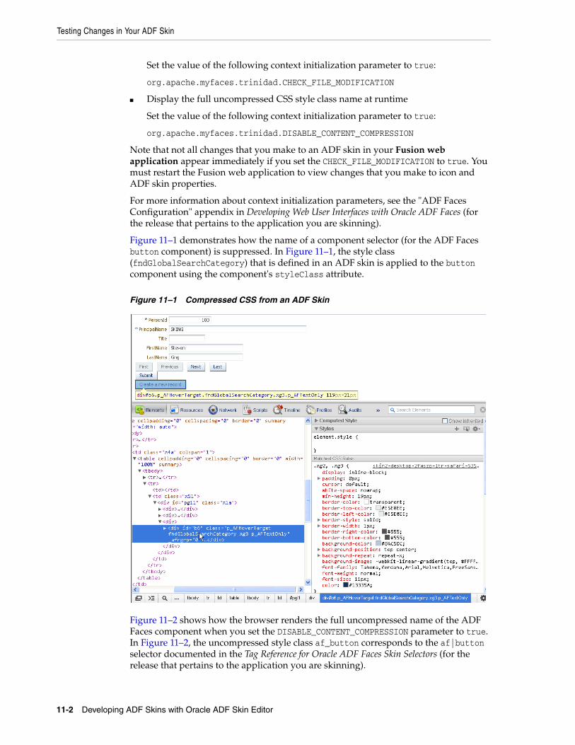
Testing Changes in Your ADF Skin
11-2 Developing ADF Skins with Oracle ADF Skin Editor
Set the value of the following context initialization parameter to true:
org.apache.myfaces.trinidad.CHECK_FILE_MODIFICATION
■ Display the full uncompressed CSS style class name at runtime
Set the value of the following context initialization parameter to true:
org.apache.myfaces.trinidad.DISABLE_CONTENT_COMPRESSION
Note that not all changes that you make to an ADF skin in your Fusion web application appear immediately if you set the CHECK_FILE_MODIFICATION to true. You must restart the Fusion web application to view changes that you make to icon and ADF skin properties.
For more information about context initialization parameters, see the "ADF Faces Configuration" appendix in Developing Web User Interfaces with Oracle ADF Faces (for the release that pertains to the application you are skinning).
Figure 11–1 demonstrates how the name of a component selector (for the ADF Faces button component) is suppressed. In Figure 11–1, the style class (fndGlobalSearchCategory) that is defined in an ADF skin is applied to the button component using the component's styleClass attribute.
Figure 11–1 Compressed CSS from an ADF Skin
Figure 11–2 shows how the browser renders the full uncompressed name of the ADF Faces component when you set the DISABLE_CONTENT_COMPRESSION parameter to true. In Figure 11–2, the uncompressed style class af_button corresponds to the af|button selector documented in the Tag Reference for Oracle ADF Faces Skin Selectors (for the release that pertains to the application you are skinning).
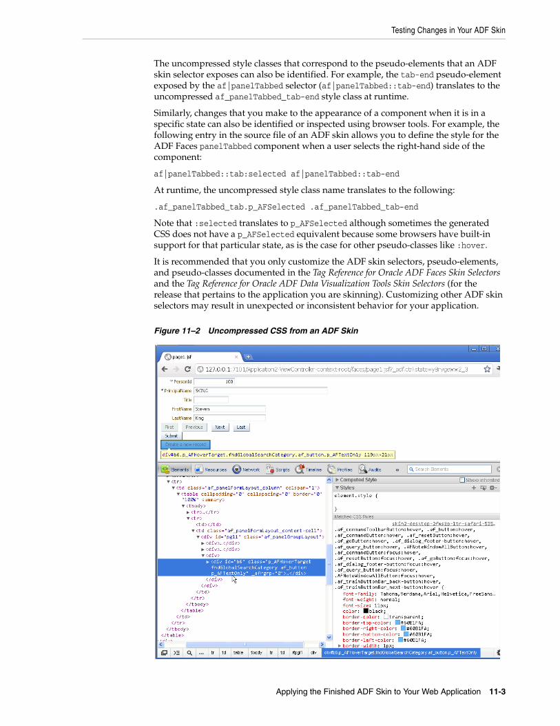
Testing Changes in Your ADF Skin
Applying the Finished ADF Skin to Your Web Application 11-3
The uncompressed style classes that correspond to the pseudo-elements that an ADF skin selector exposes can also be identified. For example, the tab-end pseudo-element exposed by the af|panelTabbed selector (af|panelTabbed::tab-end) translates to the uncompressed af_panelTabbed_tab-end style class at runtime.
Similarly, changes that you make to the appearance of a component when it is in a specific state can also be identified or inspected using browser tools. For example, the following entry in the source file of an ADF skin allows you to define the style for the ADF Faces panelTabbed component when a user selects the right-hand side of the component:
af|panelTabbed::tab:selected af|panelTabbed::tab-end
At runtime, the uncompressed style class name translates to the following:
.af_panelTabbed_tab.p_AFSelected .af_panelTabbed_tab-end
Note that :selected translates to p_AFSelected although sometimes the generated CSS does not have a p_AFSelected equivalent because some browsers have built-in support for that particular state, as is the case for other pseudo-classes like :hover.
It is recommended that you only customize the ADF skin selectors, pseudo-elements, and pseudo-classes documented in the Tag Reference for Oracle ADF Faces Skin Selectors and the Tag Reference for Oracle ADF Data Visualization Tools Skin Selectors (for the release that pertains to the application you are skinning). Customizing other ADF skin selectors may result in unexpected or inconsistent behavior for your application.
Figure 11–2 Uncompressed CSS from an ADF Skin
Packaging an ADF Skin into an ADF Library JAR
11-4 Developing ADF Skins with Oracle ADF Skin Editor
11.2.1 How to Set Parameters for Testing Your ADF SkinYou set the CHECK_FILE_MODIFICATION and DISABLE_CONTENT_COMPRESSION context initialization parameters to true in the web.xml file of your application.
To set parameters for testing your ADF skin:1. In the Applications window, double-click the web.xml file.
2. In the source editor, add the following context initialization parameter entries and set to true:
■ org.apache.myfaces.trinidad.CHECK_FILE_MODIFICATION
■ org.apache.myfaces.trinidad.DISABLE_CONTENT_COMPRESSION
3. Save and close the web.xml file.
11.2.2 What Happens When You Set Parameter for Testing Your ADF SkinEntries appear in the web.xml file for your application, as illustrated in Example 11–1.
Example 11–1 web.xml Entry
<context-param> <param-name>org.apache.myfaces.trinidad.CHECK_FILE_MODIFICATION</param-name> <param-value>true</param-value></context-param><context-param> <param-name>org.apache.myfaces.trinidad.DISABLE_CONTENT_COMPRESSION</param-name> <param-value>true</param-value></context-param>
Changes that you make to a selector for an ADF Faces component (other than changes to icon and skin properties) render immediately when you refresh a Fusion web application's page that renders the ADF Faces component. Using Firebug if your browser is Mozilla Firefox or Google Chrome's developer tools, you can see the uncompressed style class names that render at runtime and establish what ADF skin selector it corresponds to. Remember that setting org.apache.myfaces.trinidad.DISABLE_CONTENT_COMPRESSION to true incurs a performance cost for your Fusion web application so set it to false when you finish testing your changes.
11.3 Packaging an ADF Skin into an ADF Library JARYou can deploy an ADF skin and associated files (for example, image files, configuration files, and resource bundles) in an ADF Library JAR. This enables you to package files required to apply an ADF skin to an application. The benefits of packaging ADF skins into an ADF Library JAR as compared to bundling them into the application are the following:
■ An ADF skin can be deployed and developed separately from the application. This also helps to reduce the number of files to be checked in case some changes must be applied to the ADF skin.
■ The source files for an ADF skin and images can be separated into their own ADF Library JARs. Therefore, you can partition the image base into separate ADF Library JARs, so that not all files have to be deployed with all applications.
■ An ADF skin in an ADF Library JAR can be applied to an application that is running without requiring a restart, as described in Section 11.5, "Applying an
Packaging an ADF Skin into an ADF Library JAR
Applying the Finished ADF Skin to Your Web Application 11-5
ADF Skin to a Running Web Application."
11.3.1 How to Package an ADF Skin into an ADF Library JARCreate an ADF Library JAR file deployment profile to package the ADF skin into an ADF Library JAR.
To create an ADF Library JAR file deployment profile:1. In the Applications window, right-click the project that contains the ADF skins
and choose Deploy > New Deployment Profile.
2. In the Create Deployment Profile dialog, choose ADF Library JAR File in the Profile Type dropdown list.
3. Enter a name for the deployment profile in the Deployment Profile Name input field and click OK.
4. Review the options in the Edit ADF Library JAR Deployment Profile Properties dialog that appears. For more information at any time, click Help.
5. Click OK.
To package an ADF skin into an ADF Library JAR:1. In the Applications window, right-click the project that contains the ADF skin and
choose Deploy > deployment, where deployment is the name of the ADF Library JAR file deployment profile.
2. In the Deploy dialog Deployment Action page, click Deploy to ADF Library JAR file, click Next and then click Finish.
11.3.2 What Happens When You Package an ADF Skin into an ADF Library JARAn ADF Library JAR file is written to the directory specified by the deployment profile. This ADF Library JAR contains the source file for the ADF skin, the trinidad-skins.xml file, image files, and any resource bundles that you created to define resource strings or to override the default strings defined for ADF Faces components. The ADF Library JAR file also contains other files from the ADF skin's project not related to skinning.
Example 11–2 shows the directory structure for a project that contains the following items for an ADF skin:
■ The trinidad-skins.xml file
■ An image file (sort_des_ena.png) copied into the ADF skin project
■ The source file for an ADF skin (skin1.css)
■ An .sva file (oracle.adf.common.services.ResourceService.sva) that is used to inspect the content of the ADF Library JAR when you import it into a project, as described in Section 4.5, "Importing ADF Skins from an ADF Library JAR."
■ A resource bundle (skinBundle.properties) that contains string values to override strings from the default resource bundle
For information about how to specify resource bundles that contain string values you define, see Section 7.2.1, "How to Specify an Additional Resource Bundle for an ADF Skin."
Applying an ADF Skin to Your Web Application
11-6 Developing ADF Skins with Oracle ADF Skin Editor
Example 11–2 Directory Structure for an ADF Library JAR Containing an ADF Skin
ADFLibraryJARRootDirectory+---META-INF| | MANIFEST.MF| | oracle.adf.common.services.ResourceService.sva| | trinidad-skins.xml| || +---adf| | \---skins| | \---skin1| | \---images| | \---af_column| | colSort_des_ena.png| || \---skins| \---skin1| skin1.css|\---resources skinBundle.properties
The directory paths for images in the ADF skin that appear in the ADF Library JAR are modified to include the directory path from the ADF skin project. Example 11–3 demonstrates an example of the changes that occur:
Example 11–3 Modified Directory Path for Images in a Deployed ADF Skin
// Reference to an image in an ADF skin prior to deployment to an ADF Library JARaf|column::sorted-descending-icon-style{ background-image: url("images/af_column/colSort_des_ena.png"); }
// Reference to an image in an ADF skin after deployment to an ADF Library JARaf|column::sorted-descending-icon-style{ background-image: url("/adf/skins/skin1/images/af_column/colSort_des_ena.png"); }
11.4 Applying an ADF Skin to Your Web ApplicationYou configure an application to use an ADF skin by specifying values in the application's trinidad-config.xml file. You specify a value for the <skin-family> element that identifies the ADF skin family the application uses at runtime. If you created more than one ADF skin in the ADF skin family, you can version these ADF skins. If you versioned multiple ADF skins in the same ADF skin family, use the <skin-version> element in the trinidad-config.xml file to identify the specific version that you want the application to use.
If you do not identify a specific ADF skin from an ADF skin family by entering a value for the <skin-version> element in the trinidad-config.xml file or using the <default>true</default> element in the trinidad-skins.xml file, the application uses the last skin defined in the trinidad-skins.xml file. For more information about versioning ADF skins and how this can determine the ADF skin that your application chooses, see Section 12.4, "Versioning ADF Skins."
Note that you can configure an application page for your end users to dynamically select the ADF skin that they want the application to use. For more information, see
Applying an ADF Skin to a Running Web Application
Applying the Finished ADF Skin to Your Web Application 11-7
Developing Web User Interfaces with Oracle ADF Faces (for the release that pertains to the application you are skinning).
11.4.1 How to Apply an ADF Skin to an ApplicationYou apply an ADF skin to an application by modifying the application's trinidad-config.xml file. You do this by editing the application's trinidad-config.xml file to specify the ADF skin family to use. Alternatively, you can select the ADF skin family from a list in the ADF View options of JDeveloper's Project Properties dialog.
To apply an ADF skin to an application:1. In the Applications window, double-click the trinidad-config.xml file. By default,
this file is in the Web Content/WEB-INF node.
2. In the source editor, write entries to specify the value of the <skin-family> element and, optionally, the <skin-version> element as shown in Example 11–4.
11.4.2 What Happens When You Apply an ADF Skin to an ApplicationThe values that you specify for the <skin-family> element and, optionally, the <skin-version> element in the trinidad-config.xml file determine the ADF skin that the Fusion web application uses at runtime, as shown in Example 11–4.
Example 11–4 trinidad-config.xml File
<?xml version="1.0" encoding="windows-1252"?><trinidad-config xmlns="http://myfaces.apache.org/trinidad/config"> <skin-family>skyros</skin-family> <skin-version>v1</skin-version></trinidad-config>
11.5 Applying an ADF Skin to a Running Web Application Using Java Management Extensions (JMX), you can apply an ADF skin that is packaged in an ADF Library JAR to a Fusion web application without having to restart the application. To do this, you must configure the Fusion web application's source files, as described in Section 11.5.1, "How to Configure your Fusion Web Application to Accept an Updated ADF Skin." You then use the ADF Skin Editor to connect to the MBean server and deploy the ADF Library JAR containing the ADF skin(s). For more information, see Section 11.5.2, "How to Deploy an ADF Library JAR to an MBean Server." This makes all ADF skins contained in the ADF Library JAR available to the Fusion web application.
11.5.1 How to Configure your Fusion Web Application to Accept an Updated ADF SkinYou make the following changes to the Fusion web application's ViewController project in JDeveloper so that the application can apply a new ADF skin deployed by a MBean server without requiring a restart of the Fusion web application:
■ Select the Enable Runtime Skin Updates checkbox in the ADF View page of the application's ViewController project
■ Add ADF Faces JMX Runtime 11 to the application's classpath
■ (Optional) Add a context initialization parameter to the application's web.xml file
Applying an ADF Skin to a Running Web Application
11-8 Developing ADF Skins with Oracle ADF Skin Editor
The context initialization parameter enables you to specify a user friendly name to identify the Fusion web application rather than use the application's context root.
To configure your Fusion web application to accept an updated ADF skin:1. In JDeveloper's Applications window, select the ViewController project.
2. From the main menu, choose Application > Project Properties.
3. In the Project Properties dialog, select the ADF View page and then select the Enable Runtime Skin Updates checkbox.
4. Select the Libraries and Classpath page and verify that ADF Faces JMX Runtime 11 appears in the Classpath Entries list. If it is not, click Add Library.
5. In the Add Library dialog, select ADF Faces JMX Runtime 11 and click OK.
6. Click OK.
7. Optionally, in the Applications window, double-click the web.xml file located in the WEB-INF directory and add a context initialization parameter where you can specify an easy to remember name for your application. Otherwise, the default behavior is to use the context root of the application.
In the overview editor, click the Application navigation tab and then click the Add icon next to the Context Initialization Parameters table to add an entry for the oracle.adf.view.rich.SKINNING_MBEAN_NAME parameter and set its value to a name that you will use to identify the Fusion web application to the MBean server.
11.5.2 How to Deploy an ADF Library JAR to an MBean ServerYou deploy the ADF Library JAR that packages the ADF skin(s) to the MBean server. For information about how to create an ADF Library JAR file deployment profile to package the ADF skin(s), see Section 11.3.1, "How to Package an ADF Skin into an ADF Library JAR."
To deploy an ADF Library JAR to an MBean Server:1. In the Applications window, right-click the project that contains the ADF skin(s)
and choose Deploy > deployment, where deployment is the name of the ADF Library JAR file deployment profile.
2. In the Deployment Action page, select Deploy to ADF Skin Managed Bean and then click Next.
3. In the Skin Connection page, choose the appropriate option:
■ Click Add to create a new connection to the MBean server and go to Step 4.
■ Choose an existing connection from the Connection dropdown list and go to Step 5.
4. In the Create JMX Connection dialog, complete the fields to connect to the MBean server:
■ Connection Name: Enter a name for the connection. The connection name must be a valid Java identifier, and as the name and connection are global across your installation, choose an appropriate and unique name.
Note: The Fusion web application must be deployed in an exploded format, as is the case when you run the application in the Integrated WebLogic Server.
Applying an ADF Skin to a Running Web Application
Applying the Finished ADF Skin to Your Web Application 11-9
■ Server Type: The default of Weblogic Server is preselected for connections from the ADF Skin Editor.
■ Username: Enter the user name to be authorized for access to the MBean server.
■ Password: Enter the password to be associated with the specified user name. An asterisk (*) appears for each character you type in this field.
■ Protocol: The ADF Skin Editor uses the t3 protocol to communicate with the MBean server.
■ Hostname: Enter a value to identify the machine running the MBean server. Use an IP address or a host name that can be resolved by TCP/IP, for example if the MBean server is on the local machine, use localhost, or 127.0.0.1.
■ Port: Enter the listen port for the MBean server. The default is whatever the default port number of the Integrated Weblogic Server is (often 7101).
■ URL Provider Path: Enter the absolute JNDI name of the MBean server. It must start with /jndi/ and be followed by one of:
– weblogic.management.mbeanservers.domainruntime
– weblogic.management.mbeanservers.runtime
– weblogic.management.mbeanservers.edit
■ Server Install Location: Displays the server install location.
■ Test Connection: Click to test the connection.
■ Status: A Success! message indicates that the ADF Skin Editor has been able to connect to the MBean server. Any other message indicates that the connection has failed. Amongst the things you should check before trying Test Connection again are:
– Whether the network is working correctly when the MBean server is not local.
– The values entered in this dialog.
5. In the Application Name field, select the name of the Fusion web application that you want to deploy the ADF Library JAR containing the ADF skin(s) to. Click Find Running Applications to retrieve the list of available applications and to make sure that the application is running.
The name of the application's root context appears unless you specified the name of the application to be the value that you entered for the oracle.adf.view.rich.SKINNING_MBEAN_NAME parameter, as described in Section 11.5.1, "How to Configure your Fusion Web Application to Accept an Updated ADF Skin."
6. Click Next and then click Finish.
11.5.3 What Happens When You Apply an ADF Skin to a Running ApplicationThe ADF Skin Editor deploys the ADF Library JAR containing the ADF skin(s) to the Fusion web application. This ADF Library JAR contains the ADF skin and other associated files (for example, any images that the ADF skin requires). For more information about the contents of the ADF Library JAR, see Section 11.3.2, "What Happens When You Package an ADF Skin into an ADF Library JAR." The ADF skins are installed in the root directory of the Fusion web application. The
Applying an ADF Skin to a Running Web Application
11-10 Developing ADF Skins with Oracle ADF Skin Editor
trinidad-skins.xml file of the Fusion web application is updated to reference the newly-added ADF skins.
To make the Fusion web application use the newly-available ADF skin, you need to update the value that the trinidad-config.xml file's <skin-family> element references. You can do this manually, as described in Section 11.4.1, "How to Apply an ADF Skin to an Application," or you can specify an EL expression for the element that updates the value programmatically. For more information about this latter option, see the "Customizing the Appearance Using Styles and Skins" chapter in Developing Web User Interfaces with Oracle ADF Faces (for the release that pertains to the application you are skinning).
12
Advanced Topics 12-1
12Advanced Topics
This chapter provides information to help you if you make changes in the source file of an ADF skin or in the configuration files that control the usage of ADF skins. The chapter also lists and describes the ADF skins provided by Oracle ADF.
This chapter includes the following sections:
■ Section 12.1, "Referring to URLs in an ADF Skin's CSS File"
■ Section 12.2, "Configuration Files for an ADF Skin"
■ Section 12.3, "ADF Skins Provided by Oracle ADF"
■ Section 12.4, "Versioning ADF Skins"
12.1 Referring to URLs in an ADF Skin's CSS FileAn ADF skin's CSS file typically uses a URL to refer to a resource that is external to the file. For example, an image that an application uses to render with an error message. You can refer to a URL from an ADF skin's CSS file in a number of different formats. The supported formats are:
■ Absolute
You specify the complete URL to the resource. For example, a URL in the following format:
http://www.mycompany.com/WebApp/Skin/skin1/img/errorIcon.gif
■ Relative
You can specify a relative URL if the URL does not start with / and no protocol is present. A relative URL is based on the location of the ADF skin's CSS file. For example, if the ADF skin's CSS file directory is WebApp/Skin/skin1/ and the specified URL is img/errorIcon.gif, the final URL is /WebApp/Skin/mySkin/img/errorIcon.gif
■ Context relative
This format of URL is resolved relative to the context root of your web application. You start a context relative root with /. For example, if the context relative root of a web application is:
/WebApp
and the specified URL is:
/img/errorIcon.gif
the resulting URL is:
Configuration Files for an ADF Skin
12-2 Developing ADF Skins with Oracle ADF Skin Editor
/WebApp/img/errorIcon.gif
■ Server relative
A server relative URL is resolved relative to the web server. This differs to the context relative URL in that it allows you reference a resource located in another application on the same web server. You specify the start of the URL using //. For example, write a URL in the following format:
//WebApp/Skin/mySkin/img/errorIcon.gif
The format of URL that you use may be important if you create a Java Archive (JAR) file to package and distribute your ADF skin and its associated files. For more information, see Section 11.3, "Packaging an ADF Skin into an ADF Library JAR."
12.2 Configuration Files for an ADF SkinThe following list describes the configuration files associated with the project for an ADF skin. You modify values in these files while you develop your ADF skin or when you finish development and want to apply the finished ADF skin to an application.
■ trinidad-skins.xml
This file registers the ADF skins that you create, as described in Section 4.3, "Creating an ADF Skin File." Example 12–1 demonstrates how to register a number of ADF skins that extends from a sample of the ADF skins described in Table 12–1.
Example 12–1 Registering an ADF Skin in the trinidad-skins.xml File
<!-- Use the following values in the trinidad-skins.xml file if you want to extend the fusionFx-v1.2 skin. --><skin> <id>yourSkin.desktop</id> <family>yourSkinFamily</family> <extends>fusionFx-v1.2.desktop</extends> ...</skin> <!-- Use the following values in the trinidad-skins.xml file if you want to extend the skyros-v1 skin. --><skin> <id>yourSkin.desktop</id> <family>yourSkinFamily</family> <extends>skyros-v1.desktop</extends> ...</skin>
For more information about this file, see the "Configuration in trinidad-skins.xml" section in Developing Web User Interfaces with Oracle ADF Faces (for the release that pertains to the application you are skinning).
■ trinidad-config.xml
You configure the <skin-family> element in this configuration file to tell the application what ADF skin to use, as described in Section 11.4, "Applying an ADF Skin to Your Web Application." Example 12–2 demonstrates a number of examples that show how to configure your web application to use some of the ADF skins listed in Table 12–1.
ADF Skins Provided by Oracle ADF
Advanced Topics 12-3
Example 12–2 Configuring an Application's trinidad-config.xml File to Use an ADF Skin
<!-- Use the following value in the trinidad-config.xml file if you want your application to use the fusionFx-simple-v2 skin --><skin-family>fusionFx-simple</skin-family> <skin-version>v2</skin-version> <!-- Use the following value in the trinidad-config.xml file if you want your application to use the fusionFx-v2.1 skin. --><skin-family>fusionFx</skin-family> <skin-version>v2.1<skin-version> <!-- Use the following value in the trinidad-config.xml file if you want your application to use the skyros skin. --><skin-family>skyros</skin-family> <skin-version>v1<skin-version>
For more information about this file, see the "Configuration in trinidad-config.xml" section in Developing Web User Interfaces with Oracle ADF Faces (for the release that pertains to the application you are skinning).
■ web.xml
You can configure context initialization parameters in this file to facilitate the development and testing of your ADF skin, as described in Section 11.2, "Testing Changes in Your ADF Skin." You can also configure a context initialization parameter (org.apache.myfaces.trinidad.skin.MAX_SKINS_CACHED) to specify the maximum number of unique ADF skins (for example, fusion or fusionFx-simple) for which you store information in memory about the generated CSS files. Using this context initialization parameter can help maintain the performance of your application if you use many different skins.
For more information about the web.xml file and context initialization parameters, see the "Configuration in web.xml" section in Developing Web User Interfaces with Oracle ADF Faces (for the release that pertains to the application you are skinning).
12.3 ADF Skins Provided by Oracle ADFOracle ADF provides a variety of ADF skins from which you can extend when you create a new ADF skin. Table 12–1 describes the differences between each of these ADF skins. The value you choose for the Target Application Release property, as described in Section 4.2, "Creating ADF Skin Applications and ADF Skin Projects," determines the ADF skins available to you to extend from. Not all ADF skin listed in Table 12–1 will be available to you. For example, if you choose 11.1.1.4.x as the value for the Target Application Release property the skyros skin is not available to extend.
The Base Skin page of the Create ADF Skin dialog that appears when you create an ADF skin, as described in Section 4.3, "Creating an ADF Skin File," recommends the appropriate ADF skin to extend from based on the release of Oracle ADF for which you want to create an ADF skin. For example, if you choose 12.1.2.0.x as the value for the Target Application Release property, the recommended ADF skin to extend from is skyros-v1.desktop.
You can apply any of the ADF skins listed in Table 12–1 to your web application. For more information, see Section 12.2, "Configuration Files for an ADF Skin." For a diagram that illustrates the inheritance relationship between the ADF skins, see Section 1.4, "Inheritance Relationship of the ADF Skins Provided by Oracle ADF."
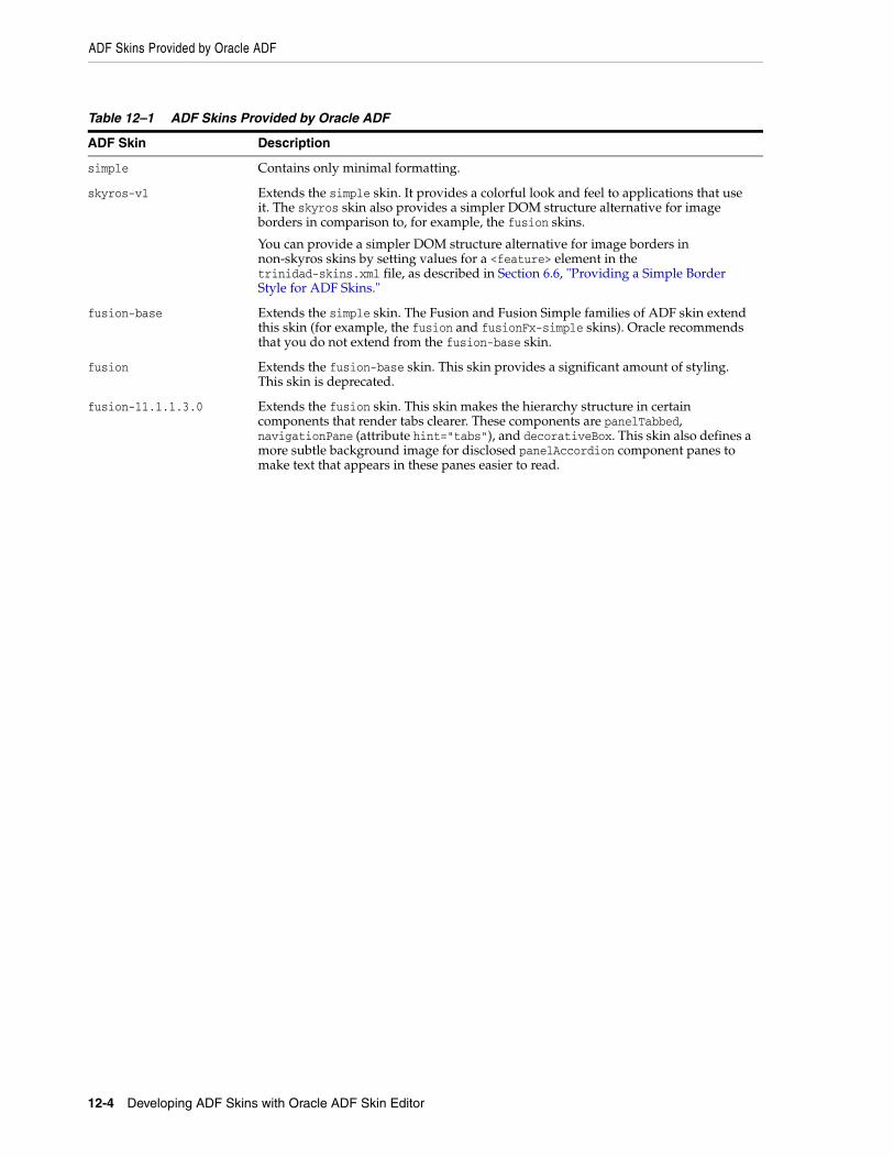
ADF Skins Provided by Oracle ADF
12-4 Developing ADF Skins with Oracle ADF Skin Editor
Table 12–1 ADF Skins Provided by Oracle ADF
ADF Skin Description
simple Contains only minimal formatting.
skyros-v1 Extends the simple skin. It provides a colorful look and feel to applications that use it. The skyros skin also provides a simpler DOM structure alternative for image borders in comparison to, for example, the fusion skins.
You can provide a simpler DOM structure alternative for image borders in non-skyros skins by setting values for a <feature> element in the trinidad-skins.xml file, as described in Section 6.6, "Providing a Simple Border Style for ADF Skins."
fusion-base Extends the simple skin. The Fusion and Fusion Simple families of ADF skin extend this skin (for example, the fusion and fusionFx-simple skins). Oracle recommends that you do not extend from the fusion-base skin.
fusion Extends the fusion-base skin. This skin provides a significant amount of styling. This skin is deprecated.
fusion-11.1.1.3.0 Extends the fusion skin. This skin makes the hierarchy structure in certain components that render tabs clearer. These components are panelTabbed, navigationPane (attribute hint="tabs"), and decorativeBox. This skin also defines a more subtle background image for disclosed panelAccordion component panes to make text that appears in these panes easier to read.
ADF Skins Provided by Oracle ADF
Advanced Topics 12-5
fusionFx-v1 Extends the fusion-11.1.1.3.0 skin. This skin contains design improvements and changes to address a number of issues. Specifically, it adds:
■ A background color to the .AFMaskingFrame global style selector to prevent the display of content from an underlying frame when an inline popup displays in certain browsers.
■ A boolean ADF skin property, -tr-stretch-dropdown-table, for the inputComboboxListOfValues component. This property determines whether the table in the list stretches to show the content of the table columns or limits the width of the table to the width of the input field in the inputComboboxListOfValues component.
■ The inlineFrame component displays an image that serves as a loading indicator until the browser determines that the frame's contents have been loaded.
You can implement this functionality in an ADF skin that you create. The af|inlineFrame selector has "busy" and "flow" pseudo-classes that enable you to do this. The inlineFrame component only generates an IFrame element when the parent component does not stretch the inlineFrame component (the inlineFrame component is flowing). Use af|inlineFrame:busy:flow to define a background-image style that references a loading indicator. When the parent component stretches the inlineFrame component, the generated content is more complex. This complexity allows you define a content image URL using the af|inlineFrame::status-icon and an optional additional background-image using the af|inlineFrame::status-icon-style. It also allows you to reuse images that other component selectors use. For example, the carousel component's af|carousel::status-icon and af|carousel::status-icon-style selectors. Use skinning aliases to reuse these images.
The following global selectors have also been introduced that you can use if you implement this functionality in your ADF skin:
■ .AFBackgroundImageStatus:alias: use to reference the background image used in af|inlineFrame::busy:flow.
■ .AFStatusIcon:alias use to reference the af|carousel::status-icon and af|inlineFrame::status-icon.
■ .AFStatusIconStyle:alias use to reference the af|carousel::status-icon-style and af|inlineFrame::status-icon-style.
A resource key (af_inlineFrame.LABEL_FETCHING) defines the string to display for the inlineFrame component's loading icon.
fusionFx-v1.1 Extends the fusionFx-v1 skin. It adds support for the ability to clear Query-By-Example (QBE) filters in an af:table component.
fusionFx-v1.2 Extends the fusionFx-v1.1 skin. It contains a number of user interface enhancements, including optimizations for when your application renders in a touch screen device.
fusionFx-v1.3 Extends the fusionFx-v1.2 skin. Changes include a new skin property (-tr-pop-out-animation-duration) and a number of modified pseudo-elements for the af|carousel selector.
fusionFx-v2 Extends from the fusionFx-v1 skin. It makes the hierarchy structure in certain components that render tabs clearer. These components are panelTabbed, navigationPane (attribute hint="tabs"), and decorativeBox. This skin also defines a more subtle background image for disclosed panelAccordion component panes to make text that appears in these panes easier to read.
Table 12–1 (Cont.) ADF Skins Provided by Oracle ADF
ADF Skin Description
Versioning ADF Skins
12-6 Developing ADF Skins with Oracle ADF Skin Editor
12.4 Versioning ADF SkinsYou can specify version numbers for your ADF skins in the trinidad-skins.xml file using the <version> element. Use this optional capability if you want to distinguish between ADF skins that have the same value for the <family> element in the trinidad-skins.xml file. Note that when you configure an application to use a particular ADF skin, you do so by specifying values in the trinidad-config.xml file, as described in section Section 11.4, "Applying an ADF Skin to Your Web Application."
fusionFx-v2.1 Extends from the fusionFx-v2 skin. It contains a number of user interface enhancements, including optimizations for when your application renders in a touch screen device.
fusionFx-v3 Extends from the fusionFx-v2 skin. It contains a number of enhancements, including changes to make the appearance lighter and brighter across container-type components such as the panelBox and decorativeBox components.
fusionFx-simple-vN.N The fusionFx-simple-vN.N skins are the same as the Fusion family of ADF skins, but with a simplified color palette. This makes changing the color scheme for ADF skins that extend the fusionFx-simple-vN.N skins easier than changing the color scheme for skins that extend the Fusion family of ADF skins. You can change a small number of color aliases in an ADF skin that extends the fusionFx-simple-vN.N skins to make significant changes to the color scheme. In addition, you can use the images editor to change the color scheme of your ADF skin when you extend one of the fusionFx-simple-vN.N skins. For more information about the images editor, see Section 6.5, "Working with the Images Editor."
In 12c (12.1.3) of Oracle ADF, the Fusion Simple family of ADF skin is available in the following versions:
■ fusionFx-simple (This skin is deprecated).
■ fusionFx-simple-v1
■ fusionFx-simple-v1.1
■ fusionFx-simple-v1.2
■ fusionFx-simple-v1.3
■ fusionFx-simple-v2
■ fusionFx-simple-v2.1
■ fusionFx-simple-v3
Projector skins ADF Faces provides projector skins that you can download from the Oracle Technology Network (OTN) web site. These skins define styles for an application that you want to demonstrate to an audience using a projector. Each projector skin modifies a number of elements in a parent skin so that an application renders appropriately when displayed using table-top projectors (particularly older models of projector). These skins are useful if the audience is present at the same location as the projector. They may not be appropriate for an audience that views an application online through a web conference. ADF Faces provides the following projector skins:
■ fusion-projector: This skin modifies a number of elements in the fusion skin so that an application renders appropriately on a projector.
■ fusionFx-v2-projector: This skin modifies a number of elements in the fusionFx-v2 skin so that an application renders appropriately on a projector.
■ fusion-11.1.1.3.0-projector: This skin modifies a number of elements in the fusion-11.1.1.3.0 skin so that an application renders appropriately on a projector.
Table 12–1 (Cont.) ADF Skins Provided by Oracle ADF
ADF Skin Description
Versioning ADF Skins
Advanced Topics 12-7
12.4.1 How to Version an ADF SkinYou specify a version for your ADF skin by entering a value for the <version> element in the trinidad-skins.xml file.
To version an ADF skin:1. In the Applications window, double-click the trinidad-skins.xml file. By default,
this is in the Web Content/WEB-INF node.
2. In the Structure window, right-click the skin node for the ADF skin that you want to version and choose Insert inside skin > version.
3. In the Insert version dialog, select true from the default list if you want your application to use this version of the ADF skin when no value is specified in the <skin-version> element of the trinidad-config.xml file, as described in Section 11.4, "Applying an ADF Skin to Your Web Application."
4. Enter a value in the name field. For example, enter v1 if this is the first version of the ADF skin.
5. Click OK.
12.4.2 What Happens When You Version ADF SkinsExample 12–3 shows an example trinidad-skins.xml that references three ADF skins (skin1.desktop, skin2.desktop, and skin3.desktop). Each of these ADF skins have the same value for the <family> element (test). The values for the child elements of the <version> elements distinguish between each of these ADF skins. At runtime, an application that specifies test as the value for the <skin-family> element in the application's trinidad-config.xml file uses skin1.desktop because this ADF skin is configured as the default skin in the trinidad-skins.xml file (<default>true</default>). You can override this behavior by specifying a value for the <skin-version> element in the trinidad-config.xml file, as described in Section 11.4, "Applying an ADF Skin to Your Web Application." For example, if you specify v2 as a value for the <skin-version> element in the trinidad-config.xml file, the application uses skin2.desktop instead of skin1.desktop that is defined as the default in the trinidad-skins.xml file.
If you do not specify the skin version to pick (using the <skin-version> element in the trinidad-config.xml file), then the application uses the skin that is defined as the default using the <default>true</default> element in the trinidad-skins.xml file. If you do not specify a default skin, the application uses the last ADF skin defined in the trinidad-skins.xml file. In Example 12–3, the last ADF skin to be defined is skin3.desktop.
Example 12–3 trinidad-skins.xml File with Versioned ADF Skin Files
<?xml version="1.0" encoding="windows-1252"?><skins xmlns="http://myfaces.apache.org/trinidad/skin"> <skin> <id>skin1.desktop</id> <family>test</family> <extends>skyros-v1.desktop</extends> <render-kit-id>org.apache.myfaces.trinidad.desktop</render-kit-id> <style-sheet-name>skins/skin1/skin1.css</style-sheet-name> <version> <default>true</default> <name>v1</name> </version>
Versioning ADF Skins
12-8 Developing ADF Skins with Oracle ADF Skin Editor
</skin> <skin> <id>skin2.desktop</id> <family>test</family> <extends>skin1.desktop</extends> <render-kit-id>org.apache.myfaces.trinidad.desktop</render-kit-id> <style-sheet-name>skins/skin2/skin2.css</style-sheet-name> <version> <name>v2</name> </version> </skin> <skin> <id>skin3.desktop</id> <family>test</family> <extends>skin2.desktop</extends> <render-kit-id>org.apache.myfaces.trinidad.desktop</render-kit-id> <style-sheet-name>skins/skin3/skin3.css</style-sheet-name> <version> <name>v3</name> </version> </skin></skins>