oracle data visualization · pdf fileoracle data visualization tutorial before you begin...
TRANSCRIPT
Oracle Data Visualization Tutorial
Before You Begin
Purpose
In this tutorial you learn how to use Oracle Data Visualization to create visualizations to explore and
analyze the data.
There are four sections in this tutorial:-
1. Creating a Data Visualization with Sample Data
2. Adding Data Sources from Comma Separated Value Files
3. Creating a Data Flow
4. Adding a Data Source from Oracle Database
Time to Complete
40 minutes
Background
Oracle Data Visualization makes rich, powerful visual analytics accessible to every business user. People at
all levels of an organization can blend and analyze data in just a few clicks, effectively sifting through data
clutter to quickly uncover and share hidden patterns and actionable insights.
You begin by creating a project in Oracle Data Visualization with sample data sources. Then you create
visualization, modify the visualization by moving data elements into and out of the canvas, manually
change the visualization type, and apply filters. You also learn how to navigate and adjust the canvas
layout, and how to find, organize, and manage content.
What Do You Need?
Before starting this tutorial, you should:
Download Oracle Data Visualization Desktop from here and install it on your computer. Select the
Deploy Samples default option during the installation process. We use Oracle Data Visualization 12c
12.2.2.2.0 in this tutorial
Download the sample data files, People.csv and Income.csv
Creating a Data Visualization with Sample Data
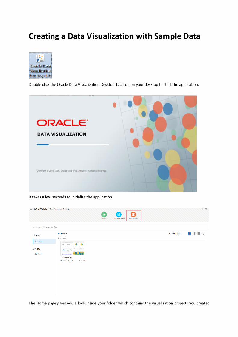
Double click the Oracle Data Visualization Desktop 12c icon on your desktop to start the application.
It takes a few seconds to initialize the application.
The Home page gives you a look inside your folder which contains the visualization projects you created
and a sample project created during the process of installation of Oracle Data Visualization.
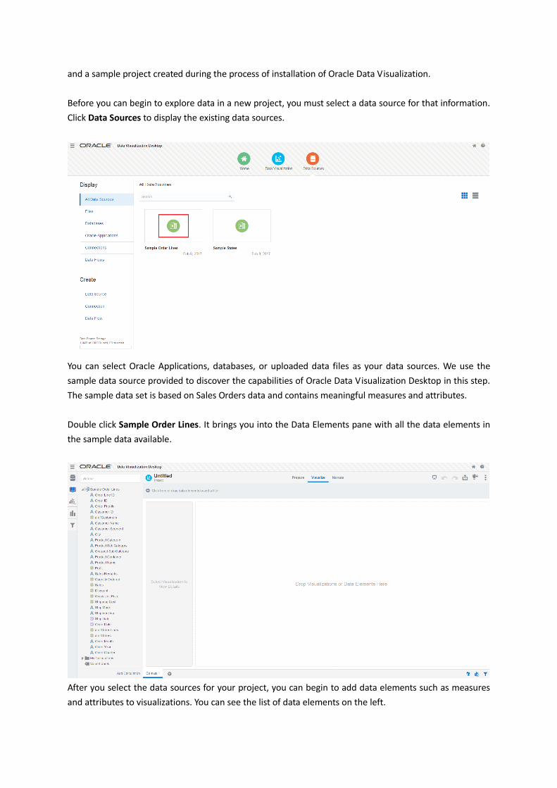
Before you can begin to explore data in a new project, you must select a data source for that information.
Click Data Sources to display the existing data sources.
You can select Oracle Applications, databases, or uploaded data files as your data sources. We use the
sample data source provided to discover the capabilities of Oracle Data Visualization Desktop in this step.
The sample data set is based on Sales Orders data and contains meaningful measures and attributes.
Double click Sample Order Lines. It brings you into the Data Elements pane with all the data elements in
the sample data available.
After you select the data sources for your project, you can begin to add data elements such as measures
and attributes to visualizations. You can see the list of data elements on the left.
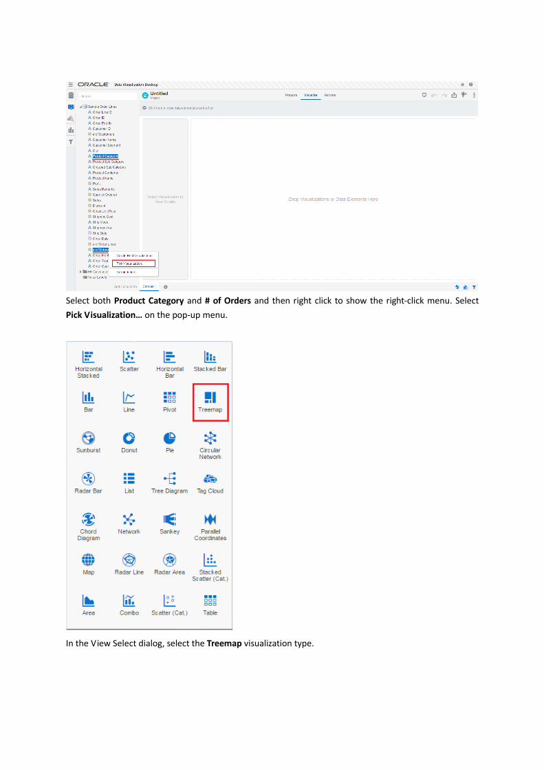
Select both Product Category and # of Orders and then right click to show the right-click menu. Select
Pick Visualization… on the pop-up menu.
In the View Select dialog, select the Treemap visualization type.

A tree map of # of Orders by Product Category is generated. You can see the largest one is Office Supplies
with 3949 orders followed by Technology and then Furniture.
You can work with color to make visualizations more attractive, dynamic, and informative. The Visualize
canvas has a Color drop target where you can put a measure column, attribute column, or set of
attributes columns.
Select Product Category on the left, drag and drop it into the Color drop target.

The blocks in the tree map are colored in different colors. It is easier to distinguish the differences among
the product categories.
You might want to add Product Sub Category information to the tree map as well. It might help you
understand the sales better.
Select Product Sub Category on the left, drag and drop it under the Product Category in the Category
drop target.

You can see there is a sub tree map in each product category block for you to drill down into each sub
product category.
Now let’s add a new visualization – a map of sales by states.
Right click in the blank area of Data Elements pane on the left, select Add Data Source in the pop-up
menu.

Select Sample States, click Add to Project in the Add Data Source dialog.
You can see the elements in the Sample States data source are expended in the Data Elements pane.
Right click in the blank area of Data Elements pane, select Source Diagram… in the pop-up menu.
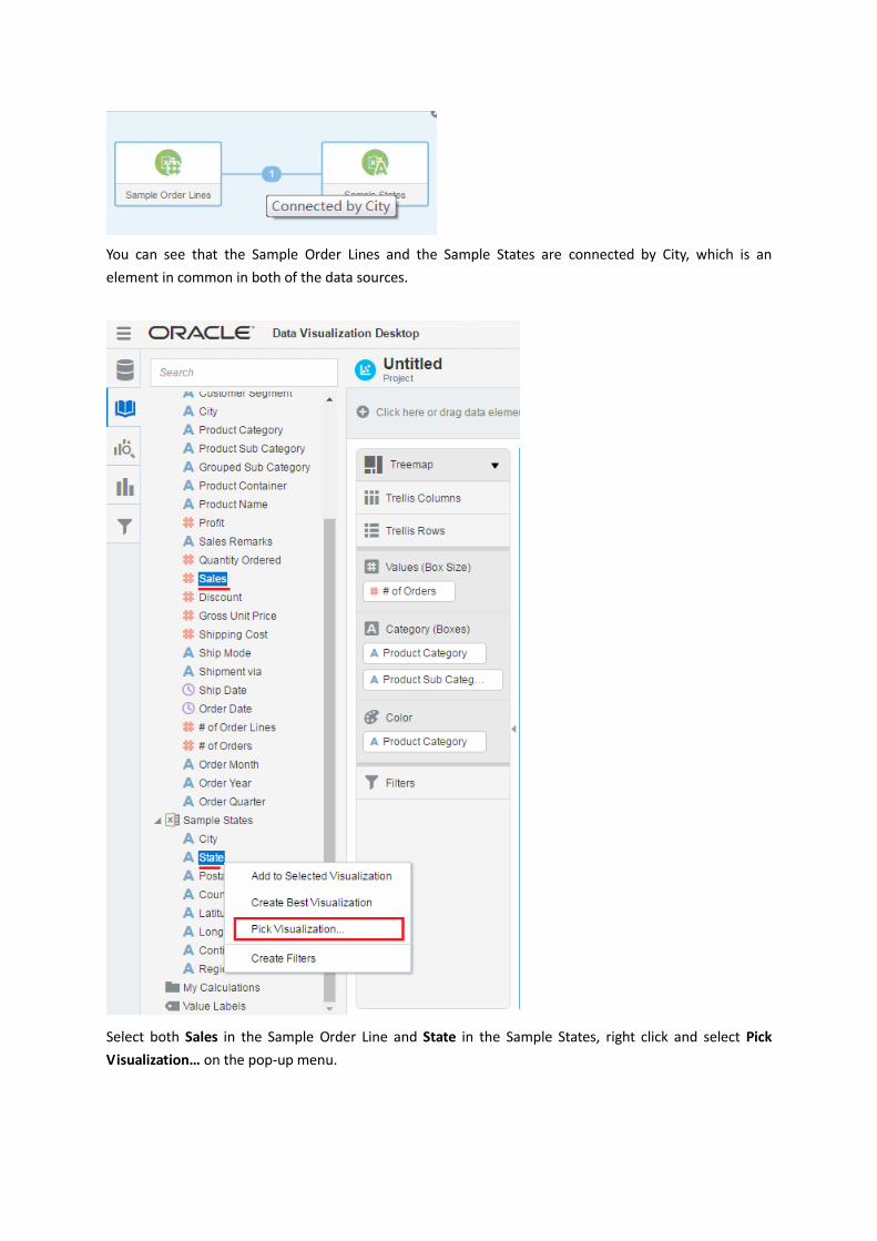
You can see that the Sample Order Lines and the Sample States are connected by City, which is an
element in common in both of the data sources.
Select both Sales in the Sample Order Line and State in the Sample States, right click and select Pick
Visualization… on the pop-up menu.

In the View Select dialog, select the Map visualization type.
A map of sales by states is added to the right of tree map.
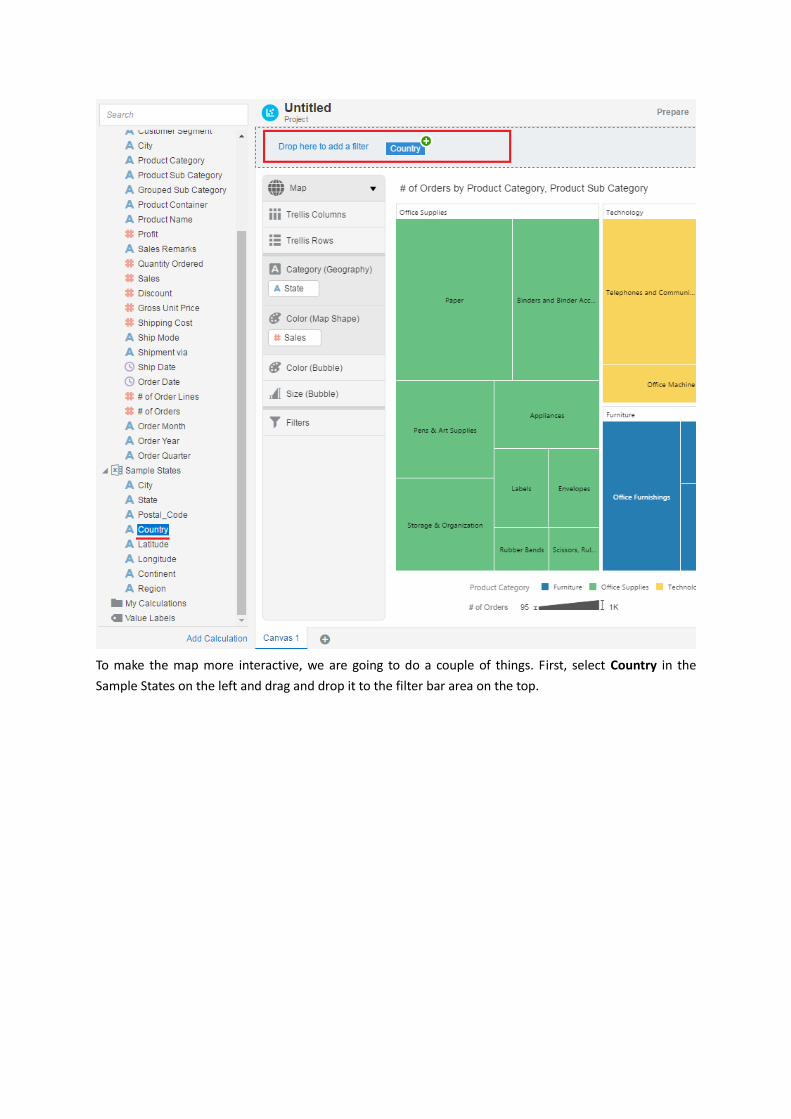
To make the map more interactive, we are going to do a couple of things. First, select Country in the
Sample States on the left and drag and drop it to the filter bar area on the top.
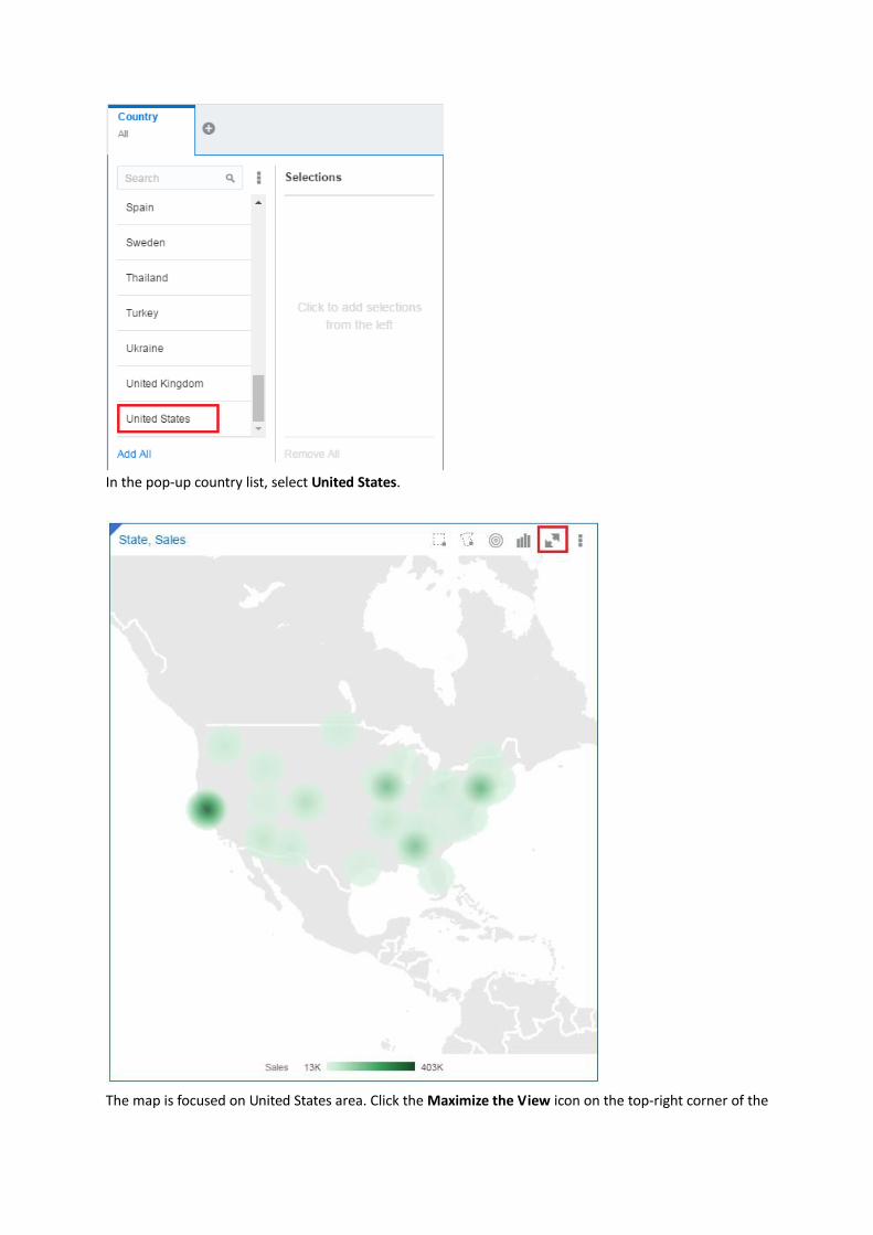
In the pop-up country list, select United States.
The map is focused on United States area. Click the Maximize the View icon on the top-right corner of the
map.
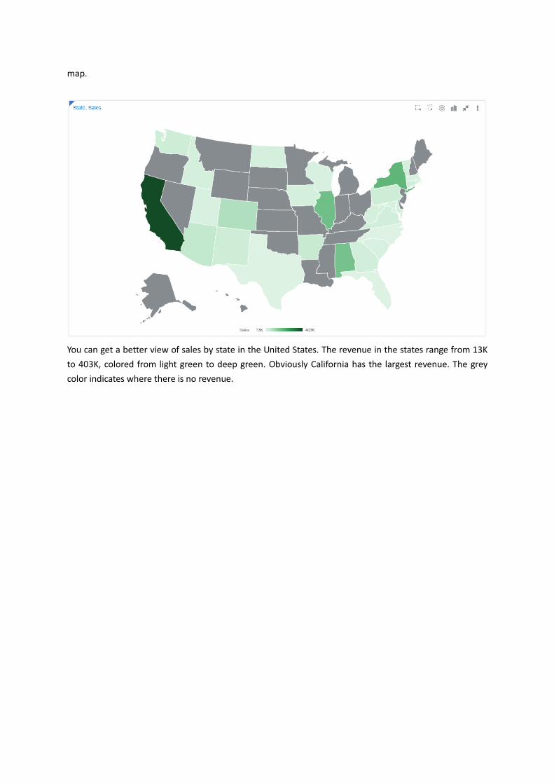
You can get a better view of sales by state in the United States. The revenue in the states range from 13K
to 403K, colored from light green to deep green. Obviously California has the largest revenue. The grey
color indicates where there is no revenue.

Select # of Customers on the left and drag and drop it to the Color (Bubble) drop target and Size (Bubble)
drop target respectively.

The more customers a state has, the deeper color and larger bubble it has.
Click the Close Maximized Visualization icon in the top-right corner of the map.
Select Sales in the Sample Order Line list on the left, right click it and select Pick Visualization… on the
pop-up menu.
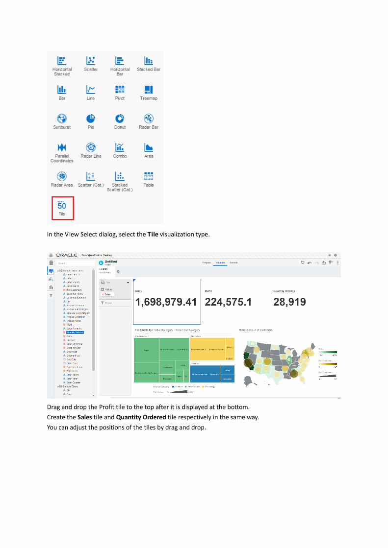
In the View Select dialog, select the Tile visualization type.
Drag and drop the Profit tile to the top after it is displayed at the bottom.
Create the Sales tile and Quantity Ordered tile respectively in the same way.
You can adjust the positions of the tiles by drag and drop.
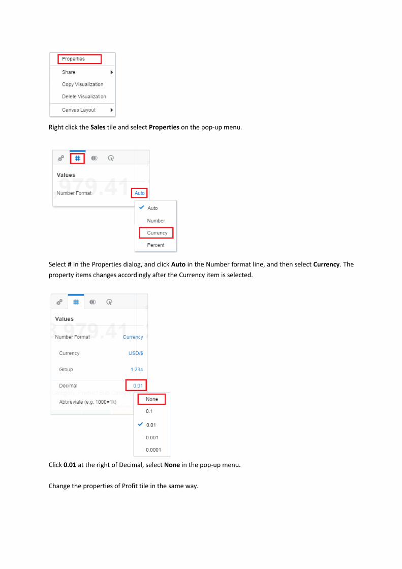
Right click the Sales tile and select Properties on the pop-up menu.
Select # in the Properties dialog, and click Auto in the Number format line, and then select Currency. The
property items changes accordingly after the Currency item is selected.
Click 0.01 at the right of Decimal, select None in the pop-up menu.
Change the properties of Profit tile in the same way.

Now you get a nice visualization. You can save and share. You can see the tiles of Sales, Profits, and
Quantity Ordered on the top. Down below you can see the tree map by product category and sub product
category. You can also see the geographic distribution of sales and # of customers by states US.
Adding Data Sources from Comma Separated
Value files
In this section you add two data sources from Comma Separated Value files with the .CSV extension to
your project. You can also add Microsoft Excel spreadsheet file. Data source files from a Microsoft Excel
spreadsheet file must have the XLSX extension (signifying a Microsoft Office Open XML Workbook file).

Return to the Home page, and click Data Sources on the top and click Data Source on the left.
In the Create New Data Source dialog, click Add Connection to view different types of data sources Oracle
Data Visualization supports.

Oracle Data Visualization can connect many types of data sources like Oracle Applications, databases,
Salesforce, Spark.
Because you will upload Comma Separated Value files as the data sources in this section, click the left
arrow icon to go back to the Create New Data Source dialog.
In the Create New Data Source dialog, click File.
In the Select File dialog, select the People.csv file, which should be downloaded at the beginning of this
tutorial.

The column names and data from People.csv are listed. Note, only part of the records in the data source is
displayed.
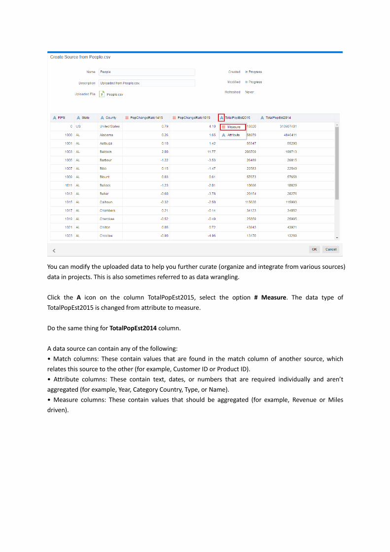
You can modify the uploaded data to help you further curate (organize and integrate from various sources)
data in projects. This is also sometimes referred to as data wrangling.
Click the A icon on the column TotalPopEst2015, select the option # Measure. The data type of
TotalPopEst2015 is changed from attribute to measure.
Do the same thing for TotalPopEst2014 column.
A data source can contain any of the following:
• Match columns: These contain values that are found in the match column of another source, which
relates this source to the other (for example, Customer ID or Product ID).
• Attribute columns: These contain text, dates, or numbers that are required individually and aren’t
aggregated (for example, Year, Category Country, Type, or Name).
• Measure columns: These contain values that should be aggregated (for example, Revenue or Miles
driven).
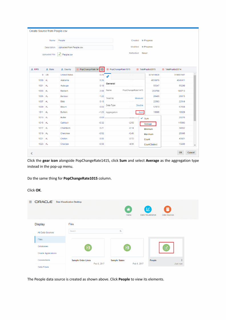
Click the gear icon alongside PopChangeRate1415, click Sum and select Average as the aggregation type
instead in the pop-up menu.
Do the same thing for PopChangeRate1015 column.
Click OK.
The People data source is created as shown above. Click People to view its elements.
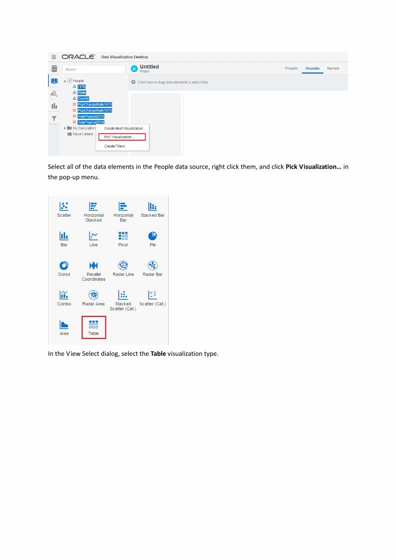
Select all of the data elements in the People data source, right click them, and click Pick Visualization… in
the pop-up menu.
In the View Select dialog, select the Table visualization type.
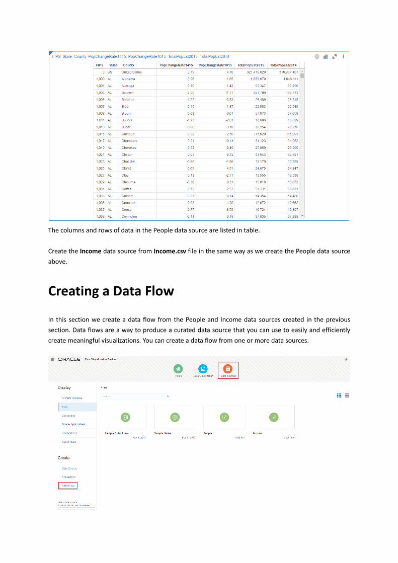
The columns and rows of data in the People data source are listed in table.
Create the Income data source from Income.csv file in the same way as we create the People data source
above.
Creating a Data Flow
In this section we create a data flow from the People and Income data sources created in the previous
section. Data flows are a way to produce a curated data source that you can use to easily and efficiently
create meaningful visualizations. You can create a data flow from one or more data sources.
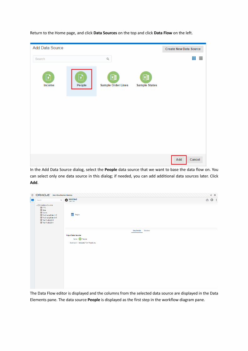
Return to the Home page, and click Data Sources on the top and click Data Flow on the left.
In the Add Data Source dialog, select the People data source that we want to base the data flow on. You
can select only one data source in this dialog; if needed, you can add additional data sources later. Click
Add.
The Data Flow editor is displayed and the columns from the selected data source are displayed in the Data
Elements pane. The data source People is displayed as the first step in the workflow diagram pane.
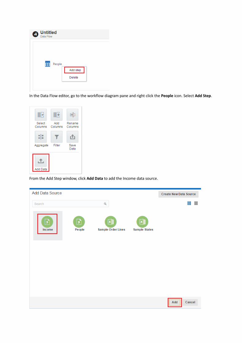
In the Data Flow editor, go to the workflow diagram pane and right click the People icon. Select Add Step.
From the Add Step window, click Add Data to add the Income data source.
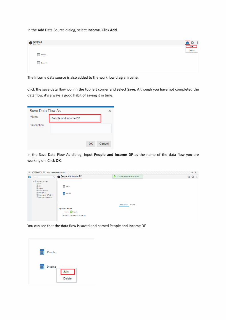
In the Add Data Source dialog, select Income. Click Add.
The Income data source is also added to the workflow diagram pane.
Click the save data flow icon in the top left corner and select Save. Although you have not completed the
data flow, it’s always a good habit of saving it in time.
In the Save Data Flow As dialog, input People and Income DF as the name of the data flow you are
working on. Click OK.
You can see that the data flow is saved and named People and Income DF.

Let’s continue to create the data flow after saving it.
In the workflow diagram pane, select both the People and the Income icons and right click them. Select
Join.
In the Step Details pane, you can see the two data sources are joined by the match column FIPS.
You can analyze a data source on its own, or you can analyze two or more data sources together,
depending on what the data source contains. If you use multiple sources together, then at least one
match column must exist in each source. The requirements for matching are:
• The sources contain common values (for example, Customer ID or Product ID)
• The match must be of the same data type (for example, number with number, date with date, or text
with text)
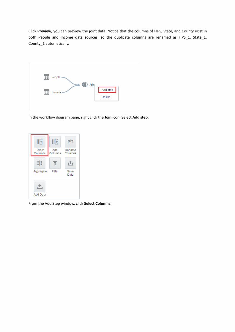
Click Preview, you can preview the joint data. Notice that the columns of FIPS, State, and County exist in
both People and Income data sources, so the duplicate columns are renamed as FIPS_1, State_1,
County_1 automatically.
In the workflow diagram pane, right click the Join icon. Select Add step.
From the Add Step window, click Select Columns.
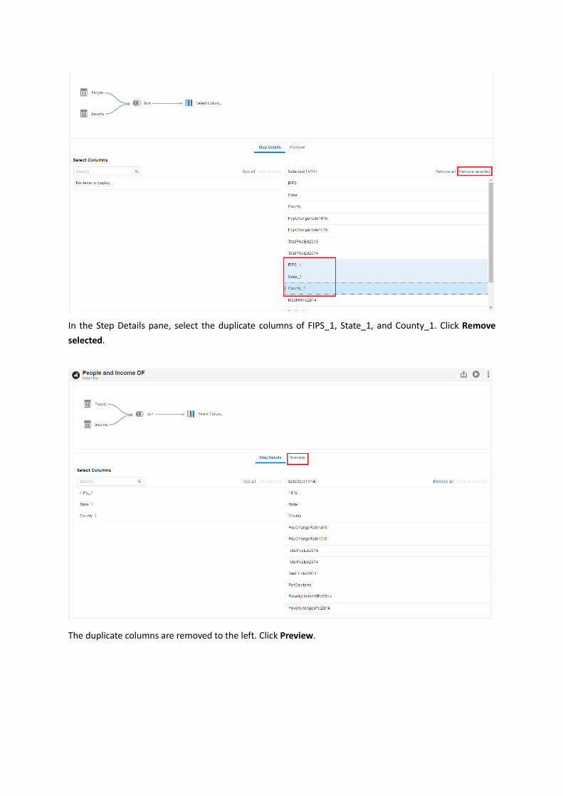
In the Step Details pane, select the duplicate columns of FIPS_1, State_1, and County_1. Click Remove
selected.
The duplicate columns are removed to the left. Click Preview.
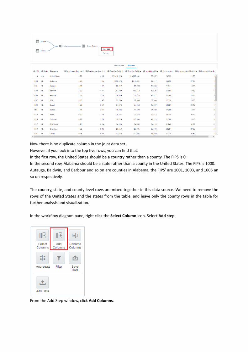
Now there is no duplicate column in the joint data set.
However, if you look into the top five rows, you can find that:
In the first row, the United States should be a country rather than a county. The FIPS is 0.
In the second row, Alabama should be a state rather than a county in the United States. The FIPS is 1000.
Autauga, Baldwin, and Barbour and so on are counties in Alabama, the FIPS’ are 1001, 1003, and 1005 an
so on respectively.
The country, state, and county level rows are mixed together in this data source. We need to remove the
rows of the United States and the states from the table, and leave only the county rows in the table for
further analysis and visualization.
In the workflow diagram pane, right click the Select Column icon. Select Add step.
From the Add Step window, click Add Columns.
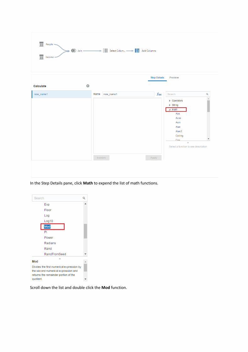
In the Step Details pane, click Math to expend the list of math functions.
Scroll down the list and double click the Mod function.
The MOD function is selected in the edit box. Input FIPS as the first parameter and 1000 as the second
parameter for the MOD function. Input LOCATE_STATE as the new column name. Click Validate and Apply.
Then click Preview.
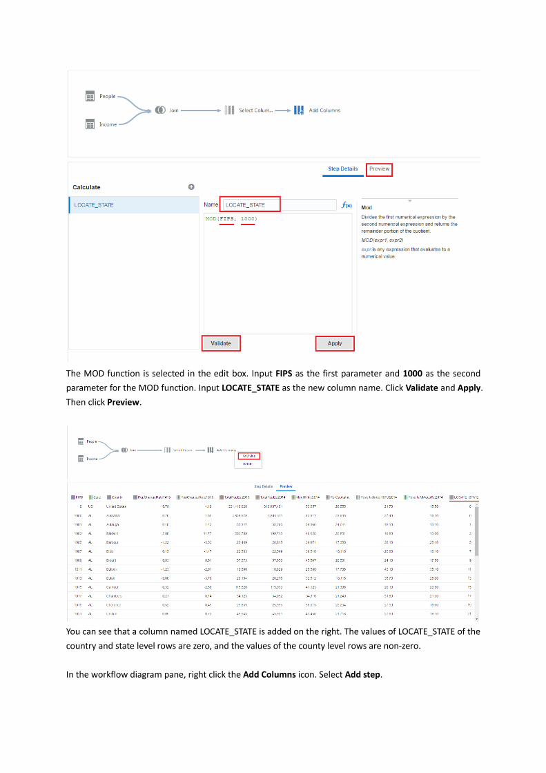
You can see that a column named LOCATE_STATE is added on the right. The values of LOCATE_STATE of the
country and state level rows are zero, and the values of the county level rows are non-zero.
In the workflow diagram pane, right click the Add Columns icon. Select Add step.
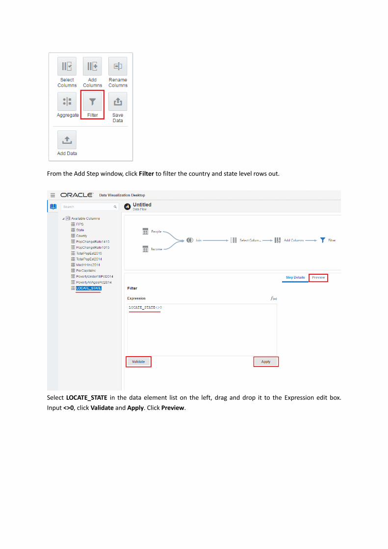
From the Add Step window, click Filter to filter the country and state level rows out.
Select LOCATE_STATE in the data element list on the left, drag and drop it to the Expression edit box.
Input <>0, click Validate and Apply. Click Preview.
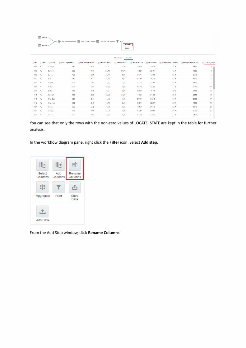
You can see that only the rows with the non-zero values of LOCATE_STATE are kept in the table for further
analysis.
In the workflow diagram pane, right click the Filter icon. Select Add step.
From the Add Step window, click Rename Columns.
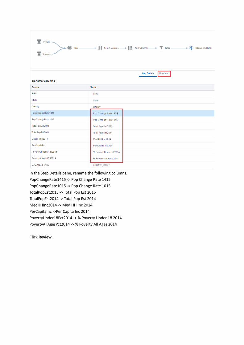
In the Step Details pane, rename the following columns.
PopChangeRate1415 -> Pop Change Rate 1415
PopChangeRate1015 -> Pop Change Rate 1015
TotalPopEst2015 -> Total Pop Est 2015
TotalPopEst2014 -> Total Pop Est 2014
MedHHInc2014 -> Med HH Inc 2014
PerCapitaInc ->Per Capita Inc 2014
PovertyUnder18Pct2014 -> % Poverty Under 18 2014
PovertyAllAgesPct2014 -> % Poverty All Ages 2014
Click Review.
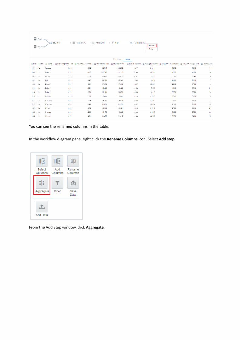
You can see the renamed columns in the table.
In the workflow diagram pane, right click the Rename Columns icon. Select Add step.
From the Add Step window, click Aggregate.

The aggregate function for each data element should be shown as that in the screenshot. If not, change
the functions to Average or Sum accordingly. The function is Sum for Total Pop Est 2015 and Total Pop Est
2014, and Average for the rest of data elements.
In the workflow diagram pane, right click the Aggregate icon. Select Add step.
From the Add Step window, click Save Data.
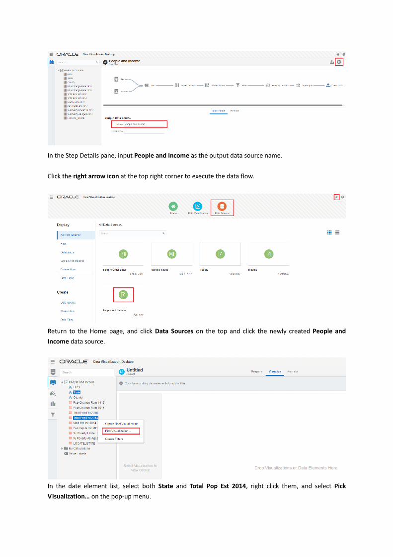
In the Step Details pane, input People and Income as the output data source name.
Click the right arrow icon at the top right corner to execute the data flow.
Return to the Home page, and click Data Sources on the top and click the newly created People and
Income data source.
In the date element list, select both State and Total Pop Est 2014, right click them, and select Pick
Visualization… on the pop-up menu.

In the View Select dialog, select the Map visualization type.
You can see that states are colored in blue. The darker the color is, the higher value of Total Pop Est 2014
is.
Right click My Calculations on the left, select Add Calculations….
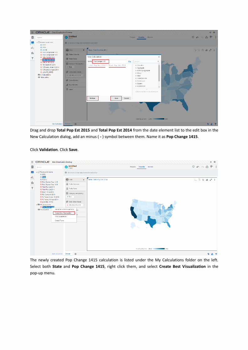
Drag and drop Total Pop Est 2015 and Total Pop Est 2014 from the date element list to the edit box in the
New Calculation dialog, add an minus ( - ) symbol between them. Name it as Pop Change 1415.
Click Validation. Click Save.
The newly created Pop Change 1415 calculation is listed under the My Calculations folder on the left.
Select both State and Pop Change 1415, right click them, and select Create Best Visualization in the
pop-up menu.
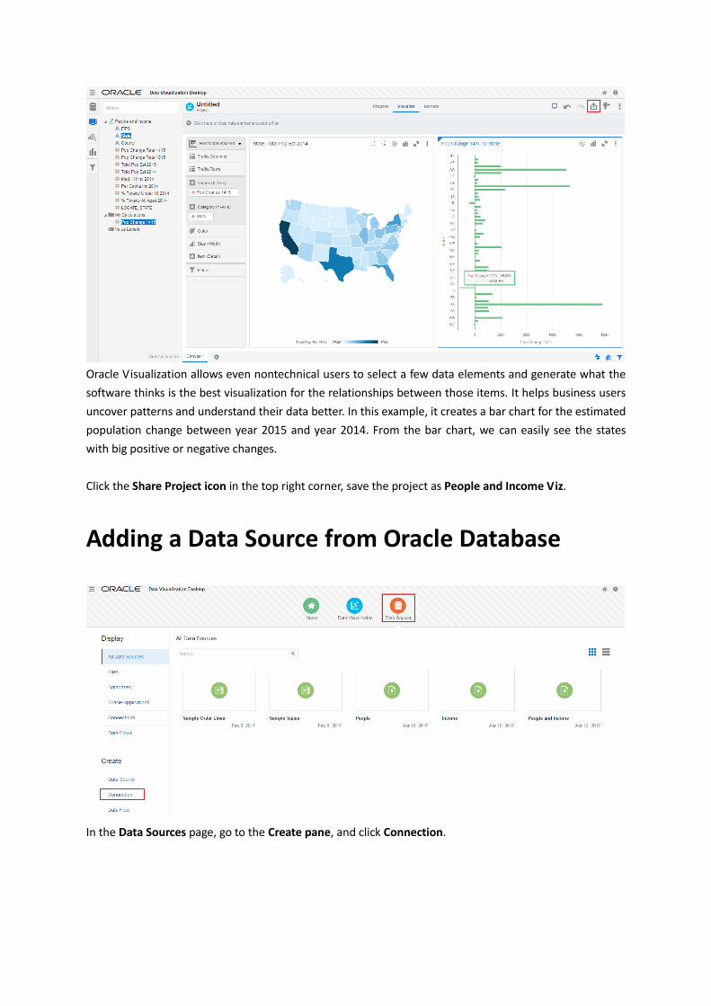
Oracle Visualization allows even nontechnical users to select a few data elements and generate what the
software thinks is the best visualization for the relationships between those items. It helps business users
uncover patterns and understand their data better. In this example, it creates a bar chart for the estimated
population change between year 2015 and year 2014. From the bar chart, we can easily see the states
with big positive or negative changes.
Click the Share Project icon in the top right corner, save the project as People and Income Viz.
Adding a Data Source from Oracle Database
In the Data Sources page, go to the Create pane, and click Connection.
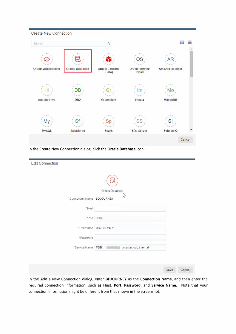
In the Create New Connection dialog, click the Oracle Database icon.
In the Add a New Connection dialog, enter BDJOURNEY as the Connection Name, and then enter the
required connection information, such as Host, Port, Password, and Service Name. Note that your
connection information might be different from that shown in the screenshot.
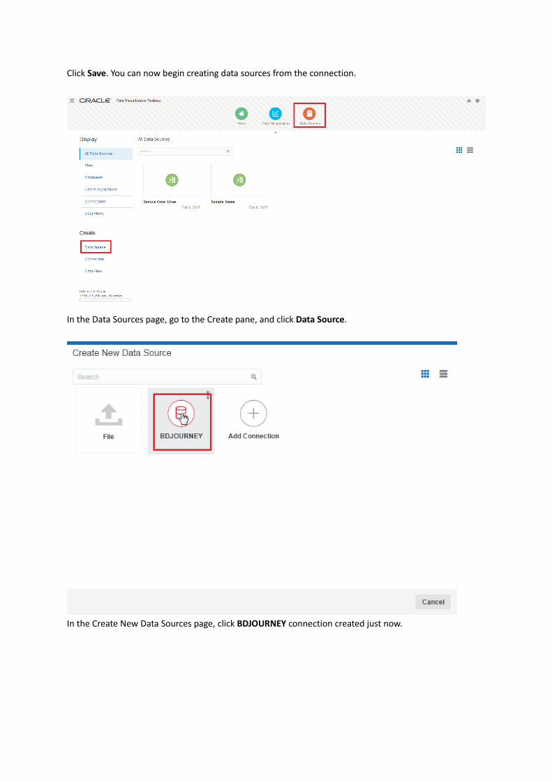
Click Save. You can now begin creating data sources from the connection.
In the Data Sources page, go to the Create pane, and click Data Source.
In the Create New Data Sources page, click BDJOURNEY connection created just now.
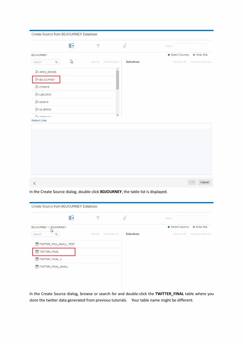
In the Create Source dialog, double click BDJOURNEY, the table list is displayed.
In the Create Source dialog, browse or search for and double-click the TWITTER_FINAL table where you
store the twitter data generated from previous tutorials. Your table name might be different.
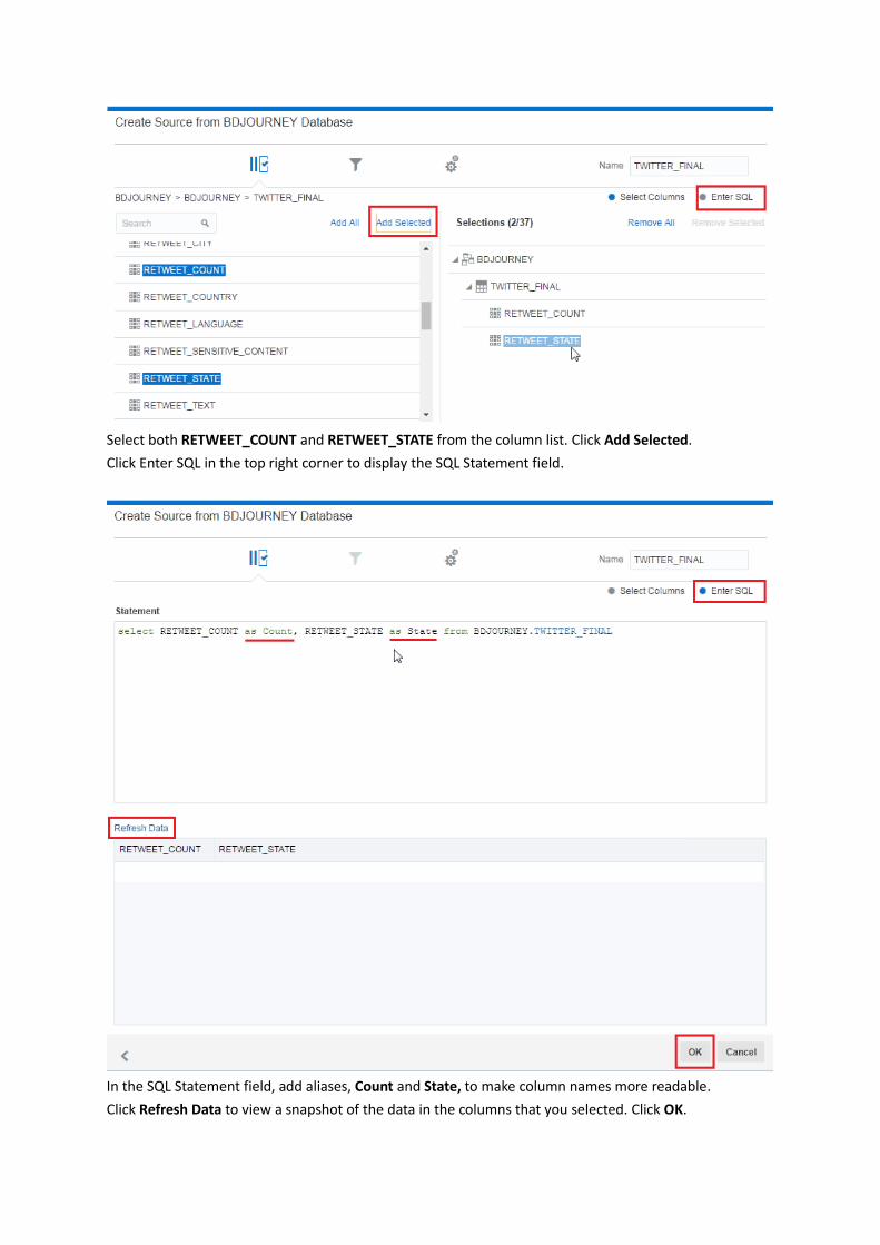
Select both RETWEET_COUNT and RETWEET_STATE from the column list. Click Add Selected.
Click Enter SQL in the top right corner to display the SQL Statement field.
In the SQL Statement field, add aliases, Count and State, to make column names more readable.
Click Refresh Data to view a snapshot of the data in the columns that you selected. Click OK.
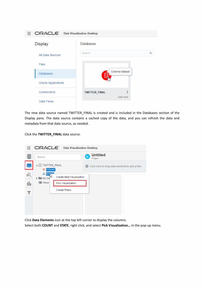
The new data source named TWITTER_FINAL is created and is included in the Databases section of the
Display pane. The data source contains a cached copy of the data, and you can refresh the data and
metadata from that data source, as needed.
Click the TWITTER_FINAL data source.
Click Data Elements icon at the top left corner to display the columns.
Select both COUNT and STATE, right click, and select Pick Visualization… in the pop-up menu.
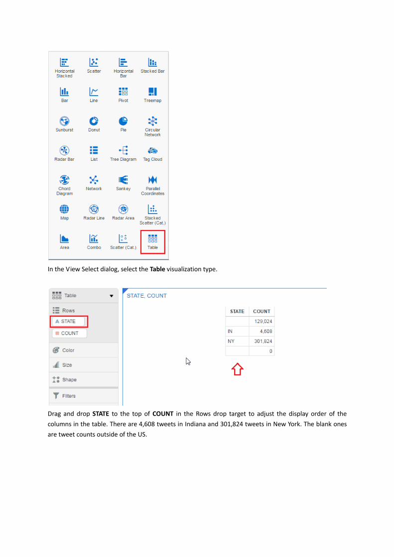
In the View Select dialog, select the Table visualization type.
Drag and drop STATE to the top of COUNT in the Rows drop target to adjust the display order of the
columns in the table. There are 4,608 tweets in Indiana and 301,824 tweets in New York. The blank ones
are tweet counts outside of the US.
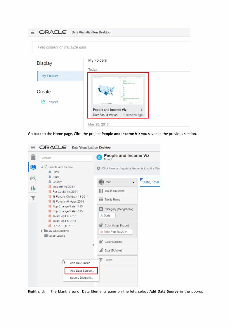
Go back to the Home page, Click the project People and Income Viz you saved in the previous section.
Right click in the blank area of Data Elements pane on the left, select Add Data Source in the pop-up

menu.
Select TWITTER_FINAL in the Add Data Source window.
Drag and drop COUNT from the data element list on the left to the Size (Bubble) drop target. Two bubbles
are displayed in the map.
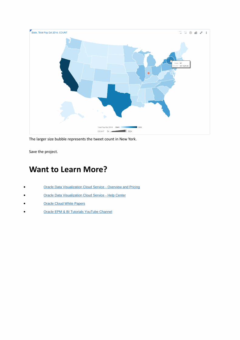
The larger size bubble represents the tweet count in New York.
Save the project.
Want to Learn More?
Oracle Data Visualization Cloud Service - Overview and Pricing
Oracle Data Visualization Cloud Service - Help Center
Oracle Cloud White Papers
Oracle EPM & BI Tutorials YouTube Channel