new rules for responsive design
TRANSCRIPT

The new rules for responsive design.

First rule:

Mobile first.

April 21.

Easier coding.


Problem:


Or worse.


AA.com?

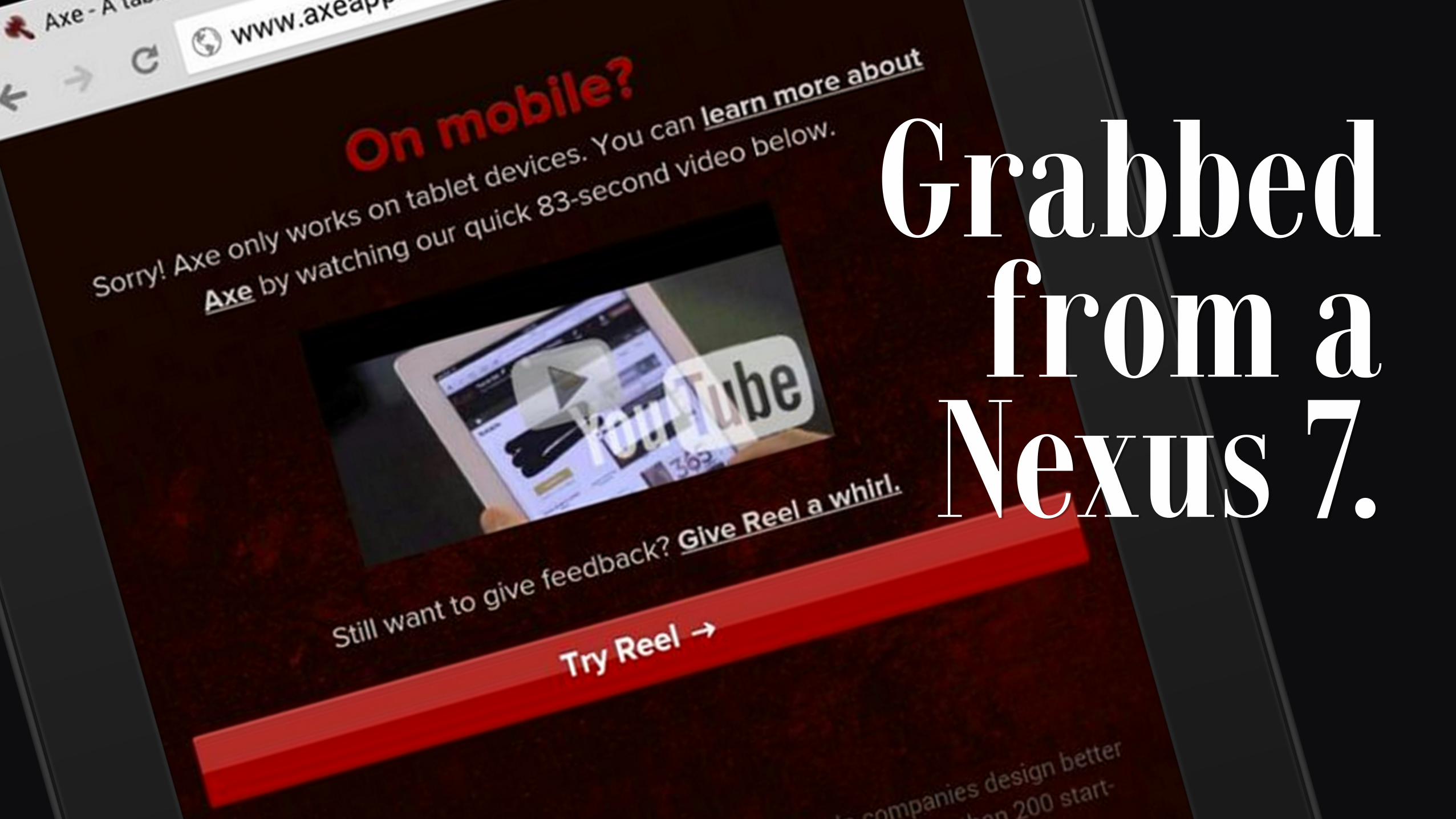
Grabbed from a
Nexus 7.

Why make us this mad?

UX > UI.Even I don’t critique the visuals until after
I’ve done my task.


UX=>CX=>

Customer Satisfaction.

=> BRAND.

BRAND => $$$$

So?

Don’t make things worse.

Remember 2007?

Double-tap and scroll never went away.

Beyond the stripes.

A start. Responsive images, kinda.


A hero image. Not a splash
screen, and with better navigation.


Main nav = main visual.

Be Explicit.

Be clear.

Give great directions.

Label All The Things!

WTF => HY!

UX => C-SAT

=> BRAND!

Mary Baum@marybaum [email protected] marginhancers.com frontenactennis.com