neal stublen [email protected]. font limitations browsers can only display the fonts installed on...
TRANSCRIPT


CHAPTER 9
EMBEDDED FONTS AND MULTICOLUMN LAYOUTS

Web Fonts

Font Limitations
Browsers can only display the fonts installed on the deviceArial, Verdana, Times, Georgia
Custom fonts usually meant using images

Now: @font-face
Instructs the browser to download a font and make it available
@font-face {
font-family: ‘fontName’;
src: url(…);
font-weight: weight;
font-style: style;
}

Font Sources
Specify one or more font sources Similar to specifying media sources
Let the browser choose the supported format
src: url(…) format(‘eot’),
url(…) format(‘woff’),
url(…) format(‘trutype’)

Font Types
EOT – proprietary font format for IE4-8 WOFF – Web Open Font Format OTF – OpenType TTF – TrueType SVG – Scalable Vector Graphics
(original iPhone)
Compatibility – Table 9.1, caniuse.com
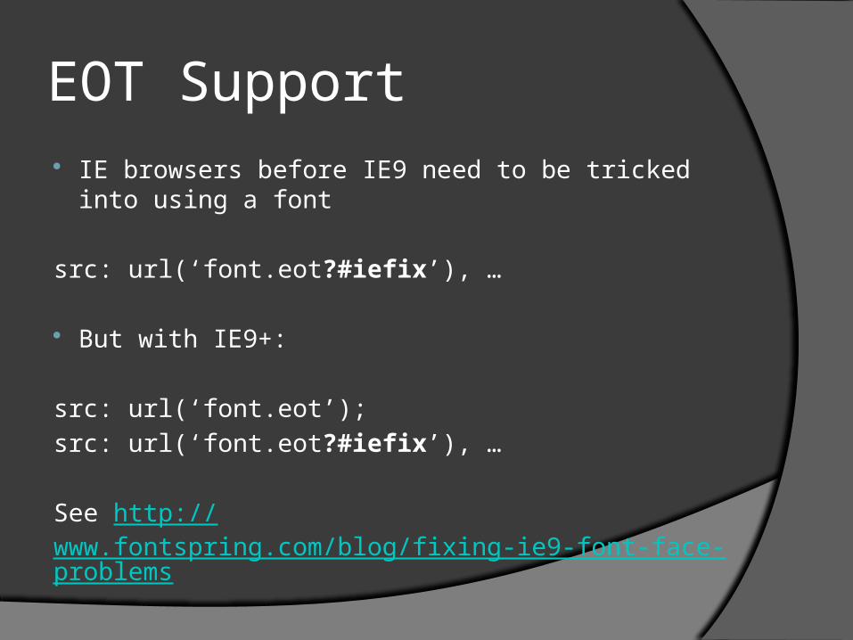
EOT Support IE browsers before IE9 need to be tricked into using a
font
src: url(‘font.eot?#iefix’), …
But with IE9+:
src: url(‘font.eot’);
src: url(‘font.eot?#iefix’), …
See http://www.fontspring.com/blog/fixing-ie9-font-face-problems

Font Property Descriptors @font-face properties, such as font-
weight, don’t control the font – they describe the font
@font-face { font-family: ‘MyFont’;
font-style: normal }
@font-face { font-family: ‘MyFont’;
font-style: italic }

Unicode Range
Specifies the characters included in the font
May be necessary for specialized fonts or with some languages

Applying the Font
Refer to the font as any other font
h1 {
font-family: MyFont, sans-serif;
}
Fallback fonts may be a good idea

Adding a Font
Let’s add fonts to the HTML Herald page
Add fonts to @font-face

Fonts That Won’t Load
Some browsers (meaning IE) won’t load online fonts for an offline web page
Fonts from other sources, such as Google Fonts, may need to be copied
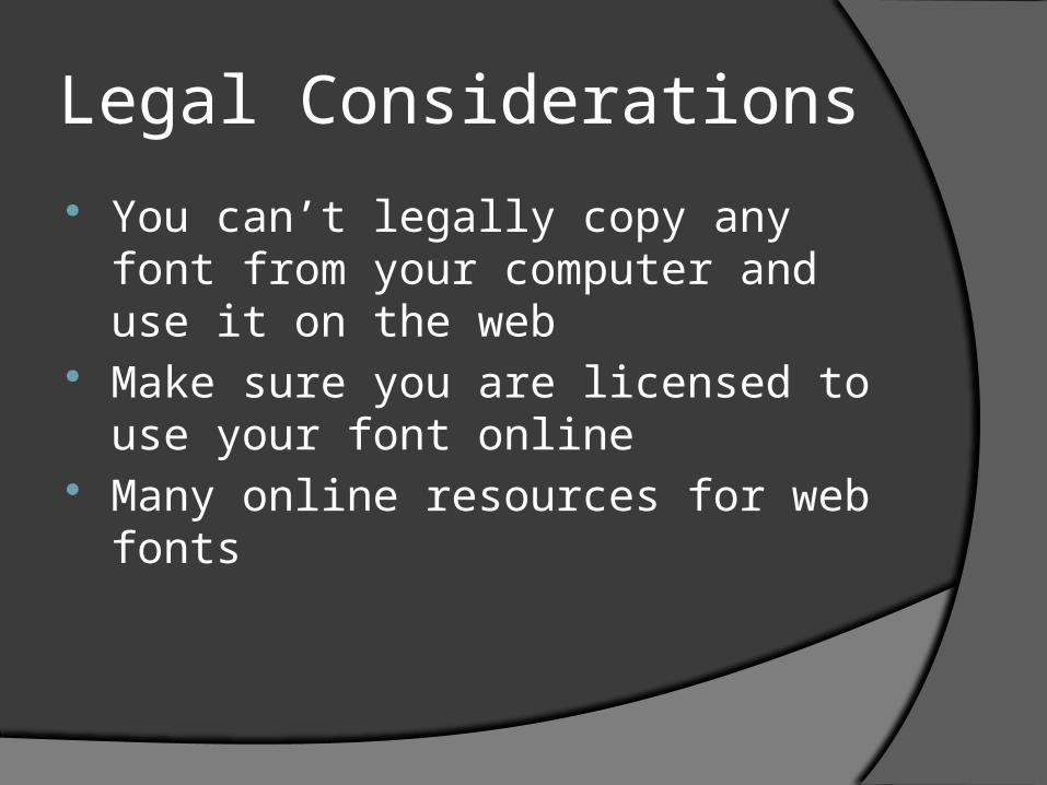
Legal Considerations
You can’t legally copy any font from your computer and use it on the web
Make sure you are licensed to use your font online
Many online resources for web fonts

Font Squirrel
If you need to create multiple font files, Font Squirrel can help
Upload a single font format, download multiple font formats

Exercise Caution
Downloading fonts can use a lot of bandwidthDo I need a custom font on mobile devices?
Only include fonts you use Consider images for rare font use Can the font size be reduced to only
include the characters you need?Only uppercase, etc.

Multicolumn Layouts

Mimic Newsletter Formats CSS3 can wrap text into multiple
columns
column-count
column-gap
column-width
No columns if not supported

Columns and Height
How do columns wrap if the containing element has a specified height?
Columns are only created when needed Text overflows out of the last column
(use overlow: hidden to hide overflow content)
Use column-fill: balance to evenly spread content across all columns

Column Rules and Breaks Use column-rule to display a line
between columns Use break-before, break-after, break-
inside to prevent column breaks
h2 {
break-after: avoid
} Use column-span to force an element to
span multiple columns

Media Queries

What are media queries?
Conditional CSS that depends on device attributesScreen vs. printDisplay widthPixel ratio (iOS)
Seen in the <link rel=“stylesheet”> as media=“print”
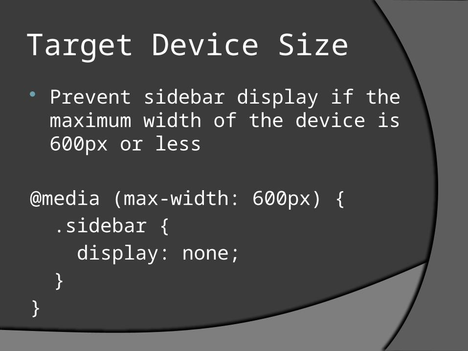
Target Device Size
Prevent sidebar display if the maximum width of the device is 600px or less
@media (max-width: 600px) {
.sidebar {
display: none;
}
}

Target Device Orientation Prevent sidebar display if the device is
in portrait mode
@media (orientation: portrait) {
.sidebar {
display: none;
}
}

Possible Queries
color (bits per pixel for colors) aspect-ratio, device-aspect-ratio device-height, device-width height, width orientation resolution
Upcoming queries:http://dev.w3.org/csswg/mediaqueries4/