music magazinefront cover analysis
TRANSCRIPT
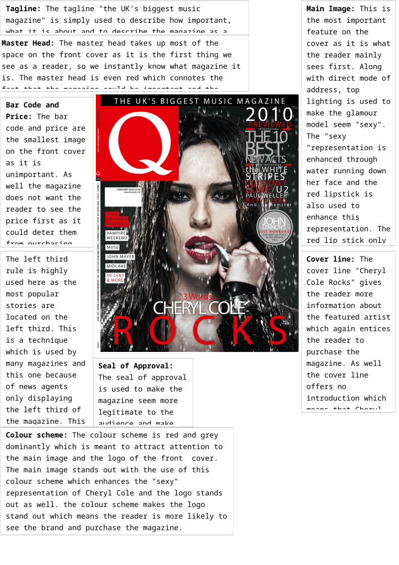
Master Head: The master head takes up most of the space on the front cover as it is the first thing we see as a reader, so we instantly know what magazine it is. The master head is even red which connotes the fact that the magazine could be important and the design is very simplistic which shows how well known the brand is to people.
Main Image: This is the most important feature on the cover as it is what the reader mainly sees first. Along with direct mode of address, top lighting is used to make the glamour model seem "sexy". The "sexy "representation is enhanced through water running down her face and the red lipstick is also used to enhance this representation. The red lip stick only does not represent "sexiness", but also it links in with the magazines style and colour scheme. This link emphasises the style of the magazine and reinforces the magazine's look to the reader.
Tagline: The tagline "the UK's biggest music magazine" is simply used to describe how important, what it is about and to describe the magazine as a whole.
Bar Code and Price: The bar code and price are the smallest image on the front cover as it is unimportant. As well the magazine does not want the reader to see the price first as it could deter them from purchasing the magazine. The magazine wants the reader to be enticed by the stories and the featured artist before seeing the front cover.
The left third rule is highly used here as the most popular stories are located on the left third. This is a technique which is used by many magazines and this one because of news agents only displaying the left third of the magazine. This magazine has placed its logo and stories on the left third to make the reader see that the band of the magazine and also to entice the reader.
Cover line: The cover line "Cheryl Cole Rocks" gives the reader more information about the featured artist which again entices the reader to purchase the magazine. As well the cover line offers no introduction which means that Cheryl is well known to us and so that the magazine does not waste time or space on introducing her to the audience.
Seal of Approval: The seal of approval is used to make the magazine seem more legitimate to the audience and make the reader be more comfortable about the purchase of the magazine
Colour scheme: The colour scheme is red and grey dominantly which is meant to attract attention to the main image and the logo of the front cover. The main image stands out with the use of this colour scheme which enhances the "sexy" representation of Cheryl Cole and the logo stands out as well. the colour scheme makes the logo stand out which means the reader is more likely to see the brand and purchase the magazine.
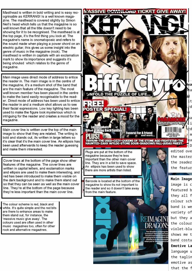
Master Head: The master head is following the third rule as it is on the left third. This shows the potential reader that the magazine is “billboard”. The fact that the main singer of the featured band “Imagine Dragons” is edited over part of the master head shows the reader the reader the featured band. This shows the reader what band is featured in the magazine but it also the fact that the reader knows its “billboard” so the magazine is more concerned about conveying the band that is being featured in their magqazine.Main Image: The main image is clearly the featured band and they all follow a colour scheme. The band is wearing a variety of colours but they all surround the colour scheme of violet-blue. This shows me that the band costumes and the background of the images correlate to create a better front cover that seems more organised.
Emotive Language: language used below the tagline is very emotive as it states that the featured band “imagine Dragons” is great as they performed at the Grammys and are releasing