ms-excel - hipaco.inhipaco.in/upload/coursematerial/excel2007.pdf · 41 ms-excel -devendra singh...
TRANSCRIPT

41
Ms-Excel
-Devendra Singh
Excel is an electronic spreadsheet program that can be used for storing, organizing and
manipulating data.
When you look at the Excel screen (refer to the example on this page) you see a
rectangular table or grid of rows and columns. The horizontal rows are identified by
numbers (1, 2, 3) and the vertical columns with letters of the alphabet (A,B,C). For
columns beyond 26, columns are identified by two or more letters such as AA, AB, and
AC.
The intersection point between a column and a row is a small rectangular box known as
a cell. A cell is the basic unit for storing data in the spreadsheet. Because an Excel
spreadsheet contains thousands of these cells, each is given a cell reference or
address to identify it.
The cell reference is a combination of the column letter and the row number such as A3,
B6, and AA345.
The Excel 2007 "Big Grid" increases the maximum number of rows per worksheet
from 65536 to over 1 million(1,048,576 rows), and the number of columns from 256 to
16385 Excel is the widely used statistical package, which serves as a tool to understand
statistical concepts and computation to check your hand-worked calculation in solving
your homework problems. The screen appears below.
Start > Programs > Microsoft Office > Microsoft Excel 2007
Bold
d Italic
Underline
42
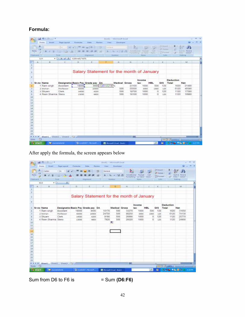
Formula:
After apply the formula, the screen appears below
Sum from D6 to F6 is = Sum (D6:F6)

43
Average from D6 to F6 is = AVG (D6:F6)
Maximum from D6 to F6 is = MAX (D6:F6)
Minimum from D6 to F6 is = Min (D6:F6)
Deduct the value from H6 to L6 = H6-L6
Chart: Microsoft Office Excel 2007 supports numerous types of charts to help you
display data in ways that are meaningful to your audience. When you want to create a
chart or change an existing chart, you can choose from a wide range of chart subtypes
available for each of the following chart types.
chart types
Column charts

44
Line charts
Pie charts
Bar charts
Area charts
XY (scatter) charts
Stock charts
Surface charts
Doughnut charts
Bubble charts
Radar charts
Column charts
Data that is arranged in columns or rows on a worksheet can be plotted in a column
chart. Column charts are useful for showing data changes over a period of time or for
illustrating comparisons among items.
In column charts, categories are typically organized along the horizontal axis and values
along the vertical axis.
Column charts have the following chart subtypes:
Clustered column and clustered column in 3-D Clustered column charts
compare values across categories. A clustered column chart displays values in

45
2-D vertical rectangles. A clustered column in 3-D chart displays only the vertical
rectangles in 3-D format; it does not display the data in 3-D format.
NOTE To present data in a 3-D format that uses three axes (horizontal,
vertical, and depth axes) that you can modify, you should use the 3-D column
chart subtype.
You can use a clustered column chart type when you have categories that
represent:
Ranges of values (for example, item counts in a histogram).
Specific scale arrangements (for example, a Likert scale with entries, such
as strongly agree, agree, neutral, disagree, strongly disagree).
Names that are not in any specific order (for example, item names,
geographic names, or the names of people).
Stacked column and stacked column in 3-D Stacked column charts show the
relationship of individual items to the whole, comparing the contribution of each
value to a total across categories. A stacked column chart displays values in 2-D
vertical stacked rectangles. A 3-D stacked column chart displays the vertical
stacked rectangles in 3-D format; it does not display the data in 3-D format.
You can use a stacked column chart when you have multiple data series and
when you want to emphasize the total.
100% stacked column and 100% stacked column in 3-D These types of
column charts compare the percentage each value contributes to a total across
categories. A 100% stacked column chart displays values in 2-D vertical 100%
stacked rectangles. A 3-D 100% stacked column chart displays the vertical
100% stacked rectangles in 3-D format; it does not display the data in 3-D
format. You can use a 100% stacked column chart when you have three or more
data series and you want to emphasize the contributions to the whole, especially
if the total is the same for each category.
3-D column 3-D column charts use three axes that you can modify (a horizontal
axis, a vertical axis, and a depth axis) and they compare data points (data

46
points: Individual values plotted in a chart and represented by bars, columns,
lines, pie or doughnut slices, dots, and various other shapes called data
markers. Data markers of the same color constitute a data series.) along the
horizontal and the depth axes.
You can use a 3-D column chart when you want to compare data across the
categories and across the series equally.
Cylinder, cone, and pyramid Cylinder, cone, and pyramid charts are available
in the same clustered, stacked, 100% stacked, and 3-D chart types that are
provided for rectangular column charts, and they show and compare data
exactly the same way. The only difference is that these chart types display
cylinder, cone, and pyramid shapes instead of rectangles.
Line charts
Data that is arranged in columns or rows on a worksheet can be plotted in a line chart.
Line charts can display continuous data over time, set against a common scale, and are
therefore ideal for showing trends in data at equal intervals. In a line chart, category
data is distributed evenly along the horizontal axis, and all value data is distributed
evenly along the vertical axis.
You should use a line chart if your category labels are text, and are representing evenly
spaced values such as months, quarters, or fiscal years. This is especially true if there
are multiple series—for one series, you should consider using a category chart. You
should also use a line chart if you have a few evenly spaced numerical labels,
especially years. If you have more than ten numerical labels, use a scatter chart
instead.

47
Line charts have the following chart subtypes:
Line and line with markers Displayed with or without markers to indicate
individual data values, line charts are useful to show trends over time or ordered
categories, especially when there are many data points and the order in which
they are presented is important. If there are many categories or the values are
approximate, you should use a line chart without markers.
Stacked line and stacked line with markers Displayed with or without markers
to indicate individual data values, stacked line charts are useful to show the
trend of the contribution of each value over time or ordered categories. If there
are many categories or the values are approximate, you should use a stacked
line chart without markers.
TIP For a better presentation of this type of data, you may want to consider
using a stacked area chart instead.
100% stacked line and 100% stacked line with markers Displayed with or
without markers to indicate individual data values, 100% stacked line charts are
useful to show the trend of the percentage each value contributes over time or
ordered categories. If there are many categories or the values are approximate,
you should use a 100% stacked line chart without markers.
TIP For a better presentation of this type of data, you may want to consider
using a 100% stacked area chart instead.
3-D line 3-D line charts show each row or column of data as a 3-D ribbon. A 3-
D line chart has horizontal, vertical, and depth axes that you can modify.
Pie charts
Data that is arranged in one column or row only on a worksheet can be plotted in a pie
chart. Pie charts show the size of items in one data series (data series: Related data
points that are plotted in a chart. Each data series in a chart has a unique color or
pattern and is represented in the chart legend. You can plot one or more data series in
a chart. Pie charts have only one data series.), proportional to the sum of the items. The
data points (data points: Individual values plotted in a chart and represented by bars,

48
columns, lines, pie or doughnut slices, dots, and various other shapes called data
markers. Data markers of the same color constitute a data series.) in a pie chart are
displayed as a percentage of the whole pie.
Consider using a pie chart when:
You only have one data series that you want to plot.
None of the values that you want to plot are negative.
Almost none of the values that you want to plot are zero values.
You don't have more than seven categories.
The categories represent parts of the whole pie.
Pie charts have the following chart subtypes:
Pie and pie in 3-D Pie charts display the contribution of each value to a total in
a 2-D or 3-D format. You can manually pull out the slices of a pie chart to
emphasize them.
Pie of pie and bar of pie Pie of pie or bar of pie charts display pie charts with
user-defined values extracted from the main pie chart and combined into a
second pie or into a stacked bar. These chart types are useful when you want to
make small slices in the main pie easier to see.
Exploded pie and exploded pie in 3-D Exploded pie charts display the
contribution of each value to a total while emphasizing individual values.

49
Exploded pie charts can be displayed in 3-D format. Because you cannot move
the slices of an exploded pie individually, you may want to consider using a pie
or pie in 3-D chart instead. You can then pull out the slices manually.
Bar charts
Data that is arranged in columns or rows on a worksheet can be plotted in a bar chart.
Bar charts illustrate comparisons among individual items.
Consider using a bar chart when:
The axis labels are long.
The values that are shown are durations.
Bar charts have the following chart subtypes:
Clustered bar and clustered bar in 3-D Clustered bar charts compare values
across categories. In a clustered bar chart, the categories are typically organized
along the vertical axis, and the values along the horizontal axis. A clustered bar
in 3-D chart displays the horizontal rectangles in 3-D format; it does not display
the data in 3-D format.
Stacked bar and stacked bar in 3-D Stacked bar charts show the relationship
of individual items to the whole. A stacked bar in 3-D chart displays the
horizontal rectangles in 3-D format; it does not display the data in 3-D format.

50
100% stacked bar and 100% stacked bar in 3-D This type of chart compares
the percentage each value contributes to a total across categories. A 100%
stacked bar in 3-D chart displays the horizontal rectangles in 3-D format; it does
not display the data in 3-D format.
Horizontal cylinder, cone, and pyramid Horizontal cylinder, cone, and
pyramid charts are available in the same clustered, stacked, and 100% stacked
chart types that are provided for rectangular bar charts, and they show and
compare data exactly the same way. The only difference is that these chart
types display cylinder, cone, and pyramid shapes instead of horizontal
rectangles.
Area charts
Data that is arranged in columns or rows on a worksheet can be plotted in an area
chart. Area charts emphasize the magnitude of change over time, and can be used to
draw attention to the total value across a trend. For example, data that represents profit
over time can be plotted in an area chart to emphasize the total profit.
By displaying the sum of the plotted values, an area chart also shows the relationship of
parts to a whole.
Area charts have the following chart subtypes:
Area and area in 3-D Area charts display the trend of values over time or
categories. An area chart in 3-D displays the same but presents the areas in a 3-
D format; it does not display the data in 3-D format. To present data in a 3-D
format that uses three axes (horizontal, vertical, and depth axes) that you can

51
modify, you should use the 3-D area chart subtype. As a general rule, you
should consider using a line chart instead of a non-stacked area chart.
Stacked area and stacked area in 3-D Stacked area charts display the trend of
the contribution of each value over time or categories. A stacked area chart in 3-
D displays the same but presents the areas in a 3-D format; it does not display
the data in 3-D format. To present data in a 3-D format that uses three axes
(horizontal, vertical, and depth axes) that you can modify, you should use the 3-
D area chart subtype.
100% stacked area and 100% stacked area in 3-D 100% stacked area charts
display the trend of the percentage each value contributes over time or
categories. A 100% stacked area chart in 3-D displays the same but presents
the areas in a 3-D format; it does not display the data in 3-D format. To present
data in a 3-D format that uses three axes (horizontal, vertical, and depth axes)
that you can modify, you should use the 3-D area chart subtype.
3-D area 3-D area charts display the trend of values over time or categories by
using three axes (horizontal, vertical, and depth axes) that you can modify.
XY (scatter) charts
Data that is arranged in columns and rows on a worksheet can be plotted in an xy
(scatter) chart. Scatter charts show the relationships among the numeric values in
several data series, or plots two groups of numbers as one series of xy coordinates.
A scatter chart has two value axes, showing one set of numerical data along the
horizontal axis (x-axis) and another along the vertical axis (y-axis). It combines these
values into single data points and displays them in uneven intervals, or clusters. Scatter
charts are commonly used for displaying and comparing numeric values, such as
scientific, statistical, and engineering data.
Consider using a scatter chart when:
You want to change the scale of the horizontal axis.
You want to make that axis a logarithmic scale.

52
Values for horizontal axis are not evenly spaced.
There are many data points on the horizontal axis.
You want to effectively display worksheet data that includes pairs or grouped
sets of values and adjust the independent scales of a scatter chart to reveal
more information about the grouped values.
You want to show similarities between large sets of data instead of differences
between data points.
You want to compare large numbers of data points without regard to time—the
more data that you include in a scatter chart, the better the comparisons that you
can make.
To arrange data on a worksheet for a scatter chart, you should place the x values in one
row or column, and then enter the corresponding y values in the adjacent rows or
columns.
Scatter charts have the following chart subtypes:
Scatter with only markers This type of chart compares pairs of values. Use a
scatter chart without lines when you have data in a specific order.
Scatter with smooth lines and scatter with smooth lines and markers This
type of chart can be displayed with or without a smooth curve connecting the

53
data points. These lines can be displayed with or without markers. Use the
scatter chart without markers if there are many data points.
Scatter with straight lines and scatter with straight lines and markers This
type of chart can be displayed with or without straight connecting lines between
data points. These lines can be displayed with or without markers.
Surface charts
Data that is arranged in columns or rows on a worksheet can be plotted in a surface
chart. A surface chart is useful when you want to find optimum combinations between
two sets of data. As in a topographic map, colors and patterns indicate areas that are in
the same range of values.
You can use a surface chart when both categories and data series are numeric values.
Surface charts have the following chart subtypes:
3-D surface 3-D surface charts show trends in values across two dimensions
in a continuous curve. Colors in a surface chart do not represent the data series;
they represent the distinction between the values.
Wireframe 3-D surface Displayed without color, a 3-D surface chart is called a
wireframe 3-D surface chart.
NOTE Without color, a wireframe 3-D surface chart is not easy to read. You
may want to use a 3-D surface chart instead.

54
Contour and wireframe contour Contour and wireframe contour charts are
surface charts viewed from above. In a contour chart, colors represent specific
ranges of values. A wireframe contour chart is displayed without color.
NOTE Contour or wireframe contour chart are not easy to read. You may
want to use a 3-D surface chart instead.
Doughnut charts
Data that is arranged in columns or rows only on a worksheet can be plotted in a
doughnut chart. Like a pie chart, a doughnut chart shows the relationship of parts to a
whole, but it can contain more than one data series (data series: Related data points
that are plotted in a chart. Each data series in a chart has a unique color or pattern and
is represented in the chart legend. You can plot one or more data series in a chart. Pie
charts have only one data series.).
NOTE Doughnut charts are not easy to read. You may want to use a stacked column
or stacked bar chart instead.
Doughnut charts have the following chart subtypes:
Doughnut Doughnut charts display data in rings, where each ring represents a
data series. For example, in the previous chart, the inner ring represents gas tax
revenues, and the outer ring represents property tax revenues.
Exploded Doughnut Much like exploded pie charts, exploded doughnut charts
display the contribution of each value to a total while emphasizing individual
values, but they can contain more than one data series.
Top of Page
Bubble charts

55
Data that is arranged in columns on a worksheet so that x values are listed in the first
column and corresponding y values and bubble size values are listed in adjacent
columns, can be plotted in a bubble chart.
For example, you would organize your data as shown in the following example.
Bubble charts have the following chart subtypes:
Bubble and bubble with 3-D effect Bubble charts are similar to xy (scatter)
chart, but they compare sets of three values instead of two. The third value
determines the size of the bubble marker. You can choose a bubble or a bubble
with a 3-D effect chart subtype.
Top of Page
Radar charts
Data that is arranged in columns or rows on a worksheet can be plotted in a radar chart.
Radar charts compare the aggregate values of a number of data series (data series:
Related data points that are plotted in a chart. Each data series in a chart has a unique
color or pattern and is represented in the chart legend. You can plot one or more data
series in a chart. Pie charts have only one data series.).

56
Radar charts have the following chart subtypes:
Radar and radar with markers With or without markers for individual data
points, radar charts display changes in values relative to a center point.
Filled radar In a filled radar chart, the area covered by a data series is filled with
a color.
Sorting Data: Home > Data > Click on Sort
Sort data based on several criteria at once. Sorting data is an integral part of data analysis. You might want to put a list of names in alphabetical order, i.e. A-Z (Ascending order) and Z-A (Descending order) as
shown in figure below.

57
Formatting the Data: Select the cell > Right click on mouse button > format cells>
alignment as shown in the figure. The text or data is formatted.
Function
Function Syntax
LEFT =LEFT(text, num_chars)
MID =MID(text,start_num,num_chars)
RIGHT =RIGHT(text, num_chars)
SEARCH =SEARCH(find_text,within_text,start_num)
LEN =LEN(text)
Data
BD122
BD123
BD123
Formula Description (Result)

58
=EXACT(A2,A3) Compare contents of A2 and A3 (FALSE)
=EXACT(A3,A4) Compare contents of A3 and A4 (TRUE)
IF
Returns one value if a condition you specify evaluates to TRUE and another value if it
evaluates to FALSE. Use IF to conduct conditional tests on values and formulas.
Syntax
IF(logical_test,value_if_true,value_if_false)
Logical_test is any value or expression that can be evaluated to TRUE or FALSE. For
example, A10=100 is a logical expression; if the value in cell A10 is equal to 100, the
expression evaluates to TRUE. Otherwise, the expression evaluates to FALSE. This
argument can use any comparison calculation operator.
Value_if_true is the value that is returned if logical_test is TRUE. For example, if this
argument is the text string "Within budget" and the logical test argument evaluates to
TRUE, then the IF function displays the text "Within budget". If logical test is TRUE and
value_if_true is blank, this argument returns 0 (zero). To display the word TRUE, use
the logical value TRUE for this argument. Value_if_true can be another formula.
Value_if_false is the value that is returned if logical_test is FALSE. For example, if
this argument is the text string "Over budget" and the logical_test argument evaluates to
FALSE, then the IF function displays the text "Over budget". If logical_test is FALSE
and value_if_false is omitted, (that is, after value_if_true, there is no comma), then the
logical value FALSE is returned. If logical_test is FALSE and value_if_false is blank
(that is, after value_if_true, there is a comma followed by the closing parenthesis), then
the value 0 (zero) is returned. Value_if_false can be another formula.
Remarks
Up to 64 IF functions can be nested as value_if_true and value_if_false
arguments to construct more elaborate tests. (See Example 3 for a sample of
nested IF functions.). Alternatively, to test many conditions, consider using the

59
LOOKUP, VLOOKUP, or HLOOKUP function. (See Example 4 for a sample of
the LOOKUP function.)
When the value_if_true and value_if_false arguments are evaluated, IF returns
the value returned by those statements.
If any of the arguments to IF are arrays (array: Used to build single formulas that
produce multiple results or that operate on a group of arguments that are
arranged in rows and columns. An array range shares a common formula; an
array constant is a group of constants used as an argument.), every element of
the array is evaluated when the IF statement is carried out.
Microsoft Excel provides additional functions that can be used to analyze your
data based on a condition. For example, to count the number of occurrences of
a string of text or a number within a range of cells, use the COUNTIF and
COUNTIFS worksheet functions. To calculate a sum based on a string of text or
a number within a range, use the SUMIF and SUMIFS worksheet function.
Example 1
The example may be easier to understand if you copy it to a blank worksheet.
How to copy an example
1. Create a blank workbook or worksheet.
2. Select the example in the Help topic.
NOTE Do not select the row or column headers.
Selecting an example from Help
3. Press CTRL+C.

60
4. In the worksheet, select cell A1, and press CTRL+V.
5. To switch between viewing the results and viewing the formulas that return the
results, press CTRL+` (grave accent), or on the Formulas tab, in the Formula
Auditing group, click the Show Formulas button.
1
2
A
Data
50
Formula Description (Result)
=IF(A2<=100,"Within budget","Over budget")
If the number above is less than or equal to 100, then the formula displays "Within budget". Otherwise, the function displays "Over budget" (Within budget)
=IF(A2=100,SUM(B5:B15),"") If the number above is 100, then the range B5:B15 is calculated. Otherwise, empty text ("") is returned ()
Example 2
The example may be easier to understand if you copy it to a blank worksheet.
How to copy an example
1. Create a blank workbook or worksheet.
2. Select the example in the Help topic.
NOTE Do not select the row or column headers.
Selecting an example from Help
3. Press CTRL+C.

61
4. In the worksheet, select cell A1, and press CTRL+V.
5. To switch between viewing the results and viewing the formulas that return the
results, press CTRL+` (grave accent), or on the Formulas tab, in the Formula
Auditing group, click the Show Formulas button.
1
2
3
4
A B
Actual Expenses Predicted Expenses
1500 900
500 900
500 925
Formula Description (Result)
=IF(A2>B2,"Over Budget","OK")
Checks whether the first row is over budget (Over Budget)
=IF(A3>B3,"Over Budget","OK")
Checks whether the second row is over budget (OK)
Example 3
The example may be easier to understand if you copy it to a blank worksheet.
How to copy an example
1. Create a blank workbook or worksheet.
2. Select the example in the Help topic.
NOTE Do not select the row or column headers.
Selecting an example from Help

62
3. Press CTRL+C.
4. In the worksheet, select cell A1, and press CTRL+V.
5. To switch between viewing the results and viewing the formulas that return the
results, press CTRL+` (grave accent), or on the Formulas tab, in the Formula
Auditing group, click the Show Formulas button.
1
2
3
4
A
Score
45
90
78
Formula Description (Result)
=IF(A2>89,"A",IF(A2>79,"B", IF(A2>69,"C",IF(A2>59,"D","F"))))
Assigns a letter grade to the first score (F)
=IF(A3>89,"A",IF(A3>79,"B", IF(A3>69,"C",IF(A3>59,"D","F"))))
Assigns a letter grade to the second score (A)
=IF(A4>89,"A",IF(A4>79,"B", IF(A4>69,"C",IF(A4>59,"D","F"))))
Assigns a letter grade to the third score (C)
In the preceding example, the second IF statement is also the value_if_false argument
to the first IF statement. Similarly, the third IF statement is the value_if_false argument
to the second IF statement. For example, if the first logical test (Average>89) is TRUE,
"A" is returned. If the first logical test is FALSE, the second IF statement is evaluated,
and so on.
The letter grades are assigned to numbers using the following key.
If Score is Then return
Greater than 89 A
From 80 to 89 B
From 70 to 79 C

63
From 60 to 69 D
Less than 60 F
Example 4
In this example, the LOOKUP function is used instead of the IF function because there
are thirteen conditions to test and you may find this easier to read and maintain.
The example may be easier to understand if you copy it to a blank worksheet.
How to copy an example
1. Create a blank workbook or worksheet.
2. Select the example in the Help topic.
NOTE Do not select the row or column headers.
Selecting an example from Help
3. Press CTRL+C.
4. In the worksheet, select cell A1, and press CTRL+V.
5. To switch between viewing the results and viewing the formulas that return the
results, press CTRL+` (grave accent), or on the Formulas tab, in the Formula
Auditing group, click the Show Formulas button.
1
2
3
A
Score
45
90
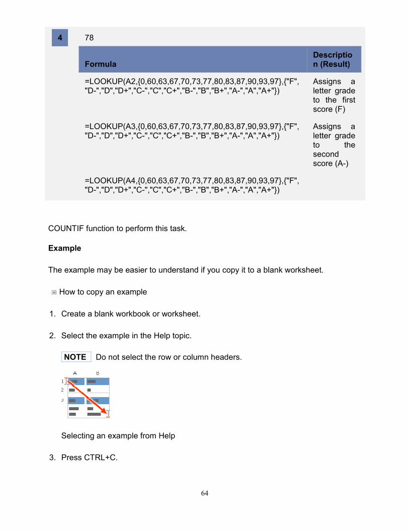
64
4
78
Formula Description (Result)
=LOOKUP(A2,{0,60,63,67,70,73,77,80,83,87,90,93,97},{"F","D-","D","D+","C-","C","C+","B-","B","B+","A-","A","A+"})
Assigns a letter grade to the first score (F)
=LOOKUP(A3,{0,60,63,67,70,73,77,80,83,87,90,93,97},{"F","D-","D","D+","C-","C","C+","B-","B","B+","A-","A","A+"})
Assigns a letter grade to the second score (A-)
=LOOKUP(A4,{0,60,63,67,70,73,77,80,83,87,90,93,97},{"F","D-","D","D+","C-","C","C+","B-","B","B+","A-","A","A+"})
COUNTIF function to perform this task.
Example
The example may be easier to understand if you copy it to a blank worksheet.
How to copy an example
1. Create a blank workbook or worksheet.
2. Select the example in the Help topic.
NOTE Do not select the row or column headers.
Selecting an example from Help
3. Press CTRL+C.

65
4. In the worksheet, select cell A1, and press CTRL+V.
5. To switch between viewing the results and viewing the formulas that return the
results, press CTRL+` (grave accent), or on the Formulas tab, in the Formula
Auditing group, click the Show Formulas button.
1
2
3
4
5
6
7
A B
Salesperson Invoice
Buchanan 15,000
Buchanan 9,000
Suyama 8,000
Suyama 20,000
Buchanan 5,000
Dodsworth 22,500
Formula Description (Result)
=COUNTIF(A2:A7,"Buchanan") Number of entries for Buchanan (3)
=COUNTIF(A2:A7,A4) Number of entries for Suyama (2)
=COUNTIF(B2:B7,"< 20000") Number of invoice values less than 20,000 (4)
=COUNTIF(B2:B7,">="&B5) Number of invoice values greater than or equal to 20,000 (2)
Function details
COUNTIF
Top of Page
Count how often multiple number values occur by using functions

66
Let's say you need to determine how many salespeople sold a particular item in a
certain region, or you want to know how many sales over a certain value were made by
a particular salesperson. You can use the IF and COUNT functions.
Example
The example may be easier to understand if you copy it to a blank worksheet.
How to copy an example
1. Create a blank workbook or worksheet.
2. Select the example in the Help topic.
NOTE Do not select the row or column headers.
Selecting an example from Help
3. Press CTRL+C.
4. In the worksheet, select cell A1, and press CTRL+V.
5. To switch between viewing the results and viewing the formulas that return the
results, press CTRL+` (grave accent), or on the Formulas tab, in the Formula
Auditing group, click the Show Formulas button.
1
2
3
4
5
A B C D
Region Salesperson Type
Sales
South Buchanan Beverages
3571
West Davolio Dairy 3338

67
6
7
8
9
10
11
East Suyama Beverages
5122
North Suyama Dairy 6239
South Dodsworth Produce
8677
South Davolio Meat 450
South Davolio Meat 7673
East Suyama Produce
664
North Davolio Produce
1500
South Dodsworth
Meat 6596
Formula
Description (result)
=COUNT(IF((A2:A11="South")*(C2:C11="Meat"),D2:D11))
Number of salespeople who sold meat in the South region (3)
=COUNT(IF((B2:B11="Suyama")*(D2:D11>=1000),D2:D11))
Number of sales greater than 1000 by Suyama (2)
NOTES
The formulas in the example must be entered as array formulas (array formula:
A formula that performs multiple calculations on one or more sets of values, and
then returns either a single result or multiple results. Array formulas are enclosed
68
between braces { } and are entered by pressing CTRL+SHIFT+ENTER.). After
copying the example to a blank worksheet, select the formula cell. Press F2, and
then press CTRL+SHIFT+ENTER. If the formula is not entered as an array
formula, the error #VALUE! is returned.
For these formulas to work, the second argument to the IF function must be a
number.
Function details
COUNT IF
Count how often multiple text or number values occur by using functions
Use the IF and SUM functions to do this task:
Assign a value of 1 to each true condition by using the IF function.
Add the total, by using the SUM function.
Example
The example may be easier to understand if you copy it to a blank worksheet.
How to copy an example
1. Create a blank workbook or worksheet.
2. Select the example in the Help topic.
NOTE Do not select the row or column headers.
Selecting an example from Help

69
3. Press CTRL+C.
4. In the worksheet, select cell A1, and press CTRL+V.
5. To switch between viewing the results and viewing the formulas that return the
results, press CTRL+` (grave accent), or on the Formulas tab, in the Formula
Auditing group, click the Show Formulas button.
1
2
3
4
5
6
7
A B
Salesperson Invoice
Buchanan 15,000
Buchanan 9,000
Suyama 8,000
Suyama 20,000
Buchanan 5,000
Dodsworth 22,500
Formula Description (Result)
=SUM(IF((A2:A7="Buchanan")+(A2:A7="Dodsworth"),1,0)) Number of invoices for Buchanan or Dodsworth (4)
=SUM(IF((B2:B7<9000)+(B2:B7>19000),1,0)) Number of invoices with values less than 9000 or greater than 19000 (4)
=SUM(IF(A2:A7="Buchanan",IF(B2:B7<9000,1,0))) Number of invoices for Buchanan with a value less than 9,000. (1)

70
Filter: Filtered data displays only the rows that meet criteria (criteria: Conditions you
specify to limit which records are included in the result set of a query or filter.) That you
specify and hides rows that you do not want displayed. After you filter data, you can
copy, find, edit, format, chart, and print the subset of filtered data without rearranging or
moving it. Select the data >Home > Data > Filter (as shown in figure below) . You can
filter data based on the criteria.
Filter data Shown below.
71
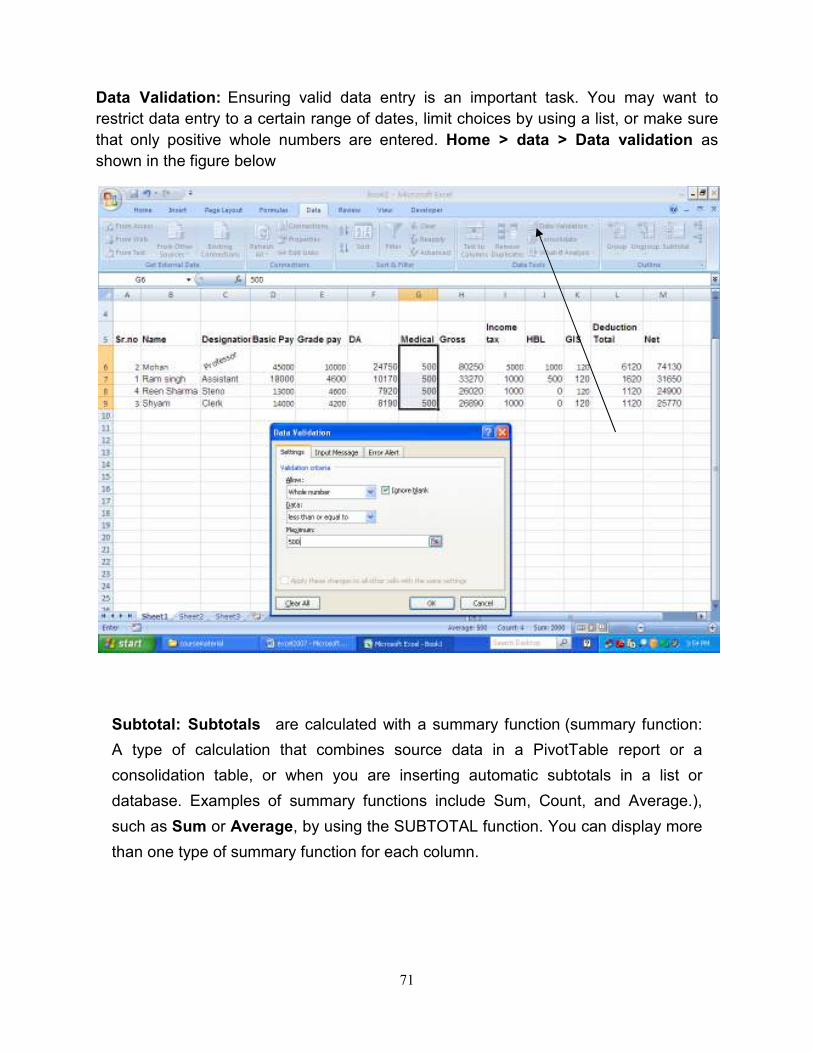
Data Validation: Ensuring valid data entry is an important task. You may want to
restrict data entry to a certain range of dates, limit choices by using a list, or make sure
that only positive whole numbers are entered. Home > data > Data validation as
shown in the figure below
Subtotal: Subtotals are calculated with a summary function (summary function:
A type of calculation that combines source data in a PivotTable report or a
consolidation table, or when you are inserting automatic subtotals in a list or
database. Examples of summary functions include Sum, Count, and Average.),
such as Sum or Average, by using the SUBTOTAL function. You can display more
than one type of summary function for each column.

72
Home > Data > select the data > click on Sort for sorting the data >click
subtotal. The screen appears below.
The subtotal shown below.