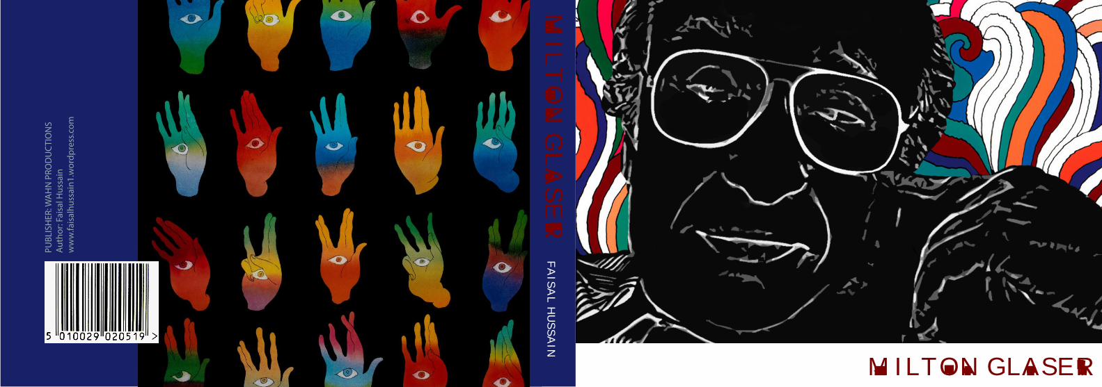
milton glaser - wordpress.com · milton glaser publisher: wahn productions milton glaser ... tion,...
TRANSCRIPT

MILTON GLASER
MIL
TO
N G
LA
SE
R
P
UBL
ISH
ER: W
AH
N P
ROD
UC
TIO
NS
A
utho
r: Fa
isal
Hus
sain
w
ww
.fais
alhu
ssai
n1.w
ordp
ress
.com
FA
ISA
L H
US
SA
IN
MILTON GLASER
MILTON GLASER
“Less is more” dictum: “Just enough is more”
ASSIGNMENT BY
FAISAL HUSSAIN

TABLE OF CONTENT
1. Introduction
2. Analysis: 0 I Love NY
0 notion behind BOB DYLAN POSTER 0 Islamophobia 3. BIBLIOGRAPHY
Book
Cov
er: “
Trip
to L
otus
Lan
d” b
y Milt
on G
lase
r

DOUBT IS BETTER THAN CERTAINTY.
“If you believed that you had achieved enlightenment you have merely arrived
at your limitation.”
Milton Glaser
Post
er C
ourt
esy:
H
unte
r Aco
sta
Introduction:An illustrator and a graphic designer who is fairly respon-sible for the massive increase of tourism in New York City, Milton Glaser was born on June 26th, 1929. Milton has designed more than three hundred posters and has been known to be one of the most massively creative designers, not only that his work exhibits a vivacious no-tion, but it is also communicates. Milton Glaser studied at (MACUAS) Cooper Union Art School. He went to study in Italy after receiving a scholarship at Academy of Fine Arts. Push Pin studio was founded in August 1954 where Glaser worked. Glaser’s singular genius is hard to catego-rize for over the course of several decades he reinvented himself as a creative force by exploring new graphic techniques and motifs. During 1960s he formed images using flat shapes formed by thin black-ink contour lines, adding color by applying color films. Not only Glaser’s work is evidently conceptual but also incites the imagination of an individual, his work usually works as a fill the blanks, viewer can fill the blanks by shadowing their imagination. His another famous design poster of Bob Dylan singer became inspiration for the psychedelic art movement. In the image Bob Dylan is presented as black silhouette with vibrant colored hair patterns inspired by art nouveau sources.
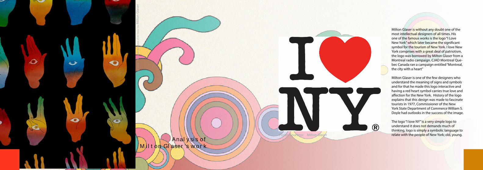
Glaser’s captivation amplified with the illusions and dimensionality, for him geometric forms, words and numbers are not merely abstract signs but tangible enti-ties with an object life that allows them to be interpreted as ideas. He is the receiver of Society of Illustrator’s Gold Medal from the Cooper Union and the Prix Savignac for the worlds’ most memorable poster of 1996. He is also a member of the Art Director’s club hall of fame and AIGA. He is also recipient of the 2004 life time achievement award from the Smithsonian Cooper- Hewitt, National design museum. He is without a doubt one of the most influencer designers in the world, his techniques, con-cepts, theories and designs are perhaps most undisputa-ble. His famous design “New York I Love you” was a huge success which almost became a brand logo of New York City for the tourist. Due to the deep nature of his designs, N.Y I Love you suggests the patriotism and the spirit of American people and their love for this cosmopolitan city.
Analysis of Milton Glaser’s work
Book
Cov
er: “
The
Gre
at Il
lust
rato
r of A
ll Ti
mes
” by M
ilton
Gla
ser
Milton Glaser is without any doubt one of the most intellectual designers of all times. His one of the famous works is the logo “I Love New York” which later became the significant symbol for the tourism of New York. I love New York comprises with a great deal of patriotism, the logo was borrowed by Milton Glaser from a Montreal radio campaign. CJAD Montreal Que-bec Canada ran a campaign entitled “Montreal, the city with a heart”
Milton Glaser is one of the few designers who understand the meaning of signs and symbols and for that he made this logo interactive and having a red heart symbol carries true love and affection for the New York. History of the logo explains that this design was made to fascinate tourists in 1977, Commissioner of the New York State Department of Commerce William S. Doyle had outlooks in the success of the image.
The logo “I love NY” is a very simple logo to understand it does not demands much of thinking, logo is simply a symbolic language to relate with the people of New York; old, young. Poster Courtesy: Milton Glaser
The logo itself is a subtle way of communicating with the people. Milton used red and black color contrasting which is an effort to ricochet the immersion to some-thing that is close to heart. Red is the color of fire and blood, so it is allied with energy, war, danger, strength, power, determination as well as passion, desire and love.So the color red which is used in this poster signifies a lot of traits of New York, Perhaps he wanted to portray New York as the most powerful city in the world or it could also suggest that New York has too much love to give to the tourist and its citizens.
Concept behind this poster was simply to attract the tourist of the world. This poster became more prevalent and energetic after the attacks of September 11 on the city, it gave the New Yorkers the sense of harmony among the population.
Posters and T-shirts were wore by the tourists and citizens of New York as the sign of their support. It is also believed that during 1970s America was going through a hard time because of the increasing inflation and un-clean regions. The logo reflects the impression of peace and on the other hand it gives a welcoming image of the city.
Font of the poster reveals that it is smack in the middle and the logo consists of the capital letter I, followed by a red heart symbol heart, below which are the capital letters N and Y, set in a rounded slab serif typeface called American Typewriter. It neither calligraphic nor crowded, however it gives the vibe and which relates to the people New York with their busy lives. Big red heart in the poster perhaps indicates the enormous love and strength of the citizens.
The logo was designed in 1977 when the America was suffering from numerous issues, people were mentally tired and exhausted due to the Vietnam War so the No-tion behind the heart could also suggest that triumph or prevalence of the people. Though Vietnam War manifest itself differently but the idea was to give something to the people to endure and fight. Logo can be used to communicate at any level of social interfaces.
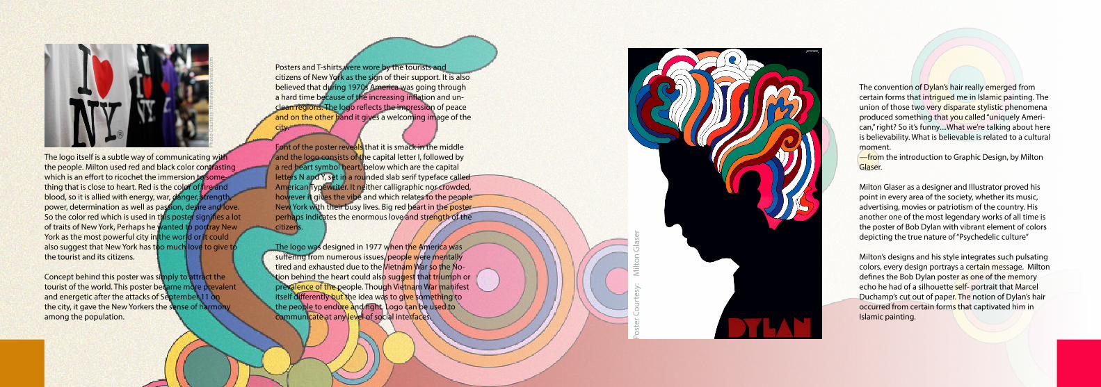
The convention of Dylan’s hair really emerged from certain forms that intrigued me in Islamic painting. The union of those two very disparate stylistic phenomena produced something that you called “uniquely Ameri-can,” right? So it’s funny....What we’re talking about here is believability. What is believable is related to a cultural moment.—from the introduction to Graphic Design, by Milton Glaser.
Milton Glaser as a designer and Illustrator proved his point in every area of the society, whether its music, advertising, movies or patriotism of the country. His another one of the most legendary works of all time is the poster of Bob Dylan with vibrant element of colors depicting the true nature of “Psychedelic culture”
Milton’s designs and his style integrates such pulsating colors, every design portrays a certain message. Milton defines the Bob Dylan poster as one of the memory echo he had of a silhouette self- portrait that Marcel Duchamp’s cut out of paper. The notion of Dylan’s hair occurred from certain forms that captivated him in Islamic painting.
Post
er C
ourt
esy:
M
ilton
Gla
ser
Phot
o Co
urte
sy: t
hene
wyo
rkw
orld
.com
Dylan with kaleidoscopic hair with elevating colors is often associated with rock posters. Milton was interested in Art Nouveau at the time of its making, different rich colors and shapes in the picture is the Milton’s inspiration of Art Nouveau can be seen in the poster, not only that dark silhouetted profile reflects Glaser’s response to the modernist “Less is more” dictum: “Just enough is more”So typical type face of Bob Dylan was created by Milton Glaser which he later used in frequent occasions. As far as fonts of the poster is concern, it was the development from the futurist’s propaganda typeface in the 1920s.
The usage of line and shape work beautifully throughout the composition of the Dylan’s poster. His hair is man-aged as a clear visual form with larger than life color and shape. The prominent elements at work in this poster would be shape and color, having said that we also see shapes with delineation line, the white empty space and use of type.
Different colors which are used in this posters are Blue, White, Maroon, Pink, Orange and Brown. Color blue is associated with complexity and firmness, it also implies trust, loyalty, wisdom, self-reliance, aptitude, belief, veracity and heaven. Color blue is preferred color for corporate America. Light blue signifies health, un-derstanding and softness, whereas dark blue represents knowledge, supremacy and solemnity.
White color is also very vividly seen in Dylan’s poster. White is related with light, goodness, innocence, purity and virginity. Unlike Black, white usually has a positive connotation. White can also signifies success.Green is also quite vibrant in this poster, which is a sign of development, congruence and freshness. Dark green color is associated with ambition, greed and jealous. Orange is also another color which can be seen in this poster, which suggest enthusiasm, captivation, content-ment, imagination, willpower, attraction, success and encouragement.
So in a way Milton has taken all the elements which color represents and made them into one package and portrayed it as Dylan’s brain.
Milton successfully through his transparent emotions made the poster of Dylan which has several connota-tions. However, his design speaks a language which all can relate to it.
“To design is to communicate clearly by whatever means you can control or master”
Milton Glaser
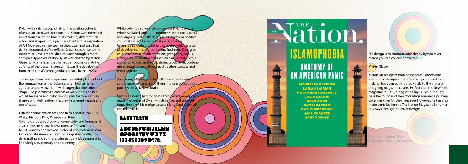
Milton Glaser, apart from being a well-known and established designer in the fields of poster and logo making, has even contributed vastly to the arena of designing magazine covers. He founded the New York Magazine in 1968, along with Clay Felker. Although, he is the founder of New York Magazine and a primary cover designer for the magazine. However, he has also made contributions to The Nation Magazine in numer-ous ways through his cover designs.
Courtesy: Milton GlaserMagazince Cover “The Nation”

The most dominant colours used are white, green and yellow. White and green predominantly mark out the Is-lamic representation which is indeed the motif through-out the composition. However, yellow has been used by Glaser to signify the instability that Islamic world has to offer to the Western sphere. The yellow colour that is blended into the formation of the sky is quite dingy and dull, which is a symbol of caution.
The type face used for the words ‘The Nation’ is a serif font, which is a classic and formal representation of the name of the magazine. In contrast, the rest of the font is a san serif type face to give the reader a modern feel. The entire stylization of the cover gives way to vari-ety and balance. Along with that the cover is able to effectively convey the details of what the magazine hold within it.
The cover of The Nation Magazine, designed by Milton Glaser for the week 2nd to 9th July 2012, was designed keeping in mind the contents of the magazine. Thus, the cover broadly states Islamophobia in bold letters to highlight the concept behind the magazine. The main concept is brought out through the wordings displayed on the cover; however the Middle Eastern structure that lies in the background of the cover also serves as a depic-tion of the idea of Islamophobia. The setting sun evokes a sense of dooms day, in terms of the consequences of the battle between America and Islamization.
There is not much of negative spacing in the composi-tion of the cover, but instead there is an overlapping of the text onto the image. Thus, the text is given way more importance as it is positioned into the foreground of the compositional framework.
Bibliography
Megg. (2007). Milton Glaser. In: Sean Noel Meggs history of graphic design. 5th ed. London: Meggs. 440-446.
Andrew Wilson. (1998). I Love New York Logo. Avail-able: http://www.famouslogos.us/i-love-ny-logo/. Last accessed 28th Jan 2014.
Mr Davey. (2004). 10 things from Milton Glaser. Available: http://mbwilsonart.wordpress.com/2012/06/19/10-things-from-milton-glaser/. Last accessed 28th Jan 2014.
Stewart Kampel. (2010). Profile: Milton Glaser. Available: http://www.hadassahmagazine.org/site/apps/nlnet/con-tent2.aspx?c=twI6LmN7IzF&b=5724115&ct=7782493. Last accessed 28th Jan 2014.
Maggie Hobson. (2002). Art and Design. Available: http://maggie-artanddesign.blogspot.com/2012/08/the-ele-ments-of-design.html. Last accessed 28th Jan 2014.
Steven Heller. (2012). Another side of Bob Dylan, Milton Glaser and that famous poster. Available: http://www.printmag.com/illustration/another-side-of-bob-dylan-milton-glaser-and-that-famous-poster/. Last accessed 28th Jan 2014.
Samantha J. (2012). The Relevance of Bob Dylan and Milton Glaser Today. Available: http://samantha-jay.blog-spot.com/2012/05/relevance-of-bob-dylan-and-milton.html. Last accessed 28th Jan 2014.
BACKDROP IMAGE:http://b.vimeocdn.com/ts/424/296/424296772_1280.jpg
http://archives.jrn.columbia.edu/2010-2011/thenewyo-rkworld.com/wp-content/uploads/2010/11/hoe_brand-ing_image11.jpg