media magazine indie rock
TRANSCRIPT
the genre I am choosing for my magazine is
indie rockTeri-Anne Chambers
What is Rock
• Rock music when it first started appearing in the 1950’s with Elvis and other artists that was rebellious and attracted a lot of teenagers.
• Rock (Rock and roll) became popular in the 50’s in America and Europe and is based on older music styles like R&B and most songs contain music from guitars and drums, as well as strong vocals.
• Rock music developed into a range of styles including Alternative rock, indie rock, grunge and Indie pop.
An example of a rock band is the Beatles, which was a successful band in the 1960’s and were inspired by rhythm and blues ( R&B)
Another example is Elvis Presley, he became popular because of his dancing and powerful rock and roll vocals.
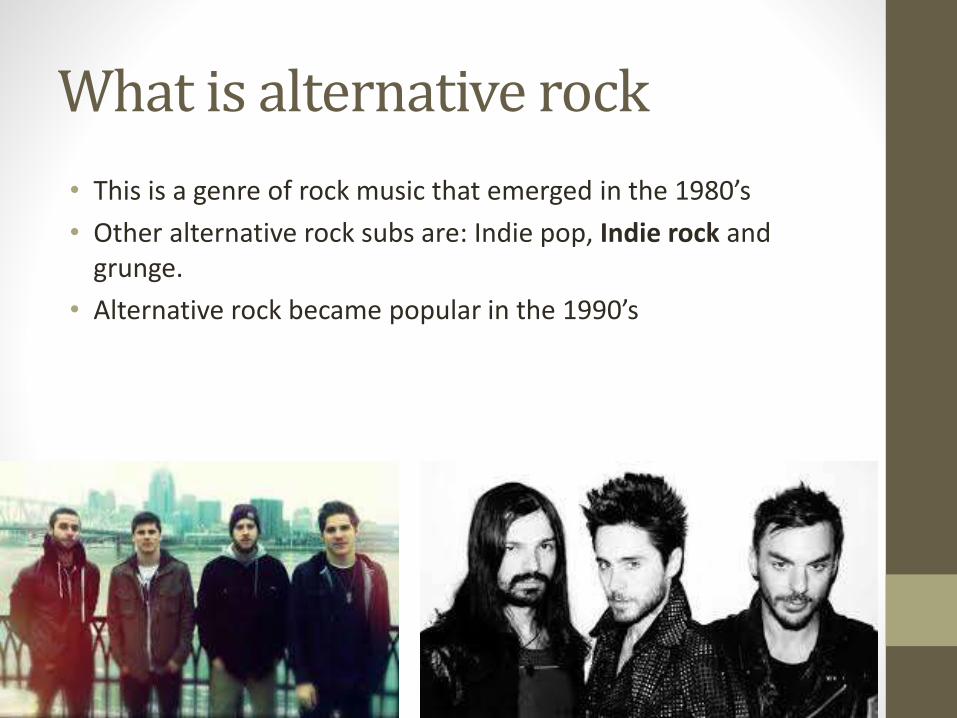
What is alternative rock
• This is a genre of rock music that emerged in the 1980’s
• Other alternative rock subs are: Indie pop, Indie rock and grunge.
• Alternative rock became popular in the 1990’s
What is Indie rock?
• This is a sub-genre that emerges from alternative rock that originated in the United Kingdom and in the United States in the 1980’s
• Indie rock is often described as underground music.
• Indie rock is also used to describe an independent label.
• It later came to define the genres evolving from it, for example Britpop, dance rock and new wave etc.
• Some see Indie rock as a distinct genre of rock music
• Indie rock started appearing in the 1990’s and was made popular by well known bands like Nirvana and Green day.
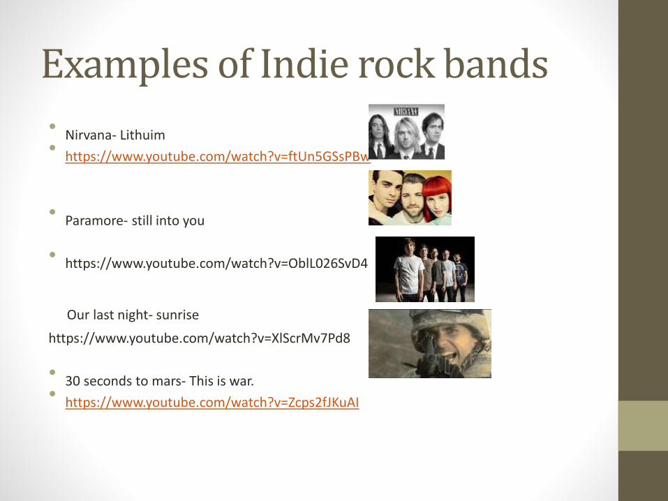
Examples of Indie rock bands
• Nirvana- Lithuim• https://www.youtube.com/watch?v=ftUn5GSsPBw
• Paramore- still into you
• https://www.youtube.com/watch?v=OblL026SvD4
Our last night- sunrise
https://www.youtube.com/watch?v=XlScrMv7Pd8
• 30 seconds to mars- This is war.• https://www.youtube.com/watch?v=Zcps2fJKuAI
Audience
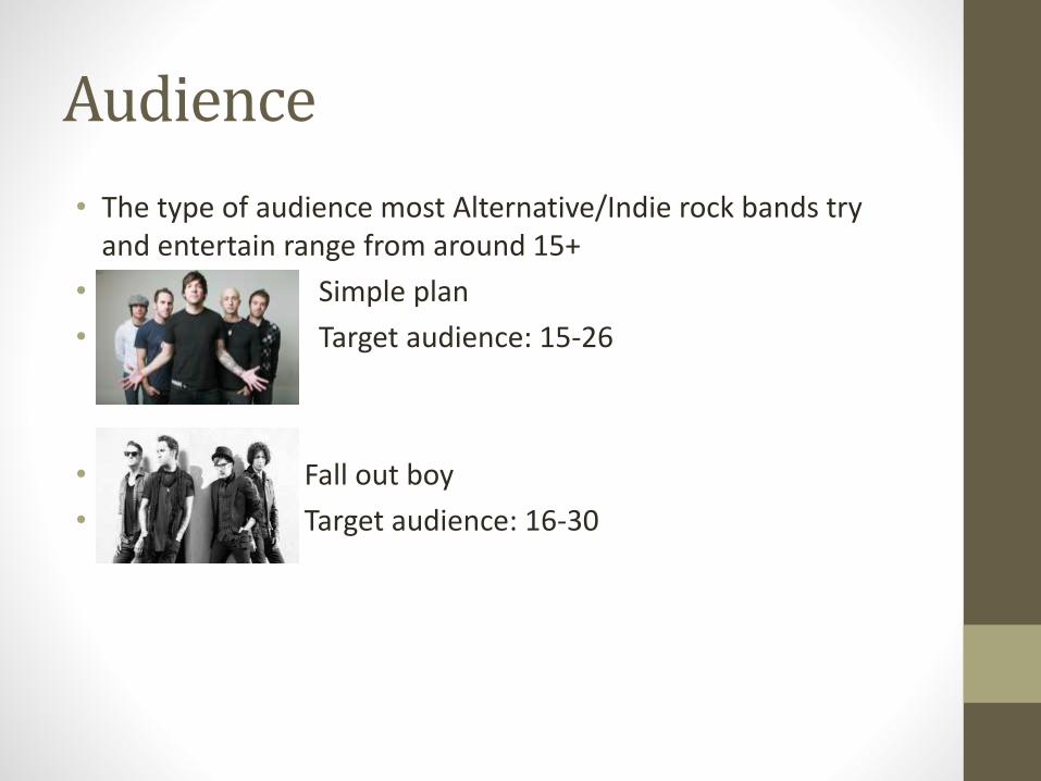
• The type of audience most Alternative/Indie rock bands try and entertain range from around 15+
• Simple plan
• Target audience: 15-26
• Fall out boy
• Target audience: 16-30
Typical music video
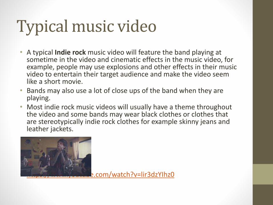
• A typical Indie rock music video will feature the band playing at sometime in the video and cinematic effects in the music video, for example, people may use explosions and other effects in their music video to entertain their target audience and make the video seem like a short movie.
• Bands may also use a lot of close ups of the band when they are playing.
• Most indie rock music videos will usually have a theme throughout the video and some bands may wear black clothes or clothes that are stereotypically indie rock clothes for example skinny jeans and leather jackets.
• https://www.youtube.com/watch?v=lir3dzYIhz0
How is indie rock different from rock?• Most rock music bands will mainly have male vocals while
Indie rock has a higher proportion of female artists.
• Indie rock are from independent labels
• Rock music is more flashy and rebellious than indie.
• Indie and alternative are the broadest genres ( its hard to define them)
• Rock music tends to be bands with guitars and drums.
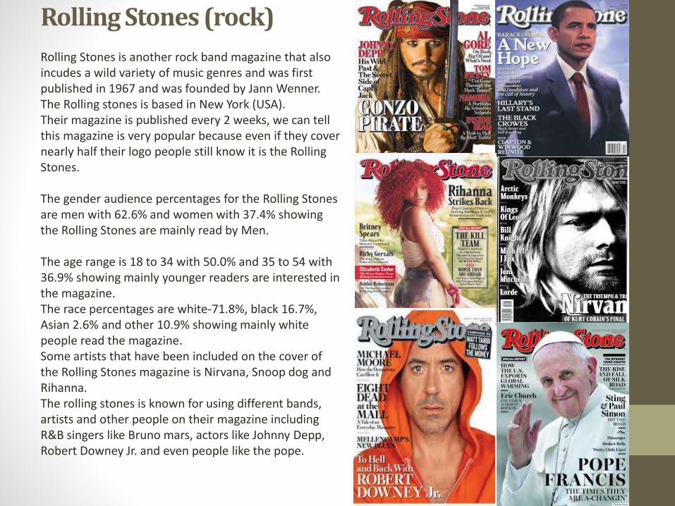
Rolling Stones (rock)
Rolling Stones is another rock band magazine that also incudes a wild variety of music genres and was first published in 1967 and was founded by Jann Wenner. The Rolling stones is based in New York (USA).Their magazine is published every 2 weeks, we can tell this magazine is very popular because even if they cover nearly half their logo people still know it is the Rolling Stones.
The gender audience percentages for the Rolling Stones are men with 62.6% and women with 37.4% showing the Rolling Stones are mainly read by Men.
The age range is 18 to 34 with 50.0% and 35 to 54 with 36.9% showing mainly younger readers are interested in the magazine.The race percentages are white-71.8%, black 16.7%, Asian 2.6% and other 10.9% showing mainly white people read the magazine.Some artists that have been included on the cover of the Rolling Stones magazine is Nirvana, Snoop dog and Rihanna.The rolling stones is known for using different bands, artists and other people on their magazine including R&B singers like Bruno mars, actors like Johnny Depp, Robert Downey Jr. and even people like the pope.
Alternative rock
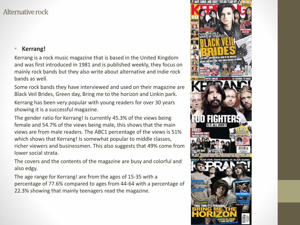
• Kerrang!
Kerrang is a rock music magazine that is based in the United Kingdom and was first introduced in 1981 and is published weekly, they focus on mainly rock bands but they also write about alternative and indie rock bands as well.
Some rock bands they have interviewed and used on their magazine are Black Veil Brides, Green day, Bring me to the horizon and Linkin park.
Kerrang has been very popular with young readers for over 30 years showing it is a successful magazine.
The gender ratio for Kerrang! Is currently 45.3% of the views being female and 54.7% of the views being male, this shows that the main views are from male readers. The ABC1 percentage of the views is 51% which shows that Kerrang! Is somewhat popular to middle classes, richer viewers and businessmen. This also suggests that 49% come from lower social strata.
The covers and the contents of the magazine are busy and colorful and also edgy.
The age range for Kerrang! are from the ages of 15-35 with a percentage of 77.6% compared to ages from 44-64 with a percentage of 22.3% showing that mainly teenagers read the magazine.
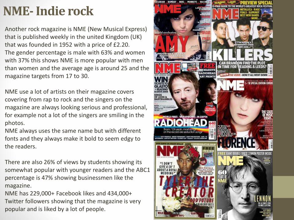
NME- Indie rockAnother rock magazine is NME (New Musical Express) that is published weekly in the united Kingdom (UK) that was founded in 1952 with a price of £2.20.The gender percentage is male with 63% and women with 37% this shows NME is more popular with men than women and the average age is around 25 and the magazine targets from 17 to 30.
NME use a lot of artists on their magazine covers covering from rap to rock and the singers on the magazine are always looking serious and professional, for example not a lot of the singers are smiling in the photos. NME always uses the same name but with different fonts and they always make it bold to seem edgy to the readers.
There are also 26% of views by students showing its somewhat popular with younger readers and the ABC1 percentage is 47% showing businessmen like the magazine.NME has 229,000+ Facebook likes and 434,000+ Twitter followers showing that the magazine is very popular and is liked by a lot of people.
My magazine.• The main genre I am going to choose for my magazine is indie rock which is a sub genre of
alternative rock, from my research I know that My target audience will be from the ages of 17-25, I want to try and aim for this age because a lot of younger readers enjoy alternative rock magazines and songs.
• When I design my magazine I am going to include an alternative rock/ indie rock band on my front cover. I will also make my magazine more busy for the front page in the style of Kerrangs magazine front cover that is very busy and bold so my magazine will look more interesting, also I think that by making the front cover more busy and using the space correctly it would attract more readers.
• When I make my magazine I am going to try and appeal to all genders, however seeing as the majority of alternative rock readers are male teenagers it may be hard to do this. I will choose a band for my front cover and use them as the main background like the style of NME who always uses close-ups of an artists face.
• I am not going to cover a part of my magazine name like how the Rolling stones does for their title name because my magazine is new.
• I am going to use bold and bright colours like Kerrang! Who use one main colour each time they print out a magazine.
• I am also going to use headlines on my magazine and I will be using a lot like Kerrang! Who uses a lot of headlines on their magazine pages, I am using this because it makes my magazine appeal to younger readers because of the rough looking front cover which associated with those who listen to alternative music.
• I will be going to use a barcode and using free item giveaways to appeal to my target audience and to also make my magazine looks more realistic.
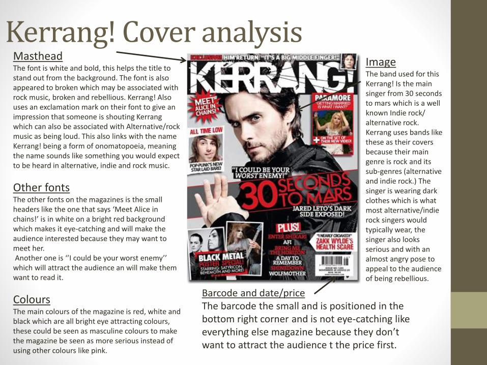
Kerrang! Cover analysis MastheadThe font is white and bold, this helps the title to stand out from the background. The font is also appeared to broken which may be associated with rock music, broken and rebellious. Kerrang! Also uses an exclamation mark on their font to give an impression that someone is shouting Kerrang which can also be associated with Alternative/rock music as being loud. This also links with the name Kerrang! being a form of onomatopoeia, meaning the name sounds like something you would expect to be heard in alternative, indie and rock music.
Other fontsThe other fonts on the magazines is the small headers like the one that says ‘Meet Alice in chains!’ is in white on a bright red background which makes it eye-catching and will make the audience interested because they may want to meet her.Another one is ‘’I could be your worst enemy’’
which will attract the audience an will make them want to read it.
ColoursThe main colours of the magazine is red, white and black which are all bright eye attracting colours, these could be seen as masculine colours to make the magazine be seen as more serious instead of using other colours like pink.
ImageThe band used for this Kerrang! Is the main singer from 30 seconds to mars which is a well known Indie rock/ alternative rock.Kerrang uses bands like these as their covers because their main genre is rock and its sub-genres (alternative and indie rock.) The singer is wearing dark clothes which is what most alternative/indie rock singers would typically wear, the singer also looks serious and with an almost angry pose to appeal to the audience of being rebellious.
Barcode and date/priceThe barcode the small and is positioned in the bottom right corner and is not eye-catching like everything else magazine because they don’twant to attract the audience t the price first.
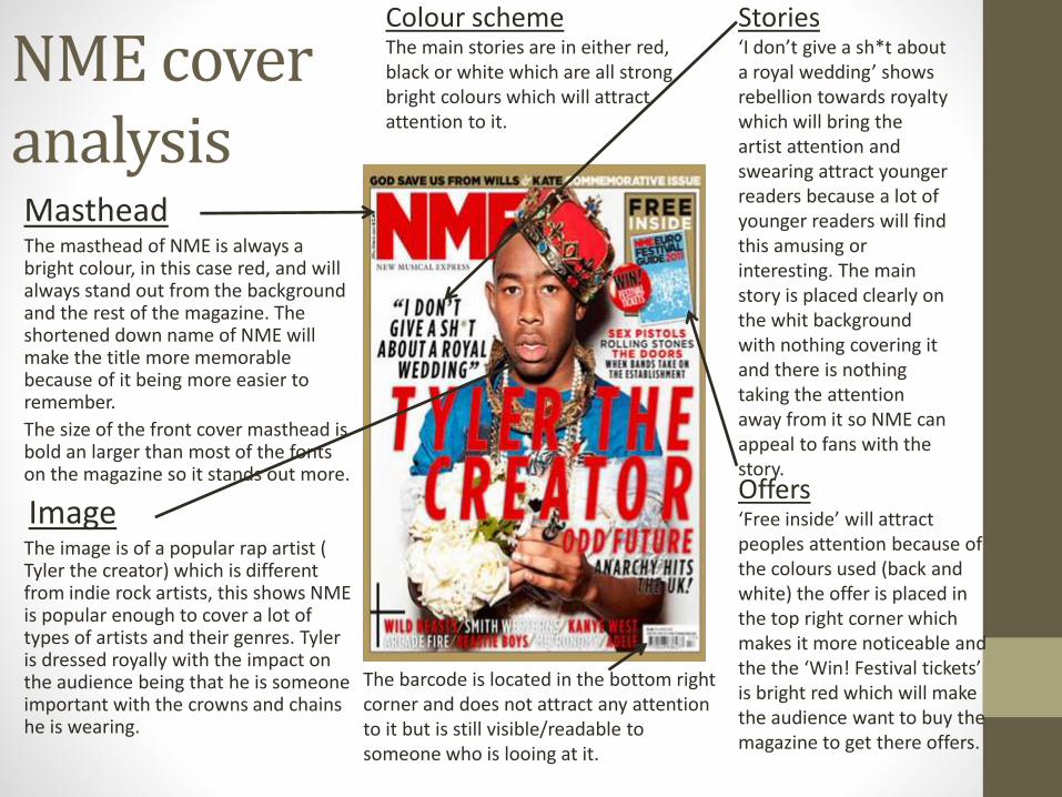
NME cover analysisMastheadThe masthead of NME is always a bright colour, in this case red, and will always stand out from the background and the rest of the magazine. The shortened down name of NME will make the title more memorable because of it being more easier to remember.
The size of the front cover masthead is bold an larger than most of the fonts on the magazine so it stands out more.
ImageThe image is of a popular rap artist ( Tyler the creator) which is different from indie rock artists, this shows NME is popular enough to cover a lot of types of artists and their genres. Tyler is dressed royally with the impact on the audience being that he is someone important with the crowns and chains he is wearing.
Colour schemeThe main stories are in either red, black or white which are all strong bright colours which will attract attention to it.
Stories‘I don’t give a sh*t about a royal wedding’ shows rebellion towards royalty which will bring the artist attention and swearing attract younger readers because a lot of younger readers will find this amusing or interesting. The main story is placed clearly on the whit background with nothing covering it and there is nothing taking the attention away from it so NME can appeal to fans with the story.Offers‘Free inside’ will attract peoples attention because of the colours used (back and white) the offer is placed in the top right corner which makes it more noticeable and the the ‘Win! Festival tickets’ is bright red which will make the audience want to buy the magazine to get there offers.
The barcode is located in the bottom right corner and does not attract any attention to it but is still visible/readable to someone who is looing at it.
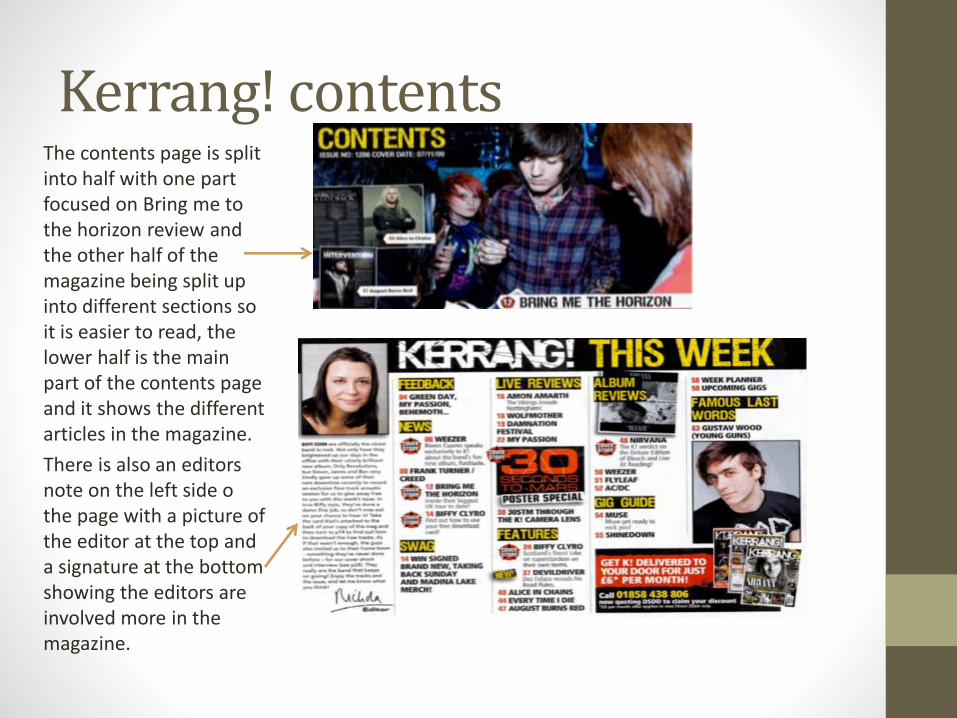
Kerrang! contentsThe contents page is split into half with one part focused on Bring me to the horizon review and the other half of the magazine being split up into different sections so it is easier to read, the lower half is the main part of the contents page and it shows the different articles in the magazine.
There is also an editors note on the left side o the page with a picture of the editor at the top and a signature at the bottom showing the editors are involved more in the magazine.
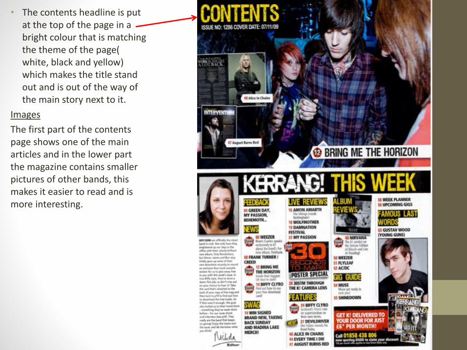
• The contents headline is put at the top of the page in a bright colour that is matching the theme of the page( white, black and yellow) which makes the title stand out and is out of the way of the main story next to it.
Images
The first part of the contents page shows one of the main articles and in the lower part the magazine contains smaller pictures of other bands, this makes it easier to read and is more interesting.
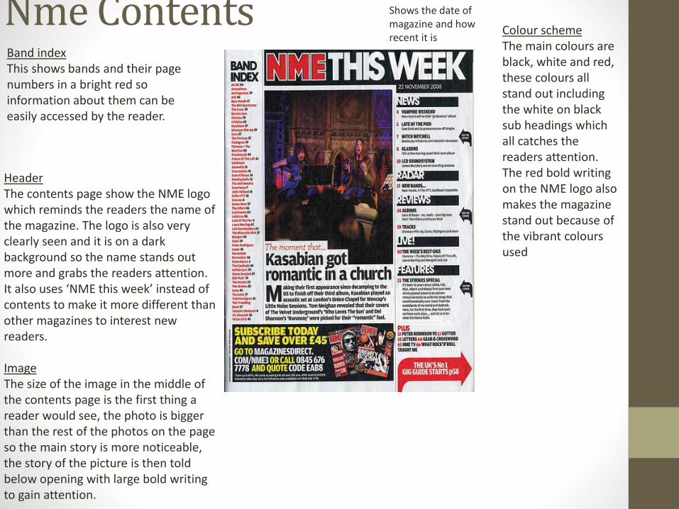
Nme Contents
HeaderThe contents page show the NME logo which reminds the readers the name of the magazine. The logo is also very clearly seen and it is on a dark background so the name stands out more and grabs the readers attention. It also uses ‘NME this week’ instead of contents to make it more different than other magazines to interest new readers.
ImageThe size of the image in the middle of the contents page is the first thing a reader would see, the photo is bigger than the rest of the photos on the page so the main story is more noticeable, the story of the picture is then told below opening with large bold writing to gain attention.
Band indexThis shows bands and their page numbers in a bright red so information about them can be easily accessed by the reader.
Shows the date of magazine and how recent it is
Colour schemeThe main colours are black, white and red, these colours all stand out including the white on black sub headings which all catches the readers attention.The red bold writing on the NME logo also makes the magazine stand out because of the vibrant colours used
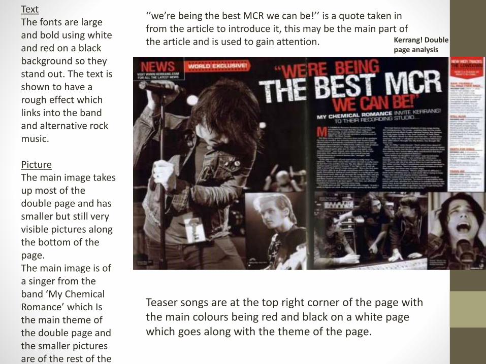
TextThe fonts are large and bold using white and red on a black background so they stand out. The text is shown to have a rough effect which links into the band and alternative rock music.
PictureThe main image takes up most of the double page and has smaller but still very visible pictures along the bottom of the page.The main image is of a singer from the band ‘My Chemical Romance’ which Is the main theme of the double page and the smaller pictures are of the rest of the band.
‘’we’re being the best MCR we can be!’’ is a quote taken in from the article to introduce it, this may be the main part of the article and is used to gain attention.
Teaser songs are at the top right corner of the page with the main colours being red and black on a white page which goes along with the theme of the page.
Kerrang! Double page analysis
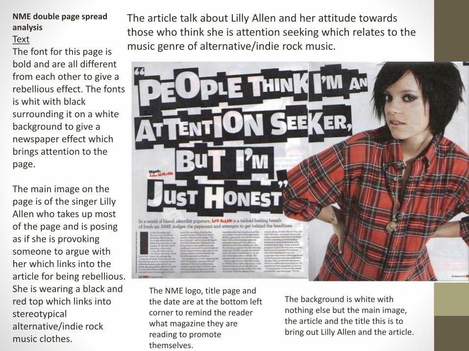
NME double page spread analysis
TextThe font for this page is bold and are all different from each other to give a rebellious effect. The fonts is whit with black surrounding it on a white background to give a newspaper effect which brings attention to the page.
The main image on the page is of the singer Lilly Allen who takes up most of the page and is posing as if she is provoking someone to argue with her which links into the article for being rebellious.She is wearing a black and red top which links into stereotypical alternative/indie rock music clothes.
The NME logo, title page and the date are at the bottom left corner to remind the reader what magazine they are reading to promote themselves.
The background is white with nothing else but the main image, the article and the title this is to bring out Lilly Allen and the article.
The article talk about Lilly Allen and her attitude towards those who think she is attention seeking which relates to the music genre of alternative/indie rock music.