media analysing article g322
TRANSCRIPT

Main image – The main image has been stretched to fill on entire page this can show the importance of the artist because the magazine is using a whole page for his photo. On this magazine is a close up of an artist with sun glasses on. Unlike other magazine which show to eyes of the artist this one does not show the artists eyes this makes him like he is too cool look at us. One on side of the magazine there is a red light and on the other side there is normal light this may have been done to show that there are two sides to the artist, and after reading the article I have found out the article talks about the rappers millionaire life now and the normal life he use to have. On the picture there is a half red and half normal light effect this could have been done to symbolise the millionaire life style he lives now and the normal life style he used to live on the other side. In the main image the artist is wearing a black t-shirt and two chains this can attract the audience that listens to him.
RapRader – there is a RapRadar logo on the artists picture this will attract the audience that listen to rap music, this has been done because people who listen to rap are going to be the people who are more likely to buy the magazine with an article of ‘jay Z’ on it.
Colour scheme – The colour scheme used is red, white and black, these colour may have been used to symbolise how important the text is. The word ‘jay z’ has been wrote in a red font because he the main subject of the magazine article, so the red symbolises the importance. Red is the colour of fire and blood, so it is associated with strength, power and determination, this can symbolize how artist has lots of power and strength because of his wealthy lifestyle.
Header – The header of the page follows the code and convections of other magazines by having its header located right at the top of the page. The name of the artist ‘Jay z’ has been wrote in a bright red font so people it catches the readers attention when they see the magazine and are able to quickly workout that the article is about jay z.
Text – The text has been wrote in a very small font this, with the huge picture of jay z next to it could have been done to emphasise how big the artist is. In the text there are two letters at the start of the paragraph that have been wrote in a very big font, this in done very often used in newspapers, this could have been done to emphases the paragraph and to show the importance of it, this immediately catches the readers attention. The big ‘j’ that has been placed in the centre of the article is something that Q magazine do when they write an article on the more popular artists, because of this most magazine readers will know as soon as they see the big ‘j’ that this article is from Q magazine, This has effect has been kind of used as a signature by Q magazine.
Pull quote – Near the bottom right corner of the page with the picture of jay z there is a pull quote, this quote has been wrote there so when the reader reads it he will be interested in what the quote means and they may read the article to find out what is means.
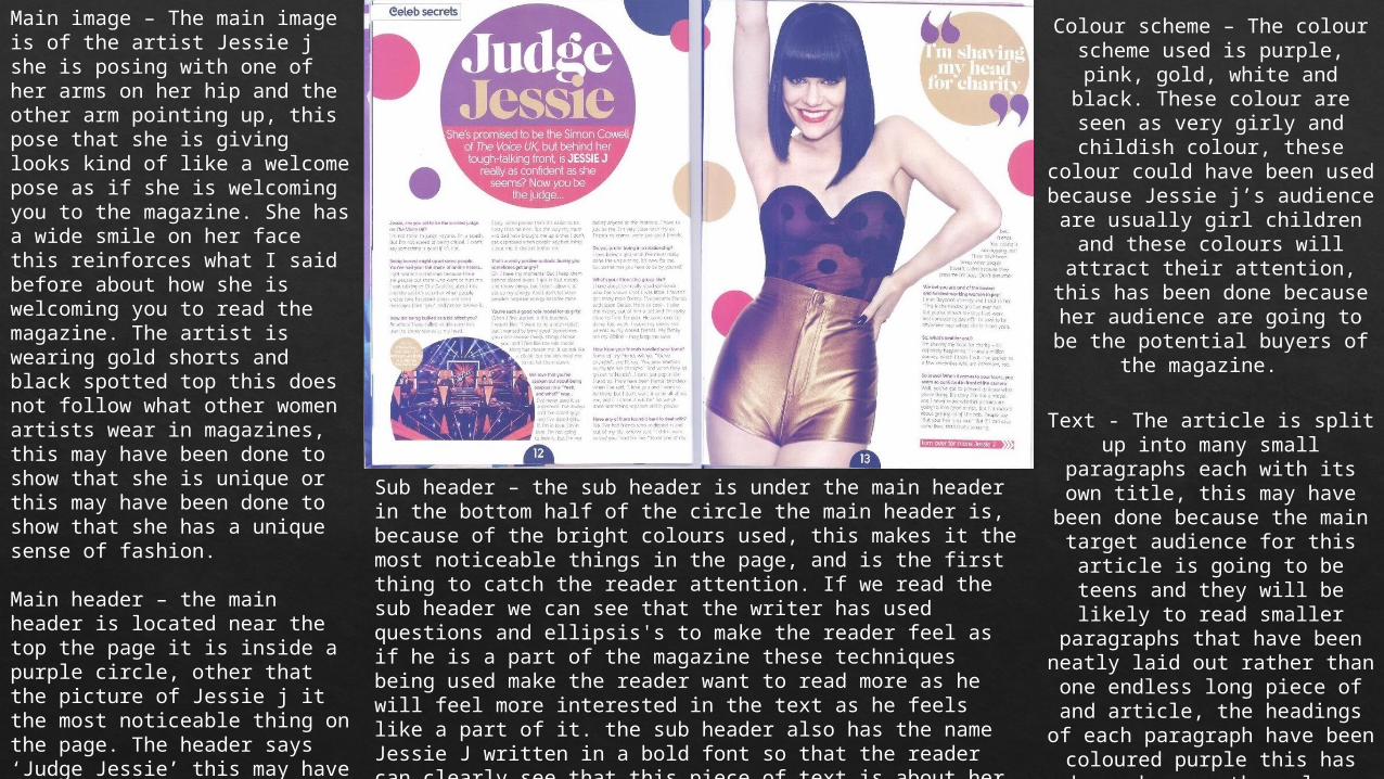
Main image – The main image is of the artist Jessie j she is posing with one of her arms on her hip and the other arm pointing up, this pose that she is giving looks kind of like a welcome pose as if she is welcoming you to the magazine. She has a wide smile on her face this reinforces what I said before about how she is welcoming you to read the magazine. The artist is wearing gold shorts and black spotted top this does not follow what other women artists wear in magazines, this may have been done to show that she is unique or this may have been done to show that she has a unique sense of fashion.
Main header – the main header is located near the top the page it is inside a purple circle, other that the picture of Jessie j it the most noticeable thing on the page. The header says ‘Judge Jessie’ this may have been done so people who read the header will want to know why it says ‘Judge’ and will want to read on to find out. The font has a gold colour to it, gold is usually associatedwith luxury, joy ,happiness so this colour may have been used to symbolise her carrier/ life, it may have been also used to match the outfit she is. wearing.
Sub header – the sub header is under the main header in the bottom half of the circle the main header is, because of the bright colours used, this makes it the most noticeable things in the page, and is the first thing to catch the reader attention. If we read the sub header we can see that the writer has used questions and ellipsis's to make the reader feel as if he is a part of the magazine these techniques being used make the reader want to read more as he will feel more interested in the text as he feels like a part of it. the sub header also has the name Jessie J written in a bold font so that the reader can clearly see that this piece of text is about her. The sub header has been wrote behind a pink background this could have been done to match the other pink aspects on the page.
Colour scheme – The colour scheme used is purple, pink, gold, white and black. These colour are seen as very girly
and childish colour, these colour could have been used
because Jessie j’s audience are usually girl children and these
colours will attract their attention, this has been done
because her audience are going to be the potential buyers of
the magazine.
Text - The article is split up into many small paragraphs each
with its own title, this may have been done because the main
target audience for this article is going to be teens and they will be likely to read smaller paragraphs that have been
neatly laid out rather than one endless long piece of and
article, the headings of each paragraph have been coloured purple this has been done so the colour matches the circles
in the background.
Pull line - the pull line at the top right side of the page is a
quote, it says what the artist may have said this quote will
interest the readers as they will want to know why she is doing what she has said in her quote.
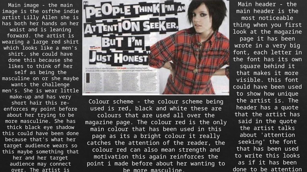
Main image - the main image is the osfthe indie artist Lilly
Allen she is has both her hands on her waist and is
leaning forward. the artist is wearing a large red shirt
which looks like a men's shirt, she could have done this
because she likes to think of her self as being the
masculine on or she maybe wants the challenge men's. She is wear little make-up
and has very short hair this re-enforces my point before about her trying to be more
masculine. She has thick black eye shadow this could
have been done because that's what her target audience wears so this
maybe something that her and her target audience may
connect over. The artist is looking directly into the
camera which makes it look like she is looing at the
reader this may have been done so the reader can feel like the artist is interacting
with them.
Colour scheme - the colour scheme being used is red, black and white these are colours that are
used all over the magazine page. The colour red is the only main colour that has been used in this
page as its a bright colour it really catches the attention of the reader, the colour red can also
mean strength and motivation this again reinforces the point i made before about her
wanting to be more masculine.
Main header - the main header is the most
noticeable thing when you first look at the
magazine page it has been wrote in a very big font, each letter in the font has its own square behind it that makes it more visible. this font
could have been used to show how unique the
artist is. The header has a quote that the artist
has said in the quote the artist talks about
'attention seeking' the font that has been used to write this looks as if it
has been done to be attention seeking as
well.text - there is very little text on the two pages because most of the
space is taken up by the main header and the
image of Lilly Allen this may have been done to show how big the artist
is.