math 3359 introduction to mathematical modeling linear system, simple linear regression
TRANSCRIPT
MATH 3359 Introduction to Mathematical
Modeling
Linear System, Simple Linear Regression
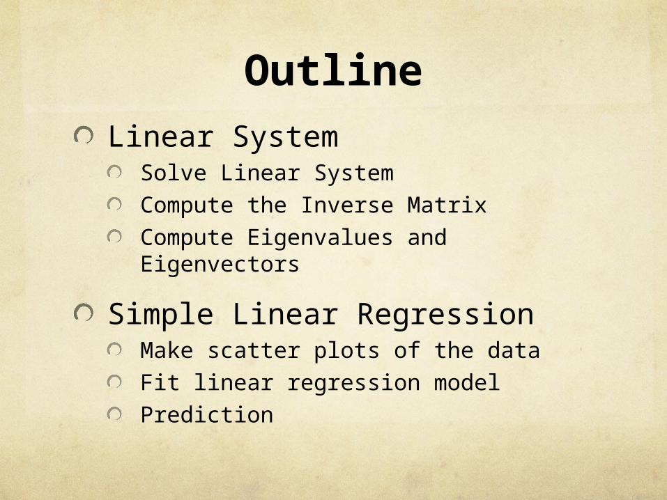
OutlineLinear System
Solve Linear SystemCompute the Inverse MatrixCompute Eigenvalues and Eigenvectors
Simple Linear RegressionMake scatter plots of the data Fit linear regression modelPrediction
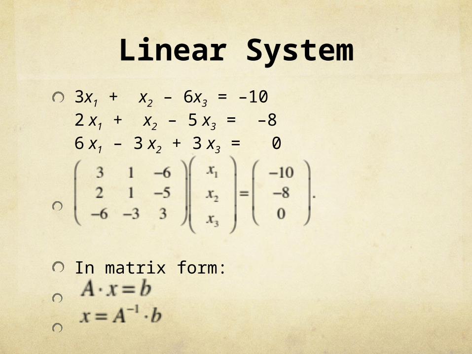
Linear System3x1 + x2 – 6x3 = –102 x1 + x2 – 5 x3 = –86 x1 – 3 x2 + 3 x3 = 0
In matrix form:
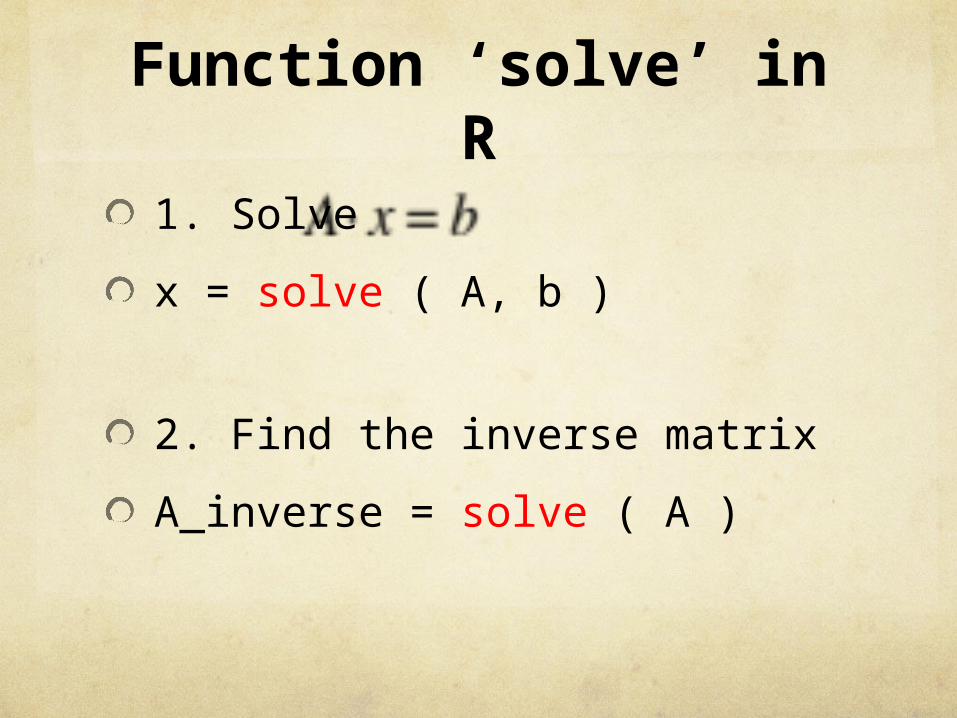
Function ‘solve’ in R
1. Solve
x = solve ( A, b )
2. Find the inverse matrix
A_inverse = solve ( A )
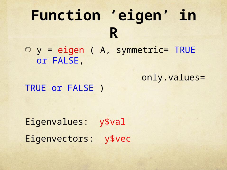
Function ‘eigen’ in R
y = eigen ( A, symmetric= TRUE or FALSE,
only.values= TRUE or FALSE )
Eigenvalues: y$val
Eigenvectors: y$vec
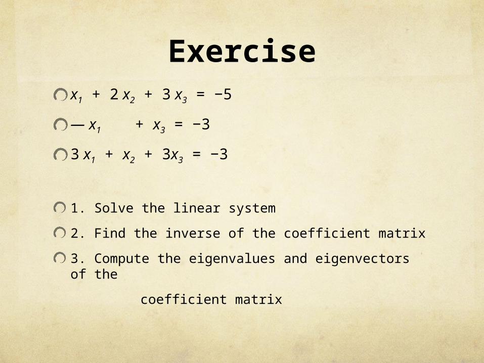
Exercisex1 + 2 x2 + 3 x3 = −5
— x1 + x3 = −3
3 x1 + x2 + 3x3 = −3
1. Solve the linear system
2. Find the inverse of the coefficient matrix
3. Compute the eigenvalues and eigenvectors of the
coefficient matrix
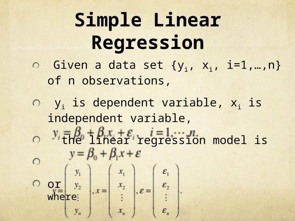
Given a data set {yi, xi, i=1,…,n} of n observations,
yi is dependent variable, xi is independent variable,
the linear regression model is
or where
Simple Linear Regression
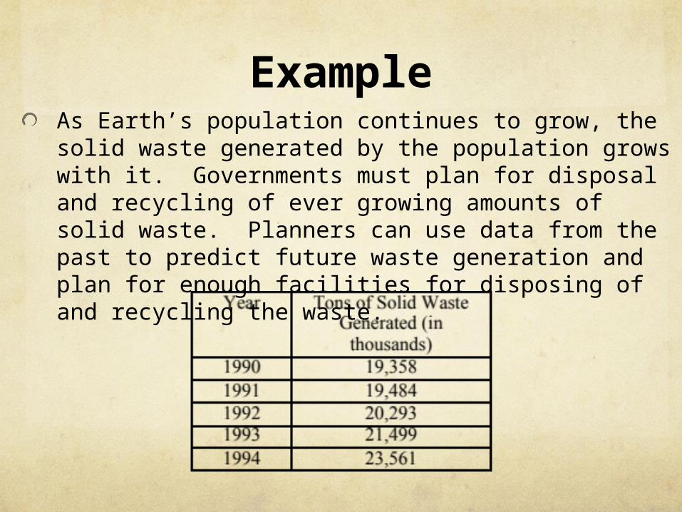
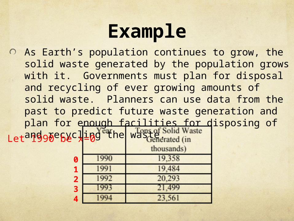
ExampleAs Earth’s population continues to grow, the solid waste generated by the population grows with it. Governments must plan for disposal and recycling of ever growing amounts of solid waste. Planners can use data from the past to predict future waste generation and plan for enough facilities for disposing of and recycling the waste.
ExampleAs Earth’s population continues to grow, the solid waste generated by the population grows with it. Governments must plan for disposal and recycling of ever growing amounts of solid waste. Planners can use data from the past to predict future waste generation and plan for enough facilities for disposing of and recycling the waste.
Let 1990 be x=0
01234
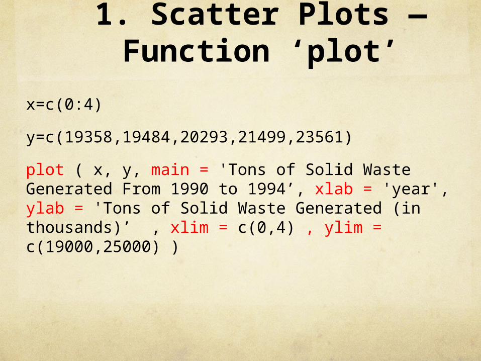
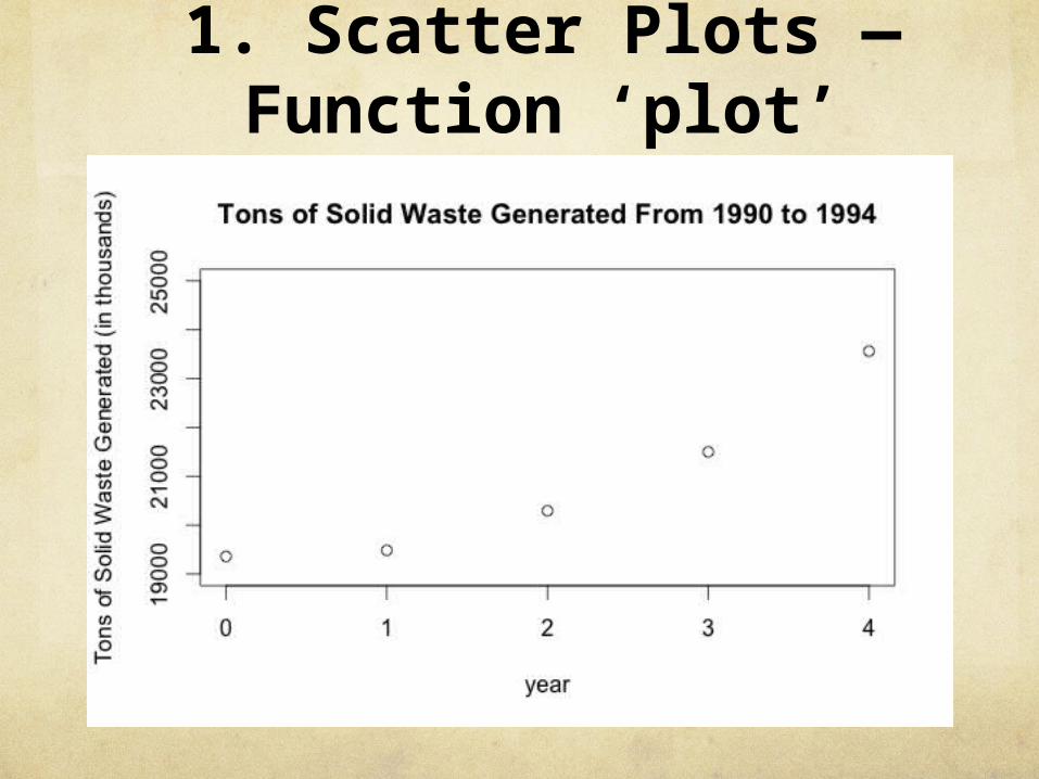
1. Scatter Plots — Function ‘plot’
x=c(0:4)
y=c(19358,19484,20293,21499,23561)
plot ( x, y, main = 'Tons of Solid Waste Generated From 1990 to 1994’, xlab = 'year', ylab = 'Tons of Solid Waste Generated (in thousands)’ , xlim = c(0,4) , ylim = c(19000,25000) )
1. Scatter Plots — Function ‘plot’
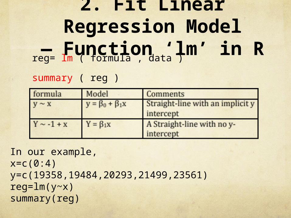
2. Fit Linear Regression Model
— Function ‘lm’ in Rreg= lm ( formula , data )
summary ( reg )
In our example,x=c(0:4)y=c(19358,19484,20293,21499,23561)reg=lm(y~x)summary(reg)
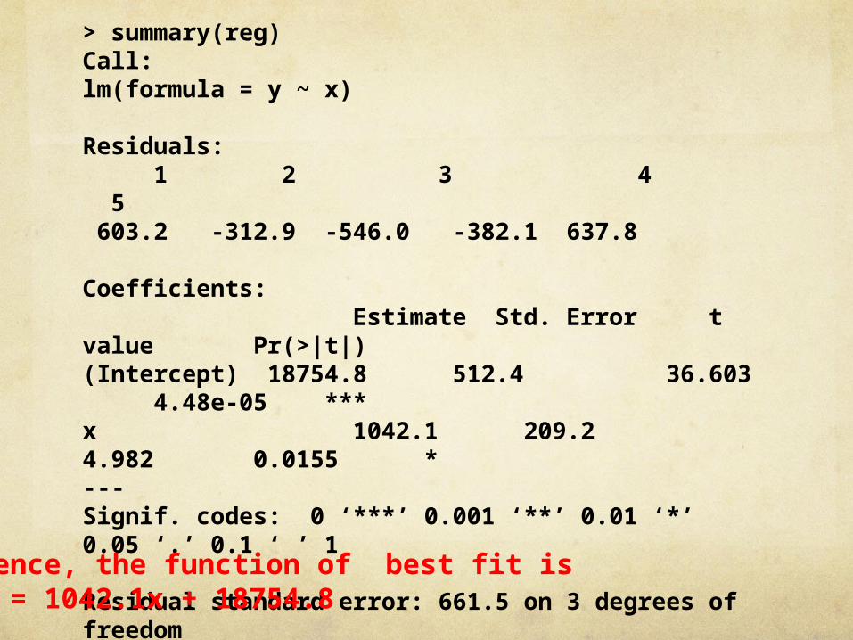
> summary(reg)Call:lm(formula = y ~ x)
Residuals: 1 2 3 4 5 603.2 -312.9 -546.0 -382.1 637.8
Coefficients: Estimate Std. Error t value Pr(>|t|) (Intercept) 18754.8 512.4 36.603 4.48e-05 ***x 1042.1 209.2 4.982 0.0155 * ---Signif. codes: 0 ‘***’ 0.001 ‘**’ 0.01 ‘*’ 0.05 ‘.’ 0.1 ‘ ’ 1
Residual standard error: 661.5 on 3 degrees of freedomMultiple R-squared: 0.8922, Adjusted R-squared: 0.8562 F-statistic: 24.82 on 1 and 3 DF, p-value: 0.01555
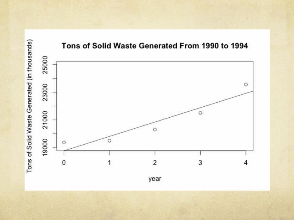
Hence, the function of best fit isy = 1042.1x + 18754.8
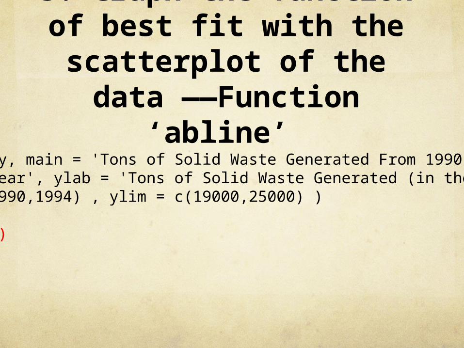
3. Graph the function of best fit with the
scatterplot of the data ——Function ‘abline’
plot ( x, y, main = 'Tons of Solid Waste Generated From 1990 to 1994’, xlab = 'year', ylab = 'Tons of Solid Waste Generated (in thousands)’ , xlim = c(1990,1994) , ylim = c(19000,25000) )
abline(reg)
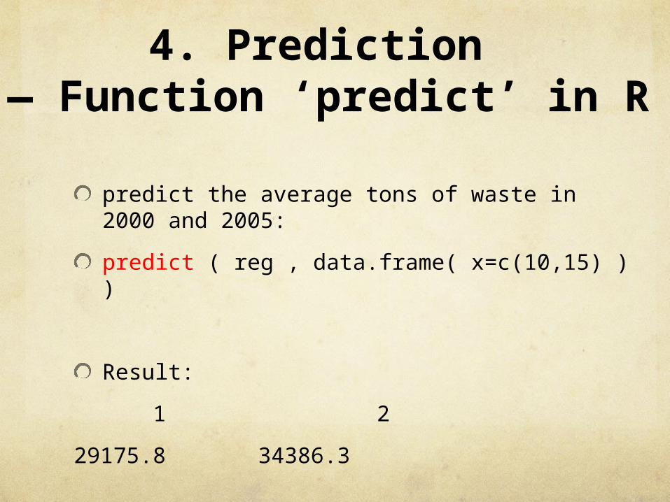
4. Prediction — Function ‘predict’ in R
predict the average tons of waste in 2000 and 2005:
predict ( reg , data.frame( x=c(10,15) ) )
Result:
1 2
29175.8 34386.3
Exercise
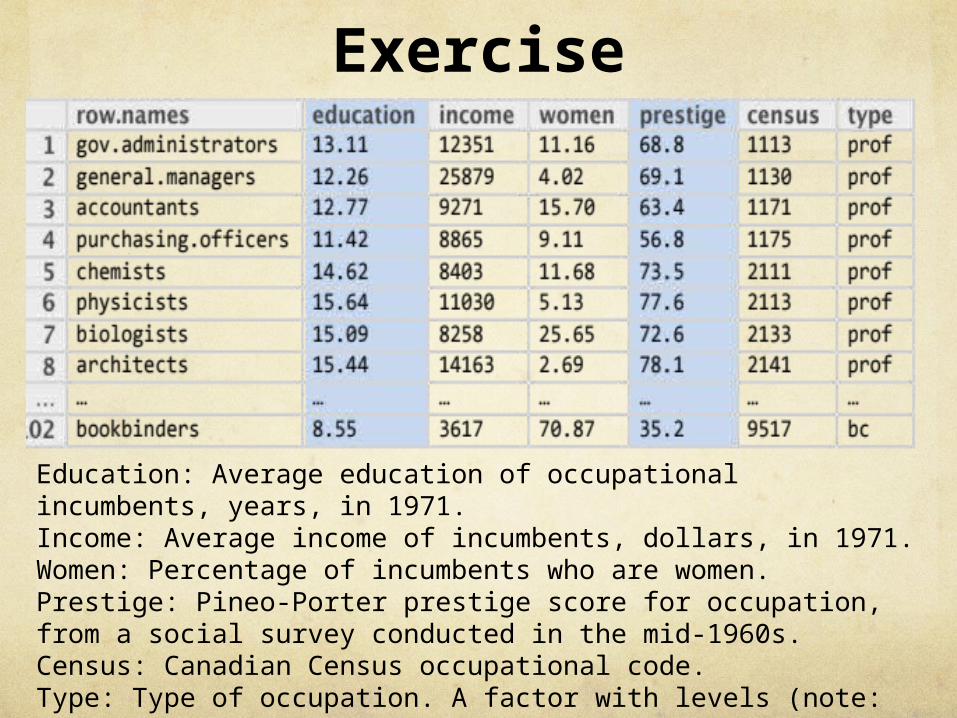
Education: Average education of occupational incumbents, years, in 1971.Income: Average income of incumbents, dollars, in 1971.Women: Percentage of incumbents who are women.Prestige: Pineo-Porter prestige score for occupation, from a social survey conducted in the mid-1960s.Census: Canadian Census occupational code.Type: Type of occupation. A factor with levels (note: out of order): bc, Blue Collar; prof, Professional, Managerial, and Technical; wc, White Collar.
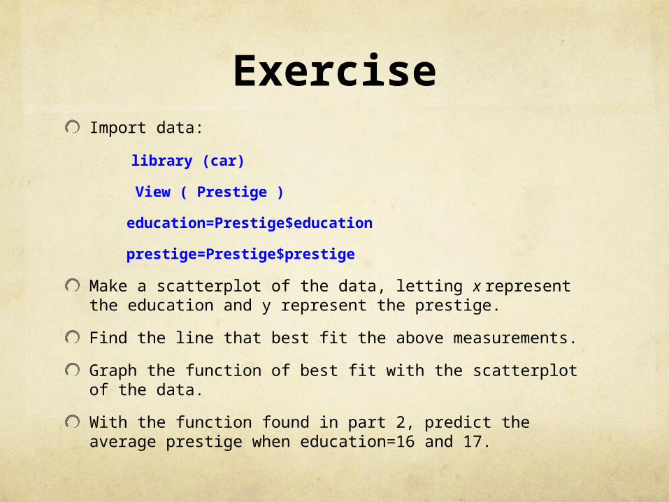
ExerciseImport data:
library (car)
View ( Prestige )
education=Prestige$education
prestige=Prestige$prestige
Make a scatterplot of the data, letting x represent the education and y represent the prestige.
Find the line that best fit the above measurements.
Graph the function of best fit with the scatterplot of the data.
With the function found in part 2, predict the average prestige when education=16 and 17.