marker rendering step by step by: billy wilburn …...marker rendering step by step by: billy...
TRANSCRIPT
Marker Rendering Step by Step By: Billy Wilburn
South Dakota State University
Types of Markers -- There are many types of markers that you can use for renderings. I
personally use Prismacolor. You could also use Copic, Chartpak, Dickblick, etc.. Each
brand of marker has its own strengths and weaknesses.
Work Quickly -- When working with markers it is important to fill in larger areas
quickly working in one direction so that you do not get lines in your renderings.
Skin Tones -- Skin tones can be made very easily! Brick beige and light peach make a
great Caucasian skin tone.
Transfer to Card Stock -- Scan in your sketches and set up your renderings in
Microsoft Word or Publisher. This way you can print out as many copies as you want
and you can resize all of your sketches to the same size. You can also put the show title
and character name in the proper place. This looks more professional. Then, send your
heavy watercolor paper through your printer. If you make a mistake starting over is
only a print button away!
Lights!!!-- Chose a direction for light and stick with it. If you use a post-it note with an
arrow you can always remove it later.
It’s all about layers-- Renderings take time. Work using several layers to get a three
dimensional quality to your renderings.
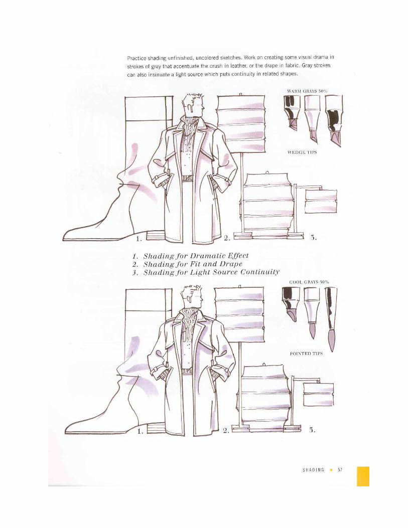
Shadows-- After using markers take a grey art marker (Prismacolor -20% cool) and
reinforce your shadows giving more dimension to your renderings.
Craft Paint and rendering…WHAT!!!—So, if you buy yourself a bottle of white
paint or glitter paint you can add glitter details to costumes or help define your light
source more clearly.
Lining-- Grab yourself a set of black scrapbook pens. They come in different
thicknesses….005, 01, 05, 08, etc. Once you have the size you want you can
draw in details.
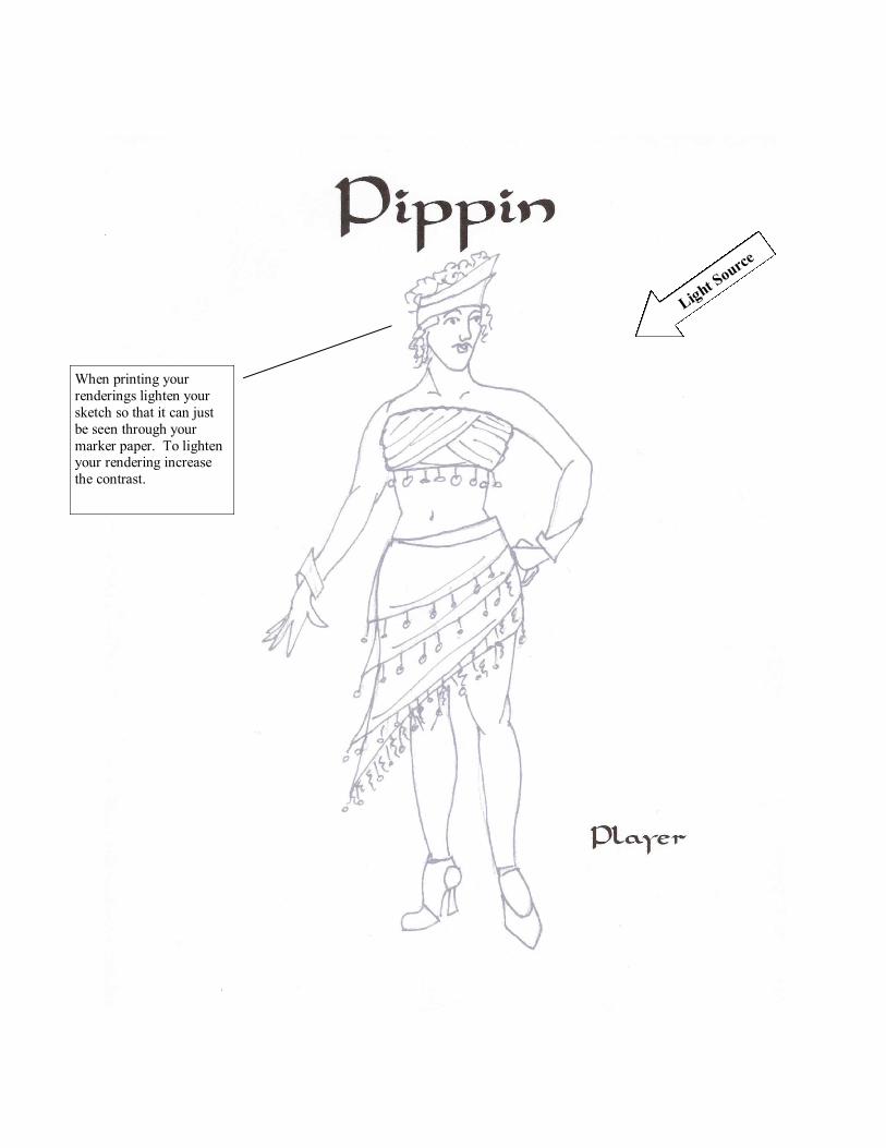
When printing your
renderings lighten your
sketch so that it can just
be seen through your
marker paper. To lighten your rendering increase
the contrast.
Light S
ource
Light S
ource
You can use the same
marker to create depth by
adding more and more
layers building on the
color.
The first layers should
be the lightest shade of
skin. In this case I
started with brick beige.
After brick beige I used light
peach and tan to create more
contour. Your shadow should
get gradually smaller to give
more dimension.
Light S
ource
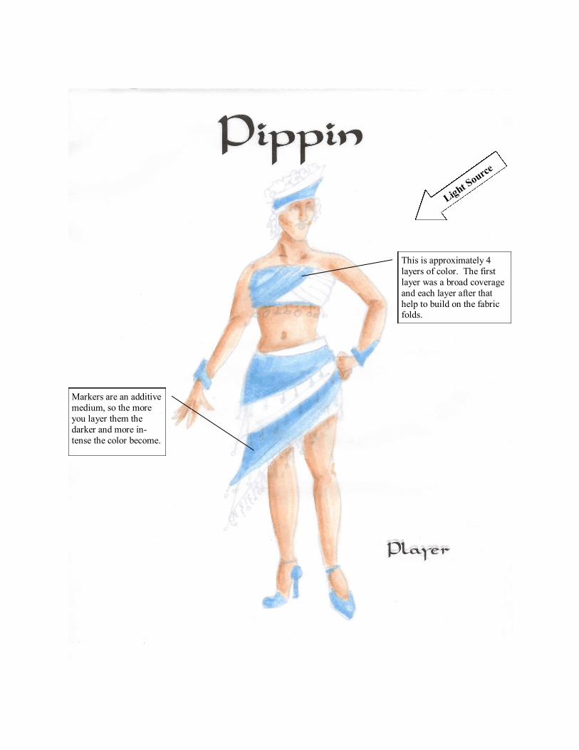
Markers are an additive
medium, so the more
you layer them the
darker and more in-
tense the color become.
This is approximately 4
layers of color. The first
layer was a broad coverage
and each layer after that
help to build on the fabric folds.
Light S
ource
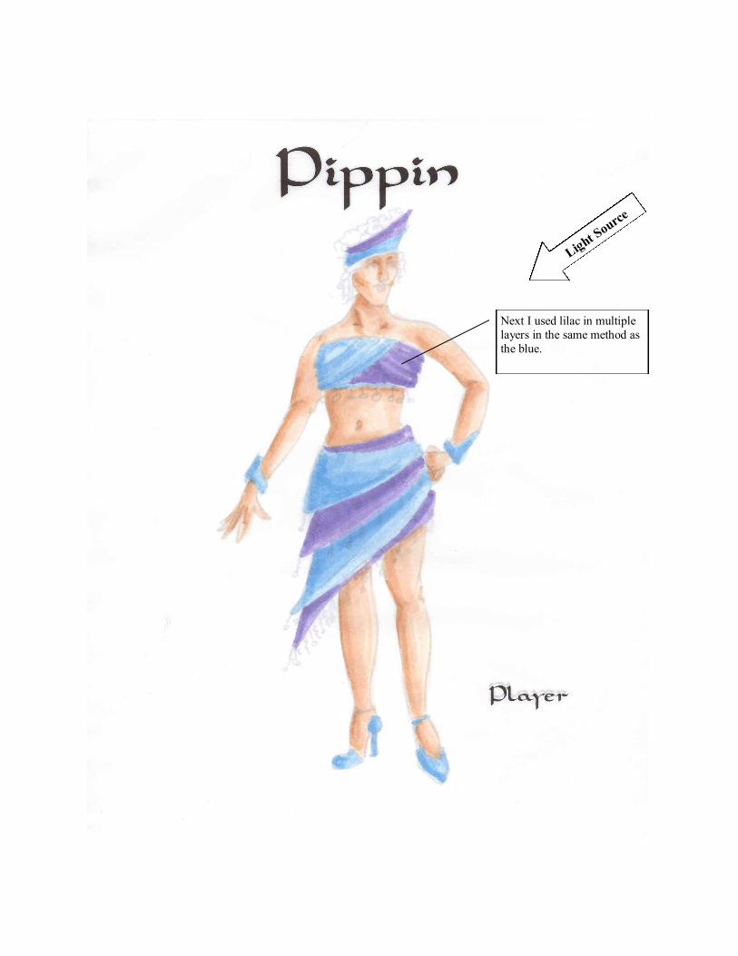
Next I used lilac in multiple
layers in the same method as
the blue.
Light S
ource
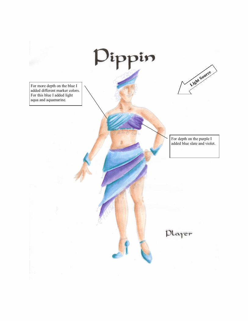
For more depth on the blue I
added different marker colors.
For this blue I added light
aqua and aquamarine.
For depth on the purple I
added blue slate and violet.
Light S
ource
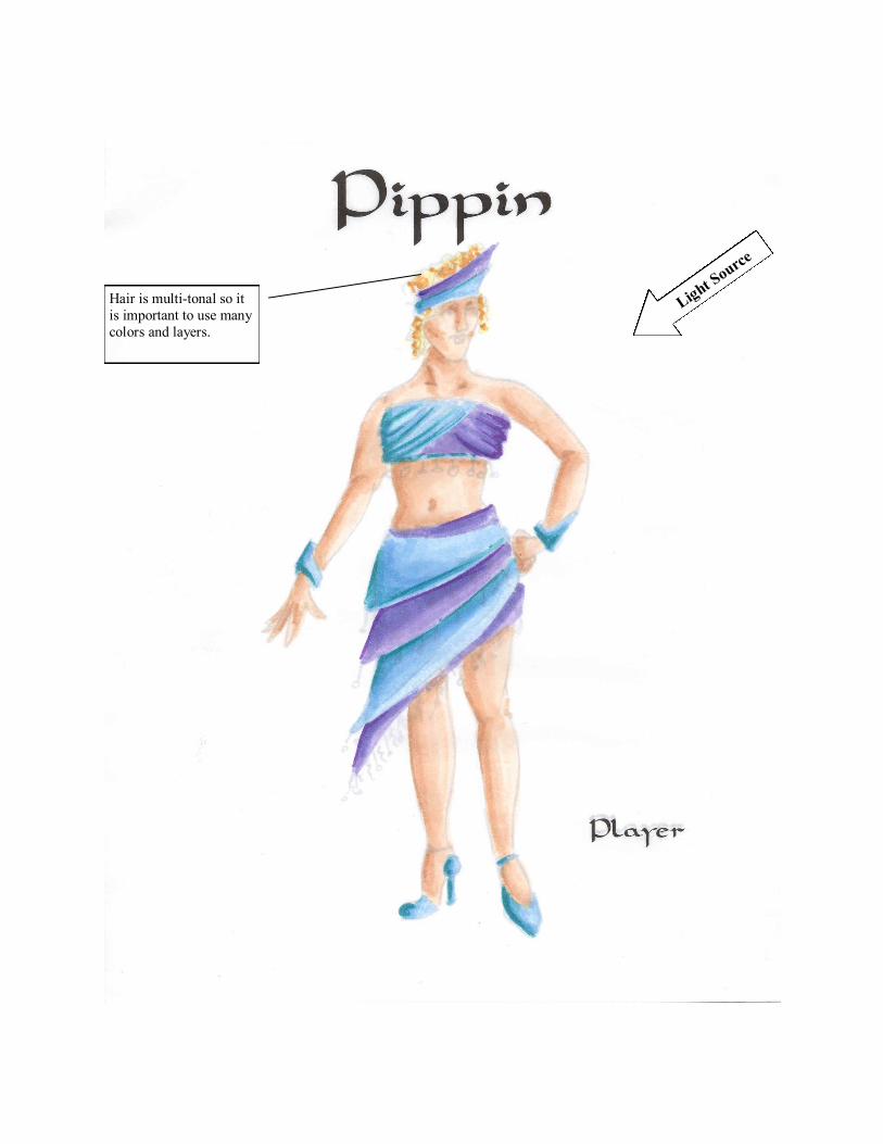
Hair is multi-tonal so it
is important to use many
colors and layers.
Light S
ource
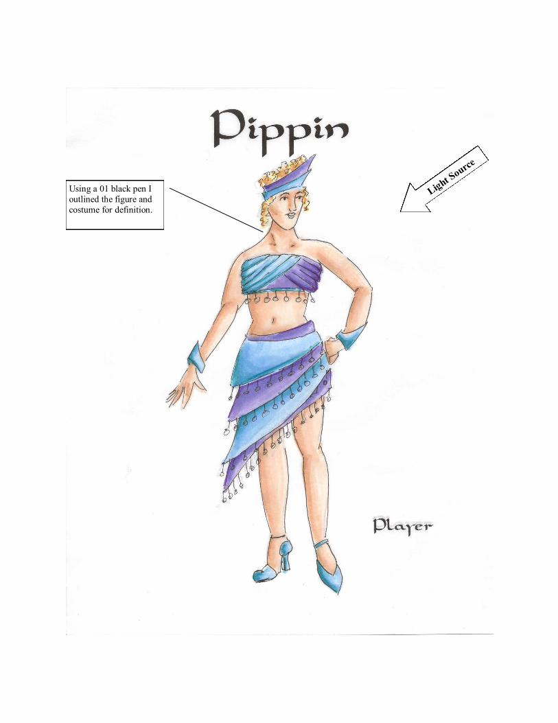
Using a 01 black pen I
outlined the figure and
costume for definition.
Light S
ource
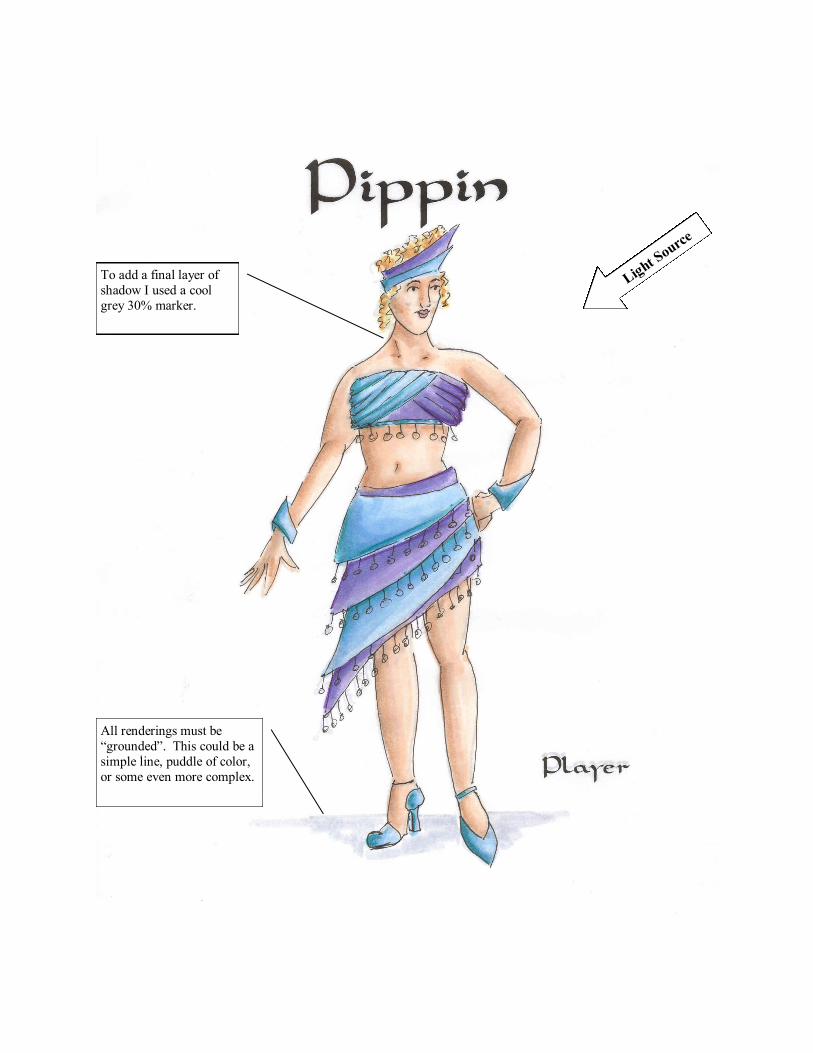
To add a final layer of
shadow I used a cool
grey 30% marker.
All renderings must be
“grounded”. This could be a
simple line, puddle of color,
or some even more complex.
Light S
ource
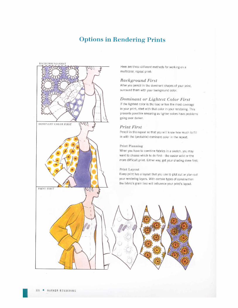
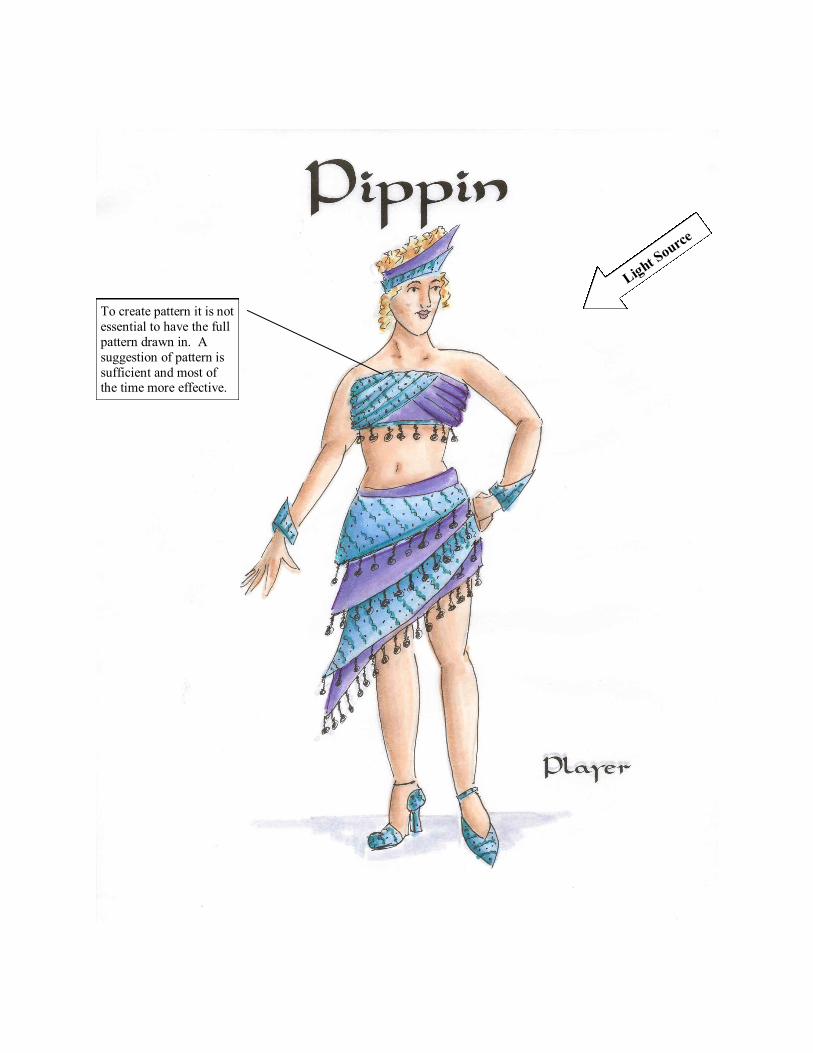
To create pattern it is not
essential to have the full
pattern drawn in. A
suggestion of pattern is
sufficient and most of the time more effective.