magazine front covers
TRANSCRIPT
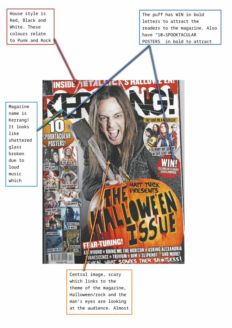
House style is Red, Black and White. These colours relate to Punk and Rock and rebellious.
The puff has WIN in bold letters to attract the readers to the magazine. Also have “10 SPOOKTACULAR POSTERS” in bold to attract the readers into buying the magazine.
Magazine name is Kerrang! It looks like shattered glass broken due to loud music which links to the genre of the magazine (Rock, metal, screamo)
Central image, scary which links to the theme of the magazine, Halloween/rock and the man’s eyes are looking at the audience. Almost like he’s coming for you.
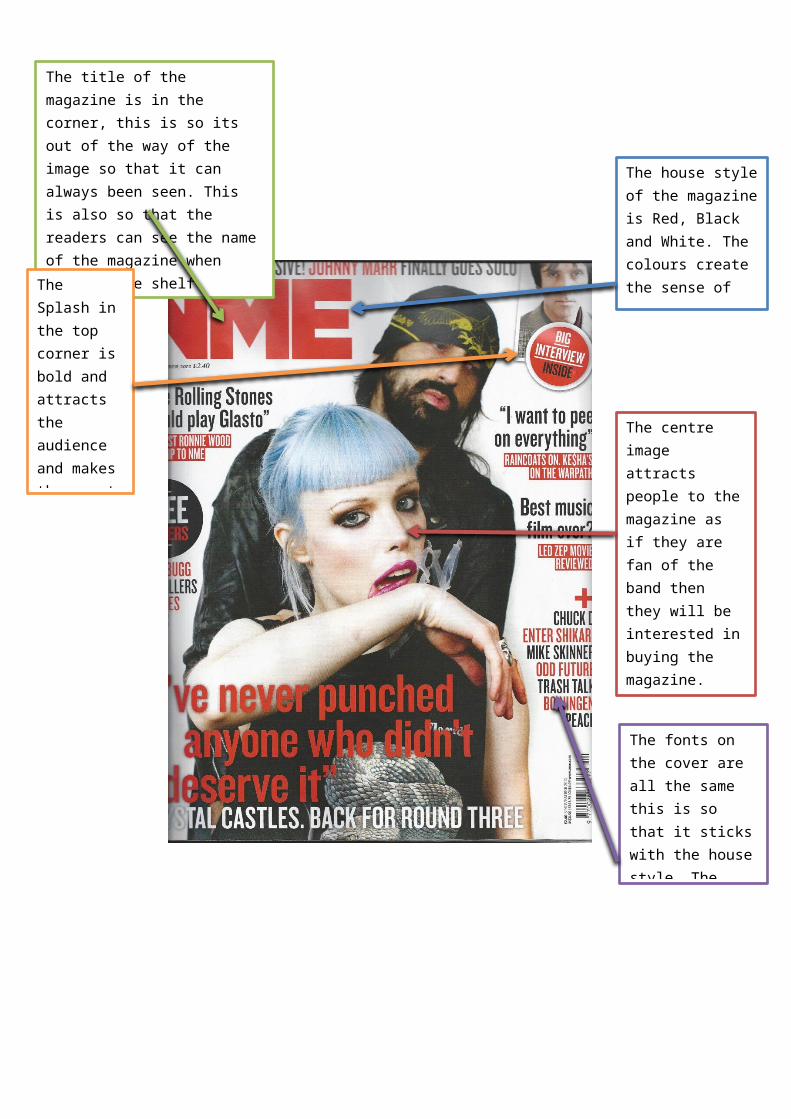
The house style of the magazine is Red, Black and White. The colours create the sense of rebellious as they’re quite dark, rockish/punk colours.
The centre image attracts people to the magazine as if they are fan of the band then they will be interested in buying the magazine. Also the girl in the image is looking at the audience and connecting with the reader.
The title of the magazine is in the corner, this is so its out of the way of the image so that it can always been seen. This is also so that the readers can see the name of the magazine when it’s on the shelf
The fonts on the cover are all the same this is so that it sticks with the house style. The writing is bold so that it stands out with the colours.
The Splash in the top corner is bold and attracts the audience and makes them want to read it to find out more information.