looper poster analysis
TRANSCRIPT

Looper poster analysisThe movie poster which I will be analysing is the looper movie poster. This was one of the official movie posters which was advertised by the movie company.
The movie is an science – fiction action thriller which was released in 2012. The movie is based on a futuristic society where time travel exists and the hit man (looper) is sent by the mob to eliminate a man in the past however this target man turns out to be the looper himself in the past.
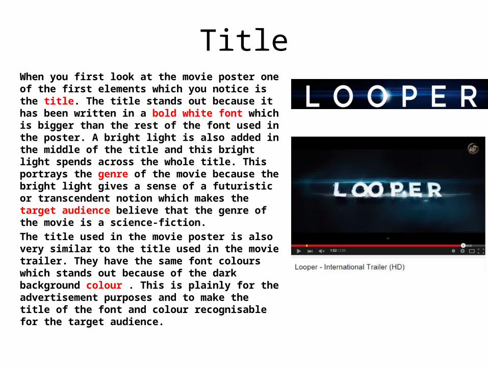
TitleWhen you first look at the movie poster one of the first elements which you notice is the title. The title stands out because it has been written in a bold white font which is bigger than the rest of the font used in the poster. A bright light is also added in the middle of the title and this bright light spends across the whole title. This portrays the genre of the movie because the bright light gives a sense of a futuristic or transcendent notion which makes the target audience believe that the genre of the movie is a science-fiction.The title used in the movie poster is also very similar to the title used in the movie trailer. They have the same font colours which stands out because of the dark background colour . This is plainly for the advertisement purposes and to make the title of the font and colour recognisable for the target audience.
Key image
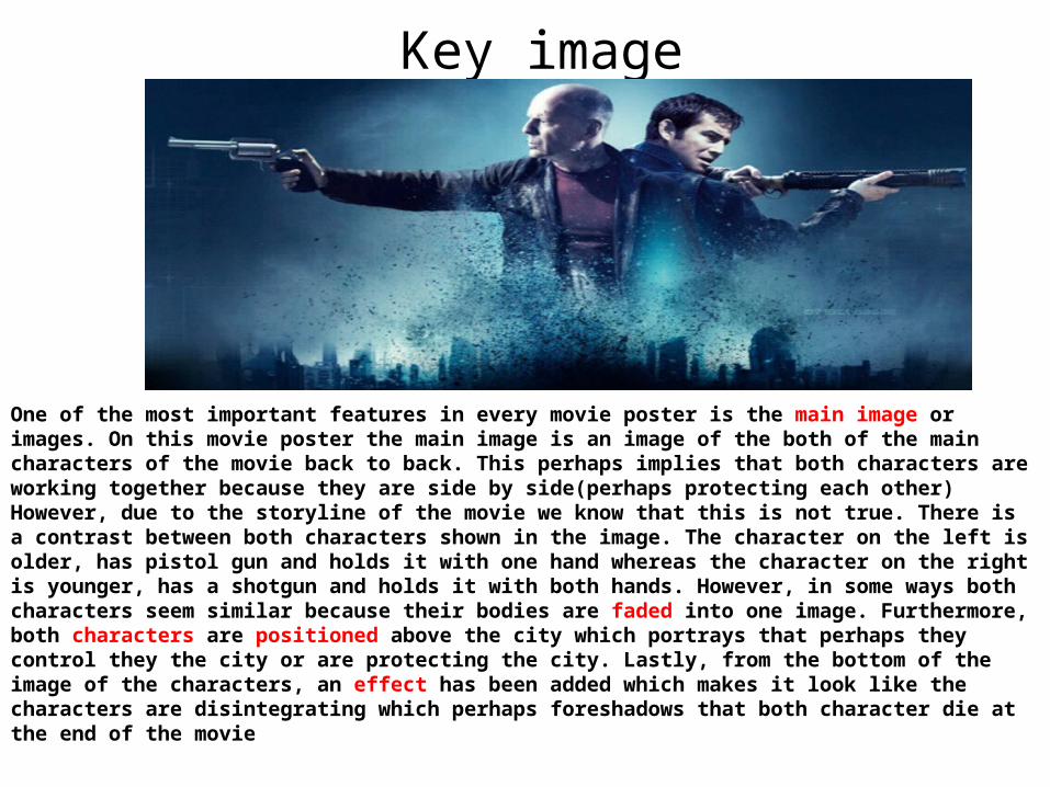
One of the most important features in every movie poster is the main image or images. On this movie poster the main image is an image of the both of the main characters of the movie back to back. This perhaps implies that both characters are working together because they are side by side(perhaps protecting each other) However, due to the storyline of the movie we know that this is not true. There is a contrast between both characters shown in the image. The character on the left is older, has pistol gun and holds it with one hand whereas the character on the right is younger, has a shotgun and holds it with both hands. However, in some ways both characters seem similar because their bodies are faded into one image. Furthermore, both characters are positioned above the city which portrays that perhaps they control they the city or are protecting the city. Lastly, from the bottom of the image of the characters, an effect has been added which makes it look like the characters are disintegrating which perhaps foreshadows that both character die at the end of the movie

Tagline
The tagline of the movie poster is clear and precise in terms of relating to the storyline of the movie because the story of movie is about a man who meets his future self. Furthermore, the tagline is also short and swift which is an advantage because this makes it easy to remember for the target audience. In terms of language devices the tagline uses simple colloquial language which the target audience can easily understand. Alliteration is also used in the tagline as words starting with the letter F “Face, Future and Fight” are used in the tagline in order to make it sound more powerful when pronounced.
Credits
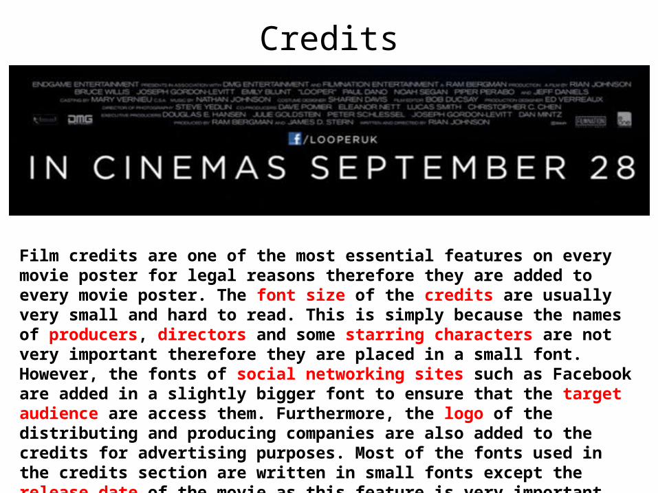
Film credits are one of the most essential features on every movie poster for legal reasons therefore they are added to every movie poster. The font size of the credits are usually very small and hard to read. This is simply because the names of producers, directors and some starring characters are not very important therefore they are placed in a small font. However, the fonts of social networking sites such as Facebook are added in a slightly bigger font to ensure that the target audience are access them. Furthermore, the logo of the distributing and producing companies are also added to the credits for advertising purposes. Most of the fonts used in the credits section are written in small fonts except the release date of the movie as this feature is very important therefore the font needs to be big and stand out in order to highlight this to the target audience.
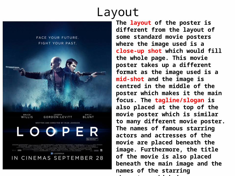
LayoutThe layout of the poster is different from the layout of some standard movie posters where the image used is a close-up shot which would fill the whole page. This movie poster takes up a different format as the image used is a mid-shot and the image is centred in the middle of the poster which makes it the main focus. The tagline/slogan is also placed at the top of the movie poster which is similar to many different movie poster. The names of famous starring actors and actresses of the movie are placed beneath the image. Furthermore, the title of the movie is also placed beneath the main image and the names of the starring characters which is traditionally done in most movie posters. Finally, credits , social network icons and the release dates are all placed at the bottom of the movie poster which is again traditionally done in every movie poster.
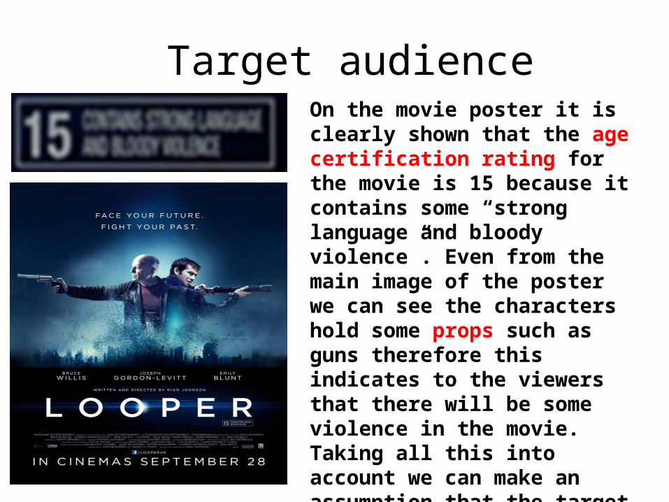
Target audienceOn the movie poster it is clearly shown that the age certification rating for the movie is 15 because it contains some “strong language and bloody violence”. Even from the main image of the poster we can see the characters hold some props such as guns therefore this indicates to the viewers that there will be some violence in the movie. Taking all this into account we can make an assumption that the target audience of the movie poster are teenagers and also adults who are thriller seekers and enjoy watch sci-fi and action movies.

ColourThe movie poster uses different colours in order to set a thrilling and mysterious atmosphere within the poster. The poster uses a dark colours such as dark blue and black in order to adapt to the mysteriousness and tense atmosphere set within the poster. The colour of fonts used in the movie poster is white and this is simply to make the font stand out from the background. The outer clothes worn by the characters in the image are also dark colours which might collide with the dark background therefore a white cloud effect is added around the image of the characters to make it easier to see. In addition, the white cloud effect also perhaps portrays the sanctity of both characters as it seems that the characters are feeding away from the dark.