logo and analysis of logos
TRANSCRIPT

Perception Analysis Of A Brand Logo- Pertaining To Consumer Research

LOGO
• A company uses logo to identify itself or its products
• A logo influences the speed of recognition and to remember brand name
• A logo clarifies the company’s features and Qualities
• Contributions for a logo are by
– Shape, color, size, style, image etc

Basis of colors
• Long wavelength(red and yellow)
• Short wavelength(blue and green)
• Neutral colors(white, black, grey)

Red Color
• Confident
• Daring
• Leader
• Exciting
• Successful
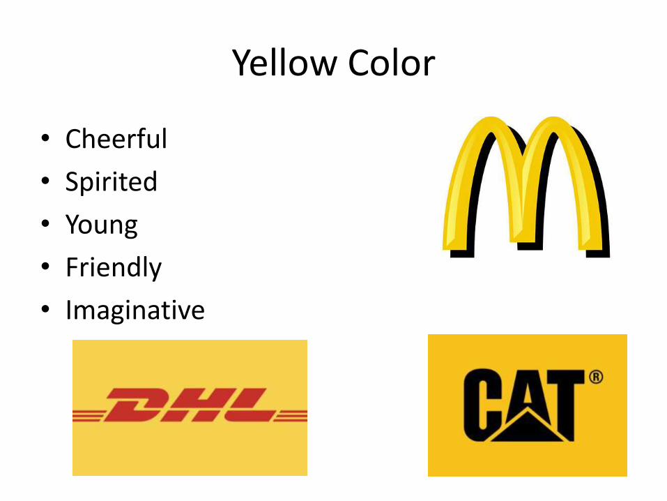
Yellow Color
• Cheerful
• Spirited
• Young
• Friendly
• Imaginative

Orange Color
• Down to earth
• Unique
• Cheerful
• friendly

Blue logo
• Secure
• Reliable
• Honest
• Sincere

Green Logo
• Down to earth
• Outdoorsy
• Wholesome
• Family oriented

Brown color
• Rugged
• Outdoorsy
• Original
• tough

Purple color
• Trendy
• Feminine
• Cotemporary
• Unique
• cool

Pink color
• Feminine
• Charming
• Imaginative
• young

Black color
• Technical
• Masculine
• Confident
• Leader
• Tough

Grey color
• Technical
• Corporate
• Hard-working
• leader

White color
• Secure
• Real
• Corporate
• Honest
• Wholesome
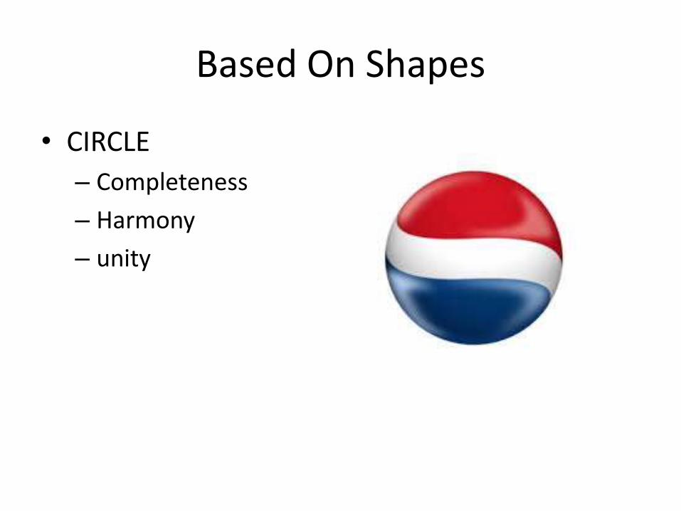
Based On Shapes
• CIRCLE
– Completeness
– Harmony
– unity

• Rectangles and Squares
– Stability
– Trust
– Honesty
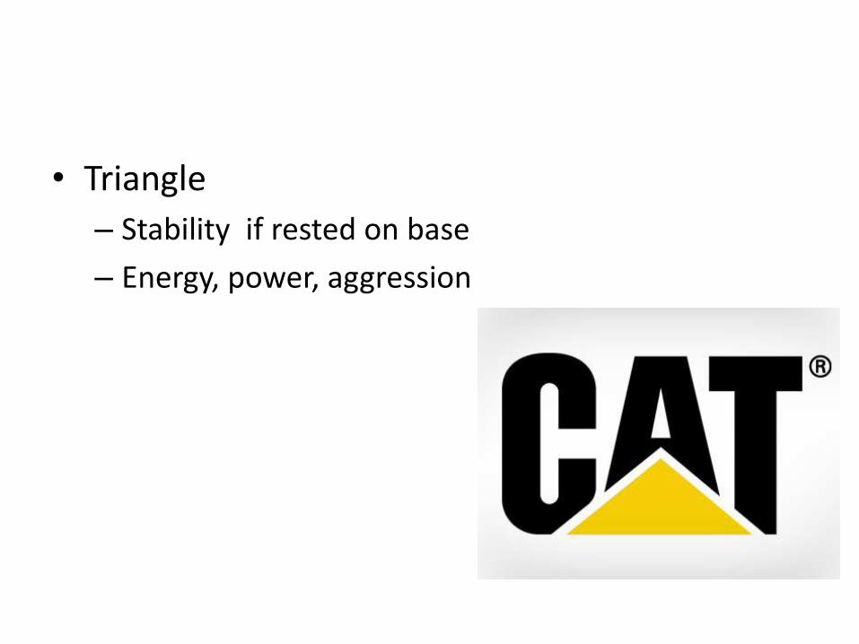
• Triangle
– Stability if rested on base
– Energy, power, aggression

• Vertical lines and shapes
– Courage
– domination

• Curves
– Feminity
– Rhythm

• Spiral
– Growth
– expansion

VISUAL IDENTITY
• Refers to consumer’s perception of a brand’s characteristics
• How do customer’s relate to a brand via initial observation

Continued…
• Referential meanings• Colour association• Meanings of shape and symbol
So consumer research is very important in understanding what the consumer perceives
A research based on Aaker’s brand personality scale
Aaker defines brand equity as the set of brand assets and liabilities linked to the brand – its name and symbol that add value to, or subtract value from a product or service

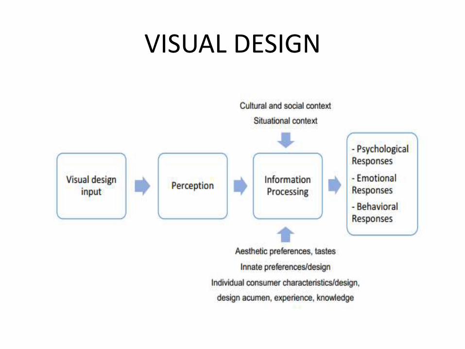
VISUAL DESIGN
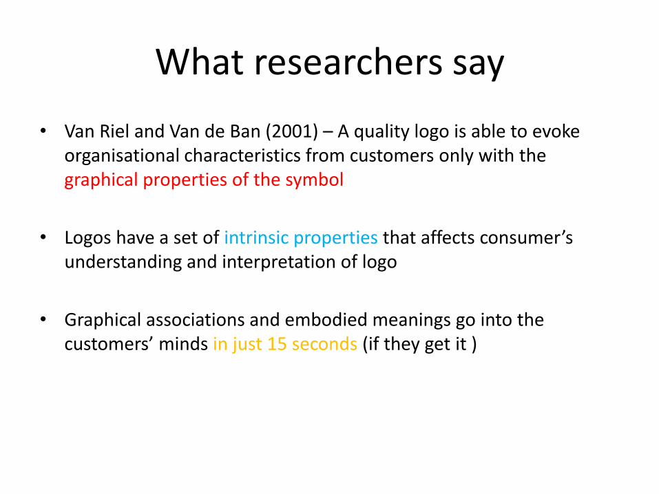
What researchers say
• Van Riel and Van de Ban (2001) – A quality logo is able to evoke organisational characteristics from customers only with the graphical properties of the symbol
• Logos have a set of intrinsic properties that affects consumer’s understanding and interpretation of logo
• Graphical associations and embodied meanings go into the customers’ minds in just 15 seconds (if they get it )
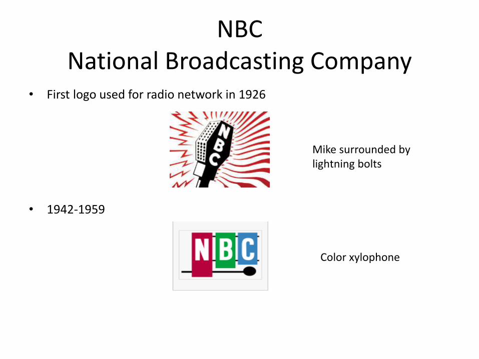
NBCNational Broadcasting Company
• First logo used for radio network in 1926
• 1942-1959
Mike surrounded by lightning bolts
Color xylophone

• 1957-1960 – Introduction of peacock
• 1960-1976 – Snake logo
• Indicates richness in color • RCA manufacturer of color TV
• Stacked typographic logo• Snake form in front of a
multi-coloured background
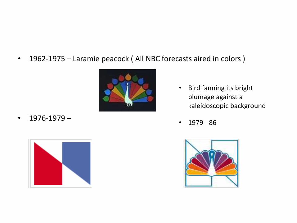
• 1962-1975 – Laramie peacock ( All NBC forecasts aired in colors )
• 1976-1979 –
• Bird fanning its bright plumage against a kaleidoscopic background
• 1979 - 86
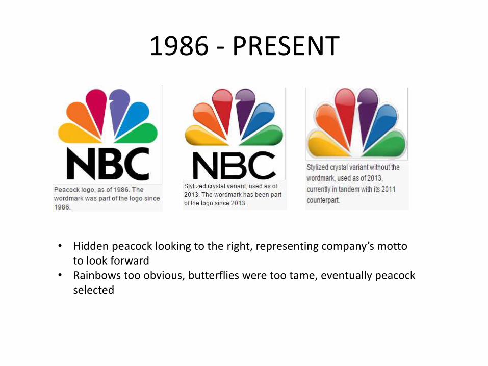
1986 - PRESENT
• Hidden peacock looking to the right, representing company’s motto to look forward
• Rainbows too obvious, butterflies were too tame, eventually peacock selected

VARIANTS
• Environmental initiative
• Earth week
• Signifies masculine, mystery, intimidating and death
• Feminism, soft, love
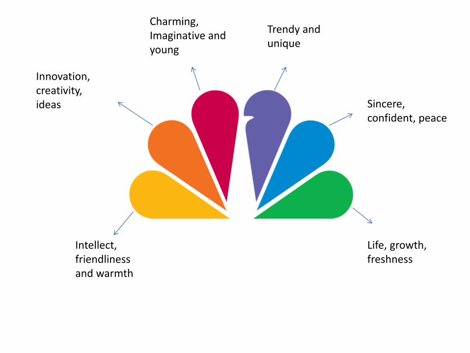
Intellect, friendliness and warmth
Innovation, creativity, ideas
Charming,Imaginative and young
Trendy and unique
Sincere, confident, peace
Life, growth, freshness
TAGLINES
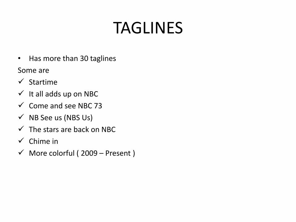
• Has more than 30 taglines
Some are
Startime
It all adds up on NBC
Come and see NBC 73
NB See us (NBS Us)
The stars are back on NBC
Chime in
More colorful ( 2009 – Present )

video
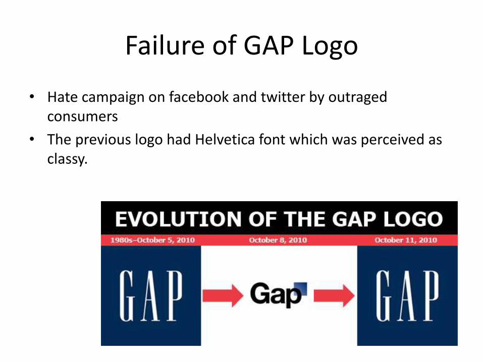
Failure of GAP Logo
• Hate campaign on facebook and twitter by outraged consumers
• The previous logo had Helvetica font which was perceived as classy.

Failure of FIFA world cup 2014
• What was intended
• Yellow and green represents brazil(host) nation
• Amazon rain forest
• Three victorious hands raising
World’s most famous trophy

• What We Actually Perceive