line, space, shape and form - uh.edu · line, space, shape, and form i. line a. definition an...
TRANSCRIPT
LINE, SPACE, SHAPE, AND FORM
I. LINE
A. Definition
An extension of a point, elongated mark, connection between two points, the effect of theedge of an object
B. Ways designers employ lines in a composition
1. to make a shape, contour, define a boundary2. create variety by using angular, broken, bent, thick or thin lines3. create rhythm with curved or straight lines, varied in length4. simulate texture5. passive lines created between the division of one color from anotheror mass from space6. in perspective to create the illusion of depth7. organized to express movement or motion8. create focus through direction
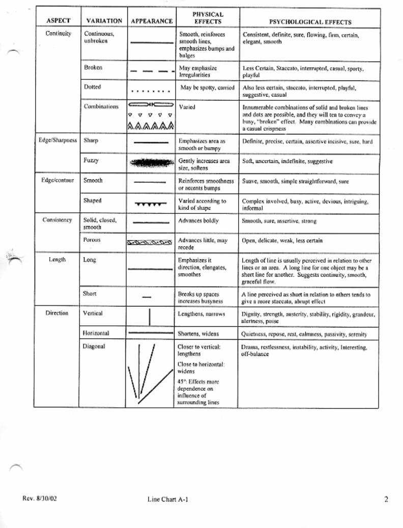
C. Aspects
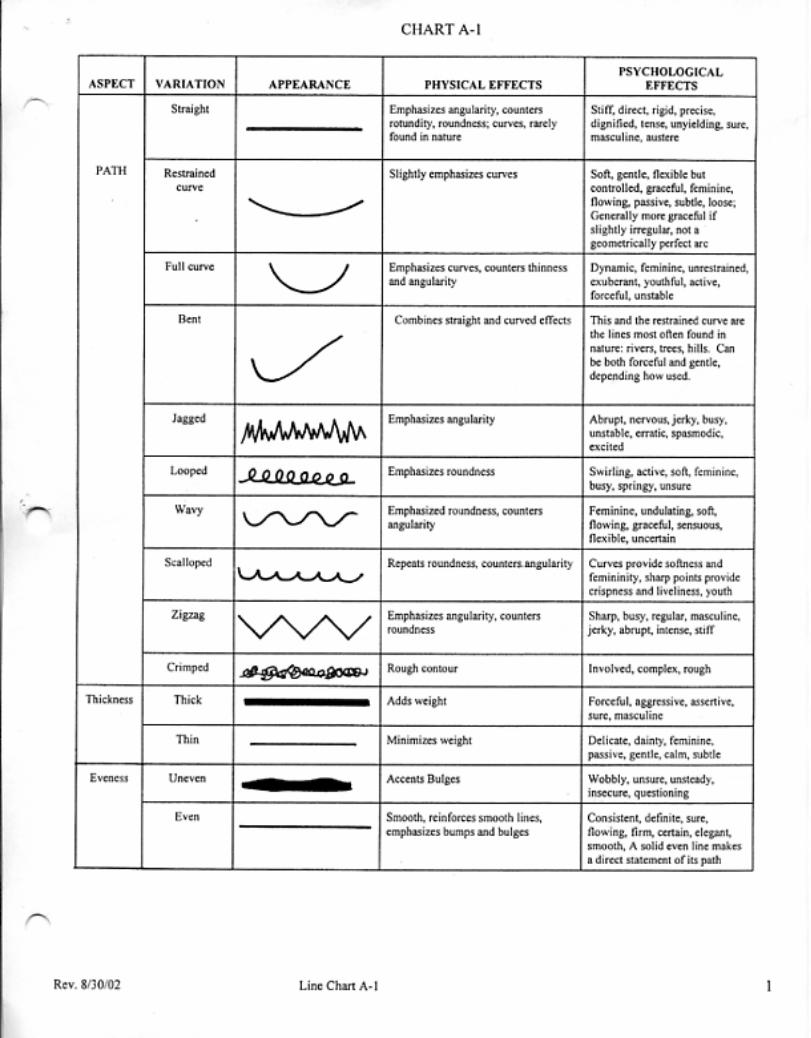
Lines are analyzed according to nine aspects:
1. Path2. Thickness3. Evenness4. Continuity5. Sharpness of the edge6. Contour of the edge7. Consistency8. Length9. Direction
D. Lines as design components
1. Lines in buildings
a. Structural uses include columns, trusses, rafters,beams, planking, brick rows
b. Decorative uses include moulding, wallpaper, color blockingc.
2. Lines in Clothing
a. Structural uses include Seams, darts, shirring,silhouette, edges of collars, lapels, pockets, belts,sleeves, hems, openings, pleats, gathers, tucks, draping
b. Decorative uses included braid, rickrack, piping, rowsof buttons, insertions, binding, lace edgings, ribbon,soutache, topstitching, faggoting, ruffles, fringe, linearembroidery, beading or fabric patterns such as plaid,stripes, herringbones, checks, zigzags
3. Lines in Lighting
Single beams of light, edge of shadows, template patterns

E. Physical and Psychological effects of line
1. The direction of the line is the strongest of the aspects because itleads the eye and creates focus
a. Vertical lines are awake, alert, defy gravity, rigid, firm,stable, strong
b. Horizontal lines are restful, yield to gravity, createquiet, repose, passivity, calmness, or serenity
c. Diagonal lines appear undecided, unstable, busy, active,dynamic, restless, dramatic, sporty, lengthening, and reducehorizontal or vertical shapes.
1. Often a diagonal line needs opposingdiagonal to appear balanced.
2. If joining diagonal lines are pointingdown they tend to lift up, or make object/wearer appear lighter, happier, moreyouthful
3. if they are pointing up the lines willhave the opposite effect causing theobject/wearer to appear older, heavier,somber, or droopy.
d. A horizontal line combined with a vertical line createsstillness, staticness, equilibrium. For example, the framework of a building, telephone poles, branches of a tree.
F. Expressive power of lines
1. The choices made with respect to the aspects of the lines in a designcan manipulate the viewer for example:
DANGER or DANGER
Which danger is more informative and gets the point across?
2. Mood can also be manipulated depending on how aspects are used
a. An assertive mood can be created with straight, solid,sharp, thick, even, smooth, bold, or vertical lines
b. A soft, or delicate mood would employ curved, thin, orcontinuous lines
c. A casual feeling would involve using lines that arezigzag, soft, broken, sharp, thin, porous
3. Moods can be modified by aspects as well
An assertive straight path can be modified with shaped,lacy, porous or fuzzy edges and become delicate orephemeral
G. Reinforcement and countering with line aspects
1. Lines emphasis the direction in which the lines are going
a. A horizontal line at the shoulder or hip visually widenthe figure while a vertical line from the shoulder to thehip will visually lengthen the torso
b. A thick horizontal line at the top of a low building, forexample a row of bricks in a contrasting color will causethe building to look wider or squatty, while the placementof a contrasting line of bricks vertical will give thebuilding more height
c. Soften tall, angular, thin, line with countering curvedlines
d. Counter protruding round lines with straight lines andsharp corners

II. SPACE
Space can either be a flat area or have volume. An enclosed space is usually called“shape” while and unenclosed space is simply “space”, but the two are inseparable andhave a powerful and complementary relationship. Space/shape relationships can createillusions of depth or of foreground and background. In this relationship shape is knownas figure, enclosed space, or positive space while space is called ground, background, ornegative space. Empty space is also called open, unbroken, plain, or blank while filledspace is closed.
Theatre is a three-dimensional space which requires that a designer always concentrateon how a design will look in a three-dimensional space.
Scenic designers create on the vertical plane of the proscenium, and on the horizontalplane of the stage floor.
Costume designers created on the vertical plane of the human figure in motion.Costumes take on the qualities of sculpture.
Lighting designers can create designs that will change the look of a scenic or costumedesign elements from a shape with volume to a flat space by changing the direction ofthe line of the light and shadows.
A. Definition
The two dimensional or three dimensional area into which all otherelements of design are placed
1. Becomes shape, form, and pattern
2. Determines how all other elements relate
3. Surrounding unenclosed space should not beconsidered what is left over but a part of the overalldesign
4. Space is organized by introducing lines thatsubdivide, rearrange, push, pull, and otherwisemanipulate
5. A line drawn around some space creates shape and ashape is simply enclosed space thus, space, line, andshape are inseparable
B. Descriptive terms for space/shape relationships1. Inside space is a shape, figure, foreground, positive, internal space
2. Outside space is ground, background, negative, external, interstitial
Interstitial space is between unconnected shapes
3. Empty space can be open, unbroken, plain, blank
4. Filled space can be closed, broken
C. Six cues that control visual perception of spatial effects
1. Size of spatial divisions2. Overlapping3. Closeness of shapes4. Density of spatial divisions5. Convectivity and concavity6. Character of enclosing lines
D. Advancing or flattening cues
1. The cues that make enclosed space (shape) appear solid areadvancing cues. These cues expand, create depth, and increase theapparent distance between foreground and background.
a. If sizes of shapes differ from each other and from thesurrounding space the shape will be perceived as a solidon a background.
b. Overlapping spaces/shapes distinguish foregroundfrom background
c. Closeness of shapes that are not touching cause themto be seen as in front of a background and isolated, nottouching, floating
d. Density of space/shape filled w/texture pattern isperceived as solide. Convectivity or convex curves enclosing lines areperceived as shape, protrusion, pushing out, bumps
f. Line character that is thick and sharp make theenclosed space seem more solid, and dense, or furtherfrom the background.
2. Cues that reduce, minimize, make areas recede, seem hollow, or porous areflattening cues.
a. Similar sizes of areas create confusion betweenforeground and background
b. No overlapping lacks depth and all things are equal
c. If shapes are so close they are touching it suggest one surface
d. Empty, plain space is perceived as hollow, void, orwithout density
e. Concave curves are perceived as holes, indentations
f. The character of thin, fuzzy, broken, or blurredenclosing lines creates a flat airy feeling because spaceflows into and out of the area, weak
E. Space as Ground in a composition
Why is unenclosed space, or background, so vital in visual design?Ground, or interstitial space is a critical “captured space” and not justpassive, empty distance between other parts, but a tool that gives vitalityto relationships of shapes. Unenclosed space is complementary toenclosed space, or shape, and shape is complementary to space.
1. gives the object form, importance, identifies, isolates,defines, distinguishes
2. exerts pressure and locates or fixates an object inposition, gives stability
3. provides distance to determine how shapes, lines,and spatial divisions relate
4. provides rest and relief in pattern, a visual intervalsimilar to a rest in music, or a pause in speech
5. appears behind shape thus pushes shape forward
6. because it is less dense, more airy or hollow than theshape it surrounds it gives shape buoyancy
F. Space as volume
A three-dimensional volume of air “space” surrounds us as we moveabout the stage, and is critical to functional and structural, as well asvisual design. In designing the organization of two-dimensional andthree-dimensional shapes in space, the designer is also concerned withthe relationship of the human form in that space. Together, thecostumed human form in space and the arrangements of three-dimensional objects in space need to equal, or balance the volume of thestage space. The lighting of that space can either maintain, enhance, ordestroy that balance.
G. Effects of Space
Space conveys both physiological and psychological effects.Physiologically, it contributes to illusion s of size. Filled space seemslarger than empty space. Spatial distance through which lines travel, aswell as their angles, contributes to inaccurate perceptions of their length.Psychologically, large, unbroken spaces are serene, yet bold anddramatic. Small, broken spaces suggest delicacy and complexity.
H. Spatial Effects
1. The designer incorporates spatial effects both structurally anddecoratively.
a. Structural techniques control the distance betweenstructural lines. Space can be either structurally open orclosed.
b. Decorative techniques control distance betweenmotifs, decorative construction details, or applied trimsmake shapes either decoratively open or closed.
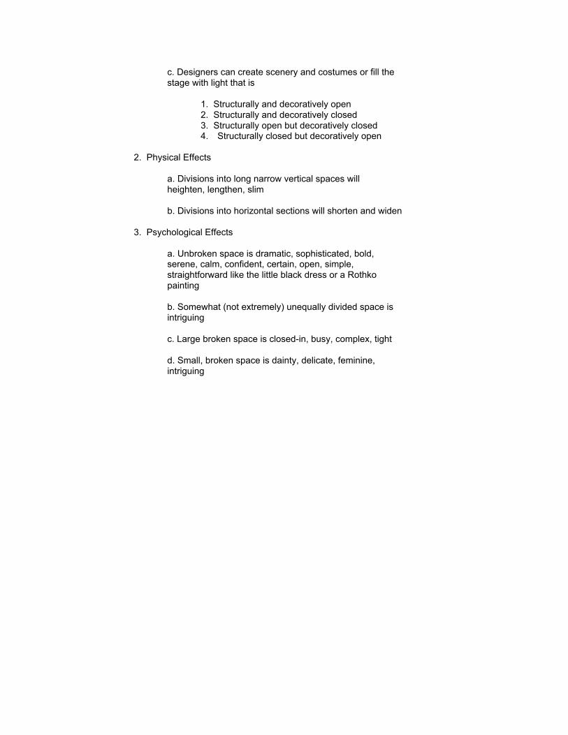
c. Designers can create scenery and costumes or fill thestage with light that is
1. Structurally and decoratively open2. Structurally and decoratively closed3. Structurally open but decoratively closed4. Structurally closed but decoratively open
2. Physical Effects
a. Divisions into long narrow vertical spaces willheighten, lengthen, slim
b. Divisions into horizontal sections will shorten and widen
3. Psychological Effects
a. Unbroken space is dramatic, sophisticated, bold,serene, calm, confident, certain, open, simple,straightforward like the little black dress or a Rothkopainting
b. Somewhat (not extremely) unequally divided space isintriguing
c. Large broken space is closed-in, busy, complex, tight
d. Small, broken space is dainty, delicate, feminine,intriguing
III. SHAPE AND FORM
A line completely surrounding space creates something that a line dividing space doesnot which in turn creates potential effects that nothing else can
A. Definitions
1. Shape is a flat two-dimensional area enclosed by lines
2. Form is a three-dimensional area enclosed by a surface
a. Hollow forms have volumeb. Solid forms have mass
B. Type of shapes and forms
Variations of geometric shapes compose all buildings, works of art, andthe human body
1. Equal sided
a. Shapes – Square, circle, equilateral triangle,pentagon, hexagon, octagon, diamond, marquis, ogive,star
b. Forms – sphere, cube
2. Unequal sided
a. Shapes – oval, scalene and isosceles triangle,rectangle, parallelogram, trapezoid, heart, teardrop,paisley, club, spade, pear, kidney
b. Forms – tube, cylinder, cone, pyramid, rectangularbox, bell, dome, ovoid, egg, hourglass, trumpet, barrel
C. Attributes of Shape and Form
Shapes project the moods of the types and directions of lines enclosingthem and the space within them.
1. Stable and confident – rectangles, squares2. Less stable but more dynamic – triangles, pentagons, hexagons,octagons, trapezoids, parallelograms, cones, and pyramids
3. Visually interesting – unequal proportions4. Less visually interest – equal proportions, circle, square, sphere, cube
5. Security – shapes that fit together tightly, squares, hexagons, ogives,diamonds, triangles, paisleys, parallelograms, rectangles
6. Variety – shapes that leave spaces, octagon, star, circle, etc.
D. Relationships between 2D shape and 3D form
1. The interplay of shape and form belongs to the world of the sculptor,architect, scenic designer, interior designer, fashion designer, costumedesigner
2. Because scenery exists on a three-dimensional stage and theappearance of the scenery will be viewed from different points in thetheatre a scenic design must be concerned with what the scenic designwill look like in terms of space, shape and form.
3. Because people move and turn on stage we must approach costumedesign in the same way a sculptor approaches a block of clay or stone.
4. It follows then that the lighting designer must be concerned with morethan just lighting the stage from the front which would create a flat two-dimensional look. Lighting designers can enhance the three-dimensionalaspects of the stage by including side, diagonal, back, and foot lightinginto the lighting design.
5. Because we must “sell” our ideas to directors and actors we mustalso approach design as a painter and a sculptor.
TEXTURE AND PATTERN
I. Texture
Texture appeals to the sense of touch, sight and hearing and thus the function of texture in anoverall design is key. Since all surfaces have a texture ranging from smooth to rough, texture isboth an integral part of any design and can not be left out or not considered.
A. There are three dimensions of texture
Tactile quality of surfaceTactile quality of manipulated three-dimensional substancevisual quality of surface and substance
B. Determinants of texture depend on the medium
1. Metala. Sources – Iron, aluminum, nickel, zinc, nickel, copper, brass, etc.b. Form – bar, sheet, wire, extrusion, tubec. Finish – polished, rusted, weathered, painted, raw, die cut
2. Stone
a. Sources – limestone, granite, marble, sandstone, fieldstone, etc.b. Form –c. Finish – natural, polished, weathered
3. Concrete
a. Percentage and size of aggregate included in composition will change the surfaceappearanceb. From --c. Finish – floated, unfloated, aggregate prominence, stained, painted
4. Masonry
a. Content – concrete, clay, aggregate, straw, chemicalsb. Form – concrete block, plaster, bricks, etc.b. Finish – porosity, fired, unfired, glazed, painted
5. Glass
a. Source -- of all glass is essentially melted sandb. Form – sheets, tubes, objects,c. Finish – polished, etched, formed, pressed, extruded, embedded particles
6. Plastics
a. Source – petrochemicalsb. Form – same as glassc. Finish – same as glass, die cut
7. Wood
a. Species Source – oak, pine, elm, mahagony, cedar, Fir, spruce, etc.
Each species has a particular grain
b. Grade - grading of lumber is done by visual inspection and is a judgment ofappearance and suitability to end-use. Natural characteristics and manufacturingimperfections are taken into account. Uniform grading assures the buyer ofcomparable properties regardless of manufacturer or log quality. Grading is ayardstick for determining relative lumber quality and used in specifying and identifying.
Natural Characteristics
Knots – classified by quality then according to form, size, and occurrence
Quality – soundness, firmness, tightnessForm – round, oval, spikeOccurrence – well spaced, well scattered or clustered
Manufacturing Imperfections
Defects, imperfections, blemishes or defacing caused by processing include
Torn GrainSkipBurnsHoles (pin, knot, grub, dot)Bird’s EyePitch StreakDecay
c. Grade Classifications
_ Select – used when the ultimate in appearance is essential_ Finish – very good quality_ Common -- widely used for paneling, shelving, fences, boxes, crating, etc._ Select Merchantable – intended primarily for use in housing and lightconstruction_ Construction – recommended for sub-floors, roof, and wall sheathing_ Standard – general construction seldom left exposed_ Utility -- general construction when appearance is not important_ Economy – sheathing, crating, bracing, temporary construction
8. Fibers and Fabric
Fibers are manufactured into to yarn and yarn is manufactured into fabric. The texture ofeach element will contribute to the texture of the end product and each have a variety offactors
a. Fiber sources are either natural or from man-made materials
_ Natural = cotton, linen, wool, silk, ramie, alpaca_ Man-made = rayon, acetate, nylon, polyester, acrylics, olefin
b. Yarn can be manufactured from fibers in various ways. Yarn structures vary from:_ Long filament = smooth_ Short filament = fuzzy
i. Elements of yarn structure can be altered mechanically
Degree of twistDirection of twistNumber of strands/ply/filamentsCombing different types
c. Fabric structure
i. Fabric is manufactured by weaving, knitting, or felting
_ Woven Fabric surfaces varies according to thread count and weave
Thread count refers to number of warp and filling threads persquare inch before any finishing process has been applied
Type of weaves include plain, basket, twill, herringbone, satin,and sateen
_ Knitted fabric surfaces vary according to method
Hand knitting is done with continuous yarn using plain stitch, purlstitch, and ribbed stitch creating ladder-like runs if a thread issnipped
Machine filling knit is similar to hand knitting with the same typeof stitches
Warp knitting uses a series of yarns working sided by sideinterloping individual warp yarns into the loops of adjacent warpyarns. Types are similar to filling and hand knitted fabric andinclude plain, pearl, and rib, however the fabric is stronger, firmerand will not run if a single thread is snagged.
ii. Fabric finishes (luster) include:
FlockingEmbossingGlazingMoireing
CalenderingNappingShearing
iii. Fabric can also be finished with construction techniques including:
SmockingShirringGathersPleats
SlashingAppliquéTrims
9. Paper
a. Source – paper is formed from wood fiber pulpb. Form – paste or sheetsc. Finishes – hot pressed, cold pressed, un-pressed, rolled, folded, embossed,
embedded with other materials, die-cut, etc.
C. Aspects of Texture
1. Surface Contour is the deviation from smooth
— The greater the deviation the more visually textured
— The more textured a surface the larger the object appears, as it is perceivedas a tiny pattern
— Coarse texture enlarges more than a fine one and can hide seams
2. Surface Friction is the resistance to slipping/slide
Wet looking, scratchy, clammy, sticky, rough, unbreathing
3. Thermal Character or how surface feels to the touch
— Elicits physical reactions and evokes psychological perceptions
Rough surfaces not only looks warm they evokes warmthShiny polished surfaces not only look cool they evokes coolness
4. Hand refers to the tactile qualities of a manipulated three-dimensional substance
— Flexibility = supple - rigidAbility to drape softly or retain a shape
— Compressibility = response to crumplingAbility to bend and fold
— Extensibility = ability to stretch and conform
— Resilience = ability to spring back or resist wrinkling
— Density = weight per volume
Described as thick, thin, coarse, fine, porousRanges from fine - coarseStructurally open to compactMeasured in thickness -- thin or bulky/thick
D. Texture interaction with light according to degree of smoothness
Refraction, absorption, reflectionTransparent = refractionTranslucent = refraction and reflectionOpaque = absorption
E. Texture and Color
1. Color looks different reflected from different surfacesEx. Red might appear dull pink if a napped fabric is turned with the napyet rich red when viewed into the nap
2. Colors seem lighter on a shiny surface/ darker on a dull surface3. Wet surfaces change color and some change transparent quality (paper & fabric)
F. Textural Language
1. Terms that refer to surface quality
airy*blisteredbristlybubblybumpycoolcorrugatedcrackedcreepy*curlydelicatedownyembossedfeatheryfineflakyflockedfurrowedfurryfuzzy
glassyglazed
grainy grainygranulargrittygroovedhairyharshleathery*metallicnubbypebblypittedpleatedporous*pricklypuckeredquilted*raspyribbed
ridged*rippledroughsandysatinyscalyscratchyshaggyshirredsilky*sleekslickslipperyundulatingunevenvelvetywarmwaxywoolly
2. Terms that refer to hand (* terms in 1 above also refer to hand)
brittlebulkycoarsecompactcrinklycrispcrumplydelicatedenseevenfilmyfinefirmflexibleflimsyfluffyfoamy
furryhardharshkinkylacylimplumpymeshynonstretchyopenpaperyperforatedpiercedpleatedpliablerigidrubbery
shirredsmockedsoftsolidspongyspringystiffstretchysupplethickthintoughunevenunyieldingwiry
3. Terms that refer to the visual quality of light reaction to texture
brassycopperycrystallinedullenameledglossygoldeniridescent
lustrousmattemottledopaquepatinapearlypolishedsheer
shimmeryshinysilverysparklytranslucenttransparentunpolished
G. Psychological Effects
Texture of the surfaces in a painting, a room, a set, and costumes can change the moodconveyed to the view. The same structural design in three different textures can conveythree different psychological moods. Moods can be as varied as dignified, soothing, lively,businesslike, sophisticated, seasonal, etc.
H. Audible effects of texture include:
taffeta rustlesleather crackleswoods clattersmetal clangscrystal/glass ringsmasonry/bricks thud
R 8/20/07 T t d P tt 7
II. PATTERN
Technically pattern is not a design element because it equals line, space, and shape but we will treat it asone in practice because it has its own visual effects and independent life with psychological and physicaleffects
A. Aspects of Pattern
1. Sources = Nature, man-made objects, imagination, symbolism
2. Interpretation of source = realistic, stylized, abstract, geometric
3. Arrangement
a. All-over — same effect from any directionb. Four-way — same effect in both directions 90 degree turnc. Two-way — same effect when turned 180 degreesd. One-way — same effect from only one directione. Border — main motifs along edgef. Spaced — relationship to the area occupied
_ Accent one place_ Follow and fill a part of object structure according to shape of part_ Fill area of object in one single composition ex. Scarf, tablecloth, wallpaper, mural
B. Visual Effects of Pattern
1. Pattern accents and enlarges the part where used2. The larger the motif size, the more enlarging the pattern3. Extremes of pattern size emphasize extremes of object size4. Directional patterns emphasize that direction5. Extreme contrasts of color and line enlarge6. Pattern adds visual interest to plain textures that might otherwise be boring7. Pattern attracts attention away from object and can help distract viewer and hide flaws8. Sharply edged motifs are more emphatic and enlarging than fuzzy-edged motifs makingfigure-ground distinction easier9. Patterns susceptible to directional, figure-ground reversal, spontaneous change of position,or autokinetic illusions soon become distracting
C. Psychological Effects of Pattern
1. patterns combine the psychological effects of the elements of design that make up thepattern2. Closely spaced motifs can create a crowded, pressured feeling3. widely spaced motifs may seem spotty and loosely organized3. Flattened motifs suggest simplicity and casualness5. Motifs suggesting depth seem more complex and sophisticated6. Plant, flower, flowing or shadowy abstracts may seem feminine and lighthearted7. animal, geometric, man-made objects (not all) may have masculine associations8. Recognizable motifs suggest specific places, e.g. gardening tools, vegetables9. Large motifs and spacing are vigorous and bold10. Tiny motifs seem dainty11. All-over arrangements seem stead12. Directional arrangements carry the psychological effect of their dominant direction
R 8/20/07 T t d P tt 8
D. Pattern and structural design
1. Pattern that follows structural contours agrees most easily and logically with structuraldesign2. Pattern and structure compatibility allows harmony3. Pattern can create motion ex. Pleated skirt in striped fabric4. Location of motifs (especially large ones)5. Size of motif should be used in relation to size of object or part6. Combination of pattern and plain areas create simultaneous contrast
_ Plain areas emphasize business of pattern_ Patterned areas emphasize empty space
E. Things to think about when combining patterns in one composition include:
1. compatible subjects, occasions, psychological effects2. motifs of similar size and spacing (typically small and close together)3. interpretations are comparable in detail
flat, simplified vs. minutely detailed and shaded4. have at least one color in common5. color schemes are compatible with similar degrees of value and intensity contrasts
Rev: 8/20/07 Light and Shadow 1
Light and Shadow
I. WHAT IS LIGHT AND HOW IS IT USED IN VISUAL DESIGN?
A. Light simply defined is electromagnetic energy that makes objects visible measured in degrees ofKelvin.
1. Sunlight is approx 5600 Kelvin2. Candlelight is approx 1800 Kelvin3. Stage lights range from 2800 – 3200 Kelvin
B. Visual perception depends on 3 factors – wavelength, frequency, and intensity
1. Wavelength = the distance between the highest point of one wave and the highest point ofthe next; only a small portion of light wavelengths are visible to the human eye. This portion iscalled the visible spectrum.
a. Visible wavelengths are between 400 - 700 nanometersb. Visible spectrum is divided into colors according to wavelength
in fared (not visible) above 700 nanometersRed = longest visible 700-610 nanometersOrange 610-590 nanometersYellow 590-570 nanometersGreen 570-500 nanometersBlue 500-460 nanometersViolet = shortest visible 460-400 nanometersUltraviolet (not visible) below 400 nanometers
3. Frequency refers to how fast the wave vibratesRed = slowestViolet = fastest
4. Level of illumination or brightness/intensity depends on amount of radiated energy thus moreenergy = more light
C. We experience light two ways;
1. Direct = sun, stars, firelight, candlelight, lamp, etc.2. Reflected = everything else we see people, clothing, objects etc.
D. Light and shadow
A shadow is the absence of light caused by objects that absorb or partially absorb (intercept) lightwaves. The presence of shadows requires light.
1. The quality of the edges of a shadow is determined by the quality of the source of thelight.
2. The direction of a shadow is controlled by the position of an object in the path of thelight wave from the source.
Scenic and costume designers can’t control the light on stage but they can be aware of how light is perceived anduse that in designs in collaboration with the lighting designer by choosing appropriate surfaces and colors to workwith the set and lighting concepts
Rev: 8/20/07 Light and Shadow 2
II. HOW IS LIGHT USED IN A VISUAL DESIGN?
A. Defines
1. External Shape is perceived as the edges of mass against a background
B. Locates
1. If there is no light – we can’t see objects
D. Sculpts
1. Internal shape and texture are revealed because of highlights and shadows; thus light is whatmakes an object visible as three-dimensional
2. If there is too much light objects are washed out and we can’t see details; shadows areobliterated and objects appear to be flat
3. Both light and shadow are necessary to identify shapes and clearly see details.
E. Can be manipulated according to the controllable qualities of light
1. Distribution
a. Direction -- front, back, side, up, down, diagonalb. Quality – diffused, sharp, hard, harsh, soft, clear, crispc. Size and shape can be manipulated by scenery, templates, and shutters of instrument, ortype of instrument.
2. Intensity – brightness -- dim; measured as a percentage from 0 – 100
3. Movement -- created by;
a. Instrument on stageb. Instrument off-stagec. Cues or cross fades
4. Texture -- planned variation of the pattern of light and shadows on surfaces
1. Light react with surfaces in 3 ways
a. Reflection – the light waves are bounce back from the surface as the same angleof incidence.
Smooth, shiny, polished surfaces such as metal, satin, silk, or lame and glasssurfaces reflect light
b. Refraction – light waves pass through a transparent or translucent (semi-transparent) object at a slightly different angle than incidence
Thin textiles such as gauze, chiffon, lightweight cotton and clear glass or waterwill refract light
Rev: 8/20/07 Light and Shadow 3
c. Absorption – light waves are total absorbed by texture of surface and neither reflect orrefract.
Dull, opaque textiles such as velvet, or velour, and rough surfaces such as carpetand flat paint will absorb light.
5. Color
1. All lighting sources have a color.
a. Incandescent is usually amberb. Halogen is amber to white (almost)c. Florescent can be blue or amber
2. The color of the light source can be manipulated with color medium (gels, glass) or by thepercentage of the intensity with any dimmable source.
3. The color of an object can be affected by the color of the light source
III. PSYCHOLOGICAL EFFECTS OF LIGHT
Our moods and sense of well-being are affected by the qualities of light.
A. Lightness is associated with openness, clarity, awareness, alertness, and knowledge
1. Expressions of lightness include
“seeing the light”“ the age of enlightenment”“ a light went off in my head”“ and I have a bright idea”
2. Too much light is tiring
a. Too bright/high intensityb. Illuminates too large of a surfacec. Illuminates too evenly, causes objects to look flat or 2D
B. Darkness is associated with gloom, mystery, quietness, seriousness, depression, threat, fear of theunknown, ignorance, age, sophistication, and experience
1. Expressions of darkness include
“ the dark ages”“ don’t leave me in the dark”
2. Not enough light is tiring and make the viewer work too hard to see. The older the viewer themore light is required to see as the eyes age. Hearing clearly can also be affected by the abilityto see what is making the noise or who is talking.
Rev: 8/20/07 Light and Shadow 4
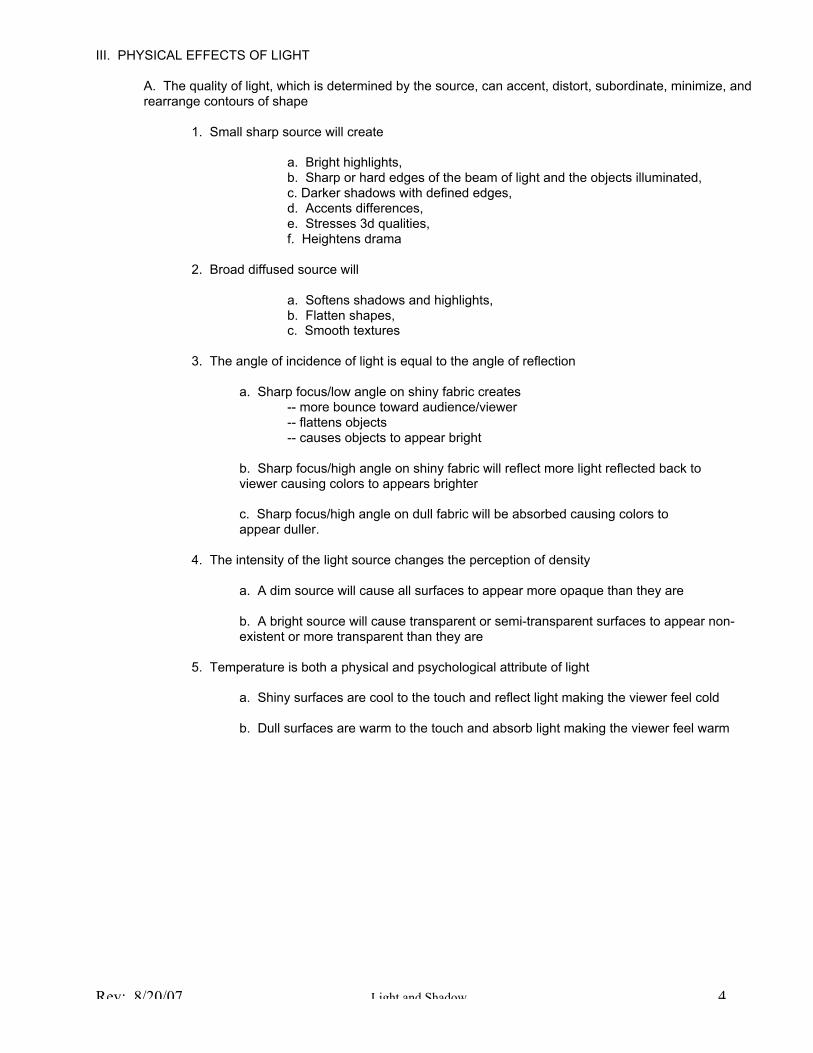
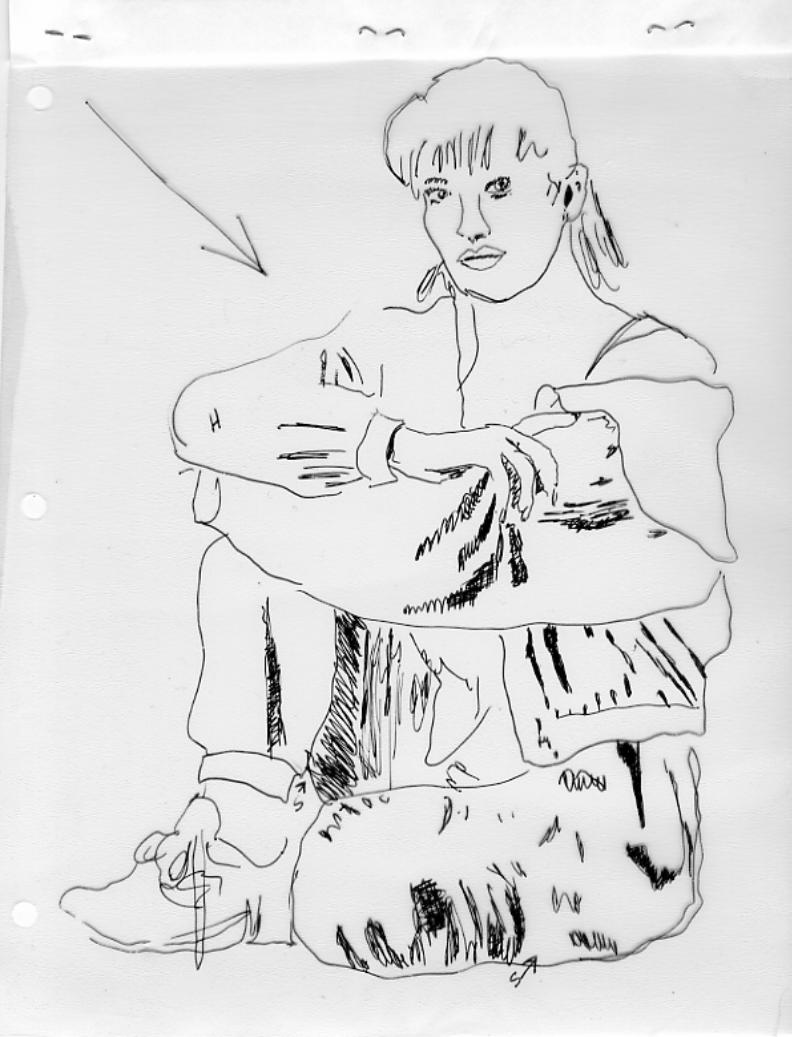
III. PHYSICAL EFFECTS OF LIGHT
A. The quality of light, which is determined by the source, can accent, distort, subordinate, minimize, andrearrange contours of shape
1. Small sharp source will create
a. Bright highlights,b. Sharp or hard edges of the beam of light and the objects illuminated,c. Darker shadows with defined edges,d. Accents differences,e. Stresses 3d qualities,f. Heightens drama
2. Broad diffused source will
a. Softens shadows and highlights,b. Flatten shapes,c. Smooth textures
3. The angle of incidence of light is equal to the angle of reflection
a. Sharp focus/low angle on shiny fabric creates-- more bounce toward audience/viewer-- flattens objects-- causes objects to appear bright
b. Sharp focus/high angle on shiny fabric will reflect more light reflected back toviewer causing colors to appears brighter
c. Sharp focus/high angle on dull fabric will be absorbed causing colors toappear duller.
4. The intensity of the light source changes the perception of density
a. A dim source will cause all surfaces to appear more opaque than they are
b. A bright source will cause transparent or semi-transparent surfaces to appear non-existent or more transparent than they are
5. Temperature is both a physical and psychological attribute of light
a. Shiny surfaces are cool to the touch and reflect light making the viewer feel cold
b. Dull surfaces are warm to the touch and absorb light making the viewer feel warm
Color Theory
Color Theory is a topic that could easily fill a semesters study. In fact, truth told, one could study color for a lifetime andconstantly discover new things. Obviously we don’t have that much time. The following outline will at times disagree withyour textbook and while I don’t know Mr. Gillette’s exact background in regards to color, I do know that the information inthis handout represents my fifteen years of extensive study of color, color theory, and it’s uses with the last six yearsconcentrated on the theatre. By understanding the principles of color and color theory we can manipulate it’s illusions tosuit our purposes.
I. COLOR DEFINITIONS
Color is both an external occurrence and an internal sensation of three basic dimensions – hues and their relativevalues and intensities.
A. External Occurrence
1. The range of visible light wavelengths measured in nanometers visible on surfaces which selectivelyreflect or absorb light stimulating brain receptors
Violet has a short wavelength at one end of the spectrum while red has a long wavelength at the oppositeend. See figure 6.2 pg. 82 in your text.
2. As an external scientific principle in theory the number of different colors is infinite however the human eyecan only discriminate about 10,000 of the 30,000 identifiable colors including but not limited to:
160 pure hues200 grey values20 levels of brightness
3. The human eye focuses different wavelengths at different points in relation to the retina. So, if you arelooking at something that juxtaposes both long and short wavelength in one object the eye must constantlyrefocus. This can be physically uncomfortable in prolonged viewing and explains why it literally hurts to lookat a pattern with clashing bright colors too long.
B. Internal Sensation
We receive the visual stimulation of color as a mental perception which causes emotional, psychological, andphysiological reactions.
C. Hue
1. A hue is a pure pigment and the basic quality that distinguishes one “color” from another. Here is one place that Idisagree with your text. Saturation is not separate from hue and chroma is not another word for saturation. Chromais synonymous with hue and the more saturated a color is the closer it is to being a pure hue. The word color actuallyonly applies to a hue mixed with another hue which results in a color.
2. A pigment is derived from the earth in rocks, plants, minerals. Pigments can be obtained in dry powder form whichare then mixed with a medium (oil, egg, water) and become paint.
3. There are as many hues as there are sources to grind into powder, e.g. tobacco, indigo, cobalt, raw umber, ochre,bitumen, gem stones, or coal just to name a few.
D. ValueThe lightness or darkness of a hue can be altered by the addition of black or white pigment
1. Tints are hues that have white added
2. Shades are hues that have black added
3. Pastels are hues that have black and white added and can vary from very light to very dark
Note: Gillette refers to these as tones in error and further complicates the discussion by incorrectly stating that acomplementary hue tones a color, but more about that in the next point.
4. The addition of white to black will create a “gray-scale” from barely gray to almost black
Note: Not all grays are only black and white which explains why grays, whites, and blacks are so hard to match indifferent paints, textiles, etc. For example, warm gray, cool gray or French gray.
E. Intensity
The relative brightness or dullness of a hue. The closer to pure hue the brighter a color is.
1. Adding complimentary hues changes the intensity of the hue (more on the concept of complimentary in a moment)thus we call the resulting color an Intensity
2. Adding black to an intensity will still create a shade
3. Adding white to an intensity will still create a tint
4. Adding both white and black to an intensity will still create a pastel
5. At some point between the two complementary hues you will reach a point where one more drop of either color willpush that color into the opposite saturation thus you have reached a neutral intensity
Note: Don’t worry I have color charts and graphs to demonstrate all of this in detail. Now you can begin to understandhow we arrive at 30,000 identifiable colors.

II. COLOR THEORY
A. There are two basic types of color theories
1. Light – (we will deal with the details of color theory in Light later in the semester)
a. Additive – combining of colors give “white” light; individual hues transmitted together perceived by oureyes as a secondary color
b. Subtractive – the result of using color filters (gels) in front of a full spectrum light source
2. Pigment – considered to be subtractive because combining of colors results in black
B. History (the one minute version)
In the past the phenomenon of color has been akin to alchemy with its secrets closely held by its initiates. Paintersmixed their own paints from pigments derived from the minerals, rocks, and plants of the earth combining them witha medium such as egg, water, or oil. They often took the secret of their special colors to their graves. Some passedthese secrets on to trusted apprentices. By the early part of the eighteenth century artists and scientist were bothstudying the principles of color in an attempt to control and codify the results of their experiments. Theimpressionists, post-impressionist, Nabis, and Blaue Riter Group, were groups of artist who advanced the study ofcolor with color-studies and experiments. It was these artists who were the first to use ready-made hues in metaltubes without relying on mixing paint from complicated formulas allowing them for the first time to paint in plein-air orout-of-doors near the source of their inspiration. These artist’s experiments with the effect of light on color (Monet,Manet, etc.) and the ability of the eye to mix juxtaposed colors into an entirely different color fill art museums today(pointillism -- e.g. Seurat’s “Sunday in the Park on the Island of La Grande Jatte”).
C. Practical Color Theories In Use Today
1. Prang (yes, just like the paint company)
This theory of color was first experimented with in 1831. It is simple and practical with easilyrepeatable results based on a few simple precepts. It is the color wheel theory that most of us arefamiliar with and the one we will be using for this course. It identifies three primary hues, threesecondary hues, and six tertiary hues between the primaries and secondaries.
a. Primary Hues
There are three primary hues in this system: red, blue, yellow
b. Secondary Hues
There are three secondary hues created by mixing two (and only two) primary hues
1. Red + Blue = violet
(not purple, that is a marketing name in a crayola box like fire-engine red,hot-pink, salmon, forest green)
2. Red + Yellow = Orange
3. Blue + Yellow = Green
Saturation is a term that would apply to secondary hues. If you mix more red than blue tocreate violet the resulting hue would have a higher saturation of red.
Because certain hues are stronger than others the formula for creating the secondary hues isnot 50/50 and one must rely on a keen sense of color (which you can develop over time) todetermine if you have reached a true secondary color that is not visually perceived as eitherone or the other hue in use.
c. Tertiary Hues
There are six tertiary hues created between one primary hue and one secondary hue whichare referred to by the primary hue first and then the secondary hue.
1. Red + Orange = Red-Orange2. Red + Violet = Red-Violet3. Blue + Violet = Blue-Violet4. Blue + Green = Blue-Green5. Yellow + Green = Yellow-Green6. Yellow + Orange = Yellow-Orange
Saturation is a term more appropriately used to refer to tertiary hues. Red-orange forexample can have either more saturation of red or orange and still be called red-orange.
2. Munsell
At the turn of the 20th
century Munsell was the first theorist to attempt to codify color with notationsthat eliminated the guesswork from color mixing and standardized the language of color. Thischanged the notion of marketing type names to letters and numbers. This system is widely used inthe commercial industry so that a designer can choose a color in the U.S. and wind up with the samecolor when a fabric is dyed in Italy, China, etc. This is also the system being used when you order acan of paint from the paint or hardware store. The labels in the Munsell system are also simple usinga letter to denote the hue and the numbers 1 - 10 to denote the value as follows.
Red = R and can range from R1 toR10 with any number in-between (R1.5, R2, R2.5 and so on)
The Munsell system identifies five “principal” hues (all of his hues are not primary), intermediatehues between every two principal hues all arranged on a central pole or axis for value. Although thesystem is accurate, well known, and widely used, the execution of his system creates a 100 hue wheeland thus not very practical at this stage of your career, so I will leave further investigation to you. I dohowever, have some examples of this system to share with you in class.
Incidentally, Munsell is probably where Gillette got the term chroma for an intensity but in reality“chroma” derives from the Latin word for color in general.
D. Color Schemes
There are two basic types of color schemes
1. Related
a. Monochromatic – based on one hue
1. may use any tint, shade, or pastel of that hue and the addition of any achromatic or non-color
2. Achromatics include white, black, clear, and gray (but only if purely white + black or gray with thesame hue added.
b. Analogus – based on two to four hues
1. Must be adjacent hues on the color wheel
2. May include any tint, shade, or pastel of the hues being used and the addition of any achromatic
2. Contrasting
a. Complementary – based on two hues
1. Must be opposite each other on the color wheel
2. May include any tint, shade, or pastel of the hues being used and the addition of any achromatic
3. May also include intensities of the two hues being used and any tint, shade, or pastel of thoseintensities
b. Double complementary – based on the four hues
1. Includes two adjacent hues and their complements
2. May include any tint, shade, or pastel of the hues being used and the addition of any achromatic
3. May also include intensities of the complement hues being used and any tint, shade, or pastel ofthose intensities
c. Adjacent complementary - based on three hues
1. Includes a pair of complementary hues and one hue adjacent to one of the other hues
2. May include any tint, shade, or pastel of the hues being used and the addition of any achromatic
3. May also include intensities of the complement hues being used and any tint, shade, or pastel ofthose intensities
d. Single Split Complementary – based on three hues
1. Includes one hue and the hues on either side of it’s complement
2. May include any tint, shade, or pastel of the hues being used and the addition of any achromatic
e. Double Split Complementary – based on four hues
1. Includes the hue on each side of two complements
2. May include any tint, shade, or pastel of the hues being used and the addition of any achromatic
f. Triad - based on three hue equidistant apart on the color wheel
May include any tint, shade, or pastel of the hues being used and the addition of any achromatic
g. Tetrad – based on four hues equidistant apart on the color wheel
May include any tint, shade, or pastel of the hues being used and the addition of any achromatic
II. PHYSICAL EFFECT OF COLOR
A. Simultaneous Contrast
1. Actual differences between colors appear exaggerated when colors are juxtaposed
2. Dominate color pushes or manipulates the smaller area of color
3. Depending on the dominate background color
a. Identical colors may appear to be different
b. Different colors may appear to be the same
B. After Image
After extended exposure one will see a ghost negative image of the complement or contrasting value
e.g. a green wall with white trim will appear to have pink trim if the viewer stares long enough (about 1 minute) atthe wall and then focuses on the trim.
C. Motion
1. Edges of adjoining hues change in size or sharpness
a. Hues that are adjacent on the color wheel merge when touching each other or whiteb. Hues that are adjacent on the color wheel will stand out against a black backgroundc. White pulls colors togetherd. Black separates colors
2. Advancing
Warm hues, light tints, bright intensity
3. Receding
Cool hues, dark shades, dull intensities
4. Spread outward
Warm hues
5. Shrink inward
Cool hues
6. Vibration
Bright intensities used together
7. Distance
Colors that advance also enlarge and suggest nearness
8. Colors that recede also decrease and suggest farness
D. Irradiation
1. Light values advance and enlarge causing objects to seem larger and closer2. Dark values recede and reduce causing objects to seem smaller and more distance
E. Visual Mixtures
Related hues merge into their intervening hue1. Primary hues close together will visually mix into secondaries2. A primary hue and a secondary hue close together will visually mix into a tertiary
III. PSYCHO-PHYSICAL EFFECT OF COLOR
A. Temperature
Color is associated with temperatures from warm to cool
1. Warm = red, yellow, orange, the secondary and tertiary hues derived from these and dark values
2. Cool = blue, green, violet, the secondary and tertiary hues derived from these and light values
3. The tertiary hues, yellow-green and red-violet , can fall into either warm or cool depending on their value andsaturation
B. Density
1. Dark values suggest greater density and make things appear heavier
2. Light values appear to weigh less
C. Sound
1. Loud
Warm hues, bright intensities, light values
2. Quiet
Cool hues, dark values, dull intensities
IV. PSYCHOLOGY OF COLOR
A. Emotional associations are strong depending on the viewers background and experience. How often have you heardsome of these phrases
Pea green with envyI have the bluesYellow-belly cowardRed devilHe is a shady characterWe are in the red (need money)
B. Color suggests or encourages action
1. Stimulating, active colors are warm hues, light values, and bright intensities
think about the kinds of colors you see most often in a fast food chain in opposition to an expensive orexclusive restaurant
2. Relaxing, quiet colors are cool hues, dark values, and dull intensities
What type of colors do you most often see in hospitals
C. Color suggests gender
1. Western Culture
a. Warm hues, light values, and dull intensities are often associated with femininty and softness while,
b. Cool hues, dark values, and bright intensities are associated with strength and masculinity
c. Boys wear blue, girls wear pink
d. Brides wear white, grooms wear black
2. Oriental cultures
a. Light values are masculine
b. Dark values are feminine
c. Brides wear red
D. Color suggest drama
Warm hues, bright intensities, extreme contrasts “shout” for attention
E. Color suggest age or degree of sophistication
1. Bright intensity – simple
2. Dull intensity – sophisticated
3. Children wear tints and their rooms are often decorated in bright intensities and saturated hues
F. Color is seasonal
1. Summer – light values, bright intensities, warm hues
2. Winter – dark values, dull intensities, cool hues
3. Autumn - dark values, dull intensities, warm hues
4. Spring – light values, cool hues
DIRECTIONAL PRINCIPLES
There are eight directional principles of design which include:
_ Repetition_ Parallelism_ Sequence_ Alternation/Variation_ Gradation_ Transition_ Radiation_ Rhythm
A. REPETITION
Use of the same thing arranged in different locations; the simplest and most fundamental of all designprinciples.
1. Visual Effects:
a. Eye moves from one use of an element to the next which emphasizesthe direction of movementb. Repeat in the direction you want to emphasize
2. Two basic types of repetition
a. regular = identical elements including spacing; steady, predictable strong directionRegular vertical spacing of horizontal lines will beperceived as a strong vertical direction and reduce thewidening effect of the horizontal line
b. irregular or varied spacing weakens directionEx. Irregular spacing of horizontal lines in a verticaldirection retains the widening effect of the horizontallines
3. Uses of repetition
1. repeats in several directions leads the eye from one to another in anattempt to relate and minimize direction; pulls composition together2. widely scattered repetitions look spotty and may seem unrelated3. well-arranged repetitions lead the eye smoothly — things seems to belong in theirrelationship4. repetition of line path, thickness, continuity, consistency, edge, direction reinforceseffects.5. repetition of opposing line paths modifies effects6. horizontal repetition of spacing between lines invites the eye across7. Several directions of repeats of texture help unify the overall design8. Periodic repeats of arrangements as well as use in several parts lead the eyevertically
4. Psychological effects of repetition
a. Regular repetition is soothing and reassuringb. Irregular repetition helps things relate subtlety
B. PARALLELISM
Use of lines lying on the same plane equidistant at all points and never meeting or having thepotential of meeting
1. Direction is always perpendicular to the direction of the parallel repeats2. The more parallel the lines the weaker the directional effect of each individual line3. Applies to only line, space, shape, and the combination of same in a pattern4. Can be used with straight or curved lines5. Necessarily involves repetition
C. SEQUENCE
Following of differing things one after another in a particular order, regular succession
1. Each item must have its own meaning and thus repetition is not needede.g. 2,4,6,8
2. Without its own meaning there is no sequence unless there is repetitione.g. A row of random colors
3. Psychological Effects
Builds to a climax, releases,
D. ALTERNATION
Repeated sequence of two and only two things that change back and forth in the same order; aspecific combination of repetition and sequence
1. Uses include:
a. Alternating line path onlyb. Alternating line path, thickness, continuity, and lengthc. Alternating direction e.g. a zigzagd. Alternating shape size and contoure. Alternating space and shape within a line, and alternating distance of spacingbetween shapesf. Alternating texture e.g. thick and opaque with thin and sheerg. Alternating two patternsh. Alternating a pattern with a plain area
E. GRADATION
Sequence of adjacent units usually alike in all respects except one that changes consistentlyand distinctly in steps from one unit to the next.
1. Needs more than two steps to be more than a comparison2. Progression must continue consistently
E.g. if consecutively longer lines are interrupted by a short one gradation and climax is destroyed
a. Progression may build to a climax and stop orb. Progression may build to a climax and begin again orc. Progression may build to a climax and reverse to beginning
3. Gradation effects:
a. Stronger if used in a single long series rather than in short repeated setsb. The longer the graduated sequence the greater the climaxc. Evokes illusions of depthd. Sweeps the gaze to a final statemente. Larger shapes enlarge objects while smaller shapes make the object seem tinier than it isf. Small shapes are usually needed near objects that need to appear small while large shapes areneeded near the larger end or side of an objectg. Greater changes between each step accent differencesh. Slight changes lessen apparent differences
4. Gradation psychological effects:
a. Strengthen effect of element used since changes invite comparison and contrastb. Builds intensity of feeling if neatly ranked suggesting decisiveness; assurancec. Suggests assertiveness and straightforwardness
5. Gradation uses
a. Graduation of line path from straight to wavy or curved, each line more curved than theprecedingb. Line thickness increases progressively while spacing stays constantc. Length of line increases consistently with each successive lined. Line direction changes gradually as each line becomes more horizontale. Spaces between lines become progressively narrowerf. Contour of shapes become successively rounderg. Size of each next shape decreases or increases consistently with contours held constanth. Space in shapes increase consecutively, changing shape’s proportionsi. Colors progressively become lighter, darkerj. Textured surface of successive layers of material gradually increase opacityk. Motif size of a pattern increase with each repeatL. motifs identical throughout one section increase in size in the next sectionm. Motifs in a pattern that overlap as well as reduce in size consecutively can create a felling ofdepth
F. TRANSITION
A smooth, flowing passage from one condition and position to another with no break point,step or distinct place to pinpoint the change. (Gradation is distinct transition is gradual andsubtle) Transition is a linear principle, emphasizing its direction on the object.
1. Visual effects
a. Emphasizes the direction in which it is going on the bodyb. Power comes from subtletyc. The eyes seek a breakpoint that doesn’t exist causing the view to “see” the entire area
2. Psychological effects
Creates a smooth, graceful, sinuous, flow
3. Using transition
a. A line path gently changes from straight to curvedb. A thin line gradually thickens into a shapec. A fuzzy line fades off into nothingd. Areas between line smoothly increase or decreasee. Shapes smoothly widen as they lengthen
G. RADIATION
The feeling of movement steadily bursting outward in all directions from a visible orsuggested central point — the emission of rays from a central source
1. Radiation effects:
a. Must be used sparingly because it controls attention powerfullyb. If lines all go one direction then that direction will dominatec. Close lines thrusting out from opposite sides of central point strengthen dominant directiond. Lines that fan out in several directions make the area near the point seem smallere. Lines that burst out in a circle attention is led out in all directionsf. A suggested central point heightens interest — where will lines converge?g. Primarily outward thrust in direction though some will see inwardh. Repetition of radiation lines leads the eye from one line to the nexti. Be aware that whatever is at the end of the radiating line will be the focus of attentionj. Lines radiating from both sides of an axis suggest a convergencek. Closed outer ends of radiating lines create stable, self-contained shapesl. Radiating lines in a pattern motif enlarge outer edges, yet seem coherent
H. RHYTHM
The feeling of organized movement or an arrangement of internally organized motion.Rhythm can be staccato, syncopated, clearly stated, subtly suggested, repeated, vaguelysimilar, etc. Rhythm does not require repetition but gains strength from it.
1. Rhythm effects:
a. Emphasizes the direction in which the movement flowsb. Influences apparent object size by its own size
— The more lively the unity the more attention it commands
2. Psychological effects:
a. Satisfying if predictableb. Shorter or smoother is calmingc. Barely suggested is more sophisticatedd. The longer the development to climax the more excitinge. Understatement is more potentf. Too much is upsetting and unbalancedg. Rhythm established with lines:
_ scalloped lines give a lilting effect_ regular broken lines suggest staccato_ irregular = syncopated_ thick = martial_ thin - lightly tripping, dainty_ curved = sea waves_ jagged/zigzag = jerky vibration
h. Rhythm established with shape:_ space between allows arrangement to breathe_ small enough space directs gaze from one unit to the next_ a long spatial pause loses rhythmic beat_ space injects vitality or tranquility_ unequally sided shapes = dynamic rhythm
Ex. Paisleys, teardrops, bells, free forms
3. Rhythmic Terms:
Any term that describes the rhythm of music can also be used to describe the rhythm of visualdesign including the following not necessarily musical terms:
bouncingboundingfanningflowingjerkyliltinglooping
lurchingmarchingregimentalsedatestaccatostatelyswaying
sweepingswingingswirlingsyncopatedundulatingvibratingwhirling
R 8/20/07 Hi hli h i P i i l 1
HIGHLIGHTING PRINCIPLES
I. CONCENTRICITY
A progressive increase in size of layers of the same shape, each with the same center e.g.Bull’s eye target
A. Effects:
1. Visual
a. forces the focus of attention to a central point and the part of an object on which it appears
b. directional attention leads the eye inward to center
2. Psychological
a. bold and demanding, not subtleb. casualc. also has the same effect of the aspect of the lines used and space between lines
B. Practical uses include but are not limited to
1. squares and rectangle best on straight-edged objects2. if not small on costumes actor may resemble a walking target3. spacing between lines can vary4. freeform shapes are difficult but striking5. in a pattern can be powerful
C. Concentricity is perpendicular to radiation
1. concentricity moves the eye in the opposite direction from radiation
a. concentricity leads the eye from the outside toward the centerb. radiation leads the eye from the inside to the outer edge
II. CONTRAST
A feeling of distant differences with the accent on the differences
A. Effects:
1. Physical
a. juxtaposition of opposites heightens differences and createssimultaneous contrast
1. defines and stabilizes the way an element is used at that point2. emphasizes and enlarges the area where it occurs
2. Psychological
a. contrast is invigorating and dramatic
R 8/20/07 Hi hli h i P i i l 2
b. the stronger a contrast the more assertive the effectc. a bold contrast overwhelms a delicate moodd. no contrast could be bland or boringe. Too much similarity is monotonousf. Too much contrast is confusing
B. Samples of Contrast
1. Color
a. light/darkb. bright/dullc. complementary, triad, tetrad color schemesd. warm/cool
2. Line
a. continuous/brokenb. thick/thinc. fuzzy/sharpd. smooth/shapede. solid/porousf. short/longg. vertical/ horizontal
3. Texture
a. sheer/opaqueb. smooth/roughc. harsh/slipperyd. stiff/supplee. porous/compactf. coarse/fineg. shiny/dull
4. Space
a. open/closedb. wide/narrow
5. Shape
a. large/smallb. round/square
R 8/20/07 Hi hli h i P i i l 3
III. EMPHASIS
Creation of a focal point, center of interest to which all others are subordinate, the dominance of onefeature
A. Effects
1. Physical
a. attention is focused on part where it occursb. diverts attention from other areasc. in costume designer must determine if the actor or the costume is the focus; is the personwearing the clothes or are the clothes wearing the person and if the effect serves the characterd. in scenery the designer must determine if the focus is being drawn away from the actors andif so is that the desirable effect
2. Psychological
a. designer must determine if there needs to be harmony between thecultural significance of what is being emphasized and how it is beingemphasized and the occasion for which it is in use e.g. a weddingscene in different cultures and religions
B. Usage
1. usually does not employ several elements at once2. aspects of an element in use will apply3. structural edges emphasize neighboring object part
SYNTHESIZING PRINCIPLES
I. PROPORTION
The relationship of distances, sizes, amounts, degrees, or parts in relation to each other.
A. Works on any or all of four levels
1. Within one part e.g. length and width2. Among parts e.g. area of one part to area of adjoining one3. Part to whole4. Whole to the environment
What makes proportion beautiful or ugly?
B. Though most guidelines are based on mathematical formulas, strict adherence to formula could beboring.
1. A design should have enough variety for interest but not overwhelming2. A proportion of _ is the least interesting for most observers3. Extreme relationships force one area into dominance and can be boring4. The golden mean or golden section (2/3 or 3/5) is a proportion that “feels” comfortable andlooks “right” This is the proportion used for many of the most famous buildings e.g. theParthenon in Athens, Greece. Neither length nor width is overpowering. It is a proportion thatinvites repeated comparison, analysis, and reflection, holding the viewers attention. Rigidlysticking to a golden mean in design, however, would also be boring. Proportions must beappropriate to the function.
II. SCALE
Consistent relationship of sizes to each other and to the whole regardless of shapes compares onlysizes not other qualities
A. Effects:
1. Visual
a. size of accent should take into consideration side of object on which it occurs.b. tiny accessories enlarge a large person but a very large accessory emphasizes size byrepetitionc. large accessories minimize a small person but a very large accessory emphasizes size aswelld. pattern as filled space enlarges more than plain areae. large motifs overpower a small objects by contrast and emphasize or enlarge a largeobject or person by repetitionf. the larger the motif the more it enlarges a figure
2. Psychological
a. large shapes are bold, aggressive, assertive, straightforward, and casualb. small shapes are fragile, delicate, and dainty
III. BALANCE
The feeling of evenly distributed weight, equilibrium, steadiness, repose, stability, rest.
A. There are four types of balance
1. horizontal balance is between the right and left sides
a. formal horizontal balance is symmetricalb. informal horizontal balance is asymmetrical
2. vertical balance is between the upper and lower portions of an object
a. prevents top heavy or bottom heavy appearance
3. radial balance integrates the whole around a center of gravity; think of it as a concentration ofweight near center
B. Effects
1. A strong sense of balance will give a feeling of security and stability
a. Formal balance is stately, regal, dignified as well as obvious, passive, staticb. Informal balance is casual, dynamic, complex, subtle but also capable of elegance, lessrigid, lively, rhythmic, and conducive to creativityc. Radial balance provides control, stability, and authorityd. Radial imbalance creates instability or a lack of disciplinee. Imbalance creates disturbance (often difficult to pinpoint and analyze but is felt or sensedintuitively)
IV. HARMONY
Agreement in feeling, consistency in mood, pleasing combination of all parts relating
A. Culturally subjective
B. Time period subjective
V. UNITY
Sense of oneness, coherence, totality, quality of being whole and finished, sense of completeness; allparts add up to a whole
A. There can be harmony without unity
B. There cannot be unity without harmony