kieran brobst portfolio
DESCRIPTION
Graphic Design Portfolio | San Francisco StateTRANSCRIPT
1PORTFOLIO 2015
\\ kieran brobst //portfolio 2015

2 KIERAN BROBST
3PORTFOLIO 2015
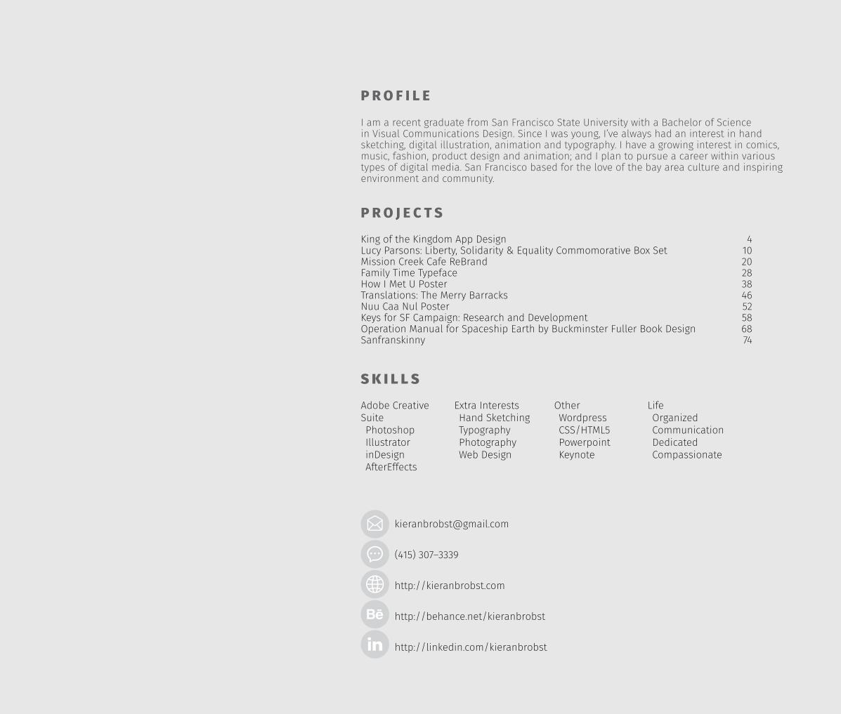
I am a recent graduate from San Francisco State University with a Bachelor of Science in Visual Communications Design. Since I was young, I’ve always had an interest in hand sketching, digital illustration, animation and typography. I have a growing interest in comics, music, fashion, product design and animation; and I plan to pursue a career within various types of digital media. San Francisco based for the love of the bay area culture and inspiring environment and community.
P R O F I L E
King of the Kingdom App Design Lucy Parsons: Liberty, Solidarity & Equality Commomorative Box Set Mission Creek Cafe ReBrand Family Time Typeface How I Met U Poster Translations: The Merry Barracks Nuu Caa Nul Poster Keys for SF Campaign: Research and Development Operation Manual for Spaceship Earth by Buckminster Fuller Book DesignSanfranskinny
4102028384652586874
P R O J E C T S
Adobe Creative SuitePhotoshopIllustratorinDesignAfterEffects
Extra InterestsHand SketchingTypographyPhotographyWeb Design
S K I L L S
OtherWordpressCSS/HTML5PowerpointKeynote
Life OrganizedCommunicationDedicatedCompassionate
(415) 307–3339
http://kieranbrobst.com
http://behance.net/kieranbrobst
http://linkedin.com/kieranbrobst
4 KIERAN BROBST
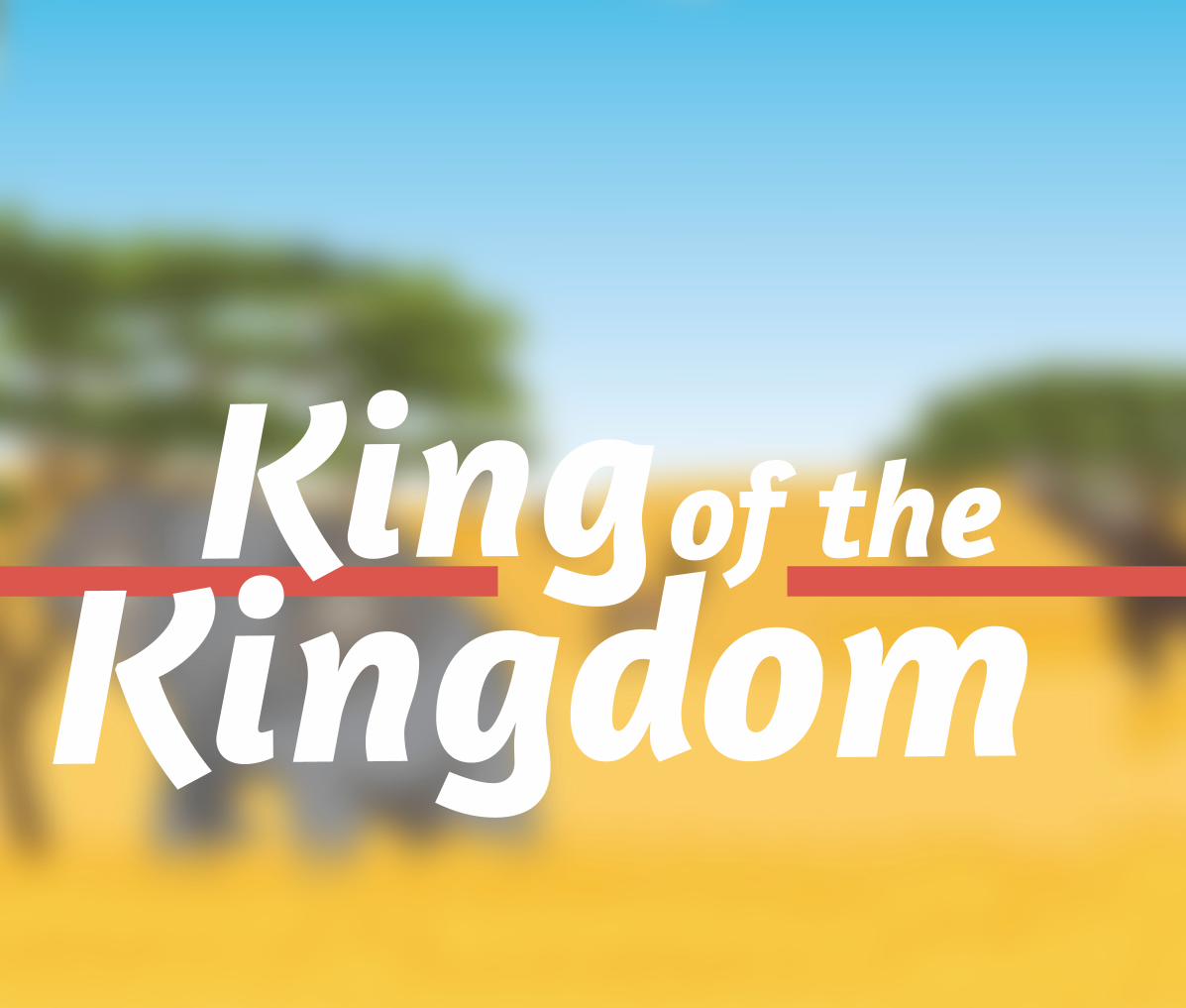
Kingof the
Kingdom
5PORTFOLIO 2015
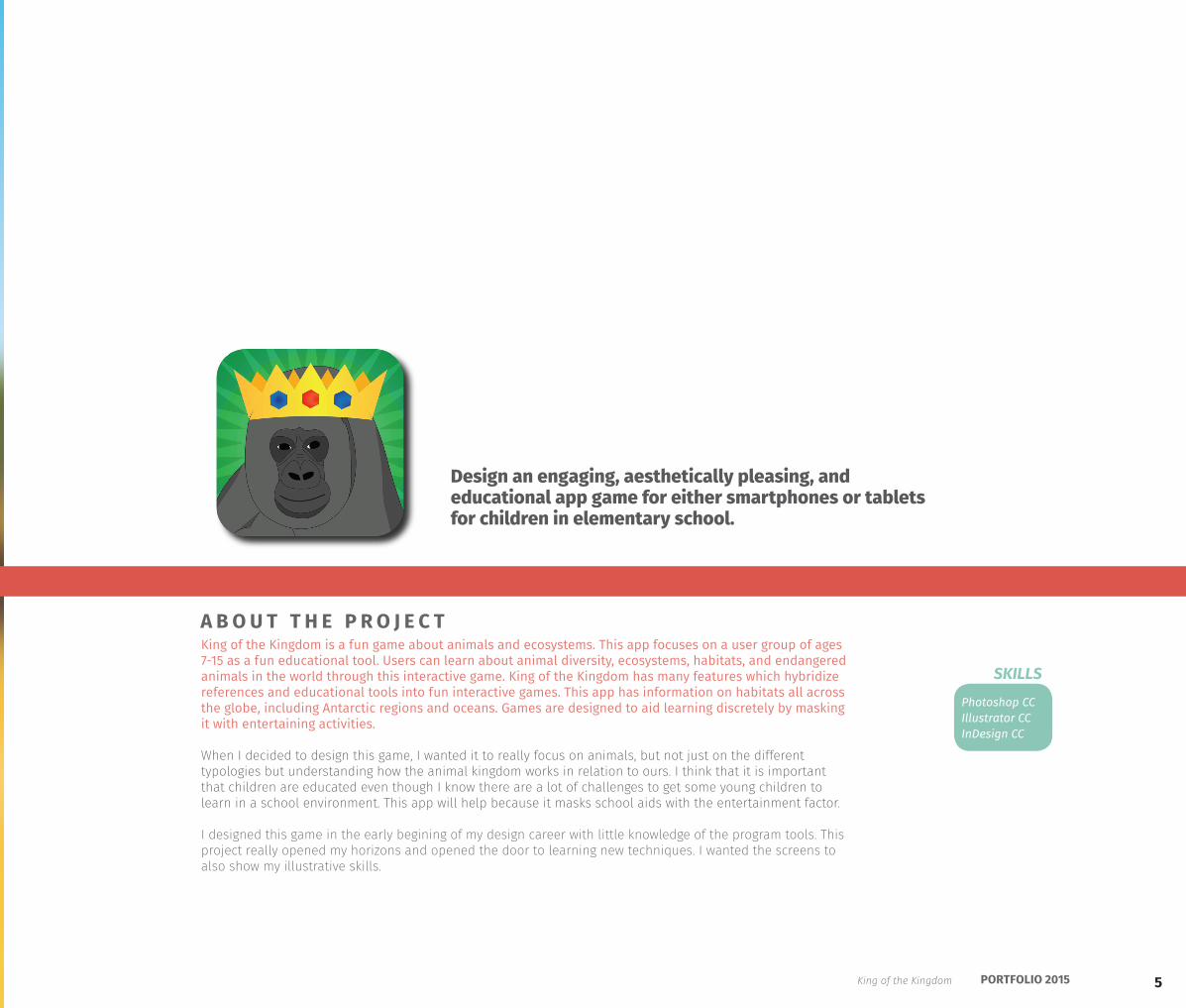
King of the Kingdom is a fun game about animals and ecosystems. This app focuses on a user group of ages 7-15 as a fun educational tool. Users can learn about animal diversity, ecosystems, habitats, and endangered animals in the world through this interactive game. King of the Kingdom has many features which hybridize references and educational tools into fun interactive games. This app has information on habitats all across the globe, including Antarctic regions and oceans. Games are designed to aid learning discretely by masking it with entertaining activities.
When I decided to design this game, I wanted it to really focus on animals, but not just on the different typologies but understanding how the animal kingdom works in relation to ours. I think that it is important that children are educated even though I know there are a lot of challenges to get some young children to learn in a school environment. This app will help because it masks school aids with the entertainment factor.
I designed this game in the early begining of my design career with little knowledge of the program tools. This project really opened my horizons and opened the door to learning new techniques. I wanted the screens to also show my illustrative skills.
Design an engaging, aesthetically pleasing, and educational app game for either smartphones or tablets for children in elementary school.
Photoshop CCIllustrator CCInDesign CC
A B O U T T H E P R O J E C T
SKILLS
King of the Kingdom
6 KIERAN BROBST
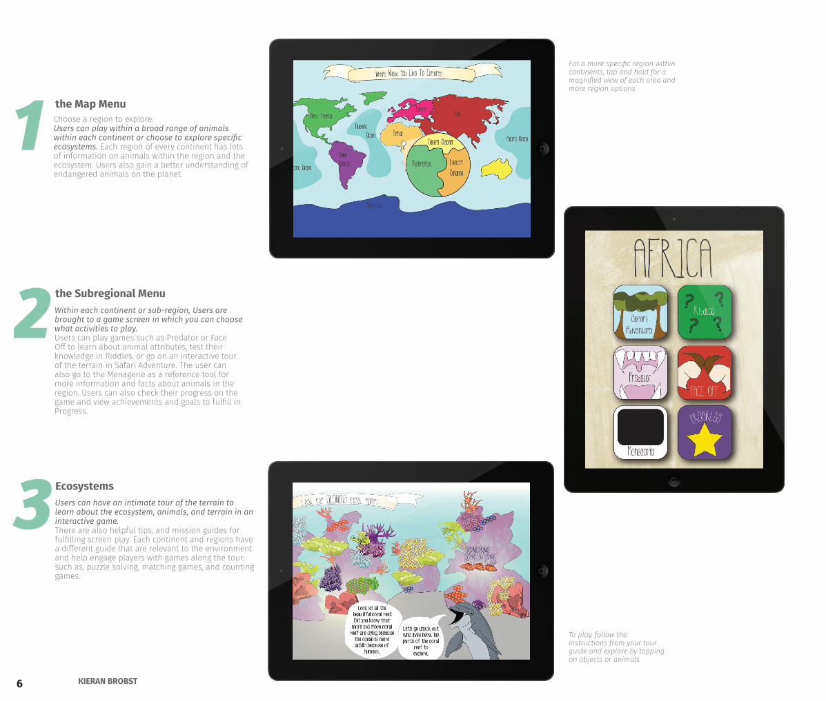
To play, follow the instructions from your tour guide and explore by tapping on objects or animals.
For a more specific region within continents, tap and hold for a magnified view of each area and more region options.
2Within each continent or sub-region, Users are brought to a game screen in which you can choose what activities to play. Users can play games such as Predator or Face Off to learn about animal attributes, test their knowledge in Riddles, or go on an interactive tour of the terrain in Safari Adventure. The user can also go to the Menagerie as a reference tool for more information and facts about animals in the region. Users can also check their progress on the game and view achievements and goals to fulfill in Progress.
the Subregional Menu
1 Choose a region to explore.Users can play within a broad range of animals within each continent or choose to explore specific ecosystems. Each region of every continent has lots of information on animals within the region and the ecosystem. Users also gain a better understanding of endangered animals on the planet.
the Map Menu
3Users can have an intimate tour of the terrain to learn about the ecosystem, animals, and terrain in an interactive game. There are also helpful tips, and mission guides for fulfilling screen play. Each continent and regions have a different guide that are relevant to the environment and help engage players with games along the tour; such as, puzzle solving, matching games, and counting games.
Ecosystems
7PORTFOLIO 2015
4
5
6
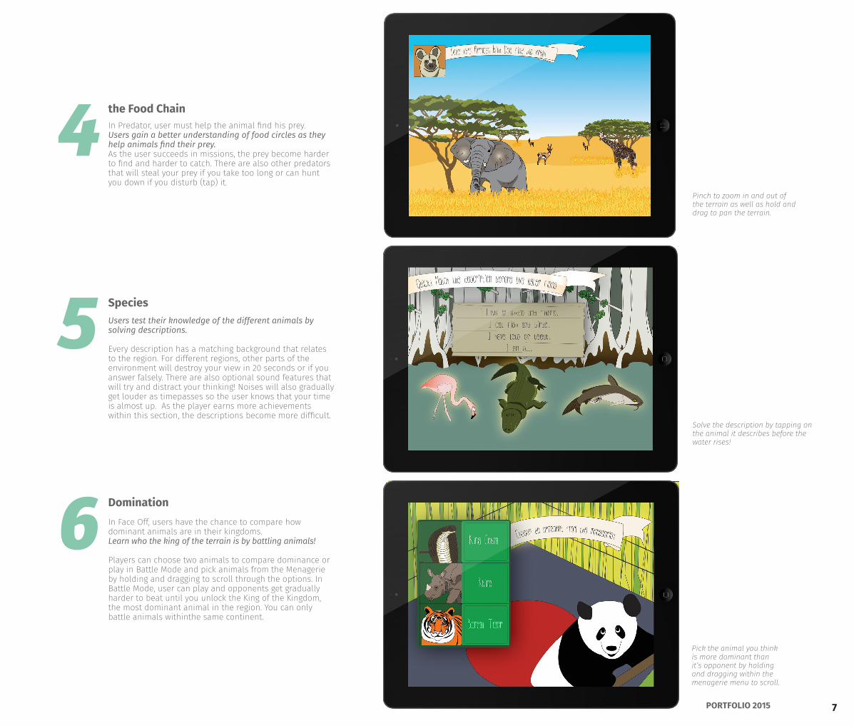
Users test their knowledge of the different animals by solving descriptions.
Every description has a matching background that relates to the region. For different regions, other parts of the environment will destroy your view in 20 seconds or if you answer falsely. There are also optional sound features that will try and distract your thinking! Noises will also gradually get louder as timepasses so the user knows that your time is almost up. As the player earns more achievements within this section, the descriptions become more difficult.
In Face Off, users have the chance to compare how dominant animals are in their kingdoms. Learn who the king of the terrain is by battling animals!
Players can choose two animals to compare dominance or play in Battle Mode and pick animals from the Menagerie by holding and dragging to scroll through the options. In Battle Mode, user can play and opponents get gradually harder to beat until you unlock the King of the Kingdom, the most dominant animal in the region. You can only battle animals withinthe same continent.
In Predator, user must help the animal find his prey.Users gain a better understanding of food circles as they help animals find their prey. As the user succeeds in missions, the prey become harder to find and harder to catch. There are also other predators that will steal your prey if you take too long or can hunt you down if you disturb (tap) it.
Solve the description by tapping on the animal it describes before the water rises!
Pick the animal you think is more dominant than it’s opponent by holding and dragging within the menagerie menu to scroll.
Pinch to zoom in and out of the terrain as well as hold and drag to pan the terrain.
the Food Chain
Species
Domination
8 KIERAN BROBST
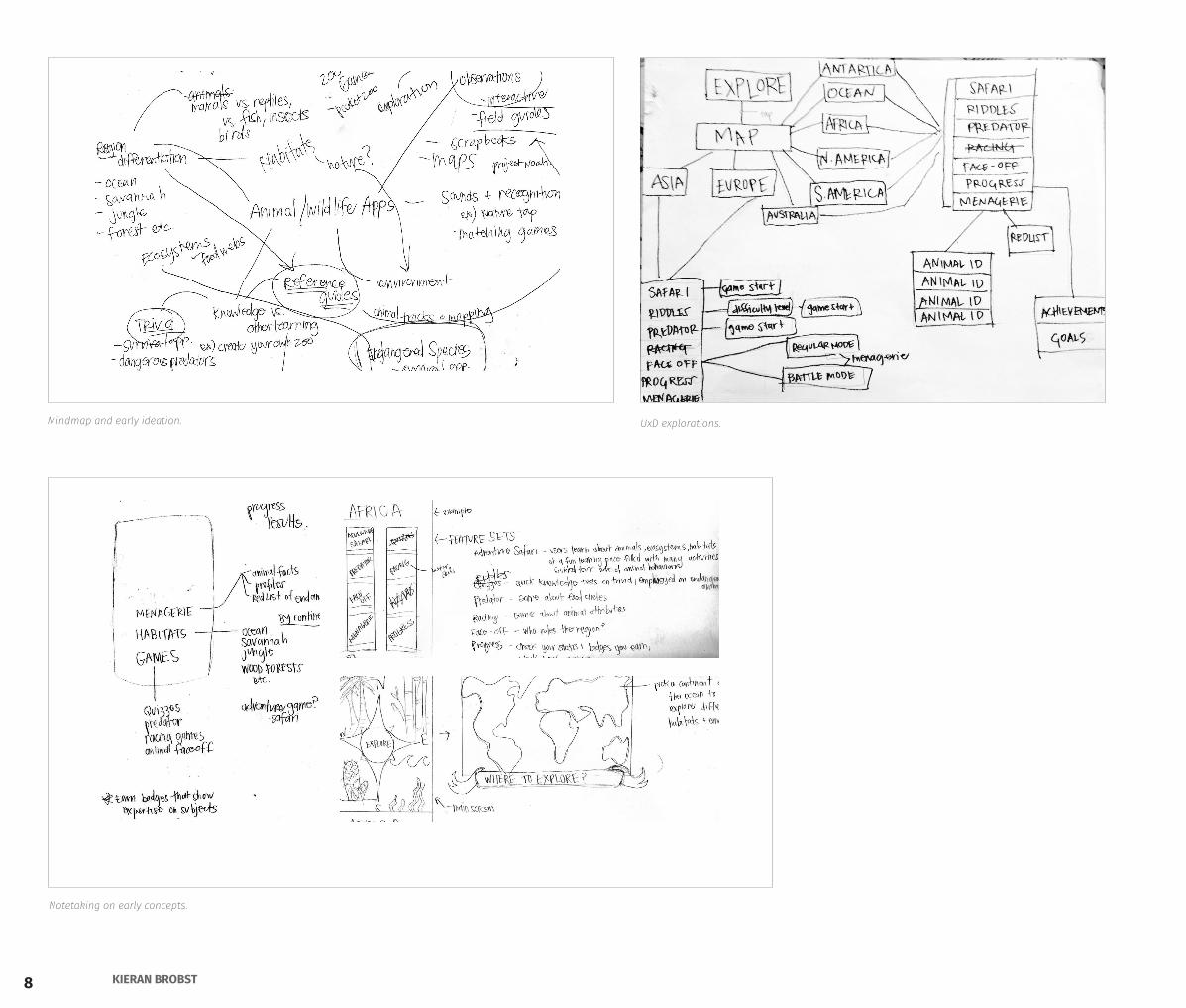
Notetaking on early concepts.
Mindmap and early ideation. UxD explorations.
9PORTFOLIO 2015
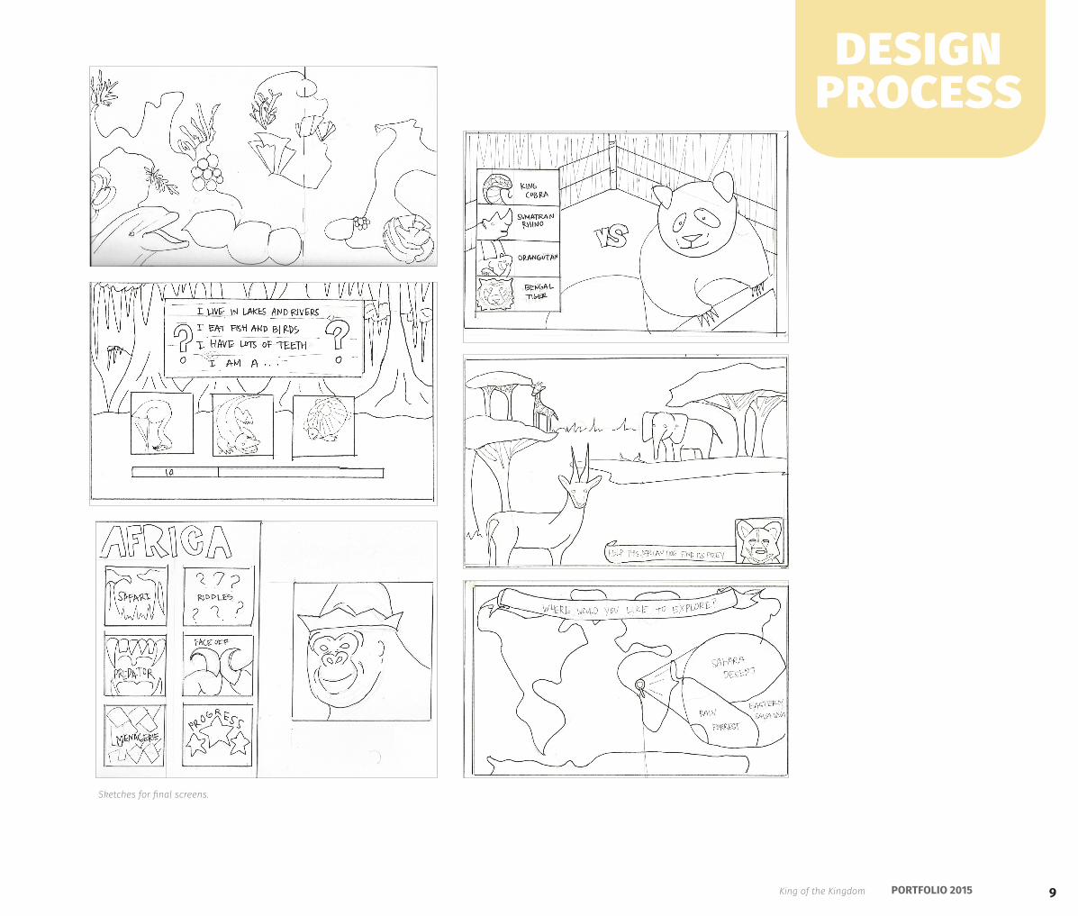
Sketches for final screens.
design process
King of the Kingdom
10 KIERAN BROBST
Photoshop CCIllustrator CCInDesign CCBookbinding
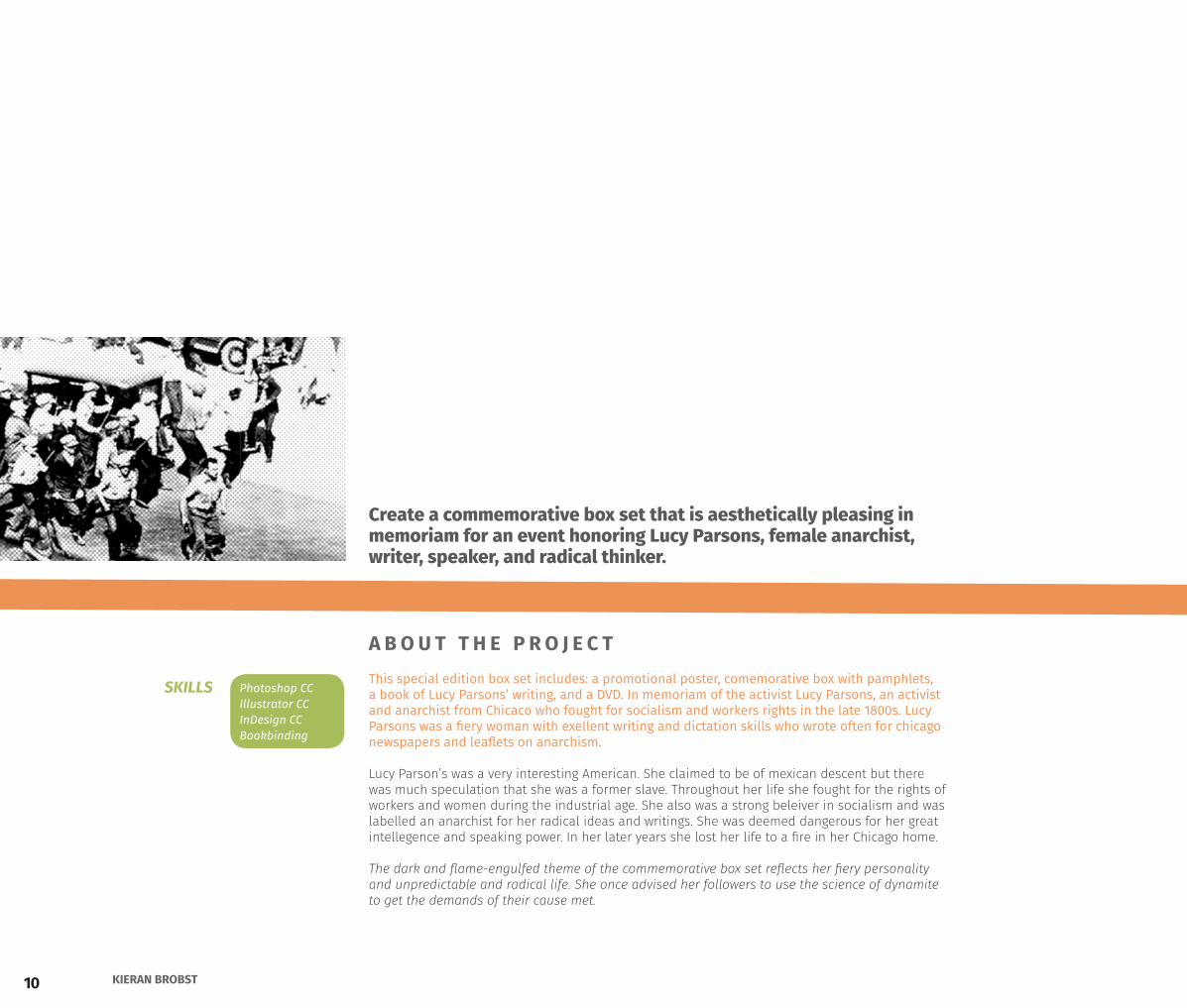
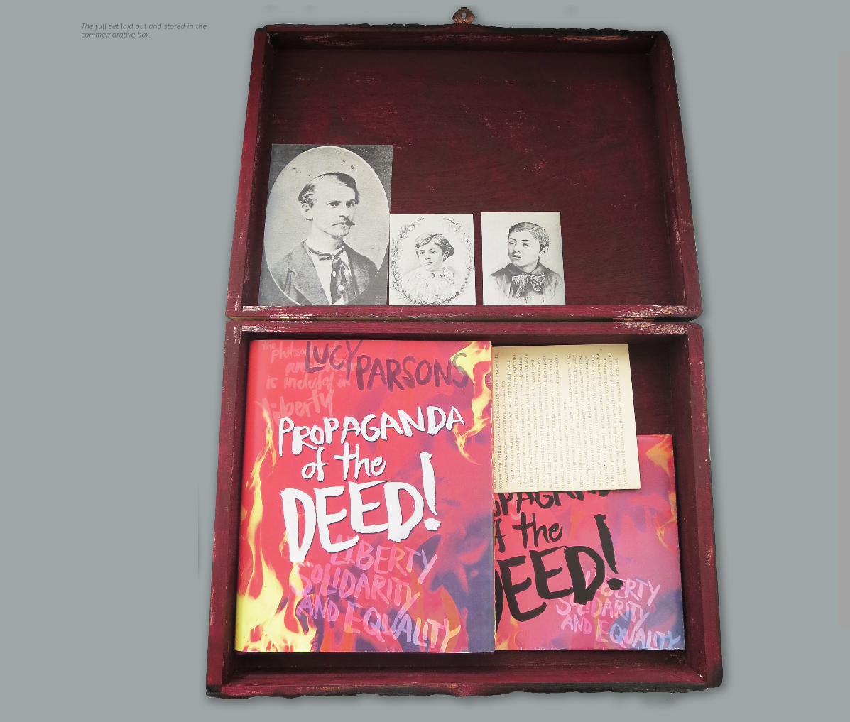
This special edition box set includes: a promotional poster, comemorative box with pamphlets, a book of Lucy Parsons’ writing, and a DVD. In memoriam of the activist Lucy Parsons, an activist and anarchist from Chicaco who fought for socialism and workers rights in the late 1800s. Lucy Parsons was a fiery woman with exellent writing and dictation skills who wrote often for chicago newspapers and leaflets on anarchism. Lucy Parson’s was a very interesting American. She claimed to be of mexican descent but there was much speculation that she was a former slave. Throughout her life she fought for the rights of workers and women during the industrial age. She also was a strong beleiver in socialism and was labelled an anarchist for her radical ideas and writings. She was deemed dangerous for her great intellegence and speaking power. In her later years she lost her life to a fire in her Chicago home.
The dark and flame-engulfed theme of the commemorative box set reflects her fiery personality and unpredictable and radical life. She once advised her followers to use the science of dynamite to get the demands of their cause met.
Create a commemorative box set that is aesthetically pleasing in memoriam for an event honoring Lucy Parsons, female anarchist, writer, speaker, and radical thinker.
A B O U T T H E P R O J E C T
SKILLS
11PORTFOLIO 2015
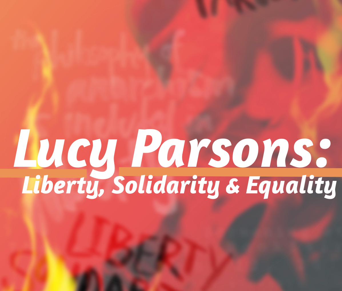
Lucy Parsons:Liberty, Solidarity & Equality
12 KIERAN BROBST
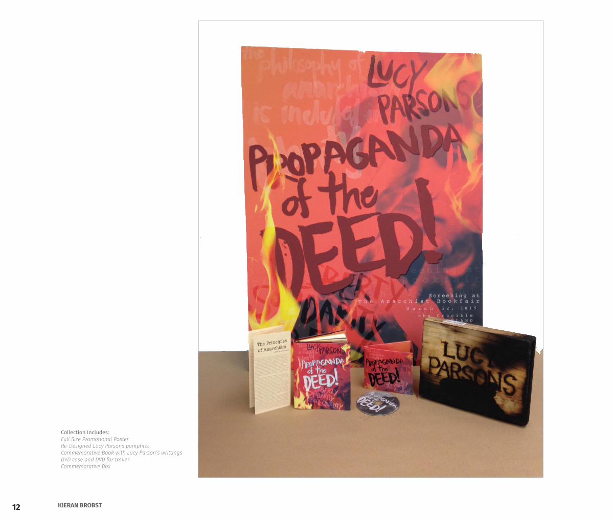
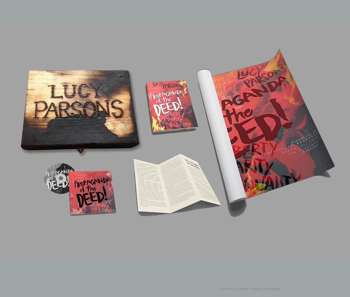
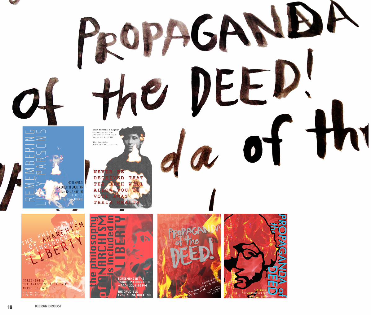
Collection Includes:Full Size Promotional PosterRe-Designed Lucy Parsons pamphletCommemorative Book with Lucy Parson’s writtingsDVD case and DVD for trailerCommemorative Box
13PORTFOLIO 2015
S c r e e n i n g a t T h e A n a r c h i s t B o o k f a i r
M a r c h 2 2 , 2 0 1 5
t h e C r u c i b l eO A K L A N D
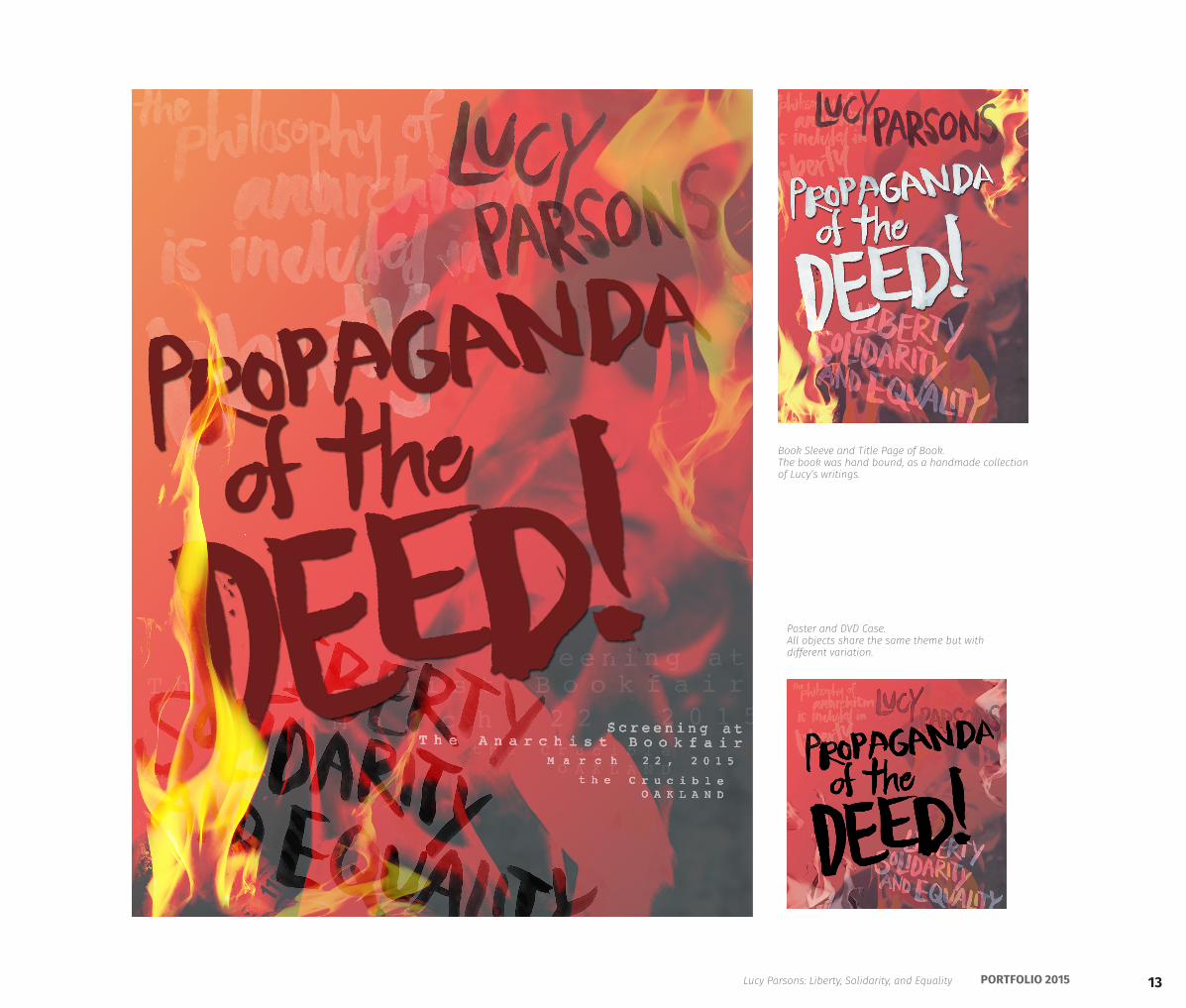
Poster and DVD Case. All objects share the same theme but with different variation.
Lucy Parsons: Liberty, Solidarity, and Equality
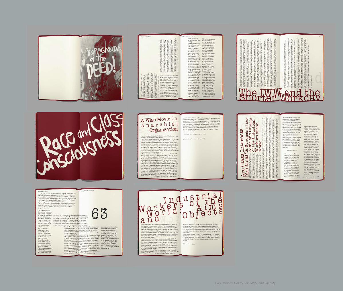
Book Sleeve and Title Page of Book. The book was hand bound, as a handmade collection of Lucy’s writings.
14 KIERAN BROBST
The full set laid out and stored in the commemorative box.
15PORTFOLIO 2015Lucy Parsons: Liberty, Solidarity, and Equality
16 KIERAN BROBST
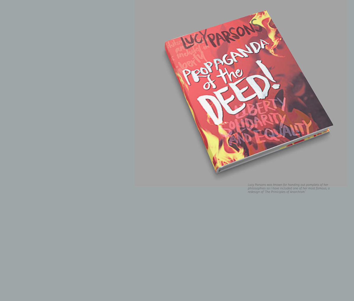
Lucy Parsons was known for handing out pamplets of her philosophies so I have included one of her most famous, a redesign of ‘The Priniciples of Anarchism.’
17PORTFOLIO 2015Lucy Parsons: Liberty, Solidarity, and Equality
18 KIERAN BROBST
19PORTFOLIO 2015
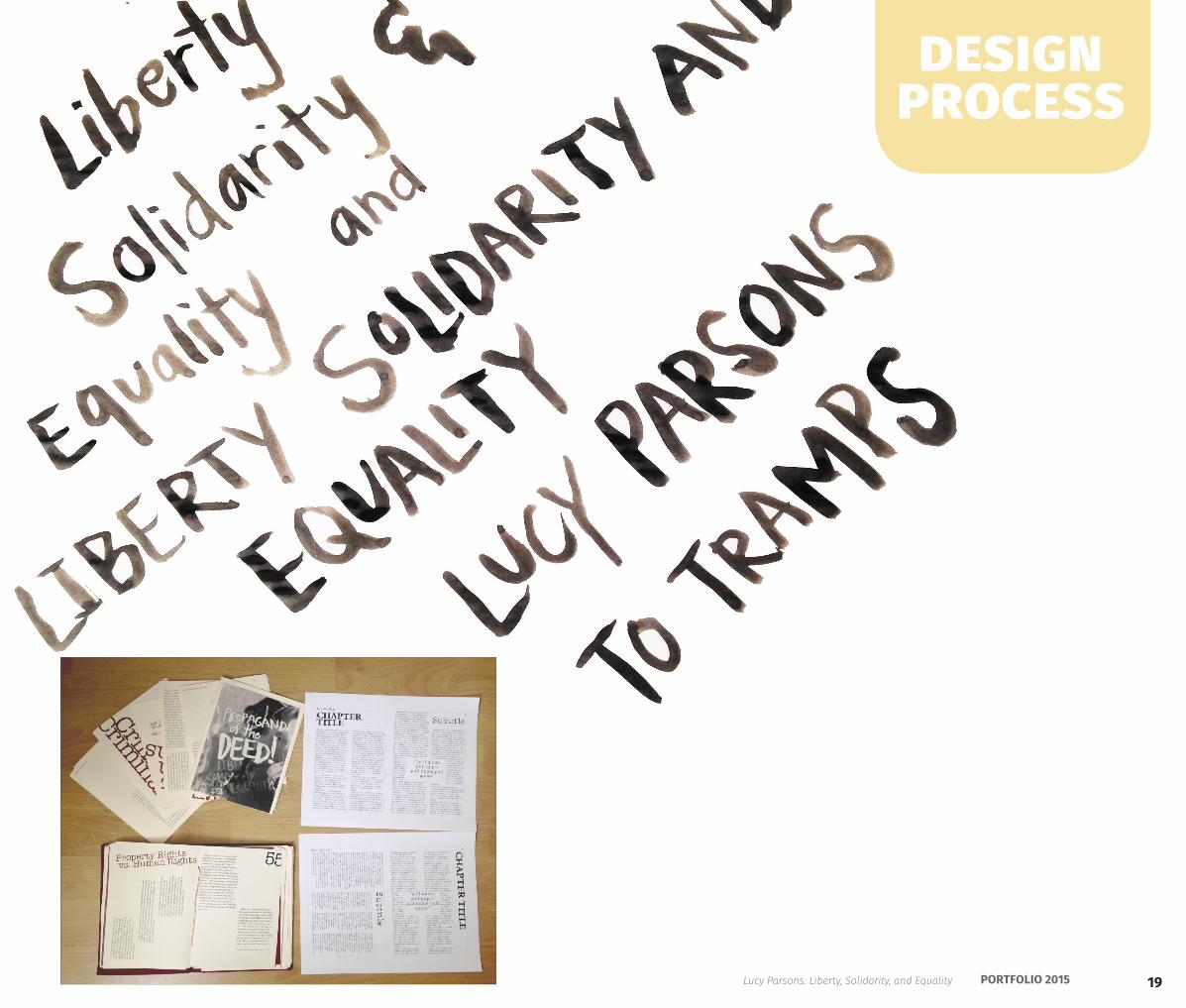
design process
Lucy Parsons: Liberty, Solidarity, and Equality
20 KIERAN BROBST
Mission CreekRE-Brand
21PORTFOLIO 2015
CreekIllustrator CCInDesign CC
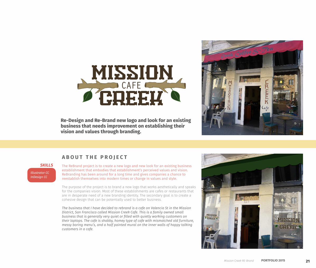
The ReBrand project is to create a new logo and new look for an existing business establishment that embodies that establishment’s perceived values and vision. ReBranding has been around for a long time and gives companies a chance to reestablish themselves into modern times or change in values and style.
The purpose of the project is to brand a new logo that works aesthetically and speaks for the companies vision. Most of these establishments are cafes or restaurants that are in desperate need of a new branding identity. The secondary goal is to create a cohesive design that can be potentially used to better business.
The business that I have decided to rebrand is a cafe on Valencia St in the Mission District, San Francisco called Mission Creek Cafe. This is a family owned small business that is generally very quiet or filled with quietly working customers on their laptops. The cafe is shabby, homey type of cafe with mismatched old furniture, messy boring menu’s, and a half painted mural on the inner walls of happy talking customers in a cafe.
Re-Design and Re-Brand new logo and look for an existing business that needs improvement on establishing their vision and values through branding.
Mission
creekCAFE
SKILLS
A B O U T T H E P R O J E C T
Mission Creek RE-Brand
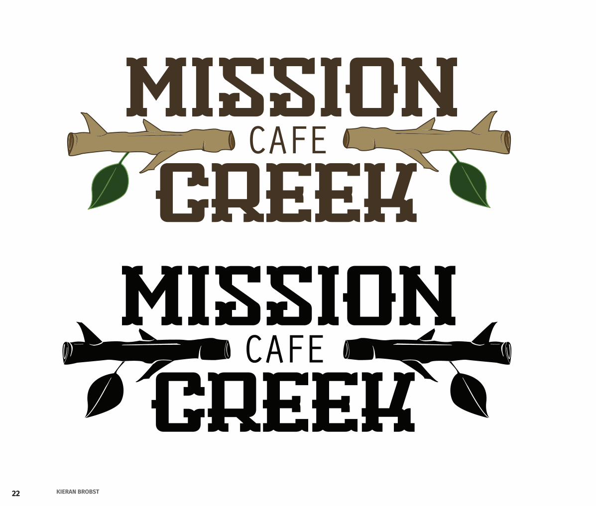
22 KIERAN BROBST
Mission
creekCAFE
Mission
creekCAFE
23PORTFOLIO 2015
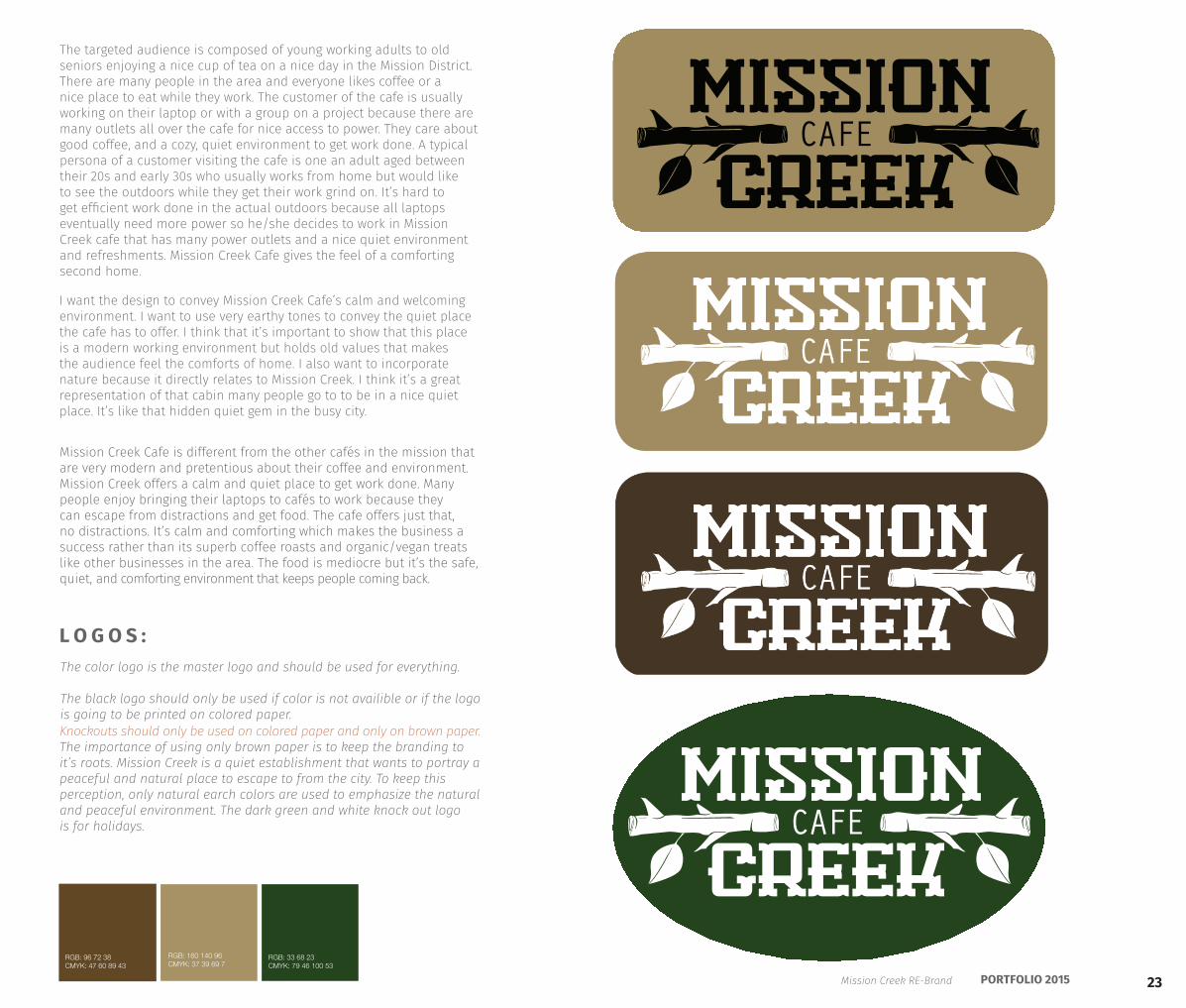
The targeted audience is composed of young working adults to old seniors enjoying a nice cup of tea on a nice day in the Mission District. There are many people in the area and everyone likes coffee or a nice place to eat while they work. The customer of the cafe is usually working on their laptop or with a group on a project because there are many outlets all over the cafe for nice access to power. They care about good coffee, and a cozy, quiet environment to get work done. A typical persona of a customer visiting the cafe is one an adult aged between their 20s and early 30s who usually works from home but would like to see the outdoors while they get their work grind on. It’s hard to get efficient work done in the actual outdoors because all laptops eventually need more power so he/she decides to work in Mission Creek cafe that has many power outlets and a nice quiet environment and refreshments. Mission Creek Cafe gives the feel of a comforting second home.
The color logo is the master logo and should be used for everything.
The black logo should only be used if color is not availible or if the logo is going to be printed on colored paper.
L O G O S :
Knockouts should only be used on colored paper and only on brown paper.The importance of using only brown paper is to keep the branding to it’s roots. Mission Creek is a quiet establishment that wants to portray a peaceful and natural place to escape to from the city. To keep thisperception, only natural earch colors are used to emphasize the natural and peaceful environment. The dark green and white knock out logo is for holidays.
Mission
creekCAFE
I want the design to convey Mission Creek Cafe’s calm and welcoming environment. I want to use very earthy tones to convey the quiet place the cafe has to offer. I think that it’s important to show that this place is a modern working environment but holds old values that makes the audience feel the comforts of home. I also want to incorporate nature because it directly relates to Mission Creek. I think it’s a great representation of that cabin many people go to to be in a nice quiet place. It’s like that hidden quiet gem in the busy city.
Mission Creek Cafe is different from the other cafés in the mission that are very modern and pretentious about their coffee and environment. Mission Creek offers a calm and quiet place to get work done. Many people enjoy bringing their laptops to cafés to work because they can escape from distractions and get food. The cafe offers just that, no distractions. It’s calm and comforting which makes the business a success rather than its superb coffee roasts and organic/vegan treats like other businesses in the area. The food is mediocre but it’s the safe, quiet, and comforting environment that keeps people coming back.
Mission
creekCAFE
RGB: 96 72 38CMYK: 47 60 89 43
RGB: 160 140 96CMYK: 37 39 69 7
RGB: 33 68 23CMYK: 79 46 100 53
Mission Creek RE-Brand
24 KIERAN BROBST
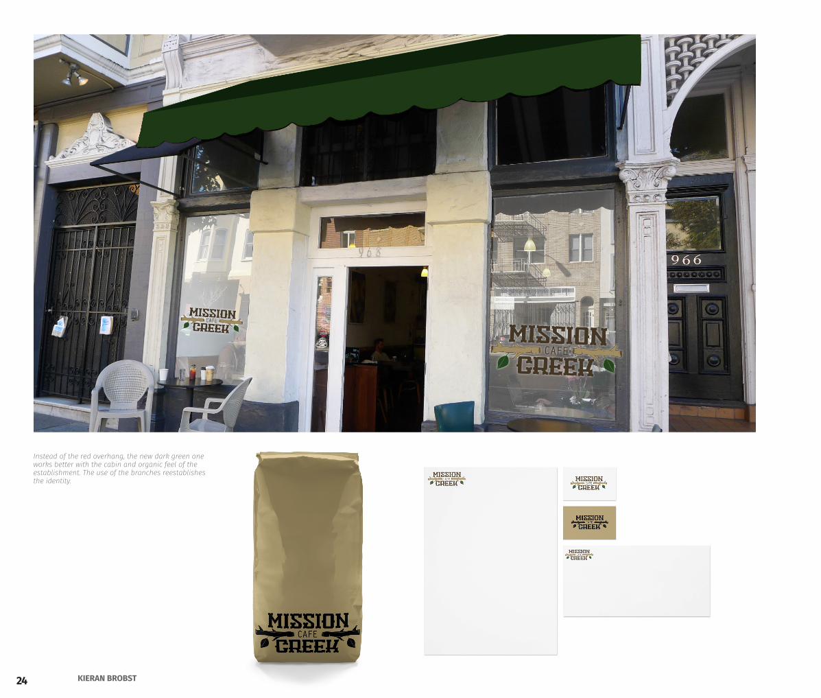
Instead of the red overhang, the new dark green one works better with the cabin and organic feel of the establishment. The use of the branches reestablishes the identity.
25PORTFOLIO 2015
Mission
creekCAFE
House Coffee 1.50 1.70 1.80Americano 1.90 2.15 2.50Latté 2.50 3.05 3.35Cappachino 2.50 3.05 3.35 Mocha 2.85 3.35 3.65White Mocha 3.15 3.65 4.10Hot Chocolate 2.35 2.60 2.85Hot Tea 2.35 2.60 2.85
Espresso Shots 1.50 1.90 2.15
12oz 16 oz 20oz
1 2 3
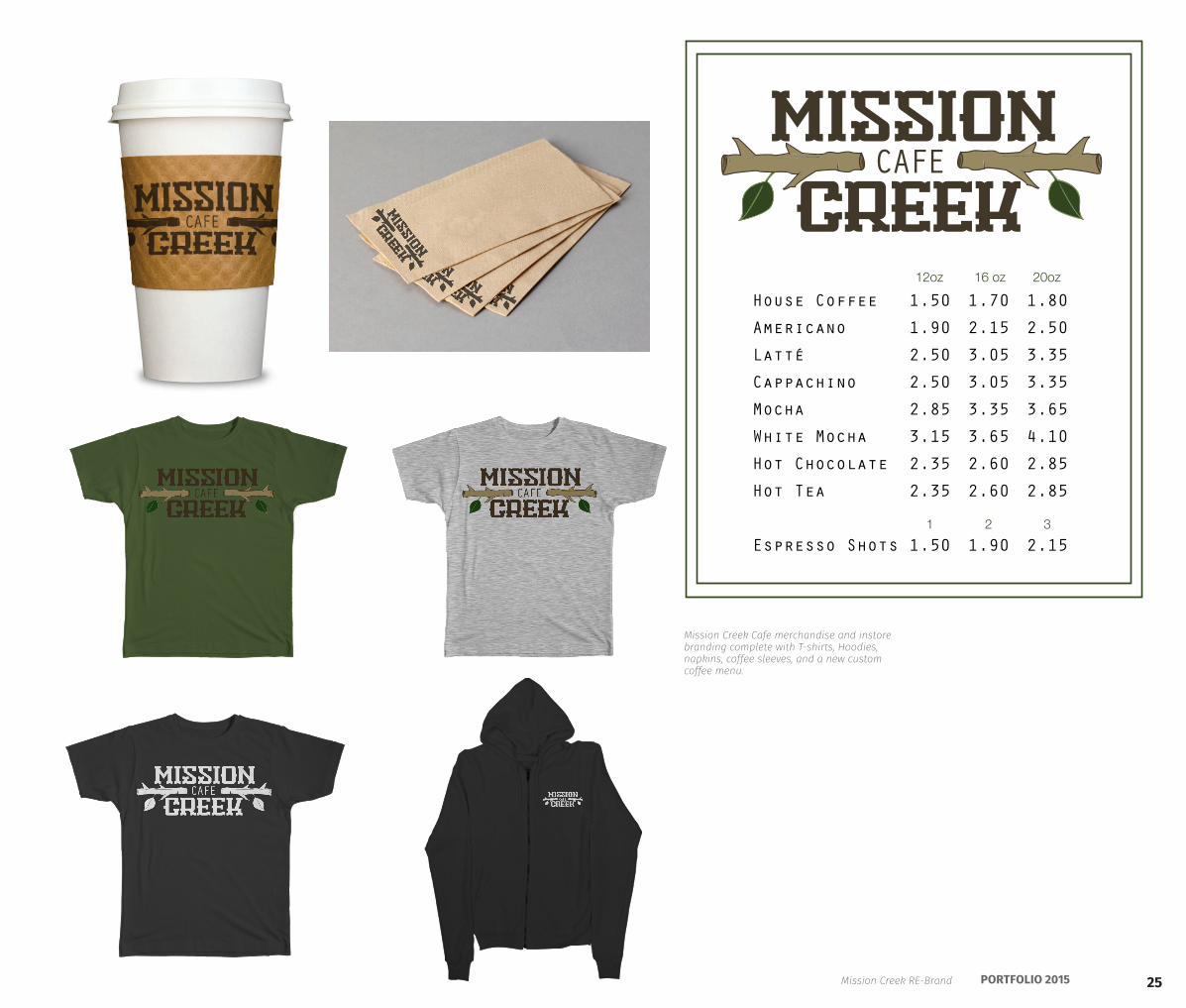
Mission Creek Cafe merchandise and instore branding complete with T-shirts, Hoodies, napkins, coffee sleeves, and a new custom coffee menu.
Mission Creek RE-Brand
26 KIERAN BROBST
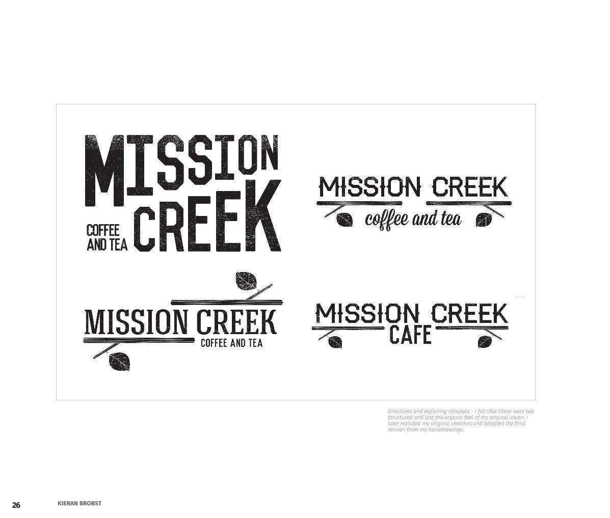
Directions and exploring concepts - I felt that these were too structured and lost the organic feel of my original vision. I later revisited my original sketches and adapted the final version from my handdrawings.
27PORTFOLIO 2015
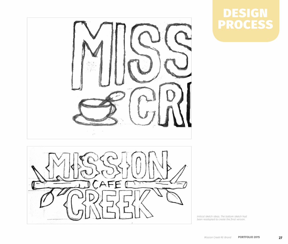
Initical sketch ideas. The bottom sketch had been readapted to create the final version.
design process
Mission Creek RE-Brand
28 KIERAN BROBST
Family Time
29PORTFOLIO 2015
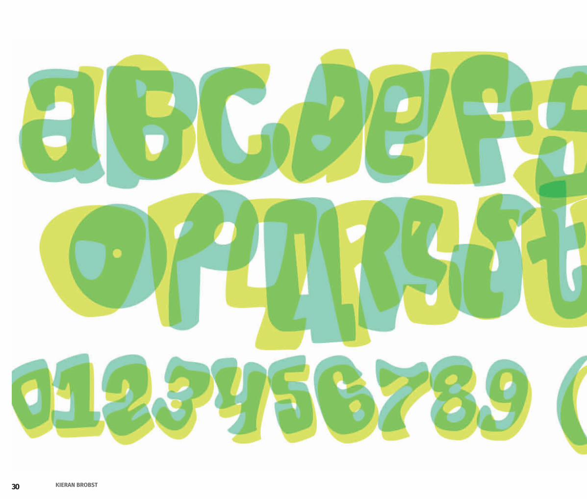
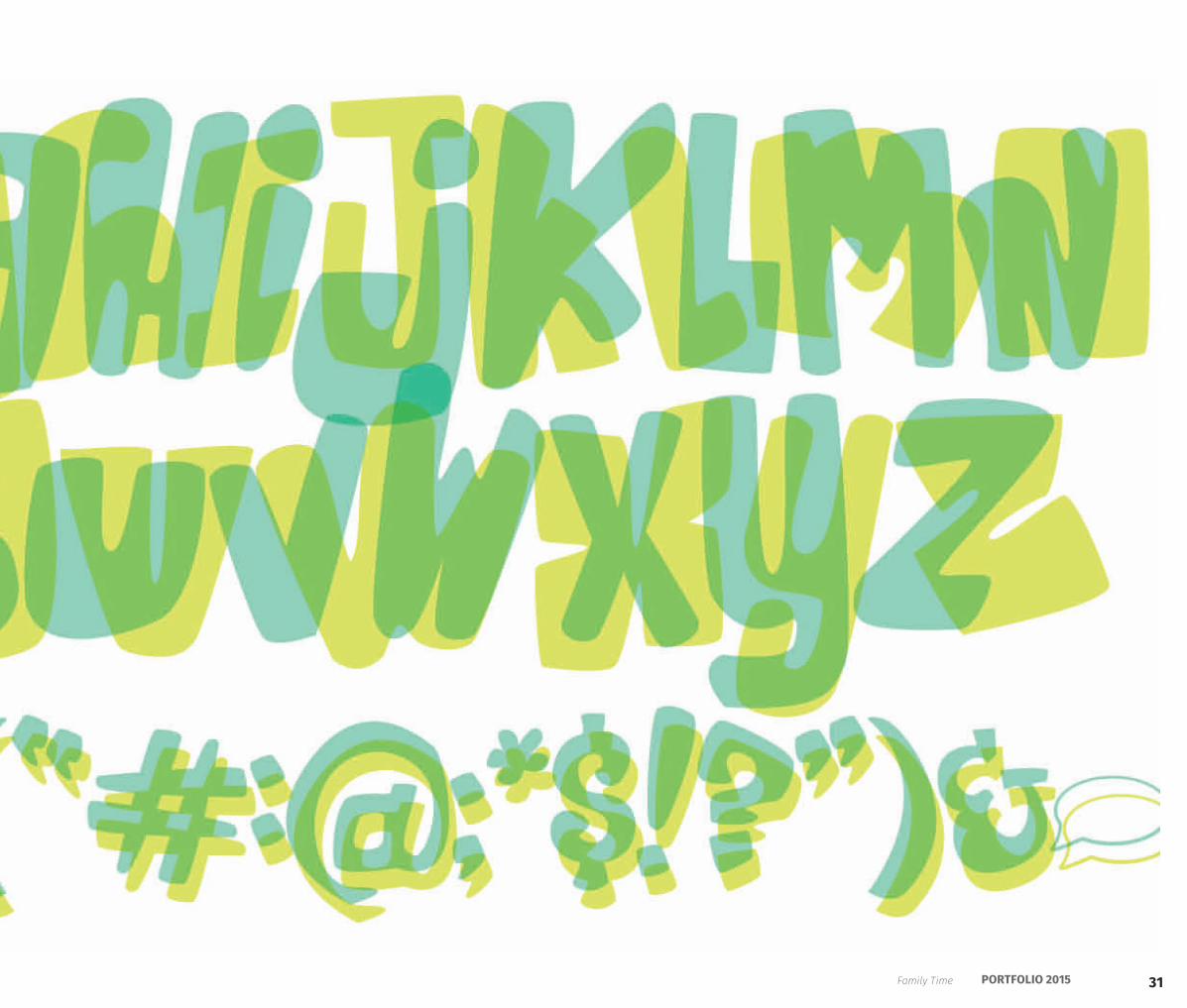
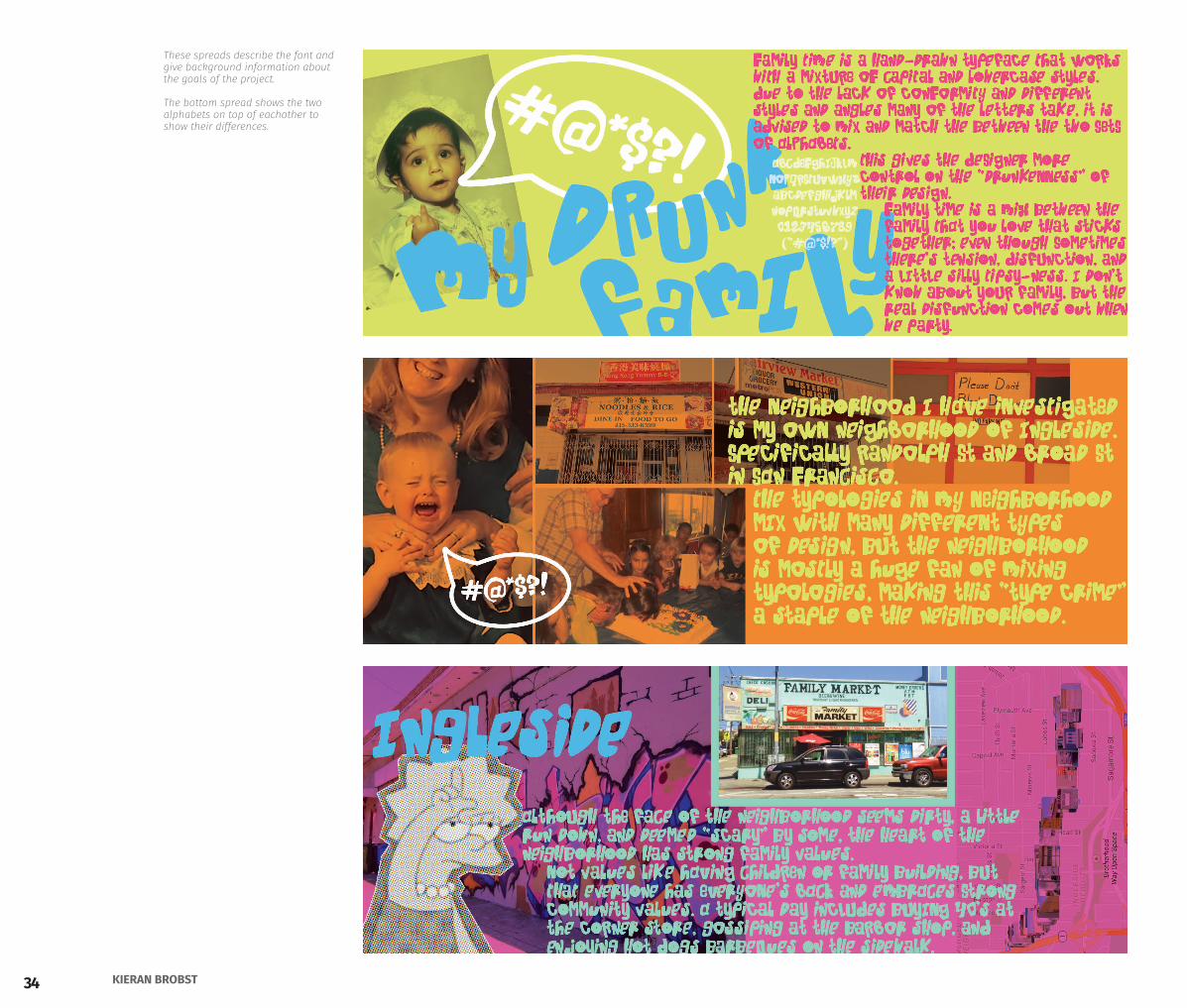
Time Family Time is font designed based on the concept of “drunk disfunctional families.” This concept comes from the hidden good nature of my little neighborhood on the edge of Ingleside.
After investigating the signage and typography in my neighborhood, it was apparent that many see the family owned businesses a little run down, old, and have many ‘type crimes’ of mixed typography throughout the streets. Even though it seems grimey on the outside, Randolph St and Broad St are full of characters who are nice and always have the community’s back. The hidden aspect of my neighborhood is the sense of community. Even though we fight, gossip, and drink a lot, we still have eachothers backs.
Thinking about drunk families, I was inspired by real life families acting ridiculous and the many disfunctional families in popular culture. All the photographs in the book are from real awkward/disfunctional/drunk families.
Design a display typeface that reflects findings and concepts derrived from studying neighborhoods.
GlyphsIllustrator CCInDesign CC
A B O U T T H E P R O J E C T
SKILLS
Family Time
30 KIERAN BROBST
31PORTFOLIO 2015Family Time
32 KIERAN BROBST
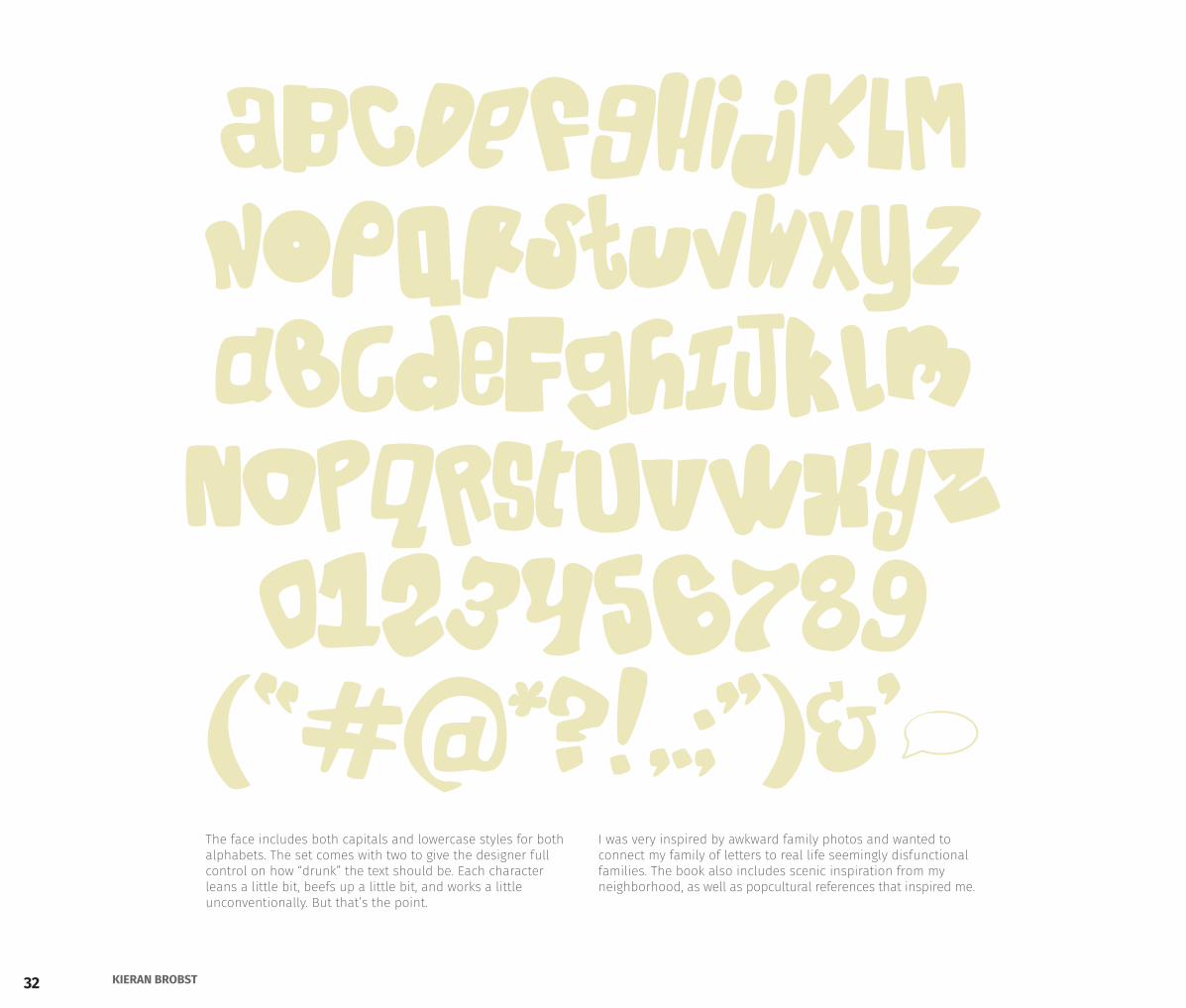
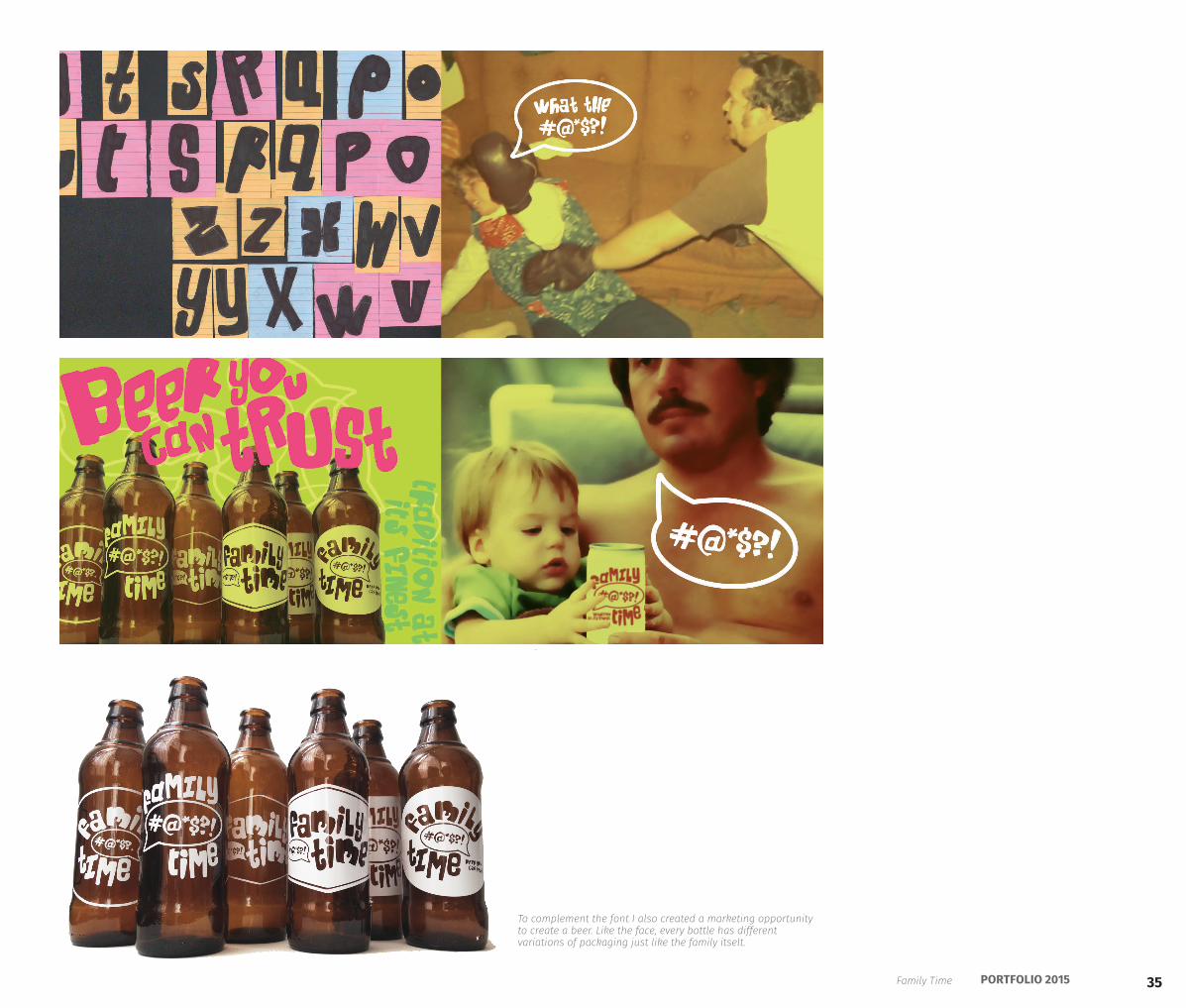
The face includes both capitals and lowercase styles for both alphabets. The set comes with two to give the designer full control on how “drunk” the text should be. Each character leans a little bit, beefs up a little bit, and works a little unconventionally. But that’s the point.
I was very inspired by awkward family photos and wanted to connect my family of letters to real life seemingly disfunctional families. The book also includes scenic inspiration from my neighborhood, as well as popcultural references that inspired me.
abcdefghijklmnopqrstuvwxyzABCDEFGHIJKLMNOPQRSTUVWXYZ0123456789(�#@*?!,.;")&'~
33PORTFOLIO 2015
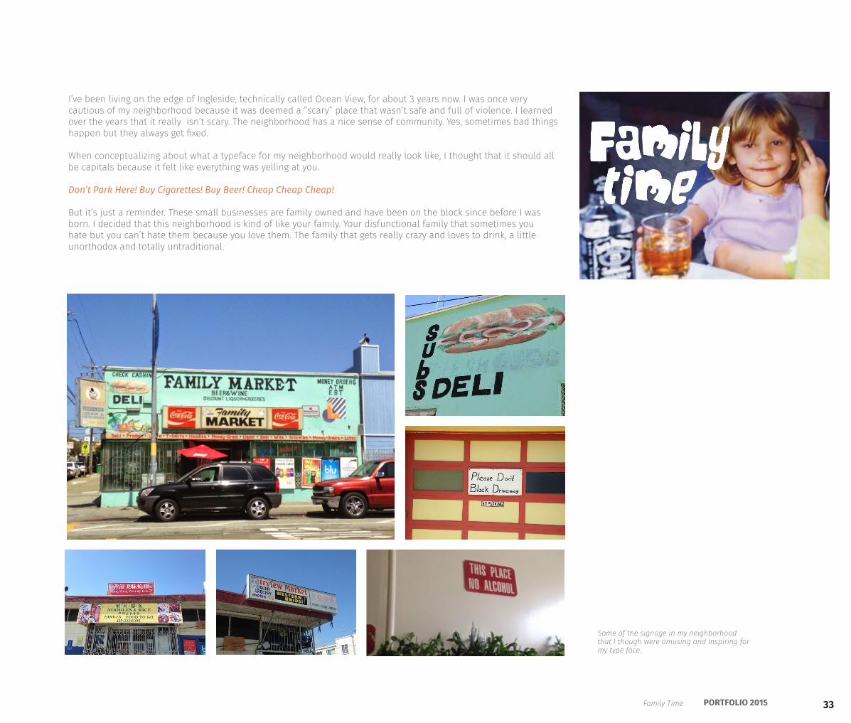
Some of the signage in my neighborhood that I though were amusing and inspiring for my type face.
I’ve been living on the edge of Ingleside, technically called Ocean View, for about 3 years now. I was once very cautious of my neighborhood because it was deemed a “scary” place that wasn’t safe and full of violence. I learned over the years that it really isn’t scary. The neighborhood has a nice sense of community. Yes, sometimes bad things happen but they always get fixed.
When conceptualizing about what a typeface for my neighborhood would really look like, I thought that it should all be capitals because it felt like everything was yelling at you.
Don’t Park Here! Buy Cigarettes! Buy Beer! Cheap Cheap Cheap!
But it’s just a reminder. These small businesses are family owned and have been on the block since before I was born. I decided that this neighborhood is kind of like your family. Your disfunctional family that sometimes you hate but you can’t hate them because you love them. The family that gets really crazy and loves to drink, a little unorthodox and totally untraditional.
Family Time
34 KIERAN BROBST
These spreads describe the font and give background information about the goals of the project.
The bottom spread shows the two alphabets on top of eachother to show their differences.
35PORTFOLIO 2015
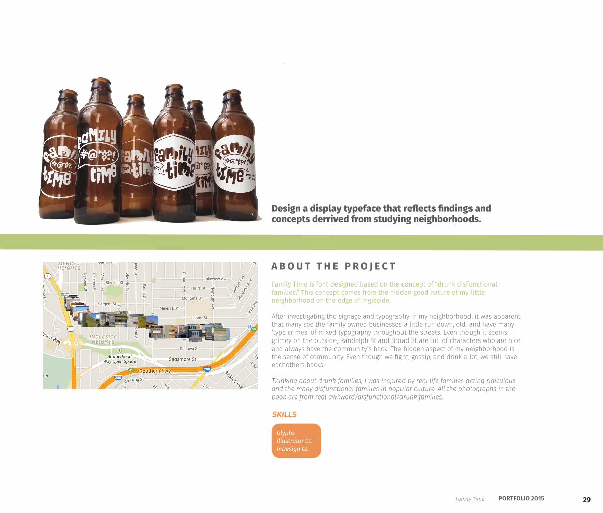
To complement the font I also created a marketing opportunity to create a beer. Like the face, every bottle has different variations of packaging just like the family itselt.
Family Time
36 KIERAN BROBST
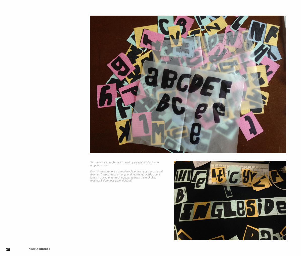
To create the letterforms I started by sketching ideas onto graphed paper.
From those iterations I picked my favorite shapes and placed them on flashcards to arrange and rearrange words. Some letters I traced onto tracing paper to keep the alphabet together before they were digitized.
37PORTFOLIO 2015
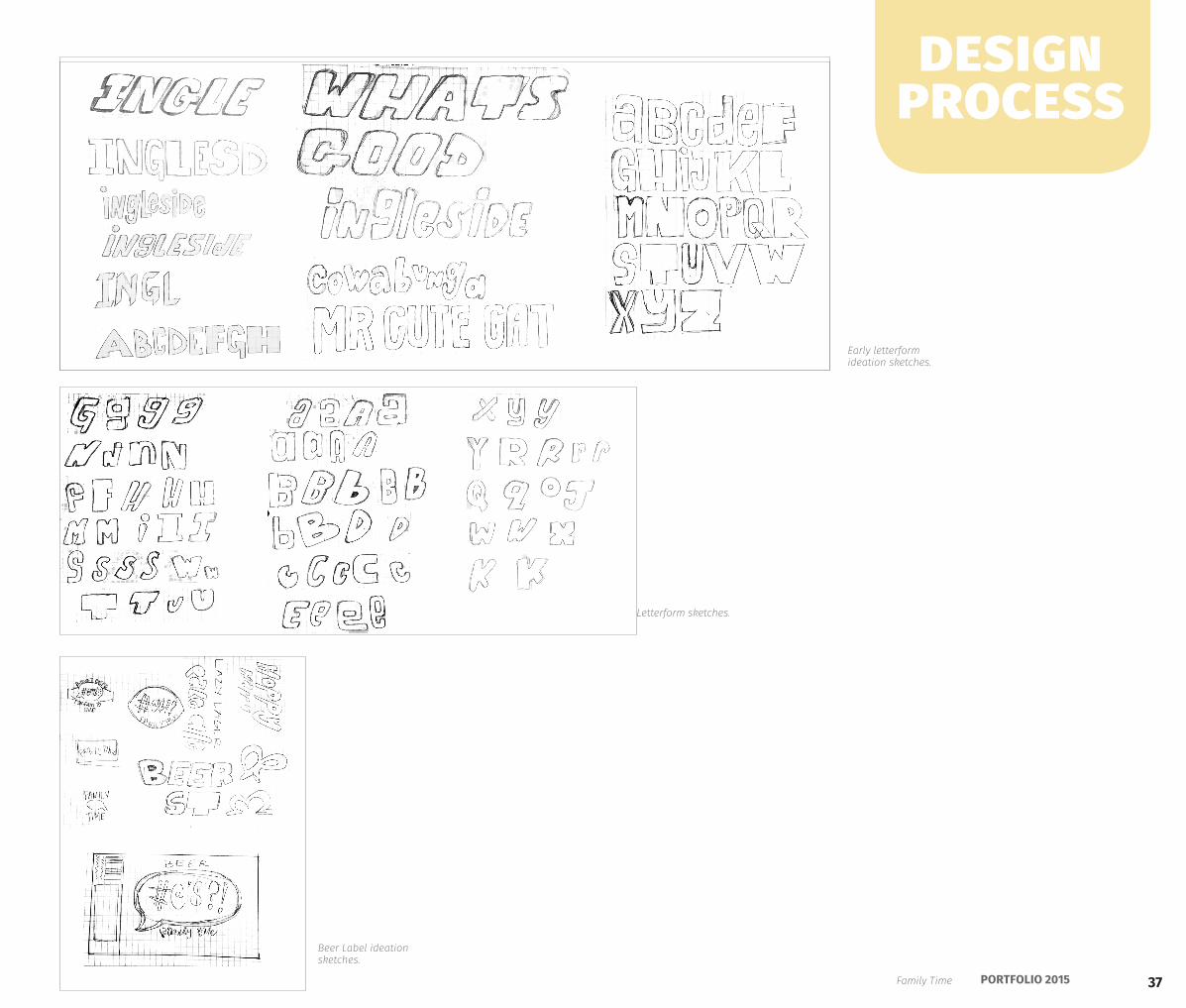
Early letterform ideation sketches.
Letterform sketches.
Beer Label ideation sketches.
design process
Family Time
38 KIERAN BROBST
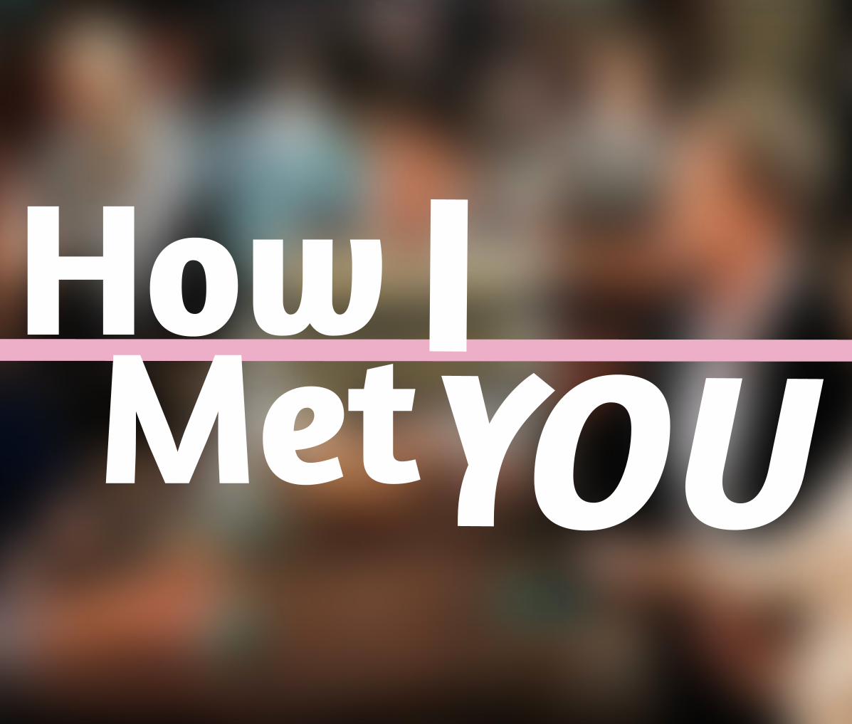
HowMet
IYOU
39PORTFOLIO 2015
The personal ad: How I Met You was a very long and descriptive writing of this sensitive and kind man’s desires. He describes his passions and what he looks for in a girl. Overall he is most interested in the amazing journey he will have finding the girl of his dreams.
There is much dimension to this man’s character. He’s on an emotional journey to find the right connection. For this very emotional piece, I explore the themes of perception, dimension, and junction.
“I’m a young, energetic, & active guy. I enjoy working out, dirtbiking, & snowboarding, but also love shopping, looking good, & spending time with my family. The most important thing for me is to find a girl I can have wonderful conversations with & connect with on our own level. I’m like Ted from How I Met Your Mother, I’m ready for the journey to get me there.”
Design a poster that represents and interprets the message of specific Personal Ad only using type.
A B O U T T H E P R O J E C T
Illustrator CC
SKILLS
How I Met U
YOU
40 KIERAN BROBST
41PORTFOLIO 2015
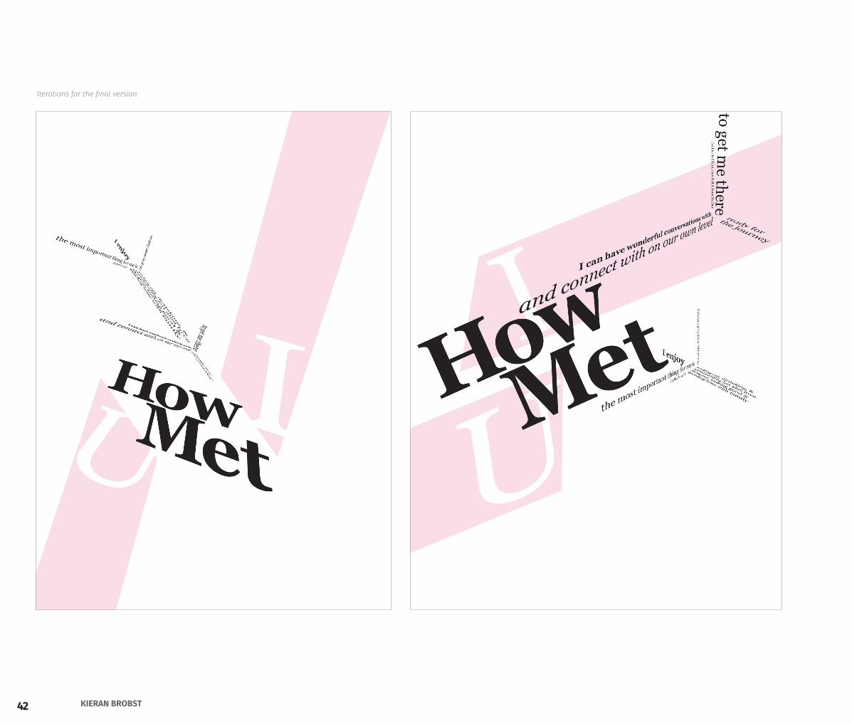
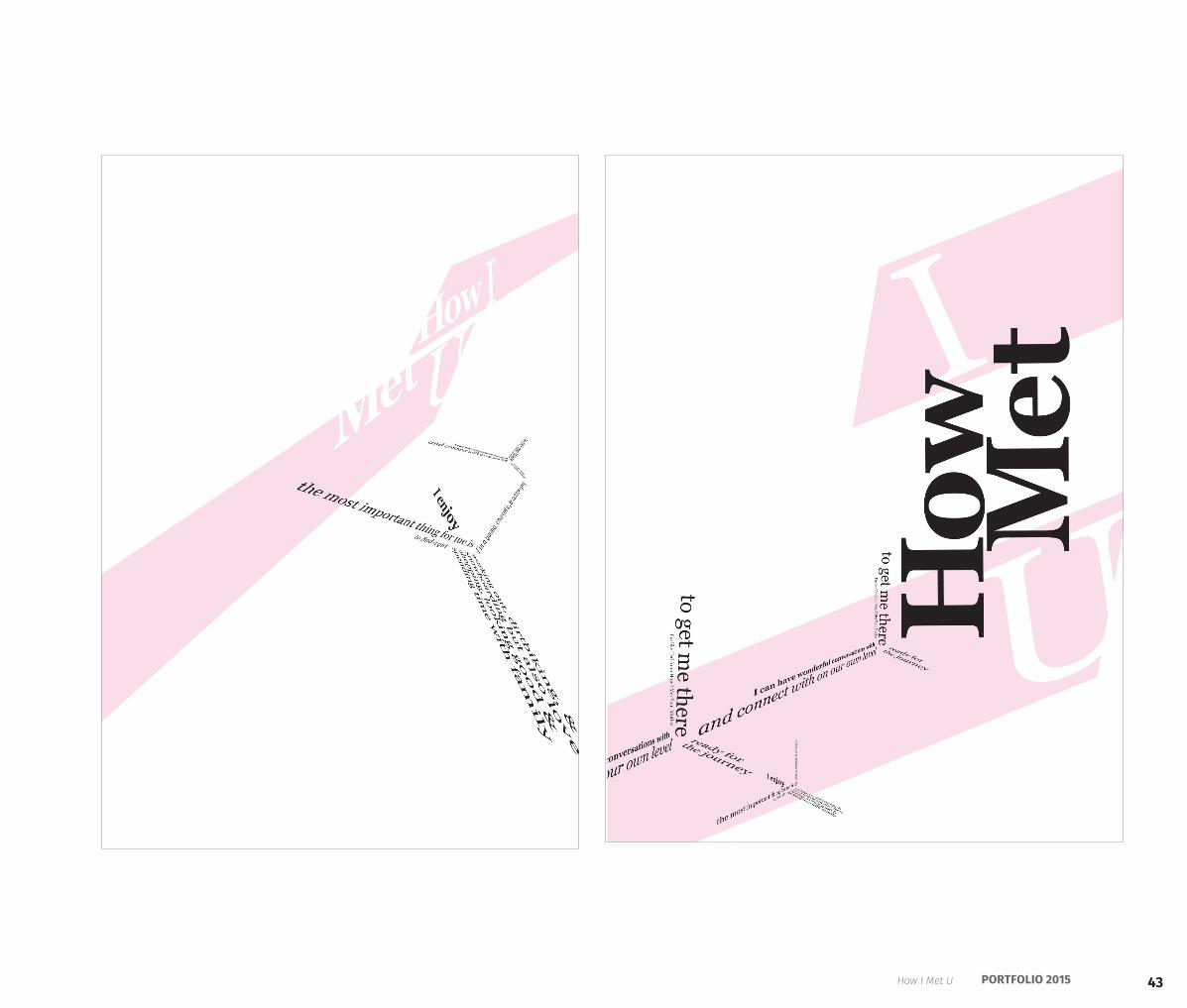
This personal ad made me think about the journey this man is willing to take on to meet the love of his life. The themes I conceptualized were his many dimensions to his personality he was willing to share, the journey to the junction where he will meet the perfect girl for him.
The poster reflects the journey by the diagonal movement across the poster. The knockouts of the I and U symbolize the meeting of their relationship. The use of perspective and typography are representational of the depth of his personality. The junctions of type are also reflective of a meeting point, the whole meaning of his personal ad.
42 KIERAN BROBST
Iterations for the final version.
43PORTFOLIO 2015How I Met U
44 KIERAN BROBST
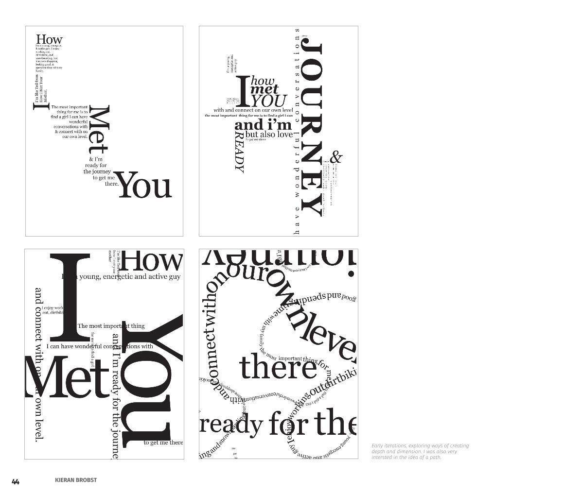
Early iterations, exploring ways of creating depth and dimension. I was also very intersted in the idea of a path.
45PORTFOLIO 2015
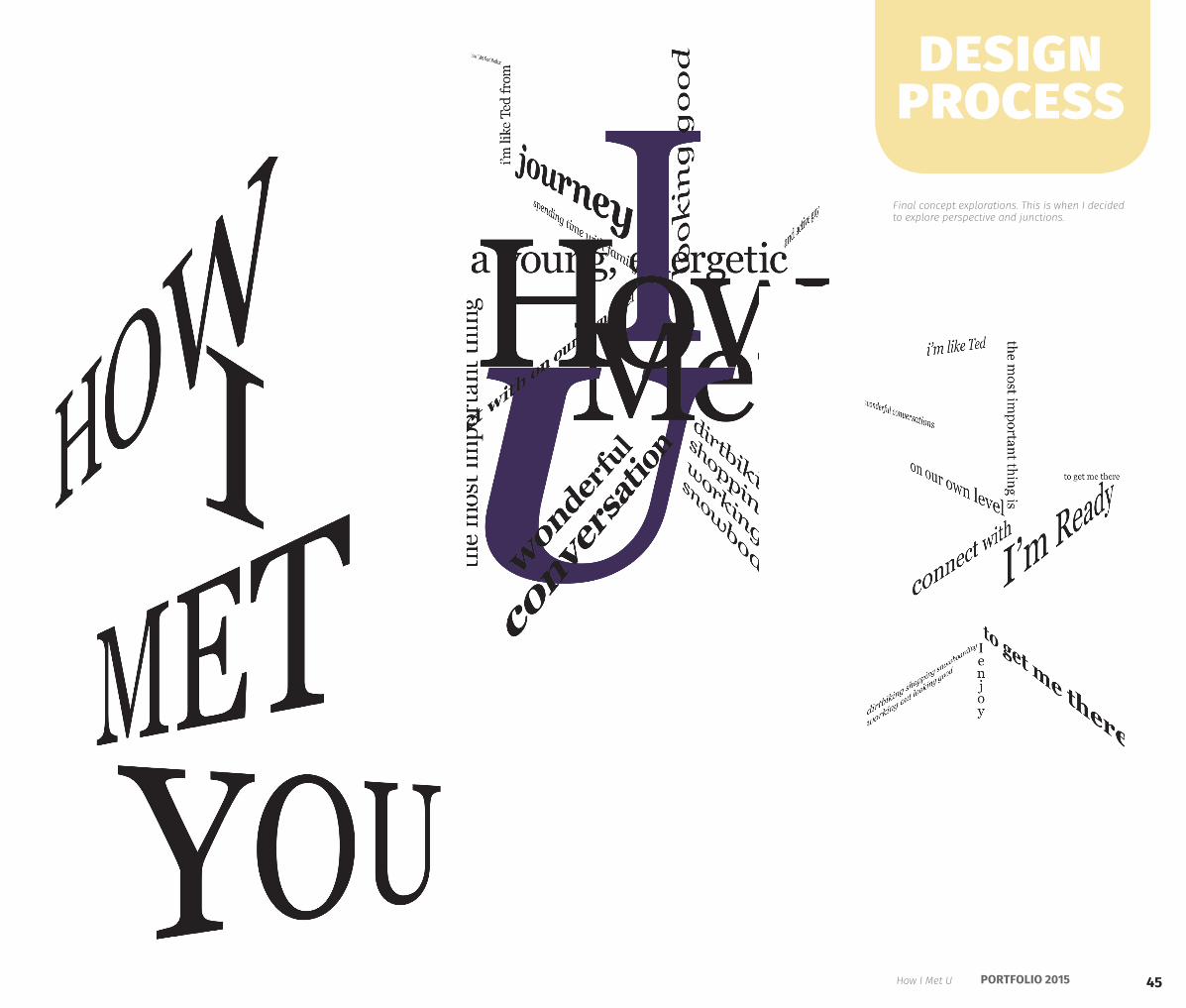
Final concept explorations. This is when I decided to explore perspective and junctions.
design process
How I Met U
46 KIERAN BROBST
TRANSLATIONThe Merry Barracks - Deerhoof
47PORTFOLIO 2015
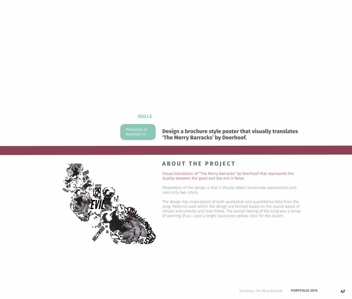
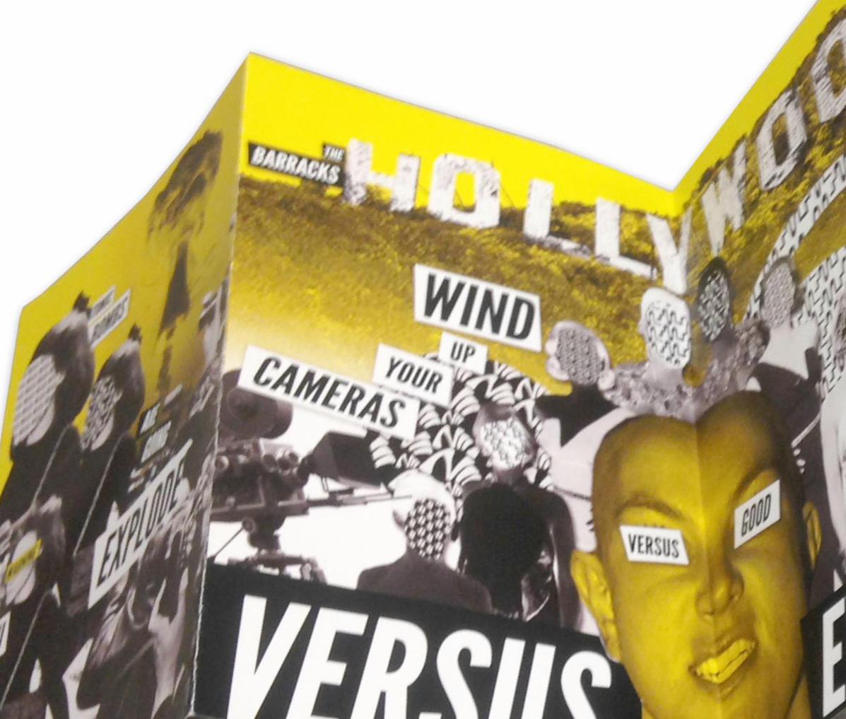
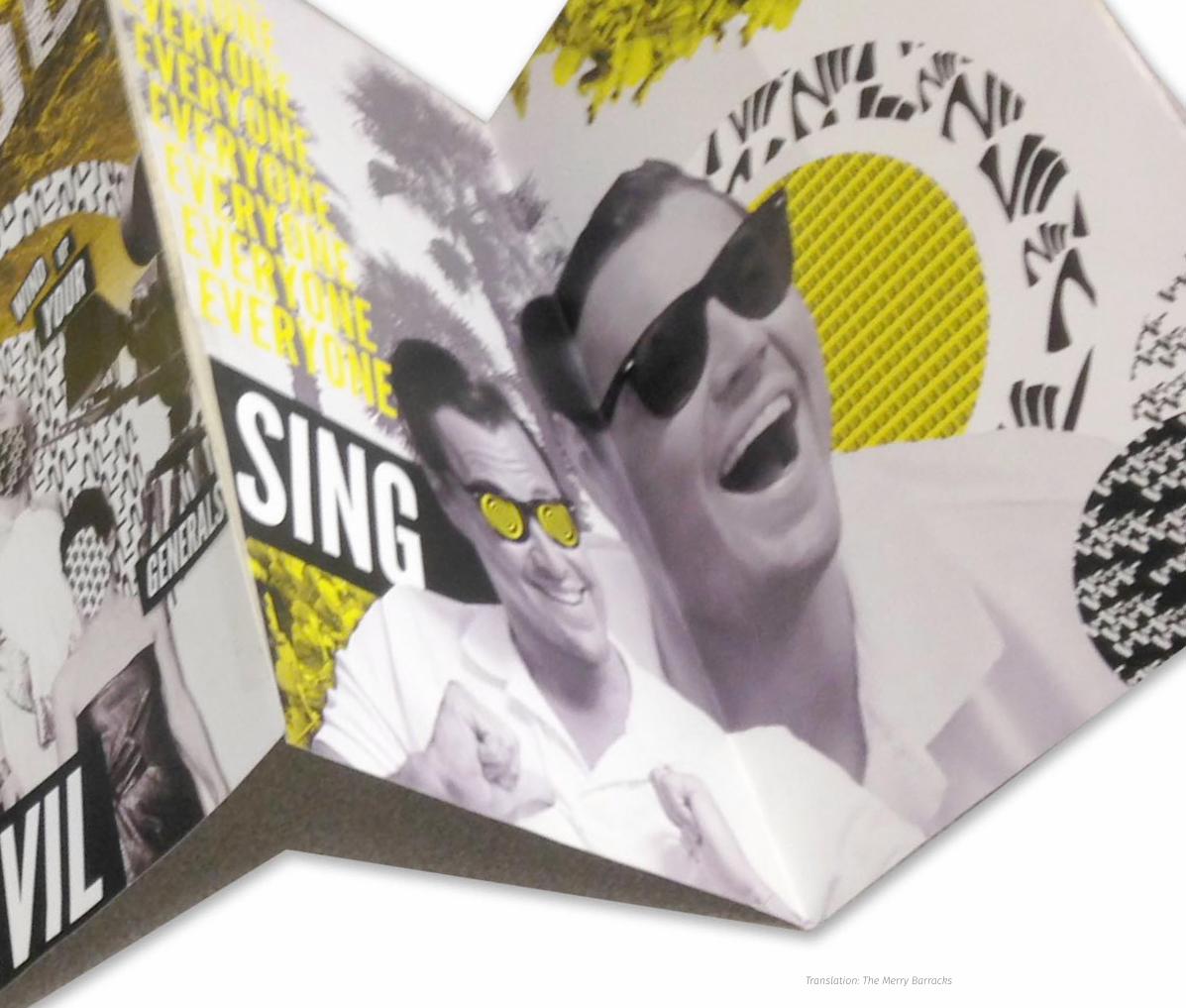
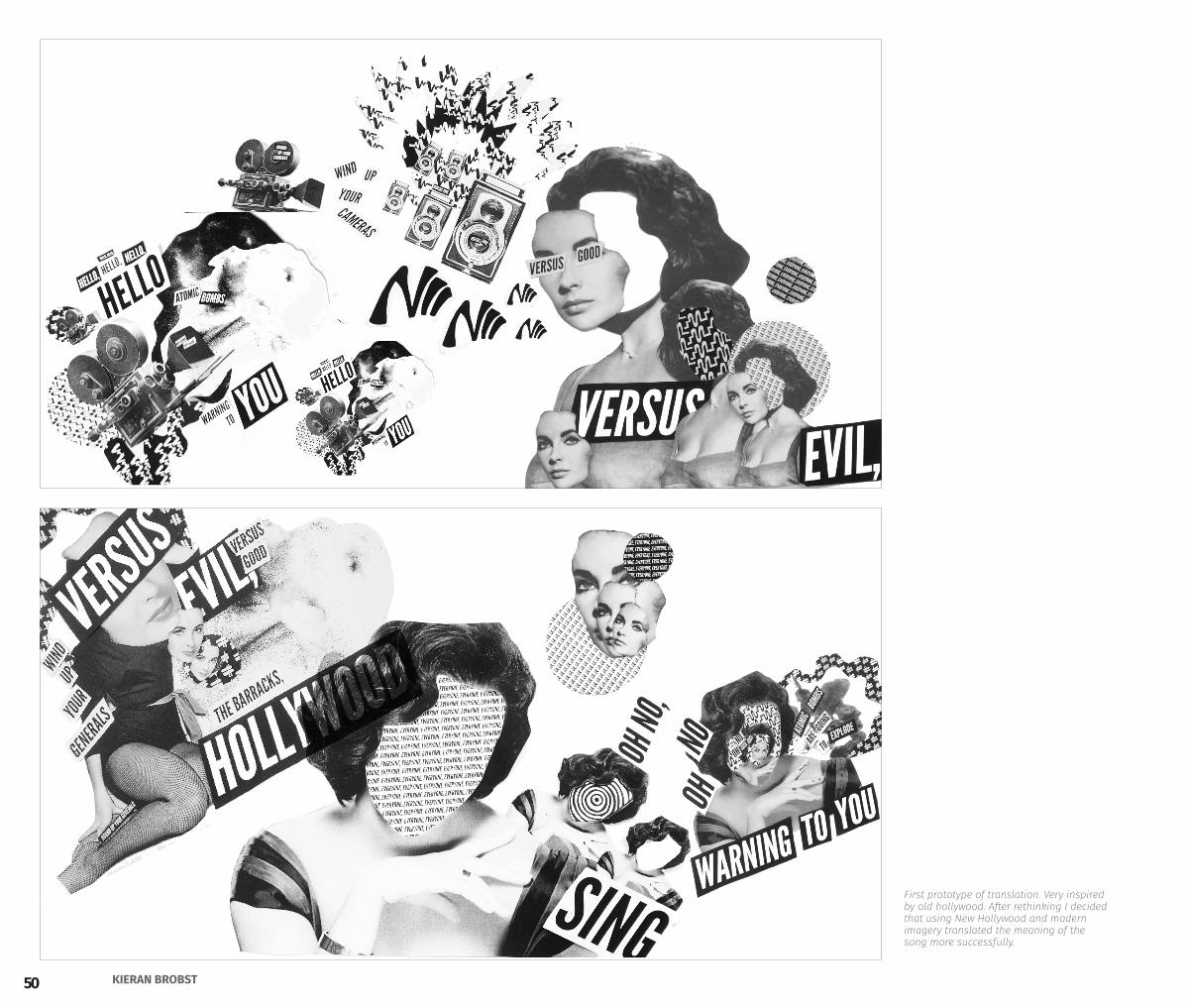
Visual translation of “The Merry Barracks” by Deerhoof that represents the duality between the good and the evil in fame.
Perameters of the design is that it should reflect handmade explorations and uses only two colors.
The design has implications of both qualitative and quantitative data from the song. Patterns used within the design are formed based on the sound waves of certain instruments and time frame. The overall feeling of the song was a sense of warning, thus I used a bright cautionary yellow color for the accent.
Design a brochure style poster that visually translates ‘The Merry Barracks’ by Deerhoof.
A B O U T T H E P R O J E C T
Photoshop CCIllustrator CC
SKILLS
The Merry Barracks - Deerhoof
Translation: The Merry Barracks
48 KIERAN BROBST
49PORTFOLIO 2015Translation: The Merry Barracks
50 KIERAN BROBST
First prototype of translation. Very inspired by old hollywood. After rethinking I decided that using New Hollywood and modern imagery translated the meaning of the song more successfully.
51PORTFOLIO 2015
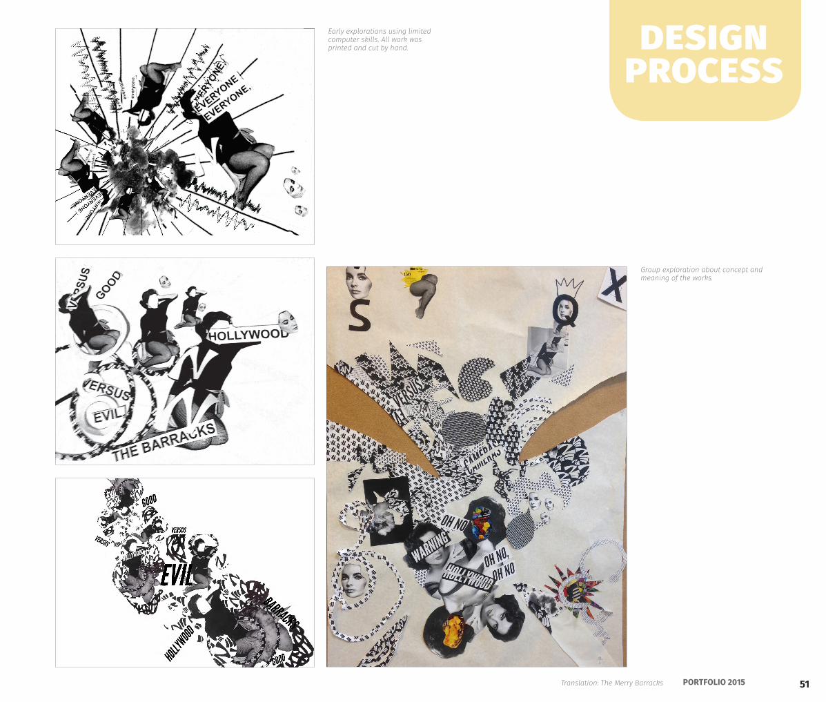
Early explorations using limited computer skills. All work was printed and cut by hand.
Group exploration about concept and meaning of the works.
design process
Translation: The Merry Barracks
52 KIERAN BROBST
NuuCaaNul
53PORTFOLIO 2015
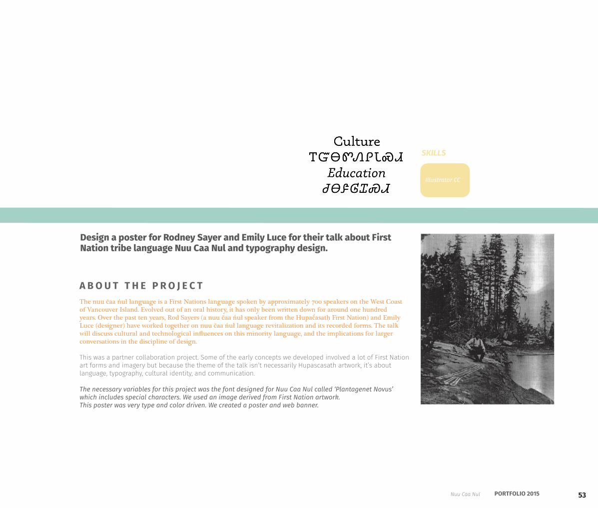
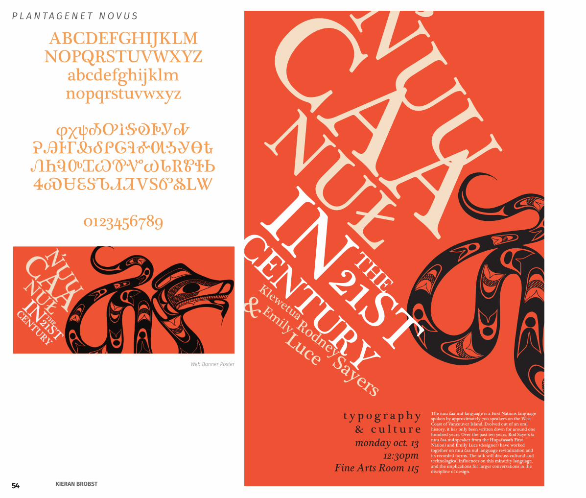
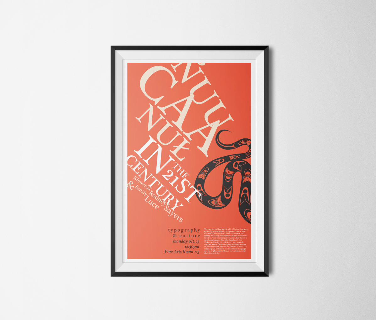
The nuu čaa n̓uł language is a First Nations language spoken by approximately 700 speakers on the West Coast of Vancouver Island. Evolved out of an oral history, it has only been written down for around one hundred years. Over the past ten years, Rod Sayers (a nuu čaa n̓uł speaker from the Hupač̓asatḥ First Nation) and Emily Luce (designer) have worked together on nuu čaa n̓uł language revitalization and its recorded forms. The talk will discuss cultural and technological influences on this minority language, and the implications for larger conversations in the discipline of design.
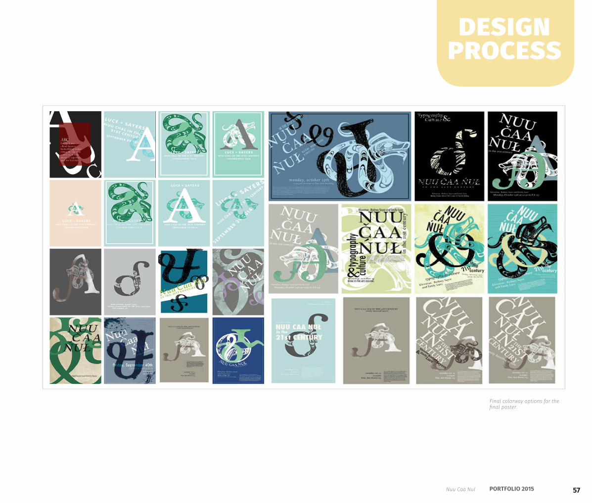
This was a partner collaboration project. Some of the early concepts we developed involved a lot of First Nation art forms and imagery but because the theme of the talk isn’t necessarily Hupascasath artwork, it’s about language, typography, cultural identity, and communication.
The necessary variables for this project was the font designed for Nuu Caa Nul called ‘Plantagenet Novus’ which includes special characters. We used an image derived from First Nation artwork. This poster was very type and color driven. We created a poster and web banner.
Design a poster for Rodney Sayer and Emily Luce for their talk about First Nation tribe language Nuu Caa Nul and typography design.
A B O U T T H E P R O J E C T
Illustrator CC
SKILLS
Nuu Caa Nul
Nul
54 KIERAN BROBST
monday oct. 1312:30pm
Fine Arts Room 115
The nuu čaa nuł language is a First Nations language spoken by approximately 700 speakers on the West Coast of Vancouver Island. Evolved out of an oral history, it has only been written down for around one hundred years. Over the past ten years, Rod Sayers (a nuu čaa nuł speaker from the Hupačasath First Nation) and Emily Luce (designer) have worked together on nuu čaa nuł language revitalization and its recorded forms. The talk will discuss cultural and technological influences on this minority language, and the implications for larger conversations in the discipline of design.
t y p o g r a p h y & c u l t u r emonday oct. 13
12:30pmFine Arts Room 115
ABCDEFGHIJKLMNOPQRSTUVWXYZ
abcdefghijklmnopqrstuvwxyz
φχψᎣᎤᎥᎦᎧᎨᎩᎭᎮᎯᎰᎱᎲᎴᎵᎶᎸᎹᎺᎼᎽᎾᎿᏁᏂᏄᏅᏆᏇᏈᏉᏊᏓᏒᏑᏐᏏᏎᏍᏌᏋᏕᏖᏗᏘᏙᏚᏛᏜᏞᏔ
0123456789
P L A N T A G E N E T N O V U S
Web Banner Poster
55PORTFOLIO 2015
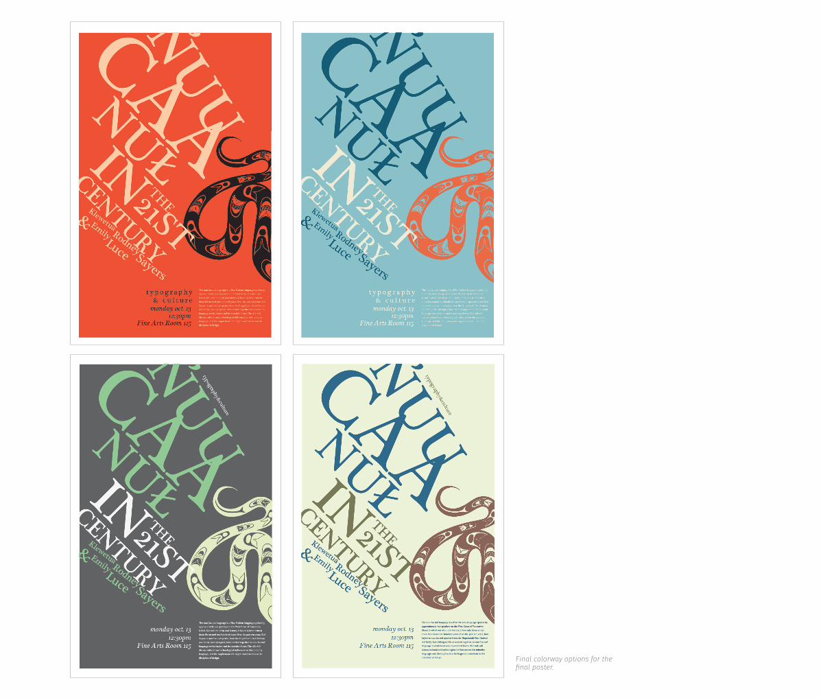
Final colorway options for the final poster.
57PORTFOLIO 2015
Final colorway options for the final poster.
design process
Nuu Caa Nul
58 KIERAN BROBST
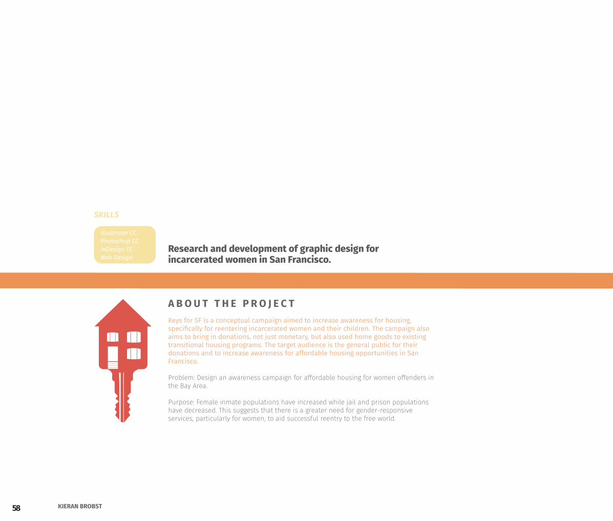
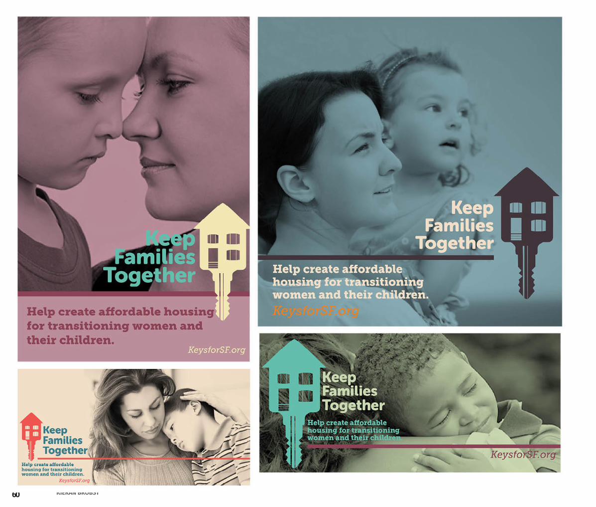
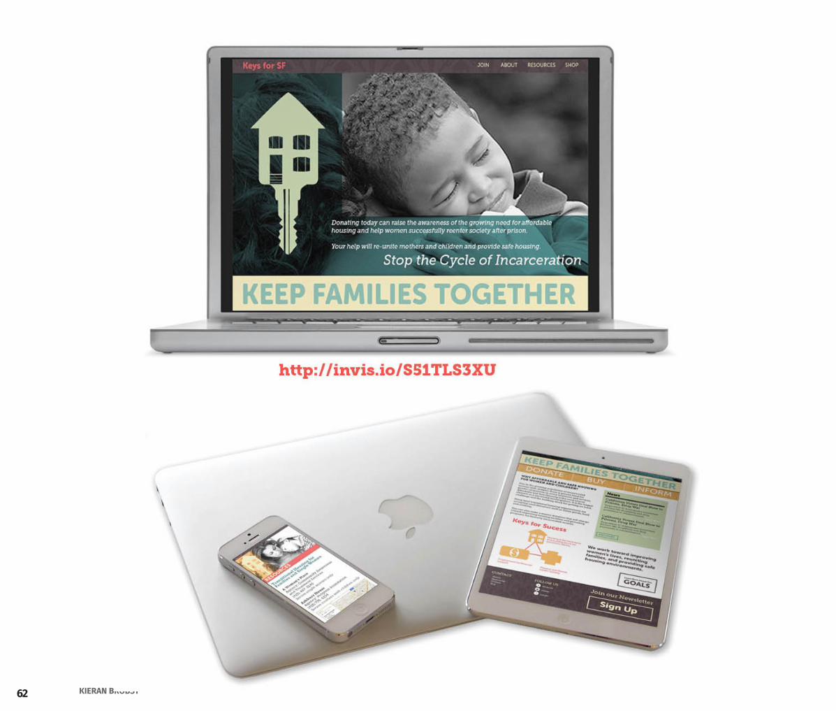
Keys for SF is a conceptual campaign aimed to increase awareness for housing, specifically for reentering incarcerated women and their children. The campaign also aims to bring in donations, not just monetary, but also used home goods to existing transitional housing programs. The target audience is the general public for their donations and to increase awareness for affordable housing opportunities in San Francisco.
Problem: Design an awareness campaign for affordable housing for women offenders in the Bay Area.
Purpose: Female inmate populations have increased while jail and prison populations have decreased. This suggests that there is a greater need for gender-responsive services, particularly for women, to aid successful reentry to the free world.
Research and development of graphic design for incarcerated women in San Francisco.
A B O U T T H E P R O J E C T
Illustrator CCPhotoshop CCinDesign CCWeb Design
SKILLS
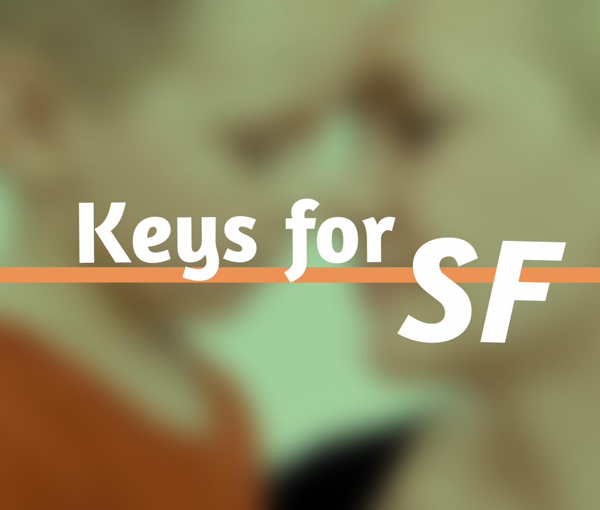
59PORTFOLIO 2015Keys for SF
Keys for
60 KIERAN BROBST
61PORTFOLIO 2015Keys for SF
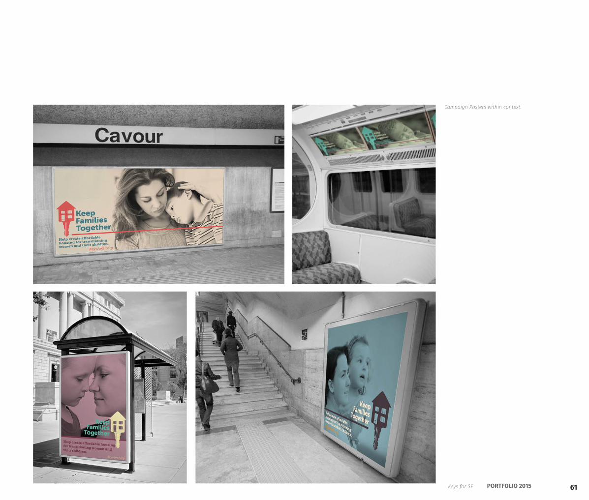
Campaign Posters within context.
62 KIERAN BROBST
63PORTFOLIO 2015Keys for SF
64 KIERAN BROBST
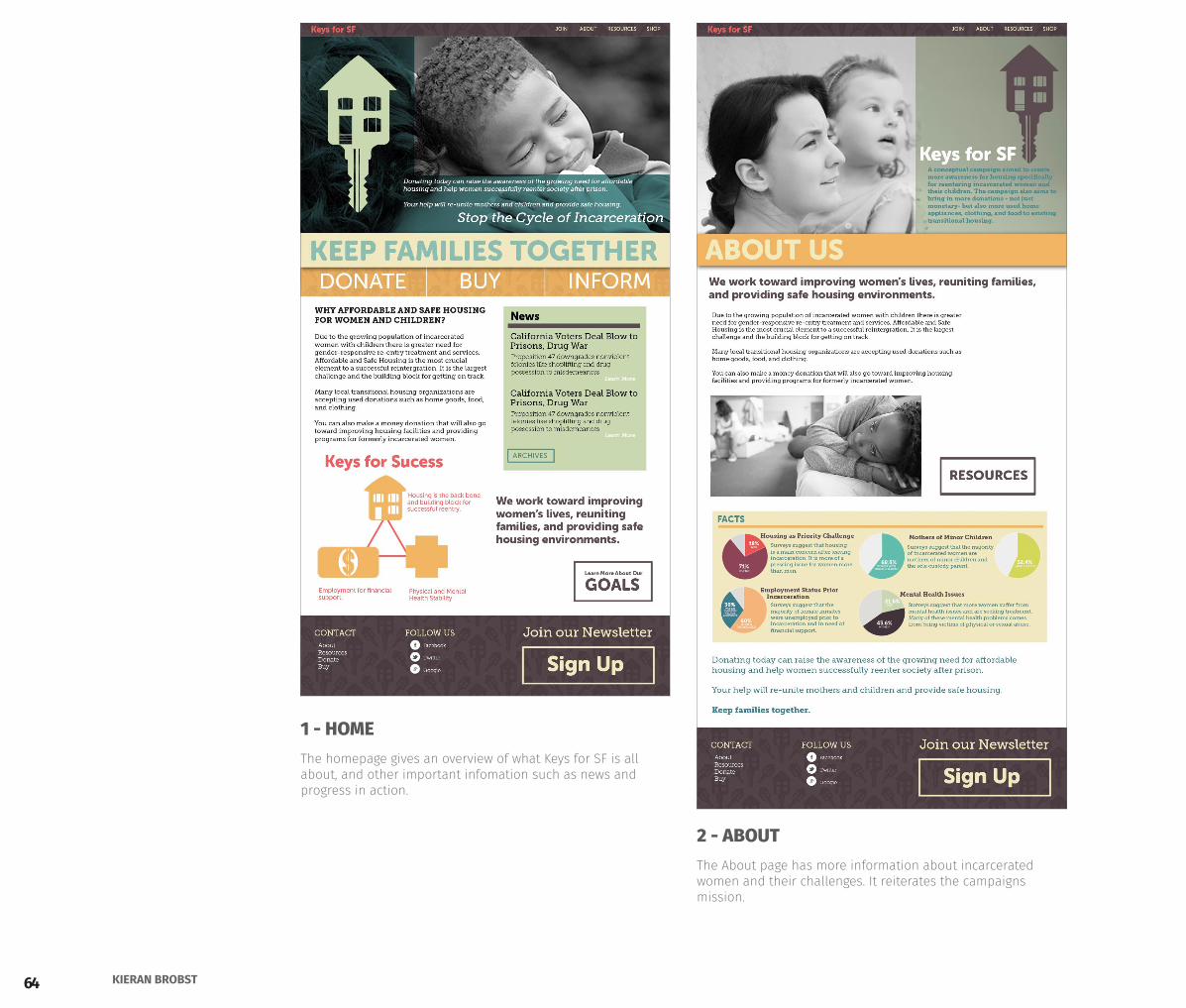
1 - HOME
2 - ABOUT
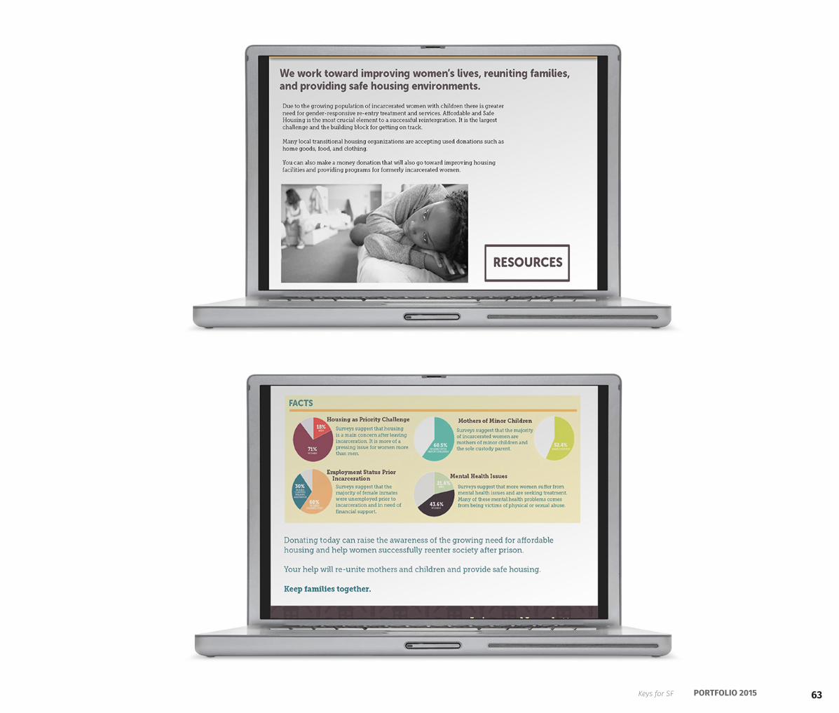
The homepage gives an overview of what Keys for SF is all about, and other important infomation such as news and progress in action.
The About page has more information about incarcerated women and their challenges. It reiterates the campaigns mission.
65PORTFOLIO 2015Keys for SF
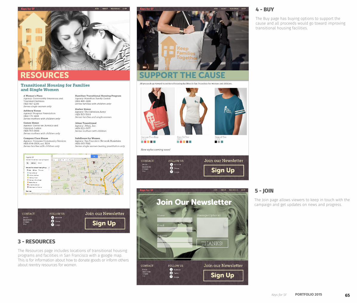
3 - RESOURCES
5 - JOIN
4 - BUY
The Resources page includes locations of transitional housing programs and facilities in San Francisco with a google map. This is for information about how to donate goods or inform others about reentry resources for women.
The Join page allows viewers to keep in touch with the campaign and get updates on news and progress.
The Buy page has buying options to support the cause and all proceeds would go toward improving transitional housing facilities.
66 KIERAN BROBST
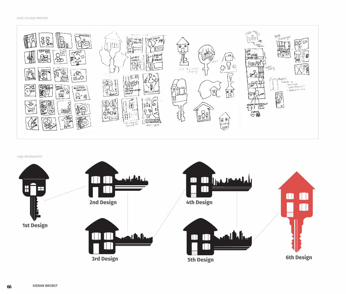
1st Design
2nd Design
3rd Design
4th Design
5th Design 6th Design
Early concept sketches.
Logo development.
67PORTFOLIO 2015
design process
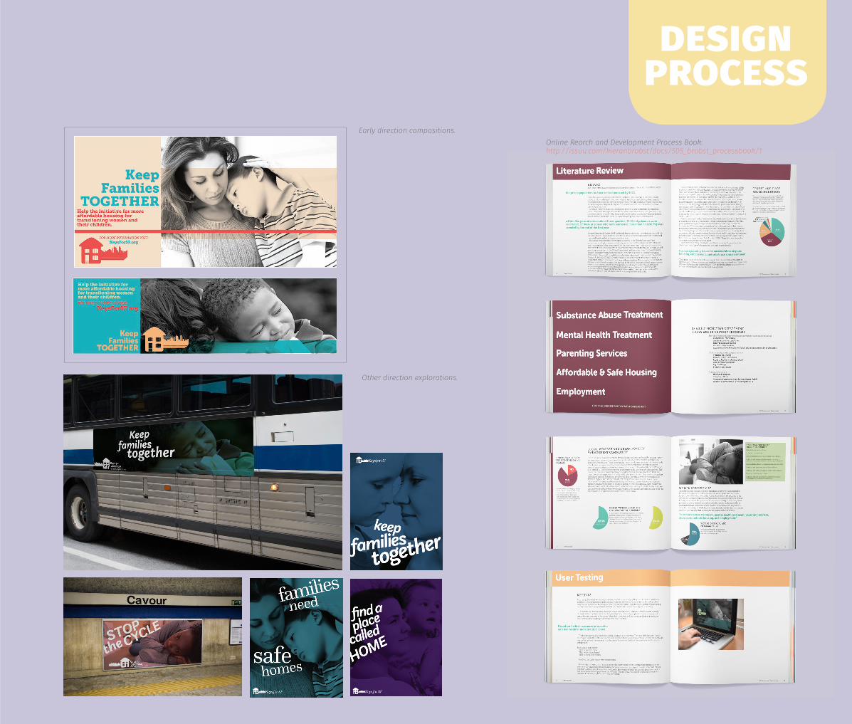
Other direction explorations.
Early direction compositions. Online Rearch and Development Process Book: http://issuu.com/kieranbrobst/docs/505_brobst_processbook/1
68 KIERAN BROBST
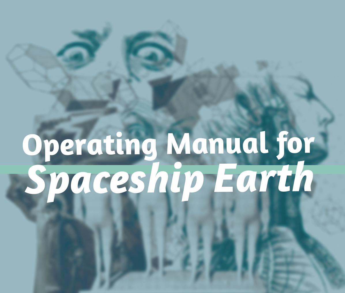
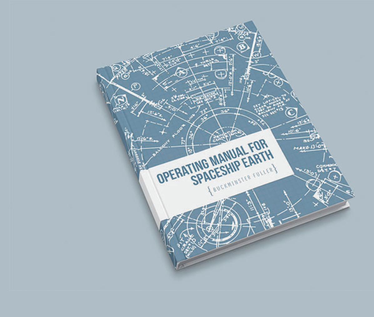
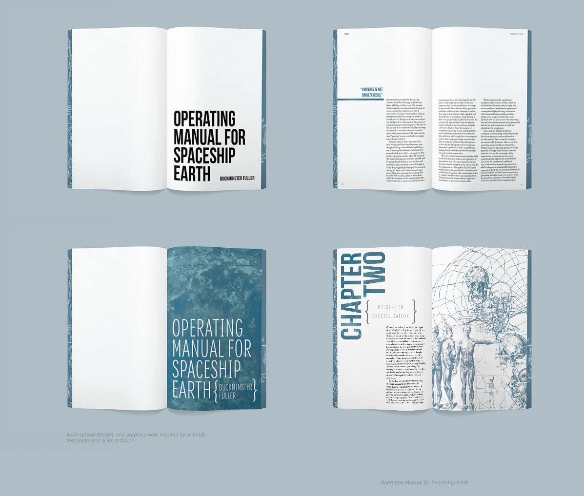
Operating Manual for Spaceship Earth written by Buckminster Fuller is a book that explores ideas about automation, human development, and sustainability. Written in 1967, Buckminster Fuller has paved the way for critical thinking and has inspired many to undertake his challenge: to take whole systems approach to to understanding and intervening in complex and interrelated crises for wide-scale social and environmental impact.
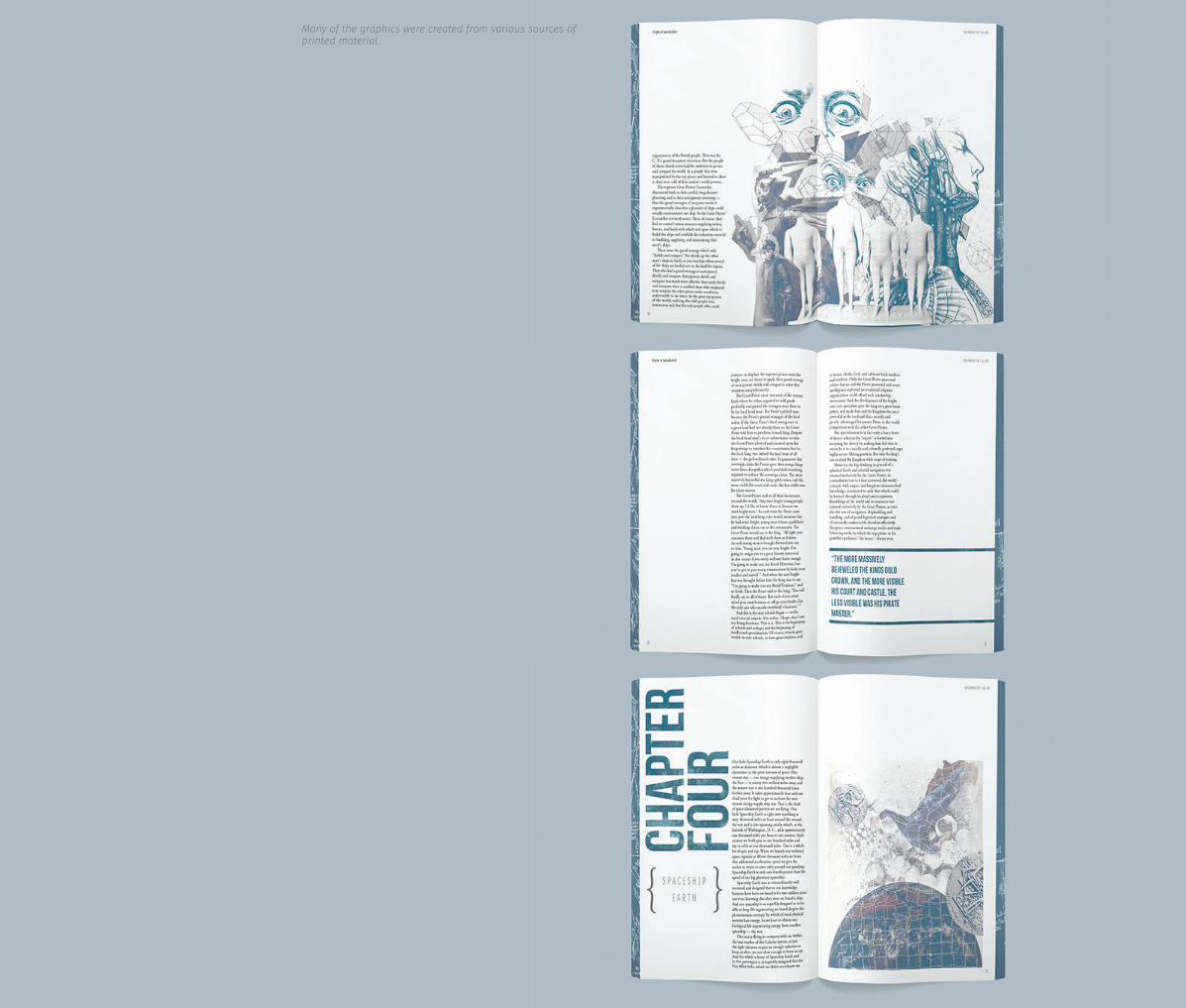
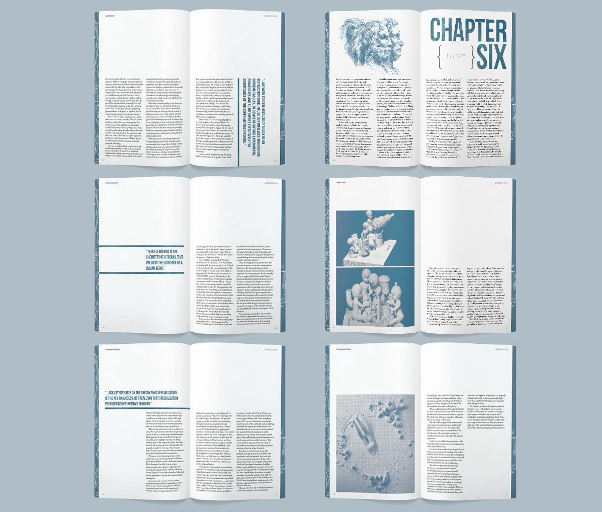
While reading the dense yet short work, I felt that there was something very poetic and a sense of science and ficition in his writing. I interpretted these feelings into the book and focused on his main topics: specialization, automation, the development of man, sustainability, systems, planning and energy.
View or download the whole book here: http://issuu.com/kieranbrobst/docs/minsterbook_online
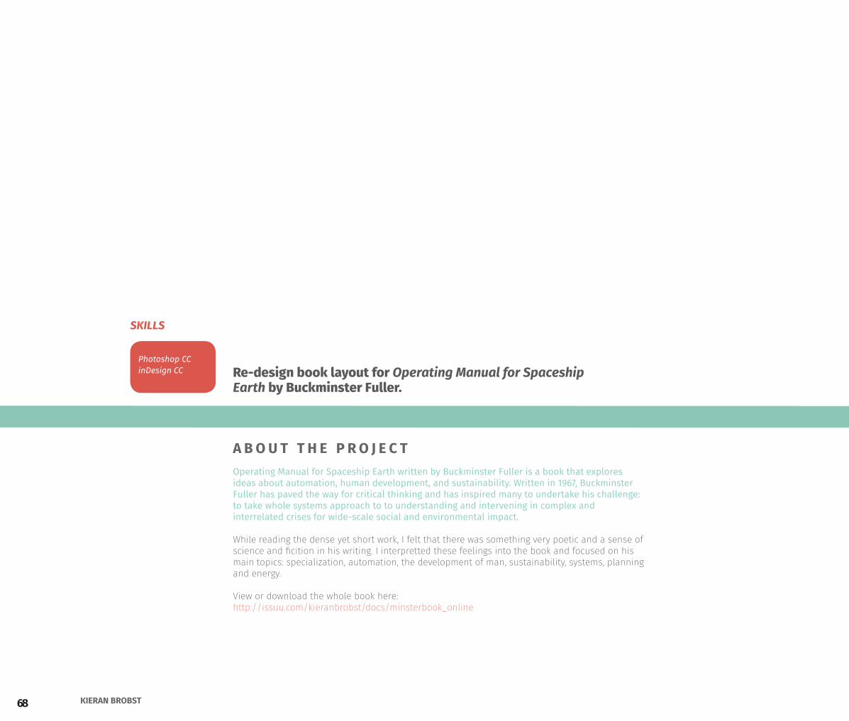
Re-design book layout for Operating Manual for Spaceship Earth by Buckminster Fuller.
A B O U T T H E P R O J E C T
Photoshop CCinDesign CC
SKILLS
69PORTFOLIO 2015
Operating Manual forSpaceship Earth
70 KIERAN BROBST
71PORTFOLIO 2015Operation Manual for Spaceship Earth
Book spread designs and graphics were inspired by scientific text books and science fiction.
72 KIERAN BROBST
Many of the graphics were created from various sources of printed material.
73PORTFOLIO 2015Operation Manual for Spaceship Earth
74 KIERAN BROBST
Sanfranskinny is a weightloss clinic located in El Cerrito, California who needed graphics for online promotions, printed ads for the local paper, and some material for their office.
For this project I used photography and typography within their brand guidelines to create promotions for treatment and inspire visitors to adapt a healthy lifestyle and promote their brand identity. I also helped update graphics on their website and put together email templates and fliers for community open house events.
Marketing material and interior design graphics for the El Cerrito doctors office.
A B O U T T H E P R O J E C T
Photoshop CCinDesign CCIllustrator CC
SKILLS
75PORTFOLIO 2015
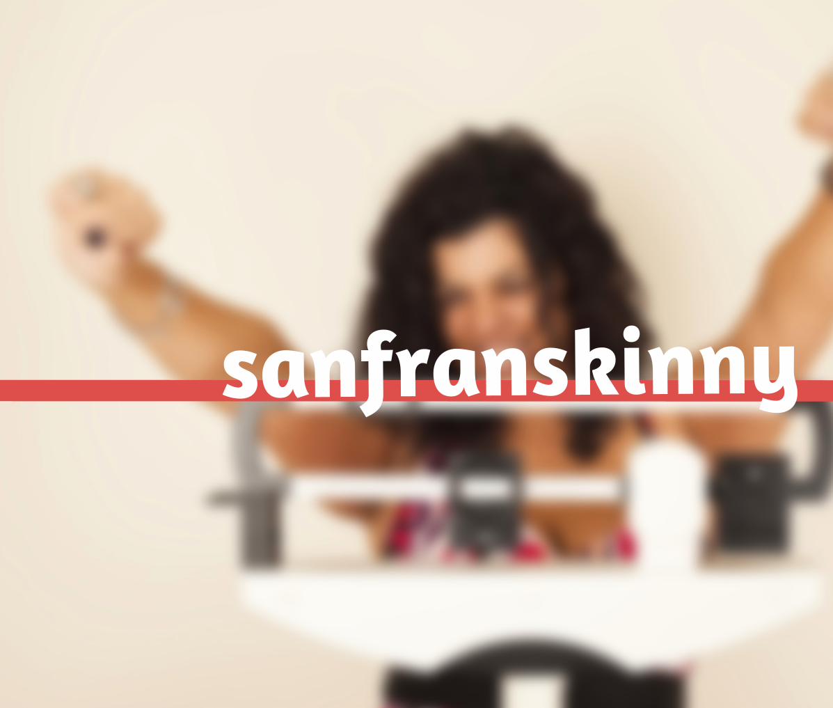
sanfranskinny
76 KIERAN BROBST
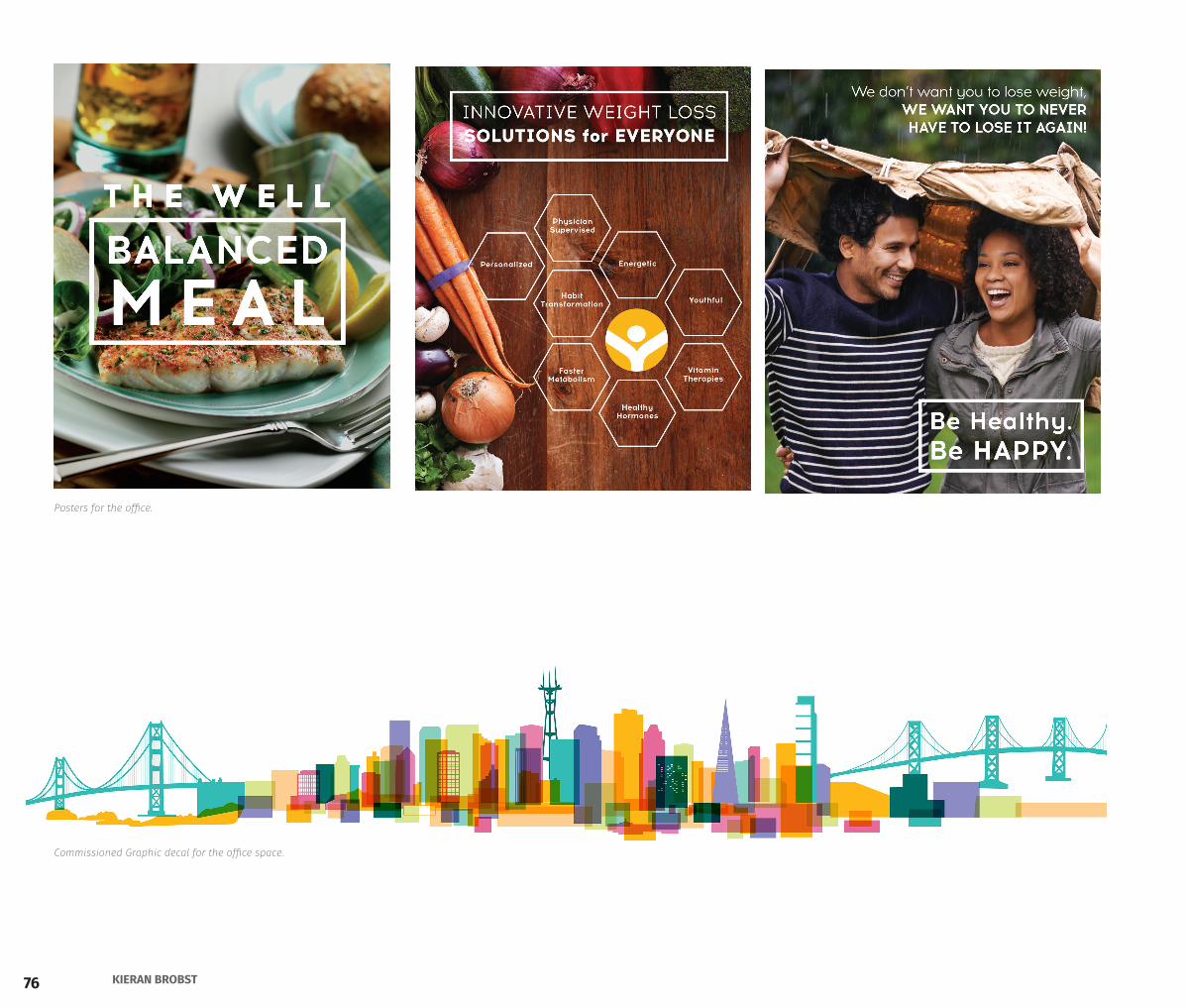
Posters for the office.
Commissioned Graphic decal for the office space.
77PORTFOLIO 2015
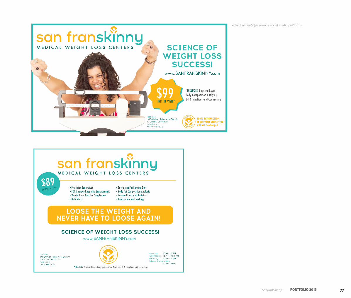
Advertisements for various social media platforms.
Sanfranskinny

78 KIERAN BROBST

79PORTFOLIO 2015
design process
Operation Manual for Spaceship Earth
