kerrang! magazine deconstruction
TRANSCRIPT
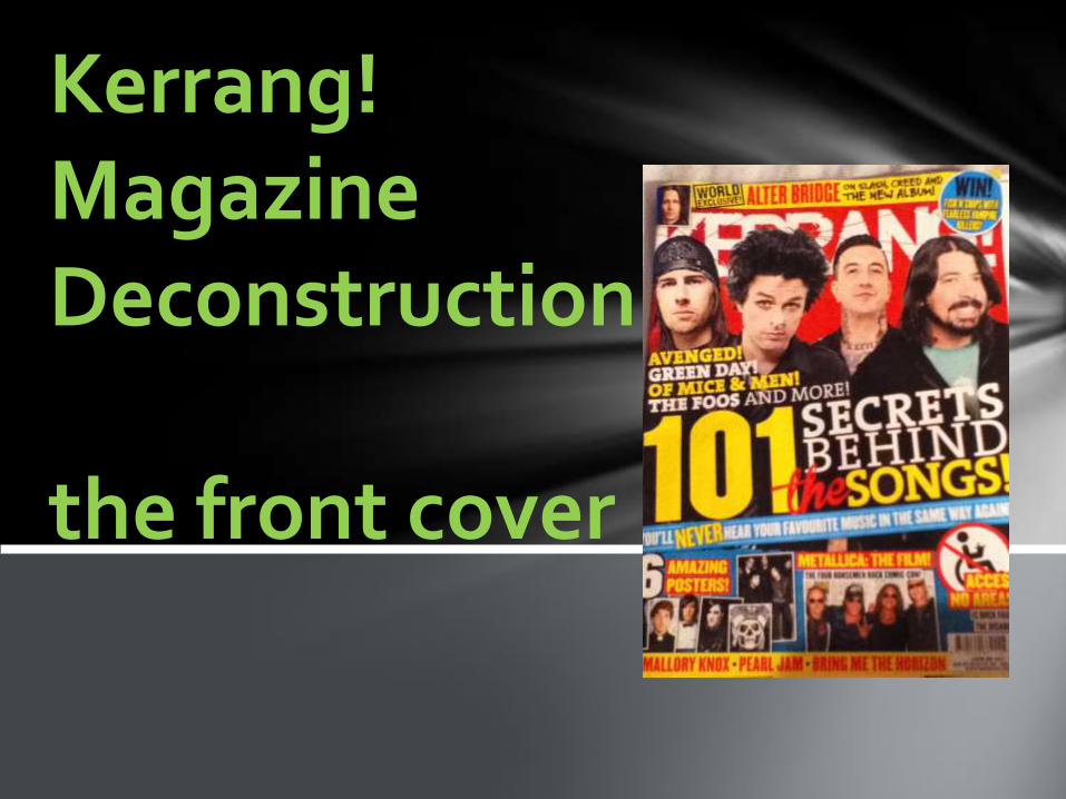
Kerrang! Magazine Deconstruction
the front cover
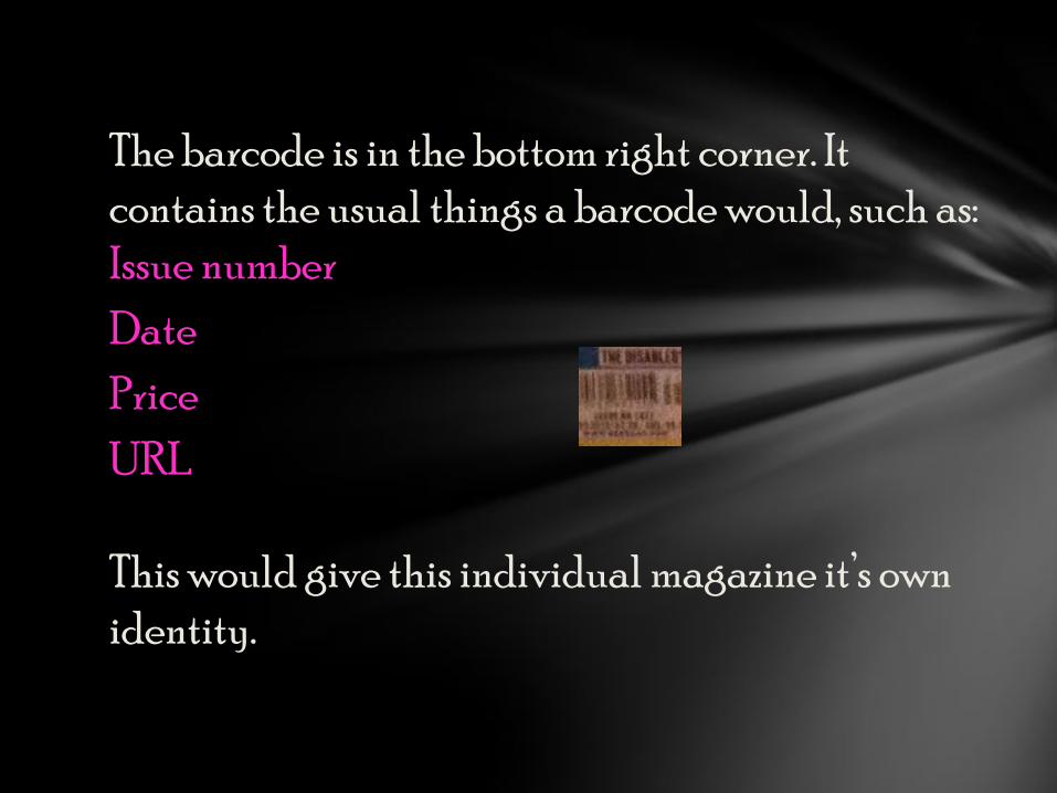
The barcode is in the bottom right corner. It
contains the usual things a barcode would, such as:
Issue number
Date
Price
URL
This would give this individual magazine it’s own
identity.
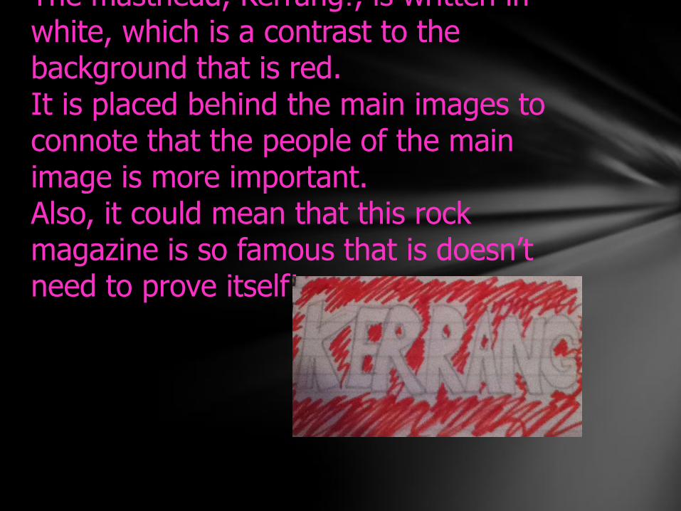
The masthead, Kerrang!, is written in white, which is a contrast to the background that is red.It is placed behind the main images to connote that the people of the main image is more important. Also, it could mean that this rock magazine is so famous that is doesn’t need to prove itself!
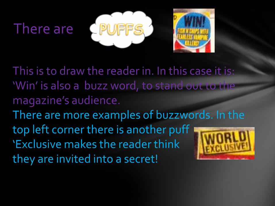
There are
This is to draw the reader in. In this case it is:‘Win’ is also a buzz word, to stand out to the magazine’s audience.There are more examples of buzzwords. In the top left corner there is another puff‘Exclusive makes the reader think they are invited into a secret!
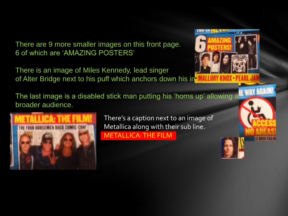
There are 9 more smaller images on this front page.
6 of which are ‘AMAZING POSTERS’
There is an image of Miles Kennedy, lead singer
of Alter Bridge next to his puff which anchors down his image.
The last image is a disabled stick man putting his ‘horns up’ allowing a
broader audience.
There’s a caption next to an image of Metallica along with their sub line.METALLICA: THE FILM
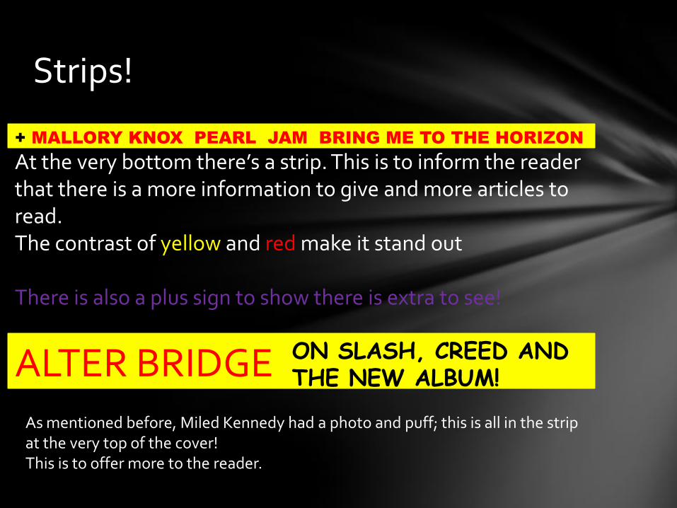
Strips!
+ MALLORY KNOX PEARL JAM BRING ME TO THE HORIZON
At the very bottom there’s a strip. This is to inform the reader that there is a more information to give and more articles to read.The contrast of yellow and red make it stand out
There is also a plus sign to show there is extra to see!
ALTER BRIDGE ON SLASH, CREED ANDTHE NEW ALBUM!
As mentioned before, Miled Kennedy had a photo and puff; this is all in the strip at the very top of the cover!This is to offer more to the reader.
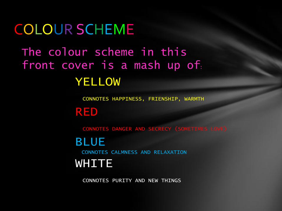
COLOUR SCHEME
The colour scheme in this front cover is a mash up of:
YELLOWCONNOTES HAPPINESS, FRIENSHIP, WARMTH
REDCONNOTES DANGER AND SECRECY (SOMETIMES LOVE)
BLUE CONNOTES CALMNESS AND RELAXATION
WHITECONNOTES PURITY AND NEW THINGS
the contents page
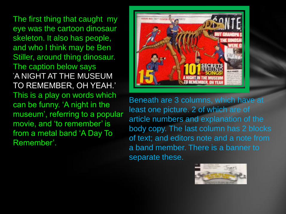
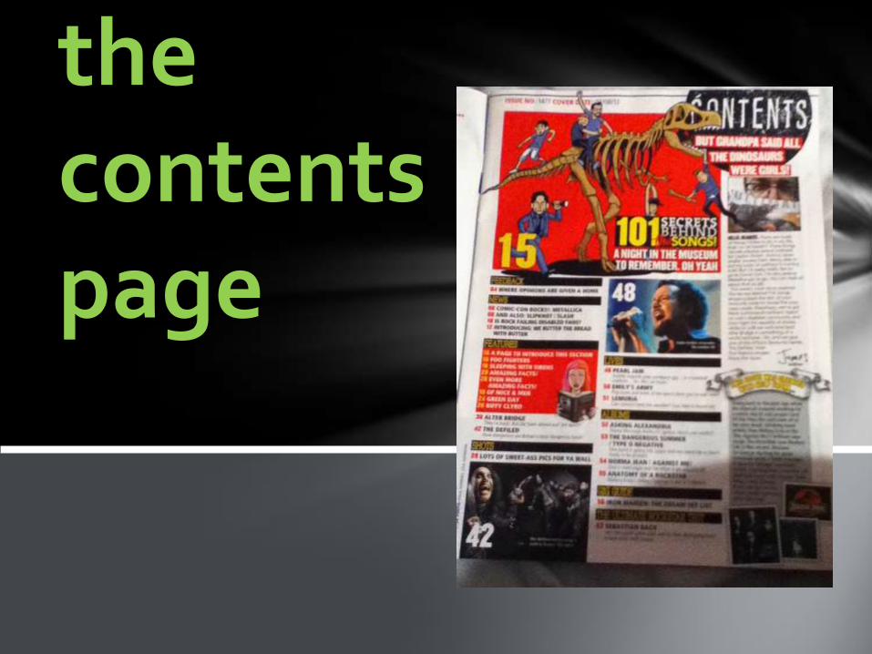
The first thing that caught my
eye was the cartoon dinosaur
skeleton. It also has people,
and who I think may be Ben
Stiller, around thing dinosaur.
The caption below says
‘A NIGHT AT THE MUSEUM
TO REMEMBER, OH YEAH.’
This is a play on words which
can be funny. ‘A night in the
museum’, referring to a popular
movie, and ‘to remember’ is
from a metal band ‘A Day To
Remember’.
Beneath are 3 columns, which have at
least one picture. 2 of which are of
article numbers and explanation of the
body copy. The last column has 2 blocks
of text; and editors note and a note from
a band member. There is a banner to
separate these.
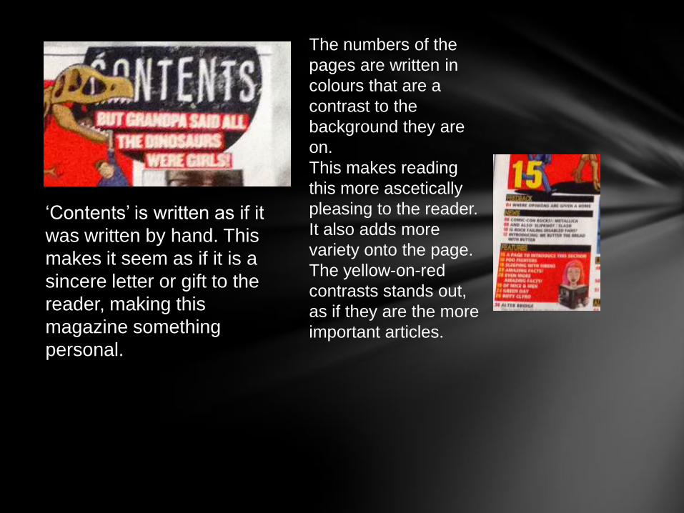
‘Contents’ is written as if it
was written by hand. This
makes it seem as if it is a
sincere letter or gift to the
reader, making this
magazine something
personal.
The numbers of the
pages are written in
colours that are a
contrast to the
background they are
on.
This makes reading
this more ascetically
pleasing to the reader.
It also adds more
variety onto the page.
The yellow-on-red
contrasts stands out,
as if they are the more
important articles.
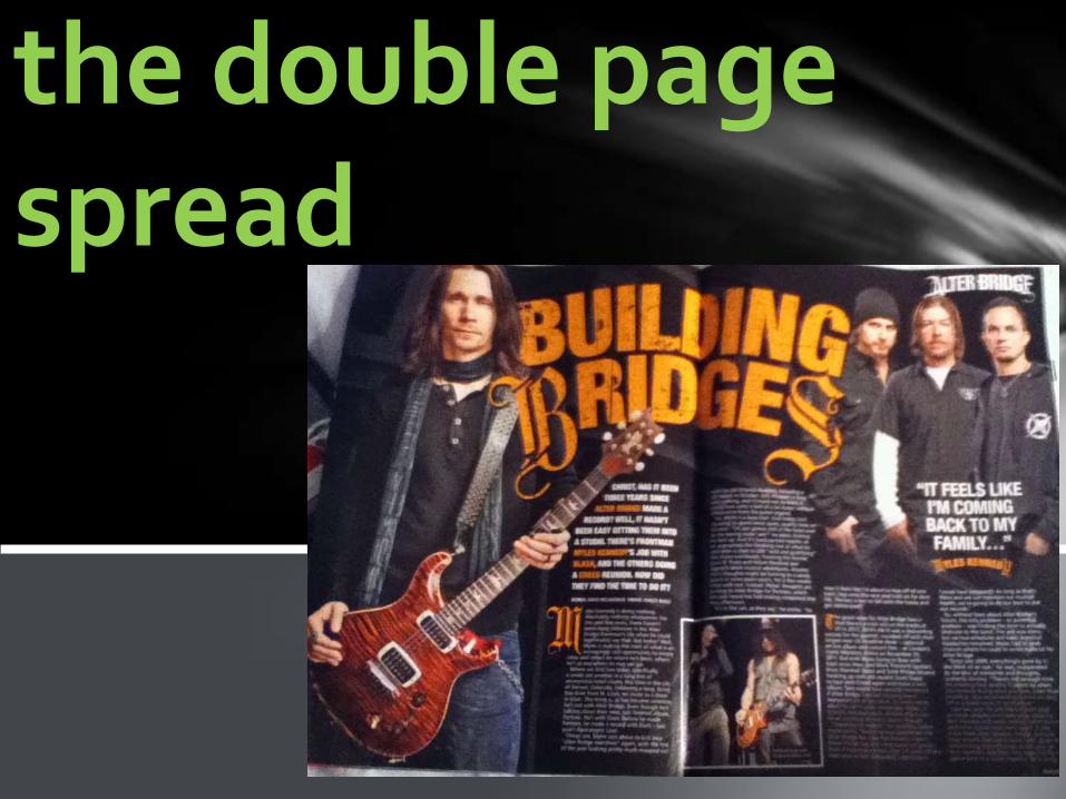
the double page spread
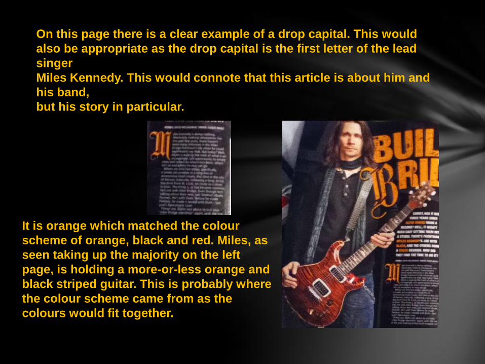
On this page there is a clear example of a drop capital. This would
also be appropriate as the drop capital is the first letter of the lead
singer
Miles Kennedy. This would connote that this article is about him and
his band,
but his story in particular.
It is orange which matched the colour
scheme of orange, black and red. Miles, as
seen taking up the majority on the left
page, is holding a more-or-less orange and
black striped guitar. This is probably where
the colour scheme came from as the
colours would fit together.
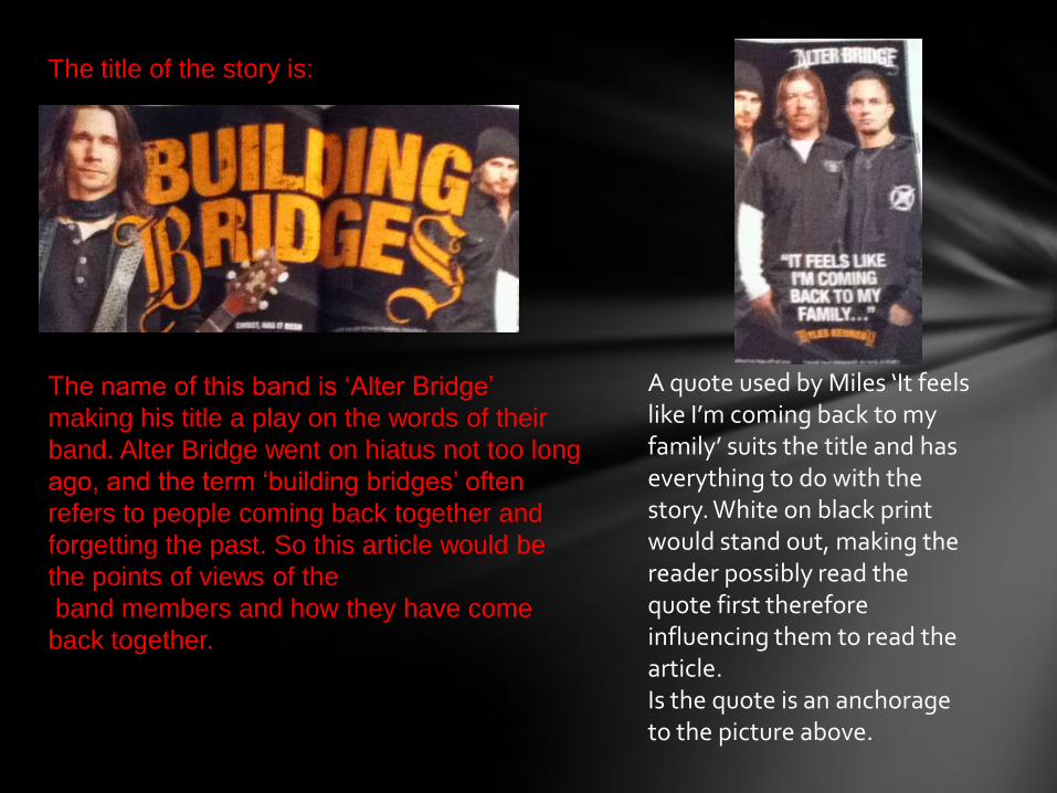
The title of the story is:
The name of this band is ‘Alter Bridge’
making his title a play on the words of their
band. Alter Bridge went on hiatus not too long
ago, and the term ‘building bridges’ often
refers to people coming back together and
forgetting the past. So this article would be
the points of views of the
band members and how they have come
back together.
A quote used by Miles ‘It feels like I’m coming back to my family’ suits the title and has everything to do with the story. White on black print would stand out, making the reader possibly read the quote first therefore influencing them to read the article.Is the quote is an anchorage to the picture above.
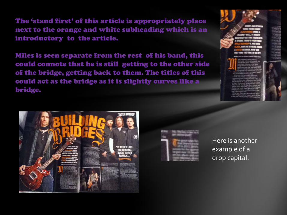
The ‘stand first’ of this article is appropriately place
next to the orange and white subheading which is an
introductory to the article.
Miles is seen separate from the rest of his band, this
could connote that he is still getting to the other side
of the bridge, getting back to them. The titles of this
could act as the bridge as it is slightly curves like a
bridge.
Here is another example of a drop capital.
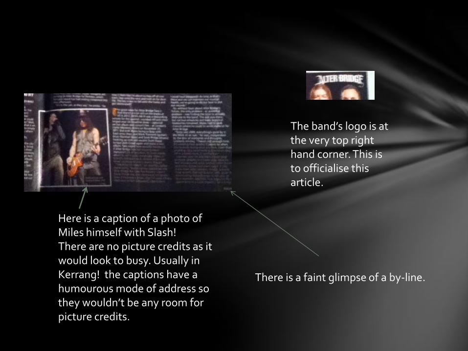
Here is a caption of a photo of Miles himself with Slash!There are no picture credits as it would look to busy. Usually in Kerrang! the captions have a humourous mode of address so they wouldn’t be any room for picture credits.
The band’s logo is at the very top right hand corner. This is to officialise this article.
There is a faint glimpse of a by-line.
By Maddie Williams :D