jacks 6 magazine front covers
TRANSCRIPT
6 magazine front covers
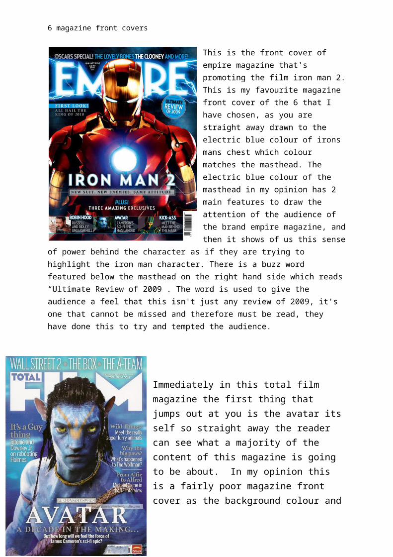
This is the front cover of empire magazine that's promoting the film iron man 2. This is my favourite magazine front cover of the 6 that I have chosen, as you are straight away drawn to the electric blue colour of irons mans chest which colour matches the masthead. The electric blue colour of the masthead in my opinion has 2 main features to draw the attention of the audience of the brand empire magazine, and then it shows of us this sense of power behind the character as if they are trying to highlight the iron man character. There is a buzz word featured below the masthead on the right hand side which reads “Ultimate Review of 2009”. The word is used to give the audience a feel that this isn't just any review of 2009, it's one that cannot be missed and therefore must be read, they have done this to try and
tempted the audience.
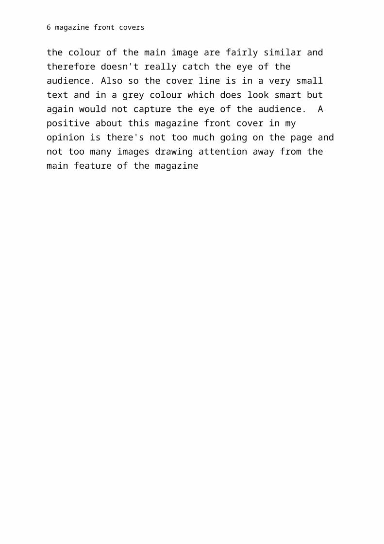
Immediately in this total film magazine the first thing that jumps out at you is the avatar its self so straight away the reader can see what a majority of the content of this magazine is going to be about. In my opinion this is a fairly poor magazine front cover as the background colour and the colour of the main image are fairly similar and therefore doesn't really catch the eye of the audience. Also so the cover line is in a very small text and in a grey colour which does look smart but again would not capture the eye of the audience. A positive about this magazine front cover in my opinion is there's not too much going on the page and not too many images drawing attention away from the main feature of the magazine
6 magazine front covers
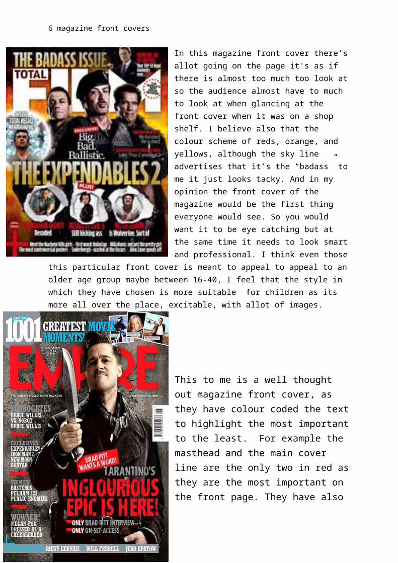
In this magazine front cover there's allot going on the page it's as if there is almost too much too look at so the audience almost have to much to look at when glancing at the front cover when it was on a shop shelf. I believe also that the colour scheme of reds, orange, and yellows, although the sky line advertises that it’s the “badass” to me it just looks tacky. And in my opinion the front cover of the magazine would be the first thing everyone would see. So you would want it to be eye catching but at the same time it needs to look smart and professional. I think even those this particular front cover is meant to appeal to appeal to an older age group maybe between 16-40, I feel that the style in which they have chosen is more suitable for children as its more all over the place, excitable, with allot of images.
This to me is a well thought out magazine front cover, as they have colour coded the text to highlight the most important to the least. For example the masthead and the main cover line are the only two in red as they are the most important on the front page. They have also chosen the red as it contrasts with the grey background to make it stand out. I also like how part of the character is covering a section of the magazine to make the front cover seem more 3d. To me this makes it look more approachable, as it’s as if the audience can reach out and touch Brad Pitt.
6 magazine front covers
This magazine front cover straight away stands out as quite a dark, creepy front cover linking to the character the joker’s personality. They have also linked the colour scheme to the colour scheme of joker physical appearance with the bright green waist coat and the green hair. This magazine front covers in my opinion is quite bare and when they are charging £3.50 for the magazine to make it look very bare on the front cover will make the audience worry about whether or not it is actually worth paying the money for that magazine. That is why I believe you can’t over cram the magazine front cover but you shouldn’t have very little on it. For example having the perfect amount like the one with brad Pitt on and the one with iron man on. These two magazines are the best example of a good magazine front cover as the colour scheme, layout, and content of the front cover have been carefully thought out.
Straight away with this magazine we notice the red, white, and blue shield of captain America. This is good as straight away the audience can sees what the content of this magazine is going to be about. Also with the colour scheme of the text contrasting with the colours of his costume and the shield really assist the text to stand out. Also the layout of the magazine front cover, in my opinion they placed each cover line to fit the figure of his body, the reason they have done this is because as people look at the imaged of captain America they come across these cover lines telling them the content of the magazine. This way the magazine front cover seems to flow when you read it instead of things being placed all over the page and people maybe not getting the chance to read it.