independent sector providers caring for nhs patients/media/confederation/files... · web viewthe...
TRANSCRIPT
Independent sector providers caring for NHS patientsComparative performance indicators
February 2016
Edition 20
New in this edition
In this edition, we have included comparative information about CQC inspection ratings for the first time since the new approach began in April 2015. While the initial figures make interesting reading, we would caution against widespread use just yet as the proportion of independent providers that have been inspected is significantly less than that of other providers.
Updated data
Every table included in this edition has been updated.
All the graphs and charts in this document are derived directly from data provided by independent sources including NHS England, the Health and Social Care Information Centre and the Care Quality Commission. The relevant source, including links, are given by each visualisation.
If organisations wish to refer to specific visualisations contained within this data, we would recommend that the relevant source data, together with the relevant explanatory notes as published in this document, are included in any citations.
For more information about the data underlying the visualisations in this presentation, please contact [email protected]
Page 2 of 51
ContentsIndependent sector providers caring for NHS patients......................................................................................................................................................................................... 1
Comparative performance indicators................................................................................................................................................................................................................ 1
February 2016................................................................................................................................................................................................................................................... 1
Edition 20.......................................................................................................................................................................................................................................................... 1
New in this edition................................................................................................................................................................................................................................................. 2
Independent sector performance.......................................................................................................................................................................................................................... 5
Patient experience................................................................................................................................................................................................................................................. 6
Friends and family test performance..................................................................................................................................................................................................................... 7
Friends and family test – performance of all providers.........................................................................................................................................................................................8
Friends and family test – the top performers........................................................................................................................................................................................................ 9
Friends and family test response rates................................................................................................................................................................................................................ 10
Clinical quality..................................................................................................................................................................................................................................................... 11
CQC ratings since April 2015................................................................................................................................................................................................................................ 12
CQC ratings – overall ratings compared.............................................................................................................................................................................................................. 13
CQC ratings – overall ratings compared.............................................................................................................................................................................................................. 14
Patient outcomes and safety............................................................................................................................................................................................................................... 15
Patient outcomes and safety............................................................................................................................................................................................................................... 16
Patient Reported Outcome Measures (PROMs).................................................................................................................................................................................................. 17
PROMs – primary hip replacement.................................................................................................................................................................................................................. 18
Page 3 of 51
PROMs – primary knee replacement.............................................................................................................................................................................................................. 23
PROMs – groin hernia...................................................................................................................................................................................................................................... 28
Rate of assessment for VTE (blood clots)............................................................................................................................................................................................................ 31
Infection control data.......................................................................................................................................................................................................................................... 32
Efficiency indicators............................................................................................................................................................................................................................................. 33
Referral to treatment times................................................................................................................................................................................................................................. 34
Percentage of patients waiting less than 18 weeks for treatment......................................................................................................................................................................35
Typical waiting times........................................................................................................................................................................................................................................... 36
Average waiting times by specialty...................................................................................................................................................................................................................... 38
Waiting times for 95% of patients....................................................................................................................................................................................................................... 41
Diagnostic waiting times...................................................................................................................................................................................................................................... 43
Numbers of patients treated............................................................................................................................................................................................................................... 45
Numbers of patients treated by independent providers.....................................................................................................................................................................................46
General and acute admissions............................................................................................................................................................................................................................. 47
GP outpatient referrals admissions..................................................................................................................................................................................................................... 48
Elective admissions and GP referrals (2).............................................................................................................................................................................................................. 49
Elective admissions and GP referrals (3).............................................................................................................................................................................................................. 50
Diagnostic tests carried out by independent sector by modality........................................................................................................................................................................51
Page 4 of 51
Independent sector performance
The NHS Partners Network is the trade association representing the widest range of independent sector providers of NHS clinical services ranging through acute, diagnostic, primary and community care, as well as dental services. Our members are drawn from both the “for profit” and “not for profit” sectors and include large international hospital groups and small specialist providers. All are committed to working in partnership with the NHS and to the values set out in the NHS Constitution.
This document gives an overview of the performance of independent sector providers of care to NHS patients. It focuses on care sectors represented by NHSPN members and the indicators available cover five broad domains of quality:
Patient experience Clinical quality Patient outcomes and safety Efficiency indicators The contribution of the sector shown by numbers of patients treated
All the visualisations shown in this document are based on publicly available data published by organisations such as NHS England, Public Health England, the Health and Social Care Information Centre and the Care Quality Commission.
Not all data collected for traditional NHS organisations and independent sector providers can be compared easily. Historic differences in the way NHS and independent sector providers have been regulated have often required independent providers to collect different information from their NHS counterparts. As the range of information is increasingly harmonised, we hope to be able to produce more comparative information published by third parties such as the organisations listed above.
Page 5 of 51
Patient experience
Page 6 of 51
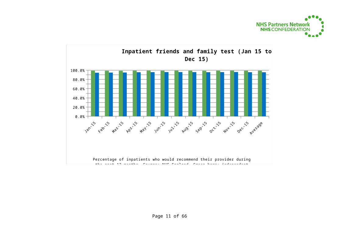
Friends and family test performanceThe Government’s preferred measure of patient satisfaction, the Friends and Family Test (FFT), applies equally to traditional NHS and the independent sector. Collected monthly since April 2013, around 99% of patients would be ‘extremely likely’ or ‘likely’ to recommend independent providers compared with a national average of around 95%. At present, acute inpatient care is the only area where the FFT is collected by both independent and NHS providers however NHS England is in the process of rolling out the FFT across all NHS care. Since April, the data shown below includes results from day case patients.
Jan-15 Feb-15 Mar-15 Apr-15 May-15 Jun-15 Jul-15 Aug-15 Sep-15 Oct-15 Nov-15 Dec-15 Average0.0%
10.0%
20.0%
30.0%
40.0%
50.0%
60.0%
70.0%
80.0%
90.0%
100.0%
Inpatient friends and family test (Jan 15 to Dec 15)
Percentage of inpatients who would recommend their provider during the past 12 months. Source: NHS England. Green bars: independent providers and blue bars: Av of all providers to NHS patients
Page 7 of 51
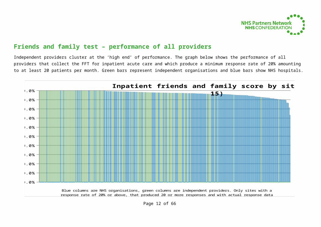
Friends and family test – performance of all providersIndependent providers cluster at the ‘high end’ of performance. The graph below shows the performance of all providers that collect the FFT for inpatient acute care and which produce a minimum response rate of 20% amounting to at least 20 patients per month. Green bars represent independent organisations and blue bars show NHS hospitals.
0.0%
10.0%
20.0%
30.0%
40.0%
50.0%
60.0%
70.0%
80.0%
90.0%
100.0%Inpatient friends and family score by site (Dec 15)
Blue columns are NHS organisations, green columns are independent providers. Only sites with a response rate of 20% or above, that produced 20 or more responses and with actual response data are shown. Source: NHS Eng
Page 8 of 51
Friends and family test – the top performersThe graph below shows all those hospitals that scored a 100% recommendation rate (extremely likely and likely to recommend) as measured by patients in their response to the FFT for acute inpatient care. Within this group, organisations are ordered on the basis of those with the highest proportion of patients ‘extremely likely’ to recommend their providers (highest on left, lowest on right). NB some providers with an overall percentage recommendation rate below 100% may have achieved higher rates of patients ‘extremely likely’ to recommend them than those shown on this graph.
BMI -
The
Chilter
n H
ospita
l - N
T410
Nu
ffiel
d Hea
lth, B
righto
n Hosp
ital -
NT2
05
Renac
res
Hospit
al -
NV
C16
The
York
shire
Clin
ic -
NV
C20
BMI
- The
Kin
gs O
ak H
ospita
l - N
T421
Nu
ffiel
d Hea
lth, T
ees
Hosp
ital -
NT2
37
Clifton
Par
k Hosp
ital -
NVC
28
Duchy
Hospit
al -
NV
C04
Prob
us Su
rgic
al C
entre
NAM
01
Nuffi
eld H
ealth
, Tun
bridge
Wel
ls H
osp
ital
- N
T239
Ashte
ad H
osp
ital -
NVC0
1
Horto
n N
HS Tr
eatm
ent
Centre
- N
VC25
BMI
The
Linco
ln H
osp
ital -
NT4
50
Mo
orfiel
ds at
Dar
ent V
alle
y Hosp
ital
- RP6
27
Bost
on N
HS Tr
eatm
ent C
entre
- N
VC27
Robert J
ones a
nd A
gnes
Hu
nt Orth
opaedic
Hosp
ital -
RL1
31
Blake
land
s N
HS Tr
eatm
ent C
entr
e - N
VC31
Nu
ffiel
d Hea
lth, W
oki
ng Hosp
ital
- N
T24
1
BMI -
The
South
Ches
hire
Priv
ate
Hospit
al -
NT4
39
Park
Hill
Hosp
ital
- N
VC14
BMI
- The
Hig
hfield H
osp
ital
- N
T42
0
BMI
- The
Par
k Ho
spita
l - N
T427
BMI -
The
Ridge
way
Ho
spita
l - N
T430
BMI -
The
Win
terb
ourne
Hospit
al -
NT4
43
The
Esse
x C
ardio
tho
raci
c Cen
tre -
RDD
H8
Kidder
min
ster
Hosp
ital -
RW
P31
Mo
orfiel
ds At N
orthw
ick
Par
k H
ospita
l - R
P606
Spire
Par
kway
Hosp
ital -
NT3
20
Fosc
ote H
ospita
l (Ban
bury
) - A
HH0
1
BMI -
The
Hampsh
ire
Clinic
- N
T418
BMI
- Shirl
ey O
aks
Hosp
ital -
NT4
36
Univ
ersi
ty O
f Bri
stol
Denta
l Hosp
ital -
RA
709
Nu
ffiel
d Hea
lth, B
risto
l Hosp
ital (
Ches
terfi
eld)
- NT2
06
BMI -
The
Sandrin
gham
Ho
spita
l - N
T43
2
Qu
een E
liza
beth I
I Ho
spita
l - R
WH2
0
Mo
orfiel
ds At M
ile
End H
osp
ital -
RP60
7
Spire
Rod
ing
Hosp
ital
- N
T31
4
Spire
Duned
in H
ospita
l - N
T344
BMI T
he Ed
gbas
ton H
osp
ital
- N
T44
5
Spire
Ports
mou
th H
ospi t
al -
NT3
05
Man
sfiel
d Co
mm
unity
Hosp
ital -
RK5
BL
0%20%40%60%80%
100%
Inpatient friends and family score by site (Dec 15)_x000d_Organisations with overall 100% recommendation rate,
ranked by % extremely likely to recommend
Blue columns represent NHS orgs and green columns show independent providers. Shows only sites with response rate of 20% or above, with 20 or more responses and a 100% recommendation rate. Ranking by
percentage of patients 'extremely likely' to recommend.
Page 9 of 51
Friends and family test response ratesResponse rates to the FFT are used by the CQC to measure NHS Trusts’ reporting culture. On average independent providers manage response rates of above 40% compared with an England average of below 30%.
Jan-15 Feb-15 Mar-15 Apr-15 May-15 Jun-15 Jul-15 Aug-15 Sep-15 Oct-15 Nov-15 Dec-15 Average0.0%
5.0%
10.0%
15.0%
20.0%
25.0%
30.0%
35.0%
40.0%
45.0%
50.0%
Inpatient friends and family test response rates (Jan 15 to Dec 15)
Friends and Family Test inpatient response rates for the past 12 months. Green bars show independent providers and blue bars represents average for all organisations treating NHS patients. Source: NHS England
The data that underpins all the FFT graphs above is available at: http://www.england.nhs.uk/statistics/statistical-work-areas/friends-and-family-test/friends-and-family-test-data/
Page 10 of 51
Clinical quality
Page 11 of 51
CQC ratings since April 2015In April 2015, the CQC began to introduce a new approach to regulating providers of healthcare.
The graphs that follow show how independent healthcare organisations compare to NHS healthcare organisations, using the CQC’s data and definitions 1.
Although the CQC began inspecting NHS organisations during 2014-15, it is still rolling out its inspections of independent providers under the new system. Consequently, a smaller proportion of independent providers have been rated compared to NHS organisations under the new system. We have therefore provided this information to members for information but would caution against using this more widely until more ratings are available.
It is possible to cut the data by service type and population group served, e.g. to examine diagnostic services or surgery. In time we plan to show data for these services, but at present there is insufficient comparative data available.
Figures for overall ratings:
Organisation type Rating Inadequate
Requires improvemen
t Good Outstanding TotalIndependent Healthcare Org Overall 3 17 67 10 97NHS Healthcare Organisation Overall 17 120 77 3 217
1 http://www.cqc.org.uk/content/how-get-and-re-use-cqc-information-and-dataPage 12 of 51
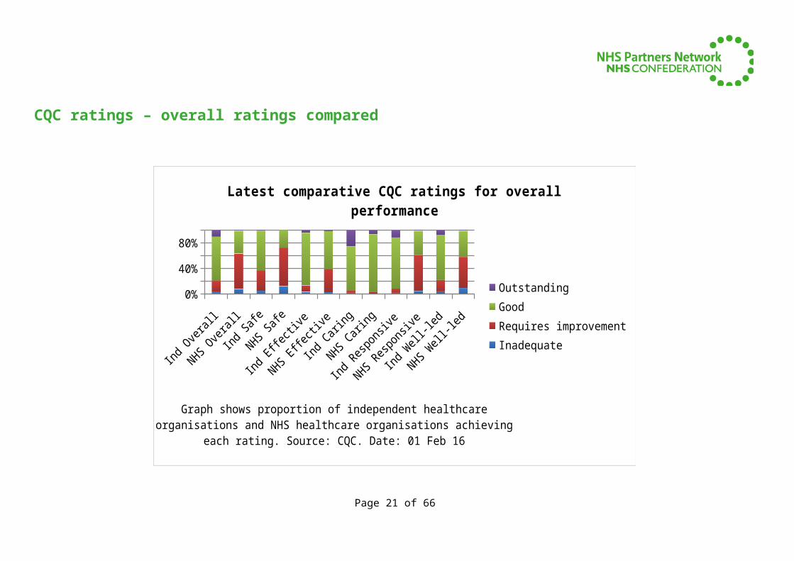
CQC ratings – overall ratings compared
Inadequate Requires improvement Good Outstanding0.0%
10.0%
20.0%
30.0%
40.0%
50.0%
60.0%
70.0%
80.0%
Latest comparative CQC ratings for overall performance
Graph shows proportion of independent healthcare organisations (green) and NHS healthcare organisations (blue) achieving each rating. Source: CQC. Date: 01 Feb 16
Page 13 of 51
CQC ratings – overall ratings compared
Ind Overall
NHS Over
all
Ind Safe
NHS Safe
Ind Effecti
ve
NHS Effecti
ve
Ind Caring
NHS Cari
ng
Ind Responsiv
e
NHS Resp
onsive
Ind Well-
led
NHS Well-
led
0%10%20%30%40%50%60%70%80%90%
100%
Latest comparative CQC ratings for overall performance
OutstandingGoodRequires improvementInadequate
Graph shows proportion of independent healthcare organisations and NHS healthcare organisations achieving each rating. Source: CQC. Date: 01 Feb 16
Page 14 of 51
Patient outcomes and safety
Page 15 of 51
Patient outcomes and safety
Indicators that relate to outcomes and safety for which it is reasonable to make comparisons between independent sector organisations and their NHS counterparts include:
Patient Reported Outcome Measures (PROMs); and Rate of assessment for VTE (blood clots)
Infection control information is also an important indicator. Because Public Health England analyses information collected for the independent sector and the NHS organisations on a different basis, its view is that like-for-like comparison should not be made. For completeness, we have published rates for independent sector providers in the pages that follow. These show that independent providers have very low rates of healthcare-acquired infections.
Page 16 of 51
Patient Reported Outcome Measures (PROMs)Patient Reported Outcome Measures (PROMs) are collected by the Health and Social Care Information Centre for a range of elective procedures: hip and knee replacements, groin hernias and varicose vein treatment.
The Health and Social Care Information Centre (HSCIC) publishes casemix-adjusted health gain by provider each quarter. The graphs that follow are based on the most recently available 12-month period (April 2014 to March 2015, provisional data – released February 2015).
PROMs data is not published for all organisations that submit completed PROMs questionnaires. The HSCIC collects data from every organisation that offers these types of surgery as it is a national requirement that all organisations should offer PROMs questionnaires to patients eligible to participate. However, it is voluntary for patients to complete these forms and the HSCIC only publishes adjusted data for organisations that have a representative number of completed records.
The pages that follow use funnel plot data from http://www.hscic.gov.uk/catalogue/PUB19823 for two different types of PROMs scores for primary knee and hip replacements. These graphs show adjusted health gain. The original source files provided by the HSCIC should be used to identify positive and negative statistical outliers.
The Oxford Scores focus on joint function and pain and include questions about patients’ mobility and factors such as ability to navigate stairs and use transport specifically affected by the hip or knee. More information about these measures is available at http://www.isis-innovation.com/outcomes/orthopaedic/. The EQ-5DTM score, developed by the EuroQol Group, is a standardised instrument for use as a measure of health outcome and has a broader base than the Oxford scores. Its questions relate to mobility, self-care, usual life activities, pain/discomfort and anxiety/depression. More information about the EQ-5D is available at http://www.euroqol.org. The Health and Social Care Information Centre also provides an informative guide to PROMs methodology used by the Centre, available at http://www.hscic.gov.uk/article/3843/Background-information-about-PROMs.
Page 17 of 51
PROMs – primary hip replacement
The tables below show average adjusted health gain on PROMs reported by the Health and Social Care Information for independent providers compared to the national average.
Independent providers England average21.200
21.300
21.400
21.500
21.600
21.700
21.800
Oxford hip score – average health gain
Average adjusted health gain on PROMs reported by the Health and Social Care Information Cen-tre. Green line shows patient-weighted average for independent providers for which HSCIC pub-
lishes a value. Blue line shows England average.
Independent providers England average0.425
0.430
0.435
0.440
0.445
0.450
0.455
0.460
Hip replacement EQ 5D – average health gain
Average adjusted health gain on PROMs reported by the Health and Social Care Information Cen-tre. Green line shows patient-weighted average for independent providers for which HSCIC pub-
lishes a value. Blue line shows England average.
Page 18 of 51
0
5
10
15
20
25
PROMs adjusted average health gain primary hip replace-ment_x000d_Oxford Hip Score Apr 2014 to Mar 2015
Graph shows average adjusted health gain on Patient Reported Outcome Measures (PROMs) reported by the Health and Social Care Information Centre.
Green lines relate to independent providers and blue bars treated by NHS organisations
Page 19 of 51
ST H
UGH'S H
OSPIT
AL
SHEP
TON
MALL
ET N
HS TR
EATM
ENT
CENTR
E
BMI -
THREE
SHIR
ES H
OSP
ITAL
CIRCLE
BATH
HO
SPIT
AL
NUFFIE
LD H
EALT
H, NO
RTH S
TAFF
ORDSHIR
E HOSP
ITAL
WES
T MID
LAN
DS HO
SPIT
AL
SPIR
E CLA
RE PARK H
OSPIT
AL
SPRIN
GFIEL
D HO
SPIT
AL
WIN
FIEL
D HOSP
ITAL
BMI -
THE
SOUTH
CHES
HIRE
PRIVATE
HO
SPIT
AL
NORTH
DO
WN
S HO
SPIT
AL
THE
HORDER
CEN
TRE
- ST
JOHN
S RO
AD
NUFFIE
LD H
EALT
H, WOLV
ERHAM
PTON
HOSP
ITAL
UNIV
ERSI
TY C
OLL
EGE L
ONDO
N H
OSPIT
ALS N
HS FO
UNDATIO
N T
RUST
NEW H
ALL H
OSP
ITAL
NUFFIE
LD H
EALT
H, IPSW
ICH H
OSP
ITAL
ROYA
L DEV
ON A
ND EXET
ER N
HS FO
UNDATI
ON
TRUST
EMER
SON
S GREE
N NHS
TREA
TMEN
T CEN
TRE
SPIR
E LE
ICES
TER H
OSP
ITAL
BMI -
THE
CHILTE
RN H
OSP
ITAL
BMI T
HE CAVEL
L HO
SPIT
AL
NORTH
AMPTO
N G
ENER
AL HO
SPITA
L N
HS TR
UST
MED
WAY
NHS
FOUN
DATIO
N T
RUST
BMI T
HE ED
GBASTO
N H
OSP
ITAL
SPIR
E SU
SSEX
HO
SPIT
AL
YORK T
EACHIN
G HO
SPIT
AL N
HS FO
UNDATIO
N TRUST
SALF
ORD R
OYAL
NHS
FOUN
DATION
TRUST
BOLT
ON
NHS
FOUN
DATIO
N T
RUST
BMI -
BATH
CLI
NIC
BMI -
THE
SHEL
BURNE H
OSP
ITAL
IMPER
IAL
COLL
EGE
HEALT
HCARE NHS
TRUST
PENIN
SULA
NHS
TREA
TMEN
T CEN
TRE
MAID
STO
NE
AND TUN
BRIDGE W
ELLS
NHS
TRUST
DORSE
T COUN
TY H
OSP
ITAL
NHS FO
UNDATI
ON
TRUST
STO
CKPORT N
HS FO
UNDATI
ON
TRUST
EAST
SUSS
EX H
EALT
HCARE N
HS TR
UST
ASPEN
- CLA
REMO
NT
HOSPITA
L
SPIR
E CAM
BRIDGE
LEA H
OSP
ITAL
SPIR
E LI
VERPO
OL
HOSP
ITAL
BMI -
THE
RIDGEW
AY HO
SPIT
AL
THE
ROYA
L ORTH
OPAED
IC H
OSP
ITAL N
HS FO
UNDATI
ON
TRUST
WYE
VALL
EY N
HS TR
UST
ROYA
L BER
KSHIR
E N
HS FO
UNDATI
ON
TRUST
TAUN
TON
AND S
OM
ERSE
T N
HS FO
UNDATIO
N T
RUST
SPIR
E N
ORW
ICH H
OSP
ITAL
NUFF
IELD
HOSP
ITAL
OXFO
RD
BMI -
THE
BEARDW
OOD H
OSP
ITAL
SPIR
E W
ASHIN
GTON
HO
SPIT
AL
THE
ROTH
ERHAM
NHS F
OUNDATI
ON T
RUST
BMI G
ISBURNE
PARK HO
SPIT
AL 05
10152025
PROMs adjusted average health gain primary hip replacement_x000d_Oxford Hip Score Apr 2014 to Mar 2015 (top 50
providers)
Graph shows average adjusted health gain on Patient Reported Outcome Measures (PROMs) reported by the Health and Social Care Information Centre.
Green lines relate to independent providers and blue bars treated by NHS organisations
Page 20 of 51
00.05
0.10.15
0.20.25
0.30.35
0.40.45
0.50.55
PROMs adjusted average health gain – primary hip re-placement_x000d_EQ-5D Score Apr 2014 to Mar 2015
Graph shows average adjusted health gain on Patient Reported Outcome Measures (PROMs) reported by the Health and Social Care Information Centre.
Green lines relate to independent providers and blue bars treated by NHS organisations
Page 21 of 51
SPIR
E CLA
RE PARK H
OSP
ITAL
ST H
UGH'S H
OSP
ITAL
BMI -
THREE
SHIR
ES H
OSP
ITAL
BMI -
THE
SHEL
BURNE
HOSP
ITAL
NUFFIEL
D HO
SPIT
AL O
XFORD
BMI T
HE CAVEL
L HO
SPIT
AL
SHEP
TON
MALL
ET N
HS TR
EATM
ENT
CENTR
E
WYE
VALL
EY N
HS TR
UST
RIVER
S HO
SPIT
AL
SPRIN
GFIEL
D HOSP
ITAL
NEW
HALL
HO
SPIT
AL
CIRCLE
BATH
HO
SPIT
AL
BMI T
HE ED
GBASTO
N H
OSP
ITAL
ROYA
L DEV
ON
AN
D EXET
ER N
HS FO
UNDATI
ON T
RUST
NUFFIEL
D HEA
LTH, I
PSWIC
H HO
SPIT
AL
NUFF
IELD
HEA
LTH, W
OLV
ERHAM
PTON
HO
SPIT
AL
SPIR
E HULL
AN
D EAST
RID
ING H
OSP
ITAL
NUFF
IELD
HEA
LTH, N
ORTH
STA
FFO
RDSHIR
E HO
SPIT
AL
NUFF
IELD
HEA
LTH, W
ESSE
X HO
SPIT
AL
NUFF
IELD
HEA
LTH, H
EREF
ORD H
OSP
ITAL
NO
RTHAM
PTON
GEN
ERAL
HOSP
ITAL
NHS
TRUST
THE
HORDER
CEN
TRE
- ST
JOHN
S RO
AD
ASPEN
- CLA
REMO
NT
HOSP
ITAL
STO
CKPORT
NHS
FOUN
DATIO
N T
RUST
SPIR
E ALE
XANDRA H
OSPIT
AL
BMI -
THO
RNBURY
HOSP
ITAL
SPIR
E CHES
HIRE
HOSP
ITAL
BMI -
THE
CHILTE
RN H
OSP
ITAL
DORSE
T CO
UNTY
HO
SPIT
AL N
HS FO
UNDATI
ON
TRUST
PENIN
SULA
NHS
TREA
TMEN
T CEN
TRE
ROYA
L SU
RREY C
OUN
TY H
OSP
ITAL
NHS F
OUN
DATION
TRUST
TAUN
TON
AN
D SO
MER
SET
NHS
FOUN
DATIO
N T
RUST
WES
T M
IDLA
NDS
HOSP
ITAL
MAID
STO
NE
AND TU
NBRID
GE W
ELLS
NHS T
RUST
SPIR
E PO
RTSM
OUTH
HO
SPIT
AL
SPIR
E W
ASHIN
GTON
HO
SPIT
AL
NORTH
DO
WN
S HO
SPIT
AL
BMI -
BATH
CLI
NIC
BMI -
THE
SAXO
N C
LIN
IC
EMER
SON
S GREE
N NHS
TREA
TMEN
T CEN
TRE
BMI -
THE
SAN
DRINGHAM
HO
SPIT
AL
ROYA
L BER
KSHIR
E N
HS FO
UNDATIO
N T
RUST
SPIR
E SU
SSEX
HO
SPIT
AL
YEO
VIL D
ISTR
ICT
HOSP
ITAL
NHS
FOUN
DATIO
N T
RUST
BMI -
THE
SOUTH
CHES
HIRE
PRIVATE
HO
SPIT
AL
WO
RCESTE
RSHIR
E ACUTE
HO
SPIT
ALS N
HS TRUST
SPIR
E LIT
TLE
ASTO
N H
OSP
ITAL
SPIR
E W
ELLE
SLEY
HO
SPIT
AL
MED
WAY
NHS
FOUN
DATIO
N T
RUST
FRIM
LEY
HEALT
H NHS
FOUN
DATIO
N T
RUST 0
0.150.3
0.45
PROMs adjusted average health gain – primary hip replace-ment_x000d_EQ-5D Score Apr 2014 to Mar 2015 top 50
providers
Graph shows average adjusted health gain on Patient Reported Outcome Measures (PROMs) reported by the Health and Social Care Information Centre.
Green lines relate to independent providers and blue bars treated by NHS organisations
Page 22 of 51
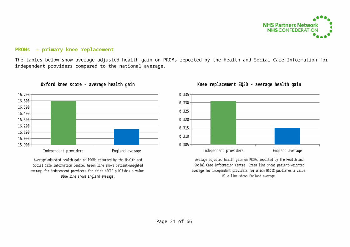
PROMs – primary knee replacement
The tables below show average adjusted health gain on PROMs reported by the Health and Social Care Information for independent providers compared to the national average.
Independent providers England average15.900
16.000
16.100
16.200
16.300
16.400
16.500
16.600
16.700
Oxford knee score – average health gain
Average adjusted health gain on PROMs reported by the Health and Social Care Information Cen-tre. Green line shows patient-weighted average for independent providers for which HSCIC pub-
lishes a value. Blue line shows England average.
Independent providers England average0.305
0.310
0.315
0.320
0.325
0.330
0.335
Knee replacement EQ5D – average health gain
Average adjusted health gain on PROMs reported by the Health and Social Care Information Cen-tre. Green line shows patient-weighted average for independent providers for which HSCIC pub-
lishes a value. Blue line shows England average.
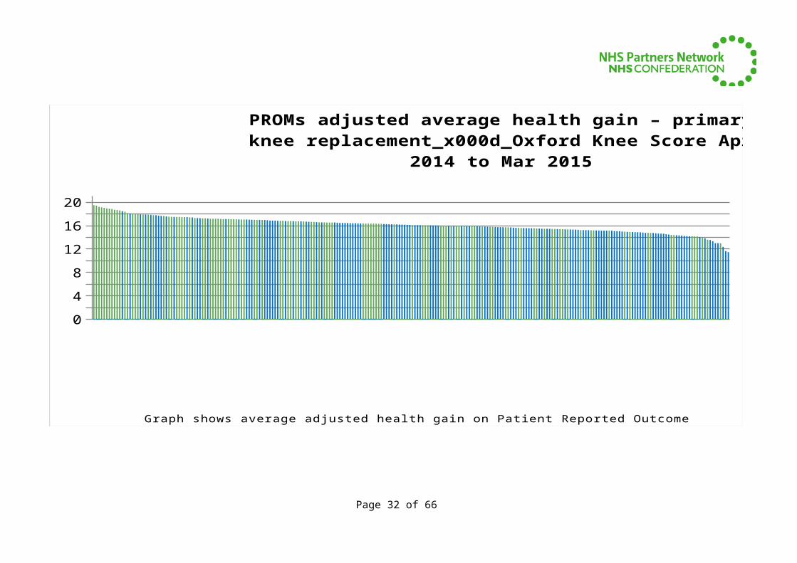
Page 23 of 51
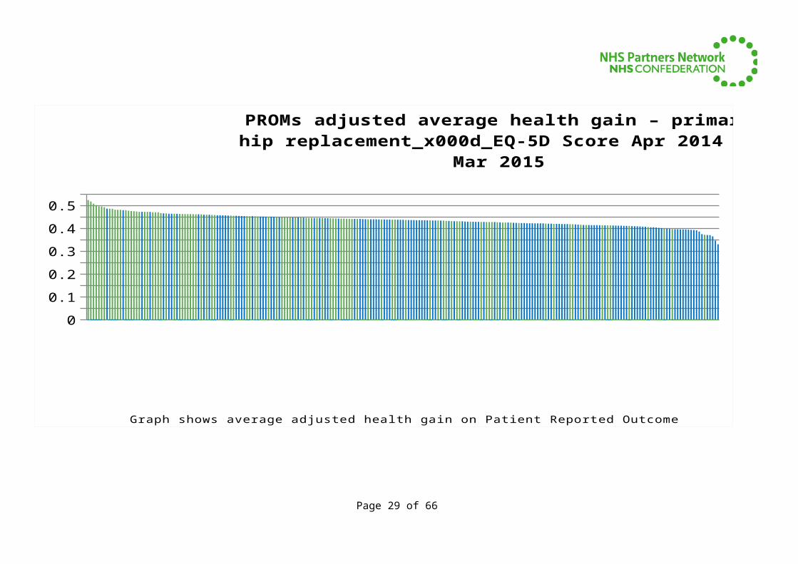
02468
101214161820
PROMs adjusted average health gain – primary knee re-placement_x000d_Oxford Knee Score Apr 2014 to Mar 2015
Graph shows average adjusted health gain on Patient Reported Outcome Measures (PROMs) reported by the Health and Social Care Information Centre.
Green lines relate to independent providers and blue bars treated by NHS organisations
Page 24 of 51
BMI -
THE
SOM
ERFI
ELD H
OSP
ITAL
BMI G
ISBURN
E PARK H
OSP
ITAL
NUFF
IELD
HEA
LTH, H
EREF
ORD H
OSP
ITAL
SHEP
TON
MALL
ET N
HS TR
EATM
ENT
CENTR
E
BENEN
DEN H
OSP
ITAL
SPIR
E EL
LAN
D HO
SPIT
AL
BMI -
THE
PARK HO
SPIT
AL
SPIR
E PO
RTSM
OUTH
HO
SPIT
AL
NUFF
IELD
HEA
LTH, C
AMBRID
GE HO
SPIT
AL
SPIR
E M
ON
TEFI
ORE
HOSP
ITAL
BMI -
THO
RNBURY
HOSP
ITAL
IPSW
ICH H
OSP
ITAL
NHS
TRUST
BMI W
OO
DLAN
DS HO
SPIT
AL
DUCHY HO
SPIT
AL
MIL
TON
KEY
NES
UN
IVER
SITY
HOSP
ITAL
NHS
FOUN
DATIO
N T
RUST
NUFF
IELD
HEA
LTH, T
EES
HOSP
ITAL
BMI -
BATH
CLI
NIC
SPIR
E BRIS
TOL
HOSP
ITAL
EAST
CHES
HIRE
NHS
TRUST
WO
ODLA
ND H
OSP
ITAL
ROYA
L DEV
ON
AN
D EXET
ER N
HS FO
UNDATI
ON
TRUST
RIVER
S HO
SPIT
AL
NO
RTHER
N D
EVO
N H
EALT
HCARE N
HS TR
UST
NUFF
IELD
HEA
LTH, E
XETER
HO
SPIT
AL
NORTH
AMPTO
N G
ENER
AL HO
SPIT
AL N
HS TR
UST
EAST
LAN
CASHIR
E HO
SPITA
LS N
HS TR
UST
ROYA
L UN
ITED
HO
SPIT
ALS B
ATH N
HS FO
UNDATI
ON
TRUST
CIRCLE
BATH
HO
SPIT
AL
STO
CKPORT
NHS
FOUN
DATIO
N T
RUST
BMI -
FAW
KHAM M
ANO
R HO
SPIT
AL
SPIR
E WEL
LESL
EY H
OSP
ITAL
WARRIN
GTON
AND H
ALTO
N H
OSP
ITALS
NHS
FOUN
DATIO
N T
RUST
BMI -
THE
DROIT
WIC
H SPA H
OSPIT
AL
BMI -
THE
ALEXAN
DRA HO
SPIT
AL
BMI T
HE ED
GBASTO
N H
OSP
ITAL
SPIR
E CLA
RE PARK H
OSP
ITAL
KETTE
RING G
ENER
AL HO
SPIT
AL N
HS FO
UNDATI
ON
TRUST
NUFF
IELD
HEA
LTH, I
PSWIC
H HO
SPIT
AL
TAUN
TON
AN
D SO
MER
SET
NHS
FOUN
DATIO
N T
RUST
NUFF
IELD
HEA
LTH, T
AUNTO
N HO
SPIT
AL
SOUTH
TEES
HO
SPIT
ALS N
HS FO
UNDATIO
N T
RUST
ROYA
L CO
RNW
ALL H
OSP
ITALS
NHS
TRUST
BMI -
THE
BEARDW
OO
D HO
SPIT
AL
SPIR
E CHES
HIRE
HOSP
ITAL
COLC
HESTE
R HO
SPIT
AL UN
IVER
SITY
NHS
FOUN
DATIO
N T
RUST
SPIR
E HARPEN
DEN H
OSP
ITAL
NUFFIE
LD H
EALT
H, BREN
TWO
OD H
OSP
ITAL
SPIR
E LEI
CESTE
R HO
SPIT
AL
BMI -
THE
RIDGEW
AY HO
SPIT
AL
THE
HORDER
CEN
TRE
- ST
JOHN
S RO
AD 06
1218
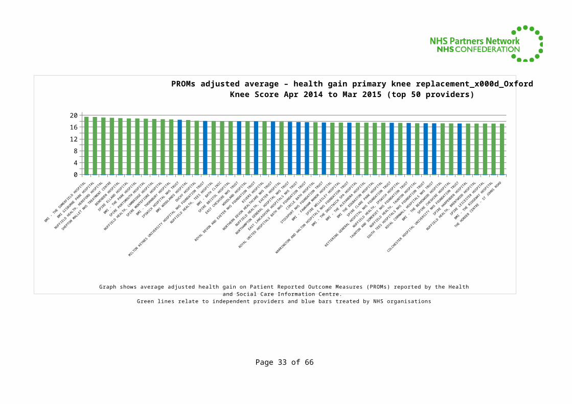
PROMs adjusted average – health gain primary knee replacement_x000d_Oxford Knee Score Apr 2014 to Mar 2015 (top 50
providers)
Graph shows average adjusted health gain on Patient Reported Outcome Measures (PROMs) reported by the Health and Social Care Information Centre.
Green lines relate to independent providers and blue bars treated by NHS organisations
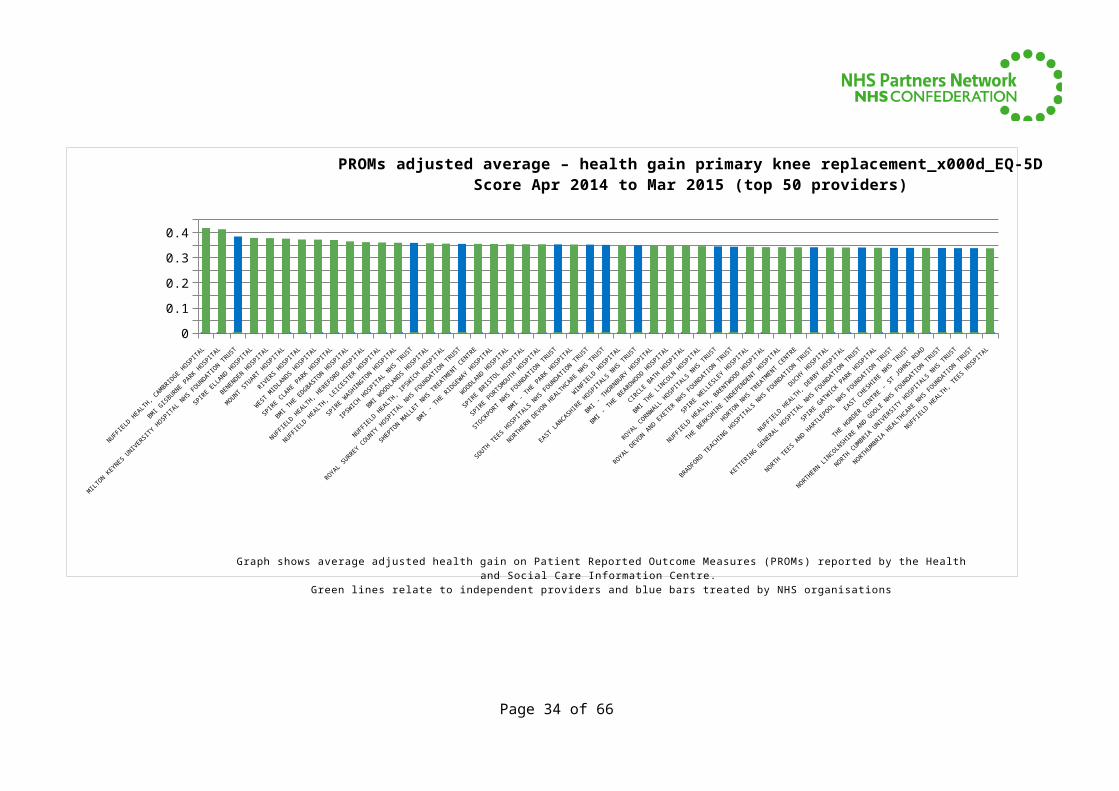
Page 25 of 51
0
0.05
0.1
0.15
0.2
0.25
0.3
0.35
0.4
0.45
PROMs adjusted average health gain – primary knee replacement_x000d_EQ-5D Score Apr 2014 to Mar 2015
Graph shows average adjusted health gain on Patient Reported Outcome Measures (PROMs) reported by the Health and Social Care Information Centre.
Green lines relate to independent providers and blue bars treated by NHS organisations
Page 26 of 51
NUFFIEL
D HEA
LTH, C
AMBRID
GE HO
SPIT
AL
MIL
TON
KEY
NES
UN
IVER
SITY
HO
SPIT
AL N
HS FO
UNDATI
ON
TRUST
BENEN
DEN H
OSP
ITAL
RIVER
S HO
SPIT
AL
SPIR
E CLA
RE PARK H
OSP
ITAL
NUFF
IELD
HEA
LTH, H
EREF
ORD H
OSP
ITAL
SPIR
E W
ASHIN
GTON
HO
SPIT
AL
BMI W
OODLA
NDS
HOSP
ITAL
ROYA
L SU
RREY C
OUN
TY H
OSP
ITAL
NHS
FOUN
DATIO
N T
RUST
BMI -
THE
RIDGEW
AY HO
SPIT
AL
SPIR
E BRIST
OL
HOSP
ITAL
STO
CKPORT
NHS
FOUNDATI
ON
TRUST
SOUTH
TEES
HO
SPIT
ALS N
HS FO
UNDATI
ON
TRUST
WIN
FIEL
D HO
SPIT
AL
BMI -
THO
RNBURY
HOSP
ITAL
CIRCLE
BATH
HO
SPIT
AL
ROYA
L CO
RNWALL
HO
SPIT
ALS N
HS TR
UST
SPIR
E W
ELLE
SLEY
HO
SPIT
AL
THE
BERKSH
IRE
INDEP
ENDEN
T HO
SPIT
AL
BRADFORD T
EACHIN
G HO
SPIT
ALS N
HS FO
UNDATI
ON
TRUST
NUFF
IELD
HEA
LTH, D
ERBY
HOSP
ITAL
SPIR
E GATW
ICK P
ARK HO
SPIT
AL
EAST
CHES
HIRE
NHS
TRUST
NO
RTHER
N L
INCO
LNSH
IRE
AND G
OO
LE N
HS FO
UNDATI
ON T
RUST
NO
RTHUM
BRIA H
EALT
HCARE N
HS FO
UNDATI
ON T
RUST
00.10.20.30.4
PROMs adjusted average – health gain primary knee replace-ment_x000d_EQ-5D Score Apr 2014 to Mar 2015 (top 50
providers)
Graph shows average adjusted health gain on Patient Reported Outcome Measures (PROMs) reported by the Health and Social Care Information Centre.
Green lines relate to independent providers and blue bars treated by NHS organisations
Page 27 of 51
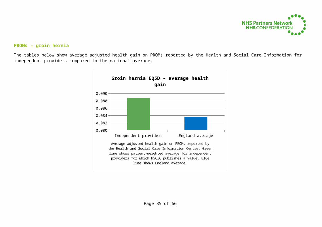
PROMs – groin hernia
The tables below show average adjusted health gain on PROMs reported by the Health and Social Care Information for independent providers compared to the national average.
Independent providers England average0.081
0.082
0.083
0.084
0.085
0.086
0.087
0.088
0.089
0.090
Groin hernia EQ5D – average health gain
Average adjusted health gain on PROMs reported by the Health and Social Care Information Cen-tre. Green line shows patient-weighted average for independent providers for which HSCIC pub-
lishes a value. Blue line shows England average.
Page 28 of 51
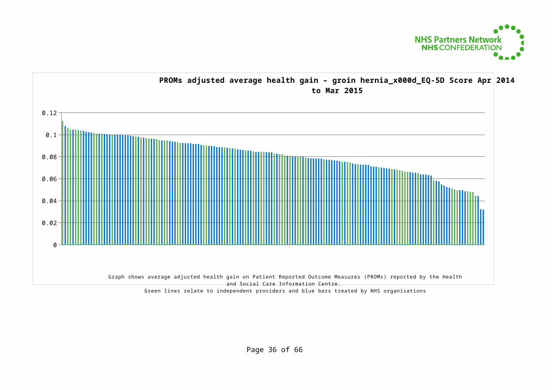
0
0.02
0.04
0.06
0.08
0.1
0.12
PROMs adjusted average health gain – groin hernia_x000d_EQ-5D Score Apr 2014 to Mar 2015
Graph shows average adjusted health gain on Patient Reported Outcome Measures (PROMs) reported by the Health and Social Care Information Centre.
Green lines relate to independent providers and blue bars treated by NHS organisations
Page 29 of 51

NUFF
IELD
HEA
LTH, T
AUNTO
N HO
SPIT
AL
WYE
VALL
EY N
HS TR
UST
THE
YORKSH
IRE
CLINIC
OAKLA
NDS
HOSP
ITAL
PLYM
OUTH
HO
SPIT
ALS N
HS TR
UST
SPIR
E M
URRAYFIE
LD H
OSP
ITAL
BMI -
THE
BEAUM
ON
T HO
SPIT
AL
BMI T
HE HUDDER
SFIE
LD H
OSP
ITAL
PETER
BORO
UGH AN
D STA
MFO
RD HO
SPIT
ALS N
H...
THE
ROTH
ERHAM
NHS
FOUN
DATIO
N T
R...
BRADFORD T
EACHIN
G HOSP
ITALS
NHS
FOUN
...
CAMBRID
GE UN
IVER
SITY
HO
SPIT
ALS N
HS FO
U...
NUFFIEL
D HEA
LTH, S
HREWSB
URY HO
SPI..
.
BMI -
THE
DROIT
WIC
H SPA H
OSP
ITAL
SOUTH
END U
NIV
ERSI
TY H
OSP
ITAL N
HS FO
UN...
SPIR
E REG
ENCY
HOSPIT
AL
GLOUCES
TERSH
IRE
HOSP
ITALS
NHS
FOUN
DA...
ROYA
L DEV
ON
AN
D EXET
ER N
HS FO
UNDATI
...
HAMPSH
IRE
HOSP
ITALS
NHS
FOUN
DATIO
N...
BMI -
THE
WIN
TERBO
URNE
HOSP
ITAL
HULL A
ND E
AST Y
ORKSH
IRE
HOSP
ITALS
NH...
PENN
INE A
CUTE H
OSP
ITALS
NHS
TRUST
BURTON
HO
SPIT
ALS N
HS FO
UNDATI
ON T
...
MID
ESS
EX H
OSP
ITAL
SERVIC
ES N
HS TR
...
EAST
KEN
T HO
SPIT
ALS U
NIVER
SITY
NHS
FOU...
NORTH
AMPTO
N G
ENER
AL HO
SPIT
AL N
HS ...
BUCKINGHAM
SHIR
E HEA
LTHCARE
NHS
TR...
ROYA
L SU
RREY C
OUN
TY H
OSP
ITAL N
HS FO
UN...
CIRCLE
REA
DING H
OSP
ITAL
NO
RFOLK
AN
D NO
RWIC
H UN
IVER
SITY
HO
SPIT
ALS...
NUFF
IELD
HEA
LTH, H
EREF
ORD H
OSP
ITAL
CHESTE
RFIEL
D RO
YAL
HOSP
ITAL
NHS
FOUN
D...
SPIR
E DUN
EDIN
HO
SPIT
AL
SPIR
E SO
UTH B
ANK H
OSP
ITAL
SOUTH
WARW
ICKSH
IRE
NHS FO
UNDATI
ON
...
COLC
HESTE
R HO
SPIT
AL UN
IVER
SITY
NHS
FOU...
BOST
ON
WES
T HO
SPIT
AL
OAKS
HOSP
ITAL
SOUTH
TEES
HO
SPIT
ALS N
HS FO
UNDATI
ON
...
CIREN
CESTE
R NHS
TREA
TMEN
T CEN
TRE
NUFF
IELD
HEA
LTH, T
EES
HOSP
ITAL
AIRED
ALE N
HS FO
UNDATI
ON
TRUST
HEART
OF
ENGLA
ND N
HS FO
UNDATI
ON T
...
DORSE
T HEA
LTHCARE
UNIV
ERSI
TY N
HS FO
UN...
DEVIZ
ES N
HS TR
EATM
ENT
CENTR
E
EMER
SON
S GREE
N N
HS TR
EATM
ENT
CEN...
ROYA
L CO
RNW
ALL H
OSP
ITALS
NHS
TR...
WO
RCESTE
RSHIR
E ACUTE
HO
SPIT
ALS N
HS ...
THE
NEW
CASTLE
UPO
N T
YNE
HOSP
ITALS
NHS
...
ROYA
L LI
VERPO
OL
AND B
ROADGREE
N U
NIV
ERSI
TY...
0
0.02
0.04
0.06
0.08
0.1
0.12
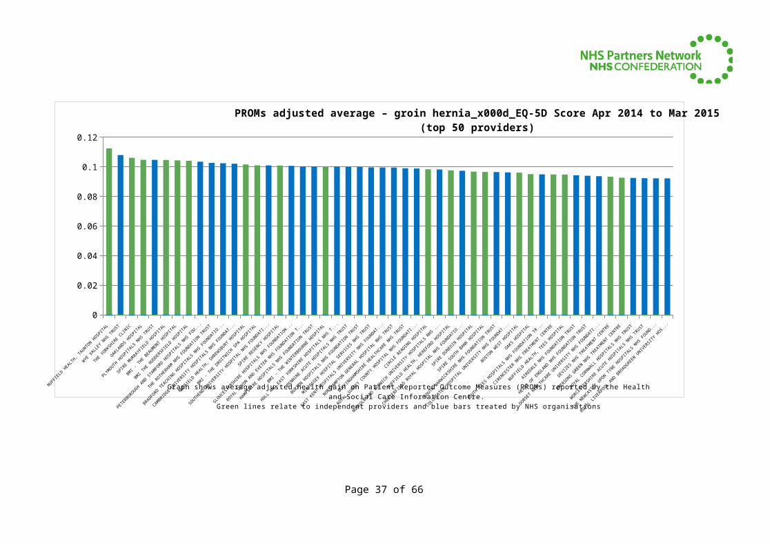
PROMs adjusted average – groin hernia_x000d_EQ-5D Score Apr 2014 to Mar 2015 (top 50 providers)
Graph shows average adjusted health gain on Patient Reported Outcome Measures (PROMs) reported by the Health and Social Care Information Centre.
Green lines relate to independent providers and blue bars treated by NHS organisations
Page 30 of 51
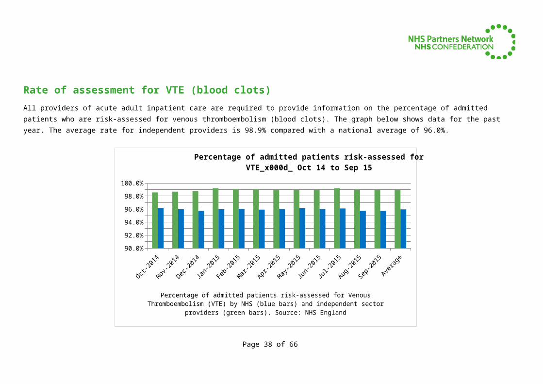
Rate of assessment for VTE (blood clots)All providers of acute adult inpatient care are required to provide information on the percentage of admitted patients who are risk-assessed for venous thromboembolism (blood clots). The graph below shows data for the past year. The average rate for independent providers is 98.9% compared with a national average of 96.0%.
Oct-2014
Nov-2014
Dec-2014
Jan-2015
Feb-2015
Mar-2015
Apr-2015
May-2015
Jun-2015
Jul-2015
Aug-2015
Sep-2015
Average
90.0%91.0%92.0%93.0%94.0%95.0%96.0%97.0%98.0%99.0%
100.0%
Percentage of admitted patients risk-assessed for VTE_x000d_ Oct 14 to Sep 15
Percentage of admitted patients risk-assessed for Venous Thromboembolism (VTE) by NHS (blue bars) and independent sector providers (green bars). Source: NHS England
Source: http://www.england.nhs.uk/statistics/statistical-work-areas/vte
Page 31 of 51
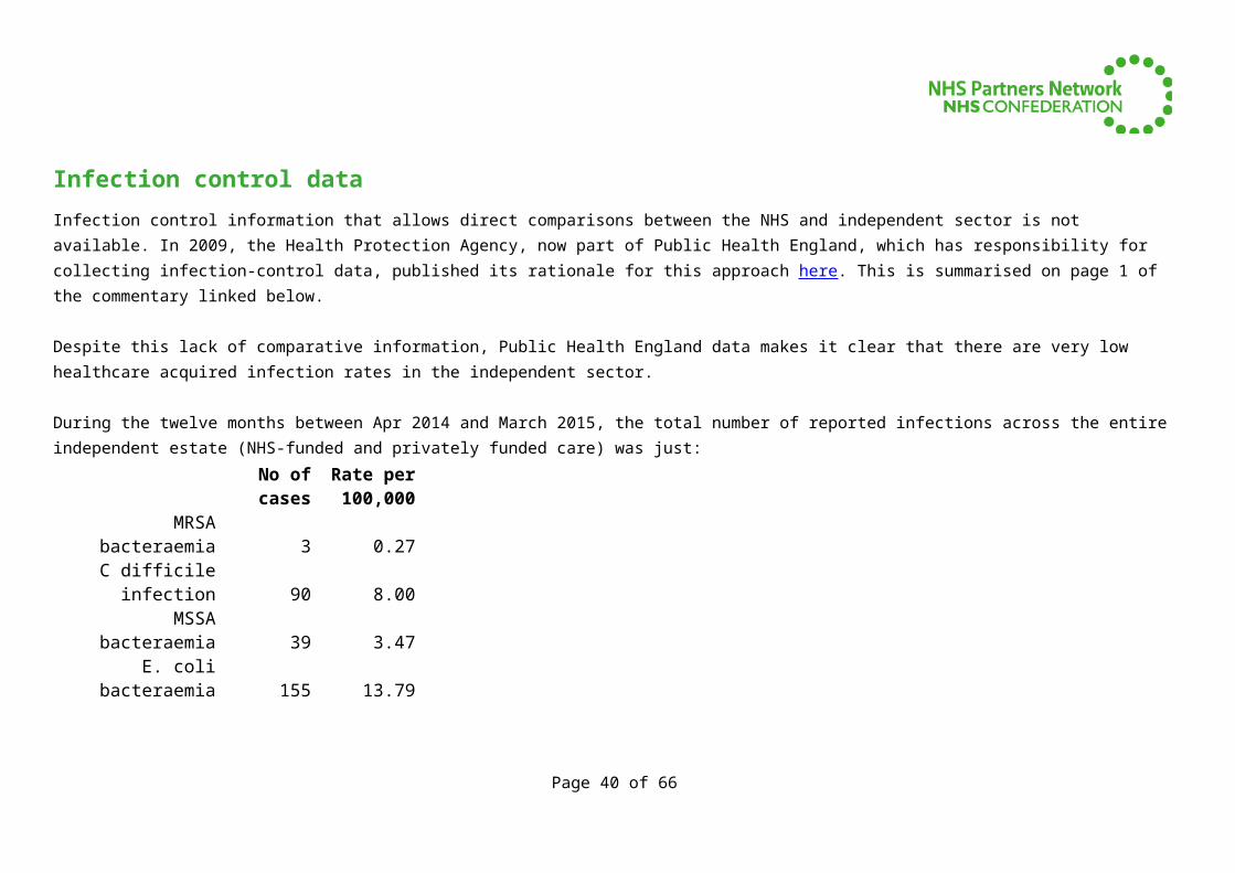
Infection control dataInfection control information that allows direct comparisons between the NHS and independent sector is not available. In 2009, the Health Protection Agency, now part of Public Health England, which has responsibility for collecting infection-control data, published its rationale for this approach here. This is summarised on page 1 of the commentary linked below.
Despite this lack of comparative information, Public Health England data makes it clear that there are very low healthcare acquired infection rates in the independent sector.
During the twelve months between Apr 2014 and March 2015, the total number of reported infections across the entire independent estate (NHS-funded and privately funded care) was just:
No of cases
Rate per 100,000
MRSA bacteraemia 3 0.27C difficile infection 90 8.00MSSA bacteraemia 39 3.47E. coli bacteraemia 155 13.79
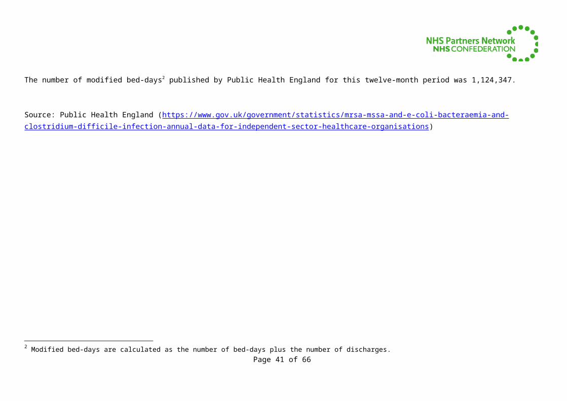
The number of modified bed-days2 published by Public Health England for this twelve-month period was 1,124,347.
Source: Public Health England (https://www.gov.uk/government/statistics/mrsa-mssa-and-e-coli-bacteraemia-and-clostridium-difficile-infection-annual-data-for-independent-sector-healthcare-organisations)
2 Modified bed-days are calculated as the number of bed-days plus the number of discharges.Page 32 of 51
Efficiency indicators
Page 33 of 51
Referral to treatment times
Referral to treatment times show that patients are treated earlier by independent sector providers compared with those treated by NHS organisations. Waiting times are an important indicator of organisational efficiency and for patients deciding where to choose treatment.
There are three ways of measuring waiting times: Those currently waiting for treatment (the incomplete pathway) How long outpatients who have been treated spent waiting in total (the non-admitted pathway) How long inpatients who have begun their treatment spent waiting in total (the admitted adjusted pathway)
In June 2015, NHS England announced that only the incomplete standard would be enforced. However, data will still be collected on all three measurements.
The incomplete standard states that 92% of patients on incomplete pathways should have been waiting no more than 18 weeks from referral.
The graphs below show that across almost all specialties, patients spend less time waiting when treated by independent providers.
Mean* and median waiting times are generally shorter across most specialties for both inpatients and outpatients treated by independent providers compared with their NHS peers.
http://www.england.nhs.uk/statistics/statistical-work-areas/rtt-waiting-times/
* NB Means have been inferred from data published by NHS England. This data shows numbers of patients waiting between 1 and 2 weeks, 2 and 3 weeks, etc. up to 52+ weeks for RTT times and 13+ weeks for diagnostic waiting times. Mean values have been calculated on the assumption that patients who have been waiting between 1 and 2 weeks have waited an average of 1.5 weeks etc. Also, for those patients waiting longer than 52 weeks (RTT) or 13 weeks (diagnostics), we have used values of 52.5 (RTT) and 13.5 weeks (diagnostics) which is likely to be an underestimate. As we are looking at national trends rather than specific provider-level performance we have counted all patients when calculating means rather than excluding organisations with low volumes.
Page 34 of 51
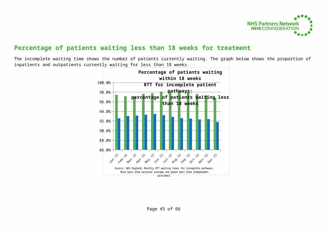
Percentage of patients waiting less than 18 weeks for treatmentThe incomplete waiting time shows the number of patients currently waiting. The graph below shows the proportion of inpatients and outpatients currently waiting for less than 18 weeks.
Jan 15
Feb 15
Mar 15
Apr 15May 1
5Jun 15
Jul 15Aug 15
Sep 15
Oct 15
Nov 15Dec 1
5
86.0%
88.0%
90.0%
92.0%
94.0%
96.0%
98.0%
100.0%
Percentage of patients waiting within 18 weeksRTT for incomplete patient pathways:
percentage of patients waiting less than 18 weeks
Source: NHS England, Monthly RTT waiting times for incomplete pathways. Blue bars show national average and green bars show independent providers.
Page 35 of 51
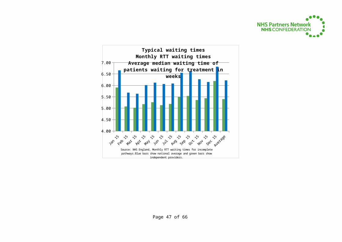
Typical waiting times
Median waiting times illustrate the typical experience of most patients when waiting for care. The graph below shows how long each person typically had spent waiting for treatment who were still on the waiting list in each month (the incomplete median waiting time).
Jan 15 Feb 15 Mar 15 Apr 15 May 15 Jun 15 Jul 15 Aug 15 Sep 15 Oct 15 Nov 15 Dec 15 Average4.00
4.50
5.00
5.50
6.00
6.50
7.00
Typical waiting timesMonthly RTT waiting times
Average median waiting time of patients waiting for treatment in weeks
Source: NHS England, Monthly RTT waiting times for incomplete pathways.Blue bars show national average and green bars show independent providers.
Page 36 of 51
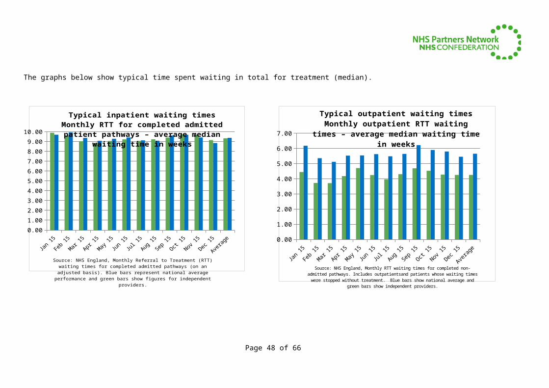
The graphs below show typical time spent waiting in total for treatment (median).
Jan 15 Feb 15 Mar 15 Apr 15 May 15 Jun 15 Jul 15 Aug 15 Sep 15 Oct 15 Nov 15 Dec 15 Average0.001.002.003.004.005.006.007.008.009.00
10.00
Typical inpatient waiting timesMonthly RTT for completed admitted patient pathways – average
median waiting time in weeks
Source: NHS England, Monthly Referral to Treatment (RTT) waiting times for completed admitted pathways (on an ad-justed basis). Blue bars represent national average performance and green bars show figures for independent providers.
Jan 15 Feb 15 Mar 15 Apr 15 May 15 Jun 15 Jul 15 Aug 15 Sep 15 Oct 15 Nov 15 Dec 15 Average0.00
1.00
2.00
3.00
4.00
5.00
6.00
7.00
Typical outpatient waiting timesMonthly outpatient RTT waiting times – average median waiting time
in weeks
Source: NHS England, Monthly RTT waiting times for completed non-admitted pathways. Includes outpatientsand patients whose waiting times were stopped without treatment. Blue bars show national average and green bars show independent providers.
Page 37 of 51
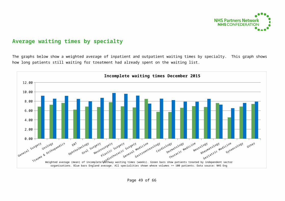
Average waiting times by specialty
The graphs below show a weighted average of inpatient and outpatient waiting times by specialty. This graph shows how long patients still waiting for treatment had already spent on the waiting list.
General Surgery
Urology
Trauma & Orth
opaedics
ENT
Ophthalm
ology
Oral Surgery
Neurosu
rgery
Plastic Surgery
Cardioth
oracic Surgery
General Medicine
Gastroentero
logy
Cardiology
Dermato
logy
Thoracic Medicine
Neurology
Rheumatology
Geriatri
c Medicine
Gynaecology
Other
0.00
2.00
4.00
6.00
8.00
10.00
12.00
Incomplete waiting times December 2015
Weighted average (mean) of incomplete pathway waiting times (weeks). Green bars show patients treated by inde-pendent sector organisations. Blue bars England average. All specialities shown where volumes >= 100 patients. Data
source: NHS Eng
Page 38 of 51

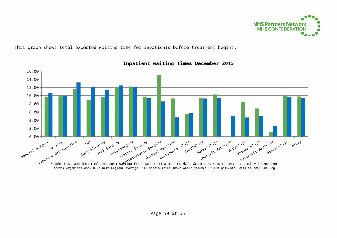
This graph shows total expected waiting time for inpatients before treatment begins.
General Surgery
Urology
Trauma & Orth
opaedics
ENT
Ophthalm
ology
Oral Surgery
Neurosu
rgery
Plastic Surgery
Cardioth
oracic Surgery
General Medicine
Gastroentero
logy
Cardiology
Dermato
logy
Thoracic Medicine
Neurology
Rheumatology
Geriatri
c Medicine
Gynaecology
Other
0.00
2.00
4.00
6.00
8.00
10.00
12.00
14.00
16.00
Inpatient waiting times December 2015
Weighted average (mean) of time spent waiting for inpatient treatment (weeks). Green bars show patients treated by independent sector organisations. Blue bars England average. All specialities shown where volumes >= 100 patients.
Data source: NHS Eng
Page 39 of 51
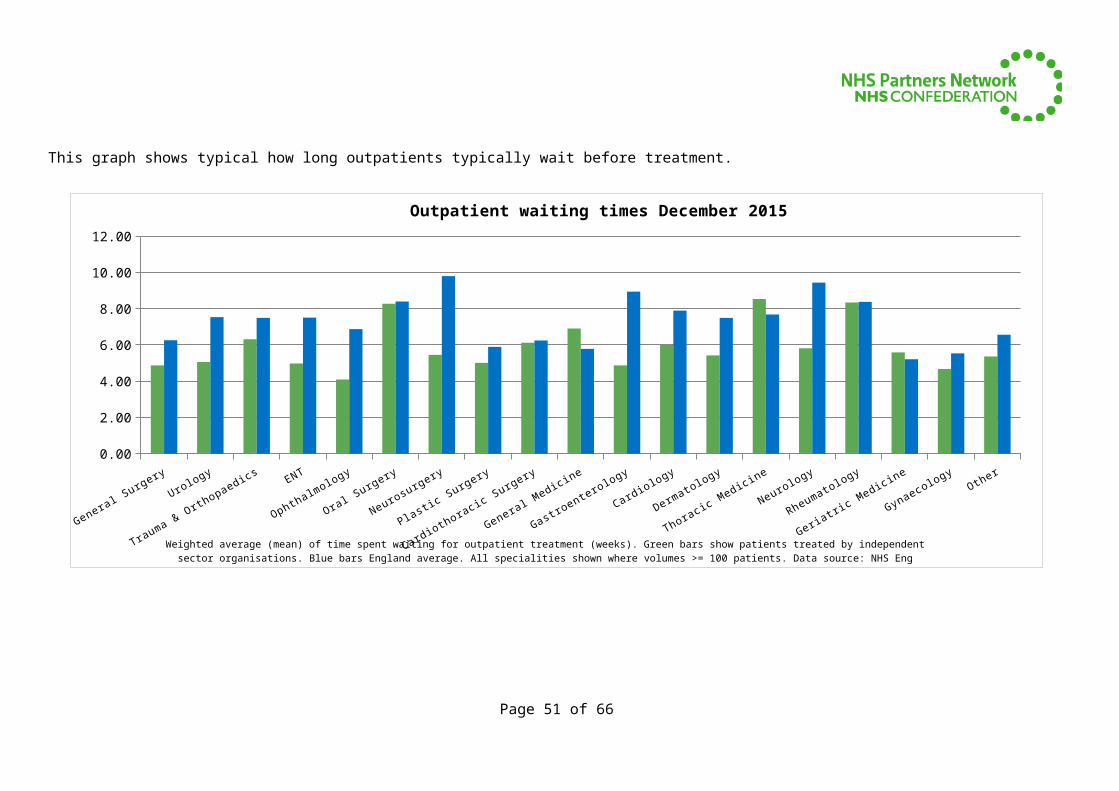
This graph shows typical how long outpatients typically wait before treatment.
General Surgery
Urology
Trauma & Orth
opaedics
ENT
Ophthalm
ology
Oral Surgery
Neurosu
rgery
Plastic Surgery
Cardioth
oracic Surgery
General Medicine
Gastroentero
logy
Cardiology
Dermato
logy
Thoracic Medicine
Neurology
Rheumatology
Geriatri
c Medicine
Gynaecology
Other
0.00
2.00
4.00
6.00
8.00
10.00
12.00
Outpatient waiting times December 2015
Weighted average (mean) of time spent waiting for outpatient treatment (weeks). Green bars show patients treated by independent sector organisations. Blue bars England average. All specialities shown where volumes >= 100 patients.
Data source: NHS Eng
Page 40 of 51
Waiting times for 95% of patients
It is likely that there will be a small number of patients for whom treatment takes a significantly longer than expected amount of time. The graphs below show the maximum waiting time for 95% of patients, i.e. the longest period that most patients can reasonably expect to have to wait.
Jan 15 Feb 15 Mar 15 Apr 15 May 15 Jun 15 Jul 15 Aug 15 Sep 15 Oct 15 Nov 15 Dec 15 Average.00
5.00
10.00
15.00
20.00
25.00
Waiting times for 95% of inpatientsMonthly RTT for completed admitted patient pathways – 95th
percentile waiting time (in weeks)
Source: NHS England, Monthly Referral to Treatment (RTT) waiting times for completed admitted pathways (on an ad-justed basis). Blue bars represent national average performance and green bars show figures for independent providers..
Jan 15 Feb 15 Mar 15 Apr 15 May 15 Jun 15 Jul 15 Aug 15 Sep 15 Oct 15 Nov 15 Dec 15 Average.00
5.00
10.00
15.00
20.00
25.00
Waiting times for 95% of outpatientsMonthly outpatient RTT waiting times – 95th percentile waiting time
(in weeks)
Source: NHS England, Monthly RTT waiting times for completed non-admitted pathways. Includes outpatientsand patients whose waiting times were stopped without treatment. Blue bars show national average and green bars show independent providers.
Page 41 of 51
The graph below shows the length of time within which all but 5% of patients had been treated.
Jan 15 Feb 15 Mar 15 Apr 15 May 15 Jun 15 Jul 15 Aug 15 Sep 15 Oct 15 Nov 15 Dec 15 Average10.0
12.0
14.0
16.0
18.0
20.0
22.0
Waiting times for 95% of patientsMonthly impcomplete RTT waiting times – 95th percentile waiting
time (in weeks)
Source: NHS England, Monthly RTT waiting times for incomplate pathways. Blue bars show national average and green bars show independent providers.
Page 42 of 51
Diagnostic waiting times
The graph below shows mean waiting times for diagnostic tests by modality. MRI scans and non-obstetric-ultrasound are the most frequently provided diagnostic tests by independent organisations.
AUDIOLOGY_ASSESSMENTS
COLONOSCOPY CT
CYSTOSCOPY
DEXA_SCAN
ECHOCARDIOGRAPHY
ELECTROPHYSIOLOGY
FLEXI_SIGMOIDOSCOPY
GASTROSCOPY MRI
NON_OBSTETRIC_ULTRASOUND
PERIPHERAL_NEUROPHYS
0.00
0.50
1.00
1.50
2.00
2.50
3.00
3.50
Average waiting time for diagnostic tests by type and sector in December 2015
Chart shows mean time (weeks) spent waiting by patients for diagnostic tests for each type where vol of proceduces >= 100. Blue bars show national average waiting times. Green bars show mean waiting times
for independent providers. Source: NHS England
Source: http://www.england.nhs.uk/statistics/statistical-work-areas/diagnostics-waiting-times-and-activity NB see note in section on referral to treatment times about the calculation of mean waiting time values
Page 43 of 51
Cancelled elective operationsOperations that are cancelled on the day of surgery for non-clinical reasons are disruptive and distressing for patients. Cancellations are also a good indicator of an organisation’s system-wide efficiency.
NHS England does not publish the total number of elective operations alongside its cancellations data so it is not possible to make a precise calculation of comparative cancellation rates, however, the data published at www.england.nhs.uk/statistics/statistical-work-areas/cancelled-elective-operations reveals that NHS patients treated by independent sector providers experience far fewer cancellations on the day than those treated by traditional NHS organisations.
The data shows that less than 0.5% of non-clinical cancellations occur at independent providers. Also, of that small number of patients who do experience a cancellation at an independent provider, hardly any wait longer than a further 28 days for their treatment (just four patients in total in the whole of the last 12 months). Cancelled Operations (elective only)Period NHS provider non-
clinical cancellations (percentage of all cancellations)
Independent provider non-clinical cancellations (percentage of all cancellations)
Percentage of all patients still waiting for treatment after 28 days following last minute elective cancellation (NHS organisations)
Percentage of all patients still waiting for treatment after 28 days following last minute elective cancellation (Independent providers)
Quarter 4, 2014-15 (January to March 2015) 99.57% 0.43% 99.94% 0.06%Quarter 1, 2015-16 (April to June 2015) 99.31% 0.69% 99.75% 0.25%Quarter 2, 2015-16 (July to September 2015) 99.64% 0.36% 100.00% 0.00%Quarter 3, 2015-16 (October - December 2013) 99.73% 0.27% 99.64% 0.36%Average 99.56% 0.44% 99.83% 0.17%
Page 44 of 51
Numbers of patients treated
Page 45 of 51
Numbers of patients treated by independent providersElective care is critically dependent on independent sector provision.
Around 20% of all elective gastroenterology procedures and hip and knee replacements are now carried out by the independent sector. In some areas of the country this figure is far higher.
As well as NHS patients, many independent sector providers also treat large numbers of privately-funded patients as well.
The graphs in the section that follows show a steady increase in the number and proportion of procedures carried out by independent providers since 2011 when easily comparable statistics were first published. However, the overall number of NHS patients treated by independent organisations remains a small fraction of total NHS volumes.
Page 46 of 51
General and acute admissionsAnalysis of hospital activity data (http://www.england.nhs.uk/statistics/statistical-work-areas/hospital-activity/) shows that the number of patients treated by the independent sector is steadily growing.
Jan 1
3
Mar
13
May
13
Jul 1
3
Sep 1
3
Nov 13
Jan 1
4
Mar
14
May
14
Jul 1
4
Sep 1
4
Nov 14
Jan 1
5
Mar
15
May
15
Jul 1
5
Sep 1
5
Nov 15
0
5,000
10,000
15,000
20,000
25,000
30,000
35,000
40,000
45,000
General & acute admissions to independent providers. Jan 13 to Dec 15
Elective G&A Ordi-nary Admis-sions (FFCEs)Elective G&A Daycase Admis-sions (F-FCEs)Elective G&A Total Admis-sions (F-FCEs)
Page 47 of 51
GP outpatient referrals admissionsThis data (http://www.england.nhs.uk/statistics/statistical-work-areas/hospital-activity/) also shows steady growth in GP referrals to outpatients.
Jan 1
3
Mar 1
3
May
13
Jul 1
3
Sep 13
Nov
13
Jan 1
4
Mar 1
4
May
14
Jul 1
4
Sep 14
Nov
14
Jan 1
5
Mar 1
5
May
15
Jul 1
5
Sep 15
Nov
1530,000
35,000
40,000
45,000
50,000
55,000
60,000
65,000
70,000
75,000
GP outpatient referrals to independent providers. Jan 13 to Dec 15
GP Re-ferrals Made (All special-ties) GP Re-ferrals Seen (All special-ties)
Page 48 of 51
Elective admissions and GP referrals (2)
Despite the growth in independent sector provision, it is clear that traditional NHS providers still dominate overall provision for NHS patients.
Apr to Jun 11
Jul to Sep
11
Oct to Dec 1
1
Jan to Mar 12
Apr to Jun 12
Jul to Sep
12
Oct to Dec 1
2
Jan to Mar 13
Apr to Jun 13
Jul to Sep
13
Oct to Dec 1
3
Jan to Mar 1
4
Apr to Jun 14
Jul to Sep
14
October t
o December..
.
January
to March 2015
April to June 2015
July to Sep
tember .
..
0,000
200,000
400,000
600,000
800,000
1,000,000
1,200,000
1,400,000
1,600,000
1,800,000
Quarterly independent sector and NHS admissions
Quarterly elective admissions to independent sector providers (green bars) and NHS organisations (blue bars). Source: NHS England
Apr to Jun 11
Jul to Sep
11
Oct to Dec 1
1
Jan to Mar 1
2
Apr to Jun 12
Jul to Sep
12
Oct to Dec 1
2
Jan to Mar 1
3
Apr to Jun 13
Jul to Sep 13
Oct to Dec 1
3
Jan to Mar 1
4
Apr to Jun 14
Jul to Sep 14
October t
o December..
.
January
to March ...
April to June 2015
July to Sep
tember ..
.
0,000
500,000
1,000,000
1,500,000
2,000,000
2,500,000
3,000,000
3,500,000
4,000,000
Total GP referrals for outpatients appointments
Quarterly GP referrals for outpatients appointments. Independent sector providers (green bars) and NHS organisations (blue bars). Source: NHS England
Page 49 of 51
Elective admissions and GP referrals (3)
The overall percentage of patients treated by the independent sector has grown in accordance with the increasing number of patients choosing independent providers.
Apr to Jun 11
Jul to Sep
11
Oct to Dec 1
1
Jan to Mar 1
2
Apr to Jun 12
Jul to Sep
12
Oct to Dec 1
2
Jan to Mar 1
3
Apr to Jun 13
Jul to Sep
13
Oct to Dec 1
3
Jan to Mar 1
4
Apr to Jun 14
Jul to Sep
14
October t
o Decembe...
January
to March ...
April to June 2015
July to Sep
tember ..
.
0.00%
1.00%
2.00%
3.00%
4.00%
5.00%
6.00%
7.00%
8.00%
9.00%
Elective admissions to independent sector providers as a proportion of all NHS patients
Quarterly admissions to independent sector providers as a proportion of all NHS elective activity. Source: NHS England
Apr to Jun 11
Jul to Sep
11
Oct to Dec 1
1
Jan to Mar 1
2
Apr to Jun 12
Jul to Sep
12
Oct to Dec 1
2
Jan to Mar 1
3
Apr to Jun 13
Jul to Sep
13
Oct to Dec 1
3
Jan to Mar 1
4
Apr to Jun 14
Jul to Sep
14
October to Dece
mber...
January
to March 2015
April to June 2015
July to Sep
tember ..
.
0.00%
1.00%
2.00%
3.00%
4.00%
5.00%
6.00%
7.00%
Percentage GP referrals for independent sector outpatients ap-pointments
Quarterly GP referrals independent sector outpatients appointments as a proportion of all NHS elective activity. Source: NHS England
Page 50 of 51
Diagnostic tests carried out by independent sector by modality
The pie chart below shows the range of diagnostic tests provided by independent sector organisations.
Independent sector workload (all tests carried out by independent providers for which waiting times are collected) during December
2015
AUDIOLOGY_ASSESSMENTSCOLONOSCOPYCTCYSTOSCOPYDEXA_SCANECHOCARDIOGRAPHYELECTROPHYSIOLOGYFLEXI_SIGMOIDOSCOPYGASTROSCOPYMRINON_OBSTETRIC_ULTRASOUNDPERIPHERAL_NEUROPHYS
Page 51 of 51