in what ways does your media products use, develop or challenge forms and conventions of real media...
TRANSCRIPT

EvaluationElla Duncan
In what ways does your media products use, develop or challenge forms and conventions of
real media products?My poster follows the conventions of a real Action thriller move poster as we see both the victim and the antagonist on the content. The audience are able to see the victim in a brighter light allowing audience members to connote the idea of the actor on the right being the victim. This is emphasised by the shadow that covers the right side of her face, implying the darkness from the antagonist on the left of the poster. The antagonist on the left is in much darker light with the red stripe over her face. This follows the conventions of the 2009 film “The Box” directed by Richard Kelly, also an action thriller movie. Therefore, this allows my film poster to match a real, existing poster that has a similar target audience to mine. The poster follows other conventions used from different real action thriller movie posters because of the red colour that is consistent throughout the poster. The red allows the audience to focus on the poster but also highlights a shock or surprise that film contains. I chose to have the red stripe over the antagonists face as it shows this character is the enemy. The stripe also covers a lot of the actor’s face, which with the darkness of the lighting used for the image makes the character look mysterious, shadowy and secretive as the character portrays an image that makes the audience imply she is hiding something. Other aspects used in my film poster that follow the conventions of real media products are the credit block used at the bottom of the poster. This credit block shows that my poster follows the conventional aspects of real film posters that exist. The name of the actors at the top of the poster in a white, clear and simple font allows the audience to see the famous, well-known actors that are in the film. The tag line also allows the audience to get an idea about the concept of the film and what the film could be about. This links to conventional aspects because it makes the audience question what action might occur in the film, meaning they are more likely to watch the film, in order to find out the story. Finally, the establishing shot at the bottom of the poster allows the audience to see the main setting of the film and creates a mysterious and cryptic location for the film to be set in
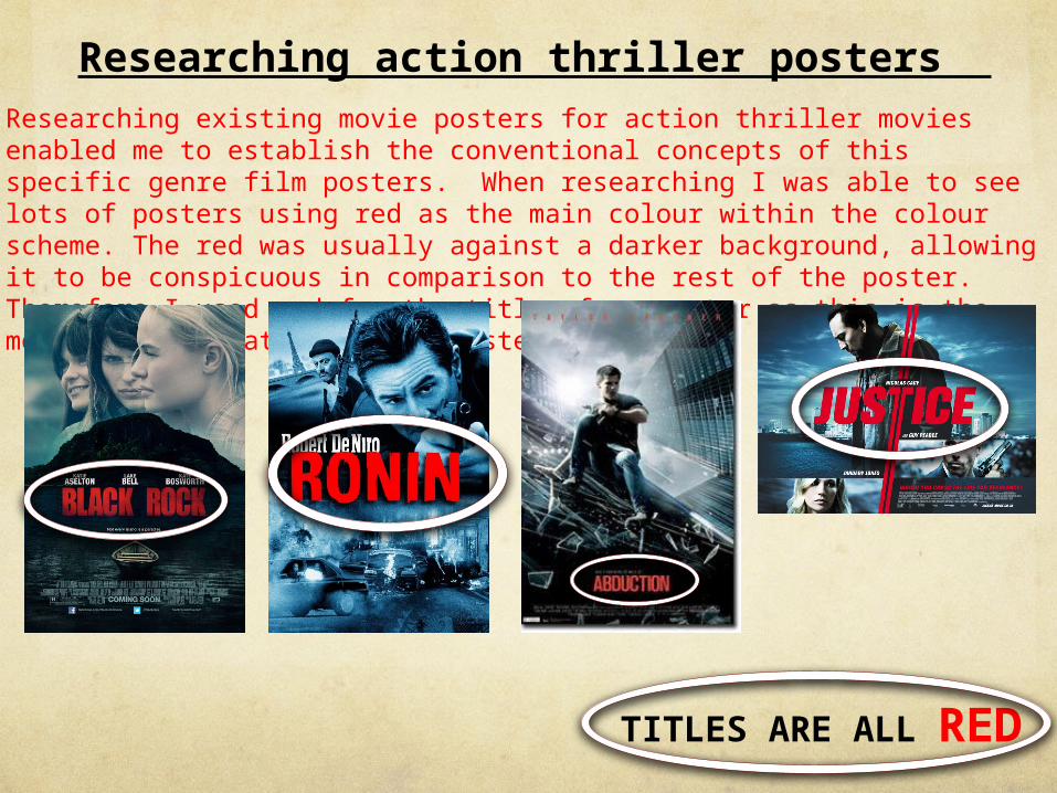
Researching existing movie posters for action thriller movies enabled me to establish the conventional concepts of this specific genre film posters. When researching I was able to see lots of posters using red as the main colour within the colour scheme. The red was usually against a darker background, allowing it to be conspicuous in comparison to the rest of the poster. Therefore I used red for the title of my poster as this is the most central feature on the poster.
Researching action thriller posters
TITLES ARE ALL RED

Linking to other film posters
The red stripe signifies the antagonist character. This feature is used on “The Box” movie poster with the suspicious, secretive character at the
foot of the stripe. Therefore whilst creating my poster, I used this idea to heighten the antagonist character and highlight the secrecy of the
character on the left.

MagazineMy magazine cover follows the conventional fashion magazine cover for various different reasons. Firstly, the masthead is a main focus for the reader and allows the reader to know the genre of magazine this is. Also, the cover lines allow readers to know what is happening inside of the magazine and the main stories that are discussed in this edition. The choice of colours I believe match the colours used on the main image of one of the actors from the new film that is the main story in this edition. The typography used on the cover allows the readers to get a glimpse of the different aspects of the film, with interviews with an actor from the film. The existing media product i chose to base my ideas on for my magazine cover was the March 2009 edition of Fashion Magazine. I used this as a guideline when creating my media product and i did this by using a similar colour scheme and pose for the actor for the main image on the cover. In order to create a similar product to this edition I used different shades of blue font and a simple, clear font for the sub-headings and the text used on the cover. This allows a direct and simple cover to be presented to the readers enticing them to read the magazine. Moreover, the use of the barcode highlights the type of media product i am aiming to create. The issue number and the price further follow the conventions of a real magazine because they allow the reader to see what issue this is and the price of the magazine which would both be portrayed on a real magazine.

Looking at other magazines
When looking a this “Fashion” magazine i was able to follow that blue colour scheme which I believe worked well with the image on my poster. The Fashion magazine allowed me to have a guideline and something that I could use to inspire the final magazine product. When choosing which image I would use for my magazine cover, i decided to use the one that was the closest match to that of the mid-shot used on the cover of Fashion of Mary-Kate Olsen. Also the use of various different fonts that are used on the edition are a convention that i noticed in other magazine covers and also decided to follow.
TrailerThe trailer for our movie Obsessed follows the conventional aspects of an action thriller trailer because of different concepts used in our media product. Firstly, the use of the green band highlights the realistic concept of a film trailer and by using this, we are allowing our trailer to come across as naturalistic and real as possible. Every film trailer has a green band which allows the audience to see the age rating of the film and allows the preview to become a real as possible trailer. More over, the trailer included inter-titles which follow the conventional aspects of trailers as they allow the audience to get an idea of different things that happen in the film and allows them to get an idea of the story line of the film. This therefore should entice audience’s to see the film so that they can see exactly what is happening in the film. The use of the various jump cuts from different scenes also follow the conventions of an action thriller film trailer because they create confusion and excitement to match the thrilling genre.

Other action thriller trailersWe researched a number of different action thriller film trailers in order
to find the main codes and conventions of a trailer in this genre. We then decided to base our trailer and storyline of the film on “Taken” the 2008 film , directed by Pierre Morel. We felt that this was a film that was best related to our target audience as it was based around a young girl, a similar age to our target audience. We then watched the different trailers and focused on the fast pace of the action in the trailer and the continual movement of settings and shots in order to create disorder and confusion for the audience. Therefore we decided that our trailer would consist of lots of different shots at day and night time in order to again aim to create disorder but also so that the audience are able to see the different atmosphere of the characters during the day in comparison to the dark, thrilling aspects we aimed to portray in the darker night time shots.