image rationale
TRANSCRIPT
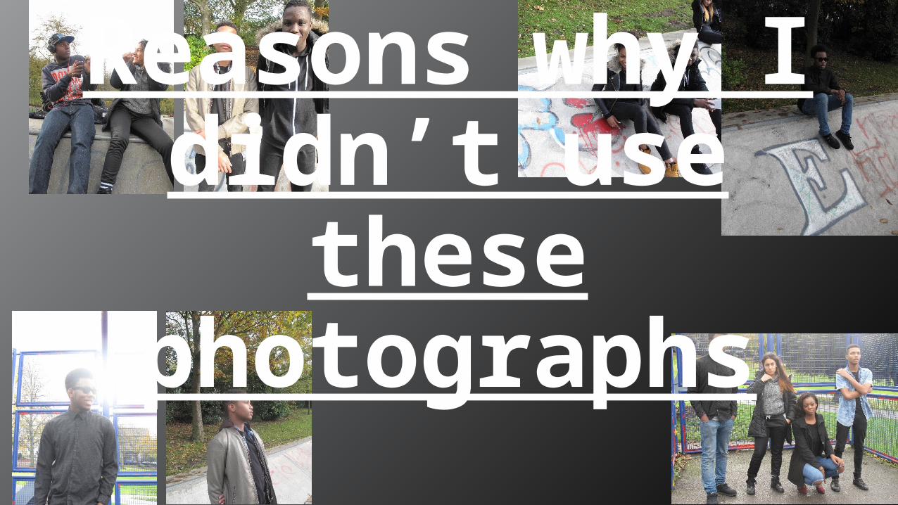
Reasons why I didn’t use
these photographs

Main ImageI didn’t choose to use any of these two images for my main image as the models are not in the correct pose.
The image above makes the models seem as childish and may not appeal to my target audience.
I took the photograph before the models were ready so the image is not to plan.

Contents page imagesI didn’t use the image on the left on my contents page as there is too much lighting in the models face which makes the image too bright & unclear.The image on the right was not used as thebackground is irrelevant to my
genre of magazine. There is also unnecessary objects & someone walking in background which is unprofessional.

Contents page imagesI didn’t use the image on the left on my contents page as it is blurry, which makes it unclear to identify the object.The image on the right was not used on myContents page as the trees in
the background is unnecessary and would make it hard to edit and crop and edit the image. Also the model is not looking into the camera.

Double Spread imagesThese images was not used on my double page spread as they look unprofessional and doesn’t portray music in anyway.
The image below makes the models look uncomfortable together, which shows that the image is staged.There is no eye contact from any of the models which makes the image look messy.

Double Spread imagesThe image on the left was not used as it is completely irrelevant to my genre of magazine. My magazine is about music, this image was taken on a basketball court.The image on the
right was not used as it hasn’t got enough lighting, this makes the image dark and unclear.