ii. political shocks reorient markets · ii. political shocks reorient markets financial markets in...
TRANSCRIPT

23BIS 87th Annual Report
II. Political shocks reorient markets
Financial markets in the second half of 2016 and the first half of 2017 were confronted by a changing political environment as the economic background brightened. Political events surprised markets, notably the June 2016 vote in the United Kingdom to leave the European Union (Brexit) and, most of all, the US presidential election in November. Market participants needed to rapidly take views on the shifting policy direction in several areas, including trade, taxation and regulation, and to evaluate the consequences for likely “winners” and “losers”. At the same time, both growth and inflation picked up in the large economies, supporting equity and credit markets and pushing up bond yields.
Attention moved away from monetary policy as a driver of markets. One result was a change to long-established patterns of correlation and risk. Instead of broad-based swings between “risk-on” and “risk-off” positions, investors began to differentiate more across sectors and countries. Bond yields diverged across the major economies, with knock-on effects on foreign exchange markets. At the same time, a gap opened up between surging measures of policy uncertainty and sinking financial market volatility. That said, until mid-March some indicators suggested that the perceived risk of large equity market declines had actually increased.
Markets adjust to a new environment
From mid-2016 onwards, the improving growth outlook contributed to rising stock prices and narrowing credit spreads in major advanced and emerging economies (Graph II.1, left-hand and centre panels). As growth gathered steam, market volatility remained very subdued (Graph II.1, right-hand panel), even as policy uncertainty soared (Box II.B).
Within this broad picture, three phases defined market developments. From July to October 2016, initial signs of recovery and rising inflation started to boost advanced economy bond yields, while equity markets were subdued. In November and December, expectations of shifts in US economic policy sparked a rally in advanced economy (AE) equities and sharply higher bond yields, while weighing on some emerging market economy (EME) assets. Finally, in the first half of 2017, continued good news on growth supported AE and EME equity markets, even as long bond yields stayed range-bound, against a backdrop of quiescent inflation indicators and growing doubts about the prospects for large-scale US fiscal stimulus.
The three phases were demarcated by a series of political tremors. The first was the outcome of the UK Brexit referendum on 23 June 2016. Major stock indices in advanced economies fell more than 5% the day after the vote, and the pound sterling depreciated by 8% against the US dollar. Bond yields also fell initially, as investors reassessed growth prospects and the near-term monetary policy course for the United Kingdom and worldwide. But stock prices soon recovered globally. An initial widening of corporate credit spreads also reversed.
Benchmark bond yields started creeping up in the third quarter. Inflation indicators in the large advanced economies edged up, and major central banks were seen as moving closer to the long-anticipated monetary policy normalisation (Chapter IV). The result was a reversal of the trend towards lower yields that had

24 BIS 87th Annual Report
been in place since late 2014 (Graph II.2, left-hand panel). The US 10-year yield reached a low of 1.4% on 8 July, the day data releases showed strong hiring in June. From then on, it rose steadily, reaching 1.9% on the eve of the presidential election. The 10-year German bund yield also rebounded, after marking a trough of –0.2% on 8 July. The corresponding Japanese government bond yield, by contrast, did not rise much after reaching a low point of –0.3% on 27 July. The Bank of Japan’s policy of maintaining bond yields around zero, introduced in September, kept downward pressure on long yields even as expected growth and inflation rose. The global stock of bonds trading at negative yields remained quite high (Graph II.2, centre panel).
Politics delivered another shock to financial markets in November, with the unexpected US presidential election outcome. Stocks initially plunged on the results, but in a matter of hours began to rally on expectations of lower corporate taxes, higher government spending and deregulation. The S&P 500 index gained 5% from 8 November to the end of December, while the STOXX Europe 600 rose 8%. At the same time, returns diverged across sectors, as market participants sought to identify winners and losers from the incoming administration’s policies (Graph II.3).
Bond yields rose sharply after the election in anticipation of fiscal stimulus and a more rapid removal of monetary policy accommodation. The US 10-year yield rose from 1.9% on 8 November to 2.5% by year-end. The 10-year German bund reached 0.4% in December. Japanese yields did not increase much, however, turning slightly positive in November. Market commentary began to centre on a “reflation trade”, betting on an acceleration of growth and rising inflation in the advanced economies.
Higher yields reflected both higher expected short-term interest rates and rising term premia. Estimated term premia began to rise in the second half of 2016. While the US 10-year term premium turned positive in December, that for the euro area remained negative, at about –1 percentage point (Graph II.2, right-hand panel, and Box II.A).
Stocks and corporate bonds rally as growth revives Graph II.1
Stock prices Corporate credit spreads1 Implied volatility 5 Jan 2015 = 100 Basis points Basis points Percenta e points Percenta e points
1 Option-adjusted spreads over treasuries. 2 JPMorgan VXY Global index, a turnover-weighted index of implied volatility (IV) of three-month at-the-money options on 23 US dollar currency pairs. 3 IV of at-the-money options on long-term bond futures of Germany, Japan, the United Kingdom and the United States; weighted average based on GDP and PPP exchange rates. 4 IV of S&P 500, EURO STOXX 50, FTSE 100 and Nikkei 225 indices; weighted average based on market capitalisation. 5 IV of at-the-money options on commodity futures contracts on oil, gold and copper; simple average.
Sources: IMF, World Economic Outlook; Bank of America Merrill Lynch; Bloomberg; Datastream; BIS calculations.
120
110
100
90
80
702017201620152014
S&P 500EURO STOXX 50Nikkei 225MSCI Emerging Markets index
300
250
200
150
100
50
1,150
950
750
550
350
1502017201620152014
Investment grade (lhs): High-yield (rhs): United States Euro area EMEs
24
20
16
12
8
4
40
32
24
16
8
02017201620152014
FX2
Bonds3
Lhs:Equities4
Commodities5
Rhs:
g g

25BIS 87th Annual Report
The rapid rise of US yields – the spread of US over German two-year yields widened to more than 2 percentage points, the highest since 2000 – supported the dollar against the euro and other currencies (Graph II.4). The dollar had started to rise against the euro and yen in July and August 2016, roughly in coincidence with the turn in bond yields. The rise quickened after the US election, when it looked as if trade policies favouring US exports might be implemented. The strong dollar, in turn, may have boosted yields further, as authorities in some EMEs sold dollar bonds to support their currencies.
Asset prices in EMEs diverged after the US election, as markets strove to assess the implications for individual countries. Countries with closer trade links with the United States tended to see their exchange rates depreciate and stock markets decline, while others looked poised to benefit from the expected uptick in global growth (Graph II.5, left-hand and centre panels). Some EME sovereign spreads widened. Chinese markets experienced a bout of turbulence in December and early January, as problems at a mid-range stock brokerage pointed to broader fragility in funding markets and led to sharp rises in bond yields and volatile exchange rates (Graph II.5, right-hand panel).
Global markets entered a third phase in the new year. Bond yields plateaued as the rise in inflation came to a halt and political developments in the United States raised doubts about an imminent fiscal expansion. Policy remained accommodative in the euro area and Japan, and long bond yields remained range-bound. The US 10-year yield fluctuated between 2.3 and 2.5% in the early months of 2017, before falling to 2.2% by end-May. The German bund stayed within a 0.2–0.5% range, and
Bond yields rise, but diverge Graph II.2
Long-term government bond yields Stock of government bonds with negative yields3
Components of bond yields4
Per cent Per cent USD trn Per cent Per cent
The vertical line in the centre panel indicates 29 January 2016 (the date on which the Bank of Japan announced its move to negative interestrates on reserves); the vertical lines in the right-hand panel indicate 23 June 2016 (UK referendum on EU membership) and 8 November 2016 (US presidential election).
1 JPMorgan GBI-EM Broad Diversified index, yield to maturity in local currency. 2 Ten-year government bond yields. 3 Analysis based on the constituents of the Bank of America Merrill Lynch World Sovereign index. 4 Decomposition of the 10-year nominal yield according to an estimated joint macroeconomic and term structure model; see P Hördahl and O Tristani, “Inflation risk premia in the euro area and the United States”, International Journal of Central Banking, September 2014. Yields are expressed in zero coupon terms; for the euro area, French government bond data are used. 5 Difference between the 10-year nominal zero coupon yield and the 10-year estimated term premium.
Sources: Bank of America Merrill Lynch; Bloomberg; Datastream; national data; BIS calculations.
The new environment has an unequal impact across sectors
Sectoral stock returns, in per cent Graph II.3
United States Europe
BNK = banks; COG = consumer goods; COS = consumer services; HLC = health care; IND = industrials; MAT = basic materials; O&G = oil and gas; TEC = technology; TEL = telecommunications; UTL = utilities.
Sources: Bank of America Merrill Lynch; Bloomberg; Datastream; BIS calculations.
6
4
2
0
–2
3
2
1
0
–12017201620152014
EMEs (lhs)1
United StatesGermany
Rhs:2
United KingdomJapan
10.0
7.5
5.0
2.5
0.0
2017201620152014
Euro areaJapanRest of the world
2
1
0
–1
–2
2.5
2.0
1.5
1.0
0.52017201620152014
(lhs):Term premium Expected
rates (rhs):5
United States Euro area
Russell 2000TECBNKUTLTEL
COSHLCCOGIND
MATO&G
S&P 500
20100–10
Sub-
indi
ces
8 Nov–30 Dec 2016
Small CapMSCI Europe
TECBNKUTLTEL
COSHLCCOGIND
MATO&G
STOXX Europe 600
20151050–5
Sub-
indi
ces
1 Jan–26 May 2017

26 BIS 87th Annual Report
the corresponding 10-year yield in Japan remained below 10 basis points. The dollar lost ground, as yield differentials narrowed and the debate over fiscal and trade proposals continued.
Equities, in contrast, continued to advance, raising questions about potential overvaluation. The S&P 500 and STOXX Europe 600 both rose 8% in the first five months of the year. While equity prices in part tracked stronger corporate earnings, price/earnings ratios based on forward earnings stayed well above historical averages in the United States and Europe (as they had been since late 2013), and close to average in Japan (Graph II.6). Valuation indicators based on past earnings
Bond yields rise, but diverge Graph II.2
Long-term government bond yields Stock of government bonds with negative yields3
Components of bond yields4
Per cent Per cent USD trn Per cent Per cent
The vertical line in the centre panel indicates 29 January 2016 (the date on which the Bank of Japan announced its move to negative interestrates on reserves); the vertical lines in the right-hand panel indicate 23 June 2016 (UK referendum on EU membership) and 8 November 2016 (US presidential election).
1 JPMorgan GBI-EM Broad Diversified index, yield to maturity in local currency. 2 Ten-year government bond yields. 3 Analysis based on the constituents of the Bank of America Merrill Lynch World Sovereign index. 4 Decomposition of the 10-year nominal yield according to an estimated joint macroeconomic and term structure model; see P Hördahl and O Tristani, “Inflation risk premia in the euro area and the United States”, International Journal of Central Banking, September 2014. Yields are expressed in zero coupon terms; for the euro area, French government bond data are used. 5 Difference between the 10-year nominal zero coupon yield and the 10-year estimated term premium.
Sources: Bank of America Merrill Lynch; Bloomberg; Datastream; national data; BIS calculations.
The new environment has an unequal impact across sectors
Sectoral stock returns, in per cent Graph II.3
United States Europe
BNK = banks; COG = consumer goods; COS = consumer services; HLC = health care; IND = industrials; MAT = basic materials; O&G = oil and gas; TEC = technology; TEL = telecommunications; UTL = utilities.
Sources: Bank of America Merrill Lynch; Bloomberg; Datastream; BIS calculations.
6
4
2
0
–2
3
2
1
0
–12017201620152014
EMEs (lhs)1
United StatesGermany
Rhs:2
United KingdomJapan
10.0
7.5
5.0
2.5
0.0
2017201620152014
Euro areaJapanRest of the world
2
1
0
–1
–2
2.5
2.0
1.5
1.0
0.52017201620152014
(lhs):Term premium Expected
rates (rhs):5
United States Euro area
Russell 2000TECBNKUTLTEL
COSHLCCOGIND
MATO&G
S&P 500
20100–10
Sub-
indi
ces
8 Nov–30 Dec 2016
Small CapMSCI Europe
TECBNKUTLTEL
COSHLCCOGIND
MATO&G
STOXX Europe 600
20151050–5
Sub-
indi
ces
1 Jan–26 May 2017
Divergence in bond yields supports the dollar Graph II.4
Euro area Japan United Kingdom Percentage points EUR/USD Percentage points JPY/USD Percentage points GBP/USD
1 Two-year US Treasury yield spread over the comparable government bond yield (for the euro area, German bund yield). 2 An increase indicates a depreciation against the US dollar.
Sources: Bloomberg; national data; BIS calculations.
Some EMEs face trade and financial concerns in the closing months of 2016 Graph II.5
Changes in bilateral exchange rates1 Trade balance with the US2 China: 10-year bond yields and Shibor
Per cent Per cent Per cent
The vertical lines in the right-hand panel indicate 23 June 2016 (UK referendum on EU membership) and 8 November 2016 (US presidential election).
1 A negative value indicates a depreciation of the local currency against the US dollar. 2 The slope coefficient of the fitted line has a p-value of 0.1397. When Turkey is excluded, the p-value falls to 0.0465. A p-value greater than 0.1 means that the coefficient is not statistically significant at the 10% level. Change in exchange rate over the period 8 November–30 December 2016. 3 For each country, defined as the trade balance with the United States divided by its own GDP; as of Q4 2016. A negative (positive) value indicates a deficit (surplus).
Sources: IMF, Direction of Trade, International Financial Statistics and World Economic Outlook; China State Administration of Foreign Exchange; Bloomberg; CEIC; Datastream; national data; BIS calculations.
2.2
1.9
1.6
1.3
1.0
0.94
0.92
0.90
0.88
0.8620172016
Yield differential (lhs)1
2.0
1.7
1.4
1.1
0.8
119
113
107
101
9520172016
Exchange rate (rhs)2
1.2
0.9
0.6
0.3
0.0
0.80
0.75
0.70
0.65
0.6020172016
10
5
0
–5
–10
–15
COILBRCLIDCZHUMYTRRUPETHPHINZAARKRPLMX
8 Nov–30 Dec 20161 Jan–26 May 2017
3
0
–3
–6
–9
–1286420
Chan
ge in
exc
hang
e ra
te, %
1
Trade balance with the US, % of GDP3
2.8
2.6
2.4
2.2
2.0
1.8
5.0
4.5
4.0
3.5
3.0
2.5Q2 17Q4 16Q2 16
ShiborO/N
Lhs:Corporate AAA-ratedSovereign
Rhs:

27BIS 87th Annual Report
Divergence in bond yields supports the dollar Graph II.4
Euro area Japan United Kingdom Percentage points EUR/USD Percentage points JPY/USD Percentage points GBP/USD
1 Two-year US Treasury yield spread over the comparable government bond yield (for the euro area, German bund yield). 2 An increase indicates a depreciation against the US dollar.
Sources: Bloomberg; national data; BIS calculations.
Some EMEs face trade and financial concerns in the closing months of 2016 Graph II.5
Changes in bilateral exchange rates1 Trade balance with the US2 China: 10-year bond yields and Shibor
Per cent Per cent Per cent
The vertical lines in the right-hand panel indicate 23 June 2016 (UK referendum on EU membership) and 8 November 2016 (US presidential election).
1 A negative value indicates a depreciation of the local currency against the US dollar. 2 The slope coefficient of the fitted line has a p-value of 0.1397. When Turkey is excluded, the p-value falls to 0.0465. A p-value greater than 0.1 means that the coefficient is not statistically significant at the 10% level. Change in exchange rate over the period 8 November–30 December 2016. 3 For each country, defined as the trade balance with the United States divided by its own GDP; as of Q4 2016. A negative (positive) value indicates a deficit (surplus).
Sources: IMF, Direction of Trade, International Financial Statistics and World Economic Outlook; China State Administration of Foreign Exchange; Bloomberg; CEIC; Datastream; national data; BIS calculations.
2.2
1.9
1.6
1.3
1.0
0.94
0.92
0.90
0.88
0.8620172016
Yield differential (lhs)1
2.0
1.7
1.4
1.1
0.8
119
113
107
101
9520172016
Exchange rate (rhs)2
1.2
0.9
0.6
0.3
0.0
0.80
0.75
0.70
0.65
0.6020172016
10
5
0
–5
–10
–15
COILBRCLIDCZHUMYTRRUPETHPHINZAARKRPLMX
8 Nov–30 Dec 20161 Jan–26 May 2017
3
0
–3
–6
–9
–1286420
Chan
ge in
exc
hang
e ra
te, %
1
Trade balance with the US, % of GDP3
2.8
2.6
2.4
2.2
2.0
1.8
5.0
4.5
4.0
3.5
3.0
2.5Q2 17Q4 16Q2 16
ShiborO/N
Lhs:Corporate AAA-ratedSovereign
Rhs:
Equity valuations in advanced economies approach or exceed historical norms
Ratio Graph II.6
United States Europe2 Japan
The dashed lines indicate the long-term averages of the CAPE ratio (December 1982–latest) and the forward P/E ratio (July 2003–latest).
1 For each country/region, the CAPE ratio is calculated as the inflation-adjusted MSCI equity price index (in local currency) divided by the10-year moving average of inflation-adjusted reported earnings. 2 European advanced economies included in the MSCI Europe index. 3 Defined as the price to 12-month forward earnings.
Sources: Barclays; Datastream.
Emerging market assets overcome doubts, strengthen in new year
1 January 2014 = 100 Graph II.7
Equities Exchange rates1 Credit default swaps2
1 An increase indicates a depreciation of the local currency against the US dollar. For Russia, 2 January 2014 = 100. 2 CDS on senior unsecured debt, five-year maturity.
Sources: Datastream; national data; BIS calculations.
25
20
15
10171615141312
Cyclically adjusted P/E (CAPE)1
18
15
12
9171615141312
Forward price/earnings (P/E)3
40
30
20
10171615141312
200
150
100
502017201620152014
Brazil Russia
220
160
100
402017201620152014
India China South Africa
300
200
100
02017201620152014
Korea Mexico

28 BIS 87th Annual Report
measured over a longer horizon, such as the 10-year cyclically adjusted price/earnings ratio (CAPE), were also historically high in the United States.
For EME assets, many of the initial negative reactions to the US election were reversed in December 2016 and early 2017, as fears of heightened trade tension receded and stronger global growth came to the fore. Equity valuations in most EMEs rallied, currencies soared and credit spreads receded (Graph II.7). Still, divergences across countries remained, with markets focused on areas of continuing uncertainty, such as geopolitical risks in the case of Korea.
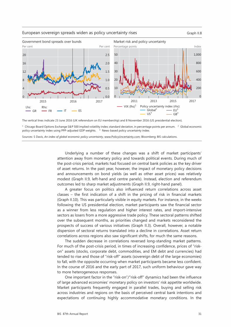
A series of electoral results in Europe reassured markets in the first half of 2017. European stocks outperformed the S&P 500 in the days following the defeat of Eurosceptic parties in the Dutch elections in mid-March. In late April and early May a similar outcome in the French presidential election sparked a rally in equity markets and a broad-based strengthening of the euro. The French election result also reversed part of the previous widening in intra-European sovereign spreads that had stemmed from political worries and concerns about non-performing loans in some national banking systems (Graph II.8, left-hand panel, and Chapter V). The outcome of the UK parliamentary elections on 8 June, however, added another note of uncertainty to markets.
By May 2017, global equity markets were again at or close to record highs and volatility indicators at historical lows. True, markets experienced occasional shocks, including geopolitical concerns in the Middle East and the Korean peninsula and a swirl of legal issues confronting the US presidency. But they proved resilient as growth remained strong. At the same time, moderate inflation data kept a lid on bond yields.
The changing nature of market risk
The past year saw shifts in a number of risk relationships that had characterised financial markets in recent years. One such shift was the fall in correlations of asset returns across sectors and regions. Another was the growing divergence between
Equity valuations in advanced economies approach or exceed historical norms
Ratio Graph II.6
United States Europe2 Japan
The dashed lines indicate the long-term averages of the CAPE ratio (December 1982–latest) and the forward P/E ratio (July 2003–latest).
1 For each country/region, the CAPE ratio is calculated as the inflation-adjusted MSCI equity price index (in local currency) divided by the10-year moving average of inflation-adjusted reported earnings. 2 European advanced economies included in the MSCI Europe index. 3 Defined as the price to 12-month forward earnings.
Sources: Barclays; Datastream.
Emerging market assets overcome doubts, strengthen in new year
1 January 2014 = 100 Graph II.7
Equities Exchange rates1 Credit default swaps2
1 An increase indicates a depreciation of the local currency against the US dollar. For Russia, 2 January 2014 = 100. 2 CDS on senior unsecured debt, five-year maturity.
Sources: Datastream; national data; BIS calculations.
25
20
15
10171615141312
Cyclically adjusted P/E (CAPE)1
18
15
12
9171615141312
Forward price/earnings (P/E)3
40
30
20
10171615141312
200
150
100
502017201620152014
Brazil Russia
220
160
100
402017201620152014
India China South Africa
300
200
100
02017201620152014
Korea Mexico

29BIS 87th Annual Report
Box II.ATerm premia: concepts, models and estimates
Unconventional monetary policy measures, in particular large-scale government bond purchases, have put the spotlight on the impact of monetary policy on the term structure of interest rates. One question is how big the monetary policy impact on long-term bond yields has been, and through which channels. Another, closely related question concerns the potential magnitude of a correction in bond yields.
One standard way of approaching these questions is to decompose long-term interest rates into an expectations component and a term premium. Conceptually, the former captures the path of short-term interest rates as priced in bond markets, while the latter measures the excess return over short-term bonds that risk-averse investors demand for holding long-term bonds. More recently, the evolution of term premia on long-term government bonds has received particular attention, both as a proxy measure of the impact of central bank bond purchases (and balance sheet policies more generally), and as an indicator of snapback risk: to the extent that central bank bond purchases have compressed term premia, market participants might revert to demanding a “normal” compensation for holding long-term bonds once they expect such policies to end.
Neither term premia nor the expected path of future short-term interest rates – the two assumed components of bond yields – are directly observable. Thus, estimates depend crucially on the approach followed and the additional assumptions made.
One approach is to proxy the expected short rate path with survey measures. A limitation is that surveys are infrequent and cover only a restricted set of forecast horizons. Nor is it clear that surveys reliably represent market participants’ actual expectations. More sophisticated techniques model the term structure of interest rates with a small set of explanatory factors, and then interpret the model forecasts as agents’ expectations of future short-term rates. In this framework, term premia ensure that the dynamics of the factors driving the yields are consistent with the pricing of bonds of various maturities prevailing at each point in time, assuming a specific way of pricing the associated risks. While the most common approach in the literature is to extract the factors exclusively from bond yields themselves, some researchers have also included survey data on interest rate expectations. Others have
Term premium estimates and their drivers
In percentage points Graph II.A
Ten-year term premium Average expected short rate over 10 years
Cumulative changes in yields
ACM = Adrian, Crump and Moench; HT = Hördahl and Tristani; KW = Kim and Wright.
1 ZLB = zero lower bound. 2 Difference between 2000 average and November 2008. 3 Difference between January 2009 and December2015.
Sources: T Adrian, R Crump and E Moench, “Pricing the term structure with linear regressions”, Journal of Financial Economics, October 2013, pp 110–38; P Hördahl and O Tristani, “Inflation risk premia in the euro area and the United States”, International Journal of Central Banking, September 2014, pp 1–47; D Kim and J Wright, “An arbitrage-free three-factor term structure model and the recent behavior of long-term yields and distant-horizon forward rates”, FEDS Working Papers, August 2005; Survey of Professional Forecasters.
8
6
4
2
0
–2171207029792
ACMTen-year government bond yield
HT KW
8
6
4
2
0
–2171207029792
ACMEffective federal funds rate
HT KW
1
0
–1
–2
–3
–4KWHTACMKWHTACM
Pre-ZLB1, 2 ZLB1, 3
Ten-year term premium
10 yearsAverage expected short rate over

30 BIS 87th Annual Report
proposed the use of macroeconomic factors, such as measures of inflation and economic activity, in addition to (or instead of) yield factors, to enable a deeper understanding of the economic drivers of bond yields. Typically, these macro factors are then linked to the short-term interest rate via an assumed monetary policy rule.
Different modelling choices naturally yield different term premia. This is illustrated in the left-hand panel of Graph II.A, which plots various estimates of US 10-year term premia together with the 10-year yield itself. These estimates come from dynamic term structure models: the yield-factor-only model used by the Federal Reserve Bank of New York (Adrian, Crump and Moench (2013; ACM)); a yield-factor model with additional survey information used by the Federal Reserve Board (Kim and Wright (2005; KW)); and a macro factor model that also includes survey information used by the BIS and the ECB (Hördahl and Tristani (2014; HT)). Despite the large uncertainty that surrounds specific model estimates and the greater variability in the ACM model estimates, the various methods broadly agree on some key features: a gradual decline in premia over the past 25 years or so, which parallels the decline in observed yields; very low (and even negative) premia post-crisis; and near zero premia at the current juncture.
The differences in the term premium estimates across models can be sizeable at times and appear to exhibit systematic patterns, largely driven by the way the expectations component is constructed (Graph II.A, centre panel). Overall, this component tends to broadly follow movements at the very short-term end of the yield curve, as measured by the effective federal funds rate. This co-movement is stronger for the ACM yield-only model, since the use of survey information by the KW and HT approaches provides a separate anchor for expectations. For example, following the Lehman collapse in late 2008, the ACM model produces a drop in the average expected US short-term interest rate of more than 100 basis points, to around 1.5%, and a corresponding surge in the term premium to more than 3%. In the KW model, the drop is considerably smaller, around 50 basis points, and since the average expected short-term rate is then stable at around 3% – very close to the level indicated by the survey data – the plunge in the 10-year yields in late 2010 leads to a sharp drop in the term premium, which turns negative. The HT model estimate is somewhere in between, arguably owing to the inclusion of macroeconomic information.
Such differences become starker if one compares the cumulative change in yields in the pre- and post-zero lower bound (ZLB) period (right-hand panel of Graph II.A).p Pre-ZLB, the ACM model attributes all the decline in US 10-year yields to lower expected short rates, resulting in an actual increase in the term premium. While the KW and HT models also point to a relatively large role for changes in expectations, they instead indicate a decline in the premium. At the ZLB, the role of changes in term premia increases in all models, but more so in the ACM yield-only approach.
An additional difference across models relates to their real-time performance. Are the estimates revised as more observations become available and the parameter estimates updated? Here, the models that include more parameters or data inputs that are themselves heavily revised, such as estimates of the output gap, are at a disadvantage.q
A prerequisite of this decomposition is that agents’ portfolio decisions are based on long-range predictions, rather than on considerations such as risk management or shorter-horizon expectations. On the conceptual pitfalls in treating the “market” as a “person” with such attributes, see H S Shin, “How much should we read into shifts in long-dated yields?”, speech at the US Monetary Policy Forum, New York, March 2017. The factor dynamics are typically modelled as a low-order vector autoregressive (VAR) process; in addition, it is assumed that the risks that investors are concerned about are priced in such a way that they depend linearly on the factors. This type of risk-price assumption gives rise to implied adjusted factor dynamics (so-called “risk-neutral dynamics”, as opposed to the real-world “objective dynamics”) that are consistent with how bonds are priced in the market. See eg D Duffie and R Kan, “A yield-factor model of interest rates”, Mathematical Finance, vol 6, no 4, October 1996, pp 379–406. See eg D Kim and A Orphanides, “Term structure estimation with survey data on interest rate forecasts”, Journal of Financial and Quantitative Analysis, vol 47, 2012, pp 241–72. Examples include A Ang and M Piazzesi, “A no-arbitrage vector autoregression of term structure dynamics with macroeconomic and latent variables”, Journal of Monetary Economics, vol 50, no 4, May 2003, pp 745–87; P Hördahl, O Tristani and D Vestin, “A joint econometric model of macroeconomic and term structure dynamics”, Journal of Econometrics, vol 131, March-April 2006, pp 405–44; and G Rudebusch and T Wu, “A macro-finance model of the term structure, monetary policy and the economy”, The Economic Journal, vol 118, July 2008, pp 906–26. Detailed references are given in the sources to Graph II.A. p A related issue is how the zero lower bound affects the near-term end of the yield curve and hence estimates of expected short-term rates and the term premium. While a number of models have been suggested to deal with the lower bound issue – see eg J Wu and F Xia, “Measuring the macroeconomic impact of monetary policy at the zero lower bound”, Journal of Money, Credit and Banking, vol 48, pp 253–91 – the term premia implications have not been fully investigated. q This is the case, in particular, of the HT model, which therefore trades off a richer interpretation of the yield curve determinants, more consistent with the architecture of macroeconomic models, with poorer real-time performance.
measures of market risk and of policy uncertainty. Finally, the expected distribution of asset returns became increasingly skewed. These changes may point towards an increased risk of a snapback in key asset prices.
31BIS 87th Annual Report
Underlying a number of these changes was a shift of market participants’ attention away from monetary policy and towards political events. During much of the post-crisis period, markets had focused on central bank policies as the key driver of asset returns. In the past year, however, the impact of monetary policy decisions and announcements on bond yields (as well as other asset prices) was relatively modest (Graph II.9, left-hand and centre panels). Instead, election and referendum outcomes led to sharp market adjustments (Graph II.9, right-hand panel).
A greater focus on politics also influenced return correlations across asset classes – the first indication of a shift in the pricing of risk in financial markets (Graph II.10). This was particularly visible in equity markets. For instance, in the weeks following the US presidential election, market participants saw the financial sector as a winner from less regulation and higher interest rates, and import-intensive sectors as losers from a more aggressive trade policy. These sectoral patterns shifted over the subsequent months, as priorities changed and markets reconsidered the prospects of success of various initiatives (Graph II.3). Overall, however, a notable dispersion of sectoral returns translated into a decline in correlations. Asset return correlations across regions also saw significant shifts, for much the same reasons.
The sudden decrease in correlations reversed long-standing market patterns. For much of the post-crisis period, in times of increasing confidence, prices of “risk-on” assets (stocks, corporate debt, commodities, and EM debt and currencies) had tended to rise and those of “risk-off” assets (sovereign debt of the large economies) to fall, with the opposite occurring when market participants became less confident. In the course of 2016 and the early part of 2017, such uniform behaviour gave way to more heterogeneous responses.
One important factor in the “risk-on”/”risk-off” dynamics had been the influence of large advanced economies’ monetary policy on investors’ risk appetite worldwide. Market participants frequently engaged in parallel trades, buying and selling risk across industries and regions on the basis of perceived central bank intentions and expectations of continuing highly accommodative monetary conditions. In the
European sovereign spreads widen as policy uncertainty rises Graph II.8
Government bond spreads over bunds Market risk and policy uncertainty Per cent Per cent Percenta e points Index
The vertical lines indicate 23 June 2016 (UK referendum on EU membership) and 8 November 2016 (US presidential election).
1 Chicago Board Options Exchange S&P 500 implied volatility index; standard deviation, in percentage points per annum. 2 Global economic policy uncertainty index using PPP-adjusted GDP weights. 3 News-based policy uncertainty index.
Sources: S Davis, An index of global economic policy uncertainty, www.PolicyUncertainty.com; Bloomberg; BIS calculations.
Political events move markets, monetary policy meetings much less
In basis points Graph II.9
FOMC1 meetings ECB Governing Council meetings Political events2
1 Federal Open Market Committee. 2 23 June 2016: UK referendum on EU membership; 8 November 2016: US presidential election; 24 April2017: first round of French presidential election.
Sources: Bloomberg; BIS calculations.
20
16
12
8
4
0
2.5
2.0
1.5
1.0
0.5
0.0201720162015
GRLhs:
FRRhs:
IT ES
50
40
30
20
10
0
1,000
800
600
400
200
02017201520132011
VIX (lhs)1
Global2
US3
Policy uncertainty index (rhs):EU3
GB3
20
0
–20
–40
–603210–1–2
14 Dec 20161 Feb 201715 Mar 2017
Ten-year US Treasury yield relative to:
20
0
–20
–40
–603210–1–2
Days
8 Dec 201619 Jan 20179 Mar 2017
Ten-year German bund yield relative to:
20
0
–20
–40
–603210–1–2
23 Jun 2016 (GB)8 Nov 2016 (US)24 Apr 2017 (FR)
Ten-year goverment yield relative to:
g

32 BIS 87th Annual Report
Political events move markets, monetary policy meetings much less
In basis points Graph II.9
FOMC1 meetings ECB Governing Council meetings Political events2
1 Federal Open Market Committee. 2 23 June 2016: UK referendum on EU membership; 8 November 2016: US presidential election; 24 April2017: first round of French presidential election.
Sources: Bloomberg; BIS calculations.
20
0
–20
–40
–603210–1–2
14 Dec 20161 Feb 201715 Mar 2017
Ten-year US Treasury yield relative to:
20
0
–20
–40
–603210–1–2
Days
8 Dec 201619 Jan 20179 Mar 2017
Ten-year German bund yield relative to:
20
0
–20
–40
–603210–1–2
23 Jun 2016 (GB)8 Nov 2016 (US)24 Apr 2017 (FR)
Ten-year government yield relative to:
Correlation patterns break down
Correlation coefficient Graph II.10
Cross-correlations1 Asset return correlations2
The vertical lines in the left-hand panel indicate 17 July 2007 (Bear Stearns discloses the virtual demise of two of its mortgage-backed security funds) and 8 November 2016 (US presidential election).
1 Average of one-year rolling bilateral correlation coefficients of daily changes in the corresponding indices/assets included in each category; the sign of negative correlations is inverted. For “cross-sectoral”, the S&P 500 level 1 sectoral sub-indices (11 sub-indices); for “cross-regional”, main stock indices for BR, CN, GB, HK, JP, KR, MX, PL, RU, TR, US and Europe. 2 Intra-quarter correlation coefficients of daily changes in the corresponding indices included in each category. 3 AE and EME Bank of America Merrill Lynch aggregates. 4 The sign has been flipped to facilitate comparability.
Sources: Bank of America Merrill Lynch; Bloomberg; Datastream; JPMorgan Chase; BIS calculations.
0.75
0.60
0.45
0.30
0.15
0.00171513110907
Sectoral Regional
0.75
0.60
0.45
0.30
0.15
0.00Q2 17Q1 17Q4 16Q3 16Q2 16Q1 16
AE and EME stockAE stock index and VIX4
AE stock and investment grade bond4
AE high-yield and EME government bond
Indices:3

33BIS 87th Annual Report
period under review, politically driven developments in other policies played a greater role, contributing to the fall in correlations.
The second sign of a change in risk relationships was the growing divergence between historically low market indicators of risk and rising indices of policy uncertainty (Graph II.8, right-hand panel). There are a number of explanations for this widening gap (Box II.B). One is that rising political uncertainty contrasted with greater confidence in the sustainability of the economic upswing. Another, related explanation is that the prospect of growth- and profit-boosting policy measures outweighed the uncertainty surrounding them: market participants viewed manifestations of political risks that would damage growth and profits as tail events.
Indeed, a third development pointing to changes in risk dynamics was indications that markets did price in tail events. Despite the low level of the VIX, indicators of risks of large asset price changes trended up from the beginning of 2017. The most popular of these, the CBOE SKEW index, uses out-of-the-money option prices to measure the risk of large declines in the S&P 500. This index rose sharply from January until March 2017, then retreated. The RXM, an index that traces the willingness to profit from large increases in the S&P, rose steadily through the first five months of 2017 (Graph II.11, left-hand panel).
The expectations of extreme returns have also been reflected in the cost of buying protection against large moves in exchange rates. Prices of risk reversals on the US dollar against other currencies suggest that investors were willing to pay more to protect themselves against a large dollar appreciation against the euro in the immediate aftermath of the US election (Graph II.11, right-hand panel). As the dollar weakened in 2017, these indicators retreated.
Evidence for the pricing of tail risks in fixed income markets is less definitive. Most options trading activity takes place over the counter, so price information is harder to come by. Nevertheless, some factors may point to a heightened risk of an unexpectedly large rise – a snapback – in core bond yields, whether priced in or not.
Markets price in tail moves
Index Graph II.11
Skew indices FX risk reversals (12-month)3
The vertical lines indicate 23 June 2016 (UK referendum on EU membership) and 8 November 2016 (US presidential election).
1 The CBOE SKEW index is a global, strike-independent measure of the slope of the implied volatility curve. 2 The CBOE S&P 500 Risk Reversal index tracks the performance of a hypothetical risk reversal strategy that buys a rolling out-of-the-money monthly SPX call option, sells a rolling out-of-the-money monthly SPX put option and holds a rolling money market account. 3 An increase indicates that market participants are willing to pay more to hedge against an appreciation of the US dollar.
Source: Bloomberg.
Financial market anomalies narrow, but persist Graph II.12
Three-month Libor-OIS spread Three-month cross-currency basis swaps vs US dollar
Ten-year interest rate swap spreads1
Basis points Basis points Per cent
1 Monthly averages of daily data.
Sources: Bloomberg; Datastream; BIS calculations.
145
140
135
130
125
120
900
875
850
825
800
775Q2 17Q1 17Q4 16Q3 16Q2 16Q1 16
CBOE SKEW index (lhs)1 RXM index (rhs)2
5
4
3
2
1
0Q2 17Q1 17Q4 16Q3 16Q2 16Q1 16
USD/EUR JPY/USD USD/GBP
40
30
20
10
0
–10201720162015
USDJPY
EURGBP
25
0
–25
–50
–75
–100201720162015
AUDJPY
EURGBP
50
25
0
–25
–50
–75171513110907
USDEUR
Swap spreads:
US Treasury holdingscentral bankChange in

34 BIS 87th Annual Report
Box II.BRisk or uncertainty?
The divergence between measures of financial risk and of policy uncertainty featured prominently in the period under review. The two phenomena are conceptually related. Financial risk traditionally refers to the distribution of future returns as implied by financial market prices, in particular those of options. Financial risk is higher, the greater the potential for large price movements, in either direction. By contrast, measures of policy uncertainty typically try to capture the general degree to which observers are unsure about policy-related economic events.
While implied volatility (as derived from option prices) has become the most prominent measure of financial risk, policy uncertainty is, by its very nature, more challenging to quantify. Among the various indicators, the Baker, Bloom and Davis (2016) policy uncertainty index has become quite popular. The US-focused version of the index has three components: newspaper coverage of uncertainty about economic policy matters; the number of federal tax code provisions set to expire in future years; and the degree of disagreement among economic forecasters about future government spending and inflation. Indices that have been compiled for other large economies are based only on the first of these components.
One possible explanation for the divergence between implied volatility and news-based measures of policy uncertainty is an amplification mechanism in media reporting: the proliferation of uncertainty-related articles may have triggered a broader coverage of the topic. Indeed, the rise in the policy uncertainty index since mid-2016 has coincided with a surge in newspaper articles covering uncertainty (Graph II.B, left-hand panel). By contrast, the index component that focuses on forecast disagreements has been trending downwards, more closely tracking market volatility.
Other, complementary explanations have to do with financial market prices. Market volatility could be low because of factors unrelated to risk: prices could be stable, for example, because of abundant liquidity related to
Policy uncertainty and financial market risk diverge Graph II.B
US Economic Policy Uncertainty decomposition
Monthly trading volumes in volatility ETFs, in millions of shares
Volatility, uncertainty and recessions
Percentage points Index Percenta e points Index
The vertical lines in the left-hand panel indicate 23 June 2016 (UK referendum on EU membership) and 8 November 2016 (US presidential election). The shaded areas in the right-hand panel indicate economic contraction periods as defined by the US National Bureau of Economic Research.
1 Chicago Board Options Exchange S&P 500 implied volatility index; standard deviation, in percentage points per annum. 2 VelocityShares Daily Inverse VIX Short-Term exchange-traded note (ETN). Payments are based on the inverse performance of the underlying index and the S&P 500 VIX Short-Term Futures index. 3 iPath S&P 500 VIX Short-Term Futures ETN. Payments are based on the performance of the underlying index and the S&P 500 Short-Term VIX Futures TR index. 4 ProShares Ultra VIX Short-Term Futures exchange-traded fund (ETF). The fund seeks daily investment results that correspond to twice (200%) the performance of the S&P 500 VIX Short-Term Futures index.
Sources: S Davis, An index of global economic policy uncertainty, www.PolicyUncertainty.com; www.nber.org/cycles.html; Bloomberg; BIS calculations.
22.5
20.0
17.5
15.0
12.5
10.0
250
200
150
100
50
0
Q2 17Q4 16Q2 16
VIX1Lhs:
News-basedRhs :
Govt purchasingCPI
Forecast disagreements:
60
48
36
24
12
0
32.5
26.0
19.5
13.0
6.5
0.0
2017201620152014
XIV2
VXX3Lhs: UVXY4Rhs:
100
80
60
40
20
0
240
200
160
120
80
40
17120702979287
VIX (lhs)1
Uncertainty index (rhs)US Economic Policy
g

35BIS 87th Annual Report
First, market participants have so far been rather sanguine about higher inflation risks. In particular, bond yields did not rise alongside rallying equity markets in the first half of 2017. Bond yields could snap back if inflation risks unexpectedly materialised and participants reconsidered the timing and pace of monetary policy normalisation, including unwinding central bank balance sheets (Chapter IV).
Second, a number of structural factors may potentially play a role in amplifying price movements in fixed income markets. One set of drivers relates to the investment and hedging behaviour of large institutional investors.1 Falling yields in the post-crisis period led some pension funds and insurers to buy more long-maturity bonds to match the increased duration of their liabilities. This in turn drove long-term yields down further.
More generally, low market volatility can foster risk-taking. Some popular market strategies, such as “risk parity”, implement leveraged portfolio allocations based on the historical risk profiles of different asset classes. In some cases, a shift in volatility patterns could mechanically induce asset sales, which would in turn amplify the volatility spike and drive the market down further.
Perhaps reflecting these or similar mechanisms, there is evidence that in recent years long-term interest rates have tended to react more sharply to high-frequency movements in short-term interest rates than before.2 The “taper tantrum” and “bund tantrum” – when government yields rose unexpectedly sharply in mid-2013 and the first half of 2015, respectively – showed that an aggregate rotation out of fixed income assets can produce significant temporary dislocations in asset prices, particularly following a lengthy period of relative market calm.
Pricing anomalies retreat but do not disappear
Even as they reacted to policy shifts and political shocks, financial markets continued to reflect the impact of longer-term structural changes in technology, regulatory frameworks and bank business models (Chapter V). Foreign exchange markets have seen significant shifts in the role of different market players in recent years, with implications for market depth and resilience (Box II.C). Other markets have also seen changes to liquidity and pricing dynamics. Some of these changes have produced persistent pricing anomalies.
International banks’ US dollar funding is one area where structural change has had an impact on markets. In October 2016, a new set of rules for US prime money market mutual funds (MMMFs) designed to mitigate systemic risks came into effect (Chapter V). Starting in late 2015, as banks began to shift their dollar funding
central banks’ quantitative easing policies. Another possibility is that policy uncertainty captures tail risks that may not significantly affect implied volatilities due to the inherent difficulty in assigning probability to tail events. Position-taking in volatility-based products, in which activity has grown rapidly in recent years, could be suppressing the underlying volatility index (Graph II.B, centre panel). Finally, the news-based measures of uncertainty may reflect concerns that are not yet on market participants’ radar, if their effects play out over a longer horizon.
The divergence between policy uncertainty and market volatility is not unprecedented. Previous bouts of high policy uncertainty alongside relatively low market volatility occurred in the wake of the early 1990s recession, in the years after the bursting of the tech bubble and the 9/11 attacks, and in the aftermath of the Great Financial Crisis. In general, the volatility and policy uncertainty indices appear to have been tightly related and relatively subdued in periods leading up to crises, and disconnected in the early stages of economic recovery (Graph II.B, right-hand panel).
S Baker, N Bloom and S Davis, “Measuring economic policy uncertainty”, Quarterly Journal of Economics, vol 131, no 4, pp 1593–636, 2016.

36 BIS 87th Annual Report
sources in anticipation of the revised rules, these changes affected short-term US dollar money markets. For example, the spread between US dollar Libor and overnight index swap (OIS) rates widened throughout 2016 (Graph II.12, left-hand panel). This spread narrowed once the October deadline passed, but did not return to its 2015 levels until the second quarter of 2017.
The MMMF reform also contributed to a wider cross-currency basis (Graph II.12, centre panel). The cross-currency basis indicates the amount by which the interest paid to borrow one currency by swapping it against another in the FX market differs from the cost of directly borrowing it in the cash market. A non-zero basis implies a violation of covered interest parity (CIP) – one of the most reliable pricing relationships in financial markets pre-crisis. Since then, dollar borrowers have paid a premium for funding through the FX swap market (negative basis) against most currencies, notably the euro and the yen, while against others, including the Australian dollar, they have enjoyed a discount.
A number of factors determine the persistence of the cross-currency basis.3 During the Great Financial Crisis (GFC), CIP violations reflected crisis-induced tensions in the interbank markets, in particular non-US banks’ difficulties in obtaining dollar funding. More recently, a combination of unprecedented hedging demand and more stringent limits to arbitrage has been at work. Among other things, in recent years, the low-rate environment has led non-US institutional investors to buy dollar-denominated securities as part of their search for yield, increasing the demand for FX-hedged investments in US dollar assets. At the same time, banks now face higher costs for using their balance sheet to close arbitrage opportunities, as a result of tighter management of balance sheet risks and more binding regulatory constraints. A stronger dollar can also increase the cost of bank balance sheet capacity. Thus, the post-crisis behaviour of the cross-currency basis has also been tightly related to US dollar strength.4 The basis narrowed in most currency pairs in late 2016 and the first half of 2017, but did not disappear.
Another persistent market anomaly has emerged in the single currency interest rate swap market (Graph II.12, right-hand panel). Spreads between the fixed rate
Markets price in tail moves
Index Graph II.11
Skew indices FX risk reversals (12-month)3
The vertical lines indicate 23 June 2016 (UK referendum on EU membership) and 8 November 2016 (US presidential election).
1 The CBOE SKEW index is a global, strike-independent measure of the slope of the implied volatility curve. 2 The CBOE S&P 500 Risk Reversal index tracks the performance of a hypothetical risk reversal strategy that buys a rolling out-of-the-money monthly SPX call option, sells a rolling out-of-the-money monthly SPX put option and holds a rolling money market account. 3 An increase indicates that market participants are willing to pay more to hedge against an appreciation of the US dollar.
Source: Bloomberg.
Financial market anomalies narrow, but persist Graph II.12
Three-month Libor-OIS spread Three-month cross-currency basis swaps vs US dollar
Ten-year interest rate swap spreads1
Basis points Basis points Per cent
1 Monthly averages of daily data.
Sources: Bloomberg; Datastream; BIS calculations.
145
140
135
130
125
120
900
875
850
825
800
775Q2 17Q1 17Q4 16Q3 16Q2 16Q1 16
CBOE SKEW index (lhs)1 RXM index (rhs)2
5
4
3
2
1
0Q2 17Q1 17Q4 16Q3 16Q2 16Q1 16
USD/EUR JPY/USD USD/GBP
40
30
20
10
0
–10201720162015
USDJPY
EURGBP
25
0
–25
–50
–75
–100201720162015
AUDJPY
EURGBP
50
25
0
–25
–50
–75171513110907
USDEUR
Swap spreads:
US Treasury holdingscentral bankChange in

37BIS 87th Annual Report
Box II.CChanges in the FX market ecosystem
Daily trading in foreign exchange markets amounted to $5.1 trillion in 2016, according to the BIS Triennial Central Bank Survey of foreign exchange market activity. For the first time, activity fell relative to the previous survey three years earlier. Trading by hedge funds and principal trading firms declined, while that by institutional investors increased significantly. Subdued trade and capital flows, shifts in major central banks’ monetary policies and the decline in FX prime brokerage were behind many of these trends. These shifts in market players and drivers have gone hand in hand with a further evolution in FX liquidity provision and changes in FX trade execution (see Chapter V for a broader discussion of changes to large dealer banks’ business models).
Among dealer banks, there has been a growing bifurcation between the few large institutions still willing to take risks onto their balance sheets as principals and those that have primarily moved to an agency model of market-making. Indeed, the 2016 Triennial Survey found that the number of banks accounting for 75% of FX turnover resumed its trend decline (Graph II.C.1, left-hand panel), while the share of inter-dealer trading picked up for the first time since the 1995 survey.
As a result, FX market liquidity now flows from a handful of top-tier “core” FX dealer banks to the other “periphery” banks. This inter-dealer trading pattern marks a change from the classic “hot potato” trading of inventory imbalances, the main driver of previous trading growth among dealers. Only a small number of bank dealers have retained a strong position as so-called “flow internalisers”. Internalisation refers to the process whereby dealers seek to match staggered offsetting client flows on their own books instead of immediately hedging them in the inter-dealer market. The 2016 Triennial Survey found that internalisation ratios of FX dealer banks intermediating large flows and of banks located in the top trading centres are much higher compared with those of other FX dealers (Graph II.C.1, centre panel).
Dealer banks appear to have focused more on retaining a relationship-driven market structure, where bilateral OTC transactions dominate, albeit in electronic form. Bilateral trading takes place primarily via proprietary single-bank trading platforms operated by FX dealing banks (Graph II.C.2, left-hand panel), or electronic price streams. This
Changing patterns of inter-dealer trading and the entry of non-bank market-makers
In per cent Graph II.C.1
Bifurcation among FX dealers Internalisation ratios by trading centre size
Share of trading by top dealers7
1 Across the following jurisdictions: AU, BR, CH, DE, DK, FR, GB, HK, JP, SE, SG and US. 2 Spot, outright forwards and FX swaps. 3 Adjusted for local and cross-border inter-dealer double-counting, ie “net-net” basis; daily averages in April. 4 AU, CH, DE, DK, FR, GB, HK, JP, SG and US. 5 Remaining 40 jurisdictions that supplied internalisation ratios. 6 Weighted by each reporting dealer’s trading volumes, excluding zeros and non-reporting. 7 Based on Euromoney rankings.
Sources: Euromoney Foreign Exchange Survey 2016; BIS Triennial Central Bank Survey; BIS calculations.
13
11
9
7
5
70
60
50
40
3016131007040198
Mean number of banks covering 75% of FX turnover (lhs)1, 2
Inter-dealer trading, share of total FX turnover (rhs)3
48
36
24
12
0
Others5Top 10 trading centres4
/ 25th–75th percentilesVolume-weighted median6
Simple median
75
60
45
30
1516131007040198
Top five banks Top 12 banks

38 BIS 87th Annual Report
small set of top global FX dealer banks has faced competition from sophisticated technology-driven non-bank liquidity providers (Graph II.C.2, centre panel). Some of these have also morphed from pure high-frequency traders into flow internalisers and have started pricing directly to clients.
While the relationship-driven, direct dealer-customer trading on heterogeneous electronic trading venues delivers lower spreads in stable market conditions, its resilience to stress is as yet unproven. To be sure, dealers can internalise large FX flows and quote narrow spreads to their customers in good times. But their need to hedge inventory risk on an anonymous basis in the inter-dealer market rises sharply in stress episodes (Graph II.C.2, right-hand panel). In this sense, anonymous trading venues, such as EBS and Reuters, can be seen as public good providers. Furthermore, while technology-driven players have also emerged as market-makers and liquidity providers, the majority of non-bank market-makers often do not bring much risk-absorption capacity to the market.
Bank for International Settlements, “Foreign exchange turnover in April 2016”, Triennial Central Bank Survey, September 2016; see also M Moore, A Schrimpf and V Sushko, “Downsized FX markets: causes and implications”, BIS Quarterly Review, December 2016, pp 35–51. See M Evans and R Lyons, “Order flow and exchange rate dynamics”, Journal of Political Economy, vol 110, no 1, 2002, pp 170–80; and W Killeen, R Lyons and M Moore, “Fixed versus flexible: lessons from EMS order flow”, Journal of International Money and Finance, vol 25, no 4, 2006, pp 551–79.
Shifts in electronic trading and trading on primary inter-dealer venues Graph II.C.2
Electronic execution methods1 Share of algorithmic trading on EBS FX illiquidity and trading on EBS5
Per cent Per cent z-score USD trn
1 Adjusted for local and cross-border inter-dealer double-counting. 2 Single-bank trading systems operated by a single dealer. 3 Other electronic direct execution methods, eg direct electronic price streams. 4 Electronic communication networks. 5 The systematic (market) FX illiquidity measure is from Karnaukh et al (2015) and is a standardised indicator based on a composite measure of relative bid-ask spreads and bid-ask spreads adjusted for the currency variance, covering 30 currency pairs.
Sources: N Karnaukh, A Ranaldo and P Söderlind, "Understanding FX liquidity", Review of Financial Studies, vol 28, no 11, 2015, pp 3073–108; EBS; BIS Triennial Central Bank Survey; BIS calculations.
23% 33%
31%26%
24% 19%
16% 19%
100
75
50
25
020162013
Single-bankplatforms2
Electronicdirect, other3
Electronic direct:
matching/EBSReuters
Other ECNs4
dark poolsindirect, includingOther electronic
Electronic indirect:
100
75
50
25
01613100704
Algorithmic tradingManual trading
3
2
1
0
–1
0.25
0.20
0.15
0.10
0.05161412100806
Systemic FX illiquidity (lhs)EBS turnover (rhs)
leg of these instruments and government bond yields, normally positive to reflect counterparty credit risk, dropped below zero for US dollar contracts in 2015. This may in part have reflected sales of US Treasuries by EME reserve managers, which would have pushed Treasury yields upwards. In addition, a supply-demand imbalance appears to have pushed the rate on the fixed rate leg of the swaps downwards. On the one hand, the demand to receive fixed rates has risen along with the volume of fixed income US dollar instruments issued worldwide. On the other, the large US government-sponsored entities, which before the GFC tended

39BIS 87th Annual Report
to pay the fixed rate leg and receive floating rates in dollar swap markets in order to hedge their portfolios of long-term fixed rate mortgages, are no longer active participants now that the Federal Reserve has taken over a large share of these portfolios through its asset purchase programmes. And, as with the CIP anomaly, large dealer banks are less willing to use their balance sheets to exploit the arbitrage opportunities created by this imbalance. Spreads on euro-denominated swaps, which were not subject to these pressures, have widened in the past few years, perhaps because of pressure on euro government bond yields from the ECB’s asset purchase programme.5
The interest rate swap anomaly, too, diminished over the period under review but has not disappeared. The US dollar spread became less negative from mid-2016, while the euro spread widened further. On the dollar side, rising yields may have reduced investors’ demand for receive-fixed positions; on the euro side, the ECB’s asset purchases continued to keep benchmark government yields low.

40 BIS 87th Annual Report
Endnotes1 See D Domanski, H S Shin and V Sushko, “The hunt for duration: not waving but drowning?”, IMF
Economic Review, vol 65, no 1, April 2017, pp 113–53.
2 See S Hanson, D Lucca and J Wright, “Interest rate conundrums in the twenty-first century”, Federal Reserve Bank of New York Staff Reports, no 810, March 2017.
3 See C Borio, R McCauley, P McGuire and V Sushko, “Covered interest parity lost: understanding the cross-currency basis”, BIS Quarterly Review, September 2016, pp 45–64.
4 See S Avdjiev, W Du, C Koch and H S Shin, “The dollar, bank leverage and the deviation from covered interest parity”, BIS Working Papers, no 592, November 2016.
5 See S Sundaresan and V Sushko, “Recent dislocations in fixed income derivatives markets”, BIS Quarterly Review, December 2015, pp 8–9; and T Ehlers and E Eren, “The changing shape of interest rate derivatives markets”, BIS Quarterly Review, December 2016, pp 53–65.