iat 355 visual analytics luminance, contrast and colour … · visual analytics luminance, contrast...
TRANSCRIPT

IAT 355 Visual Analytics
Luminance, Contrast and Colour in Information Display Lyn Bartram

Simultaneous contrast effects
• a gray patch placed on a dark background looks lighter than the same gray patch on a light background.
• http://www.michaelbach.de/ot/lum_dynsimcontrast/index.html
Contrast, Luminance and Colour | IAT814 | 21.09.2011

Assimilation of lightness
• The gray background with black lines appears to be darker while the gray background with white lines appears to be lighter.
Contrast, Luminance and Colour | IAT814 | 21.09.2011

Mach bands
• Illusory Mach bands appear when gradients from darker to lighter shades are created
Contrast, Luminance and Colour | IAT814 | 21.09.2011

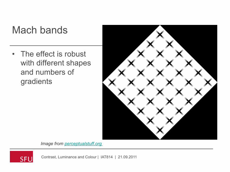
Mach bands
• The effect is robust with different shapes and numbers of gradients
Contrast, Luminance and Colour | IAT814 | 21.09.2011
Image from perceptualstuff.org

Mach bands
• The effect is robust with different shapes and numbers of gradients
Contrast, Luminance and Colour | IAT814 | 21.09.2011
Image from perceptualstuff.org
Mach bands
• The effect is robust with different shapes and numbers of gradients
Contrast, Luminance and Colour | IAT814 | 21.09.2011
Image from perceptualstuff.org

Chevreuil Illusion
• When a sequence of gray bands is generated , the bands appear darker at one edge than at the other, even though they are uniform
Contrast, Luminance and Colour | IAT814 | 21.09.2011

Chevreuil Illusion
• Again, this also works in colour and with irregular borders.
• Note we are not talking about hue change but luminance change
Contrast, Luminance and Colour | IAT814 | 21.09.2011
Image from perceptualstuff.org

Dynamic Luminance
• Changes in apparent brightness with quick changes in viewing distance
Contrast, Luminance and Colour | IAT814 | 21.09.2011
Image from perceptualstuff.org

The Breathing Light Illusion
• Change in apparent brightness as you move closer in and farther away quickly
• Gori, S. & Stubbs, D. A. ( 2006). A new set of illusions - The Dynamic Luminance-Gradient Illusion and the Breathing Light Illusion. Perception. 35, 1573-15771.
Contrast, Luminance and Colour | IAT814 | 21.09.2011
Image from perceptualstuff.org

The Café Wall Illusion
• The tiles appear to be wedge shaped and the lines curved but are actually evenly rectangular
Contrast, Luminance and Colour | IAT814 | 21.09.2011

Effects cause error!
• Simultaneous contrast effects can result in large errors of judgment when reading quantitative (value) information displayed using a gray scale.
• Ware et al showed an average error of 20% of the entire gray scale in a map encoding gravity fields using 16 levels of gray.
Contrast, Luminance and Colour | IAT814 | 21.09.2011

Cornsweet effect
• Which area is lighter than the other?
Contrast, Luminance and Colour | IAT814 | 21.09.2011
• These areas appear different in lightness, but are in fact the same

Cornsweet effect
• These areas appear different in lightness, but are in fact the same
Contrast, Luminance and Colour | IAT814 | 21.09.2011

• Seurat deliberately enhanced edge contrast to make his figures stand out.
Contrast, Luminance and Colour | IAT814 | 21.09.2011
• On the other hand .. • The enhancement of
edges is also an important part of some artists’ techniques

Low spatial frequency modulation
Contrast, Luminance and Colour | IAT814 | 21.09.2011

Luminance, Brightness and Lightness
• Luminance refers to the measured amount of light coming from some region of space. • Physical measure, not perceptual quantity
• Brightness generally refers to the perceived amount of light coming from a source. • It is used to refer only to things that are perceived as self-
luminous. • A bright light
• Lightness generally refers to the perceived reflectance of a surface. • A white surface is light. A black surface is dark
Contrast, Luminance and Colour | IAT814 | 21.09.2011

Luminance, Contrast and Constancy
Contrast, Luminance and Colour | IAT814 | 21.09.2011

Crispening
Contrast, Luminance and Colour | IAT814 | 21.09.2011

What about colour?
• Colour perception is relative
• We are sensitive to small differences • hence need sixteen million colours
• Not sensitive to absolute values • hence we can only use < 10 colours for coding
Contrast, Luminance and Colour | IAT814 | 21.09.2011
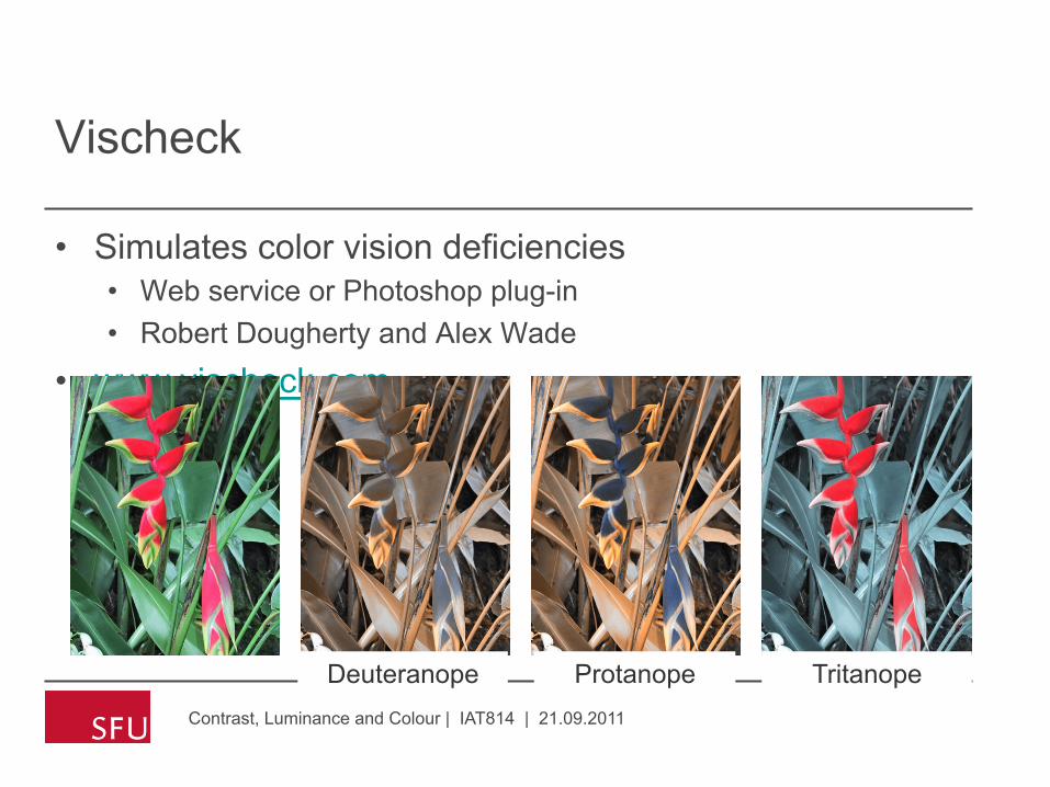
Vischeck
• Simulates color vision deficiencies • Web service or Photoshop plug-in • Robert Dougherty and Alex Wade
• www.vischeck.com
Contrast, Luminance and Colour | IAT814 | 21.09.2011
Deuteranope Protanope Tritanope

2D Color Space
Contrast, Luminance and Colour | IAT814 | 21.09.2011

Similar Colors
Contrast, Luminance and Colour | IAT814 | 21.09.2011
protanope
deuteranope
luminance

Contrast, Luminance and Colour | IAT814 | 21.09.2011

Smart Money
Contrast, Luminance and Colour | IAT814 | 21.09.2011

Color Design Terminology
• Hue (color wheel) • Red, yellow, blue (primary) • Orange, green, purple (secondary) • Opposites complement (contrast) • Adjacent are analogous • Many different color wheels*
• *See www.handprint.com for examples
• Chroma (saturation) • Intensity or purity • Distance from gray
• Value (lightness) • Dark to light • Applies to all colors, not just gray
IAT355 | Colour for Information Display

Tints and Tones
• Tone or shade • Hue + black • Decrease saturation • Decrease lightness
• Tint • Hue + white • Decrease saturation • Increase lightness
IAT355 | Colour for Information Display

IAT355 | Colour for Information Display

Gradations
IAT355 | Colour for Information Display

Psuedo-Perceptual Models
• HLS, HSV, HSB • NOT perceptual models • Simple renotation of RGB
• View along gray axis • See a hue hexagon • L or V is grayscale pixel value
• Cannot predict perceived lightness
Contrast, Luminance and Colour | IAT814 | 21.09.2011

L vs. Luminance, L*
Contrast, Luminance and Colour | IAT814 | 21.09.2011
Luminance values (retinal response)
L* values
L from HLS All the same
Corners of the RGB color cube

What makes color effective?
IAT355 | Colour for Information Display
“Good ideas executed with superb craft” —E.R. Tufte

Information Display
• Graphical presentation of information • Charts, graphs, diagrams, maps, illustrations • Originally hand-crafted, static • Now computer-generated, dynamic
• Color is a key component • Color labels and groups • Color scales (colormaps) • Multi-variate color encoding • Color shading and textures • And more…
IAT355 | Colour for Information Display
www.nps.gov
Colour includes Grey

A quick revisit of data characteristics
• What kind of task are you hoping to support?
• What kind of data do you have?
• No single approach
• Techniques and tools in context
IAT355 | Colour for Information Display

Types of values
• Nominal: names without ordering • Continents: Africa, America, Asia, Australia, Europe • No concept of relative relationship other than inclusion in the set
• Ordinal: Before-than than relationship holds • Rental cars: Economy, Compact, Mid-sized, Full-sized • Distance is not uniform
• Quantitative: Relative measurements, equal distances, numeric
IAT355 | Colour for Information Display

Color Design Principles
• Control value (lightness) • Ensure legibility • Avoid unwanted emphasis
• Use a limited hue palette • Control color “pop out” • Define color grouping • Avoid clutter from too many competing colors
• Use neutral backgrounds • Control impact of color • Minimize simultaneous contrast
IAT355 | Colour for Information Display

Envisioning Information
IAT355 | Colour for Information Display
“… avoiding catastrophe becomes the first principle in bringing color to information: Above all, do no harm.”
—E. R. Tufte
www.edwardtufte.com

Fundamental Uses
• To label (colour as noun) • To measure ( colour as quantity/value) • To represent (colour as representation)
• to imitate reality • To enliven or decorate (colour as beauty)
IAT355 | Colour for Information Display
To Label (nominal coding)
IAT355 | Colour for Information Display

Colour great for classification
• Rapid visual segmentation • Colour helps us determine type • Only about six categories
IAT355 | Colour for Information Display
Information Visualization Colin Ware

Product Categories
IAT355 | Colour for Information Display
Created by Tableau - Visual Analysis for DatabasesTM

Grouping, Highlighting
IAT355 | Colour for Information Display

Considerations for Labels
• How critical is the color encoding? • Unique specification or is it a “hint”? • Quick response, or time for inspection? • Is there a legend, or need it be memorized?
• Contextual issues • Are there established semantics? • Grouping or ordering relationships? • Surrounding shapes and colors?
• Shape and structural issues • How big are the objects? • How many objects, and could they overlap? • Need they be readable, or only visible (discernible)?
IAT355 | Colour for Information Display

Psychophysics of Labeling
• Preattentive, “pop out”
IAT355 | Colour for Information Display
13579345978274055 24937916478254137 23876597277103866 19874367259047362 95637283649105676 32543787954836754 56840378465485690
Time proportional to the number of digits
13579345978274055 24937916478254137 23876597277103866 19874367259047362 95637283649105676 32543787954836754 56840378465785690
Time proportional to the number of 7’s
13579345978274055 24937916478254137 23876597277103866 19874367259047362 95637283649105676 32543787954836754 56840378465785690
Both 3’s and 7’s “Pop out”

Contrast Creates Pop-out
IAT355 | Colour for Information Display
Hue and lightness Lightness only

Pop-out vs. Distinguishable
• Pop-out • Typically, 5-6 distinct values simultaneously • Up to 9 under controlled conditions
• Distinguishable • 20 easily for reasonable sized stimuli • More if in a controlled context • Usually need a legend
IAT355 | Colour for Information Display

Radio Spectrum Map (33 colors)
IAT355 | Colour for Information Display
http://www.cybergeography.org/atlas/us_spectrum_map.pdf

Distinguishable on Inspection
IAT355 | Colour for Information Display

Cultural semantics
• The fact that certain colours are special is because they are hard wired
• The meaning of those colours is culturally determined
IAT355 | Colour for Information Display
Summary: labeling
• Distinctiveness (perceptual distance) • Unique hues
• Don’t choose colours from the same category! • Contrast with background
• Luminance • Compensate for colour blindness • Limited number of codes • Size
• Objects should not be too small • Cultural conventions
IAT355 | Colour for Information Display
To Measure
IAT355 | Colour for Information Display

Data to Color
• Types of data values • Nominal, ordinal, numeric • Qualitative, sequential, diverging
• Types of color scales • Hue scale
• Nominal (labels) • Cyclic (learned order)
• Lightness or saturation scales • Ordered scales • Lightness best for high frequency • More = darker (or more saturated) • Most accurate if quantized
IAT355 | Colour for Information Display
Quantized • Signal varies
continuously
Discretized • Restricted to a
prescribed set of values

Pseudocoloring
• Pseudocoloring is the technique of representing continuously varying map values with a sequence of colours
• Sometimes overlaid on luminosity information • Need to use an isoluminant color map to avoid distortion
• “intuitive” based on lightness, saturation • No perceptually based hue scales
• Need to be learned
IAT355 | Colour for Information Display

Pseudocoloring
IAT355 | Colour for Information Display
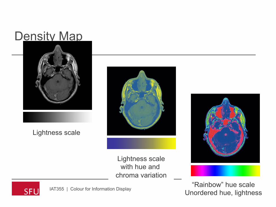
Density Map
IAT355 | Colour for Information Display
Lightness scale
Lightness scale with hue and
chroma variation “Rainbow” hue scale
Unordered hue, lightness
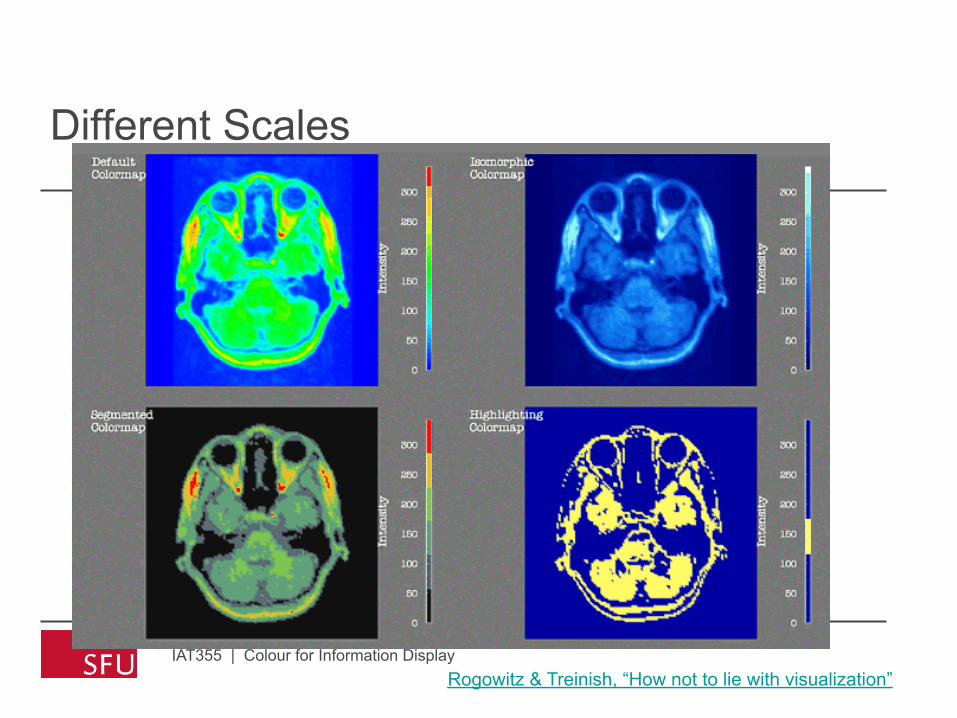
Different Scales
IAT355 | Colour for Information Display Rogowitz & Treinish, “How not to lie with visualization”

Brewer Scales
• Qulitative scales • nominal • Distinct hues, but similar emphasis
• Sequential scale • Vary in lightness and saturation • Vary slightly in hue
• Diverging scale • Complementary sequential scales • Neutral at “zero” • Cross-fade through a neutral color
IAT355 | Colour for Information Display

Brewer’s Categories
IAT355 | Colour for Information Display Cynthia Brewer, Pennsylvania State University

Thematic Maps
IAT355 | Colour for Information Display
US Census Map
Mapping Census 2000: The Geography of U.S. Diversity

Color Brewer
IAT355 | Colour for Information Display
www.colorbrewer.org

Heat Map (default ramp)
IAT355 | Colour for Information Display
Skewed Data
www.tableausoftware.com
Slightly negative

Full Range
IAT355 | Colour for Information Display
Skewed Data
www.tableausoftware.com

Stepped
IAT355 | Colour for Information Display
Skewed Data
www.tableausoftware.com

Threshold
IAT355 | Colour for Information Display
Skewed Data
www.tableausoftware.com

Color and Shading
• Shape is defined by lightness (shading) • “Color” (hue, saturation) labels
IAT355 | Colour for Information Display
Image courtesy of Siemens
CT image (defines shape) PET color highlights tumor
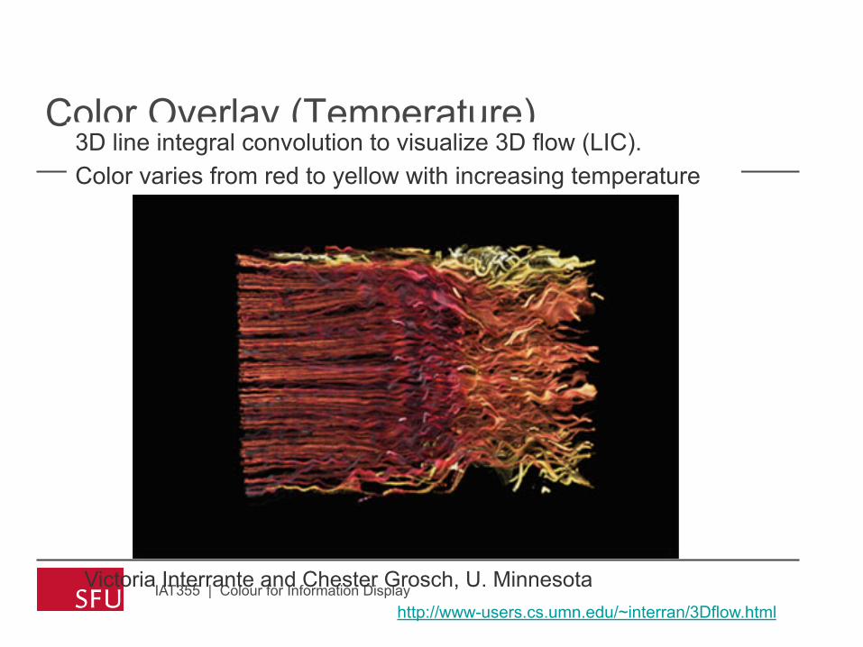
Color Overlay (Temperature)
IAT355 | Colour for Information Display
3D line integral convolution to visualize 3D flow (LIC). Color varies from red to yellow with increasing temperature
http://www-users.cs.umn.edu/~interran/3Dflow.html
Victoria Interrante and Chester Grosch, U. Minnesota

Multivariate Color Sequences

How many dimensions?
• Univariate scale is a path in a colour space • Progression along a line
• Multivariate is: • Plane? 2D • Volume ? 3D • Rules for color mixing
• Only perceptual coding is 2D • lightness x saturation
• Color for multivariate only works well for highly quantized data • Like a mnemonic for a labeling scheme
• IAT355 | Colour for Information Display

Multi-dimensional Scatter plot
IAT355 | Colour for Information Display
Variable 1, 2 → X, Y Variable 3, 4, 5 → R, G, B
Using Color Dimensions to Display Data Dimensions Beatty and Ware Do people interpret color blends as sums of
variables?

Color Weaves
IAT355 | Colour for Information Display
6 variables = 6 hues, which vary in brightness
Additive mixture (blend) Spatial texture (weave)
Weaving versus Blending (APGV06 and SIGGRAPH poster) Haleh Hagh-Shenas, Victoria Interrante, Christopher Healey and Sunghee Kim

Brewer System
IAT355 | Colour for Information Display http://www.colorbrewer.org

Brewer Examples
IAT355 | Colour for Information Display

To Represent or Imitate Reality

Illustrative Color
IAT355 | Colour for Information Display
www.bartleby.com/107/illus520.html
Gray’s Anatomy of the Human Body Map of Point Reyes
www.nps.gov
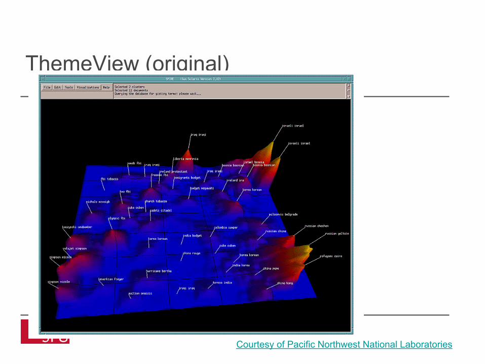
ThemeView (original)
IAT355 | Colour for Information Display Courtesy of Pacific Northwest National Laboratories

ThemeScape (commercial)
IAT355 | Colour for Information Display Courtesy of Cartia

To Enliven or Decorate

Visualization of isoelectron density surfaces around molecules
Marc Levoy (1988)
Which has more information?
Which would you rather look at?
IAT355 | Colour for Information Display

More Tufte Principles
• Limit the use of bright colors • Small bright areas, dull backgrounds
• Use the colors found in nature • Familiar, naturally harmonious
• Use grayed colors for backgrounds • Quiet, versatile
• Create color unity • Repeat, mingle, interweave
IAT355 | Colour for Information Display

Controlling Value

Get it right in black & white
• Value • Perceived lightness/darkness • Controlling value primary rule for design
• Value defines shape • No edge without lightness difference • No shading without lightness variation
• Value difference (contrast) • Defines legibility • Controls attention • Creates layering
IAT355 | Colour for Information Display

Controls Legibility
IAT355 | Colour for Information Display
colorusage.arc.nasa.gov

Legibility
IAT355 | Colour for Information Display
Drop Shadows
Drop Shadow Drop shadow adds edge Primary colors on black
Primary colors on black
Primary colors on black
Primary colors on black
Primary colors on black
Primary colors on black
Primary colors on white
Primary colors on white
Primary colors on white
Primary colors on white
Primary colors on white
Primary colors on white

Readability
IAT355 | Colour for Information Display
If you can’t use color wisely, it is best to avoid it entirely Above all, do no harm
If you can’t use color wisely, it is best to avoid it entirely Above all, do no harm.

Why does the logo work?
IAT355 | Colour for Information Display

Why does this logo work so well?
IAT355 | Colour for Information Display
Value control
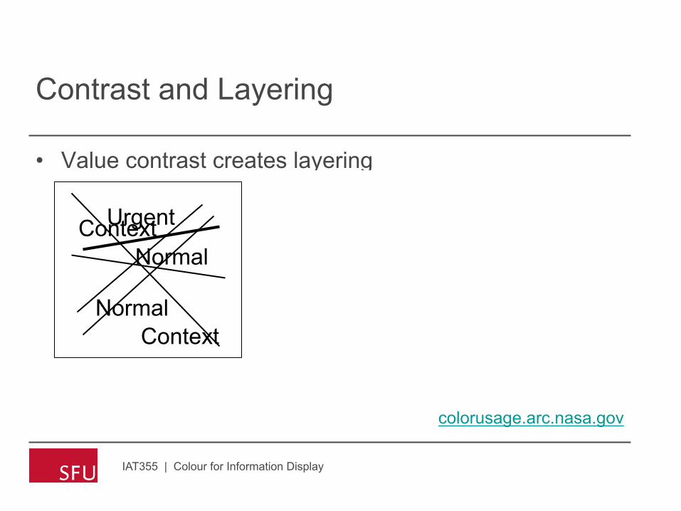
Contrast and Layering
• Value contrast creates layering
IAT355 | Colour for Information Display
Context
Context
Normal
Normal
Urgent Context
Context
Normal
Normal
Urgent Context
Context
Normal
Normal
Urgent
colorusage.arc.nasa.gov

What Defines Layering?
• Perceptual features • Contrast (especially lightness) • Color, shape and texture
• Task and attention • Attention affects perception
• Display characteristics • Brightness, contrast, “gamma”
IAT355 | Colour for Information Display
Emergency
Emergency
Emergency

General guidelines … or from Tufte to practice [Stone, Ware]
• Assign colour according to function
• Use contrast to highlight
• Use analogy to group
• Control value contrast for legibility
• Break isoluminance with borders IAT355 | Colour for Information Display

From principles to palettes
• Limit palette to 2 or 3 colours and use variations within them
• Different choices convey different messages
IAT355 | Colour for Information Display

Tableau Color Example
• Color palettes • How many? Algorithmic? • Basic colors (regular and pastel) • Extensible? Customizable?
• Color appearance • As a function of size • As a function of background
• Robust and reliable color names
IAT355 | Colour for Information Display

Tableau™ Colors
IAT355 | Colour for Information Display
www.tableausoftware.com

Maximum hue separation
IAT355 | Colour for Information Display

Analogous, yet distinct
IAT355 | Colour for Information Display

Sequential
IAT355 | Colour for Information Display

IAT355 | Colour for Information Display

Stephen Few’s practical rules on charts
1. If you want different objects of the same color in a table or graph to look the same, make sure that the background—the color that surrounds them—is consistent.
2. If you want objects in a table or graph to be easily seen, use a background color that contrasts sufficiently with the object.
IAT355 | Colour for Information Display
Don’t do this!

Few (2)
3. Use colour only when needed to serve a particular communication goal
4. Use different colours only when they correspond to differences of meaning in the data
IAT355 | Colour for Information Display

Few (3)
5. Use soft, natural colors to display most information and bright and/or dark colors to highlight information that requires greater attention.
6. When using color to encode a sequential range of quantitative values, stick with a single hue (or a small set of closely related hues) and vary intensity from pale colors for low values to increasingly darker and brighter colors for high values.
IAT355 | Colour for Information Display

Few (4)
7. Non-data components of tables and graphs should be displayed just visibly enough to perform their role, but no more so, for excessive salience could cause them to distract attention from the data
8. Avoid using red/green display without redundant cueing 9. Avoid using visual effects in graphs
IAT355 | Colour for Information Display

Additional Resources on Color
• Even without the “u” ….
• Stone Soup website • http://www.stonesc.com/Vis06 • Final copy of slides, references
• A Field Guide to Digital Color • Maureen C. Stone • Published by A.K. Peters
• Stephen Few’s articles on color • http://www.perceptualedge.com
IAT355 | Colour for Information Display