howto control chart - saferpak.com · types of variation. one goal of using a control chart is to...
TRANSCRIPT
Basic Tools for Process Improvement
CONTROL CHART 1
CONTROL CHART
Basic Tools for Process Improvement
2 CONTROL CHART
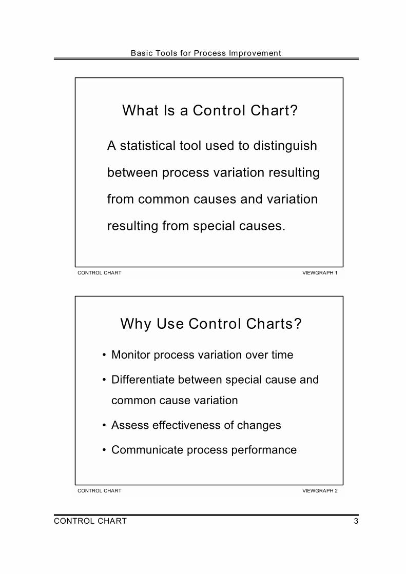
What is a Control Chart?
A control chart is a statistical tool used to distinguish between variation in a process
resulting from common causes and variation resulting from special causes. It
presents a graphic display of process stability or instability over time (Viewgraph 1).
Every process has variation. Some variation may be the result of causes which are
not normally present in the process. This could be special cause variation. Some
variation is simply the result of numerous, ever-present differences in the process.
This is common cause variation. Control Charts differentiate between these two
types of variation.
One goal of using a Control Chart is to achieve and maintain process stability.
Process stability is defined as a state in which a process has displayed a certain
degree of consistency in the past and is expected to continue to do so in the future.
This consistency is characterized by a stream of data falling within control l imits
based on plus or minus 3 standard deviations (3 sigma) of the centerline [Ref.
6, p. 82]. We will discuss methods for calculating 3 sigma limits later in this module.
NOTE: Control l imits represent the limits of variation that should be expected from
a process in a state of statistical control. When a process is in statistical control, any
variation is the result of common causes that effect the entire production in a similar
way. Control limits should not be confused with specification limits , which
represent the desired process performance.
Why should teams use Control Charts?
A stable process is one that is consistent over time with respect to the center and the
spread of the data. Control Charts help you monitor the behavior of your process to
determine whether it is stable. Like Run Charts, they display data in the time
sequence in which they occurred. However, Control Charts are more efficient
that Run Charts in assessing and achieving process stability.
Your team will benefit from using a Control Chart when you want to (Viewgraph 2)
Monitor process variation over time.
Differentiate between special cause and common cause variation.
Assess the effectiveness of changes to improve a process.
Communicate how a process performed during a specific period.
CONTROL CHART VIEWGRAPH 2
Why Use Control Charts?
• Monitor process variation over time
• Differentiate between special cause and
common cause variation
• Assess effectiveness of changes
• Communicate process performance
CONTROL CHART VIEWGRAPH 1
What Is a Control Chart?
A statistical tool used to distinguish
between process variation resulting
from common causes and variation
resulting from special causes.
Basic Tools for Process Improvement
CONTROL CHART 3
Basic Tools for Process Improvement
4 CONTROL CHART
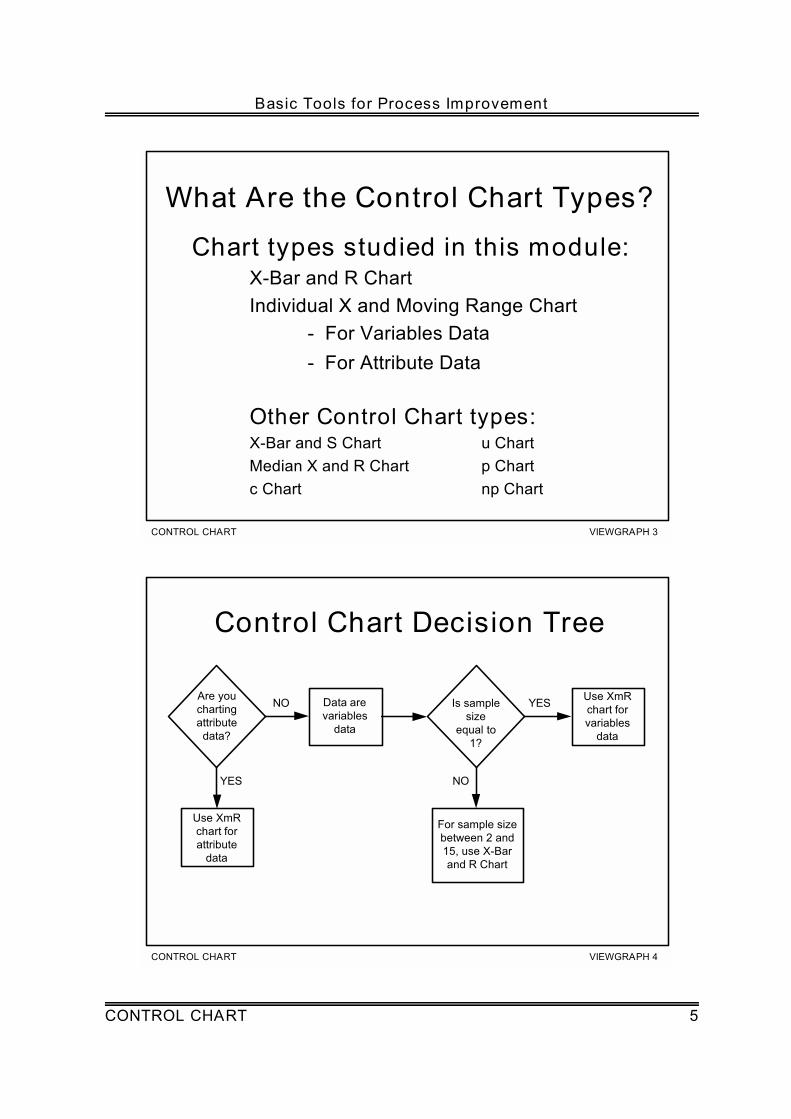
What are the types of Control Charts?
There are two main categories of Control Charts, those that display attribute data,
and those that display variables data.
Attribute Data: This category of Control Chart displays data that result from
counting the number of occurrences or items in a single category of similar
items or occurrences. These “count” data may be expressed as pass/fail,
yes/no, or presence/absence of a defect.
Variables Data: This category of Control Chart displays values resulting
from the measurement of a continuous variable. Examples of variables data
are elapsed time, temperature, and radiation dose.
While these two categories encompass a number of different types of Control Charts
(Viewgraph 3), there are three types that will work for the majority of the data analysis
cases you will encounter. In this module, we will study the construction and
application in these three types of Control Charts:
X-Bar and R Chart
Individual X and Moving Range Chart for Variables Data
Individual X and Moving Range Chart for Attribute Data
Viewgraph 4 provides a decision tree to help you determine when to use these three
types of Control Charts.
In this module, we will study only the Individual X and Moving Range Control Chart
for handling attribute data, although there are several others that could be used, such
as the np, p, c, and u charts. These other charts require an understanding of
probability distribution theory and specific control limit calculation formulas which will
not be covered here. To avoid the possibility of generating faulty results by
improperly using these charts, we recommend that you stick with the Individual X and
Moving Range chart for attribute data.
The following six types of charts will not be covered in this module:
X-Bar and S Chart
Median X and R Chart
c Chart
u Chart
p Chart
np Chart
CONTROL CHART VIEWGRAPH 3
What Are the Control Chart Types?
Chart types studied in this module:X-Bar and R Chart
Individual X and Moving Range Chart
- For Variables Data
- For Attribute Data
Other Control Chart types:X-Bar and S Chart u Chart
Median X and R Chart p Chart
c Chart np Chart
CONTROL CHART VIEWGRAPH 4
Control Chart Decision Tree
Are you
charting
attribute
data?
YES
NO YES
NO
Data are
variables
data
Is sample
size
equal to
1?
Use XmR
chart for
variables
data
For sample size
between 2 and
15, use X-Bar
and R Chart
Use XmR
chart for
attribute
data
Basic Tools for Process Improvement
CONTROL CHART 5
Basic Tools for Process Improvement
6 CONTROL CHART
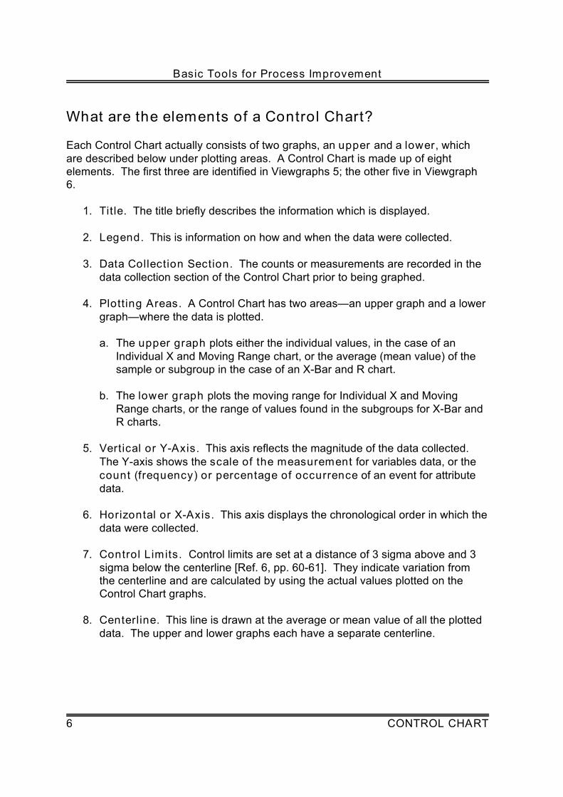
What are the elements of a Control Chart?
Each Control Chart actually consists of two graphs, an upper and a lower, which
are described below under plotting areas. A Control Chart is made up of eight
elements. The first three are identified in Viewgraphs 5; the other five in Viewgraph
6.
1. Title. The title briefly describes the information which is displayed.
2. Legend. This is information on how and when the data were collected.
3. Data Collection Section. The counts or measurements are recorded in the
data collection section of the Control Chart prior to being graphed.
4. Plotting Areas. A Control Chart has two areas—an upper graph and a lower
graph—where the data is plotted.
a. The upper graph plots either the individual values, in the case of an
Individual X and Moving Range chart, or the average (mean value) of the
sample or subgroup in the case of an X-Bar and R chart.
b. The lower graph plots the moving range for Individual X and Moving
Range charts, or the range of values found in the subgroups for X-Bar and
R charts.
5. Vertical or Y-Axis. This axis reflects the magnitude of the data collected.
The Y-axis shows the scale of the measurement for variables data, or the
count (frequency) or percentage of occurrence of an event for attribute
data.
6. Horizontal or X-Axis. This axis displays the chronological order in which the
data were collected.
7. Control Limits. Control limits are set at a distance of 3 sigma above and 3
sigma below the centerline [Ref. 6, pp. 60-61]. They indicate variation from
the centerline and are calculated by using the actual values plotted on the
Control Chart graphs.
8. Centerline. This line is drawn at the average or mean value of all the plotted
data. The upper and lower graphs each have a separate centerline.
CONTROL CHART VIEWGRAPH 5
Elements of a Control Chart
M
E
A
S
U
R
E
M
E
N
T
S
Date
Title: ____________________________________ Legend:________________________
Average
Range
1
2
3
4
5
6
1 2 3 4 5 6 7 8 9 10 11 12 13 14
21
3
CONTROL CHART VIEWGRAPH 6
Elements of a Control Chart
0
.
. .
. .
.
. .
..
.
5
4a
8
6
7
.5
6
7
4b
8
Basic Tools for Process Improvement
CONTROL CHART 7
xx
1x
2x
3...x
n
n
Where: x The average of the measurements within each subgroupx
iThe individual measurements within a subgroup
n The number of measurements within a subgroup
Subgroup 1 2 3 4 5 6 7 8 9
X1 15.3 14.4 15.3 15.0 15.3 14.9 15.6 14.0 14.0
X2 14.9 15.5 15.1 14.8 16.4 15.3 16.4 15.8 15.2
X3 15.0 14.8 15.3 16.0 17.2 14.9 15.3 16.4 13.6
X4 15.2 15.6 18.5 15.6 15.5 16.5 15.3 16.4 15.0
X5 16.4 14.9 14.9 15.4 15.5 15.1 15.0 15.3 15.0
Average: 15.36 15.04 15.82 15.36 15.98 15.34 15.52 15.58 14.56
= 76.8
5= 15.36
15.3 + 14.9 + 15.0 + 15.2 + 16.4
5X =
Basic Tools for Process Improvement
8 CONTROL CHART
What are the steps for calculating and plotting anX-Bar and R Control Chart for Variables Data?
The X-Bar (arithmetic mean) and R (range) Control Chart is used with variables
data when subgroup or sample size is between 2 and 15. The steps for
constructing this type of Control Chart are:
Step 1 - Determine the data to be collected. Decide what questions about the
process you plan to answer. Refer to the Data Collection module for information
on how this is done.
Step 2 - Collect and enter the data by subgroup. A subgroup is made up of
variables data that represent a characteristic of a product produced by a process.
The sample size relates to how large the subgroups are. Enter the individual
subgroup measurements in time sequence in the portion of the data collection
section of the Control Chart labeled MEASUREMENTS (Viewgraph 7).
STEP 3 - Calculate and enter the average for each subgroup. Use the formula
below to calculate the average (mean) for each subgroup and enter it on the line
labeled Average in the data collection section (Viewgraph 8).
Average Example

CONTROL CHART VIEWGRAPH 7
Constructing an X-Bar & R ChartStep 2 - Collect and enter data by subgroup
A
V
E
R
A
GE
Date
Title: ____________________________________ Legend: _______________________
1 Feb 2 Feb 5 Feb 6 Feb 7 Feb 8 Feb3 Feb 4 Feb 9 Feb
M
E
AS
U
R
E
M
E
N
T
S
Average
Range
1
2
4
5
6
1 2 3 4 5 6 7 8 9
14.9 16.4 15.315.5 14.815.1 15.216.4 15.8
3 15.0 14.9 15.314.8 16.015.3 17.2 13.616.4
15.2 15.6 15.618.5 15.5 15.316.5 15.016.4
16.4 14.9 15.414.9 15.115.5 15.0 15.015.3
15.3 15.3 14.9 15.614.4 15.015.3 14.014.0
Enter data by subgroup
in time sequence
CONTROL CHART VIEWGRAPH 8
Constructing an X-Bar & R ChartStep 3 - Calculate and enter subgroup averages
A
V
E
R
A
GE
Date
Title: ____________________________________ Legend: _______________________
1 Feb 2 Feb 5 Feb 6 Feb 7 Feb 8 Feb3 Feb 4 Feb 9 Feb
M
E
AS
U
R
E
M
E
N
T
S
Average
Range
1
2
4
5
6
1 2 3 4 5 6 7 8 9
14.9 16.4 15.315.5 14.815.1 15.216.4 15.8
3 15.0 14.9 15.314.8 16.015.3 17.2 13.616.4
15.2 15.6 15.618.5 15.5 15.316.5 15.016.4
16.4 14.9 15.414.9 15.115.5 15.0 15.015.3
15.3 15.3 14.9 15.614.4 15.015.3 14.014.0
Enter the average
for each subgroup
15.36 15.04 15.82 15.36 15.34 15.58 14.5615.98 15.52
Basic Tools for Process Improvement
CONTROL CHART 9
RANGE (Largest Value in each Subgroup ) (Smallest Value in each Subgroup )
Subgroup 1 2 3 4 5 6 7 8 9
X1 15.3 14.4 15.3 15.0 15.3 14.9 15.6 14.0 14.0
X2 14.9 15.5 15.1 14.8 16.4 15.3 16.4 15.8 15.2
X3 15.0 14.8 15.3 16.0 17.2 14.9 15.3 16.4 13.6
X4 15.2 15.6 18.5 15.6 15.5 16.5 15.3 16.4 15.0
X5 16.4 14.9 14.9 15.4 15.5 15.1 15.0 15.3 15.0
Average: 15.36 15.04 15.82 15.36 15.98 15.34 15.52 15.58 14.56
Range: 1.5 1.2 3.6 1.2 1.9 1.6 1.4 2.4 1.6
xx
1x
2x
3...x
k
k
Where: x The grand mean of all the individual subgroup averages
x The average for each subgroupk The number of subgroups
x15.36 15.04 15.82 15.36 15.98 15.34 15.52 15.58 14.56
9
138.56
915.40
Basic Tools for Process Improvement
10 CONTROL CHART
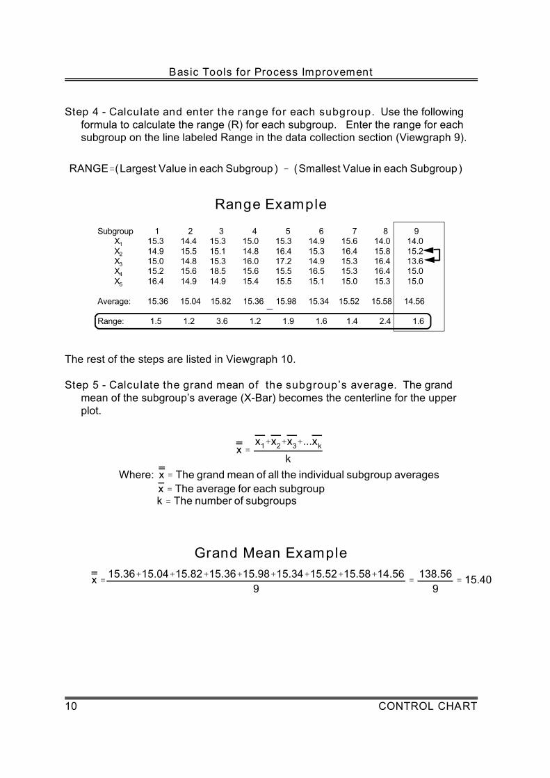
Step 4 - Calculate and enter the range for each subgroup. Use the following
formula to calculate the range (R) for each subgroup. Enter the range for each
subgroup on the line labeled Range in the data collection section (Viewgraph 9).
Range Example
The rest of the steps are listed in Viewgraph 10.
Step 5 - Calculate the grand mean of the subgroup’s average. The grand
mean of the subgroup’s average (X-Bar) becomes the centerline for the upper
plot.
Grand Mean Example
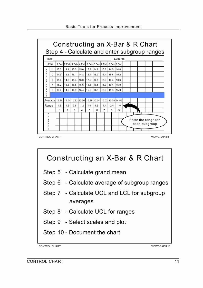
CONTROL CHART VIEWGRAPH 10
Constructing an X-Bar & R Chart
Step 5 - Calculate grand mean
Step 6 - Calculate average of subgroup ranges
Step 7 - Calculate UCL and LCL for subgroup
averages
Step 8 - Calculate UCL for ranges
Step 9 - Select scales and plot
Step 10 - Document the chart
CONTROL CHART VIEWGRAPH 9
Constructing an X-Bar & R ChartStep 4 - Calculate and enter subgroup ranges
A
V
E
R
A
GE
Date
Title: ____________________________________ Legend: _______________________
1 Feb 2 Feb 5 Feb 6 Feb 7 Feb 8 Feb3 Feb 4 Feb 9 Feb
M
E
AS
U
R
E
M
E
N
T
S
Average
Range
1
2
4
5
6
1 2 3 4 5 6 7 8 9
14.9 16.4 15.315.5 14.815.1 15.216.4 15.8
3 15.0 14.9 15.314.8 16.015.3 17.2 13.616.4
15.2 15.6 15.618.5 15.5 15.316.5 15.016.4
16.4 14.9 15.414.9 15.115.5 15.0 15.015.3
15.3 15.3 14.9 15.614.4 15.015.3 14.014.0
Enter the range for
each subgroup
15.36 15.04 15.82 15.36 15.34 15.58 14.5615.98 15.52
1.5 1.2 3.6 1.2 1.9 1.6 1.4 2.4 1.6
Basic Tools for Process Improvement
CONTROL CHART 11
RR1 R2 R3 ...Rk
kWhere: Ri The individual range for each subgroup
R The average of the ranges for all subgroupsk The number of subgroups
R1.5 1.2 3.6 1.2 1.9 1.6 1.4 2.4 1.6
9
16.4
91.8
UCLX
X A2R
LCLX X A2R
Basic Tools for Process Improvement
12 CONTROL CHART
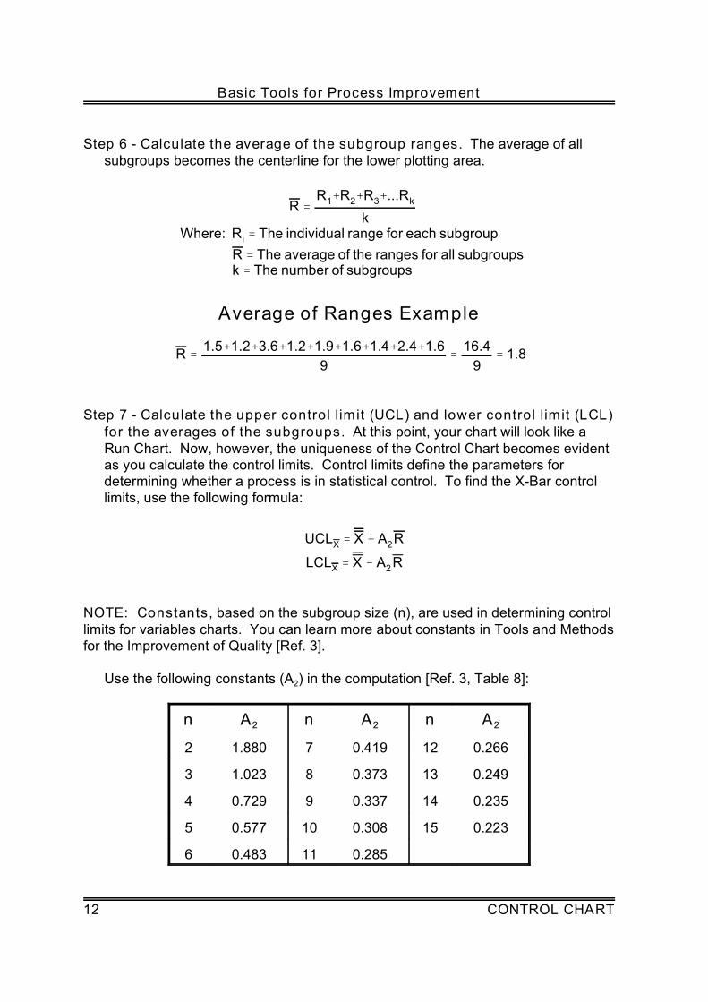
Step 6 - Calculate the average of the subgroup ranges. The average of all
subgroups becomes the centerline for the lower plotting area.
Average of Ranges Example
Step 7 - Calculate the upper control limit (UCL) and lower control limit (LCL)
for the averages of the subgroups. At this point, your chart will look like a
Run Chart. Now, however, the uniqueness of the Control Chart becomes evident
as you calculate the control limits. Control limits define the parameters for
determining whether a process is in statistical control. To find the X-Bar control
limits, use the following formula:
NOTE: Constants, based on the subgroup size (n), are used in determining control
limits for variables charts. You can learn more about constants in Tools and Methods
for the Improvement of Quality [Ref. 3].
Use the following constants (A ) in the computation [Ref. 3, Table 8]:2
n A n A n A2 2 2
2 1.880 7 0.419 12 0.266
3 1.023 8 0.373 13 0.249
4 0.729 9 0.337 14 0.235
5 0.577 10 0.308 15 0.223
6 0.483 11 0.285
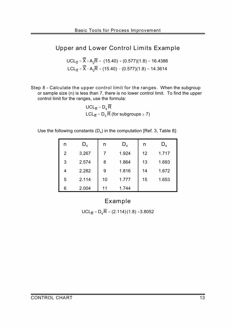
UCLX
X A2R (15.40) (0.577)(1.8) 16.4386
LCLX X A2R (15.40) (0.577)(1.8) 14.3614
UCLR
D4
R
LCLR D3 R (for subgroups 7)
UCLR D4R (2.114) (1.8) 3.8052
Basic Tools for Process Improvement
CONTROL CHART 13
Upper and Lower Control Limits Example
Step 8 - Calculate the upper control limit for the ranges. When the subgroup
or sample size (n) is less than 7, there is no lower control limit. To find the upper
control limit for the ranges, use the formula:
Use the following constants (D ) in the computation [Ref. 3, Table 8]:4
n D n D n D4 4 4
2 3.267 7 1.924 12 1.717
3 2.574 8 1.864 13 1.693
4 2.282 9 1.816 14 1.672
5 2.114 10 1.777 15 1.653
6 2.004 11 1.744
Example
Basic Tools for Process Improvement
14 CONTROL CHART
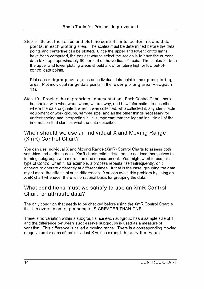
Step 9 - Select the scales and plot the control limits, centerline, and data
points, in each plotting area. The scales must be determined before the data
points and centerline can be plotted. Once the upper and lower control limits
have been computed, the easiest way to select the scales is to have the current
data take up approximately 60 percent of the vertical (Y) axis. The scales for both
the upper and lower plotting areas should allow for future high or low out-of-
control data points.
Plot each subgroup average as an individual data point in the upper plotting
area. Plot individual range data points in the lower plotting area (Viewgraph
11).
Step 10 - Provide the appropriate documentation. Each Control Chart should
be labeled with who, what, when, where, why, and how information to describe
where the data originated, when it was collected, who collected it, any identifiable
equipment or work groups, sample size, and all the other things necessary for
understanding and interpreting it. It is important that the legend include all of the
information that clarifies what the data describe.
When should we use an Individual X and Moving Range(XmR) Control Chart?
You can use Individual X and Moving Range (XmR) Control Charts to assess both
variables and attribute data. XmR charts reflect data that do not lend themselves to
forming subgroups with more than one measurement. You might want to use this
type of Control Chart if, for example, a process repeats itself infrequently, or it
appears to operate differently at different times. If that is the case, grouping the data
might mask the effects of such differences. You can avoid this problem by using an
XmR chart whenever there is no rational basis for grouping the data.
What conditions must we satisfy to use an XmR ControlChart for attribute data?
The only condition that needs to be checked before using the XmR Control Chart is
that the average count per sample IS GREATER THAN ONE.
There is no variation within a subgroup since each subgroup has a sample size of 1,
and the difference between successive subgroups is used as a measure of
variation. This difference is called a moving range. There is a corresponding moving
range value for each of the individual X values except the very first value.
CONTROL CHART VIEWGRAPH 11
Constructing an X-Bar & R ChartStep 9 - Select scales and plot
..
.
.
.. .
.
. .
.
.. . .
..
A
V
E
R
A
G
E
R
A
N
G
E
3.0
2.0
1.0
0
16.0
15.5
15.0
14.5
14.0
16.5
.
Basic Tools for Process Improvement
CONTROL CHART 15
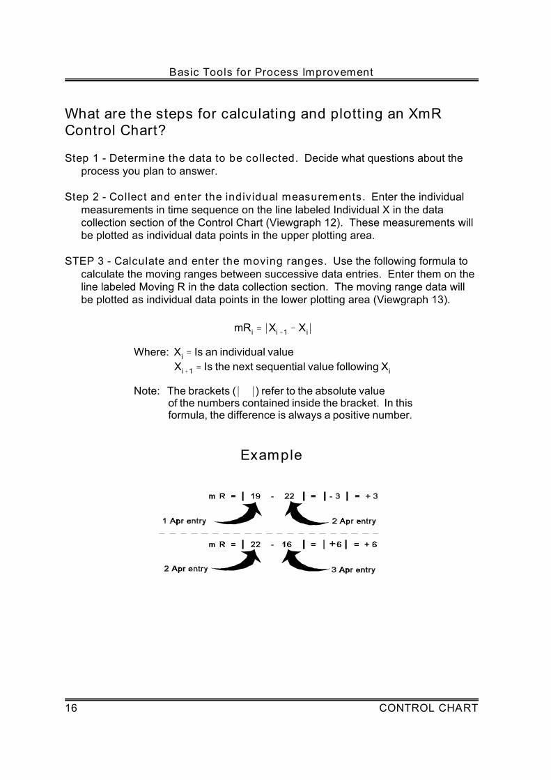
mRi Xi 1 Xi
Where: Xi
Is an individual value
Xi 1 Is the next sequential value following Xi
Note: The brackets ( ) refer to the absolute valueof the numbers contained inside the bracket. In thisformula, the difference is always a positive number.
Basic Tools for Process Improvement
16 CONTROL CHART
What are the steps for calculating and plotting an XmRControl Chart?
Step 1 - Determine the data to be collected. Decide what questions about the
process you plan to answer.
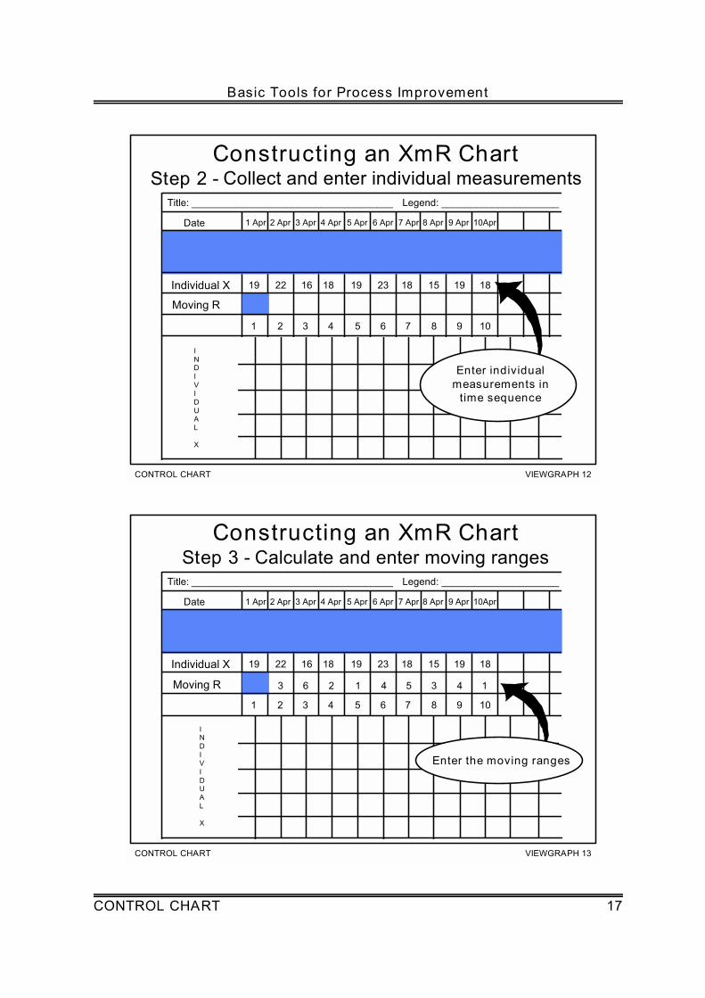
Step 2 - Collect and enter the individual measurements. Enter the individual
measurements in time sequence on the line labeled Individual X in the data
collection section of the Control Chart (Viewgraph 12). These measurements will
be plotted as individual data points in the upper plotting area.
STEP 3 - Calculate and enter the moving ranges. Use the following formula to
calculate the moving ranges between successive data entries. Enter them on the
line labeled Moving R in the data collection section. The moving range data will
be plotted as individual data points in the lower plotting area (Viewgraph 13).
Example
CONTROL CHART VIEWGRAPH 12
Constructing an XmR ChartStep 2 - Collect and enter individual measurements
Title: ____________________________________ Legend: _____________________
Date 1 Apr 2 Apr 5 Apr 6 Apr 7 Apr 8 Apr3 Apr 4 Apr 9 Apr 10Apr
Moving R
1 2 3 4 5 6 7 8 9 10
Individual X 19 22 16 18 19 23 18 15 19 18
Enter individual
measurements in
time sequence
I
ND
I
V
I
D
UA
L
X
CONTROL CHART VIEWGRAPH 13
Constructing an XmR ChartStep 3 - Calculate and enter moving ranges
Title: ____________________________________ Legend: _____________________
Date 1 Apr 2 Apr 5 Apr 6 Apr 7 Apr 8 Apr3 Apr 4 Apr 9 Apr 10Apr
Moving R
1 2 3 4 5 6 7 8 9 10
Individual X 19 22 16 18 19 23 18 15 19 18
Enter the moving ranges
3 6 2 1 4 5 3 4 1
IN
D
I
V
I
DU
A
L
X
Basic Tools for Process Improvement
CONTROL CHART 17
xx
1x
2x
3...x
n
k
Where: x The average of the individual measurementsx
iAn individual measurement
k The number of subgroups of one
X19 22 16 18 19 23 18 15 19 18
10
169
1016.9
mRmR
1mR
2mR
3...mR
n
k 1
Where: mR The average of all the Individual Moving RangesmR
nThe Individual Moving Range measurements
k The number of subgroups of one
mR3 6 2 1 4 5 3 4 1
(10 1)
29
93.2
UCLx X (2.66)mR
UCLx
X (2.66)mR
Basic Tools for Process Improvement
18 CONTROL CHART
Example
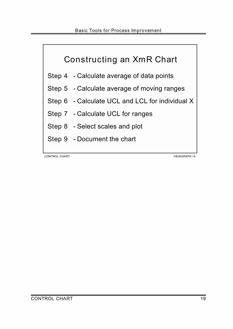
Steps 4 through 9 are outlined in Viewgraph 14.
Step 4 - Calculate the overall average of the individual data points. The
average of the Individual-X data becomes the centerline for the upper plot.
Step 5 - Calculate the average of the moving ranges. The average of all
moving ranges becomes the centerline for the lower plotting area.
Average of Moving Ranges Example
Step 6 - Calculate the upper and lower control limits for the individual X
values. The calculation will compute the upper and lower control limits for the
upper plotting area. To find these control limits, use the formula:
NOTE: Formulas in Steps 6 and 7 are based on a two-point moving range.
CONTROL CHART VIEWGRAPH 14
Constructing an XmR Chart
Step 4 - Calculate average of data points
Step 5 - Calculate average of moving ranges
Step 6 - Calculate UCL and LCL for individual X
Step 7 - Calculate UCL for ranges
Step 8 - Select scales and plot
Step 9 - Document the chart
Basic Tools for Process Improvement
CONTROL CHART 19
UCLX
X (2.66)mR (16.9) (2.66)(3.2) 25.41
LCLX X (2.66)mR (16.9) (2.66)(3.2) 8.39
UCLmR
(3.268)mR
UCLmR NONE
UCLmR (3.268)mR (3.268)(3.2) 10.45
Basic Tools for Process Improvement
20 CONTROL CHART
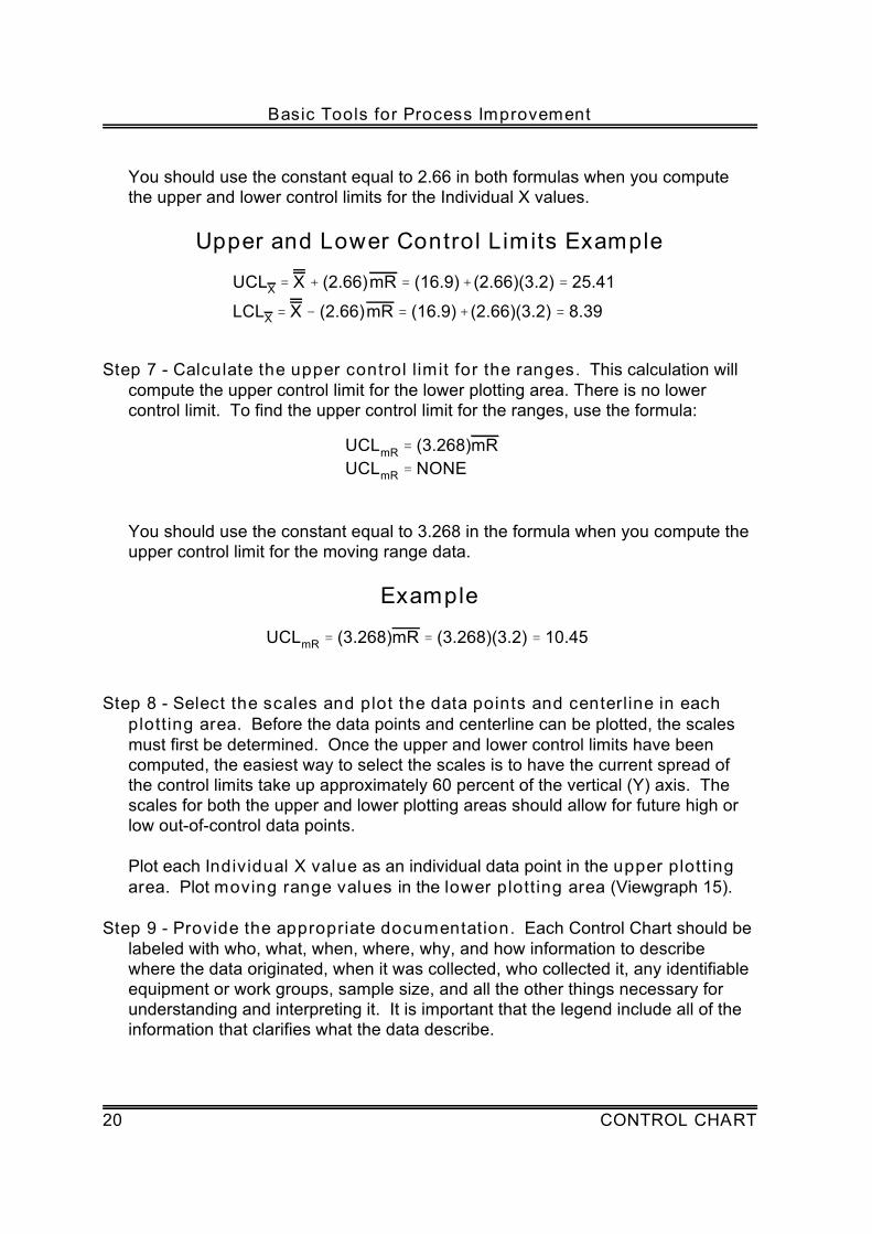
You should use the constant equal to 2.66 in both formulas when you compute
the upper and lower control limits for the Individual X values.
Upper and Lower Control Limits Example
Step 7 - Calculate the upper control limit for the ranges. This calculation will
compute the upper control limit for the lower plotting area. There is no lower
control limit. To find the upper control limit for the ranges, use the formula:
You should use the constant equal to 3.268 in the formula when you compute the
upper control limit for the moving range data.
Example
Step 8 - Select the scales and plot the data points and centerline in each
plotting area. Before the data points and centerline can be plotted, the scales
must first be determined. Once the upper and lower control limits have been
computed, the easiest way to select the scales is to have the current spread of
the control limits take up approximately 60 percent of the vertical (Y) axis. The
scales for both the upper and lower plotting areas should allow for future high or
low out-of-control data points.
Plot each Individual X value as an individual data point in the upper plotting
area. Plot moving range values in the lower plotting area (Viewgraph 15).
Step 9 - Provide the appropriate documentation. Each Control Chart should be
labeled with who, what, when, where, why, and how information to describe
where the data originated, when it was collected, who collected it, any identifiable
equipment or work groups, sample size, and all the other things necessary for
understanding and interpreting it. It is important that the legend include all of the
information that clarifies what the data describe.
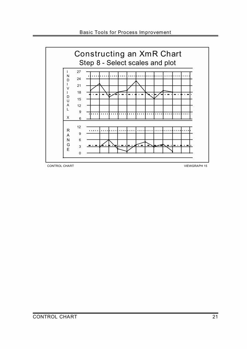
CONTROL CHART VIEWGRAPH 15
Constructing an XmR ChartStep 8 - Select scales and plot
..
.. . .
.
.
..
I
N
D
I
V
I
D
U
A
L
X
R
A
N
G
E0
.21
18
15
12
9
24
6
27
..
.. . .
.
9
6
3
12
.
Basic Tools for Process Improvement
CONTROL CHART 21
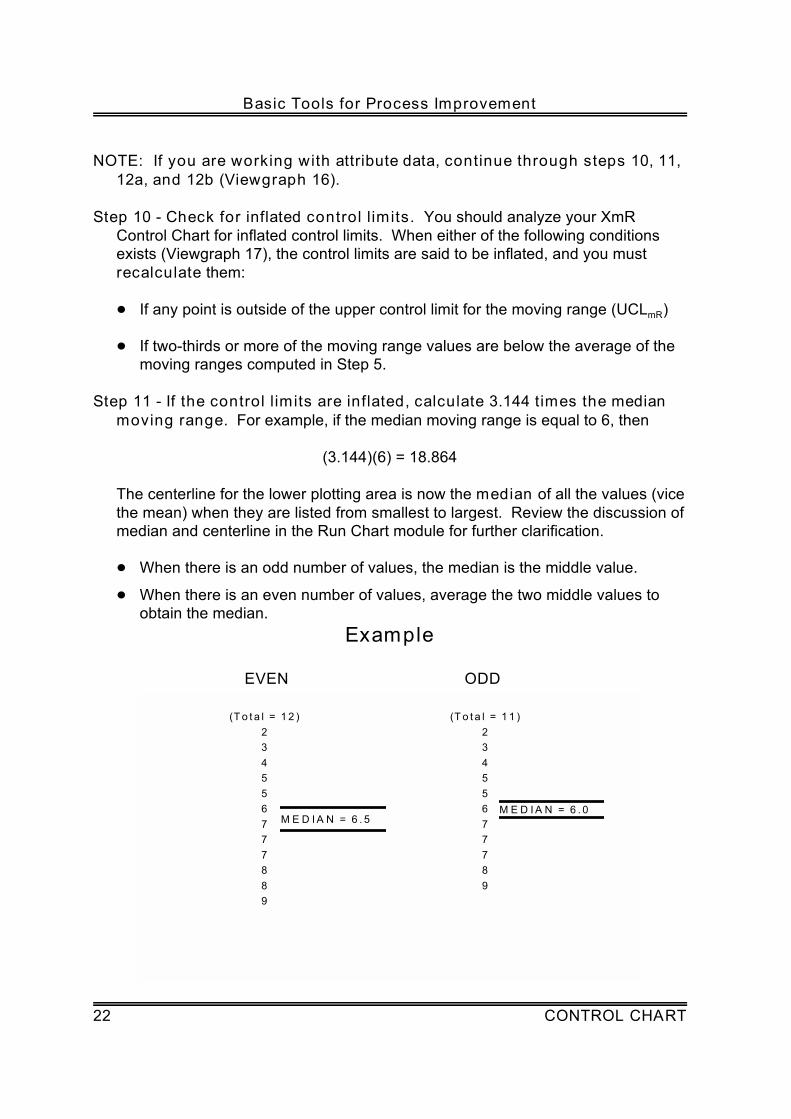
(T o t a l = 1 2 )
2
3
4
5
5
6
7
7
7
8
8
9
M E D I A N = 6 . 5
(T o t a l = 1 1 )
2
3
4
5
5
6
7
7
7
8
9
M E D I A N = 6 . 0
Basic Tools for Process Improvement
22 CONTROL CHART
EVEN ODD
NOTE: If you are working with attribute data, continue through steps 10, 11,
12a, and 12b (Viewgraph 16).
Step 10 - Check for inflated control l imits. You should analyze your XmR
Control Chart for inflated control limits. When either of the following conditions
exists (Viewgraph 17), the control limits are said to be inflated, and you must
recalculate them:
If any point is outside of the upper control limit for the moving range (UCL )mR
If two-thirds or more of the moving range values are below the average of the
moving ranges computed in Step 5.
Step 11 - If the control limits are inflated, calculate 3.144 times the median
moving range. For example, if the median moving range is equal to 6, then
(3.144)(6) = 18.864
The centerline for the lower plotting area is now the median of all the values (vice
the mean) when they are listed from smallest to largest. Review the discussion of
median and centerline in the Run Chart module for further clarification.
When there is an odd number of values, the median is the middle value.
When there is an even number of values, average the two middle values to
obtain the median.
Example
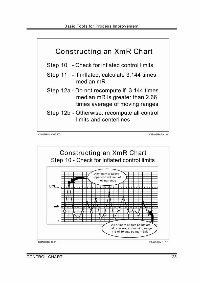
CONTROL CHART VIEWGRAPH 17
Constructing an XmR ChartStep 10 - Check for inflated control limits
UCLmR
mR
0
Any point is above
upper control limit of
moving range
2/3 or more of data points are
below average of moving range
(13 of 19 data points = 68%)
CONTROL CHART VIEWGRAPH 16
Constructing an XmR Chart
Step 10 - Check for inflated control limits
Step 11 - If inflated, calculate 3.144 times
median mR
Step 12a - Do not recompute if 3.144 times
median mR is greater than 2.66
times average of moving ranges
Step 12b - Otherwise, recompute all control
limits and centerlines
Basic Tools for Process Improvement
CONTROL CHART 23
Basic Tools for Process Improvement
24 CONTROL CHART
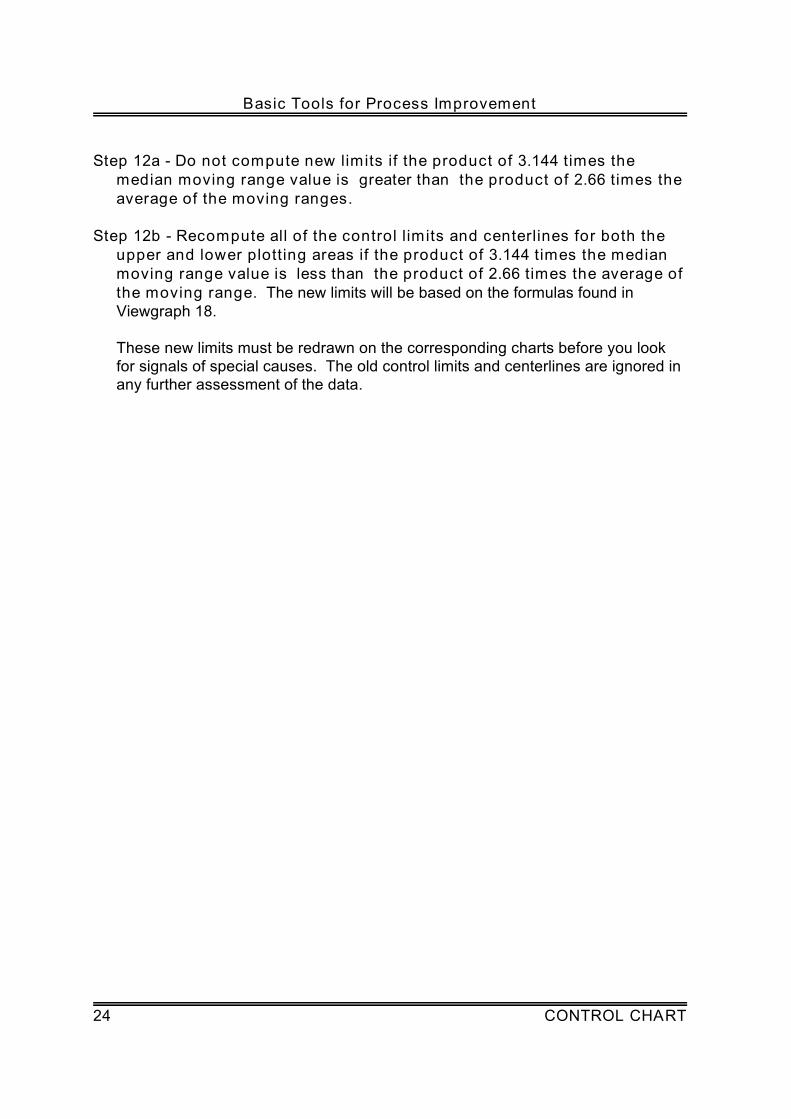
Step 12a - Do not compute new limits if the product of 3.144 times the
median moving range value is greater than the product of 2.66 times the
average of the moving ranges.
Step 12b - Recompute all of the control limits and centerlines for both the
upper and lower plotting areas if the product of 3.144 times the median
moving range value is less than the product of 2.66 times the average of
the moving range. The new limits will be based on the formulas found in
Viewgraph 18.
These new limits must be redrawn on the corresponding charts before you look
for signals of special causes. The old control limits and centerlines are ignored in
any further assessment of the data.
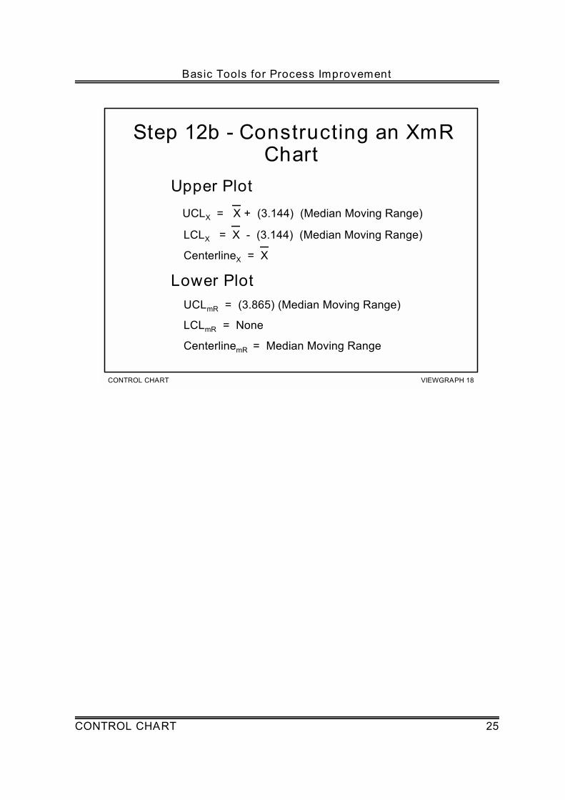
CONTROL CHART VIEWGRAPH 18
Upper Plot
UCLX = X + (3.144) (Median Moving Range)
LCLX = X - (3.144) (Median Moving Range)
CenterlineX = X
Lower Plot
UCLmR = (3.865) (Median Moving Range)
LCLmR = None
CenterlinemR = Median Moving Range
Step 12b - Constructing an XmRChart
Basic Tools for Process Improvement
CONTROL CHART 25
Basic Tools for Process Improvement
26 CONTROL CHART
What do we need to know to interpret Control Charts?
Process stability is reflected in the relatively constant variation exhibited in Control
Charts. Basically, the data fall within a band bounded by the control limits. If a
process is stable, the likelihood of a point falling outside this band is so small that
such an occurrence is taken as a signal of a special cause of variation. In other
words, something abnormal is occurring within your process. However, even though
all the points fall inside the control limits, special cause variation may be at work.
The presence of unusual patterns can be evidence that your process is not in
statistical control. Such patterns are more likely to occur when one or more special
causes is present.
Control Charts are based on control limits which are 3 standard deviations (3 sigma)
away from the centerline. You should resist the urge to narrow these limits in the
hope of identifying special causes earlier. Experience has shown that l imits based
on less than plus and minus 3 sigma may lead to false assumptions about
special causes operating in a process [Ref. 6, p. 82]. In other words, using control
limits which are less than 3 sigma from the centerline may trigger a hunt for special
causes when the process is already stable.
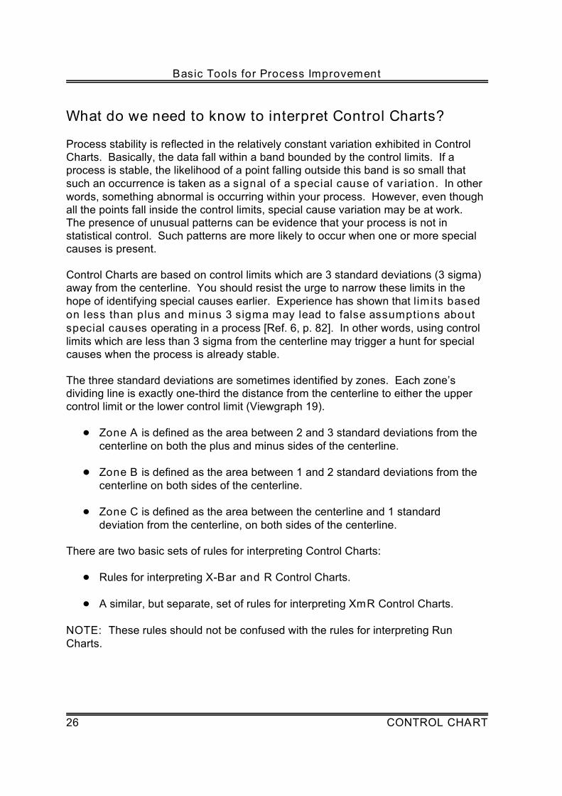
The three standard deviations are sometimes identified by zones. Each zone’s
dividing line is exactly one-third the distance from the centerline to either the upper
control limit or the lower control limit (Viewgraph 19).
Zone A is defined as the area between 2 and 3 standard deviations from the
centerline on both the plus and minus sides of the centerline.
Zone B is defined as the area between 1 and 2 standard deviations from the
centerline on both sides of the centerline.
Zone C is defined as the area between the centerline and 1 standard
deviation from the centerline, on both sides of the centerline.
There are two basic sets of rules for interpreting Control Charts:
Rules for interpreting X-Bar and R Control Charts.
A similar, but separate, set of rules for interpreting XmR Control Charts.
NOTE: These rules should not be confused with the rules for interpreting Run
Charts.
CONTROL CHART VIEWGRAPH 19
Control Chart Zones
1/3 distance
from
Centerline
to Control
Limits
LCL
Centerline
ZONE A
ZONE B
ZONE C
ZONE C
ZONE B
ZONE A
UCL
Basic Tools for Process Improvement
CONTROL CHART 27
Basic Tools for Process Improvement
28 CONTROL CHART
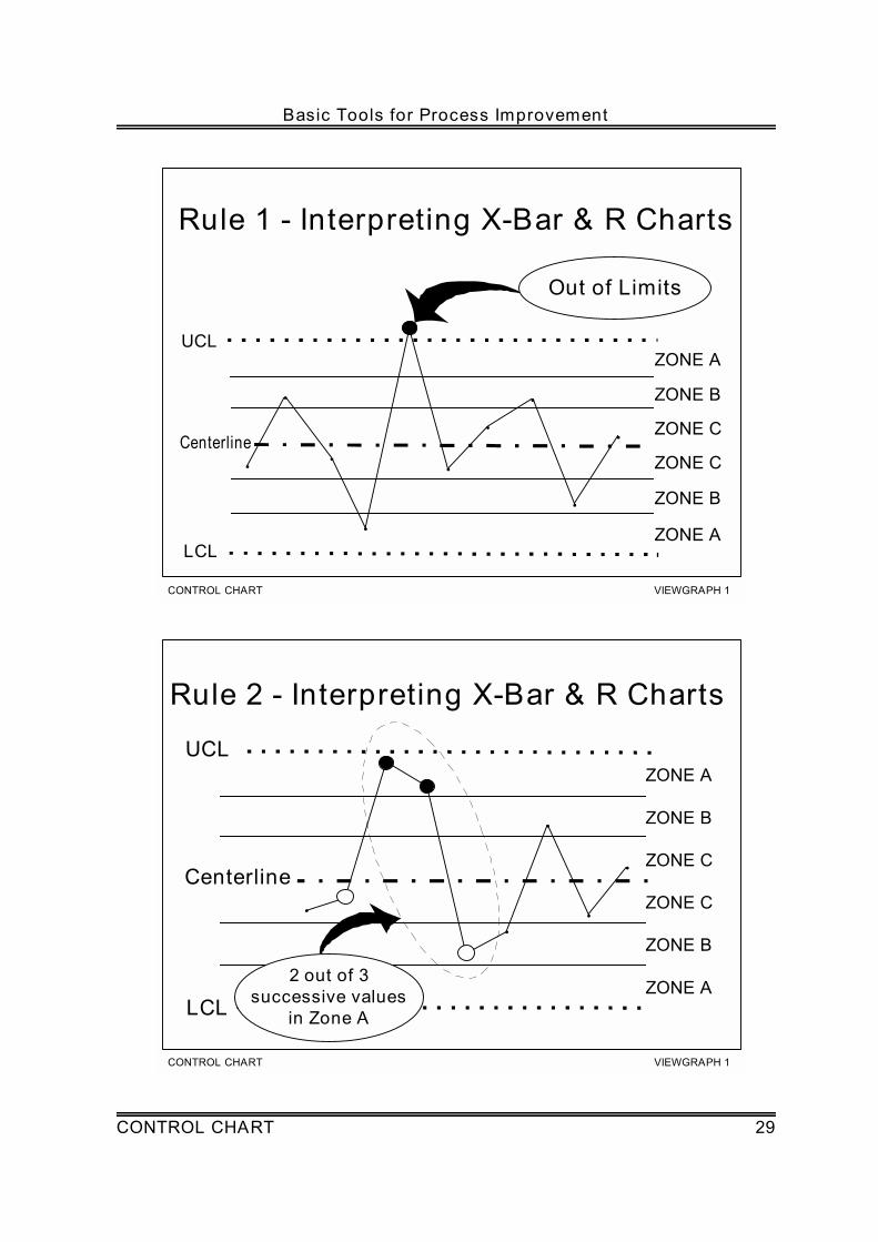
What are the rules for interpreting X-Bar and R Charts?
When a special cause is affecting the data, the nonrandom patterns displayed in a
Control Chart will be fairly obvious. The key to these rules is recognizing that they
serve as a signal for when to investigate what occurred in the process.
When you are interpreting X-Bar and R Control Charts, you should apply the
following set of rules:
RULE 1 (Viewgraph 20): Whenever a single point falls outside the 3 sigma
control l imits , a lack of control is indicated. Since the probability of this
happening is rather small, it is very likely not due to chance.
RULE 2 (Viewgraph 21): Whenever at least 2 out of 3 successive values fall on
the same side of the centerline and more than 2 sigma units away from the
centerline (in Zone A or beyond), a lack of control is indicated. Note that the third
point can be on either side of the centerline.
CONTROL CHART VIEWGRAPH 1
Rule 1 - Interpreting X-Bar & R Charts
.
.
.
.
.
.
..
.Centerline
UCL
LCL
ZONE A
Out of Limits
ZONE B
ZONE C
ZONE B
ZONE A
ZONE C
CONTROL CHART VIEWGRAPH 1
..
.
.
.
UCL
LCL
Centerline
ZONE A
ZONE B
ZONE C
ZONE C
ZONE B
ZONE A2 out of 3
successive values
in Zone A
Rule 2 - Interpreting X-Bar & R Charts
Basic Tools for Process Improvement
CONTROL CHART 29
Basic Tools for Process Improvement
30 CONTROL CHART
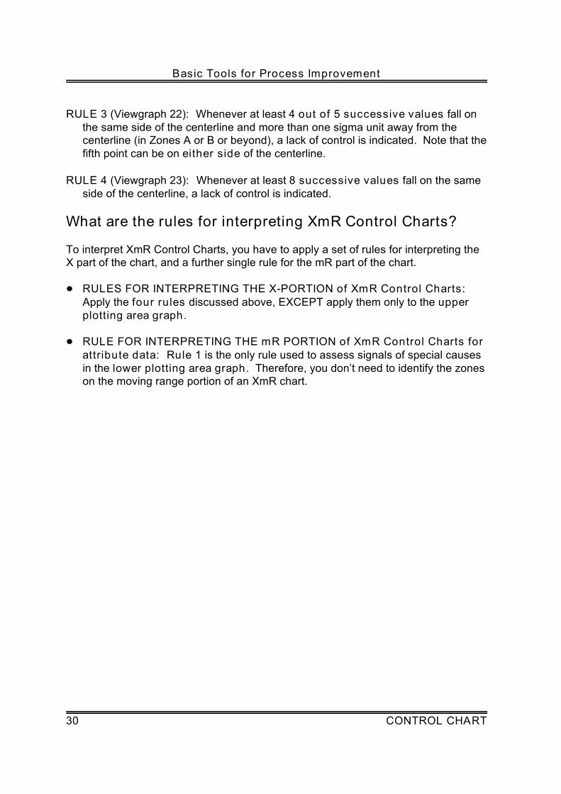
RULE 3 (Viewgraph 22): Whenever at least 4 out of 5 successive values fall on
the same side of the centerline and more than one sigma unit away from the
centerline (in Zones A or B or beyond), a lack of control is indicated. Note that the
fifth point can be on either side of the centerline.
RULE 4 (Viewgraph 23): Whenever at least 8 successive values fall on the same
side of the centerline, a lack of control is indicated.
What are the rules for interpreting XmR Control Charts?
To interpret XmR Control Charts, you have to apply a set of rules for interpreting the
X part of the chart, and a further single rule for the mR part of the chart.
RULES FOR INTERPRETING THE X-PORTION of XmR Control Charts:
Apply the four rules discussed above, EXCEPT apply them only to the upper
plotting area graph .
RULE FOR INTERPRETING THE mR PORTION of XmR Control Charts for
attribute data: Rule 1 is the only rule used to assess signals of special causes
in the lower plotting area graph . Therefore, you don’t need to identify the zones
on the moving range portion of an XmR chart.
CONTROL CHART VIEWGRAPH 1
.
.. .
UCL
LCL
Centerline
4 out of 5
successive values
in Zones A & B
ZONE A
ZONE B
ZONE C
ZONE C
ZONE B
ZONE A
Rule 3 - Interpreting X-Bar & R Charts
CONTROL CHART VIEWGRAPH 1
. .
UCL
LCL
Centerline
8 successive
values on same
side of Centerline
Rule 4 - Interpreting X-Bar & R Charts
ZONE A
ZONE B
ZONE C
ZONE C
ZONE B
ZONE A
Basic Tools for Process Improvement
CONTROL CHART 31
Basic Tools for Process Improvement
32 CONTROL CHART
When should we change the control limits?
There are only three situations in which it is appropriate to change the control limits:
When removing out-of-control data points. When a special cause has
been identified and removed while you are working to achieve process
stability, you may want to delete the data points affected by special causes
and use the remaining data to compute new control limits.
When replacing trial l imits . When a process has just started up, or has
changed, you may want to calculate control limits using only the limited data
available. These limits are usually called trial control limits. You can calculate
new limits every time you add new data. Once you have 20 or 30 groups of 4
or 5 measurements without a signal, you can use the limits to monitor future
performance. You don’t need to recalculate the limits again unless
fundamental changes are made to the process.
When there are changes in the process. When there are indications that
your process has changed, it is necessary to recompute the control limits
based on data collected since the change occurred. Some examples of such
changes are the application of new or modified procedures, the use of different
machines, the overhaul of existing machines, and the introduction of new
suppliers of critical input materials.
How can we practice what we've learned?
The exercises on the following pages will help you practice constructing and
interpreting both X-Bar and R and XmR Control Charts. Answer keys follow the
exercises so that you can check your answers, your calculations, and the graphs you
create for the upper and lower plotting areas.
Basic Tools for Process Improvement
CONTROL CHART 33
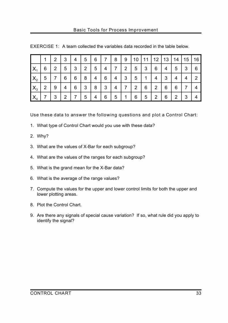
EXERCISE 1: A team collected the variables data recorded in the table below.
1 2 3 4 5 6 7 8 9 10 11 12 13 14 15 16
X16 2 5 3 2 5 4 7 2 5 3 6 4 5 3 6
X25 7 6 6 8 4 6 4 3 5 1 4 3 4 4 2
X32 9 4 6 3 8 3 4 7 2 6 2 6 6 7 4
X47 3 2 7 5 4 6 5 1 6 5 2 6 2 3 4
Use these data to answer the following questions and plot a Control Chart:
1. What type of Control Chart would you use with these data?
2. Why?
3. What are the values of X-Bar for each subgroup?
4. What are the values of the ranges for each subgroup?
5. What is the grand mean for the X-Bar data?
6. What is the average of the range values?
7. Compute the values for the upper and lower control limits for both the upper and
lower plotting areas.
8. Plot the Control Chart.
9. Are there any signals of special cause variation? If so, what rule did you apply to
identify the signal?
Basic Tools for Process Improvement
34 CONTROL CHART
EXERCISE 1 ANSWER KEY:
1. X-Bar and R.
2. There is more than one measurement within each subgroup.
3. Refer to Viewgraph 24.
4. Refer to Viewgraph 24.
5. Grand Mean of X = 4.52.
6. Average of R = 4.38.
7. UCL = 4.52 + (0.729) (4.38) = 7.71.X
LCL = 4.52 - (0.729) (4.38) = 1.33.X
UCL = (2.282) (4.38) = 10.0.R
LCL = 0.R
8. Refer to Viewgraph 25.
9. No.
Basic Tools for Process Improvement
CONTROL CHART 35
CALCULATIONS
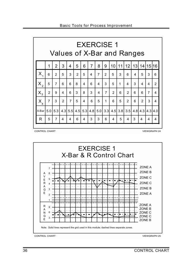
CONTROL CHART VIEWGRAPH 24
EXERCISE 1
Values of X-Bar and Ranges
X1
X2
X3
42 4 6 5 6 27 57 3 5 6 2 3 41
8 3 4 6 64 6 62 9 3 2 2 7 47
4 6 4 3 46 6 15 7 8 5 4 4 23
3 5 36 2 5 2 4 7 5 6 4 5 3 62
3 6 7 8 9 13 14 154 111 2 5 10 12 16
R
3.55.5 4.55.0 5.3 4.3 5.3 4.8 5.0 3.3 4.5 3.8 4.8 4.3 4.3 4.0
5 7 4 4 6 3 3 6 4 5 4 3 4 4 4
X
X-Bar
4
CONTROL CHART VIEWGRAPH 25
ZONE A
ZONE B
ZONE C
ZONE C
ZONE B
ZONE A
EXERCISE 1 X-Bar & R Control Chart
A
V
E
R
A
G
E
R
A
N
G
E
.ZONE A
ZONE B
ZONE C
ZONE C
ZONE B
.... ...
..... .
.
.
.
. ...
. .. ...... .
.7
6
5
4
3
2
1
9
6
3
Note: Solid lines represent the grid used in this module; dashed lines separate zones.
Basic Tools for Process Improvement
36 CONTROL CHART
Basic Tools for Process Improvement
CONTROL CHART 37
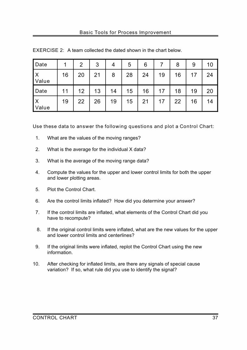
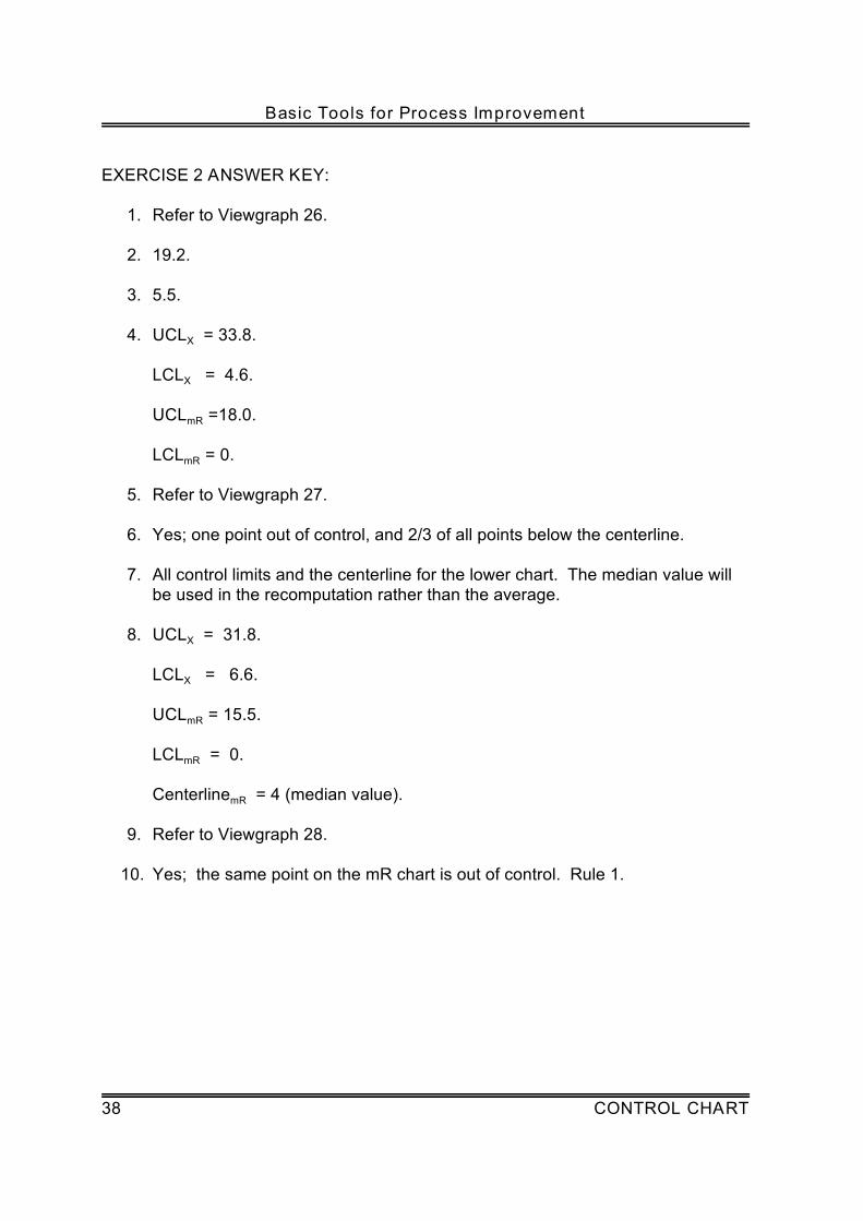
EXERCISE 2: A team collected the dated shown in the chart below.
Date 1 2 3 4 5 6 7 8 9 10
X
Value16 20 21 8 28 24 19 16 17 24
Date 11 12 13 14 15 16 17 18 19 20
X
Value19 22 26 19 15 21 17 22 16 14
Use these data to answer the following questions and plot a Control Chart:
1. What are the values of the moving ranges?
2. What is the average for the individual X data?
3. What is the average of the moving range data?
4. Compute the values for the upper and lower control limits for both the upper
and lower plotting areas.
5. Plot the Control Chart.
6. Are the control limits inflated? How did you determine your answer?
7. If the control limits are inflated, what elements of the Control Chart did you
have to recompute?
8. If the original control limits were inflated, what are the new values for the upper
and lower control limits and centerlines?
9. If the original limits were inflated, replot the Control Chart using the new
information.
10. After checking for inflated limits, are there any signals of special cause
variation? If so, what rule did you use to identify the signal?
Basic Tools for Process Improvement
38 CONTROL CHART
EXERCISE 2 ANSWER KEY:
1. Refer to Viewgraph 26.
2. 19.2.
3. 5.5.
4. UCL = 33.8.X
LCL = 4.6. X
UCL =18.0.mR
LCL = 0.mR
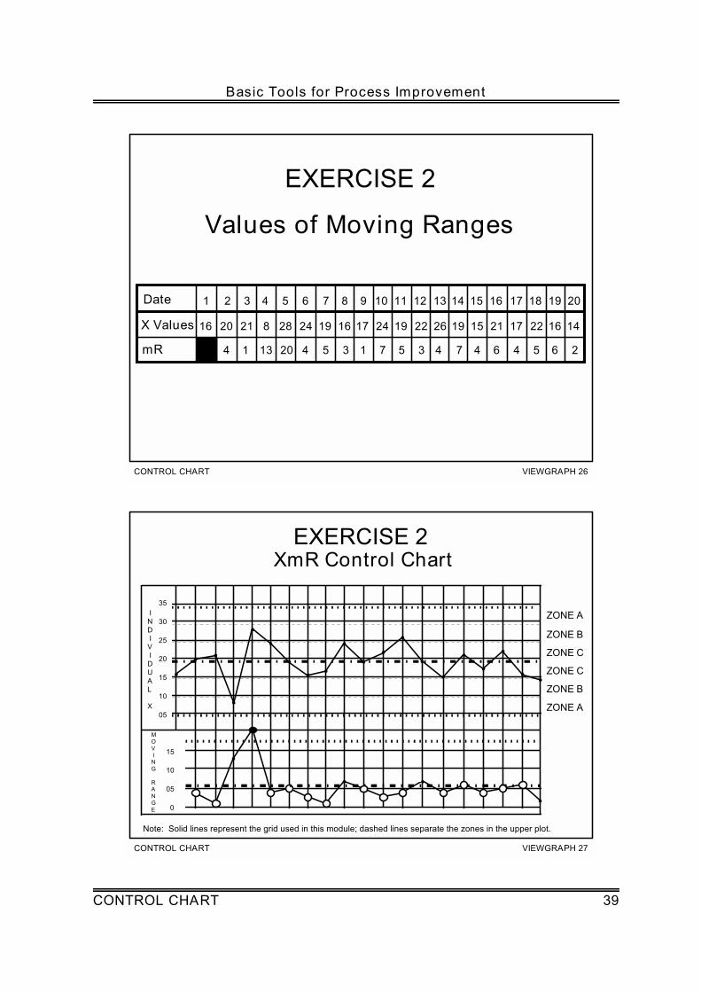
5. Refer to Viewgraph 27.
6. Yes; one point out of control, and 2/3 of all points below the centerline.
7. All control limits and the centerline for the lower chart. The median value will
be used in the recomputation rather than the average.
8. UCL = 31.8.X
LCL = 6.6.X
UCL = 15.5.mR
LCL = 0.mR
Centerline = 4 (median value).mR
9. Refer to Viewgraph 28.
10. Yes; the same point on the mR chart is out of control. Rule 1.
CONTROL CHART VIEWGRAPH 26
EXERCISE 2
Values of Moving Ranges
1 2 3 4 5 6 7 8 9 10 11 12 13 14 15 16 17 18 19 20Date
816 20 21 28 24 19 16 17 24 19 22 26 19 15 21 17 22 16 14X Values
134 1 20 4 5 3 1 7 5 3 4 7 4 6 4 5 6 2mR
CONTROL CHART VIEWGRAPH 27
EXERCISE 2 XmR Control Chart
ZONE B
ZONE A
ZONE C
ZONE C
ZONE A
ZONE B.
.
.
.
...
...
..
... . .
. . ..
. .
I
N
D
IV
I
D
U
A
L
X
35
30
25
20
15
10
05
15
10
05
0
.
M
O
V
IN
G
RA
N
G
E
Note: Solid lines represent the grid used in this module; dashed lines separate the zones in the upper plot.
Basic Tools for Process Improvement
CONTROL CHART 39
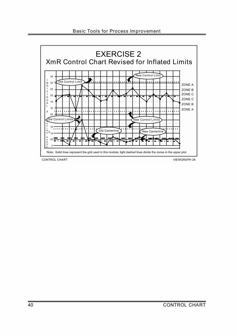
CONTROL CHART VIEWGRAPH 28
EXERCISE 2 XmR Control Chart Revised for Inflated Limits
ZONE B
ZONE A
ZONE C
ZONE A
ZONE C
ZONE B
I
ND
I
V
I
D
UA
L
X
35
30
25
20
15
10
05
15
10
05
0
M
O
V
IN
G
R
A
NG
E
.Old Control Limits New Control Limits
Note: Solid lines represent the grid used in this module; light dashed lines divide the zones in the upper plot.
Old Centerline New Centerline
Old Control Limit
New Control Limit
Basic Tools for Process Improvement
40 CONTROL CHART
Basic Tools for Process Improvement
CONTROL CHART 41
REFERENCES:
1. Department of the Navy (November 1992). Fundamentals of Total Quality
Leadership (Instructor Guide), pp, 3-39 - 3-66 and 6-57 - 6-62. San Diego, CA:
Navy Personnel Research and Development Center.
2. Department of the Navy (September 1993). Systems Approach to Process
Improvement (Instructor Guide), Lessons 8 and 9. San Diego, CA: OUSN Total
Quality Leadership Office and Navy Personnel Research and Development
Center.
3. Gitlow, H., Gitlow, S., Oppenheim, A., Oppenheim, R. (1989). Tools and Methods
for the Improvement of Quality. Homewood, IL: Richard D. Irwin, Inc.
4. U.S. Air Force (Undated). Process Improvement Guide - Total Quality Tools for
Teams and Individuals, pp. 61 - 81. Air Force Electronic Systems Center, Air
Force Materiel Command.
5. Wheeler, D.J. (1993). Understanding Variation - The Key to Managing Chaos.
Knoxville, TN: SPC Press.
6. Wheeler, D.J., & Chambers, D.S. (1992). Understanding Statistical Process
Control (2nd Ed.). Knoxville, TN: SPC Press.