home economics - federal reserve bank of st. louis/media/publications/regional-economist/... ·...
TRANSCRIPT

A Quarterly Review of Business and Economic Conditions
Vol. 24, No. 4
October 2016
THE FEDERAL RESERVE BANK OF ST. LOUIS CENTRAL TO AMERICA’S ECONOMY®
Q&A with Bullard St. Louis Fed President Discusses New “Narrative”
Immigrants to U.S. Where They Are From, Where They Are Going
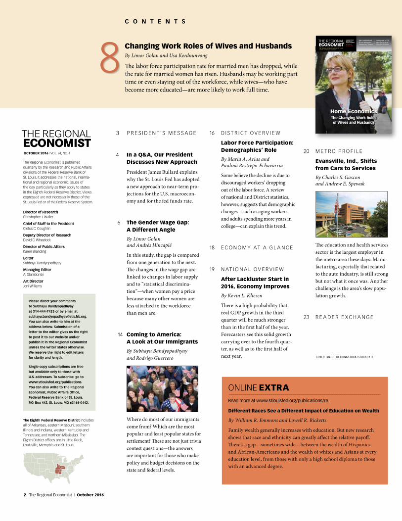
The Changing Work Roles of Wives and Husbands
Home Economics
C O N T E N T S
Changing Work Roles of Wives and HusbandsBy Limor Golan and Usa Kerdnunvong
The labor force participation rate for married men has dropped, while the rate for married women has risen. Husbands may be working part time or even staying out of the workforce, while wives—who have become more educated—are more likely to work full time.
8
THE REGIONALECONOMISTOCTOBER 2016 | VOL. 24, NO. 4
The Regional Economist is published quarterly by the Research and Public Affairs divisions of the Federal Reserve Bank of St. Louis. It addresses the national, interna-tional and regional economic issues of the day, particularly as they apply to states in the Eighth Federal Reserve District. Views expressed are not necessarily those of the St. Louis Fed or of the Federal Reserve System.
Director of ResearchChristopher J. Waller
Chief of Staff to the President Cletus C. Coughlin
Deputy Director of ResearchDavid C. Wheelock
Director of Public AffairsKaren Branding
EditorSubhayu Bandyopadhyay
Managing EditorAl Stamborski
Art DirectorJoni Williams
The Eighth Federal Reserve District includes all of Arkansas, eastern Missouri, southern Illinois and Indiana, western Kentucky and Tennessee, and northern Mississippi. The Eighth District offices are in Little Rock, Louisville, Memphis and St. Louis.
Please direct your comments
to Subhayu Bandyopadhyay
at 314-444-7425 or by email at
You can also write to him at the
address below. Submission of a
letter to the editor gives us the right
to post it to our website and/or
publish it in The Regional Economist
unless the writer states otherwise.
We reserve the right to edit letters
for clarity and length.
Single-copy subscriptions are free
but available only to those with
U.S. addresses. To subscribe, go to
www.stlouisfed.org/publications.
You can also write to The Regional
Economist, Public Affairs Office,
Federal Reserve Bank of St. Louis,
P.O. Box 442, St. Louis, MO 63166-0442.
3 P R E S I D E N T ’ S M E S S A G E
4 In a Q&A, Our President Discusses New Approach
President James Bullard explains why the St. Louis Fed has adopted a new approach to near-term pro-jections for the U.S. macroecon-omy and for the fed funds rate.
6 The Gender Wage Gap: A Different Angle
By Limor Golan and Andrés Hincapié
In this study, the gap is compared from one generation to the next. The changes in the wage gap are linked to changes in labor supply and to “statistical discrimina-tion”—when women pay a price because many other women are less attached to the workforce than men are.
14 Coming to America: A Look at Our Immigrants
By Subhayu Bandyopadhyay and Rodrigo Guerrero
Where do most of our immigrants come from? Which are the most popular and least popular states for settlement? These are not just trivia contest questions—the answers are important for those who make policy and budget decisions on the state and federal levels.
16 D I S T R I C T O V E R V I E W
Labor Force Participation: Demographics’ Role
By Maria A. Arias and Paulina Restrepo-Echavarria
Some believe the decline is due to discouraged workers’ dropping out of the labor force. A review of national and District statistics, however, suggests that demographic changes—such as aging workers and adults spending more years in college—can explain this trend.
18 E C O N O M Y AT A G L A N C E
19 N AT I O N A L O V E R V I E W
After Lackluster Start in 2016, Economy Improves
By Kevin L. Kliesen
There is a high probability that real GDP growth in the third quarter will be much stronger than in the first half of the year. Forecasters see this solid growth carrying over to the fourth quar-ter, as well as to the first half of next year.
20 M E T R O P R O F I L E
Evansville, Ind., Shifts from Cars to Services
By Charles S. Gascon and Andrew E. Spewak
The education and health services sector is the largest employer in the metro area these days. Manu-facturing, especially that related to the auto industry, is still strong but not what it once was. Another challenge is the area’s slow popu-lation growth.
23 R E A D E R E X C H A N G E
A Quarterly Review of Business and Economic Conditions
Vol. 24, No. 4
October 2016
THE FEDERAL RESERVE BANK OF ST. LOUIS CENTRAL TO AMERICA’S ECONOMY®
Q&A with Bullard St. Louis Fed President Discusses New “Narrative”
Immigrants to U.S. Where They Are From, Where They Are Going
The Changing Work Roles of Wives and Husbands
Home Economics
COVER IMAGE: © THINKSTOCK /STOCKBYTE
ONLINE EXTRARead more at www.stlouisfed.org/publications/re.
Different Races See a Different Impact of Education on Wealth
By William R. Emmons and Lowell R. Ricketts
Family wealth generally increases with education. But new research shows that race and ethnicity can greatly affect the relative payoff. There’s a gap—sometimes wide—between the wealth of Hispanics and African-Americans and the wealth of whites and Asians at every education level, from those with only a high school diploma to those with an advanced degree.
2 The Regional Economist | October 2016
Real gross domestic product (GDP) growth in the U.S. has been relatively
slow since the recession ended in June 2009. It has averaged about 2 percent over the past seven years, compared with roughly 3 percent to 4 percent in the three previous expansions. At this point, the slower growth during the current recovery can no longer be attributed to cyclical factors that resulted from the recession—rather, it likely reflects a trend.
A common topic of discussion among observers of the U.S. economy is how to return to a higher growth rate for the U.S. economy. The pace of growth is important because it has implications for the nation’s standard of living. For instance, at an annual growth rate of 1 percent, a country’s standard of living would double roughly every 70 years; at 2 percent it would double every 35 years; at 7 percent it would double every 10 years.
While some might want to turn to mon-etary policy as the tool for increasing the GDP growth trend, monetary policy cannot permanently alter the long-run growth rate. Leading theories say that monetary policy can have only temporary effects on econo-mic growth and that, ultimately, it would have no effect on economic growth because money is neutral in the medium term and the long term. Monetary policy can only pull some growth forward (e.g., when the economy is in recession) in exchange for less growth in the future. This process allows for a smoother growth rate across time—so-called “stabilization policy”— but there would be no additional output produced overall.
One of the most important drivers of increased real GDP growth in the long
Higher GDP Growth in the Long Run Requires Higher Productivity Growth
P R E S I D E N T ’ S M E S S A G E
capital can improve private-sector pro-ductivity and, therefore, may lead to faster growth.
The U.S. experienced faster productiv-ity growth in the not-too-distant past. If we could return to the productivity growth rates experienced in the late 1990s, the U.S. economy would likely see better outcomes overall. As a nation, we need to think about what kinds of public policies are needed to encourage higher productivity growth—and, in turn, higher real GDP growth—over the next five to 10 years. The above consid-erations suggest the following might help: encouraging investment in new technolo-gies, improving the diffusion of technology, investing in human capital so that workers’ skillsets match what the economy needs, and investing in public capital that has pro-ductive uses for the private sector. These are all beyond the scope of monetary policy.
James Bullard, President and CEO
Federal Reserve Bank of St. Louis
The U.S. experienced faster
productivity growth in the
not-too-distant past. If we
could return to the productiv-
ity growth rates experienced
in the late 1990s, the U.S.
economy would likely see
better outcomes overall.
run is growth in productivity. In recent years, average labor productivity growth in the U.S. has been very slow. For the total economy, it grew only 0.4 percent on average from the second quarter of 2013 to the first quarter of 2016, whereas it grew 2.3 percent on average from the first quarter of 1995 to the fourth quarter of 2005.
What influences productivity over time? The literature on the fundamentals of economic growth tends to focus on three factors. One is the pace of technological development. Productivity improves as new general purpose technologies are introduced and diffuse through the whole economy. Classic examples are the automobile and electricity. The second factor is human capital. The workforce receives better train-ing and a higher level of knowledge over time, both of which help make workers more productive and improve growth over the medium and long run. The third factor is productive public capital. The idea is that government would provide certain types of public capital that would not otherwise be provided by the private sector, such as roads, bridges and airports. This type of public
The Regional Economist | www.stlouisfed.org 3
Federal Reserve Bank of St. Louis President James Bullard discussed the St. Louis Fed’s new narrative regarding the outlook for the U.S. economy and monetary policy during an interview with Jeremy Schwartz and Jeremy Siegel on “Behind the Markets” on Aug. 12. The content originally aired on Business Radio Powered by The Wharton School, SiriusXM Channel 111. The following excerpts are from the interview. They have been edited for clarity and length. More information on this topic, including the entire interview, is available on President Bullard’s webpage and in his Aug. 25 blog post. Links can be found in the endnotes.
Siegel: Why don’t you … spend a few minutes setting out what you think is the future for interest rates and why you think this way.
Bullard: [The St. Louis Fed] put out … what we called a new narrative on June 17. 1 … The basic idea is that there’s an old narrative that we were using really over the last five years. We think it’s time to switch now to a new narrative.
The old narrative had a long-run steady state, which is very common in macroeco-nomics, and then the idea was that you’re converging toward this steady state, so all the variables [e.g., real GDP growth, unem-ployment, inflation] are going to go back to their long-run values. And, you know, gaps [between current values and goals] are get-ting to be zero, or we think they’re basically zero as far as output gaps, and the distance of inflation from target is not very large. Therefore, you would get this idea that the
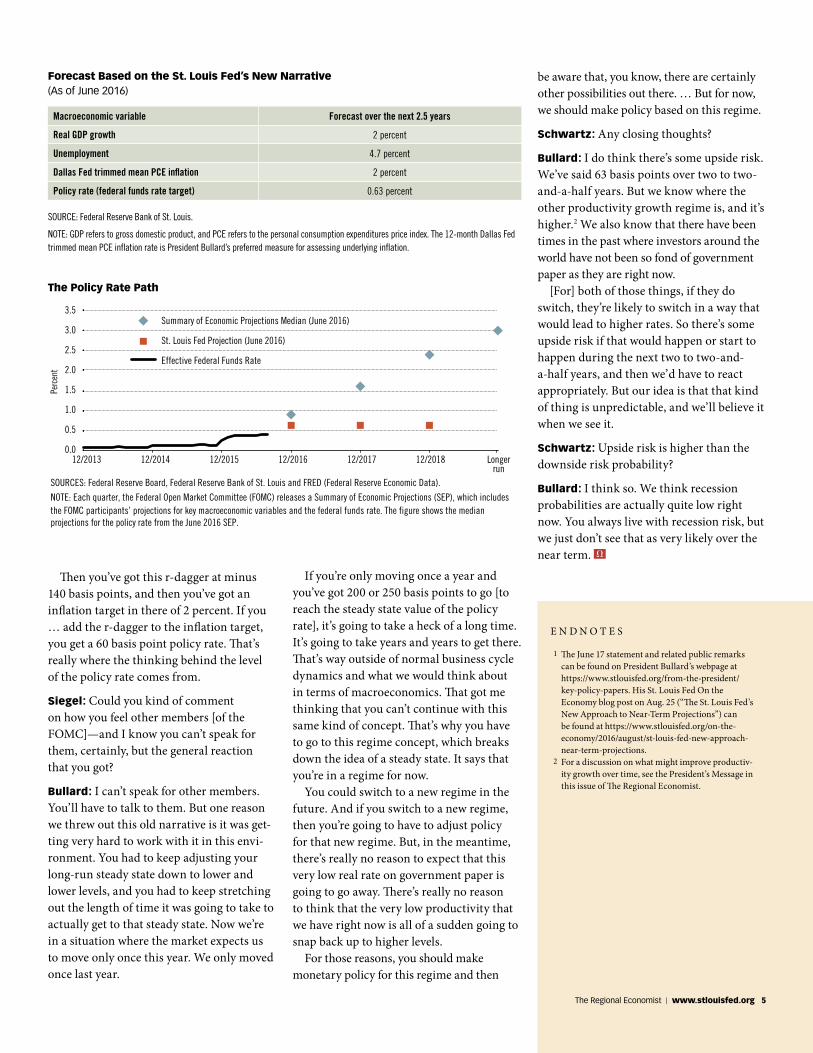
policy rate [i.e., the federal funds rate target] has to rise, and we certainly had that for quite a while in our narrative. And so you get this rising dot picture from the Fed. [See the figure.]
In the June announcement, we abandoned that narrative and we went to a new narra-tive, partly because we think parts of the old narrative were not working and probably were not going to work going forward. In the new narrative, you get rid of this idea of a long-run steady state and you go to the idea of regimes instead. … And these regimes are very persistent. Once you’re in one of these regimes, what you want to do is make the best monetary policy that you can based on that regime.
Policy is regime-dependent, and it’s unpredictable. You can switch out of these regimes to something else, but it’s unpredict-able when that will happen. Once you’re in a regime, you just predict that you’re going to stay there for the forecast horizon, which
is about two to two-and-a-half years for the Fed. The current regime is characterized by low growth, low productivity and especially by very low real rates of return on govern-ment debt, what we’re calling r-dagger [r†].
We think this regime is going to persist, so the policy rate can stay about flat over the forecast horizon with just one increase to get to the right level of the policy rate for this regime. We’ve got the policy rate at only 63 basis points [0.63 percent] over the forecast horizon. [The target range for the federal funds rate has been at 0.25 to 0.50 percent since December 2015.] …
Another important thing … is that the cyclical dynamics in the economy, I think, are pretty much over. You’ve got unemploy-ment down basically at what the [Federal Open Market] Committee thinks is the natural rate of unemployment. … So, this is a good time to think about a new narrative.
[The table and figure show the forecasts based on the new narrative.]
Siegel: R[-dagger] is just, for clarification, a short-term equilibrium real rate on top-quality short-term instruments.
Bullard: Right. If you look at the ex-post real rate of return on one-year U.S. Treasur-ies, so you take the Treasury yield and you subtract off the Dallas Fed trimmed mean inflation rate over the last three years, you’re going to get about a minus 140 basis points. We took that to heart as part of the regime. It hasn’t changed much in the last three years. We don’t see any reason for that to really change over the forecast horizon of two to two-and-a-half years.
We think we should just accept that as an input to monetary policy for now and then try to make monetary policy as best we can, given that value. One way to justify the 63 basis point recommendation is to think of a Taylor rule. … The Taylor rule would produce a recommendation for the policy rate. It’s a formula … that depends on gaps, and we’re already saying let’s just take the gaps to be about zero. [For example, there is almost no gap between the current unem-ployment rate and the FOMC’s estimate of the longer-run unemployment rate in the Summary of Economic Projections, and inflation as measured by the Dallas Fed trimmed mean PCE inflation rate is close to 2 percent.]
Q&A with President Bullard on New Approach to Projections
4 The Regional Economist | October 2016
Then you’ve got this r-dagger at minus 140 basis points, and then you’ve got an inflation target in there of 2 percent. If you … add the r-dagger to the inflation target, you get a 60 basis point policy rate. That’s really where the thinking behind the level of the policy rate comes from.
Siegel: Could you kind of comment on how you feel other members [of the FOMC]—and I know you can’t speak for them, certainly, but the general reaction that you got?
Bullard: I can’t speak for other members. You’ll have to talk to them. But one reason we threw out this old narrative is it was get-ting very hard to work with it in this envi-ronment. You had to keep adjusting your long-run steady state down to lower and lower levels, and you had to keep stretching out the length of time it was going to take to actually get to that steady state. Now we’re in a situation where the market expects us to move only once this year. We only moved once last year.
If you’re only moving once a year and you’ve got 200 or 250 basis points to go [to reach the steady state value of the policy rate], it’s going to take a heck of a long time. It’s going to take years and years to get there. That’s way outside of normal business cycle dynamics and what we would think about in terms of macroeconomics. That got me thinking that you can’t continue with this same kind of concept. That’s why you have to go to this regime concept, which breaks down the idea of a steady state. It says that you’re in a regime for now.
You could switch to a new regime in the future. And if you switch to a new regime, then you’re going to have to adjust policy for that new regime. But, in the meantime, there’s really no reason to expect that this very low real rate on government paper is going to go away. There’s really no reason to think that the very low productivity that we have right now is all of a sudden going to snap back up to higher levels.
For those reasons, you should make monetary policy for this regime and then
Macroeconomic variable Forecast over the next 2.5 years
Real GDP growth 2 percent
Unemployment 4.7 percent
Dallas Fed trimmed mean PCE inflation 2 percent
Policy rate (federal funds rate target) 0.63 percent
Forecast Based on the St. Louis Fed’s New Narrative (As of June 2016)
SOURCE: Federal Reserve Bank of St. Louis.
NOTE: GDP refers to gross domestic product, and PCE refers to the personal consumption expenditures price index. The 12-month Dallas Fed trimmed mean PCE inflation rate is President Bullard’s preferred measure for assessing underlying inflation.
E N D N O T E S
1 The June 17 statement and related public remarks can be found on President Bullard’s webpage at https://www.stlouisfed.org/from-the-president/key-policy-papers. His St. Louis Fed On the Economy blog post on Aug. 25 (“The St. Louis Fed’s New Approach to Near-Term Projections”) can be found at https://www.stlouisfed.org/on-the-economy/2016/august/st-louis-fed-new-approach-near-term-projections.
2 For a discussion on what might improve productiv-ity growth over time, see the President’s Message in this issue of The Regional Economist.
The Policy Rate Path
3.5
3.0
2.5
2.0
1.5
1.0
0.5
0.0
Perc
ent
SOURCES: Federal Reserve Board, Federal Reserve Bank of St. Louis and FRED (Federal Reserve Economic Data).
NOTE: Each quarter, the Federal Open Market Committee (FOMC) releases a Summary of Economic Projections (SEP), which includes the FOMC participants’ projections for key macroeconomic variables and the federal funds rate. The figure shows the median projections for the policy rate from the June 2016 SEP.
12/2013 12/2014 12/2015 12/2016 12/2017 12/2018 Longerrun
Summary of Economic Projections Median (June 2016)
St. Louis Fed Projection (June 2016)
Effective Federal Funds Rate
be aware that, you know, there are certainly other possibilities out there. … But for now, we should make policy based on this regime.
Schwartz: Any closing thoughts?
Bullard: I do think there’s some upside risk. We’ve said 63 basis points over two to two-and-a-half years. But we know where the other productivity growth regime is, and it’s higher.2 We also know that there have been times in the past where investors around the world have not been so fond of government paper as they are right now.
[For] both of those things, if they do switch, they’re likely to switch in a way that would lead to higher rates. So there’s some upside risk if that would happen or start to happen during the next two to two-and-a-half years, and then we’d have to react appropriately. But our idea is that that kind of thing is unpredictable, and we’ll believe it when we see it.
Schwartz: Upside risk is higher than the downside risk probability?
Bullard: I think so. We think recession probabilities are actually quite low right now. You always live with recession risk, but we just don’t see that as very likely over the near term.
The Regional Economist | www.stlouisfed.org 5
The gender pay gap has declined substan-tially since the 1960s, a period of many
decades when women’s participation in the labor market has risen and their working hours have increased. An especially sig-nificant decline in the pay gap occurred in the 1970s and the 1980s. The convergence slowed down in the 1990s, and some gap still remains.1
In this article, we examine the evolution of the wage gap by cohorts. We also look at the evolution over the life cycle to gain further insight into the patterns and possible causes of the gender wage gap. Using data from the Panel Study of Income Dynamics (PSID), we followed the evolution over the life cycle for three cohorts: those born in 1941-1950, those born in 1951-1960 and those born in 1961-1970.
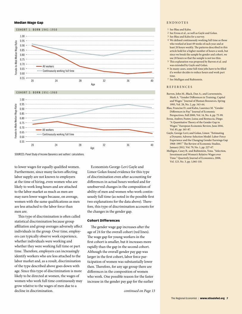
The figure presents the evolution of the gender pay gap over the life cycle for the first two cohorts of white individuals. (An analysis for all races is beyond the scope of this article; there are other issues regarding labor market pay gaps for nonwhites.) The red line shows the median wage of females divided by the median wage of males by age. Where the line is sloping upward, the gender wage gap is declining because the median female wage is larger relative to the median male wage; the opposite is true if the line is sloping downward.
As can be seen from the two charts, the gap increases with age, at least after the age of 24, which is the age by which the majority of individuals have completed their educa-tion. Thus, the gender gap when workers are 24 is substantially smaller than the gap when workers are in their mid-30s. This fact is well-known,2 and one of the main reasons for this pattern is that men and women make
Time Card
Name
DateIn Out
L A B O R M A R K E T S
different choices over the life cycle. As they get older, women are more likely than men to work fewer hours outside the home and have breaks in their labor force participation (yielding less accumulated experience and possibly fewer labor market skills) and are less likely to hold highly compensated jobs with promotion prospects.3
Life-Cycle Wage Gap
To further explore the role of labor market experience, we plotted the evolution of the gender pay gap for employees who work full time continuously during their careers. The blue dotted line in the charts shows the gender pay gap within this subset. For each age, we divided the median wage of females who worked full time continuously up to that age by the same for males.4 From the figure, it is clear that the gender wage gap is smaller for those who worked full time continuously than for all workers in general. This is true for all cohorts.
For those in the second cohort (born 1951-1960), the pay gap for those working full time continuously is not only smaller but decreases with age for the most part. This latter fact is in contrast to what is seen in the full sample.
We considered several possible explana-tions for this pattern. First, the composi-tion of the sample changes. For example, if skilled women (skill can be formal education and training but also innate ability, which is unobserved by the researchers) are more likely to work full time continuously, then the wage gap at a later age reflects the fact that we are comparing the wages of less-skilled women to those of men early on, while we are comparing more-skilled women to men at older ages. (The group of men working full
time continuously can be more stable because both more-skilled and less-skilled men are likely to work full time.) Second, while men still work more hours than women, the gap in hours declines in this group; so, the increase in experience (and, therefore, labor market skills) of women who work full time con-tinuously is larger than that of men. Third, the wage gap reflects discrimination, and discrimination of women who continuously work full time declines over time.
Regarding the first explanation, we calcu-lated the share of college-and-above-educated males and females among those who work full time. If anything, after age 25, the education of males continuously working full time is increasing relative to that of females. However, it is still possible that education is simply one dimension of skill and that women in this group are in fact increasingly skilled but their skills are unobserved by the researcher.
Regarding the second explanation, the gap of hours worked between males and females who work continuously full time does not decline substantially. Therefore, we ruled this out, too.
Last, we turn to the third explanation: Labor market experience and discrimination are related.5 Specifically, firms often have costs of hiring and training workers. When they hire people for jobs with good promo-tion prospects and jobs that require train-ing and long hours, they are likely to seek individuals who are less likely to leave the labor force or to reduce their hours substan-tially.6 While some women are more inclined to participate in the labor market and work full time, women in general are still more likely to reduce hours or leave the labor force, especially during childbearing years, relative to what men are likely to do. This can lead
By Limor Golan and Andrés Hincapié
Breaking Down the Gender Wage Gap by Age
and by Hours Worked
6 The Regional Economist | October 2016
E N D N O T E S
1 See Blau and Kahn. 2 See Erosa et al., as well as Gayle and Golan. 3 See Blau and Kahn for a survey. 4 We defined continuously working full time as those
who worked at least 49 weeks of each year and at least 20 hours weekly. The patterns described in this article hold for a higher number of hours a week, but since we break the sample by gender and cohort, we use 20 hours so that the sample is not too thin.
5 This explanation was proposed by Barron et al. and was extended by Gayle and Golan.
6 In many cases, some full-time jobs have to be filled if a worker decides to reduce hours and work part time.
7 See Mulligan and Rubinstein.
R E F E R E N C E S
Barron, John M.; Black, Dan A.; and Loewenstein, Mark A. “Gender Differences in Training, Capital and Wages.” Journal of Human Resources, Spring 1993, Vol. 28, No. 2, pp. 343-64.
Blau, Francine D.; and Kahn, Laurence M. “Gender Differences in Pay.” Journal of Economic Perspectives, Fall 2000, Vol. 14, No. 4, pp. 75-99.
Erosa, Andres; Fuster, Luisa; and Restuccia, Diego. “A Quantitative Theory of the Gender Gap in Wages.” European Economic Review, June 2016, Vol. 85, pp. 165-87.
Gayle, George-Levi; and Golan, Limor. “Estimating a Dynamic Adverse-Selection Model: Labor-Force Experience and the Changing Gender Earnings Gap 1968–1997.” The Review of Economic Studies, January 2012, Vol. 79, No. 1, pp. 227-67.
Mulligan, Casey B.; and Rubinstein, Yona. “Selection, Investment and Women’s Relative Wages over Time.” Quarterly Journal of Economics, 2008, Vol. 123, No. 3, pp. 1,061-110.
to lower wages for equally qualified women. Furthermore, since many factors affecting labor supply are not known to employers at the time of hiring, even women who are likely to work long hours and are attached to the labor market as much as men are may earn lower wages because, on average, women with the same qualifications as men are less attached to the labor force than men are.
This type of discrimination is often called statistical discrimination because group affiliation and group averages adversely affect individuals in the group. Over time, employ-ers can typically observe work experience, whether individuals were working and whether they were working full time or part time. Therefore, employers can increasingly identify workers who are less attached to the labor market and, as a result, discrimination of the type described above goes down with age. Since this type of discrimination is more likely to be directed at women, the wages of women who work full time continuously may grow relative to the wages of men due to a decline in discrimination.
Economists George-Levi Gayle and Limor Golan found evidence for this type of discrimination even after accounting for differences in actual hours worked and for unobserved changes in the composition of ability of men and women who work contin-uously full time (as noted in the possible first two explanations for the data above). There-fore, this type of discrimination accounts for the changes in the gender gap.
Cohort Differences
The gender wage gap increases after the age of 24 for the overall cohort (red lines). The wage gap for young workers in the first cohort is smaller, but it increases more rapidly than the gap in the second cohort. Although the overall gender pay gap was larger in the first cohort, labor force par-ticipation of women was substantially lower then. Therefore, for any age group there are differences in the composition of women who work. One possible reason for the faster increase in the gender pay gap for the earlier
C O H O R T 1 : B O R N 1 9 4 1 - 1 9 5 0
SOURCES: Panel Study of Income Dynamics and authors’ calculations.
C O H O R T 2 : B O R N 1 9 5 1 - 1 9 6 0
Median Wage Gap
20 24 28Age
32 36 40
1.00
0.95
0.90
0.85
0.80
0.75
0.70
0.65
0.60
0.55
Fem
ale-
to-M
ale
Med
ian
Wag
e Ra
tio
All workers
Continuously working full time
20 24 28Age
32 36 40
1.00
0.95
0.90
0.85
0.80
0.75
0.70
0.65
0.60
0.55
Fem
ale-
to-M
ale
Med
ian
Wag
e Ra
tio
All workers
Continuously working full time
continued on Page 13
The Regional Economist | www.stlouisfed.org 7

8 The Regional Economist | October 2016
By Limor Golan and Usa Kerdnunvong
L A B O R M A R K E T S
The Changing Work Roles of Wives and Husbands
It is well-known that the labor force participation rate for men and the hours worked by men have declined
over the past four decades. More men are reporting that they either are not employed and not actively searching
for a job or are working part time; these two trends are contributing to the decline in the average hours
worked by men in the past four or five decades.1 During this same time, women have increased their representation in the labor market: The fraction of
women participating in the labor force has increased, as has the number of hours women work outside the home, with the majority of the increases driven by
growth in the labor supply of married women.
Home Economics
The Regional Economist | www.stlouisfed.org 9
The changes in the labor supply of men and women may be related, especially if we consider married men and women. Time allocation—that is, how much a spouse works, how much time each spends on housework and child care, and how much leisure each enjoys—is decided within households. This context is needed to analyze married individuals’ decisions to withdraw from the labor market or to work part time. Although many papers have doc-umented the decline in the labor supply of males,2 this article focuses on the changing role of wives in providing economic support for their families and changes in the labor supply of prime-age (25-54) married males.
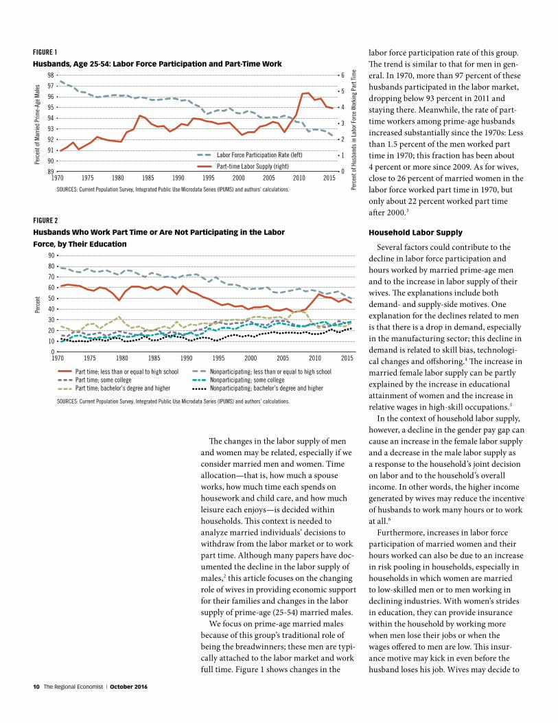
We focus on prime-age married males because of this group’s traditional role of being the breadwinners; these men are typi-cally attached to the labor market and work full time. Figure 1 shows changes in the
labor force participation rate of this group. The trend is similar to that for men in gen-eral. In 1970, more than 97 percent of these husbands participated in the labor market, dropping below 93 percent in 2011 and staying there. Meanwhile, the rate of part-time workers among prime-age husbands increased substantially since the 1970s: Less than 1.5 percent of the men worked part time in 1970; this fraction has been about 4 percent or more since 2009. As for wives, close to 26 percent of married women in the labor force worked part time in 1970, but only about 22 percent worked part time after 2000.3
Household Labor Supply
Several factors could contribute to the decline in labor force participation and hours worked by married prime-age men and to the increase in labor supply of their wives. The explanations include both demand- and supply-side motives. One explanation for the declines related to men is that there is a drop in demand, especially in the manufacturing sector; this decline in demand is related to skill bias, technologi-cal changes and offshoring.4 The increase in married female labor supply can be partly explained by the increase in educational attainment of women and the increase in relative wages in high-skill occupations.5
In the context of household labor supply, however, a decline in the gender pay gap can cause an increase in the female labor supply and a decrease in the male labor supply as a response to the household’s joint decision on labor and to the household’s overall income. In other words, the higher income generated by wives may reduce the incentive of husbands to work many hours or to work at all.6
Furthermore, increases in labor force participation of married women and their hours worked can also be due to an increase in risk pooling in households, especially in households in which women are married to low-skilled men or to men working in declining industries. With women’s strides in education, they can provide insurance within the household by working more when men lose their jobs or when the wages offered to men are low. This insur-ance motive may kick in even before the husband loses his job. Wives may decide to
FIGURE 1
Husbands, Age 25-54: Labor Force Participation and Part-Time Work98
97
96
95
94
93
92
91
90
89
6
5
4
3
2
1
0
Perc
ent o
f Mar
ried
Prim
e-Ag
e M
ales
Perc
ent o
f Hus
band
s in
Lab
or F
orce
Wor
king
Par
t Tim
e
Labor Force Participation Rate (left)
Part-time Labor Supply (right)
SOURCES: Current Population Survey, Integrated Public Use Microdata Series (IPUMS) and authors’ calculations.
1970 1975 1980 1985 1990 1995 2000 2005 2010 2015
FIGURE 2
Husbands Who Work Part Time or Are Not Participating in the Labor
Force, by Their Education90
80
70
60
50
40
30
20
10
0
Perc
ent
Part time; less than or equal to high schoolPart time; some collegePart time; bachelor’s degree and higher
Nonparticipating; less than or equal to high schoolNonparticipating; some collegeNonparticipating; bachelor’s degree and higher
SOURCES: Current Population Survey, Integrated Public Use Microdata Series (IPUMS) and authors’ calculations.
1970 1975 1980 1985 1990 1995 2000 2005 2010 2015
10 The Regional Economist | October 2016
work outside the home when there is just a threat of unemployment or a decline in their husbands’ earnings.
Another possible explanation for the increase in married males’ working part time has to do with the fact that finding jobs can take time and effort. Working part time allows the individual to spend more time searching for a better-paying job or investing in the acquisition and enhance-ment of skills, which often means going back to school or even acquiring skills that allow individuals to change occupation or sector.7 Thus, in households in which wives work full time, husbands might be able to be choosier in accepting jobs—they can afford to be less willing to take full-time jobs for low pay or jobs that may not offer good promotion prospects or other nonpecuni-ary qualities. These men may take part-time jobs while searching for better jobs.
Next, we explore changes in characteris-tics of households in which prime-age men were not participating in the labor force or worked part time between 1970 and 2015.
Labor Supply and Education Composition
The education composition of husbands who either work part time or are nonpar-ticipating has changed significantly over time. As shown in Figure 2, in both groups, the respective fraction of husbands with high school education or less decreased, and the fraction of husbands with at least some college education increased since 1970. (During and after the Great Recession of 2007-09, however, the fraction of males who worked part time and had no more than a high school diploma went up but has since reverted to its decreasing trend. As for better-educated husbands, there was a relative decline in the fraction working part time during the recession. The differ-ences between the experiences of the two groups during the recession can be due to the differences in the demand for the skills of educated and less-educated men; another factor is that more-educated husbands are more likely to have more-educated wives with different labor market prospects.)
To further explore the changes in the composition of households in which hus-bands do not participate in the labor force or work part time, we turn to the education
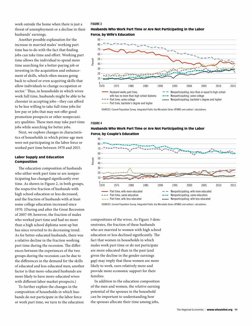
compositions of the wives. As Figure 3 dem-onstrates, the fraction of these husbands who are married to women with high school education or less declined significantly. The fact that women in households in which males work part time or do not participate are more educated than in the past (and given the decline in the gender earnings gap) may imply that these women are more likely to work, earn relatively more and provide more economic support for their families.
In addition to the education composition of the men and women, the relative earning potential of the spouses in the household can be important to understanding how the spouses allocate their time among jobs,
FIGURE 4
Husbands Who Work Part Time or Are Not Participating in the Labor
Force, by Couple’s Education90
80
70
60
50
40
30
20
10
0
Perc
ent
Part time; wife more educatedPart time; same educationPart time; wife less educated
Nonparticipating; wife more educatedNonparticipating; same educationNonparticipating; wife less educated
SOURCES: Current Population Survey, Integrated Public Use Microdata Series (IPUMS) and authors’ calculations.
1970 1975 1980 1985 1990 1995 2000 2005 2010 2015
FIGURE 3
Husbands Who Work Part Time or Are Not Participating in the Labor
Force, by Wife’s Education90
80
70
60
50
40
30
20
10
0
Perc
ent
Husband works part time; wife has no more than high school diplomaPart time; some collegePart time; bachelor’s degree and higher
Nonparticipating; less than or equal to high schoolNonparticipating; some collegeNonparticipating; bachelor’s degree and higher
SOURCES: Current Population Survey, Integrated Public Use Microdata Series (IPUMS) and authors’ calculations.
1970 1975 1980 1985 1990 1995 2000 2005 2010 2015
The Regional Economist | www.stlouisfed.org 11
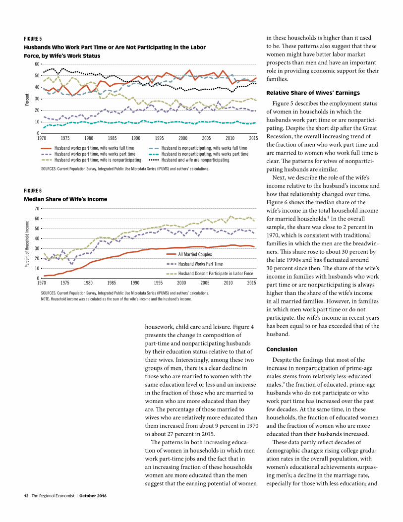
FIGURE 5
Husbands Who Work Part Time or Are Not Participating in the Labor
Force, by Wife’s Work Status60
50
40
30
20
10
0
Perc
ent
Husband works part time; wife works full timeHusband works part time; wife works part timeHusband works part time; wife is nonparticipating
Husband is nonparticipating; wife works full timeHusband is nonparticipating; wife works part timeHusband and wife are nonparticipating
SOURCES: Current Population Survey, Integrated Public Use Microdata Series (IPUMS) and authors’ calculations.
1970 1975 1980 1985 1990 1995 2000 2005 2010 2015
FIGURE 6
Median Share of Wife’s Income
70
60
50
40
30
20
10
0
Perc
ent o
f Hou
seho
ld In
com
e
All Married Couples
Husband Works Part Time
Husband Doesn’t Participate in Labor Force
SOURCES: Current Population Survey, Integrated Public Use Microdata Series (IPUMS) and authors’ calculations.NOTE: Household income was calculated as the sum of the wife’s income and the husband’s income.
1970 1975 1980 1985 1990 1995 2000 2005 2010 2015
housework, child care and leisure. Figure 4 presents the change in composition of part-time and nonparticipating husbands by their education status relative to that of their wives. Interestingly, among these two groups of men, there is a clear decline in those who are married to women with the same education level or less and an increase in the fraction of those who are married to women who are more educated than they are. The percentage of those married to wives who are relatively more educated than them increased from about 9 percent in 1970 to about 27 percent in 2015.
The patterns in both increasing educa-tion of women in households in which men work part-time jobs and the fact that in an increasing fraction of these households women are more educated than the men suggest that the earning potential of women
in these households is higher than it used to be. These patterns also suggest that these women might have better labor market prospects than men and have an important role in providing economic support for their families.
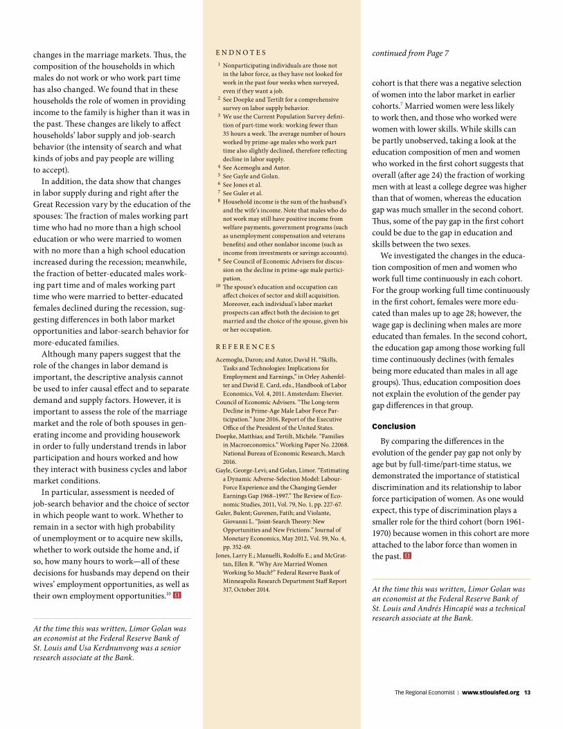
Relative Share of Wives’ Earnings
Figure 5 describes the employment status of women in households in which the husbands work part time or are nonpartici-pating. Despite the short dip after the Great Recession, the overall increasing trend of the fraction of men who work part time and are married to women who work full time is clear. The patterns for wives of nonpartici-pating husbands are similar.
Next, we describe the role of the wife’s income relative to the husband’s income and how that relationship changed over time. Figure 6 shows the median share of the wife’s income in the total household income for married households.8 In the overall sample, the share was close to 2 percent in 1970, which is consistent with traditional families in which the men are the breadwin-ners. This share rose to about 30 percent by the late 1990s and has fluctuated around 30 percent since then. The share of the wife’s income in families with husbands who work part time or are nonparticipating is always higher than the share of the wife’s income in all married families. However, in families in which men work part time or do not participate, the wife’s income in recent years has been equal to or has exceeded that of the husband.
Conclusion
Despite the findings that most of the increase in nonparticipation of prime-age males stems from relatively less-educated males,9 the fraction of educated, prime-age husbands who do not participate or who work part time has increased over the past few decades. At the same time, in these households, the fraction of educated women and the fraction of women who are more educated than their husbands increased.
These data partly reflect decades of demographic changes: rising college gradu-ation rates in the overall population, with women’s educational achievements surpass-ing men’s; a decline in the marriage rate, especially for those with less education; and
12 The Regional Economist | October 2016
E N D N O T E S 1 Nonparticipating individuals are those not
in the labor force, as they have not looked for work in the past four weeks when surveyed, even if they want a job.
2 See Doepke and Tertilt for a comprehensive survey on labor supply behavior.
3 We use the Current Population Survey defini-tion of part-time work: working fewer than 35 hours a week. The average number of hours worked by prime-age males who work part time also slightly declined, therefore reflecting decline in labor supply.
4 See Acemoglu and Autor. 5 See Gayle and Golan. 6 See Jones et al. 7 See Guler et al. 8 Household income is the sum of the husband’s
and the wife’s income. Note that males who do not work may still have positive income from welfare payments, government programs (such as unemployment compensation and veterans benefits) and other nonlabor income (such as income from investments or savings accounts).
9 See Council of Economic Advisers for discus-sion on the decline in prime-age male partici-pation.
10 The spouse’s education and occupation can affect choices of sector and skill acquisition. Moreover, each individual’s labor market prospects can affect both the decision to get married and the choice of the spouse, given his or her occupation.
R E F E R E N C E S
Acemoglu, Daron; and Autor, David H. “Skills, Tasks and Technologies: Implications for Employment and Earnings,” in Orley Ashenfel-ter and David E. Card, eds., Handbook of Labor Economics, Vol. 4, 2011. Amsterdam: Elsevier.
Council of Economic Advisers. “The Long-term Decline in Prime-Age Male Labor Force Par-ticipation.” June 2016, Report of the Executive Office of the President of the United States.
Doepke, Matthias; and Tertilt, Michèle. “Families in Macroeconomics.” Working Paper No. 22068. National Bureau of Economic Research, March 2016.
Gayle, George-Levi; and Golan, Limor. “Estimating a Dynamic Adverse-Selection Model: Labour-Force Experience and the Changing Gender Earnings Gap 1968–1997.” The Review of Eco-nomic Studies, 2011, Vol. 79, No. 1, pp. 227-67.
Guler, Bulent; Guvenen, Fatih; and Violante, Giovanni L. “Joint-Search Theory: New Opportunities and New Frictions.” Journal of Monetary Economics, May 2012, Vol. 59, No. 4, pp. 352-69.
Jones, Larry E.; Manuelli, Rodolfo E.; and McGrat-tan, Ellen R. “Why Are Married Women Working So Much?” Federal Reserve Bank of Minneapolis Research Department Staff Report 317, October 2014.
changes in the marriage markets. Thus, the composition of the households in which males do not work or who work part time has also changed. We found that in these households the role of women in providing income to the family is higher than it was in the past. These changes are likely to affect households’ labor supply and job-search behavior (the intensity of search and what kinds of jobs and pay people are willing to accept).
In addition, the data show that changes in labor supply during and right after the Great Recession vary by the education of the spouses: The fraction of males working part time who had no more than a high school education or who were married to women with no more than a high school education increased during the recession; meanwhile, the fraction of better-educated males work-ing part time and of males working part time who were married to better-educated females declined during the recession, sug-gesting differences in both labor market opportunities and labor-search behavior for more-educated families.
Although many papers suggest that the role of the changes in labor demand is important, the descriptive analysis cannot be used to infer causal effect and to separate demand and supply factors. However, it is important to assess the role of the marriage market and the role of both spouses in gen-erating income and providing housework in order to fully understand trends in labor participation and hours worked and how they interact with business cycles and labor market conditions.
In particular, assessment is needed of job-search behavior and the choice of sector in which people want to work. Whether to remain in a sector with high probability of unemployment or to acquire new skills, whether to work outside the home and, if so, how many hours to work—all of these decisions for husbands may depend on their wives’ employment opportunities, as well as their own employment opportunities.10
At the time this was written, Limor Golan was an economist at the Federal Reserve Bank of St. Louis and Usa Kerdnunvong was a senior research associate at the Bank.
cohort is that there was a negative selection of women into the labor market in earlier cohorts.7 Married women were less likely to work then, and those who worked were women with lower skills. While skills can be partly unobserved, taking a look at the education composition of men and women who worked in the first cohort suggests that overall (after age 24) the fraction of working men with at least a college degree was higher than that of women, whereas the education gap was much smaller in the second cohort. Thus, some of the pay gap in the first cohort could be due to the gap in education and skills between the two sexes.
We investigated the changes in the educa-tion composition of men and women who work full time continuously in each cohort. For the group working full time continuously in the first cohort, females were more edu-cated than males up to age 28; however, the wage gap is declining when males are more educated than females. In the second cohort, the education gap among those working full time continuously declines (with females being more educated than males in all age groups). Thus, education composition does not explain the evolution of the gender pay gap differences in that group.
Conclusion
By comparing the differences in the evolution of the gender pay gap not only by age but by full-time/part-time status, we demonstrated the importance of statistical discrimination and its relationship to labor force participation of women. As one would expect, this type of discrimination plays a smaller role for the third cohort (born 1961-1970) because women in this cohort are more attached to the labor force than women in the past.
At the time this was written, Limor Golan was an economist at the Federal Reserve Bank of St. Louis and Andrés Hincapié was a technical research associate at the Bank.
continued from Page 7
The Regional Economist | www.stlouisfed.org 13
Immigration into the U.S. is unevenly distributed across its different states.
Although the share of the foreign-born pop-ulation in the U.S. as a whole is 14.2 percent, that of individual states ranges from a high of 28.1 percent in California to a low of 1.9 percent in West Virginia.1 These differences factor into policy debates. For example, tax revenue that is collected from immi-grants and taxpayer money that is spent on immigrants affect states’ budgets. In this article, we first discuss some factors that can influence the level of immigration to a state; then, we present some facts regarding immigration levels in different states.
Immigrants to the U.S.:Where They Are Coming from,and Where They Are Headed
P O L I C Y A N A L Y S I S
By Subhayu Bandyopadhyay and Rodrigo Guerrero
© THINKSTOCK /MOODBOARD
ever, both state and federal policies can influence states’ unauthorized immigrant shares. For example, if there is greater enforcement by the federal government at the border, then unauthorized immigration into the country is reduced; this, in turn, will reduce inflows into the states. Similarly, if one state is stricter than a neighboring state in verifying the immigration status of potential employees, unauthorized immi-gration to the first state may be discour-aged, and the flow might be diverted to the neighboring state.
We used data on foreign-born residents of a state as a proxy for current and past immigration flows. Admittedly, this mea-sure is imperfect because it lumps together naturalized citizens and foreign-born individuals whose parents are both natives, as well as legal and unauthorized immi-grants. However, we used the data because of its accessibility and reliability. Indeed, if a state is more attractive to immigrants, one would expect it to get a larger inflow of immigrants, which should be reflected in a correspondingly higher level of foreign- born residents.
States’ Shares
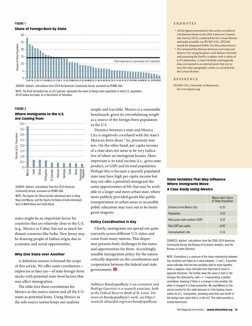
Figure 1 presents the share of foreign-born populations of different U.S. states. The horizontal line, at 14.2 percent, repre-sents the share of the U.S. population that was born abroad. Only 14 states are above this national average. This implies that immigrants favor only a few states; alterna-tively, a few states are more hospitable than others for immigrants.
The distribution of foreign-born shares across states might also point toward an accumulation effect: a higher share of
foreign-born may lead to a higher immi-grant inflow. California and New York are the top two destinations for the foreign-born, while Mississippi and West Virginia have the lowest shares. Most states in the top five destinations either have major urban centers or are relatively close to the border. In contrast, the lowest five tend to be more sparsely populated or are interior states. Although urban centers like New York City or Los Angeles are likely to attract immi-grants for a variety of reasons, including ethnic networks on which fresh immigrants can rely, distance from the border also plays a role, especially for immigrants from a neighboring poorer nation like Mexico.
Immigrants’ Home Countries
Figure 2 shows the top origin nations of the immigrants. Mexico is the largest source nation, providing about 4 percent of the U.S. population, followed by India, China and the Philippines. India contributes less than a quarter of the share that Mexico contrib-utes. This overwhelming weight of Mexico stems from its proximity to the United Sates. Canada is also a bordering nation, but it is closer to the U.S. in terms of its level of economic prosperity than is Mexico, and, hence, the incentive for Canadians to migrate to the U.S. is not comparable to that for Mexicans.
States bordering Mexico (Arizona, California, New Mexico and Texas) all have Mexico as the leading source nation of immigrants. Similarly, Florida shows Cuba as the top source nation because of Florida’s geography and history. On the other hand, New Jersey has India as its largest source nation. This suggests that distance between source nations and potential destination
States with better job opportunities, greater public amenities, and more favorable social or ethnic networks will attract more immigrants.
State-Level Factors
Immigrant stock in a state is due to both legal and unauthorized immigration. Legal immigration is determined at the national level by the federal government. However, after being admitted into the U.S., an immi-grant is free to choose the state of location. In turn, this implies that states do not have control over legal immigration, and their respective legal immigrant shares are deter-mined by their relative desirability in the eyes of an immigrant. States with better job opportunities, greater public amenities, and more favorable social or ethnic networks will attract more immigrants.
Unauthorized immigration, by its very nature, is not directly a policy choice. How-
14 The Regional Economist | October 2016
states might be an important factor for countries that are relatively close to the U.S. (e.g., Mexico or Cuba), but not as much for distant countries like India. New Jersey may be drawing people of Indian origin due to economic and social opportunities.
Why One State over Another
A definitive answer is beyond the scope of this article. We offer some correlations—imprecise as they are—of state foreign-born stocks with potential state-level factors that may affect immigration.
The table lists these correlations for Mexico as the source nation and all the U.S. states as potential hosts. Using Mexico as the sole source nation keeps our analysis
E N D N O T E S
1 All the figures presented in this article are authors’ calculations based on the 2014 American Commu-nity Survey (ACS), conducted by the Census Bureau and made available via IPUMS-USA. (IPUMS stands for Integrated Public Use Microdata Series.)
2 We estimated the distance between each state and Mexico City using the great-circle distance formula and assuming the Earth is a sphere with a radius of 6,371 kilometers. A state’s latitude and longitude data correspond to an internal point that is at or near the state’s geographic center, as calculated by the Census Bureau.
R E F E R E N C E
IPUMS-USA, University of Minnesota. See www.ipums.org.
FIGURE 1
Share of Foreign-Born by State
Total foreign-born as a percentage of U.S. population
SOURCE: Authors’ calculations from 2014 the American Community Survey, accessed via IPUMS-USA.
NOTE: The thick horizontal line, at 14.2 percent, represents the share of foreign-born population in total U.S. population. All 50 states are listed, as is the District of Columbia.
CA NJNY FL NV HI TX MAMD AZDC CT WA IL RI VA CO ORNM GA UY DE AK MNNC IDKS MI PA NE NH OK TN SC IA AR IN WI VT WY OHME LA MOND KY AL SDMT MSWV
30
25
20
15
10
5
0
Perc
ent o
f Sta
te P
opul
atio
n
Mex
ico
Indi
a
Chin
a
Phili
ppin
es
El S
alva
dor
Viet
nam
Germ
any
Cuba
Kore
a
4.0
3.5
3.0
2.5
2.0
1.5
1.0
0.5
0
Perc
ent o
f U.S
. Pop
ulat
ion
Dom
inic
anRe
publ
ic
SOURCE: Authors’ calculations from the 2014 American Community Survey, accessed via IPUMS-USA.
NOTE: The figures for China include individuals born in Hong Kong and Macau, and the figures for Korea include individuals born in North Korea and South Korea.
FIGURE 2
Where Immigrants to the U.S. Are Coming from
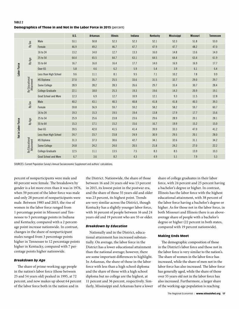
simple and tractable. Mexico is a reasonable benchmark, given its overwhelming weight as a source of the foreign-born population in the U.S.
Distance between a state and Mexico City is negatively correlated with the state’s Mexican-born share.2 So, proximity mat-ters. On the other hand, per capita income of a state does not seem to be very indica-tive of where an immigrant locates. More important is its total income (i.e., gross state product, or GSP) and its total population. Perhaps this is because a sparsely populated state may have high per capita income but may not offer a potential immigrant the same opportunities of life that may be avail-able in a larger and more urban state, where more publicly provided goods like public transportation in urban areas or accessible public education may turn out to be immi-grant magnets.
Policy Coordination Is Key
Clearly, immigrants are spread out quite unevenly across different U.S. states and come from many nations. This disper-sion presents both challenges to the states and opportunities for them. Accordingly, sensible immigration policy for the nation critically depends on the coordination and cooperation between the federal and state governments.
Subhayu Bandyopadhyay is an economist and Rodrigo Guerrero is a research associate, both at the Federal Reserve Bank of St. Louis. For more on Bandyopadhyay’s work, see https:// research.stlouisfed.org/econ/bandyopadhyay.
SOURCES: Authors’ calculations from the 2000-2014 American Community Survey, the Bureau of Economic Analysis, and the Bureau of Labor Statistics.
NOTE: Correlation is a measure of the linear relationship between two variables and takes on a value between –1 and 1. A positive value indicates that the two variables tend to move together, while a negative value indicates that they tend to move in opposite directions. The further away the value is from 0, the stronger the relationship, with +/–1 representing a perfect correlation, meaning if there is a change in one variable, the other is changed in a fixed proportion. We used Mexico as the source country for this table because it is the leading source nation for U.S. immigration, providing more than one fourth of the foreign-born stock that is in the U.S. This table provides a simple benchmark.
Mexico-Born Share of State Population
Distance from Mexico City –0.35
Population 0.52
Real gross state product (GSP) 0.52
Real GSP per capita –0.05
Unemployment rate 0.16
State Variables That May Influence Where Immigrants Move
A Case Study Using Mexico
The Regional Economist | www.stlouisfed.org 15
D I S T R I C T O V E R V I E W
Demographics Help Explain the Fallin the Labor Force Participation Rate The Eighth Federal Reserve District
is composed of four zones, each of which is centered around one of the four main cities: Little Rock, Louisville, Memphis and St. Louis.
By Maria A. Arias and Paulina Restrepo-Echavarria
Labor market performance is at center stage in monetary policy discussions.
As such, measures of employment growth and the unemployment rate are constantly being scrutinized. Recently, however, the measure of labor force participation (LFP) has increasingly drawn attention; research studies during the past several years have focused on LFP in an attempt to explain the slow and jobless recovery since the end of the Great Recession.
The LFP rate measures the share of the population that actively participates in the labor market—the total number of people employed and unemployed as a share of the working-age population.1 As economists
What does the nation’s labor force look like? How does the St. Louis Fed’s dis-trict compare? In this article, we explore demographic changes; we describe how the composition of the labor force has changed nationwide and in the District’s states over the past 30 years and how these changes tie into the LFP rate.3
Participation Trends
The national LFP rate is hump-shaped: It hovered between 58 and 60 percent until the early 1970s, increased at a relatively fast pace for two decades (surpassing 66 percent by the end of the 1980s) and continued to rise until it reached its peak of 67.3 percent in the year 2000. Then, the participation rate remained fairly steady, declining only slightly, until 2009, when the pace of decline accelerated.
State-level data show that the seven states in the District exhibited the same rising and falling hump-shaped pattern since 1976 (when the data first became available), peaking sometime between 1995 and 2000. Among them, Mississippi has usually had the lowest participation rates, followed by Kentucky, Arkansas and Tennessee, all with rates lower than the national average. On the other hand, Missouri, Illinois and Indi-ana have had the three highest participation
rates in the District, at or above the national average for most of the period. (See Table 1.)
In the Labor Force or Not?
To better understand the changes in LFP, we used data from the Current Population Survey’s Annual Socioeconomic Supple-ment to decompose the labor force and the nonparticipants by three demographic characteristics: sex, age and educational attainment during the last 30 years.4 Table 2 summarizes the results for 2015.
As with the participation rate, the general demographic composition of those in the labor force and those not in the labor force in the District’s states highly resembles the national average, particularly when it comes to breakdowns by sex and age. There are marked differences with some states, however, when it comes to educational attainment.
Breakdown by Sex
The changes over the years portray the well-documented national trends of increas-ing participation of women in the labor force between the early 1970s and its peak during the early 2000s and of the longer-term decline in male participation.
In 2015, the labor force was 53 percent male and 47 percent female, while 40
U.S. Arkansas Illinois Indiana Kentucky Mississippi Missouri Tennessee
1976 61.8 58.2 62.8 63.8 60.0 58.6 61.7 60.6
1995 66.4 64.8 68.3 70.1 62.4 62.6 70.5 66.6
2015 62.6 58.0 65.0 63.8 56.6 56.4 65.7 59.1
TABLE 1
Labor Force Participation Rates (percent)
SOURCE: Bureau of Labor Statistics.
The share of prime-working-
age people (those between
25 and 54 years old) now
makes up about 64 percent
of the labor force, both in the
nation and in the District.
have tried to explain the national economy’s slow and long recovery by decomposing the factors that affect the labor market, two general views have emerged. James Bullard, the economist who is the president and CEO of the Federal Reserve Bank of St. Louis, describes these two views as the “bad omen” view, which says that the declines in the LFP rate are due to people leaving the labor force because of the poor state of the economy, and the “demograph-ics” view, which states that the changes in the rate are a reflection of changes in the demographics of the labor force.2
16 The Regional Economist | October 2016
percent of nonparticipants were male and 60 percent were female. The breakdown by gender is a lot more even than it was in 1976, when 59 percent of the labor force was male and only 28 percent of nonparticipants were male. Between 1985 and 2015, the rise of women in the labor force ranged from 1 percentage point in Missouri and Ten-nessee to 5 percentage points in Indiana and Kentucky, compared with a 2 percent-age point increase nationwide. In contrast, changes in the share of nonparticipant males ranged from 3 percentage points higher in Tennessee to 12 percentage points higher in Kentucky, compared with 7 per-centage points higher nationwide.
Breakdown by Age
The share of prime-working-age people in the nation’s labor force (those between 25 and 54 years old) peaked in 1995, at 72 percent, and now makes up about 64 percent of the labor force both in the nation and in
the District. Nationwide, the share of those between 16 and 24 years old was 13 percent in 2015, its lowest point in the postwar era, and the share of those 55 years old and older was 23 percent, its highest point. Trends are very similar across the District, though Kentucky has a slightly younger labor force, with 16 percent of people between 16 and 24 years old and 19 percent who are 55 or older.
Breakdown by Education
Nationally and in the District, educa-tional attainment has increased substan-tially. On average, the labor force in the District has a lower educational attainment than the national average; however, there are some important differences to highlight. In Arkansas, the share of those in the labor force with less than a high school diploma and the share of those with a high school diploma but no college are the highest, at 11 percent and 36 percent, respectively. Sim-ilarly, Mississippi and Arkansas have a lower
U.S. Arkansas Illinois Indiana Kentucky Mississippi Missouri Tennessee
Male 53.1 50.8 52.3 52.3 52.1 52.3 51.8 53.0
Female 46.9 49.2 46.7 47.7 47.9 47.7 48.2 47.0
16 to 24 13.2 14.0 12.7 13.3 16.0 14.8 13.6 14.0
25 to 54 64.4 65.5 64.7 63.1 64.5 64.4 63.4 61.9
55 to 64 16.7 16.0 16.4 17.7 14.0 16.9 16.9 17.7
Over 65 5.8 4.6 6.2 5.9 5.4 3.9 6.1 6.4
Less than High School 9.6 11.1 8.1 9.5 7.1 10.2 7.8 9.9
HS Diploma 27.0 35.7 25.5 33.6 31.5 32.7 29.0 29.7
Some College 28.9 28.2 28.3 26.6 29.7 33.4 30.7 28.4
College Graduate 22.1 18.0 25.3 19.3 19.6 14.3 20.9 19.1
Grad School and More 12.3 6.9 12.7 10.9 12.1 9.3 11.5 12.8
Male 40.2 43.1 40.3 40.8 41.8 41.8 40.3 39.3
Female 59.8 56.9 59.7 59.2 58.2 58.2 59.7 60.7
16 to 24 19.3 15.3 19.5 19.4 13.8 17.9 17.7 15.6
25 to 54 25.9 25.6 23.8 23.6 29.6 28.9 20.1 28.1
55 to 64 15.3 17.1 15.2 15.6 16.7 19.9 15.2 15.0
Over 65 39.5 42.0 41.5 41.4 39.9 33.3 47.0 41.2
Less than High School 24.7 23.7 23.8 24.9 30.9 29.5 20.1 28.0
HS Diploma 31.3 37.3 30.6 42.7 34.1 32.6 31.1 34.2
Some College 24.8 24.2 24.0 20.5 21.8 24.2 27.0 22.2
College Graduate 12.5 11.1 13.5 7.5 8.3 8.5 13.9 10.3
Grad School and More 6.7 3.6 8.2 4.3 4.9 5.1 7.9 5.3
TABLE 2
Demographics of Those in and Not in the Labor Force in 2015 (percent)By
Sex
By A
geBy
Edu
catio
nal
Atta
inm
ent
By S
exBy
Age
By E
duca
tiona
l At
tain
men
tNot i
n La
bor F
orce
Labo
r For
ce
SOURCES: Current Population Survey’s Annual Socioeconomic Supplement and authors’ calculations.
share of college graduates in their labor force, with 24 percent and 25 percent having a bachelor’s degree or higher. In contrast, Illinois has the labor force with the highest educational attainment, with 38 percent of the labor force having a bachelor’s degree or higher. As for those not in the labor force, in both Missouri and Illinois there is an above-average share of people with a bachelor’s degree or higher (22 percent in both states, compared with 19 percent nationwide).
Making Ends Meet
The demographic composition of those in the District’s labor force and those not in the labor force is very similar to the nation’s. The share of women in the labor force has increased, while the share of men not in the labor force has also increased. The labor force has generally aged, while the share of those over 55 years old not in the labor force has also increased. Furthermore, a larger share of the working-age population is reaching
The Regional Economist | www.stlouisfed.org 17
higher levels of education, with the share of the labor force having at least a bachelor’s degree continuing to increase steadily.
Piecing together these characteristics of the working-age population, we can help explain the declining labor force participa-tion rate. The clearest trend is the overall aging of the working-age population, largely because the baby boomers started retiring in the early 2000s. Similarly, more educa-tion implies spending more years in school, giving people later starts to their working careers. Also putting downward pressure on the LFP rate is the increased participation of women in the labor force, since families have to decide how to balance their time accordingly. That is, with more mothers working full time, fathers may decide to stay at home or work only part time to help care for children and do any work that is needed at home.
Paulina Restrepo-Echavarria is an economist and Maria Arias is a senior research associate, both at the Federal Reserve Bank of St. Louis. For more on the former’s work, see https:// research.stlouisfed.org/econ/restrepo-echavarria.
On the web version of this issue, 11 more charts are available, with much of those charts’ data specific to the Eighth District. Among the areas they cover are agriculture, commercial banking, housing permits, income and jobs. To see those charts, go to www.stlouisfed.org/economyataglance.
U . S . A G R I C U L T U R A L T R A D E AVERAGE LAND VALUES ACROSS THE EIGHTH DISTRICT
’16’11 ’12 ’13 ’14 ’15
90
75
60
45
30
15
0
NOTE: Data are aggregated over the past 12 months.
Exports
Imports
AugustTrade Balance
BILL
IONS
OF
DOLL
ARS
2015:Q2 2015:Q3 2015:Q4 2016:Q1 2016:Q2
6
4
2
0
–2
–4
–6
–8
YEAR
-OVE
R-YE
AR P
ERCE
NT C
HANG
E
Quality Farmland
Ranchland or Pastureland
SOURCE: Agricultural Finance Monitor.
C I V I L I A N U N E M P L O Y M E N T R AT E I N T E R E S T R AT E S
’11 ’12 ’13 ’14 ’15 ’16
10
9
8
7
6
5
4
3
PERC
ENT
September
’11 ’12 ’13 ’14 ’15 ’16
4
3
2
1
0
10-Year Treasury
Fed Funds Target
September1-Year Treasury
PERC
ENT
NOTE: On Dec. 16, 2015, the FOMC set a target range for the federal funds rate of 0.25 to 0.5 percent. The observations plotted since then are the midpoint of the range (0.375 percent).
I N F L AT I O N - I N D E X E D T R E A S U R Y Y I E L D S P R E A D S RATES ON FEDERAL FUNDS FUTURES ON SELECTED DATES
3.00
2.75
2.50
2.25
2.00
1.75
1.50
1.25
1.00
NOTE: Weekly data.
5-Year
10-Year
20-Year
PERC
ENT
Sept. 30
’12 ’13 ’14 ’15 ’16 1st-ExpiringContract
3-Month 6-Month 12-Month
0.7
0.6
0.5
0.4
0.3
CONTRACT SETTLEMENT MONTH
PERC
ENT
03/16/16
4/27/16 7/27/16
6/15/16 9/21/16
R E A L G D P G R O W T H C O N S U M E R P R I C E I N D E X ( C P I )
’11 ’12 ’13 ’14 ’15 ’16
6
4
2
0
–2
NOTE: Each bar is a one-quarter growth rate (annualized); the red line is the 10-year growth rate.
PERC
ENT
Q2
’11 ’12 ’13 ’14 ’15 ’16
4
2
0
–2
PERC
ENT
CHAN
GE F
ROM
A Y
EAR
EARL
IER
August
CPI–All Items
All Items, Less Food and Energy
E C O N O M Y A T A G L A N C E
E N D N O T E S
1 The standard definition for working-age popula-tion is the civilian noninstitutional population above the age of 16. Note that to be considered unemployed, the person must be available to work and have been actively looking for a job in the previous month. If a person is neither employed nor unemployed, that person is not in the labor force, also called nonparticipant.
2 See Bullard. 3 The state-level data we use are statewide averages.
However, the only state that is entirely in the Eighth District is Arkansas. The other states are Illinois, Indiana, Kentucky, Mississippi, Missouri and Tennessee.
4 Note that adding the share of those in the labor force to the share of those not in the labor force equals the total working-age population; so, 1 minus the labor force participation rate gives us the share of those not in the labor force.
R E F E R E N C E
Bullard, James. “The Rise and Fall of Labor Force Participation Rates in the United States.” Federal Reserve Bank of St. Louis Review, First Quarter 2014, Vol. 96, No. 1, pp. 1-12.
18 The Regional Economist | October 2016
By Kevin L. Kliesen
N A T I O N A L O V E R V I E W
U.S. economic conditions have improved since our last report in July. Paced by
healthy job growth, solid increases in house-hold consumption expenditures, further gains in the housing and commercial real estate sectors, and continued low inflation, there is a high probability that real gross domestic prod-uct (GDP) growth in the third quarter will be much stronger than its average over the first half of this year. Indeed, professional forecast-ers see solid growth, low inflation and healthy labor markets carrying into the fourth quarter of 2016 and the first half of 2017. But, as with any forward-looking view of the economy, one must attempt to determine—as much as possible—whether the evolving data suggest either stronger or weaker outcomes than the forecast consensus.
What We Know—or Think We Know
Over the first half of the year, real GDP increased at a tepid 1 percent annual rate, and the all-items (headline) personal con-sumption expenditures price index (PCEPI) rate rose at a 0.3 percent annual rate. These increases were substantially smaller than forecasters were expecting in late 2015. Weaker-than-expected real GDP growth over the first half of the year largely reflected unexpected weakness in real business and residential fixed investment and a sizable inventory correction, while lower inflation reflected declines in food prices and the lagged effects of the sharp decline in crude oil prices from June 2015 to February 2016.
Although third-quarter data are incom-plete at the time of this writing, the available evidence suggests a high probability that real GDP growth in the third quarter will be appreciably stronger than over the first half of the year. Part of this acceleration reflects the likely end of the inventory correction that has been underway for more than a year. Briefly, the demand for goods was weaker than expected, so firms slowed production and used available inventory stocks to help meet existing demand. The net effect was a decline in inventory investment and weaker
After a StartThat Was Lackluster,Economy Improves
real GDP growth. Over the first half of 2016, real private inventory investment subtracted 0.8 percentage points from real GDP growth.
As the U.S. economy transitioned to the second half of the year, the economic land-scape importantly suggested that consumer spending would remain vibrant. This vibrancy reflects many factors, including the likelihood of continued healthy job gains, faster growth of nominal wages and salaries, and an expec-tation of weaker gasoline prices that helps to boost consumer purchasing power.
Of course, there are risks to any forecast, and the unexpected weakness in August retail sales was worrisome. With sentiment among homebuilders and potential home-buyers remaining elevated, it is likely that real residential fixed investment will also strengthen over the near term. Indeed, hous-ing starts and new-home sales in 2016 are on pace to be the strongest since 2007. Similarly, business fixed investment should rebound. However, surveys of business executives suggest that the boost to capital spending will be modest because a large percentage of firms remain reluctant to expand in the face of higher-than-average levels of uncertainty about the health of the global economy and the near-term direction of economic policy.
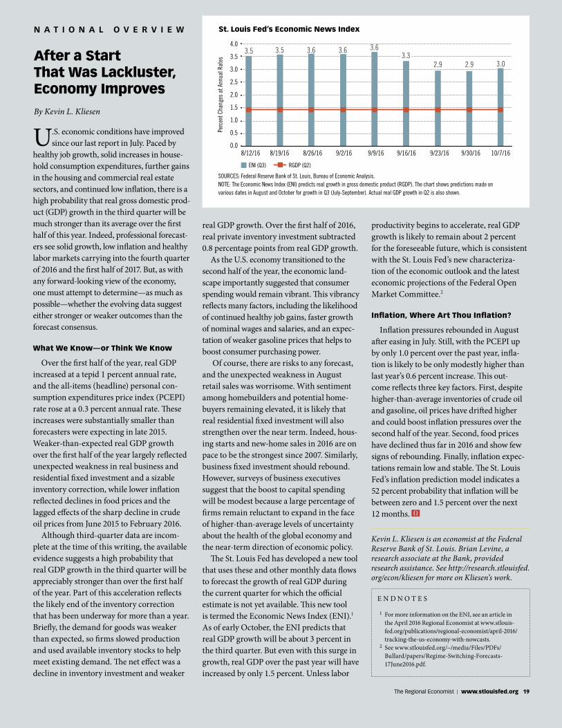
The St. Louis Fed has developed a new tool that uses these and other monthly data flows to forecast the growth of real GDP during the current quarter for which the official estimate is not yet available. This new tool is termed the Economic News Index (ENI).1 As of early October, the ENI predicts that real GDP growth will be about 3 percent in the third quarter. But even with this surge in growth, real GDP over the past year will have increased by only 1.5 percent. Unless labor
productivity begins to accelerate, real GDP growth is likely to remain about 2 percent for the foreseeable future, which is consistent with the St. Louis Fed’s new characteriza-tion of the economic outlook and the latest economic projections of the Federal Open Market Committee.2
Inflation, Where Art Thou Inflation?
Inflation pressures rebounded in August after easing in July. Still, with the PCEPI up by only 1.0 percent over the past year, infla-tion is likely to be only modestly higher than last year’s 0.6 percent increase. This out-come reflects three key factors. First, despite higher-than-average inventories of crude oil and gasoline, oil prices have drifted higher and could boost inflation pressures over the second half of the year. Second, food prices have declined thus far in 2016 and show few signs of rebounding. Finally, inflation expec-tations remain low and stable. The St. Louis Fed’s inflation prediction model indicates a 52 percent probability that inflation will be between zero and 1.5 percent over the next 12 months.
4.0
3.5
3.0
2.5
2.0
1.5
1.0
0.5
0.0
Perc
ent C
hang
es a
t Ann
ual R
ates
8/12/16 8/19/16 8/26/16 9/2/16 9/9/16 9/16/16 9/23/16 9/30/16 10/7/16
St. Louis Fed’s Economic News Index
SOURCES: Federal Reserve Bank of St. Louis, Bureau of Economic Analysis.NOTE: The Economic News Index (ENI) predicts real growth in gross domestic product (RGDP). The chart shows predictions made on various dates in August and October for growth in Q3 (July-September). Actual real GDP growth in Q2 is also shown.
3.5 3.5 3.6 3.6 3.6
2.9 2.9 3.0
ENI (Q3) RGDP (Q2)
3.3
E N D N O T E S
1 For more information on the ENI, see an article in the April 2016 Regional Economist at www.stlouis-fed.org/publications/regional-economist/april-2016/tracking-the-us-economy-with-nowcasts.
2 See www.stlouisfed.org/~/media/Files/PDFs/Bullard/papers/Regime-Switching-Forecasts-17June2016.pdf.
Kevin L. Kliesen is an economist at the Federal Reserve Bank of St. Louis. Brian Levine, a research associate at the Bank, provided research assistance. See http://research.stlouisfed.org/econ/kliesen for more on Kliesen’s work.
The Regional Economist | www.stlouisfed.org 19
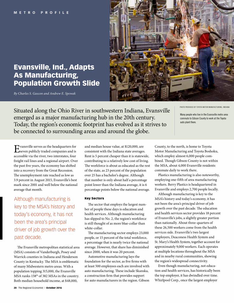
M E T R O P R O F I L E
and median house value, at $120,000, are consistent with the Indiana state averages. Rent is 5 percent cheaper than it is statewide, contributing to a relatively low cost of living. The workforce is about as educated as the rest of the state, as 23 percent of the population over 25 has a bachelor’s degree. Although that number is only about half a percentage point lower than the Indiana average, it is 6 percentage points below the national average.
Key Sectors
The sector that employs the largest num-ber of people these days is education and health services. Although manufacturing has slipped to No. 2, the region’s workforce is still thought of as more blue-collar than white-collar.
The manufacturing sector employs 23,000 people, or 15 percent of the total workforce, a percentage that is nearly twice the national average. However, that share has diminished since 2000, when it was 20 percent.
Automotive manufacturing lays the foundation for the sector, as five firms with at least 500 employees each are involved with auto manufacturing. These include Skanska, a construction firm that provides support for auto manufacturers in the region. Gibson
Evansville, Ind., AdaptsAs Manufacturing,Population Growth Slide
Evansville serves as the headquarters for seven publicly traded companies and is
accessible via the river, two interstates, four freight rail lines and a regional airport. Over the past five years, the economy has shifted into a recovery from the Great Recession. The unemployment rate reached as low as 3.9 percent in August 2015, Evansville’s best mark since 2001 and well below the national average that month.
County, to the north, is home to Toyota Motor Manufacturing and Toyota Boshoku, which employ almost 6,000 people com-bined. Though Gibson County is not within the MSA, about 4,000 Evansville residents commute daily to work there.
Plastics manufacturing is also noteworthy, employing one-fifth of area manufacturing workers. Berry Plastics is headquartered in Evansville and employs 2,700 people locally.
Although manufacturing is key to the MSA’s history and today’s economy, it has not been the area’s principal driver of job growth over the past decade. The education and health services sector provides 18 percent of Evansville’s jobs, a slightly greater portion than nationally. About three-quarters of these 26,500 workers come from the health services side. Evansville’s two largest employers, Deaconess Health System and St. Mary’s Health System, together account for approximately 9,000 workers. Each operates at multiple locations throughout the MSA and in nearby rural communities, showing the region’s widespread connectivity.
Even though manufacturing, not educa-tion and health services, has historically been the top employer, it has dwindled over time. Whirlpool Corp., once the largest employer
By Charles S. Gascon and Andrew E. Spewak
Situated along the Ohio River in southwestern Indiana, Evansville emerged as a major manufacturing hub in the 20th century. Today, the region’s economic footprint has evolved as it strives to be connected to surrounding areas and around the globe.
Although manufacturing is
key to the MSA’s history and
today’s economy, it has not
been the area’s principal
driver of job growth over the
past decade.
The Evansville metropolitan statistical area (MSA) consists of Vanderburgh, Posey and Warrick counties in Indiana and Henderson County in Kentucky. The MSA is emblematic of many Midwestern metro areas. With a population topping 315,000, the Evansville MSA ranks 158th of 382 MSAs in the country. Both median household income, at $48,000,
PHOTO PROVIDED BY TOYOTA MOTOR MANUFACTURING, INDIANA
Many people who live in the Evansville metro area commute to Gibson County to work at the Toyota auto plant there.
20 The Regional Economist | October 2016
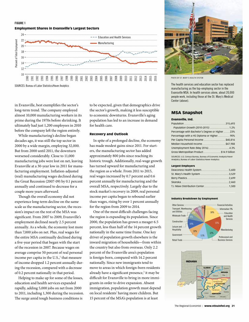
Evansville, Ind. Population ............................................................................................315,693
Population Growth (2010-2015) ............................................1.2%
Percentage with Bachelor’s Degree or Higher ..............23%
Percentage with a HS Diploma or Higher...........................90%
Per Capita Personal Income .................................................$40,816
Median Household Income ....................................................$47,988
Unemployment Rate (May 2016) ..............................................4.3%
Gross Metropolitan Product ......................................$14.9 billion
SOURCES: U.S. Census Bureau, Bureau of Economic Analysis/Haver Analytics, Bureau of Labor Statistics/Haver Analytics
MSA Snapshot
Largest Employers
Deaconess Health System.............................................................5,600
St. Mary’s Health System ...............................................................3,529
Berry Plastics ............................................................................................2,699
Skanska ..........................................................................................................2,460
T.J. Maxx Distribution Center .......................................................1,500
Industry Breakdown by Employment
Professional andBusiness Services
Construction
Retail Trade
Government
Educationand Health
ServicesWholesale Trade
Transport, Warehousing and Utilities
Other Services
Information 1%
Financial Activities
Leisure and Hospitality Manufacturing
18%
15%
12%
10%
4%4%
10%
6%
4%
11%
in Evansville, best exemplifies the sector’s long-term trend. The company employed almost 10,000 manufacturing workers in its prime during the 1970s before shrinking. It ultimately had just 1,200 employees in 2010 before the company left the region entirely.
While manufacturing’s decline began decades ago, it was still the top sector in 2000 by a wide margin, employing 32,000. But from 2000 until 2011, the downturn worsened considerably. Close to 11,000 manufacturing jobs were lost on net, leaving Evansville at a 30-year low in 2011 for manu-facturing employment. Inflation-adjusted (real) manufacturing wages declined during the Great Recession (2007-09) by 0.1 percent annually and continued to decrease for a couple more years afterward.
Though the overall economy did not experience long-term decline on the same scale as the manufacturing sector, the reces-sion’s impact on the rest of the MSA was significant. From 2007 to 2009, Evansville’s employment declined nearly 2.5 percent annually. As a whole, the economy lost more than 7,000 jobs on net. Plus, real wages for the entire MSA continually declined during a five-year period that began with the start of the recession in 2007. Because wages on average comprise 50 percent of real personal income per capita in the U.S.,1 that measure of income dropped 1.2 percent annually dur-ing the recession, compared with a decrease of 0.2 percent nationally in that period.
Helping to make up for some of the losses, education and health services expanded rapidly, adding 5,000 jobs on net from 2000 to 2011, including 1,300 during the recession. The surge amid tough business conditions is
to be expected, given that demographics drive the sector’s growth, making it less susceptible to economic downturns. Evansville’s aging population has led to an increase in demand for health care.
Recovery and Outlook
In spite of a prolonged decline, the economy has made modest gains since 2011. For start-ers, the manufacturing sector has added approximately 800 jobs since reaching its historic trough. Additionally, real-wage growth has turned upward for manufacturing and the region as a whole. From 2011 to 2015, real wages increased by 0.7 percent and 0.6 percent annually for manufacturing and the overall MSA, respectively. Largely due to the stock market’s recovery in 2009, real personal income per capita began to rebound earlier than wages, rising by over 1 percent annually for the region from 2009 to 2014.
One of the most difficult challenges facing the region is expanding its population. Since 2000, the population has grown a meager 6.5 percent, less than half of the 14 percent growth nationally in the same time frame. One key driver of population growth elsewhere is the inward migration of households—from within the country but also from overseas. Only 2.2 percent of the Evansville area’s population is foreign-born, compared with 14.2 percent nationally. Since new immigrants tend to move to areas in which foreign-born residents already have a significant presence,2 it may be difficult for Evansville to bring in more immi-grants in order to drive expansion. Absent immigration, population growth must depend on local residents’ having more children. But 15 percent of the MSA’s population is at least
DaviessHenderson
Union
McLeanWebster
HopkinsCrittenden
GallatinSaline
HardinPope
HamiltonSpencer
Gibson PikeDubois
PoseyVanderburgh
Warrick
Evansville
Wayne
Clay Richland Lawrence
Edwards
Wabash
Knox Daviess Martin
Perry
Crawford
Orange
Lawrence
KENTUCKY
INDIANA
ILLINOIS
White
INDIANA
FIGURE 1
Employment Shares in Evansville’s Largest Sectors
SOURCES: Bureau of Labor Statistics/Haver Analytics
1990
1991
1992
1993
1994
1995
1996
1997
1998
1999
2000
2001
2002
2003
2004
2005
2006
2007
2008
2009
2010
2011
2012
2013
2014
2015
2016
24
22
20
18
16
14
12
10
Perc
ent o
f Tot
al E
mpl
oym
ent Education and Health Services
Manufacturing
The health services and education sector has replaced manufacturing as the top-employing sector in the Evansville MSA. In health services alone, about 20,000 people work, including those at the St. Mary’s Medical Center (above).
PHOTO BY ST. MARY’S HEALTH SYSTEM
The Regional Economist | www.stlouisfed.org 21
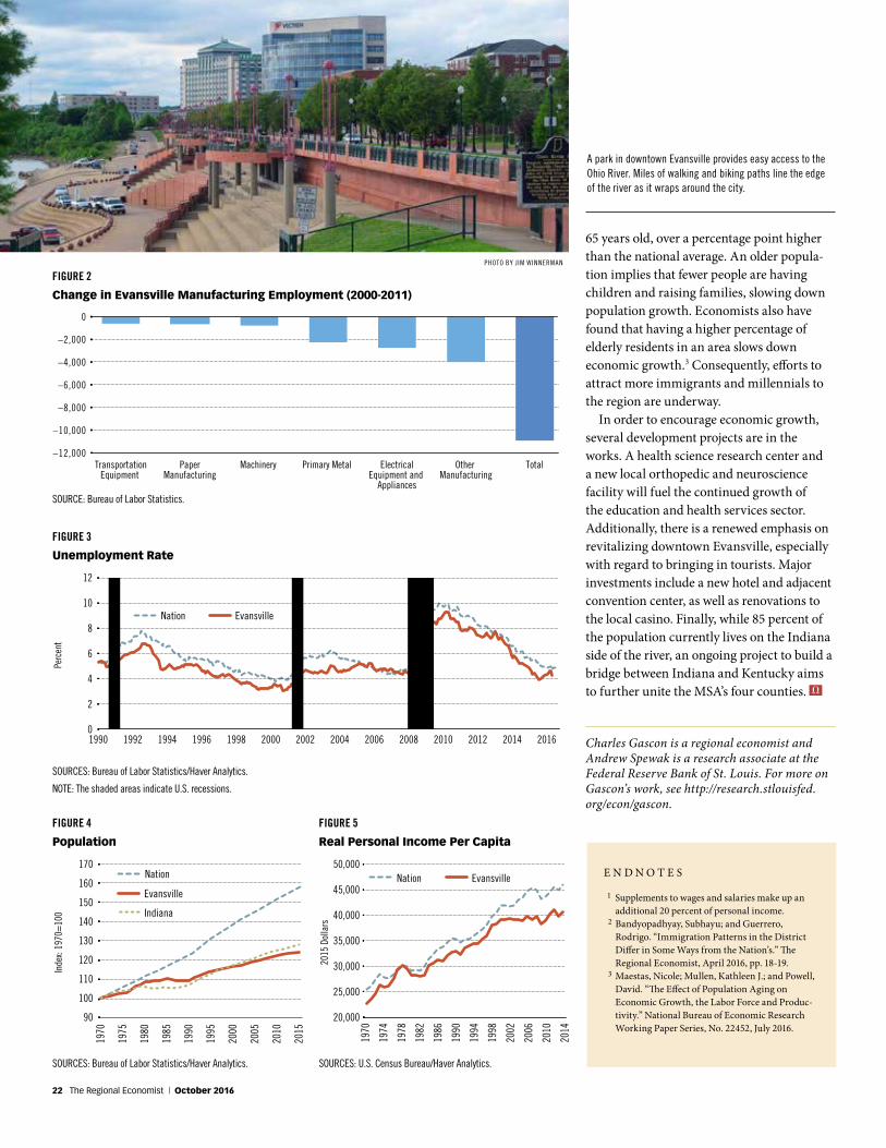
FIGURE 2
Change in Evansville Manufacturing Employment (2000-2011)
SOURCE: Bureau of Labor Statistics.
TransportationEquipment
PaperManufacturing
Machinery Primary Metal ElectricalEquipment and
Appliances
Other Manufacturing
Total
0
–2,000
–4,000
–6,000
–8,000
–10,000
–12,000
FIGURE 3
Unemployment Rate
SOURCES: Bureau of Labor Statistics/Haver Analytics.
NOTE: The shaded areas indicate U.S. recessions.
12
10
8
6
4
2
0
Perc
ent
Nation Evansville
1990 1992 1994 1996 1998 2000 2002 2004 2006 2008 2010 2012 2014 2016
FIGURE 4
Population
SOURCES: Bureau of Labor Statistics/Haver Analytics.
65 years old, over a percentage point higher than the national average. An older popula-tion implies that fewer people are having children and raising families, slowing down population growth. Economists also have found that having a higher percentage of elderly residents in an area slows down economic growth.3 Consequently, efforts to attract more immigrants and millennials to the region are underway.
In order to encourage economic growth, several development projects are in the works. A health science research center and a new local orthopedic and neuroscience facility will fuel the continued growth of the education and health services sector. Additionally, there is a renewed emphasis on revitalizing downtown Evansville, especially with regard to bringing in tourists. Major investments include a new hotel and adjacent convention center, as well as renovations to the local casino. Finally, while 85 percent of the population currently lives on the Indiana side of the river, an ongoing project to build a bridge between Indiana and Kentucky aims to further unite the MSA’s four counties.
Charles Gascon is a regional economist and Andrew Spewak is a research associate at the Federal Reserve Bank of St. Louis. For more on Gascon’s work, see http://research.stlouisfed.org/econ/gascon.
E N D N O T E S
1 Supplements to wages and salaries make up an additional 20 percent of personal income.
2 Bandyopadhyay, Subhayu; and Guerrero, Rodrigo. “Immigration Patterns in the District Differ in Some Ways from the Nation’s.” The Regional Economist, April 2016, pp. 18-19.
3 Maestas, Nicole; Mullen, Kathleen J.; and Powell, David. “The Effect of Population Aging on Economic Growth, the Labor Force and Produc-tivity.” National Bureau of Economic Research Working Paper Series, No. 22452, July 2016.
A park in downtown Evansville provides easy access to the Ohio River. Miles of walking and biking paths line the edge of the river as it wraps around the city.
170
160
150
140
130
120
110
100
90
Inde
x: 19
70=
100
Nation
Evansville
Indiana
1970
1975
1980
1985
1990
1995
2000
2005
2010
2015
1970
1974
1978
1982
1986
1990
1994
1998
2002
2006
2010
2014
50,000
45,000
40,000
35,000
30,000
25,000
20,000
2015
Dol
lars
Nation Evansville
FIGURE 5
Real Personal Income Per Capita
SOURCES: U.S. Census Bureau/Haver Analytics.
PHOTO BY JIM WINNERMAN
22 The Regional Economist | October 2016
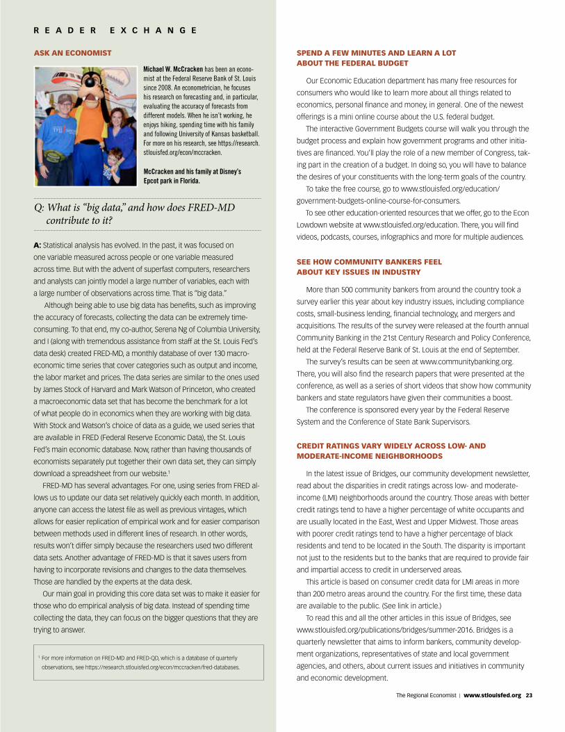
A S K A N E C O N O M I S TR E A D E R E X C H A N G E
ASK AN ECONOMIST
Michael W. McCracken has been an econo-mist at the Federal Reserve Bank of St. Louis since 2008. An econometrician, he focuses his research on forecasting and, in particular, evaluating the accuracy of forecasts from different models. When he isn’t working, he enjoys hiking, spending time with his family and following University of Kansas basketball. For more on his research, see https://research.stlouisfed.org/econ/mccracken.
A: Statistical analysis has evolved. In the past, it was focused on
one variable measured across people or one variable measured
across time. But with the advent of superfast computers, researchers
and analysts can jointly model a large number of variables, each with
a large number of observations across time. That is “big data.”
Although being able to use big data has benefits, such as improving
the accuracy of forecasts, collecting the data can be extremely time-
consuming. To that end, my co-author, Serena Ng of Columbia University,
and I (along with tremendous assistance from staff at the St. Louis Fed’s
data desk) created FRED-MD, a monthly database of over 130 macro-
economic time series that cover categories such as output and income,
the labor market and prices. The data series are similar to the ones used
by James Stock of Harvard and Mark Watson of Princeton, who created
a macroeconomic data set that has become the benchmark for a lot
of what people do in economics when they are working with big data.
With Stock and Watson’s choice of data as a guide, we used series that
are available in FRED (Federal Reserve Economic Data), the St. Louis
Fed’s main economic database. Now, rather than having thousands of
economists separately put together their own data set, they can simply
download a spreadsheet from our website.1
FRED-MD has several advantages. For one, using series from FRED al-
lows us to update our data set relatively quickly each month. In addition,
anyone can access the latest file as well as previous vintages, which
allows for easier replication of empirical work and for easier comparison
between methods used in different lines of research. In other words,
results won’t differ simply because the researchers used two different
data sets. Another advantage of FRED-MD is that it saves users from
having to incorporate revisions and changes to the data themselves.
Those are handled by the experts at the data desk.
Our main goal in providing this core data set was to make it easier for
those who do empirical analysis of big data. Instead of spending time
collecting the data, they can focus on the bigger questions that they are
trying to answer.
Q: What is “big data,” and how does FRED-MD contribute to it?
McCracken and his family at Disney’s Epcot park in Florida.
1 For more information on FRED-MD and FRED-QD, which is a database of quarterly
observations, see https://research.stlouisfed.org/econ/mccracken/fred-databases.
SPEND A FEW MINUTES AND LEARN A LOT ABOUT THE FEDERAL BUDGET
Our Economic Education department has many free resources for
consumers who would like to learn more about all things related to
economics, personal finance and money, in general. One of the newest
offerings is a mini online course about the U.S. federal budget.
The interactive Government Budgets course will walk you through the
budget process and explain how government programs and other initia-
tives are financed. You’ll play the role of a new member of Congress, tak-
ing part in the creation of a budget. In doing so, you will have to balance
the desires of your constituents with the long-term goals of the country.
To take the free course, go to www.stlouisfed.org/education/
government-budgets-online-course-for-consumers.
To see other education-oriented resources that we offer, go to the Econ
Lowdown website at www.stlouisfed.org/education. There, you will find
videos, podcasts, courses, infographics and more for multiple audiences.
SEE HOW COMMUNITY BANKERS FEEL ABOUT KEY ISSUES IN INDUSTRY
More than 500 community bankers from around the country took a
survey earlier this year about key industry issues, including compliance
costs, small-business lending, financial technology, and mergers and
acquisitions. The results of the survey were released at the fourth annual
Community Banking in the 21st Century Research and Policy Conference,
held at the Federal Reserve Bank of St. Louis at the end of September.
The survey’s results can be seen at www.communitybanking.org.
There, you will also find the research papers that were presented at the
conference, as well as a series of short videos that show how community
bankers and state regulators have given their communities a boost.
The conference is sponsored every year by the Federal Reserve
System and the Conference of State Bank Supervisors.
CREDIT RATINGS VARY WIDELY ACROSS LOW- AND MODERATE-INCOME NEIGHBORHOODS
In the latest issue of Bridges, our community development newsletter,
read about the disparities in credit ratings across low- and moderate-
income (LMI) neighborhoods around the country. Those areas with better
credit ratings tend to have a higher percentage of white occupants and
are usually located in the East, West and Upper Midwest. Those areas
with poorer credit ratings tend to have a higher percentage of black
residents and tend to be located in the South. The disparity is important
not just to the residents but to the banks that are required to provide fair
and impartial access to credit in underserved areas.
This article is based on consumer credit data for LMI areas in more
than 200 metro areas around the country. For the first time, these data
are available to the public. (See link in article.)
To read this and all the other articles in this issue of Bridges, see
www.stlouisfed.org/publications/bridges/summer-2016. Bridges is a
quarterly newsletter that aims to inform bankers, community develop-
ment organizations, representatives of state and local government
agencies, and others, about current issues and initiatives in community
and economic development.
The Regional Economist | www.stlouisfed.org 23

Change Service Requested
Want more?
If you like The Regional Economist, you might want to subscribe to two e-newsletters from the Federal Reserve Bank of St. Louis.
For updates from around the St. Louis Fed—on everything from our president’s speeches to podcasts about personal finance—subscribe to Central Banker: News and Notes from the St. Louis Fed. You can do that at stlouisfed.org/central-banker-newsletter.
If you are interested in just all things related to our Research Division, sign up for Economic Research, and you’ll get highlights of the most recent economic analysis, discourse and data. Subscribe at https://research.stlouisfed.org/newsletter-subscribe.html.