heriberto sanchez portfolio
DESCRIPTION
My wrok during the school yearTRANSCRIPT

Heriberto SanchezGraphic Designer

Canonball! Backyard Supplies
Neat Design
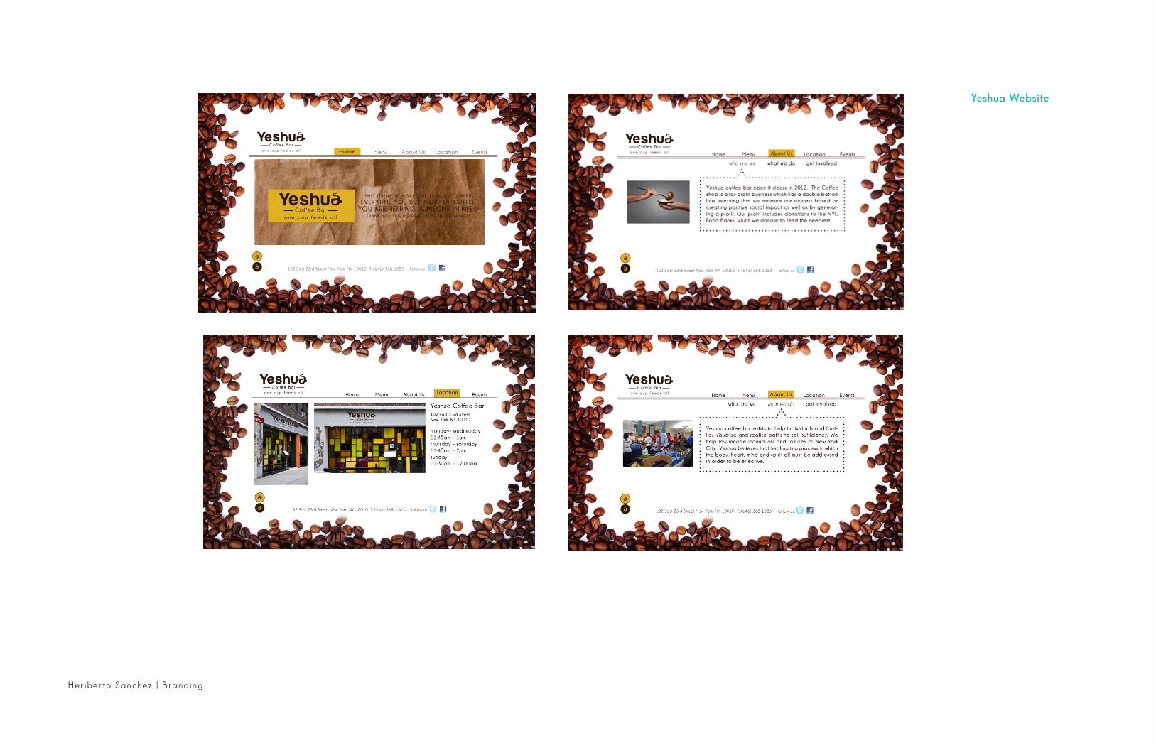
Yeshua Coffee Bar
Branding

Branding | Heriberto Sanchez
Yeshua Coffee BarThe Brand Manual

Heriberto Sanchez | Branding

Branding | Heriberto Sanchez
102 East 23rd Street New York, NY 10010T: (646) 368-1083F: (646) 368-1090www.Yeshua.com
Carlos A. AfanadorOwner
102 East 23rd Street New York, NY 10010
www.yeshua.com
T: (646) 368-1083F: (646) 368-1090M: [email protected]
www.yeshua.com
102 East 23rd Street New York, NY 10010
Yeshua Coffee BarIncludes Letter Head
Business CardEnvelope
Heriberto Sanchez | Branding
Home
Yeshua Website

Branding | Heriberto Sanchez
Yeshua Advertisement
Campaign is to reach out to the customers to be aware of struggling
families and individuals.

Heriberto Sanchez | Branding

Branding | Heriberto Sanchez

Heriberto Sanchez | Branding
Yeshua SignageMTA Billboards
Public Telephone Booth

Logo Measurement
Main Neat Logowwa 1.5in x H 0.5in
Horizontal layout logoW 2.25in x H 0.507 in
Minimum sizesThe minimum size admitted for the main layout is 25mm.The minimum size admitted for horizontal layout is 30mm
The Vanilla Design brand mark has been cre-ated to reflect the vision and ambitions of our organization. The modernity and cleverness of the design reflects our intention to position our-selves specifically as the Advance Cloth Technol-ogy. In itself, the Neat rand mark is an important element whose simple shape, strong color and distinctive ‘shape within a shape’ make it highly recognizable and memorable.
The brand mark is the key visual symbol identi-fying the trademark and reinforcing its position within the fashion world and outdoors wear.The brand mark is created specifically for visualimpact and may not be substituted by any type-face which may appear to be similar.
Master artwork is to be used for the reproduction of all elements.
1.1 CORE IDENTITY ELEMETS the brand mark
2
Branding | Heriberto Sanchez
Neat
The Brand Manual
1.2 CORE IDENTITY protection
The Vanilla Design brand mark is fine as it is. Please do not squeeze, stretch, adjust, change colors or try to recreate the logo yourself.
Always use the artwork sup-plied. These are just some examples of prohibited usage and should not be seen as a finite list.
Never use a drop shadow
Never lose the proportions of the logo
Never flip the logo
Never use another color
Never use logo on disturbing backgrounds3
Logo shouldn’t be the negative version

4
1.3 CORE IDENTITY typography
Type is an integral part of the brand identity andwhen used in conjunction with the brand color itbecomes a powerful visual communication tool.
Primary brand typefaceSan Serif Book has been chosen for its contem-porary, straightforward, open and friendly feel and its legibility. It is permissible to use it in all its weights and versions.
San Serif Book is used for stationary elements and whenever possible for corporate publica-tions.
Secondary brand typefaceAdobe Caslon Pro has been chosen to comple-ment the San Serif Book in internal documents such as regulations and other publications, cor-respondence and digital applications.
Sans Serif Book ABCDEFGHIJKLMNOPQRSTUVWXYZ
abcdefghi jk lmnopqrs tuvwxyz 1234567890
Sans Seri f I tal ic ABCDEFGHIJKLMNOPQRSTUVWXYZ
abcdefghi jklmnopqrstuvwxyz 1234567890
Adobe Caslon Pro ABCDEFGHIJK LMNOPQRSTUV W X YZ
abcdefghijk lmnopqrstuv w x yz 1234567890
Adobe Caslon Pro Ita l ic ABCDEFGHIJK LMNOPQRSTU V WX YZ
abcdefghijk lmnopqrstuvwxyz 1234567890
5
In those cases where the logo cannot be applied in its primary colour, it shouald be used in solid black. Both positive and negative versions are al-lowed. However the positive version is preferred.The Vanilla Design brand mark has been designed to allow application on a variety of backgrounds, whilst still remaining distinctly recognisable.
Note: the black background color is indicative
However, the colour and nature of the backgroundon which the brand mark is applied has a greatinfluence on its legibility. Whether in colour or inblack, the positive version should be used on lightbackgrounds and the negative version on dark backgrounds.When applied on imagery, always place theNeat brand mark in a position where there is maximum contrast.
2.1 COLOR APPLICATION use on background
Applications on color backgrounds - Color applications
Applications on black/white backgrounds - Black/White applica-
Heriberto Sanchez | Branding

200 Madison Ave 5th Floor New York, NY 10016
Tel (212) 356-6866www.NEAT.com
WWW.NEAT.COM
Santiago Meza200 Madison Ave 5th Floor New York, NY 10016 Tel (212)[email protected]
200 Madison Ave 5th Floor New York, NY 10016
Branding | Heriberto Sanchez
Neat Stationary Includes Letter Head
Business CardEnvelope

251 West 14th StreetNew York, New York 11019 Tel (212) 356-6866
Heriberto Sanchez | Branding
How does it works?This Small booklet tell you how does Neat Cloth work.

Branding | Heriberto Sanchez
Neat Shopping Bag

Home Shop Our Technology Contact Us
First Name:
Last Name:
Adress:
City:
State:
Email:
Card Type:
Security Code:
Card Number:
ReceiptCheck Out
Home Shop Our Technology
Ne
xt Step
Pre
viou
s Step
Contact Us
Information
Expiration Date:
200 Madison Ave 5th Floor ,New York, NY 10016
Heriberto Sanchez | Branding
Neat WebSite

2
1
Logo Colors
Logo Clear Space
The palette consists of the en-tire range of tints that originatefrom the colors. The lightertints were created by screeningthe colors, and the darker tintswere created by adding black tothe colors. The tints specified inthe palette are samples of thisrange of tints.
The consistent use of these colors will create recognition and strengthen the identity. The Cannonball! logo must always use the primary and supportive colors.
Pantone® is a registered trade-mark of Pantone, Inc. The Can-nonball! mark is fine as it is.
Logo MeasurementMain Cannonball! LogoW 2.5in x H 0.7in
Minimum sizesThe minimum size admitted for the main layout is 25mm.
The Cannonball! brand mark has been created to reflect the vision and ambitions of our organization.
The modernity and cleverness of the design reflects our intention to position ourselves specifically as the
Backyard Appliance In itself the Can-nonball! brand mark is an important el-ement whose simple shape, strong color and distinctive ‘shape within a shape’ make it highly recognizable and memo-rable.
The brand mark is the key visual symbol Identifying the trademark and reinforc-ing its position within the fashion world and outdoors wear. The brand mark is created specifically for visual impact and may not be substituted by any type-face which may appear to be similar.
Master artwork is to be used for the re-production of all elements.
PMS 300 C
PMS 032 C
C15 M100 Y90 K0
C85 M50 Y0 K0
CMYK RGB
100% 80% 60% 40% 20%
R23 G27 B46
R28 G98 B176
Branding | Heriberto Sanchez
Canonball!The Brand Manual

Use on Background
Logo Protection
Never use a drop shadow
Logo should be the negative version
Never lose the proportions of the logo
Never use another color
Never flip the logo
Never outline the logo
In those cases where the logo cannot be applied in its primary color, it should be used in solid black. Both positiveand negative versions are allowed.However the positive version is preferred. The Cannonball! brand mark has been designed to allow application on a vari-ety of backgrounds, whilst still remaining distinctly recognizable.However, the color and nature of the background on which the brand mark is applied has a great influence on itslegibility. Whether in color or in black, the positive version should be used on light backgrounds and the negative versionon dark backgrounds. When applied on imagery, always place the Cannonball! brand mark in a position where thereis maximum contrast.
Note: the black background color is in-dicative
The Cannonball! mark is fine as it is. Please do not squeeze, stretch, adjust, change colors or try to recreatethe logo yourself.
Always use the artwork supplied. These are just some examples of prohibited usage and should not be seen as a finite list.
4
3
Heriberto Sanchez | Branding

Canonball! Stationary Includes Letter Head
Business CardEnvelope
Alfred Guiterrez251 West 14th StreetNew York, New York 11019 Tel (212)356-6866www.canonball!.com
Alfred Guiterrez251 West 14th StreetNew York, New York 11019 Tel (212)[email protected]!.com
251 West 14th StreetNew York, New York 11019
Branding | Heriberto Sanchez

251 West 14th StreetNew York, New York 11019 Tel (212)-356-6866
Heriberto Sanchez | Branding
Canonball!Canonball! T-ShirtsBlack & White
Canonball! CompanyVan

Publication Design
Stenberg Brothers Brochure
Think Manual
The Station Magazine

The StationContemporary magazine that appeal to young men and women . It ranges from politics to high fashions trends in New York City.
Cuddle up with abook and fire upyour ipod
Heriberto Sanchez | Publ ication Des ign

Deep FreezeFront of Book article about how to survive
a New York City cold winter and 6 items to
keep you ready.
2 Surviving the City
Surviving the City 3
Bachunan’s18 years
($120 at local liquor store)
Apple Ipad
($300 at apple
store)
&tieTie Scarf($ 117 at &tie.com)
VasqueHiking Boots
($120 at Para-gon Store)
BurberryWinter Coat($1,200 at Burb-erry Store)
Snow Shovel($24 at Lowe’s Store)
Publ ication Des ign | Heriberto Sanchez
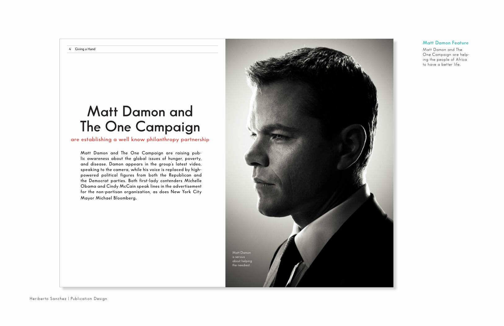
4 Giving a Hand
Matt Damon FeatureMatt Damon and The One Campaign are help-ing the people of Africa to have a better life.
Matt Damon is serious about helping the neediest.
Matt Damon and The One Campaign
are establishing a well know philanthropy partnership
Matt Damon and The One Campaign are raising pub-lic awareness about the global issues of hunger, poverty, and disease. Damon appears in the group’s latest video, speaking to the camera, while his voice is replaced by high-powered political figures from both the Republican and the Democrat parties. Both first-lady contenders Michelle Obama and Cindy McCain speak lines in the advertisement for the non-partisan organization, as does New York City Mayor Michael Bloomberg.
Heriberto Sanchez | Publ ication Des ign

6 Giving a Hand Giving a Hand 7
Damon supports the ONE Campaign, which is aimed at fighting AIDS and poverty in Third World countries. He has appeared in their print and tele-vision advertising. Damon is also an ambassador for OneXOne, a non-profit foundation committed to supporting, preserving and improving the lives of children at home in Canada, the United States, and around the world.
Damon is also a spokesperson for Feeding America, the largest USA-focused hunger-relief or-ganization, and a member of their Entertainment Council, participating in their Ad Council PSAs.
Damon is a board member of Tonic Mailstopper (formerly GreenDimes), a company that attempts to halt junk mail delivered to American homes each day. Appearing on The Oprah Winfrey Show on April 20, 2007, Damon promoted the organiza-tion’s efforts to prevent the trees used for junk mail letters and envelopes from being chopped down. ONE is an organization which attempts to mobi-lize supporters around its issues and organize them into a lobbying force, with the goal of encouraging national leaders to fund more international devel-opment and relief programs. As a campaign to fight extreme poverty and global diseases, it sup-ports the Millennium Development Goals.
Although its central talking points center on ending extreme poverty and fighting the AIDS pandemic, ONE supports a broad variety of in-ternational development and relief issues, includ-ing debt relief, clean water, increasing the quan-tity and efficiency of aid, lessening corruption in the governments of the aid-recipient countries, providing basic education for all, making trade more fair, reforming the farm bill to make it more fair for farmers in developing countries, slowing deadly diseases such as HIV/AIDS, malaria, and tuberculosis, and increasing the international af-fairs budget. ONE holds the position that increas-ing foreign development assistance will create a more secure world, believing that global poverty and the ideological extremism that fuels terrorism are linked.As a student at Harvard University, he continued to pursue acting and performed small roles in projects such as the TNT original film Rising Son and the ensemble prep-school drama School Ties. In 1992, he landed a big part in Geronimo: An American Legend with Gene Hackman and Jason Patric.
Four years later, he auditioned for a small role in Cutthroat Island, but was turned away. Damon next appeared as an opiate-addicted soldier in 1996’s Courage Under Fire. He was required to lose 40 pounds (18 kg) in 100 days (for only two days of filming). After following a self-prescribed diet and fitness regimen to lose the weight, i was told after filming that he was fortunate his heart did not shrink. He took medication for several years afterwards to correct the stress inflicted on his adrenal gland.
It’s better to be a fakesomebody than a realnobody.
- Matt Damon
Courage Under Fire gained him some criti-cal notice, as The Washington Post labeled his performance “impressive;”Damon has stated that it was worthwhile to risk his health in order to properly portray his character and show the industry how committed he was to his work as an actor.
Camon has become known for choosing a wide variety of film roles, from his portrayal of Patricia Highsmith’s anti-hero Tom Ripley in The Talented Mr. Ripley (1999) to a fallen angel who discusses pop culture as intellectual subject matter with Affleck in Dogma (1999); from a conjoined twin in Stuck on You (2003), which got a mixed critical reception, to the low budget ex-perimental film Gerry (2002), which he co-wrote with Casey Affleck and Gus Van Sant.
The Station
Reasons You Should Join The Cause.
Helping the people of Africa.
Talking to local leader in a small-village.
Publ ication Des ign | Heriberto Sanchez
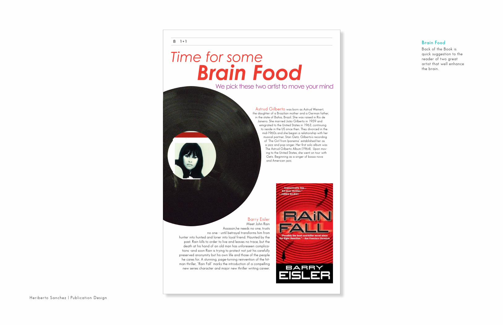
8 1 + 1
Astrud Gilberto was born as Astrud Weinert, the daughter of a Brazilian mother and a German father,
in the state of Bahia, Brazil. She was raised in Rio de Janeiro. She married João Gilberto in 1959 and emigrated to the United States in 1963, continuing to reside in the US since then. They divorced in the mid-1960s and she began a relationship with her musical partner, Stan Getz. Gilberto’s recording of “The Girl from Ipanema” established her as a jazz and pop singer. Her first solo album was The Astrud Gilberto Album (1964). Upon mov-ing to the United States, she went on tour with Getz. Beginning as a singer of bossa nova and American jazz.
Barry EislerMeet John Rain
Assassin,he needs no one, trusts no one - until betrayal transforms him from
hunter into hunted and loner into loyal friend. Haunted by the past. Rain kills to order to live and leaves no trace, but the death at his hand of an old man has unforeseen complica-
tions -and soon Rain is trying to protect not just his carefully preserved anonymity but his own life and those of the people
he cares for. A stunning, page-turning reinvention of the hit-man thriller, “Rain Fall” marks the introduction of a compelling
new series character and major new thriller writing career.
Brain FoodBack of the Book is quick suggestion to the reader of two great artist that well enhance the brain.
Heriberto Sanchez | Publ ication Des ign

graphic design handbook
basic design 1.2 basic design 1.3
3/4
Type is the textural elements within a design that us typically applied through the use of typeset characters.
letteform
Sets of typographic characters contain the letter forms, numbers and punctuation, all in a par-ticular style or font. while most desktop publishing software allows a designer to make fake bold or italic characters from the base character set, fonts are normally available in these common variations and their use prevents possible distortion and spacing problems.
type
romanThis sans serif font is the normal, basic or Roman version. No-tice its variable stroke weight and lack of serif stroke terminate
san serifThis sans serif does not have decorative serif stroke terminations. Notice its even stroke weight.
serif This is a serif font with subtle termination at the end of its stroke and a variable stroke weight
italicThis a true italic, a drawn typeface with an axis angled be-tween 7-20 degree. True italic are typically found with serif fonts.
Roman Plain Stroke aa
Layout is the management of form and space in which the design components of a work are arranged. Layout aims to present the visual and textural elements that are to be communi-cated in manner that do receive the message they contain. This chapter discusses some of the general principles of layout that have proven to be effective in design
the pageThe page is the space that a design occupies is the space occupies, including the visual and textural elements organized through the design. A page has a topography comprising differ-ent features that a designer can manipulate. This section introduces some of these features.
layout
Publ ication Des ign | Heriberto Sanchez
Think Manual
This booklet offers hands-on approach to
the processes of produc-tion management.

production 4.3 production 4.3
19/20
Printing is a process that applies ink or varnish from a printing plate to a substrate through the ap-plication of pressure. Modern printing whereby the ink is sprayed on the substrate.There are four main process used by the commercial printing industry- offset lithography , gravure, letterpress and silk all of which in cost, production quality and production rate or volume.
printing process
lithography Lithography printing is a process through which the inked image form a printing plate is trans-ferred or offset on to a rubber blanket roller, which is then pressed against the substrate. Lithography uses a smooth printing plate and functions on the basil that oil and water repel each other, when the plate passes under the ink roller, non-image areas that have a water film repel the oily inks that stick to the image areas.Lithography produces good photographic reproduction and fine line work on a variety of stocks. The printing plates are easy to prepare and high speeds are achievable, which helps make it low-cost printing method.
web printing Web printing uses stock that is supplied on mas-sive rolls rather than individual sheets. This allow for higher volume printing speeds and lower pro-duction cost per unit for high-volume print jobs. Webs can be used with lithograhy, but more commonly with relief printing methods such as rotogravure and flexography as the plates are more addable. Due to the scale and cost of this production method, it is not suitable for low-vol-ume print runs.
problems with web & litho printing
The main drawbacks to offset lithography con-cern prints runs, the cost benefits of the method achieved with medium to long prints runs. The high and very high prints runs can start to suf-fer due to wear on the plate, so rotogravures is generally used instead.
Color control can be an issue as well. Problems with the ink/water balance on the plate the presence of water can cause more absorbent substrates to distort. A dense ink film is also dif-ficult to achieve.
lithographic press paper on web press
finishing 5.1 finishing 5.1
23/24
Binding is a process through which the various pages that comprise a job are gathered and secured help together so that they function as a publication.
types of bindingMany different types of blinding are the available and they all have different durability, aesthetics, cost and functional characteristics, as shown on the opposite page.
binding
book binding
Book binding involves a variety if processes toproduces a finished book. The various sections that form the book block are either stitch en or glues to hold them together. The book block may then be shaped or curved.
End papers of stronger stock are added to provide to provide material for the cover to adhere to provide protection to the top and bottom of the binding, as well as for decora-tive effect, the cover is applied.
spiral binding
A spiral of metal wire that winds through punched holes al-lowing the publica-tions to open flat.
singer stitch
A binding method whereby the pages are sewn together with one continual thread
saddle stitch
Signature are nested and bound with wire stitch, applied through the spine along the centre fold
perfect binding
The backs of sections are removed and help together with a flexible adhesive, which also attaches a paper cover to the spine,and the fore edge trimmed flat. Commonly used for paperback books.
Heriberto Sanchez | Publ ication Des ign

Cover
Publ ication Des ign | Heriberto Sanchez
Stenberg BrothersStep box fold brochure, it contains information and
poster art of the Rus-sian designers Stenberg
Brothers.

Front
Back
Heriberto Sanchez | Publ ication Des ign

A Day In My Life
Creative Process
Infographic Design

Heriberto Sanchez | Infographics
The creative process is not just iterative; it’salso recursive. It plays out “in the large” and “in the
small”—in defining the broadest goals and conceptsand refining the smallest details. It branches like a
tree, and each choice has ramifications, which maynot be known in advance. Recursion also suggests a
procedure that “calls” or includes itself. Many designersdefine the design process as a recursive function:
D
Gather all ideas and play aroundwith them. Conduct a question-naire or interview with the client to get the design brief.
Conduct research focused on theindustry itself, on its history, and on its competitors. Develop the logo design concept(s) around the brief and research.
Just play around with initials sketches to make the idea stronger. After get-ting the initial idea I experimented in Adobe Illustrator. with different type-faces, sizes, proportions, etc. to see what typefaces worked and what line widths and combinations worked best together.
Then finally came down to two styles.At this time received feedback frompeers and from forums. Make sure theconcept holds together. Create anddeliver the final process . Celebratedrink beer, eat chocolate, sleep, starton the next creative process.
Creative Process Infographic poster

Infographics | Heriberto Sanchez
A Day In My LifeThis Infographic shows
the daily route that I take during tuesday. I have a lot of things to do during this day and take a lot of transpor-
tation.

h s a n c h e z 1 4 6 @ g m a i l . c o m | H s a n c h e z . c o m | 3 4 7 . 4 1 9 . 0 0 2 2
Heriberto SanchezGraphic Designer