hci usability evaluation of systems - university of manitobairani/cs792/01_evaluation_parta.pdf ·...
TRANSCRIPT
1
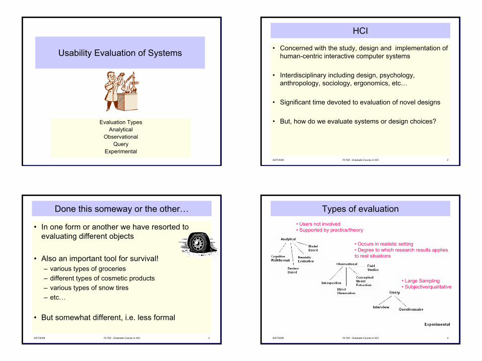
Usability Evaluation of Systems
Evaluation TypesAnalytical
ObservationalQuery
Experimental9/27/2006 74.792 - Graduate Course in HCI 2
HCI
• Concerned with the study, design and implementation of human-centric interactive computer systems
• Interdisciplinary including design, psychology, anthropology, sociology, ergonomics, etc…
• Significant time devoted to evaluation of novel designs
• But, how do we evaluate systems or design choices?
9/27/2006 74.792 - Graduate Course in HCI 3
Done this someway or the other…
• In one form or another we have resorted to evaluating different objects
• Also an important tool for survival! – various types of groceries– different types of cosmetic products– various types of snow tires– etc…
• But somewhat different, i.e. less formal
9/27/2006 74.792 - Graduate Course in HCI 4
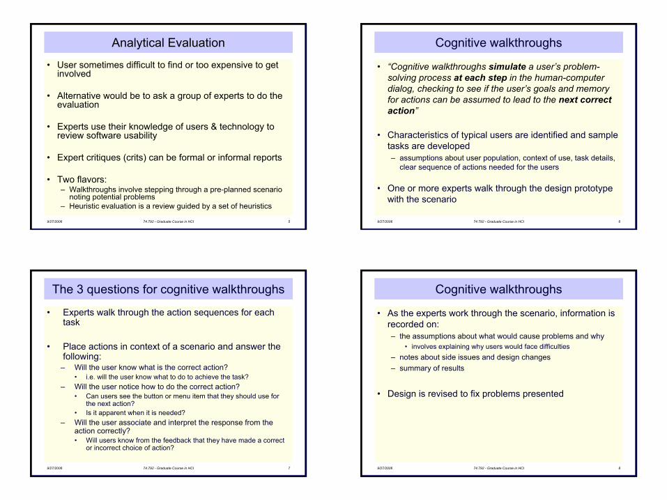
Types of evaluation• Users not involved• Supported by practice/theory
• Occurs in realistic setting• Degree to which research results applies to real situations
• Large Sampling• Subjective/qualitative
2
9/27/2006 74.792 - Graduate Course in HCI 5
Analytical Evaluation
• User sometimes difficult to find or too expensive to get involved
• Alternative would be to ask a group of experts to do the evaluation
• Experts use their knowledge of users & technology to review software usability
• Expert critiques (crits) can be formal or informal reports
• Two flavors: – Walkthroughs involve stepping through a pre-planned scenario
noting potential problems– Heuristic evaluation is a review guided by a set of heuristics
9/27/2006 74.792 - Graduate Course in HCI 6
Cognitive walkthroughs
• “Cognitive walkthroughs simulate a user’s problem-solving process at each step in the human-computer dialog, checking to see if the user’s goals and memory for actions can be assumed to lead to the next correct action”
• Characteristics of typical users are identified and sample tasks are developed– assumptions about user population, context of use, task details,
clear sequence of actions needed for the users
• One or more experts walk through the design prototype with the scenario
9/27/2006 74.792 - Graduate Course in HCI 7
The 3 questions for cognitive walkthroughs
• Experts walk through the action sequences for each task
• Place actions in context of a scenario and answer the following:
– Will the user know what is the correct action?• i.e. will the user know what to do to achieve the task?
– Will the user notice how to do the correct action? • Can users see the button or menu item that they should use for
the next action?• Is it apparent when it is needed?
– Will the user associate and interpret the response from the action correctly?• Will users know from the feedback that they have made a correct
or incorrect choice of action?
9/27/2006 74.792 - Graduate Course in HCI 8
Cognitive walkthroughs
• As the experts work through the scenario, information is recorded on:– the assumptions about what would cause problems and why
• involves explaining why users would face difficulties– notes about side issues and design changes– summary of results
• Design is revised to fix problems presented
3
9/27/2006 74.792 - Graduate Course in HCI 9
Example: Find a book at Amazon.com
Task: to buy a copy of text book from amazon.comTypical users: students who use the web regularly
• Step 1. Selecting the correct category of goods on the home page– Q: will users know what to do?– A: Yes – they know that they must find “books”
– Q: will users see how to do it?– A: Yes – they have seen menus before and will know to select
the appropriate item and click go.
– Q: will users understand from feedback whether the action was correct or not?
– A: Yes – their action takes them to a form that they need to complete to search for the book.
9/27/2006 74.792 - Graduate Course in HCI 10
Example: Find a book at Amazon.com
• Step 2. Completing the form– Q: Will users know what to do?– A: Yes – the online form is like a paper form so they know they
have to complete it.– A: No – they may not realize that the form has defaults to
prevent inappropriate answers because this is different from a paper form
– Q: Will users see how to do it?– A: Yes – it is clear where the information goes and there is a
button to tell the system to search for the book.
– Q: will users understand from feedback whether the action was correct or not?
– A: Yes – they are taken to a picture of the book, a description, and purchase details.
9/27/2006 74.792 - Graduate Course in HCI 11
Heuristic Evaluation
• Developed by Jakob Nielsen– www.useit.com/papers/heuristic
• Use a set of principles to “evaluate” a system for usability problems
• Gained popularity for several reasons:– does not require user involvement – can catch many design flaws early
• A small set (3-5) of evaluators inspect UI– independently check for compliance with usability principles
(“heuristics”)– different evaluators will find different problems– evaluators only communicate afterwards
• findings are then aggregated
• Can also perform heuristic evaluation on prototypes or on sketches
9/27/2006 74.792 - Graduate Course in HCI 12
Heuristic Evaluation Process
• Evaluators go through UI several times independently– inspect various dialogue elements– compare with list of usability principles– consider other principles/results that come to mind
• Based on usability principles– Nielsen’s “heuristics”– supplementary list of environment-specific heuristics
• To follow
• Detect violations to redesign/fix problems
4
9/27/2006 74.792 - Graduate Course in HCI 13
Nielsen’s heuristics
• Visibility of system status - Are users kept informed at all times?• Match between system and real world - Is the UI language simple?• User control and freedom - Are there easy escapes from
unexpected locations?• Consistency and standards - Is performing similar action consistent?• Help users recognize, diagnose, recover from errors - Are error
messages helpful?• Error prevention - Is it easy to make errors?• Recognition rather than recall - Are objects, actions and options
always visible?• Flexibility and efficiency of use - Are there accelerators?• Aesthetic and minimalist design - Is any unnecessary and irrelevant
information provided?• Help and documentation - Is help provided that can be easily
searched?9/27/2006 74.792 - Graduate Course in HCI 14
Nielsen’s heuristics
• Could be too general and needs to be tailored to the environment
• HOMERUN suggested for web site evaluation– High-quality content– Often updated– Minimal download time– Ease-of-use– Relevant to users’ needs– Unique to the online medium– Netcentric corporate culture
9/27/2006 74.792 - Graduate Course in HCI 15
Discount evaluation
• Heuristic evaluation is referred to as discount evaluation when 5 evaluators are used
• Empirical evidence suggests that on average 5 evaluators identify 75-80% of usability problems
Pro
porti
on o
f Usa
bilit
yP
robl
ems
Foun
d
Number of Evaluators
25%
50%
75%
100%
5 10 15
9/27/2006 74.792 - Graduate Course in HCI 16
Why multiple evaluators?
• Need multiple evaluators since:
– Every evaluator doesn’t find every problem – Good evaluators find both easy & hard ones
5
9/27/2006 74.792 - Graduate Course in HCI 17
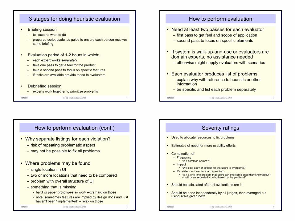
3 stages for doing heuristic evaluation
• Briefing session – tell experts what to do– prepared script useful as guide to ensure each person receives
same briefing
• Evaluation period of 1-2 hours in which:– each expert works separately– take one pass to get a feel for the product– take a second pass to focus on specific features– if tasks are available provide these to evaluators
• Debriefing session – experts work together to prioritize problems
9/27/2006 74.792 - Graduate Course in HCI 18
How to perform evaluation
• Need at least two passes for each evaluator– first pass to get feel and scope of application– second pass to focus on specific elements
• If system is walk-up-and-use or evaluators are domain experts, no assistance needed– otherwise might supply evaluators with scenarios
• Each evaluator produces list of problems– explain why with reference to heuristic or other
information– be specific and list each problem separately
9/27/2006 74.792 - Graduate Course in HCI 19
How to perform evaluation (cont.)
• Why separate listings for each violation?– risk of repeating problematic aspect– may not be possible to fix all problems
• Where problems may be found– single location in UI– two or more locations that need to be compared– problem with overall structure of UI– something that is missing
• hard w/ paper prototypes so work extra hard on those• note: sometimes features are implied by design docs and just
haven’t been “implemented” – relax on those9/27/2006 74.792 - Graduate Course in HCI 20
Severity ratings• Used to allocate resources to fix problems
• Estimates of need for more usability efforts
• Combination of– Frequency
• “Is it common or rare? “– Impact
• “Will it be easy or difficult for the users to overcome?”– Persistence (one time or repeating)
• “Is it a one-time problem that users can overcome once they know about it or will users repeatedly be bothered by the problem?”
• Should be calculated after all evaluations are in
• Should be done independently by all judges, then averaged out using scale given next
6
9/27/2006 74.792 - Graduate Course in HCI 21
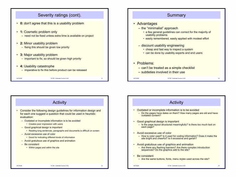
Severity ratings (cont).
• 0: don't agree that this is a usability problem
• 1: Cosmetic problem only– need not be fixed unless extra time is available on project
• 2: Minor usability problem– fixing this should be given low priority
• 3: Major usability problem– important to fix, so should be given high priority
• 4: Usability catastrophe– imperative to fix this before product can be released
9/27/2006 74.792 - Graduate Course in HCI 22
Summary
• Advantages– the “minimalist” approach
• a few general guidelines can correct for the majority of usability problems
• easily remembered, easily applied with modest effort
– discount usability engineering• cheap and fast way to inspect a system• can be done by usability experts and end users
• Problems:– can’t be treated as a simple checklist– subtleties involved in their use
9/27/2006 74.792 - Graduate Course in HCI 23
Activity
• Consider the following design guidelines for information design and for each one suggest a question that could be used in heuristic evaluation:– Outdated or incomplete information is to be avoided
• Creates poor impression with users– Good graphical design is important
• Reading long sentences, paragraphs and documents is difficult on screen– Avoid excessive use of color
• Good for indicating different kinds of information– Avoid gratuitous use of graphics and animation– Be consistent
• Within pages and within the site
9/27/2006 74.792 - Graduate Course in HCI 24
Activity• Outdated or incomplete information is to be avoided
– Do the pages have dates on them? How many pages are old and haveoutdated content?
• Good graphical design is important– Is the page layout structured meaningfully? Is there too much text on
each page?
• Avoid excessive use of color– How is color used? Is it used for coding information? Does it make the
site bright and cheerful? Is it excessive and garish?
• Avoid gratuitous use of graphics and animation– Are there any flashing banners? Are there complex introduction
sequences? Do the graphics add to the site?
• Be consistent– Are the same buttons, fonts, menu styles used across the site?
7
9/27/2006 74.792 - Graduate Course in HCI 25
Why usability for the web?
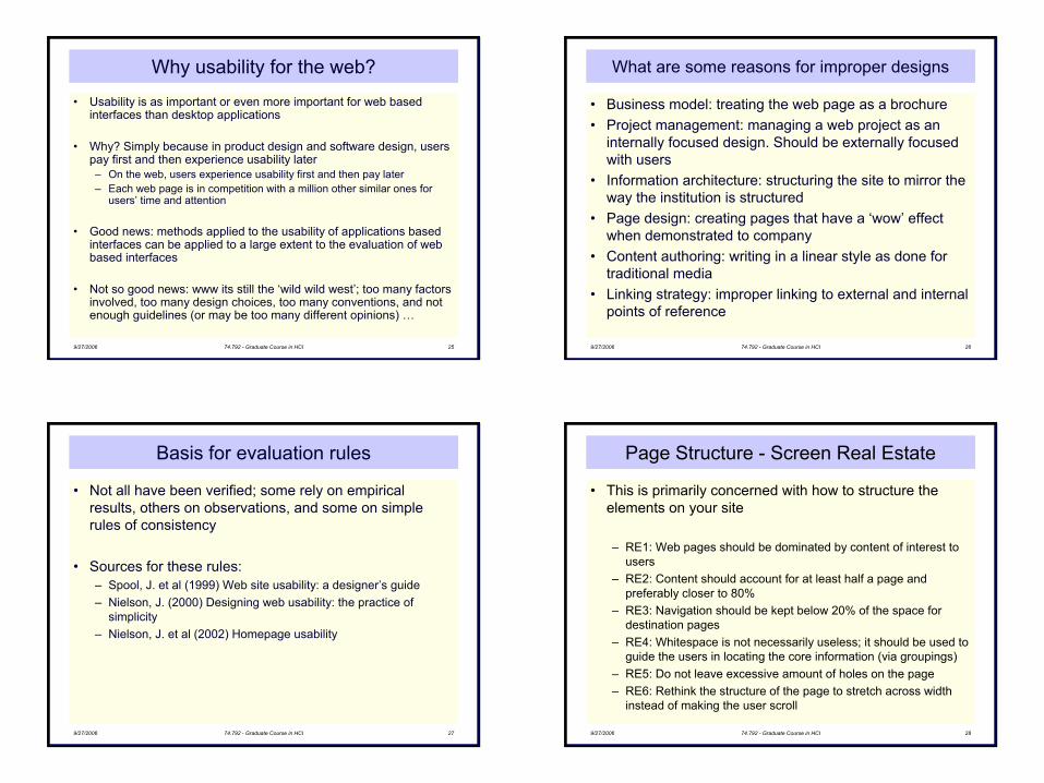
• Usability is as important or even more important for web based interfaces than desktop applications
• Why? Simply because in product design and software design, userspay first and then experience usability later– On the web, users experience usability first and then pay later– Each web page is in competition with a million other similar ones for
users’ time and attention
• Good news: methods applied to the usability of applications based interfaces can be applied to a large extent to the evaluation of web based interfaces
• Not so good news: www its still the ‘wild wild west’; too many factors involved, too many design choices, too many conventions, and notenough guidelines (or may be too many different opinions) …
9/27/2006 74.792 - Graduate Course in HCI 26
What are some reasons for improper designs
• Business model: treating the web page as a brochure• Project management: managing a web project as an
internally focused design. Should be externally focused with users
• Information architecture: structuring the site to mirror the way the institution is structured
• Page design: creating pages that have a ‘wow’ effect when demonstrated to company
• Content authoring: writing in a linear style as done for traditional media
• Linking strategy: improper linking to external and internal points of reference
9/27/2006 74.792 - Graduate Course in HCI 27
Basis for evaluation rules
• Not all have been verified; some rely on empirical results, others on observations, and some on simple rules of consistency
• Sources for these rules:– Spool, J. et al (1999) Web site usability: a designer’s guide– Nielson, J. (2000) Designing web usability: the practice of
simplicity– Nielson, J. et al (2002) Homepage usability
9/27/2006 74.792 - Graduate Course in HCI 28
Page Structure - Screen Real Estate
• This is primarily concerned with how to structure the elements on your site
– RE1: Web pages should be dominated by content of interest to users
– RE2: Content should account for at least half a page and preferably closer to 80%
– RE3: Navigation should be kept below 20% of the space for destination pages
– RE4: Whitespace is not necessarily useless; it should be used to guide the users in locating the core information (via groupings)
– RE5: Do not leave excessive amount of holes on the page– RE6: Rethink the structure of the page to stretch across width
instead of making the user scroll
8
9/27/2006 74.792 - Graduate Course in HCI 29
Page Structure - Screen Real Estate
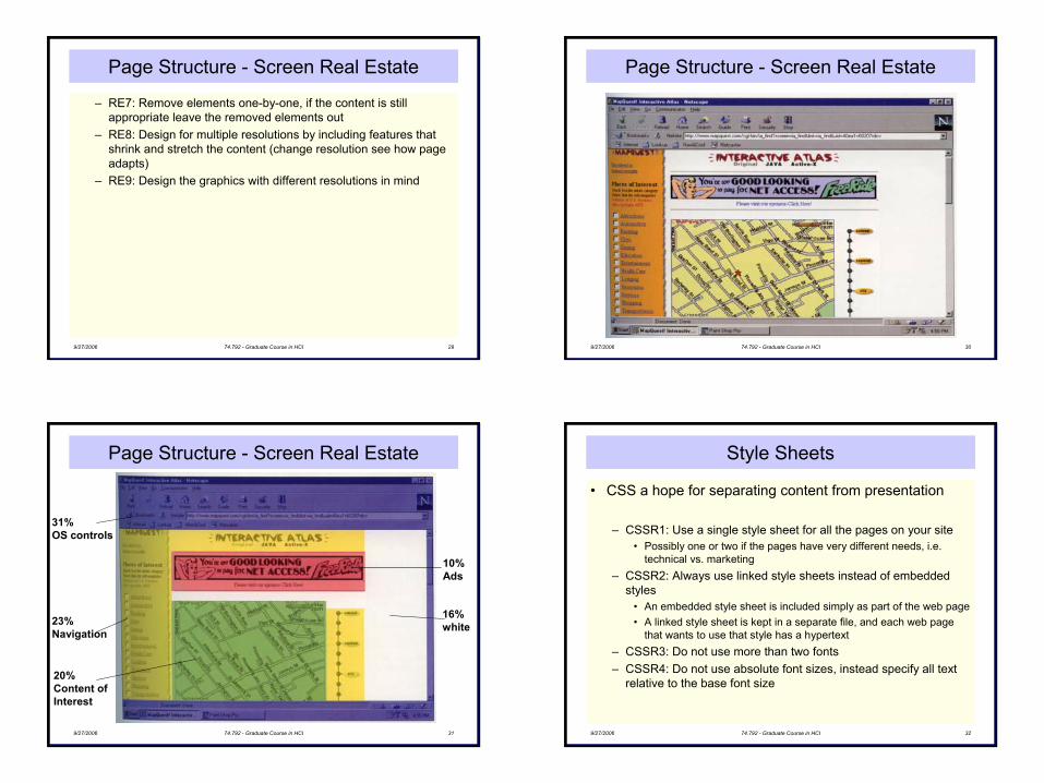
– RE7: Remove elements one-by-one, if the content is still appropriate leave the removed elements out
– RE8: Design for multiple resolutions by including features that shrink and stretch the content (change resolution see how page adapts)
– RE9: Design the graphics with different resolutions in mind
9/27/2006 74.792 - Graduate Course in HCI 30
Page Structure - Screen Real Estate
9/27/2006 74.792 - Graduate Course in HCI 31
Page Structure - Screen Real Estate
31% OS controls
23% Navigation
20% Content ofInterest
10% Ads
16% white
9/27/2006 74.792 - Graduate Course in HCI 32
Style Sheets
• CSS a hope for separating content from presentation
– CSSR1: Use a single style sheet for all the pages on your site• Possibly one or two if the pages have very different needs, i.e.
technical vs. marketing– CSSR2: Always use linked style sheets instead of embedded
styles• An embedded style sheet is included simply as part of the web page• A linked style sheet is kept in a separate file, and each web page
that wants to use that style has a hypertext– CSSR3: Do not use more than two fonts– CSSR4: Do not use absolute font sizes, instead specify all text
relative to the base font size
9
9/27/2006 74.792 - Graduate Course in HCI 33
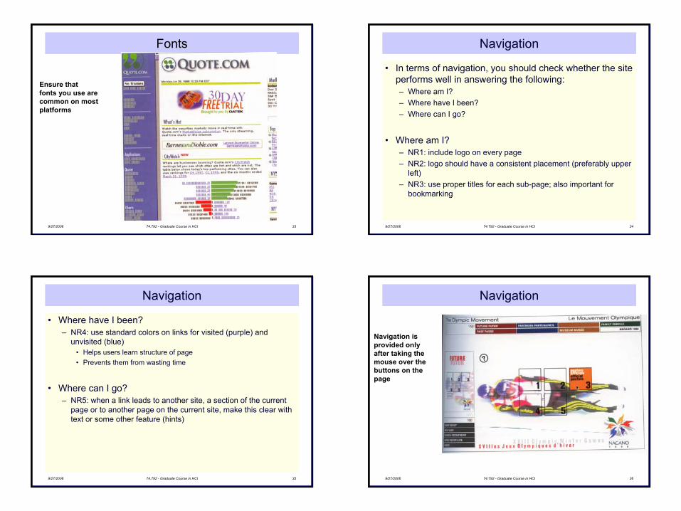
Fonts
Ensure that fonts you use are common on most platforms
9/27/2006 74.792 - Graduate Course in HCI 34
Navigation
• In terms of navigation, you should check whether the site performs well in answering the following: – Where am I? – Where have I been? – Where can I go?
• Where am I?– NR1: include logo on every page– NR2: logo should have a consistent placement (preferably upper
left)– NR3: use proper titles for each sub-page; also important for
bookmarking
9/27/2006 74.792 - Graduate Course in HCI 35
Navigation
• Where have I been?– NR4: use standard colors on links for visited (purple) and
unvisited (blue)• Helps users learn structure of page• Prevents them from wasting time
• Where can I go?– NR5: when a link leads to another site, a section of the current
page or to another page on the current site, make this clear with text or some other feature (hints)
9/27/2006 74.792 - Graduate Course in HCI 36
Navigation
Navigation isprovided onlyafter taking themouse over thebuttons on thepage

10
9/27/2006 74.792 - Graduate Course in HCI 37
Linking – Description Rules
• Hypertext links are anchored in the text that users click on to follow a certain path in their information search
– LDR1: avoid using “click here” as the anchor text for a link• For non-mouse visitors• Does not carry any information
– LDR2: no more than 2 to 4 words long for the verbiage that explains the link
– LDR3: Links that seem overly similar need to be differentiated with supplementary text so that users can determine which one has the information they need
9/27/2006 74.792 - Graduate Course in HCI 38
Linking – Color Rules
• Blue colored text could present problems
• Unfortunately, when the first web pages were being designed the idea of avoiding blue for text was not taken into effect
• However, to remain consistent with current standards we choose the following rules
– LCR1: links that have not been visited should be displayed in blue
– LCR2: links that have been visited should be displayed in purpleor reddish hue
9/27/2006 74.792 - Graduate Course in HCI 39
Link Colors
Standard linkcolors make it trivial for users to see at aglance which of thelinks they have visited
9/27/2006 74.792 - Graduate Course in HCI 40
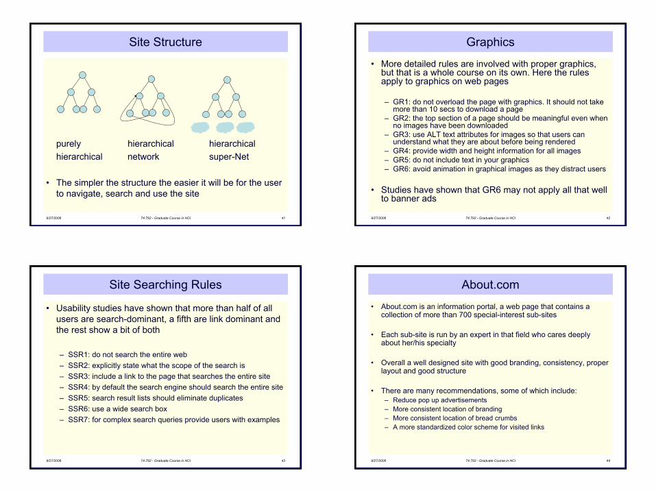
Site Structure
• “A well-defined structure … provides users with an obvious, clear model of the information space” – Darrell Sano
• Many sites evolve without a planned structure or some organizational based structure
– SR1: have a structure and make it reflect the user’s view of the site and its information
– SR2: do not mirror the organization’s structure onto the web site (for example two separate departments may be on one page and vice versa)
• Most sites have a hierarchical structure with progressively moredetailed levels of information
• Other sites have tabular formats (indices) or linear structure for web-enabled applications that necessitate a progression of steps
11
9/27/2006 74.792 - Graduate Course in HCI 41
Site Structure
purely hierarchical hierarchicalhierarchical network super-Net
• The simpler the structure the easier it will be for the user to navigate, search and use the site
9/27/2006 74.792 - Graduate Course in HCI 42
Graphics
• More detailed rules are involved with proper graphics, but that is a whole course on its own. Here the rules apply to graphics on web pages
– GR1: do not overload the page with graphics. It should not take more than 10 secs to download a page
– GR2: the top section of a page should be meaningful even when no images have been downloaded
– GR3: use ALT text attributes for images so that users can understand what they are about before being rendered
– GR4: provide width and height information for all images– GR5: do not include text in your graphics– GR6: avoid animation in graphical images as they distract users
• Studies have shown that GR6 may not apply all that well to banner ads
9/27/2006 74.792 - Graduate Course in HCI 43
Site Searching Rules
• Usability studies have shown that more than half of all users are search-dominant, a fifth are link dominant and the rest show a bit of both
– SSR1: do not search the entire web– SSR2: explicitly state what the scope of the search is– SSR3: include a link to the page that searches the entire site– SSR4: by default the search engine should search the entire site– SSR5: search result lists should eliminate duplicates– SSR6: use a wide search box– SSR7: for complex search queries provide users with examples
9/27/2006 74.792 - Graduate Course in HCI 44
About.com
• About.com is an information portal, a web page that contains a collection of more than 700 special-interest sub-sites
• Each sub-site is run by an expert in that field who cares deeply about her/his specialty
• Overall a well designed site with good branding, consistency, proper layout and good structure
• There are many recommendations, some of which include:– Reduce pop up advertisements– More consistent location of branding– More consistent location of bread crumbs– A more standardized color scheme for visited links
12
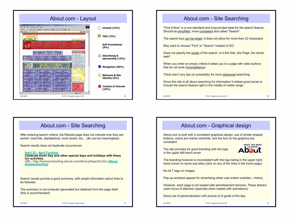
9/27/2006 74.792 - Graduate Course in HCI 45
About.com - LayoutUnused (15%)
Filler (2%)
Self Promotional (0%)
Advertising & sponsorship (13%)
Navigation (46%)
Welcome & Site Identity (5%)
Content of Interest (19%)
9/27/2006 74.792 - Graduate Course in HCI 46
About.com - Site Searching“Find it Now” is a non-standard and long-winded label for the search feature. Should be simplified, more consistent and called “Search”
The search box can be larger; it does not allow for more than 23 characters
May want to choose “Find” or “Search” instead of GO
Does not specify the scope of the search. Is it this Site, this Page, the whole web?
When you enter an empty criteria it takes you to a page with radio buttons that do not work (inconsistency)
There aren’t any tips (or possibility) for more advanced searching
Since this site is all about searching for information it makes good sense to include the search feature right in the middle of visible range
9/27/2006 74.792 - Graduate Course in HCI 47
About.com - Site SearchingAfter entering search criteria, the Results page does not indicate how they are sorted: most hits, alphabetical, most recent, etc… (#s can be meaningless)
Search results does not duplicate occurrences
April 22 - April FundaysCelebrate Earth Day and other special days and holidays with these fun activities.URL: http://homeschooling.about.com/library/blapr22.htm (About Homeschooling)
Search results provide a good summary, with ample information about links to be followed
The summary is not computer generated but obtained from the page itself (this is recommended)
9/27/2006 74.792 - Graduate Course in HCI 48
About.com - Graphical designAbout.com is built with a consistent graphical design: use of similar shaped buttons, colors are mainly red/white, and the font on the graphics are consistent
The site provides for good branding with the logo in the upper left-hand corner
The branding however is inconsistent with the logo being in the upper right-hand corner on some sub-sites (click on any of the links in the home page)
No ALT tags on images
Pop-up windows appear for advertising when user enters subsites – history
However, each page is not loaded with advertisement banners. These distract users focus of attention (specially when loaded with animations)
Good use of personalization with picture id of guide of the day
13
9/27/2006 74.792 - Graduate Course in HCI 49
About.com - Navigation
• Since logo is included on every page, even if visitor happens tostumble from somewhere else, would have a clue as to where she/he is
• Logo on each page takes user back to main page
• Note the location of the bread-crumbs feature when click on “Computing and Technology” and when click on “History”
• Link colors change for the visited pages when in the “History” sub-site
• Terminology used for differentiating between Resources and Partners is not clear (terminology problem, but also impedes navigation)
9/27/2006 74.792 - Graduate Course in HCI 50
About.com - Structure
• Hierarchical super-net
• Easy to conceptualize a mental model of the structure
• Matches user expectation of wanting to gather resourceful information from different areas
• Unified through the mechanism of dynamically managing the content
9/27/2006 74.792 - Graduate Course in HCI 51
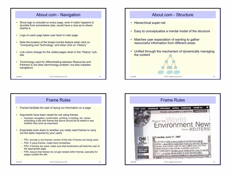
Frame Rules
• Frames facilitate the task of laying out information on a page
• Arguments have been raised for not using frames– improper navigation, bookmarks, printing, e-mailing, etc. (when
evaluating a site with frames the above should all be tested to see whether they work as expected)
• Essentially boils down to whether you really need frames to carry out the tasks required by your users
– FR1: provide a non-frames version of the site if frames are being used– FR2: if using frames, make them borderless– FR3: if frames are used, make sure that bookmarks will lead the user to
the appropriate page– FR4: ensure that frames do not get nested within frames, specially for
pages outside the site
9/27/2006 74.792 - Graduate Course in HCI 52
Frame Rules
14
9/27/2006 74.792 - Graduate Course in HCI 53
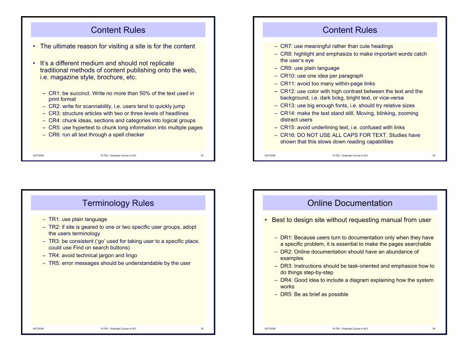
Content Rules
• The ultimate reason for visiting a site is for the content
• It’s a different medium and should not replicate traditional methods of content publishing onto the web, i.e. magazine style, brochure, etc.
– CR1: be succinct. Write no more than 50% of the text used in print format
– CR2: write for scannability, i.e. users tend to quickly jump– CR3: structure articles with two or three levels of headlines– CR4: chunk ideas, sections and categories into logical groups– CR5: use hypertext to chunk long information into multiple pages– CR6: run all text through a spell checker
9/27/2006 74.792 - Graduate Course in HCI 54
Content Rules
– CR7: use meaningful rather than cute headings– CR8: highlight and emphasize to make important words catch
the user’s eye– CR9: use plain language– CR10: use one idea per paragraph– CR11: avoid too many within-page links– CR12: use color with high contrast between the text and the
background, i.e. dark bckg, bright text, or vice-versa– CR13: use big enough fonts, i.e. should try relative sizes– CR14: make the text stand still. Moving, blinking, zooming
distract users– CR15: avoid underlining text, i.e. confused with links– CR16: DO NOT USE ALL CAPS FOR TEXT. Studies have
shown that this slows down reading capabilities
9/27/2006 74.792 - Graduate Course in HCI 55
Terminology Rules
– TR1: use plain language– TR2: if site is geared to one or two specific user groups, adopt
the users terminology– TR3: be consistent (‘go’ used for taking user to a specific place,
could use Find on search buttons)– TR4: avoid technical jargon and lingo – TR5: error messages should be understandable by the user
9/27/2006 74.792 - Graduate Course in HCI 56
Online Documentation
• Best to design site without requesting manual from user
– DR1: Because users turn to documentation only when they have a specific problem, it is essential to make the pages searchable
– DR2: Online documentation should have an abundance of examples
– DR3: Instructions should be task-oriented and emphasize how to do things step-by-step
– DR4: Good idea to include a diagram explaining how the system works
– DR5: Be as brief as possible
15
9/27/2006 74.792 - Graduate Course in HCI 57
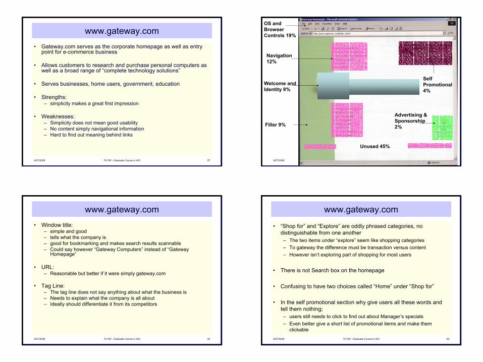
www.gateway.com• Gateway.com serves as the corporate homepage as well as entry
point for e-commerce business
• Allows customers to research and purchase personal computers as well as a broad range of “complete technology solutions”
• Serves businesses, home users, government, education
• Strengths: – simplicity makes a great first impression
• Weaknesses: – Simplicity does not mean good usability– No content simply navigational information– Hard to find out meaning behind links
9/27/2006 74.792 - Graduate Course in HCI 58
Filler 9%
Welcome andIdentity 9%
Navigation 12%
OS andBrowser Controls 19%
Advertising & Sponsorship2%
SelfPromotional4%
Unused 45%
9/27/2006 74.792 - Graduate Course in HCI 59
www.gateway.com• Window title:
– simple and good– tells what the company is– good for bookmarking and makes search results scannable– Could say however “Gateway Computers” instead of “Gateway
Homepage”
• URL:– Reasonable but better if it were simply gateway.com
• Tag Line:– The tag line does not say anything about what the business is– Needs to explain what the company is all about– Ideally should differentiate it from its competitors
9/27/2006 74.792 - Graduate Course in HCI 60
www.gateway.com
• “Shop for” and “Explore” are oddly phrased categories, no distinguishable from one another– The two items under “explore” seem like shopping categories– To gateway the difference must be transaction versus content– However isn’t exploring part of shopping for most users
• There is not Search box on the homepage
• Confusing to have two choices called “Home” under “Shop for”
• In the self promotional section why give users all these words and tell them nothing; – users still needs to click to find out about Manager’s specials– Even better give a short list of promotional items and make them
clickable
16
9/27/2006 74.792 - Graduate Course in HCI 61
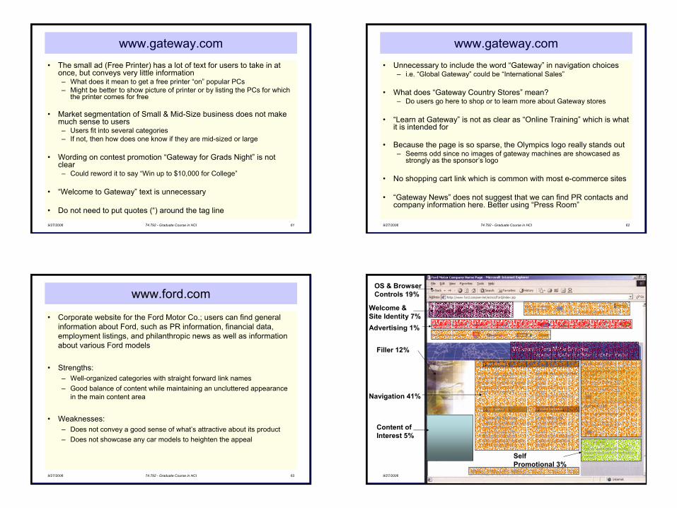
www.gateway.com• The small ad (Free Printer) has a lot of text for users to take in at
once, but conveys very little information– What does it mean to get a free printer “on” popular PCs– Might be better to show picture of printer or by listing the PCs for which
the printer comes for free
• Market segmentation of Small & Mid-Size business does not make much sense to users– Users fit into several categories– If not, then how does one know if they are mid-sized or large
• Wording on contest promotion “Gateway for Grads Night” is not clear– Could reword it to say “Win up to $10,000 for College”
• “Welcome to Gateway” text is unnecessary
• Do not need to put quotes (“) around the tag line
9/27/2006 74.792 - Graduate Course in HCI 62
www.gateway.com• Unnecessary to include the word “Gateway” in navigation choices
– i.e. “Global Gateway” could be “International Sales”
• What does “Gateway Country Stores” mean?– Do users go here to shop or to learn more about Gateway stores
• “Learn at Gateway” is not as clear as “Online Training” which is what it is intended for
• Because the page is so sparse, the Olympics logo really stands out– Seems odd since no images of gateway machines are showcased as
strongly as the sponsor’s logo
• No shopping cart link which is common with most e-commerce sites
• “Gateway News” does not suggest that we can find PR contacts andcompany information here. Better using “Press Room”
9/27/2006 74.792 - Graduate Course in HCI 63
www.ford.com
• Corporate website for the Ford Motor Co.; users can find generalinformation about Ford, such as PR information, financial data, employment listings, and philanthropic news as well as information about various Ford models
• Strengths:– Well-organized categories with straight forward link names– Good balance of content while maintaining an uncluttered appearance
in the main content area
• Weaknesses:– Does not convey a good sense of what’s attractive about its product– Does not showcase any car models to heighten the appeal
9/27/2006 74.792 - Graduate Course in HCI 64
OS & BrowserControls 19%
Welcome &Site Identity 7%Advertising 1%
Self Promotional 3%
Filler 12%
Content ofInterest 5%
Navigation 41%
17
9/27/2006 74.792 - Graduate Course in HCI 65
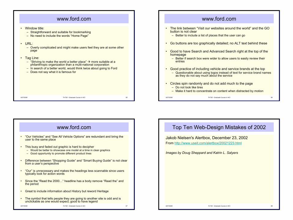
www.ford.com• Window title:
– Straightforward and suitable for bookmarking– No need to include the words “Home Page”
• URL:– Overly complicated and might make users feel they are at some other
page
• Tag Line:– “Striving to make the world a better place” more suitable at a
philanthropic organization than a multi-national corporation– In search of a better world, would think twice about going to Ford– Does not say what it is famous for
9/27/2006 74.792 - Graduate Course in HCI 66
www.ford.com• The link between “Visit our websites around the world” and the GO
button is not clear– Better to include a list of places that the user can go
• Go buttons are too graphically detailed; no ALT text behind these
• Good to have Search and Advanced Search right at the top of the homepage– Better if search box were wider to allow users to easily review their
entries
• Good practice of including vehicle and service brands at the top– Questionable about using logos instead of text for service brand names
as they do not say much about the service
• Circles spin randomly and do not add much to the page– Do not look like tires – Make it hard to concentrate on content when distracted by motion
9/27/2006 74.792 - Graduate Course in HCI 67
www.ford.com• “Our Vehicles” and “See All Vehicle Options” are redundant and bring the
user to the same place
• This busy and faded out graphic is hard to decipher – Would be better to showcase one model at a time in clear graphics– Good opportunity to promote different product lines
• Difference between “Shopping Guide” and “Smart Buying Guide” is not clear from a user’s perspective
• “Our” is unnecessary and makes the headings less scannable since users typically look for action words
• Since the “Read the 2000…“ headline has a body remove “Read the” and the period
• Great to include information about History but reword Heritage
• The symbol that tells people they are going to another site is odd and is unclickable as one would expect; good to have legend
9/27/2006 74.792 - Graduate Course in HCI 68
Top Ten Web-Design Mistakes of 2002
Jakob Nielsen's Alertbox, December 23, 2002From http://www.useit.com/alertbox/20021223.html
Images by Doug Sheppard and Katrin L. Salyers
18
9/27/2006 74.792 - Graduate Course in HCI 69
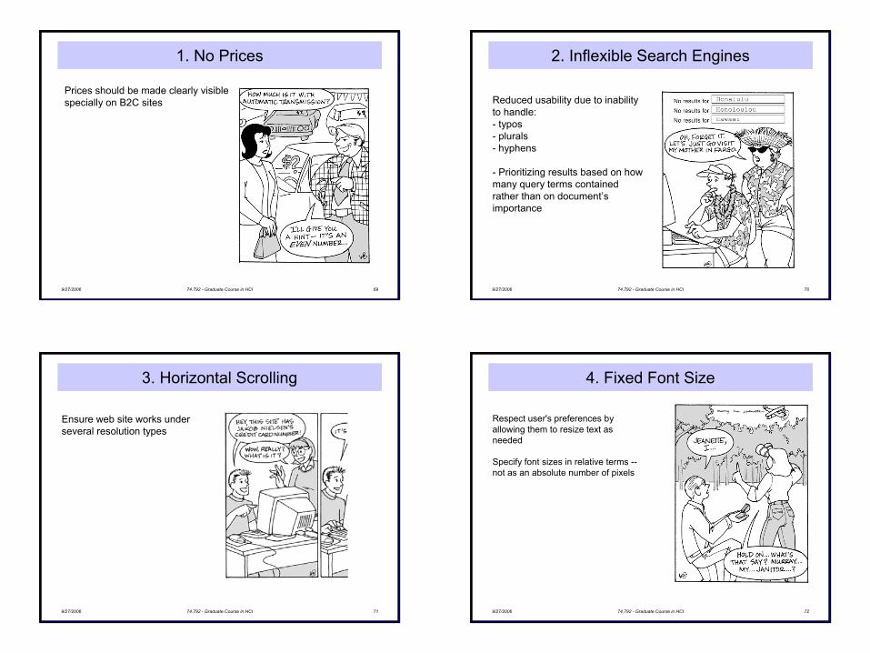
1. No Prices
Prices should be made clearly visiblespecially on B2C sites
9/27/2006 74.792 - Graduate Course in HCI 70
2. Inflexible Search Engines
Reduced usability due to inability to handle:- typos- plurals - hyphens
- Prioritizing results based on how many query terms contained rather than on document’s importance
9/27/2006 74.792 - Graduate Course in HCI 71
3. Horizontal Scrolling
Ensure web site works under several resolution types
9/27/2006 74.792 - Graduate Course in HCI 72
4. Fixed Font Size
Respect user's preferences by allowing them to resize text as needed
Specify font sizes in relative terms --not as an absolute number of pixels
19
9/27/2006 74.792 - Graduate Course in HCI 73
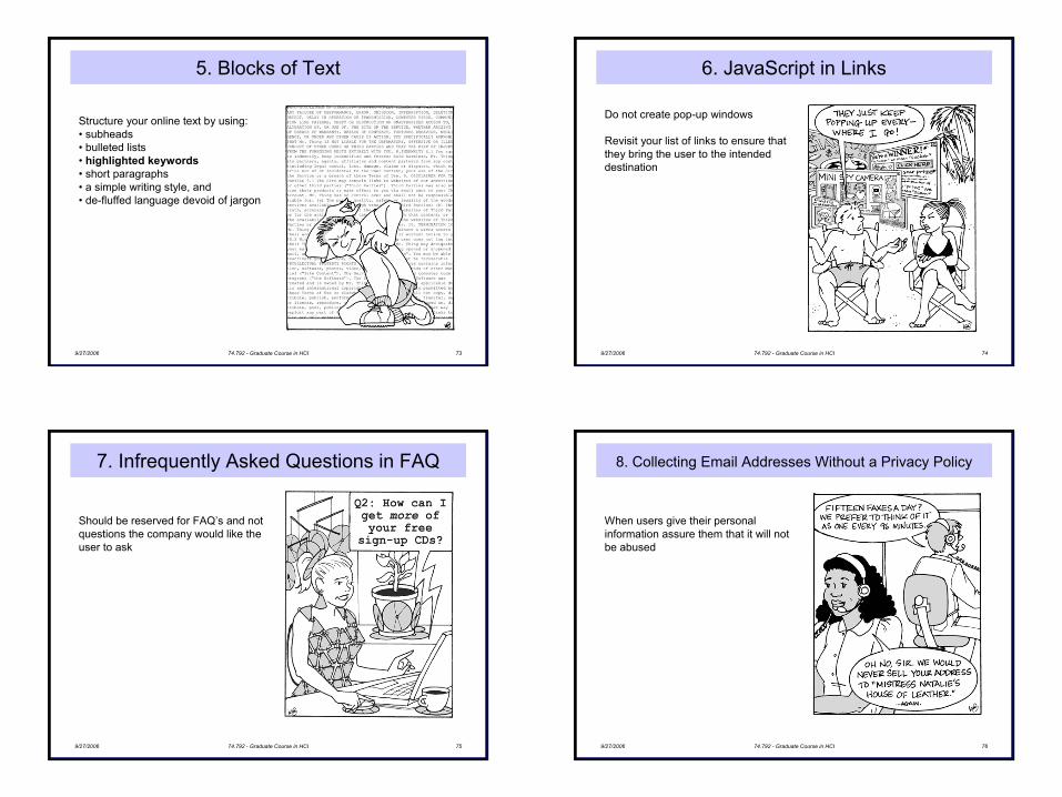
5. Blocks of Text
Structure your online text by using:• subheads • bulleted lists • highlighted keywords• short paragraphs • a simple writing style, and • de-fluffed language devoid of jargon
9/27/2006 74.792 - Graduate Course in HCI 74
6. JavaScript in Links
Do not create pop-up windows
Revisit your list of links to ensure that they bring the user to the intended destination
9/27/2006 74.792 - Graduate Course in HCI 75
7. Infrequently Asked Questions in FAQ
Should be reserved for FAQ’s and not questions the company would like the user to ask
9/27/2006 74.792 - Graduate Course in HCI 76
8. Collecting Email Addresses Without a Privacy Policy
When users give their personal information assure them that it will not be abused
20
9/27/2006 74.792 - Graduate Course in HCI 77
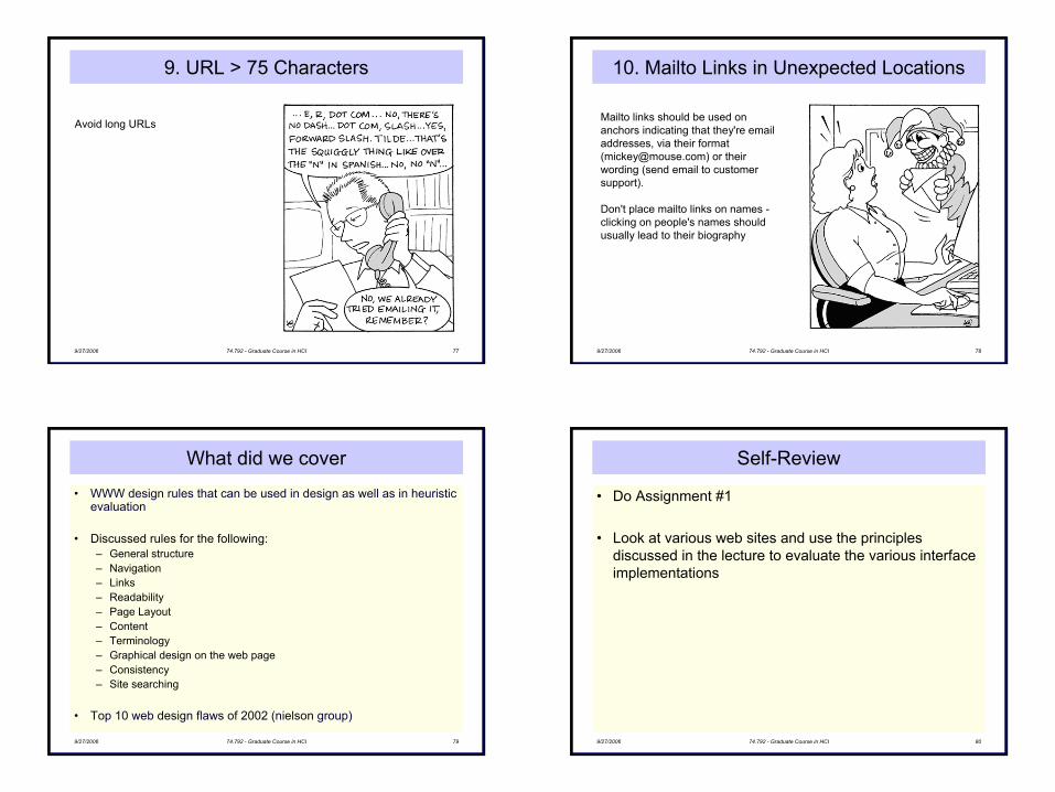
9. URL > 75 Characters
Avoid long URLs
9/27/2006 74.792 - Graduate Course in HCI 78
10. Mailto Links in Unexpected Locations
Mailto links should be used on anchors indicating that they're email addresses, via their format ([email protected]) or their wording (send email to customer support).
Don't place mailto links on names -clicking on people's names should usually lead to their biography
9/27/2006 74.792 - Graduate Course in HCI 79
What did we cover
• WWW design rules that can be used in design as well as in heuristic evaluation
• Discussed rules for the following:– General structure– Navigation– Links– Readability– Page Layout– Content– Terminology– Graphical design on the web page– Consistency– Site searching
• Top 10 web design flaws of 2002 (nielson group)
9/27/2006 74.792 - Graduate Course in HCI 80
Self-Review
• Do Assignment #1
• Look at various web sites and use the principles discussed in the lecture to evaluate the various interface implementations
21
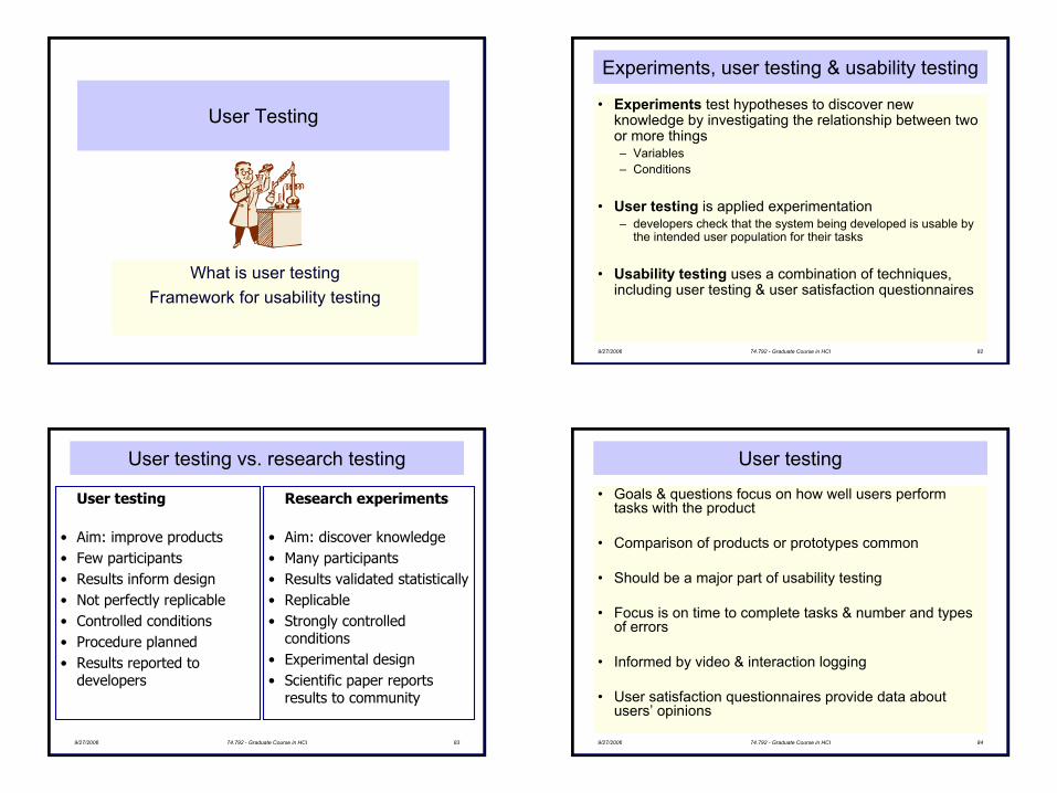
User Testing
What is user testingFramework for usability testing
9/27/2006 74.792 - Graduate Course in HCI 82
Experiments, user testing & usability testing
• Experiments test hypotheses to discover new knowledge by investigating the relationship between two or more things– Variables– Conditions
• User testing is applied experimentation – developers check that the system being developed is usable by
the intended user population for their tasks
• Usability testing uses a combination of techniques, including user testing & user satisfaction questionnaires
9/27/2006 74.792 - Graduate Course in HCI 83
User testing vs. research testing
User testing
• Aim: improve products• Few participants• Results inform design• Not perfectly replicable• Controlled conditions• Procedure planned• Results reported to
developers
Research experiments
• Aim: discover knowledge• Many participants• Results validated statistically • Replicable• Strongly controlled
conditions• Experimental design• Scientific paper reports
results to community
9/27/2006 74.792 - Graduate Course in HCI 84
User testing
• Goals & questions focus on how well users perform tasks with the product
• Comparison of products or prototypes common
• Should be a major part of usability testing
• Focus is on time to complete tasks & number and types of errors
• Informed by video & interaction logging
• User satisfaction questionnaires provide data about users’ opinions
22
9/27/2006 74.792 - Graduate Course in HCI 85
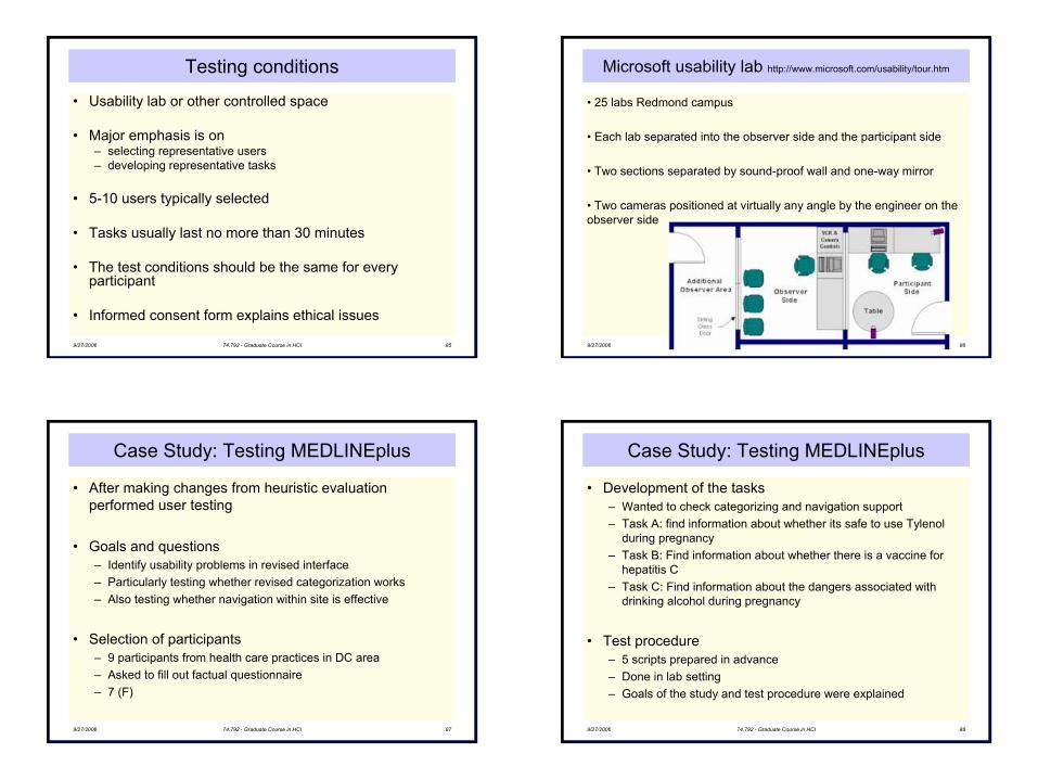
Testing conditions
• Usability lab or other controlled space
• Major emphasis is on– selecting representative users– developing representative tasks
• 5-10 users typically selected
• Tasks usually last no more than 30 minutes
• The test conditions should be the same for every participant
• Informed consent form explains ethical issues
9/27/2006 74.792 - Graduate Course in HCI 86
Microsoft usability lab http://www.microsoft.com/usability/tour.htm
• 25 labs Redmond campus
• Each lab separated into the observer side and the participant side
• Two sections separated by sound-proof wall and one-way mirror
• Two cameras positioned at virtually any angle by the engineer on the observer side
9/27/2006 74.792 - Graduate Course in HCI 87
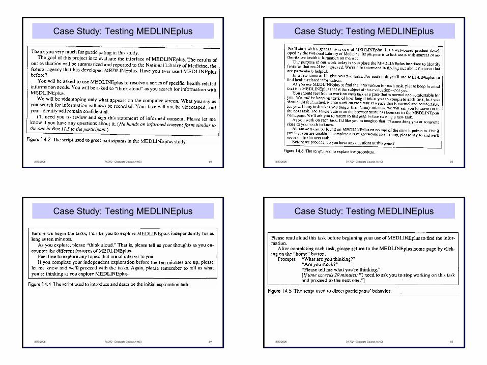
Case Study: Testing MEDLINEplus
• After making changes from heuristic evaluation performed user testing
• Goals and questions– Identify usability problems in revised interface– Particularly testing whether revised categorization works– Also testing whether navigation within site is effective
• Selection of participants– 9 participants from health care practices in DC area– Asked to fill out factual questionnaire– 7 (F)
9/27/2006 74.792 - Graduate Course in HCI 88
Case Study: Testing MEDLINEplus
• Development of the tasks– Wanted to check categorizing and navigation support– Task A: find information about whether its safe to use Tylenol
during pregnancy– Task B: Find information about whether there is a vaccine for
hepatitis C– Task C: Find information about the dangers associated with
drinking alcohol during pregnancy
• Test procedure– 5 scripts prepared in advance– Done in lab setting– Goals of the study and test procedure were explained
23
9/27/2006 74.792 - Graduate Course in HCI 89
Case Study: Testing MEDLINEplus
9/27/2006 74.792 - Graduate Course in HCI 90
Case Study: Testing MEDLINEplus
9/27/2006 74.792 - Graduate Course in HCI 91
Case Study: Testing MEDLINEplus
9/27/2006 74.792 - Graduate Course in HCI 92
Case Study: Testing MEDLINEplus
24
9/27/2006 74.792 - Graduate Course in HCI 93
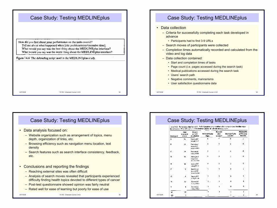
Case Study: Testing MEDLINEplus
9/27/2006 74.792 - Graduate Course in HCI 94
Case Study: Testing MEDLINEplus
• Data collection– Criteria for successfully completing each task developed in
advance• Participants had to find 3-9 URLs
– Search moves of participants were collected– Completion times automatically recorded and calculated from the
video and log data– Data collection contained:
• Start and completion times of tasks• Page count (i.e. pages accessed during the search task)• Medical publications accessed during the search task• Users’ search path• Negative comments, mannerisms• User satisfaction questionnaire data
9/27/2006 74.792 - Graduate Course in HCI 95
Case Study: Testing MEDLINEplus
• Data analysis focused on:– Website organization such as arrangement of topics, menu
depth, organization of links, etc.– Browsing efficiency such as navigation menu location, text
density– Search features such as search interface consistency, feedback,
etc.
• Conclusions and reporting the findings– Reaching external sites was often difficult– Analysis of search moves revealed that participants experienced
difficulty finding health topics devoted to different types of cancer– Post-test questionnaire showed opinion was fairly neutral– Rated well for ease of learning but poorly for ease of use
9/27/2006 74.792 - Graduate Course in HCI 96
Case Study: Testing MEDLINEplus
25
9/27/2006 74.792 - Graduate Course in HCI 97
Elements of user testing
• Adopt DECIDE framework
• Determine the goals and Explore the questions– Not suitable for testing prototypes– Goals can be broad but need more specific questions
• Can users complete a certain task within a certain time?• Can users find an item within a certain time frame?
• Choose the paradigm and techniques– “user testing” paradigm– Record data using a combination of video and interaction
logging, user satisfaction questionnaires, and interviews
9/27/2006 74.792 - Graduate Course in HCI 98
Types of data (Wilson & Wixon, ‘97)
• Identify practical issues - design typical tasks– Time to complete a task– Time to complete a task after a specified time away from the
product– Number and type of errors per task– Number of errors per unit of time– Number of navigations to online help or manuals– Number of users making a particular error– Number of users completing task successfully
9/27/2006 74.792 - Graduate Course in HCI 99
Creating tasks
• A task is designed to probe a problem
• Tasks should be straightforward and require the user to find certain items, or do certain operations
• They can be more complex such as solving particular problems
• Sample tasks for a weather network web site:– What is the forecasted weather for Winnipeg?– What is air quality in Los Angeles today?– What is the level of humidity in Winnipeg?– What is the forecast for Ottawa for the upcoming weekend?
9/27/2006 74.792 - Graduate Course in HCI 100
Elements of user testing
• Identify practical issues – select typical users– make sure you have appropriate representation
• i.e. e-recipe primarily for families but 90% sample are single people
• Identify practical issues – prepare testing conditions– Lab preferably
• Identify practical issues – plan to run tests– Have scripts in place– Test equipment– Have recording material prepared
• Deal with ethical issues– Consent form
26
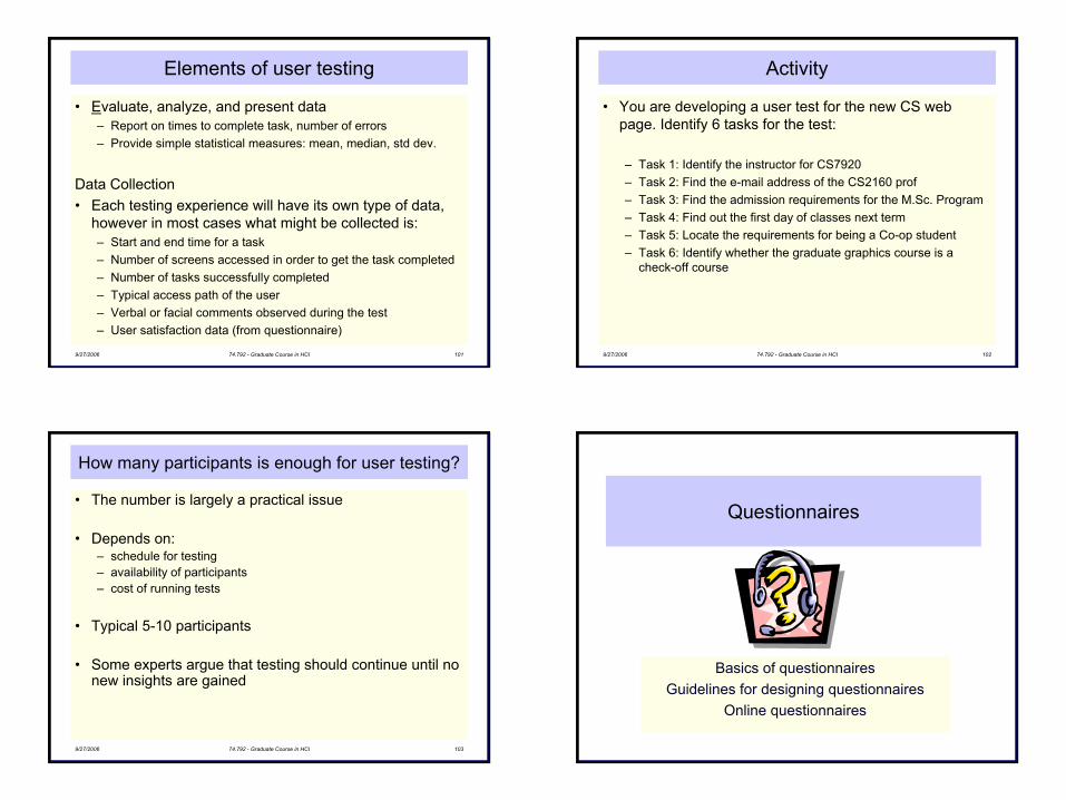
9/27/2006 74.792 - Graduate Course in HCI 101
Elements of user testing
• Evaluate, analyze, and present data– Report on times to complete task, number of errors– Provide simple statistical measures: mean, median, std dev.
Data Collection• Each testing experience will have its own type of data,
however in most cases what might be collected is:– Start and end time for a task– Number of screens accessed in order to get the task completed– Number of tasks successfully completed– Typical access path of the user– Verbal or facial comments observed during the test– User satisfaction data (from questionnaire)
9/27/2006 74.792 - Graduate Course in HCI 102
Activity
• You are developing a user test for the new CS web page. Identify 6 tasks for the test:
– Task 1: Identify the instructor for CS7920– Task 2: Find the e-mail address of the CS2160 prof– Task 3: Find the admission requirements for the M.Sc. Program– Task 4: Find out the first day of classes next term– Task 5: Locate the requirements for being a Co-op student– Task 6: Identify whether the graduate graphics course is a
check-off course
9/27/2006 74.792 - Graduate Course in HCI 103
How many participants is enough for user testing?
• The number is largely a practical issue
• Depends on:– schedule for testing– availability of participants– cost of running tests
• Typical 5-10 participants
• Some experts argue that testing should continue until no new insights are gained
Questionnaires
Basics of questionnairesGuidelines for designing questionnaires
Online questionnaires
27
9/27/2006 74.792 - Graduate Course in HCI 105
Definition
• A method for the elicitation, recording, and collecting of information about user satisfaction of your design
• Method: used as a tool– What do I need to find out and how best to do this– Once I get the information how do I analyze and make
conclusions from it
• Elicitation: starts of a process of discovery in the user’s mind; encourages the user to think about aspects of their work in relation to your tools– How did I use the features? was I effective and efficient?– Am I satisfied by using this?
9/27/2006 74.792 - Graduate Course in HCI 106
Definition
• Recording: user’s responses have to be recorded to be analyzed– Writing the answers, on a form– Audio/video
• Collecting: – Defines the purpose of the questionnaire
• Can restrict the respondent to think of a particular aspect of the system in a specific way:– Close-ended create more bias– Open-ended contains less bias
9/27/2006 74.792 - Graduate Course in HCI 107
Careful design
• Effort and skill required to ensure that questions are properly worded and that data can be easily analyzed– advantage of questionnaire over structured interviews is that
they can be distributed to a larger number of people– use structured interviews when you want immediate feedback,
and in situations in which people will not fill out questionnaire
9/27/2006 74.792 - Graduate Course in HCI 108
Types of questions
• Factual-type• Opinion-type• Attitude
28
9/27/2006 74.792 - Graduate Course in HCI 109
Types of questions
• Factual-type– public, observable information that is tedious or inconvenient to
get any other way• age, gender, etc.• number of years respondent has been working with computers• education received by the respondent • how many times did the computer break down in a two-hour session• how quickly did a user complete a certain task
– Spend time and effort to ensure information collected is accurate– Inspect how much bias are obtained with the answers
• Wording of questions
9/27/2006 74.792 - Graduate Course in HCI 110
Types of questions
• Opinion-type– Ask respondents what they think about a feature– Direct the thought of the respondent outwards, towards people or
artifacts in the world out there – No right or wrong answer, all we have to do is give the strength
of our feeling: • do we like it or not, or which do we prefer? • do we prefer feature A or feature B?
– Not concerned with subtleties of thought in the respondent; concerned with finding out how popular something is
– Responses to opinion questions can be checked against actual behavior of people, usually, in retrospect
• ‘Wow! The tool was lot less easier than we imagined it would be!’
9/27/2006 74.792 - Graduate Course in HCI 111
Types of questions
• Attitude– what are their attitudes working with a particular product they
have experience with – Focus on the respondent's attention to inner selves, to their
internal response to events and situations in their lives– attitudes working with a particular system can be divided up into
attitudes concerning: • The user's feeling of being efficient • The degree to which the user likes the system • How helpful the user feels the system is • To what extent the user feels in control of the interactions • Does the user feel they can learn more about the system by using it
– We can't directly cross-check attitude results against behaviors in the way we can with factual and opinion type questions
– check for internal consistency, i.e. repeated statements9/27/2006 74.792 - Graduate Course in HCI 112
Advantages
• Feedback is from the point of view of the user– If reliable a trustworthy sample of what you (will) get from your
whole user population
• Quick and cost effective to administer
• Can gather a lot of data using questionnaires as surveys
• Can be used to cross check quantitative targets from usability studies
• Measures can be independent of the system, users, or tasks to which the questionnaire was applied– compare usability of a word processor with e-mail– ease of use of application by a novice vs. expert user
29
9/27/2006 74.792 - Graduate Course in HCI 113
Disadvantages
• Only gives a feeling for user's perceived reaction
• Questions related to time measurement or frequency of event occurrence not usually reliably answered
• Good for subjective but not performance measures – more reliably gathered using direct event and time recording
techniques
• Usually designed for a limited number of situations ($)– cannot give details of what is right or wrong with the application – can get you near to the issues but never right on
• Subjective data must be enhanced with performance, mental effort, and effectiveness– ask, why? talking to the users and observing them
9/27/2006 74.792 - Graduate Course in HCI 114
Reliability and validity
• Reliability: – ability to give the same results when filled out by like-minded
people in similar circumstances– Expressed on a numerical scale from zero (very unreliable) to
one (extremely reliable.)
• Validity: – degree to which you are measuring/collecting data about what
you think it should be measuring/collecting data about– Prone to not only opinion surveys but also factual questionnaires
• could have serious validity issues if respondents interpret the questions differently
9/27/2006 74.792 - Graduate Course in HCI 115
Reliability and validity
• Use pre-designed questionnaires when possible
• Avoid quick & dirty questionnaires altogether
• Could have developed a good questionnaire by chance but most likely not if quickly put together– could be insensitive to differences between versions of software,
releases, etc. may not show significant differences. – does it fail to show differences because they do not actually
exist, or is it simply because your questionnaire is insensitiveand unreliable?
• Are differences due to bias or due to one version being better
9/27/2006 74.792 - Graduate Course in HCI 116
Open-ended/Close-ended
• Closed-ended questionnaire no room for individual comments – Respondent replies to a set of questions in terms of pre-set
responses– Responses can then be coded as numbers– How do you eliminate bias?– How to carefully select questions?
• Open-ended questionnaire requests respondent to reply to questions in their own words– possibly suggest topics to which replies may be given– Ideal type is a 'critical incident' type of open ended-ness in which
respondents explain: • several good or bad experiences• circumstances which led up to them• what happened after
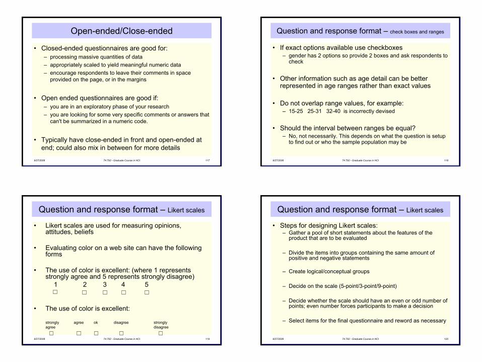
30
9/27/2006 74.792 - Graduate Course in HCI 117
Open-ended/Close-ended
• Closed-ended questionnaires are good for:– processing massive quantities of data– appropriately scaled to yield meaningful numeric data– encourage respondents to leave their comments in space
provided on the page, or in the margins
• Open ended questionnaires are good if: – you are in an exploratory phase of your research – you are looking for some very specific comments or answers that
can't be summarized in a numeric code.
• Typically have close-ended in front and open-ended at end; could also mix in between for more details
9/27/2006 74.792 - Graduate Course in HCI 118
Question and response format – check boxes and ranges
• If exact options available use checkboxes– gender has 2 options so provide 2 boxes and ask respondents to
check
• Other information such as age detail can be better represented in age ranges rather than exact values
• Do not overlap range values, for example:– 15-25 25-31 32-40 is incorrectly devised
• Should the interval between ranges be equal? – No, not necessarily. This depends on what the question is setup
to find out or who the sample population may be
9/27/2006 74.792 - Graduate Course in HCI 119
Question and response format – Likert scales
• Likert scales are used for measuring opinions, attitudes, beliefs
• Evaluating color on a web site can have the following forms
• The use of color is excellent: (where 1 represents strongly agree and 5 represents strongly disagree)
1 2 3 4 5
• The use of color is excellent:
strongly agree ok disagree strongly agree disagree
9/27/2006 74.792 - Graduate Course in HCI 120
Question and response format – Likert scales
• Steps for designing Likert scales:– Gather a pool of short statements about the features of the
product that are to be evaluated
– Divide the items into groups containing the same amount of positive and negative statements
– Create logical/conceptual groups
– Decide on the scale (5-point/3-point/9-point)
– Decide whether the scale should have an even or odd number of points; even number forces participants to make a decision
– Select items for the final questionnaire and reword as necessary
31
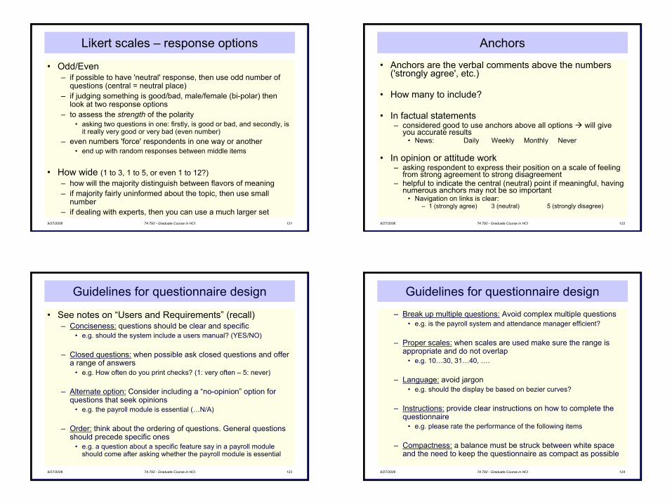
9/27/2006 74.792 - Graduate Course in HCI 121
Likert scales – response options
• Odd/Even– if possible to have 'neutral' response, then use odd number of
questions (central = neutral place)– if judging something is good/bad, male/female (bi-polar) then
look at two response options– to assess the strength of the polarity
• asking two questions in one: firstly, is good or bad, and secondly, is it really very good or very bad (even number)
– even numbers 'force' respondents in one way or another• end up with random responses between middle items
• How wide (1 to 3, 1 to 5, or even 1 to 12?)– how will the majority distinguish between flavors of meaning– if majority fairly uninformed about the topic, then use small
number– if dealing with experts, then you can use a much larger set
9/27/2006 74.792 - Graduate Course in HCI 122
Anchors
• Anchors are the verbal comments above the numbers ('strongly agree', etc.)
• How many to include?
• In factual statements – considered good to use anchors above all options will give
you accurate results• News: Daily Weekly Monthly Never
• In opinion or attitude work– asking respondent to express their position on a scale of feeling
from strong agreement to strong disagreement– helpful to indicate the central (neutral) point if meaningful, having
numerous anchors may not be so important• Navigation on links is clear:
– 1 (strongly agree) 3 (neutral) 5 (strongly disagree)
9/27/2006 74.792 - Graduate Course in HCI 123
Guidelines for questionnaire design
• See notes on “Users and Requirements” (recall)– Conciseness: questions should be clear and specific
• e.g. should the system include a users manual? (YES/NO)
– Closed questions: when possible ask closed questions and offer a range of answers
• e.g. How often do you print checks? (1: very often – 5: never)
– Alternate option: Consider including a “no-opinion” option for questions that seek opinions
• e.g. the payroll module is essential (…N/A)
– Order: think about the ordering of questions. General questions should precede specific ones
• e.g. a question about a specific feature say in a payroll moduleshould come after asking whether the payroll module is essential
9/27/2006 74.792 - Graduate Course in HCI 124
Guidelines for questionnaire design
– Break up multiple questions: Avoid complex multiple questions• e.g. is the payroll system and attendance manager efficient?
– Proper scales: when scales are used make sure the range is appropriate and do not overlap
• e.g. 10…30, 31…40, ….
– Language: avoid jargon • e.g. should the display be based on bezier curves?
– Instructions: provide clear instructions on how to complete the questionnaire
• e.g. please rate the performance of the following items
– Compactness: a balance must be struck between white space and the need to keep the questionnaire as compact as possible
32
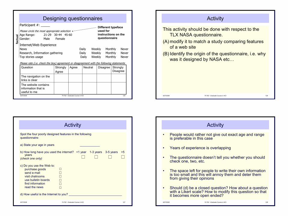
9/27/2006 74.792 - Graduate Course in HCI 125
Participant #: _____
Please circle the most appropriate selectionAge Range: 21-29 30-44 45-60Gender: Male Female
Internet/Web ExperienceNews Daily Weekly Monthly NeverResearch, Information gathering Daily Weekly Monthly NeverTop stories usage Daily Weekly Monthly Never
Please rate (i.e. check the box) agreement or disagreement with the following statements
The website contains information that is useful to me
The navigation on the links is clear
Strongly Disagree
DisagreeNeutralAgreeStronglyAgree
Question
Different typeface used for instructions on the questionnaire
Designing questionnairesfa
ctua
l
9/27/2006 74.792 - Graduate Course in HCI 126
Activity
This activity should be done with respect to the TLX NASA questionnaire.
(A) modify it to match a study comparing features of a web site
(B) Identify the origin of the questionnaire, i.e. why was it designed by NASA etc…
9/27/2006 74.792 - Graduate Course in HCI 127
Spot the four poorly designed features in the following questionnaire:
a) State your age in years ____________
b) How long have you used the internet? <1 year 1-3 years 3-5 years >5 years
(check one only)
c) Do you use the Web to:purchase goodssend e-mailvisit chatroomsuse bulletin boardsfind informationread the news
d) How useful is the Internet to you? ________________________________
Activity
9/27/2006 74.792 - Graduate Course in HCI 128
Activity
• People would rather not give out exact age and range is preferable in this case
• Years of experience is overlapping
• The questionnaire doesn’t tell you whether you should check one, two, etc.
• The space left for people to write their own information is too small and this will annoy them and deter them from giving their opinions
• Should (d) be a closed question? How about a question with a Likert scale? How to modify this question so that it becomes more open ended?
33
9/27/2006 74.792 - Graduate Course in HCI 129
Analyzing questionnaire data
• Helps to think of analysis of questionnaire even before its design
– Present results clearly - tables can be used for proper structure
– Simple statistics can say a lot, e.g., mean, median, mode, standard deviation
– Percentages are useful but give population size
– Bar graphs show categorical data well
– More advanced statistics can be used if needed
9/27/2006 74.792 - Graduate Course in HCI 130
Exercise
• You have been asked to compare user performance and preferences with two different computer science web sites. Design a questionnaire to find out what the users think of the system. How would you go about comparing user performance with these two systems?
Hints:• Questions to ask yourself:
– What information is required from the questionnaire?– How is the questionnaire to be analyzed?
9/27/2006 74.792 - Graduate Course in HCI 131
What did we cover
• Questions can be closed or open
• Closed questions are easiest to analyze, and may be done by computer
• Can be administered to large populations
• Paper, email & the web used for dissemination
• Advantage of electronic questionnaires is that data goes into a data base & is easy to analyze
• Sampling can be a problem when the size of a population is unknown as is common online
9/27/2006 74.792 - Graduate Course in HCI 132
Self-review questions
• Design a questionnaire for the web site you evaluated in assignment #1. Imagine that the questionnaire will be given to a range of users who depend on information from that site.