graphing in excel on the mac - michigan astronomy · graphing in excel on the mac quick reference...
TRANSCRIPT
Graphing in excel on the Mac Quick Reference for people who just need a reminder
The easiest thing is to have a single series, with y data in the column to the left of the x-data.
Select the data and click the Chart Wizard button.
Make a “XY (scatter)” graph
If you need to add more series, click the series tab, then click “Add”. Name your series, then select the data for the x axis, then for the y axis.
Don’t forget units when you label the axes.
You only need a legend if you have more than one series.
To prepare the chart for printing, double click the background and choose “No Fill”, then double click a data point and de-select “shadow”.
To add a trendline, control click on a data point or go to the Chart menu and select “Add Trendline”
Double click to edit the trendline.
“Display Equation on chart” is under the “options” tab.
For more detailed instructions see one of the sections below: Making a graph with data in 2 adjacent columns Making a graph with multiple series or in non-adjacent or out of order columns Best-Fit lines (aka trendlines) Formatting for printing
Multiple series Page 2 of 15
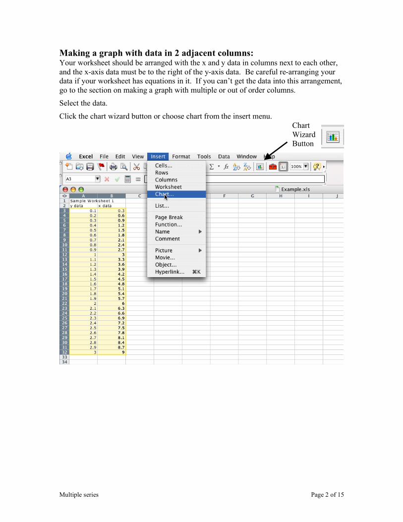
Making a graph with data in 2 adjacent columns: Your worksheet should be arranged with the x and y data in columns next to each other, and the x-axis data must be to the right of the y-axis data. Be careful re-arranging your data if your worksheet has equations in it. If you can’t get the data into this arrangement, go to the section on making a graph with multiple or out of order columns.
Select the data.
Click the chart wizard button or choose chart from the insert menu.
Chart Wizard Button
Multiple series Page 3 of 15
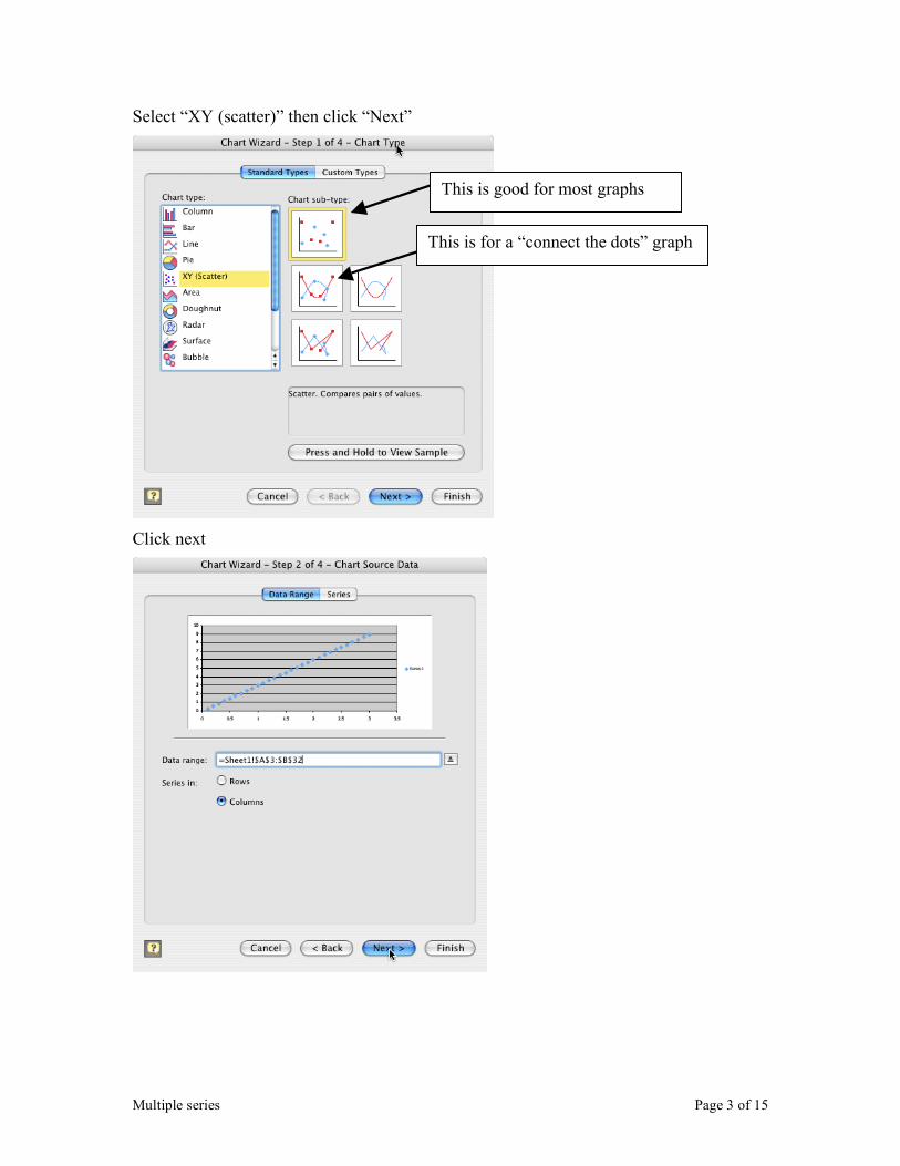
Select “XY (scatter)” then click “Next”
Click next
This is good for most graphs
This is for a “connect the dots” graph
Multiple series Page 4 of 15
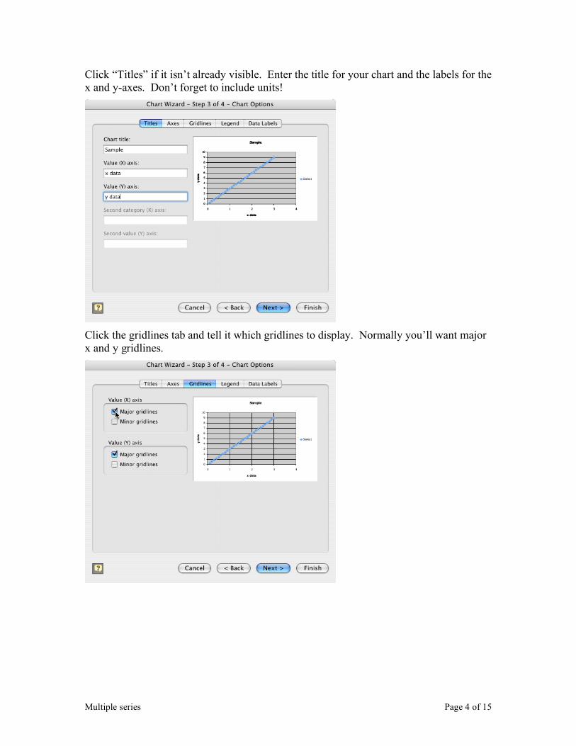
Click “Titles” if it isn’t already visible. Enter the title for your chart and the labels for the x and y-axes. Don’t forget to include units!
Click the gridlines tab and tell it which gridlines to display. Normally you’ll want major x and y gridlines.
Multiple series Page 5 of 15
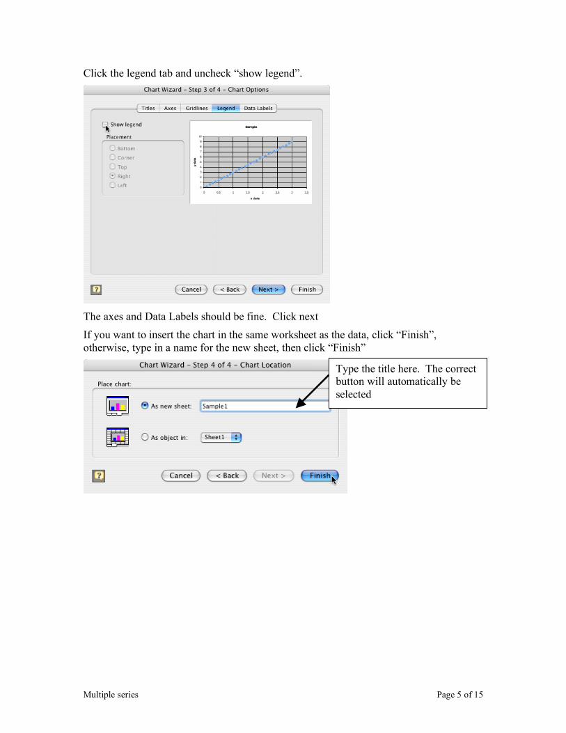
Click the legend tab and uncheck “show legend”.
The axes and Data Labels should be fine. Click next
If you want to insert the chart in the same worksheet as the data, click “Finish”, otherwise, type in a name for the new sheet, then click “Finish”
Type the title here. The correct button will automatically be selected
Multiple series Page 6 of 15
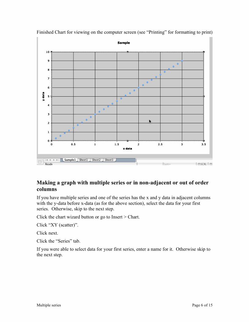
Finished Chart for viewing on the computer screen (see “Printing” for formatting to print)
Making a graph with multiple series or in non-adjacent or out of order columns
If you have multiple series and one of the series has the x and y data in adjacent columns with the y-data before x-data (as for the above section), select the data for your first series. Otherwise, skip to the next step.
Click the chart wizard button or go to Insert > Chart.
Click “XY (scatter)”.
Click next.
Click the “Series” tab.
If you were able to select data for your first series, enter a name for it. Otherwise skip to the next step.
Multiple series Page 7 of 15
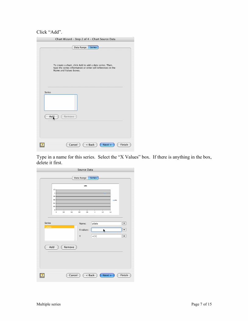
Click “Add”.
Type in a name for this series. Select the “X Values” box. If there is anything in the box, delete it first.
Multiple series Page 8 of 15
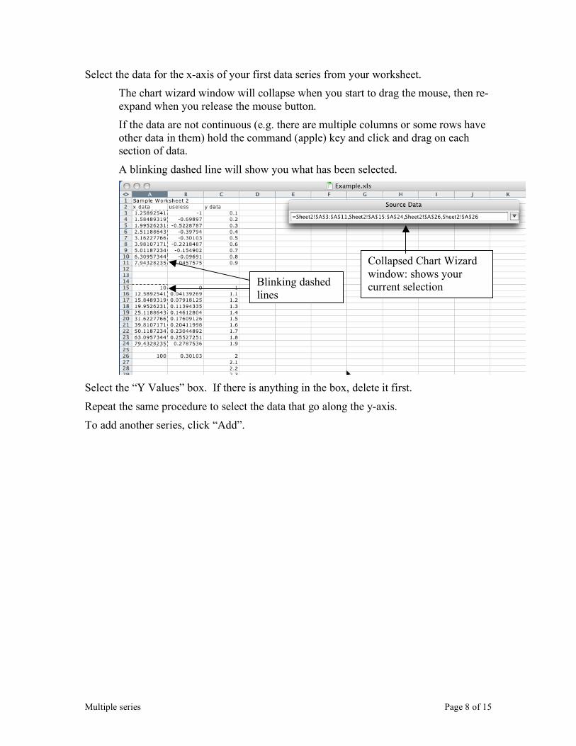
Select the data for the x-axis of your first data series from your worksheet.
The chart wizard window will collapse when you start to drag the mouse, then re-expand when you release the mouse button.
If the data are not continuous (e.g. there are multiple columns or some rows have other data in them) hold the command (apple) key and click and drag on each section of data.
A blinking dashed line will show you what has been selected.
Select the “Y Values” box. If there is anything in the box, delete it first.
Repeat the same procedure to select the data that go along the y-axis.
To add another series, click “Add”.
Blinking dashed lines
Collapsed Chart Wizard window: shows your current selection
Multiple series Page 9 of 15
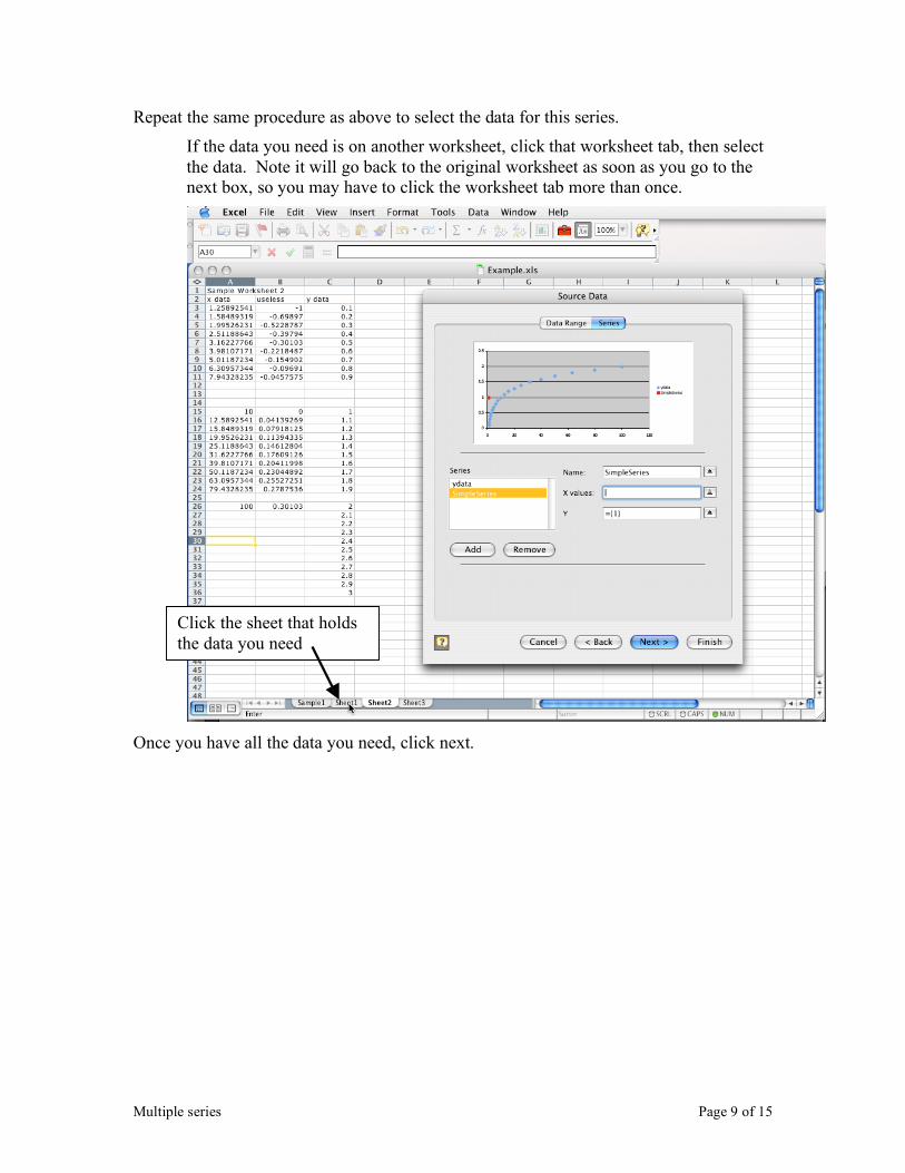
Repeat the same procedure as above to select the data for this series.
If the data you need is on another worksheet, click that worksheet tab, then select the data. Note it will go back to the original worksheet as soon as you go to the next box, so you may have to click the worksheet tab more than once.
Once you have all the data you need, click next.
Click the sheet that holds the data you need
Multiple series Page 10 of 15
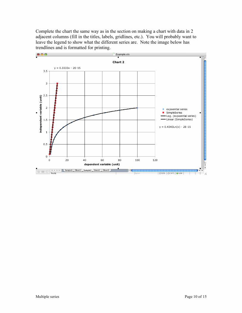
Complete the chart the same way as in the section on making a chart with data in 2 adjacent columns (fill in the titles, labels, gridlines, etc.). You will probably want to leave the legend to show what the different series are. Note the image below has trendlines and is formatted for printing.
Trendline Page 11 of 15
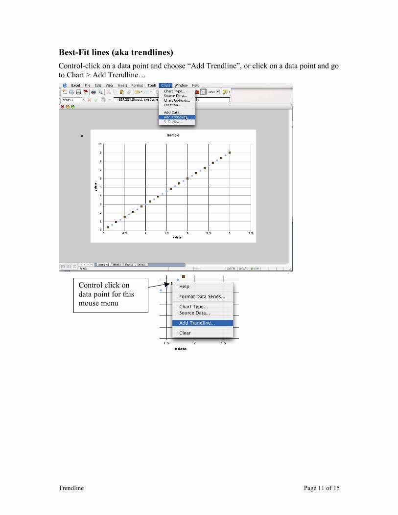
Best-Fit lines (aka trendlines)
Control-click on a data point and choose “Add Trendline”, or click on a data point and go to Chart > Add Trendline…
Control click on data point for this mouse menu

Trendline Page 12 of 15
If you know what kind of trendline you want, select it from the window. Otherwise, select one that looks good.
Under the “Options” tab, check “Display equation on chart”
Click OK
To make changes, double click on the trendline (but not on a data point). You can change the kind of line under “Type”. “Display equation on chart” is available under “Options”. You can change the appearance under “Colors and Lines”
If the equation is in an inconvenient spot (e.g. covering a data point) simply click and drag it around.
Trendline Page 13 of 15
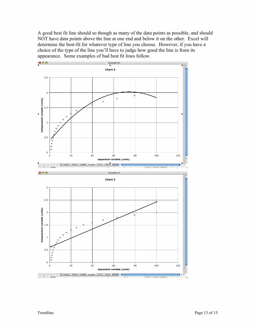
A good best fit line should so though as many of the data points as possible, and should NOT have data points above the line at one end and below it on the other. Excel will determine the best-fit for whatever type of line you choose. However, if you have a choice of the type of the line you’ll have to judge how good the line is from its appearance. Some examples of bad best fit lines follow.
Trendline Page 14 of 15
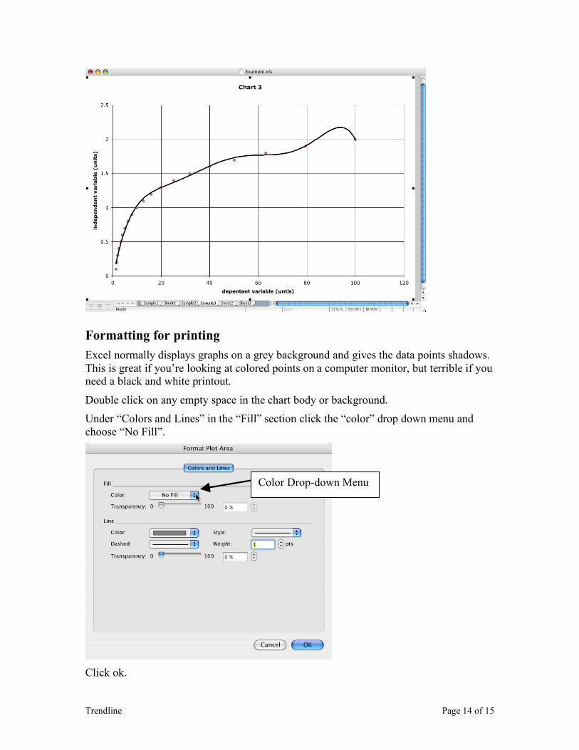
Formatting for printing
Excel normally displays graphs on a grey background and gives the data points shadows. This is great if you’re looking at colored points on a computer monitor, but terrible if you need a black and white printout.
Double click on any empty space in the chart body or background.
Under “Colors and Lines” in the “Fill” section click the “color” drop down menu and choose “No Fill”.
Click ok.
Color Drop-down Menu
Trendline Page 15 of 15
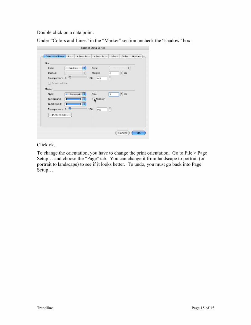
Double click on a data point.
Under “Colors and Lines” in the “Marker” section uncheck the “shadow” box.
Click ok.
To change the orientation, you have to change the print orientation. Go to File > Page Setup… and choose the “Page” tab. You can change it from landscape to portrait (or portrait to landscape) to see if it looks better. To undo, you must go back into Page Setup…