graphic design (processes & evaluation)
TRANSCRIPT

Graphic Design Processes & Evaluations
Thursday, 26 June 14
2
App Icon(in-direct advertising)
Thursday, 26 June 14
3
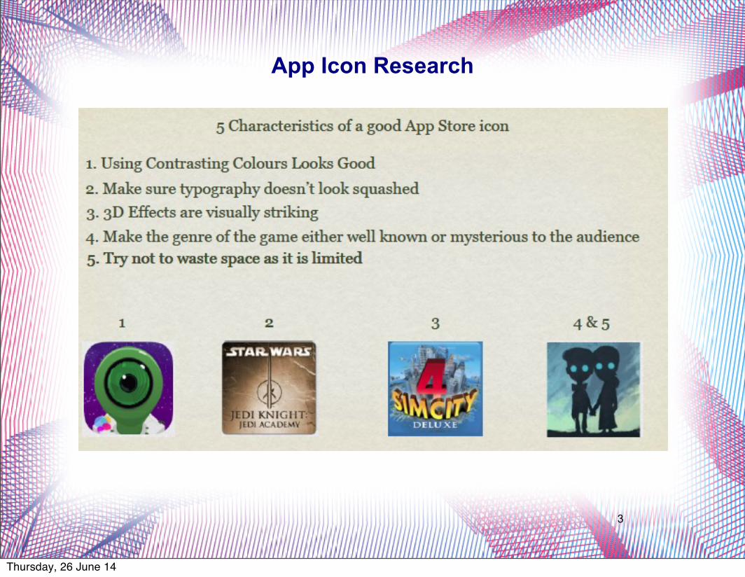
App Icon Research
Thursday, 26 June 14

4
Looking at a fewiphone screens ofpeople in my class Ithen came to aconclusion aboutwhat sort of appspeople, in my targetaudience for mygame, would buy.You have youobvious socialnetworking appsand fast food apps.
I feel like these appsthat I have chosenare a fairly closerepresentation ofwhat my targetaudience wouldalready own interms of Apps.
Thursday, 26 June 14

5
Thursday, 26 June 14

6
5 Rough Ideas
Thursday, 26 June 14

7
Feedback Idea 1
Thursday, 26 June 14
8
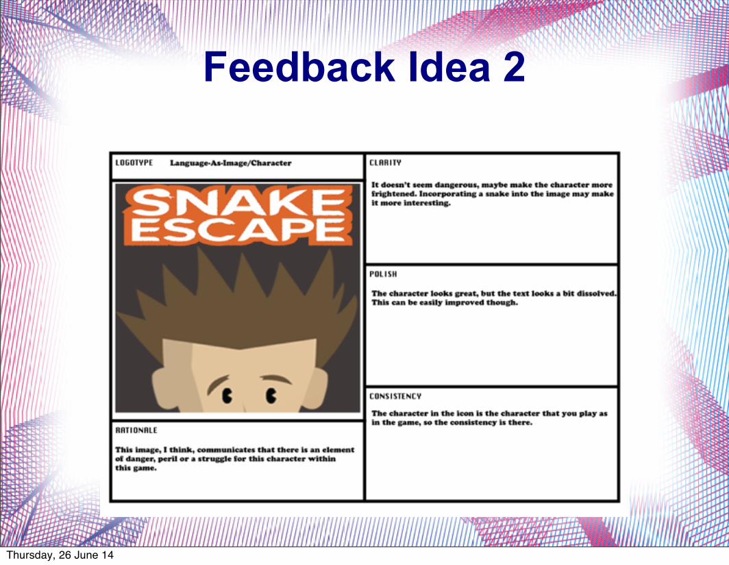
Feedback Idea 2
Thursday, 26 June 14
9
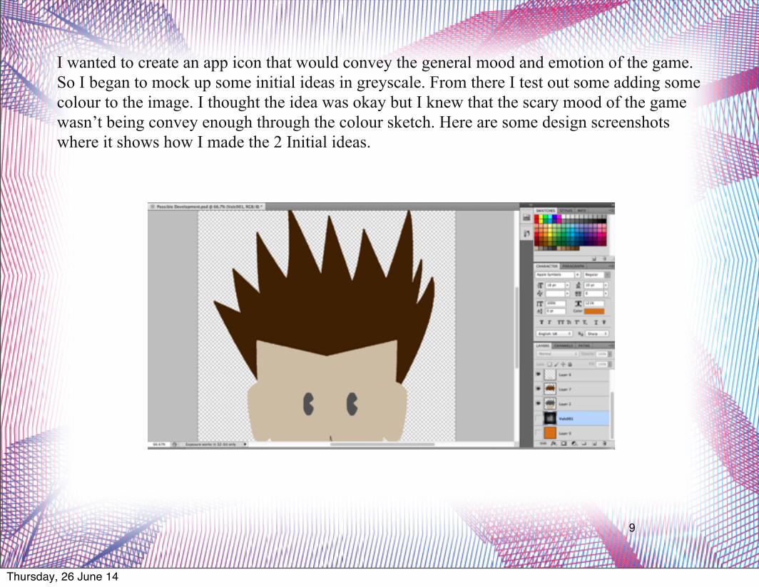
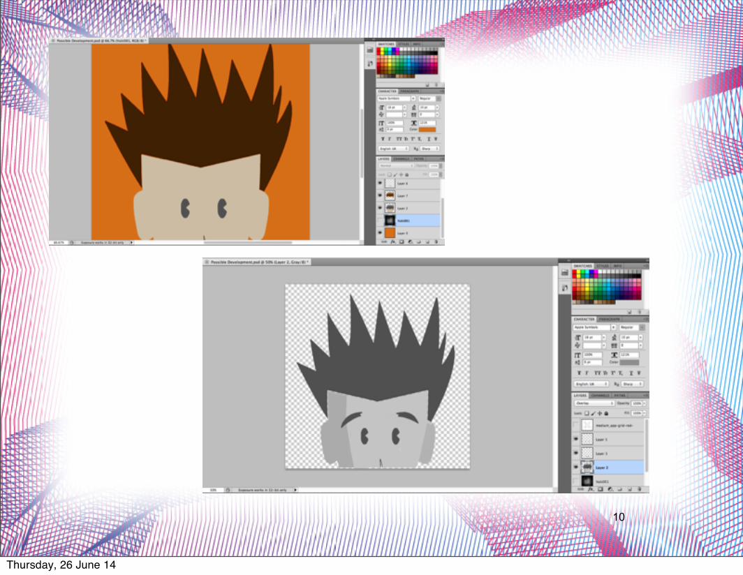
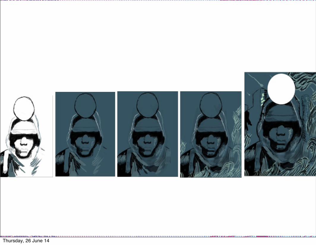
I wanted to create an app icon that would convey the general mood and emotion of the game. So I began to mock up some initial ideas in greyscale. From there I test out some adding some colour to the image. I thought the idea was okay but I knew that the scary mood of the game wasn’t being convey enough through the colour sketch. Here are some design screenshots where it shows how I made the 2 Initial ideas.
Thursday, 26 June 14
10
Thursday, 26 June 14
11
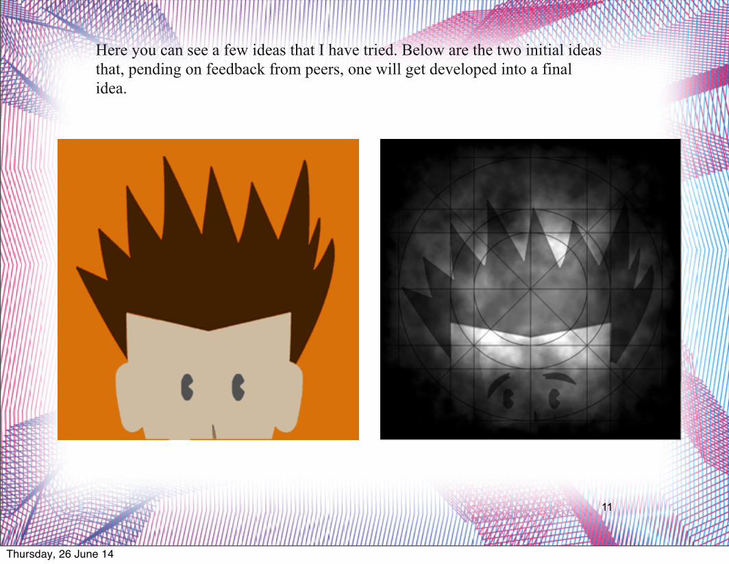
Here you can see a few ideas that I have tried. Below are the two initial ideas that, pending on feedback from peers, one will get developed into a final idea.
Thursday, 26 June 14
12
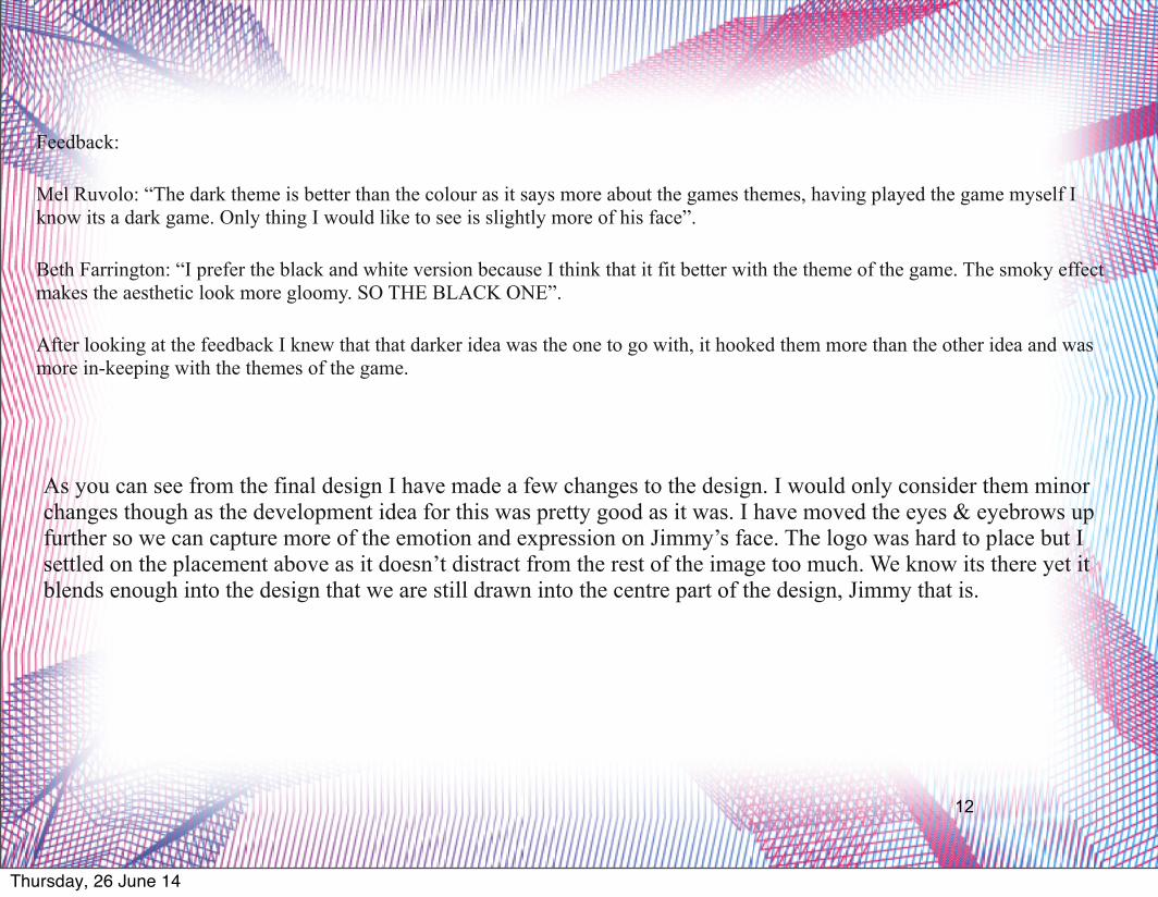
Feedback:
Mel Ruvolo: “The dark theme is better than the colour as it says more about the games themes, having played the game myself I know its a dark game. Only thing I would like to see is slightly more of his face”.
Beth Farrington: “I prefer the black and white version because I think that it fit better with the theme of the game. The smoky effect makes the aesthetic look more gloomy. SO THE BLACK ONE”.
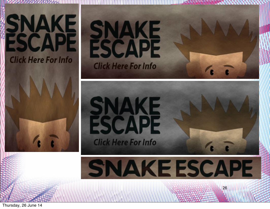
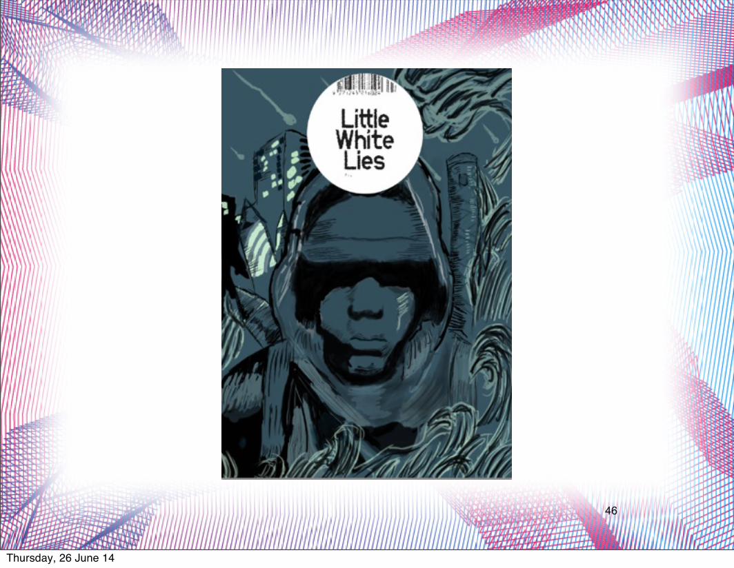
After looking at the feedback I knew that that darker idea was the one to go with, it hooked them more than the other idea and was more in-keeping with the themes of the game.
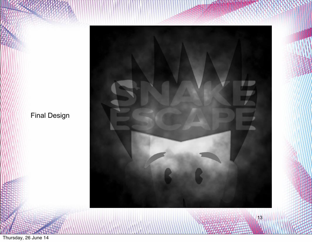
As you can see from the final design I have made a few changes to the design. I would only consider them minor changes though as the development idea for this was pretty good as it was. I have moved the eyes & eyebrows up further so we can capture more of the emotion and expression on Jimmy’s face. The logo was hard to place but I settled on the placement above as it doesn’t distract from the rest of the image too much. We know its there yet it blends enough into the design that we are still drawn into the centre part of the design, Jimmy that is.
Thursday, 26 June 14
13
Final Design
Thursday, 26 June 14
14
T-shirt(Direct advertising)
Thursday, 26 June 14

15
T-Shirt Research
Thursday, 26 June 14

16
Thursday, 26 June 14
17
I started with trying to make a simple design with an element from the game that only people who have played the game will understand. My initial idea was take influence from fashion and create a small logo, to try and create a sort of Lyle & Scott Tee. And this was my initial idea.
I then received feedback which basically suggested I change design direction to fit more in-line with my logo and web banners
Feedback:
Ryan Worcester – “It is clear that the dark, cloudy texture fits well with your other marketing products such as your website banners and the app icon itself. I would suggest keeping the t-shirt design greyscale, as i feel that the website banners that use little colours work better and also links your marketing products to your app icon design. I feel you should continue to use the cloudy texture on your tshirt design.
I basically after this point started from scratch. As the app icon was such a strong design for me, I wanted to carry the theme of that a long. So I began work on the T-shirt. I only wanted to do one T-shirt as variation in T-shirt designs are so common and so I wanted to refrain from creating so many different styles and just put all my effort into one. The reason why was because I though If i create similar advertising assets because it would make my brand more recognisable and uniformed. So I began to implement my app icon, with some obvious
Thursday, 26 June 14
18
Thursday, 26 June 14

19
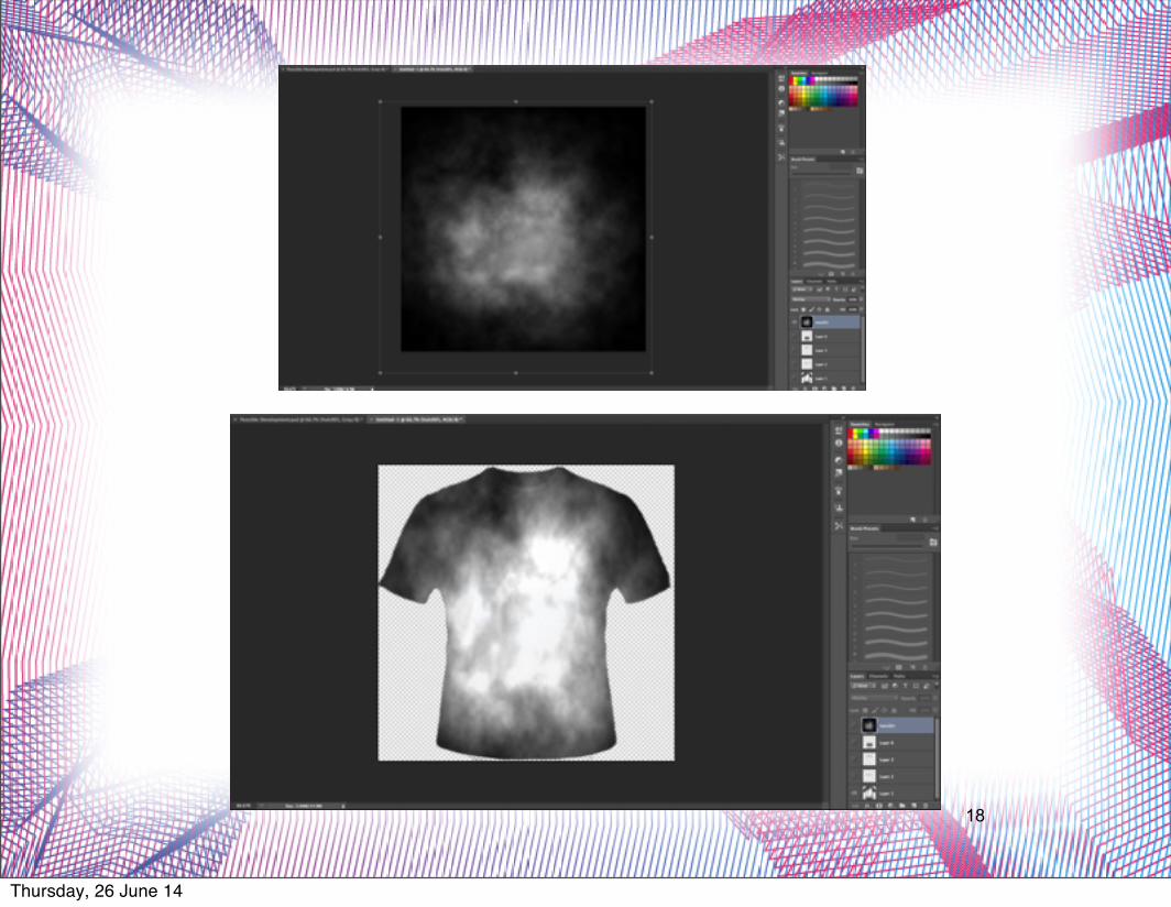
The images above will give you a fairly good idea about the main design processes and techniques used to create the t-shirt. The end result follows the same style as the app icon logo and the web banners.
Thursday, 26 June 14
20
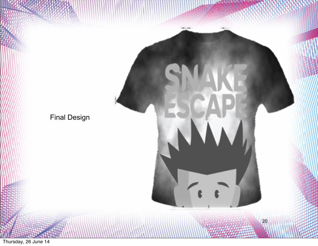
Final Design
Thursday, 26 June 14
21
Web Banner(Direct advertising)
Thursday, 26 June 14
22
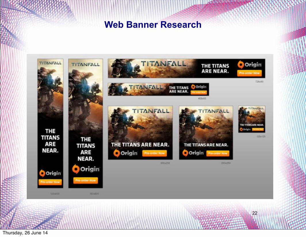
Web Banner Research
Thursday, 26 June 14

23
I first went about finding out about the different web banners and the official dimensions they had to be. It was when I then stumbled upon this image that basically told me the dimensions I should use. As you can see there are a lot on there so I didn't create all of them.
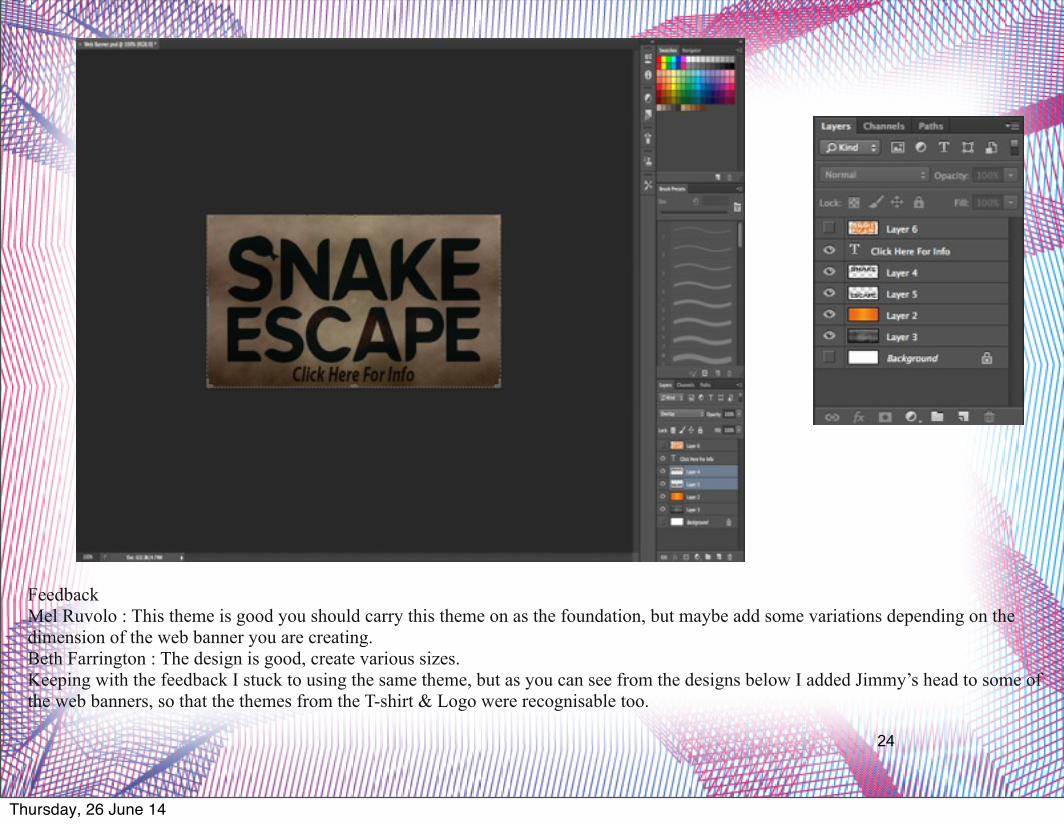
From then on the basis for all my designs were started in one photoshop file then once I had all the elements in the photoshop file such as the logo, the texture and colour I would transfer and resize it on another psd to create a web banner with the desired dimensions. The screen grabs below show my initial design and the layers they were on. s
Thursday, 26 June 14
24
Feedback Mel Ruvolo : This theme is good you should carry this theme on as the foundation, but maybe add some variations depending on the dimension of the web banner you are creating.Beth Farrington : The design is good, create various sizes.Keeping with the feedback I stuck to using the same theme, but as you can see from the designs below I added Jimmy’s head to some of the web banners, so that the themes from the T-shirt & Logo were recognisable too.
Thursday, 26 June 14
25
Final Designs
Thursday, 26 June 14
26
Thursday, 26 June 14

27
Thursday, 26 June 14
28
Discount Code Leaflet(Promotion)
Thursday, 26 June 14
29
Thursday, 26 June 14

30
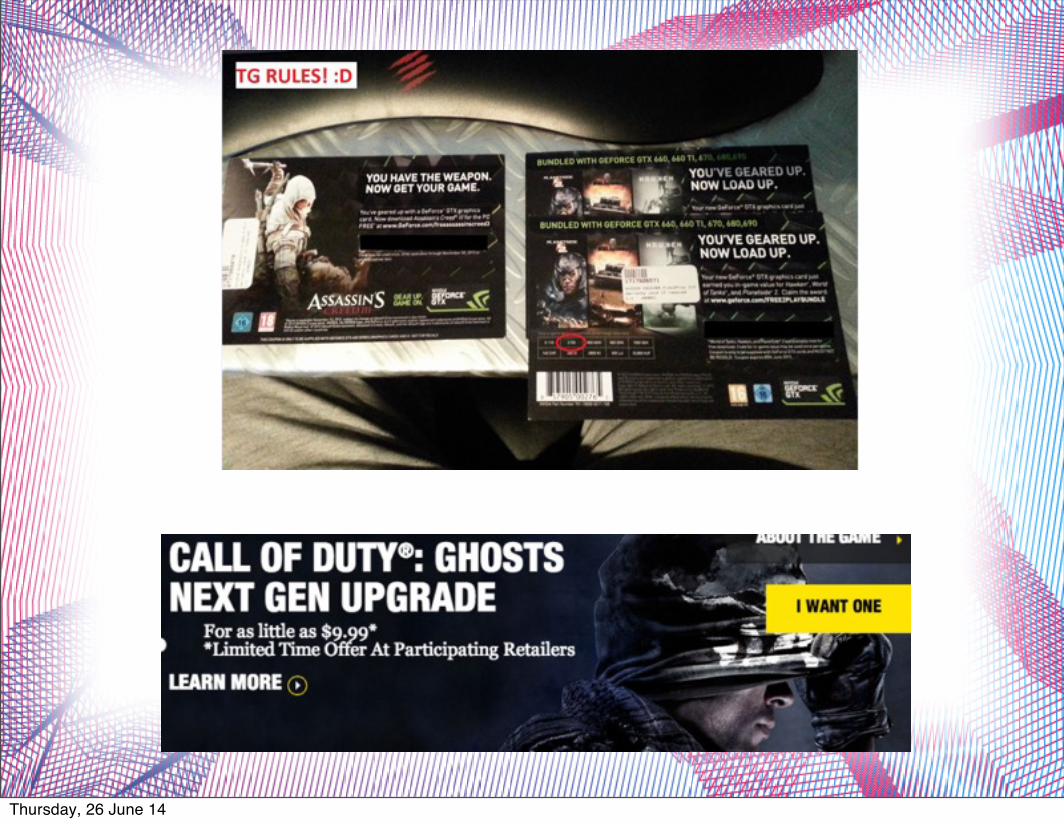
One thing that is apparently obvious from researching various discount code leaflets for games etc. Is that they appear to jus re-use a lot of assets form previous graphic design products. In some cases I've just seen them use the cover image, much like the Call of Duty : Ghosts discount code, and put that on the poster. This seems to be a good way of getting your message across, making sure that your brand is identifiable from its recognisable artwork, in a cost effective way. Which if you are a small company, like us, then that is always beneficial.
Thursday, 26 June 14

31
I wanted to create something that in practical wouldn’t be a huge leaflet, as I believe that puts some people off when your handing them out. So I created I thought that a good dimension to follow would be the 720/300 (w/h) that I used for the web banner. I wanted to try and keep a theme going with the discount code design. As its a form of physical marketing and something that a potential customer can hold in their hands. I thought I would make it very accessible for them to get the game but I just didn’t know how.
With that in mind this was the initial design that I created, following the same theme as the web banners. Its visually striking and catches people attention.
Thursday, 26 June 14
32
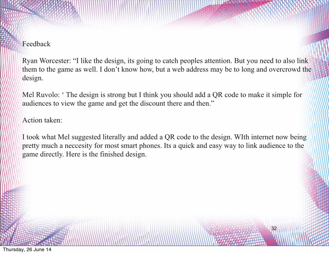
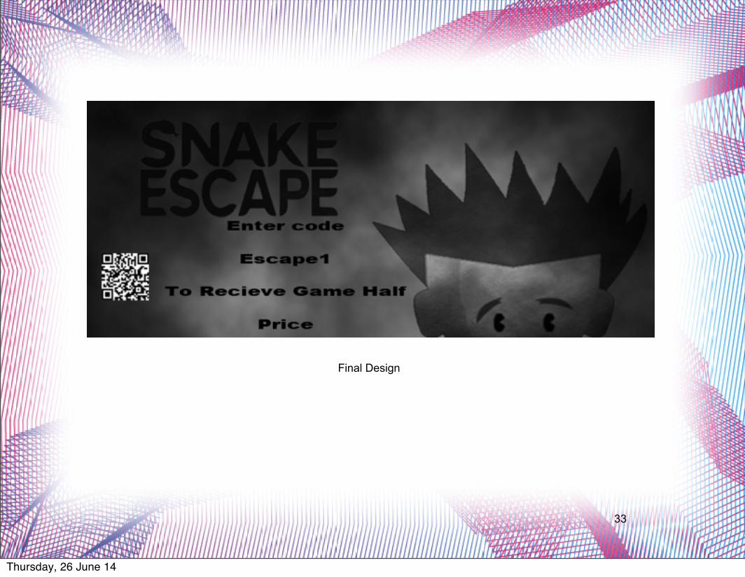
Feedback
Ryan Worcester: “I like the design, its going to catch peoples attention. But you need to also link them to the game as well. I don’t know how, but a web address may be to long and overcrowd the design.
Mel Ruvolo: ‘ The design is strong but I think you should add a QR code to make it simple for audiences to view the game and get the discount there and then.”
Action taken:
I took what Mel suggested literally and added a QR code to the design. WIth internet now being pretty much a neccesity for most smart phones. Its a quick and easy way to link audience to the game directly. Here is the finished design.
Thursday, 26 June 14
33
Final Design
Thursday, 26 June 14
Little White LiesCover
34
Thursday, 26 June 14
35
Thursday, 26 June 14
36
Thursday, 26 June 14
37
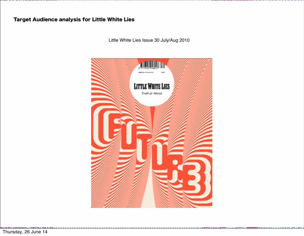
Little White Lies Issue 30 July/Aug 2010
Target Audience analysis for Little White Lies
Thursday, 26 June 14
38
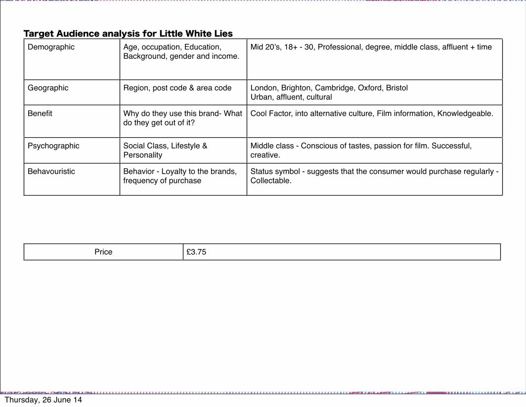
Demographic Age, occupation, Education, Background, gender and income.
Mid 20’s, 18+ - 30, Professional, degree, middle class, affluent + time
Geographic Region, post code & area code London, Brighton, Cambridge, Oxford, BristolUrban, affluent, cultural
Benefit Why do they use this brand- What do they get out of it?
Cool Factor, into alternative culture, Film information, Knowledgeable.
Psychographic Social Class, Lifestyle & Personality
Middle class - Conscious of tastes, passion for film. Successful, creative.
Behavouristic Behavior - Loyalty to the brands, frequency of purchase
Status symbol - suggests that the consumer would purchase regularly - Collectable.
Price £3.75
Target Audience analysis for Little White Lies
Thursday, 26 June 14
39
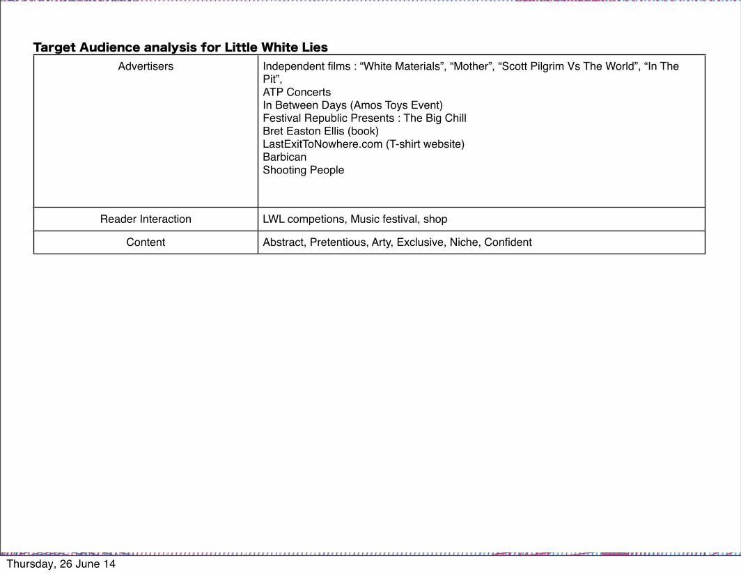
Advertisers Independent films : “White Materials”, “Mother”, “Scott Pilgrim Vs The World”, “In The Pit”, ATP ConcertsIn Between Days (Amos Toys Event)Festival Republic Presents : The Big ChillBret Easton Ellis (book)LastExitToNowhere.com (T-shirt website)BarbicanShooting People
Reader Interaction LWL competions, Music festival, shop
Content Abstract, Pretentious, Arty, Exclusive, Niche, Confident
Target Audience analysis for Little White Lies
Thursday, 26 June 14

40
Degree Educated “Mature” “Truth & Movies”, Sophisticated design, for the middle & upper class demographic. Compared to the bold, loud and disjointed design of Total Film & Empire which is more for the average movie watcher, but not enthusiast.
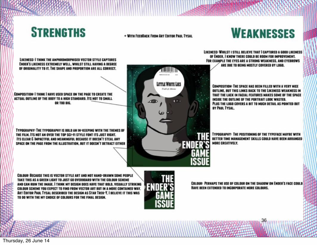
Why does the design of the Little White Lies Cover appeal to the target audience identified?
Thursday, 26 June 14
41
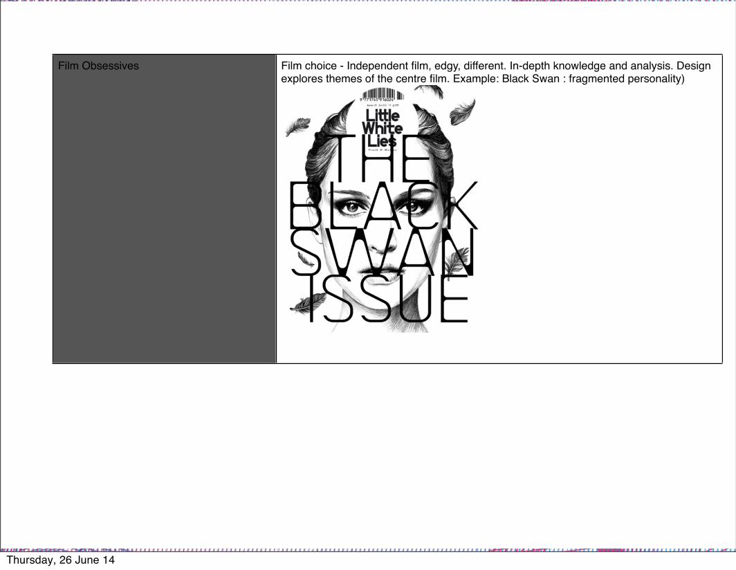
Film Obsessives Film choice - Independent film, edgy, different. In-depth knowledge and analysis. Design explores themes of the centre film. Example: Black Swan : fragmented personality)
Thursday, 26 June 14

42
Design led creative Creative, hand drawn, craft gone into the magazine, cover finish- spot, embossed. The barcode has been embedded into the logo, they have taken the ugliest part of any magazine and turned it into one of the most appealing an beautiful parts of the magazine.
Exclusive for “In The Know” Knows what its about, not trying to sell to the mass market: Confident alternative design to match the alternative movies they are reviewing.
Alternative Culture Alternative films, doesn’t try and sell itself too much. Doesn’t look like an ordinary film magazine. Design is quite challenging.
Thursday, 26 June 14
43
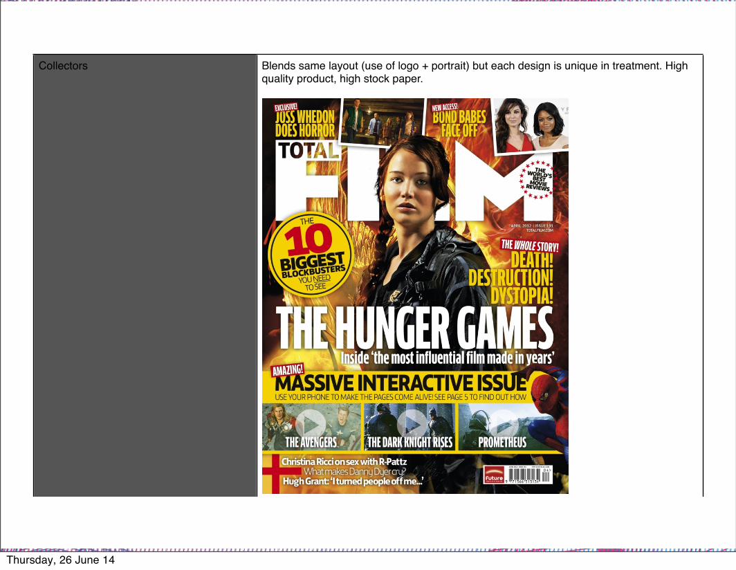
Collectors Blends same layout (use of logo + portrait) but each design is unique in treatment. High quality product, high stock paper.
Thursday, 26 June 14

44
Thursday, 26 June 14
45
Thursday, 26 June 14
46
Thursday, 26 June 14

47
“It’s time for a change” Man Of Steel. Title stands out and eye catching. Font is cleverly done in that classic superman style font.100 Greatest Heroes and villians of
all time! Increases the value of this issue. Not every issue do they do a top 100 something of all time.
Additional information about other films, along the right hand side provide a very clean structured look to the cover. These additional tag lines could be dotted about all over the cover.The top of the cover provides an
example heroes and villains in this issue. Gets the audience hooked, hopefully enough to make them buy the issue and read on.
Additional information uses to hollywood stars names as a means to draw readers to the issue. E.G if you look Ryan Gosling there is an article about him in the magazine.
Thursday, 26 June 14
48
Thursday, 26 June 14
49
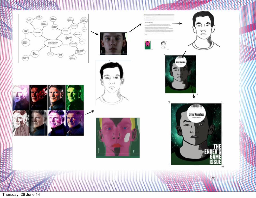
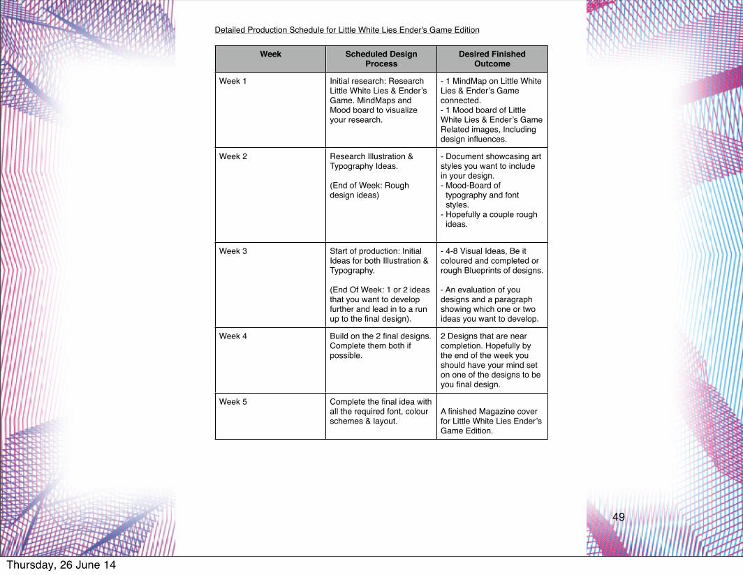
Detailed Production Schedule for Little White Lies Ender's Game Edition
Week Scheduled Design Process
Desired Finished Outcome
Week 1 Initial research: Research Little White Lies & Ender’s Game. MindMaps and Mood board to visualize your research.
- 1 MindMap on Little White Lies & Ender’s Game connected.- 1 Mood board of Little White Lies & Ender’s Game Related images, Including design influences.
Week 2 Research Illustration & Typography Ideas.
(End of Week: Rough design ideas)
- Document showcasing art styles you want to include in your design. - Mood-Board of
typography and font styles.
- Hopefully a couple rough ideas.
Week 3 Start of production: Initial Ideas for both Illustration & Typography.
(End Of Week: 1 or 2 ideas that you want to develop further and lead in to a run up to the final design).
- 4-8 Visual Ideas, Be it coloured and completed or rough Blueprints of designs.
- An evaluation of you designs and a paragraph showing which one or two ideas you want to develop.
Week 4 Build on the 2 final designs. Complete them both if possible.
2 Designs that are near completion. Hopefully by the end of the week you should have your mind set on one of the designs to be you final design.
Week 5 Complete the final idea with all the required font, colour schemes & layout.
A finished Magazine cover for Little White Lies Ender’s Game Edition.
Thursday, 26 June 14