graphic design
TRANSCRIPT

2 CHAP TER 1: ABOU T GR APHIC DE SIGN
CH01_G2GD_Santoro_final_rev.indd 2 10/29/12 9:01 PM

CHAPTER OBJEC TIVES
AF TE R R E AD I N G TH I S CHAP TE R , YO U S H O U LD B E AB LE TO :
• Sequence the heritage of graphic design, beginning with early cave paintings, noting the first use of the term, and continuing through to present times.
• Summarize the many categories of graphic design.
• Describe what it means to be a graphic designer.
• Distinguish art forms and theories that have influenced the development of graphic design.
• Sequence the steps of the design process, from the first contact with a client to the finished work.
• Characterize the basic components of a graphic design solution.
• Exercises and Projects
Research categories of graphic design; critique graphic designs; design a T-shirt using text and image; visually document and present a business through the eyes of a graphic designer.
3
1
About Graphic Design
The field uses the two words graphic and design because of the dual nature of its process. Successful design solutions stimulate viewers intellectually and move them emotionally by including both familiar and surprising elements. As a result, a design communication can not only explain some-thing to an audience but also affect that group on another level.
If you apply this complex thinking to your design process, the results will reflect your intentions, and your messages will be clear. A website is user friendly when its pages are attractive and its navigation simple; a book’s content might be more accessible when its cover presents an expressive visual metaphor; a building is easier to navigate when the architect has applied a logical system of signage to its passageways. Each of these situations presents a unique communication problem, solved with specific design approaches.
Being a designer also involves finding ways to reveal the beauty in something that others may not see and expressing a thought in an
raphic design is so much a part of our lives that at times it goes unnoticed. The layout of type and imagery on the page you’re reading right now is a key aspect of graphic design. This book was designed by organizing all the visual and textual information into a communicable message, an object bound between two covers. But if organizing were the only job of graphic designers, the computer would have replaced us by now.
Opposite page: KAREEm COllIE. Opening page (detail) for Man behind the Curtain (full image, see Figure 1.31).
G
I think design in essence has to have an authentic honesty built into it. The main goal is to convey something that makes a difference in other people’s lives. —Scott W. Santoro
Watch the Video on myartslab.com
CH01_G2GD_Santoro_final_rev.indd 3 10/29/12 9:01 PM

4 CHAP TER 1: ABOU T GR APHIC DE SIGN
unexpected way—a mission through which blending the useful with the aesthetically appealing has one primary goal—to communicate. For example, Rafael Esquer embraced the notion of giving instead of receiving by transforming a clothing collection bag into a typographic call to action (Figure 1.1). The fresh approach was also a declaration that read visually as “This idea is so clever, I want to help.” According to the designer, most people liked the design so much that they kept it as a laundry bag and sent their clothing donations in plain bags and boxes.
In another example, Pierre Bernard transformed the scaffolding for an architectural renovation into a sidewalk spectacle for the Centre Pompidou in Paris (Figure 1.2). A giant program listed the museum’s monthly events, and, after each event was over, it was manually crossed out by mountaineers hoisting themselves down on ropes. This creative idea made a simple calendar into a continually dramatic and entertain-ing performance. The designer found an idea and pushed it further than anyone would have expected. A graphic designer needs to be part artist, scientist, researcher, psychologist, and businessperson.
Design work incorporates aesthetics (to achieve notions of beauty) structure (to organize and arrange), emotion (to accentuate feelings), and
1.1 RAFAEl ESqUER. Clothing donation bag sent to clients for the holidays as a way to help people in need.
CH01_G2GD_Santoro_final_rev.indd 4 10/29/12 9:01 PM

1.2 PIERRE BERNARD, ATElIER DE
CRéATION GRAPHIqUE. For the Centre Pompidou renovation in Paris, a temporary system of signs was devised. Type was hoisted up, crossed out, and ultimately removed.
utility (for use). Whether designing for an individual, a small business, or a large corporation, the designer brings a degree of art, craft, intelligence, and intuition to every project.
Graphic designers often collaborate with writers, illustrators, pho-tographers, and printers, making for an energizing work environment. Clients sometimes invest large sums of money, and an audience of mil-lions just might see the designer’s work, but the most exciting aspect of the graphic designer’s job—and the most admirable one—is saying some-thing that matters, and saying it with both grace and intelligence.
Everything is design. Everything!
—Paul Rand
5
View a Closer Look for the Centre Pompidou on myartslab.com
CH01_G2GD_Santoro_final_rev.indd 5 10/29/12 9:01 PM

6 CHAP TER 1: ABOU T GR APHIC DE SIGN
Graphic Design’s Heritage
Graphic design (the art of conveying messages) has always been a part of us, even as far back as the early cave paintings of approximately 16,000 years ago. Scenes of the hunt—like the ones pictured at Lascaux—may have been more than merely decorative, possibly serving a number of purposes (Figure 1.3). One purpose may have been to literally describe the animals as an instruction manual might, picturing what to chase and what to avoid. Another likely purpose may have been to bring good for-tune by symbolically capturing the animals on the wall. Made with only burnt sticks and colored pigments, these beautifully executed designs could have motivated the hunting group and helped it to survive.
Fast-forwarding 14,000 years, a stone mosaic from Pompeii was used to communicate an important message: “Beware of the dog” (Figure 1.4). A ferocious dog perfectly translated into the black and white mosaic along with words of caution made its point clearly to visitors. Forward another 1,700 years to America’s first political cartoon, Join or Die, a woodcut by Benjamin Franklin (1706–1790) (Figure 1.5). Franklin’s wit and conviction can be seen in the design of a snake severed into eighths, each segment representing a British American colony or region. The design inspired colonial unity in a yet-to-be-born country.
Today, digital printing and electronic media have replaced cave wall paintings, mosaics, and woodcuts. But the functional aspect of graphic design is the same—to educate, symbolize, and even compel us to action.
Understanding graphic design in the context of its history is essen-tial to being a good designer. In Chapter 2, A Brief History of Graphic Design, you will come to see why this context is so important.
The Coining of the Term
The great book designer W. A. Dwiggins (1880–1956) coined the term “graphic design” in 1922. Since then, graphic design has grown into its own, legitimate profession. Dwiggins had it right in two ways. First by blending the words graphic and design, he better explained the pro-cess—graphic sensibility fused with planning and organizing. Second, by naming the profession, he categorized it as its own, legitimate activity.
Although graphic design had an association with commerce, just as printing, lettering, and the advertising trades did, it was no longer con-sidered a subcategory of those trades but a valid field in its own right. Dwiggins’s term was just abstract enough to encompass many kinds of design. (See the upcoming Excerpt from “The Name Game,” by Michael Worthington.) The categories of graphic design, as described in this chap-ter, all have their own particular practices, and what unites them is the process graphic designers go through to communicate a concept.
As you continue reading this book, you will see just how that con-cept of process applies to the art of graphic design. The field is as much
1.3 lascaux cave paintings, Dordogne, France.
1.4 Cave canem (beware of the dog) mosaic, Pompeii, Italy. late first century AD.
1.5 Benjamin Franklin’s political cartoon that appeared in the Pennsylvania Gazette, his American newspaper from 1754. In Franklin’s time, a superstition existed that a snake cut to pieces could be brought back to life if the pieces were put back together before sunset.
CH01_G2GD_Santoro_final_rev.indd 6 10/29/12 9:01 PM
GR APHIC DE SIGN’S HER ITAGE 7
ExcErpt: The Name Game by Michael Worthington (AIGA Journal, Vol. 16, No. 2, p. 37)
Eventually I realized it is the vagueness of the term “graphic design” that makes it so appropriate. The same reason my grandmother initially couldn’t understand that term is the very reason it works. It can cover myriad skills, cope with technological innovations and changes in the profession, but still refer to the larger concerns of visual communication, representation, and issues of creating meaning through content. This flexibility allows me to take on the role of an interface designer, website designer, or motion typographer, and add that knowledge to the variety of skills that currently fall under the title “graphic designer,” a term that itself is as unfinished and malleable as any digital piece of work.
about problem solving, clear thinking, and creativity as it is about the end result, the final design.
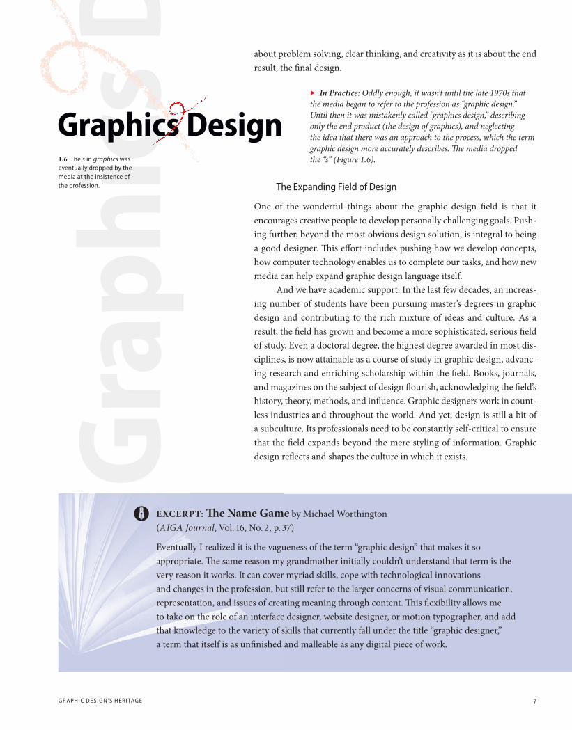
In Practice: Oddly enough, it wasn’t until the late 1970s that the media began to refer to the profession as “graphic design.” Until then it was mistakenly called “graphics design,” describing only the end product (the design of graphics), and neglecting the idea that there was an approach to the process, which the term graphic design more accurately describes. The media dropped the “s” (Figure 1.6).
The Expanding Field of Design
One of the wonderful things about the graphic design field is that it encourages creative people to develop personally challenging goals. Push-ing further, beyond the most obvious design solution, is integral to being a good designer. This effort includes pushing how we develop concepts, how computer technology enables us to complete our tasks, and how new media can help expand graphic design language itself.
And we have academic support. In the last few decades, an increas-ing number of students have been pursuing master’s degrees in graphic design and contributing to the rich mixture of ideas and culture. As a result, the field has grown and become a more sophisticated, serious field of study. Even a doctoral degree, the highest degree awarded in most dis-ciplines, is now attainable as a course of study in graphic design, advanc-ing research and enriching scholarship within the field. Books, journals, and magazines on the subject of design flourish, acknowledging the field’s history, theory, methods, and influence. Graphic designers work in count-less industries and throughout the world. And yet, design is still a bit of a subculture. Its professionals need to be constantly self-critical to ensure that the field expands beyond the mere styling of information. Graphic design reflects and shapes the culture in which it exists.
1.6 The s in graphics was eventually dropped by the media at the insistence of the profession.
Graphics Design
CH01_G2GD_Santoro_final_rev.indd 7 10/29/12 9:01 PM

8 CHAP TER 1: ABOU T GR APHIC DE SIGN
Graphic Design Categories
To varying degrees, the intent of design is to persuade, identify, or inform. A book jacket informs the viewer of the book’s content, persuades the reader to buy, and identifies the writer. The same is true in food packag-ing where persuasion, identity on the shelf, and information all matter. Even a geographical map’s organization and clarity requires the designer to decide on what to include and exclude as well as how to present the information. A clear map is more likely to be purchased and used than a confusing map.
A designer’s clients can range from a small, nonprofit organiza-tion in need of a few hundred educational posters (Figure 1.7) to a major corporation requiring a set of streamlined, easy-to-read forms that are printed in the millions (Figure 1.8). Take the time to get to know your clients as well as you can. It can help tremendously in producing a design that fits their needs. Each of the specialized areas of graphic design has its own particular problems to solve. The job of a publication design is not the same as that of a package design, for example. But with each project, it is you, the designer, who will bring a graphic sensibility to the final product.
Corporate Design
Corporations have large, internal design departments, hire independent design consultants, and devote relatively large amounts of money for their graphic design projects. Corporations need to project a consistent visual identity—one that brands a corporation into the minds (and hearts) of the general public.
1.7 DAvID PlUNKERT, SPUR DESIGN.
Posters for TurnAround, a nonprofit agency serving victims of sexual assault and domestic violence. 1.8 lANDOR ASSOCIATES.
FedEx Express airbill. FedEx servicemark used by permission.
CH01_G2GD_Santoro_final_rev.indd 8 10/29/12 9:01 PM
GR APHIC DE SIGN C ATEGO R IE S 9
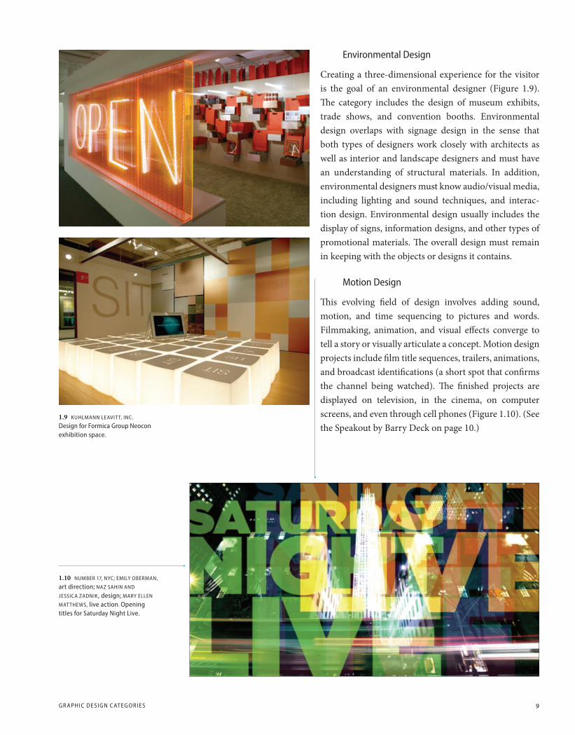
Environmental Design
Creating a three-dimensional experience for the visitor is the goal of an environmental designer (Figure 1.9). The category includes the design of museum exhibits, trade shows, and convention booths. Environmental design overlaps with signage design in the sense that both types of designers work closely with architects as well as interior and landscape designers and must have an understanding of structural materials. In addition, environmental designers must know audio/visual media, including lighting and sound techniques, and interac-tion design. Environmental design usually includes the display of signs, information designs, and other types of promotional materials. The overall design must remain in keeping with the objects or designs it contains.
motion Design
This evolving field of design involves adding sound, motion, and time sequencing to pictures and words. Filmmaking, animation, and visual effects converge to tell a story or visually articulate a concept. Motion design projects include film title sequences, trailers, animations, and broadcast identifications (a short spot that confirms the channel being watched). The finished projects are displayed on television, in the cinema, on computer screens, and even through cell phones (Figure 1.10). (See the Speakout by Barry Deck on page 10.)
1.9 KUHlmANN lEAvIT T, INC.
Design for Formica Group Neocon exhibition space.
1.10 NUmBER 17, NYC; EmIlY OBERmAN,
art direction; NAz SAHIN AND
JESSICA zADNIK, design; mARY EllEN
mATTHEWS, live action. Opening titles for Saturday Night live.
CH01_G2GD_Santoro_final_rev.indd 9 10/29/12 9:01 PM

10 CHAP TER 1: ABOU T GR APHIC DE SIGN
Interaction Design
Designers involved in this computer-based medium create user experi-ences through Internet browsers and touch-screen devices. Software allows for interaction through body movement and speech. This field is a quickly evolving one, and designers need to stay current with the latest software and hardware advancements. The field requires a working knowledge of programming languages (Figure 1.11).
Type Design
A type designer creates new letterforms and fonts (variations such as italic and bold) to develop a complete typeface family. The elements include let-ters, numerals, ligatures (where two letters are joined), and punctuation. The designer must have a sharp sensitivity to detail to create a unified feeling within a typeface. It is important to have a strong knowledge of the history of type and an understanding of the theoretical issues involved. As with all design fields, good skills in the latest computer technology will simplify your task. Type design involves a great deal of effort and the results may not be obvious to the general public, but designers under-stand how expressive a typeface can be and how it can subtly influence those who read it (Figure 1.12).
1.12 JONATHAN HOEFlER.
Hoefler & Frere-Jones cover for specimens of type, 8th edition.
1.11 mODE. Website design for mellow mushroom restaurant.
SpEAkOut: Motion Design’s Evolving role by Barry Deck, BarryDeckGroup
Although the practice of graphic design began with print, designers are being asked with increas-ing frequency to consider time, motion, and sound in their work. This is part of a general trend in communication, which may have started with cave paintings and could lead to the making of full-on virtual reality experiences. Most of the messages that were conveyed in print only a century ago have now shifted to onscreen media, like movies, television, software, games, and the Internet. In El Lissitzky’s 1923 manifesto, Topography of Typography, (which appeared in Kurt Schwitters’s Dadaist magazine Merz), he wrote exuberantly, “The printed sheet overcomes space and time. The printed sheet, the infinity of the book, has to be overcome. THE ELECTRO-LIBRARY.” That future is here, and technology continues to evolve. As the possibilities of the technology change, the designer’s role begins to overlap with other disciplines. The difference between design and art has always been a subject of debate. Boundaries between graphic design and writing, software design, behavioral science, film directing, and editing do indeed blur. The graphic designers of the future will have more responsibilities and collaborators than ever, but there will always be a role for people skilled in telling stories visually.
CH01_G2GD_Santoro_final_rev.indd 10 10/29/12 9:01 PM

GR APHIC DE SIGN C ATEGO R IE S 11
Publication Design
Magazines, newspapers, newsletters, and other peri-odicals all fall within the umbrella of publication design. Thousands of periodicals are published each year in the United States alone, and other countries are equally invested in their own periodicals. Categories include news, business, travel, retail, entertainment, and fashion, and these publications are distributed weekly, monthly, quarterly, or annually. Each peri-odical strives for a unique identity, and the elements that provide this uniqueness are a blend of photog-raphy, typography, and continuity from page to page. In terms of design, a newspaper or newsletter might
stress utility of reading, whereas a magazine will stress creative interpreta-tion of each story (Figure 1.13). Now that most publications have both a print and online presence, designers have to consider how their designs will function in both platforms. A particular printed font may not work well online, or a sequence of images in print may not present themselves in the same way on the screen. Do you design for print and adapt it for the Web or vice versa? Or do you design with both formats in mind from the beginning? These decisions challenge publication designers every day. As online technology advances, such design decisions become not only more complex but also more important for the publication.
Book Design
Book publishers give the final, edited text to designers for layout. It is important that the designer understand the content when making deci-sions about the font, headers, and all other design elements. The style decisions need to be consistent with the subject matter (Figure 1.14). Illustrated books present a whole different set of design challenges.
1.13 ANDREA FEllA. PaPer mAGAzINE.
layout spread for this New York City-based independent magazine focusing on fashion, pop-culture, nightlife, music, art, and film.
1.14 mUCCA DESIGN. layout spread for a dictionary of words that are a single letter in length. Initial letters were also designed specifically for the book, here a large letter M.
CH01_G2GD_Santoro_final_rev.indd 11 10/29/12 9:02 PM

12 CHAP TER 1: ABOU T GR APHIC DE SIGN
Book Jacket Design
The success of a book, or a series of books, may be dependent on the cover design. The cover relays a great deal of nonverbal information about the content. The ultimate test is the bookshelf—either at actual book stores or on a website where a book becomes a miniposter. The designer’s job is to attract notice and provide a point of entry for the book (Figure 1.15).
Signage Design
Helping people find their way through stores, airports, highways, and buildings is the main goal of signage design. A strong understanding of typography is essential in this area of design, as is an understanding of building plans, floor plans, construction, and exit procedures. Signage designers work with interior and landscape designers as well as architects to create signage—a sign, or system of signs, that will be highly visible but also will integrate with the space for which they are planned (Figure 1.16).
1.15 KEENAN. Book jacket for The Bug, vintage Books. The image of computer keys illustrates this novel about the fate between a software programmer and the bug she sets out to eliminate.
1.16 mICHAEl GERICKE/PENTAGRAm.
Signage and wayfinding for Terminal 1 at lester B. Pearson International Airport, Toronto.
A book is a container to save things
permanently; better than a picture
frame or filing cabinet.
—Alvin Eisenman
CH01_G2GD_Santoro_final_rev.indd 12 10/29/12 9:02 PM

GR APHIC DE SIGN C ATEGO R IE S 13
1.18 WORKSIGHT. Pocket folder and capability brochure for Automatic Data Processing (ADP). Computerized transaction processing is abstracted as a cover image for ADP’s pocket folder. Inside, the brochure literally translates the end result of the cover—a mailed piece.
1.17 DUFFY & PARTNERS. logo for Tall Tales Restaurant. The hand crafted illustration brings warmth and charm to this Gander mountain restaurant.
Brand and Identity Design
For any company to succeed, it must establish its own, unique brand (an identifying personality) that is burnt into the mind of its audience. A logo (a graphic or symbolic representation) can accomplish this function by presenting a face for the viewer to see—a visual identity (Figure 1.17). A logo also differentiates one company from another, becoming quite valuable if used consistently in advertising, print collateral, websites, and broadcast media.
Graphic designers who work at corporations create a wide array of materials. Style manuals help coordinate how a corporate identity is applied to various communications from the annual report and websites, to business cards, advertising layouts, and environmental signage. The goal is to create a comfort zone for the general public by consistently pre-senting a familiar, instantly recognizable face (Figure 1.18).
Package Design
Package design must function three-dimensionally and often utilizes tex-ture as well as text and image. Industrial packaging is a major field, but it’s the consumer category that holds the most presence for industry, includ-ing food and beverages, cosmetics, household products, pharmaceuticals, and smaller groups. Decisions about size and shape are often impacted by government regulations, and decisions about the overall personality and approach are often determined based on focus groups and consumer feedback (Figure 1.19).
1.19 lARSEN. Photography lars Hansen. Le Saucier package design using contemporary typography and photography to bring a distinctive look and feel to this product.
CH01_G2GD_Santoro_final_rev.indd 13 10/29/12 9:02 PM

14 CHAP TER 1: ABOU T GR APHIC DE SIGN
Information Design
The presentation of information and data is both an art and a science. The designer must make data understandable and easy to use in a way that is effective, efficient, and attractive. Typical examples might include instructions for product use, signs, public information systems, computer interfaces, websites, forms, educational materials, maps, charts, graphs, and diagrams (Figure 1.20).
Collateral Design
Promotion that supports or reinforces an identity, service, or event is considered collateral material. This type of material includes brochures, mailers, catalogs, announcements, and so on. These materials usually require copywriting (composing the words), photography, and illus-tration (stylized drawing/painting). While advertising agencies handle major campaigns for promoting a brand’s product or service, they will often commission designers to produce collateral pieces (Figure 1.21).
1.21 JASON ACKlEY, mORNINGSTAR.
Morningstar FundInvestor and StockInvestor newsletters that project a clarity and vibrancy to complicated financial information.
1.20 NIGEl HOlmES. A map of manhattan/World Trade Center for Rolling Stone magazine that helped readers locate the specific 9/11 site known as “Ground zero.”
CH01_G2GD_Santoro_final_rev.indd 14 10/29/12 9:02 PM

GR APHIC DE SIGN C ATEGO R IE S 15
Advertising Design
Graphic designers working within advertising media fuse their under-standing of visual identity with campaign marketing strategies. Magazine advertising and direct mail are two potential directions for designers to take in this category. Designers can bring a graphic sensibility to tradi-tional campaigns and help integrate type and image to strengthen adver-tising concepts. Advertising designers usually have a strong background in marketing (Figure 1.22).
Self-Publishing
A digitally interactive performance is an example of how new media and activities can be incorporated into a self-published project. In the example shown here, the designer Elliot Earls com-bines elements of music, poetry, typography, design criticism, and performance into a piece that enters territory traditionally defined as fine art (Figure 1.23).
1.22 SCOTT STOWEll, OPEN. The “Between” campaign, developed in collaboration with ad agency Wieden + Kennedy advertising agency, tries to make Coca-Cola more a part of everyday Japanese life. Each print ad defines a moment (and chance to drink Coke) by what came before and what comes after. In this example, the theme was “between heartbreaks.”
1.23 ElIOT EARlS. video still. Eye Sling Shot incorporates a mélange of typography, sound, video fragments, interactive digital video, simulated live performance, short films, and pop music—all controlled by means of midi (musical instrument digital instrument).
The secret of all effective advertising
is not the creation of new and tricky
words and pictures, but one of
putting familiar words and pictures
into new relationships.
—Leo Burnett (1891–1971)
CH01_G2GD_Santoro_final_rev.indd 15 10/29/12 9:02 PM
16 CHAP TER 1: ABOU T GR APHIC DE SIGN
Being a Graphic Designer
The field of graphic design is always changing and advancing. Keeping up with these changes means the life of a designer is continually exciting. The software applications used to create and assemble designs are making production effortless, digital printing technology is advancing every day, and critical writing on design has gained respect as a legitimate field. The general public seems to be more aware of the design world and of the huge impact graphic design has on daily life.
The design field can be so much more than a straightforward job. Designers are paid to be creative and expressive—something so few people in other occupations can claim. But the field also offers the chance to contribute to the community in a positive way. From social to political to environmental causes, each project offers an opportunity to make a difference in the world.
Contributing to the community in which you live begins with an awareness of that community. A conscious observation of how informa-tion is presented and how meaning is read must become your path of study. To be an informed designer, you need to be continually aware of current events as well as political, economic, and social issues. In other words, you need to take responsibility for your place in the world by read-ing newspapers, books, and magazines and by listening to the news. You should also keep up with what is happening in your community cultur-ally—by going to museums, galleries, concerts, and theater. If you can present yourself to a client as a person who is intelligent and worldly, the client will trust your judgment ever so much more than if you appear to be uninformed. All this knowledge will help with your design work on a very practical level. The abilities we use to interpret culture and social issues are the same ones we exercise to solve design problems.
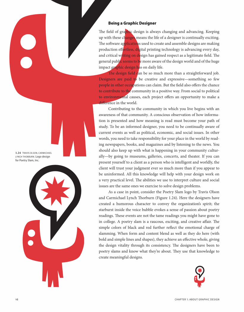
As a case in point, consider the Poetry Slam logo by Travis Olson and Carmichael Lynch Thorburn (Figure 1.24). Here the designers have created a humorous character to convey the organization’s spirit; the starburst inside the voice bubble evokes a sense of passion about poetry readings. These events are not the tame readings you might have gone to in college. A poetry slam is a raucous, exciting, and creative affair. The simple colors of black and red further reflect the emotional charge of slamming. When form and content blend as well as they do here (with bold and simple lines and shapes), they achieve an effective whole, giving the design vitality through its consistency. The designers have been to poetry slams and know what they’re about. They use that knowledge to create meaningful designs.
1.24 TRAvIS OlSON, CARmICHAEl
lYNCH THORBURN. logo design for Poetry Slam, Inc.
CH01_G2GD_Santoro_final_rev.indd 16 10/29/12 9:02 PM

BEING A GR APHIC DE SIGNER 17
voice and vision
Acknowledging your individual point of view in your own work also has significant value. The places you’ve been, the things you’ve seen, felt, or heard, all feed into your ability to approach a design project in a unique way. Your life experiences, as well as your education, will have a profound impact on your designs. Because of these influences, your work will have a distinct identity and will be a contribution to the field and to the commu-nity. (See the Speakout by Kali Nikitas and Figure 1.27.)
So many charts are a mundane representation of data, but the “Move Our Money” chart is anything but dull (Figure 1.25). The designers blended creativity with politics through an unusual medium—an inflatable bal-loon. Part of a traveling road show, the sculpture dra-matized extreme military spending, creating a spectacle wherever it went. The designers’ voice and vision made
an otherwise dull set of statistics become very much alive. The light-hearted approach brought a disarming aspect to the information, adding to the message by presenting horrifying data in a ridiculous way. The piece spoke effectively because there was an informed opinion to begin with.
In the context of a business-oriented problem, Cheryl Heller used a similar approach to create the package identity for LouisBoston (Figure 1.26). She used a witty voice and adept vision to promote the store’s expanded offering for women and younger customers. A light-hearted presentation with an approachable style, the shopping bag design is humorous as well as engaging and intelligently communicates “young and fresh” at the same time. Its success derives from the insightful blend of form and content into a meaningful concept.
1.25 STEFAN SAGmEISTER AND
HJAlTI KARlSSON. “move Our money” charts as part of a traveling road show.
1.26 CHERYl HEllER. Package identity for louisBoston.
CH01_G2GD_Santoro_final_rev.indd 17 10/29/12 9:02 PM
18 CHAP TER 1: ABOU T GR APHIC DE SIGN
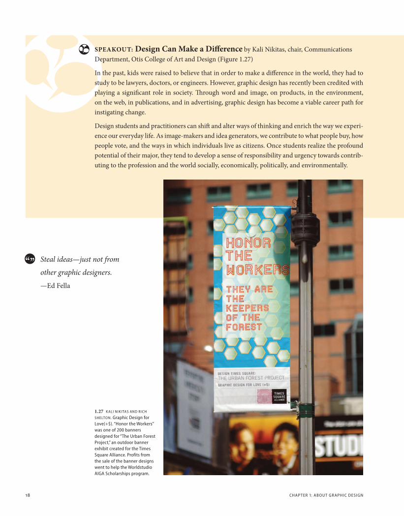
1.27 K AlI NIKITAS AND RICH
SHElTON. Graphic Design for love(+$). “Honor the Workers” was one of 200 banners designed for “The Urban Forest Project,” an outdoor banner exhibit created for the Times Square Alliance. Profits from the sale of the banner designs went to help the Worldstudio AIGA Scholarships program.
SpEAkOut: Design can Make a Difference by Kali Nikitas, chair, Communications Department, Otis College of Art and Design (Figure 1.27)
In the past, kids were raised to believe that in order to make a difference in the world, they had to study to be lawyers, doctors, or engineers. However, graphic design has recently been credited with playing a significant role in society. Through word and image, on products, in the environment, on the web, in publications, and in advertising, graphic design has become a viable career path for instigating change.
Design students and practitioners can shift and alter ways of thinking and enrich the way we experi-ence our everyday life. As image-makers and idea generators, we contribute to what people buy, how people vote, and the ways in which individuals live as citizens. Once students realize the profound potential of their major, they tend to develop a sense of responsibility and urgency towards contrib-uting to the profession and the world socially, economically, politically, and environmentally.
Steal ideas—just not from
other graphic designers.
—Ed Fella
CH01_G2GD_Santoro_final_rev.indd 18 10/29/12 9:02 PM
BEING A GR APHIC DE SIGNER 19
The creative process is not
performed by the skilled hand
alone, or by the intellect alone,
but must be a unified process
in which head, heart, and hand
play a simultaneous role.
—Herbert Bayer
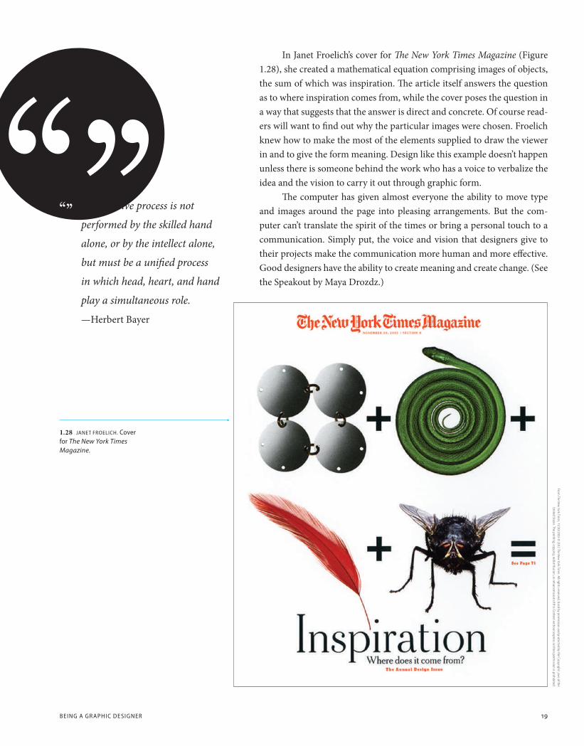
In Janet Froelich’s cover for The New York Times Magazine (Figure 1.28), she created a mathematical equation comprising images of objects, the sum of which was inspiration. The article itself answers the question as to where inspiration comes from, while the cover poses the question in a way that suggests that the answer is direct and concrete. Of course read-ers will want to find out why the particular images were chosen. Froelich knew how to make the most of the elements supplied to draw the viewer in and to give the form meaning. Design like this example doesn’t happen unless there is someone behind the work who has a voice to verbalize the idea and the vision to carry it out through graphic form.
The computer has given almost everyone the ability to move type and images around the page into pleasing arrangements. But the com-puter can’t translate the spirit of the times or bring a personal touch to a communication. Simply put, the voice and vision that designers give to their projects make the communication more human and more effective. Good designers have the ability to create meaning and create change. (See the Speakout by Maya Drozdz.)
1.28 JANET FROElICH. Cover for The New York Times Magazine.
From The New
York Times, 11/30/2003 ©
2012 The New York Tim
es. All rights reserved. Used by permission and protected by the Copyright Law
s of the United States. The printing, copying, redistribution, or retransm
ission of this Content without express w
ritten permission is prohibited.
CH01_G2GD_Santoro_final_rev.indd 19 10/29/12 9:02 PM

How do you define graphic design—what does it mean to you?
Graphic design is both a process and an arti-fact—software and hardware. Communications design involves serious cerebral activity, including research, analysis, conceptualizing, and planning. All this rational activity must be translated through the designer’s personal talent, intuition, experience, and a scientifically indescribable connection between body and brain. In that mysterious mix, original expres-sions are born which bring the design brief to life and resonate with the audience. These expressions take eloquent form in the tangible artifacts that we see in museums and design exhibitions, including posters, books, brochures, and many other graphic media, and also in nonphysical communications in the digital realm. At the end of the day, it is the audience’s interaction with the graphic message, and their response, that really counts.
How do you see design evolving? Is it morphing into something designers won’t recognize in 100 years or are there staples that hold true?
The staples hold true, but rapidly changing media challenge designers to develop new conceptual theories, processes, and skills. Interactive electronic communications require far more education to understand how audiences navigate and make meaning out of nonphysical communications spaces. Electronic communications design now involves sound, motion, and interactivity.
What advice or insight can you give to students studying graphic design?
Passion is the largest requirement. This is a challenging, competitive, and rapidly evolving field, so it is essential that prospective designers feel a real love of the conceptual and form-giving elements.
Vignette 1.1 Cranbrook Crane symbol, Cranbrook Educational Community.
Katherine McCoy was cochair of the design department at Cranbrook Academy of Art for twenty-four years, a distinguished visiting professor at London’s Royal College of Art, and a senior lecturer at Illinois Institute of Technology’s Institute of Design. Her graphic design practice and teaching have garnered her a medal from the American Institute of Design (AIGA), election to the Alliance Graphique International, and an honorary Ph.D. from the Kansas City Art Institute. She served as national vice president of AIGA and is a past president of both the Industrial Designers Society of America and the American Center for Design. She writes frequently on design criticism and history, has coproduced a television documentary on Japanese design, and chaired the first Living Surfaces Conference on interactive communications design. Currently the Hall Distinguished Professor at Kansas City Art Institute, she is also a partner, with her husband Michael McCoy, of High Ground, a design workshop and studio based in Colorado.
de
sig
ne
r v
ign
et
te
: d
ef
inin
g g
ra
ph
ic d
es
ign
, w
ith
k
At
hE
riN
E M
ccO
y
20 CHAP TER 1: ABOU T GR APHIC DE SIGN
“Passion is the largest requirement.”
CH01_G2GD_Santoro_final_rev.indd 20 10/29/12 9:02 PM

Vignette 1.4 KATHERINE mCCOY
& DANIEl lIBESKIND. Architecture Symbol and Interpretation exhibition poster. An announce-ment for an exhibition refers to the rational and irrational in architecture. A reconstruction of a De Chirico painting includes an early Renaissance perspec-tive drawing and diagrammatic notations from an Edgar Allan Poe short story.
Vignette 1.3 Fluxus exhibit catalog cover. This cover’s structure refers to a diagram of the history of Fluxus by the movement’s founder, George maciunas. The bright colors of cheap printing paper are in the provocative spirit of Fluxus.
Vignette 1.2 Cranbrook Metalsmithing poster. A staged photograph makes a landscape of recent student work. Here, a schematic plan for the pitcher is superimposed and metallic forms of silver and copper cut into the photograph.
DE SIGNER v IGNE T TE: K ATHER INE mCCOY 21
CH01_G2GD_Santoro_final_rev.indd 21 10/29/12 9:02 PM

SpEAkOut: intuitive knowledge by Maya Drozdz, visualingual.wordpress.com
Design is something to which you have been exposed your entire life. You take your cues from design as you make even the most mundane choices, including shopping for groceries or interpreting road signs. If you ever feel overwhelmed by how much you don’t yet know about design, con-sider and draw on the wealth of design knowledge you already have. You may lack the specialized vocabulary to articulate what you know, but you already have an intuitive knowledge about the subject.
22 CHAP TER 1: ABOU T GR APHIC DE SIGN
Addressing the Personal and the Public
There is both a personal and a public side to graphic design. In other words, the same communication tools that designers use in service to the business commu-nity can also be redirected in service to the social com-munity. Graphic designers have that potential, and they work in both arenas. The emotionally charged thought is easily expressed when words and images are at our fingertips.
The flier What Is Your Culture? by Loan Lam does just that (Figure 1.29). After noticing a newspa-per article about a law banning the use of fireworks being enforced in Chinatown, especially during the Chinese New Year, Lam felt the need to speak out. After researching the subject, she used her design to make the point that banning fireworks during the Chi-nese New Year was as culturally insensitive as banning turkey during Thanksgiving or a decorated tree during Christmas. She used an image of a cooked duck—a classic icon of Chinese culture seen hanging in most Chinatown restaurant windows. In a surreal twist, a firecracker is being removed from the duck’s dissected body. It is an emotional translation as much as a literal one. The ban on fireworks rips something vital out of Chinese culture. The image is confrontational and cre-ates the kind of public dialogue the designer wanted.
In Practice: A cooked duck is used as a cultural icon to represent Chinese culture. The dominance of the image draws the specific audience in, while smaller images and text explain the social issue being challenged.
Another equally passionate student project is a design titled Man behind the Curtain (Figures 1.30 and 1.31) by Kareem Collie. The piece
1.29 lOAN lAm. Design for a flier titled What Is Your Culture? questioning a law banning the use of fireworks in New York City’s Chinatown.
CH01_G2GD_Santoro_final_rev.indd 22 10/29/12 9:02 PM

BEING A GR APHIC DE SIGNER 23
notes that in Crown Heights, a neighborhood in Brooklyn whose popula-tion is primarily of African descent, there are many bronze statues com-memorating civic leaders, but not one of them is black. The student asks: “How can I create a home in a place that feels like someone else’s living
room?” His answer is expressed in the design. A bronze hand transforms into the designer’s own hand. The “tag” is a graffiti signature that takes some representation away from the past and moves it into the present day. In both projects, the designers use personal convictions, a strong connection with their heritage, and awareness of their surroundings to make a social concern more public. What Is Your Culture? deals with the conflict between Chinese culture and West-ern law. Man behind the Curtain explains neigh-borhood graffiti as a proud expression of black presence. In this sense, the personal, expressed publicly, makes for what we might call a citizen designer, an important role in the field.
1.30 KAREEm COllIE. Design project (series) on revealing a neighborhood’s cultural icon discrepencies; titled Man behind the Curtain.
1.31 KAREEm COllIE.
Opening page to Man behind the Curtain.
CH01_G2GD_Santoro_final_rev.indd 23 10/29/12 9:02 PM
24 CHAP TER 1: ABOU T GR APHIC DE SIGN
Influences on Graphic Design
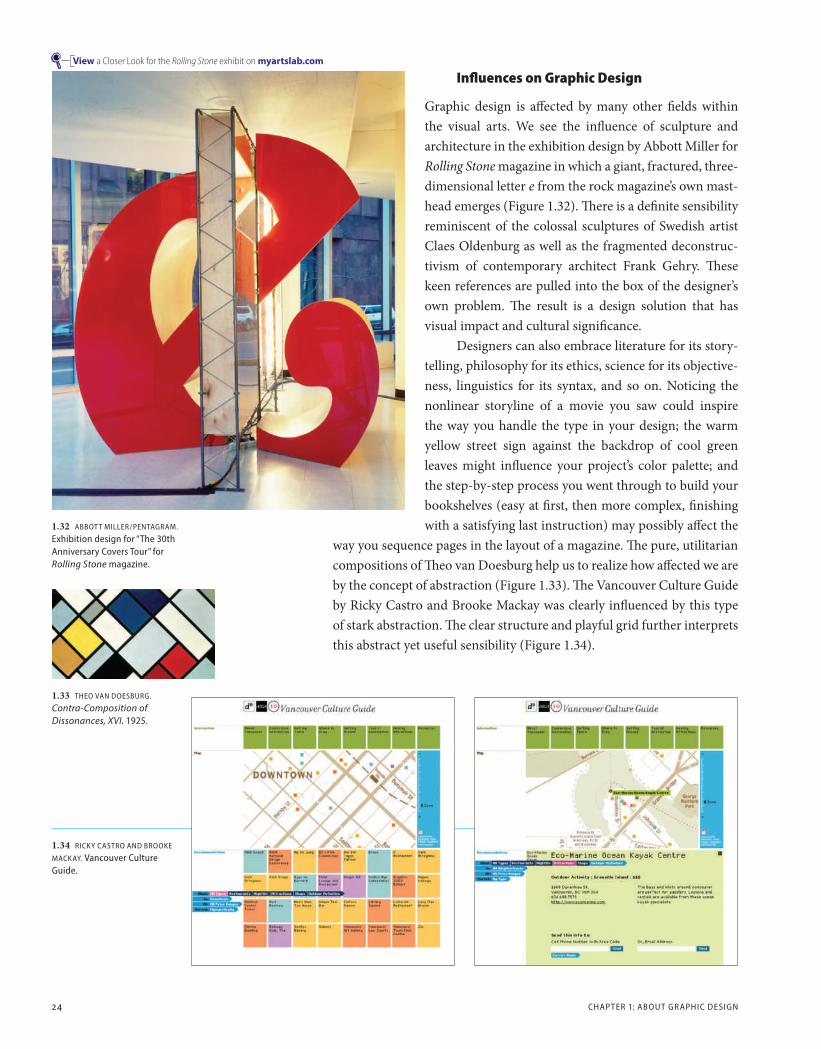
Graphic design is affected by many other fields within the visual arts. We see the influence of sculpture and architecture in the exhibition design by Abbott Miller for Rolling Stone magazine in which a giant, fractured, three-dimensional letter e from the rock magazine’s own mast-head emerges (Figure 1.32). There is a definite sensibility reminiscent of the colossal sculptures of Swedish artist Claes Oldenburg as well as the fragmented deconstruc-tivism of contemporary architect Frank Gehry. These keen references are pulled into the box of the designer’s own problem. The result is a design solution that has visual impact and cultural significance.
Designers can also embrace literature for its story-telling, philosophy for its ethics, science for its objective-ness, linguistics for its syntax, and so on. Noticing the nonlinear storyline of a movie you saw could inspire the way you handle the type in your design; the warm yellow street sign against the backdrop of cool green leaves might influence your project’s color palette; and the step-by-step process you went through to build your bookshelves (easy at first, then more complex, finishing with a satisfying last instruction) may possibly affect the
way you sequence pages in the layout of a magazine. The pure, utilitarian compositions of Theo van Doesburg help us to realize how affected we are by the concept of abstraction (Figure 1.33). The Vancouver Culture Guide by Ricky Castro and Brooke Mackay was clearly influenced by this type of stark abstraction. The clear structure and playful grid further interprets this abstract yet useful sensibility (Figure 1.34).
1.32 ABBOTT mIllER/PENTAGRAm.
Exhibition design for “The 30th Anniversary Covers Tour” for Rolling Stone magazine.
1.33 THEO vAN DOESBURG.
Contra-Composition of Dissonances, XVI. 1925.
1.34 RICKY CASTRO AND BROOKE
mACKAY. vancouver Culture Guide.
View a Closer Look for the Rolling Stone exhibit on myartslab.com
CH01_G2GD_Santoro_final_rev.indd 24 10/29/12 9:02 PM

INFlUENCE S O N GR APHIC DE SIGN 25
Music also has a large influence. A reoc-curring melody in a piece of classical music from 300 years ago may help a designer understand how to bring unity and rhythm to a series of printed pages with a repeating graphic element. Or, similarly, a designer’s work may be energized by the influence of the punk rock movement of the late 1970s and early 1980s. The structure, the beat, and the melody of music can all have an impact on a design. Some of the designers pro-filed in this book talk directly about their influ-ences. In all the work presented here, you will learn to discern the influences, and more impor-tant, you will learn to look to outside sources to inform your own design work.
The fliers by Art Chantry take an unusual approach to punk rock (Figure 1.35). Their tough photocopier aesthetic complemented the “street” environment of the fliers—taped and stapled to telephone poles and sides of build-ings. The visual language also worked back-wards: distressed graphics became an alternative language to counter the bland aesthetic conven-tions toward which design seemed to be heading during that time period, for example, uninven-tive grids and overuse of the typeface Helvetica.
In Practice: László Moholy-Nagy (1895–1946), believed that a strong interrelationship exists between the fine and applied arts. In his 1947 book Vision in Motion, Moholy-Nagy wrote of design’s broad scope: “There is design in organization of emotional experiences, in family life, in labor relations, in city planning, in working together as civilized human beings.” A very basic, reductive approach was a way
to connect the various fields. Architecture, painting, photography, industrial and graphic design, and so forth, all shared an aesthetic based on a simple but inventive use of materials and production. A refinement of this approach translated into the clean, organized Swiss style of the 1950s.
Designing is not a
1.35 ART CHANTRY. Black and white offset poster for the music band Gang of Four.
Designing is not a profession but an attitude.
—László Moholy-Nagy
CH01_G2GD_Santoro_final_rev.indd 25 10/29/12 9:02 PM
26 CHAP TER 1: ABOU T GR APHIC DE SIGN
1.36 SIEGEl & GAlE. The New School visual identity.
ExcErpt: Emptying the Spoon, Enlarging the plate; Some Thoughts on Graphic Design Education by Warren Lehrer, The Education of a Graphic Designer, Second Edition, Allworth Press, 2005
graphic design is an art
graphic design is a business
graphic design is a profession
graphic design is next week’s garbage
graphic design gives shape to culture
graphic design gives shape to ideas
graphic design gives shape to information
graphic design gives shape to misinformation
graphic design gives shape to feelings
graphic design gives shape to stories
graphic design gives shape to dreams and experiments
graphic design gives shape to experience
graphic design creates experience
graphic design is the visualization of language
graphic design facilitates dialogue
graphic design boils things down like poetry
graphic design diagrams teeming complexities
graphic design grows out of local traditions
graphic design drains local traditions
graphic design is manifest through invention
graphic design can help save lives
graphic design can destroy lives
graphic design can pose questions and illuminate ambiguities
graphic design can help transform consciousness
graphic design can make the ordinary sacred
graphic design can be used as a weapon
graphic design can be cool, slick, objective
graphic design can be personal, idiosyncratic, hot, deep, strange, lovely
graphic design can be playful, funny, ironic, or biting
graphic design can make the useless mandatory
graphic design can make the unseen visible
graphic design can make the incomprehensible clear
graphic design can be condescending, misinformed, and insulting
graphic design can be a flower blooming on a rainy day
graphic design can help perpetuate stereotypes or dispel them
graphic design can help facilitate democracy
graphic design can help fake democracy and enable fascism
graphic design is a powerful gift/responsibility
graphic design can be a one- or a two-trick pony
graphic design reveals the society that produces it
graphic design can be the life you make it
The agitated, expressive spontaneity of punk rock still influences design today, an example of which is even seen in the visual identity for The New School in New York City by the design firm Siegel & Gale. Its graffiti aesthetic has an unexpected edge that reflects not only the urban environment of the school itself but also its socialist underpinnings (Figure 1.36).
In the excerpt by Warren Lehrer, many of the definitions, associa-tions, and contradictions of design are fleshed out in poetic form. Its most poignant line is his last: graphic design can be the life you make it.
CH01_G2GD_Santoro_final_rev.indd 26 10/29/12 9:02 PM

INFlUENCE S O N GR APHIC DE SIGN 27
The SCI-Arc lecture series poster demonstrates the production value of a design idea (Figure 1.37). The event hosts cross-disciplinary speakers that push the technological boundaries of architecture. In this spirit, the piece twists the idea of a traditional announcement. It is created with a silkscreen, a common printing method used to make posters, but one printed onto a clear, inflatable plastic poster. It must be pumped up to be read and, in so doing, transforms into a three-dimensional, toy-like object.
Knowledge of every possible medium is quite valuable to the graphic designer. How something looks in its texture and feel is built into the images a designer uses, but texture and feel also become part of the printing of a brochure or the functioning links on a website. These subtle finishes can make or break a design. A crisply folded brochure or a web-site’s seamless flow through efficient coding all become part of the design process, too. Knowing what the possibilities are can greatly expand your creativity.
1.37 mICHAEl WORTHINGTON. SCI-Arc lecture series poster using an inflatable poster to draw attention.
CH01_G2GD_Santoro_final_rev.indd 27 10/29/12 9:03 PM

28 CHAP TER 1: ABOU T GR APHIC DE SIGN
1.38 Elements of a successful design solution.
The Nuts and Bolts of Graphic Design
The design process is typically linear. Steps include the initial brief, research, roughs, and so on. Along the way are basic components (or elements) that designers must consider and factor into every distinctive design solution (Figure 1.38).
Components of a Successful Design Solution
time/Budget: The most concrete of graphic design components, making graphic design an applied art with constraints.
content: What needs to be included in the communication being made.
Form: The shape a design takes based on the content it needs to convey.
Function: The basic determination of a project’s goals. For example, a promotion for an event will have, as its main objective, to convince people to attend. Function defines the direction a design will take.
Structure: A hierarchy to the audience: what to see and read first, then second, third, and so on. Every design benefits from some kind of struc-ture or planned order to convey information.
usefulness: A practical consideration to make the design useful for the audience. Usefulness can include many aspects. For example, an edgy aesthetic with distressed type might be useful for a music magazine, but not for instructions on a medicine bottle, which must be in a clear, easily readable typeface.
Aesthetics: The way a design looks, which can attract or repel the audi-ence. Aesthetics is tied to usefulness in this way. An environmentally friendly product that is packaged with a cold, industrial aesthetic isn’t going to connect as logically as one that is packaged using earth tones and organic shapes. A design that is tough or sweet, mundane or excit-ing, should be made with the subject and audience in mind. Remember, though, that aesthetics can be a matter of taste and are influenced by cul-tural norms. You need to know your audience and the context in which your work will be seen.
Distinction: The ways a design can be different from all that is around it. We are bombarded with all sorts of messages and images. Your design must somehow stand out. If a wall full of posters shouts, a unique quality might be achieved by one that whispers. The ephemeral nature of graphic design offers the possibility for distinction to be made by what a design does (it is functional, structured, useful, and aesthetic), but also by what it doesn’t do.
In Practice: There is a joke within the profession in which a typical client is always presented with three options—a kind of a triangle, as it were. The options are as follows: a project can be done quickly, well, and cheaply, but the client can pick only two of those options. The combinations are as follows: (1) design made quickly and at a high quality, but at a cost that will not be cheap, (2) design made quickly and cheaply, but not of high quality, and( 3) design with high quality and made cheaply, but done slowly.
Everything should be made as
simple as possible, but not simpler.
—Albert Einstein
G R A P H I C D E S I G N
( T I m E / B U D G E T )
FO
RM
CO
NT
EN
T
U S E F U L N E S S( A U D I E N C E P R A G m A T I C S )
A E S T H E T I C S( F O R m E N H A N C E m E N T )
F U N C T I O N( P R O J E C T G O A l S )
S T R U C T U R E( H I E R A R C H Y , O R D E R )
CH01_G2GD_Santoro_final_rev.indd 28 10/29/12 9:03 PM

T HE NU T S AND BO lTS O F GR APHIC DE SIGN 29
The Graphic Design Process
Getting a design brief from a client is generally the first step in the design process (Figure 1.39). A brief might include a rough outline about the company initiating the project, its history and mission, the goals of the company’s communication, a target audience (age, sex, and social levels), and the general requirements (media, budget, and time frame).
Once the client has submitted the brief, the designer creates a sched-ule (Figure 1.40). If no brief exists, then the designers might want to create one. This information becomes part of the project’s research (for more details on research, see Chapter 4). research helps determine what the project is really about and where it can go. A company’s competitors—along with any of their solutions designed along the same terms—help a designer get started. Knowing design history, how past designers have approached similar communication problems, becomes very valuable at this early stage of the process.
When a designer has done enough research and starts to feel comfortable with the knowledge attained, she begins developing ideas. Designers record these ideas as small drawings, known as thumbnails, on paper or on a computer screen. Here the designer begins to indicate words and images with the simplest lines and shapes (Figure 1.41). The point is to generate as many thumbnails as possible and to do it as quickly as they occur so they aren’t forgotten. Many idea-generating techniques come into play during this phase of the process (see Chapter 5 for a dis-cussion of such techniques).
Selecting from the thumbnails, designers then enlarge a few of the best ideas into rough approximations of the design (Figure 1.42). These roughs help determine how the design ideas can be better visualized and further refined. Designers present these roughs to their colleagues in a session called a critique. A critique is an evaluation in which a profes-sor, classmates, and, when you’re working at a design firm, your manager
1.41 Thumbnail sketches indicating ideas, in this case, creating a map of company locations as a three-dimen-sional construction that can be photographed.
1.39 Client brief outlining project goals, coordinates, and suggestions.
1.40 Schedule notating what is due, and when.
CH01_G2GD_Santoro_final_rev.indd 29 10/29/12 9:03 PM
30 CHAP TER 1: ABOU T GR APHIC DE SIGN
1.42 A “rough” example of an actual map sketched in against the corner of a wall.
and coworkers, review the solutions you have created. Critiques also help you to clarify ideas; asking questions about your own work can begin the process. For example: Is the objective being met? Is the concept commu-nicating? How is the design being packaged and does the solution work within the company’s brand image and strategy? Is the form creative and eye-catching? Is the overall design pushed as far as it can go, or is there another level that the concept can step toward? The answers and the dis-cussion that follow these kinds of questions will help you move forward. Ultimately, the critique will help you clarify ideas and recharge your cre-ativity. (See the Worklist: How to Be Critiqued by Randall Hoyt.)
Final comprehensives, or comps as they’re called, are the polished and finished versions of roughs. Comps are prepared for the client and, therefore, typography, imagery, and layout are more refined. For example, a poster should be scaled to 100 percent to realize its full effect, a website presented in the context of a computer screen, a package’s label wrapped around its container—all with the intention of bringing the comp as close to the real thing as possible.
At the presentation, the designer shows the finished comp to the client, explaining the ideas behind the solution and going over the entire concept. Designers do their best to make sure the client feels that the pri-mary goals are being met, with the design balancing creativity, integrity, clear communication, and budget.
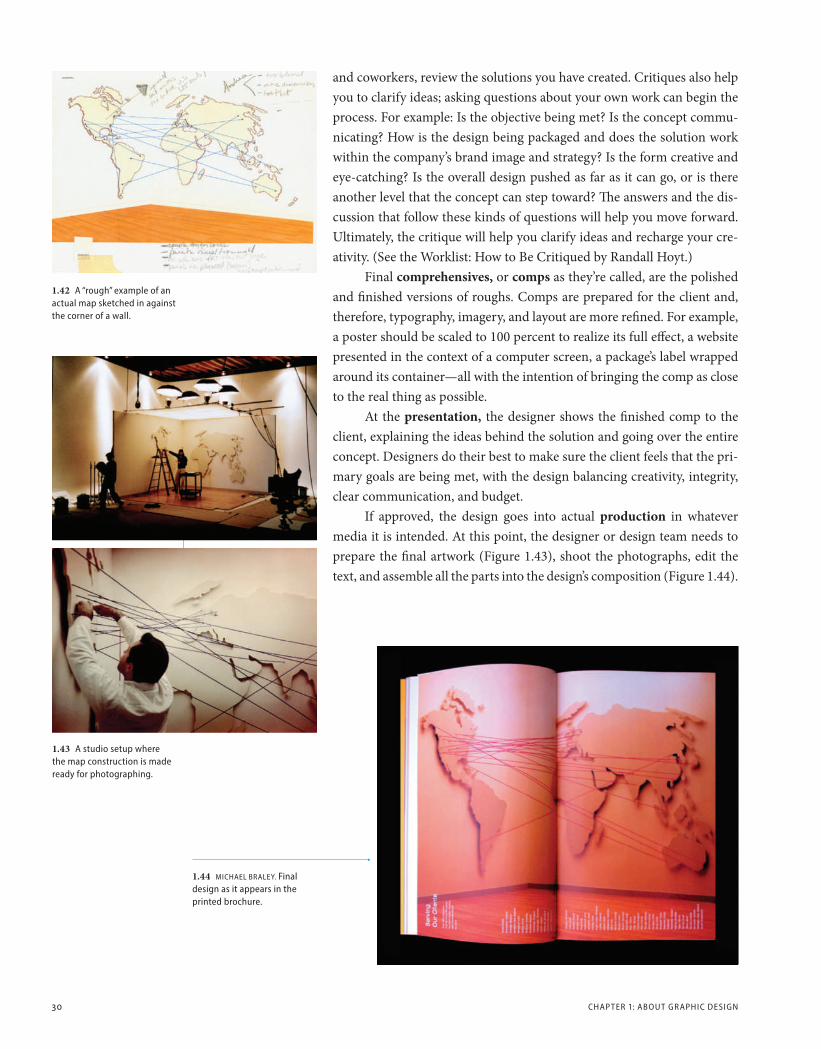
If approved, the design goes into actual production in whatever media it is intended. At this point, the designer or design team needs to prepare the final artwork (Figure 1.43), shoot the photographs, edit the text, and assemble all the parts into the design’s composition (Figure 1.44).
1.44 mICHAEl BRAlEY. Final design as it appears in the printed brochure.
1.43 A studio setup where the map construction is made ready for photographing.
CH01_G2GD_Santoro_final_rev.indd 30 10/29/12 9:03 PM

T HE NU T S AND BO lTS O F GR APHIC DE SIGN 31
WO
RK
LIS
T how to Be critiqued by Randall Hoyt, associate professor of communication design, University of Connecticut
The critique process is essential in graphic design education, but we forget how much of a skill it actually is. Design students must be prepared to take advantage of the experience. Following are twelve steps to a healthy and memorable critique:
1 Get some sleep: Preferably a good night’s sleep, but no fewer than three hours.
2 Look sharp: Engage in the rituals of hygiene. Take a shower and put on clean clothes free of tears and stains. How your ideas are perceived is in direct relation to how you are perceived. Dress accordingly.
3 Bring some work: If you don’t have work, then come anyway and listen. When it is your turn, respectfully decline.
4 Shut up and listen: Give a brief introduction to your work, and then hear what others have to say.
5 Rehearse your introduction: Write it down, but don’t read it. Spend no more than 2–4 minutes explaining it.
6 Present your work well: Work should be well crafted, clean, and neat. Keep process materials well preserved and organized.
7 Know your issues: Facilitate your critique by asking for commentary on specific issues in your introduction. But don’t direct it—allow for a fresh response from your reviewers.
8 Don’t critique yourself or your work: Give yourself a break and let everyone else do what they came to do.
9 Don’t be defensive: You can explain confusing aspects of the work when necessary, but do not try to convince people that your way is correct. Let the discussion run its course—listen to all sides.
10 Take notes (or have someone take them for you): Critiques go quickly, so record what happens. They are an invaluable resource.
11 Don’t take it personally: Try to remain detached while your work is discussed. If you think your critique was too personal, talk about it with your instructor outside of class.
12 Thank everyone: Appreciate the effort of those involved and thank everyone for their time in discussing your work.
CH01_G2GD_Santoro_final_rev.indd 31 10/29/12 9:03 PM
32 CHAP TER 1: ABOU T GR APHIC DE SIGN
In Perspective
There are many areas of graphic design, but whatever the final form, the designer’s job includes assembling words, numbers, and images into a coherent whole. Thinking is required in all the processes of design. This discipline is not an intuitive art; it is an art of rationality combined with creativity. The designer combines all the elements into a cohesive whole, giving a unique identity to a product, service, or company, just as one’s manner of speech, facial features, or the clothes one wears shout THIS IS ME!
As ideas, aesthetics, and digital technology merge more cohesively, the understanding of graphic design as an applied art will change, too. This energized path is just starting to emerge in this early part of the twenty-first century. It includes design solutions that are printed, yet ani-mate, that are projected, but interact with the user. As you will see in the following chapter on the history of graphic design, design has been vital to our culture and to the world. Its goal for the future remains the same—to create communications that are meaningful.
ExErciSES AND prOjEctS
Exercise 1 (categories of Design): Research two categories of graphic design, for example, package design and motion design. Then find at least two design firms that specialize in those areas. Use the Internet, maga-zines, books, and design competition annuals in your search. Create a five-minute presentation reviewing the two categories, the two firms, their locations, and how they approach their projects. Include the skills you think are especially necessary for each of the two design categories.
Exercise 2 (Design ideas): Find an example of graphic design that you think is terrible. It can take any form—an advertisement, website, motion design, package, and so on. What is the basis for your choice? What is the design lacking? Next, choose an example of graphic design that you think is fabulous. What makes it so successful? Present both to the class and give the reasons for your choices.
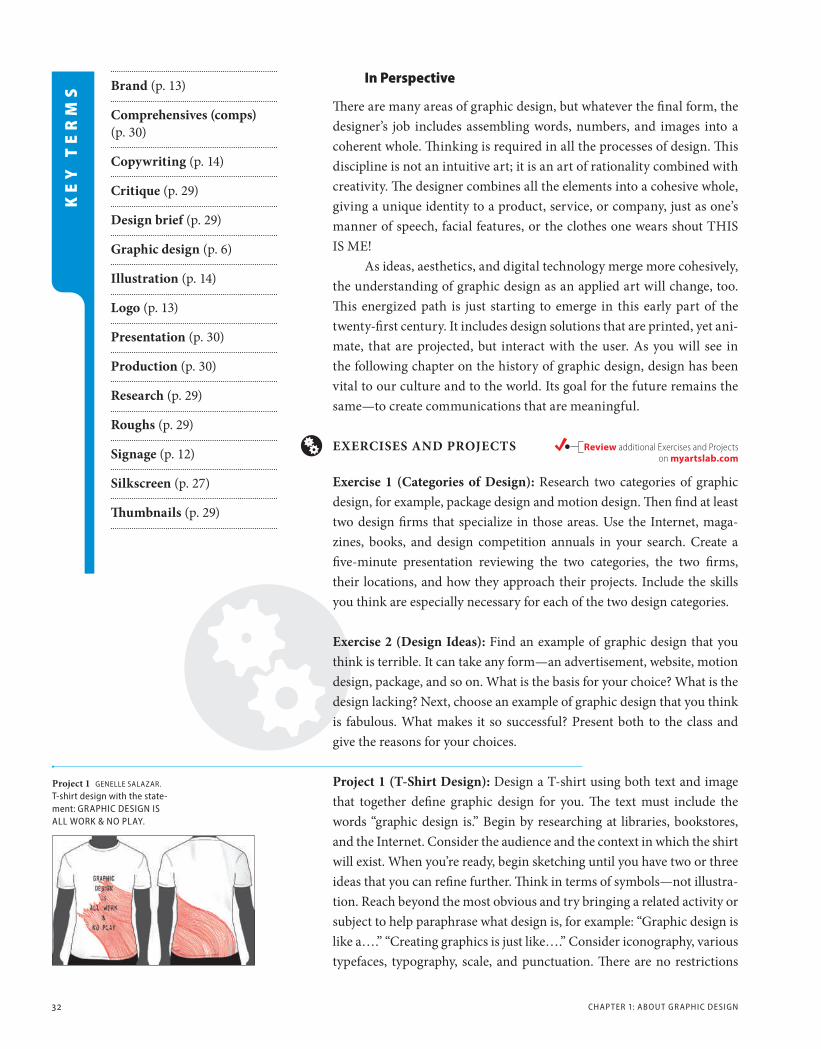
project 1 (t-Shirt Design): Design a T-shirt using both text and image that together define graphic design for you. The text must include the words “graphic design is.” Begin by researching at libraries, bookstores, and the Internet. Consider the audience and the context in which the shirt will exist. When you’re ready, begin sketching until you have two or three ideas that you can refine further. Think in terms of symbols—not illustra-tion. Reach beyond the most obvious and try bringing a related activity or subject to help paraphrase what design is, for example: “Graphic design is like a….” “Creating graphics is just like….” Consider iconography, various typefaces, typography, scale, and punctuation. There are no restrictions
Brand (p. 13)
comprehensives (comps) (p. 30)
copywriting (p. 14)
critique (p. 29)
Design brief (p. 29)
Graphic design (p. 6)
illustration (p. 14)
Logo (p. 13)
presentation (p. 30)
production (p. 30)
research (p. 29)
roughs (p. 29)
Signage (p. 12)
Silkscreen (p. 27)
Thumbnails (p. 29)
KE
Y T
ER
MS
project 1 GENEllE SAlAzAR. T-shirt design with the state-ment: GRAPHIC DESIGN IS All WORK & NO PlAY.
Review additional Exercises and Projects on myartslab.com
CH01_G2GD_Santoro_final_rev.indd 32 10/29/12 9:03 PM
E xERCISE S AND PROJEC TS 33
on color or style of shirt. Use the back of the shirt only if it works with your idea. For the finished piece, either present a flat 11" × 17" laser print-out with the design located within a shirt, or use a real shirt (instructor’s preference).
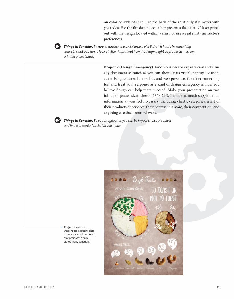
project 2 (Design Emergency): Find a business or organization and visu-ally document as much as you can about it: its visual identity, location, advertising, collateral materials, and web presence. Consider something fun and treat your response as a kind of design emergency in how you believe design can help them succeed. Make your presentation on two full-color poster-sized sheets (18" × 24"). Include as much supplemental information as you feel necessary, including charts, categories, a list of their products or services, their context in a store, their competition, and anything else that seems relevant.
Things to Consider: Be sure to consider the social aspect of a T-shirt. It has to be something wearable, but also fun to look at. also think about how the design might be produced—screen printing or heat press.
Things to Consider: Be as outrageous as you can be in your choice of subject and in the presentation design you make.
project 2 ABBY HIRSH. Student project using data to create a visual document that promotes a bagel store’s many variations.
CH01_G2GD_Santoro_final_rev.indd 33 10/29/12 9:03 PM