girls go it -- day 6 training 2 -- bootstrap integration
TRANSCRIPT

Intro. Bine ai revenit!
- Responsive web;
- Bootstrap Grid Layout;
- Jinja2.
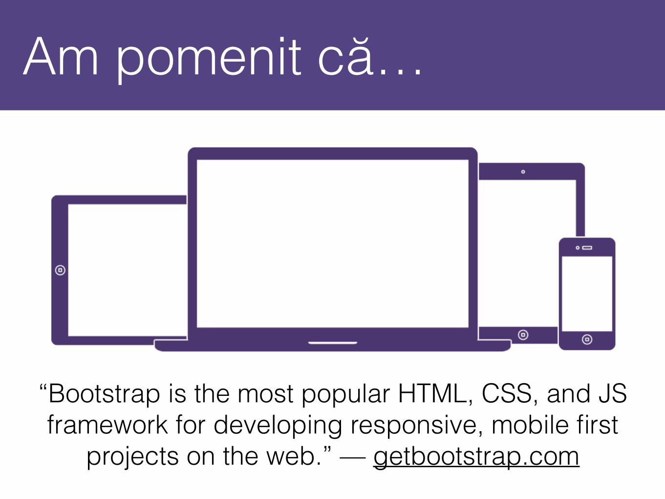
Am pomenit că…
“Bootstrap is the most popular HTML, CSS, and JS framework for developing responsive, mobile first
projects on the web.” — getbootstrap.com

Ce-i aia Responsive Web?
Reutilizarea și extinderea modelelor web.
A scrie o dată și a rula oriunde!
© Sun Microsystems

De fapt…
Iată ce înseamnă Responsive Web Design:

Desktop.
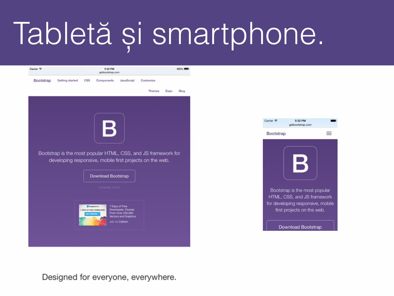
Tabletă și smartphone.
Mobile first?
- O interfață gândită de la început pentru mobile are deobicei calitate mai bună;
- Se analizează toate detaliile de jos în sus;
- Micșorează cantitatea de cod rescris.
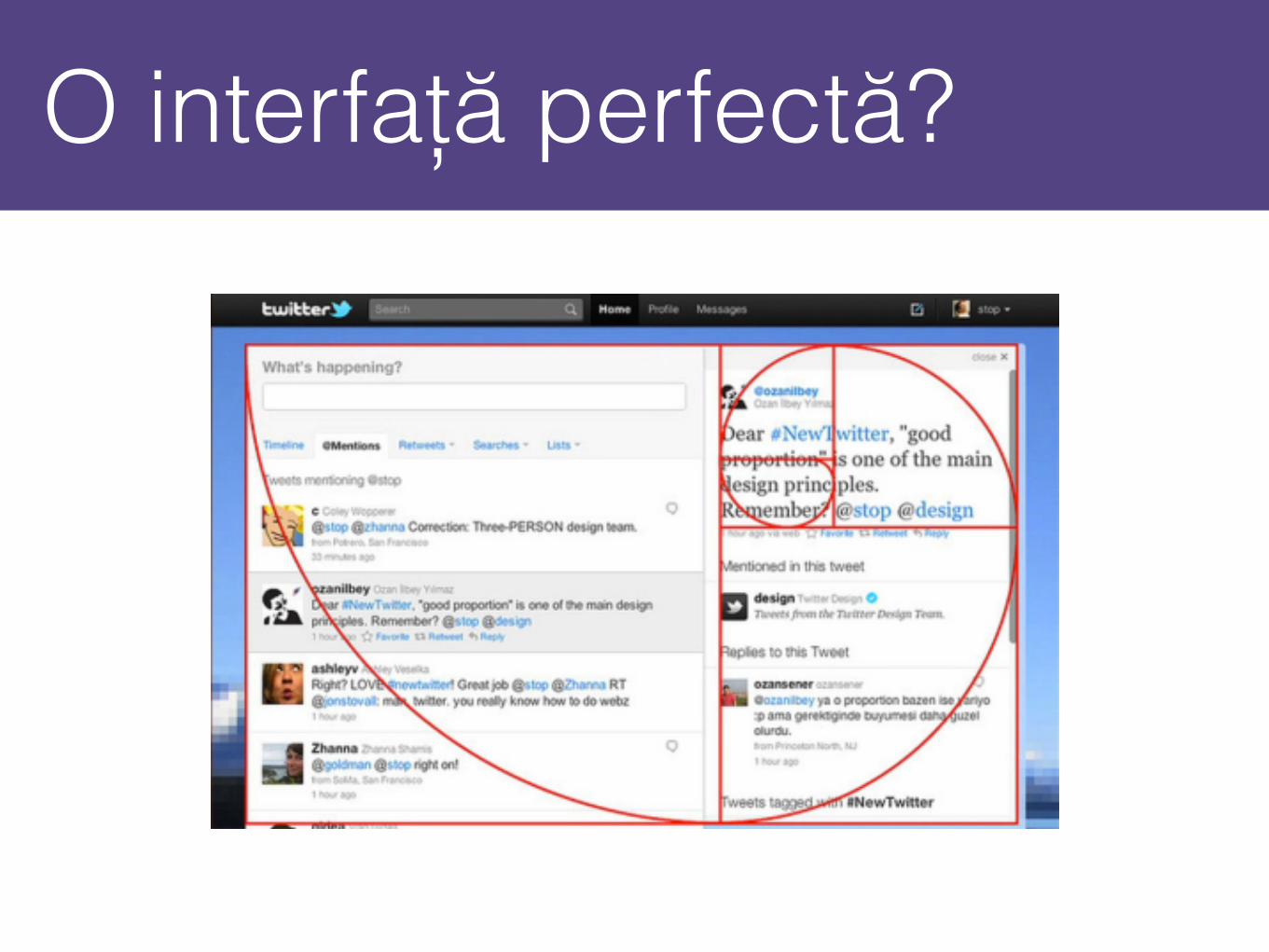
O interfață perfectă?
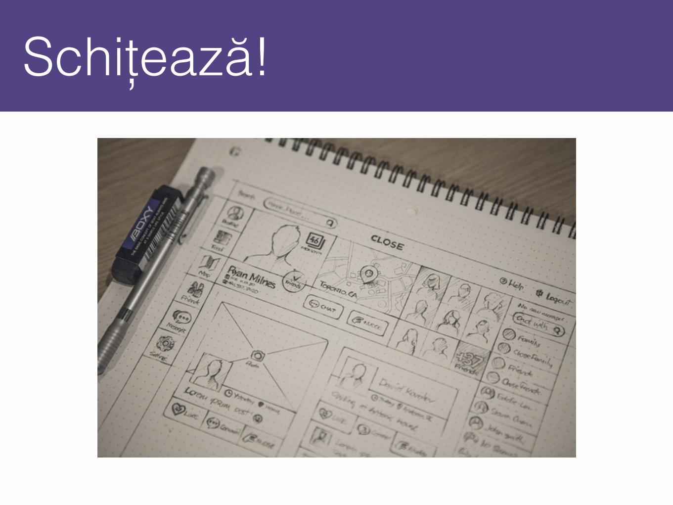
Schițează!

Instrument util.
Pentru a înțelege mai bine Grid Layout există o aplicație web interesantă:
http://responsify.it/
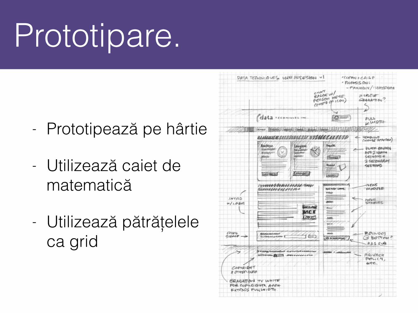
Prototipare.
- Prototipează pe hârtie
- Utilizează caiet de matematică
- Utilizează pătrățelele ca grid
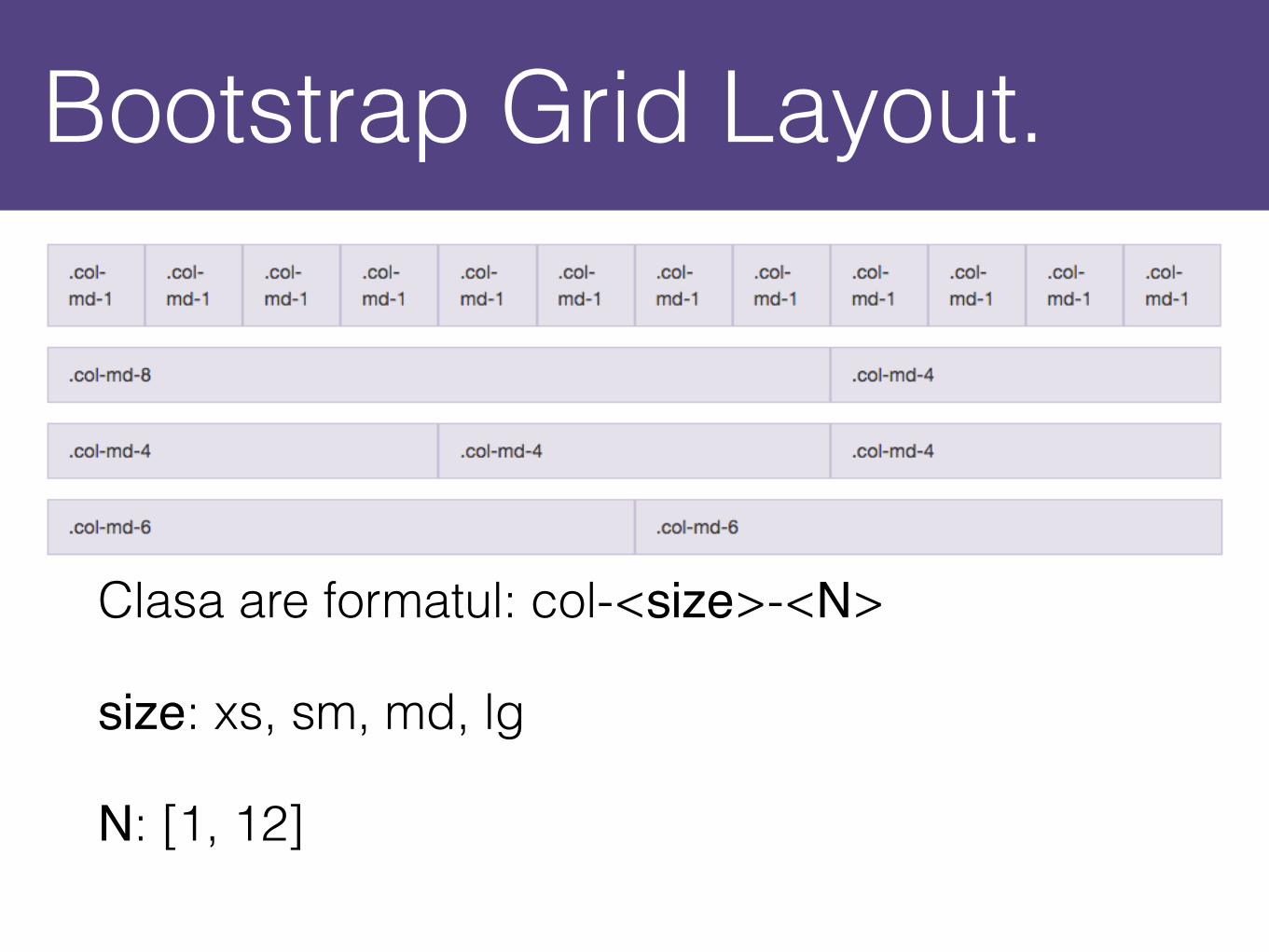
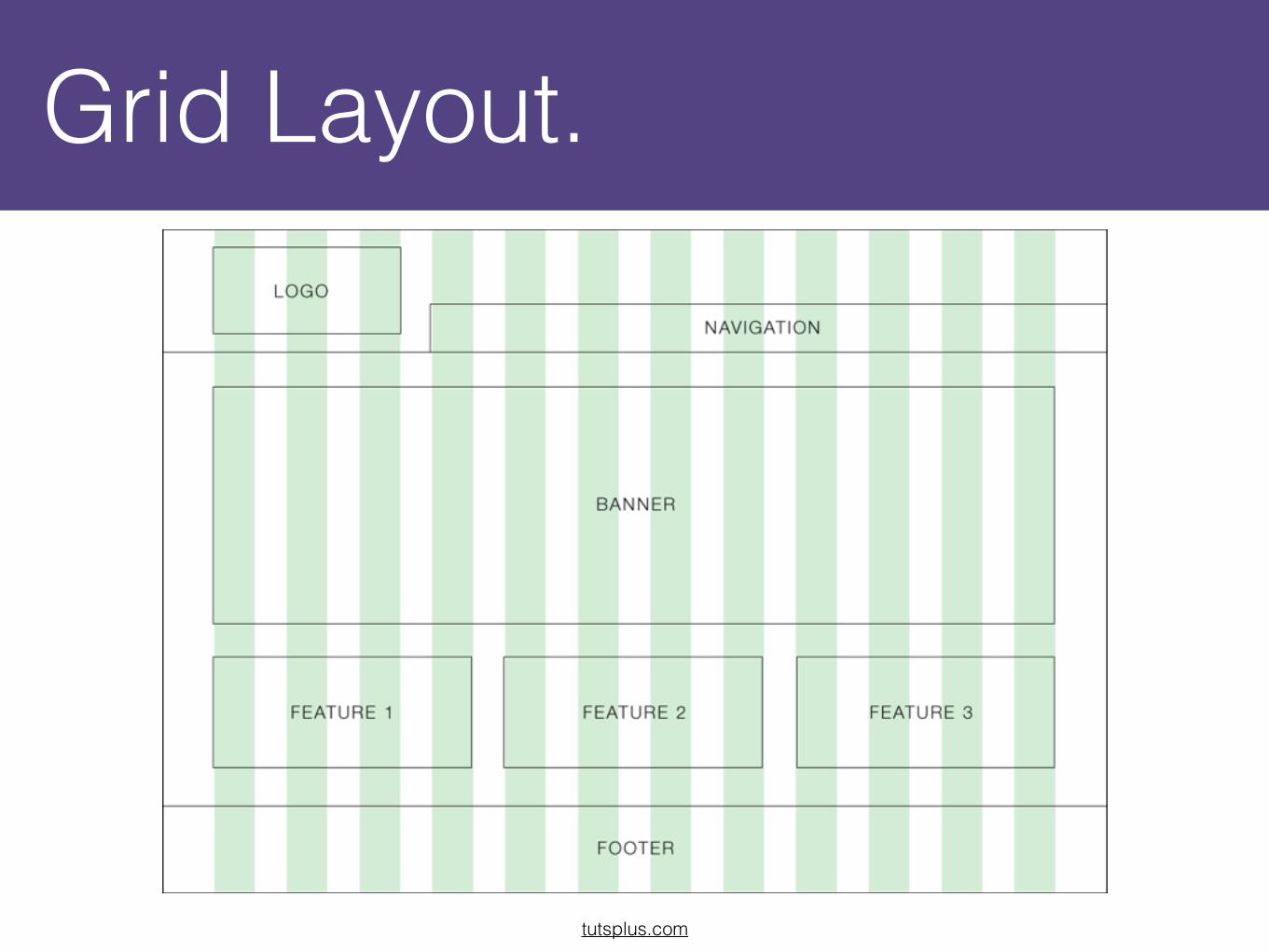
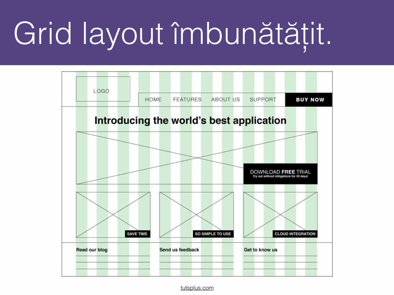
Bootstrap Grid Layout.
Clasa are formatul: col-<size>-<N>
size: xs, sm, md, lg
N: [1, 12]

Media Queries.

Responsive utilities.

Bootstrap în Flask?
- Putem încărca Bootstrap de pe CDN;
- Vom utiliza modulul Flask-Bootstrap;
- Vom extinde layout-ul de bază din acest modul;
- {% extends "bootstrap/base.html" %}

Hai să integrăm!