ext designer for ext js 4- users guide
DESCRIPTION
Users GuideTRANSCRIPT
Ext Designer for Ext JS 4User’s Guide
Table of Contents Page I
Table of Contents · · · · · · · · · · · · · · · · · · · · · · · · · · · · · · · · · · · · · · · · · · · · · · · · · · · · · · · · · · · · · · · · · · · · · · · · · · · · · · ·IIntroduction · · · · · · · · · · · · · · · · · · · · · · · · · · · · · · · · · · · · · · · · · · · · · · · · · · · · · · · · · · · · · · · · · · · · · · · · · · · · · · · · · · · · 5Chapter 1: Getting Started with Designer · · · · · · · · · · · · · · · · · · · · · · · · · · · · · · · · · · · · · · · · · · · · · · · · · · · · · · · · 7
Navigating Designer · · · · · · · · · · · · · · · · · · · · · · · · · · · · · · · · · · · · · · · · · · · · · · · · · · · · · · · · · · · · · · · · · · · · · · · · · · · · 7Toolbox · · · · · · · · · · · · · · · · · · · · · · · · · · · · · · · · · · · · · · · · · · · · · · · · · · · · · · · · · · · · · · · · · · · · · · · · · · · · · · · · · · · · · 8Canvas · · · · · · · · · · · · · · · · · · · · · · · · · · · · · · · · · · · · · · · · · · · · · · · · · · · · · · · · · · · · · · · · · · · · · · · · · · · · · · · · · · · · · 8Components tab · · · · · · · · · · · · · · · · · · · · · · · · · · · · · · · · · · · · · · · · · · · · · · · · · · · · · · · · · · · · · · · · · · · · · · · · · · · · · 8Component Config Inspector · · · · · · · · · · · · · · · · · · · · · · · · · · · · · · · · · · · · · · · · · · · · · · · · · · · · · · · · · · · · · · · · · · 8Data Stores Inspector · · · · · · · · · · · · · · · · · · · · · · · · · · · · · · · · · · · · · · · · · · · · · · · · · · · · · · · · · · · · · · · · · · · · · · · · 8Shortcuts · · · · · · · · · · · · · · · · · · · · · · · · · · · · · · · · · · · · · · · · · · · · · · · · · · · · · · · · · · · · · · · · · · · · · · · · · · · · · · · · · · · 9
Anatomy of a UI created with Designer · · · · · · · · · · · · · · · · · · · · · · · · · · · · · · · · · · · · · · · · · · · · · · · · · · · · · · · · · · · · 9Laying Out UI Components · · · · · · · · · · · · · · · · · · · · · · · · · · · · · · · · · · · · · · · · · · · · · · · · · · · · · · · · · · · · · · · · · · · · · · 9Adding Components · · · · · · · · · · · · · · · · · · · · · · · · · · · · · · · · · · · · · · · · · · · · · · · · · · · · · · · · · · · · · · · · · · · · · · · · · · · 9Positioning Components · · · · · · · · · · · · · · · · · · · · · · · · · · · · · · · · · · · · · · · · · · · · · · · · · · · · · · · · · · · · · · · · · · · · · · · 10Layout Options · · · · · · · · · · · · · · · · · · · · · · · · · · · · · · · · · · · · · · · · · · · · · · · · · · · · · · · · · · · · · · · · · · · · · · · · · · · · · · · 12Configuring Components · · · · · · · · · · · · · · · · · · · · · · · · · · · · · · · · · · · · · · · · · · · · · · · · · · · · · · · · · · · · · · · · · · · · · · 12Using Templates · · · · · · · · · · · · · · · · · · · · · · · · · · · · · · · · · · · · · · · · · · · · · · · · · · · · · · · · · · · · · · · · · · · · · · · · · · · · · · 14Connecting to Data · · · · · · · · · · · · · · · · · · · · · · · · · · · · · · · · · · · · · · · · · · · · · · · · · · · · · · · · · · · · · · · · · · · · · · · · · · · 15Exporting a Project · · · · · · · · · · · · · · · · · · · · · · · · · · · · · · · · · · · · · · · · · · · · · · · · · · · · · · · · · · · · · · · · · · · · · · · · · · · · 17Attaching Event Handlers to UI Components · · · · · · · · · · · · · · · · · · · · · · · · · · · · · · · · · · · · · · · · · · · · · · · · · · · · · 18Additional Information · · · · · · · · · · · · · · · · · · · · · · · · · · · · · · · · · · · · · · · · · · · · · · · · · · · · · · · · · · · · · · · · · · · · · · · · · 18
Chapter 2: Working with Layouts · · · · · · · · · · · · · · · · · · · · · · · · · · · · · · · · · · · · · · · · · · · · · · · · · · · · · · · · · · · · · · · 19Basic Container Layouts · · · · · · · · · · · · · · · · · · · · · · · · · · · · · · · · · · · · · · · · · · · · · · · · · · · · · · · · · · · · · · · · · · · · · · · 19
Auto · · · · · · · · · · · · · · · · · · · · · · · · · · · · · · · · · · · · · · · · · · · · · · · · · · · · · · · · · · · · · · · · · · · · · · · · · · · · · · · · · · · · · · · 19Absolute · · · · · · · · · · · · · · · · · · · · · · · · · · · · · · · · · · · · · · · · · · · · · · · · · · · · · · · · · · · · · · · · · · · · · · · · · · · · · · · · · · · 19Accordion · · · · · · · · · · · · · · · · · · · · · · · · · · · · · · · · · · · · · · · · · · · · · · · · · · · · · · · · · · · · · · · · · · · · · · · · · · · · · · · · · · 20Anchor · · · · · · · · · · · · · · · · · · · · · · · · · · · · · · · · · · · · · · · · · · · · · · · · · · · · · · · · · · · · · · · · · · · · · · · · · · · · · · · · · · · · 20Border · · · · · · · · · · · · · · · · · · · · · · · · · · · · · · · · · · · · · · · · · · · · · · · · · · · · · · · · · · · · · · · · · · · · · · · · · · · · · · · · · · · · · 20Card · · · · · · · · · · · · · · · · · · · · · · · · · · · · · · · · · · · · · · · · · · · · · · · · · · · · · · · · · · · · · · · · · · · · · · · · · · · · · · · · · · · · · · 20Column · · · · · · · · · · · · · · · · · · · · · · · · · · · · · · · · · · · · · · · · · · · · · · · · · · · · · · · · · · · · · · · · · · · · · · · · · · · · · · · · · · · · 20Fit · · · · · · · · · · · · · · · · · · · · · · · · · · · · · · · · · · · · · · · · · · · · · · · · · · · · · · · · · · · · · · · · · · · · · · · · · · · · · · · · · · · · · · · · · 21
Table of Contents
Table of Contents Page II
Table · · · · · · · · · · · · · · · · · · · · · · · · · · · · · · · · · · · · · · · · · · · · · · · · · · · · · · · · · · · · · · · · · · · · · · · · · · · · · · · · · · · · · · 21Hbox · · · · · · · · · · · · · · · · · · · · · · · · · · · · · · · · · · · · · · · · · · · · · · · · · · · · · · · · · · · · · · · · · · · · · · · · · · · · · · · · · · · · · · 21Vbox · · · · · · · · · · · · · · · · · · · · · · · · · · · · · · · · · · · · · · · · · · · · · · · · · · · · · · · · · · · · · · · · · · · · · · · · · · · · · · · · · · · · · · 21
Nested Layouts · · · · · · · · · · · · · · · · · · · · · · · · · · · · · · · · · · · · · · · · · · · · · · · · · · · · · · · · · · · · · · · · · · · · · · · · · · · · · · · 21Flexible Box Layouts · · · · · · · · · · · · · · · · · · · · · · · · · · · · · · · · · · · · · · · · · · · · · · · · · · · · · · · · · · · · · · · · · · · · · · · · · · · 21Stretching Components to Fit · · · · · · · · · · · · · · · · · · · · · · · · · · · · · · · · · · · · · · · · · · · · · · · · · · · · · · · · · · · · · · · · · · · 23Configuring the Layout for a Container · · · · · · · · · · · · · · · · · · · · · · · · · · · · · · · · · · · · · · · · · · · · · · · · · · · · · · · · · · · 23Using CardLayout to Create a Wizard · · · · · · · · · · · · · · · · · · · · · · · · · · · · · · · · · · · · · · · · · · · · · · · · · · · · · · · · · · · · 24Using Border Layout for a Viewport · · · · · · · · · · · · · · · · · · · · · · · · · · · · · · · · · · · · · · · · · · · · · · · · · · · · · · · · · · · · · · 27Using hbox Layout to Create Multiple Columns · · · · · · · · · · · · · · · · · · · · · · · · · · · · · · · · · · · · · · · · · · · · · · · · · · · · 28
Chapter 3: Component Overview · · · · · · · · · · · · · · · · · · · · · · · · · · · · · · · · · · · · · · · · · · · · · · · · · · · · · · · · · · · · · · 30Adding Components to a UI · · · · · · · · · · · · · · · · · · · · · · · · · · · · · · · · · · · · · · · · · · · · · · · · · · · · · · · · · · · · · · · · · · · · 30Containers Overview · · · · · · · · · · · · · · · · · · · · · · · · · · · · · · · · · · · · · · · · · · · · · · · · · · · · · · · · · · · · · · · · · · · · · · · · · · 31
Container · · · · · · · · · · · · · · · · · · · · · · · · · · · · · · · · · · · · · · · · · · · · · · · · · · · · · · · · · · · · · · · · · · · · · · · · · · · · · · · · · · 31FieldContainer · · · · · · · · · · · · · · · · · · · · · · · · · · · · · · · · · · · · · · · · · · · · · · · · · · · · · · · · · · · · · · · · · · · · · · · · · · · · · · 31FieldSet · · · · · · · · · · · · · · · · · · · · · · · · · · · · · · · · · · · · · · · · · · · · · · · · · · · · · · · · · · · · · · · · · · · · · · · · · · · · · · · · · · · · 32Form Panel · · · · · · · · · · · · · · · · · · · · · · · · · · · · · · · · · · · · · · · · · · · · · · · · · · · · · · · · · · · · · · · · · · · · · · · · · · · · · · · · · 32Panel · · · · · · · · · · · · · · · · · · · · · · · · · · · · · · · · · · · · · · · · · · · · · · · · · · · · · · · · · · · · · · · · · · · · · · · · · · · · · · · · · · · · · · 33Tab Panel · · · · · · · · · · · · · · · · · · · · · · · · · · · · · · · · · · · · · · · · · · · · · · · · · · · · · · · · · · · · · · · · · · · · · · · · · · · · · · · · · · 33Viewport · · · · · · · · · · · · · · · · · · · · · · · · · · · · · · · · · · · · · · · · · · · · · · · · · · · · · · · · · · · · · · · · · · · · · · · · · · · · · · · · · · · 34Window · · · · · · · · · · · · · · · · · · · · · · · · · · · · · · · · · · · · · · · · · · · · · · · · · · · · · · · · · · · · · · · · · · · · · · · · · · · · · · · · · · · · 34
Charts · · · · · · · · · · · · · · · · · · · · · · · · · · · · · · · · · · · · · · · · · · · · · · · · · · · · · · · · · · · · · · · · · · · · · · · · · · · · · · · · · · · · · · · 35Chart Axis Overview · · · · · · · · · · · · · · · · · · · · · · · · · · · · · · · · · · · · · · · · · · · · · · · · · · · · · · · · · · · · · · · · · · · · · · · · · · · 35
Category Axis · · · · · · · · · · · · · · · · · · · · · · · · · · · · · · · · · · · · · · · · · · · · · · · · · · · · · · · · · · · · · · · · · · · · · · · · · · · · · · 35Gauge Axis · · · · · · · · · · · · · · · · · · · · · · · · · · · · · · · · · · · · · · · · · · · · · · · · · · · · · · · · · · · · · · · · · · · · · · · · · · · · · · · · 35Numeric Axis · · · · · · · · · · · · · · · · · · · · · · · · · · · · · · · · · · · · · · · · · · · · · · · · · · · · · · · · · · · · · · · · · · · · · · · · · · · · · · · 35Radial Axis · · · · · · · · · · · · · · · · · · · · · · · · · · · · · · · · · · · · · · · · · · · · · · · · · · · · · · · · · · · · · · · · · · · · · · · · · · · · · · · · · 35
Chart Series Overview · · · · · · · · · · · · · · · · · · · · · · · · · · · · · · · · · · · · · · · · · · · · · · · · · · · · · · · · · · · · · · · · · · · · · · · · · 35Area Series · · · · · · · · · · · · · · · · · · · · · · · · · · · · · · · · · · · · · · · · · · · · · · · · · · · · · · · · · · · · · · · · · · · · · · · · · · · · · · · · · 36Bar Series · · · · · · · · · · · · · · · · · · · · · · · · · · · · · · · · · · · · · · · · · · · · · · · · · · · · · · · · · · · · · · · · · · · · · · · · · · · · · · · · · · 36Column Series · · · · · · · · · · · · · · · · · · · · · · · · · · · · · · · · · · · · · · · · · · · · · · · · · · · · · · · · · · · · · · · · · · · · · · · · · · · · · · 36Gauge Series · · · · · · · · · · · · · · · · · · · · · · · · · · · · · · · · · · · · · · · · · · · · · · · · · · · · · · · · · · · · · · · · · · · · · · · · · · · · · · · 36Line Series · · · · · · · · · · · · · · · · · · · · · · · · · · · · · · · · · · · · · · · · · · · · · · · · · · · · · · · · · · · · · · · · · · · · · · · · · · · · · · · · · 36Pie Series · · · · · · · · · · · · · · · · · · · · · · · · · · · · · · · · · · · · · · · · · · · · · · · · · · · · · · · · · · · · · · · · · · · · · · · · · · · · · · · · · · 36Radar Series · · · · · · · · · · · · · · · · · · · · · · · · · · · · · · · · · · · · · · · · · · · · · · · · · · · · · · · · · · · · · · · · · · · · · · · · · · · · · · · 36Scatter Series · · · · · · · · · · · · · · · · · · · · · · · · · · · · · · · · · · · · · · · · · · · · · · · · · · · · · · · · · · · · · · · · · · · · · · · · · · · · · · 36
Chart Legend · · · · · · · · · · · · · · · · · · · · · · · · · · · · · · · · · · · · · · · · · · · · · · · · · · · · · · · · · · · · · · · · · · · · · · · · · · · · · · · · 37Form Fields Overview · · · · · · · · · · · · · · · · · · · · · · · · · · · · · · · · · · · · · · · · · · · · · · · · · · · · · · · · · · · · · · · · · · · · · · · · · · 37
Checkbox · · · · · · · · · · · · · · · · · · · · · · · · · · · · · · · · · · · · · · · · · · · · · · · · · · · · · · · · · · · · · · · · · · · · · · · · · · · · · · · · · · 37Checkbox Group · · · · · · · · · · · · · · · · · · · · · · · · · · · · · · · · · · · · · · · · · · · · · · · · · · · · · · · · · · · · · · · · · · · · · · · · · · · · 37ComboBox · · · · · · · · · · · · · · · · · · · · · · · · · · · · · · · · · · · · · · · · · · · · · · · · · · · · · · · · · · · · · · · · · · · · · · · · · · · · · · · · · 37Date Field · · · · · · · · · · · · · · · · · · · · · · · · · · · · · · · · · · · · · · · · · · · · · · · · · · · · · · · · · · · · · · · · · · · · · · · · · · · · · · · · · · 38Display Field · · · · · · · · · · · · · · · · · · · · · · · · · · · · · · · · · · · · · · · · · · · · · · · · · · · · · · · · · · · · · · · · · · · · · · · · · · · · · · · · 38File Upload · · · · · · · · · · · · · · · · · · · · · · · · · · · · · · · · · · · · · · · · · · · · · · · · · · · · · · · · · · · · · · · · · · · · · · · · · · · · · · · · · 38Hidden Field · · · · · · · · · · · · · · · · · · · · · · · · · · · · · · · · · · · · · · · · · · · · · · · · · · · · · · · · · · · · · · · · · · · · · · · · · · · · · · · · 38HTML Editor · · · · · · · · · · · · · · · · · · · · · · · · · · · · · · · · · · · · · · · · · · · · · · · · · · · · · · · · · · · · · · · · · · · · · · · · · · · · · · · · 38
Table of Contents Page III
Label · · · · · · · · · · · · · · · · · · · · · · · · · · · · · · · · · · · · · · · · · · · · · · · · · · · · · · · · · · · · · · · · · · · · · · · · · · · · · · · · · · · · · · 38Multi Slider · · · · · · · · · · · · · · · · · · · · · · · · · · · · · · · · · · · · · · · · · · · · · · · · · · · · · · · · · · · · · · · · · · · · · · · · · · · · · · · · · 39Number Field · · · · · · · · · · · · · · · · · · · · · · · · · · · · · · · · · · · · · · · · · · · · · · · · · · · · · · · · · · · · · · · · · · · · · · · · · · · · · · · 39Radio · · · · · · · · · · · · · · · · · · · · · · · · · · · · · · · · · · · · · · · · · · · · · · · · · · · · · · · · · · · · · · · · · · · · · · · · · · · · · · · · · · · · · · 39Radio Group · · · · · · · · · · · · · · · · · · · · · · · · · · · · · · · · · · · · · · · · · · · · · · · · · · · · · · · · · · · · · · · · · · · · · · · · · · · · · · · 39Slider · · · · · · · · · · · · · · · · · · · · · · · · · · · · · · · · · · · · · · · · · · · · · · · · · · · · · · · · · · · · · · · · · · · · · · · · · · · · · · · · · · · · · · 39Text Area · · · · · · · · · · · · · · · · · · · · · · · · · · · · · · · · · · · · · · · · · · · · · · · · · · · · · · · · · · · · · · · · · · · · · · · · · · · · · · · · · · 40Text Field · · · · · · · · · · · · · · · · · · · · · · · · · · · · · · · · · · · · · · · · · · · · · · · · · · · · · · · · · · · · · · · · · · · · · · · · · · · · · · · · · · 40Time Field · · · · · · · · · · · · · · · · · · · · · · · · · · · · · · · · · · · · · · · · · · · · · · · · · · · · · · · · · · · · · · · · · · · · · · · · · · · · · · · · · · 40Trigger Field · · · · · · · · · · · · · · · · · · · · · · · · · · · · · · · · · · · · · · · · · · · · · · · · · · · · · · · · · · · · · · · · · · · · · · · · · · · · · · · · 41
Grids Overview · · · · · · · · · · · · · · · · · · · · · · · · · · · · · · · · · · · · · · · · · · · · · · · · · · · · · · · · · · · · · · · · · · · · · · · · · · · · · · · 41Grid Panel · · · · · · · · · · · · · · · · · · · · · · · · · · · · · · · · · · · · · · · · · · · · · · · · · · · · · · · · · · · · · · · · · · · · · · · · · · · · · · · · · 41Property Grid · · · · · · · · · · · · · · · · · · · · · · · · · · · · · · · · · · · · · · · · · · · · · · · · · · · · · · · · · · · · · · · · · · · · · · · · · · · · · · · 41Editing · · · · · · · · · · · · · · · · · · · · · · · · · · · · · · · · · · · · · · · · · · · · · · · · · · · · · · · · · · · · · · · · · · · · · · · · · · · · · · · · · · · · · 42Grid Columns · · · · · · · · · · · · · · · · · · · · · · · · · · · · · · · · · · · · · · · · · · · · · · · · · · · · · · · · · · · · · · · · · · · · · · · · · · · · · · 42Action Column · · · · · · · · · · · · · · · · · · · · · · · · · · · · · · · · · · · · · · · · · · · · · · · · · · · · · · · · · · · · · · · · · · · · · · · · · · · · · · 42Action Column Item · · · · · · · · · · · · · · · · · · · · · · · · · · · · · · · · · · · · · · · · · · · · · · · · · · · · · · · · · · · · · · · · · · · · · · · · · 42Boolean Column · · · · · · · · · · · · · · · · · · · · · · · · · · · · · · · · · · · · · · · · · · · · · · · · · · · · · · · · · · · · · · · · · · · · · · · · · · · · 42Column · · · · · · · · · · · · · · · · · · · · · · · · · · · · · · · · · · · · · · · · · · · · · · · · · · · · · · · · · · · · · · · · · · · · · · · · · · · · · · · · · · · · 42Date Column · · · · · · · · · · · · · · · · · · · · · · · · · · · · · · · · · · · · · · · · · · · · · · · · · · · · · · · · · · · · · · · · · · · · · · · · · · · · · · · 42Number Column · · · · · · · · · · · · · · · · · · · · · · · · · · · · · · · · · · · · · · · · · · · · · · · · · · · · · · · · · · · · · · · · · · · · · · · · · · · · 42Template Column · · · · · · · · · · · · · · · · · · · · · · · · · · · · · · · · · · · · · · · · · · · · · · · · · · · · · · · · · · · · · · · · · · · · · · · · · · · 42Grid Features · · · · · · · · · · · · · · · · · · · · · · · · · · · · · · · · · · · · · · · · · · · · · · · · · · · · · · · · · · · · · · · · · · · · · · · · · · · · · · · 42Grouping Feature · · · · · · · · · · · · · · · · · · · · · · · · · · · · · · · · · · · · · · · · · · · · · · · · · · · · · · · · · · · · · · · · · · · · · · · · · · · 43Grouping Summary Feature · · · · · · · · · · · · · · · · · · · · · · · · · · · · · · · · · · · · · · · · · · · · · · · · · · · · · · · · · · · · · · · · · · 43Row Body Feature · · · · · · · · · · · · · · · · · · · · · · · · · · · · · · · · · · · · · · · · · · · · · · · · · · · · · · · · · · · · · · · · · · · · · · · · · · 43Summary Feature · · · · · · · · · · · · · · · · · · · · · · · · · · · · · · · · · · · · · · · · · · · · · · · · · · · · · · · · · · · · · · · · · · · · · · · · · · · 43Grid Selection · · · · · · · · · · · · · · · · · · · · · · · · · · · · · · · · · · · · · · · · · · · · · · · · · · · · · · · · · · · · · · · · · · · · · · · · · · · · · · 43Cell Selection Model · · · · · · · · · · · · · · · · · · · · · · · · · · · · · · · · · · · · · · · · · · · · · · · · · · · · · · · · · · · · · · · · · · · · · · · · · 43Checkbox Selection Model · · · · · · · · · · · · · · · · · · · · · · · · · · · · · · · · · · · · · · · · · · · · · · · · · · · · · · · · · · · · · · · · · · · 44Row Selection Model · · · · · · · · · · · · · · · · · · · · · · · · · · · · · · · · · · · · · · · · · · · · · · · · · · · · · · · · · · · · · · · · · · · · · · · · 44Drag Drop Plugin · · · · · · · · · · · · · · · · · · · · · · · · · · · · · · · · · · · · · · · · · · · · · · · · · · · · · · · · · · · · · · · · · · · · · · · · · · · · 44Grid View · · · · · · · · · · · · · · · · · · · · · · · · · · · · · · · · · · · · · · · · · · · · · · · · · · · · · · · · · · · · · · · · · · · · · · · · · · · · · · · · · · 44
Menu Components Overview · · · · · · · · · · · · · · · · · · · · · · · · · · · · · · · · · · · · · · · · · · · · · · · · · · · · · · · · · · · · · · · · · · · 44Check Item · · · · · · · · · · · · · · · · · · · · · · · · · · · · · · · · · · · · · · · · · · · · · · · · · · · · · · · · · · · · · · · · · · · · · · · · · · · · · · · · · 44Color Menu · · · · · · · · · · · · · · · · · · · · · · · · · · · · · · · · · · · · · · · · · · · · · · · · · · · · · · · · · · · · · · · · · · · · · · · · · · · · · · · · 44Date Menu · · · · · · · · · · · · · · · · · · · · · · · · · · · · · · · · · · · · · · · · · · · · · · · · · · · · · · · · · · · · · · · · · · · · · · · · · · · · · · · · · 44Menu · · · · · · · · · · · · · · · · · · · · · · · · · · · · · · · · · · · · · · · · · · · · · · · · · · · · · · · · · · · · · · · · · · · · · · · · · · · · · · · · · · · · · · 44Menu Item · · · · · · · · · · · · · · · · · · · · · · · · · · · · · · · · · · · · · · · · · · · · · · · · · · · · · · · · · · · · · · · · · · · · · · · · · · · · · · · · · 45Separator · · · · · · · · · · · · · · · · · · · · · · · · · · · · · · · · · · · · · · · · · · · · · · · · · · · · · · · · · · · · · · · · · · · · · · · · · · · · · · · · · · 45
Standard Components Overview · · · · · · · · · · · · · · · · · · · · · · · · · · · · · · · · · · · · · · · · · · · · · · · · · · · · · · · · · · · · · · · · 45Button · · · · · · · · · · · · · · · · · · · · · · · · · · · · · · · · · · · · · · · · · · · · · · · · · · · · · · · · · · · · · · · · · · · · · · · · · · · · · · · · · · · · · 45Component · · · · · · · · · · · · · · · · · · · · · · · · · · · · · · · · · · · · · · · · · · · · · · · · · · · · · · · · · · · · · · · · · · · · · · · · · · · · · · · · 45Cycle Button · · · · · · · · · · · · · · · · · · · · · · · · · · · · · · · · · · · · · · · · · · · · · · · · · · · · · · · · · · · · · · · · · · · · · · · · · · · · · · · 46Img · · · · · · · · · · · · · · · · · · · · · · · · · · · · · · · · · · · · · · · · · · · · · · · · · · · · · · · · · · · · · · · · · · · · · · · · · · · · · · · · · · · · · · · 46Progress Bar · · · · · · · · · · · · · · · · · · · · · · · · · · · · · · · · · · · · · · · · · · · · · · · · · · · · · · · · · · · · · · · · · · · · · · · · · · · · · · · 46
Table of Contents Page IV
Split Button · · · · · · · · · · · · · · · · · · · · · · · · · · · · · · · · · · · · · · · · · · · · · · · · · · · · · · · · · · · · · · · · · · · · · · · · · · · · · · · · 46Tool · · · · · · · · · · · · · · · · · · · · · · · · · · · · · · · · · · · · · · · · · · · · · · · · · · · · · · · · · · · · · · · · · · · · · · · · · · · · · · · · · · · · · · · 46Toolbar · · · · · · · · · · · · · · · · · · · · · · · · · · · · · · · · · · · · · · · · · · · · · · · · · · · · · · · · · · · · · · · · · · · · · · · · · · · · · · · · · · · · 46Button Group · · · · · · · · · · · · · · · · · · · · · · · · · · · · · · · · · · · · · · · · · · · · · · · · · · · · · · · · · · · · · · · · · · · · · · · · · · · · · · · 46Fill · · · · · · · · · · · · · · · · · · · · · · · · · · · · · · · · · · · · · · · · · · · · · · · · · · · · · · · · · · · · · · · · · · · · · · · · · · · · · · · · · · · · · · · · 47Paging Toolbar · · · · · · · · · · · · · · · · · · · · · · · · · · · · · · · · · · · · · · · · · · · · · · · · · · · · · · · · · · · · · · · · · · · · · · · · · · · · · 47Separator · · · · · · · · · · · · · · · · · · · · · · · · · · · · · · · · · · · · · · · · · · · · · · · · · · · · · · · · · · · · · · · · · · · · · · · · · · · · · · · · · · 47Spacer · · · · · · · · · · · · · · · · · · · · · · · · · · · · · · · · · · · · · · · · · · · · · · · · · · · · · · · · · · · · · · · · · · · · · · · · · · · · · · · · · · · · 47Text Item · · · · · · · · · · · · · · · · · · · · · · · · · · · · · · · · · · · · · · · · · · · · · · · · · · · · · · · · · · · · · · · · · · · · · · · · · · · · · · · · · · · 48Toolbar · · · · · · · · · · · · · · · · · · · · · · · · · · · · · · · · · · · · · · · · · · · · · · · · · · · · · · · · · · · · · · · · · · · · · · · · · · · · · · · · · · · · 48
Tree Components Overview · · · · · · · · · · · · · · · · · · · · · · · · · · · · · · · · · · · · · · · · · · · · · · · · · · · · · · · · · · · · · · · · · · · · 48Tree Panel · · · · · · · · · · · · · · · · · · · · · · · · · · · · · · · · · · · · · · · · · · · · · · · · · · · · · · · · · · · · · · · · · · · · · · · · · · · · · · · · · 48
Views Overview · · · · · · · · · · · · · · · · · · · · · · · · · · · · · · · · · · · · · · · · · · · · · · · · · · · · · · · · · · · · · · · · · · · · · · · · · · · · · · · 49Bound List · · · · · · · · · · · · · · · · · · · · · · · · · · · · · · · · · · · · · · · · · · · · · · · · · · · · · · · · · · · · · · · · · · · · · · · · · · · · · · · · · 49View · · · · · · · · · · · · · · · · · · · · · · · · · · · · · · · · · · · · · · · · · · · · · · · · · · · · · · · · · · · · · · · · · · · · · · · · · · · · · · · · · · · · · · · 49
Chapter 4: Forms, Menus, and Trees · · · · · · · · · · · · · · · · · · · · · · · · · · · · · · · · · · · · · · · · · · · · · · · · · · · · · · · · · · · 50Building Forms · · · · · · · · · · · · · · · · · · · · · · · · · · · · · · · · · · · · · · · · · · · · · · · · · · · · · · · · · · · · · · · · · · · · · · · · · · · · · · · 50
Building a Simple Form · · · · · · · · · · · · · · · · · · · · · · · · · · · · · · · · · · · · · · · · · · · · · · · · · · · · · · · · · · · · · · · · · · · · · · 50Changing the Width of Form Components · · · · · · · · · · · · · · · · · · · · · · · · · · · · · · · · · · · · · · · · · · · · · · · · · · · · · · 52Adding a password field · · · · · · · · · · · · · · · · · · · · · · · · · · · · · · · · · · · · · · · · · · · · · · · · · · · · · · · · · · · · · · · · · · · · · 52Adding a Group of Radio Buttons or Checkboxes · · · · · · · · · · · · · · · · · · · · · · · · · · · · · · · · · · · · · · · · · · · · · · · 52Arranging Fields in Multiple Columns · · · · · · · · · · · · · · · · · · · · · · · · · · · · · · · · · · · · · · · · · · · · · · · · · · · · · · · · · · 53Aligning Fields Horizontally · · · · · · · · · · · · · · · · · · · · · · · · · · · · · · · · · · · · · · · · · · · · · · · · · · · · · · · · · · · · · · · · · · · 54Populating a ComboBox · · · · · · · · · · · · · · · · · · · · · · · · · · · · · · · · · · · · · · · · · · · · · · · · · · · · · · · · · · · · · · · · · · · · · 54
Building Menus · · · · · · · · · · · · · · · · · · · · · · · · · · · · · · · · · · · · · · · · · · · · · · · · · · · · · · · · · · · · · · · · · · · · · · · · · · · · · · · 55Creating Submenus · · · · · · · · · · · · · · · · · · · · · · · · · · · · · · · · · · · · · · · · · · · · · · · · · · · · · · · · · · · · · · · · · · · · · · · · · 56
Populating Trees · · · · · · · · · · · · · · · · · · · · · · · · · · · · · · · · · · · · · · · · · · · · · · · · · · · · · · · · · · · · · · · · · · · · · · · · · · · · · · 57Chapter 5: Component-Oriented Design · · · · · · · · · · · · · · · · · · · · · · · · · · · · · · · · · · · · · · · · · · · · · · · · · · · · · · · 58
Adding Top-Level Components · · · · · · · · · · · · · · · · · · · · · · · · · · · · · · · · · · · · · · · · · · · · · · · · · · · · · · · · · · · · · · · · · 59Promoting a Component to a Class · · · · · · · · · · · · · · · · · · · · · · · · · · · · · · · · · · · · · · · · · · · · · · · · · · · · · · · · · · · · · 59Selecting a Linked Instance’s Class · · · · · · · · · · · · · · · · · · · · · · · · · · · · · · · · · · · · · · · · · · · · · · · · · · · · · · · · · · · · · · 62Setting a Top-Level Component’s xtype/alias and Class Name · · · · · · · · · · · · · · · · · · · · · · · · · · · · · · · · · · · · · · 62Reusing a Top-Level Component · · · · · · · · · · · · · · · · · · · · · · · · · · · · · · · · · · · · · · · · · · · · · · · · · · · · · · · · · · · · · · · · 63
Chapter 6: Working With Data Stores · · · · · · · · · · · · · · · · · · · · · · · · · · · · · · · · · · · · · · · · · · · · · · · · · · · · · · · · · · 65Using Data Stores in Designer · · · · · · · · · · · · · · · · · · · · · · · · · · · · · · · · · · · · · · · · · · · · · · · · · · · · · · · · · · · · · · · · · · 65Choosing a Store Type · · · · · · · · · · · · · · · · · · · · · · · · · · · · · · · · · · · · · · · · · · · · · · · · · · · · · · · · · · · · · · · · · · · · · · · · · 65Cross-Domain Requests · · · · · · · · · · · · · · · · · · · · · · · · · · · · · · · · · · · · · · · · · · · · · · · · · · · · · · · · · · · · · · · · · · · · · · · 66Specifying the Location of the Source Data · · · · · · · · · · · · · · · · · · · · · · · · · · · · · · · · · · · · · · · · · · · · · · · · · · · · · · · 66Mapping Data Fields · · · · · · · · · · · · · · · · · · · · · · · · · · · · · · · · · · · · · · · · · · · · · · · · · · · · · · · · · · · · · · · · · · · · · · · · · · 67Loading Data into a Store · · · · · · · · · · · · · · · · · · · · · · · · · · · · · · · · · · · · · · · · · · · · · · · · · · · · · · · · · · · · · · · · · · · · · · 68Binding a Store to a UI Component · · · · · · · · · · · · · · · · · · · · · · · · · · · · · · · · · · · · · · · · · · · · · · · · · · · · · · · · · · · · · · 69Data Store Examples · · · · · · · · · · · · · · · · · · · · · · · · · · · · · · · · · · · · · · · · · · · · · · · · · · · · · · · · · · · · · · · · · · · · · · · · · · 70
Using a Json Store · · · · · · · · · · · · · · · · · · · · · · · · · · · · · · · · · · · · · · · · · · · · · · · · · · · · · · · · · · · · · · · · · · · · · · · · · · 70Using an Array Store · · · · · · · · · · · · · · · · · · · · · · · · · · · · · · · · · · · · · · · · · · · · · · · · · · · · · · · · · · · · · · · · · · · · · · · · · 71Using an XML Store · · · · · · · · · · · · · · · · · · · · · · · · · · · · · · · · · · · · · · · · · · · · · · · · · · · · · · · · · · · · · · · · · · · · · · · · · 71
Introduction Page 5
Introduction
Sencha Ext Designer is a graphical user interface builder for Ext JS Web applications. The easy-to-use drag-and-drop Designer environment enables fast prototyping of application in-terface components, connecting interface components to data, and exporting well-formed, object-oriented code for each component.Programmers and non-programmers alike can use Designer to collaborate on an appli-cation’s design, which helps get projects started faster and enables faster iteration. With Designer, you can, for example:
» Quickly and easily build complex forms. » Change component layouts and swap control types with the click of a button. » Focus on writing implementation code, rather than boilerplate user interface (UI) code.
Projects developed using the latest version, Designer 1.2, can output code using either Ext JS version 3 or Ext JS version 4. This document covers projects that target Ext JS version 4.“Using Sencha Ext Designer for Ext JS 4.x Projects” is organized into the following chap-ters:Chapter 1: Getting Started with Designer
A quick introduction to the basics of using Designer to build an interface, including an ex-ample exercise in which you build an application UI.Chapter 2: Working With Layouts
How to set up and change basic container layouts you use to present content and data within an application. Chapter 3: Designer Component Overview
An introduction to all the standard Ext JS components that can be selected and configured with Designer.Chapter 4: Forms, Menus, and Trees
Using Designer to build common UI elements with Ext JS components.
Introduction Page 6
Chapter 5: Component-Oriented Design
Advanced information about working with components in designer, including creating cus-tom components and breaking an application into smaller parts that can be developed and maintained separately.Chapter 6: Working with Data Stores
Setting up client-side data stores and displaying their data in an application.
Chapter 1: Getting Started with Designer Page 7
Chapter 1: Getting Started with Designer
Designer can be used in conjunction with existing development environments and tools, as it’s not a replacement for IDEs or text editors. The code generated by Designer can be imported into an existing IDE, and the UI implementation files can be edited outside of De-signer with any common IDE or editor.When using Designer, follow this basic workflow, iterating through the process as many times as needed to create a satisfactory UI:
» Lay out UI components on the Designer canvas. » Configure the components. » Connect to data stores. » Export the project code targeting Ext JS 4.x framework. Designer generates multiple .js files. » Implement event handling and custom methods in the generated .js files.
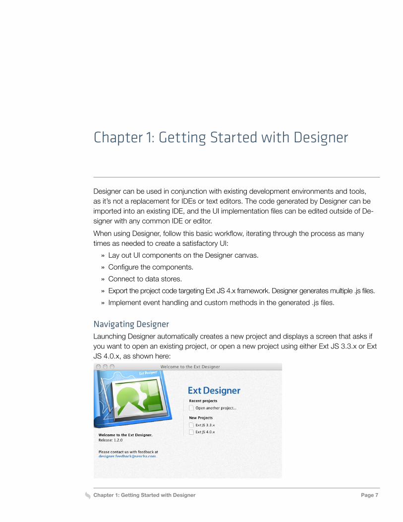
Navigating DesignerLaunching Designer automatically creates a new project and displays a screen that asks if you want to open an existing project, or open a new project using either Ext JS 3.3.x or Ext JS 4.0.x, as shown here:
Chapter 1: Getting Started with Designer Page 8
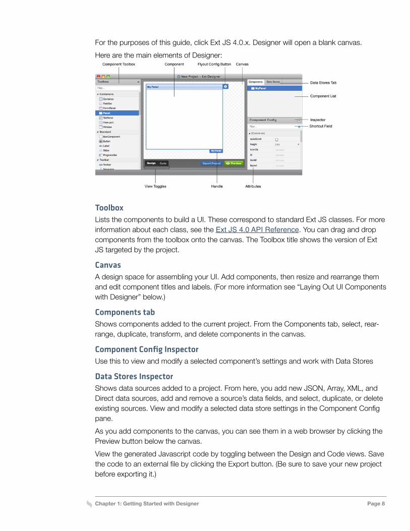
For the purposes of this guide, click Ext JS 4.0.x. Designer will open a blank canvas.Here are the main elements of Designer:
ToolboxLists the components to build a UI. These correspond to standard Ext JS classes. For more information about each class, see the Ext JS 4.0 API Reference. You can drag and drop components from the toolbox onto the canvas. The Toolbox title shows the version of Ext JS targeted by the project.
CanvasA design space for assembling your UI. Add components, then resize and rearrange them and edit component titles and labels. (For more information see “Laying Out UI Components with Designer” below.)
Components tabShows components added to the current project. From the Components tab, select, rear-range, duplicate, transform, and delete components in the canvas.
Component Config InspectorUse this to view and modify a selected component’s settings and work with Data Stores
Data Stores InspectorShows data sources added to a project. From here, you add new JSON, Array, XML, and Direct data sources, add and remove a source’s data fields, and select, duplicate, or delete existing sources. View and modify a selected data store settings in the Component Config pane.As you add components to the canvas, you can see them in a web browser by clicking the Preview button below the canvas.View the generated Javascript code by toggling between the Design and Code views. Save the code to an external file by clicking the Export button. (Be sure to save your new project before exporting it.)
Chapter 1: Getting Started with Designer Page 9
ShortcutsDesigner provides a number of navigation and configuration shortcuts, as follows:
» Double-click components in the Component Toolbox to add them to the canvas. » Tab between in-line editable fields on the canvas. » Locate particular attributes in the Component Config inspector by typing their name in
the filter field. » Set attribute values using Quickset: with the filter field in Component Config, type the
name of the attribute followed by a colon and the value you want to set. For example, title: ‘Car Listings’. note: for strings you would wrap in single quotes.
Anatomy of a UI created with DesignerDesigner enables flexible assembly of web page elements, easy reuse of components, and simplified maintenance of your UI. When laying out UI components with Designer, you drag a container such as a Window or FormPanel onto the canvas and add components to the container. By adding additional top-level containers to a project, you can lay out the different parts of the UI as separate entities. When you export your project, each top-level container is represented by a class with the code for that class in its own separate file.
Laying Out UI ComponentsDesigner leverages the powerful layout capabilities of Ext JS to simplify the creation of com-plex forms and make it easy to switch between alternate layout options.
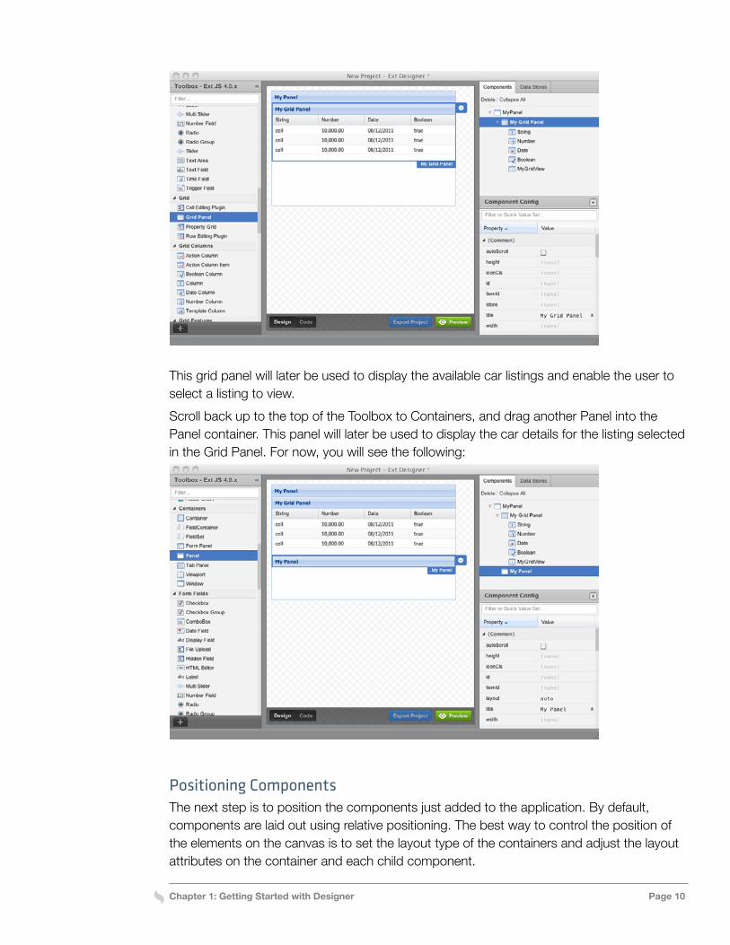
Adding ComponentsTo start assembling the application UI, drag components from the Toolbox onto the canvas. Designer ensures that components nest properly, and prevents the addition of incompat-ible components to a container. For example, Window or Viewport components can’t be dropped into a Container, and Designer will display an icon showing this can’t be done if you try to do this. The following steps show how to assemble an application UI. (The examples are all drawn from the Designer demo application, Car Listings. You can see a screen capture of the building of the Car Listings UI using Designer; see Additional Resources at the end of this chapter.)Drag a Panel container from the Toolbox onto the canvas. This is the top-level component for the application. Now scroll further down the Toolbox to the Grid Panel item, and drag a Grid Panel into the Panel container. The result will look like the following:
Chapter 1: Getting Started with Designer Page 10
This grid panel will later be used to display the available car listings and enable the user to select a listing to view. Scroll back up to the top of the Toolbox to Containers, and drag another Panel into the Panel container. This panel will later be used to display the car details for the listing selected in the Grid Panel. For now, you will see the following:
Positioning ComponentsThe next step is to position the components just added to the application. By default, components are laid out using relative positioning. The best way to control the position of the elements on the canvas is to set the layout type of the containers and adjust the layout attributes on the container and each child component.
Chapter 1: Getting Started with Designer Page 11
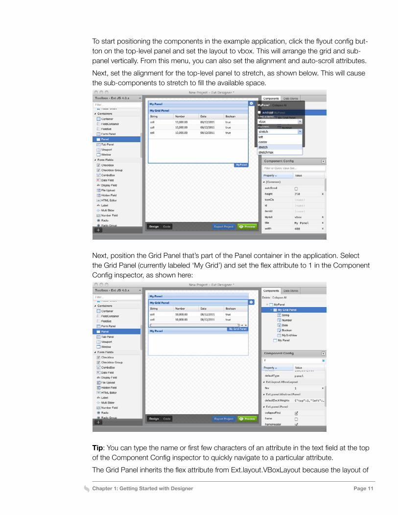
To start positioning the components in the example application, click the flyout config but-ton on the top-level panel and set the layout to vbox. This will arrange the grid and sub-panel vertically. From this menu, you can also set the alignment and auto-scroll attributes.Next, set the alignment for the top-level panel to stretch, as shown below. This will cause the sub-components to stretch to fill the available space.
Next, position the Grid Panel that’s part of the Panel container in the application. Select the Grid Panel (currently labeled ‘My Grid’) and set the flex attribute to 1 in the Component Config inspector, as shown here:
Tip: You can type the name or first few characters of an attribute in the text field at the top of the Component Config inspector to quickly navigate to a particular attribute.The Grid Panel inherits the flex attribute from Ext.layout.VBoxLayout because the layout of
Chapter 1: Getting Started with Designer Page 12
the Panel container is set to vbox. Setting the flex attribute of each of the components in the container to 1 will cause the components to take up the same amount of vertical space when the container is resized. (Similarly, if you wanted the sub-panel to take up two-thirds of the vertical space, you could set the flex value of the panel to 2 and the flex of the grid to 1.)You need to do the same thing to the sub-panel that’s been added to the top-level panel. Do this by selecting the sub-panel (currently labeled ‘My Panel, at the bottom of the top-level panel) and setting the flex attribute to 1.Although its not recommended, you can choose the absolute layout option, where you drag components on the canvas to reposition them. When working with Designer, however, it’s preferable to rely on the Ext JS layout manager to control the positioning and sizing of the components.
Layout OptionsSetting the layout on a container controls how Ext JS lays out the components within that container. Switch between layout options by clicking a container’s flyout config button and selecting a different layout.Ext JS provides the following basic container layouts. Some support specific, commonly-used presentation models such as accordions and cards, while others provide more gen-eral-purpose models that can be used for a variety of applications. They’re listed here; see “Chapter 2: Working With Layouts in Designer” to learn how to select and configure layouts and see examples of them.
» Auto » Absolute » Accordion » Anchor » Border » Card
» Column » Fit » Hbox » Table » Vbox
Configuring ComponentsComponent attributes such as titles and labels can be edited directly in the Designer Can-vas. Just double-click the text you want to modify and type. The Component Config inspec-tor enables configuration of all possible attributes for the selected component. Whenever you change the attribute from something other than the default value, Designer places an ‘x’ next to the attribute. This makes it easy to find edited attributes and revert to the default.
Chapter 1: Getting Started with Designer Page 13
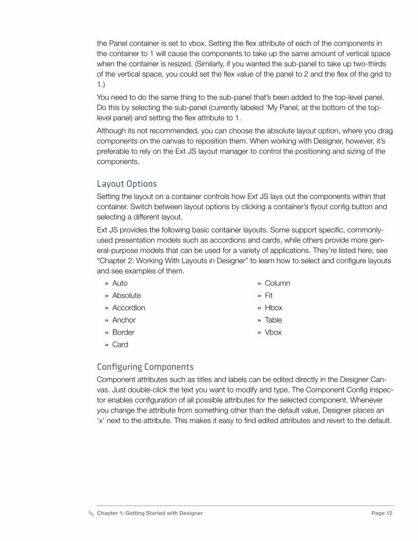
For the example application, start by setting the title and column heading attributes. Dou-ble-click the title of the top-level panel (‘My Panel’) and type Car Listings. This does the same as setting the title attribute in the Component Config inspector. You’ll see the follow-ing:
Next, double-click the text in the three column headings in the grid (‘Column’) one at a time. Type over each column head Manufacturer, Model, and Price (from left to right) to change their names. The component attributes can all be set in the Component Config inspector in the lower right corner of the Designer window. Try this for the rest of the component attributes in the example application.First, remove the title bars from the grid panel and sub-panel within the top-level panel. Select each component and click the clear button (x) to the right of the title attribute in the inspector. Now, the only title bar visible is the Car Listings title, as shown in the next image.The component needs to have its own name in the code that will be generated for the example UI. To name the component in the code, select the top-level panel, which you just renamed ‘Car Listings. Double-click the text next to the userClassName attribute in the Component Config inspector (‘MyPanel’). Type over it CarMasterDetail. To see the code for the project, click the Code button below the canvas. You can toggle between the design and code views by clicking the Design and Code buttons.Next, enable the frame attribute of the Car Listings panel. Instead of the plain 1px square borders, this renders the panel with additional styling, including rounded corners. Do this by scrolling further down the inspector and clicking the box next to the frame attribute. The box should now have a check mark in it.Now, configure ids for the components so they can be directly referenced in the code re-gardless of how they are nested. First, select the Grid Panel and set the itemId for the panel to ‘grid.’ Then, select the sub-panel and set its itemId to ‘detail’.
Chapter 1: Getting Started with Designer Page 14
To add padding around the contents of the sub-panel, select the panel, type p to jump to the padding attribute, and type 10 in the box next to the name of the attribute. This sets padding to 10, the typical CSS padding attribute.
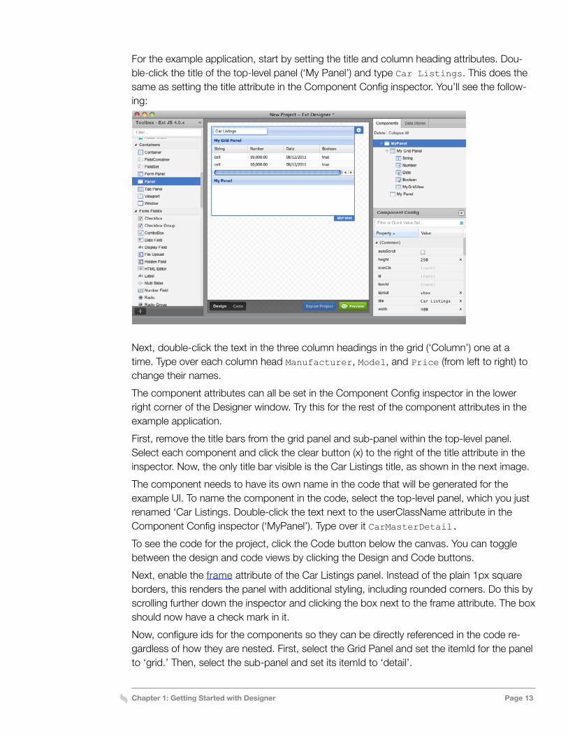
Using TemplatesYou can use templates to dynamically display information from a data store in a panel component. A template is an HTML fragment that can contain variables that reference fields in a data store. Templates also support auto-filling of arrays, conditional processing, math functions, and custom functions.Variables are enclosed in curly braces. For example, {manufacturer} references the data field called manufacturer. You can also specify formatting functions to control how the data is displayed. For example, {price:usMoney} uses the usMoney format to prepend a dollar sign and format the number as dollars and cents. See Ext.Util.Format for the full range of avail-able formatting functions.The Car Listings example application uses a template to display the detail information for the selected listing. The image and wiki URL are pulled in from data fields in the cars.json data store. (See “Connecting to Data,” below, for information about how to attach a data store.)To configure the template in the example Car Listings UI, click the flyout config button (a gear-shaped button in the blue tab just to the right of the component name) on the sub-panel and then click Edit Template to add a template for the detail information. The body of the component becomes an editable text area, as shown here.
Enter the HTML mark-up for the template into the text area, as follows:<img src=”cars/{img}” style=”float: right” />
Manufacturer: {manufacturer}<br/>
Model: <a href=”{wiki}” target=”_blank”>{model}</a><br/>
Price: {price:usMoney}<br/>
Click Done Editing to save the HTML to the example application.
Chapter 1: Getting Started with Designer Page 15
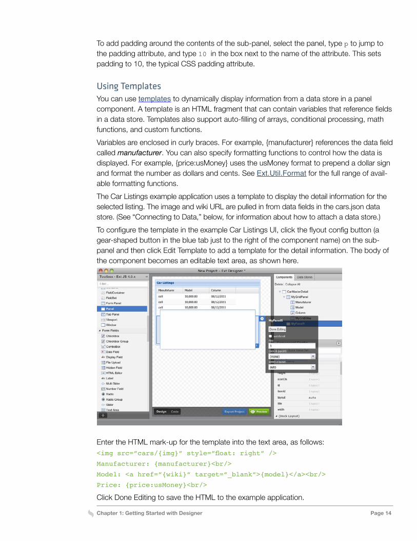
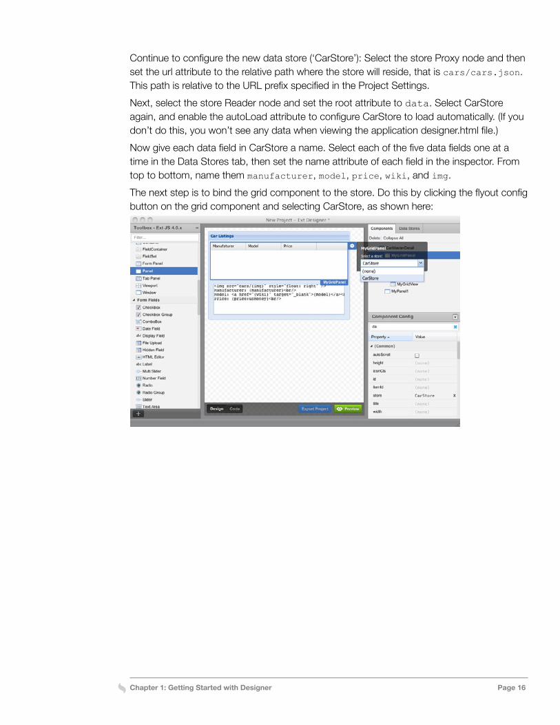
Connecting to DataYou can attach data stores and bind them to the components in your UI from Designer.The listing information displayed by the Car Listings application is read from a JSON data store called cars.json. To connect the data store and pull in manufacturer, model, price, wiki, and image data, start by adding a data store for the cars data.Select the Data Stores tab, then select Json Store from the Data Stores toolbar, as shown here:
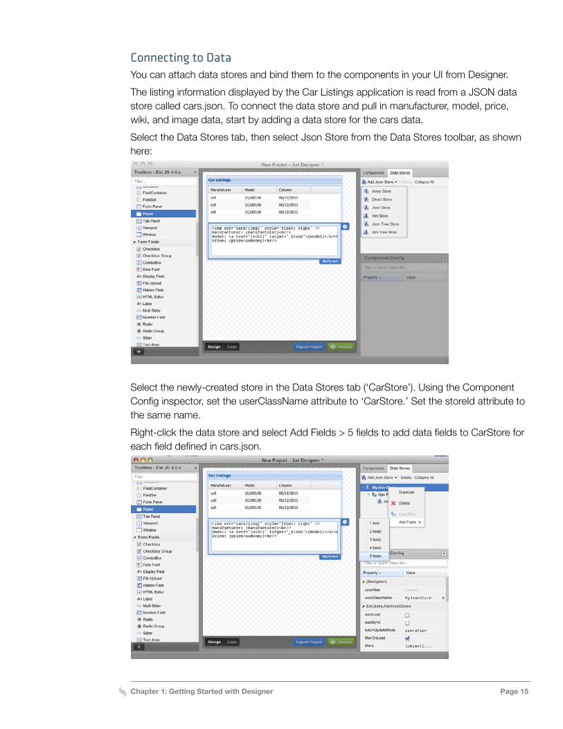
Select the newly-created store in the Data Stores tab (‘CarStore’). Using the Component Config inspector, set the userClassName attribute to ‘CarStore.’ Set the storeId attribute to the same name.Right-click the data store and select Add Fields > 5 fields to add data fields to CarStore for each field defined in cars.json.
Chapter 1: Getting Started with Designer Page 16
Continue to configure the new data store (‘CarStore’): Select the store Proxy node and then set the url attribute to the relative path where the store will reside, that is cars/cars.json. This path is relative to the URL prefix specified in the Project Settings.Next, select the store Reader node and set the root attribute to data. Select CarStore again, and enable the autoLoad attribute to configure CarStore to load automatically. (If you don’t do this, you won’t see any data when viewing the application designer.html file.)Now give each data field in CarStore a name. Select each of the five data fields one at a time in the Data Stores tab, then set the name attribute of each field in the inspector. From top to bottom, name them manufacturer, model, price, wiki, and img.The next step is to bind the grid component to the store. Do this by clicking the flyout config button on the grid component and selecting CarStore, as shown here:
Chapter 1: Getting Started with Designer Page 17
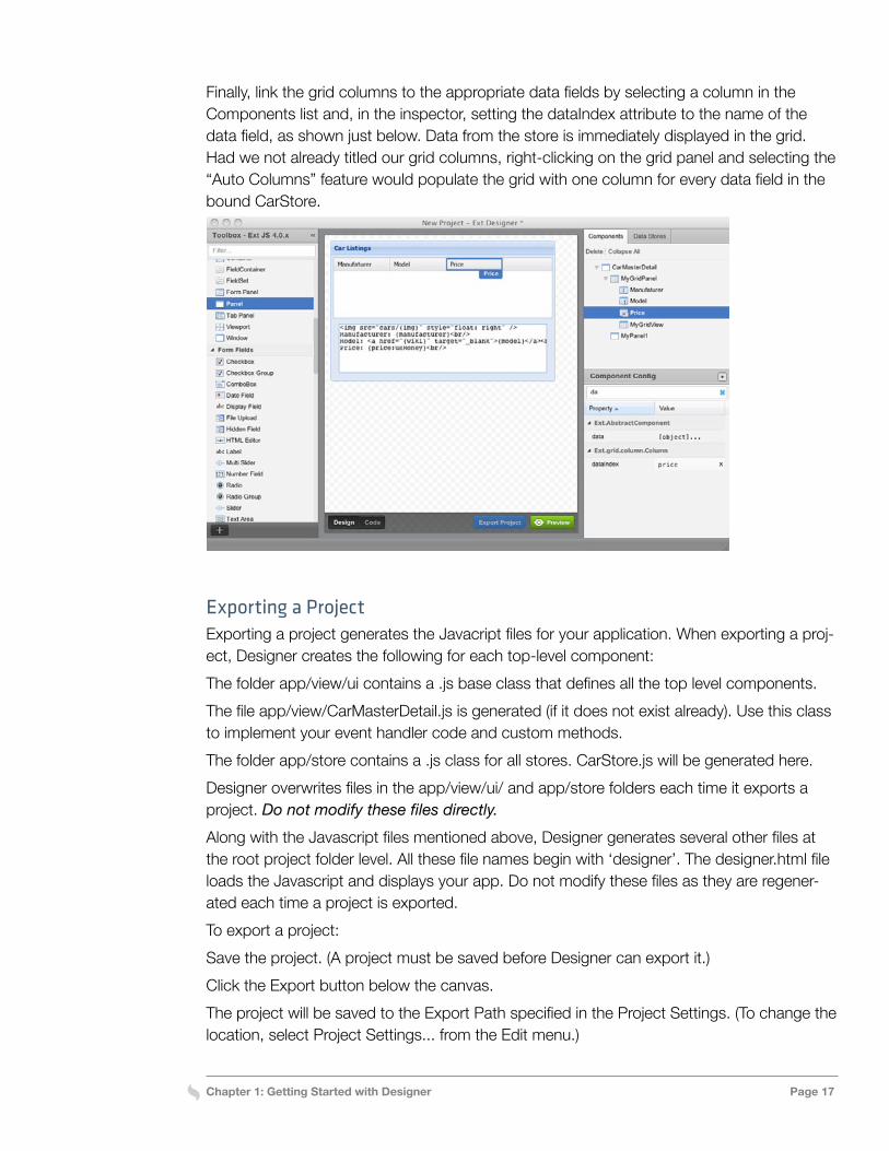
Finally, link the grid columns to the appropriate data fields by selecting a column in the Components list and, in the inspector, setting the dataIndex attribute to the name of the data field, as shown just below. Data from the store is immediately displayed in the grid. Had we not already titled our grid columns, right-clicking on the grid panel and selecting the “Auto Columns” feature would populate the grid with one column for every data field in the bound CarStore.
Exporting a ProjectExporting a project generates the Javacript files for your application. When exporting a proj-ect, Designer creates the following for each top-level component:The folder app/view/ui contains a .js base class that defines all the top level components.The file app/view/CarMasterDetail.js is generated (if it does not exist already). Use this class to implement your event handler code and custom methods.The folder app/store contains a .js class for all stores. CarStore.js will be generated here.Designer overwrites files in the app/view/ui/ and app/store folders each time it exports a project. Do not modify these files directly.Along with the Javascript files mentioned above, Designer generates several other files at the root project folder level. All these file names begin with ‘designer’. The designer.html file loads the Javascript and displays your app. Do not modify these files as they are regener-ated each time a project is exported.To export a project:Save the project. (A project must be saved before Designer can export it.)Click the Export button below the canvas.The project will be saved to the Export Path specified in the Project Settings. (To change the location, select Project Settings... from the Edit menu.)
Chapter 1: Getting Started with Designer Page 18
Attaching Event Handlers to UI ComponentsThe files Designer generates can be imported to an external IDE or editor for customiza-tion or adding event handlers. You add event handlers by editing the .js files exported by Designer. Here’s how to add an event handler to the Car Listings example application that displays the appropriate image and wiki information when a user selects a row in the grid.In the file CarMasterDetail.js Designer created when it exported the Car Listings example application, retrieve the selection model reference for the grid:var sm = me.down(‘#grid’).getSelectionModel();
The default selection model for a grid is a RowModel. Whenever a row in the grid is select-ed, a select event is fired. This event includes the SelectionModel, the record that provides the data for the row, and the rowIndex.Next, add an event handler to call a custom onGridRowSelect function when a row in the grid is selected:sm.on(‘select’, me.onGridRowSelect, me);
Finally, implement onGridRowSelect to update the detail panel with the data from the data store:onGridRowSelect: function(grid, record) {
this.down(‘#detail’).update(record.data);
}
Test the final application by launching it in the browser, pointing to the URL specified in the Project Settings dialog.For more information about working with Ext JS grids, see the API Documentation.
Additional InformationFor more information about Designer and Ext JS:
» Watch the Designer Demo, which shows how to build the Car Listings example ap-plication described here. » View the Designer webcast, which introduces Designer 1.2 » For information about release and updates, see the Designer Changelog. » If you’re new to Ext JS, see the Learn Ext JS section of the Learning Center. » For the details about any Ext JS class or method, see the Ext JS API Reference.
Chapter 2: Working with Layouts Page 19
Chapter 2: Working with Layouts
In Ext JS, layouts control the size and position of the components within an application. With Designer, configuring a layout on each container lets you manage how that container’s children are rendered. The container layout determines what size and position configuration options can be set on its child components.
Basic Container LayoutsExt JS provides a number of basic container layouts, which you can select and configure using Designer. Some support specific, commonly used presentation models such as ac-cordions and cards, while others provide more general-purpose models that can be used for a variety of applications.
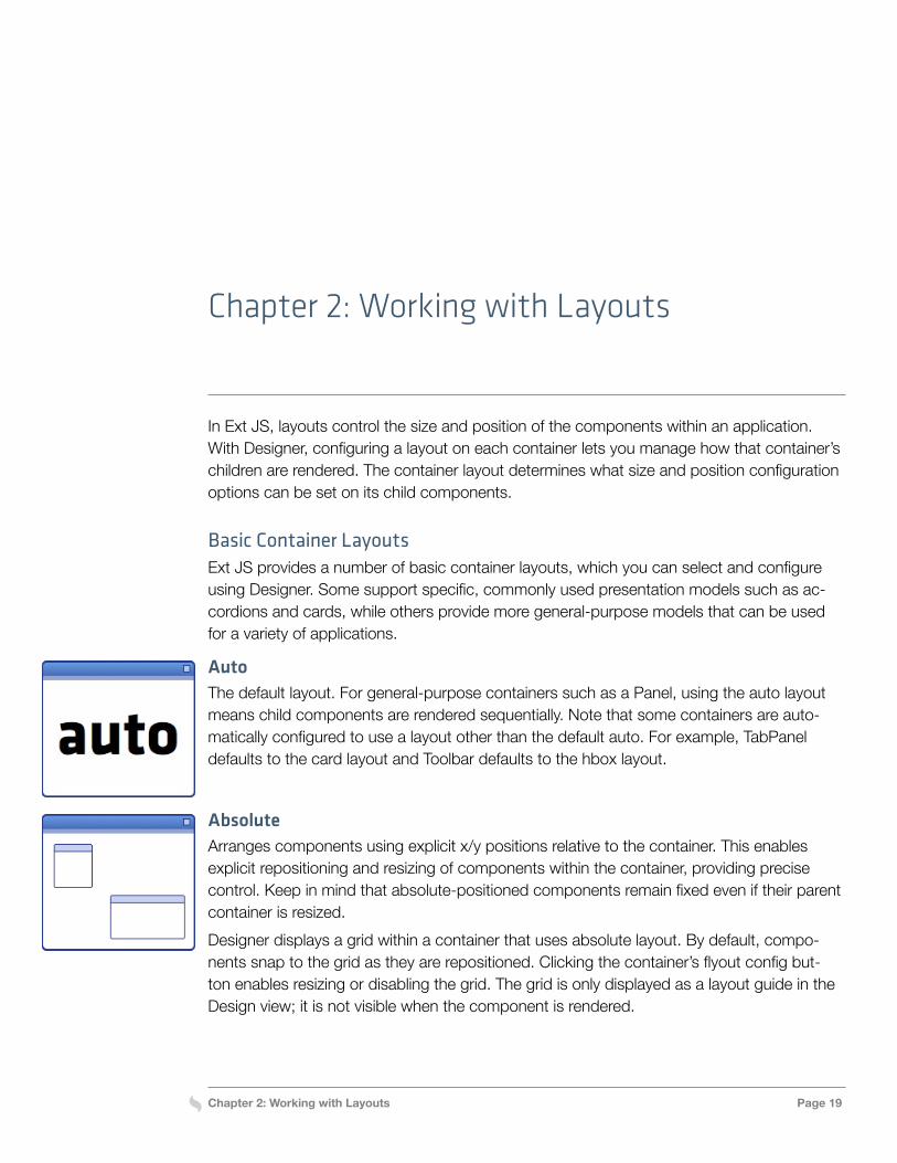
AutoThe default layout. For general-purpose containers such as a Panel, using the auto layout means child components are rendered sequentially. Note that some containers are auto-matically configured to use a layout other than the default auto. For example, TabPanel defaults to the card layout and Toolbar defaults to the hbox layout.
AbsoluteArranges components using explicit x/y positions relative to the container. This enables explicit repositioning and resizing of components within the container, providing precise control. Keep in mind that absolute-positioned components remain fixed even if their parent container is resized.Designer displays a grid within a container that uses absolute layout. By default, compo-nents snap to the grid as they are repositioned. Clicking the container’s flyout config but-ton enables resizing or disabling the grid. The grid is only displayed as a layout guide in the Design view; it is not visible when the component is rendered.
Chapter 2: Working with Layouts Page 20
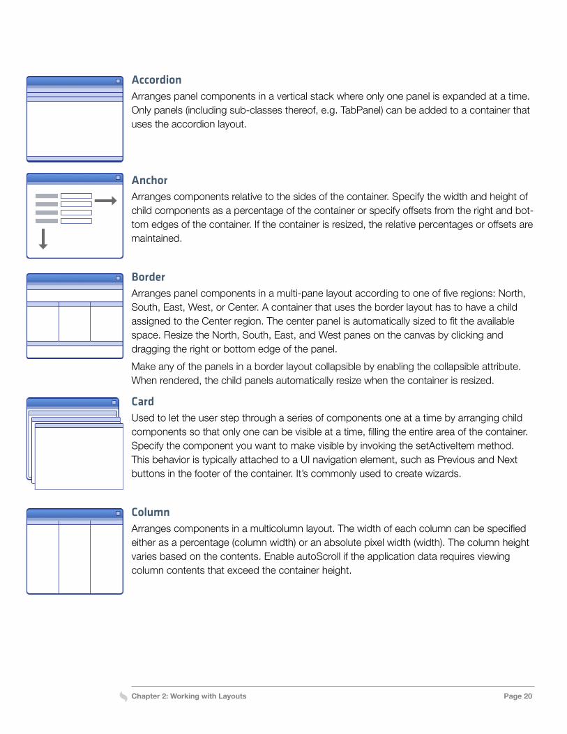
AccordionArranges panel components in a vertical stack where only one panel is expanded at a time. Only panels (including sub-classes thereof, e.g. TabPanel) can be added to a container that uses the accordion layout.
AnchorArranges components relative to the sides of the container. Specify the width and height of child components as a percentage of the container or specify offsets from the right and bot-tom edges of the container. If the container is resized, the relative percentages or offsets are maintained.
BorderArranges panel components in a multi-pane layout according to one of five regions: North, South, East, West, or Center. A container that uses the border layout has to have a child assigned to the Center region. The center panel is automatically sized to fit the available space. Resize the North, South, East, and West panes on the canvas by clicking and dragging the right or bottom edge of the panel.Make any of the panels in a border layout collapsible by enabling the collapsible attribute. When rendered, the child panels automatically resize when the container is resized.
CardUsed to let the user step through a series of components one at a time by arranging child components so that only one can be visible at a time, filling the entire area of the container. Specify the component you want to make visible by invoking the setActiveItem method. This behavior is typically attached to a UI navigation element, such as Previous and Next buttons in the footer of the container. It’s commonly used to create wizards.
ColumnArranges components in a multicolumn layout. The width of each column can be specified either as a percentage (column width) or an absolute pixel width (width). The column height varies based on the contents. Enable autoScroll if the application data requires viewing column contents that exceed the container height.
Chapter 2: Working with Layouts Page 21
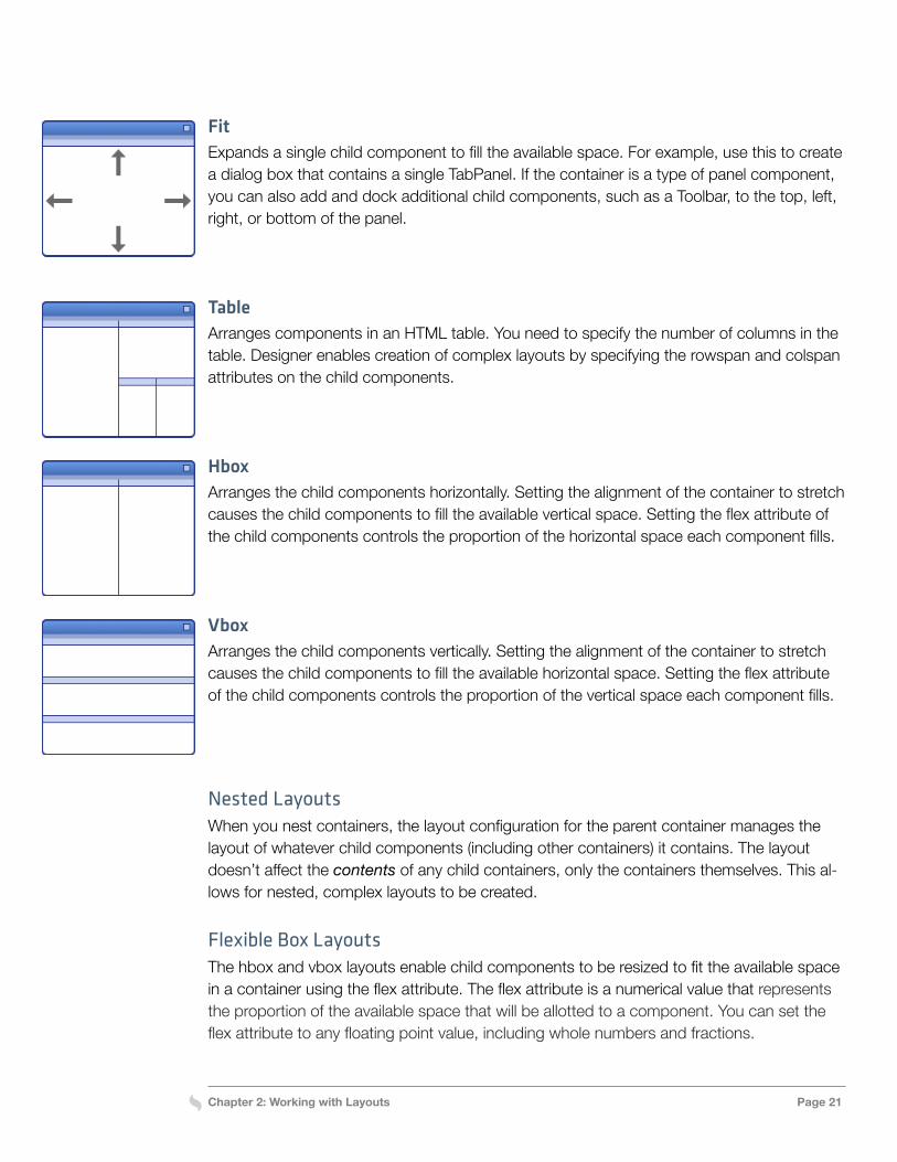
FitExpands a single child component to fill the available space. For example, use this to create a dialog box that contains a single TabPanel. If the container is a type of panel component, you can also add and dock additional child components, such as a Toolbar, to the top, left, right, or bottom of the panel.
TableArranges components in an HTML table. You need to specify the number of columns in the table. Designer enables creation of complex layouts by specifying the rowspan and colspan attributes on the child components.
HboxArranges the child components horizontally. Setting the alignment of the container to stretch causes the child components to fill the available vertical space. Setting the flex attribute of the child components controls the proportion of the horizontal space each component fills.
VboxArranges the child components vertically. Setting the alignment of the container to stretch causes the child components to fill the available horizontal space. Setting the flex attribute of the child components controls the proportion of the vertical space each component fills.
Nested LayoutsWhen you nest containers, the layout configuration for the parent container manages the layout of whatever child components (including other containers) it contains. The layout doesn’t affect the contents of any child containers, only the containers themselves. This al-lows for nested, complex layouts to be created.
Flexible Box LayoutsThe hbox and vbox layouts enable child components to be resized to fit the available space in a container using the flex attribute. The flex attribute is a numerical value that represents the proportion of the available space that will be allotted to a component. You can set the flex attribute to any floating point value, including whole numbers and fractions.
Chapter 2: Working with Layouts Page 22
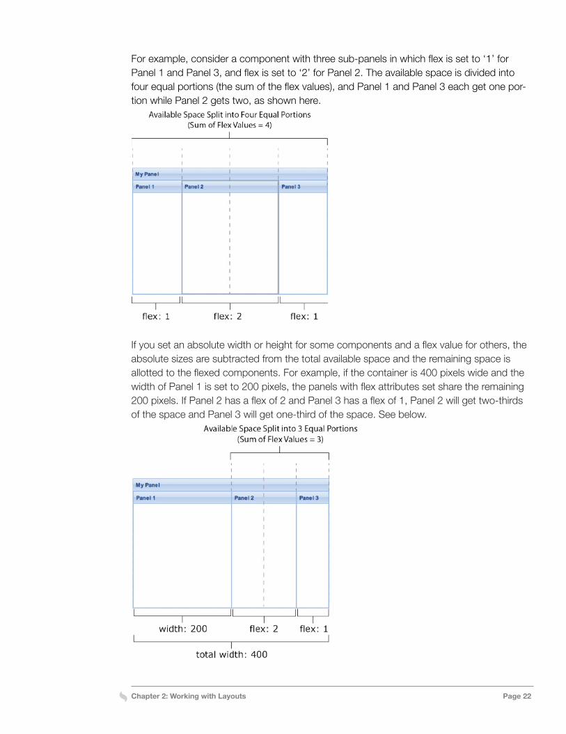
For example, consider a component with three sub-panels in which flex is set to ‘1’ for Panel 1 and Panel 3, and flex is set to ‘2’ for Panel 2. The available space is divided into four equal portions (the sum of the flex values), and Panel 1 and Panel 3 each get one por-tion while Panel 2 gets two, as shown here.
If you set an absolute width or height for some components and a flex value for others, the absolute sizes are subtracted from the total available space and the remaining space is allotted to the flexed components. For example, if the container is 400 pixels wide and the width of Panel 1 is set to 200 pixels, the panels with flex attributes set share the remaining 200 pixels. If Panel 2 has a flex of 2 and Panel 3 has a flex of 1, Panel 2 will get two-thirds of the space and Panel 3 will get one-third of the space. See below.
Chapter 2: Working with Layouts Page 23
If neither an absolute size nor a flex value are specified for a component, the framework checks to see if the size is defined in the application’s CSS. If no size is specified in the CSS, the framework assigns the minimum necessary space to the item.
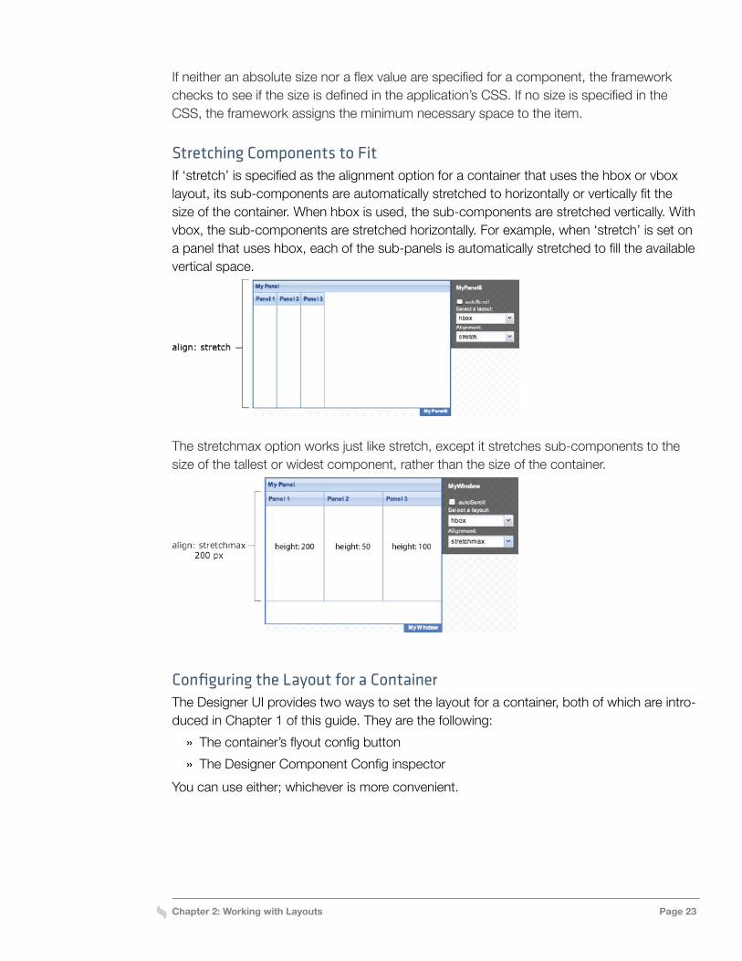
Stretching Components to FitIf ‘stretch’ is specified as the alignment option for a container that uses the hbox or vbox layout, its sub-components are automatically stretched to horizontally or vertically fit the size of the container. When hbox is used, the sub-components are stretched vertically. With vbox, the sub-components are stretched horizontally. For example, when ‘stretch’ is set on a panel that uses hbox, each of the sub-panels is automatically stretched to fill the available vertical space.
The stretchmax option works just like stretch, except it stretches sub-components to the size of the tallest or widest component, rather than the size of the container.
Configuring the Layout for a ContainerThe Designer UI provides two ways to set the layout for a container, both of which are intro-duced in Chapter 1 of this guide. They are the following:
» The container’s flyout config button » The Designer Component Config inspector
You can use either; whichever is more convenient.
Chapter 2: Working with Layouts Page 24
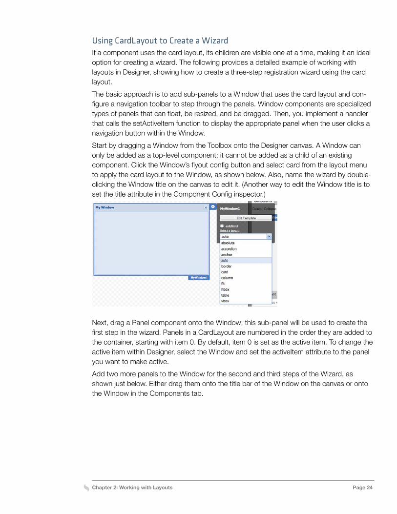
Using CardLayout to Create a WizardIf a component uses the card layout, its children are visible one at a time, making it an ideal option for creating a wizard. The following provides a detailed example of working with layouts in Designer, showing how to create a three-step registration wizard using the card layout.The basic approach is to add sub-panels to a Window that uses the card layout and con-figure a navigation toolbar to step through the panels. Window components are specialized types of panels that can float, be resized, and be dragged. Then, you implement a handler that calls the setActiveItem function to display the appropriate panel when the user clicks a navigation button within the Window.Start by dragging a Window from the Toolbox onto the Designer canvas. A Window can only be added as a top-level component; it cannot be added as a child of an existing component. Click the Window’s flyout config button and select card from the layout menu to apply the card layout to the Window, as shown below. Also, name the wizard by double-clicking the Window title on the canvas to edit it. (Another way to edit the Window title is to set the title attribute in the Component Config inspector.)
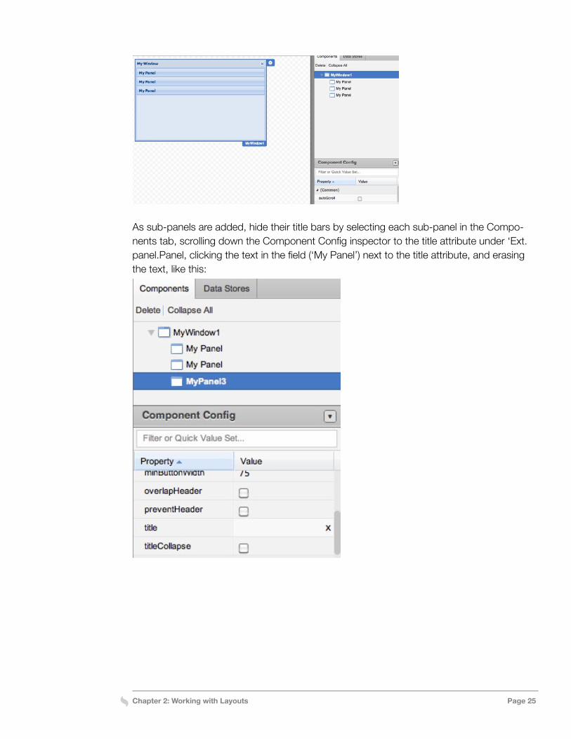
Next, drag a Panel component onto the Window; this sub-panel will be used to create the first step in the wizard. Panels in a CardLayout are numbered in the order they are added to the container, starting with item 0. By default, item 0 is set as the active item. To change the active item within Designer, select the Window and set the activeItem attribute to the panel you want to make active.Add two more panels to the Window for the second and third steps of the Wizard, as shown just below. Either drag them onto the title bar of the Window on the canvas or onto the Window in the Components tab.
Chapter 2: Working with Layouts Page 25
As sub-panels are added, hide their title bars by selecting each sub-panel in the Compo-nents tab, scrolling down the Component Config inspector to the title attribute under ‘Ext.panel.Panel, clicking the text in the field (‘My Panel’) next to the title attribute, and erasing the text, like this:
Chapter 2: Working with Layouts Page 26
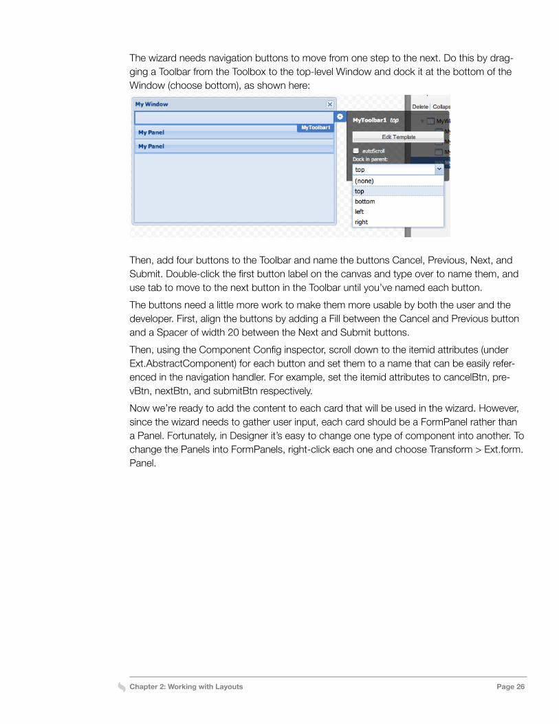
The wizard needs navigation buttons to move from one step to the next. Do this by drag-ging a Toolbar from the Toolbox to the top-level Window and dock it at the bottom of the Window (choose bottom), as shown here:
Then, add four buttons to the Toolbar and name the buttons Cancel, Previous, Next, and Submit. Double-click the first button label on the canvas and type over to name them, and use tab to move to the next button in the Toolbar until you’ve named each button. The buttons need a little more work to make them more usable by both the user and the developer. First, align the buttons by adding a Fill between the Cancel and Previous button and a Spacer of width 20 between the Next and Submit buttons.Then, using the Component Config inspector, scroll down to the itemid attributes (under Ext.AbstractComponent) for each button and set them to a name that can be easily refer-enced in the navigation handler. For example, set the itemid attributes to cancelBtn, pre-vBtn, nextBtn, and submitBtn respectively.Now we’re ready to add the content to each card that will be used in the wizard. However, since the wizard needs to gather user input, each card should be a FormPanel rather than a Panel. Fortunately, in Designer it’s easy to change one type of component into another. To change the Panels into FormPanels, right-click each one and choose Transform > Ext.form.Panel.
Chapter 2: Working with Layouts Page 27
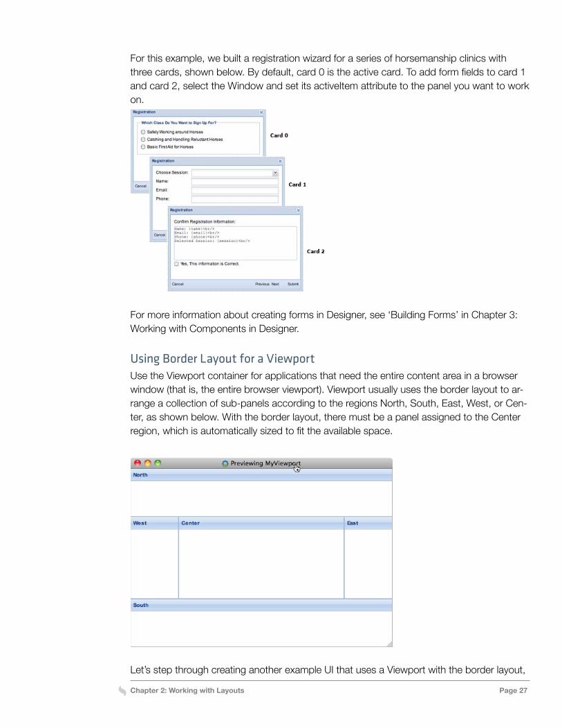
For this example, we built a registration wizard for a series of horsemanship clinics with three cards, shown below. By default, card 0 is the active card. To add form fields to card 1 and card 2, select the Window and set its activeItem attribute to the panel you want to work on.
For more information about creating forms in Designer, see ‘Building Forms’ in Chapter 3: Working with Components in Designer.
Using Border Layout for a ViewportUse the Viewport container for applications that need the entire content area in a browser window (that is, the entire browser viewport). Viewport usually uses the border layout to ar-range a collection of sub-panels according to the regions North, South, East, West, or Cen-ter, as shown below. With the border layout, there must be a panel assigned to the Center region, which is automatically sized to fit the available space.
Let’s step through creating another example UI that uses a Viewport with the border layout,
Chapter 2: Working with Layouts Page 28
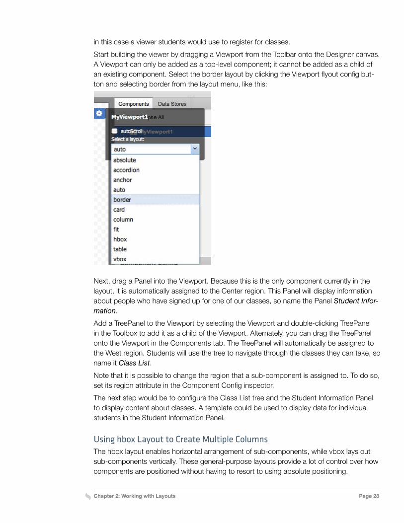
in this case a viewer students would use to register for classes. Start building the viewer by dragging a Viewport from the Toolbar onto the Designer canvas. A Viewport can only be added as a top-level component; it cannot be added as a child of an existing component. Select the border layout by clicking the Viewport flyout config but-ton and selecting border from the layout menu, like this:
Next, drag a Panel into the Viewport. Because this is the only component currently in the layout, it is automatically assigned to the Center region. This Panel will display information about people who have signed up for one of our classes, so name the Panel Student Infor-mation.Add a TreePanel to the Viewport by selecting the Viewport and double-clicking TreePanel in the Toolbox to add it as a child of the Viewport. Alternately, you can drag the TreePanel onto the Viewport in the Components tab. The TreePanel will automatically be assigned to the West region. Students will use the tree to navigate through the classes they can take, so name it Class List.Note that it is possible to change the region that a sub-component is assigned to. To do so, set its region attribute in the Component Config inspector. The next step would be to configure the Class List tree and the Student Information Panel to display content about classes. A template could be used to display data for individual students in the Student Information Panel.
Using hbox Layout to Create Multiple ColumnsThe hbox layout enables horizontal arrangement of sub-components, while vbox lays out sub-components vertically. These general-purpose layouts provide a lot of control over how components are positioned without having to resort to using absolute positioning.
Chapter 2: Working with Layouts Page 29
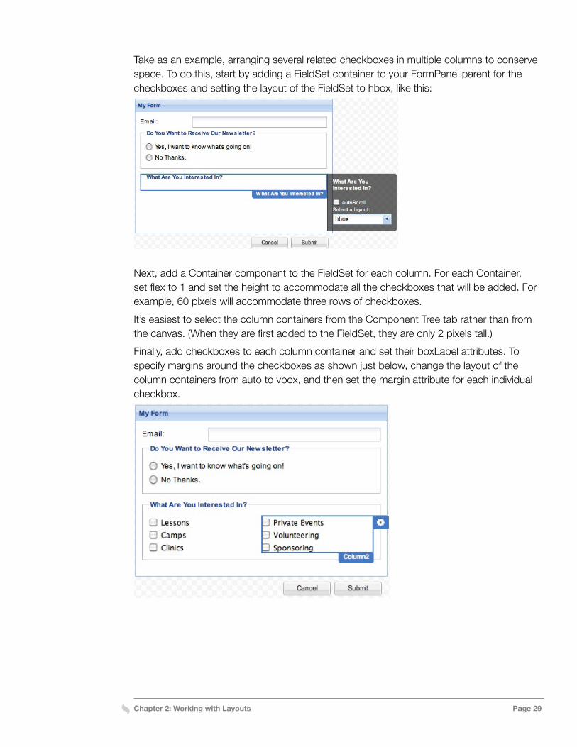
Take as an example, arranging several related checkboxes in multiple columns to conserve space. To do this, start by adding a FieldSet container to your FormPanel parent for the checkboxes and setting the layout of the FieldSet to hbox, like this:
Next, add a Container component to the FieldSet for each column. For each Container, set flex to 1 and set the height to accommodate all the checkboxes that will be added. For example, 60 pixels will accommodate three rows of checkboxes.It’s easiest to select the column containers from the Component Tree tab rather than from the canvas. (When they are first added to the FieldSet, they are only 2 pixels tall.)Finally, add checkboxes to each column container and set their boxLabel attributes. To specify margins around the checkboxes as shown just below, change the layout of the column containers from auto to vbox, and then set the margin attribute for each individual checkbox.
Chapter 3: Component Overview Page 30
Chapter 3: Component Overview
Designer supports all of the standard Ext JS UI components. This chapter provides an over-view of the standard components available through the Designer Toolbox and how to work with them, including the following types of components:
» Containers » Charts » Form Fields » Grid » Menu
» Standard » Toolbar » Tree » Views
For additional information about individual components, see the Ext JS API Documentation. Also, keep in mind that custom components created in Ext JS can be saved and accessed through the Toolbox, as well as exported from Designer and saved to your development system for later importing back into other Designer projects.
Adding Components to a UIBuilding an application UI starts with dragging a container to the Designer canvas, selecting from a variety of common UI containers provided by Ext JS, including the most basic con-tainer, called simply a Container, as well Window, Panel, and Viewport; see the next section for an overview of all of them.The next steps are to add display and control components to the container as well as ar-ranging the components with the container’s layout options. For more about layouts, see Chapter 2 in this guide and check out the Ext JS Layout Browser. Dragging additional con-tainers within the first container adds them as children; dragging them to an empty portion of the canvas adds them as new top-level containers.When nesting containers, make sure not to add redundant containers to the hierarchy. For example, if you want to display a Tree Panel and a Grid Panel in a Viewport that uses BorderLayout, you can add them directly to the Viewport and set their region attributes to control their positions. There’s no need to add left and center Panel components to the Viewport first, and then add the Tree Panel and Grid Panel to those Panels.
Chapter 3: Component Overview Page 31
Designer prevents the addition of invalid components to a parent container. For example, Viewports and Windows can only be used as top-level components and cannot be nested within other containers.When Designer exports a project, it automatically generates a separate class file for each top-level component. Nested components can be exported as separate classes by using the Promote to Class option. This enables Designer to generate several smaller, easier to maintain implementation files for a complex interface rather than a single, large, monolithic code file. It also makes it easier to reuse custom components.
Containers OverviewExt JS provides a variety of standard container types that can be added to a UI and config-ured using Designer to meet most development needs. Let’s take a look at all of them.
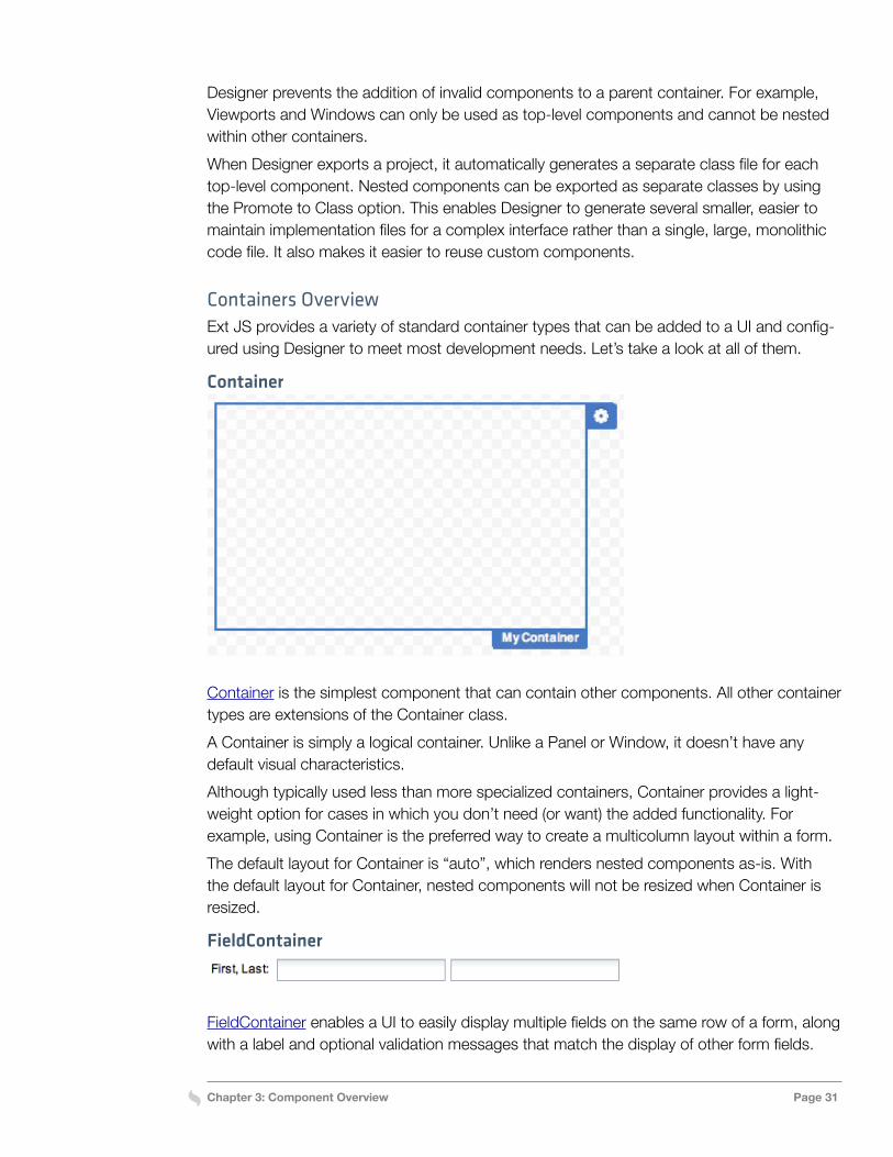
Container
Container is the simplest component that can contain other components. All other container types are extensions of the Container class. A Container is simply a logical container. Unlike a Panel or Window, it doesn’t have any default visual characteristics.Although typically used less than more specialized containers, Container provides a light-weight option for cases in which you don’t need (or want) the added functionality. For example, using Container is the preferred way to create a multicolumn layout within a form.The default layout for Container is “auto”, which renders nested components as-is. With the default layout for Container, nested components will not be resized when Container is resized.
FieldContainer
FieldContainer enables a UI to easily display multiple fields on the same row of a form, along with a label and optional validation messages that match the display of other form fields.
Chapter 3: Component Overview Page 32
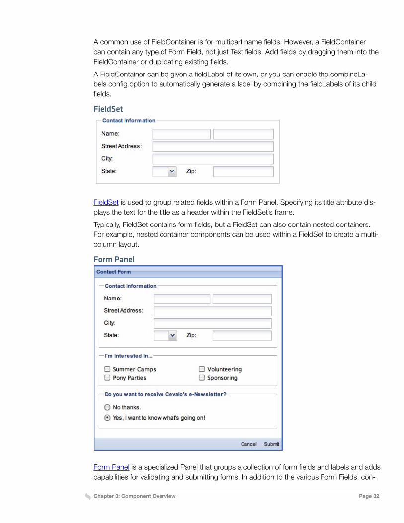
A common use of FieldContainer is for multipart name fields. However, a FieldContainer can contain any type of Form Field, not just Text fields. Add fields by dragging them into the FieldContainer or duplicating existing fields.A FieldContainer can be given a fieldLabel of its own, or you can enable the combineLa-bels config option to automatically generate a label by combining the fieldLabels of its child fields.
FieldSet
FieldSet is used to group related fields within a Form Panel. Specifying its title attribute dis-plays the text for the title as a header within the FieldSet’s frame.Typically, FieldSet contains form fields, but a FieldSet can also contain nested containers. For example, nested container components can be used within a FieldSet to create a multi-column layout.
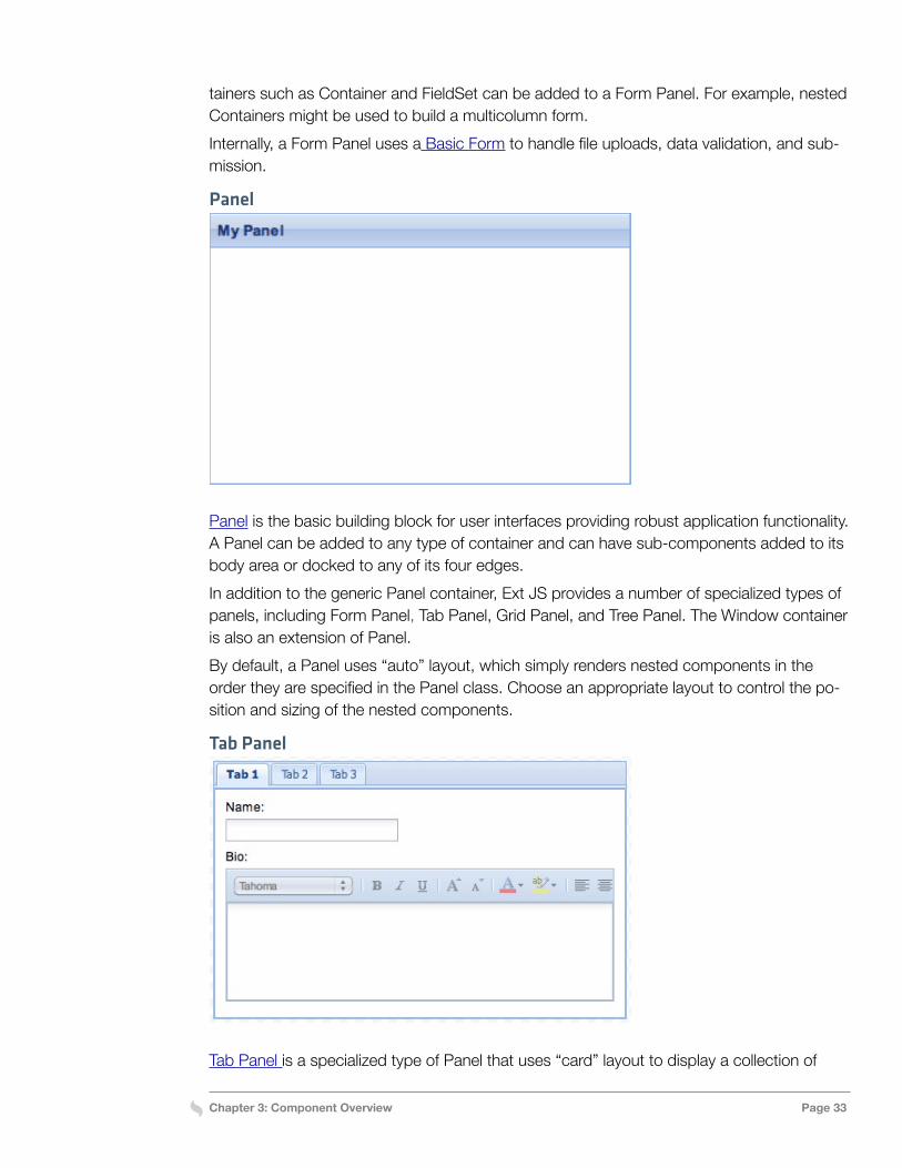
Form Panel
Form Panel is a specialized Panel that groups a collection of form fields and labels and adds capabilities for validating and submitting forms. In addition to the various Form Fields, con-
Chapter 3: Component Overview Page 33
tainers such as Container and FieldSet can be added to a Form Panel. For example, nested Containers might be used to build a multicolumn form.Internally, a Form Panel uses a Basic Form to handle file uploads, data validation, and sub-mission.
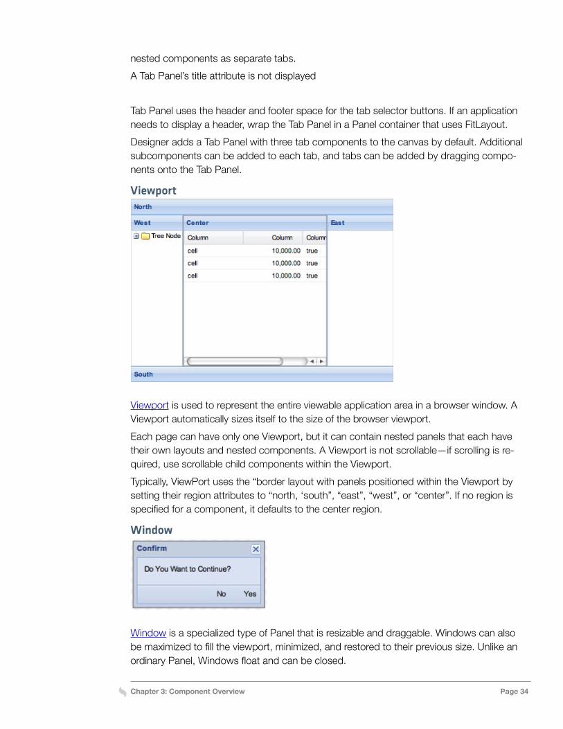
Panel
Panel is the basic building block for user interfaces providing robust application functionality. A Panel can be added to any type of container and can have sub-components added to its body area or docked to any of its four edges.In addition to the generic Panel container, Ext JS provides a number of specialized types of panels, including Form Panel, Tab Panel, Grid Panel, and Tree Panel. The Window container is also an extension of Panel.By default, a Panel uses “auto” layout, which simply renders nested components in the order they are specified in the Panel class. Choose an appropriate layout to control the po-sition and sizing of the nested components.
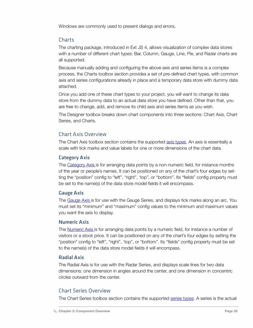
Tab Panel
Tab Panel is a specialized type of Panel that uses “card” layout to display a collection of
Chapter 3: Component Overview Page 34
nested components as separate tabs.A Tab Panel’s title attribute is not displayed
Tab Panel uses the header and footer space for the tab selector buttons. If an application needs to display a header, wrap the Tab Panel in a Panel container that uses FitLayout.Designer adds a Tab Panel with three tab components to the canvas by default. Additional subcomponents can be added to each tab, and tabs can be added by dragging compo-nents onto the Tab Panel.
Viewport
Viewport is used to represent the entire viewable application area in a browser window. A Viewport automatically sizes itself to the size of the browser viewport.Each page can have only one Viewport, but it can contain nested panels that each have their own layouts and nested components. A Viewport is not scrollable—if scrolling is re-quired, use scrollable child components within the Viewport.Typically, ViewPort uses the “border layout with panels positioned within the Viewport by setting their region attributes to “north, ‘south”, “east”, “west”, or “center”. If no region is specified for a component, it defaults to the center region.
Window
Window is a specialized type of Panel that is resizable and draggable. Windows can also be maximized to fill the viewport, minimized, and restored to their previous size. Unlike an ordinary Panel, Windows float and can be closed.
Chapter 3: Component Overview Page 35
Windows are commonly used to present dialogs and errors.
ChartsThe charting package, introduced in Ext JS 4, allows visualization of complex data stores with a number of different chart types: Bar, Column, Gauge, Line, Pie, and Radar charts are all supported.Because manually adding and configuring the above axis and series items is a complex process, the Charts toolbox section provides a set of pre-defined chart types, with common axis and series configurations already in place and a temporary data store with dummy data attached.Once you add one of these chart types to your project, you will want to change its data store from the dummy data to an actual data store you have defined. Other than that, you are free to change, add, and remove its child axis and series items as you wish.The Designer toolbox breaks down chart components into three sections: Chart Axis, Chart Series, and Charts.
Chart Axis OverviewThe Chart Axis toolbox section contains the supported axis types. An axis is essentially a scale with tick marks and value labels for one or more dimensions of the chart data.
Category AxisThe Category Axis is for arranging data points by a non-numeric field, for instance months of the year or people’s names. It can be positioned on any of the chart’s four edges by set-ting the “position” config to “left”, “right”, ‘top”, or “bottom”. Its “fields” config property must be set to the name(s) of the data store model fields it will encompass.
Gauge AxisThe Gauge Axis is for use with the Gauge Series, and displays tick marks along an arc. You must set its “minimum” and “maximum” config values to the minimum and maximum values you want the axis to display.
Numeric AxisThe Numeric Axis is for arranging data points by a numeric field, for instance a number of visitors or a stock price. It can be positioned on any of the chart’s four edges by setting the “position” config to “left”, “right”, ‘top”, or “bottom”. Its “fields” config property must be set to the name(s) of the data store model fields it will encompass.
Radial AxisThe Radial Axis is for use with the Radar Series, and displays scale lines for two data dimensions: one dimension in angles around the center, and one dimension in concentric circles outward from the center.
Chart Series OverviewThe Chart Series toolbox section contains the supported series types. A series is the actual
Chapter 3: Component Overview Page 36
representation of the records in the data store.
Area SeriesArea Series is similar to a Line Series, but allows different data points to be stacked on top of each other, each one’s value being represented by the area below it. Its “xField” and “yField config properties must be set to the names of the data model fields for its x and y dimensions, and its “axis” config property must be set to the edge of the axis corresponding to its yField.
Bar SeriesBar Series displays each data record as a horizontal bar. For vertical bars, use Column Se-ries. Its “xField” and “yField” config properties must be set to the names of the data model fields for its x and y dimensions, and its “axis” config property must be set to the edge of the axis corresponding to its yField.
Column SeriesColumn Series is identical to Bar Series, but displays the bars vertically instead of horizon-tally.
Gauge SeriesGauge Series displays a single data point as a gauge along an arc. Its “angleField” config property must be set to the name of the data model field holding its value.
Line SeriesLine Series displays each data record as a vertex on a horizontal line. The lines between points can be straight, or smoothed via the ‘smooth” config. Its “xField” and “yField” config properties must be set to the names of the data model fields for its x and y dimensions, and its “axis” config property must be set to the edge of the axis corresponding to its yField.
Pie SeriesPie Series displays data points as relatively-sized angle slices in a circle. Its “angleField” config property must be set to the name of the data model field holding the value for each slice.
Radar SeriesRadar Series displays data points as vertices of a line of varying distance from the center of a circle. It is most useful in conjunction with a Radial Axis. Its “xField” and “yField” con-fig properties must be set to the names of the data model fields for its angular and radius dimensions, respectively.
Scatter SeriesScatter Series is similar to Line Series but displays individual markers at each data point and does not connect them with a line. Its “xField” and “yField” config properties must be set to the names of the data model fields for its x and y dimensions, and its “axis” config property must be set to the edge of the axis corresponding to its yField.
Chapter 3: Component Overview Page 37
Chart LegendThe Legend item in the Charts toolbox section can be added to any chart, to display a leg-end for its various data items.
Form Fields OverviewNext, let’s look at Form Field options within Ext JS that can be added to an application and configured with Designer. To build a form, add Form Field components to a Form Panel. Use FieldSet to group related fields with a FieldSet. To create multicolumn forms, add nested Containers for the columns. For more information about designing forms, see Build-ing Forms, below.
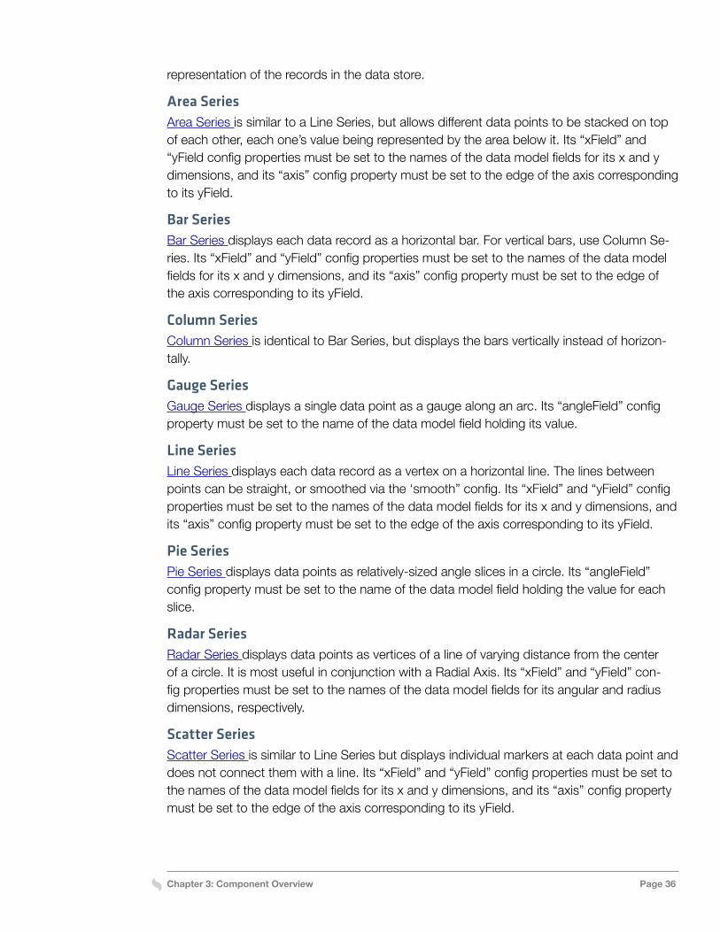
Checkbox
Checkbox represents a single checkbox field. Specify the label for a Checkbox by setting the fieldLabel or boxLabel attributes.See Adding a Group of Radio Buttons or Checkboxes for more information about how to use containers to build radio and checkbox groups with Designer.
Checkbox GroupCheckbox Group is a specialized FieldContainer for displaying a group of related check-boxes.
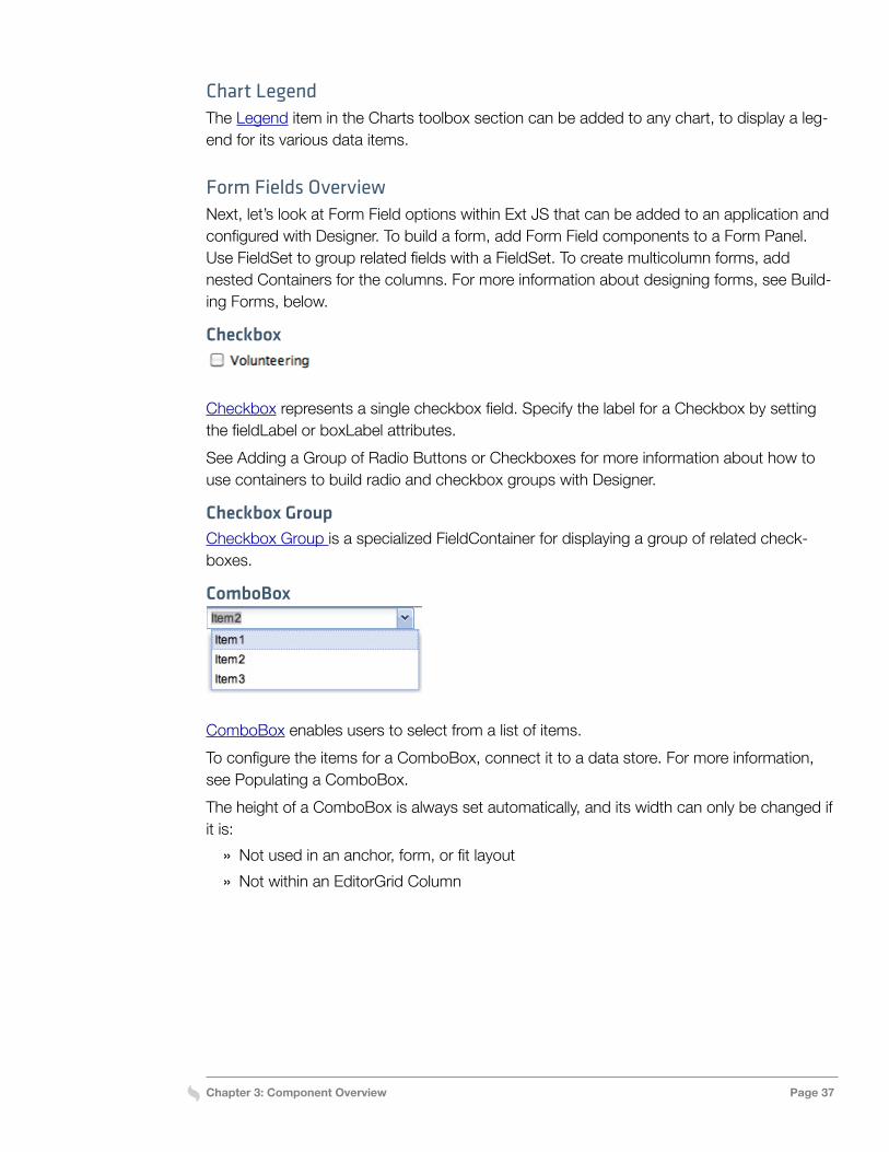
ComboBox
ComboBox enables users to select from a list of items.To configure the items for a ComboBox, connect it to a data store. For more information, see Populating a ComboBox.The height of a ComboBox is always set automatically, and its width can only be changed if it is:
» Not used in an anchor, form, or fit layout » Not within an EditorGrid Column
Chapter 3: Component Overview Page 38
Date Field
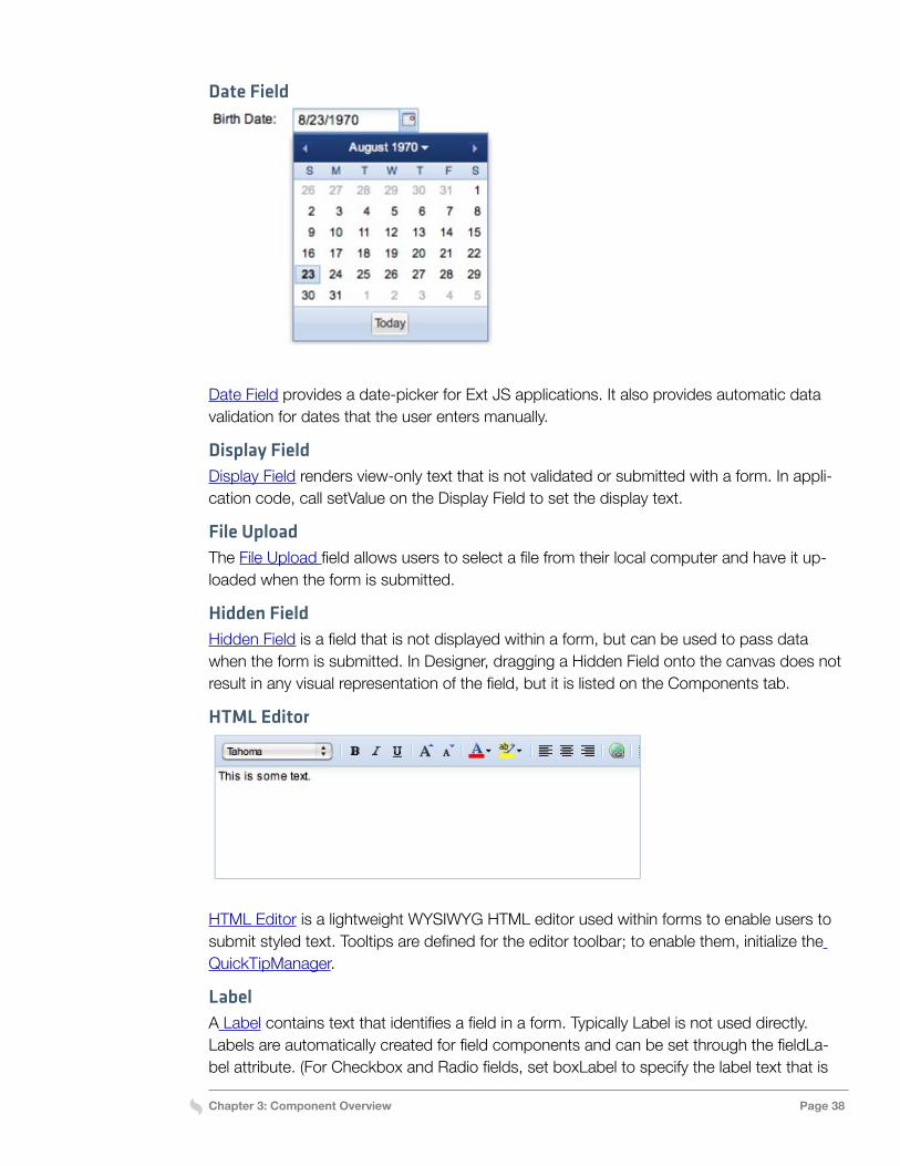
Date Field provides a date-picker for Ext JS applications. It also provides automatic data validation for dates that the user enters manually.
Display FieldDisplay Field renders view-only text that is not validated or submitted with a form. In appli-cation code, call setValue on the Display Field to set the display text.
File UploadThe File Upload field allows users to select a file from their local computer and have it up-loaded when the form is submitted.
Hidden FieldHidden Field is a field that is not displayed within a form, but can be used to pass data when the form is submitted. In Designer, dragging a Hidden Field onto the canvas does not result in any visual representation of the field, but it is listed on the Components tab.
HTML Editor
HTML Editor is a lightweight WYSIWYG HTML editor used within forms to enable users to submit styled text. Tooltips are defined for the editor toolbar; to enable them, initialize the QuickTipManager.
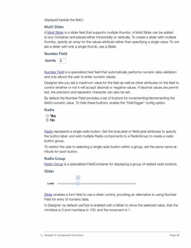
LabelA Label contains text that identifies a field in a form. Typically Label is not used directly. Labels are automatically created for field components and can be set through the fieldLa-bel attribute. (For Checkbox and Radio fields, set boxLabel to specify the label text that is
Chapter 3: Component Overview Page 39
displayed beside the field.)
Multi SliderA Multi Slider is a slider field that supports multiple thumbs. A Multi Slider can be added to any Container and placed either horizontally or vertically. To create a slider with multiple thumbs, specify an array for the values attribute rather than specifying a single value. To cre-ate a slider with only a single thumb, use a Slider.
Number Field
Number Field is a specialized text field that automatically performs numeric data validation and only allows the user to enter numeric values.Designer lets you set a maximum value for the field as well as other attributes on the field to control whether or not it will accept decimal or negative values. If decimal values are permit-ted, the precision and separator character can also be set.By default the Number Field provides a set of buttons for incrementing/decrementing the field’s numeric value. To hide these buttons, enable the “hideTrigger” config option.
Radio
Radio represents a single radio button. Set the boxLabel or fieldLabel attributes to specify the button label, and add multiple Radio components to a RadioGroup to create a radio button group.To restrict the user to selecting a single radio button within a group, set the same name at-tribute for each button.
Radio GroupRadio Group is a specialized FieldContainer for displaying a group of related radio buttons.
Slider
Slider enables a form field to use a slider control, providing an alternative to using Number Field for entry of numeric data.In Designer, by default useTips is enabled with a Slider to show the selected value, that the minValue is 0 and maxValue is 100, and the increment is 1.
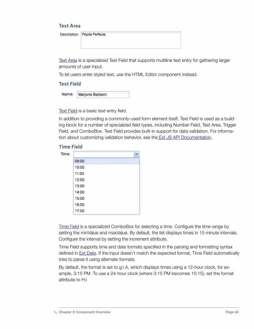
Chapter 3: Component Overview Page 40
Text Area
Text Area is a specialized Text Field that supports multiline text entry for gathering larger amounts of user input.To let users enter styled text, use the HTML Editor component instead.
Text Field
Text Field is a basic text entry field.In addition to providing a commonly-used form element itself, Text Field is used as a build-ing block for a number of specialized field types, including Number Field, Text Area, Trigger Field, and ComboBox. Text Field provides built-in support for data validation. For informa-tion about customizing validation behavior, see the Ext JS API Documentation.
Time Field
Time Field is a specialized ComboBox for selecting a time. Configure the time range by setting the minValue and maxValue. By default, the list displays times in 15 minute intervals. Configure the interval by setting the increment attribute.Time Field supports time and date formats specified in the parsing and formatting syntax defined in Ext.Date. If the input doesn’t match the expected format, Time Field automatically tries to parse it using alternate formats.By default, the format is set to g:i A, which displays times using a 12-hour clock, for ex-ample, 3:15 PM. To use a 24-hour clock (where 3:15 PM becomes 15:15), set the format attribute to H:i
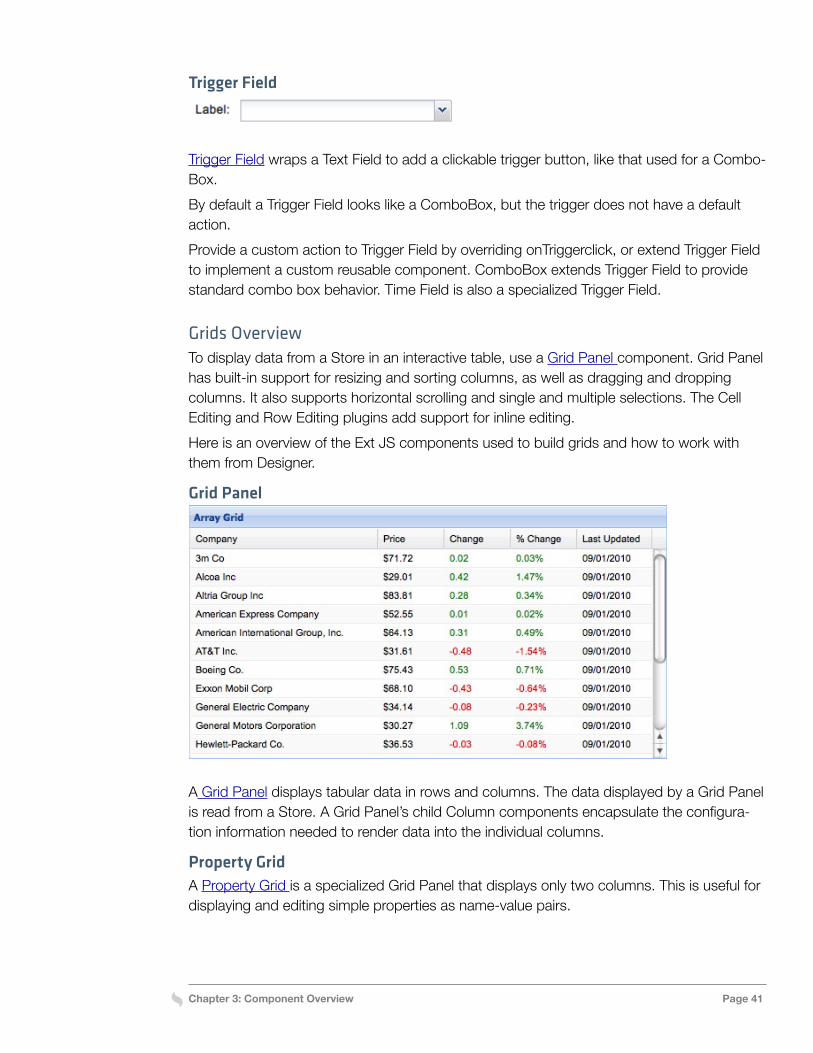
Chapter 3: Component Overview Page 41
Trigger Field
Trigger Field wraps a Text Field to add a clickable trigger button, like that used for a Combo-Box.By default a Trigger Field looks like a ComboBox, but the trigger does not have a default action. Provide a custom action to Trigger Field by overriding onTriggerclick, or extend Trigger Field to implement a custom reusable component. ComboBox extends Trigger Field to provide standard combo box behavior. Time Field is also a specialized Trigger Field.
Grids OverviewTo display data from a Store in an interactive table, use a Grid Panel component. Grid Panel has built-in support for resizing and sorting columns, as well as dragging and dropping columns. It also supports horizontal scrolling and single and multiple selections. The Cell Editing and Row Editing plugins add support for inline editing.Here is an overview of the Ext JS components used to build grids and how to work with them from Designer.
Grid Panel
A Grid Panel displays tabular data in rows and columns. The data displayed by a Grid Panel is read from a Store. A Grid Panel’s child Column components encapsulate the configura-tion information needed to render data into the individual columns.
Property GridA Property Grid is a specialized Grid Panel that displays only two columns. This is useful for displaying and editing simple properties as name-value pairs.
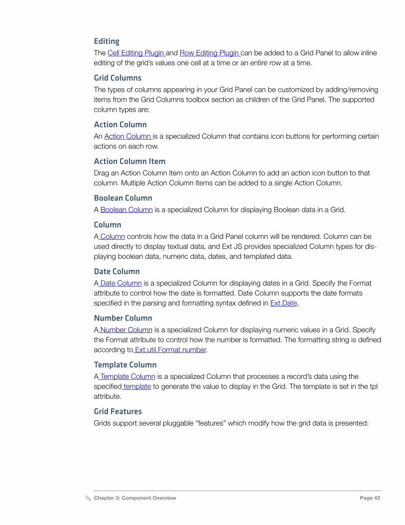
Chapter 3: Component Overview Page 42
EditingThe Cell Editing Plugin and Row Editing Plugin can be added to a Grid Panel to allow inline editing of the grid’s values one cell at a time or an entire row at a time.
Grid ColumnsThe types of columns appearing in your Grid Panel can be customized by adding/removing items from the Grid Columns toolbox section as children of the Grid Panel. The supported column types are:
Action ColumnAn Action Column is a specialized Column that contains icon buttons for performing certain actions on each row.
Action Column ItemDrag an Action Column Item onto an Action Column to add an action icon button to that column. Multiple Action Column Items can be added to a single Action Column.
Boolean ColumnA Boolean Column is a specialized Column for displaying Boolean data in a Grid.
ColumnA Column controls how the data in a Grid Panel column will be rendered. Column can be used directly to display textual data, and Ext JS provides specialized Column types for dis-playing boolean data, numeric data, dates, and templated data.
Date ColumnA Date Column is a specialized Column for displaying dates in a Grid. Specify the Format attribute to control how the date is formatted. Date Column supports the date formats specified in the parsing and formatting syntax defined in Ext.Date.
Number ColumnA Number Column is a specialized Column for displaying numeric values in a Grid. Specify the Format attribute to control how the number is formatted. The formatting string is defined according to Ext.util.Format.number.
Template ColumnA Template Column is a specialized Column that processes a record’s data using the specified template to generate the value to display in the Grid. The template is set in the tpl attribute.
Grid FeaturesGrids support several pluggable “features” which modify how the grid data is presented:
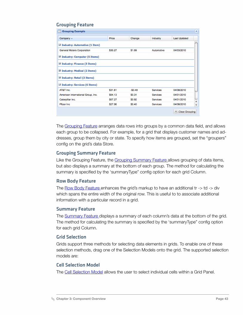
Chapter 3: Component Overview Page 43
Grouping Feature
The Grouping Feature arranges data rows into groups by a common data field, and allows each group to be collapsed. For example, for a grid that displays customer names and ad-dresses, group them by city or state. To specify how items are grouped, set the “groupers” config on the grid’s data Store.
Grouping Summary FeatureLike the Grouping Feature, the Grouping Summary Feature allows grouping of data items, but also displays a summary at the bottom of each group. The method for calculating the summary is specified by the ‘summaryType” config option for each grid Column.
Row Body FeatureThe Row Body Feature enhances the grid’s markup to have an additional tr -> td -> div which spans the entire width of the original row. This is useful to to associate additional information with a particular record in a grid.
Summary FeatureThe Summary Feature displays a summary of each column’s data at the bottom of the grid. The method for calculating the summary is specified by the ‘summaryType” config option for each grid Column.
Grid SelectionGrids support three methods for selecting data elements in grids. To enable one of these selection methods, drag one of the Selection Models onto the grid. The supported selection models are:
Cell Selection ModelThe Cell Selection Model allows the user to select individual cells within a Grid Panel.
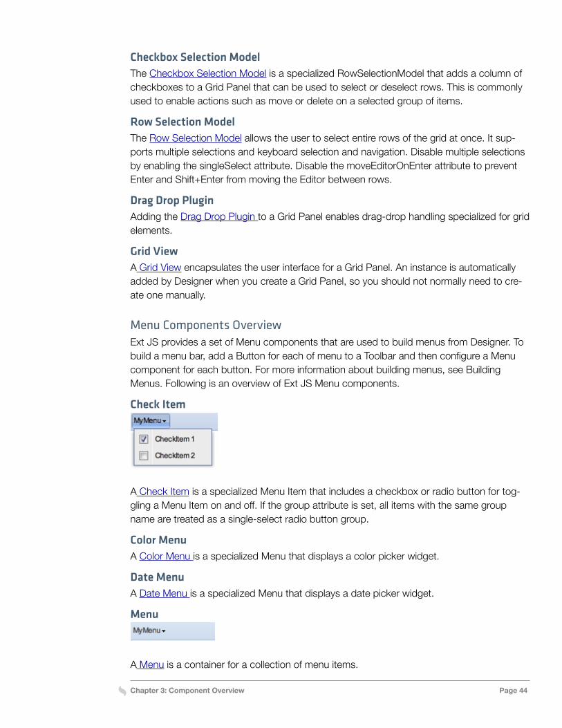
Chapter 3: Component Overview Page 44
Checkbox Selection ModelThe Checkbox Selection Model is a specialized RowSelectionModel that adds a column of checkboxes to a Grid Panel that can be used to select or deselect rows. This is commonly used to enable actions such as move or delete on a selected group of items.
Row Selection ModelThe Row Selection Model allows the user to select entire rows of the grid at once. It sup-ports multiple selections and keyboard selection and navigation. Disable multiple selections by enabling the singleSelect attribute. Disable the moveEditorOnEnter attribute to prevent Enter and Shift+Enter from moving the Editor between rows.
Drag Drop PluginAdding the Drag Drop Plugin to a Grid Panel enables drag-drop handling specialized for grid elements.
Grid ViewA Grid View encapsulates the user interface for a Grid Panel. An instance is automatically added by Designer when you create a Grid Panel, so you should not normally need to cre-ate one manually.
Menu Components OverviewExt JS provides a set of Menu components that are used to build menus from Designer. To build a menu bar, add a Button for each of menu to a Toolbar and then configure a Menu component for each button. For more information about building menus, see Building Menus. Following is an overview of Ext JS Menu components.
Check Item
A Check Item is a specialized Menu Item that includes a checkbox or radio button for tog-gling a Menu Item on and off. If the group attribute is set, all items with the same group name are treated as a single-select radio button group.
Color MenuA Color Menu is a specialized Menu that displays a color picker widget.
Date MenuA Date Menu is a specialized Menu that displays a date picker widget.
Menu
A Menu is a container for a collection of menu items.
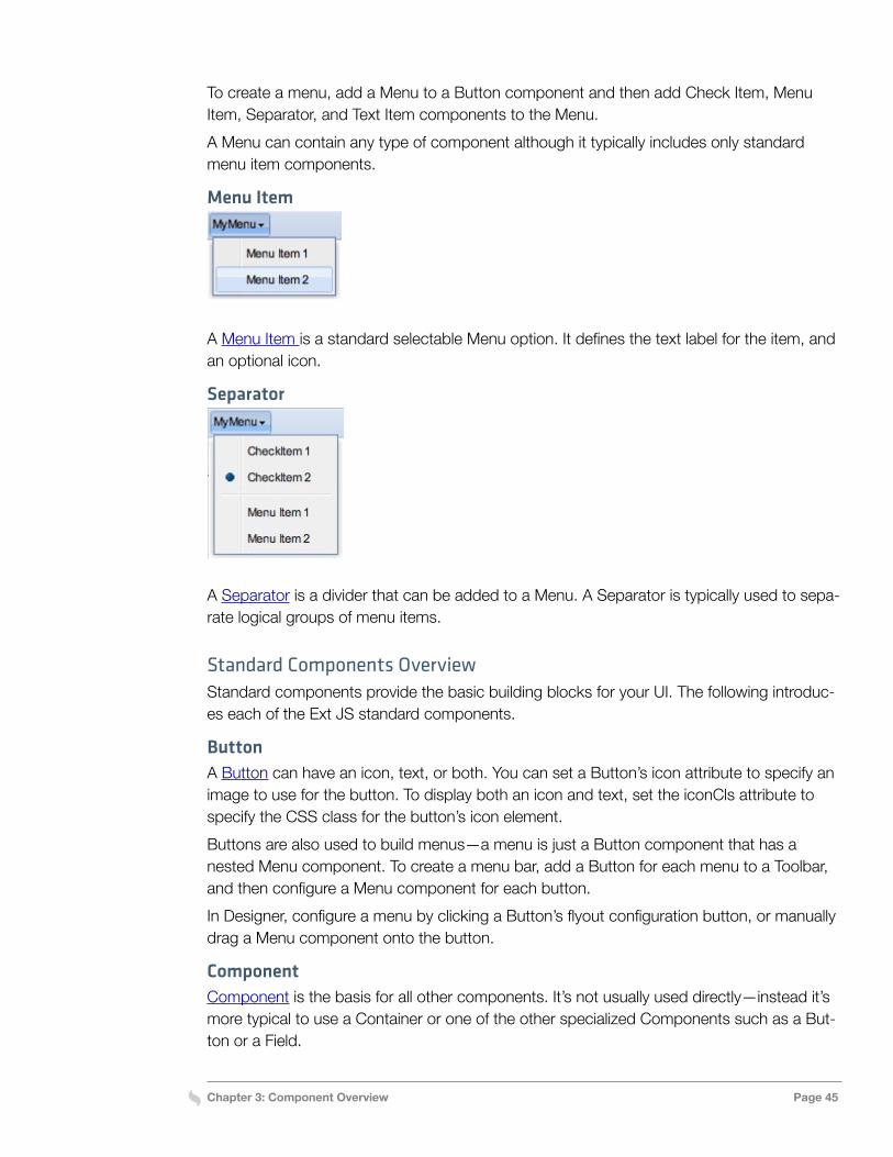
Chapter 3: Component Overview Page 45
To create a menu, add a Menu to a Button component and then add Check Item, Menu Item, Separator, and Text Item components to the Menu.A Menu can contain any type of component although it typically includes only standard menu item components.
Menu Item
A Menu Item is a standard selectable Menu option. It defines the text label for the item, and an optional icon.
Separator
A Separator is a divider that can be added to a Menu. A Separator is typically used to sepa-rate logical groups of menu items.
Standard Components OverviewStandard components provide the basic building blocks for your UI. The following introduc-es each of the Ext JS standard components.
ButtonA Button can have an icon, text, or both. You can set a Button’s icon attribute to specify an image to use for the button. To display both an icon and text, set the iconCls attribute to specify the CSS class for the button’s icon element.Buttons are also used to build menus—a menu is just a Button component that has a nested Menu component. To create a menu bar, add a Button for each menu to a Toolbar, and then configure a Menu component for each button.In Designer, configure a menu by clicking a Button’s flyout configuration button, or manually drag a Menu component onto the button.
ComponentComponent is the basis for all other components. It’s not usually used directly—instead it’s more typical to use a Container or one of the other specialized Components such as a But-ton or a Field.
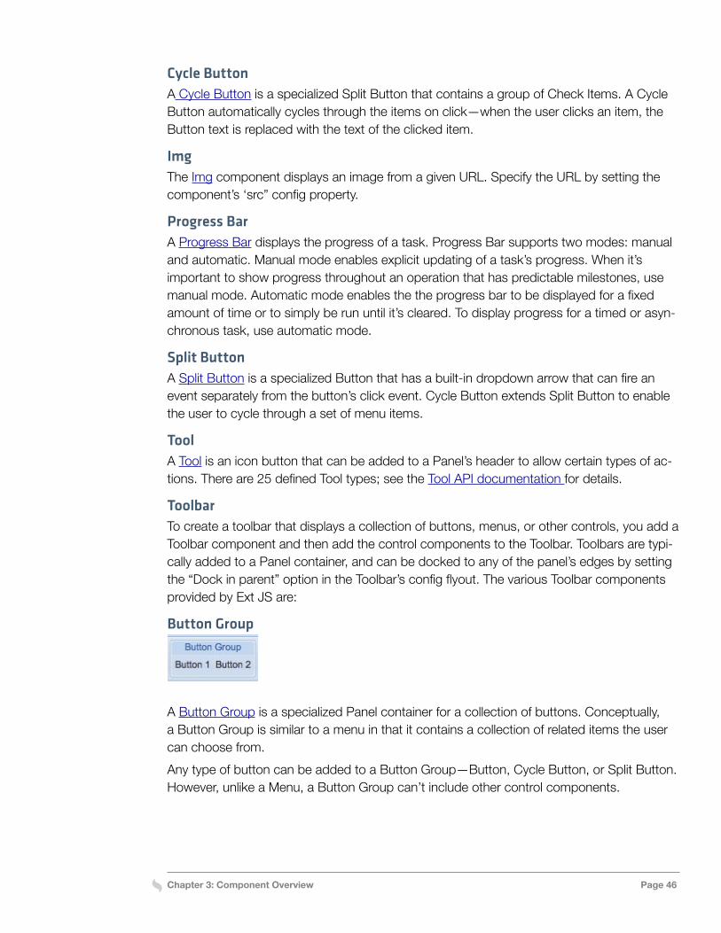
Chapter 3: Component Overview Page 46
Cycle ButtonA Cycle Button is a specialized Split Button that contains a group of Check Items. A Cycle Button automatically cycles through the items on click—when the user clicks an item, the Button text is replaced with the text of the clicked item.
ImgThe Img component displays an image from a given URL. Specify the URL by setting the component’s ‘src” config property.
Progress BarA Progress Bar displays the progress of a task. Progress Bar supports two modes: manual and automatic. Manual mode enables explicit updating of a task’s progress. When it’s important to show progress throughout an operation that has predictable milestones, use manual mode. Automatic mode enables the the progress bar to be displayed for a fixed amount of time or to simply be run until it’s cleared. To display progress for a timed or asyn-chronous task, use automatic mode.
Split ButtonA Split Button is a specialized Button that has a built-in dropdown arrow that can fire an event separately from the button’s click event. Cycle Button extends Split Button to enable the user to cycle through a set of menu items.
ToolA Tool is an icon button that can be added to a Panel’s header to allow certain types of ac-tions. There are 25 defined Tool types; see the Tool API documentation for details.
ToolbarTo create a toolbar that displays a collection of buttons, menus, or other controls, you add a Toolbar component and then add the control components to the Toolbar. Toolbars are typi-cally added to a Panel container, and can be docked to any of the panel’s edges by setting the “Dock in parent” option in the Toolbar’s config flyout. The various Toolbar components provided by Ext JS are:
Button Group
A Button Group is a specialized Panel container for a collection of buttons. Conceptually, a Button Group is similar to a menu in that it contains a collection of related items the user can choose from.Any type of button can be added to a Button Group—Button, Cycle Button, or Split Button. However, unlike a Menu, a Button Group can’t include other control components.
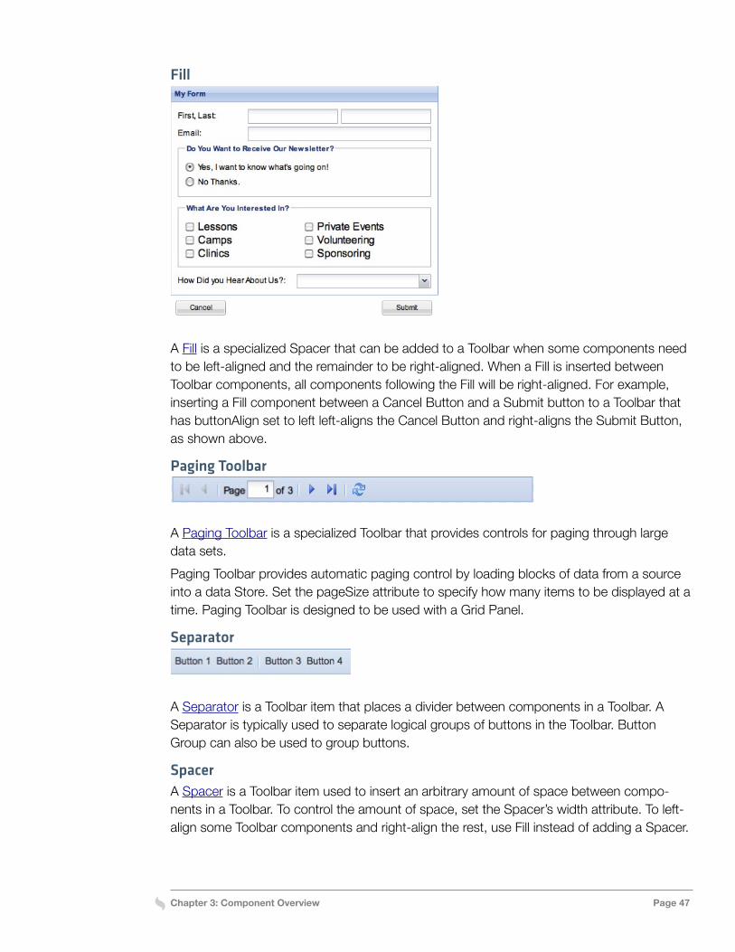
Chapter 3: Component Overview Page 47
Fill
A Fill is a specialized Spacer that can be added to a Toolbar when some components need to be left-aligned and the remainder to be right-aligned. When a Fill is inserted between Toolbar components, all components following the Fill will be right-aligned. For example, inserting a Fill component between a Cancel Button and a Submit button to a Toolbar that has buttonAlign set to left left-aligns the Cancel Button and right-aligns the Submit Button, as shown above.
Paging Toolbar
A Paging Toolbar is a specialized Toolbar that provides controls for paging through large data sets.Paging Toolbar provides automatic paging control by loading blocks of data from a source into a data Store. Set the pageSize attribute to specify how many items to be displayed at a time. Paging Toolbar is designed to be used with a Grid Panel.
Separator
A Separator is a Toolbar item that places a divider between components in a Toolbar. A Separator is typically used to separate logical groups of buttons in the Toolbar. Button Group can also be used to group buttons.
SpacerA Spacer is a Toolbar item used to insert an arbitrary amount of space between compo-nents in a Toolbar. To control the amount of space, set the Spacer’s width attribute. To left-align some Toolbar components and right-align the rest, use Fill instead of adding a Spacer.
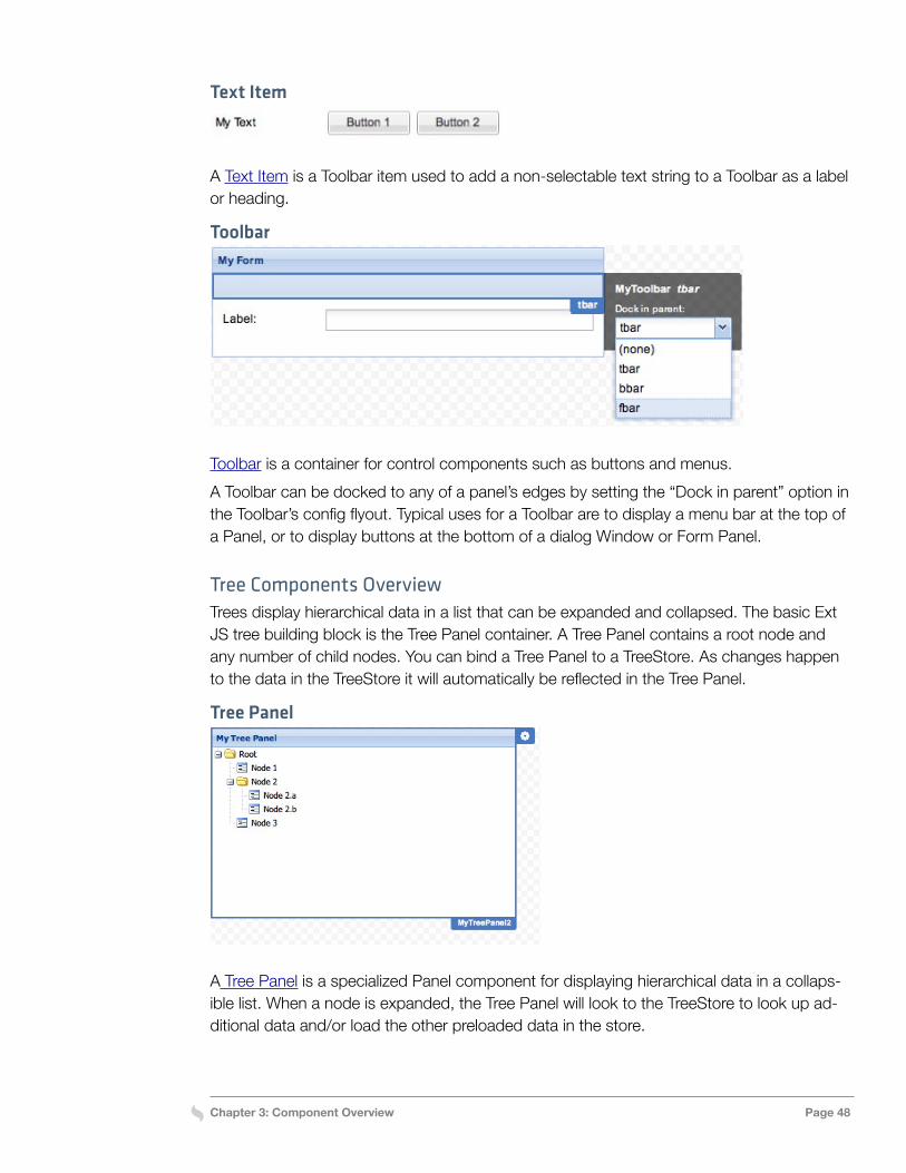
Chapter 3: Component Overview Page 48
Text Item
A Text Item is a Toolbar item used to add a non-selectable text string to a Toolbar as a label or heading.
Toolbar
Toolbar is a container for control components such as buttons and menus.A Toolbar can be docked to any of a panel’s edges by setting the “Dock in parent” option in the Toolbar’s config flyout. Typical uses for a Toolbar are to display a menu bar at the top of a Panel, or to display buttons at the bottom of a dialog Window or Form Panel.
Tree Components OverviewTrees display hierarchical data in a list that can be expanded and collapsed. The basic Ext JS tree building block is the Tree Panel container. A Tree Panel contains a root node and any number of child nodes. You can bind a Tree Panel to a TreeStore. As changes happen to the data in the TreeStore it will automatically be reflected in the Tree Panel.
Tree Panel
A Tree Panel is a specialized Panel component for displaying hierarchical data in a collaps-ible list. When a node is expanded, the Tree Panel will look to the TreeStore to look up ad-ditional data and/or load the other preloaded data in the store.
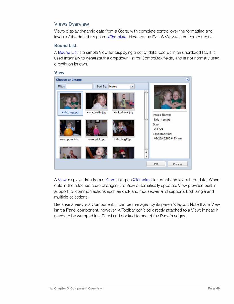
Chapter 3: Component Overview Page 49
Views OverviewViews display dynamic data from a Store, with complete control over the formatting and layout of the data through an XTemplate. Here are the Ext JS View-related components:
Bound ListA Bound List is a simple View for displaying a set of data records in an unordered list. It is used internally to generate the dropdown list for ComboBox fields, and is not normally used directly on its own.
View
A View displays data from a Store using an XTemplate to format and lay out the data. When data in the attached store changes, the View automatically updates. View provides built-in support for common actions such as click and mouseover and supports both single and multiple selections.Because a View is a Component, it can be managed by its parent’s layout. Note that a View isn’t a Panel component, however. A Toolbar can’t be directly attached to a View; instead it needs to be wrapped in a Panel and docked to one of the Panel’s edges.
Chapter 4: Forms, Menus, and Trees Page 50
Chapter 4: Forms, Menus, and Trees
One of the main purposes of Designer is to make it easy to build complex UI elements with the components introduced in Chapter 3. This chapter will show how to use Designer to build common UI elements with Ext JS components. It covers how to build forms and menus and how trees are populated with data in Ext JS 4. Designer simplifies these tasks by enabling immediate visual feedback of the changes made to the UI.
Building FormsThis section shows how to build a simple form in Designer and attach an event handler for form submission. It also shows how to add radio buttons and checkbox groups, arrange multiple fields in a row, and create multicolumn forms.
Building a Simple FormTo create a form, start with a Form Panel container. A form’s submit and cancel buttons are added to a Toolbar that is typically docked in the footer of the FormPanel. Once a form has been laid out in Designer, the project is exported and the generated code can be edited to attach event handlers for the submit and cancel buttons.To get started with this, double-click Form Panel in the Toolbox to add a new top-level con-tainer to the canvas. Edit the form title by double clicking the default title (‘My Form’) and resize the panel by dragging its frame. Next, add fields to the Form Panel. For example, double-click Text Field to add a text entry field. Edit the field label by double-clicking the existing label.Now drag a Toolbar into the Form Panel for the form’s submit and cancel buttons. Click the flyout config button on the Toolbar and select “bottom” in the “Dock in parent” field. This will display the toolbar below the form.By default, buttons added to this Toolbar will be aligned to the left. Since we want to align them to the right, we will first drag a “Fill” item onto the Toolbar.
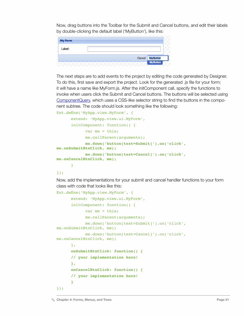
Chapter 4: Forms, Menus, and Trees Page 51
Now, drag buttons into the Toolbar for the Submit and Cancel buttons, and edit their labels by double-clicking the default label (‘MyButton’), like this:
The next steps are to add events to the project by editing the code generated by Designer. To do this, first save and export the project. Look for the generated .js file for your form; it will have a name like MyForm.js. After the initComponent call, specify the functions to invoke when users click the Submit and Cancel buttons. The buttons will be selected using ComponentQuery, which uses a CSS-like selector string to find the buttons in the compo-nent subtree. The code should look something like the following:Ext.define(‘MyApp.view.MyForm’, {
extend: ‘MyApp.view.ui.MyForm’,
initComponent: function() {
var me = this;
me.callParent(arguments);
me.down(‘button[text=Submit]’).on(‘click’, me.onSubmitBtnClick, me);
me.down(‘button[text=Cancel]’).on(‘click’, me.onCancelBtnClick, me);
}
});
Now, add the implementations for your submit and cancel handler functions to your form class with code that looks like this:Ext.define(‘MyApp.view.MyForm’, {
extend: ‘MyApp.view.ui.MyForm’,
initComponent: function() {
var me = this;
me.callParent(arguments);
me.down(‘button[text=Submit]’).on(‘click’, me.onSubmitBtnClick, me);
me.down(‘button[text=Cancel]’).on(‘click’, me.onCancelBtnClick, me);
},
onSubmitBtnClick: function() {
// your implementation here!
},
onCancelBtnClick: function() {
// your implementation here!
}
});
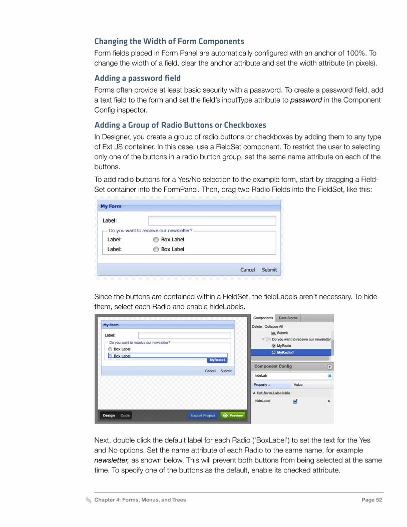
Chapter 4: Forms, Menus, and Trees Page 52
Changing the Width of Form ComponentsForm fields placed in Form Panel are automatically configured with an anchor of 100%. To change the width of a field, clear the anchor attribute and set the width attribute (in pixels).
Adding a password fieldForms often provide at least basic security with a password. To create a password field, add a text field to the form and set the field’s inputType attribute to password in the Component Config inspector.
Adding a Group of Radio Buttons or CheckboxesIn Designer, you create a group of radio buttons or checkboxes by adding them to any type of Ext JS container. In this case, use a FieldSet component. To restrict the user to selecting only one of the buttons in a radio button group, set the same name attribute on each of the buttons.To add radio buttons for a Yes/No selection to the example form, start by dragging a Field-Set container into the FormPanel. Then, drag two Radio Fields into the FieldSet, like this:
Since the buttons are contained within a FieldSet, the fieldLabels aren’t necessary. To hide them, select each Radio and enable hideLabels.
Next, double click the default label for each Radio (‘BoxLabel’) to set the text for the Yes and No options. Set the name attribute of each Radio to the same name, for example newsletter, as shown below. This will prevent both buttons from being selected at the same time. To specify one of the buttons as the default, enable its checked attribute.
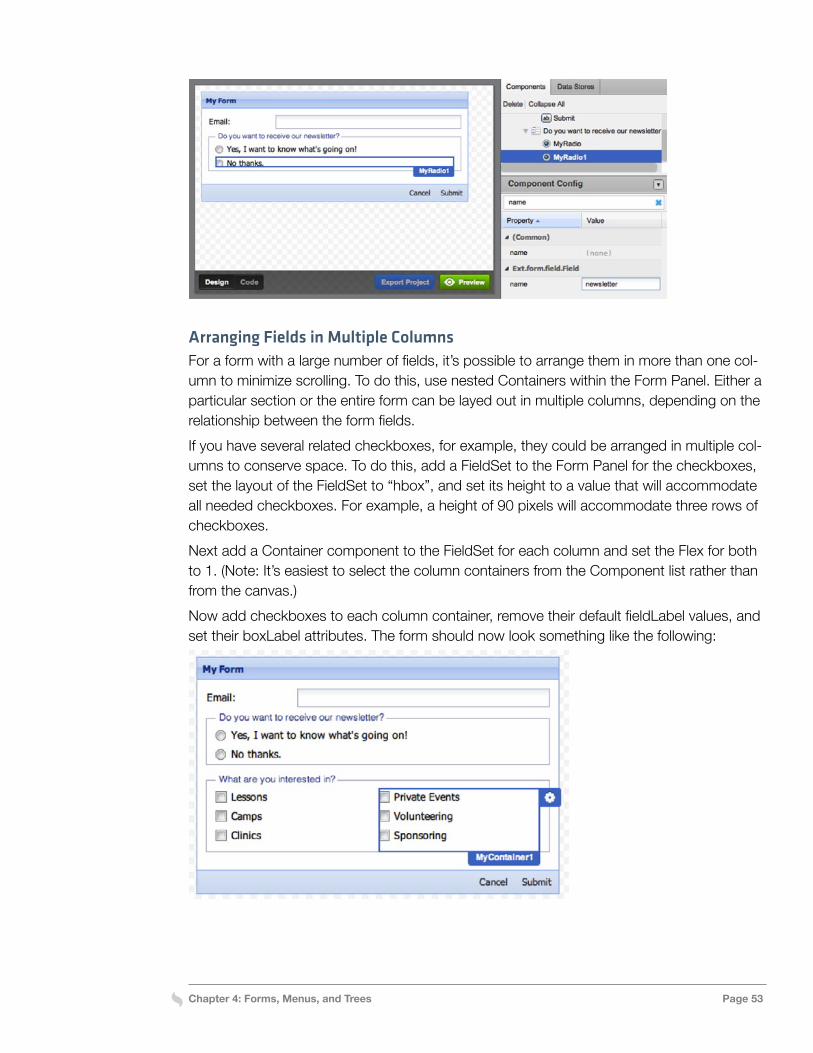
Chapter 4: Forms, Menus, and Trees Page 53
Arranging Fields in Multiple ColumnsFor a form with a large number of fields, it’s possible to arrange them in more than one col-umn to minimize scrolling. To do this, use nested Containers within the Form Panel. Either a particular section or the entire form can be layed out in multiple columns, depending on the relationship between the form fields.If you have several related checkboxes, for example, they could be arranged in multiple col-umns to conserve space. To do this, add a FieldSet to the Form Panel for the checkboxes, set the layout of the FieldSet to “hbox”, and set its height to a value that will accommodate all needed checkboxes. For example, a height of 90 pixels will accommodate three rows of checkboxes.Next add a Container component to the FieldSet for each column and set the Flex for both to 1. (Note: It’s easiest to select the column containers from the Component list rather than from the canvas.)Now add checkboxes to each column container, remove their default fieldLabel values, and set their boxLabel attributes. The form should now look something like the following:
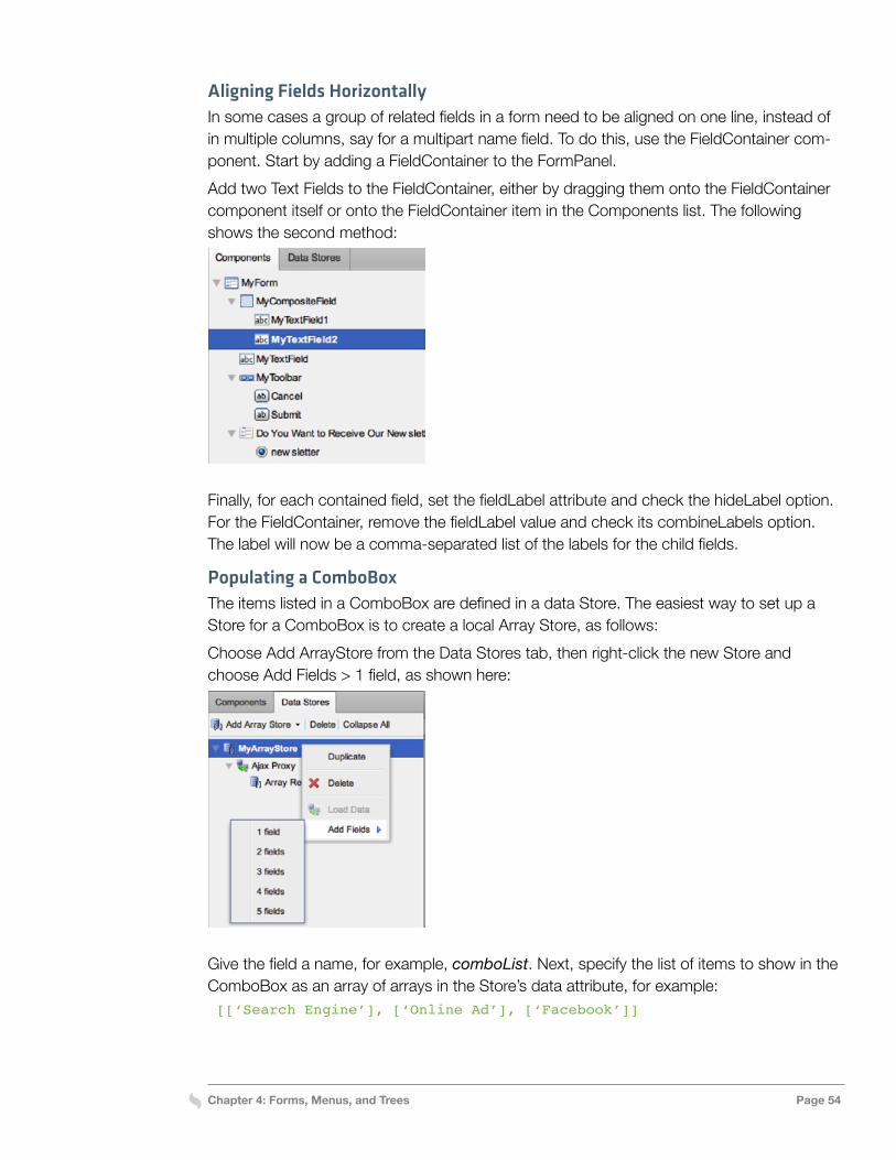
Chapter 4: Forms, Menus, and Trees Page 54
Aligning Fields HorizontallyIn some cases a group of related fields in a form need to be aligned on one line, instead of in multiple columns, say for a multipart name field. To do this, use the FieldContainer com-ponent. Start by adding a FieldContainer to the FormPanel. Add two Text Fields to the FieldContainer, either by dragging them onto the FieldContainer component itself or onto the FieldContainer item in the Components list. The following shows the second method:
Finally, for each contained field, set the fieldLabel attribute and check the hideLabel option. For the FieldContainer, remove the fieldLabel value and check its combineLabels option. The label will now be a comma-separated list of the labels for the child fields.
Populating a ComboBoxThe items listed in a ComboBox are defined in a data Store. The easiest way to set up a Store for a ComboBox is to create a local Array Store, as follows:Choose Add ArrayStore from the Data Stores tab, then right-click the new Store and choose Add Fields > 1 field, as shown here:
Give the field a name, for example, comboList. Next, specify the list of items to show in the ComboBox as an array of arrays in the Store’s data attribute, for example: [[‘Search Engine’], [‘Online Ad’], [‘Facebook’]]
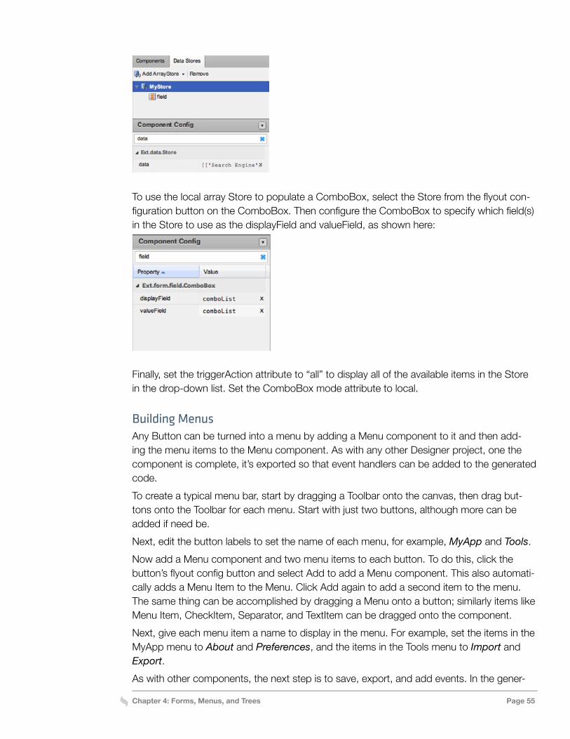
Chapter 4: Forms, Menus, and Trees Page 55
To use the local array Store to populate a ComboBox, select the Store from the flyout con-figuration button on the ComboBox. Then configure the ComboBox to specify which field(s) in the Store to use as the displayField and valueField, as shown here:
Finally, set the triggerAction attribute to “all” to display all of the available items in the Store in the drop-down list. Set the ComboBox mode attribute to local.
Building MenusAny Button can be turned into a menu by adding a Menu component to it and then add-ing the menu items to the Menu component. As with any other Designer project, one the component is complete, it’s exported so that event handlers can be added to the generated code. To create a typical menu bar, start by dragging a Toolbar onto the canvas, then drag but-tons onto the Toolbar for each menu. Start with just two buttons, although more can be added if need be.Next, edit the button labels to set the name of each menu, for example, MyApp and Tools.Now add a Menu component and two menu items to each button. To do this, click the button’s flyout config button and select Add to add a Menu component. This also automati-cally adds a Menu Item to the Menu. Click Add again to add a second item to the menu. The same thing can be accomplished by dragging a Menu onto a button; similarly items like Menu Item, CheckItem, Separator, and TextItem can be dragged onto the component.Next, give each menu item a name to display in the menu. For example, set the items in the MyApp menu to About and Preferences, and the items in the Tools menu to Import and Export. As with other components, the next step is to save, export, and add events. In the gener-
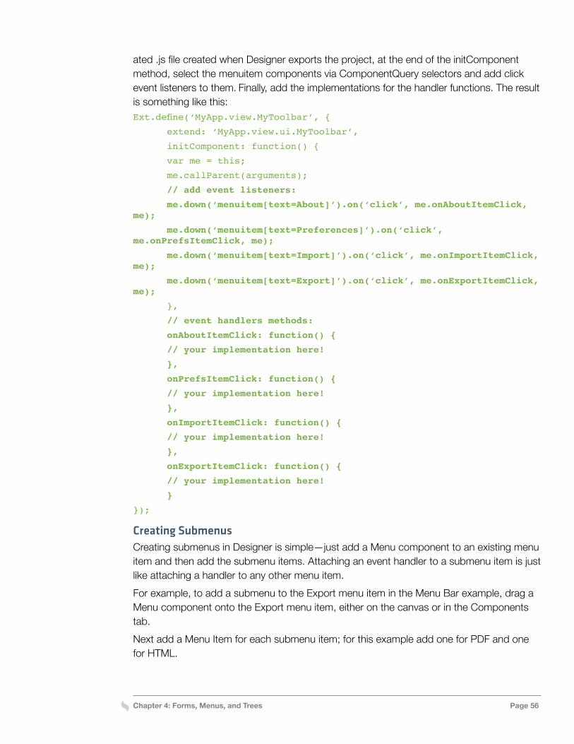
Chapter 4: Forms, Menus, and Trees Page 56
ated .js file created when Designer exports the project, at the end of the initComponent method, select the menuitem components via ComponentQuery selectors and add click event listeners to them. Finally, add the implementations for the handler functions. The result is something like this:Ext.define(‘MyApp.view.MyToolbar’, {
extend: ‘MyApp.view.ui.MyToolbar’,
initComponent: function() {
var me = this;
me.callParent(arguments);
// add event listeners:
me.down(‘menuitem[text=About]’).on(‘click’, me.onAboutItemClick, me);
me.down(‘menuitem[text=Preferences]’).on(‘click’, me.onPrefsItemClick, me);
me.down(‘menuitem[text=Import]’).on(‘click’, me.onImportItemClick, me);
me.down(‘menuitem[text=Export]’).on(‘click’, me.onExportItemClick, me);
},
// event handlers methods:
onAboutItemClick: function() {
// your implementation here!
},
onPrefsItemClick: function() {
// your implementation here!
},
onImportItemClick: function() {
// your implementation here!
},
onExportItemClick: function() {
// your implementation here!
}
});
Creating SubmenusCreating submenus in Designer is simple—just add a Menu component to an existing menu item and then add the submenu items. Attaching an event handler to a submenu item is just like attaching a handler to any other menu item.For example, to add a submenu to the Export menu item in the Menu Bar example, drag a Menu component onto the Export menu item, either on the canvas or in the Components tab.Next add a Menu Item for each submenu item; for this example add one for PDF and one for HTML.
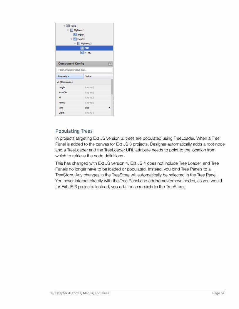
Chapter 4: Forms, Menus, and Trees Page 57
Populating TreesIn projects targeting Ext JS version 3, trees are populated using TreeLoader. When a Tree Panel is added to the canvas for Ext JS 3 projects, Designer automatically adds a root node and a TreeLoader and the TreeLoader URL attribute needs to point to the location from which to retrieve the node definitions.This has changed with Ext JS version 4. Ext JS 4 does not include Tree Loader, and Tree Panels no longer have to be loaded or populated. Instead, you bind Tree Panels to a TreeStore. Any changes in the TreeStore will automatically be reflected in the Tree Panel. You never interact directly with the Tree Panel and add/remove/move nodes, as you would for Ext JS 3 projects. Instead, you add those records to the TreeStore.
Chapter 5: Component-Oriented Design Page 58
Chapter 5: Component-Oriented Design
Designer makes it easy to use the standard Ext JS component building blocks to assemble a UI. Simply drag a container such as a Viewport or Window onto the canvas and start add-ing components to it. That’s a simple way to start building a basic UI. An application of any complexity, however, needs to be organized into smaller pieces. This lets the development team employ a more effective, efficient strategy in which the pieces of the application can be designed, implemented, and maintained separately and more easily reused. This chapter focuses on how to undertake such a component-oriented design approach using Designer.Designer provides two mechanisms for facilitating component-oriented design:
» Components can specifically be added to a project as top-level components. For ex-ample, top-level containers can be added to a project for each page or dialog. » Any child component can be made into a top-level component with the Promote to
Class feature. This makes it easy to refactor and reuse components as the application design comes together.A Designer project can contain any number of top-level components. As we’ve seen, when Designer exports a project, it generates separate class files for each top-level component. Designer creates base classes of the Ext JS components with all the configurations and settings you’ve provided. These are the subclasses defined in the generated app/view/ui/*.js files, which are overwritten every time a project is exported. In the corresponding app/view/*.js files, the preconfigured classes are extended so event handlers, additional con-figurations and custom methods can be implemented in them. The app/view/*.js file for a top-level component is created the first time it’s exported, but it’s not overwritten on sub-sequent exports. If you change the userClassName, Designer exports a new file with that class name and previously generated files become obsolete.In addition to generating more manageable code, organizing a Designer project as a collec-tion of top-level components can make it easier to continue to develop the project with De-signer. It can take a longer time to render large, deeply nested views on the canvas. Build-ing main application views using other top-level components makes it possible to work on those components individually. That way, the whole UI doesn’t have to be re-rendered when
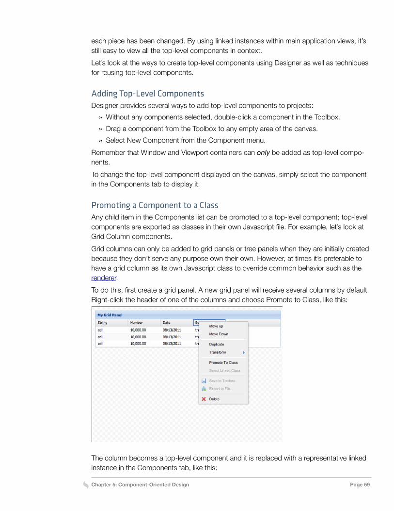
Chapter 5: Component-Oriented Design Page 59
each piece has been changed. By using linked instances within main application views, it’s still easy to view all the top-level components in context.Let’s look at the ways to create top-level components using Designer as well as techniques for reusing top-level components.
Adding Top-Level ComponentsDesigner provides several ways to add top-level components to projects:
» Without any components selected, double-click a component in the Toolbox. » Drag a component from the Toolbox to any empty area of the canvas. » Select New Component from the Component menu.
Remember that Window and Viewport containers can only be added as top-level compo-nents. To change the top-level component displayed on the canvas, simply select the component in the Components tab to display it.
Promoting a Component to a ClassAny child item in the Components list can be promoted to a top-level component; top-level components are exported as classes in their own Javascript file. For example, let’s look at Grid Column components.Grid columns can only be added to grid panels or tree panels when they are initially created because they don’t serve any purpose own their own. However, at times it’s preferable to have a grid column as its own Javascript class to override common behavior such as the renderer.To do this, first create a grid panel. A new grid panel will receive several columns by default. Right-click the header of one of the columns and choose Promote to Class, like this:
The column becomes a top-level component and it is replaced with a representative linked instance in the Components tab, like this:
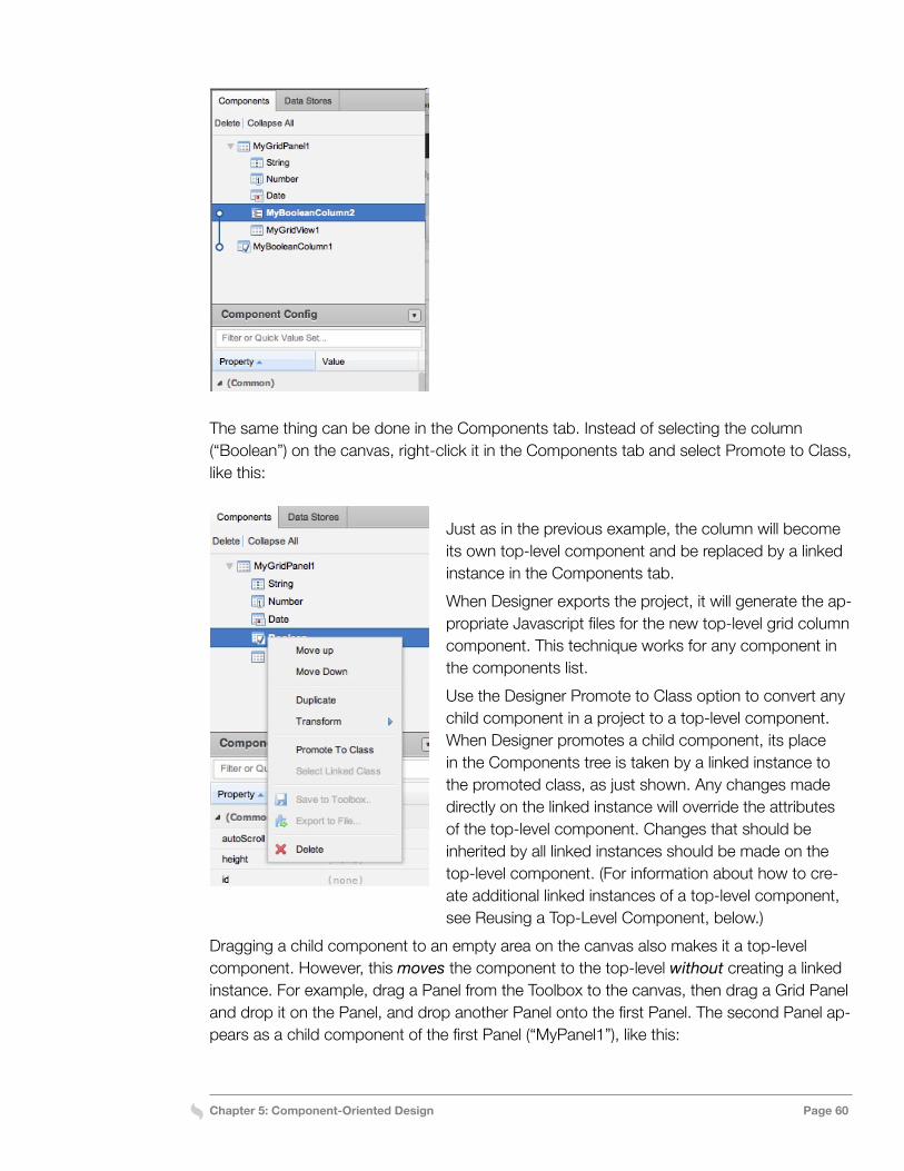
Chapter 5: Component-Oriented Design Page 60
The same thing can be done in the Components tab. Instead of selecting the column (“Boolean”) on the canvas, right-click it in the Components tab and select Promote to Class, like this:
Just as in the previous example, the column will become its own top-level component and be replaced by a linked instance in the Components tab.When Designer exports the project, it will generate the ap-propriate Javascript files for the new top-level grid column component. This technique works for any component in the components list.Use the Designer Promote to Class option to convert any child component in a project to a top-level component. When Designer promotes a child component, its place in the Components tree is taken by a linked instance to the promoted class, as just shown. Any changes made directly on the linked instance will override the attributes of the top-level component. Changes that should be inherited by all linked instances should be made on the top-level component. (For information about how to cre-ate additional linked instances of a top-level component, see Reusing a Top-Level Component, below.)
Dragging a child component to an empty area on the canvas also makes it a top-level component. However, this moves the component to the top-level without creating a linked instance. For example, drag a Panel from the Toolbox to the canvas, then drag a Grid Panel and drop it on the Panel, and drop another Panel onto the first Panel. The second Panel ap-pears as a child component of the first Panel (“MyPanel1”), like this:
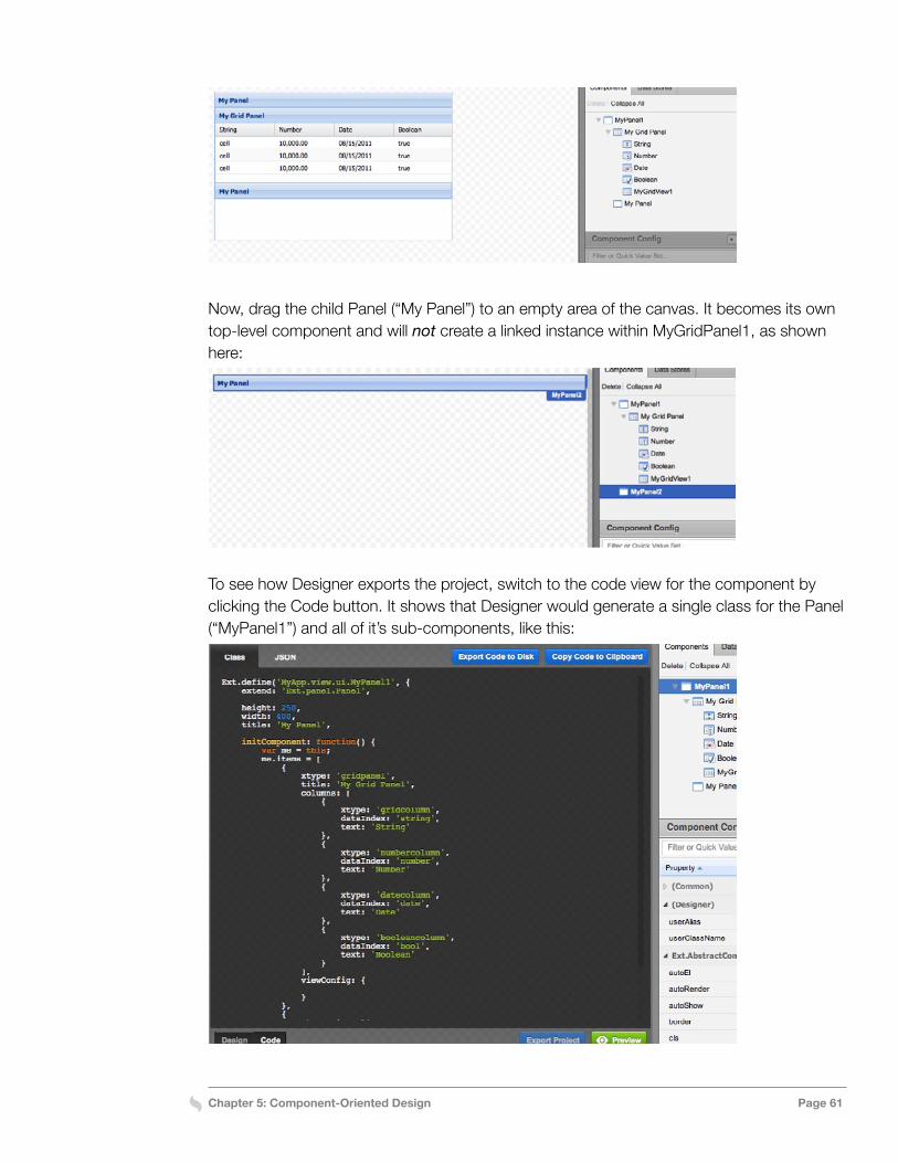
Chapter 5: Component-Oriented Design Page 61
Now, drag the child Panel (“My Panel”) to an empty area of the canvas. It becomes its own top-level component and will not create a linked instance within MyGridPanel1, as shown here:
To see how Designer exports the project, switch to the code view for the component by clicking the Code button. It shows that Designer would generate a single class for the Panel (“MyPanel1”) and all of it’s sub-components, like this:
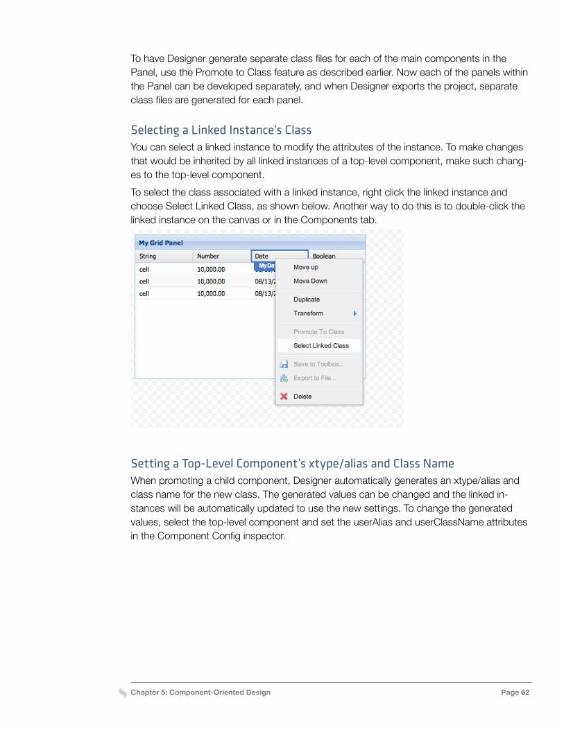
Chapter 5: Component-Oriented Design Page 62
To have Designer generate separate class files for each of the main components in the Panel, use the Promote to Class feature as described earlier. Now each of the panels within the Panel can be developed separately, and when Designer exports the project, separate class files are generated for each panel.
Selecting a Linked Instance’s ClassYou can select a linked instance to modify the attributes of the instance. To make changes that would be inherited by all linked instances of a top-level component, make such chang-es to the top-level component.To select the class associated with a linked instance, right click the linked instance and choose Select Linked Class, as shown below. Another way to do this is to double-click the linked instance on the canvas or in the Components tab.
Setting a Top-Level Component’s xtype/alias and Class NameWhen promoting a child component, Designer automatically generates an xtype/alias and class name for the new class. The generated values can be changed and the linked in-stances will be automatically updated to use the new settings. To change the generated values, select the top-level component and set the userAlias and userClassName attributes in the Component Config inspector.
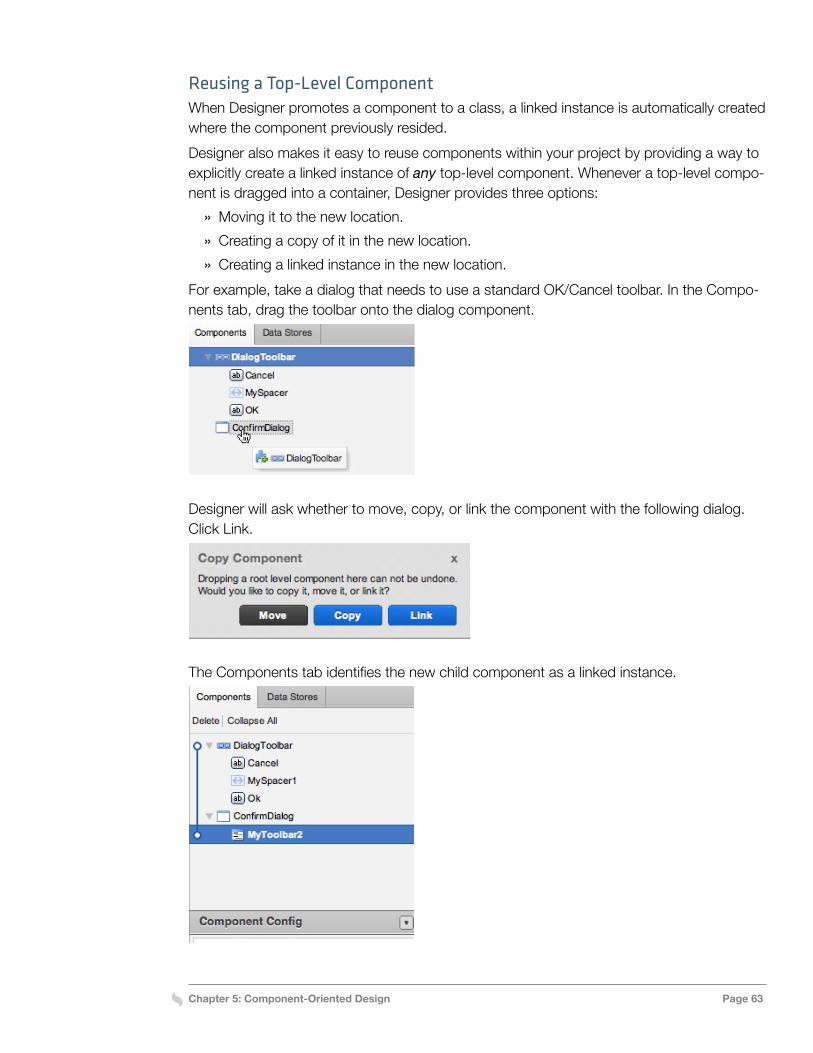
Chapter 5: Component-Oriented Design Page 63
Reusing a Top-Level ComponentWhen Designer promotes a component to a class, a linked instance is automatically created where the component previously resided. Designer also makes it easy to reuse components within your project by providing a way to explicitly create a linked instance of any top-level component. Whenever a top-level compo-nent is dragged into a container, Designer provides three options:
» Moving it to the new location. » Creating a copy of it in the new location. » Creating a linked instance in the new location.
For example, take a dialog that needs to use a standard OK/Cancel toolbar. In the Compo-nents tab, drag the toolbar onto the dialog component.
Designer will ask whether to move, copy, or link the component with the following dialog. Click Link.
The Components tab identifies the new child component as a linked instance.
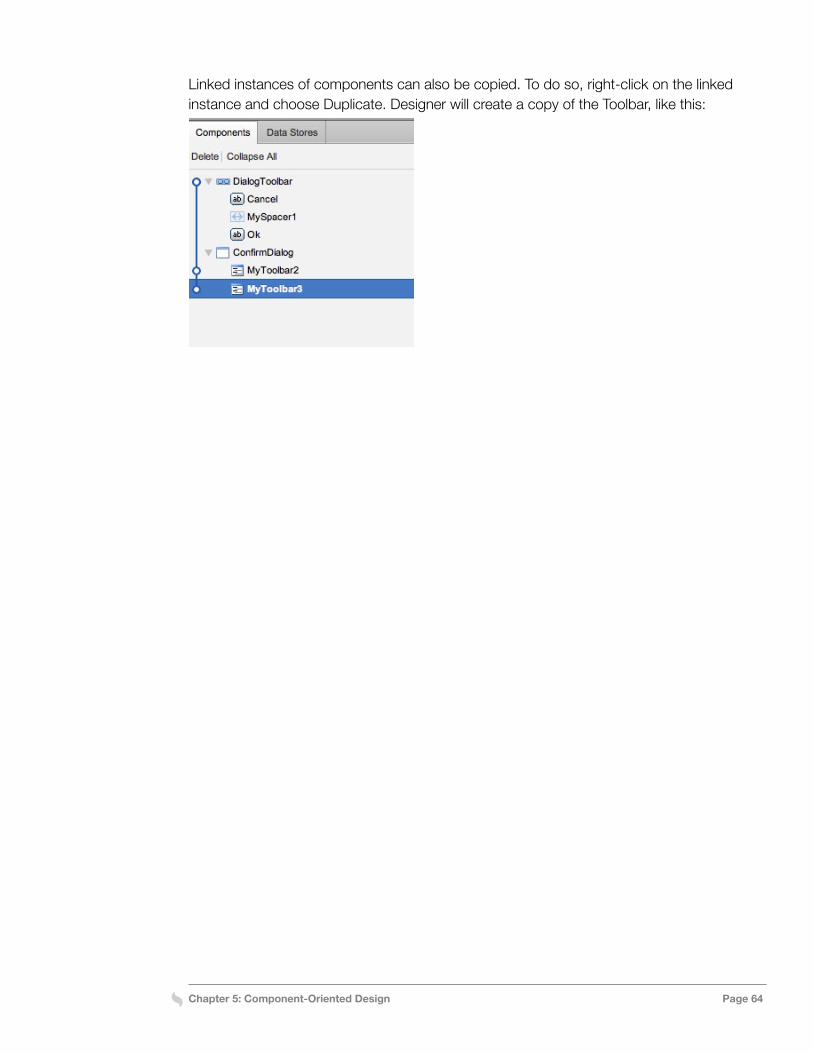
Chapter 5: Component-Oriented Design Page 64
Linked instances of components can also be copied. To do so, right-click on the linked instance and choose Duplicate. Designer will create a copy of the Toolbar, like this:
Chapter 6: Working With Data Stores Page 65
Chapter 6: Working With Data Stores
Data Stores provide a client-side data cache for UI components. An Ext JS Data Store retrieves data from a source such as an XML file and makes the data available for display within a UI component such as a GridPanel, TreePanel, or ComboBox.To do this, a Store uses a DataReader to read structured data from a source such as an XML file or JSON packet and creates an array of Model instances (also known as Records) that can be accessed by the UI components. The read requests are handled by a Data-Proxy that knows how to access the source and pass the data to the DataReader.The general process for setting up a Data Store include the following:
» Specifying the data format and where it’s located » Mapping fields in the data source to the fields that will be made available to UI compo-
nents » Configuring the UI components to use the fields that display the data
This chapter provides specific techniques for working with Ext JS Data Stores in Designer.
Using Data Stores in DesignerTo display data in a UI component using a Data Store, first select the type of Store that matches the format of the source data. Next, specify the location where data will read from in the Proxy’s url attribute and add fields to the Data Store and map them to the source data. Then load the data into the Data Store and configure the UI component to use spe-cific fields from the Data Store. Let’s take a closer look at each of these steps.
Choosing a Store TypeDesigner provides choice between several types of Data Stores. Each type defines the kind of DataReader and DataProxy that will be used to retrieve and parse data from the source. The choices are as follows:
» Json Store—retrieves data from a JSON packet using a JsonReader and HttpProxy. » Array Store—retrieves data from a local array using an ArrayReader and MemoryProxy.
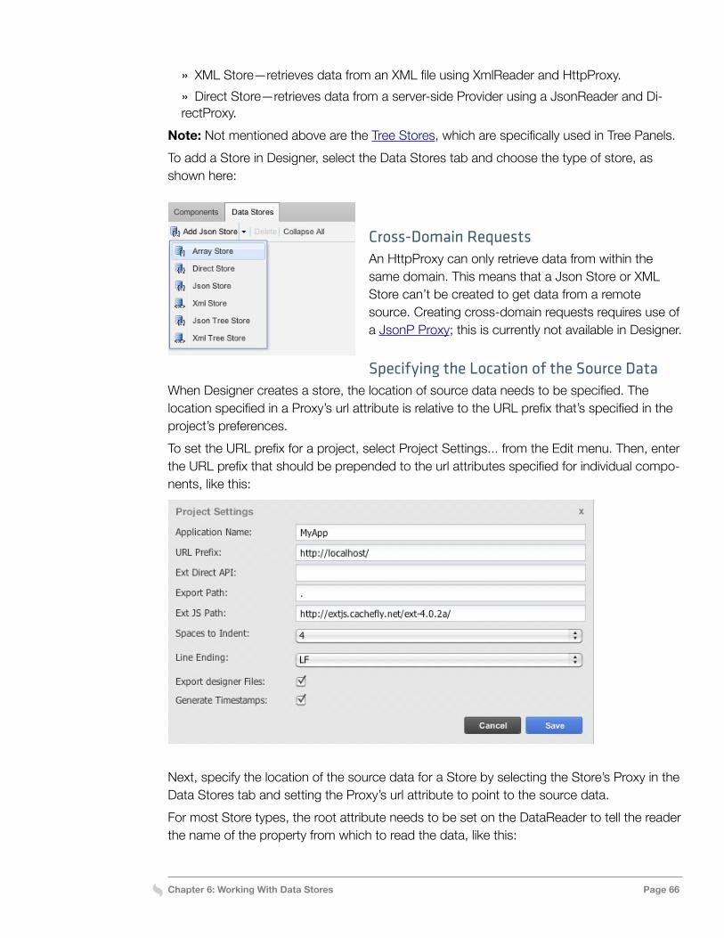
Chapter 6: Working With Data Stores Page 66
» XML Store—retrieves data from an XML file using XmlReader and HttpProxy. » Direct Store—retrieves data from a server-side Provider using a JsonReader and Di-
rectProxy.Note: Not mentioned above are the Tree Stores, which are specifically used in Tree Panels.To add a Store in Designer, select the Data Stores tab and choose the type of store, as shown here:
Cross-Domain RequestsAn HttpProxy can only retrieve data from within the same domain. This means that a Json Store or XML Store can’t be created to get data from a remote source. Creating cross-domain requests requires use of a JsonP Proxy; this is currently not available in Designer.
Specifying the Location of the Source DataWhen Designer creates a store, the location of source data needs to be specified. The location specified in a Proxy’s url attribute is relative to the URL prefix that’s specified in the project’s preferences. To set the URL prefix for a project, select Project Settings... from the Edit menu. Then, enter the URL prefix that should be prepended to the url attributes specified for individual compo-nents, like this:
Next, specify the location of the source data for a Store by selecting the Store’s Proxy in the Data Stores tab and setting the Proxy’s url attribute to point to the source data.For most Store types, the root attribute needs to be set on the DataReader to tell the reader the name of the property from which to read the data, like this:
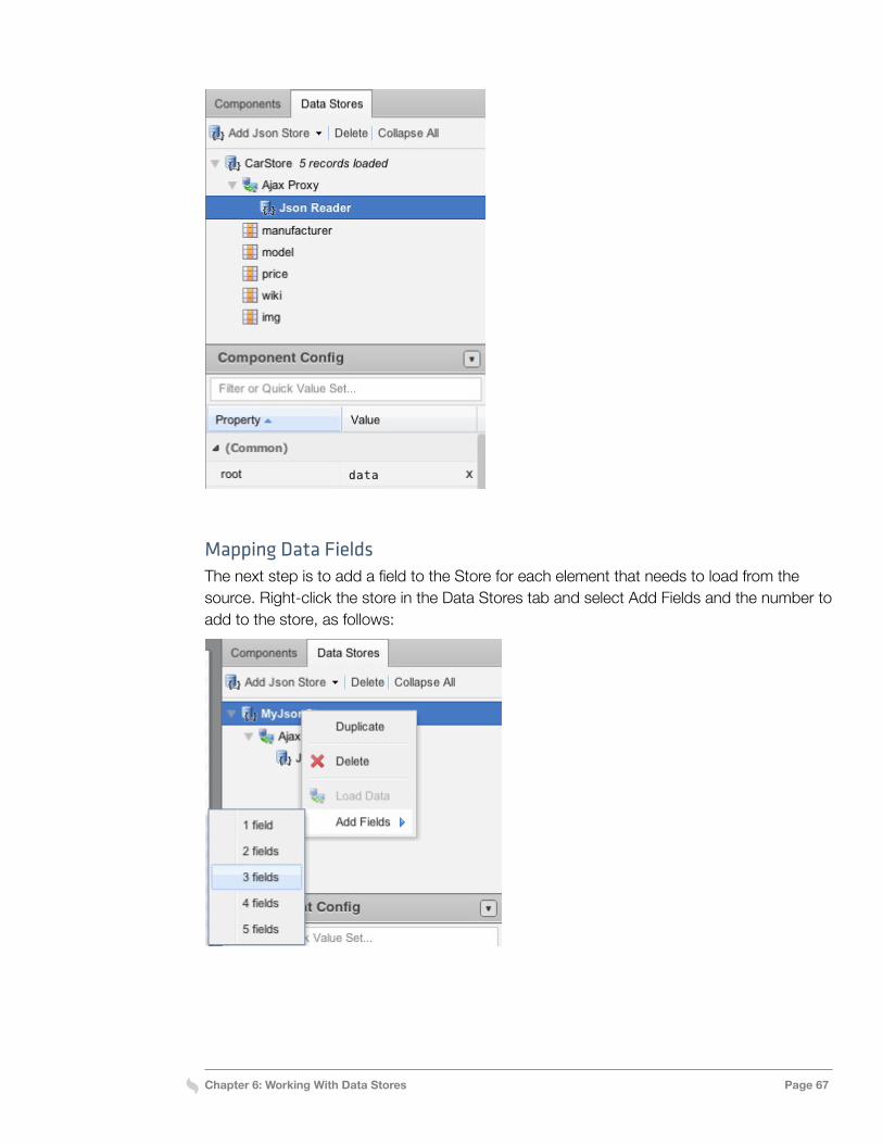
Chapter 6: Working With Data Stores Page 67
Mapping Data FieldsThe next step is to add a field to the Store for each element that needs to load from the source. Right-click the store in the Data Stores tab and select Add Fields and the number to add to the store, as follows:
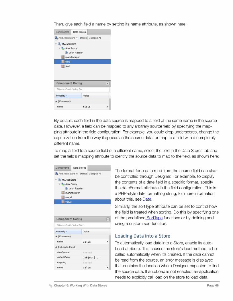
Chapter 6: Working With Data Stores Page 68
Then, give each field a name by setting its name attribute, as shown here:
By default, each field in the data source is mapped to a field of the same name in the source data. However, a field can be mapped to any arbitrary source field by specifying the map-ping attribute in the field configuration. For example, you could drop underscores, change the capitalization from the way it appears in the source data, or map to a field with a completely different name. To map a field to a source field of a different name, select the field in the Data Stores tab and set the field’s mapping attribute to identify the source data to map to the field, as shown here:
The format for a data read from the source field can also be controlled through Designer. For example, to display the contents of a date field in a specific format, specify the dateFormat attribute in the field configuration. This is a PHP-style date formatting string, for more information about this, see Date. Similarly, the sortType attribute can be set to control how the field is treated when sorting. Do this by specifying one of the predefined SortType functions or by defining and using a custom sort function.
Loading Data into a StoreTo automatically load data into a Store, enable its auto-Load attribute. This causes the store’s load method to be called automatically when it’s created. If the data cannot be read from the source, an error message is displayed that contains the location where Designer expected to find the source data. If autoLoad is not enabled, an application needs to explicitly call load on the store to load data.
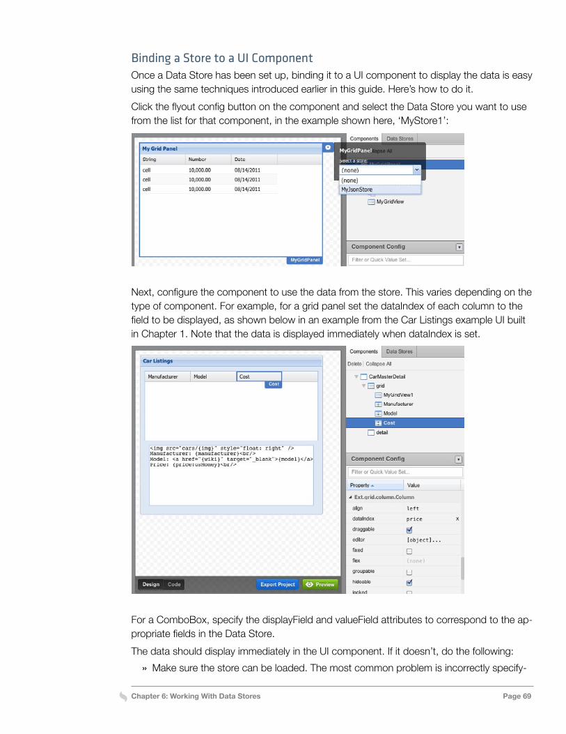
Chapter 6: Working With Data Stores Page 69
Binding a Store to a UI ComponentOnce a Data Store has been set up, binding it to a UI component to display the data is easy using the same techniques introduced earlier in this guide. Here’s how to do it.Click the flyout config button on the component and select the Data Store you want to use from the list for that component, in the example shown here, ‘MyStore1’:
Next, configure the component to use the data from the store. This varies depending on the type of component. For example, for a grid panel set the dataIndex of each column to the field to be displayed, as shown below in an example from the Car Listings example UI built in Chapter 1. Note that the data is displayed immediately when dataIndex is set.
For a ComboBox, specify the displayField and valueField attributes to correspond to the ap-propriate fields in the Data Store.The data should display immediately in the UI component. If it doesn’t, do the following:
» Make sure the store can be loaded. The most common problem is incorrectly specify-
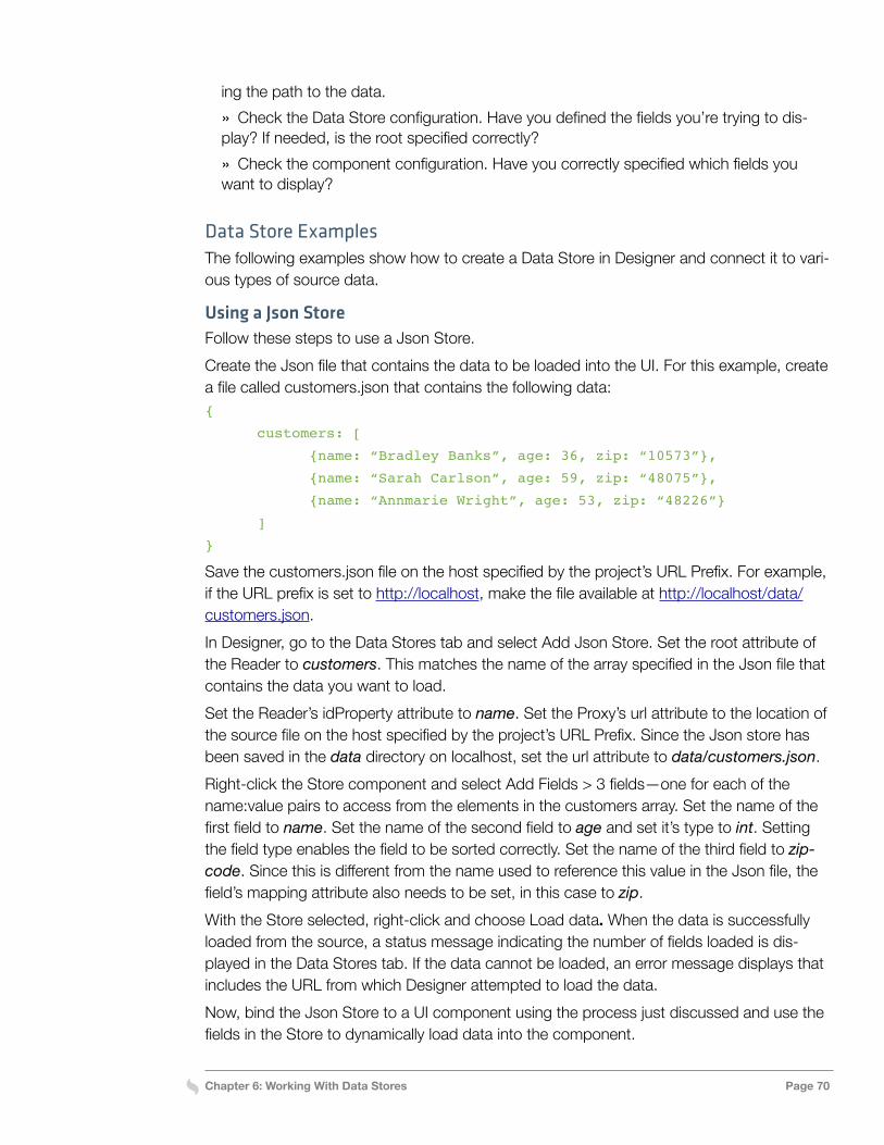
Chapter 6: Working With Data Stores Page 70
ing the path to the data. » Check the Data Store configuration. Have you defined the fields you’re trying to dis-
play? If needed, is the root specified correctly? » Check the component configuration. Have you correctly specified which fields you
want to display?
Data Store ExamplesThe following examples show how to create a Data Store in Designer and connect it to vari-ous types of source data.
Using a Json StoreFollow these steps to use a Json Store.Create the Json file that contains the data to be loaded into the UI. For this example, create a file called customers.json that contains the following data:{
customers: [
{name: “Bradley Banks”, age: 36, zip: “10573”},
{name: “Sarah Carlson”, age: 59, zip: “48075”},
{name: “Annmarie Wright”, age: 53, zip: “48226”}
]
}
Save the customers.json file on the host specified by the project’s URL Prefix. For example, if the URL prefix is set to http://localhost, make the file available at http://localhost/data/customers.json.In Designer, go to the Data Stores tab and select Add Json Store. Set the root attribute of the Reader to customers. This matches the name of the array specified in the Json file that contains the data you want to load.Set the Reader’s idProperty attribute to name. Set the Proxy’s url attribute to the location of the source file on the host specified by the project’s URL Prefix. Since the Json store has been saved in the data directory on localhost, set the url attribute to data/customers.json.Right-click the Store component and select Add Fields > 3 fields—one for each of the name:value pairs to access from the elements in the customers array. Set the name of the first field to name. Set the name of the second field to age and set it’s type to int. Setting the field type enables the field to be sorted correctly. Set the name of the third field to zip-code. Since this is different from the name used to reference this value in the Json file, the field’s mapping attribute also needs to be set, in this case to zip.With the Store selected, right-click and choose Load data. When the data is successfully loaded from the source, a status message indicating the number of fields loaded is dis-played in the Data Stores tab. If the data cannot be loaded, an error message displays that includes the URL from which Designer attempted to load the data.Now, bind the Json Store to a UI component using the process just discussed and use the fields in the Store to dynamically load data into the component.
Chapter 6: Working With Data Stores Page 71
Using an Array StoreHere’s how to use an Array Store in Designer.Create a file that contains the array data to load in the UI. For this example, create a Json file called contacts.json that contains the following data:[
[“Ace Supplies”, “Emma Knauer”, “555-3529”],
[“Best Goods”, “Joseph Kahn”, “555-8797”],
[“First Choice”, “Matthew Willbanks”, “555-4954”]
]
Save the contacts.json file on the host specified by the project’s URL Prefix. For example, if the URL prefix is set to http://localhost, make the file available at http://localhost/data/con-tacts.json.In Designer, go to the Data Stores tab and select Add Array Store. Set the Reader’s idIn-dex property to 0. This indicates that the first element in each row array (the contact name) should be used as the index.Set the Proxy’s url attribute to the location of the source file on the host specified by the project’s URL Prefix. Since the Json file has been saved in the data directory on localhost, set the url attribute to data/contacts.json.Right-click the Store component and select Add Fields > 3 fields—one for each element the application needs to reach from the row arrays in the source file. Name the three fields name, contact, and phone.With the Store selected, right-click and choose Load data. When the data is successfully loaded from the source, a status message indicating the number of fields loaded is dis-played in the Data Stores tab. If the data cannot be loaded, an error message displays that includes the URL from which Designer attempted to load the data.Finally, bind the new Array Store to a UI component and use the fields in the Store to dy-namically load data into the component.
Using an XML StoreHere’s another example, this one showing how to use an XML store.Create an XML file that contains the data to load into the UI. For this example, create a file called products.xml that contains the following data:<?xml version=”1.0” encoding=”UTF-8”?>
<Products xmlns=”http://example.org”>
<Product>
<Name>Widget</Name>
<Price>11.95</Price>
<ImageData>
<Url>widget.png</Url>
<Width>300</Width>
<Height>400</Height>
</ImageData>
</Product>
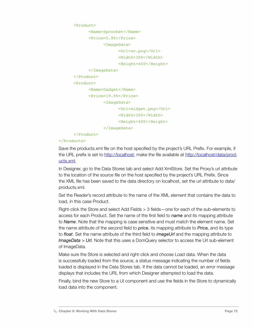
Chapter 6: Working With Data Stores Page 72
<Product>
<Name>Sprocket</Name>
<Price>5.95</Price>
<ImageData>
<Url>sc.png</Url>
<Width>300</Width>
<Height>400</Height>
</ImageData>
</Product>
<Product>
<Name>Gadget</Name>
<Price>19.95</Price>
<ImageData>
<Url>widget.png</Url>
<Width>300</Width>
<Height>400</Height>
</ImageData>
</Product>
</Products>
Save the products.xml file on the host specified by the project’s URL Prefix. For example, if the URL prefix is set to http://localhost, make the file available at http://localhost/data/prod-ucts.xml.In Designer, go to the Data Stores tab and select Add XmlStore. Set the Proxy’s url attribute to the location of the source file on the host specified by the project’s URL Prefix. Since the XML file has been saved to the data directory on localhost, set the url attribute to data/products.xml. Set the Reader’s record attribute to the name of the XML element that contains the data to load, in this case Product.Right-click the Store and select Add Fields > 3 fields—one for each of the sub-elements to access for each Product. Set the name of the first field to name and its mapping attribute to Name. Note that the mapping is case sensitive and must match the element name. Set the name attribute of the second field to price, its mapping attribute to Price, and its type to float. Set the name attribute of the third field to imageUrl and the mapping attribute to ImageData > Url. Note that this uses a DomQuery selector to access the Url sub-element of ImageData.Make sure the Store is selected and right-click and choose Load data. When the data is successfully loaded from the source, a status message indicating the number of fields loaded is displayed in the Data Stores tab. If the data cannot be loaded, an error message displays that includes the URL from which Designer attempted to load the data.Finally, bind the new Store to a UI component and use the fields in the Store to dynamically load data into the component.

We hope this has helped you learn how to use Sencha Ext Designer.For additional resources and materials, please visit www.sencha.com/learn/