evaluation question 1 a1
TRANSCRIPT
EVALUATION QUESTION 1

HOW DOES YOUR PRODUCT USE OR
CHALLENGE CONVENTIONS AND HOW DOES IT
REPRESENTS SOCIAL GROUPS OR ISSUE!
USING AS WELL AS CHALLENGING THE CODES
AND CONVENTIONS OF A MUSIC MAGAZINE.

FRONT COVER
For the front cover of my magazine, I made sure I included the main generic conventions of a typical magazine which I learnt through my research. I ensured I used a masthead, barcode, dateline, price, main image, puffs, Direct mode of address and cover lines. I placed the image of my cover star over the masthead to emphasise her importance but to also show that the magazine is a recognisable brand. I maintained colour consistency of the cover, Red, Black and white with the main image. I used a mid shot of my model so that it looks more professional. Another convention that my music magazine uses is puff, the text ‘FREE POSTER’ in a Yellow star, A bright and eye catching color and text.

MY FRONT COVER OF MUSIC MAGAZINE
Masthead
Main Cover Line
Puff
Issue Date
Barcode
Price
Header bar
Main Image
Cover Line
Direct mode of
address
FRONT COVER
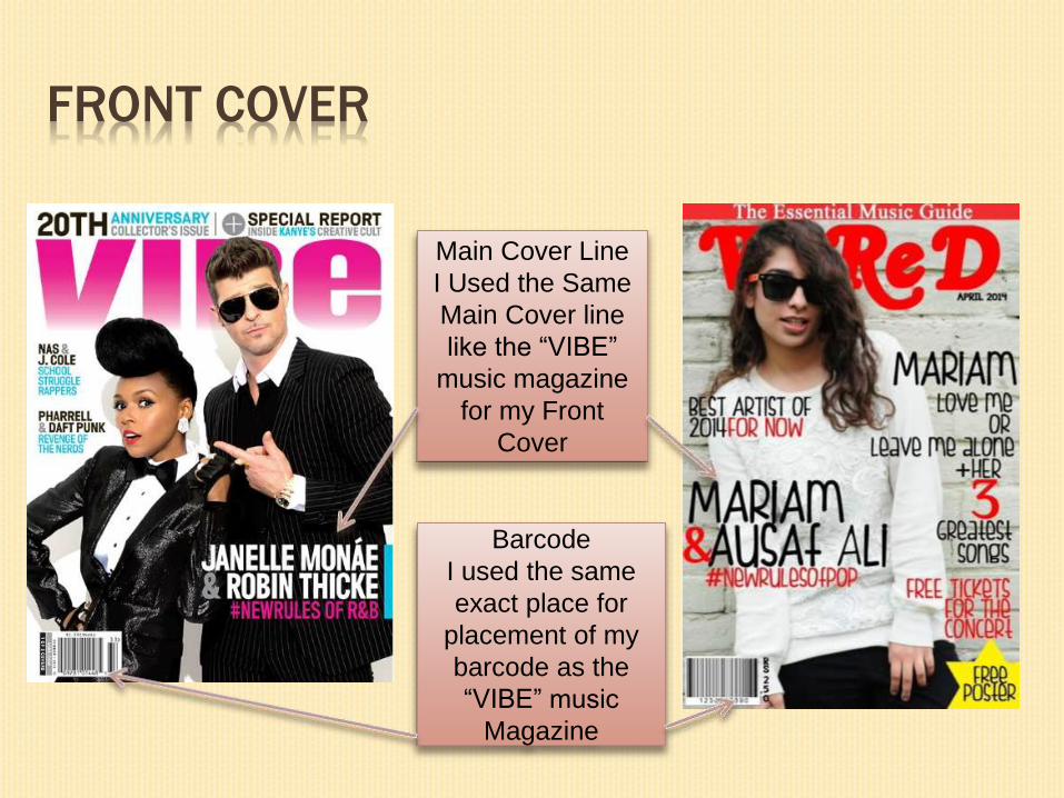
Main Cover Line
I Used the Same
Main Cover line
like the “VIBE”
music magazine
for my Front
Cover
Barcode
I used the same
exact place for
placement of my
barcode as the
“VIBE” music
Magazine
FRONT COVER
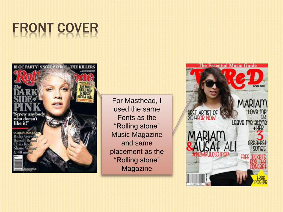
For Masthead, I
used the same
Fonts as the
“Rolling stone”
Music Magazine
and same
placement as the
“Rolling stone”
Magazine

FRONT COVER
Cover Line
For the placement
of my cover line I
used the same
placement as
“VIBE” music
Magazine

DOUBLE SPREAD PAGE
For my double page spread, I have kept to the typical layout you would expect to see in many magazine having a large image of the star of the left side and the article on the other. I also continued the same colour scheme of Blue and black to sustain consistency and give a professional feel to my magazine. I added a quote from the article in the centre and also on the right side to entice the reader into finding out more therefore having to read the article.

DOUBLE SPREAD PAGE
Another common feature that you get in
magazines is articles, reviews and interviews
as you can see I am advertising an interview
with Mariam Sana who is portrayed as an
artist and I am also including reviews from
resent music hits such as Justin Timberlake
and Wil.i.am so this is a real convention that
a music magazine would contain.
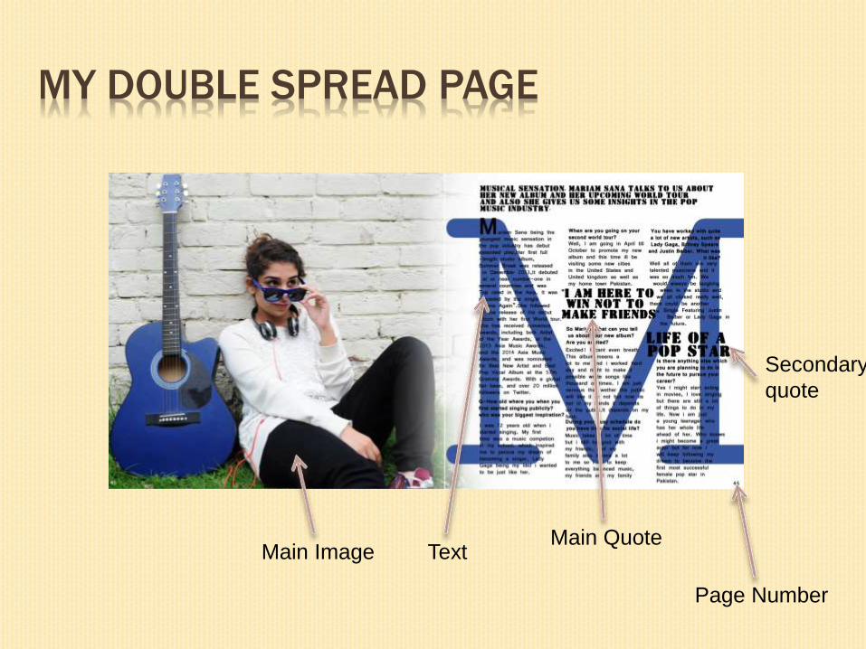
MY DOUBLE SPREAD PAGE
Main Image TextMain Quote
Page Number
Secondary
quote
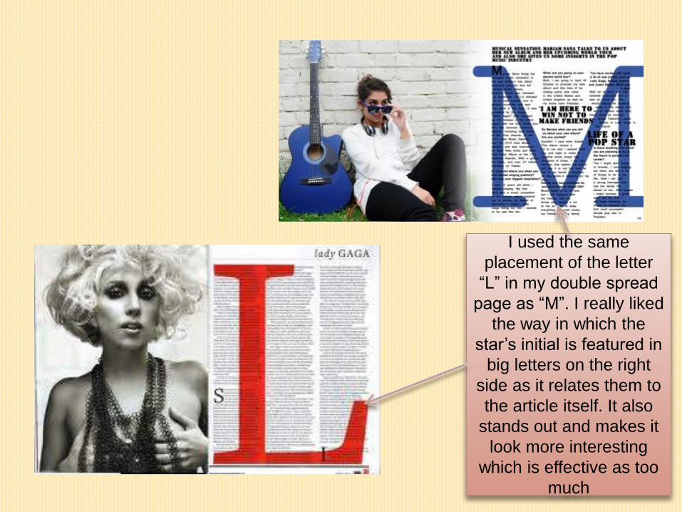
I used the same
placement of the letter
“L” in my double spread
page as “M”. I really liked
the way in which the
star’s initial is featured in
big letters on the right
side as it relates them to
the article itself. It also
stands out and makes it
look more interesting
which is effective as too
much

CONTENTS PAGE
For my contents page, I ensured to include a
different image of the cover star I featured on
my front cover. I kept the Red and black
colour scheme to make my magazine look
more consistent therefore professional. I also
added description about the sub images
which many magazine often do and edited
the photo thus removing half of the
background and mainly focusing on the
artist.

MY CONTENTS PAGE
Main ImageSub Images
List
of Features
Page
Number
Masthead

CONTENTS PAGE
Photo editing was
Performed with upper half of
the background Removed
focusing on the main artist. I
have used the similar format
I Embedded the page number on the image
Same as the sub images in Q magazine
Photo editing was
Performed with upper half
of the background
Removed focusing on the
main artist on the Q
magazine I have used the
similar format
I Embedded the page number on the image
Same as the sub images in Q magazine

CONTENTS PAGE
I used the same pattern of the
“CONTENTS” which is used in
The vibe magazine
I used the same pattern of the
“CONTENTS” which is used in
The vibe magazine

HOW DOES IT REPRESENT SOCIAL GROUP AND
ISSUES?
My magazine is aimed at mostly young, Male and female
teenagers who enjoy listening to pop music. I have used
images of my cover star which purposefully is dressed as
a Pop Music Artist. Mariam contrasts with the usual
stereotype of a woman in some ways as she is
represented as quite strong and independent
on the front cover .
I think this further shows her as an independent individual who is different from others. However, throughout the rest of the magazine and through the use of props she does represent a typical, Music Lover Artist. I have chosen to stick to this usual stereotype as the readers of this magazine will fall into the same category and therefore can relate to the cover star. It also relates to my article in the double page spread as Mariam comes across very real and true to her music and her fans.

I believe my cover star represents young second
generation who no longer live in their native land and so
have embraced different cultures. However I believe that
through the stories featured on the cover I am also
representing a much wider social group of people.