elements of interior design
TRANSCRIPT
Elements of
interiordesign

sr 2
Submitted by-Sumit RanjanCollege of Architecture,Bhaddal6th semAR/12/834
Sumbitted to-Ar Rimaljeet Kaur

sr
3
Interior design is "the art or
process of designing the interior decoration of a room or building“
An interior designer is someone
who coordinates and manages such projects.
Interior design is a multifaceted
profession that includes conceptual development, communicating with the stakeholders of a project and the management and execution of the design.

sr 4
In the past, interiors were put together instinctively as a part of the process of building.
The profession of interior design has been a consequence of the development of societyand the complex architecture that has resulted from the development of industrial processes.
In ancient India, architects used to work as interior designers.
This can be seen from the references of Vishwakarma the architect - one of the gods in Indian mythology.
The interior design profession became more established after World War II.
sr 5
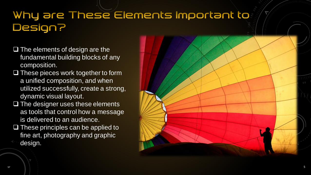
The elements of design are the
fundamental building blocks of any
composition.
These pieces work together to form
a unified composition, and when
utilized successfully, create a strong,
dynamic visual layout.
The designer uses these elements
as tools that control how a message
is delivered to an audience.
These principles can be applied to
fine art, photography and graphic
design.

sr 6

sr 7
Line
Space
Shape
Form
Texture
Color
line
colour
form
texture
spaceshapes

sr 8

One of most important element of design, line defines a subjectʼs form or shape on a flat, two-dimensional surface.
Lines can be thick or thin, smooth or jagged, rigid and mechanical or organic and hand drawn.
When discussing line as it applies to interior design, we mean the lines created by the furnishings and architecture of a room.
Line sets form and shape.
Line is responsible for harmony, contrast and unity in interior design.
Line can be used to show movement and guides the eye throughout a room.
Line can be used to show mood.
Lines can be used to convey a sense of strength, serenity, gracefulness, or action.
Combining lines and placing them in a design in certain ways can create specific effects and feelings.
The use of line can also have an effect on how space is perceived.
Different types of lines have different effects on design.

sr 10
a mark, or stroke that is longer then it is wide. It is the path of a point moving in space. Objects and things are perceived by the line that describes them.
Characteristics of line include: Width - thick, thin, tapering, uneven Length - long, short, continuous, broken Direction - horizontal, vertical, diagonal, curving, perpendicular, oblique,
parallel, radial, zig-zagFocus - sharp, blurry, fuzzy, choppy Feeling - sharp, jagged, graceful, smooth ... can you think of others?

sr 11

sr 12
The difference in line quality have created works with very different impact. How you use line is very important while creating some artwork.

sr 13
sr 14
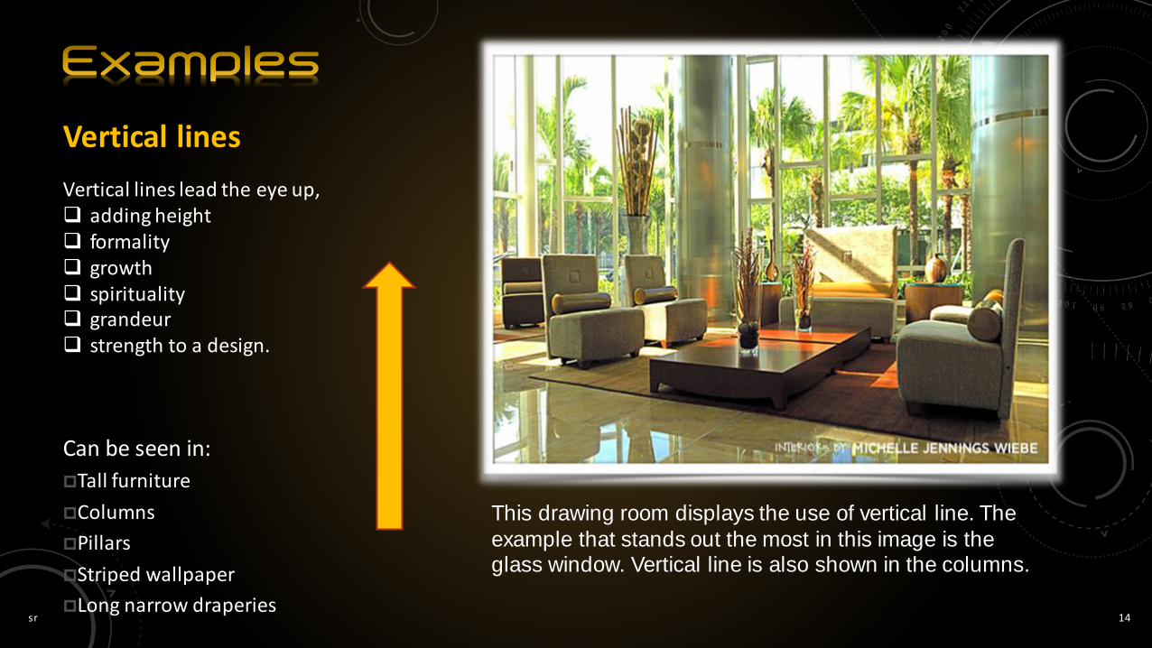
Vertical lines
Vertical lines lead the eye up, adding height formality growth spirituality grandeur strength to a design.
Can be seen in:
Tall furniture
Columns
Pillars
Striped wallpaper
Long narrow draperies
This drawing room displays the use of vertical line. The
example that stands out the most in this image is the glass window. Vertical line is also shown in the columns.

sr 15
The back wall, glass window, furniture etc. give rise to verticality

sr 16
Vertical railing showing vertical lines.These suppose to increase the height.

sr 17
Vertical lines can make rooms seem more spacious than they actually are and ceilings appear higher.
sr 18
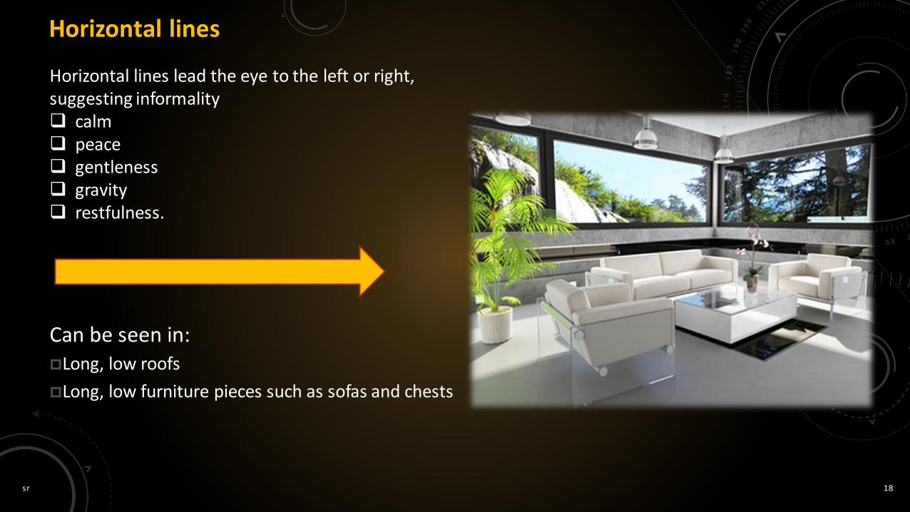
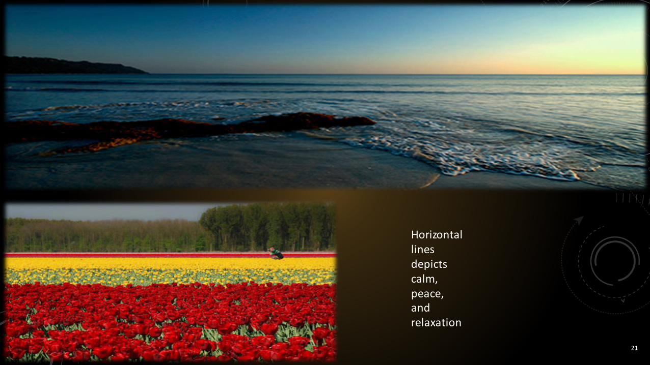
Horizontal lines
Horizontal lines lead the eye to the left or right, suggesting informality calm peace gentleness gravity restfulness.
Can be seen in:Long, low roofs
Long, low furniture pieces such as sofas and chests

sr 19
Horizontal lines can
make buildings,
rooms, and
furniture seem
wider and shorter.

sr 20
Horizontal lines can
make buildings,
rooms, and furniture
seem wider and shorter.
sr 21
Horizontal lines depicts calm, peace, and relaxation

sr 22
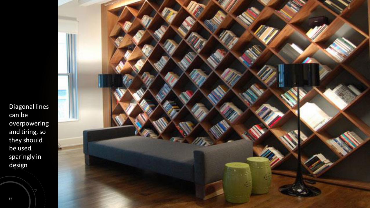
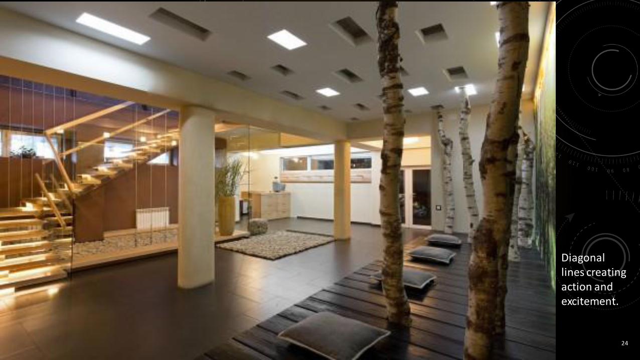
Diagonal lines
Diagonal lines suggest action, activity, movement excitement Creates a sense of speed
Can be seen in:Staircases
Cathedral ceilings
Gable Roofs
sr 23
Diagonal lines can be overpowering and tiring, so they should be used sparingly in design
sr 24
Diagonal lines creating action and excitement.

sr 25
Depicting a sense of action

sr 26
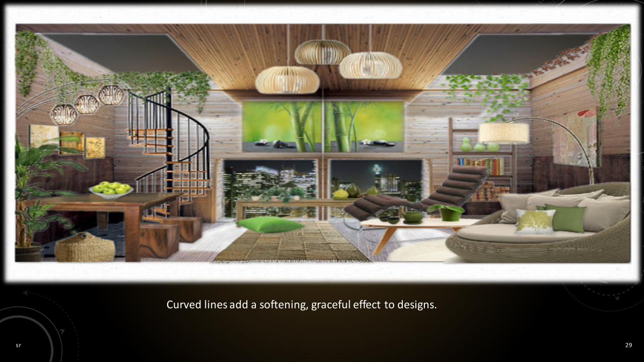
Curved linesToo many curved lines create a busy look Represent freedom Natural Flow Appearance of softness A soothing feeling.
Can be seen in:Doorway arches
Ruffled curtains
Curved furniture
Rounded accessories
Staircases

sr 27
Curved lines create natural flow and freedom.
The dynamic nature of diagonal lines creates drama and movement in room with a staircase

sr 28
Curved line represent freedom Appearance of softness
sr 29
Curved lines add a softening, graceful effect to designs.

sr 30
sr 31
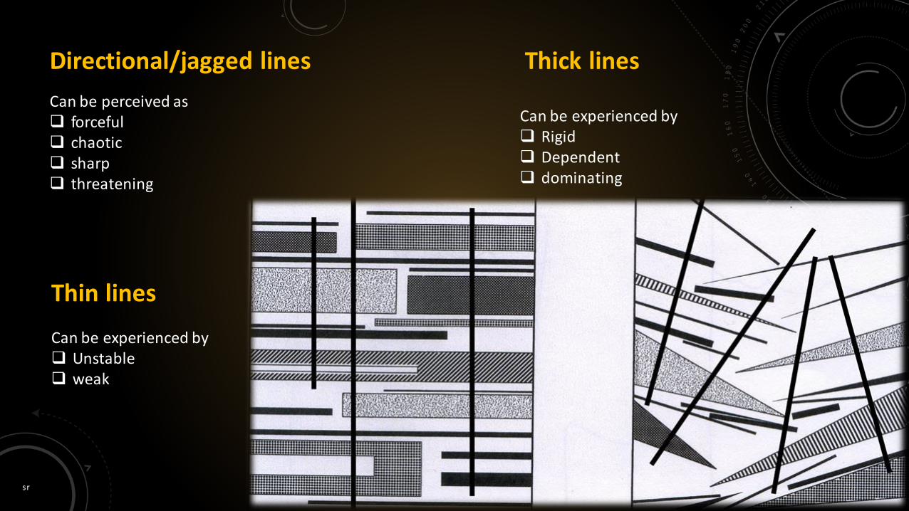
Directional/jagged lines
Can be perceived as forceful chaotic sharp threatening
Thin lines
Can be experienced by Unstable weak
Thick lines
Can be experienced by Rigid Dependent dominating

sr 32
sr 33
sr 34
Space, in two-dimensional design, is essentially flat. It has height and width, but no depth. There are certain visual cues, however, that can create the illusion of space in
the mind of the viewer. By using those cues, artists and designers can create images that are interpreted
as three-dimensional.
Space is the area provided for a particular purpose.It may have two dimensions (length and width) such as a floor, or it may have three
dimensions (length, width, and height), such as a room or dwelling.It refers to the area that a shape or form occupies.When space changes gradually, it is more pleasing than when it changes abruptly.When space changes suddenly, the eye shifts from one view to the other without
making a smooth transition.
sr 35
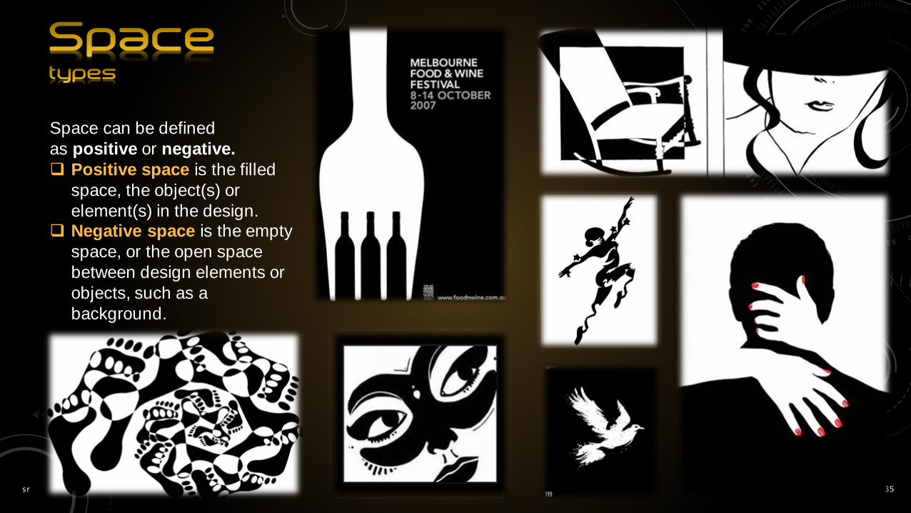
Space can be defined
as positive or negative.
Positive space is the filled
space, the object(s) or
element(s) in the design. Negative space is the empty
space, or the open space
between design elements or
objects, such as a
background.
sr 36

sr 37
Any space, no mater
what size or shape, can be divided
into distinct parts.

sr 38
Designers can create the illusion of
physical space and spatial relationships
through:
Linear Perspective
Size & Vertical Location
Overlapping
Detail (Aerial or Atmospheric
Perspective)
sr 39
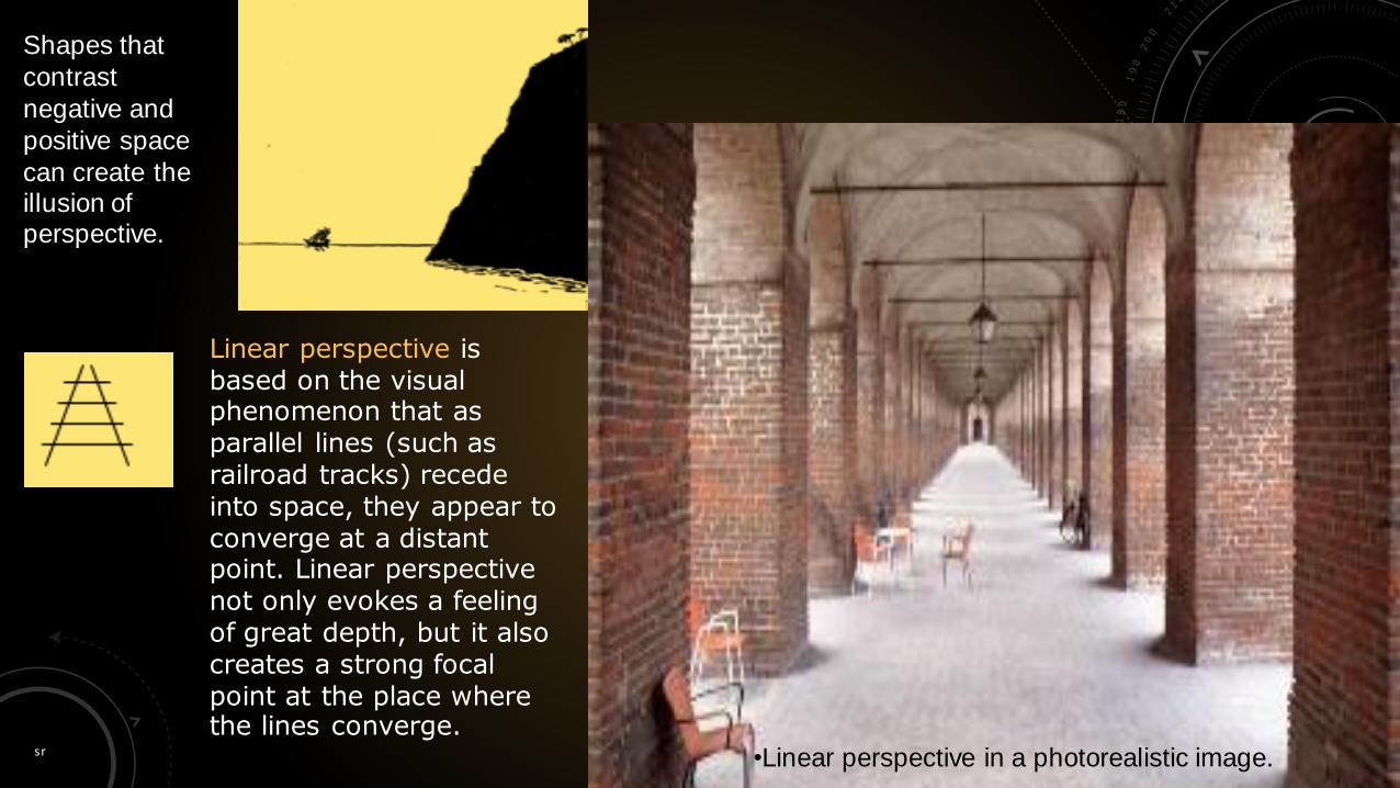
Shapes that
contrast
negative and
positive space
can create the illusion of perspective.
•Linear perspective in a photorealistic image.
Linear perspective is based on the visual phenomenon that as parallel lines (such as railroad tracks) recede into space, they appear to converge at a distant point. Linear perspective not only evokes a feeling of great depth, but it also creates a strong focal point at the place where the lines converge.

sr 40
Size is one of the easiest ways to create the illusion of space. A larger image will appear closer than a smaller one because we observed (very early in life) that objects appear to become smaller as they get farther away.
sr 41
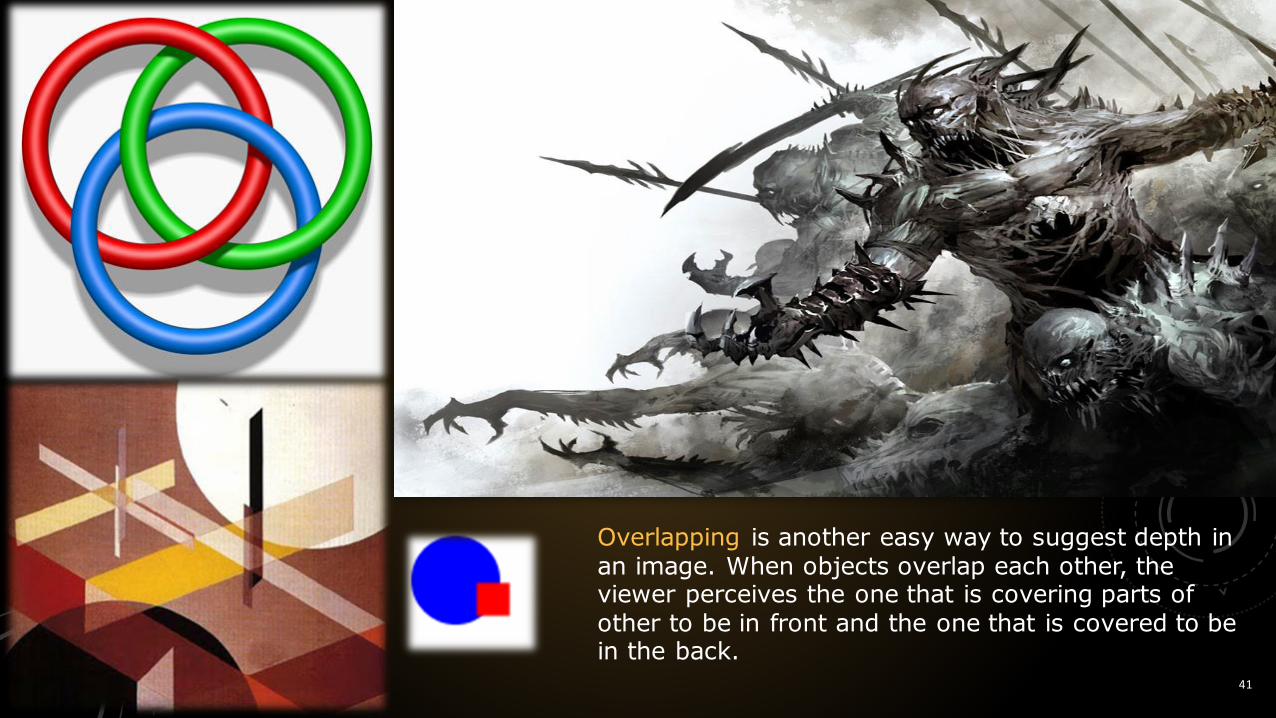
Overlapping is another easy way to suggest depth in an image. When objects overlap each other, the viewer perceives the one that is covering parts of other to be in front and the one that is covered to be in the back.

sr 42
Atmospheric perspective uses value, contrast and color to give the illusion of space.
Atmospheric perspective is based on the fact that the farther something is away from us, the more the atmospheric haze may obscure our view of it.
By lightening the value, lowering the value contrast, softening the edges, decreasing detail and muting the color, you can mimic the effect of atmospheric haze and create the illusion of increasing distance.
Increasing the bluish cast of an image also creates a sense of depth because cool colors recede and warm colorscome forward.
sr 43
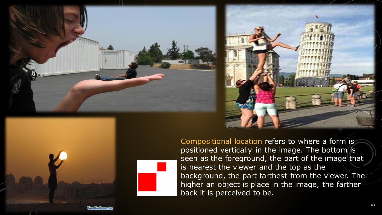
Compositional location refers to where a form is positioned vertically in the image. The bottom is seen as the foreground, the part of the image that is nearest the viewer and the top as the background, the part farthest from the viewer. The higher an object is place in the image, the farther back it is perceived to be.

sr 44
Too little space can create a
feeling of being
exposed.
sr 45
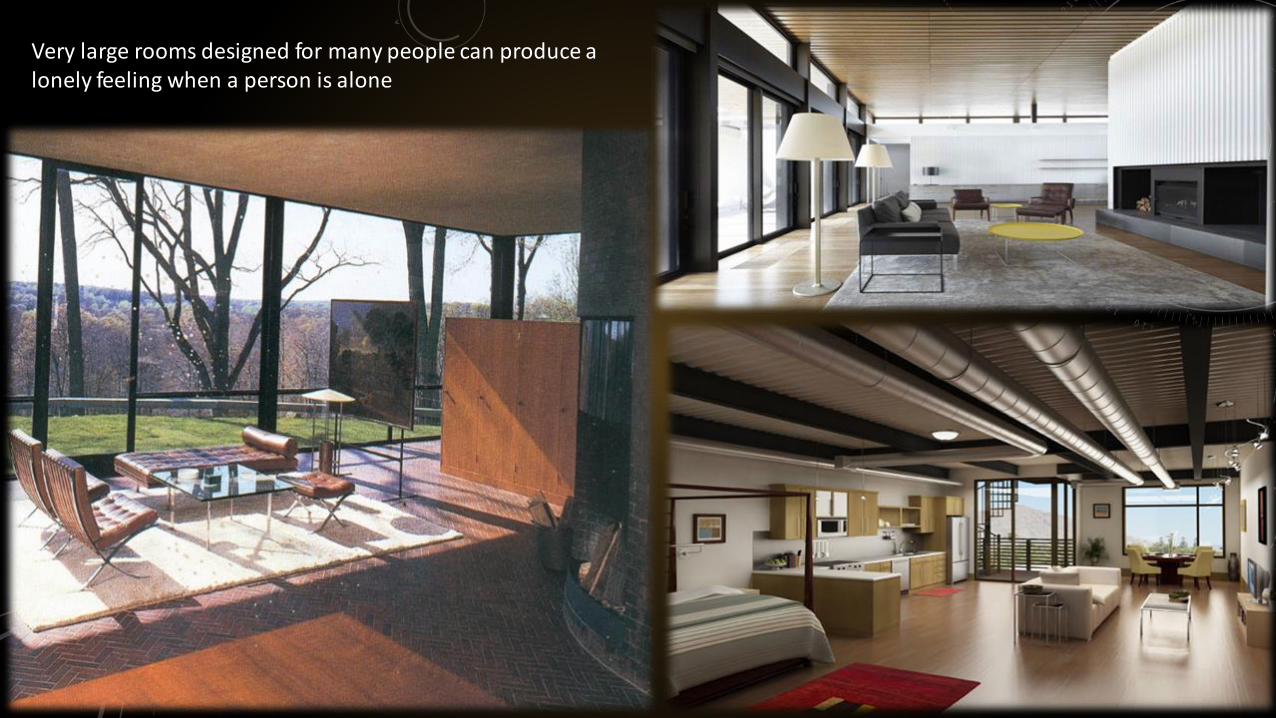
Very large rooms designed for many people can produce a lonely feeling when a person is alone
sr 46
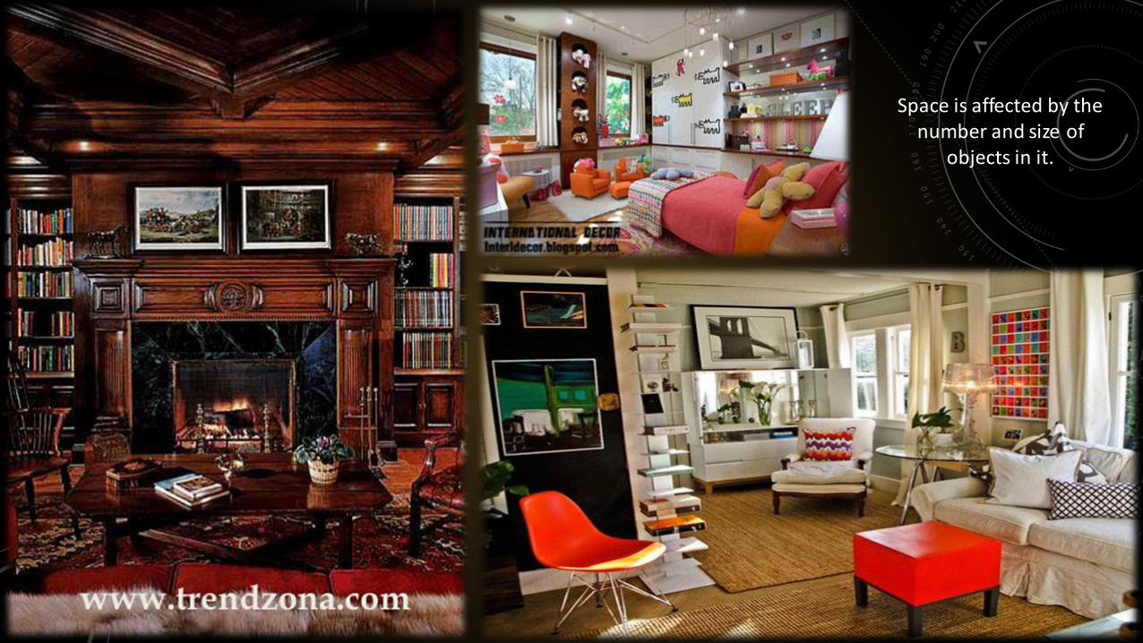
Space is affected by the number and size of
objects in it.

sr 47
Many objects scattered throughout a room will most likely destroy the
design effect because the space will have no
apparent organization or unity.
sr48
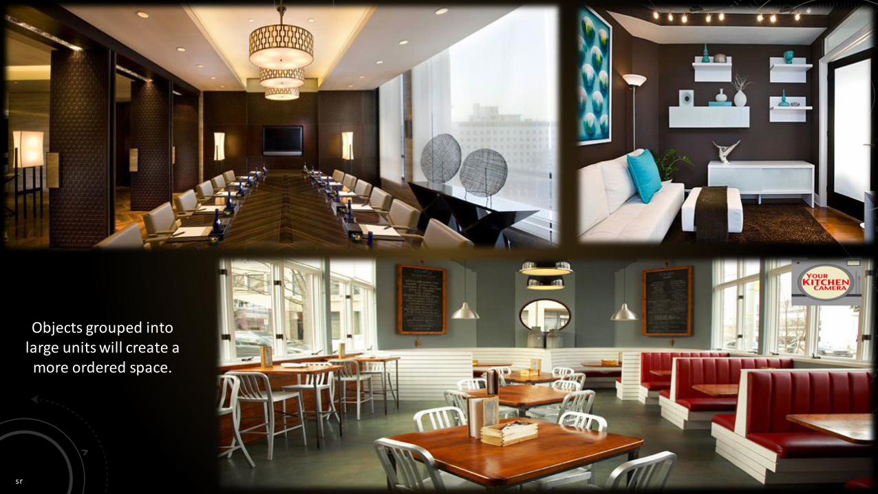
Objects grouped into large units will create a
more ordered space.
sr 49

sr 50
A shape is defined as
a two or more dimensional area.
All objects are composed of shapes and all other
'Elements of Design' are shapes in some way. Shape is a flat image with two dimensions: Length and
Width. Any self-contained area with defined form or outline. It refers to the nature of an enclosure, actual or implied,
formed by a line/curve on a flat surface. Examples of "shape" in this context include "a geometric
shape" (eg square), "organic shape" (flower-shaped object). Perceivable area. Shapes can be created by enclosing line, or by color and
value changes which define edges.

sr 51
Mechanical Shapes or Geometric Shapes
are the shapes that can be drawn using a
ruler or compass. Mechanical shapes,
whether simple or complex, produce a
feeling of control or order.[5]
Organic Shapes are freehand drawn
shapes that are complex and normally
found in nature. Organic shapes produce a
natural feel.
Shape has size, which may connote
significance or insignificance, strength or
weakness.
A coloured shape on a white back-ground is
itself a positive shape creating a negative shape (the background)
Types of shapes

sr 52
Some geometrical shapes
Shape creating pattern

sr 53
Color alone can create shapes.

sr 54
Connecting one continuous line to make a circle also creates shape

sr 55
These are perfect geometric shapes, which are very pleasing to the eye.

sr 56
Imperfect geometric shapes tend to create tension and attract greater interest.

sr 57
Shiny and reflect images- mirrors
Transparent and create visual effects - window glass
Textured and absorb light and sound -window treatments and carpeting
Hard or Soft Plain or patterned Colored light or dark
Shape may be:
sr 58
sr 59
sr 60
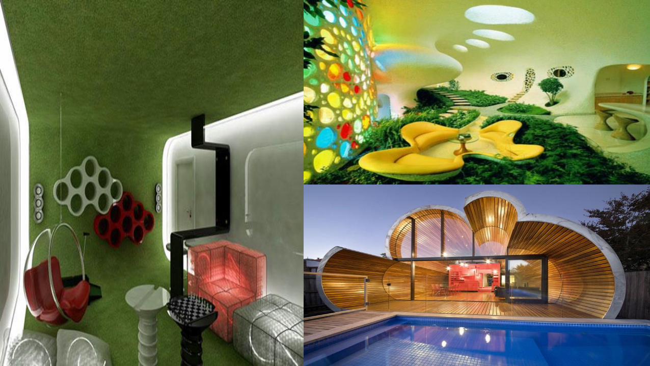
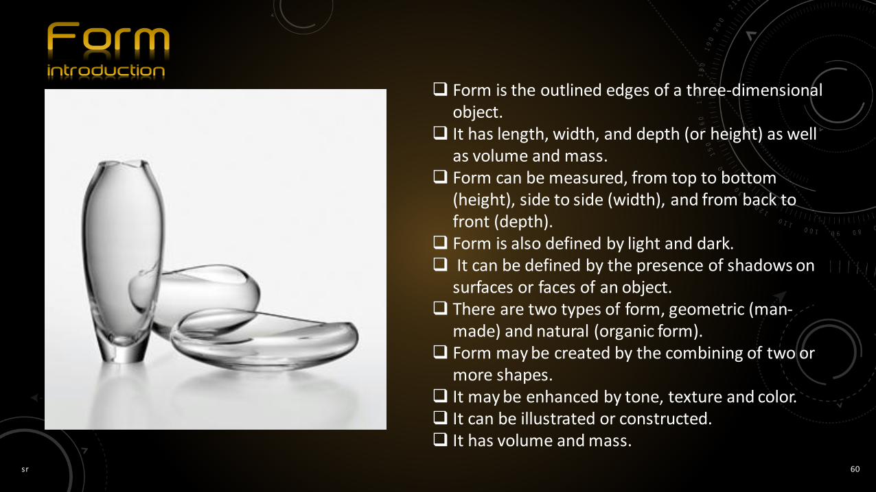
Form is the outlined edges of a three-dimensional object.
It has length, width, and depth (or height) as well as volume and mass.
Form can be measured, from top to bottom (height), side to side (width), and from back to front (depth).
Form is also defined by light and dark. It can be defined by the presence of shadows on
surfaces or faces of an object. There are two types of form, geometric (man-
made) and natural (organic form). Form may be created by the combining of two or
more shapes. It may be enhanced by tone, texture and color. It can be illustrated or constructed. It has volume and mass.
sr 61
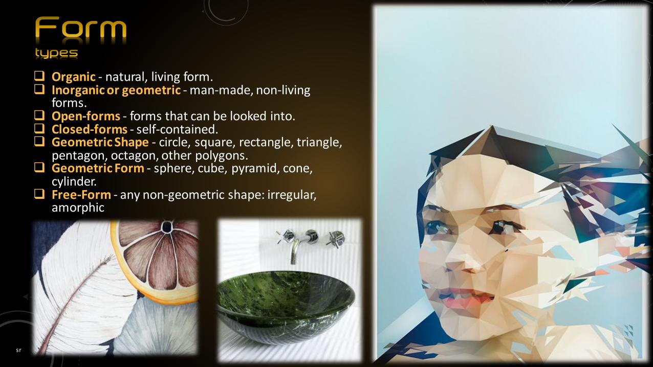
Organic - natural, living form. Inorganic or geometric - man-made, non-living
forms. Open-forms - forms that can be looked into. Closed-forms - self-contained. Geometric Shape - circle, square, rectangle, triangle,
pentagon, octagon, other polygons. Geometric Form - sphere, cube, pyramid, cone,
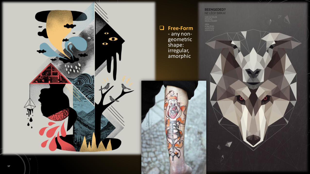
cylinder. Free-Form - any non-geometric shape: irregular,
amorphic

sr 62
Inorganic or geometric - man-made, non-living forms.

sr 63
Organic - natural, living form.
sr 64
Free-Form- any non-geometric shape: irregular, amorphic

sr 65
Related forms tend to look better together than unrelated forms.

sr 66
Open-forms - forms that can be looked into.

sr 67
A room is more pleasing if the form of the dominate piece is repeated in minor pieces and accessories in a room.
sr 68
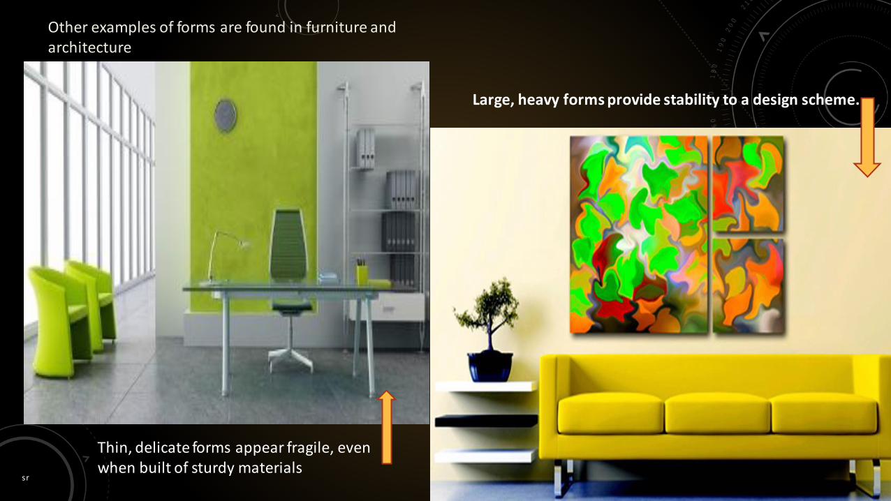
Other examples of forms are found in furniture and architecture
Thin, delicate forms appear fragile, even when built of sturdy materials
Large, heavy forms provide stability to a design scheme.
sr 69

sr 70
It is the surface quality or appearance of an object. Texture can be used to enhance a room’s features or
provide added dimension. The element of texture is defined as “the feel,
appearance, or consistency of a surface.” Texture is a surface’s tactile quality. Tactile refers to the perception of touch.
types
Visual texture is a quality of the surface that you can ‘see’, but not necessarily ‘felt’.
Actual texture is a quality of the surface that you can both ‘see’ and ‘feel’.
sr 71
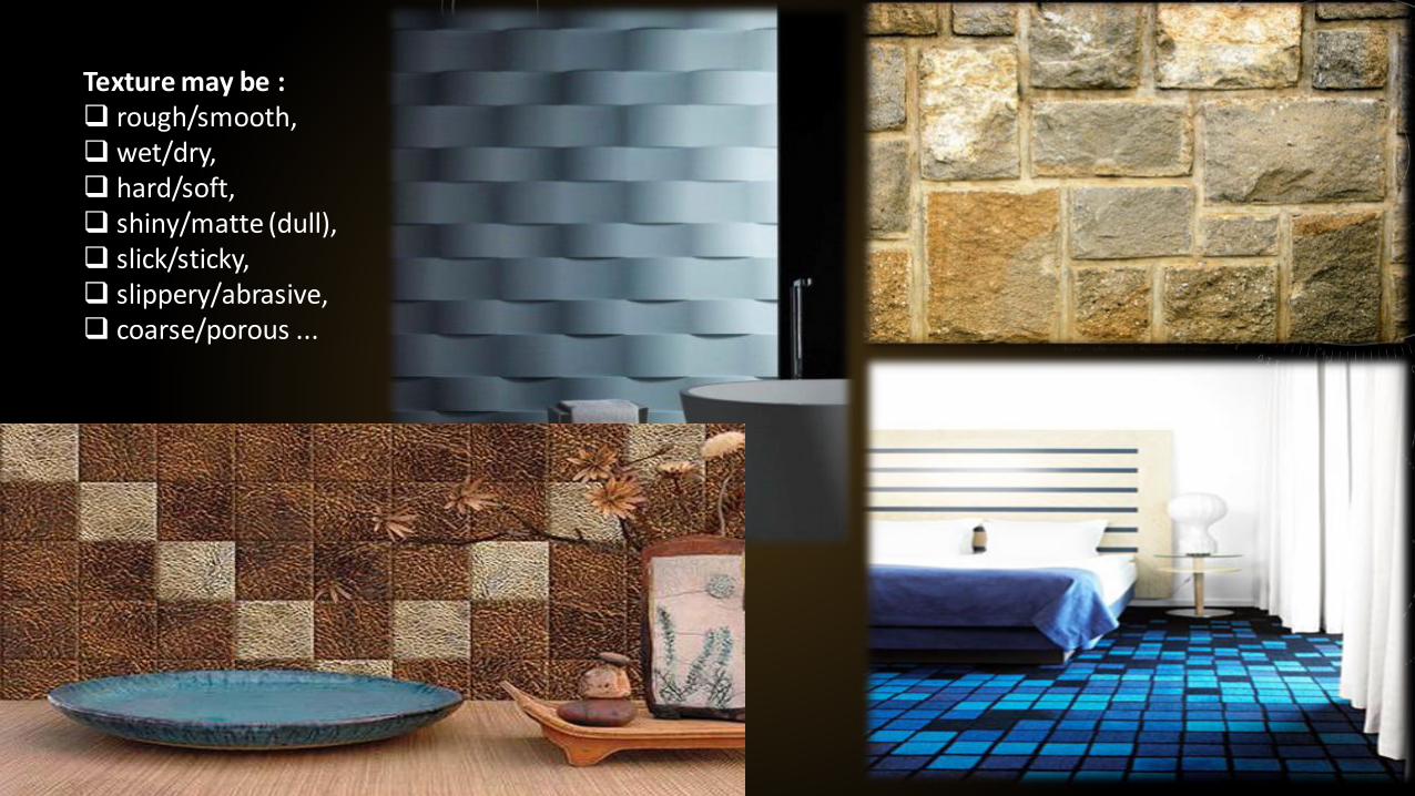
Texture may be : rough/smooth, wet/dry, hard/soft, shiny/matte (dull), slick/sticky, slippery/abrasive, coarse/porous ...
sr 72
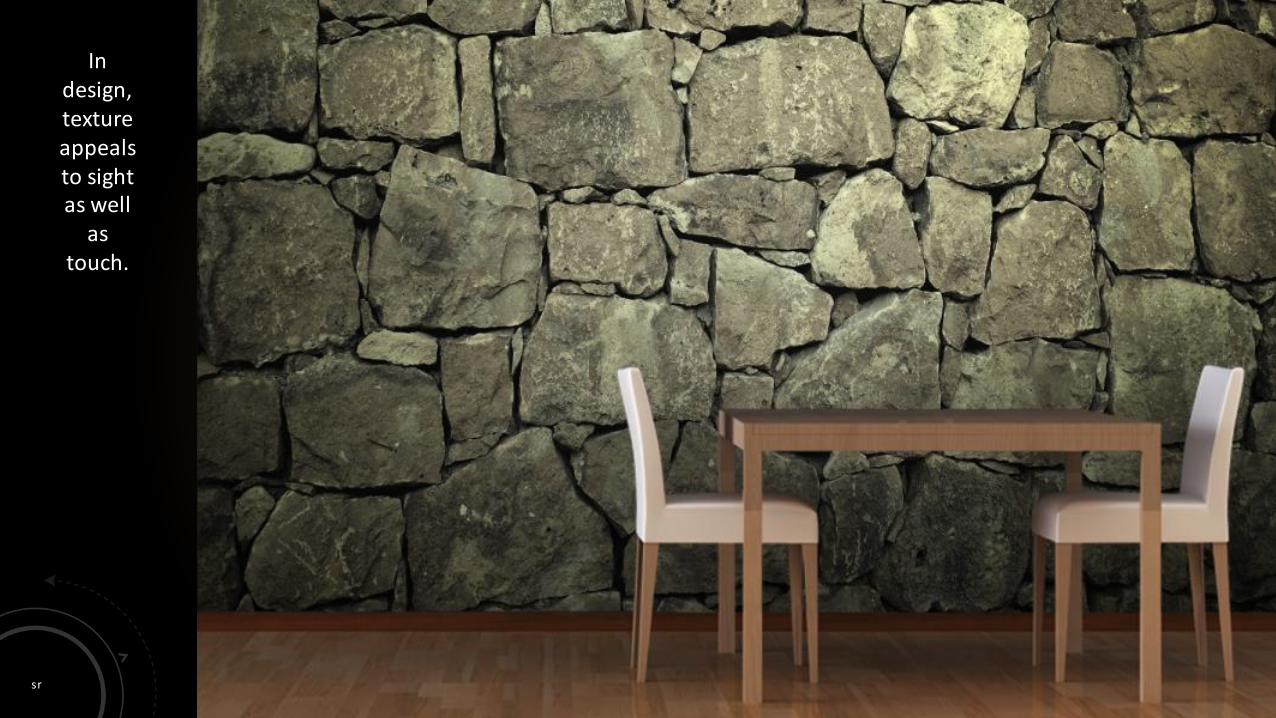
In design, texture appeals to sight as well
as touch.

sr 73
A room with the same texture throughout is monotonous, but too many different textures can appear disjointed and distracting.

sr 74
Most well-designed rooms have a dominate texture with accents of contrasting textures.
sr 75
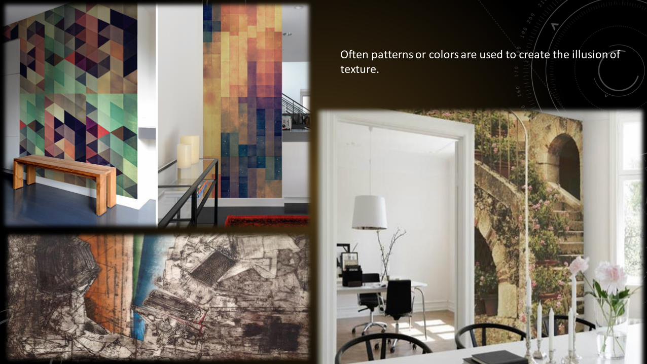
Often patterns or colors are used to create the illusion of texture.

sr 76
Smooth surfaces reflect more light than rough surfaces, making them look lighter and brighter.
Rough surfaces absorb more light, making them look darker and less intense.

sr 77

sr 78
Color is the key element of interior design.
It is used to create aesthetically pleasing combinations and
also works on a psychological level.
Each color has three characteristics: hue, value, and intensity.
It can give emphasis to create a hierarchy and the piece of art
Colour Saturation gives a color brightness or dullness. Colour may connote emotion (excitement, rage, peace)
and stimulate brain activity (action, relaxation, concentration).
Light is additive – working towards white. Paint or pigment is subtractive – working towards black. Mixing red blue and yellow can create any pigment colour. Tints are made when white is added to a pure hue to make
light values. A Shade is when black is added to a pure hue to make
dark values.

sr 79
Hue is the name of a color.
Red, green and blue-violet are examples of hues.
A color may be lightened or darkened, brightened or dulled, but the hue will remain the same.
Colour is said to have value, which refers to the lightness or darkness of the colour (hue).
Tint (colour plus white) is high-value colour, whereas shade (colour plus black) is low value colour
sr 80
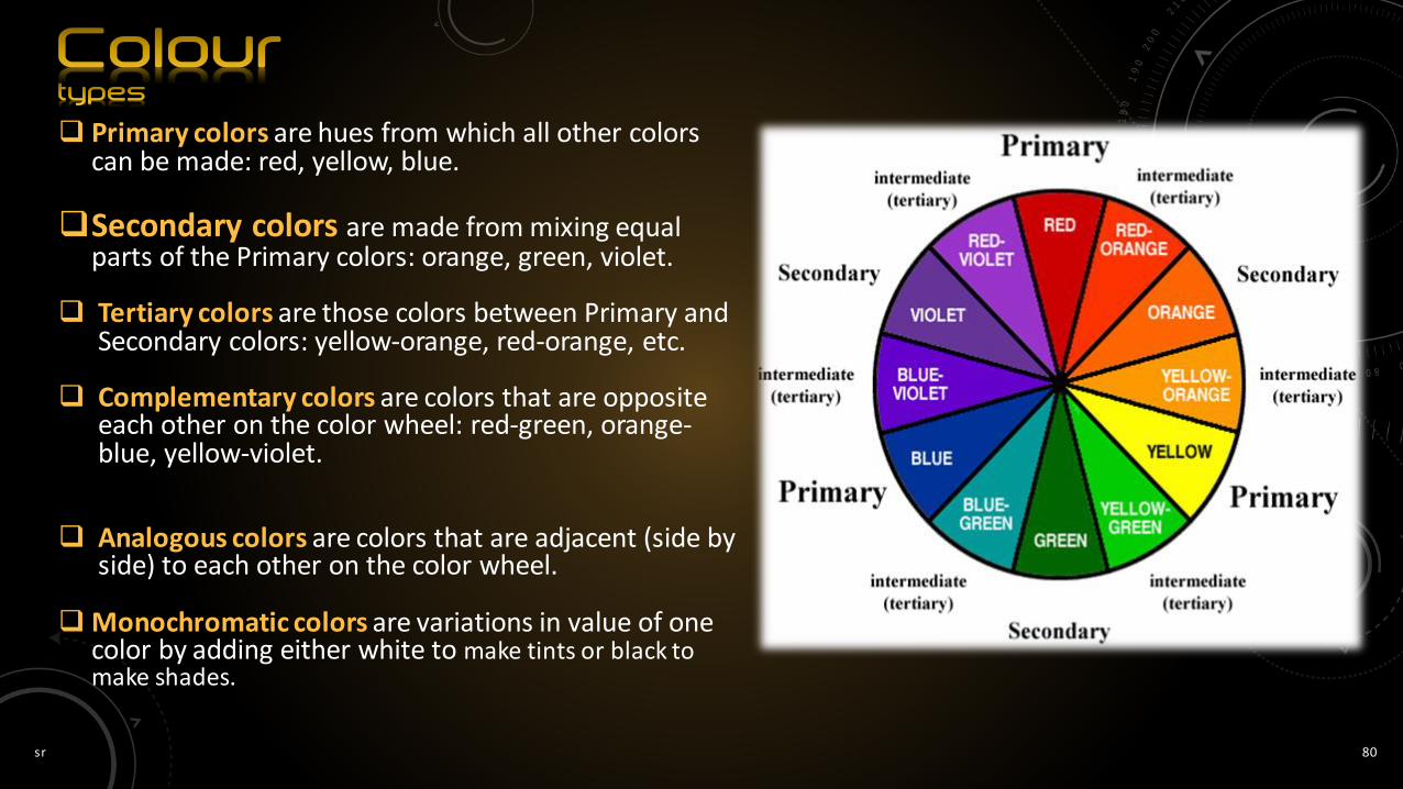
Primary colors are hues from which all other colors can be made: red, yellow, blue.
Secondary colors are made from mixing equal parts of the Primary colors: orange, green, violet.
Tertiary colors are those colors between Primary and Secondary colors: yellow-orange, red-orange, etc.
Complementary colors are colors that are opposite each other on the color wheel: red-green, orange-blue, yellow-violet.
Analogous colors are colors that are adjacent (side by side) to each other on the color wheel.
Monochromatic colors are variations in value of one color by adding either white to make tints or black to make shades.
sr 81
sr 82
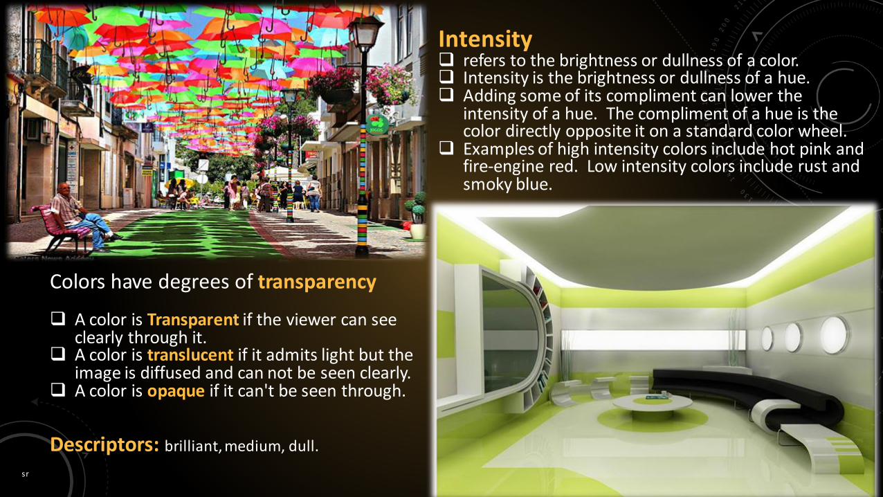
Intensity refers to the brightness or dullness of a color. Intensity is the brightness or dullness of a hue. Adding some of its compliment can lower the
intensity of a hue. The compliment of a hue is the color directly opposite it on a standard color wheel.
Examples of high intensity colors include hot pink and fire-engine red. Low intensity colors include rust and smoky blue.
A color is Transparent if the viewer can see clearly through it.
A color is translucent if it admits light but the image is diffused and can not be seen clearly.
A color is opaque if it can't be seen through.
Colors have degrees of transparency
Descriptors: brilliant, medium, dull.

sr 83
Value is the lightness or darkness of a hue.
The value of a hue can be made lighter by adding white. This produces a tint.
Pink is a tint of red, made by adding white to red.
A hue can be made darker by adding black. This produces a shade.
Maroon is a shade of red.
Google knows how to apply colour in a way that not only
enforces their brand, but also to create a fun and interesting
working environment that benefits their employees.
sr 84
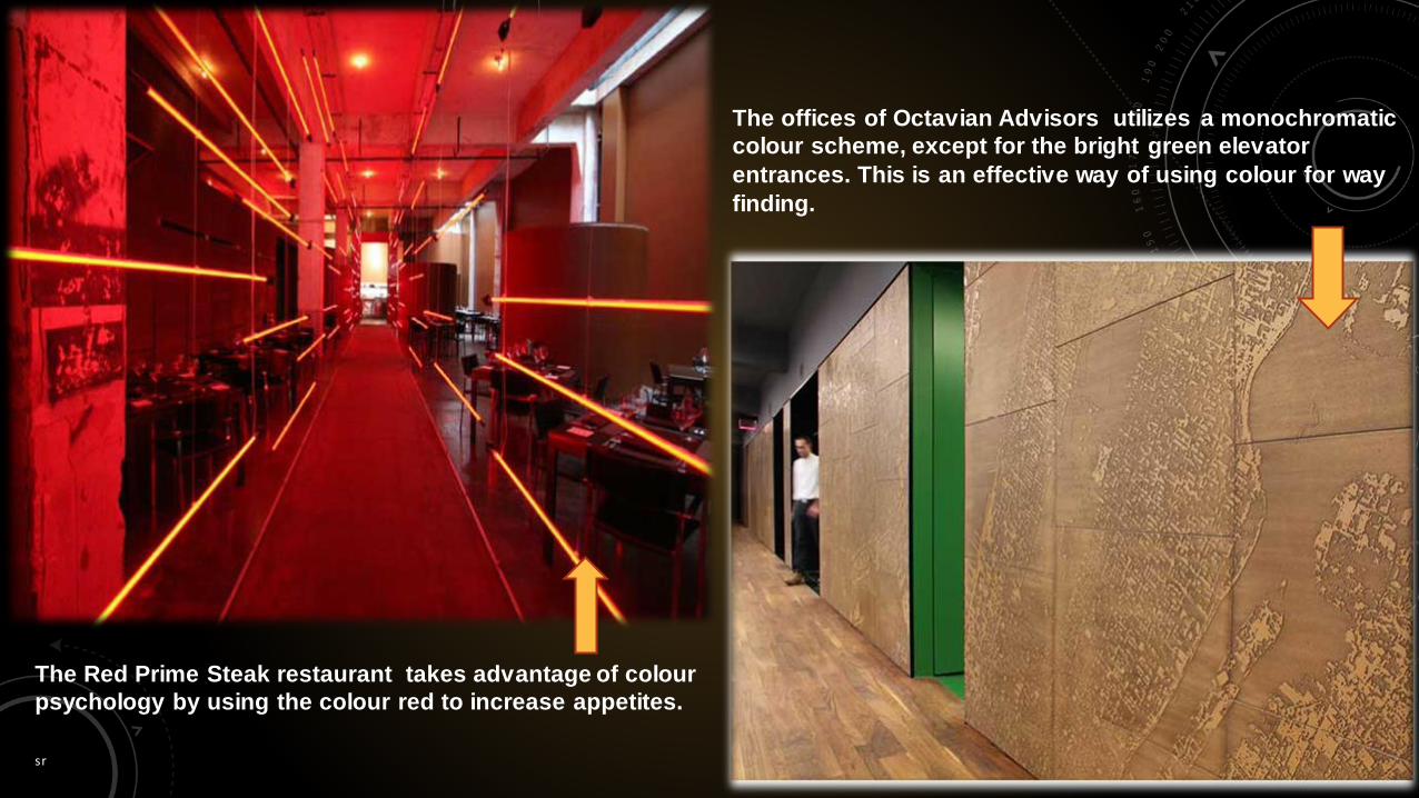
The Red Prime Steak restaurant takes advantage of colour
psychology by using the colour red to increase appetites.
The offices of Octavian Advisors utilizes a monochromatic
colour scheme, except for the bright green elevator
entrances. This is an effective way of using colour for way
finding.
sr 85
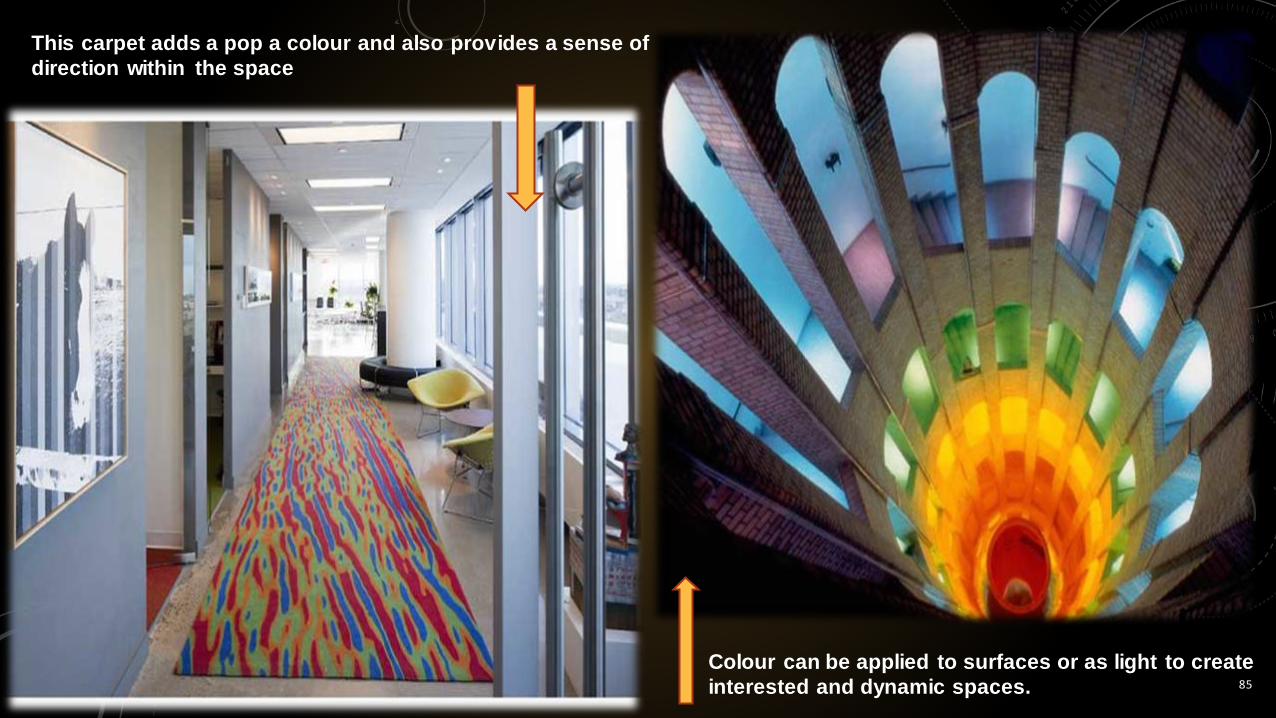
This carpet adds a pop a colour and also provides a sense of
direction within the space
Colour can be applied to surfaces or as light to create
interested and dynamic spaces.
sr 86
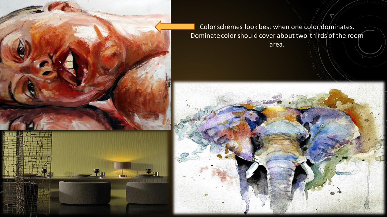
Color schemes look best when one color dominates.Dominate color should cover about two-thirds of the room
area.

sr 87

sr 88
Tints and tones add interests and breaks monotony.
sr 89
Thank you!
Sumit RanjanArchitecture student
at College of Architecture, Bhaddal,
Ropar , [email protected]/sumiran46.muz