elements of graphic design
TRANSCRIPT

Elements of Design
All Graphic Design is made up of 6 important pieces called “elements”.

Elements of GraphicDesign• Line• Shape• Color• Value• Texture• Space

Line• mark or mass longer than it is wide

4


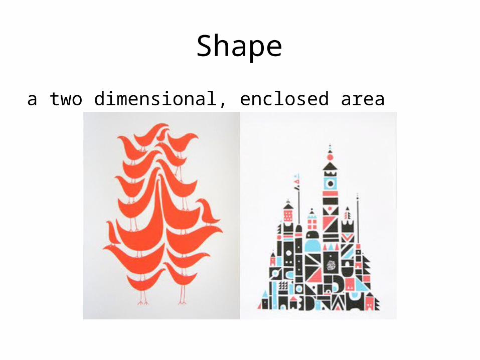
Shape
a two dimensional, enclosed area

Geometric shapesshapes that are regular and have a name.
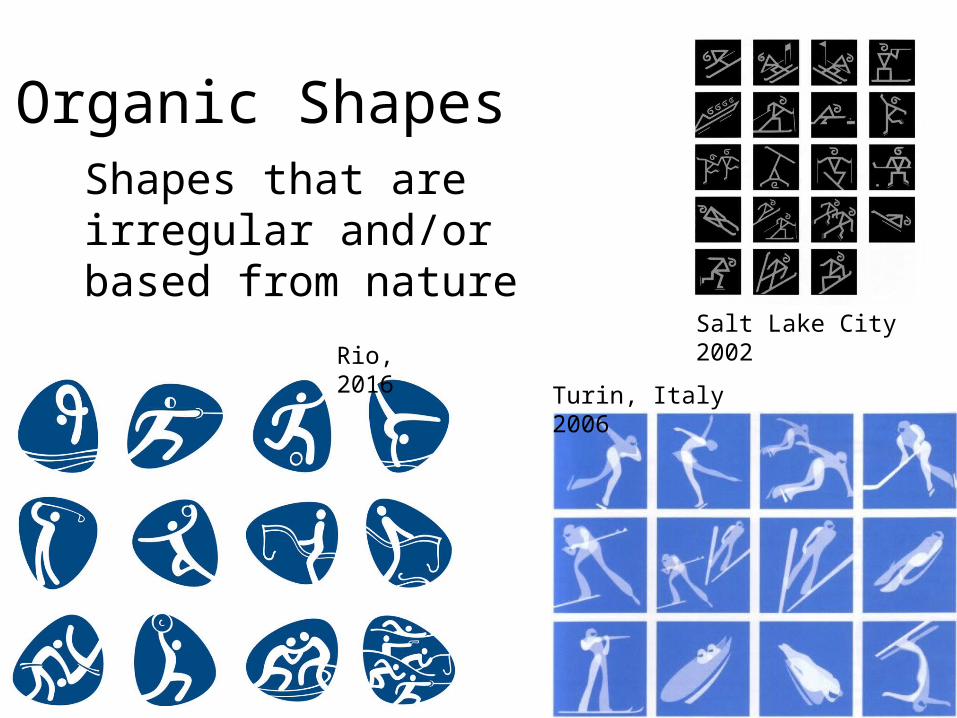
Organic ShapesShapes that are irregular and/or based from nature
Salt Lake City 2002
Turin, Italy 2006
Rio, 2016
Sketchbooks:Line and shape
Find 1 example of line and 1 example of shape in a magazine
• For line: explain how the line is being used on the page.
• For shape: name the type of shape, and why you think that the designer chose that specific shape

Learning Illustrator:Line/shape• Line: Draw 20 different
lines with the pen tool, then label them with a name that describes them
• Shape: Make a new Artboard. Then create 1 composition with only geometric shapes and one composition with only organic shapes

Color• an element
consisting of 3 properties: hue, value, and intensity – hue – the name of a
color based on the spectrum
– value – the lightness or darkness of a color
– intensity – the brightness or dullness of a color

3 Properties of Color - Example
• Olive• Hue - green • Value – dark• Intensity - dull
• Chartreuse• Hue – green• Value – light• Intensity - bright
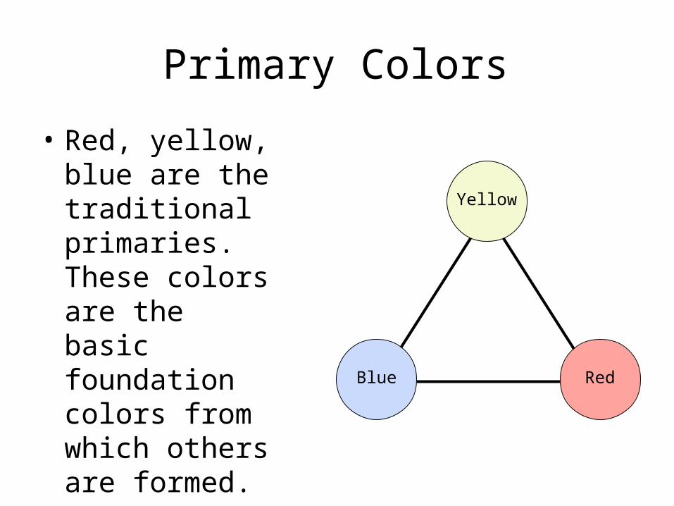
Primary Colors
• Red, yellow, blue are the traditional primaries. These colors are the basic foundation colors from which others are formed.
Red
Yellow
Blue
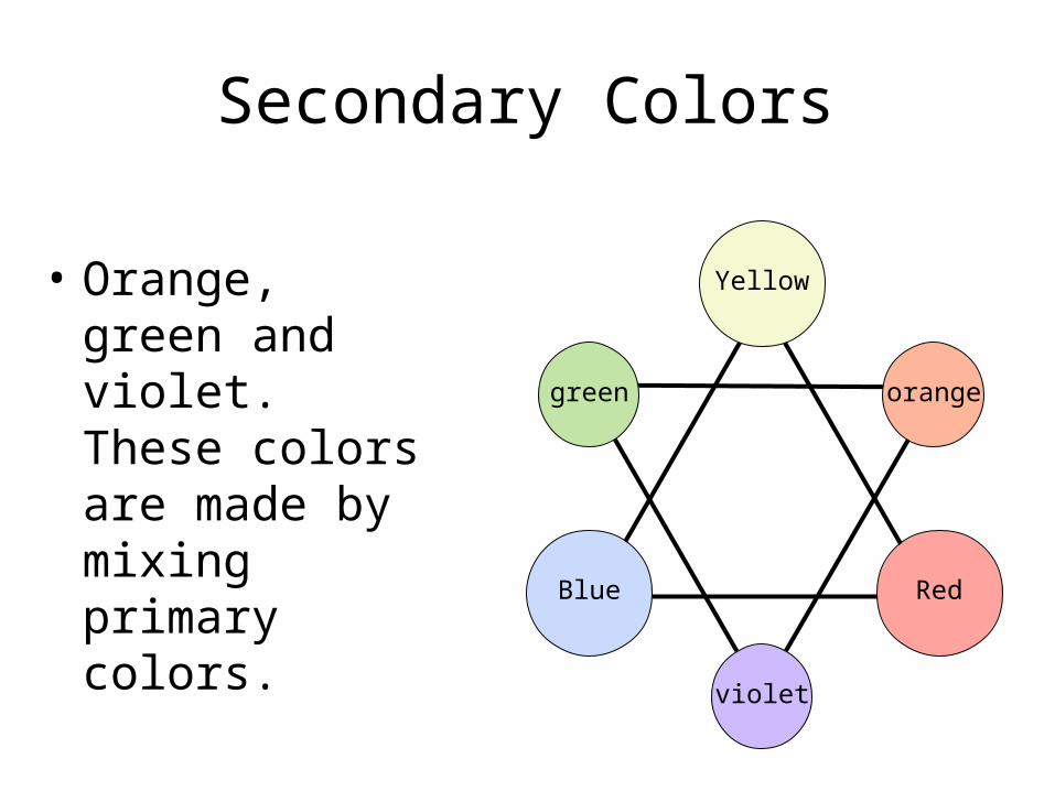
Secondary Colors
• Orange, green and violet. These colors are made by mixing primary colors.
Red
Yellow
Blue
green orange
violet
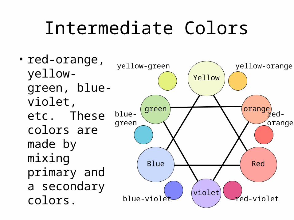
Intermediate Colors
• red-orange, yellow-green, blue-violet, etc. These colors are made by mixing primary and a secondary colors.
Red
Yellow
Blue
green orange
violet
yellow-green yellow-orange
red-orange
red-violetblue-violet
blue-green


Cool Colors• Green,
blue, violet

Color• Sketchbook: Find 1 example
each of warm and cool color schemes in magazines, glue them into your sketchbook. Explain the effect that the color scheme has on the page.
• Illustrator: Add a new artboard, use the shape tool to build your 12 step digital color wheel

Value• the lightness or darkness within a picture
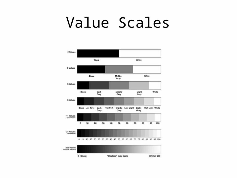
Value Scales
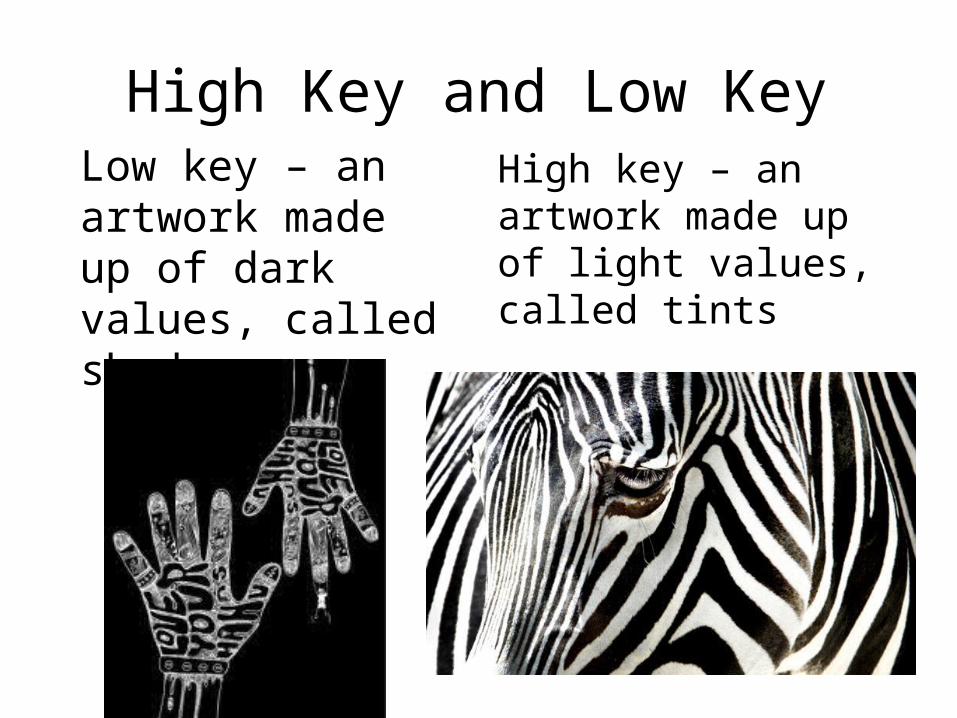
High Key and Low KeyHigh key – an artwork made up of light values, called tints
Low key – an artwork made up of dark values, called shades
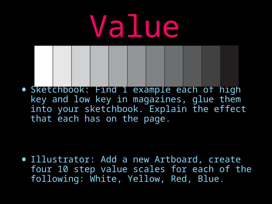
Value• Sketchbook: Find 1 example each of high key
and low key in magazines, glue them into your sketchbook. Explain the effect that each has on the page.
• Illustrator: Add a new Artboard, create four 10 step value scales for each of the following: White, Yellow, Red, Blue.
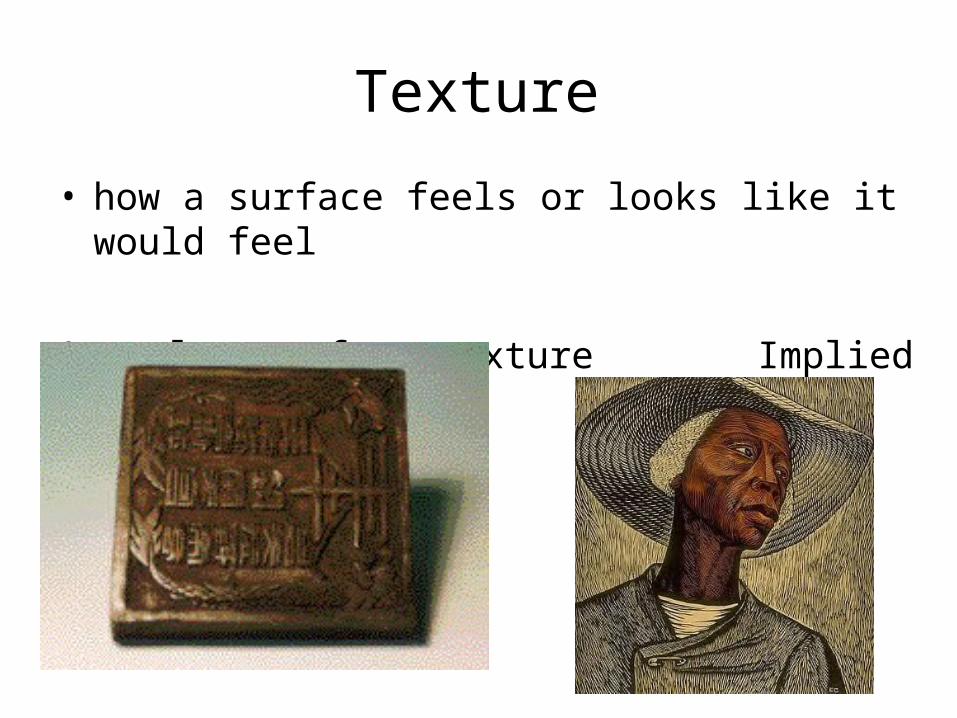
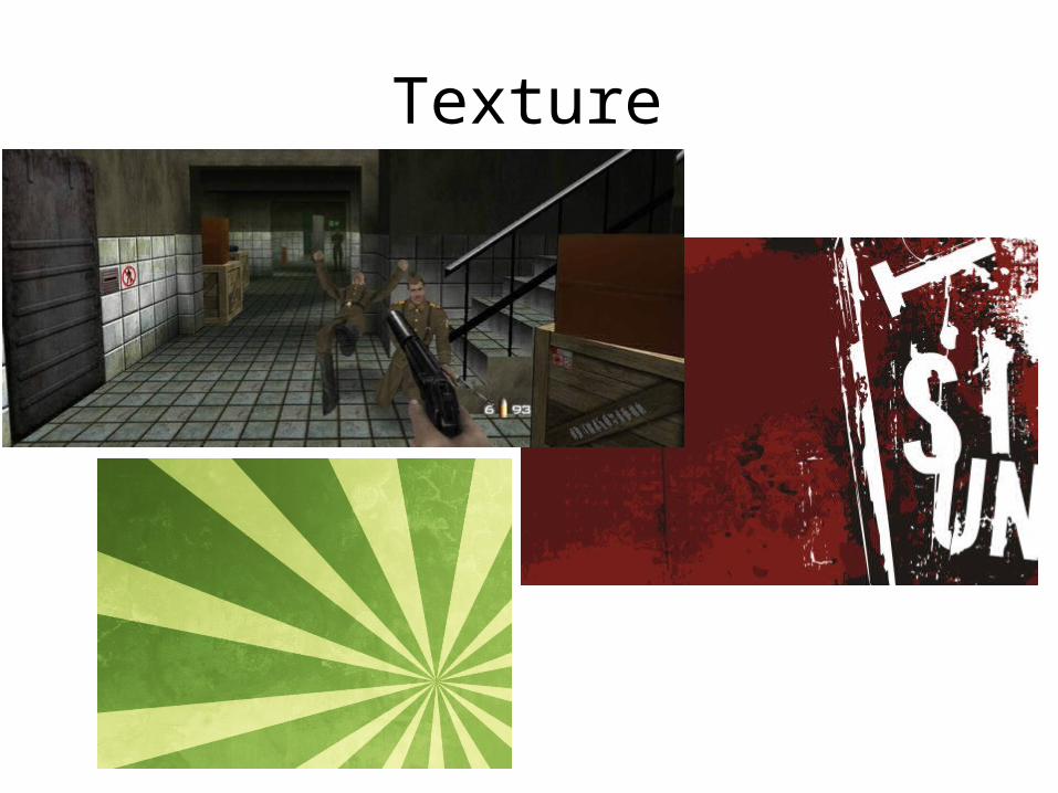
Texture
• how a surface feels or looks like it would feel
Actual – surface texture Implied – looks textured
Texture

Texture•Sketchbook: Find 1 example that
shows texture in a magazine, glue it into your sketchbook. Name the texture and explain the effect that each has on the page.
• Illustrator: Add a new Artboard. Make 10 examples of Masking texts that explain the texture of the image
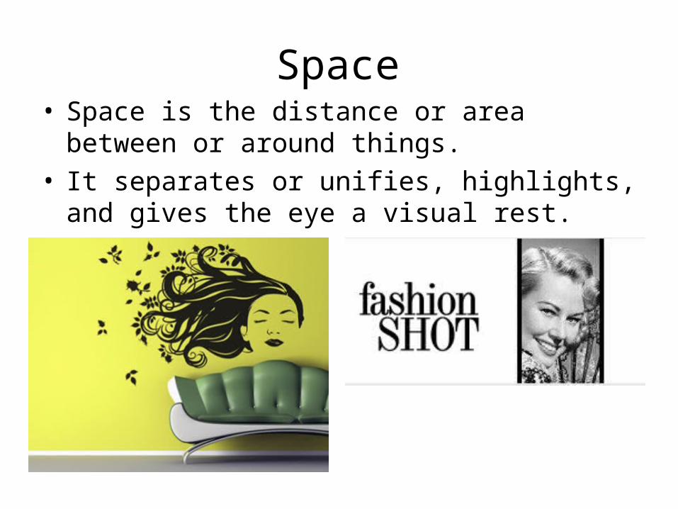
Space• Space is the distance or area between or around
things. • It separates or unifies, highlights, and gives the
eye a visual rest.

White Space
• Depending on how close together other elements are in a design, the viewer can have feelings of tension (elements are too close) or ease (elements have a good amount of area around them).

Negative Space vs Positive space
• Negative space- The “empty” space on a graphic.• Positive space- the “used” space on a graphic.

Web Design: Using Space Wisely
• Good Example:– http://usd357.org
• Bad Example:– http://www.arngren.net/
30
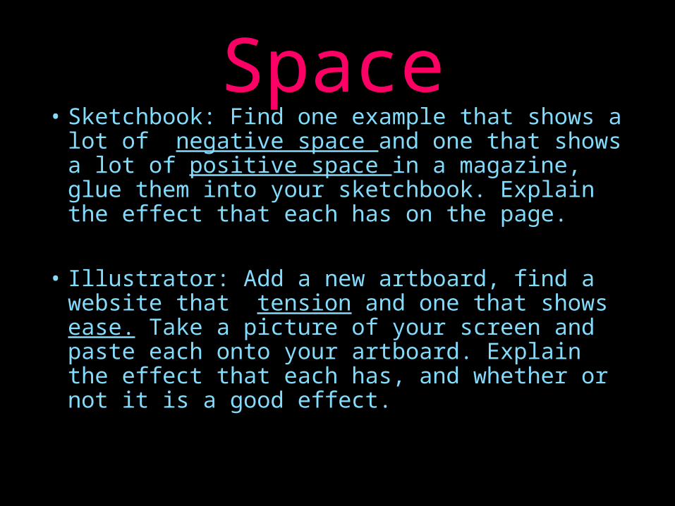
Space• Sketchbook: Find one example that shows a
lot of negative space and one that shows a lot of positive space in a magazine, glue them into your sketchbook. Explain the effect that each has on the page.
• Illustrator: Add a new artboard, find a website that tension and one that shows ease. Take a picture of your screen and paste each onto your artboard. Explain the effect that each has, and whether or not it is a good effect.