e ficha del medio ensayo: un discurso de la luz
TRANSCRIPT
E
1
Ficha del medioEnsayo: Un discurso de la luz
E
tune the light
E
Acerca de este libro ¿Qué cualidades posee la luz y cómo pueden obtenerse técnicamente e implementarse en la planificación arquitectónica? ¿Qué contenidos pueden transportarse mediante las cualidades de la luz, y de qué modo arraiga nuestra percepción de la luz en la historia de la evolución biológica y cultural de la humanidad? Este libro trata de identificar términos y criterios para las cualidades de la luz en la arquitectura, para así fomentar e inspirar la comunicación entre diseñadores y técnicos, propietarios y proyectistas, especialistas y profanos. Los 21 capítulos se estructuran en tres secciones, dedicadas respectivamente a las cualidades de la luz propiamente dichas, a la relación entre la luz y el espacio y finalmente, a la dimensión de la luz en cuanto al contenido cultural. En cada capítulo, una pareja de conceptos aborda una dimensión de diseño de la luz en la que el equipo de autores profundiza mediante textos, fotos, infografías y dibujos, desde una asignación cultural e histórica, pasando por contenidos didácticos acerca de la percepción, el diseño de iluminación y la luminotecnia, hasta estudios de casos en situaciones arquitectónicas virtuales.
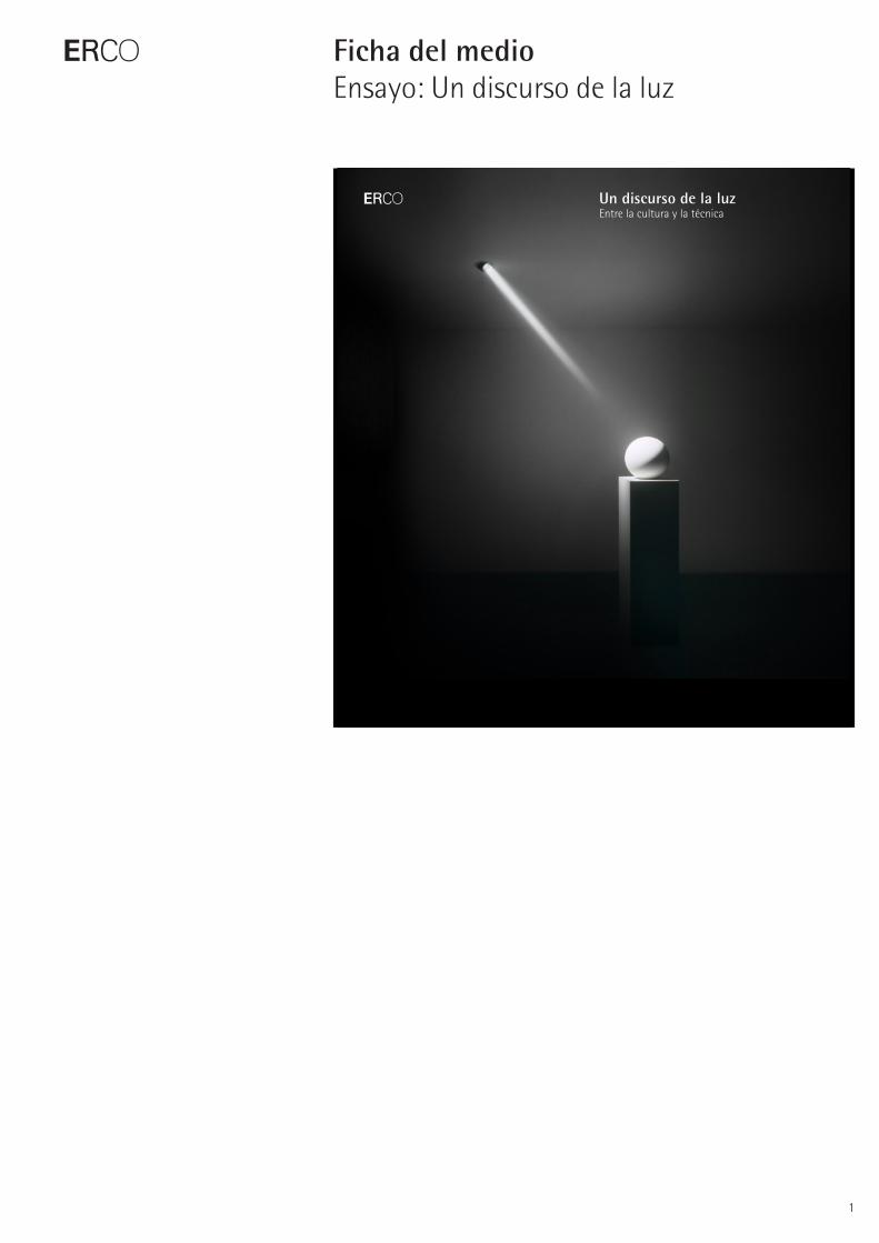
Un discurso de la luzEntre la cultura y la técnica
Un discurso de la luz

E
2
Ficha del medioEnsayo: Un discurso de la luz
Acerca de este libro¿Qué cualidades posee la luz y cómo pueden obtenerse técnicamente e implementarse en la planificación arquitectónica? ¿Qué contenidos pueden transportarse mediante las cualidades de la luz, y de qué modo arraiga nuestra per-cepción de la luz en la historia de la evolución biológica y cultural de la humanidad? Este libro trata de identificar términos y criterios para las cualidades de la luz en la arquitectura, para así fomentar e inspirar la comunicación entre diseñadores y técnicos, propietarios y proyec-tistas, especialistas y profanos. Los 21 capítulos se estructuran en tres secciones, dedicadas respectivamente a las cualidades de la luz pro-piamente dichas, a la relación entre la luz y el espacio y finalmente, a la dimensión de la luz en cuanto al contenido cultural. En cada capítulo, una pareja de conceptos aborda una dimensión de diseño de la luz en la que el equipo de auto-res profundiza mediante textos, fotos, infogra-fías y dibujos, desde una asignación cultural e histórica, pasando por contenidos didácticos acerca de la percepción, el diseño de ilumina-ción y la luminotecnia, hasta estudios de casos en situaciones arquitectónicas virtuales.
Información adicionalDepartamento de prensa ERCOMartin Krautter
Brockhauser Weg 80–8258507 LüdenscheidGermany
Tel.: +49 2351 551 345Fax: +49 2351 551 [email protected]
E
3
Ficha del medioEnsayo: Un discurso de la luz
EditoresTim Henrik MaackKay Pawlik
Concepto y redacciónDavid Kuntzsch (redactor jefe)Martin Krautter (autor)Thomas Schielke (autor)Christoph Steinke (diseño)Mariko Takagi (diseño, ilustración)Aksel Karcher (visualización arquitectónica)
Colaboración en visualización arquitectónicaMarkus Heilmann
Corrección técnicaMichael LoosRalf Wershoven
CorrecciónChristiane Kersting
TraducciónLanzillotta Translations
ReproducciónMohn media Mohndruck GmbH
ImpresiónMohn media Mohndruck GmbH
Número de páginas268 (+ 4 cubiertas)
Número de capítulos21
Fecha de publicación Octubre de 2009
Precio39 euros
Idioma / Número ISBNLichtpositionenISBN 978-3-9813216-0-9
Light PerspectivesISBN 978-3-9813216-1-6
Positions de lumièreISBN 978-3-9813216-2-3
Un discurso de la luzISBN 978-3-9813216-3-0
Le dimensioni della luceISBN 978-3-9813216-4-7
E
4
Ficha del medioEnsayo: Un discurso de la luz
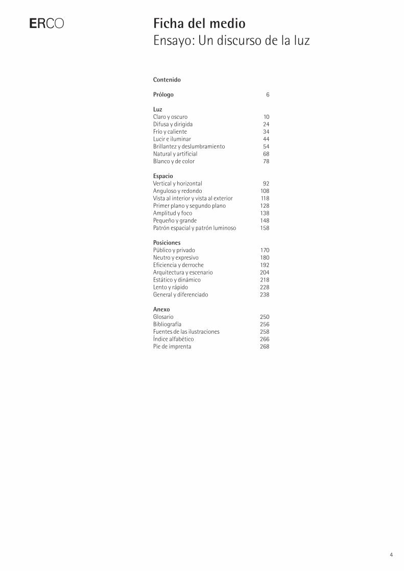
Contenido
Prólogo 6
LuzClaro y oscuro 10Difusa y dirigida 24Frío y caliente 34Lucir e iluminar 44Brillantez y deslumbramiento 54Natural y artificial 68Blanco y de color 78
EspacioVertical y horizontal 92Anguloso y redondo 108Vista al interior y vista al exterior 118Primer plano y segundo plano 128Amplitud y foco 138Pequeño y grande 148Patrón espacial y patrón luminoso 158
PosicionesPúblico y privado 170Neutro y expresivo 180Eficiencia y derroche 192Arquitectura y escenario 204Estático y dinámico 218Lento y rápido 228General y diferenciado 238
AnexoGlosario 250Bibliografía 256Fuentes de las ilustraciones 258Índice alfabético 266Pie de imprenta 268
Light and dark
The polar opposites of light and dark create the basic dimen-sion of light, which this book explores and expands into a multi-dimensional universe of design. The significance of light to our life and culture can be clearly seen from the existence of light and dark metaphors in philosophical and spiritual language. Physically speaking, light and dark are merely quantitative differences between much light and little or no light. Our individual impression of brightness, however, does not depend solely on the technical luminance levels, but equally on the condition of our personal percep-tion. For this reason, qualitative lighting design does not simply consider light as a measurable quantity, but partic-ularly as a medium of information and expression.
Radiance and illumination
Luminous architectural elements and objects are very popular, yet the appeal of such features presents several practical and design-related problems. To interpret space and add accents, a perception-orientated lighting design primarily requires equipment designed for those purposes. This can result in the distinction between light source and lighting effects appearing almost magical. By balancing lighting concepts between illuminated and luminous com-ponents contributions can be made to complement each other.
Efficiency and excess
Lighting requires energy. The responsible use of light and the development of qualitative assessment of lighting are therefore required to evaluate the cultural aspect of architectural lighting. It is the technological advances in light sources, luminaires and control technology that assist the lighting designers in their quest for improved energy efficiency. The judgement as to whether lighting is efficient must ultimately be related to human perception. This means that visual comfort is just as important as any technical measure of efficiency. A comprehensive approach to light-ing involving all technical disciplines which considers the lighting as an integral part of the energy system of the building will provide further potential to raise efficiency.
E
5
Ficha del medioEnsayo: Un discurso de la luz
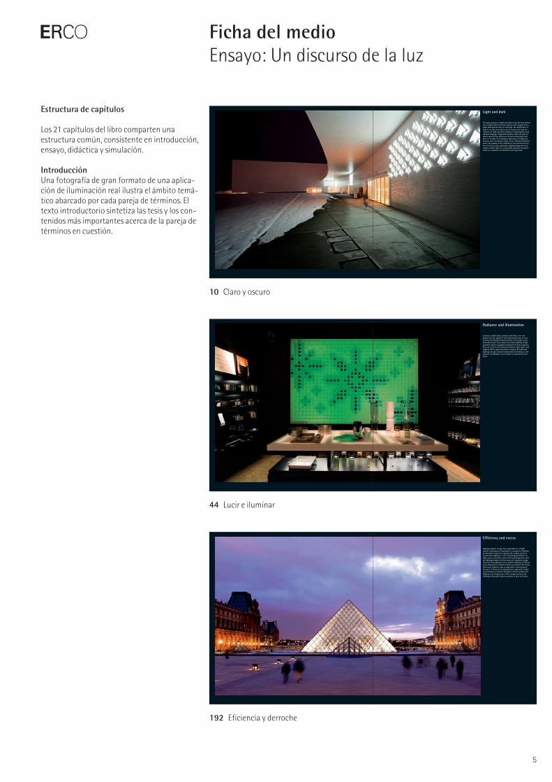
Estructura de capítulos
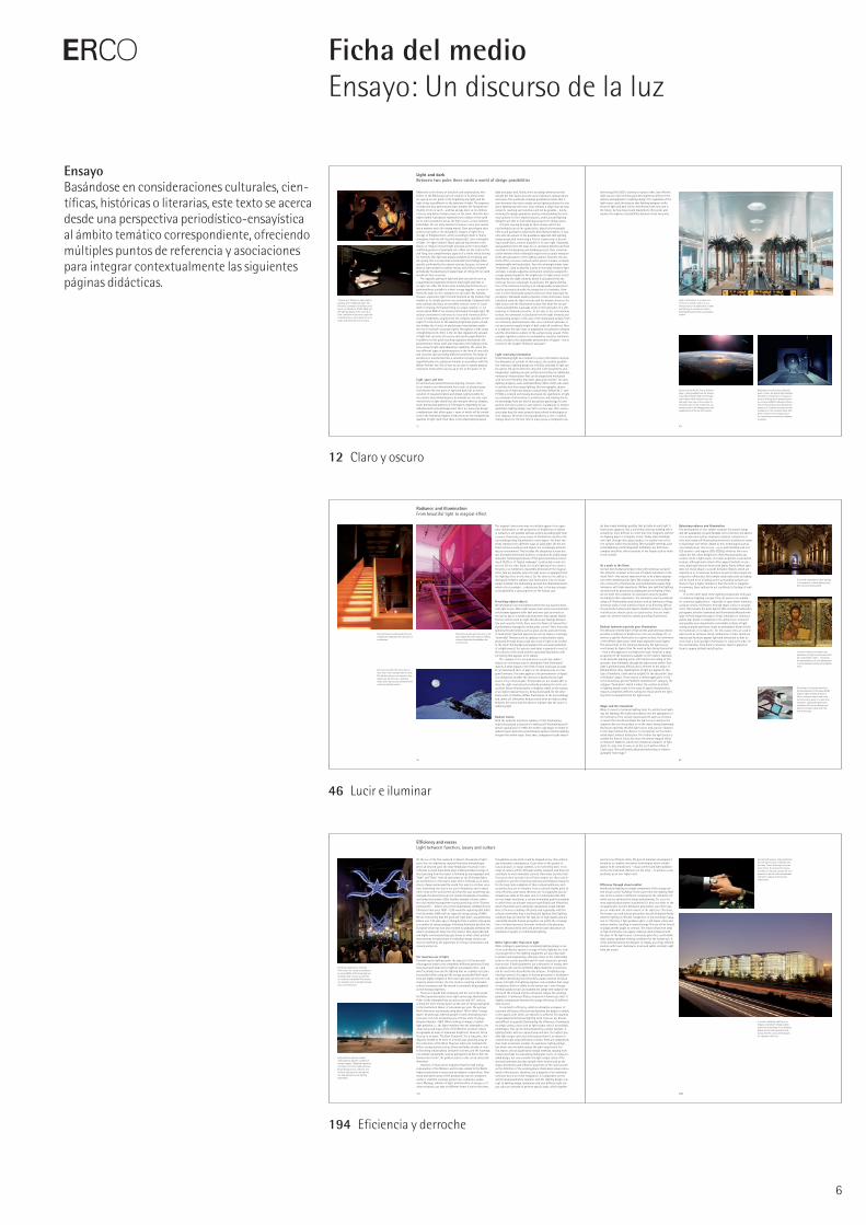
Los 21 capítulos del libro comparten una estructura común, consistente en introducción, ensayo, didáctica y simulación.
Introducción Una fotografía de gran formato de una aplica-ción de iluminación real ilustra el ámbito temá-tico abarcado por cada pareja de términos. El texto introductorio sintetiza las tesis y los con-tenidos más importantes acerca de la pareja de términos en cuestión.
10 Claro y oscuro
44 Lucir e iluminar
192 Eficiencia y derroche
12 13
Light and darkBetween two poles there exists a world of design possibilities
technology (the LED) is starting to replace other, less efficient light sources. Such technological developments influence the options and approach to lighting design. Yet, regardless of the light source used, the balance that lighting designers strike between light and dark will be determined, both now and in the future, by how bravely and inquisitively they probe and explore the expanse of possibilities between these two poles.
Adherents to the theory of evolution and creationalists, who believe in the Biblical account of creation in its literal sense, are agreed on one point: in the beginning was light, and the light of day was different to the darkness of night. The sequence of night and day, darkness and light, dictates the fundamental rhythm of life on earth – and has already done so for millions of years, long before humans came on the scene. How this day-night rhythm is produced, namely by the rotation of the earth on its orbit around the sun as the light source, is now common knowledge. For our early ancestors, however, every new sunrise was a mystery and a life-saving marvel. Does any religion exist without sun gods or the metaphoric imagery of light? Even the Age of Enlightenment, which according to Kant is “man’s emergence from his self- incurred immaturity,” uses a metaphor of light: “en-light-enment”. Many spiritual movements in the history of religion interpret light and dark as the irreconcilable, conflicting powers of good and evil; others see the terms as Yin and Yang, two complementary aspects of a whole entity striving for harmony. But light was always accepted as energising and life-giving. This is a view that accords with the findings subse-quently confirmed by the natural sciences, because, in terms of physics, light actually is radiant energy, and without its albeit periodically fluctuating but regular input of energy life on earth would not have occurred.
The opposite pairing of light and dark can also be seen as a quantitative progression between much light and little or no light. For other life forms, most notably plants that rely on photosynthesis, sunlight is a direct energy supplier – as such it forms the basis for the ecosystem we call earth. We humans, however, experience light first and foremost as the medium that enables us to visually perceive our surroundings. Compared with some animals that have an incredibly sensitive sense of touch, smell or hearing, the human being is a visual creature, i.e. we receive about 80% of our sensory information through sight. The natural environment confronts our eyes with enormous differ-ences in brightness, ranging from the complete darkness on the night of a new moon to the dazzling brightness under a cloud-less midday sky. A series of physiological mechanisms enable the eye to maintain visual perception throughout a wide range of brightness levels. There is the iris that regulates the amount of light that can enter the eye by altering the pupil diameter. In addition to this quick-reacting regulatory mechanism, the photosensitive retina itself also responds to the lighting condi-tions using its light-dark adaptation capability. The retina has two different types of photoreceptors in the form of cone cells and rod cells, each providing different sensitivity. The range of sensitivity is transformed into a sensation by being converted logarithmically into a physical stimulus in accordance with the Weber-Fechner law. This is how we are able to handle physical luminance levels which vary by up to ten to the power of 12.
Light, space and timeFor architecture and architectural lighting, however, there is not simply a uni-dimensional linear scale of physical quan-tity between the two poles of light and dark, but an entire universe of visual perception and design. Light provides for orientation and communication. As humans we not only react instinctively to light stimuli but also interpret them as complex, multi-dimen sional patterns of information, depending on our individual and cultural background. There are numerous design considerations that affect space – some of which will be consid-ered in the following chapters. Firstly, there are the fundamental qualities of light itself, then there is the relationship between
light and space and, finally, there are design dimensions that include the time factor, plus the area of abstract, cultural values and views. This multitude of design possibilities means that it soon becomes clear that a single correct lighting solution for any given lighting task will never exist, similarly a single step-by-step recipe for reaching such solutions will not be possible – but by knowing the design parameters and by understanding the tech-nical options for their implementation, architects and lighting designers are able to find individual answers for design issues.
A theme running through all these studies will be the relationship between the quantitative, objectively measur able effects and qualitative, subjectively described perception. It was only with the advent of the qualitative approach that lighting design progressed from being a field of engineering to becom-ing a stand-alone, creative discipline in its own right. Standards and guidelines form the basis for co-operation between all those involved in the designing and building process. Clear communi-cation between these individuals requires the accurate measure-ment and calculation of the lighting options. However, the aes-thetic effect, as every creatively active person is aware, is largely immeasurable and incalculable. Even the seemingly simple term “brightness”, used to describe a point in the range between light and dark, is deeply subjective and cannot simply be assigned to a single physical quantity. The brightness of a light source is best described by the light intensity, which is calculated from the luminous flux per solid angle. In particular, the spatial distribu-tion of the luminous intensity is an indispensable measurement used to accurately describe the properties of a luminaire. How-ever, it is the illuminated surfaces which are most important for perception. Standards usually prescribe certain illuminance levels, calculated using the light intensity and the distance between the light source and the illuminated surface. But what the eye per-ceives as brightness is actually closer to the luminance of a self-luminous or illuminated surface. In the case of the self-luminous surface, the luminance is calculated from the light intensity and its projecting surface; in the case of the illuminated surface, from its reflectance and illuminance. But even a defined luminance is not perceived as equally bright or dark under all conditions. There is in addition the eyes’ state of adaptation, the ambient contrasts and the information content of the surface being viewed. If this complex regulatory system is overloaded by excessive luminance levels, it leads to the undesirable phenomenon of dazzle – this is covered in the chapter “Brilliance and glare”.
Light conveying informationUnderstanding light as a medium to convey information involves the dimension of content. In this respect, the creative possibili-ties relating to lighting design are infinitely extended. If light can be used to tell stories then the only limit is the storyteller’s own imagination. Lighting can give architectural entities an additional, immaterial interpretation that can be shaped and modulated with far more flexibility than steel, glass and concrete. For early lighting designers, such as Richard Kelly (1919–1977), who came to architecture from stage lighting, this scenographic, drama-turgical use of light was simply a natural step. William M. C. Lam (*1924) is credited with having developed the significance of light as a medium of information in architecture and relating this to his knowledge from the field of perception psychology. In com-parison with these pioneers who laid the foundations of modern qualitative lighting design over half a century ago, their succes-sors today have far more powerful and refined technologies at their disposal. This book is being published at a time of radical change when, for the first time in many years, a completely new
“Chiaroscuro” (Italian for light-dark) in painting and in lighting design: “The Procuress” painting by the Dutch artist Gerrit van Honthorst (1590–1656) and the lighting design of the “L‘art de la llum” exhibition in Barcelona exploit the contrast between areas which are very bright and those that are very dark.
Brightness from the purely technical point of view: the spatial light intensity distribution of luminaires is measured using a rotating mirror goniophotome-ter, as here in ERCO’s laboratory. Photo-metric measurement data describe this property of a luminaire exactly and are necessary for the communication with those involved in the design project for calculating and simulating lighting situations.
Sunset over the Pacific from a different angle – photographed from the Interna-tional Space Station (ISS). Even though such images vividly illustrate how day and night occur due to the rotation of the earth, some of the wonder that our ancestors saw in the disappearance and reappearance of the sun still remains.
Light is information: in a visual envi-ronment as complex and new as a foreign airport, the significance of light and lighting for orientation and for understanding structures is particularly evident.
46 47
The luminous glass partition next to the stairs bathes the entire space in diffuse, coloured light which establishes the overall mood.
als have made buildings possible that actually do emit light. It has become apparent that a uniformly luminous building skin is actually far more difficult to create than first imagined, whether on drawing paper or computer screen. Today, when buildings emit light through their glass facades, it is usually from reflec-tive surfaces within that building. Other possible methods, such as backlighting a semitransparent membrane, are both more complex and affect other functions of the facade such as views to the outside.
As a moth to the flameSo how does human perception deal with luminous surfaces? Our attention is drawn to the area of highest luminance in the visual field – this natural experience has to be a basic assump-tion when designing with light. We arrange our surroundings into a hierarchy of luminances and automatically equate high luminance with high importance. William Lam said that lighting solutions will be perceived as unpleasant and irritating if they do not meet this condition. So luminances must be graded accord ing to their importance. The luminances can be produced using self-illuminating constructions such as luminous ceilings, luminous walls or even luminous floors or by directing light at the particular surfaces and objects. Radiant surfaces or objects in architecture may be great eye-catchers but they are inade-quate for another function, namely providing illumination.
Radiant luminaires provide poor illuminationThe diffusely emitted light of flat screens and luminous objects provides a modicum of brightness to the surroundings. Yet, to achieve a specific illuminance on a given surface, the luminance of the diffuse light source itself must always be much higher. This means that, in the luminous hierarchy, the light source must always be higher than the work surface being illuminated – even if this appears to contradict the logic. However, a large proportion of the luminaires available on the market, especially in the domestic lighting sector, still function according to this principle: they illuminate through the light source within. Their light is predom inantly diffuse and is inherent to the object. If Richard Kelly’s three classifications of light are applied to this type of luminaire, it will only be suitable for the decorative “play of brilliants” aspect. There may be a limited application in the non- hierarchical, general “ambient luminescence” category. The category “focal glow”, which is where the creative potential of lighting design exists in the sense of spatial interpretation, requires completely different luminaires: those where the light-ing effect is separated from the light source.
Magic and the immaterialWhen it comes to technical lighting tools for architectural light-ing, the lighting effect takes precedence over the appearance of the luminaires. They contain optical systems such as reflectors or lenses that mould and shape the light so as to achieve the required effect on the surface or on the object being illuminated. Having an optimally shielded light source and a greater distance to the object allows the observer to concentrate on the illumi-nated object without distraction. The further the light source is outside the field of vision, the more the almost magical effect is enhanced. Added to which, the immaterial character of light starts to come into its own, or, as the sci-fi author Arthur C. Clarke said, “Any sufficiently advanced technology is indistin-guishable from magic”.
Balancing radiance and illumination The development of ever smaller compact fluorescent lamps and the availability of powerful LEDs, not to mention the advent of new materials such as translucent plastics, composites or foils, have made self-illuminating elements in architecture easier to build than ever before. Added to this, technologies such as increasingly larger flat screens – up to and including wall-size LED screens – and organic LEDs (OLEDs), which by their very nature are flat, allow designers to think that practically any surface can be a light source. A certain scepticism is warranted because, although such visions often appear fantastic on pic-tures, practically they are beset with faults. Purely diffuse light does not reveal shape or provide brilliance. Objects which are situated on or in luminous furniture as well as other people are reduced to silhouettes. Even simple visual tasks such as reading will be found to be irritating as the surrounding surfaces are likely to have a higher luminance than the book or magazine. In summary, these options do not contribute to feelings of well-being.
If, on the other hand, these lighting components form part of a balanced lighting concept, they can prove to be suitable for numer ous applications – especially in cases where luminous surfaces convey information through shape, colour or arrange-ment. This includes the point light of LED orientation luminaires, pictograms, directive luminaires and illuminated billboards with large-format images through to linear luminaires or luminous panels that divide or complement the architecture. Coloured and possibly even dynamically controllable surfaces of light acting as spatial partitions create an atmosphere distinct from the humdrum of everyday life. For this reason, they are used in places such as exclusive stores, restaurants or clubs. Luminous objects and fur niture appear light and immaterial so that no more than a little spotlight illumination is required in order for the merchandise, food, drink or whatever object is placed on them to appear brilliant and attractive.
This chapter’s twin terms may not initially appear to be oppo-sites: illumination, or the production of brightness on objects or surfaces, is not possible without actively providing light from a source. Conversely, every source of illumination results in the surroundings being illuminated to some degree. Yet these two terms represent very different ways of using light. On the one hand, luminous surfaces and objects are increasingly dominat-ing our environment. This includes the ubiquitous screens but also internally illuminated furniture or translucent architectural materials. Technologists dream of flat-panel luminaires consist-ing of OLEDs or of “digital wallpaper” constructed in wall-size screens. On the other hand, the scenic lighting effects used in theatres or at exhibitions repeatedly demonstrate the magical effect that are possible when the light source is separated from the lighting effect on the object. For the observer the ability to distinguish between radiance and illumination is by no means simple. Con sider the illuminating sun and the illuminated moon, which reflects sunlight – a distinction that to this day is largely unrecognised by a vast proportion of the human race.
Perceiving radiant objects We developed in an environment where the sun was the domi-nant light source. Other light sources such as the moon and stars only became apparent after dark and were just as remote as the sun by day. It is hardly surprising then that radiant objects that are within reach at night should arouse feelings between fear and curiosity. Firstly, there were the flames of natural fires that humanity managed to bring under control. There were also luminescent phenomena such as glow-worms and some kinds of mushrooms. Spiritual experiences such as trances, seemingly “unworldly” illnesses such as epilepsy or hallucinatory states produced through drugs could also result in light to be evoked in the mind. This background explains the universal symbolism of enlightenment, the aureoles and halos recognised in most of the cultures of the world and the associated fascination with everything that appears to be radiant.
The example of the sun and moon reveals that radiant objects are not always easy to distinguish from illuminated objects. A white square in the field of vision could just as easily be an illuminated sheet of paper or the diffusing lens of a flat-panel luminaire. The same applies to the phenomenon of dazzle: it is immaterial whether the observer is dazzled by the light source or by reflected glare. Perceptually we are usually able to draw the right conclusions by instantly analysing the entire vis -ual field. Either reflected lustre or shadows visible on the surface of an object indicate that it is being illuminated. On the other hand, a lack of shadow, diffuse illumination in the surroundings and, above all, silhouettes being created when an object comes between the source and the observer indicate that the source is radiating light.
Radiant visionsBoth the symbolic and literal radiance of self-illuminating objects has played a large part in making self-illuminating archi-tecture aspirational. In 1920, the modern age began to dream of radiant towers and cities as technical progress in electric lighting brought this within reach. Since then, transparent facade materi-
Radiance and illumination From beautiful light to magical effect
We now know that the moon does no more than reflect sunlight back to earth. This did not concern our ances tors, they simply saw the moon as a luminous object and a light source attributed with numerous magical powers.
Self-illuminated surfaces and lines can dramatically emphasise the structure of architecture.
To provide atmospheric scenic lighting it is paramount to have lighting tools that can be precisely aimed.
In many religions and cultures, the phenomena of light are associated with the transcendent realm – conversely, the representation of such phenomena in art symbolises holiness and enlighten- ment.
The industry is investing heavily in the development of flat-panel OLEDs (organic light emitting diodes). In future, luminous objects and room surfaces will be easier to create than at present. Lighting designers and architects will have to develop con-sidered concepts to deal with this new technology.
194 195
can form an efficient entity. The goal of luminaire development should be to combine innovative technologies which initially appear to be contradictory – visual comfort and light guidance on the one hand and efficiency on the other – to achieve a new syntheses at an ever higher level.
Efficiency through visual comfortArchitectural lighting is a single component of the energy sys -tem known as the “building”. At the same time, the lighting itself also forms a system of different components, the interaction of which can be optimised by design and planning. Yet even the most sophisticated system is pointless if it does not relate to the occupants who, by their behaviour and actions, can either sup-port or undermine the achievement of the objectives. Therefore, the human user and human perception should ultimately decide whether lighting is efficient. Irrespective of any technical evalua-tion of efficiency, if light produces glare, it will impair vision and reduce comfort, resulting in wasted energy. The eye will be forced to adapt and the pupils to contract. The result is that even areas of high illuminance can appear relatively dark compared with the glare of the light source. Conversely, glare-free, comfortable light creates optimum viewing conditions for the human eye. It is this fact that allows the designer to employ an energy efficient solution with lower illuminance levels and subtle contrasts right from the outset.
On the eve of the first weekend in Advent, thousands of sight-seers, the civic dignitaries, regional television and photogra-phers all descend upon the small Andalusian mountain town of Ronda. A youth brass band plays traditional Advent songs. A short greeting from the mayor is followed by loud applause and “Aahs” and “Oohs” from all and sundry as the Christmas lights are switched on in the town’s main street. In Ronda, as in many cities in Spain and around the world, this event is a festive occa-sion. Something else that is not just in Ronda but also in many other cities of the world is the fact that this year something has changed. The decorations do not contain thousands of incandes-cent lamps but modern LEDs. Another example is Essen, where the city’s marketing department announced that at the “Essener Lichtwochen” – Essen’s city centre illuminations celebrated every Christmas time since 1950 – LEDs would be replacing light bulbs from December 2008 with an expected energy saving of 80%. We are now seeing that the good old “light bulb”, as patented by Edison over 125 years ago, is changing from a symbol of progress to a symbol of energy wastage. Following Australia’s decision, the European Union has now also resolved to gradually withdraw the classic incandescent lamp from the market. This unprecedented and highly controversial step just shows to what extent political interventions in markets and in individual design choices can now be justified by the arguments for energy conservation and climate protection.
The luxurious use of lightConsidering the lighting under the aspects of efficiency and extravagance leads to two completely different questions. Firstly, how much and what sort of light do we actually need – and why? Secondly, how can the lighting that we consider necessary be provided while using as little energy as possible? Both ques-tions are highly complex in their own right and can never be con - clusively answered since the first involves reaching a dynamic cultural consensus and the second is constantly being updated as technology progresses.
There is no doubt that compared with the rest of the world the West generally wastes more light and energy. Buckminster Fuller vividly illustrated this as early as the mid-20th century, coining the term “energy slaves” as the unit of energy equivalent to the mechanical labour of one person per year. The average North American was already using about 100 of these “energy slaves” 20 years ago, whereas people in some developing coun-tries were not even consuming one of these units of energy (Stephen Boyden, 1987). When looking at images of global light pollution, i.e. the light emissions into the atmosphere, the urban areas and major cities of the Western world are clearly recognisable as areas of maximum brightness. However, Africa lives up to its name “The Dark Continent”. For a long time, this disparity tended to be more of a moral issue gnawing away at the conscience of the West. However, when one considers the billion-strong nations such as China and India, already en route to becoming industrialised, consumer societies, and the warnings of a climate catastrophe, such as portrayed in Al Gore’s film “An Inconvenient Truth”, the problem starts to take on an existential dimension.
However, it must not be forgotten that the high energy consumption of the Western world is also related to the West’s higher productivity in areas such as industry or agriculture. How much and which areas of this productivity can be considered useful or wasteful is always going to be a subjective judge-ment. Wastage, whether of light, and therefore of energy, or of other resources, can take on different forms. It can be the sheer,
thoughtless excess which could be stopped at any time without any noticeable consequences. It can relate to the pursuit of luxury pleasure or status symbols, or be something done in the name of culture, which, although socially accepted, also does not contribute to one’s immediate survival. Only those societies that first secure their survival in an efficient manner are then truly in a position to use the remaining materials and temporal resources for the long-term realisation of their cultural ambitions, such as architecture, art or literature. From a cultural studies point of view, efficiency and excess therefore are not opposites, but are actually two sides of the same coin. For cultural benefits that are not simply functional, a society formulates quality standards to which they can allocate resources specifically and effectively above that which pure utilitarian calculations would indicate. Here is the key to dealing effectively and responsibly with the cultural commodity that is architectural lighting. Only lighting solutions that are ideal for the task, are of high quality and are orientated towards human perception can justify the consump-tion of related resources. Everyone involved in the planning process should actively seek and promote open discussion on standards of quality in architectural lighting.
Better light rather than more lightWhile intelligent, qualitatively orientated lighting design is one of the contributory factors in energy-efficient lighting, the tech-nical properties of the lighting equipment are also important. In physics and engineering, efficiency refers to the relationship between the service provided and the work required to provide that service. If both parameters are a dimension of energy, then an output ratio can be identified. Many machines or processes can be excellently described by this measure. In lighting engi-neering, however, the aspect of human perception is fundamen-tal. When identifying how efficiently a lamp converts electrical power into light, the lighting engineer only considers that range of radiation which is visible to the human eye – even though thermal radiators such as incandescent lamps emit radiation far into both the infrared and the ultraviolet ranges. The resulting parameter is luminous efficacy, measured in lumens per watt. It enables comparisons between the energy efficiency of different light sources.
In contrast to efficiency, which is ultimately a measure of economic efficiency, effectiveness describes the degree to which, or the quality with which, an objective is achieved. The qualities of specialised architectural lighting tools, however, are diverse and difficult to quantify. Determining the efficiency of luminaires by simply using a value such as light output ratio is accordingly problematic. This can be demonstrated by a simple example. A lighting fixture with an exposed lamp will have the highest pos-sible light output ratio, but only because there is no means to control the light using reflectors or lenses. These are components that make a luminaire suitable for qualitative lighting design, but which also inevitably reduce the light output ratio. For this reason, serious quantitative design methods, ranging from manual methods for calculating illuminance levels to computer-aided design, not only consider the light output ratios of the selected luminaires but also include other factors such as the shape, dimensions and reflective properties of the room as well as the definition of the working plane. Illuminance values calcu-lated in this way are, therefore, not a property of an individual luminaire but of an entire installation. It is dependent on the architectural parameters, together with the lighting design con-cept. In lighting design, luminaires with very different light out-put ratios are selected to perform specific tasks, which together
Efficiency and excessLight between function, luxury and culture
Christmas illumination in Ronda: LEDs reduce the energy consumption by around 80%. Is Christmas lighting fundamentally a luxury, a necessity or a cultural commodity? The answer can normally only be decided through open, social discourse.
Serving both pleasure and presentation, the concept of luxury, originally from the Latin “luxus” meaning excess, has many facets. The demand for luxury watches, for instance, ensures the con - tinuance of the art of the watchmaker with all its cultural and economic implications.
In modern buildings, lighting is an integral, constituent energy system within the technology of the building. Digital control and regulation tech - nology link the various technologies for optimum efficiency.
Light pollution above a modern metropolis has become a symbol of energy wastage. Tightened regulation is designed to restrict light pollution. By producing precise, effective and efficient lighting tools, the industry can help planners to use lighting responsibly.
E
6
Ficha del medioEnsayo: Un discurso de la luz
EnsayoBasándose en consideraciones culturales, cien-tíficas, históricas o literarias, este texto se acerca desde una perspectiva periodístico-ensayística al ámbito temático correspondiente, ofreciendo múltiples puntos de referencia y asociaciones para integrar contextualmente las siguientes páginas didácticas.
12 Claro y oscuro
46 Lucir e iluminar
194 Eficiencia y derroche
20 21
Illuminance (lx) 100,000 10,000 1,000 100
1,000,000,000 100,000 10,000 5,000LuminanceBecause the luminance incorporates the light related proper-ties of surfaces, it largely corresponds to the actual brightness impression. It can express the fact that a dimly lit, shiny grey document can appear brighter than a matt-white paper with a higher illuminance level. Luminance is also used to measure glare, but considerations such as the adaptation of the eye are not taken into account in this unit of measure.
Since the lighting properties of surfaces vary depending on the angle of observation, the measurement is only valid for the one particular observation position. This makes measurements for locations which are used from several different directions more complicated. Luminance is not just used to describe reflected light, it can also be used as a dimension for the brightness of luminous surfaces, such as light walls.
IlluminanceIn many situations the illuminance provides a general measure for brightness. It is not dependent on surface properties and can be easily confirmed by measurement. Standards exist for recom-mended light intensities for certain activities and spatial areas; first and foremost, these specify the illuminance. However, since the eye does not perceive the light hitting a surface but only the light reflected from a surface, the illuminance only corresponds to human perception to a limited extent. For example, at a work-place which has an illuminance of 500lx, a white sheet of paper next to a black sheet appears very much brighter even though the illuminance for both objects is the same.
The magnitude of the light coming from a surface is expressed via the luminance in Candela per square metre (cd/m ). Luminance describes both illu-minated and self-illuminated surfaces. The photographs only serve as a refer-ence because luminous surfaces cannot be reproduced in print.
The luminous flux incident on a surface is given by the illuminance in lux (lx). The chart illustrates typical illuminance levels for daylight and electrical lighting.
Light and darkLighting technology
500 100 1 < 1
10 1
At its zenith, the sun over the equa torial region attains a luminous power that produces approximately 100,000lx on the ground.
An overcast sky produces an illumi-nance of approximately 10,000lx on the ground.
For jobs involving demanding visual tasks, approximately 1,000lx is needed to enable concentrated and safe work over a longer time period. In very brightly illuminated retail out lets, a similar illuminance is used for the ambient lighting.
In circulation areas such as foyers, stair ways and hallways or in ancillary rooms where there are no special visual requirements, an illuminance of about 100lx is typical.
At more than 1,000,000,000cd/m , the luminance of the sun is so intense that looking at the sun without protection will damage the eye.
Matt incandescent lamps emit a bright-ness estimated at about 100,000cd/m . This produces severe glare.
Absolute glare is produced at a luminance in the field of vision of 10,000cd/m and above. This can be from exposed lamps in the indoor area or from the sun. Fluorescent lamps or sunny clouds reach an intensity of approximately 10,000-30,000cd/m . Snow in the sunlight reaches a lumi-nance of 20,000cd/m resulting in our need to wear sunglasses. The flame of a candle produces about 8,000cd/m .
A blue sky has a luminance of approxi-mately 5,000cd/m . Very high lumi nance contrasts arise when one switches from looking at indoor surfaces to looking through a window at a blue sky. Sun-shades, Venetian blinds etc. are used to reduce this contrast. In the night sky the full moon can reach a luminance of 2,500cd/m .
For street and pathway lighting, 10lx is used. The eye’s adaptation capability allows us to recognise the necessary information.
The illuminance from the full moon is approximately 1lx. The photosensitive rod cells, which enable light-dark vision under low lighting levels, respond to this brightness.
Luminous ceilings used in rooms have a luminance of about 500cd/m . This means that the ceiling often has the highest luminance in the room and therefore attracts the view upwards.
White images seen on television or flat-screen monitors have a luminance between 100 and 500cd/m .
Luminance levels of 50-500cd/m are preferred in indoor areas. The relevant factors for the luminance of surfaces are lighting intensity, colour and reflec-tance.
A white sheet of paper illuminated at 500lx emits a luminance of 100cd/m .To minimise the glare from the lamp, some luminaires are fitted with louvres. Using reflective surfaces brings the luminance levels down to 100cd/m .
A white sheet of paper illuminated at 5lx emits a luminance of 1cd/m .
The night sky with a full moon has a luminance of 0.1cd/m .
Luminance (cd/m2)
50 51
Directing light at an object has the primary advantage that it creates brightness contrasts. In addition to the valuable shaping effect of the shadow, directed light allows the creation of brilliance. These are two aspects that cannot be reproduced with diffuse light of internally-illuminated sources.
Radiance and illumination Self-illuminated surfaces such as wall panels can be attractive as the observer’s perception is naturally directed towards bright areas. Through brightness contrast, however, unilluminated objects in front of luminous surfaces can be registered as silhou-ettes resulting in the structure being difficult to see. This can be counteracted by adding additional accent lighting to the object from the front to produce better modelling and brilliance. If the luminous backdrop is coloured, then the frontal accent lighting should be used to ensure optimal colour rendition of the object. This additional illumination can also be used to complement the decorative, diffusely luminous panels by highlighting specific features and creating distinctive brightness contrasts.
IlluminationIllumination involves focusing the beam of a lamp and directing it at an object. Using reflectors allows the light to be control-led and the light distribution precisely defined. If only a narrow restricted area is to be highlighted, this can be simply achieved using a luminaire – but not with sources which are diffuse. Directed light on textured surfaces produces shadows that make the shape more easily recognisable.
If high illuminance levels are required on exhibits, then lumi-naires of appropriate quantity and power can be arranged to suit the architecture. If a luminous ceiling was used to produce the same illuminance on the surface, the result would be distracting glare due to the high luminance of the front cover. Conversely, if a luminaire is used to provide the illumination, there are various anti-glare measures such as louvres or barn doors that can be fitted to the luminaire.Adding accent lighting below diffuse
luminous surfaces makes it possible to use brightness contrasts to delineate zones, create a modelling effect and add brilliance.
Luminous ceilingsLuminous ceilings are not only used for design purposes to provide diffuse illumination in rooms, for instance, in exhibition spaces. Glass roof panels allow natural daylight to enter which is then distributed by diffuser panels. If the outdoor brightness is insufficient, lamps installed within the intermediate space are used to provide the required illuminance. The shallower the luminaires and the clearance around them, the lower the instal-lation depth required. To prevent fluorescent lamps being visible through the lower diffuser, a ratio of one to one luminaire spac-ing to diffuser is usually sufficient. To indicate that no similarity with a skylight is intended, the lamps can be subtly revealed by reducing their distance to the diffuser without the lamps becom-ing too obvious. A maintenance-friendly design ensures simple lamp replacement.
Luminous ceilings and skylights act as radiant elements emitting diffuse light into the room. Most often, the light sources are natural daylight, fluores-cent lamps or a combination of the
two. A uniform luminance depends on the arrangement of the lamps and the refractivity of the covering panel.
Radiance and illumination Lighting design
Luminous materialsMiniaturisation through LEDs and optical fibres has enabled lighting tech - nology to be integrated within thin materials such as glass and textiles. The
appearance of surfaces and objects can be continuously altered using control technology and coloured light sources.
With radiant buildings or surfaces, the lighting technology can either be on show, partially visible or completely concealed depending on how clearly the light source can be seen. The closer
the lamp is to the translucent surface, the more the lamp will be recognised.
Radiance Both luminous elements and surfaces can be used to attract attention or for orientation purposes. Such sources find only limited application in providing illumination as they can result in inacceptable glare when very high illuminance levels are required. Much lower luminance levels are all that is required to attract atten tion. The luminance contrast to the surroundings, the colour and the luminaire spacing all determine how striking the luminaires are in their spatial setting.
Directed light enables the light to be precisely controlled without emitting spill light into the surroundings.
200 201
Heat managementA high operating temperature has a positive effect on the lumi-nous efficacy of thermal radiators such as halogen lamps, but can reduce the efficiency of fluorescent lamps and especially of LEDs. The warmer an LED becomes, the lower its luminous efficacy. If the critical temperature is exceeded, the LED will be completely destroyed. Since the critical point of increasing power drop is close to the required operating temperature of an LED luminaire, excellent heat management of the LED module is essential for optimum luminous flux. For this reason, LEDs have very large heat sinks. For efficient, continuous operation, the LEDs’ heat must be further dissipated away from the luminaire components. It is not only the luminous efficacy of the light source that is crucial for the efficiency of a luminaire but also the luminaire’s design, since this ensures the optimum operating conditions for the light source.
Lighting controlA factor not to be underestimated in an efficient lighting system is the use of lighting control. Rooms and areas seldom require the same lighting scene throughout the day or the year. Where spaces are less frequented during the night, the light can be dimmed or switched off using a timer control. Only using light when and where it is needed saves energy, regardless of whether this is done manually or automatically. Pre-programmed light scenes for different zones help to use lighting sensibly. Easily understand-able control panels make the everyday use of the lighting control easier and promote its acceptance with users. Furthermore, in combination with sensors, a lighting control system can ensure that an installation that was over-dimensioned in compliance with the maintenance factor is dimmed down to the set value using constant light regulation. This will avoid a higher level of energy consumption at the start of a new maintenance cycle.
SensorsThe inclusion of sensors helps to automatically reduce the light-ing requirement, and therefore the energy requirement, down to the minimum level needed and to maintain it at that minimum. A daylight sensor in the outdoor area measures the illuminance of the daylight and controls the lighting in the indoor area. If this sensor is located inside the room, it can measure the sum of the illuminance from the incident daylight and the interior light-ing in order to regulate the lighting dependent on the available daylight. Presence detectors sense the presence of persons and can be used, for instance, to automatically switch off or dim the light in unused offices. Setting a time delay and a threshold value helps to ensure that the sensor only reacts to significant changes and not to every impulse. The option of a manual on/off switch, in addition to a presence detector, can be used to prevent the light from being switched on when sufficient daylight for ambi-ent lighting is already present.
Control gearMany lamps require control gear and these all consume some energy. LEDs and high-pressure discharge lamps both require control gear, and fluorescent lamps depend on control gear for current limitation. Low-voltage halogen lamps require transform-ers to provide the necessary operating voltage. Control gear is always designed specifically for the light source in question, it produces a higher luminous efficacy at the right voltage and, by emitting minimal heat itself, it ensures the efficient continuous operation of the luminaire. Electronic control gear saves a lot of energy compared with conventional control gear. It also ensures good starting performance, extends the lamp life and accordingly makes a significant long-term contribution to lowering overall lamp and maintenance costs.
Light guidanceThe formulation of a criterion for the efficiency of luminaires, similar to the luminous efficacy for lamps, only has limited appli-cability as a measure of luminaire performance. A higher light output ratio may well help the lighting designer, when compar-ing luminaires, to decide whether to use fewer luminaires or less connected load per luminaire, but this is still not an evaluation of the efficiency of the entire installation. Maximum light output ratio is obtained when the lamp is completely uncovered, but even from moderate wattages this will result in unacceptable glare. Solely considering light output ratio without looking at the visual comfort leads to an ineffective evaluation for perception.
Controlling light is the main function of a luminaire; to opti-mise the optics and ensure that the light is only directed to the required target surface and glare is minimised. Precise optical sys - tems avoid the energy losses that result from spill light. Narrow beams are used to concentrate the light onto one point, as in accent lighting for instance. The optical systems that prove to be energy-efficient are those whose light guidance system has a high reflectance, as is the case with the mirror finish Spherolit reflectors or with lenses which have a correspondingly high trans-mittance. Reflectors which only have a small opening for the lampholder help to ensure that the rays of light that are emitted towards the rear are also reflected forwards.
Efficiency and excessLighting technology
Light sourcesLamps, light guidance and lighting control give lighting design - ers countless possibilities to create lighting designs that are highly efficient from a technical point of view. A crucial initial decision is the selection of the light source. An important con-sideration on the one side of the equation is luminous efficacy – a dimension defining the energy expended and the resultant luminous flux. Fluorescent lamps are particularly economical, followed by high-pressure discharge lamps and the increasingly efficient LEDs. If the efficiency of lamps was the only considera-tion of luminous efficacy, the result would be a one-dimensional consideration. This is where the other side of the equation comes in, since in order to use the light effectively, it is also necessary to take account of the specific application in terms of dimmabil-ity, switching characteristics, colour rendition, lamp life and the quality of light, i.e. whether diffuse or controllable. A fluorescent lamp may be classed as economical ambient lighting, but it lacks both the brilliance required for tasks such as attractively illumi-nating merchandise in shops and dimmability for tasks such as subdued evening lighting in restaurants. Unlike halogen lamps, fluorescent light does not change colour when it is dimmed making it inappropriate for many applications. With reference to the overall ecological impact, further considerations include the manufacturing effort, the use of materials not harmful to health and the recycling process of lamps.
Shielded lamps help to reduce the glare and improve visual com - fort. When Darklight reflectors are used, the observer is not sub-ject to any glare from the reflector as long as the lamp remains within the reflector’s cut-off angle. In addition to the high preci-sion of the optical systems, another advantage that luminaires with integrated reflectors have over reflector lamps is the limited use of materials, because lamp replacement does not also involve the disposal of the reflector.
Regarding coloured lighting, luminaires with RGB colour mixing technology and the appropriate LED modules are designed to produce coloured light efficiently. Whereas, if colour filters are used, it is necessary to select the highest possible transmittance in order that as little light is lost as possible, especially with dark colours.
10080604020
LED AQT-NVQT, QPARTCTHIT-CEHSTh(lm/W)
E
7
Ficha del medioEnsayo: Un discurso de la luz
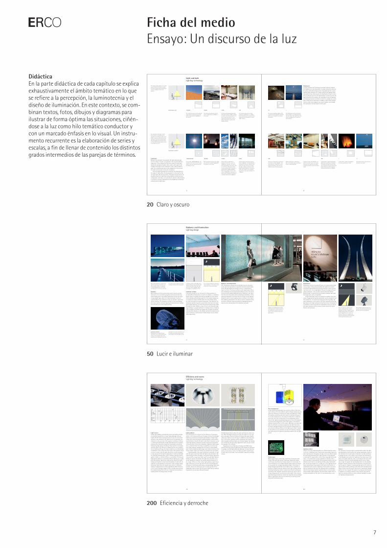
DidácticaEn la parte didáctica de cada capítulo se explica exhaustivamente el ámbito temático en lo que se refiere a la percepción, la luminotecnia y el diseño de iluminación. En este contexto, se com-binan textos, fotos, dibujos y diagramas para ilustrar de forma óptima las situaciones, ciñén-dose a la luz como hilo temático conductor y con un marcado énfasis en lo visual. Un instru-mento recurrente es la elaboración de series y escalas, a fin de llenar de contenido los distintos grados intermedios de las parejas de términos.
20 Claro y oscuro
50 Lucir e iluminar
200 Eficiencia y derroche
22 23
Light and darkLighting concepts
DarkIf the room were to be completely unlit as dusk falls, it would hardly be possible to recognise space, shapes and materials. Yet just a few accents are all that is required to reveal the spatial structure. Eye-catching features, which simultaneously provide a point of ref-erence for spatial depth, are produced by the fire and the accent light on the objects next to the fireplace. With their narrow beams, the pendant luminaires above the table and the spotlights add accents in the middle ground and foreground without detracting from the dark ambience.
Despite the high level of daylight brightness, the light coming in through the window is not sufficient to make the entire room appear bright. The light from the downlights and pendant lumi - naires lends presence to the seating around the table and provides ample lighting for communication.
LightThe even brightness impression that extends over the floor, wall and ceiling is aimed at revealing the room as a whole. The bright luminous ceiling pro-duces a scene analogous to an overcast sky bringing diffuse light into the room. By contrast, the wallwashing allows the textured wall to be recognised. To direct the viewer’s attention to the objects next to the fireplace, spotlights accen-tuate the individual items, using bright-ness contrast to distinguish them from the surroundings.
In very dark ambient settings, even a low brightness level is sufficient to attract one’s attention. The constantly flickering flames also ensure that the eyes are drawn towards this feature.
Bright rooms raise associations with the day giving objects spa-tial presence, whereas darkness is linked to themes such as night, calmness and security. If light and dark are arranged too closely together, the impressions alternate between the two opposites. The luminous ceiling produces a soft light for ambient lighting, comparable with the diffuse light of the overcast sky. In addition, daylight enters the room from the left. The wallwashing defines the verticals in the room. To add scenic lighting to eye-catching features, the accent light from the spotlights emphasises indi-vidual objects, and pendant luminaires accentuate the table.
52 53
Radiance and illumination Lighting concepts
By using wallwashers, the curtain is once again uniformly illuminated with the shadows effectively revealing the three-dimensional texture.
Projecting grazing light across the cur-tains clearly reveals the folds through the interplay of light and shadow giving the textile more body. The recessed lighting produces a strong graduation of illuminance levels resulting in the curtain appearing less uniformly illu-minated than when backlit.
Light and textilesBacklit textiles can appear to be self- illuminating. In such situations, the structure of the fabric is clearly recog-nisable and the material appears to be transparent. If the luminance is increased behind fine textiles, they can become difficult to recognise due to the surface brightness resulting in the perception of detail being reduced.
SilhouetteObjects placed in front of a luminous surface will quickly appear to be two-dimensional as they are silhouetted. In such situations, providing additional illu mination from above or from the side can enhance the shape of the object. This will also produce shadow, which makes the object appear to be more connected to the surface on which it is placed.
Luminous surfaces produce a soft light in the room through the diffuse dispersion of light. By contrast, illumination with directed light allows the three-dimensionality of shapes, materials and textures to be emphasised through stronger shadows. Further-more, illumination with hard-edged beams allows zones to be defined in order to divide the room or attract attention. The curtain and luminous furniture serve as self-illuminated elements here. The light coming in through the curtain is associated in the mind with daylight producing a natural appearance to the interior. The illumination, in this case, is provided by recessed ceiling lumi-naires. In contrast to self-illuminating panels where increased brightness is evident immediately in front of the luminous surface, an object can be illuminated by directing the light over distances using reflectors.
202 203
Efficiency and excessLighting concepts
Lighting in sales areas is essentially all about a lavish, scenic pres-entation of the goods on the one hand and about the economical considerations of minimising the running costs for electricity, lamp maintenance and air-conditioning on the other. Two steps vividly illustrate how light can be efficiently used in showrooms: firstly, zoning for different illuminances relative to the application and, secondly, a differentiated lighting concept that optimally enhances the perception of space and goods. Metal halide lamps in downlights for ambient lighting and spotlights for accent light-ing meet the requirements of good luminous efficacy. Wallwashers reveal the size of the space by emphasising the vertical surfaces. The brightness impression must be subjectively considered against the background of culture, expectation and age, and also seen in relation to the intended brand image. Further considerations such as a differentiated use of lighting control or brighter furniture and room surfaces provide additional potential for optimisation.
Ambient lightingThe direct lighting using downlights creates an average illuminance of 1,900lx on the merchandise. The high luminous efficacy of the high-pressure discharge lamps has a positive effect on the energy consumption, while the good colour rendition and brilliance contribute to making the goods look attractive. The dark spatial impression
given by the bright-dark transition on the walls, making the ceiling appear lower, is nevertheless a distraction.
102 downlights, 150W15,300W 34W/m
Goods area 1,900lxWall 220lxMain aisle 1,750lx
Efficiency through zoningBy using zoning, the high brightness required for the presentation of goods is prevented from encroaching on the aisles and seating areas where lower illuminances are sufficient. Reducing these zones to 900lx lowers the power requirement on the floor of a depart - ment store by about 15%.
86 downlights, 150W12,900W28.7W/m
Goods area 1,800lxWall 200lxMain aisle 900lx
Efficiency through reduced ambient lighting Because accent lighting often requires a contrast ratio of 1:10, reducing the ambient lighting means that considera - bly less accent lighting will be required. If the ambient level is an average of 600lx, this will allow significant energy to be saved while creating a rational basis for the accent lighting of the goods. The row of accent lighting in the aisle zone interrupts the evenness of the low ambient lighting. Due to the ability of the eye to adapt, an observer can quickly adjust to a lower ambient
level. By replacing the fluorescent lamps with metal halide lamps, more brilliance is created on surfaces.
Efficiency through accent lighting Adding accent lighting helps to direct the viewer’s attention to important objects and also to emphasise these objects in the context of an attrac - tive presentation of the merchandise. Reducing the ambient lighting allows the lighting designer to use a lower lamp output than usual. The contrast ratio of 1:10 is calculated from the maximum of 3,000lx for the accent lighting in comparison with the min - imum of about 300lx for the ambient lighting.
Efficiency through vertical illuminanceBrightly lit walls make a considerable contribution to the impression of brightness in a room, while the vertical illuminance of approximately 300lx is used to enhance the shelves on the wall.
Lighting control: evening sceneAltering the illuminance in accordance with the time of day can also contribute to reducing the energy requirement. A darker lighting effect in the evening not only creates an appropriate atmosphere, but also saves electricity.
Efficiency through a differentiated lighting conceptTo reduce the overall power consumption on the one hand and to emphasise the uniformity of the goods presentation and scenically present eye-catching features on the other, it is recommended that the ambient lighting is lowered to the benefit of the accent lighting. To give a greater impression of
brightness from the overall setting, the proportion of vertical illuminance is increased. Compared with the situation with uniform ambient lighting, this clearly enhances the quality of the merchandise, allowing the connected load to be reduced by about 25% to 11,480W or 25.5W per square metre.
52 downlights, 70W104 directional luminaires, 70W16 wallwashers, 35W 11,480W25.5W/m
Goods area 1,700lxWall 290lxMain aisle 600lx
E
8
Ficha del medioEnsayo: Un discurso de la luz
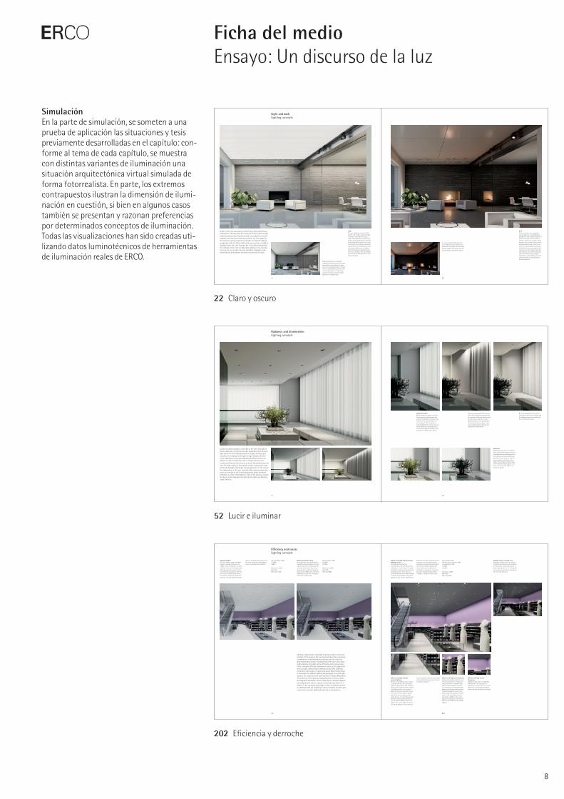
SimulaciónEn la parte de simulación, se someten a una prueba de aplicación las situaciones y tesis previamente desarrolladas en el capítulo: con-forme al tema de cada capítulo, se muestra con distintas variantes de iluminación una situación arquitectónica virtual simulada de forma fotorrea lista. En parte, los extremos contrapuestos ilustran la dimensión de ilumi-nación en cuestión, si bien en algunos casos también se presentan y razonan preferencias por determinados conceptos de iluminación. Todas las visualizaciones han sido creadas uti-lizando datos luminotécnicos de herramientas de iluminación reales de ERCO.
22 Claro y oscuro
52 Lucir e iluminar
202 Eficiencia y derroche
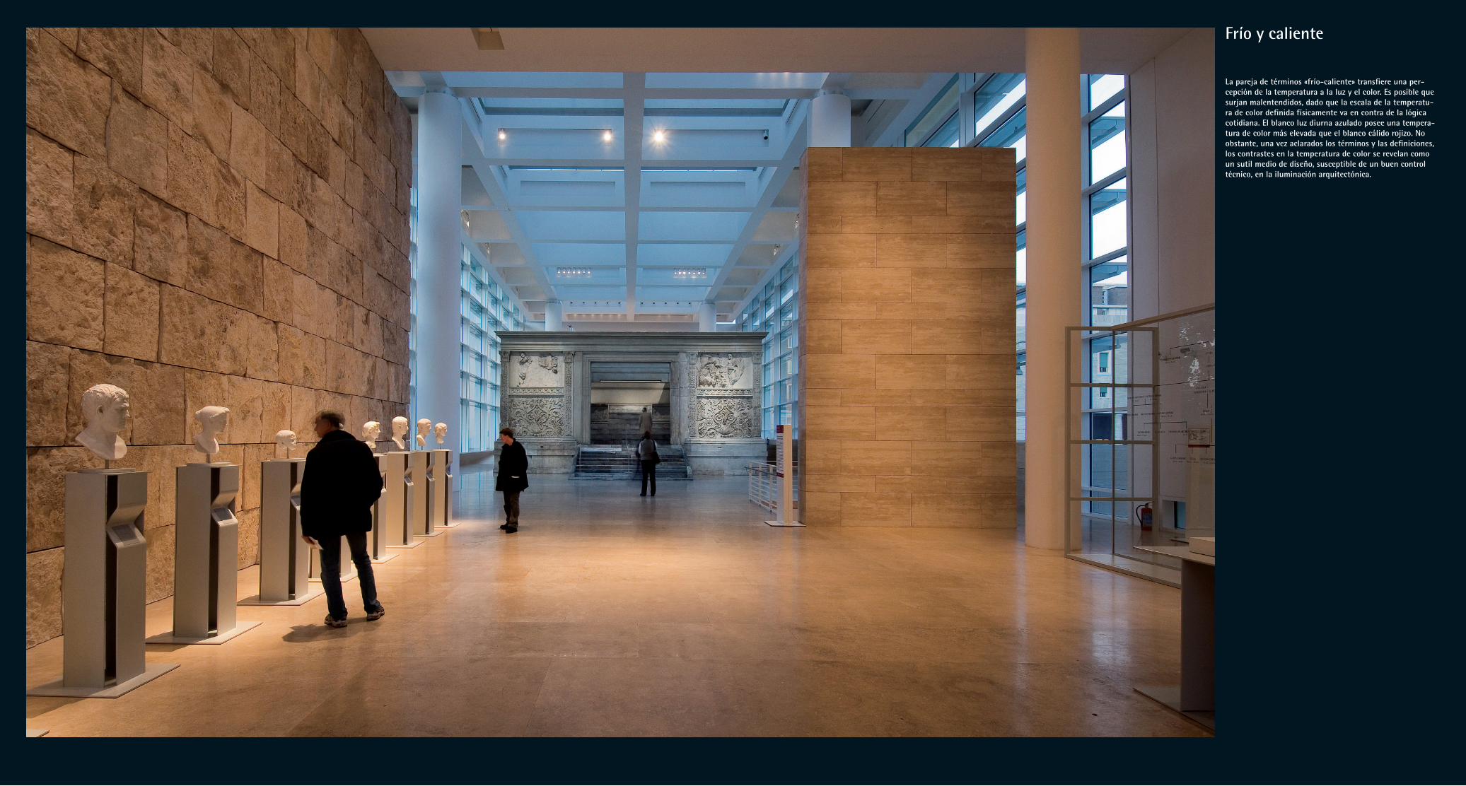
Frío y caliente
La pareja de términos «frío-caliente» transfiere una per-cepción de la temperatura a la luz y el color. Es posible que surjan malentendidos, dado que la escala de la temperatu-ra de color definida físicamente va en contra de la lógica cotidiana. El blanco luz diurna azulado posee una tempera-tura de color más elevada que el blanco cálido rojizo. No obstante, una vez aclarados los términos y las definiciones, los contrastes en la temperatura de color se revelan como un sutil medio de diseño, susceptible de un buen control técnico, en la iluminación arquitectónica.
36 37
descente o de la lámpara fluorescente de luz blanca cálida es más baja que la de la fuente de luz blanca diurna.
Cuando brilla el cuerpo negroLos físicos definen la temperatura de color a partir de un cuer- po idealizado, el denominado «cuerpo negro». Éste absorbe por completo la radiación electromagnética, como la luz de cual -quier longitud de onda, y es al mismo tiempo una fuente de radiación térmica ideal, cuyo espectro depende exclusivamen - te de su temperatura, la cual define a su vez la temperatura de color en grados Kelvin. El filamento en espiral de una lámpara incandescente se aproxima bastante a este concepto abstracto: cuando está frío es oscuro e incoloro, a medida que aumenta la temperatura pasa a brillar primero en rojo oscuro, para finalmen-te iluminar en un tono de blanco cálido al alcanzarse la tensión nominal. Si se continúa incrementando la tensión aplicada, la temperatura de color de la lámpara incandescente se sigue des-plazando en dirección al azulado, hasta que en última instancia se funde el filamento. Representado en el diagrama cromático CIE, el cuerpo negro sigue la «curva planckiana», la cual marca los lugares de color desde el blanco de tono extremadamente cálido hasta el blanco extremadamente azulado. Esta curva constituye la referencia para la indicación de la temperatura de color de las fuentes de luz.
Mientras que, en llamas y lámparas incandescentes, la tem-peratura de color de hecho está directamente relacionada con la temperatura de la fuente de luz, no es éste el caso, por ejemplo, de las lámparas de descarga o los diodos luminosos. La radiación de banda estrecha de la descarga gaseosa o de la electroluminis-cencia es transformada por una mezcla de polvos fluorescentes en luz visible, si bien carente de un espectro continuo. La com-posición de los polvos fluorescentes determina la temperatura de color del tono de blanco resultante. Esto da lugar a un ardid de psicología de la percepción al atenuar distintas lámparas: acos-tumbrado por el transcurso del día a un desplazamiento de la luz hacia el rojo a medida que disminuye la luminosidad al atardecer, el efecto análogo del desplazamiento hacia el rojo al atenuar una lámpara incandescente es percibido por el observador como agradable y natural. Por el contrario, la luz fluorescente atenua-da, la cual mantiene esencialmente constante su temperatura de color, es percibida rápidamente como pálida y fría.
Crear ambiente, generar contrastesEn la iluminación arquitectónica, estos y otros efectos de la percepción pueden utilizarse con fines de diseño en relación con distintas temperaturas de color. Básicamente, la elección del color de luz dominante puede determinar el ambiente de una sala entre los polos frío, práctico y activador por un lado y cálido, acogedor y tranquilizador por el otro. No obstante, si se observan ejemplos arquitectónicos de diversas regiones del mundo o se hojea una vieja revista del hogar, también se pone de manifiesto que la manera en que los ambientes luminosos y cromáticos cálidos o fríos van ligados a preferencias y valoraciones también depende en gran medida de modas o del trasfondo cultural.
En virtud de la asombrosa capacidad de la percepción huma-na, ya mencionada al principio, de percibir como constantes los colores de objetos tales como una hoja de papel blanca tras una breve aclimatación bajo iluminación con las más diversas tempe-raturas de color gracias a la adaptación cromática, la temperatura de color constituye un medio de diseño más bien sutil. En cambio, las películas fotográficas, pero también las cámaras digitales con el balance de blanco automático desactivado, ponen despiadada-
mente en evidencia las diversas temperaturas de color de la ilu-minación, hasta el punto de que para las películas eran necesarios complejos filtrados o emulsiones especiales a fin de obtener en el resultado unos colores de imagen de aspecto natural. Hoy en día, la mayoría de cámaras digitales ofrecen la posibilidad de ajustar manualmente el punto blanco con arreglo a categorías de luz o incluso conforme a valores Kelvin.
Así pues, si en la iluminación con una temperatura de color homogénea se pretende que ésta cobre conciencia como medio de diseño y no sólo como componente ambiental subliminal, es preciso escoger tonos de blanco marcadamente fríos o cálidos. El contraste entre iluminación de tonos cálidos e iluminación fría se percibe con mucha mayor claridad. En términos de diseño esto puede utilizarse, por ejemplo, para realzar selectivamente objetos expuestos acentuados en tonos fríos con respecto a elementos arquitectónicos iluminados en tonos cálidos, o a la inversa. Por otra parte, el ojo también percibe negativamente de forma inme-diata cuando en el mantenimiento de instalaciones de ilumina-ción se mezclan por descuido lámparas con distintos colores de luz. El color de luz puede destacar y acentuar las propiedades de superficies, o bien diferenciar zonas de espacios. Además, unos colores de luz cambiantes pueden crear en un mismo espacio un ambiente diurno o nocturno. Por medio de diversos componentes de iluminación, esto resulta técnicamente realizable en forma de luz fluorescente en blanco luz diurna más luz halógena, o bien mediante luminarias con temperatura de color variable, cada vez más presentes en el mercado.
Sin embargo, al hacer uso de este medio de diseño, el pro-yectista debería ser consciente de que la temperatura de color de una fuente de luz no guarda una relación directa con su calidad de reproducción cromática, sino que ésta depende más bien de la composición espectral de la luz. De ahí que en aplicaciones críti-cas, tales como la iluminación de museos o en el comercio textil, se requieran siempre, independientemente de la temperatura de color, fuentes de luz con un elevado índice de reproducción cro-mática Ra superior a 90, a fin de evitar sorpresas desagradables en forma de colores reproducidos erróneamente.
A primera vista, la transferencia de las percepciones de tempera-tura frío y caliente a cualidades de la luz parece sencilla y lógica. A menudo, sin embargo, esta transferencia da lugar a malenten-didos, especialmente en la discusión de conceptos de ilumina-ción entre especialistas y profanos. Y es que, con referencia a los fenómenos de la luz y del color, las dimensiones de diseño frío y caliente pueden asumir significados muy dispares. Existe el con-traste frío-caliente de colores cromáticos según Johannes Itten, existen lámparas con luz blanca cálida en contraste con el blanco luz diurna. ¡Hablamos de «temperatura de color», pero en contra-posición a la lógica cotidiana, ésta es más elevada en los tonos de blanco «fríos»! Durante sus charlas profesionales, los fotógrafos aluden frecuentemente a conceptos como luz de flash «fría» y luz de lámpara incandescente «caliente», y se ven obligados a recurrir a medios técnicos tales como el filtrado o el balance de blancos manual, un proceso ejecutado de forma totalmente automática por la percepción humana (la denominada adaptación cromática). Todos estos términos se refieren a efectos físicos y de psicología de la percepción, utilizados desde hace ya siglos con fines de diseño, inicialmente disciplinas artísticas como la pintura, pero actualmente también en la iluminación arquitectónica.
¿Azul frío, rojo caliente? Cuando los diseñadores hablan de colores fríos o cálidos, nor-malmente hacen referencia al contraste frío-cálido, un medio de diseño conocido desde siempre y que fue postulado, entre otros, por el pintor y teórico del arte Johannes Itten (1888–1967) en su obra «El arte del color». En este contexto, se atribuye instin-tivamente la cualidad «frío» a los colores azulados, mientras que se asigna la propiedad «cálido» a los tonos rojizos. Esto nos permite conjeturar sobre la manera en que pudo haber surgido evolutivamente la vinculación de estas cualidades perceptivas: con seguridad, las impresiones desempeñan un papel, como los tonos rojizos de la piel caliente y bien irrigada en comparación con el tono pálido a azulado de la piel o los labios de las perso -nas sometidas a frío intenso. En cualquier caso, los experimentos demostraron que las salas pintadas en azul son realmente perci-bidas como más frías que las pintadas en rojo. La tonalidad más cálida o fría influye también en la estimación de las distancias. Los colores de tonos cálidos parecen más cercanos, mientras que los fríos parecen más alejados. Este efecto fue empleado ya por los pintores del Renacimiento para la denominada perspectiva cromática, en la que el fondo del cuadro con tonos azulados-verdosos contrastaba con el primer plano en tonos cálidos. Sin embargo, este truco funciona también debido al hecho de que las longitudes de onda diferentes de las luces roja y azul, los ob-jetos en cuestión realmente son reproducidos en el ojo a niveles distintos.
En el ámbito más sutil de los tonos de blanco, esta clasifica-ción frío-caliente procedente de la teoría del arte ha hallado eco en la forma de la denominación «blanco cálido» para el color de la luz de determinadas lámparas fluorescentes. Dicha denomina-ción describe un tono de blanco más rojizo en contraste con el «blanco neutro» o el «blanco luz diurna» aún más intensamente azulado. En los entrañables viejos tiempos de la fotografía ana-lógica, los fotógrafos también solían hablar de la luz «caliente» de las lámparas para fotografía – las cuales calentaban literal y sensiblemente el estudio – en contraste con la luz «fría», seme-jante a la luz natural, procedente de los flashes electrónicos. Con frecuencia surge confusión cuando estas categorías del lenguaje coloquial topan con la indicación física y técnicamente precisa de la temperatura de color expresada en grados Kelvin. Y es que, paradójicamente, la temperatura de color de la lámpara incan-
Frío y calienteTemperatura de color: un sutil medio de diseño
El concepto de iluminación para las superficies de exposición en el lavadero de carbón de la mina Zollverein, Essen, Alemania, combina la luz fluorescente con color de luz diurna como ilumina-ción indirecta a lo largo del techo con acentos en tonos cálidos procedentes de proyectores para lámparas halóge -nas de bajo voltaje.
La curva planckiana dentro del dia-grama cromático CIE marca el lugar de color de un radiador de Planck en función de su temperatura, definien - do así el término de la temperatura de color de una fuente de luz blanca.
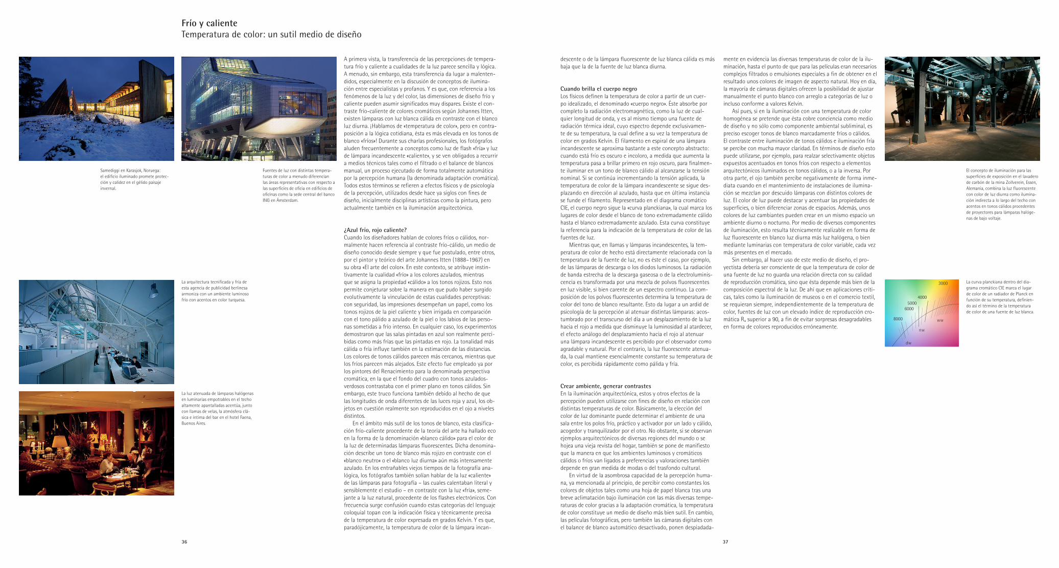
Samediggi en Karasjok, Noruega: el edificio iluminado promete protec-ción y calidez en el gélido paisaje invernal.
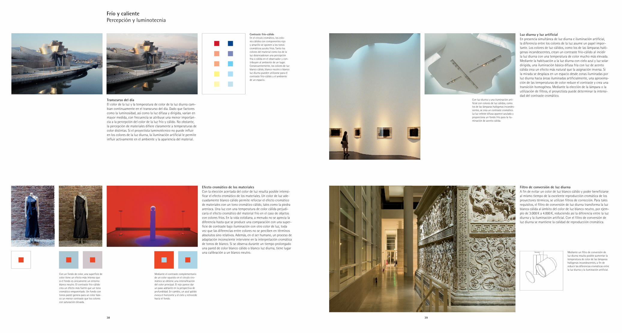
Fuentes de luz con distintas tempera-turas de color a menudo diferencian las áreas representativas con respecto a las superficies de oficia en edificios de oficinas como la sede central del banco ING en Ámsterdam.
La arquitectura tecnificada y fría de esta agencia de publicidad berlinesa armoniza con un ambiente luminoso frío con acentos en color turquesa.
La luz atenuada de lámparas halógenas en luminarias empotrables en el techo altamente apantalladas acentúa, junto con llamas de velas, la atmósfera clá-sica e íntima del bar en el hotel Faena, Buenos Aires.
527
622
465
380
490
500
510
530
555
575
600
780
480
50004000
3000
2000
1600
nw
dw
ww
2500
6000
8000
38 39
Contraste frío-cálidoEn el círculo cromático, los colo - res cálidos con componentes rojo y amarillo se oponen a los tonos cromáticos azules fríos. Tanto los colores del material como los de la luz desencadenan una percepción fría o cálida en el observador y con - tribuyen al ambiente de un lugar. Consecuentemente, los colores de luz blanco cálido, blanco neutro o blanco luz diurna pueden utilizarse para el contraste frío-cálido y el ambiente de un espacio.
Efecto cromático de los materialesCon la elección acertada del color de luz resulta posible intensi-ficar el efecto cromático de los materiales. Un color de luz ade-cuadamente blanco cálido permite reforzar el efecto cromático de materiales con un tono cromático cálido, tales como la piedra arenisca. Una luz con una temperatura de color cálida perjudi-caría el efecto cromático del material frío en el caso de objetos con colores fríos. En la vida cotidiana, a menudo no se aprecia la diferencia hasta que se produce una comparación con una super-ficie de contraste bajo iluminación con otro color de luz, toda vez que las diferencias entre colores no se perciben en términos absolutos sino relativos. Además, en el ser humano, un proceso de adaptación inconsciente interviene en la interpretación cromática de tonos de blanco. Si se observa durante un tiempo prolongado una pared de color blanco cálido o blanco luz diurna, tiene lugar una calibración a un blanco neutro.
Con un fondo de color, una superficie de color tiene un efecto más intenso que si el fondo es únicamente un entorno blanco neutro. El contraste frío-cálido crea un efecto más fuerte que un tono cromático emparentado. Un fondo con tonos pastel genera para un color bási-co un menor contraste que los colores con saturación elevada.
Transcurso del díaEl color de la luz y la temperatura de color de la luz diurna cam-bian continuamente en el transcurso del día. Dado que factores como la luminosidad, así como la luz difusa y dirigida, varían en mayor medida, con frecuencia se atribuye una menor importan-cia a la percepción del color de la luz frío y cálido. No obstante, la percepción de materiales difiere claramente a temperaturas de color distintas. Si el proyectista luminotécnico no puede influir en los colores de la luz diurna, la iluminación artificial le permite influir activamente en el ambiente y la apariencia del material.
Mediante el contraste complementario de un color opuesto en el círculo cro-mático se obtiene una intensificación del color principal. El rojo parece dar un paso adelante en la perspectiva de profundidad. En cambio, un azul pálido evoca el horizonte y el cielo y retrocede hacia el fondo.
Con luz diurna y una iluminación arti-ficial con colores de luz cálidos, como los de las lámparas halógenas incandes-centes, se crea un contraste cromático. La luz celeste difusa aparece azulada y proporciona un fondo frío para la ilu-minación de acento cálida.
Luz diurna y luz artificialEn presencia simultánea de luz diurna e iluminación artificial, la diferencia entre los colores de la luz asume un papel impor-tante. Los colores de luz cálidos, como los de las lámparas haló-genas incandescentes, crean un contraste frío-cálido al incidir la luz diurna con una temperatura de color mucho más elevada. Mediante la habituación a la luz diurna con cielo azul y luz solar dirigida, una iluminación básica difusa fría con luz de acento cálida crea un efecto más natural que la asignación inversa. Si la mirada se desplaza en un espacio desde zonas iluminadas por luz diurna hacia áreas iluminadas artificialmente, una aproxima-ción de las temperaturas de color reduce el contraste y crea una transición homogénea. Mediante la elección de la lámpara o la utilización de filtros, el proyectista puede determinar la intensi-dad del contraste cromático.
Frío y calientePercepción y luminotecnia
Filtro de conversión de luz diurnaA fin de evitar un color de luz blanco cálido y poder beneficiarse al mismo tiempo de la excelente reproducción cromática de los proyectores térmicos, se utilizan filtros de corrección. Para tales requisitos, el filtro de conversión de luz diurna transforma la luz blanca cálida al ámbito del color de luz blanco neutro, por ejem-plo de 3.000 K a 4.000 K, reduciendo así la diferencia entre la luz diurna y la iluminación artificial. Con el filtro de conversión de luz diurna se mantiene la calidad de reproducción cromática.
Mediante un filtro de conversión de luz diurna resulta posible aumentar la temperatura de color de las lámparas halógenas incandescentes, a fin de reducir las diferencias cromáticas entre la luz diurna y la iluminación artificial.
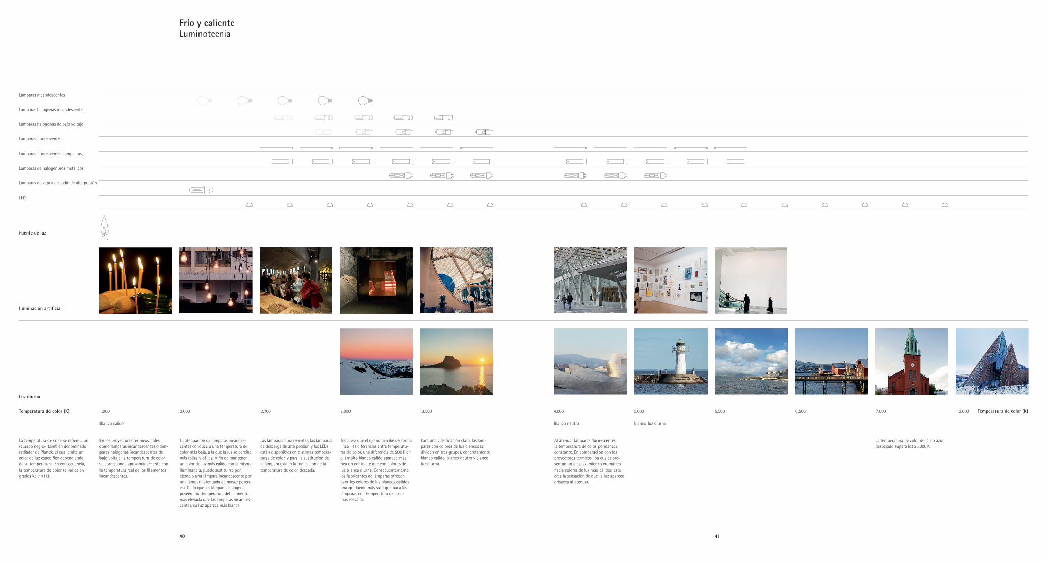
40 41
En los proyectores térmicos, tales como lámparas incandescentes o lám -paras halógenas incandescentes de bajo voltaje, la temperatura de color se corresponde aproximadamente con la temperatura real de los fi lamentos incandescentes.
La atenuación de lámparas incandes-centes conduce a una temperatura de color más baja, a la que la luz se percibe más rojiza y cálida. A fi n de mantener un color de luz más cálido con la misma iluminancia, puede sustituirse por ejemplo una lámpara incandescente por una lámpara atenuada de mayor poten-cia. Dado que las lámparas halógenas poseen una temperatura del fi lamento más elevada que las lámparas incandes-centes, su luz aparece más blanca.
Las lámparas fl uorescentes, las lámparas de descarga de alta presión y los LEDs están disponibles en distintas tempera-turas de color, y para la sustitución de la lámpara exigen la indicación de la temperatura de color deseada.
Toda vez que el ojo no percibe de forma lineal las diferencias entre temperatu-ras de color, una diferencia de 500 K en el ámbito blanco cálido aparece más rica en contraste que con colores de luz blanca diurna. Consecuentemente, los fabricantes de lámparas ofrecen para los colores de luz blancos cálidos una gradación más sutil que para las lámparas con temperatura de color más elevada.
Para una clasifi cación clara, las lám-paras con colores de luz blancos se dividen en tres grupos, concretamente blanco cálido, blanco neutro y blanco luz diurna.
Luz diurna
Fuente de luz
Temperatura de color (K) 1.900 2.000 2.700 2.800 3.500 4.000 5.000 5.500 6.500 7.000 12.000
Blanco cálido Blanco neutro Blanco luz diurna
Temperatura de color (K)
Al atenuar lámparas fl uorescentes, la temperatura de color permanece constante. En comparación con los proyectores térmicos, los cuales pre-sentan un desplazamiento cromático hacia colores de luz más cálidos, esto crea la sensación de que la luz aparece grisácea al atenuar.
La temperatura de color del cielo azul despejado supera los 25.000 K.
La temperatura de color se refi ere a un «cuerpo negro», también denominado radiador de Planck, el cual emite un color de luz específi co dependiendo de su temperatura. En consecuencia, la temperatura de color se indica en grados Kelvin (K).
Iluminación artifi cial
Frío y calienteLuminotecnia
Lámparas incandescentes
Lámparas halógenas incandescentes
Lámparas halógenas de bajo voltaje
Lámparas fl uorescentes
Lámparas fl uorescentes compactas
Lámparas de halogenuros metálicos
Lámparas de vapor de sodio de alta presión
LED
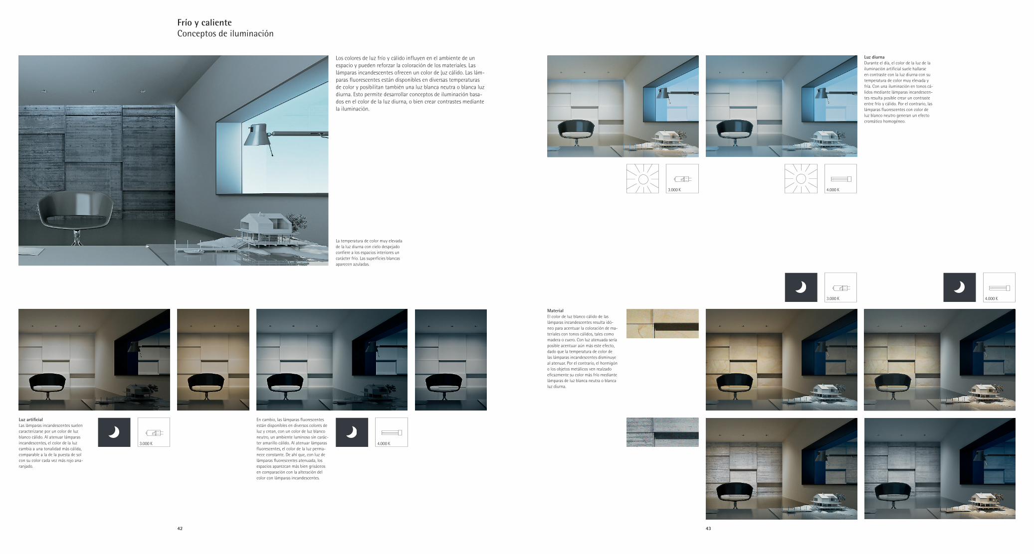
42 43
En cambio, las lámparas fluorescentes están disponibles en diversos colores de luz y crean, con un color de luz blanco neutro, un ambiente luminoso sin carác-ter amarillo cálido. Al atenuar lámparas fluorescentes, el color de la luz perma-nece constante. De ahí que, con luz de lámparas fluorescentes atenuada, los espacios aparezcan más bien grisáceos en comparación con la alteración del color con lámparas incandescentes.
3.000 K 4.000 K
La temperatura de color muy elevada de la luz diurna con cielo despejado confiere a los espacios interiores un carácter frío. Las superficies blancas aparecen azuladas.
Luz diurnaDurante el día, el color de la luz de la iluminación artificial suele hallarse en contraste con la luz diurna con su temperatura de color muy elevada y fría. Con una iluminación en tonos cá-lidos mediante lámparas incandescen-tes resulta posible crear un contraste entre frío y cálido. Por el contrario, las lámparas fluorescentes con color de luz blanco neutro generan un efecto cromático homogéneo.
MaterialEl color de luz blanco cálido de las lámparas incandescentes resulta idó - neo para acentuar la coloración de ma-teriales con tonos cálidos, tales como madera o cuero. Con luz atenuada sería posible acentuar aún más este efecto, dado que la temperatura de color de las lámparas incandescentes disminuye al atenuar. Por el contrario, el hormigón o los objetos metálicos ven realzado eficazmente su color más frío mediante lámparas de luz blanca neutra o blanca luz diurna.
Luz artificialLas lámparas incandescentes suelen caracterizarse por un color de luz blanco cálido. Al atenuar lámparas incandescentes, el color de la luz cambia a una tonalidad más cálida, comparable a la de la puesta de sol con su color cada vez más rojo ana-ranjado.
Frío y calienteConceptos de iluminación
Los colores de luz frío y cálido influyen en el ambiente de un espacio y pueden reforzar la coloración de los materiales. Las lámparas incandescentes ofrecen un color de luz cálido. Las lám-paras fluorescentes están disponibles en diversas temperaturas de color y posibilitan también una luz blanca neutra o blanca luz diurna. Esto permite desarrollar conceptos de iluminación basa-dos en el color de la luz diurna, o bien crear contrastes mediante la iluminación.
3.000 K
3.000 K
4.000 K
4.000 K