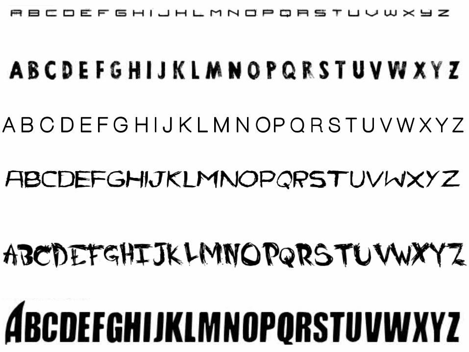
Download - Moodboard 3 fonts
Transcript
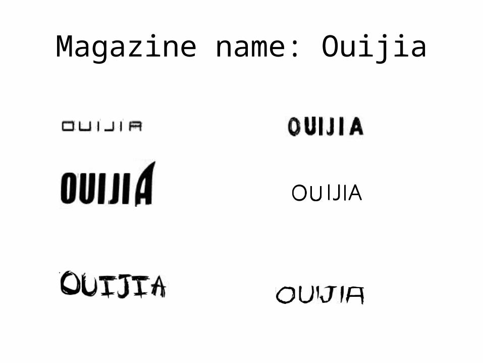
Magazine name: Ouijia
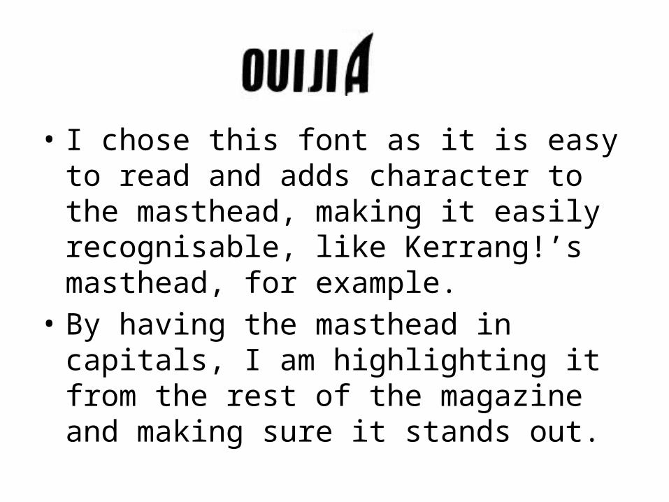
• I chose this font as it is easy to read and adds character to the masthead, making it easily recognisable, like Kerrang!’s masthead, for example.
• By having the masthead in capitals, I am highlighting it from the rest of the magazine and making sure it stands out.


