Mattel, Inc. Brand Identity Manual
Table of ContentsIntroduction
Mattel’s History
Positioning Statement
Brand Strengths & Weaknesses
The Logo
• Development
• Refinements
• Final Logo Design
Brand Identity Elements
Brand Identity Applications
• Stationery System
• Website Homepage & Favicon
• E-mail S ignature
• T-Shirts
• Hats
• Coffee Mugs
• Pens
• Bags
• Bi l lboard
• Post- It Notes
• Name/ID Badges
• Rubik’s Cube
• Stickers
• 3-D Picture Frame
Brand Identity Summary
2
3
4
5
6
6
7
8
9
10
10
11
12
13
14
15
16
17
18
19
20
21
22
23
24
1Brand Identity Manual
3Brand Identity Manual2 Brand Identity Manual
Introduction Mattel’s HistoryThe overall image and redesign of Mattel’s brand identity is
conveyed by using family friendly elements that are colorful
and fun. The colorful elements wil l evoke playfulness and
the main colors that used are red, yellow, green, and blues
with accents of gray. These colors are intended to represent
the company’s exuberance in toy making.
The company communicates an image that is both engag-
ing and fun to emphasize the company’s main objective,
which is to entertain and provide children with toys, games,
and books around the globe. The use of eye catching colors
and shapes play a role in conveying the overall brand iden-
tity. Consistency in the company’s varying identity applica-
tions also assists and provides a foundation of the overall
image. The redesign of Mattel’s logo communicates the
bui lding blocks of a chi ld’s future while also presenting a
playful and fun six pointed star.
Mattel was born in 1945 and was founded by Ruth and Ell iot
Handler and Harold “Matt” Matson. The company started
as the name Mattel out of a garage workshop in Southern
California. Mattel begun as a picture frame making busi -
ness, but El l iot soon developed doll house furniture out of
the picture frame scraps that were left over. Because of the
success of the doll furniture, the company decided to put
more of an emphasis on toy manufacturing.
In 1955, Mattel began to advertise its toy l ines through the
“Mickey Mouse Club” show on television, which in turn revo-
lut ionized the way toys were being marketed. By 1959,
Barbie made her way to hundreds of l it tle girls’ homes. The
original Barbie doll was Ruth Handler’s idea and was named
after her daughter’s nickname. The Ken doll (Barbie’s one
and only boyfriend) was later developed in 1961, which was
named after the Handlers’ son.
The sixties was a success for Mattel, which became a pub-
licly owned company. By the mid 1960’s, Mattel launched
its very popular educational toy named “See ‘N Say,” and
in 1968 Mattel rolled out the Hot Wheels toy vehicles.
By the 1990’s, Mattel acquired several dif ferent toy and
game companies, making it one of the largest toy manu-
facturers in the world. Among them were International
Games, Inc, Fisher-Price, Kransco, JW Spear & Sons, and the
Cabbage Patch Kids doll l ine. In addition to acquiring toy
companies, Mattel obtained a master toy l icense that
covered the r ights to al l programming on Nickelodeon.
By 1997, Mattel merged with the third-largest toy company,
Tyco Toys.
MATTEL’S FIRST LOGO MATTEL’S CURRENT LOGO
5Brand Identity Manual4 Brand Identity Manual
Positioning Satement Brand Strengths & WeaknessesMattel i s a toy manufactur ing company that provides
families and children around the globe with a vast array of
toys, books, and games. Our award-winning recognit ion,
family-oriented, and versati le company is the largest toy
manufacturer in the world with almost 70 years of experi -
ence that del ivers educational and innovative products
based upon a rich legacy of playful inspiration.
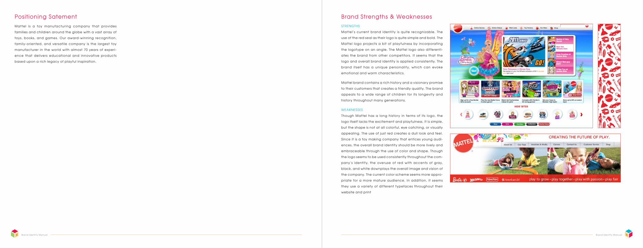
STRENGTHS
Mattel’s current brand identity is quite recognizable. The
use of the red seal as their logo is quite simple and bold. The
Mattel logo projects a bit of playfulness by incorporating
the logotype on an angle. The Mattel logo also dif ferenti-
ates the brand from other competitors. It seems that the
logo and overall brand identity is applied consistently. The
brand itself has a unique personal ity, which can evoke
emotional and warm characteristics.
Mattel brand contains a rich history and a vis ionary promise
to their customers that creates a friendly quality. The brand
appeals to a wide range of chi ldren for its longevity and
history throughout many generations.
WEAKNESSES
Though Mattel has a long history in terms of its logo, the
logo itself lacks the excitement and playfulness. It is s imple,
but the shape is not at all colorful, eye catching, or visually
appealing. The use of just red creates a dull look and feel.
S ince it is a toy making company that entices young audi-
ences, the overall brand identity should be more l ively and
embraceable through the use of color and shape. Though
the logo seems to be used consistently throughout the com-
pany’s identity, the overuse of red with accents of gray,
black, and white downplays the overall image and vis ion of
the company. The current color scheme seems more appro-
priate for a more mature audience. In addition, it seems
they use a variety of dif ferent typefaces throughout their
website and print
7Brand Identity Manual6 Brand Identity Manual
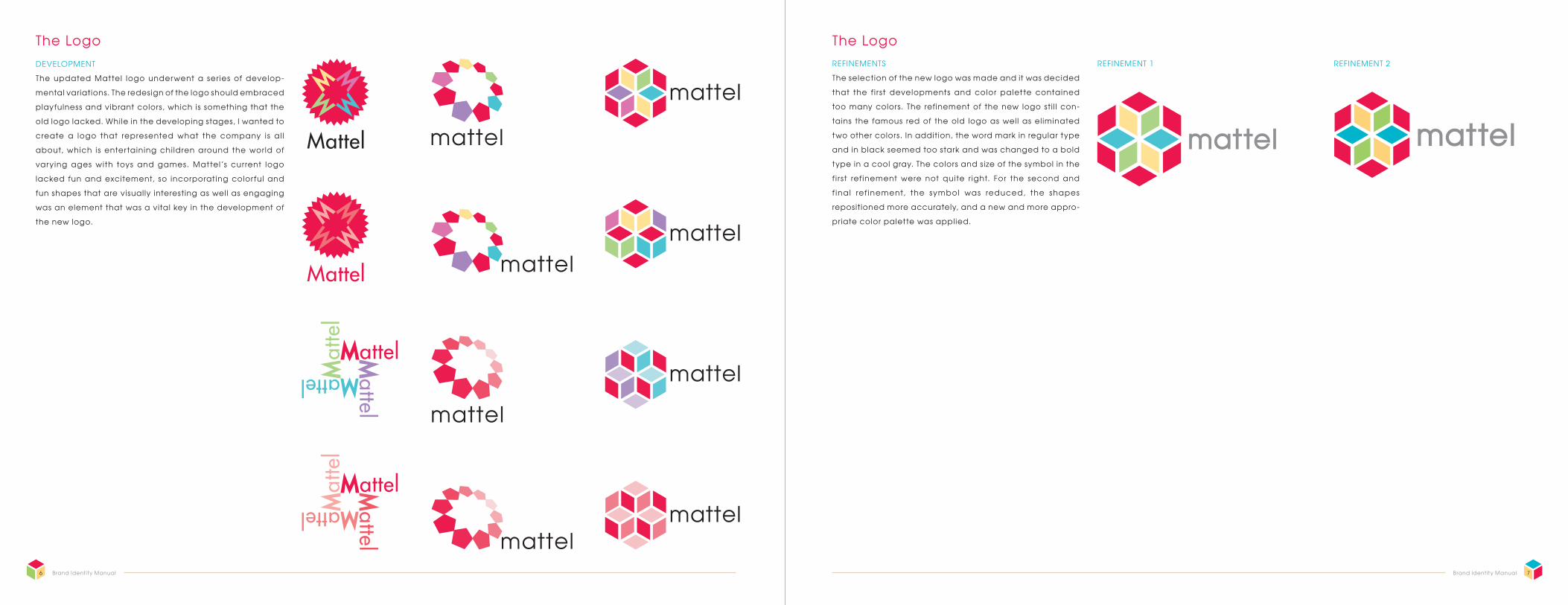
The Logo The LogoDEVELOPMENT
The updated Mattel logo underwent a series of develop-
mental variations. The redesign of the logo should embraced
playfulness and vibrant colors, which is something that the
old logo lacked. While in the developing stages, I wanted to
create a logo that represented what the company is al l
about, which is entertaining chi ldren around the world of
varying ages with toys and games. Mattel’s current logo
lacked fun and excitement, so incorporating colorful and
fun shapes that are visually interesting as well as engaging
was an element that was a vital key in the development of
the new logo.
REFINEMENTS
The selection of the new logo was made and it was decided
that the f i rst developments and color palette contained
too many colors. The refinement of the new logo sti l l con-
tains the famous red of the old logo as well as eliminated
two other colors. In addition, the word mark in regular type
and in black seemed too stark and was changed to a bold
type in a cool gray. The colors and size of the symbol in the
f i rst ref inement were not quite r ight. For the second and
f inal ref inement, the symbol was reduced, the shapes
repositioned more accurately, and a new and more appro-
priate color palette was applied.
REFINEMENT 1 REFINEMENT 2
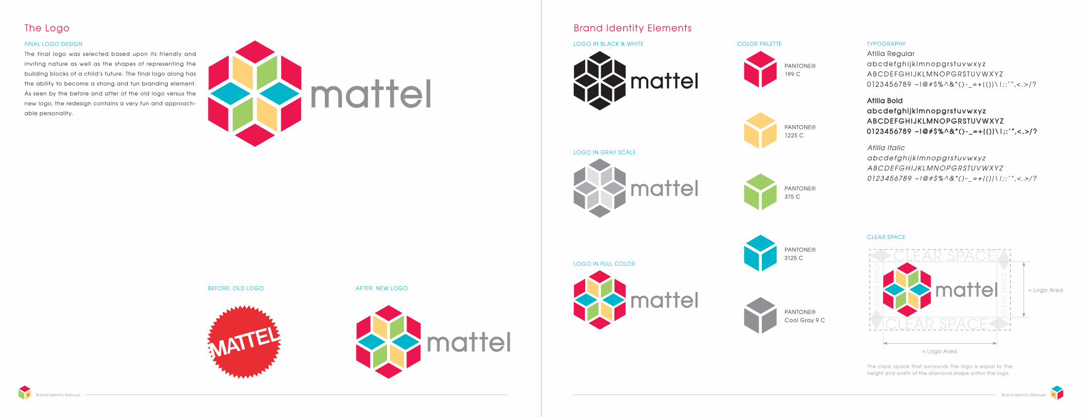
The f inal logo was selected based upon its f r iendly and
invit ing nature as wel l as the shapes of representing the
building blocks of a child’s future. The final logo along has
the abil ity to become a strong and fun branding element.
As seen by the before and after of the old logo versus the
new logo, the redesign contains a very fun and approach-
able personality.
9Brand Identity Manual8 Brand Identity Manual
The Logo Brand Identity ElementsFINAL LOGO DESIGN TYPOGRAPHY
Atil la Regular a b cd efg h i j k l m n o p g r s t u v w x y z A B CD EF G H I J K L M N O P G R S T U V W X Y Z 0123 4 5 6789 ~ !@#$ % ^ &*( ) - _ = + {[ ]}\|; :’”,< .>/?
Atilla Bold a b c d efg h i j k l m n o p g r s t u v w x y z A B C D E F G H I J K L M N O P G R S T U V W X Y Z 0123 4 5 678 9 ~ !@#$ % ^ &*( ) - _ = +{[ ]}\|; :’”,< . >/?
Atil la Italic a b cd efg h i j k l m n o p g r s t u v w x y z AB C D EFG H IJ KL M N O P G R STUV W X Y Z 0123 4 5 678 9 ~ !@#$% ^ &*( ) - _= +{[ ]}\|; :’”,< .>/?
CLEAR SPACE
COLOR PALETTE
BEFORE: OLD LOGO AFTER: NEW LOGO
PANTONE® 199 C
PANTONE® 1225 C
PANTONE® 375 C
PANTONE® 3125 C
PANTONE® Cool Gray 9 C
LOGO IN FULL COLOR
LOGO IN GRAY SCALE
LOGO IN BLACK & WHITE
= Logo Area
The clear space that surrounds the logo is equal to the height and width of the diamond shape within the logo.
= Logo Area
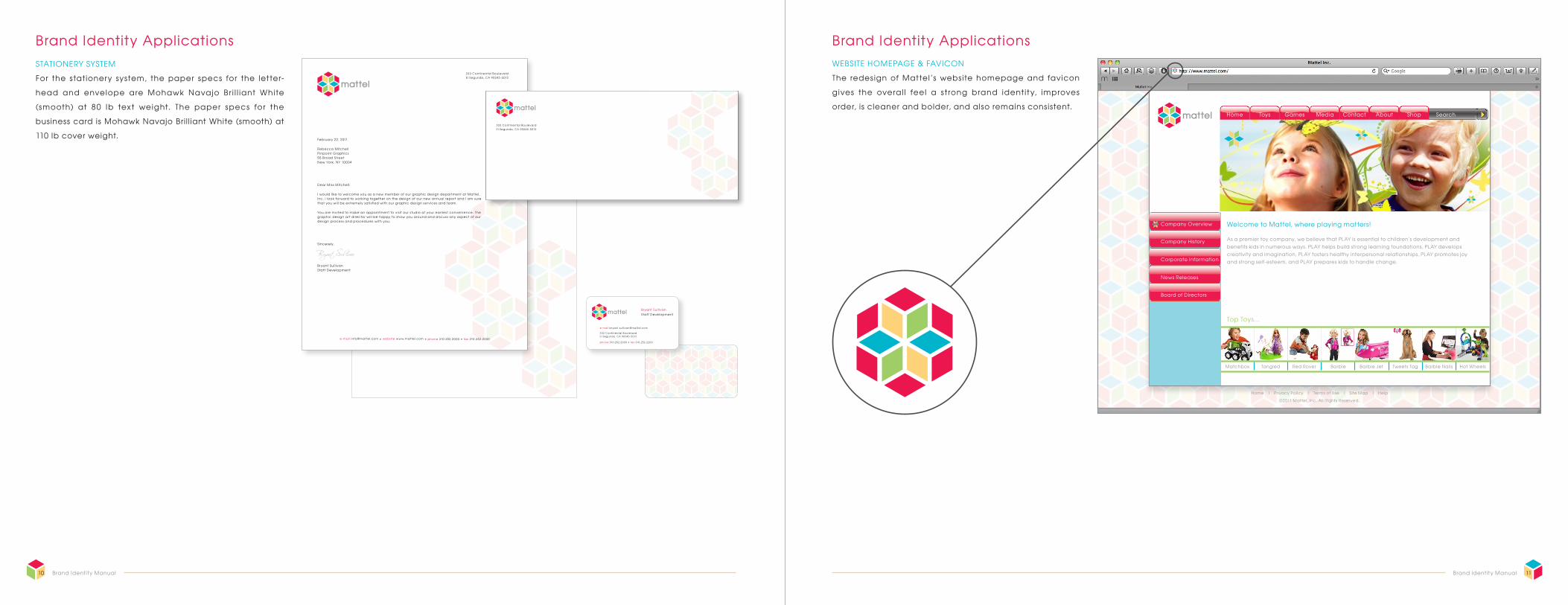
For the stationery system, the paper specs for the letter-
head and envelope are Mohawk Navajo Br i l l iant White
(smooth) at 80 Ib text weight. The paper specs for the
business card is Mohawk Navajo Bri l l iant White (smooth) at
110 Ib cover weight.
11Brand Identity Manual10 Brand Identity Manual
Brand Identity ApplicationsSTATIONERY SYSTEM
Brand Identity Applications
The redesign of Mattel’s website homepage and favicon
gives the overal l feel a strong brand identity, improves
order, is cleaner and bolder, and also remains consistent.
WEBSITE HOMEPAGE & FAVICON
GamesToysHome
Matchbox Tangled Red Rover Barbie Barbie Jet Tweets Tag Barbie Nails Hot Wheels
SearchMedia Contact About Shop
Company Overview
Company History
Welcome to Mattel, where playing matters!
Top Toys...
As a premier toy company, we believe that PLAY is essential to children’s development and benefits kids in numerous ways. PLAY helps build strong learning foundations, PLAY develops creativity and imagination, PLAY fosters healthy interpersonal relationships, PLAY promotes joy and strong self-esteem, and PLAY prepares kids to handle change.
Home | Privacy Policy | Terms of Use | Site Map | Help
©2011 Mattel, Inc. All Rights Reserved.
Corporate Information
News Releases
Board of Directors
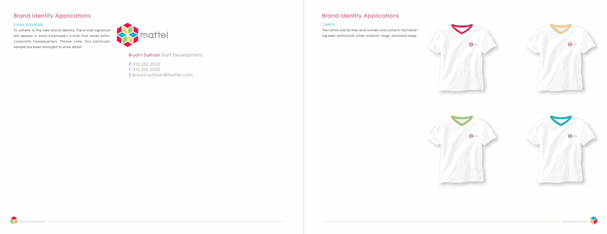
The t-shirts are for men and women and come in the follow-
ing sizes: extra small, small, medium, large, and extra large.
To adhere to the new brand identity, the e-mail s ignature
wi l l appear in each employee’s e-mai l that works within
corporate headquar ter s . P lease note: Th i s par t icu lar
sample has been enlarged to show detail.
13Brand Identity Manual12 Brand Identity Manual
Brand Identity ApplicationsE-MAIL SIGNATURE
Brand Identity ApplicationsT-SHIRTS
Bryant Sullivan Staff Development
P 310.252.2000 F 310.252.2200 E [email protected]
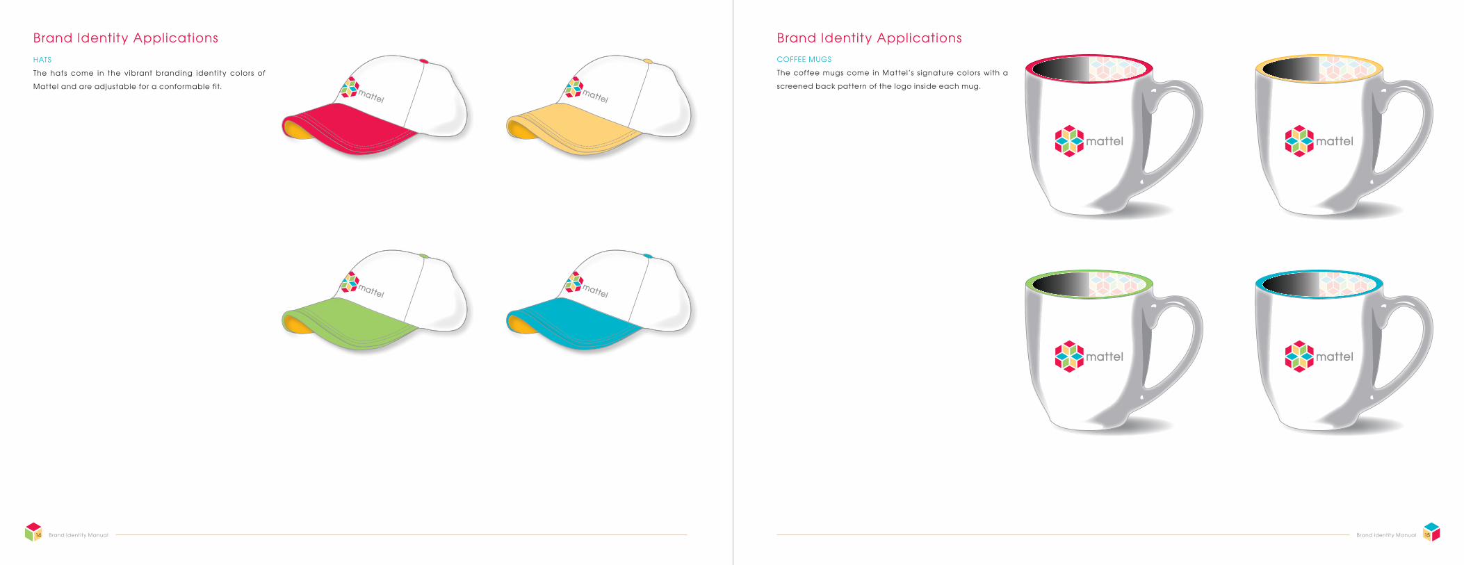
The coffee mugs come in Mattel’s s ignature colors with a
screened back pattern of the logo inside each mug.
The hats come in the vibrant branding identity colors of
Mattel and are adjustable for a conformable fit.
15Brand Identity Manual14 Brand Identity Manual
Brand Identity ApplicationsHATS
Brand Identity ApplicationsCOFFEE MUGS
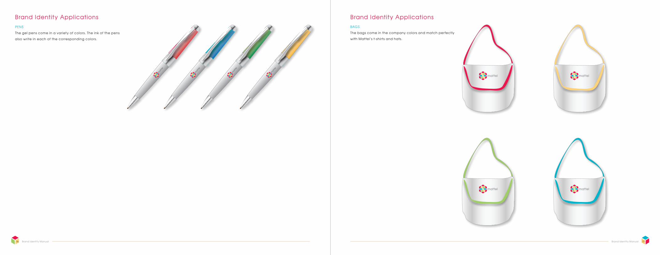
The bags come in the company colors and match perfectly
with Mattel’s t-shirts and hats.
The gel pens come in a variety of colors. The ink of the pens
also write in each of the corresponding colors.
17Brand Identity Manual16 Brand Identity Manual
Brand Identity ApplicationsPENS
Brand Identity ApplicationsBAGS
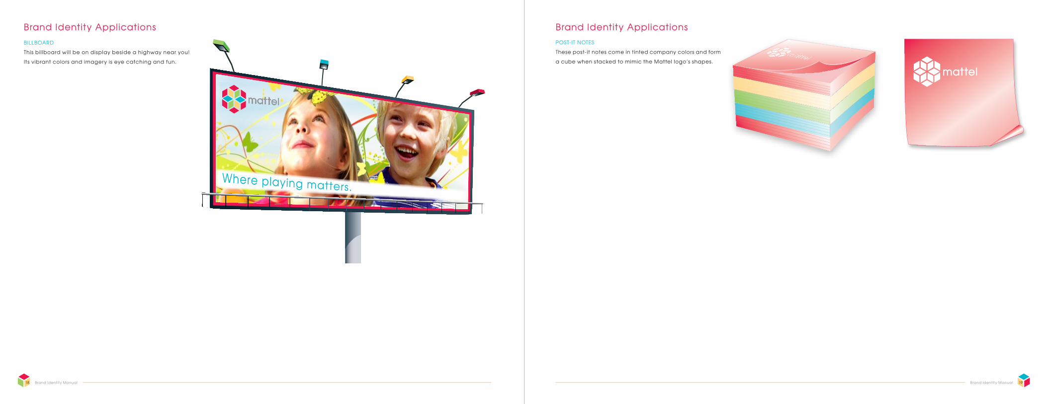
These post-it notes come in tinted company colors and form
a cube when stacked to mimic the Mattel logo’s shapes.
This bil lboard wil l be on display beside a highway near you!
Its vibrant colors and imagery is eye catching and fun.
19Brand Identity Manual18 Brand Identity Manual
Brand Identity ApplicationsBILLBOARD
Brand Identity ApplicationsPOST-IT NOTES
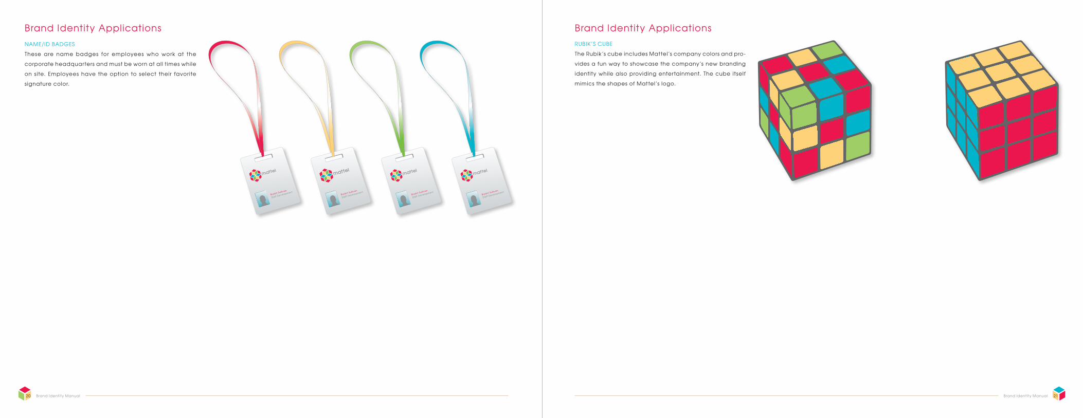
The Rubik’s cube includes Mattel’s company colors and pro-
vides a fun way to showcase the company’s new branding
identity while also providing entertainment. The cube itself
mimics the shapes of Mattel’s logo.
These are name badges for employees who work at the
corporate headquarters and must be worn at all times while
on site. Employees have the option to select their favorite
signature color.
21Brand Identity Manual20 Brand Identity Manual
Brand Identity ApplicationsNAME/ID BADGES
Brand Identity ApplicationsRUBIK’S CUBE
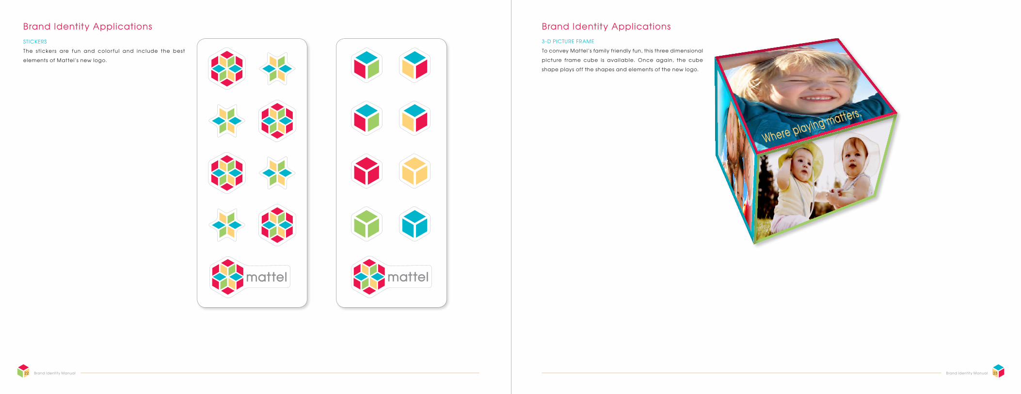
To convey Mattel’s family friendly fun, this three dimensional
picture frame cube is avai lable. Once again, the cube
shape plays off the shapes and elements of the new logo.
The st ickers are fun and color fu l and include the best
elements of Mattel’s new logo.
23Brand Identity Manual22 Brand Identity Manual
STICKERS
Brand Identity Applications3-D PICTURE FRAME
Brand Identity Applications
24 Brand Identity Manual
S ince Mattel is a large and global company that already
establ i shed a strong brand identity system that i s both
recognizable and dist inct, I found that redes igning the
brand identity was challenging yet fun. In discovering the
weaknesses of the exi s t ing brand, I was able to br ing
together an identity system that included more consistent
color applications and integrated elements that emphasize
creativity, playfulness, l ivel iness, boldness, and s implicity.
The company’s longevity and history also ass isted in the
overall concept of the brand identity while sti l l being able
to revitalize its look and feel.
The incorporation of a more color fu l and vibrant color
palette contributes to the new branding identity for Mattel
by communicating a more exuberant impress ion, which
makes it more engaging and approachable for children of
all ages. In addition, the new logo provided elements and
branding assets that created a foundation to establ i sh
new identity avenues that was not present within Mattel’s
current brand identity.
Brand Identity Summary
Mattel, Inc. Brand Identity Manual
Components of this manual have been designed,
written, and complied by Jessica George.
Where playing matters.


