LESSON PLAN 7-5
Box-and-Whisker Plots Objective: To display and analyze data in box-and- whisker plots Grade Level: 6th Grade Estimated Time: 90 minutes Mathematics Academic Standards: STANDARD E: STATISTICS AND PROBABILITY
Data Analysis and Statistics/ Probability Benchmark:
• E-2.6: I can display and analyze data in box-and-whisker plots and circle graphs
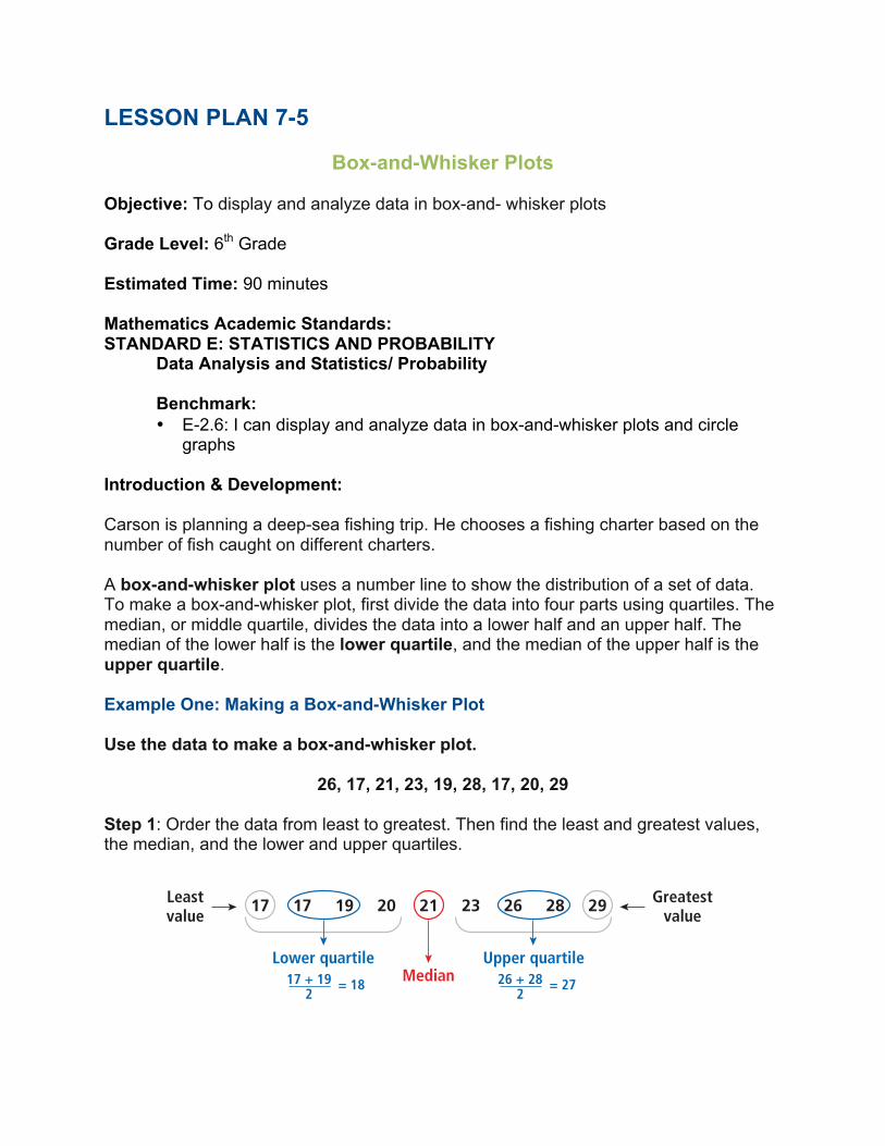
Introduction & Development: Carson is planning a deep-sea fishing trip. He chooses a fishing charter based on the number of fish caught on different charters. A box-and-whisker plot uses a number line to show the distribution of a set of data. To make a box-and-whisker plot, first divide the data into four parts using quartiles. The median, or middle quartile, divides the data into a lower half and an upper half. The median of the lower half is the lower quartile, and the median of the upper half is the upper quartile. Example One: Making a Box-and-Whisker Plot Use the data to make a box-and-whisker plot.
26, 17, 21, 23, 19, 28, 17, 20, 29
Step 1: Order the data from least to greatest. Then find the least and greatest values, the median, and the lower and upper quartiles.
Learn to display andanalyze data in box-and-whisker plots.
Vocabulary
interquartile range
upper quartile
lower quartile
box-and-whisker plot
Carson is planning a deep-sea fishing trip. He chooses a fishing charter based on the number of fish caught on different charters.
A uses a number line to show the distribution of a set of data.
To make a box-and-whisker plot, first divide the data into four parts using quartiles. The median, or middle quartile,divides the data into a lower half and an upper half. The median of the lower half is the , and the median of the upper half is the .
Making a Box-and-Whisker Plot
Use the data to make a box-and-whisker plot.
26, 17, 21, 23, 19, 28, 17, 20, 29
Step 1: Order the data from least to greatest. Then find the least and greatest values, the median, and the lower and upperquartiles.
Step 2: Draw a number line. Above the number line, plot a point foreach value in Step 1.
Step 3: Draw a box from the lower to the upper quartile. Inside thebox, draw a vertical line through the median. Then draw the“whiskers” from the box to the least and greatest values.
upper quartilelower quartile
box-and-whisker plot
15 20 25 3010
17Leastvalue
Greatestvalue
Lower quartileMedian
Upper quartile
17 19 20 21 23 26 28 29
= 1817 + 192
= 2726 + 282
394 Chapter 7 Collecting, Displaying, and Analyzing Data
7-5 Box-and-Whisker Plots
15 20 25 3010
E X A M P L E 1
To find the median of a data set with aneven number ofvalues, find the meanof the two middlevalues.

Step 2: Draw a number line. Above the number line, plot a point for each value in Step 1.
Step 3: Draw a box from the lower to the upper quartile. Inside the box, draw a vertical line through the median. Then draw the “whiskers” from the box to the least and greatest values.
The interquartile range of a data set is the difference between the lower and upper quartiles. It tells how large the spread of data around the median is. You can use a box-and-whisker plot to analyze how data in a set are distributed. You can also use box-and-whisker plots to help you compare two sets of data. Example Two: Comparing Box-and-Whisker Plots The box-and-whisker plots below show the distribution of the number of fish caught per trip by two fishing charters.
Which fishing charter has a greater median?
The median number of fish caught on Reel-to-Reel Charters, about 54, is greater
Learn to display andanalyze data in box-and-whisker plots.
Vocabulary
interquartile range
upper quartile
lower quartile
box-and-whisker plot
Carson is planning a deep-sea fishing trip. He chooses a fishing charter based on the number of fish caught on different charters.
A uses a number line to show the distribution of a set of data.
To make a box-and-whisker plot, first divide the data into four parts using quartiles. The median, or middle quartile,divides the data into a lower half and an upper half. The median of the lower half is the , and the median of the upper half is the .
Making a Box-and-Whisker Plot
Use the data to make a box-and-whisker plot.
26, 17, 21, 23, 19, 28, 17, 20, 29
Step 1: Order the data from least to greatest. Then find the least and greatest values, the median, and the lower and upperquartiles.
Step 2: Draw a number line. Above the number line, plot a point foreach value in Step 1.
Step 3: Draw a box from the lower to the upper quartile. Inside thebox, draw a vertical line through the median. Then draw the“whiskers” from the box to the least and greatest values.
upper quartilelower quartile
box-and-whisker plot
15 20 25 3010
17Leastvalue
Greatestvalue
Lower quartileMedian
Upper quartile
17 19 20 21 23 26 28 29
= 1817 + 192
= 2726 + 282
394 Chapter 7 Collecting, Displaying, and Analyzing Data
7-5 Box-and-Whisker Plots
15 20 25 3010
E X A M P L E 1
To find the median of a data set with aneven number ofvalues, find the meanof the two middlevalues.
The of a data set is the difference between thelower and upper quartiles. It tells how large the spread of data aroundthe median is.
You can use a box-and-whisker plot to analyze how data in a set aredistributed. You can also use box-and-whisker plots to help you comparetwo sets of data.
Comparing Box-and-Whisker Plots
The box-and-whisker plots below show the distribution of thenumber of fish caught per trip by two fishing charters.
Which fishing charter has a greater median?The median number of fish caught on Reel-to-Reel Charters,about 54, is greater than the median number of fish caughton Mud Puppy Charters, about 51.
Which fishing charter has a greater interquartile range?The length of the box in a box-and-whisker plot indicates theinterquartile range. Reel-to-Reel Charters has a longer box, soit has a greater interquartile range.
Which fishing charter appears to be more predictable in thenumber of fish that might be caught on a fishing trip?The range and interquartile range are smaller for Mud PuppyCharters, which means that there is less variation in the data.So the number of fish caught on Mud Puppy Charters is morepredictable.
interquartile range
Think and Discuss
1. Describe what you can tell about a data set from abox-and-whisker plot.
2. Explain how the range and the interquartile range ofa set of data are different. Which measure tells you moreabout central tendency?
2E X A M P L E
20 30 40 50 60 70 80
= Reel-to-Reel Charters
= Mud Puppy Charters
Number of fish
7-5 Box-and-Whisker Plots 395
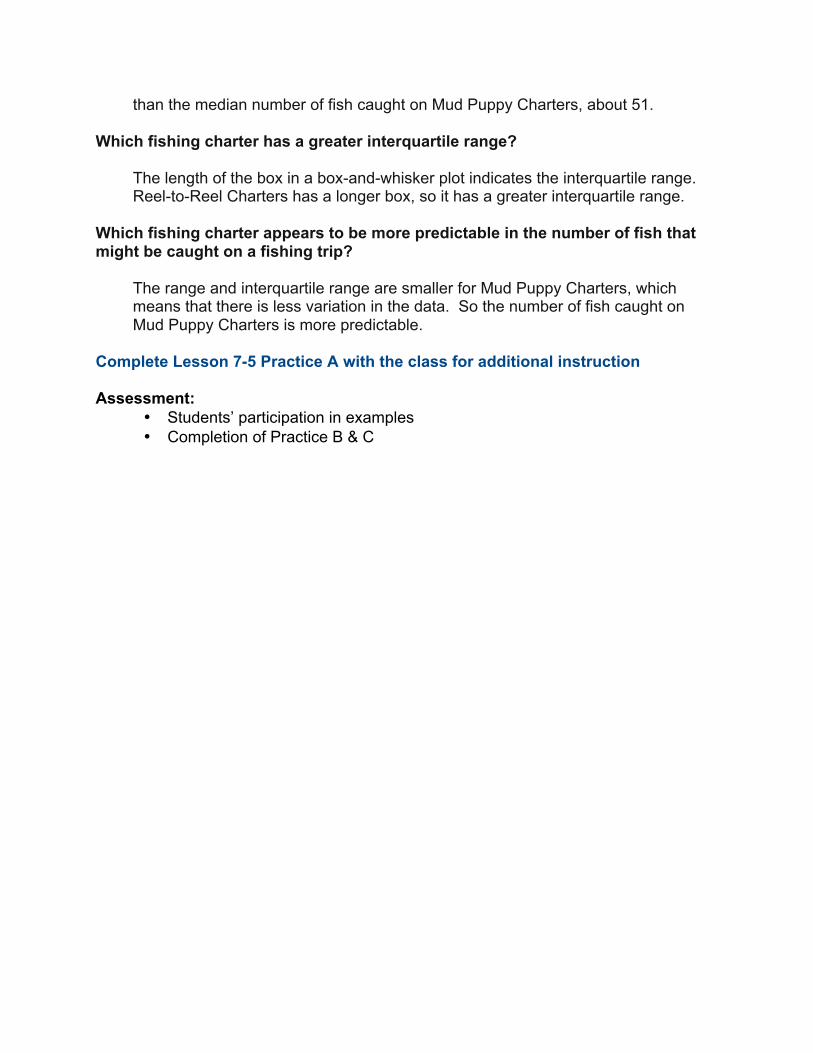
than the median number of fish caught on Mud Puppy Charters, about 51. Which fishing charter has a greater interquartile range?
The length of the box in a box-and-whisker plot indicates the interquartile range. Reel-to-Reel Charters has a longer box, so it has a greater interquartile range.
Which fishing charter appears to be more predictable in the number of fish that might be caught on a fishing trip?
The range and interquartile range are smaller for Mud Puppy Charters, which means that there is less variation in the data. So the number of fish caught on Mud Puppy Charters is more predictable.
Complete Lesson 7-5 Practice A with the class for additional instruction Assessment:
• Students’ participation in examples • Completion of Practice B & C
LESSON PLAN 7-6
Line Graphs Objective: To display and analyze data in line graphs Grade Level: 6th Grade Estimated Time: 90 minutes Mathematics Academic Standards: STANDARD E: STATISTICS AND PROBABILITY
Data Analysis and Statistics/ Probability Benchmark:
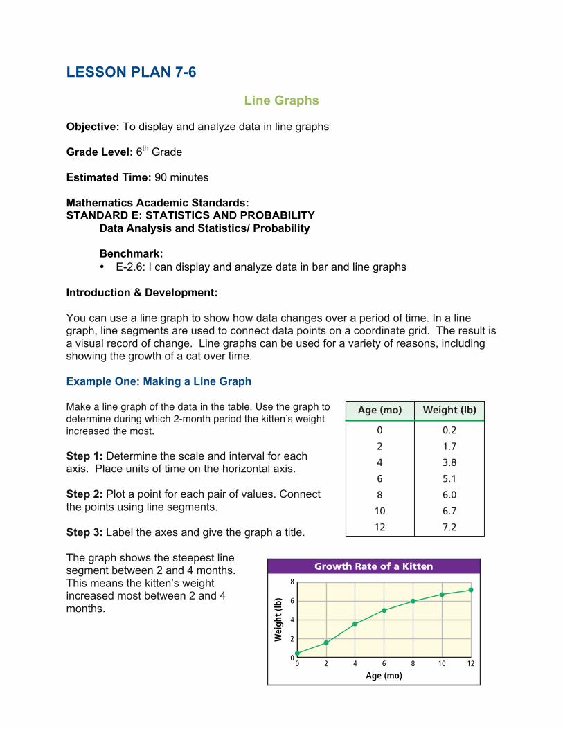
• E-2.6: I can display and analyze data in bar and line graphs Introduction & Development: You can use a line graph to show how data changes over a period of time. In a line graph, line segments are used to connect data points on a coordinate grid. The result is a visual record of change. Line graphs can be used for a variety of reasons, including showing the growth of a cat over time. Example One: Making a Line Graph Make a line graph of the data in the table. Use the graph to determine during which 2-month period the kitten’s weight increased the most. Step 1: Determine the scale and interval for each axis. Place units of time on the horizontal axis. Step 2: Plot a point for each pair of values. Connect the points using line segments. Step 3: Label the axes and give the graph a title. The graph shows the steepest line segment between 2 and 4 months. This means the kitten’s weight increased most between 2 and 4 months.
Learn to display andanalyze data in linegraphs.
Vocabulary
double-line graph
line graph
To plot each point,start at zero. Moveright for the timeand up for theweight.
7-6 Line Graphs
402 Chapter 7 Collecting, Displaying, and Analyzing Data
E X A M P L E 1
You can use a line graph to show how data changes over a period of time. In a
, line segments are used to connect data points on a coordinate grid. The result is a visual record of change.
Line graphs can be used for a variety of reasons, including showing the growth of a cat over time.
Making a Line Graph
Make a line graph of the data in the table. Use the graph todetermine during which 2-monthperiod the kitten’s weightincreased the most.
Step 1: Determine the scale andinterval for each axis. Place units of time on the horizontal axis.
Step 2: Plot a point for each pair of values. Connect the points using line segments.
Step 3: Label the axes and give the graph a title.
The graph shows the steepest line segment between 2 and 4 months.This means the kitten’s weight increased most between 2 and 4 months.
line graph
Age (mo) Weight (lb)
0 0.2
2 1.7
4 3.8
6 5.1
8 6.0
10 6.7
12 7.2
Growth Rate of a Kitten8
6
4
2
02 40 6 8 10 12
Wei
ght (
lb)
Age (mo)
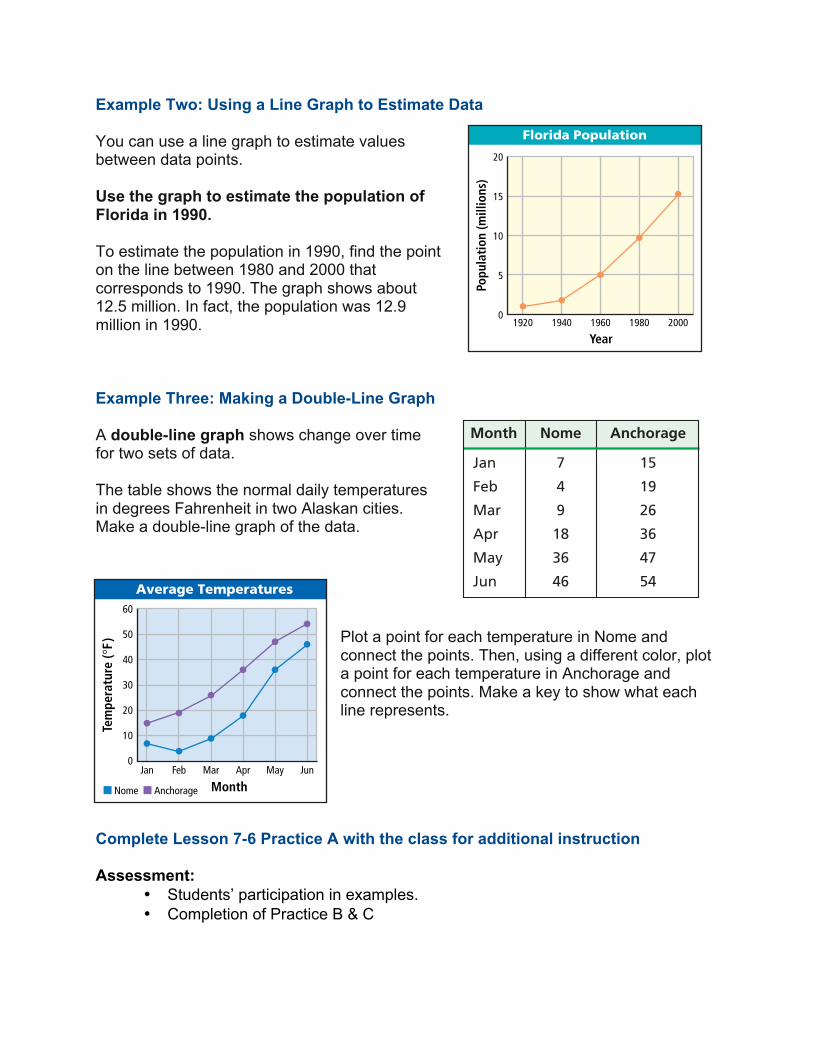
Example Two: Using a Line Graph to Estimate Data You can use a line graph to estimate values between data points. Use the graph to estimate the population of Florida in 1990. To estimate the population in 1990, find the point on the line between 1980 and 2000 that corresponds to 1990. The graph shows about 12.5 million. In fact, the population was 12.9 million in 1990. Example Three: Making a Double-Line Graph A double-line graph shows change over time for two sets of data. The table shows the normal daily temperatures in degrees Fahrenheit in two Alaskan cities. Make a double-line graph of the data.
Plot a point for each temperature in Nome and connect the points. Then, using a different color, plot a point for each temperature in Anchorage and connect the points. Make a key to show what each line represents.
Complete Lesson 7-6 Practice A with the class for additional instruction Assessment:
• Students’ participation in examples. • Completion of Practice B & C
You can use a line graph to estimate values between data points.
Using a Line Graph toEstimate Data
Use the graph to estimate thepopulation of Florida in 1990.To estimate the population in1990, find the point on the linebetween 1980 and 2000 thatcorresponds to 1990.The graph shows about 12.5 million. In fact, thepopulation was 12.9 million in 1990.
A shows change over time for two sets of data.
Making a Double-Line Graph
The table shows the normal daily temperatures in degrees Fahrenheit in two Alaskan cities. Make adouble-line graph of the data.
Plot a point for eachtemperature in Nome andconnect the points. Then,using a different color, plot a point for eachtemperature in Anchorageand connect the points.Make a key to show whateach line represents.
double-line graph
Florida Population
20
15
10
5
01920 1940 1960 1980 2000
Popu
latio
n (m
illio
ns)
Year
Month Nome Anchorage
Jan 7 15
Feb 4 19
Mar 9 26
Apr 18 36
May 36 47
Jun 46 54Average Temperatures
60
50
40
30
20
10
0Jan
Nome
Feb Mar Apr May Jun
Tem
pera
ture
( °F)
MonthAnchorage
Anchorage
Nome
Russia
CanadaAlaska
Gulf of Alaska
Think and Discuss
1. Describe how a line graph would look for a set of data thatincreases and then decreases over time.
2. Give an example of a situation that can be described by a double-line graph in which the two sets of data intersect at least once.
2E X A M P L E
E X A M P L E 3
7-6 Line Graphs 403
LESSON PLAN 7-7
Misleading Graphs Objective: To identify and analyze misleading graphs Grade Level: 6th Grade Estimated Time: 90 minutes Mathematics Academic Standards: STANDARD E: STATISTICS AND PROBABILITY
Data Analysis and Statistics/ Probability Benchmark:
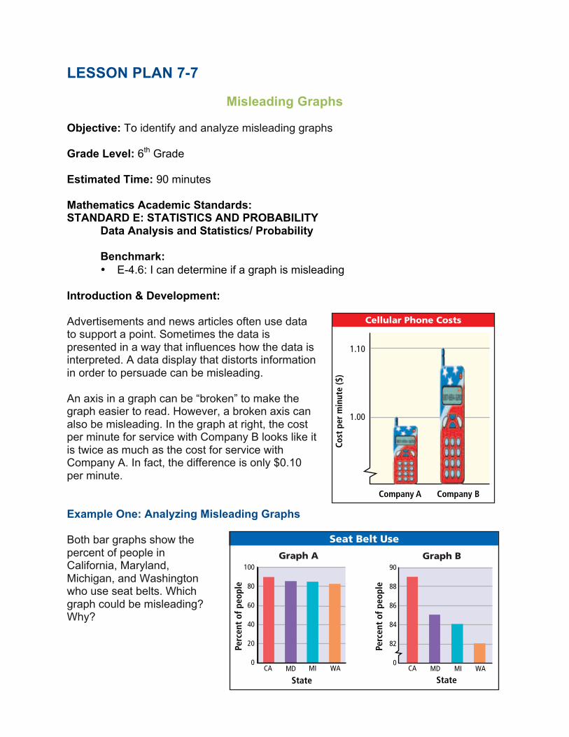
• E-4.6: I can determine if a graph is misleading Introduction & Development: Advertisements and news articles often use data to support a point. Sometimes the data is presented in a way that influences how the data is interpreted. A data display that distorts information in order to persuade can be misleading. An axis in a graph can be “broken” to make the graph easier to read. However, a broken axis can also be misleading. In the graph at right, the cost per minute for service with Company B looks like it is twice as much as the cost for service with Company A. In fact, the difference is only $0.10 per minute. Example One: Analyzing Misleading Graphs Both bar graphs show the percent of people in California, Maryland, Michigan, and Washington who use seat belts. Which graph could be misleading? Why?
Learn to identify andanalyze misleadinggraphs.
Advertisements and news articlesoften use data to support a point.Sometimes the data is presented ina way that influences how the datais interpreted. A data display thatdistorts information in order topersuade can be misleading.
An axis in a graph can be “broken”to make the graph easier to read.However, a broken axis can also bemisleading. In the graph at right,the cost per minute for service withCompany B looks like it is twice asmuch as the cost for service withCompany A. In fact, the differenceis only $0.10 per minute.
Social Studies Application
Both bar graphs show the percent of people in California,Maryland, Michigan, and Washington who use seat belts. Whichgraph could be misleading? Why?
Graph B could be misleading. Because the vertical axis on graph B isbroken, it appears that the percent of people in California who wearseat belts is twice as great as the percent in Michigan. In fact, it isonly 5% greater. People might conclude from graph B that the percentof people in California who wear seat belts is much greater than thepercents in the other states.
Cellular Phone Costs
1.10
1.00
Cost
per
min
ute
($)
Company A Company B
100
80
60
40
20
0CA MD WAMI
State
90
88
86
84
82
0CA MD WAMI
State
Seat Belt Use
Graph A Graph B
Perc
ent o
f peo
ple
Perc
ent o
f peo
ple
E X A M P L E 1
422 Chapter 7 Collecting, Displaying, and Analyzing Data
7-10 Misleading GraphsLearn to identify andanalyze misleadinggraphs.
Advertisements and news articlesoften use data to support a point.Sometimes the data is presented ina way that influences how the datais interpreted. A data display thatdistorts information in order topersuade can be misleading.
An axis in a graph can be “broken”to make the graph easier to read.However, a broken axis can also bemisleading. In the graph at right,the cost per minute for service withCompany B looks like it is twice asmuch as the cost for service withCompany A. In fact, the differenceis only $0.10 per minute.
Social Studies Application
Both bar graphs show the percent of people in California,Maryland, Michigan, and Washington who use seat belts. Whichgraph could be misleading? Why?
Graph B could be misleading. Because the vertical axis on graph B isbroken, it appears that the percent of people in California who wearseat belts is twice as great as the percent in Michigan. In fact, it isonly 5% greater. People might conclude from graph B that the percentof people in California who wear seat belts is much greater than thepercents in the other states.
Cellular Phone Costs
1.10
1.00
Cost
per
min
ute
($)
Company A Company B
100
80
60
40
20
0CA MD WAMI
State
90
88
86
84
82
0CA MD WAMI
State
Seat Belt Use
Graph A Graph B
Perc
ent o
f peo
ple
Perc
ent o
f peo
ple
E X A M P L E 1
422 Chapter 7 Collecting, Displaying, and Analyzing Data
7-10 Misleading Graphs
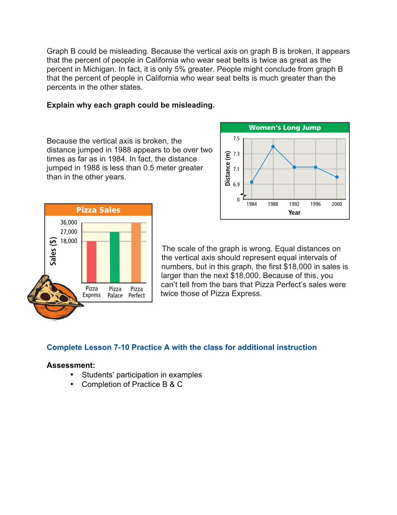
Graph B could be misleading. Because the vertical axis on graph B is broken, it appears that the percent of people in California who wear seat belts is twice as great as the percent in Michigan. In fact, it is only 5% greater. People might conclude from graph B that the percent of people in California who wear seat belts is much greater than the percents in the other states. Explain why each graph could be misleading.
Because the vertical axis is broken, the distance jumped in 1988 appears to be over two times as far as in 1984. In fact, the distance jumped in 1988 is less than 0.5 meter greater than in the other years.
The scale of the graph is wrong. Equal distances on the vertical axis should represent equal intervals of numbers, but in this graph, the first $18,000 in sales is larger than the next $18,000. Because of this, you can’t tell from the bars that Pizza Perfect’s sales were twice those of Pizza Express.
Complete Lesson 7-10 Practice A with the class for additional instruction Assessment:
• Students’ participation in examples • Completion of Practice B & C
Analyzing Misleading Graphs
Explain why each graph could be misleading.
Because the vertical axis is broken, the distance jumped in 1988appears to be over two times as far as in 1984. In fact, the distance jumped in 1988 is less than 0.5 meter greater than in the other years.
The scale of the graph is wrong. Equal distances on the verticalaxis should represent equal intervals of numbers, but in thisgraph, the first $18,000 in sales is larger than the next $18,000.Because of this, you can’t tell from the bars that Pizza Perfect’s saleswere twice those of Pizza Express.
36,00027,00018,000
Sale
s ($
)
Pizza Sales
PizzaExpress
PizzaPalace
PizzaPerfect
Women‘s Long Jump
Dis
tanc
e (m
)
Year
7.5
7.3
7.1
6.9
01984 1988 1992 1996 2000
Think and Discuss
1. Explain how to use the scale of a graph to decide if the graph ismisleading.
2. Describe what might indicate that a graph is misleading.
3. Give an example of a situation in which a misleading graphmight be used to persuade readers.
2E X A M P L E
7-10 Misleading Graphs 423

LESSON PLAN 7-8
Using Technology to Display Data Lab Objective: To identify and analyze misleading graphs Grade Level: 6th Grade Estimated Time: 90 minutes Mathematics Academic Standards: STANDARD E: STATISTICS AND PROBABILITY
Data Analysis and Statistics/ Probability Benchmark:
• E-2.6: I can display and analyze data in bar and line graphs. I can display and analyze data in box-and-whisker plots and circle graphs.
Information and Technology Standards: STANDARD A: MEDIA AND TECHNOLOGY
Benchmark: • A2-3: Students use a computer and productivity software to organize and
create information including hyperlinks, graphics, pictures, images, and/or charts
Introduction & Development: There are several ways to display data, including bar graphs, line graphs, and circle graphs. A spreadsheet provides a quick way to create these graphs. Today you will use Microsoft Excel to enter data and create various types of displays. Activity One Use a spreadsheet to display the Kennedy Middle School Student Council budget shown in the table at right.
Step 1: Open the spreadsheet program, and enter the data as shown below. Enter the activities in column A and the amount budgeted in column B. Include the column titles in row 1.
Use Technology to Display Data
Use after Lesson 7-6
7-6
There are several ways to display data, including bar graphs, line graphs, and circle graphs. A spreadsheet provides a quick way to create these graphs.
Use a spreadsheet to display the Kennedy Middle School Student Council budget shown in the table at right.
Open the spreadsheet program, and enter the data asshown below. Enter the activities in column A and theamount budgeted in column B. Include the column titles in row 1.
Highlight the data byclicking on cell A1 anddragging the cursor tocell B6. Click the ChartWizard icon . Thenclick FINISH to choosethe first type of columngraph.
Activity
KEYWORD: MS7 Lab7
Student Council Budget
Activity Amount ($)
Assemblies 275
Dances 587
Spring Festival 412
Awards Banquet 384
Other 250
406 Chapter 7 Collecting, Displaying, and Analyzing Data
1
2
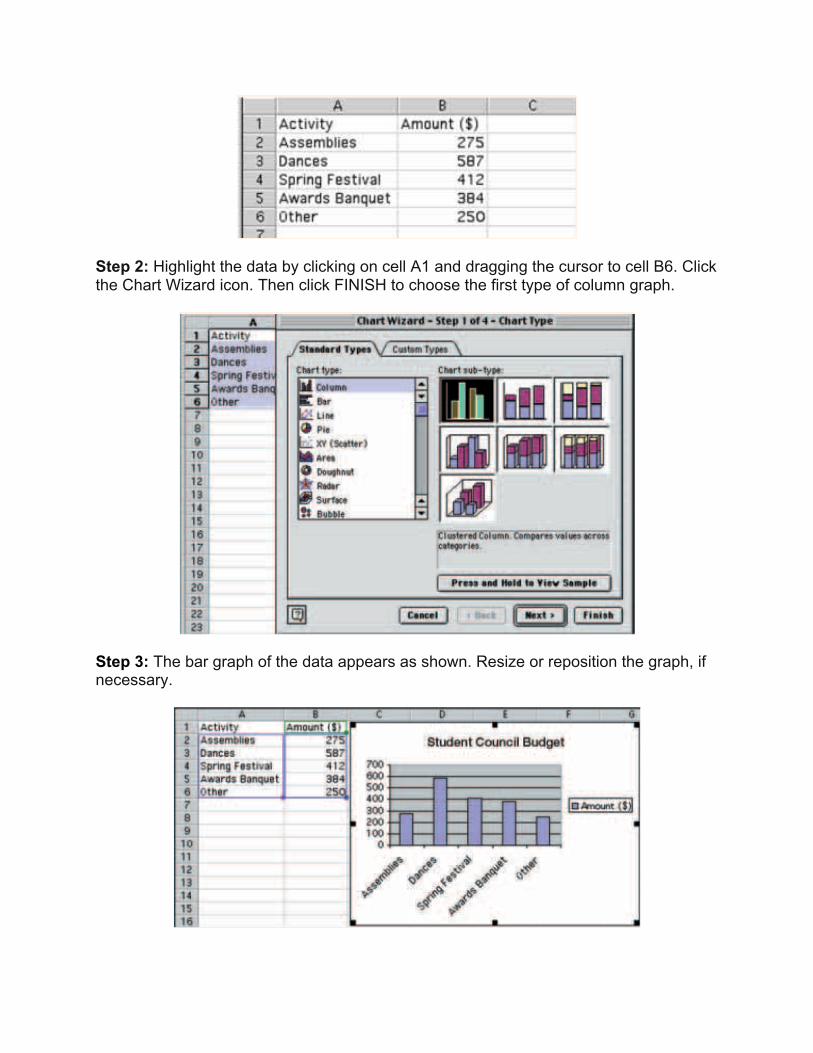
Step 2: Highlight the data by clicking on cell A1 and dragging the cursor to cell B6. Click the Chart Wizard icon. Then click FINISH to choose the first type of column graph.
Step 3: The bar graph of the data appears as shown. Resize or reposition the graph, if necessary.
Use Technology to Display Data
Use after Lesson 7-6
7-6
There are several ways to display data, including bar graphs, line graphs, and circle graphs. A spreadsheet provides a quick way to create these graphs.
Use a spreadsheet to display the Kennedy Middle School Student Council budget shown in the table at right.
Open the spreadsheet program, and enter the data asshown below. Enter the activities in column A and theamount budgeted in column B. Include the column titles in row 1.
Highlight the data byclicking on cell A1 anddragging the cursor tocell B6. Click the ChartWizard icon . Thenclick FINISH to choosethe first type of columngraph.
Activity
KEYWORD: MS7 Lab7
Student Council Budget
Activity Amount ($)
Assemblies 275
Dances 587
Spring Festival 412
Awards Banquet 384
Other 250
406 Chapter 7 Collecting, Displaying, and Analyzing Data
1
2
The bar graph of the data appears as shown. Resize or reposition thegraph, if necessary.
To see a circle graph of the data, select the bar graph (as shown above).Click the Chart Wizard icon and choose “Pie,” which is the circle graph.Then click FINISH to choose the first type of circle graph.
1. Which graph best displays the Student Council budget? Why?
2. Would a line graph be an appropriate display of the Student Council budget data? Explain.
1. The table shows the number of points scored by members of a girls’ basketball team in one season. Use a spreadsheet to create a bar graph and a circle graph of the data.
2. Which type of graph is a better display of the data? Why?
Think and Discuss
Try This
Player Ana Angel Mary Nia Tina Zoe
Points Scored 201 145 89 40 21 8
7-6 Technology Lab 407
3

To see a circle graph of the data, select the bar graph (as shown above). Click the Chart Wizard icon and choose “Pie,” which is the circle graph. Then click FINISH to choose the first type of circle graph.
1. Which graph best displays the Student Council budget? Why?
2. Would a line graph be an appropriate display of the Student Council budget data? Explain.
Activity Two
1. The table shows the number of points scored by members of a girls’ basketball team in one season. Use a spreadsheet to create a bar graph and a circle graph of the data.
2. Which type of graph is a better display of the data? Why? Assessment:
• Students completion and correctness of the activity
The bar graph of the data appears as shown. Resize or reposition thegraph, if necessary.
To see a circle graph of the data, select the bar graph (as shown above).Click the Chart Wizard icon and choose “Pie,” which is the circle graph.Then click FINISH to choose the first type of circle graph.
1. Which graph best displays the Student Council budget? Why?
2. Would a line graph be an appropriate display of the Student Council budget data? Explain.
1. The table shows the number of points scored by members of a girls’ basketball team in one season. Use a spreadsheet to create a bar graph and a circle graph of the data.
2. Which type of graph is a better display of the data? Why?
Think and Discuss
Try This
Player Ana Angel Mary Nia Tina Zoe
Points Scored 201 145 89 40 21 8
7-6 Technology Lab 407
3The bar graph of the data appears as shown. Resize or reposition thegraph, if necessary.
To see a circle graph of the data, select the bar graph (as shown above).Click the Chart Wizard icon and choose “Pie,” which is the circle graph.Then click FINISH to choose the first type of circle graph.
1. Which graph best displays the Student Council budget? Why?
2. Would a line graph be an appropriate display of the Student Council budget data? Explain.
1. The table shows the number of points scored by members of a girls’ basketball team in one season. Use a spreadsheet to create a bar graph and a circle graph of the data.
2. Which type of graph is a better display of the data? Why?
Think and Discuss
Try This
Player Ana Angel Mary Nia Tina Zoe
Points Scored 201 145 89 40 21 8
7-6 Technology Lab 407
3


