Brand Guidelines Updated October 2015
{ Excerpt }
About the Canadian Breast Cancer FoundationBrand Management and Governance
Logo Design Elements
Canadian Breast Cancer Foundation Brand Guidelines
Table of Contents
About the Canadian Breast Cancer Foundation 3
Brand Management and Governance
Language,Terminology and Key Messages 5
Logo Design Elements
Foundation Logo 6 Foundation Logo Colours, Space, & Size 8 Typography 10 Improper Foundation Logo Use 12
Canadian Breast Cancer Foundation Brand Guidelines
The Brand Standards Guide
The Canadian Breast Cancer Foundation brand is the essence of our vision, mission and values. As a leadership voice dedicated to creating a future without breast cancer, the Foundation is responsible for clearly and consistently communicating our vision through a unified, strategic approach. This strategic direction reinforces the Foundation’s identity internally, externally and in all aspects of the work we do. Our brand is one of the Foundation’s most valuable assets. Communicating and protecting the brand consistently is the responsibility of all. From the look and feel of our communications and publications to the overall message we present to our stakeholders, our brand is strengthened by each solid, consistent application.
This guide outlines standards for the Foundation’s community of users – employees, volunteers, partners and sponsors. Respect for and adherence to these standards will ensure the brand continues to be protected, growing its value and building strength in the marketplace. As the Foundation continues to build its brand presence, this document will continue to evolve with an annual review and update process.
Why a Strong Brand is Important
A brand instills its core promise to itself, employees, volunteers, donors, strategic partners and, most importantly, its benefactors to create a uniquely valued set of experiences.
Behind every successful brand lies a clearly defined organizational vision that is consistently expressed through the organization’s external communications and internal operational processes.
A strong brand is crucial to an organization’s identity in the marketplace to build support, strengthen involvement and enhance the organization’s executions.
A brand promise is embodied in everything you do and say.
About the Canadian Breast Cancer Foundation | 4
Canadian Breast Cancer Foundation Brand Guidelines
About the Canadian Breast Cancer Foundation
The Canadian Breast Cancer Foundation is the leading community driven organization in Canada dedicated to creating a future without breast cancer. Our investments in innovative and relevant research and education have led to progress in breast cancer prevention, diagnosis, treatment and care. Since 1986, we have been at the forefront of a nationwide movement supporting and advocating for the breast cancer community.
Addressing the needs of Canadians from coast to coast, the Canadian Breast Cancer Foundation has offices in British Columbia/Yukon, Prairies/NWT, Ontario and the Atlantic Regions. The Foundation’s Central Office is located in Toronto.
Vision:
Creating a future without breast cancer | Créer un avenir sans cancer du sein
Mission:
The Canadian Breast Cancer Foundation is Canada’s leading community-driven breast cancer charity dedicated to:
• funding relevant and innovative research and
• supporting and advocating for the breast cancer community.
La Fondation canadienne du cancer du sein est le principal organisme caritatif canadien qui se consacre, sous l’impulsion de la communauté, à lutter contre le cancer du sein :
• en finançant des travaux de recherche pertinents et novateurs ;
• en appuyant la communauté du cancer du sein et en défendant ses intérêts.
Values: The Canadian Breast Cancer Foundation is committed to advancing its vision and undertaking its work with:
PassionWe are passionate about the work we do and the role we play in advocating for the breast cancer community. Our dedication to the cause inspires us to work effectively and continuously evolve to achieve the greatest impact.
IntegrityWe are ethical, accountable and transparent in the work we do. We are continually striving to ensure that donors and the public can remain confident that their dollars are used wisely in carrying out our vision.
RespectWe promote trust, collaboration and open communication to help create a positive community that maximizes the potential of all individuals. We strive to create an environment where problem solving and feedback are encouraged and valued.
LeadershipWe are committed to serving as a trusted leader in the breast cancer community. As a resource in the areas of breast health and breast cancer, our positions will always be informed, evidence-based and forward-thinking.
CommunityWe recognize the invaluable contribution of our volunteers; whose dedication, support and commitment makes our work possible. Founded by a group of dedicated volunteers, we remain community-driven to this day.
ImpactWe fund research and undertake initiatives that have the greatest impact and benefit for the breast cancer community. We are dedicated to leading the way in support of our vision of creating a future without breast cancer.
To reference our values in French please visit cbcf.org
Brand Management and Governance | 5
Canadian Breast Cancer Foundation Brand Guidelines
Language, Terminology and Key Messages
Language and Tone Guiding Principles
How we talk about ourselves at the Canadian Breast Cancer Foundation is an important part of our brand; we want to proactively manage communications to remain clear and consistent for the benefit of all stakeholders.
To communicate our impact, share stories and highlight the work we do, the language and tone used is one of inspiration, spoken as a Pan-Canadian leader in funding relevant and innovative breast cancer research, education and health promotion initiatives. We do not apply such phrases as ‘the fight against breast cancer’ and instead use ‘creating a future without breast cancer.’ To embody our inspirational voice as a national leader in the breast cancer cause, we do not use statements referencing those ‘battling’ or ‘suffering’ from breast cancer, and instead reference those ‘living with breast cancer,’ ‘affected by breast cancer,’ or ‘improving quality of life for those affected by breast cancer.’ Consistency in language and tone is as important to our brand as the graphic and visual elements. All communications should be concise, clear and straightforward especially when sharing often complex and detailed references to the work we do.
Foundation Terminology
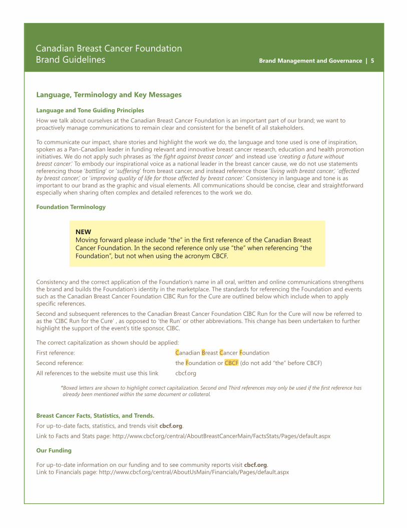
Consistency and the correct application of the Foundation’s name in all oral, written and online communications strengthens the brand and builds the Foundation’s identity in the marketplace. The standards for referencing the Foundation and events such as the Canadian Breast Cancer Foundation CIBC Run for the Cure are outlined below which include when to apply specific references.
Second and subsequent references to the Canadian Breast Cancer Foundation CIBC Run for the Cure will now be referred to as the ’CIBC Run for the Cure’ , as opposed to ‘the Run’ or other abbreviations. This change has been undertaken to further highlight the support of the event’s title sponsor, CIBC.
The correct capitalization as shown should be applied:
First reference: Canadian Breast Cancer Foundation
Second reference: the Foundation or CBCF (do not add “the” before CBCF)
All references to the website must use this link cbcf.org
* Boxed letters are shown to highlight correct capitalization. Second and Third references may only be used if the first reference has already been mentioned within the same document or collateral.
Breast Cancer Facts, Statistics, and Trends.
For up-to-date facts, statistics, and trends visit cbcf.org.
Link to Facts and Stats page: http://www.cbcf.org/central/AboutBreastCancerMain/FactsStats/Pages/default.aspx
Our Funding
For up-to-date information on our funding and to see community reports visit cbcf.org.Link to Financials page: http://www.cbcf.org/central/AboutUsMain/Financials/Pages/default.aspx
NEWMoving forward please include “the” in the first reference of the Canadian Breast Cancer Foundation. In the second reference only use “the” when referencing “the Foundation”, but not when using the acronym CBCF.
Logo Design Elements | 6
Canadian Breast Cancer Foundation Brand Guidelines
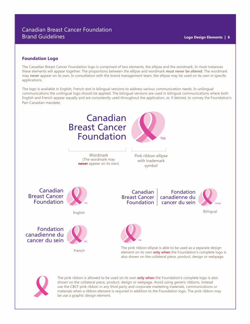
Foundation Logo
The Canadian Breast Cancer Foundation logo is comprised of two elements, the ellipse and the wordmark. In most instances these elements will appear together. The proportions between the ellipse and wordmark must never be altered. The wordmark may never appear on its own. In consultation with the brand management team, the ellipse may be used on its own in specific applications.
The logo is available in English, French and in bilingual versions to address various communication needs. In unilingual communications the unilingual logo should be applied. The bilingual versions are used in bilingual communications where both English and French appear equally and are consistently used throughout the application, or, if desired, to convey the Foundation’s Pan-Canadian mandate.
Pink ribbon ellipse with trademark
symbol
Wordmark(The wordmark may
never appear on its own)
English
French
Bilingual
The pink ribbon ellipse is able to be used as a separate design element on its own only when the Foundation’s complete logo is also shown on the collateral piece, product, design or webpage.
The pink ribbon is allowed to be used on its own only when the Foundation’s complete logo is also shown on the collateral piece, product, design or webpage. Avoid using generic ribbons, instead use the CBCF pink ribbon in any third party and corporate marketing materials, communications or materials when a ribbon element is required in addition to the Foundation logo. The pink ribbon may be use a graphic design element.
Logo Design Elements | 7
Canadian Breast Cancer Foundation Brand Guidelines
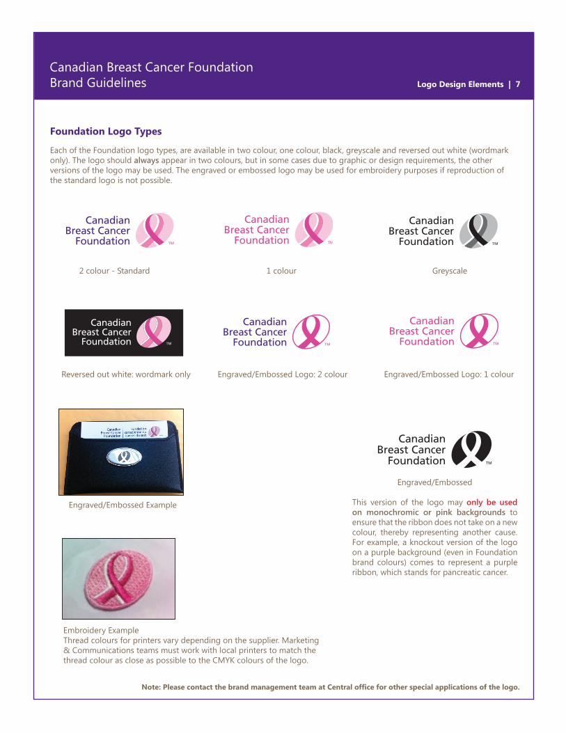
Foundation Logo Types
Each of the Foundation logo types, are available in two colour, one colour, black, greyscale and reversed out white (wordmark only). The logo should always appear in two colours, but in some cases due to graphic or design requirements, the other versions of the logo may be used. The engraved or embossed logo may be used for embroidery purposes if reproduction of the standard logo is not possible.
Note: Please contact the brand management team at Central office for other special applications of the logo.
2 colour - Standard 1 colour
Reversed out white: wordmark only
Greyscale
Engraved/Embossed Logo: 2 colour Engraved/Embossed Logo: 1 colour
Engraved/Embossed
This version of the logo may only be used on monochromic or pink backgrounds to ensure that the ribbon does not take on a new colour, thereby representing another cause. For example, a knockout version of the logo on a purple background (even in Foundation brand colours) comes to represent a purple ribbon, which stands for pancreatic cancer.
Embroidery Example Thread colours for printers vary depending on the supplier. Marketing & Communications teams must work with local printers to match the thread colour as close as possible to the CMYK colours of the logo.
Engraved/Embossed Example
Logo Design Elements | 8
Canadian Breast Cancer Foundation Brand Guidelines
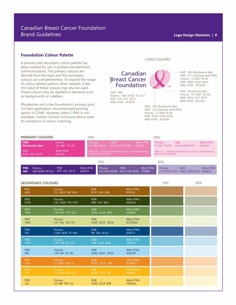
Foundation Colour Palette
A primary and secondary colour palette has been created for use in printed and electronic communications. The primary colours are derived from the logo and the secondary colours are complementary. To expand the range of colour palette options when needed, a two tint value of these colours may also be used. These colours may be applied to elements such as backgrounds or sidebars.
Rhodamine red is the Foundation’s primary pink. For best application, recommended printing option is CYMK. However, when CYMK is not available, contact Central Communications team for assistance in colour matching.
PRIMARY COLOURS 70%
70%
30%
30%
PMS Rhodamine Red
Process C9 M87 Y0 K0
Process C2 M62 Y0 K0
PMS 224 - Optional Solid PMS (in case a % of Rhodamine Red can’t be printed)
PMS 217 - Optional Solid PMS (in case a % of Rhodamine Red can’t be printed)
Process C57 M70 Y0 K8
Process C25 M30 Y0 K4
Process C1 M27 Y0 K0
RGB R224 G17 B157
RGB R236 G130 B180
RGB R117 G91 B158
RGB R181 G168 B206
RGB R246 G198 B221
Web HTML E0119D
Web HTML EC82B4
Web HTML 755B9E
Web HTML B5A8CE
Web HTML F6C6DD
Process C86 M100 Y0 K12
RGB R79 G17 B172
Web HTML 4F2D7F
PMS268
Process C52 M28 Y74 K74
RGB R64 G74 B41
Web HTML 404A29
PMS 5743
Process C13 M53 Y68 K40
RGB R147 G94 B58
Web HTML 935E3A
PMS 4635
Process C54 M7 Y79 K21
RGB R106 G150 B59
Web HTML 6A963B
PMS 7490
Process C100 M58 Y9 K42
RGB R0 G63 B114
Web HTML 003F72
PMS 541
Process C76 M6 Y8 K15
RGB R48 G149 B180
Web HTML 3095B4
PMS 7459
Process C1 M62 Y95 K2
RGB R212 G123 B34
Web HTML D47BB22
PMS 7413
Process C0 M30 Y100 K0
RGB R240 G171 B0
Web HTML F0AB00
PMS 130
Process C0 M8 Y69 K3
RGB R250 G218 B99
Web HTML FADA63
PMS 121
Process C36 M3 Y0 K0
RGB R160 G207 B235
Web HTML A0CFEB
PMS 291
Process C17 M1 Y45 K3
RGB R199 G210 B138
Web HTML EC7D28A
PMS 7492
30%SECONDARY COLOURS 70%
PMS : 70% Rhodamine RedPMS : 224 (Optional solid PMS)Process : C2 M62 Y0 K0RGB : R236 G130 B180Web HTML : EC82B4
PMS : 268Process : C86 M100 Y0 K12RGB : R79 G17 B172Web HTML : 4F2D7F
PMS : 30% Rhodamine RedPMS : 217 (Optional solid PMS)Process : C1 M27 Y0 K0RGB : R246 G198 B221Web HTML : F6C6DD
PMS : Rhodamine RedProcess : C9 M87 Y0 K0RGB : R224 G17 B157Web HTML : E0119D
LOGO COLOURS
Logo Design Elements | 9
Canadian Breast Cancer Foundation Brand Guidelines
Note: This is the minimum recommendation and more clear space is preferable. In applications with additional space restrictions, please contact the brand management team at Central office.
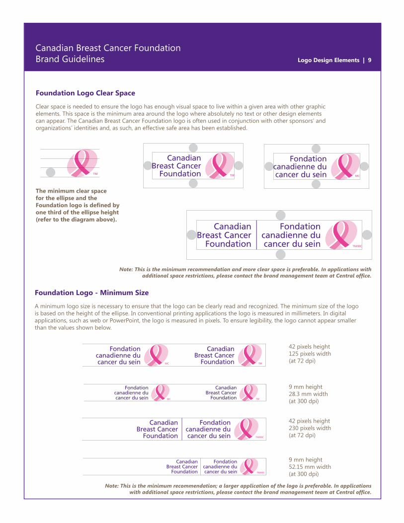
Foundation Logo Clear Space
Clear space is needed to ensure the logo has enough visual space to live within a given area with other graphic elements. This space is the minimum area around the logo where absolutely no text or other design elements can appear. The Canadian Breast Cancer Foundation logo is often used in conjunction with other sponsors’ and organizations’ identities and, as such, an effective safe area has been established.
The minimum clear space for the ellipse and the Foundation logo is defined by one third of the ellipse height (refer to the diagram above).
Foundation Logo - Minimum Size
A minimum logo size is necessary to ensure that the logo can be clearly read and recognized. The minimum size of the logo is based on the height of the ellipse. In conventional printing applications the logo is measured in millimeters. In digital applications, such as web or PowerPoint, the logo is measured in pixels. To ensure legibility, the logo cannot appear smaller than the values shown below.
42 pixels height125 pixels width(at 72 dpi)
9 mm height 28.3 mm width (at 300 dpi)
42 pixels height230 pixels width (at 72 dpi)
9 mm height 52.15 mm width (at 300 dpi)
Note: This is the minimum recommendation; a larger application of the logo is preferable. In applications with additional space restrictions, please contact the brand management team at Central office.
Logo Design Elements | 10
Canadian Breast Cancer Foundation Brand Guidelines
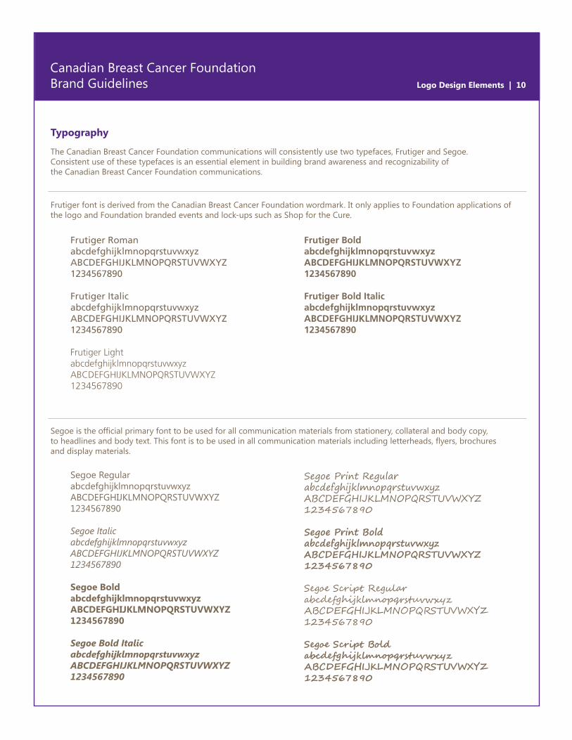
Typography
The Canadian Breast Cancer Foundation communications will consistently use two typefaces, Frutiger and Segoe. Consistent use of these typefaces is an essential element in building brand awareness and recognizability of the Canadian Breast Cancer Foundation communications.
Segoe RegularabcdefghijklmnopqrstuvwxyzABCDEFGHIJKLMNOPQRSTUVWXYZ 1234567890
Segoe ItalicabcdefghijklmnopqrstuvwxyzABCDEFGHIJKLMNOPQRSTUVWXYZ 1234567890
Segoe BoldabcdefghijklmnopqrstuvwxyzABCDEFGHIJKLMNOPQRSTUVWXYZ 1234567890
Segoe Bold ItalicabcdefghijklmnopqrstuvwxyzABCDEFGHIJKLMNOPQRSTUVWXYZ 1234567890
Segoe Print RegularabcdefghijklmnopqrstuvwxyzABCDEFGHIJKLMNOPQRSTUVWXYZ 1234567890
Segoe Print BoldabcdefghijklmnopqrstuvwxyzABCDEFGHIJKLMNOPQRSTUVWXYZ 1234567890
Segoe Script RegularabcdefghijklmnopqrstuvwxyzABCDEFGHIJKLMNOPQRSTUVWXYZ 1234567890
Segoe Script BoldabcdefghijklmnopqrstuvwxyzABCDEFGHIJKLMNOPQRSTUVWXYZ 1234567890
Frutiger RomanabcdefghijklmnopqrstuvwxyzABCDEFGHIJKLMNOPQRSTUVWXYZ 1234567890
Frutiger ItalicabcdefghijklmnopqrstuvwxyzABCDEFGHIJKLMNOPQRSTUVWXYZ 1234567890
Frutiger Light abcdefghijklmnopqrstuvwxyzABCDEFGHIJKLMNOPQRSTUVWXYZ 1234567890
Frutiger BoldabcdefghijklmnopqrstuvwxyzABCDEFGHIJKLMNOPQRSTUVWXYZ 1234567890
Frutiger Bold ItalicabcdefghijklmnopqrstuvwxyzABCDEFGHIJKLMNOPQRSTUVWXYZ 1234567890
Frutiger font is derived from the Canadian Breast Cancer Foundation wordmark. It only applies to Foundation applications of the logo and Foundation branded events and lock-ups such as Shop for the Cure.
Segoe is the official primary font to be used for all communication materials from stationery, collateral and body copy, to headlines and body text. This font is to be used in all communication materials including letterheads, flyers, brochures and display materials.
Logo Design Elements | 11
Canadian Breast Cancer Foundation Brand Guidelines
Typography
Arial RegularabcdefghijklmnopqrstuvwxyzABCDEFGHIJKLMNOPQRSTUVWXYZ 1234567890
Arial ItalicabcdefghijklmnopqrstuvwxyzABCDEFGHIJKLMNOPQRSTUVWXYZ 1234567890
Arial BoldabcdefghijklmnopqrstuvwxyzABCDEFGHIJKLMNOPQRSTUVWXYZ 1234567890
Arial Bold ItalicabcdefghijklmnopqrstuvwxyzABCDEFGHIJKLMNOPQRSTUVWXYZ 1234567890
Adobe Garamond Pro RegularabcdefghijklmnopqrstuvwxyzABCDEFGHIJKLMNOPQRSTUVWXYZ 1234567890
Adobe Garamond Pro ItalicabcdefghijklmnopqrstuvwxyzABCDEFGHIJKLMNOPQRSTUVWXYZ 1234567890
Adobe Garamond Pro BoldabcdefghijklmnopqrstuvwxyzABCDEFGHIJKLMNOPQRSTUVWXYZ 1234567890
Adobe Garamond Pro ItalicabcdefghijklmnopqrstuvwxyzABCDEFGHIJKLMNOPQRSTUVWXYZ 1234567890
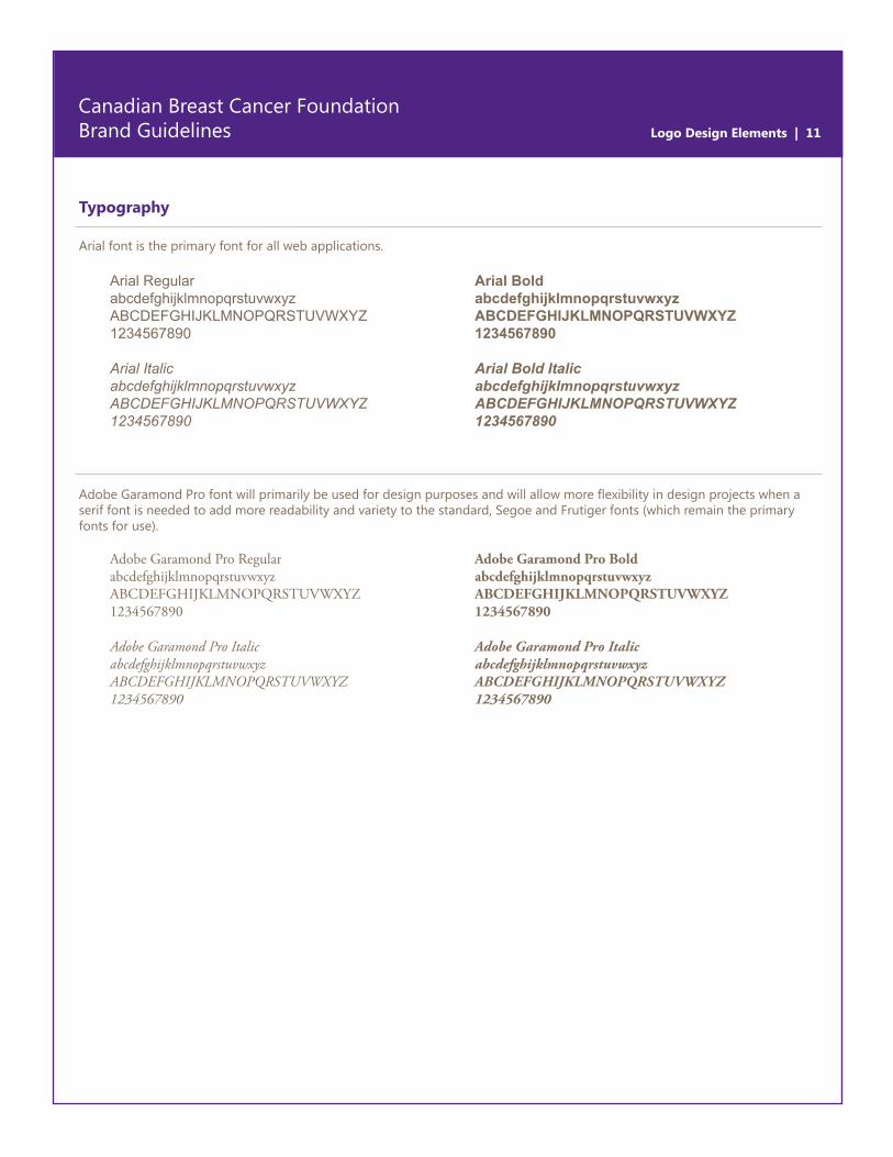
Arial font is the primary font for all web applications.
Adobe Garamond Pro font will primarily be used for design purposes and will allow more flexibility in design projects when a serif font is needed to add more readability and variety to the standard, Segoe and Frutiger fonts (which remain the primary fonts for use).
Logo Design Elements | 12
Canadian Breast Cancer Foundation Brand Guidelines
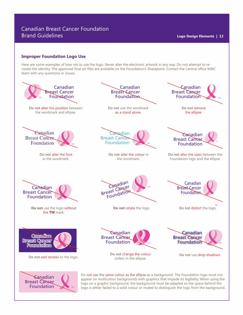
Improper Foundation Logo Use
Here are some examples of how not to use the logo. Never alter the electronic artwork in any way. Do not attempt to re-create the identity. The approved final art files are available on the Foundation’s Sharepoint. Contact the Central office M&C team with any questions or issues.
CanadianBreast Cancer
Foundation
Do not alter the position between the wordmark and ellipse.
Do not alter the font in the wordmark.
Do not change the colour orders in the ellipse.
Do not use the same colour as the ellipse as a background. The Foundation logo must not appear on multicolour backgrounds with graphics that impede its legibility. When using the logo on a graphic background, the background must be adapted so the space behind the logo is either faded to a solid colour or muted to distinguish the logo from the background.
Do not rotate the logo.Do not use the logo without the TM mark.
Do not use drop shadows.
Do not distort the logo.
Do not add strokes to the logo.
Do not use the wordmark as a stand alone.
Do not alter the colour in the wordmark.
Do not remove the ellipse.
Do not alter the sizes between the Foundation logo and the ellipse.


