skärholmen centrum - diva
TRANSCRIPT
STUDIO 3
Helen Runting, Karin Matz, Rutger Sjögrim
design of linear space
3 design scales
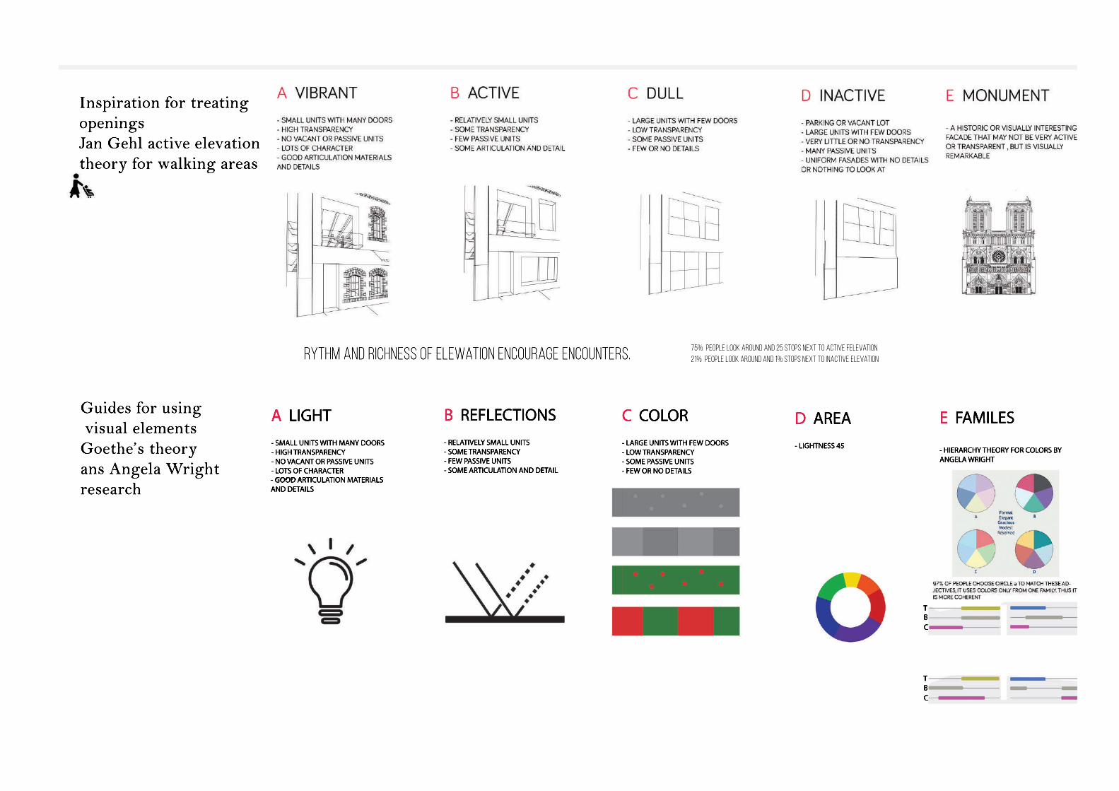
Guides for using visual elementsGoethe’s theoryans Angela Wright research
A LIGHT- SMALL UNITS WITH MANY DOORS- HIGH TRANSPARENCY - NO VACANT OR PASSIVE UNITS - LOTS OF CHARACTER - GOOD A- GOOD ARTICULATION MATERIALS AND DETAILS
C COLOR- LARGE UNITS WITH FEW DOORS- LOW TRANSPARENCY - SOME PASSIVE UNITS - FEW OR NO DETAILS
D AREA- LIGHTNESS 45
E FAMILES
- HIERARCHY THEORY FOR COLORS BY ANGELA WRIGHT
TBC
TBC
B REFLECTIONS- RELATIVELY SMALL UNITS- SOME TRANSPARENCY- FEW PASSIVE UNITS - SOME ARTICULATION AND DETAIL
Inspiration for treatingopeningsJan Gehl active elevationtheory for walking areas
Rythm and richness of elewation encourage encounters. 75% people look around and 25 stops next to active felevation 21% people look around and 1% stops next to inactive elevation
VERTICAL ON ELEVATION
HORIZONTAL IN PLAN
FUNCTIONS IN ORDER
SHOPPINGLAYER 1
SERVICESLAYER 2
ROOFLAYER 3
PLAYFULCALM,SERIOUS
LIVELY
shopp ing mall
shopp ing mall
skärholmstorg
måsholmstorg
T
SKÄRHOLMS TORG MÅSHOLMS TORG STORHOLMSGATAN
JUNE DECEMBER SHADOW LENGTH
n
s
ew
Storholm
sgatan
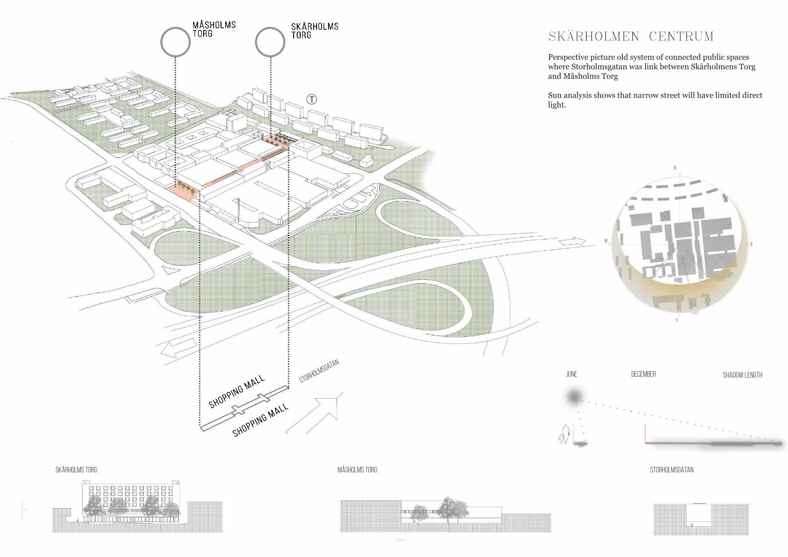
SKÄRHOLMEN CENTRUM
Perspective picture old system of connected public spaces where Storholmsgatan was link between Skärholmens Torg and Måsholms Torg
Sun analysis shows that narrow street will have limited direct light.
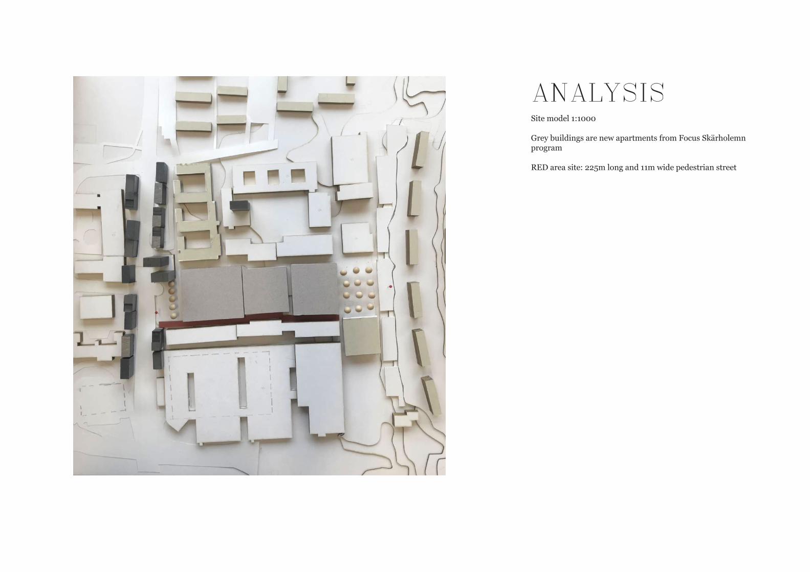
ANALYSISSite model 1:1000
Grey buildings are new apartments from Focus Skärholemn program
RED area site: 225m long and 11m wide pedestrian street
1 2 3 45
6
7
8
9 .
1 0
1 1
1 2
1 3
1 4
1 5
1 6
1 7
1 81 92 0
2 1
2 2
2 32 4
ÄPSHOLMSVÄGEN
SKÄRHOLMS-TORGET
EKSHOLM
SVÄGEN
VÅRBERGSVÄGEN
SÖDERTÄLJE
STOCKHOLM
E4
SKÄRHOLMS-PLAN
BREDHOLM
SGATA
N
STORH
OLM
SGATA
N
MÅSHOLMS-TORGET
SKÄRH
OLM
SVÄGEN
BREDHOLMS-TORGET
0 100m100m
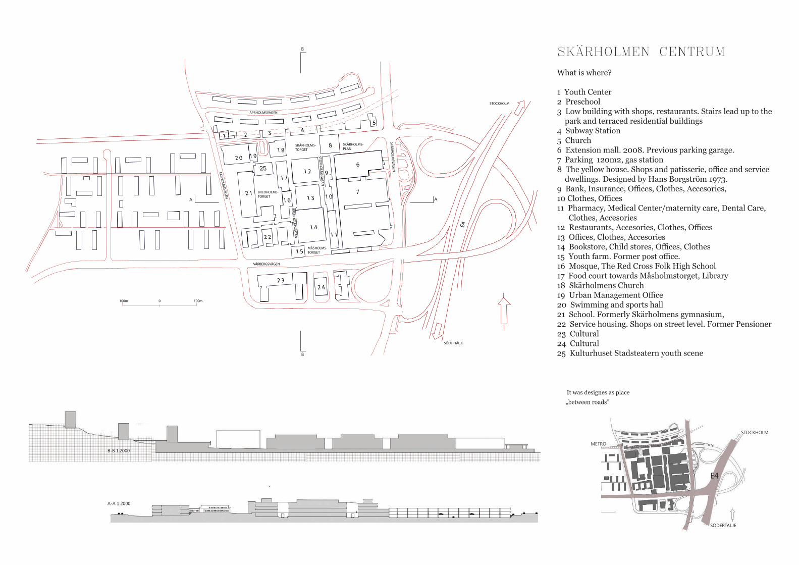
SKÄRHOLMEN CENTRUM
What is where?
1 Youth Center2 Preschool3 Low building with shops, restaurants. Stairs lead up to the park and terraced residential buildings4 Subway Station5 Church6 Extension mall. 2008. Previous parking garage.7 Parking 120m2, gas station8 The yellow house. Shops and patisserie, office and service dwellings. Designed by Hans Borgström 1973.9 Bank, Insurance, Offices, Clothes, Accesories, 10 Clothes, Offices11 Pharmacy, Medical Center/maternity care, Dental Care, Clothes, Accesories12 Restaurants, Accesories, Clothes, Offices13 Offices, Clothes, Accesories14 Bookstore, Child stores, Offices, Clothes15 Youth farm. Former post office.16 Mosque, The Red Cross Folk High School17 Food court towards Måsholmstorget, Library18 Skärholmens Church19 Urban Management Office20 Swimming and sports hall21 School. Formerly Skärholmens gymnasium, 22 Service housing. Shops on street level. Former Pensioner23 Cultural 24 Cultural25 Kulturhuset Stadsteatern youth scene
It was designes as place
„between roads”
E4
STOCKHOLM
SÖDERTALJE
METRO
AA
B
B
B-B 1:2000
A-A 1:2000
25
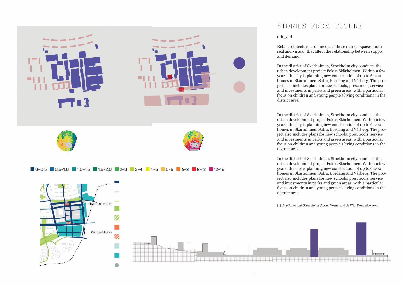
STORIES FROM FUTURE
dfhjjydd
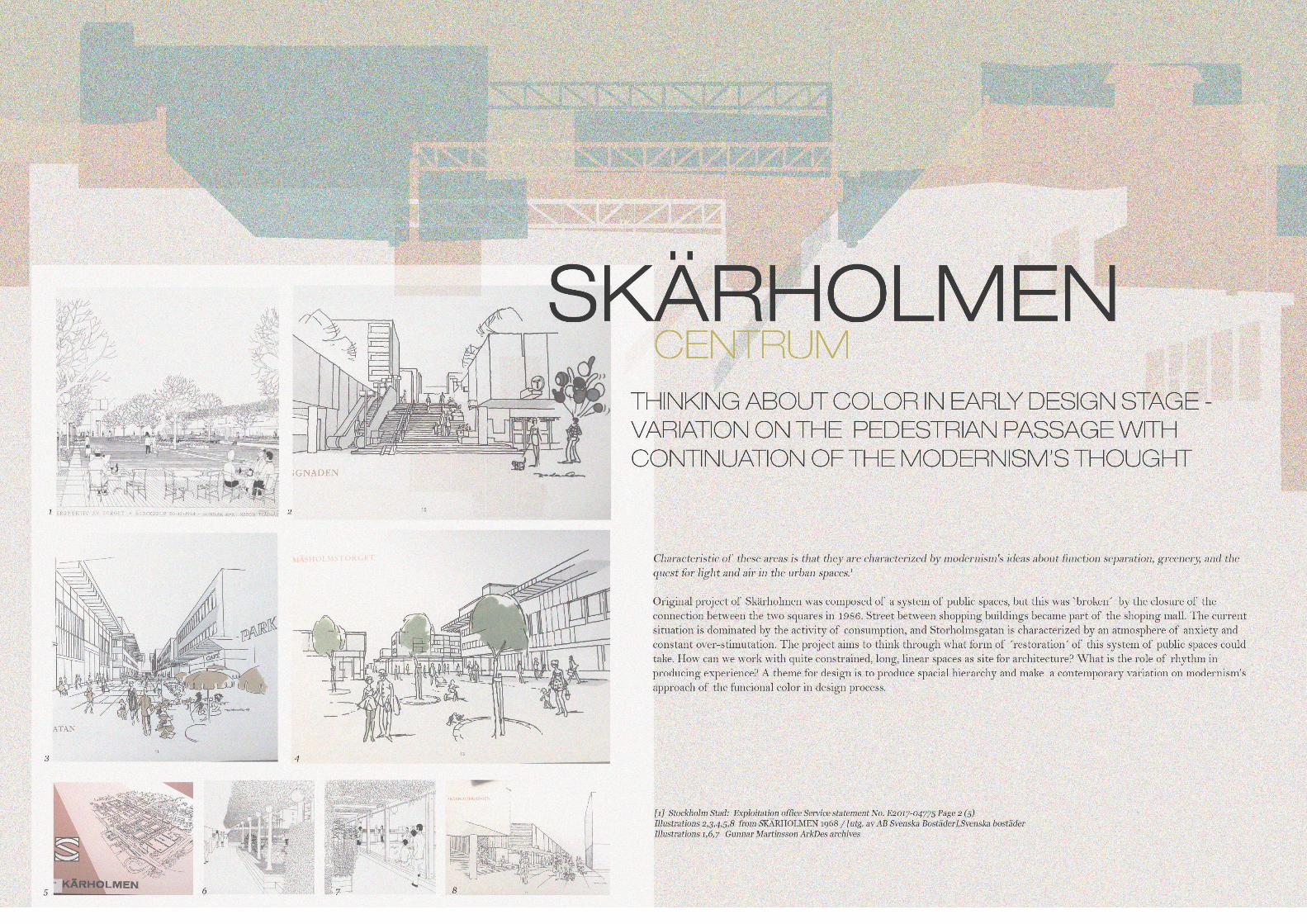
Retal architecture is defined as: ’those market spaces, both real and virtual, that affect the relationship between supply and demand’ 1
In the district of Skärholmen, Stockholm city conducts the urban development project Fokus Skärholmen. Within a few years, the city is planning new construction of up to 6,000 homes in Skärholmen, Sätra, Bredäng and Vårberg. The pro-ject also includes plans for new schools, preschools, service and investments in parks and green areas, with a particular focus on children and young people’s living conditions in the district area.
In the district of Skärholmen, Stockholm city conducts the urban development project Fokus Skärholmen. Within a few years, the city is planning new construction of up to 6,000 homes in Skärholmen, Sätra, Bredäng and Vårberg. The pro-ject also includes plans for new schools, preschools, service and investments in parks and green areas, with a particular focus on children and young people’s living conditions in the district area.
In the district of Skärholmen, Stockholm city conducts the urban development project Fokus Skärholmen. Within a few years, the city is planning new construction of up to 6,000 homes in Skärholmen, Sätra, Bredäng and Vårberg. The pro-ject also includes plans for new schools, preschools, service and investments in parks and green areas, with a particular focus on children and young people’s living conditions in the district area.
[1] Boutiques and Other Retail Spaces ,Vernet and de Wit , Routledge 2007
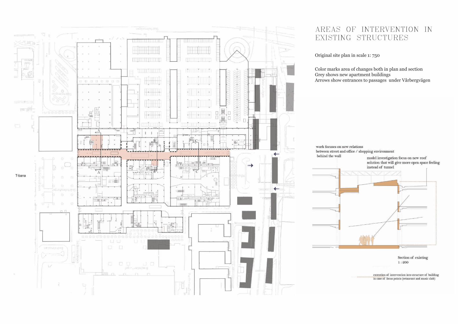
AREAS OF INTERVENTION IN EXISTING STRUCTURES
Original site plan in scale 1: 750
Color marks area of changes both in plan and sectionGrey shows new apartment buildingsArrows show entrances to passages under Vårbergvägen
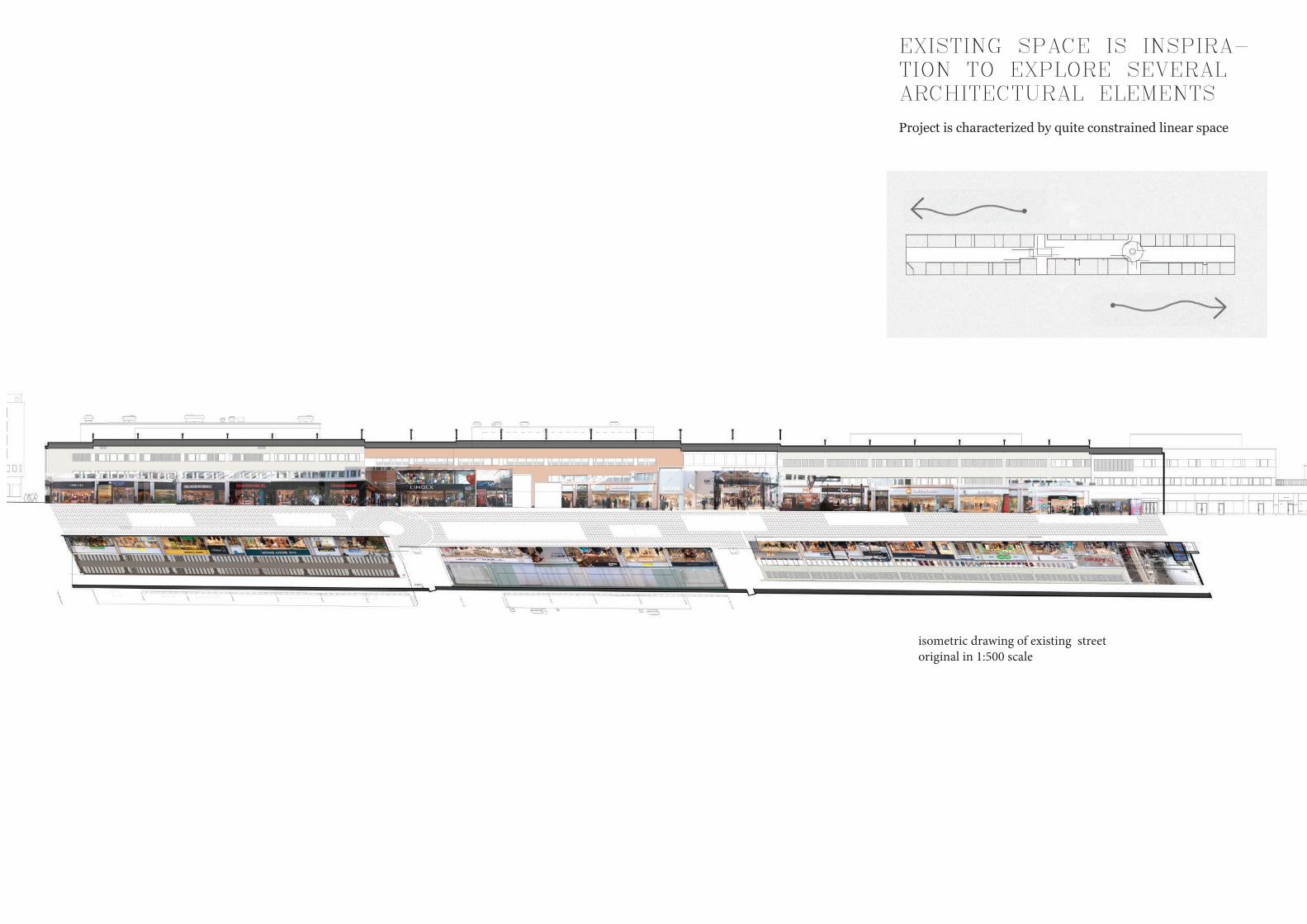
EXISTING SPACE IS INSPIRA-TION TO EXPLORE SEVERAL ARCHITECTURAL ELEMENTS
Project is characterized by quite constrained linear space
rhyt
hm, s
peed
& t
empo
in
lin
ear
proj
ect
isometric drawing of existing street original in 1:500 scale
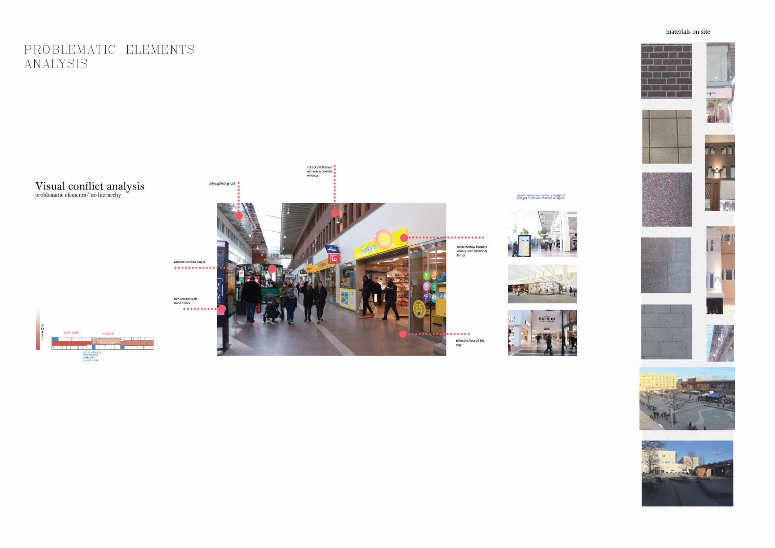
PROBLEMATIC ELEMENTS ANALYSIS
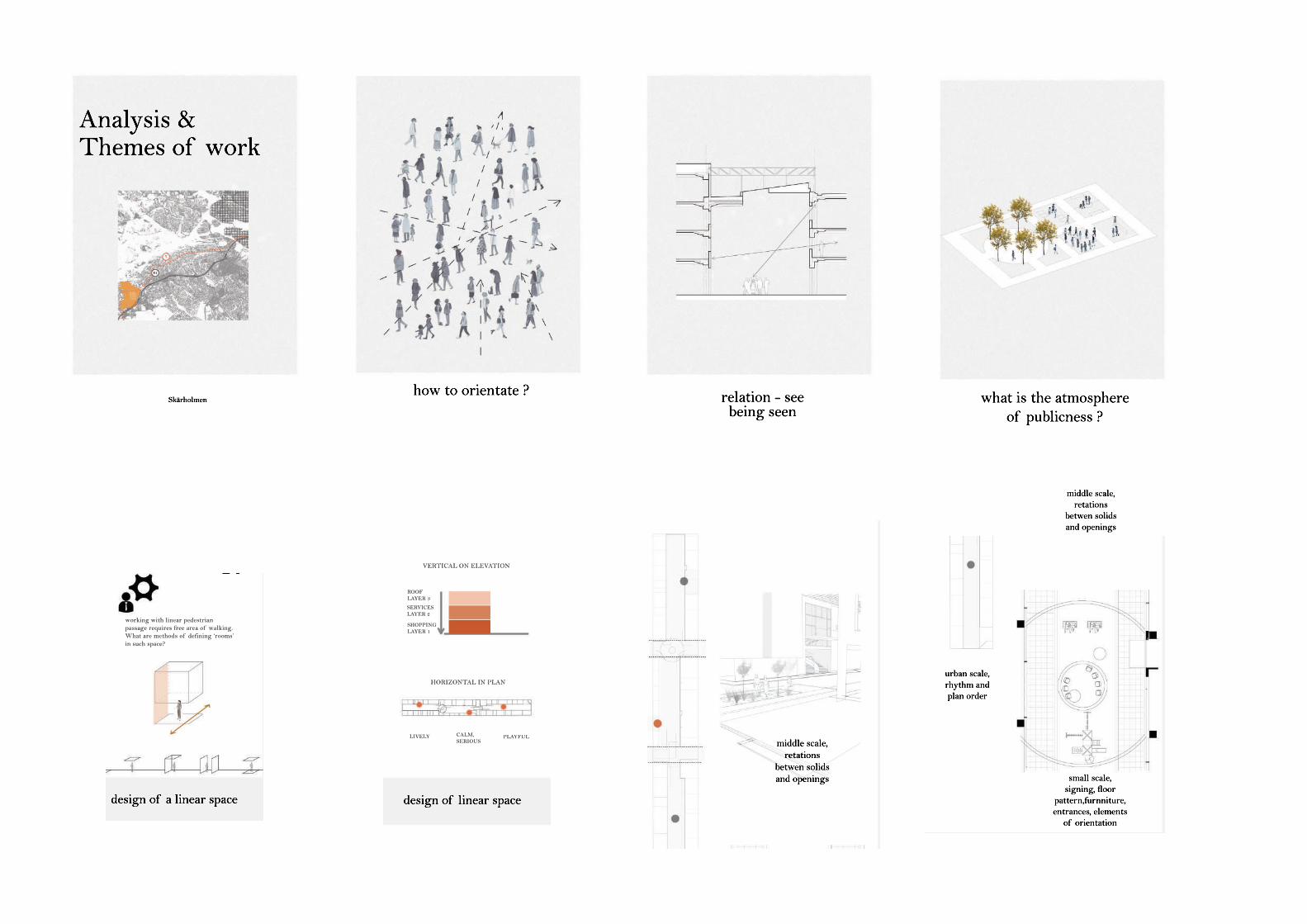
what is the atmosphere of publicness ?
how to orientate ?Skärholmen
Analysis &Themes of work
relation - seebeing seen
design of a linear space
3 design scales
urban scale, rhythm and plan order
middle scale, retations
betwen solids and openings
small scale, signing, floor
pattern,furnniture, entrances, elements
of orientation
working with linear pedestrian passage requires free area of walking. What are methods of defining ‘rooms’ in such space?
Methodology
design of linear space
3 design scales
Guides for using visual elementsGoethe’s theoryans Angela Wright research
A LIGHT- SMALL UNITS WITH MANY DOORS- HIGH TRANSPARENCY - NO VACANT OR PASSIVE UNITS - LOTS OF CHARACTER - GOOD A- GOOD ARTICULATION MATERIALS AND DETAILS
C COLOR- LARGE UNITS WITH FEW DOORS- LOW TRANSPARENCY - SOME PASSIVE UNITS - FEW OR NO DETAILS
D AREA- LIGHTNESS 45
E FAMILES
- HIERARCHY THEORY FOR COLORS BY ANGELA WRIGHT
TBC
TBC
B REFLECTIONS- RELATIVELY SMALL UNITS- SOME TRANSPARENCY- FEW PASSIVE UNITS - SOME ARTICULATION AND DETAIL
Inspiration for treatingopeningsJan Gehl active elevationtheory for walking areas
Rythm and richness of elewation encourage encounters. 75% people look around and 25 stops next to active felevation 21% people look around and 1% stops next to inactive elevation
VERTICAL ON ELEVATION
HORIZONTAL IN PLAN
FUNCTIONS IN ORDER
SHOPPINGLAYER 1
SERVICESLAYER 2
ROOFLAYER 3
PLAYFULCALM,SERIOUS
LIVELY
design of a linear space
3 design scales
urban scale, rhythm and plan order
middle scale, retations
betwen solids and openings
small scale, signing, floor
pattern,furnniture, entrances, elements
of orientation
working with linear pedestrian passage requires free area of walking. What are methods of defining ‘rooms’ in such space?
Methodology
design of linear space
3 design scales
Guides for using visual elementsGoethe’s theoryans Angela Wright research
A LIGHT- SMALL UNITS WITH MANY DOORS- HIGH TRANSPARENCY - NO VACANT OR PASSIVE UNITS - LOTS OF CHARACTER - GOOD A- GOOD ARTICULATION MATERIALS AND DETAILS
C COLOR- LARGE UNITS WITH FEW DOORS- LOW TRANSPARENCY - SOME PASSIVE UNITS - FEW OR NO DETAILS
D AREA- LIGHTNESS 45
E FAMILES
- HIERARCHY THEORY FOR COLORS BY ANGELA WRIGHT
TBC
TBC
B REFLECTIONS- RELATIVELY SMALL UNITS- SOME TRANSPARENCY- FEW PASSIVE UNITS - SOME ARTICULATION AND DETAIL
Inspiration for treatingopeningsJan Gehl active elevationtheory for walking areas
Rythm and richness of elewation encourage encounters. 75% people look around and 25 stops next to active felevation 21% people look around and 1% stops next to inactive elevation
VERTICAL ON ELEVATION
HORIZONTAL IN PLAN
FUNCTIONS IN ORDER
SHOPPINGLAYER 1
SERVICESLAYER 2
ROOFLAYER 3
PLAYFULCALM,SERIOUS
LIVELY
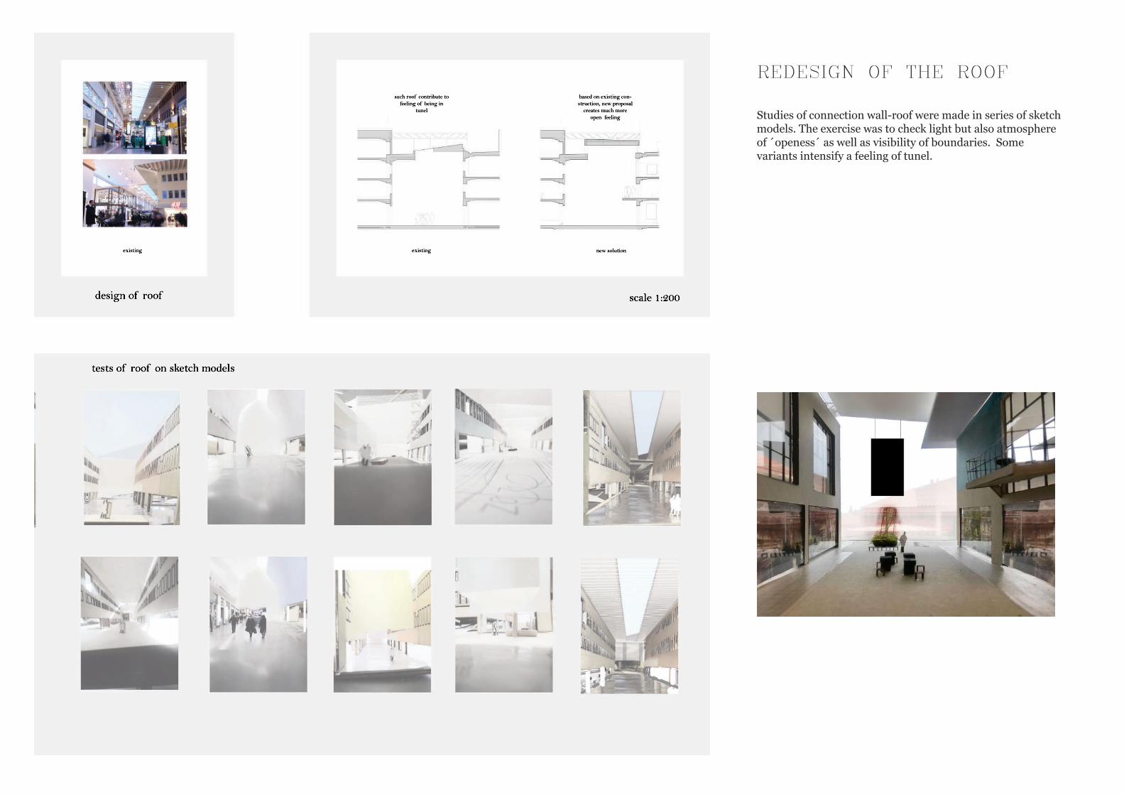
existing
scale 1:200
new solutionexisting
such roof contribute to feeling of being in
tunel
based on existing con-struction, new proposal
creates much more open feeling
design of roof
tests of roof on sketch models
REDESIGN OF THE ROOF
Studies of connection wall-roof were made in series of sketch models. The exercise was to check light but also atmosphere of ´openess´ as well as visibility of boundaries. Some variants intensify a feeling of tunel.
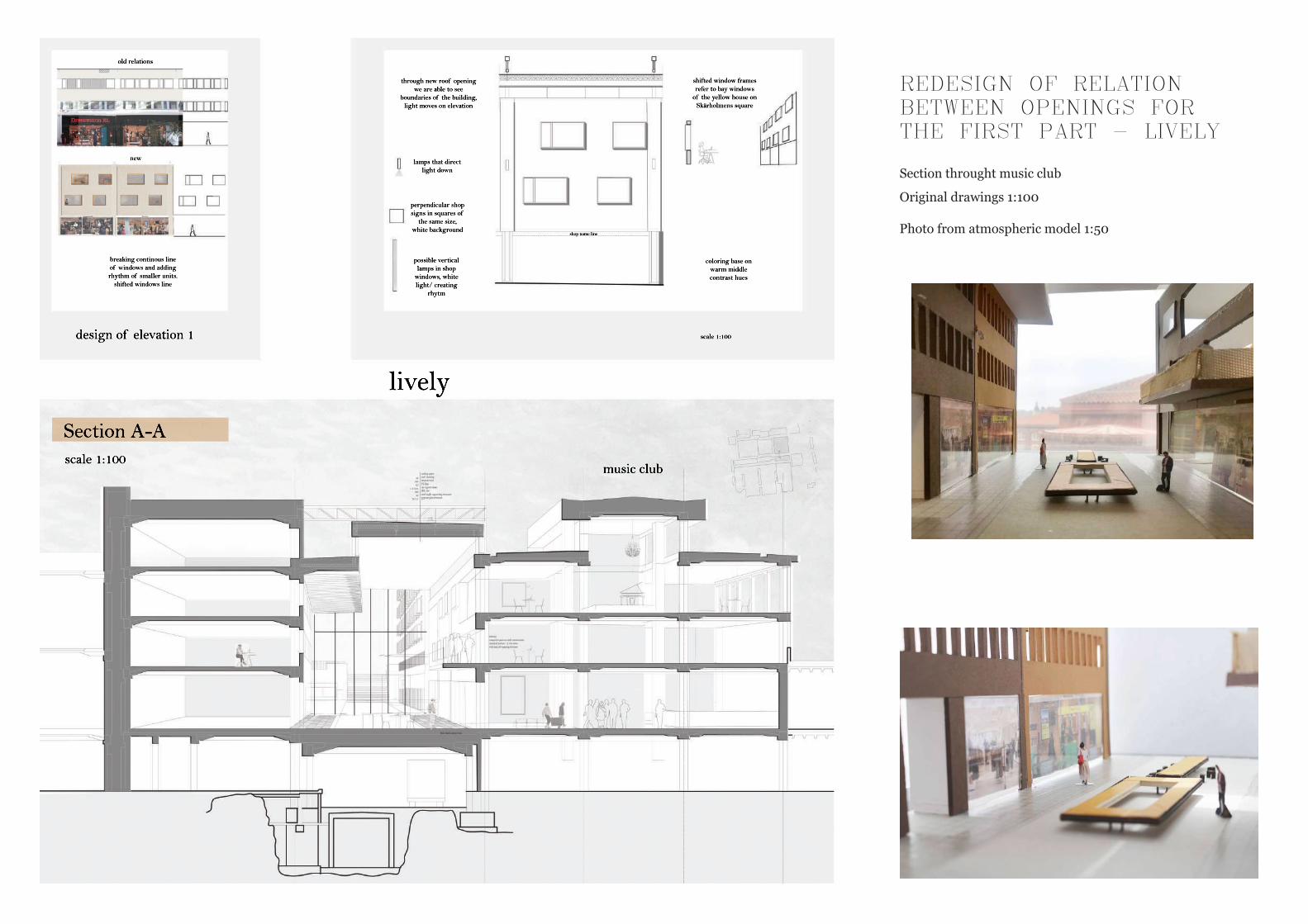
scale 1:100design of elevation 1
shop name line
lamps that direct light down
perpendicular shop signs in squares of
the same size, white background
possible vertical lamps in shop
windows, white light/ creating
rhytm
breaking continous line of windows and adding rhythm of smaller units.
shifted windows line
old relations
lively
new
coloring base on warm middle contrast hues
Section A-Ascale 1:100
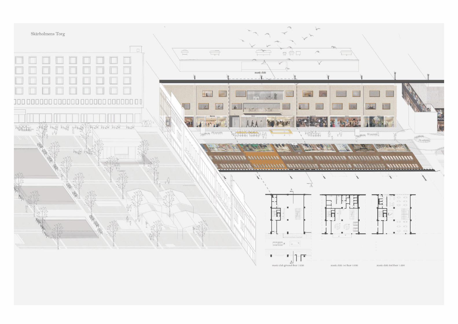
music club
through new roof opening we are able to see
boundaries of the building, light moves on elevation
shifted window frames refer to bay windows
of the yellow house on Skärholmens square
REDESIGN OF RELATION BETWEEN OPENINGS FOR THE FIRST PART - LIVELY
Section throught music club
Original drawings 1:100
Photo from atmospheric model 1:50
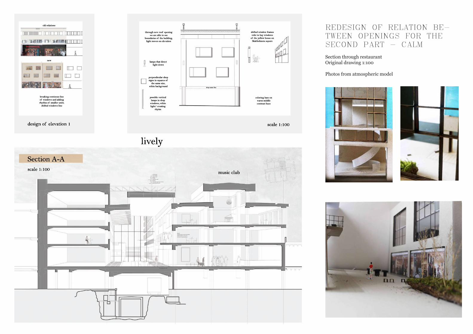
scale 1:100design of elevation 1
shop name line
lamps that direct light down
perpendicular shop signs in squares of
the same size, white background
possible vertical lamps in shop
windows, white light/ creating
rhytm
breaking continous line of windows and adding rhythm of smaller units.
shifted windows line
old relations
lively
new
coloring base on warm middle contrast hues
Section A-Ascale 1:100
music club
through new roof opening we are able to see
boundaries of the building, light moves on elevation
shifted window frames refer to bay windows
of the yellow house on Skärholmens square
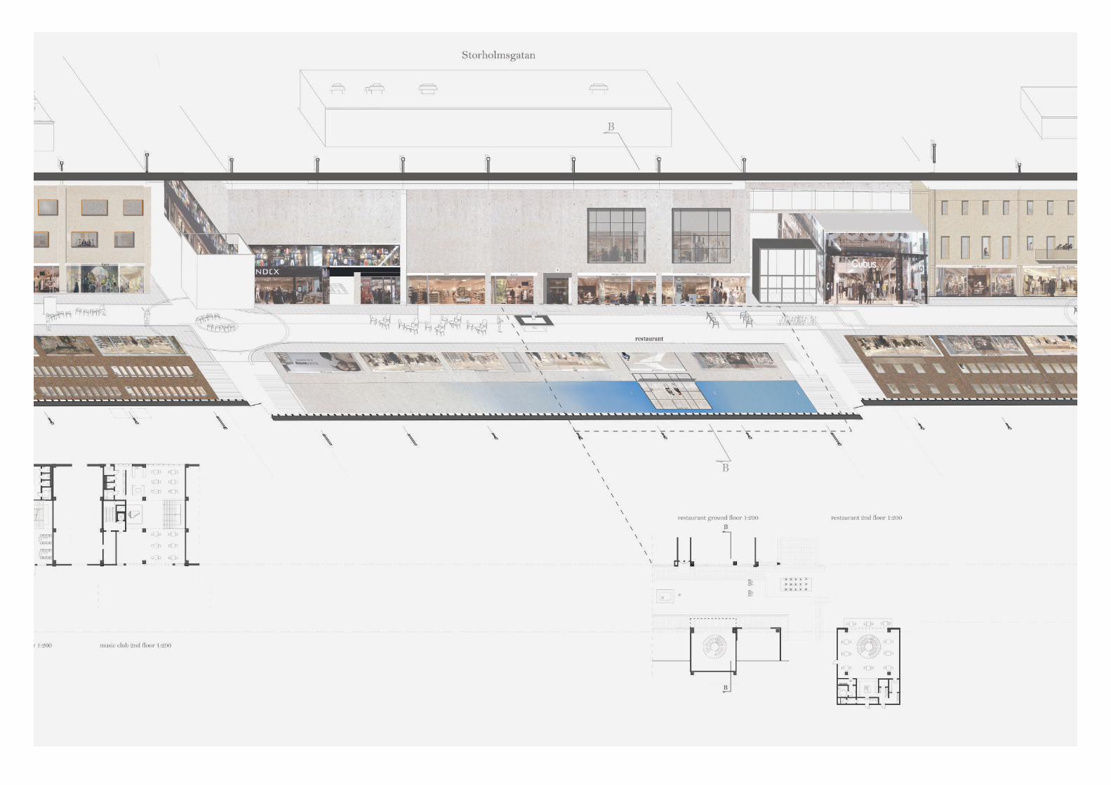
REDESIGN OF RELATION BE-TWEEN OPENINGS FOR THE SECOND PART - CALM
Section through restaurantOriginal drawing 1:100
Photos from atmospheric model
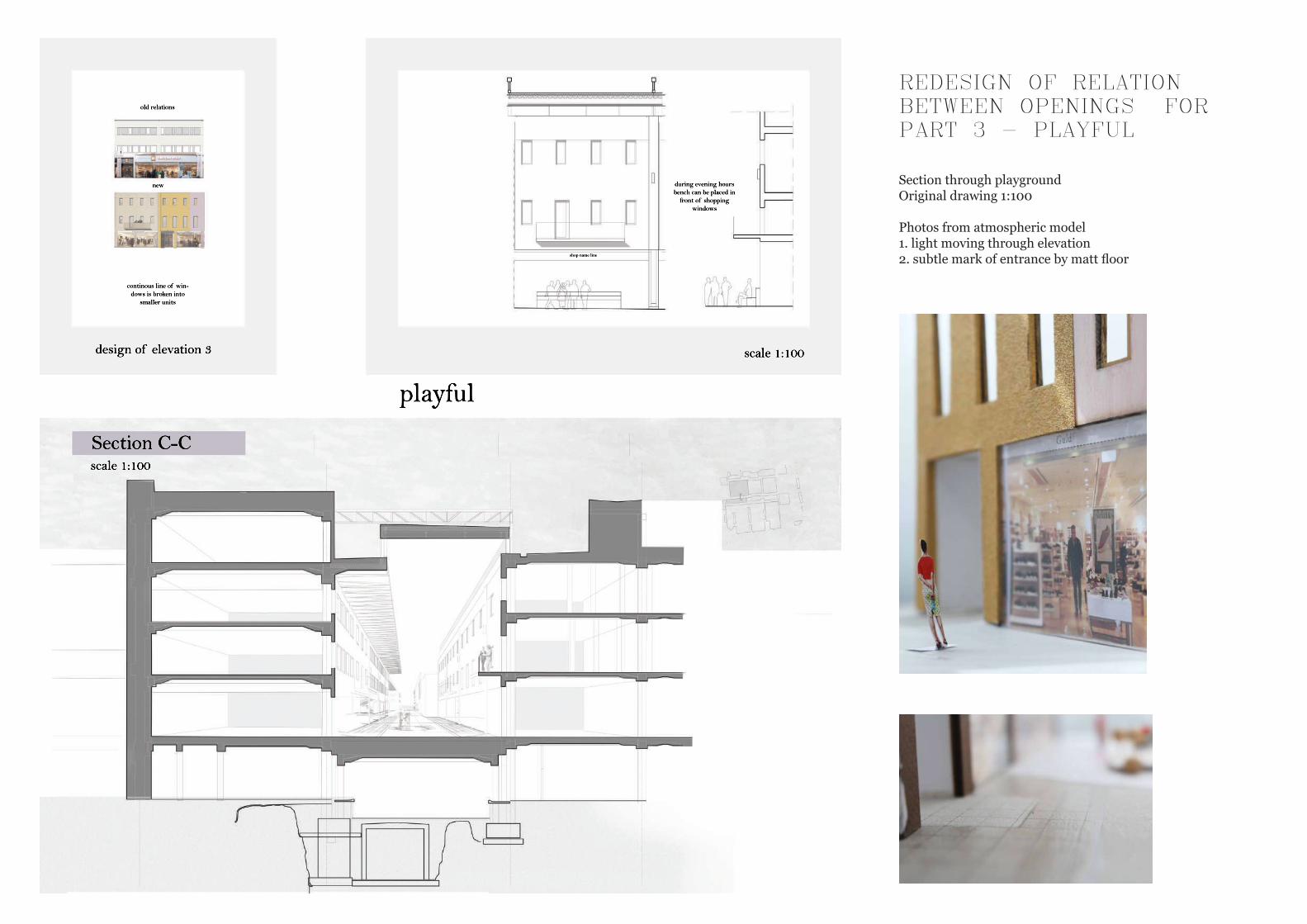
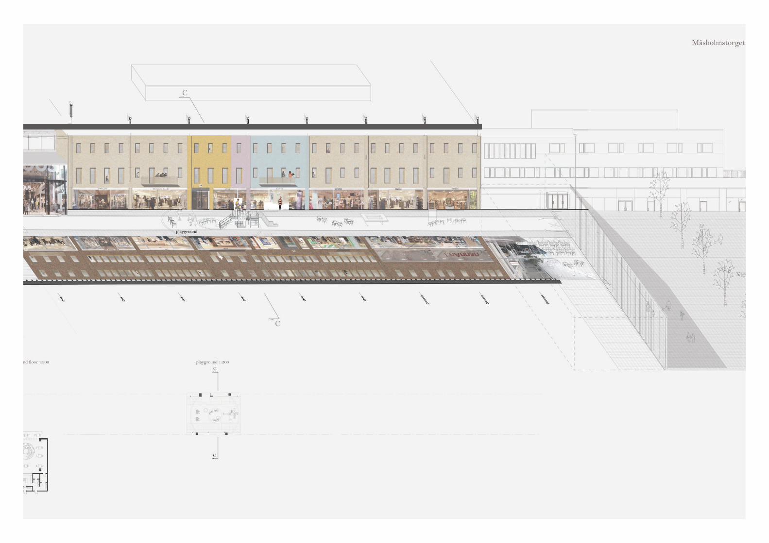
continous line of win-dows is broken into
smaller units
old relations
new
playful
during evening hours bench can be placed in
front of shopping windows
shop name line
design of elevation 3 scale 1:100
Section C-Cscale 1:100
REDESIGN OF RELATION BETWEEN OPENINGS FOR PART 3 - PLAYFUL
Section through playgroundOriginal drawing 1:100
Photos from atmospheric model 1. light moving through elevation2. subtle mark of entrance by matt floor
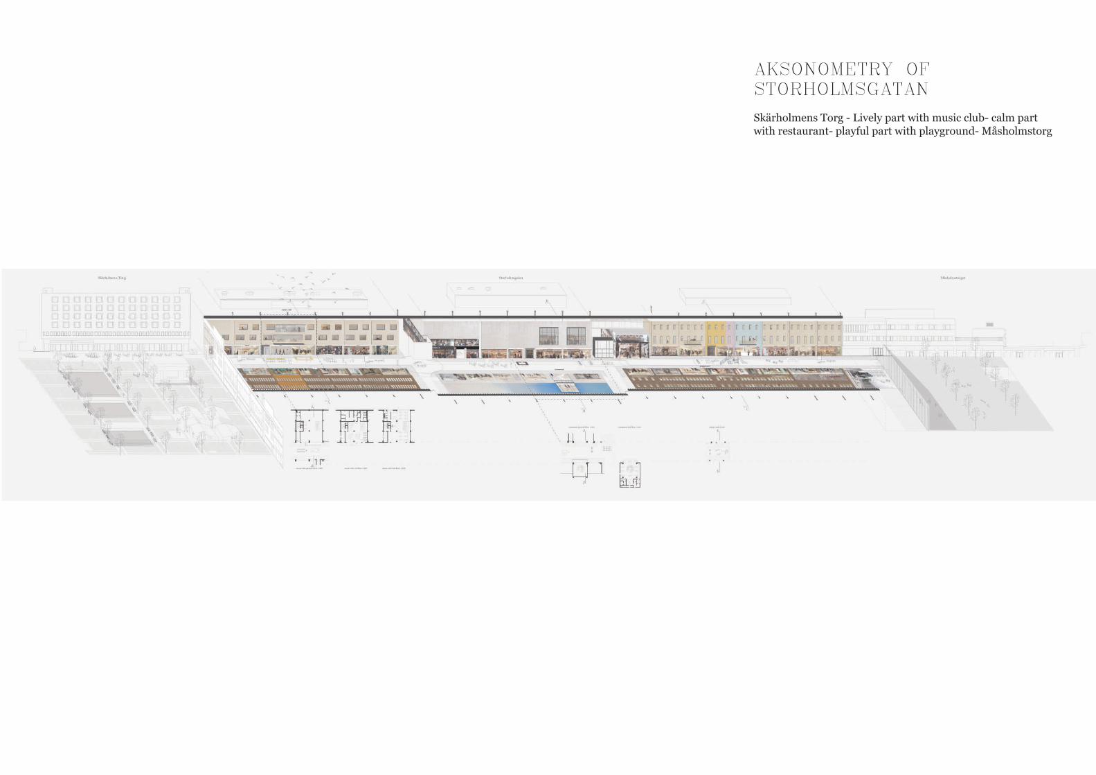
AKSONOMETRY OF STORHOLMSGATAN
Skärholmens Torg - Lively part with music club- calm part with restaurant- playful part with playground- Måsholmstorg
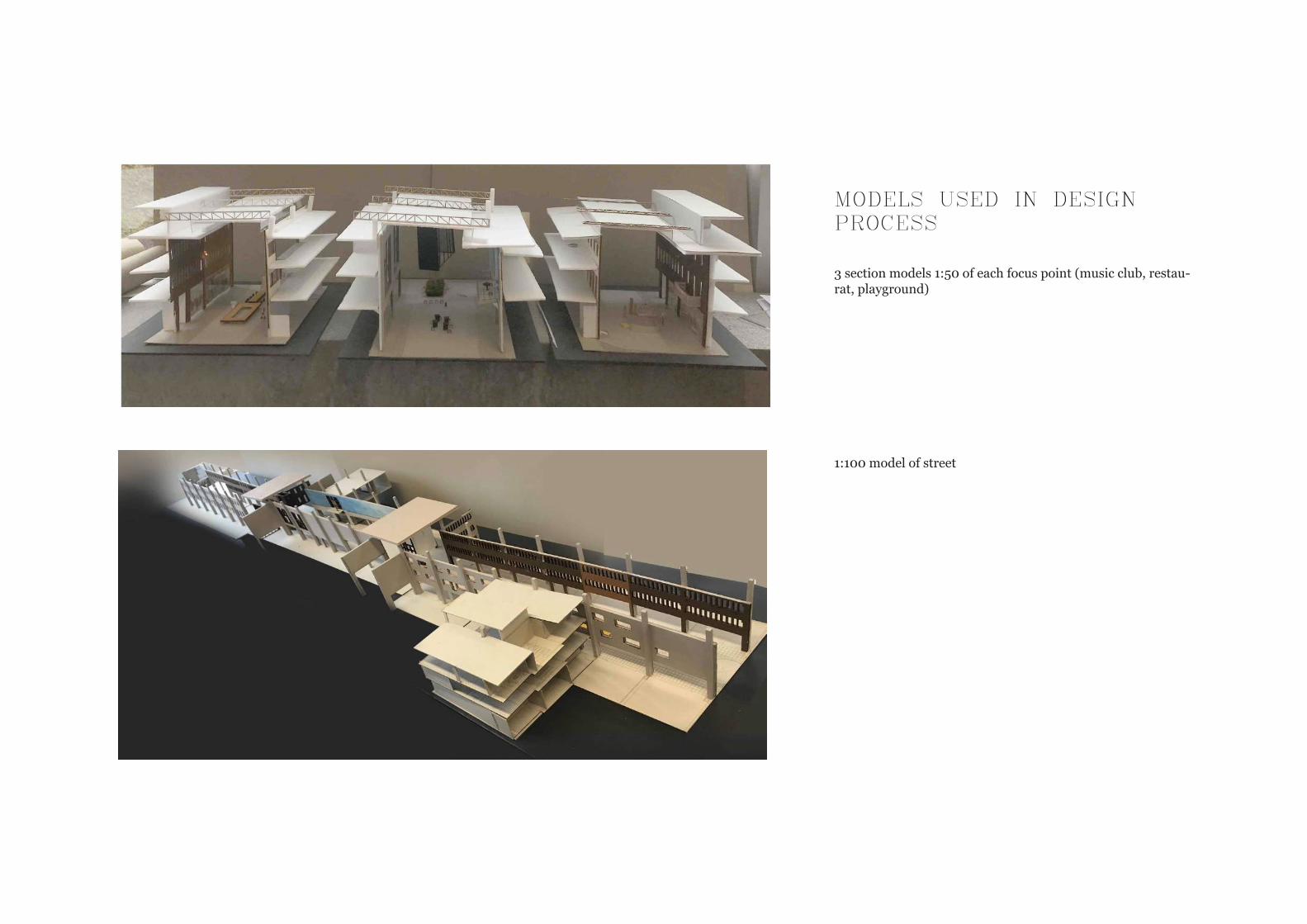
MODELS USED IN DESIGN PROCESS
3 section models 1:50 of each focus point (music club, restau-rat, playground)
1:100 model of street
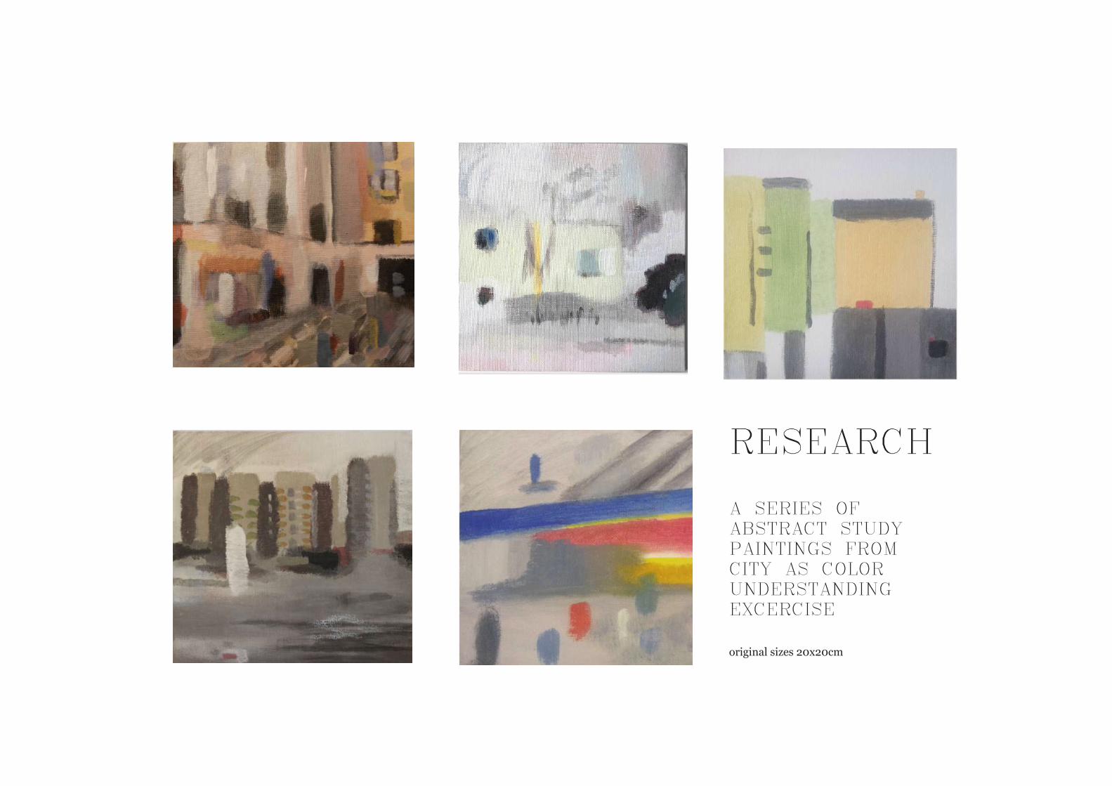
RESEARCH
A SERIES OF ABSTRACT STUDY PAINTINGS FROM CITY AS COLOR UNDERSTANDING EXCERCISE
original sizes 20x20cm
Proportions - construction - detailed shapes - material choice(color) - paint-light setting
Proportions - color and light setting- construc-tion - detailed shapes
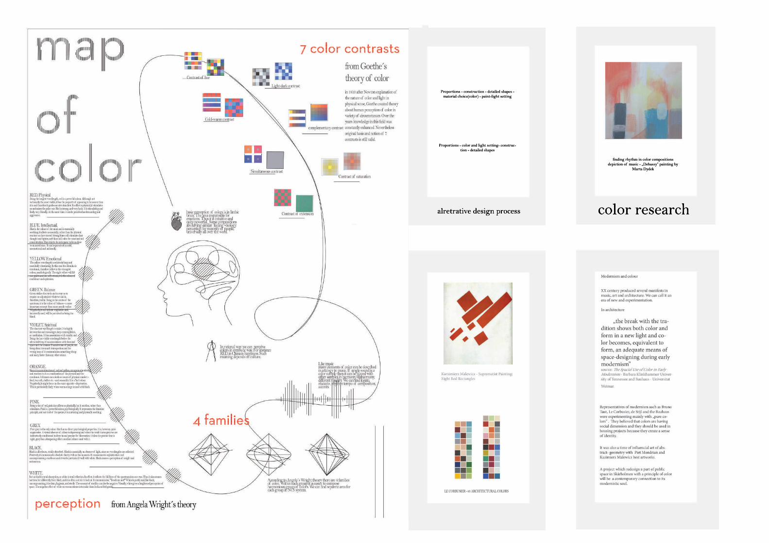
alretrative design process
LE CORBUSIER - 63 ARCHITECTURAL COLORS
Proportions - construction - detailed shapes - material choice(color) - paint-light setting
Proportions - color and light setting- construc-tion - detailed shapes
alretrative design process
LE CORBUSIER - 63 ARCHITECTURAL COLORS
color research
finding rhythm in color compositionsdepiction of music - „Debussy” painting by
Marta Dydek
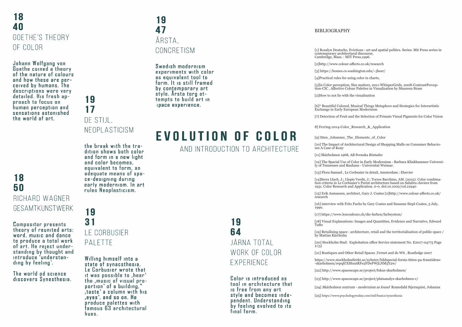
1840Goethe ’s theory of color
Johann Wolfgang von Johann Wolfgang von Goethe coined a theory of the nature of colours and how these are per-ceived by humans. The descript ions were very detai led. His fresh ap-proach to focus on human percept ion and sensat ions astonished the world of art .
1850R ichard Wagner Gesamtkunstwerk
Compositor presents Compositor presents theory of reunited arts : word, music and dance to produce a total work of art . He reject under-standing by thought and introduce ‘understan-ding by feel ing’ .
The world od science discovers Synesthesia .
1931Le corbus ierpalette
Wil l ing h imself into a Wi l l ing h imself into a state of synacsthesia , Le Corbusier wrote that i t was possible to ‚hear’ the ‚music of v isual pro-port ion’ of a bui ld ing,” ‚ taste ’ a column with h is ‚eyes’ , and so on. He ‚eyes’ , and so on. He produce palettes with famous 63 architectural hues.
1917De St i jl , neoplast ic ism
the break with the trathe break with the tra-dit ion shows both color and form in a new l ight and color becomes, equivalent to form, an adequate means of spa-ce-designing during early modernism. In art rules Neoplast ic ism.
1947årsta,concret ism
Swedish modernism Swedish modernism experiments with color as equivalent tool to form. I t is st i l l framed by contemporary art sty le . Årsta torg at-tempts to bui ld art in space experience.space experience.
1964järna total work of color exper ience
Color is introduced as Color is introduced as tool in architecture that is free from any art sty le and becomes inde-pendent . Understanding by feel ing evolved to i ts f inal form.
E V O L U T I O N O F C O L O RAND INTRODUCT ION TO ARCH ITECTURE
BIBLIOGRAPHY
[1] Rosalyn Deutsche, Evictions : art and spatial politics. Series: Mit Press series in contemporary architectural discourse,Cambridge, Mass. : MIT Press,1996.
[2]http://www.colour-affects.co.uk/research
[3] https://homes.cs.washington.edu/~jheer/
[4]Practical rules for using color in charts,
[5]In Color perception, Size matters, 2011-WhisperGrids, 2008-ContrastPercep-tion-CIC , Affective Colour Palettes in Visualization by Maureen Stone
[2]How to not lie with the visualisation
[6]* Beautiful Colored, Musical Things Metaphors and Strategies for Interartistic Exchange in Early European Modernism
[7] Detection of Fruit and the Selection of Primate Visual Pigments for Color Vision
8] Ferring-2014-Color_Research_&_Application
[9] Itten_Johannes_The_Elements_of_Color
[10] The Impact of Architectural Design of Shopping Malls on Consumer Behavio-urs A Case of Kony
[11] Skärholmen 1968, AB Svenska Böstader
[12] The Spacial Use of Color in Early Modernism - Barbara Klinkhammer Universi-ty of Tennessee and Bauhaus - Universitat Weimar.
[13] Flora Samuel , Le Corbusier in detail, Amsterdam : Elsevier
[14]Serra Lluch, J.; Llopis Verdú, J.; Torres Barchino, AM. (2015). Color combina-tion criteria in Le Corbusier’s Purist architecture based on Salubra claviers from 1931. Color Research and Application. 0-0. doi:10.1002/col.21940
[15] Erik Asmussen, architect, Gary J. Coates [2]http://www.colour-affects.co.uk/research
[16] interview with Fritz Fuchs by Gary Coates and Susanne Siepl-Coates, 5 July, 1990.
[17] https://www.lescouleurs.ch/die-farben/farbsystem/
[18] Visual Explanations: Images and Quantities, Evidence and Narrative, Edward Tufte
[19] Retailising space : architecture, retail and the territorialisation of public space / by Mattias Kärrholm
[20] Stockholm Stad: Exploitation office Service statement No. E2017-04775 Page 2 (5)
[21] Boutiques and Other Retail Spaces ,Vernet and de Wit , Routledge 2007
https://www.stockholmdirekt.se/nyheter/bildspecial-forsta-titten-pa-framtidens--skarholmen/repqfi!XMuutRFe2FDeFWjLNM5Y2w/
[22] http://www.spacescape.se/project/fokus-skarholmen/
[23] http://www.spacescape.se/project/platsanalys-skarholmen-c/
[24] Skärholmen centrum - modernism as found Romedahl Stjernquist, Johanna
[25] https://www.psychologytoday.com/intl/basics/synesthesia
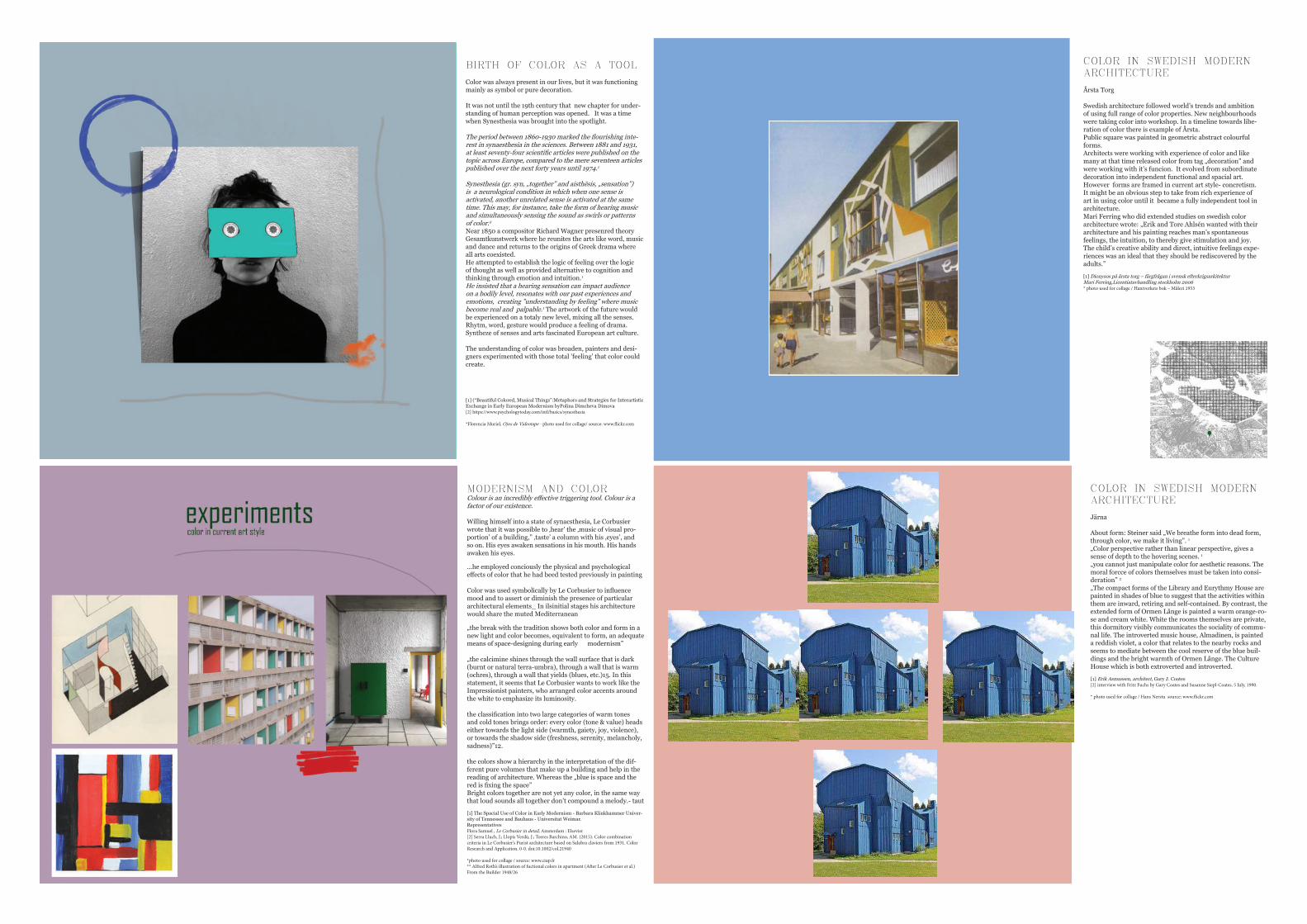
BIRTH OF COLOR AS A TOOL
Color was always present in our lives, but it was functioning mainly as symbol or pure decoration.
It was not until the 19th century that new chapter for under-standing of human perception was opened. It was a time when Synesthesia was brought into the spotlight.
The period between 1860-1930 marked the flourishing inte-rest in synaesthesia in the sciences. Between 1881 and 1931, at least seventy-four scientific articles were published on the topic across Europe, compared to the mere seventeen articles published over the next forty years until 1974.1
Synesthesia (gr. syn, „together” and aisthēsis, „sensation”) is a neurological condition in which when one sense is activated, another unrelated sense is activated at the same time. This may, for instance, take the form of hearing music and simultaneously sensing the sound as swirls or patterns of color.2
Near 1850 a compositor Richard Wagner presenred theory Gesamtkunstwerk where he reunites the arts like word, music and dance and returns to the origins of Greek drama where all arts coexisted.He attempted to establish the logic of feeling over the logic of thought as well as provided alternative to cognition and thinking through emotion and intuition.1 He insisted that a hearing sensation can impact audience on a bodily level, resonates with our past experiences and emotions, creating ”understanding by feeling” where music become real and palpable.1 The artwork of the future would be experienced on a totaly new level, mixing all the senses. Rhytm, word, gesture would produce a feeling of drama.Syntheze of senses and arts fascinated European art culture.
The understanding of color was broaden, painters and desi-gners experimented with those total ’feeling’ that color could create.
[1] (“Beautiful Colored, Musical Things”:Metaphors and Strategies for Interartistic Exchange in Early European Modernism byPolina Dimcheva Dimova[2] https://www.psychologytoday.com/intl/basics/synesthesia
*Florencia Muriel, Ojos de Videotape - photo used for collage/ source: www.flickr.com
MODERNISM AND COLORColour is an incredibly effective triggering tool. Colour is a factor of our existence.
Willing himself into a state of synacsthesia, Le Corbusier wrote that it was possible to ‚hear’ the ‚music of visual pro-portion’ of a building,” ‚taste’ a column with his ‚eyes’, and so on. His eyes awaken sensations in his mouth. His hands awaken his eyes.
...he employed conciously the physical and psychological effects of color that he had beed tested previously in painting
Color was used symbolically by Le Corbusier to influence mood and to assert or diminish the presence of particular architectural elements_ In ilsinitial stages his architecture would share the muted Mediterranean
„the break with the tradition shows both color and form in a new light and color becomes, equivalent to form, an adequate means of space-designing during early modernism”
„the calcimine shines through the wall surface that is dark (burnt or natural terra-umbra), through a wall that is warm (ochres), through a wall that yields (blues, etc.)15. In this statement, it seems that Le Corbusier wants to work like the Impressionist painters, who arranged color accents around the white to emphasize its luminosity.
the classification into two large categories of warm tones and cold tones brings order: every color (tone & value) heads either towards the light side (warmth, gaiety, joy, violence), or towards the shadow side (freshness, serenity, melancholy, sadness)”12.
the colors show a hierarchy in the interpretation of the dif-ferent pure volumes that make up a building and help in the reading of architecture. Whereas the „blue is space and the red is fixing the space”Bright colors together are not yet any color, in the same way that loud sounds all together don’t compound a melody.- taut
[1] The Spacial Use of Color in Early Modernism - Barbara Klinkhammer Univer-sity of Tennessee and Bauhaus - Universitat Weimar. Representatives Flora Samuel , Le Corbusier in detail, Amsterdam : Elsevier[2] Serra Lluch, J.; Llopis Verdú, J.; Torres Barchino, AM. (2015). Color combination criteria in Le Corbusier’s Purist architecture based on Salubra claviers from 1931. Color Research and Application. 0-0. doi:10.1002/col.21940
*photo used for collage / source: www.ciup.fr** Alfred Roth’s illustration of fuctional colors in apartment (After Le Corbusier et al.) From the Builder 1948/26
COLOR IN SWEDISH MODERN ARCHITECTURE
Årsta Torg
Swedish architecture followed world’s trends and ambition of using full range of color properties. New neighbourhoods were taking color into workshop. In a timeline towards libe-ration of color there is example of Årsta.Public square was painted in geometric abstract colourful forms. Architects were working with experience of color and like many at that time released color from tag „decoration” and were working with it’s funcion. It evolved from subordinate decoration into independent functional and spacial art. However forms are framed in current art style- concretism.It might be an obvious step to take from rich experience of art in using color until it became a fully independent tool in architecture.Mari Ferring who did extended studies on swedish color architecture wrote: „Erik and Tore Ahlsén wanted with their architecture and his painting reaches man’s spontaneous feelings, the intuition, to thereby give stimulation and joy. The child’s creative ability and direct, intuitive feelings expe-riences was an ideal that they should be rediscovered by the adults.”
[1] Dionysos på årsta torg – färgfrågan i svensk efterkrigsarkitekturMari Ferring,Licentiatavhandling stockholm 2006* photo used for collage / Hantverkets bok – Måleri 1953
COLOR IN SWEDISH MODERN ARCHITECTURE
Järna
About form: Steiner said „We breathe form into dead form, through color, we make it living”. 1
„Color perspective rather than linear perspective, gives a sense of depth to the hovering scenes. 1
„you cannot just manipulate color for aesthetic reasons. The moral forcce of colors themselves must be taken into consi-deration” 2
„The compact forms of the Library and Eurythmy House are painted in shades of blue to suggest that the activities within them are inward, retiring and self-contained. By contrast, the extended form of Ormen Långe is painted a warm orange-ro-se and cream white. White the rooms themselves are private, this dormitory visibly communicates the sociality of commu-nal life. The introverted music house, Almadinen, is painted a reddish violet, a color that relates to the nearby rocks and seems to mediate between the cool reserve of the blue buil-dings and the bright warmth of Ormen Långe. The Culture House which is both extroverted and introverted.
[1] Erik Asmussen, architect, Gary J. Coates[2] interview with Fritz Fuchs by Gary Coates and Susanne Siepl-Coates, 5 July, 1990.
* photo used for collage / Hans Nerstu source: www.flickr.com
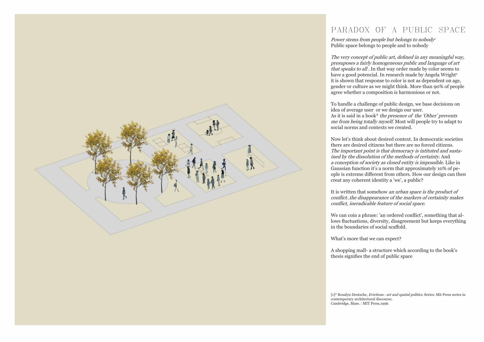
PARADOX OF A PUBLIC SPACEPower stems from people but belongs to nobody1
Public space belongs to people and to nobody
The very concept of public art, defined in any meaningful way, presuposes a fairly homogeneous public and language of art that speaks to all . In that way order made by color seems to have a good potencial. In research made by Angela Wright2 it is shown that response to color is not as dependent on age, gender or culture as we might think. More than 90% of people agree whether a composition is harmonious or not.
To handle a challenge of public design, we base decisions on idea of average user or we design our user.As it is said in a book* the presence of the ’Other’ prevents me from being totally myself. Most will people try to adapt to social norms and contexts we created.
Now let’s think about desired context. In democratic societies there are desired citizens but there are no forced citizens. The important point is that democracy is intituted and susta-ined by the dissolution of the methods of certainty. And a conception of society as closed entity is impossible. Like in Gaussian function it’s a norm that approximately 10% of pe-ople is extreme different from others. How our design can then creat any coherent identity a ’we’, a public?
It is written that somehow an urban space is the product of conflict..the disappearance of the markers of certainity makes conflict, ineradicable feature of social space.
We can coin a phrase: ’an ordered conflict’, something that al-lows fluctuations, diversity, disagreement but keeps everything in the boundaries of social scaffold.
What’s more that we can expect?
A shopping mall- a structure which according to the book’s thesis signifies the end of public space
[1]* Rosalyn Deutsche, Evictions : art and spatial politics. Series: Mit Press series in contemporary architectural discourse,Cambridge, Mass. : MIT Press,1996.
RETALISING SPACEterritorialisation
„As retail separates itself from the need of spacial proximity to residential areas it also begins to follow a different logic, a logic of agglomeration and territorialisation” 1
Usually flat rather not vertical forms became a black sheep of an ideal urbanism family.
De- and reterritorialisation is hope
The sense of absence needs to be present because without it there would not be enough goods and shoppers, also it would loose identity.
a theritory can be produced by a way of association where the proper usage is induced by association of one place to another of the same sort.
territorial network
in 1990 the Swedish Urban Environment Council conducted urban renewal of cities to achieve uniform place rather than a grid connecting different kinds of places.
The role of pedestrianisation in terms of increased sales is de-bated, but is often regarded as positive. In Copenhagen in 1962 by closing Ströget, sales increased by 30%. The golden years of Swedish pedestrian streets 1970-75 co-incided with peak of Swedish department store. Times when Sweden had highest density of departments stores in whole Europe, and pedestrian streets were almost always occupied by Domus or Åhlens.
[1] Retailising Space. Architecture, Retail and the Territorialisation of Public Space
Mattias Karrholm
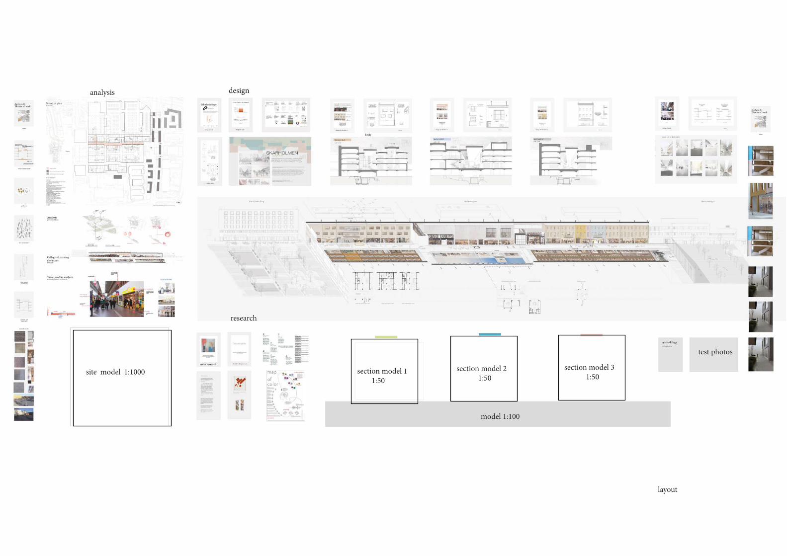
site model 1:1000 section model 1
1:50 section model 2 1:50
section model 3 1:50
model 1:100
layout
test photos
research
analysis design