digital capture and workflow for professional photographers
TRANSCRIPT

DIGITAL CAPTUREAND WORKFLOW FOR PROFESSIONAL
PHOTOGRAPHERS
Amherst Media®
P U B L I S H E R O F P H OTO G R A P H Y B O O K S
TOM LEE


Copyright © 2007 by Tom Lee.All photographs by the author unless otherwise noted.All rights reserved.
Published by:Amherst Media, Inc.P.O. Box 586Buffalo, N.Y. 14226Fax: 716-874-4508www.AmherstMedia.com
Publisher: Craig AlesseSenior Editor/Production Manager: Michelle PerkinsAssistant Editor: Barbara A. Lynch-Johnt
ISBN-13: 978-1-58428-200-6Library of Congress Control Number: 2006930069
Printed in Korea.10 9 8 7 6 5 4 3 2 1
No part of this publication may be reproduced, stored, or transmitted in any form or by any means, electronic, me-chanical, photocopied, recorded or otherwise, without prior written consent from the publisher.
Notice of Disclaimer: The information contained in this book is based on the author’s experience and opinions. Theauthor and publisher will not be held liable for the use or misuse of the information in this book.
Author Profile ........................................................6Acknowledgments ..................................................8
Introduction ..........................................................9
1. Image Control................................................13White Balance ......................................................13Resolution, Compression, and Capture Mode ......14
JPEG ...............................................................14TIFF ................................................................15RAW................................................................15
Color ...................................................................16Tone ....................................................................17Sharpness .............................................................17Exposure Value (EV) Compensation ....................17
2. Exposure ........................................................18
3. Histograms.....................................................23
4. Camera Settings .............................................27Factory Defaults...................................................27Preferred Settings.................................................27Flash Fill ..............................................................30
5. Working in JPEG ...........................................32
6. Color Management ........................................35sRGB...................................................................36Adobe RGB (1998) .............................................36Setting Up Photoshop..........................................37
7. Processing RAW Files ....................................41The Camera Raw Dialog Box ...............................44
8. Batch Conversion...........................................49Drop-Down Menu...............................................49Adobe Bridge.......................................................50
9. Workflow........................................................52Photography ........................................................52Backup.................................................................53Process.................................................................55Presentation .........................................................56How Long Does it Take? .....................................58
10. Workstation Ergonomics .............................59Monitors..............................................................59Input ...................................................................60Worktop...............................................................61Relax....................................................................61
CONTENTS 3
CONTENTS
11. Color Correction .........................................6212-Bit RAW.........................................................628-Bit JPEG Precise Approach ...............................63Quick Fix 1 ..........................................................66Quick Fix 2 ..........................................................68
12. Actions .........................................................70What Are Actions?................................................70Action Basics........................................................70Conversion to Black & White...............................71Muddy Version ....................................................74High-Contrast Version .........................................75Sepia Filter ...........................................................76
Controlled Tone Conversion ............................77Tom’s Soft Focus Filter ........................................79Sharpening...........................................................82
Smart Sharpen..................................................83Lab Mode Sharpening......................................85
Adjusting the Shadows .........................................85Shadow/Highlight Palette ...............................85Quick Fix .........................................................87
Saturation ............................................................89Rotation ..............................................................89Album-Specific Actions ........................................90
Stroke/Drop Shadow.......................................90Pillow Emboss..................................................92
13. Additional Photoshop Techniques ..............94Chiaroscuro .........................................................94Capture and Adjustment ......................................94Vignetting............................................................95Face Mask Histogram...........................................97Plug-in Filters ......................................................97Eye Makeover ....................................................100
14. Presentation ...............................................103Websites.............................................................104Preview Albums .................................................105Slide Shows........................................................105
15. Album Design ............................................107
16. Preparing for Printing ...............................116
Conclusion.........................................................120Index .................................................................123
4 DIGITAL CAPTURE AND WORKFLOW FOR PROFESSIONAL PHOTOGRAPHERS
Facing page—Bridesmaid portrait made with ambient light and
a fill flash. Postproduction work on the image included vignetting,
the application of Nik Color Efex Pro’s Midnight filter, and a slight
boost in saturation.


Leaving education as a frustrated artist, Tom turned to architecture, and life with a drawing board, then later trained as a structural engi-
neer. At the tender age of 21, he was introduced to photography. His firstcamera was a rudimentary affair including two zoom lenses. When lookingback, it’s difficult to see how, when picking up that camera, his hobby, vo-cation, and entire life would revolve around taking pictures. Like most bud-ding enthusiasts, he joined a succession of camera societies, learning basicand advanced skills and became successful at the national competition level.
Realizing the need to develop and improve his skills in the photographicmarket, Tom attended many lectures and seminars organizedby the SWPP and gained Licentiate and Associate qualifications.Now recognized for his expertise in digital image capture, Tomis also noted for his storybook style of wedding albums, involv-ing montage-style pages and softly blended backgrounds. Tomuses stylish Italian albums and the latest technology, and clientsare expected to pay a high premium for his work.
Tom has since given many seminars in the UK and writtenextensively for the SWPP magazine Professional ImageMaker. Hewas awarded a Fellowship of the SWPP in 2002 in recognitionof his services to the industry and made vice president of theSWPP and BPPA in the same year. Tom is also a member ofNAPP (National Association for Photoshop Professionals) andWPPI (Wedding and Portrait Photographers International).His recent success in their open print competition is testamentto his skills in competing with the best in the world.
As of this writing, Tom is the holder of the Overall Contem-porary Album of the Year Award. It’s also the second time inthree years that Tom has won this national competition organ-ized by the SWPP.
6 DIGITAL CAPTURE AND WORKFLOW FOR PROFESSIONAL PHOTOGRAPHERS
AUTHOR PROFILE
PHO
TO B
Y M
IKE
MCN
AM
EE, F
BPP
A, F
RPS.

Photography is not just about technical competence; this is only one as-pect of the art of weddings and portraiture. Many photographers who callthemselves artists fail to convey to their audiences the emotional impact ofthe subject. In Tom’s case, however, his well-learned and practiced skills onthe technical side have left him free to develop the aesthetic side and use hisjudgment to project his own feelings for his subjects into the picture and theviewers’ consciousness.
The vitality and insight captured via the use of light and shadow in hisportraits provide a unique view that can stand side by side with the best. Hiswork holds beauty, grace, authority, and influence of real people for us all toexperience.
Photography, unlike any other profession, brings us into close and per-sonal contact with an astonishing range of people including painters, sculp-tors, actors, musicians, and socialites. Many become lifelong friends and alsothe subjects of our portraits. Tom is a master of poetic photography, a truephotographic artist. With a career spanning 25 years, he has made a distinc-tive contribution to photographic portraiture.
—Jonathan Brooks, M.Photog. (USA), FSWPP
AUTHOR PROFILE 7

There are so many people to thank that it would take at least anotherbook to list all their names. Let’s start with Karl, without whom I would
never have picked up my first camera. My thanks, also, to mentor TerryHansen and close friends Jonathan Brooks, Andrea Barrett, Aled Oldfield,Mike McNamee, and Phil Jones, who are my greatest support and greatBritish photographers in their own right.
American friends Rick and Deborah Ferro, Bambi Cantrell, Dave New-man, and Norman Phillips have broadened my outlook on world photogra-phy and entertained me during my trips to WPPI.
My thanks also to everyone at Amherst Media—especially Craig Alesse,who has shown faith in me and allowed me to publish my first BIG book.
Many people often ask me, “How do you get to know so much?” Thesimple answer is that I practice, not just with Photoshop but with all thetools of the photographic trade. I keep up to date by reading the latest photopublications, and I talk with and see lecturers from all over the world, not juston my doorstep. Jane Connor-Ziser, Charles Green, Dennis Reggie, HansonFong, Maz Mashru, Jerry Ghionis, Yervant, and Monte Zucker have all hadan effect on my style and technique to some degree or other. It’s cost me alot of money to see some people, but without the teachings of these photo-graphic masters, I would not have had the courage to make this book pos-sible. I thank them all.
Of course, we can’t take pictures without equipment, and I also thankFuji and Nikon for their support. My great friends Sandy and Debbie ofAnna May Couture have assisted with models and bridal wear. Mike Mc-Namee has kept me straight and narrow with advise on technical matters.Without him, the world of color calibration would fall apart!
And last but certainly not least, I thank my wife, Karen, who has kept mefed and watered during the long hours of script writing and has the patienceof Job to put up with me for over 25 years.
8 DIGITAL CAPTURE AND WORKFLOW FOR PROFESSIONAL PHOTOGRAPHERS
ACKNOWLEDGMENTS
There are so many people to thank
that it would take at least another
book to list all their names.
Digital imaging is a monster, but it can be tamed. Many photographersget hung up on the technology involved in shooting and processing
their images and forget the posing, composition, and lighting basics. They
INTRODUCTION 9
INTRODUCTION
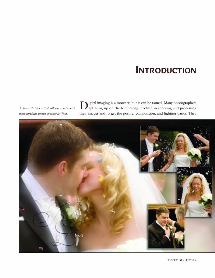
A beautifully crafted album starts with
some carefully chosen capture settings.

become button pushers who think any mistake can be corrected in Photo-shop. The reality is, if we don’t capture the image correctly in the first place,no amount of tweaking in Photoshop will help.
Freedom from film and processing costs has encouraged photographers toshoot more images, and that means that photographers are spending an everincreasing amount of time behind their computers processing the results.
Photoshop opens up a world of opportunity for the creative artist. How-ever, even artists need some time off, and I prefer not to starve. This is where
10 DIGITAL CAPTURE AND WORKFLOW FOR PROFESSIONAL PHOTOGRAPHERS
When you learn to fine-tune your capture
and maximize your workflow efficiency, you
can spend more time capturing heirloom
images for your clients.
the importance of workflow comes in. Basic tasks need to be completedquickly and efficiently in order to move on to other things. This can beachieved without sacrificing your artistry, but you need to balance the effort“out” against profit “in.”
We have assumed that the reader has some basic knowledge of Photoshop(e.g., how to access all of the tools and where the various palettes are lo-cated). We’ll cover capture modes and camera settings. We’ll learn how to setup actions in Photoshop CS2 and to implement an effective, efficient work-flow for image processing and album design. We’ll also cover image presen-tation, competition printing, and more.
Let’s dive in and get started.
INTRODUCTION 11
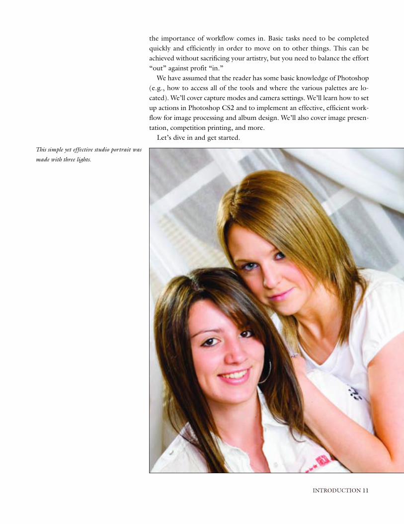
This simple yet effective studio portrait was
made with three lights.


Photographers have a myriad of choices when it comes to selecting theirfavorite weapon. It would be difficult to recommend any particular man-
ufacturer or model, however, as new models are introduced before buyers caneven pull their purchase out of the box. We will therefore discuss things onlyin general terms.
With so many digital controls at your fingertips, it’s tempting to throw inthe towel and just set your camera to its program setting. However, peoplewho have gone this route have found that this is not the answer. The varietyof scenarios you will need to shoot in, from the constant light in your stu-dio to the variable light quality you’ll come across in an outdoor shoot, require a varied approach.
Though the camera may feature a host of gadgets and buttons that can doeverything but make tea, each allows various capture modes (JPEG, TIFF,and RAW) and a means of controlling sharpness, color, tone, and contrast.If we can find a balance between optimum camera setup (not auto) and min-imum camera adjustments, we will create high-quality images with minimalfuss.
In this chapter, we’ll look at the seven controls needed to make the mostof your image: white balance, pixel count, color, tone, sharpness, exposurevalue compensation, and capture mode.
White BalanceOur eyes are very good at adjusting to the color temperature of light in agiven scene, but our cameras have great difficulty performing that task. As aresult, the images we capture are sometimes affected by a green or blue colorcast that ruins an otherwise acceptable image.
To prevent this problem, film photographers selected an emulsion tomatch their light source and/or placed colored filters over their lenses. Dig-ital cameras offer an auto white balance setting, several presets (e.g., tung-
IMAGE CONTROL 13
CHAPTER ONE
IMAGE CONTROL
Each model allows various capture
modes and a means of controlling
sharpness, color, tone, and contrast.
Facing page—This location portrait was
photographed in color at Red Rock Canyon,
Nevada. The image was then converted to
black & white using the Mono action de-
scribed in chapter 12.

sten, daylight, etc.), and the ability to set a custom white balance. The cam-era then applies a mathematical algorithm to capture the “true” color of yoursubject. While this can help to reduce the time spent correcting the imagein Photoshop, it’s not foolproof, as anyone who has tried the auto white bal-ance setting knows.
Resolution, Compression, and Capture ModeThe image resolution, compression format, and compression level that youselect will determine the quality of the final image. In general, higher reso-lution and lower compression means larger files, which are a requirementfor larger, higher-quality prints.
When you are shooting, your camera saves your image data using a com-pression format to reduce the amount of data stored on the memory card.Personal preference (and sometimes ignorance) plays a large part in whichformat photographers use. The following discussion will help you under-stand how to choose the option that best suits your needs.
JPEG. JPEG is a lossy compression format. This means that to make thefile size smaller, the camera throws away image data—and it cannot be re-claimed. The camera’s algorithms utilize a linear conversion of the recordedinformation to produce the final image, and the control settings for whitebalance, contrast, saturation, and matrix conversion are applied with somelevel of potentially destructive compression. Essentially, this means that iffiles are saved and opened frequently, some data is lost and files are steadilydegraded. Saving to a CD or DVD, so the data remains unaltered, can com-pensate for this.
Pixel Count. Each of the three JPEG compression levels are associatedwith a pixel count. With a 6-megapixel camera, the maximum resolution is3024x2016 (fine/best setting setting). The normal/better resolution is2304x1536 pixels (3 megapixels), and the basic/good setting is 1440x960(1.5 megapixels). Digital cameras allow photographers to select from threelevels of compression: basic/good is a high-level compression, normal/better is a medium-level compression, and fine/best produces the lowestlevel of compression for better image detail.
The advice here is, if using JPEG mode, avoid opening and saving the filemore than once or twice, and if saving in JPEG, always choose a low-compression save (level 10 or 12 in Photoshop). The sample images shownon the facing page illustrate the destructive nature of the “lossy” format.
JPEG allows the user to take photographs in succession more quickly thanusing the other modes and does not require images to be reprocessed afterdownloading to the computer. They can be worked on to your heart’s con-tent as soon as they are opened in Photoshop. JPEG files also take up lessspace on your memory card, allowing substantially more images to be storedthan in any other format. Typically a 6-megapixel camera will store high-quality JPEG files at about 2MB in size.
14 DIGITAL CAPTURE AND WORKFLOW FOR PROFESSIONAL PHOTOGRAPHERS
JPEG allows the user to take
photographs in succession more
quickly than using the other modes.

TIFF. During capture, TIFF files can be considered for all intents andpurposes to be similar to JPEG files, but they are generally not compressed(although they can be in certain instances) and retain all of the image datano matter how often they are saved and opened in Photoshop. Compared toJPEG files, TIFF files take longer to process and are much larger, meaningthat fewer images can be saved to the memory card. A typical TIFF file froma 6MB camera might be around 5MB in size. Though working in TIFF for-mat in Photoshop has some benefits, there is little benefit in shooting in thismode in camera. Though there is no compression applied to the saved file,the potentially destructive conversion of white balance, contrast, etc., is stillapplied. The increased popularity of RAW mode shooting and similar filesizes has led manufacturers to eliminate the TIFF capture mode on somemakes of camera.
RAW. Unlike JPEG files, RAW files are captured at full resolution but insome cases (like the Nikon D2x) can also be compressed.
RAW is the favored format for those who want only the best in qualityand flexibility from their images. Unlike JPEG and TIFF files, RAW files arenot processed into finished files in the camera. Instead, the image data issaved into separate channels of information (sharpening, contrast, saturation,white balance, etc.). Once the files are opened in a RAW file processing pro-gram (such as Adobe Camera Raw), the various settings can be adjusted toachieve optimum quality at a lossless level. Because RAW files contain a greatdeal of image data, they are very large. Also, because they must be finessedin post-capture, the wedding photographer with several hundred images totweak is faced with a daunting task. A chart comparing the file sizes for sev-eral mainstream cameras is shown on the following page.
IMAGE CONTROL 15
Enlargements from the original file (top)
showing a PSD file (bottom left) and JPEG
file (bottom right) with artifacts and break
up of the original file.

So what do we use, and when? To my mind, there is little benefit in shoot-ing in TIFF mode under any circumstances. The uncompressed TIFF filesoffer a larger file size than do the low compression JPEG files, but you’ve gotto consider the fact that shooting TIFF slows the operating speed of thecamera. If the image is shot in JPEG and then saved on the computer as aTIFF (or better still a PSD [Photoshop] file), there is no noticeable loss ofdata, you can store more files on your memory card, and can shoot faster se-quences if need be. The drawback of shooting in either TIFF or JPEG modeis that you have to get it just right. There is little margin for error, as we willdiscuss in chapter 3.
Shooting in RAW mode will give you more flexibility with high quality,even if you are able to store fewer images on the card and have to process the data later. Any mistakes in exposure at the time of shooting can, to a certain extent, be rectified in postproduction without degrading the imagequality.
The main disadvantage of this method is the time required in post-production. Some manufacturers have tried to address this problem by allow-ing simultaneous capture of RAW and lower-resolution JPEG files. This al-lows speedy access to JPEG images for proofing but the retaining the moreversatile RAW images for final output.
We will discuss this further when we look at camera settings in detail, butthe rule of thumb is, if you are sure of your exposure (e.g., in the studiowhen the lighting is constant and you know the limits of your equipment),there is nothing wrong with JPEG capture. Excellent 30x40-inch wall por-traits are possible through this method of working. When shooting wed-dings or portraits, my preference is to capture exclusively in RAW because itis much more forgiving. In changeable and difficult lighting conditions, yourclients do not want to see you fiddling with equipment. It’s more importantto concentrate on your subject and to capture the moment. When we lookat workflows, we will delve into the mysteries of file conversion and how tospeed it up, making it a much less painful experience.
ColorSome high-end digital cameras offer a color mode to control saturation ofcolors. Not to be confused with color temperature, which pertains to thewhite balance settings, the color control affects the strength of the colordensity (its saturation) that the camera produces and usually has three levels
16 DIGITAL CAPTURE AND WORKFLOW FOR PROFESSIONAL PHOTOGRAPHERS
Image File Size at Maximum Resolution
Nikon D70sFuji S2 ProCanon EOS 5DNikon D2x
(6.1 MP)(6.17 MP)(12.8 MP)(12.4 MP)
2.9 MB6.17 MB12.8 MB12.4 MB
not available35.5MBnot available36.5MB
50MB12.4MB12.5MB12.6MB
(PIXELS) JPEG TIFF RAWCAMERA
Shooting in RAW mode will
give you more flexibility with
high quality.

of low, medium, and high (off, standard, hard, etc). Setting this control toohigh can produce strong color casts that prove difficult to remove later on.
ToneThis control allows the user to select a low, medium, or high level of contrastwithin the captured file.
As camera manufacturers get ever more proficient at designing the prod-ucts and software, additional options become available. Some cameras offercolor and tone options that mimic results produced with Kodak, Fuji, andAgfa film emulsions. This allows photographers to create more saturated im-ages for landscapes or smoother skin tones for portraiture.
SharpnessIn general, a film image is either sharp or it’s not; there is no middle ground.All digital images, however, require some degree of sharpening to counter-act the effects of interpolation by the camera software. The amount of sharp-ening needed greatly depends on the subject matter, tone, color, and otheralgorithms applied to the captured image. This correction can usually be ap-plied in three levels, much the same as color and tone can.
Note that oversharpening can result in jagged outlines or artifacts on theboundaries of high-contrast areas.
Exposure Value (EV) CompensationExposure value compensation (EV) affects the under- or overexposure of animage relative to the “correct” exposure calculated by the on-board meter-ing system. The process of using this control is much the same as under- or overexposing film but is much more critical. This will be detailed in chap-ter 3.
In most professional cameras, EV control can be applied to compensate forboth ambient and flash separately. The degree of control varies from camerato camera but can generally be applied in either ±1/3 or ±1/2 stops.
Before we choose our camera settings for the various control modes, wemust first have a basic understanding of how the camera deals with our im-ages. The basic theory that follows is not rocket science, so bear with it.Though not essential, it will help you understand why we make the choiceswe do.
IMAGE CONTROL 17
Oversharpening can result in
jagged outlines or artifacts on the
boundaries of high-contrast areas.

By adjusting your aperture and shutter speed, you determine the amountof light that strikes the image sensor. A good exposure will produce an
image that accurately reflects the scene being photographed. Too much lightwill cause the image to be overexposed, and too little light will result in underexposure.
When printing film, a lab technician could make adjustments to the filtra-tion or the length of time that the image was exposed under the enlarger. In-consistencies in exposure went relatively unnoticed by the photographer.
Though exposure has always been important in getting the image justright, you’ll need to work a little harder to achieve good exposure with dig-ital. Digital capture is more akin to transparency film than negative film; youshould expose to preserve detail in the highlights.
The diagrams below compare the exposure latitude (x axis) and quality (y axis) of a good negative film with today’s image sensors.
The first diagram (film) indicates the “perfect” exposure and quality atpoint 0 with an acceptable image able to be produced at approximately 3stops over and 2 stops under (supporting the commonly held belief that filmhas approximately a 6- to 7-stop exposure latitude). Though film can bepush processed and images can be produced outside of this range, theywould not be considered acceptable due to the amount of grain, contrast,
18 DIGITAL CAPTURE AND WORKFLOW FOR PROFESSIONAL PHOTOGRAPHERS
CHAPTER TWO
EXPOSURE
Left—Idealized film latitude. Center—Digital JPEG latitude. Right—Extended latitude of digital RAW.

and loss of detail inherent in the latent image. We are assuming that the filmhas been exposed and developed in line with the manufacturer’s intentions.
The second diagram (JPEG capture) indicates the limits of most modernimage sensors, with “perfect” exposure and quality again indicated by point0. We can see how quickly we run into trouble when we don’t get the expo-sure right. Digital capture has the equivalent of a 4- to 5-stop latitude at best(1.5 stops over and 2 under). Beyond this, the resulting prints are not accept-able. In some cases, we could probably get away with pushing the exposure(e.g., creating a moody black & white image with plenty of grain given theright subject), but this is the exception rather than the rule.
The third diagram (digital RAW) shows the extended latitude that post-production work can give. Though the exposure latitude that we can achievean acceptable print from is still only 3 stops, the point at which exposure is“perfect” can vary by up to an additional stop under or over. Unlike othercapture formats, the RAW image is not set in stone at the click of the shut-ter button—it can be reset during postproduction.
We can see yet another advantage of the exposure latitude of RAW files inthe third diagram. When shooting in RAW, we can intentionally underexposethe image slightly to preserve detail in the highlights. We can then lighten themidtones and shadows in postproduction. This allows us to prevent a loss ofdetail in the lace and reflective areas of the bride’s gown.
The images above demonstrate problems common to digital exposure.The following JPEG images were captured on a Nikon D2x camera. Thebuilt-in meter was allowed to calculate the exposure, then EV compensationwas made to simulate under- and overexposure. No flash was used, and noneof the images were adjusted in Photoshop. Detail is just disappearing in the
EXPOSURE 19
–3.0 under –2.0 under –1.0 under even exposure
+0.5 over +1.0 over +1.5 over +2.0 over
“As captured” JPEG images showing the
limited latitude of digital exposure.
Digital capture has the equivalent
of a 4- to 5-stop latitude at best
(1.5 stops over and 2 under).

image that is +0.5 over but acceptable. Even at +1.0 stops overexposed,image detail has been clipped, and we are getting into trouble with exposurevery quickly.
Now compare the images on the facing page, which were equally over-and underexposed in the camera but captured in RAW format. The imageswere adjusted in Adobe Camera Raw, showing that detail can easily be re-tained in images at either end of the exposure range. From –4.0 to +2.0equates to a 7-stop latitude, which is pushing it a bit, and although satisfac-tory images can be made from severely under- or overexposed files, noisewill inevitably creep in at extreme latitudes. The accompanying histogramsalso show the increased amount of image information that has been retainedin the RAW files over the JPEG images.
We can also use the flexibility of the RAW format to shoot high-contrastscenes that extend beyond the normal range of capture by processing a cho-sen image for highlights, then processing a second copy of the same imagefor the shadows, and combining the two exposures in postproduction.
20 DIGITAL CAPTURE AND WORKFLOW FOR PROFESSIONAL PHOTOGRAPHERS
Left— –2.0 stops underexposed JPEG corrected in Photoshop. All the shadow and highlight detail has been held although the image is slightly
lacking in contrast. Center— +1.0 stop overexposed JPEG adjusted in Photoshop. Red areas show clipped highlights with no detail. Right—
+2.0 stops overexposed JPEG adjusted in Photoshop. Highlights have been totally clipped and shadow areas are losing definition.

Part of the reason for the so-called extended exposure range of RAW isdue to the way in which cameras handle the files at capture. If the camera isset to JPEG mode, the image is converted to the camera software’s 8-bitconversion mode, giving only 256 levels of brightness. When the camera isset to RAW mode, the image is not processed and remains in 12-bit or 14-bit mode (depending on camera make); this accounts for its larger size.If the camera’s RAW mode is equal to 12 bit, then there are 4096 levels ofbrightness. The RAW file is only reduced to 256 levels of brightness whenconverted after adjustment to give an optimum image. RAW images can alsobe converted to 16-bit files, giving even greater levels of brightness adjust-ment; however, the images will still need to be converted to 8-bit files priorto printing.
EXPOSURE 21
Left— –4.0 stops underexposed RAW image converted in Adobe Camera Raw. This will
make an acceptable print with minimal noise. Right— +2.0 stops overexposed RAW image
converted in Adobe Camera Raw. Note the fully developed histogram.

The table above shows the relevant brightness levels assigned to RAW andJPEG files, assuming a 5-stop dynamic range.
In the RAW format, even in the dark tones of the image, we have as manybrightness levels as the whole of a JPEG file. You can imagine even withsome moderate adjustment in Photoshop that the JPEG image will be de-stroyed in no time at all. Instead of smooth transitions in exposure, we getposterized and noisy images.
Allow me to reiterate at this point that if the JPEG image is correctly exposed, there would be no difference in the two files once the RAW filewas processed and converted, and each one would hold up perfectly duringprinting.
22 DIGITAL CAPTURE AND WORKFLOW FOR PROFESSIONAL PHOTOGRAPHERS
Relative Brightness Levels
1st—brightest tones2nd—bright tones3rd—midtones4th—dark tones5th—darkest tones
2048 levels1024 levels512 levels256 levels128 levels
69 levels50 levels37 levels27 levels20 levels
12-BIT RAW FILE 8-BIT JPEG FILEDYNAMIC RANGE
With moderate adjustment in
Photoshop the JPEG image will be
destroyed in no time at all.

Everyone knows that histograms give an indication of over- or under-exposure, or do they? Whether viewed on the back of the camera or in
Photoshop they both tell you essentially the same thing, but what?It’s important to understand that computers and cameras do not see color,
only numbers. Values of 0, 0, 0 (black) in the Red, Blue, and Green (RGBmode) channels produce black, and values of 255, 255, 255 in the samechannels produce white. By combining those colors in slightly differentamounts, you can create over 16 million colors.
Let’s look at a simple mosaic. There are 256 tiles in the mosaic with eachtile made up from a single color (87 dark blue, 10 brown, 7 red, 34 green,and 118 light blue). If we stacked each tile of the same color vertically andlooked at them from the side, they would look like the photo below. The re-sulting “histogram” shows the distribution of colors in the mosaic, with thelight blue pile the highest, and the lowest pile representing the red tiles.
So our histogram does not indicate exposure but merely the distributionof color within a given image, represented by vertical columns. The height
HISTOGRAMS 23
CHAPTER THREE
HISTOGRAMS
Left—Photographic “mosaic” of a cherry tree. Right—Histogram of a cherry tree mosaic.
Our histogram does not indicate
exposure but the distribution of
color within an image.

of each column represents the number of pixels corresponding to a particu-lar color in the image. The pixel columns are arranged in order into 256 lev-els of brightness between 0 (black) and 255 (white).
Now let’s look at how we can examine the histogram to give us an indi-cation of exposure. When we look at a histogram for a “correctly” exposedimage (whether on the camera or in the Levels palette in Photoshop), itmight look like the one above, showing the combined channels (RGB) in asingle graph with 0 (black) on the left and 255 (white) on the right. Thedata grows steadily from the left-hand edge of the graph at the shadow end,rises and falls depending on the color information in the image, and descendssteadily to the highlight end of the graph at the right.
The trick is to have the histogram extend as far to the left and right of thegraph as possible without peaking at either 0 or 255. This histogram showsthat the sample image displays all the subtle details contained in the high-lights and shadows and has “good” exposure.
If we look at the following image and accompanying histogram, we cansee peaks at the shadow end of the graph. If these peaks occur, the color in-formation is said to be “clipped.” In other words, the shadow areas areblocked up and when printed will appear black without detail.
We should, however, be very careful in assessing exposure from the his-togram. If we look at the low-key histogram, it looks as though there is notmuch detail in the highlight areas of the image; the peaks are concentrated
24 DIGITAL CAPTURE AND WORKFLOW FOR PROFESSIONAL PHOTOGRAPHERS
A “correctly” exposed image (left) and a his-
togram of a “correctly” exposed image
(right).
The image and histogram above show
“clipped” shadow detail.

right over to the left-hand side of the graph, indicating that it may be underexposed. Of course, this is what we want to see in this case, as the as-sociated image is actually low key.
If we look at the histogram for a high-key image, we will see that most ofthe tones in the image fall toward the right (or highlight) edge of the graph.This is desirable in this case, as we expect our high-key image to be comprisedmainly of light tones.
To summarize, then, histograms can be confusing and should not be re-lied upon for determining exposure; they only show color pixel information.Certainly, at the capture stage, you should be aware of what to expect de-pending on your shooting situation. Face mask histograms are a better indi-cator of correct exposure; in chapter 13, we will look at how they can beused to analyze your images.
HISTOGRAMS 25
The image and histogram show clipped highlight detail.
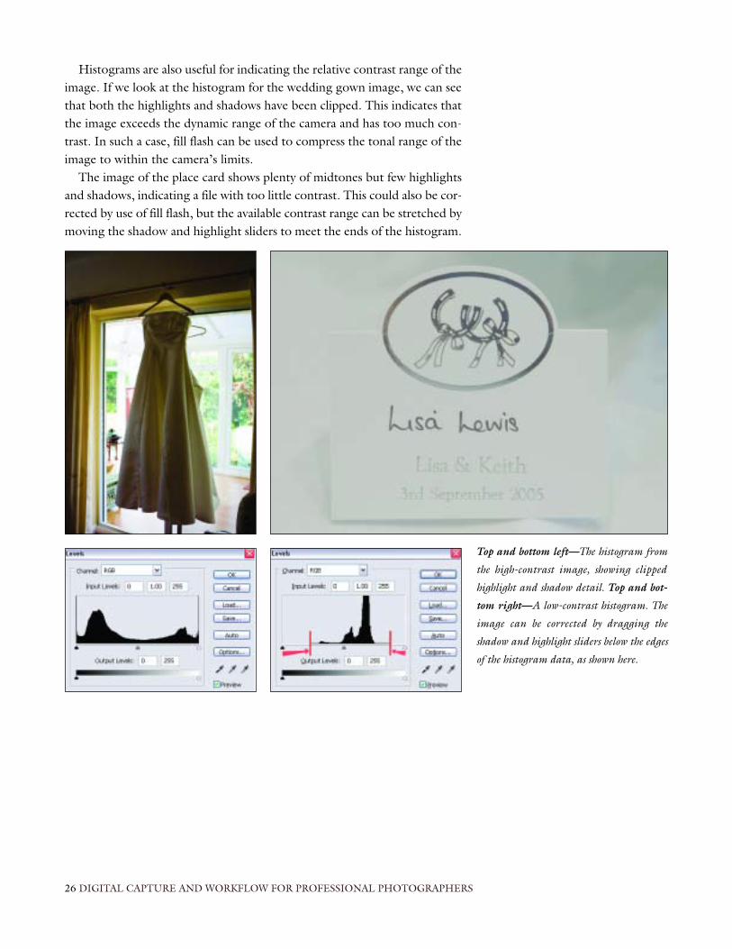
Histograms are also useful for indicating the relative contrast range of theimage. If we look at the histogram for the wedding gown image, we can seethat both the highlights and shadows have been clipped. This indicates thatthe image exceeds the dynamic range of the camera and has too much con-trast. In such a case, fill flash can be used to compress the tonal range of theimage to within the camera’s limits.
The image of the place card shows plenty of midtones but few highlightsand shadows, indicating a file with too little contrast. This could also be cor-rected by use of fill flash, but the available contrast range can be stretched bymoving the shadow and highlight sliders to meet the ends of the histogram.
26 DIGITAL CAPTURE AND WORKFLOW FOR PROFESSIONAL PHOTOGRAPHERS
Top and bottom left—The histogram from
the high-contrast image, showing clipped
highlight and shadow detail. Top and bot-
tom right—A low-contrast histogram. The
image can be corrected by dragging the
shadow and highlight sliders below the edges
of the histogram data, as shown here.

To ensure that we can capture the desired tonal range in the image, weneed to adjust our camera controls to a failsafe position, ensuring that
we only need to make minor adjustments during the photo session. Remem-ber that your clients pay the bills; you should devote most of your attentionto them, rather than to the equipment you’re using.
Factory DefaultsNormally the new camera will arrive in its box, programmed with factorydefaults that allow you to put in the batteries and start shooting. This, how-ever, will not yield the best results. The following suggestions are based onthe settings I use. This should be the subject of your own testing, however,as all equipment, studios, and subjects are not the same and require experi-mentation. Nevertheless, these guidelines offer a good starting point.
Preferred SettingsAll professional cameras allow you to control the functions that affect qual-ity. They will not be in the same location on every camera, but they can beaccessed through menu functions or dedicated scroll wheels.
Lighting conditions are constantly changing throughout the day, and withtoday’s modern photojournalistic approach to many weddings and al frescoportraiture, we rarely get the chance to change camera settings as quickly asthe weather changes. It would therefore be nice to configure the camera togive us the greatest latitude for correction should we misjudge general set-tings. This means shooting in RAW.
You may need to refer to your camera’s handbook to find out how to ac-tivate this function, but once you do, use this setting throughout the photoshoot. You could in theory leave all the other settings alone and adjust themin postproduction, but we do need to capture the image as close to perfectas we can to give us a fighting chance when the unpredictable happens.
CAMERA SETTINGS 27
CHAPTER FOUR
CAMERA SETTINGS
All professional cameras allow you
to control the functions
that affect quality.

Let’s start making our image control adjustments as discussed in chapter2. We are going to change the capture mode to RAW, so find the adjust-ment for the white balance and set it to Auto. This setting will work formost, if not all, of your shooting situations. Some settings such as Cloudymay work better indoors, but we can correct the white balance at a laterpoint in our workflow.
Next, let’s look at the compression level setting (sometimes referred to asthe “quality” of the image). If you want the best images, then there is onlyone setting to use—the highest. Usually, when the RAW mode is selected,the image is automatically captured using the highest-possible pixel count;however, if shooting in JPEG, you may need to manually select this option.You never know what your customer will order—perhaps an 8x10- or maybea 30x40-inch wall print—so selectyour highest pixel count.
Next, we’ll turn our attention tothe color, tone, and sharpness set-tings the camera applies to the image.Most manufacturers set these at themidpoint or average of the camera’scapabilities; however, I would urgeyou to turn them to the lowest set-ting or off. In chapter 3 we discussedthe problem of adding too muchcontrast. The same problems occurwhen adding saturation (color) andsharpening. By turning these additivefunctions down or completely dis-abling them on the camera, we havea cleaner image to build on—andagain, we can adjust the image inpostproduction. We will discuss colormanagement in chapter 6, but fornow, note that if you have an optionto set the color space of your cam-era’s capture mode, use Adobe RGBinstead of sRGB because of the largercolor range that the former mode cancapture.
The remaining photos show thefinished settings applied to these con-trols on the Nikon D2x. None ofthese controls need to be changed atany time during the shooting process.Note that, for comparison purposes,
28 DIGITAL CAPTURE AND WORKFLOW FOR PROFESSIONAL PHOTOGRAPHERS
Top left and right—White balance and RAW (quality) settings in the camera menu. Cen-
ter and bottom rows—Additional capture settings accessed through the menu of the Nikon
D2x camera.

the settings for the Fuji S2 Pro areshown in the table above.
Because on-board camera meteringsystems are designed to read “averagescenes,” they fall short of getting cor-rect exposure in some situations. Ashandheld meter readings are gener-ally slow (although more accurate), itwould be nice to modify our camerasettings to cater to scenes that are not“average.” Although not all brideswear white, this is generally the case,and the dress is in most cases highlyreflective. Position the bride againstdark foliage or in a room with lowlight levels, and the camera’s meter-ing system will tend to want tobrighten the overall scene (unless it’sspot metering), eventually clippingthe highlight details. The same is trueof grooms with dark suits and whiteshirts. Because the majority of thescene is darker than average, the cam-era will overexpose the image inorder to bring out the details in the
suit, consequently blowing out any texture in the subject’s white shirt.We can see that the straight capture image (top left) has clipped highlights
with no detail in the brightest parts of the dress. The final image (bottomleft) shows the result of compensating for this by adjusting the ambient EV.Making an adjustment of –1/2 or –1/3 stop will compress the highlight rangeof the histogram in order to ensure that the lightest tones of the image arenot blown out.
The compensation does cause a slight loss in the contrast range, but be-cause we can make fine adjustments in the RAW conversion of the image, wecan pull the contrast range and brighten the image by adjusting the Expo-sure and Temperature sliders until the tail of the highlight in the histogram
CAMERA SETTINGS 29
Camera Settings for the Fuji S2 Pro
white balancecapture modepixel countcolor tonesharpening
AutoHigh42560rg0rg0rg
automatic white balance controlsets camera to RAW or TIFF mode (additional changes must be made via the menu)highest pixel countturns saturation offturns contrast control offturns sharpening algorithm off
SETTING FUNCTIONCONTROL
Left column—Wedding dress has clipped
highlights (top) but has been compensated
for by –0.5 EV adjustment (bottom). Right
column—Setting EV ambient compensa-
tion on the camera (top). Final adjusted
image (bottom).

almost reaches the 255 end of the graph. The final adjusted image is repro-duced on the previous page (bottom right).
Some meters are better than others, and the degree of accuracy cannot begeneralized, so this is my advice: choose the best settings by experimentationand remember that digital capture handles shadow detail better than film, so use this property to your advantage. This technique also works for the av-erage scenes that do not seem to be overly affected by the reduction of am-bient EV, meaning that it can be set once and left, without determent to anyof your images no matter what the lightness levels or tonal range of the scene.
Fill FlashUsing reflectors to control light in the shadow areas for individual portraitsis a great way to model the light around your subjects, but there are timeswhen fill flash techniques are required.
Using individual power packs or strobes connected to the mains usuallydemands separate handheld metering to balance the main light (ambient)with your flash (fill light), particularly for those photographers who tend touse several flashes to control all of their light. This is akin to working withstudio lighting setups, and metering patterns are generally no different.
Using off-camera or tethered flash is a technique employed by many pho-tographers; it allows a degree of control that is fast and flexible without theneed to take additional meter readings.
Professional cameras will allow the additional setting of EV compensationfor flash. Differing manufacturers of flashguns allow the use of through-the-lens (TTL) metering, which is crucial to this technique, but again, read themanual for the individual units. It’s too easy to select what you think is theright setting and find out at some critical stage that there is more than one
30 DIGITAL CAPTURE AND WORKFLOW FOR PROFESSIONAL PHOTOGRAPHERS
Left—Example of off-camera flash and a
dedicated sync lead. Right—EV flash com-
pensation set on the flash unit at –2.0 stops.
Using off-camera or tethered flash
is a technique employed by many
photographers.

TTL setting depending on which camera the flashgun is attached to! Choosea TTL setting that will allow EV compensation and test it by changing thesetting to overexpose and underexpose and compare the results.
With the flash set to TTL metering, adjust the flash EV compensation tomimic the settings you might use in the studio (e.g., adjust the fill flash tobetween 1 or 2 stops under the main [ambient] light source to fill in thepockets and sockets). Remember that we have already adjusted the ambientEV to about –0.3, so the flash will need to be set to –1.3 for one stop less or–2.3 for a 2-stop adjustment. This flash adjustment is made on the rear dis-play of the digital flash unit but may also be available on the camera. Do notapply the adjustment in both camera and flash simultaneously or un-predictable results will occur.
This is a general assumption based on an average scene. If your scene isbacklit, then your metering will assume your “average scene” is overexposedand want to lower the exposure. This is fine for the background area but nogood if you don’t want your subjects in near silhouette. The answer is to ad-just the flash to deliver an extra half stop. (Use an EV compensation of –1.0instead of –1.5 without adjusting the EV ambient compensation.)
In order to get the best results from your fill flash technique you will needto set your flash sync speed to “slow.” This has the effect of dragging theshutter, allowing the camera to expose for the ambient condition and just fillthe pockets and sockets with a little sparkle, which won’t overpower theimage.
CAMERA SETTINGS 31
Flash synch set to Slow on the camera’s top plate.
Do not apply the adjustment in the
camera and flash simultaneously
or unpredictable results will occur.
As cameras get ever more sophisticated and metering systems become more accurate, photographers will learn to rely on their equipment to
get the image right in JPEG mode, eliminating the need to add an extra pro-cessing stage between capture and output. In chapter 2 we demonstratedhow RAW capture has an advantage over JPEG when it comes to capturingquality images, but when the images are processed as 8-bit files, they have ex-actly the same properties as a native JPEG.
So if we can control the conditions under which we shoot and do notneed to work at such a frantic pace, we should be able to capture a success-ful image in JPEG without compromising quality.
Working in the studio gives us our greatest chance of success. The lightconditions for a given setup remain constant, removing the variable fluctu-ations in brightness, tone, and contrast. The first image in any given seriescan be checked immediately (much the same as Polaroid proofing) to ensurethe remaining images for the lighting set will be consistent. Camera setup isthen relatively straightforward, giving dependable results every time.
The image sensor in your camera may be manufactured in an assemblyline, but it is essentially hand made. This leads to variations in build that giveeach camera its own “personality.” Having undertaken tests with two iden-tical cameras using the same capture card, lens, and camera settings, the re-sults were surprising. The two JPEG control images were visibly different!When I queried the manufacturer, they agreed that they too saw a differ-ence, but also stated that the images were “within expected tolerances.” Youcan make up your own mind as to what that means!
This observation demonstrates that each of your cameras will differ tosome degree, but the variations can be taken out to get more of a consistentresult by using a custom white balance. In RAW format this becomes unnec-essary due to the fact that the images are post-processed anyway, but in JPEGfor high-quality work it is essential.
32 DIGITAL CAPTURE AND WORKFLOW FOR PROFESSIONAL PHOTOGRAPHERS
CHAPTER FIVE
WORKING IN JPEG
. . .we should be able to capture a
successful image in JPEG without
compromising quality.

The custom setting is usually selected through the main menu controls ofthe camera. (Consult your camera’s manual.) The method described here isgeneralized so that you can follow the process, but will not vary too muchbetween camera models.
1. Meter your lighting setup and set controls on your camera in manualmode.
2. Change the camera to manual focusing mode rather than auto (you canchange it back later). Use a large sheet of pure white board (2x4 feet)or an expanded polystyrene sheet and place it in the main positionwhere your subject(s) will be, then select the Cus1 setting in the cameramenu, and it will ask you if you want to set it. Press OK to confirm.
3. Manually focus on the edge of the white board, fill the viewfinder withthe board, and then press the shutter. If your camera was left in auto-focus mode, the lens would “hunt” unsuccessfully for a focusing pointand not make an exposure.
4. You should have a pure or near white image on the camera’s LCDscreen. Press OK to confirm the setting and check the image in the backof the camera while bringing up the histogram. You should see some-thing like the image below. If so, you can reset your focusing mode toauto.
The histogram should look flat apart from a spike in the far right-hand side,indicating a good white balance. If the spike is not over to the far right of thehistogram, then you should adjust your lighting to give a little more illumi-nation or make changes to your aperture setting and run through steps 1–4again.
WORKING IN JPEG 33
Although faint, the custom white balance
“spike” can just be seen at the far right of the
histogram on the camera’s LCD screen.
The custom setting is usually
selected through the main menu
controls of the camera.

The gray balance target as produced by Digital Photo Solutions (left). The resulting image (center) and spikes produced by the target in
the histogram (right).
We can now select the Custom setting in the white balance menu in the nor-mal way and we’re ready to go. The images we capture during our shootshould be almost perfect with very minor changes required in the process-ing stage. The only time you need to repeat the custom white balance processis if you change your lighting ratios or positioning.
Some manufacturers, such as Lastolite, have come up with a new targetcalled a gray balance. The method for setting this custom balance is the sameas described above—the only difference is the position of the spike(s) in thehistogram. The target (shown below) is provided by Digital Photo Solutionsand measures approximately 6x6 inches. When the resulting image is ana-lyzed with the correct settings it will produce a histogram similar to the onebelow. Each spike represents the white, gray, and black areas of the target.
In the next section, we are going to look at various ways of postprocess-ing RAW and JPEG files to get the optimum image for printing.
34 DIGITAL CAPTURE AND WORKFLOW FOR PROFESSIONAL PHOTOGRAPHERS

There is much confusion over the concept of color management. To tryand dispel some of the myth and misinformation, a close colleague,
Mike McNamee—editor of Professional ImageMaker in the UK, and an ex-perienced lecturer, profiler, and scientist—and I combined our insights toprovide a serious and extensive investigation of color space workflow.
Why color manage? The object is simple: to get what you see on the screento match your intended output. The difficulty is that a manufacturer’s equip-ment is device independent, which means that getting one piece of equip-ment to talk to a piece of equipment made by another manufacturer is notalways straightforward.
A camera’s color profile is assigned by its manufacturer to convert the lightcaptured by the sensors into data (the capture profile). This data has to betransformed by a conversion engine in a software program on the computer(Adobe Photoshop) to show the colors on the monitor. The only way wecan be sure of the colors being shown on the monitor correctly is by calibrat-ing it. X-rite, GretagMacbeth, and other manufacturers produce equipmentthat generates another code (the monitor profile) that is assigned to the mon-
COLOR MANAGEMENT 35
CHAPTER SIX
COLOR MANAGEMENT
Capture Profile
Conversion Engine
Output Profile
Monitor Profile
Flowchart describing the color management
process.

itor that you view your images on. Finally, the monitor profile is transformedby the conversion engine to an output profile that matches the color char-acteristics of your printer (or external lab).
By calibrating our color profiles, we can ensure accurate color matchingthroughout the workflow process. Although manufacturers design profiles toput their equipment in the right ballpark, there is no substitute for profilingyour own equipment and workflow. The better the profile, the better the re-sult. However, there is a balance to this equation, and this is the color space.
Many photographers do not understand the relationship between colorspace and profiling. Profiling determines the accuracy of your capture, ma-nipulation, and ultimately your output. The color space (or gamut) is theamount of available colors that can either been seen (monitor color space)or output (printer color space).
Though there are other color spaces, we will consider only two, sRGBand Adobe 1998, in this book.
sRGBThis is the most common color space, originally promoted by Microsoft andother PC manufacturers, based on the expected quality of an “average” con-sumer viewing a PC monitor. It has also become the standard color space ofall consumer-based digital cameras and scanners. It was designed to have alow color gamut best suited for use on the Internet and for viewing on mon-itors with unknown or poor viewing characteristics.
Adobe RGB (1998)The RGB 1998 color space was developed by Adobe as a recommendedstandard for images that will be converted to CMYK for printing. Thoughthe color gamut is still relatively small, it provides the best compromise be-tween quality and gamut size.
36 DIGITAL CAPTURE AND WORKFLOW FOR PROFESSIONAL PHOTOGRAPHERS
Left—The visible spectrum (solid color) and relative space of Adobe RGB 1998 (yellow triangle) with CMYK printing gamut (blue).
Center—Diagrammatical substitution of color when moving from one color space to another. Right—Three-dimensional representation
of Adobe RGB 1998 color space (indicated by dots) and sRGB color space (solid).
By calibrating our color profiles, we
can ensure accurate color matching
throughout the workflow.
Though there are other color spaces that offer greater color gamuts, theyinclude a lot more colors than can be viewed or even printed. There is there-fore no point in working these color spaces just to throw the informationaway when printing. To get the best out of these color spaces we need to beoperating in 16-bit mode, which increases our file sizes and slows downspeed of operation.
Having worked in both color spaces, we found that there was no discern-able difference in the output when working in either sRGB or Adobe RGB.So, if the output results were so similar, why all the confusion?
The human eye is capable of discerning a wider color gamut than theCMYK and RGB gamuts and can perceive three dimensions. Also, thoughwe can perceive three dimensions, three dimensionality is hard to representon a two-dimensional page. The conversion engine has to map the colorscaptured in camera into the available gamut of the monitor for editing andmanipulation, then remap the colors again into CMYK for printing. We cansee that some colors do not transfer easily from one space to another andend up getting converted to other colors that are available, or worse still,thrown away. In this regard, it is better to use the largest availabel color spacefor capture so that fewer colors get remapped during processing furtherdown the workflow chain. The diagram (facing page, right) shows the avail-able Adobe 1998 (RGB) color space and sRGB color space in three dimen-sions, showing that Adobe has a larger color space than sRGB.
It appears that problems occur when workers do not “honor” the work-space. In other words, if you capture JPEGs or scan the image using thesRGB workspace, then you should not convert the image to Adobe 1998 orlikewise, from Adobe 1998 to sRGB. The real problems occur if images arecaptured in sRGB on the camera, converted to Adobe 1998 in Photoshopfor manipulation, then back to sRGB for printing.
Working in RAW mode capture is relatively straightforward as no colorspace is assigned to the image until it is processed. We can therefore assignsRGB or Adobe RGB depending on the remainder of our workflow.
In the past, color management has not been easy to understand or imple-ment; however, with an ever increasing number of people embracing the dig-ital revolution, equipment manufacturers, photographers, and printing labsare understanding the need to standardize and embrace the need to calibrate,profile, and take the necessary steps to ensure good workflow from beginningto end.
Setting Up PhotoshopSome photographers use Photoshop without altering its default settings.However, changing some of the preferences will give you an edge.
Edit>Preferences>General will get you into the dialog box shown on thenext page, and several changes can be made. The History States usually de-faults to 20 and refers to the number of “undo” commands you can apply.
COLOR MANAGEMENT 37
We can see that some colors do
not transfer easily from one space
to another.

This is usually too small to be of any real use, so increase this to 45. You canset it at up to 1000, but this will just fill up the hard drive with all the pre-vious versions of the file and slow down the computer.
Adobe Bridge is one of the most useful additions to CS2 and is worth theprice of the upgrade alone. It’s worth clicking the check box to Automati-cally Launch Bridge each time Photoshop is opened.
Change the General tab to the next on the menu, which is File Handling.Change the Maximize PSD and PSB File Compatibility to Never. These filetypes save all the layers that make up the image, but if the option is left
38 DIGITAL CAPTURE AND WORKFLOW FOR PROFESSIONAL PHOTOGRAPHERS
Top—The General Preferences dialog box.
Bottom—The new Adobe Bridge interface.

unchecked, it also creates a flattened image, which is saved with the layers foruse in programs that cannot handle layered files but understand the PSD for-mat. The resulting files are therefore much larger.
Move on to the Plug-ins and Scratch Disks menu. A scratch disk is a partof the hard drive that keeps track of the changes in your active files and al-lows you to undo the History and of course redo it. If the disk becomes full,it will slow down the machine or even prevent you from doing anything inPhotoshop. The answer is to shift the processing to other drives on the com-puter when the primary disk becomes full. You can choose up to four sepa-rate hard drive locations. Closing the active file will release all the cached in-formation and allow you to start over again should you not have the optionof using additional drives.
Now select Memory and Image Cache. Photoshop is memory hungry,and photographers are always advised to put in as much RAM as the com-puter will hold. This cache is usually defaulted to 50%, but you will increasethe speed of operation by increasing it to 80%. As long as you do not intend
COLOR MANAGEMENT 39
Top—The File Handling dialog box. Above—Choosing additional scratch disks.
Shift the processing to other
drives on the computer when the
primary disk becomes full.

to do too much multitasking, the computer will manage with the 20% left forother vital operations.
Close the dialog box by clicking OK and open Edit>Color Settings usingthe drop-down menu. This is where we select our color management op-tions. The Working Space should be changed to Adobe RGB (1998), andyou should turn off the Profile Mismatch check boxes. Photoshop will notwarn you about color-related issues unless it’s necessary (such as a missingprofile).
Now we can close the dialog box by clicking OK. The changes we havemade will not be active until we have closed down Photoshop completely andopened it again.
40 DIGITAL CAPTURE AND WORKFLOW FOR PROFESSIONAL PHOTOGRAPHERS
Top—Speeding up Photoshop by increasing memory allocation. Above—Finalizing your
color options.
Photoshop will not warn you
about color-related issues unless
it’s necessary.

Although shooting JPEG is an option, we have demonstrated the flexi-bility of RAW files, and this shooting mode is equally at home in the
studio as at a wedding. Let’s look at processing a sample set and some of thetools that help us do this quickly and efficiently.
One of the most useful tools for shooting in RAW mode is the Gretag-Macbeth ColorChecker color rendition chart. It consists of 24 accurate colorsquares, which have known values. (Remember that the computer sees coloras numeric values.) The value of these squares is generally expressed in Labmode (Lightness, a, and b channels) because Lab color is device independ-ent and is the same no matter what color space we are working in.
Depending on the anticipated use of your image (web or print; see pages35–37), you’ll select either the sRGB or Adobe RGB color space. The actual
PROCESSING RAW FILES 41
CHAPTER SEVEN
PROCESSING RAW FILES
The GretagMacbeth ColorChecker Color Rendition chart.
One of the most useful tools for
shooting in RAW mode is the
GretagMacbeth ColorChecker.

value of these squares will change depending on the color space of the mon-itor, but we will assume for the remainder of this book that we are workingin the Adobe RGB (1998) color space.
The most important of these colors is the gray set at the bottom of thechart. We’ll worry about the numbers later, but for now let’s go back to thecamera settings. Because we are going to use the ColorChecker and shoot inRAW capture mode, there is no need to set a custom white balance on thecamera. This means we can use our “standard” settings for RAW shooting.When shooting in the studio, the only change needed would be to removethe ambient and flash EV compensation.
Our first step in the capture process is to take a reference image with theColorChecker in the shot, then to remove the card from the set and carry onshooting the remaining images. Shooting outdoors with the ColorCheckerin every scene at a wedding would be a bit tedious, so we will discuss thisworkflow later.
The following images were shot using an Olympus E1 Pro camera inunder ten minutes with mismatched lighting units and an assortment of light
42 DIGITAL CAPTURE AND WORKFLOW FOR PROFESSIONAL PHOTOGRAPHERS
“As captured” photographs from an Olympus E1 camera.
Our first step in the capture process
is to take a reference image with the
ColorChecker in the shot.

reflectors. They were shot at a trade show with the exposure fine-tuned byexamining the histogram on the back of the camera and crowds of peoplewanting to know what was going on, so we were really up against it!
Not surprisingly, you can see that the images look a little lifeless and lacksparkle. Images always seem to look better on the camera’s viewing screen,and the only way to see what they really look like is by viewing them on a cal-ibrated monitor.
The first step in postproduction is to open the all the images using AdobeBridge. This is the new interface that has replaced the old browser in theprevious version of Photoshop and works across all of the Adobe CreativeSuite programs. If you have set up Photoshop as described in chapter 6,Adobe Bridge should open up automatically and sit in the system tray at thebottom of the screen.
Hold down the Shift key and click the first and last thumbnail image to se-lect all images. Right click over one of the images followed by another clickon Open. This automatically opens up the Adobe Camera Raw converter, al-lowing us to make several key adjustments in order to provide us with ouroptimum image.
We are not going to consider all the various elements of the RAW file con-verter; we’ll concentrate on the ones that are most important to a speedyworkflow. Let’s start by looking at the important tools in the Camera Rawscreen shot on the next page.
PROCESSING RAW FILES 43
The first step in postproduction is
to open the all the images using
Adobe Bridge.
Adobe Bridge interface with our original images in the main viewing pane.

The Camera Raw Dialog BoxGreen Ellipse. The auto correction tools (exposure, shadows, brightness,and contrast) are a new feature of the RAW file converter. Like all auto func-tions of Photoshop they go a long way to solving complex problems andgive a good representation of the final image, but not always the one youwant. For instance, if you intentionally take a silhouette, Photoshop will tryto correct it.
We can turn off these correction tools by using the Ctrl/Cmd+U keys, butlet’s leave them on for now.
Red Ellipse. The eyedropper tool, shown here, is probably the most im-portant tool when trying to achieve correct white balance and color accuracy.
Blue Ellipse. The RGB values are displayed on screen and, when used inconjunction with the other tools, tell us just how precise our corrections are.
Other windows indicate the color space Adobe RGB (this can be changedto sRGB if preferred, but refer to chapter 6 [color management]). The bit-depth field for the processed image is set to 8, and ready for output withminimal manipulation. Output resolution is set to 240dpi, which will deter-mine the overall physical size of image, but this is generally a matter of pref-erence. (240dpi is the native capture size of Olympus RAW files.)
This is where the real magic starts. If the reference image is not in themain window, click the thumbnail in the left-hand pane. The Auto functionof the RAW converter (ringed in green) rarely gives you the desired effect,so select the white balance eyedropper (ringed in red), place it over one ofthe gray squares at the base of the ColorChecker (I suggest the third squarefrom the right; this square represents 18% gray), and just click.
This will automatically shift all the colors in the image to neutral, remov-ing color casts. You will also notice that the white balance field will shift fromAs Shot to Custom, and the sliders in the adjustment settings will repositionthemselves to compensate for the color shift.
44 DIGITAL CAPTURE AND WORKFLOW FOR PROFESSIONAL PHOTOGRAPHERS
Adobe Camera Raw with the main features
circled.
The auto correction tools
are a new feature
of the RAW file converter.

In chapter 4 we turned off the color, tone, and sharpening controls in thecamera to give us greater control during postproduction. Having sorted outthe color by using the white balance tool, we are now going to turn our at-tention to the exposure and tone of the image.
Look at the section of the RAW converter ringed in blue. We can see a rep-resentation of the RGB values of our selected image. When you let the whitebalance eyedropper hover over the 18 percent gray square we used to cor-rect color, the values are R90, G90, B90. The fact that the values are all thesame indicates that the image is neutral.
Neutral gray, no matter what shade, will have equal values of red, green,and blue (e.g., R125, G125, B125 or R30, G30, B30). The informationprovided with the ColorChecker indicates that the numeric value for thissquare in RGB terms should be R117, G117, B117. This, however, is aver-aged due to the values of RGB varying with color space between 107 to 127.What matters is that the image is neutral. Using the average value of 117, wenow need to correct the exposure and tonality of the image using additionalcontrols.
The control panel on the right of the RAW file converter includes an Ex-posure (compensation) slider. Highlight the 0.00 in the box to the right ofthe slider, and position the white balance eyedropper over the 18% graysquare again, then use the up/down arrow keys on the keyboard to adjustthe slider. Watch the RGB values at the top right of the screen, and stopwhen the values reach 117, 117, 117 (or as close as you can get them).
PROCESSING RAW FILES 45
Above—The 18 percent gray square of the GretagMacbeth Color Rendition chart. Top
right—The control box after clicking the 18 percent gray square with the white balance tool.
Bottom right—The RGB field of the RAW converter dialog box after clicking on the 18 per-
cent gray square with the white balance eyedropper. The fact that the values are all the same
tells us that our image is neutral.

The check mark in the Auto box above the Exposure slider will disappeardue to this manual adjustment, and the other control sliders will automati-cally adjust to compensate for the change. The image has now been adjustedfor color tone and exposure, and we can see that the image was just over 11/3 full stop of exposure from our original settings. Let’s check that our ad-justments can be printed within the capabilities of our inkjet or the lab’sprinters.
To the left of the RGB color value indicators in the RAW conversionpalette, there are two check boxes, Highlights and Shadows, that can be se-lected to show colors that are out of gamut. When these are selected, the pre-view image in the main pane shows color patches in each of the areas that willhave clipped color and will not print correctly.
The image above has been deliberately overcorrected to demonstrate thepreview pane. If working in the sRGB color space, the corresponding areas,which are now beyond the tonal range of most printers, will be slightly different.
The following method can be used instead of checking the Shadows andHighlights indicators, to better show clipped detail in these areas.
Let’s go back to our image in the RAW converter. Without making anyfurther adjustments, hold down the Alt key and click on the Exposure sliderat the same time. The image should change to a blank black screen. If theimage had been overadjusted, you would see some color inclusions—or evenworse, white. Color inclusions would indicate that one or more of the Red,Green, or Blue channels has been clipped. White would indicate that all three
46 DIGITAL CAPTURE AND WORKFLOW FOR PROFESSIONAL PHOTOGRAPHERS
Left—Adjustment panel after exposure
compensation of 11/3 stops. Right—The
Shadows and Highlights boxes are selected in
the RAW conversion palette.

channels have been clipped and the highlights have no detail in them. Oursample image shows some minor clipping in a small section at the edge of thedress. All we need to do is back off the Exposure slider until this clipping dis-appears; but in this instance, the affected area is not critical and will go un-noticed. We can use the same technique to check for clipping in the shadowsby holding the Alt key and clicking the Shadows slider.
If none of the shadows have been clipped, we can add a little contrast tothe image by moving the Shadows slider to the right while holding the Altkey until the color inclusions or black spots appear, then backing off a cou-ple of points. The final corrected image can be compared with the originalbelow.
Now that we have adjusted our reference image, it’s going to take an ageto correct the other images in the same way from our portrait session, right?
Once you have mastered this method of RAW file adjustment, it can bedone in a matter of seconds, but we do not want to spend all our time ad-justing the remaining images in the same way. Though we have only fourimages in our sample session, we could easily have fifty!
With Adobe Bridge still open, use the Select All buttonat the top left of the thumbnail column. All the remain-ing images have now been selected and the Synchronizebutton also becomes active. When clicked, the Synchro-nize dialog box appears, with all of the possible adjust-ments selected. When OK is selected, the changes madeto the reference image are transferred to the remainingfiles without having to open them or work on them indi-vidually. The changes we have made are not permanent,and we could easily start from scratch again if needed.
With the adjustments made, we have a couple of op-tions available. We can select a single image or multiple
PROCESSING RAW FILES 47
Top—Hold down the Alt/Opt button and click the Exposure slider to show clipped colors or loss of detail. Above—Image before (left) and
after correction (right).

images and open them in Photoshop, ready to crop and make final artisticmanipulation, or select Done, which closes the Camera Raw dialog box. Thiswill be our preferred option in this instance.
The adjustments we have made are saved in .xmp sidecar files (i.e., themetadata is stored in a separate file, rather than with the main file), which arecached in the same location as the original RAW file. This means that whenAdobe Bridge opens the files for viewing, it calls for the adjustment informa-tion in the sidecar file and represents the adjusted image in the viewer with-out having to open up the file and apply the adjustments to the main image.
48 DIGITAL CAPTURE AND WORKFLOW FOR PROFESSIONAL PHOTOGRAPHERS
Left—Pick Select All to choose all the remaining files in Adobe Bridge. Right—The Synchro-
nize feature corrects all selected images to match the original adjusted image.

One of the major changes to Photoshop CS2 over the previous versionof Photoshop is the inclusion of an image processing program for RAW
files. This was previously only available as a special plug-in.So far we have only processed the image files to their “optimum expo-
sure.” They must now be converted to a working file format so that we mayapply our remaining cropping and composi-tional adjustments. This is done by applying a script file, but just like everything in Photo-shop it can be accomplished in one of severalways.
Drop-Down MenuFrom the drop-down menu, select File>Scripts>Image Processor and a new dialogwindow appears.
Section 1 of the dialog box asks you to se-lect the files required for processing, which isdone by browsing for the required files. Donot select Open First Image to Apply Set-tings, as we have already done this in AdobeBridge.
Section 2 asks where you would like tosave the images. We could select anotherfolder, but it makes sense to leave them in thesame folder. The processor creates a separatefolder automatically based on the type of filewe convert the RAW images to.
Section 3 lets us determine the file type(JPEG, PSD, or TIFF). We could choose all
BATCH CONVERSION 49
CHAPTER EIGHT
BATCH CONVERSION
The Image Processor dialog box.

three if we so desired! We have chosen to work in PSD mode but do notwant to resize at this stage.
Section 4 allows us to run an action at the same time. Because we have ad-justed our images for optimum conditions, we could run a sharpening actionto put some crispness back into the file, or a sepia toning action to create amonochrome set, but in this exercise let’s just add some copyright informa-tion as an embedded tag to the file. When opened, a copyright symbol willappear in the top left of the title bar. There are no excuses for anyone steal-ing your images! Also check the ICC profile box. Remember when we dis-cussed color profiles in chapter 6, we only assign the color profile duringconversion of the RAW image. If the image has been captured in the sRGBcolor space, then the files will be assigned that color space, but when the im-ages are opened for the first time in Photoshop, if we have set the programup as described in chapter 6, we should get a profile mismatch warning be-cause the working profile of Photoshop has been set to Adobe RGB (1998).
Just click the Run button and watch it all happen. However, if you chooseto process fifty images, you may want to grab a bite to eat! It does take sometime, but it will free you up to do something more productive elsewhere inthe studio.
Adobe BridgeThe process of converting your images using the Image Processor dialogbox is exactly the same when using Adobe Bridge; however, you can be moreselective with the images chosen to be processed or select the entire folderon view.
50 DIGITAL CAPTURE AND WORKFLOW FOR PROFESSIONAL PHOTOGRAPHERS
Batch processing selected files from Adobe Bridge.
If the image has been captured in
the sRGB color space, then the files
will be assigned that color space.

Select Tools>Photoshop>Image Processor from theAdobe Bridge drop-down menus, and the dialog will as-sume that you want to process the entire folder. If wewant to be more selective, we can Ctrl/Cmd+click indi-vidual images in the folder and then choose Tools>Pho-toshop>Image Processor and an additional option willread Process Selected Images Only. Clicking Run willprocess only the selected images.
When the process has been completed, check thefolder with your RAW images and you will find a secondfolder labeled PSD. This folder contains all the imagesyou have just processed, but the files are now in a PSDformat ready for final creative adjustment.
Processing RAW files in Photoshop CS (as opposed toCS2) is just as easy; however, you will need a plug-indownloaded from the Internet. Dr. Russell Brown has afascinating website (www.russellbrown.com) that has allthings digital to do with Photoshop (he was instrumen-tal in developing the Image Processor in the current ver-sion of Photoshop and is Adobe’s creative director).Brown’s site offers several scripts, which can be loadedinto Photoshop for precisely this purpose, and they’refree!
The one that we are interested in is the Camera Rawprocessor. If you follow the instructions (after watchingthe hilarious video that accompanies it), you will have
downloaded a script that works in precisely the same way as the version inPhotoshop CS2, although the interface is slightly different.
When you have successfully loaded the script file into Photoshop, go toFile>Scripts>Dr. Brown’s Image Processor, and the palette will open as inthe photo below. If it isn’t fully expanded, check the Advanced Mode checkbox.
Fill in the required fields and click the Run button. After a while you willhave successfully converted all your RAW files, and will be ready to apply thefull weight of your creativity.
BATCH CONVERSION 51
The Adobe Camera Raw plug-in for Adobe
Photoshop.
In the preceding chapters, we’ve reviewed the intricacies of RAW formatand conversion, but now let’s consider the actual business of undertaking
a wedding shoot and the various steps and precautions taken to achieve asuccessful result.
The following workflow is broad based and is loosely constructed aroundmy own working practices.
PhotographIt is unlikely that you will want to take photographs of the ColorChecker inevery location, particularly as photojournalistic wedding photography is invogue. We simply don’t have the time to do this, and the bridal couple wouldget fed up quickly. The whole point of this style of coverage is “no fuss.”Therefore, we will discuss a workaround later in this chapter.
After selecting the camera settings outlined in chapter 4, making only theminimal adjustments necessary (flash EV compensation and ISO rating) willallow you to concentrate on your composition and devote more time to yoursubjects than your equipment. There is no substitute for practice—tryingthese techniques on live weddings without some experimentation and theutmost confidence in your equipment is a recipe for disaster. As explainedearlier in this book, identical camera models can have minor differences thatrecord images quite differently, and some manipulation after capture is in-evitable. The whole point of adopting a middle ground approach is so thatno matter what camera, system, or lighting techniques are used, the imagescaptured on your digital media will be almost at their optimum, minimizingthe need for any postproduction work.
Today’s high-end professional cameras all have excellent light meteringbuilt in, and the metering is accurate enough for me not to worry about tak-ing separate handheld readings, which demands additional time and effort.Center-weighted metering will generally give excellent results for the major-
52 DIGITAL CAPTURE AND WORKFLOW FOR PROFESSIONAL PHOTOGRAPHERS
CHAPTER NINE
WORKFLOW
Identical camera models can have
minor differences that record
images quite differently.

ity of our photography, as our subjects will usually be in this region of theimage when focusing (even when recomposing). Spot metering is a little overthe top but does become useful if detail is required when photographingbacklit scenes. Full-frame evaluative metering tends to overcompensate forhighlights in the scene and will generally underexpose the image too far.
The size of your digital storage media is important. Using small storagecards will mean changing them frequently—and this becomes tedious. Dura-bility problems with digital media can cause anxiety when error messages ap-pear, so using large-capacity cards is like putting all your eggs in one basket!A problem with image 2 on the card may prevent the download of all the re-maining files, so be cautious. If you haven’t had a problem with your digitalmedia yet, you will! Shooting in uncompressed RAW format on the NikonD2x with a 1GB card will allow approximately 40 images to be stored. Thiskeeps me in a comfort zone of not too many and not too few.
The cost of media is coming down daily, so there is little point in not hav-ing lots of memory cards. Label all your media with a reference number orletter to identify them and store them in a carry pouch. To identify usedcards, turn them back to front!
BackupAs soon as possible, download the images to the hard drive of your com-puter. Prior to making a backup copy, you may want to rename your files.Using the default file naming of the camera is not very imaginative and canbe confusing. I suggest using the media card reference followed by an imagenumber: 1-001 to 1-040, 2-001 to 2-040, 3-001, etc. This not only identi-fies the media card the image came from but also the sequence number,which is handy if you encounter problems with the downloading process.This is usually done in Adobe Bridge via Tools>Batch Rename.
Once you select Tools>Batch Rename, a separate dialog box appears thatallows you to make several selections and add additional fields to the file
WORKFLOW 53
Carry pouch (left) and storage card (right).
The cost of media is coming down
daily, so there is little point in not
having lots of memory cards.

name. In the bottom pane of the dialog box, you’ll see the current file nameand the proposed file name. Before committing the changes, you can edit thedetails if it isn’t quite as you intended. To commit the changes to all the files,ensure that none of the images are highlighted and click the Rename button.If you have highlighted individual files in the preview pane, the renamingwill only apply to the selected files.
We can now make our first backup copy. This is our “just in case” file,which can be accessed quickly should anything happen to the main harddrive working files. When backing up, using a separate removable hard drive
54 DIGITAL CAPTURE AND WORKFLOW FOR PROFESSIONAL PHOTOGRAPHERS
Top—Photoshop’s Batch Rename dialog box.
Bottom—Renamed photos in Adobe Bridge.
“1-” indicates storage card number, “001”
indicates the sequence number.

that can be disconnected from the studio network to help prevent corruptionis advisable. We now have three copies of our images including those on themedia cards that have yet to be erased. Make a complete DVD backup forarchival purposes. This DVD should be stored and only accessed if one of thetwo hard drive copies is corrupted in order to restore the working files. Thisbelt-and-braces approach to backing up your work may seem excessive, butwhen your livelihood depends on getting the job out and avoiding heavy lit-igation from your client, you’ll be glad you did it.
Just before you delete those valuable files on the media cards, it’s worthchecking that your backups all match what you have on the main hard drive.There are many file comparators on the market that can be purchased overthe web for very little money and compare destination and source files fordata inaccuracies, flagging dodgy files before they cause you a problem.
Once the files have been backed up and checked for accuracy, it’s prettysafe to delete the files from the digital media. There have been reports of memory cards occasionally being corrupted when deleting files from themedia while attached to the computer. So to be safe, reformat the cards in the camera.
ProcessWe can now get on with the business of formatting our RAW files. We startby processing the files as discussed in chapter 7, but with one important dif-ference. It’s unlikely that we will have used a ColorChecker; however, usingthe White Balance tool and clicking on an area of the image that should bea neutral shade of gray (white wedding dress, jacket, tablecloth, shirt, flow-ers, etc.) will neutralize any color cast in the image.
Selecting a light area will make the image appear warmer in tone thanchoosing a dark jacket, which will tend toward a cooler blue or green tone.
WORKFLOW 55
Color corrected image using white balance
eyedropper on white tissue behind flowers.
Once the files have been backed
up and checked for accuracy, it’s
pretty safe to delete the files.

The color temperature will not be able to be made absolute, however; ascolor preference in the image is usually subjective, moving the Temperatureslider until the image looks right means it probably is and will produce apleasing printed result. In our sample screen shot, the exposure has been ad-justed to +1.5 stops. This is due to the predominantly light image fooling theinternal exposure meter of the camera and underexposing the image; how-ever, with the use of RAW file conversion, the image has been optimizedwithout any significant degradation.
The process of balancing all the remaining images is done exactly as de-scribed in chapter 7, including the use of the Synchronize button for adjust-ing multiple images with similar tonal values and lighting. Once balancedand processed, we can convert the images using the Image Processor into 8-bit PSD files for creative manipulation.
At this point, depending on your studio operation, you may wish to cre-ate a copy file of your converted images. This is useful if you want to savemaster copies for album design and separate fully manipulated images foruploading to the web. In either case, the images are not resized.
PresentationPhotographers have many options when it comes to presenting their imagesto the client, including transproofing, individual proof photographs, and
56 DIGITAL CAPTURE AND WORKFLOW FOR PROFESSIONAL PHOTOGRAPHERS
Previewing by digital projection.

video. In today’s technological age, the method that gets the wow factorworking for you is digital projection onto a large viewing screen. As the adage“bigger is better” suggests, showing larger images tends to increase sales.
Another conundrum is what to show your client. Do you show them in-dividual images or a completed album? Showing a completed album may re-duce your upselling of individual prints but will shorten design times on thealbum because you are not waiting for the client to make up their minds.
Whichever method you choose is bound to pay dividends, but projectingimages usually demands smaller files. We can run an automated batch processin Photoshop to do this prior to loading the images into our slide show program.
WORKFLOW 57
An “as captured” moment, shot with strong
side light and fill flash.

When the slide show has been made, burn it to a CD or DVD and offerit to the client as an add-on. It’s important that this is not done until pay-ment has been received for other goods due to the ease of copying electronicmedia.
When the client is happy with your artwork and album design, your onlyremaining task is to produce their album. This is detailed in chapter 15.
How Long Does it Take?Though today’s technology is good, things will undoubtedly get better andfaster. I have attempted to distill some working times to the above workflowbased on current computing equipment, but as specific hardware will differwith individual specification, and photographers’ expertise with Photoshopis unpredictable, the times shown are variable.
58 DIGITAL CAPTURE AND WORKFLOW FOR PROFESSIONAL PHOTOGRAPHERS
Workflow Time Table
1. Take photos at the wedding.
2. Download images from digital media.
3. Rename all files in Adobe Bridge before converting (1-001 to 1-038, 2-001 to 2-038, etc.).
4. Back up RAW files to second hard drive and DVD.
5. Check the DVD and backup drive using comparator software to ensure files were recorded.
6. “Process” files in Adobe Camera Raw.
7. Convert the files in Image Processor.
8. Crop files, make artistic adjustments (monotone, sepia tone, etc.) and sort into order by
sequence (using Adobe Bridge).
9. Upload high-quality files to online ordering server.
10. Batch convert to make presentation slides (see chapter 8).
11. Make manual and auto presentation slide shows (see chapter 14).
12. Burn slide show CD/DVD.
13. Sell to clients.
all day
1–5 minutes
2 minutes
30 minutes
5 minutes
100 images/hour
leave it running
100 images/hour
100 images/hour (288KB)
30 minutes
10 minutes
10 minutes/30 minutes
as long as you like
TASK TIME
Burn the slide show to a CD or DVD.

Before we delve into the fine detail of image adjustment and creativeworkflow, it’s worth considering how we are going to work comfortably
and efficiently at the computer (ergonomics).The photos below show a typical two-screen layout with keyboard and
graphics tablet. The work area is uncluttered and not a mouse in sight.
MonitorsIn days gone by, the use of liquid crystal display (LCD) monitors for high-quality graphics work was unheard of, mainly because of the difficulty in ob-taining good color accuracy. Cathode ray tube (CRT) screens were the orderof the day due to high color accuracy, good contrast ratios, and were alsoabout half the price of the equivalent LCD monitor.
Things seem to have taken a complete turnaround in the last few years.Manufacturers are dropping out of the CRT market due to a global decision
WORKSTATION ERGONOMICS 59
CHAPTER TEN
WORKSTATION ERGONOMICS
The workstation and two-screen setup.

to gradually phase out production. It seems that an average CRT monitorcontains approximately 7 pounds of lead shielding, which is proving to be aheadache to dispose of. Although there are a number of manufacturers stillproducing this type of monitor, their numbers are ever decreasing.
The production and sale of LCD monitors, on the other hand, has grownby leaps and bounds. Recent tests have shown that some LCD screens out-perform their CRT counterparts. They also have the added benefit of run-ning at higher brightness levels, meaning that ambient room lighting can behigher than for CRT screens without affecting performance and thereforemaking the working environment much more comfortable.
Although the images show an LCD and CRT monitor, the basic layout isthe same no matter what type of screen you are using. Photoshop CS2 allowsthe use of floating palettes, which means that the individual palettes, images,and work areas can float over both screens increasing the area of on-screenworkspace. The left-hand screen is used for keeping the most-used palettesopen and accessible without having to move them around or go hunting forthem in menus or the docking bay.
The right-hand screen is used to display the main working image withoutbeing cluttered with palettes and dialog boxes. Both screens are raised toeye level, reducing the possibility of neck strain, and the screens are largeenough (20-inch viewable) to have them positioned away from the face, re-ducing eyestrain.
InputWhen inputting information or working on image manipulation, it’s impor-tant that you are comfortable; after all, you could be at your workstation forhours. Your seat should be well padded and adjustable for both height andtilt. It should also be raised so that your eyes are in line with your monitorsand the angle of your upper and lower arms are at 90 degrees.
60 DIGITAL CAPTURE AND WORKFLOW FOR PROFESSIONAL PHOTOGRAPHERS
A Wacom graphics tablet and setup screen.
The left-hand screen is used for
keeping the most-used palettes
open and accessible.

The specific orientation of your keyboard and graphics tablet depends onwhether you are right or left handed; however, one hand is used to cover thekeyboard shortcuts and action keys while the other is used to operate thegraphics tablet. Never try using a mouse to do any fine retouching work ordelicate selections—it’s like trying to paint with a bar of soap!
Though there are many graphics tablets available, the most commonlyused is the Wacom series. The tablet should be large enough to allow goodhand movement over both screens. About a 6x8-inch area should be bigenough, but do not be tempted to use something smaller. Conversely, toolarge a tablet can get in the way and takes up a lot of space. When using twoscreens, the Wacom tablet usually auto detects the configuration and recali-brates the plotting area of the tablet into two separate halves; one side for theleft monitor and one side for the right.
WorktopThe worktop is usually kept clear in case of visitors, but in busy periods (forinstance, when writing this book) it allows for a layout space, reference area,and even room for telephones and a laptop!
The desk area is “U” shaped so that a simple spin around will give easy ac-cess to reference material or even just get you away from looking at imagesfor a while.
RelaxRemember that taking a short break at regular intervals not only allows re-lief for your eyes but relaxes the whole body, allowing you to work for longer periods.
Have you ever wondered why the last image you worked on never quitelooks as good as the first? It’s all to do with relaxing the body and the eyesin particular. When you get tired, blood sugar levels rise, causing the cone re-ceptors in your eyes to change shape—and this will alter your perception ofcolor. Some major laboratories insist on operators taking regular breaks(sometimes every half hour) followed by a brief look at a black & white imageprior to returning to the screen. This seems to act as a reset switch in thebrain, allowing you to see colors consistently.
WORKSTATION ERGONOMICS 61
The tablet should be large enough
to allow good hand movement
over both screens.

In this chapter, we’ll examine some files and apply basic color correctionsto them. At this stage we are going to get deeper into our processing
workflow, and we’ll look at some quick fixes as well as more elaborate meth-ods of adjusting images.
First, open Adobe Bridge and move it to the left-hand screen. Select animage to open and click in the center of the image with your graphics stylus.Drag the image into the desktop area of Photoshop; this will automaticallyopen the Adobe Camera Raw adjustment palette if the image was capturedin the RAW format.
12-Bit RAWThe photograph shown in the screen shot below was captured in RAW modewith center-weighted metering and auto white balance. The color, tone, andsharpness were turned off. A small amount of fill flash was used to removeheavy shadows from the face, and the camera was left to capture the imageas best it could. This was just one of a series of images,but we will examine this particular image on its ownmerits.
The automatic adjustment settings are all checkedand have therefore tried to correct the image. To seethe image as it was captured, press Ctrl/Cmd+U to de-select the auto settings. We can see that although wehave used a little flash, the metering has been fooled bythe large amount of “light” in the overall scene and theimage has been slightly underexposed. Look at the his-togram on the right-hand side and you will note thatit conforms to our expectation of a good capture(chapter 3). This is where RAW processing comes intoits own (review chapters 7 and 9).
62 DIGITAL CAPTURE AND WORKFLOW FOR PROFESSIONAL PHOTOGRAPHERS
CHAPTER ELEVEN
COLOR CORRECTION
A selected RAW file ready for adjustment in Adobe Camera Raw.

Now turn the auto settings back on (Ctrl/Cmd+U) and select the AutoWhite Balance tool. Clicking in the lighter area of the bride’s white dress im-mediately removes any color cast but requires some adjustment of the expo-sure. All that remains is to adjust the Temperature slider to produce an aes-thetically pleasing color, and a slight tweak of the Exposure and Shadowsliders to complete the transformation. Remember that RAW images havebeen captured in 12 or 14 bit and are only converted to 8 bit when opened.
The original and postproduction histograms are shown below to comparethe effect of removing underexposure and applying corrections to producethe high-key final image.
8-Bit JPEG Precise ApproachMaking color adjustments to 8-bit JPEG captured images is trickier but stillpossible. The only difference (and it’s a big one) is that much of the infor-mation present in the 12-bit RAW file is absent so we are already handi-capped. Open the same image in the RAW converter and press Ctrl/Cmd+Uto remove the auto corrections. Ensure that As Shot is selected for the whitebalance option, and process the file without making any adjustments by click-ing the Open button. The resulting file is processed as if it was shot in JPEG
COLOR CORRECTION 63
Top row—(Left) Image corrected for neu-
trality with the White Balance tool clicked
on the lighter part of the bride’s dress. (Cen-
ter) Image corrected for exposure and
shadow detail. (Right) Image balanced for
color temperature. Bottom row—(Left)
Original histogram showing most color in-
formation in the darker tones of the image.
(Right) Postproduction histogram showing
increased color information in the lighter
tones of the image.

mode and converted in camera. It’s obvious from the outset that the fill flashhas not fired, rendering the image grossly underexposed.
We need to select the Eyedropper tool for the tools palette and make surethat it is set to 5 by 5 Average in the Options bar. Next, create an adjustmentlayer by clicking Layer>New Adjustment Layer>Threshold. When the dialogbox appears, just click OK.
We can use the slider in the Threshold histogram to find our brightestand darkest point of the image. Move the slider to the left of the histogramand the black & white image will almost disappear, aside from a few areas ofblack. We need to select an area of shadow that we require detail in (thismay not be the darkest point of the image). Hold the Shift key and place thecursor over the black area and click.
This selects our first color sampled area and adds the RGB information tothe Info palette. Next, we move the slider over to the right of our Thresh-old histogram to check out the brightest areas of the image. Hold down theShift key and click in the area you want to sample.
After adding our sample points, we can cancel the Threshold histogram.When your image reappears, it will have two targets left in the areas wherewe sampled color. With this accomplished, we can start making our coloradjustments.
First, create a new adjustment layer via Layer>New Adjustment Layer>Levels. When the Levels dialog box appears, we will neutralize the color castby using the individual Red/Green/Blue channels and moving the blackpoint and white point sliders until all the channels give the same value forhighlight and shadows.
Next, look at the Info palette (below right) and view the information forcolor sample #1. This is our shadow area and gives values of R24, G18, B14.
64 DIGITAL CAPTURE AND WORKFLOW FOR PROFESSIONAL PHOTOGRAPHERS
Selecting the 5 by 5 Average option for the
Eyedropper tool in Photoshop.
Left—The Threshold image with the sampled shadow area in the drapes highlighted. Center—The Threshold image with the sampled high-
light area in the tablecloth selected. Right—This adds a second color-sampled area to the Info palette.

Because we are going to balance the shadow areas first, we need to look forthe lowest value and find which channel it applies to. In this case the lowestvalue is 14 in the Blue channel. In order to balance the color we need tomake the other two channels match this figure.
Select the Red channel first by using the drop-down menu in the Levelsdialog box and move the Shadow slider of the Levels palette until the num-bers in the Info palette match those in the Blue channel. It’s important tolook at the figures in the Info palette and not the ones in the Levels palette.Repeat the process for the Green channel, moving the slider until the num-bers in all three channels match. We have now adjusted the shadow areas inthe image to neutral. It’s important to note that the shadows will not beblack, but merely adjusted for neutrality.
The process of balancing the highlight areas is similar, but this time we willbe looking at sample number 2 in the Info palette. This time, we need to ad-just our balance for the highest value in the group, which is 188 in the Redchannel. In the Channel field of the Levels palette, select Blue and move thehighlight slider to the left until the numbers match those in the Red chan-nel. Repeat the process for the Green channel.
Occasionally after adjusting the highlights you may notice that the num-bers in the shadow color sampler have shifted. As long as they don’t movemore than a couple of points, there is no need to revisit the shadow areas andreadjust the colors.
Once the highlight and shadow areas have been adjusted we can turn ourattention to the midtones. Let’s make a new adjustment layer via Layer>NewAdjustment Layer>Curves. We can add a third sample point by holding theShift key and clicking in the midtones (usually the shadow side of the dress).The procedure for neutralizing the midtones is similar to that of the Levelsadjustment, but this time we need to select the middle value, which in thiscase is 83 in the Green channel.
COLOR CORRECTION 65
Red channel adjustment (above) and
Green channel adjustment (center).
The Info palette after adjustment of sample
areas 1 and 2.

To prevent Photoshop from making further changesto the carefully adjusted highlight and shadow values,we can lock the curve in place by adding fixed pointsalong its length. Select the Red channel from the drop-down menu in the Curves dialog box and click on theline close to the highlight and shadow ends. This will fixthe values at each of these points, allowing us to makechanges in the midtones.
Let’s add another point near the middle of the lineand type in the Input and Output values from the Infopalette. The input values for sample number 3 are onthe left of the Info palette, and the output values are onthe right. The midtone value (Green channel) is 83(input matches output). In order to make all threechannels neutral, we need to select the Red channel andtype into the Curves palette an input value of 82 andan output value of the midtone 83 (top right). Similarly,the Blue channel input value of 87 needs to match themidtone output value of 83 (center right).
The image has been properly color corrected, and allthat remains is to adjust the exposure, add contrast, andsaturate the colors slightly to give the image a littlemore impact.
Open the Levels palette by pressing Ctrl/Cmd+Land drag the highlight slider (bottom right) and con-trast slider (center) to the left to increase contrast andbrightness levels, then open the Color Balance dialog(Ctrl/Cmd+B) and apply +13 Red and –13 Yellow togive the image a pleasing warm tone. The before-and-after images appear on the facing page.
Quick Fix 1Although JPEG images can be converted as describedabove, the process of achieving high-quality resultsquickly is not easy. Photoshop has a new adjustmentpalette that makes color correction to JPEG images lesstraumatic. Simply select Image>Adjustments>Exposureto access the exposure adjustment engine.
Once the dialog is open, you’ll see three sliders: Exposure adjusts thehighlights with minimal effect on the extreme shadows, Offset darkens theshadows and midtones with little effect on the highlights, and Gamma isused for general contrast adjustment.
There are also three eyedroppers available for your adjustments: The blackeyedropper sets the offset, shifting the pixel you select to 0. The white eye-
66 DIGITAL CAPTURE AND WORKFLOW FOR PROFESSIONAL PHOTOGRAPHERS
The RGB values of sample point number 3.
Red channel input and Green channel (midtone) output.
Blue channel input and Green channel (midtone) output.

dropper sets exposure, shifting the selected point to white. The midtone eye-dropper sets the exposure of the selected point to middle gray regardless ofits color. It can have a disastrous effect on the image because the eyedrop-pers work on the luminance values of the image rather than the color con-tent. If at all possible, don’t use them—use the individual sliders. Be cau-tious when using the eyedropper tools, as they don’t work in the same wayas other eyedroppers within Photoshop. They adjust the luminance valuesrather than color.
Though using this approach is generally quicker, it’s not as accurate andtends to change the color values globally rather than using a definitive ap-proach within individual color channels.
COLOR CORRECTION 67
Left—Adjusting for contrast and brightness. Top right—Adjusting for color. Bottom right—Photoshop Exposure adjustment feature.

Quick Fix 2The following method can be used when the image has a pleasing overalllook but may need slight adjustment in the color balance to remove a gen-eral cast.
First, open your image, then open the Color Balance dialog box. Thechanges we are about to make are global, meaning that they affect the en-tire image, but this is a simple technique that can be applied quickly. Selectthe Eyedropper tool from the tools palette, and ensure that your selectionarea is set at 5 by 5 Average in the Options bar. Hover the Eyedropper overan area that should be neutral gray and observe the RGB values in the Infopalette. Remember that for colors to be neutral, all values need to have thesame number. In our example the Red, Green, and Blue channels are about5 points adrift of each other.
The major changes will occur in the midtones. With your cursor in thethird (yellow/blue) Color Levels field of the Color Balance dialog box andthe Midtones button selected, move the Eyedropper back over the sample
68 DIGITAL CAPTURE AND WORKFLOW FOR PROFESSIONAL PHOTOGRAPHERS
Original image (left) and adjusted image
(right).
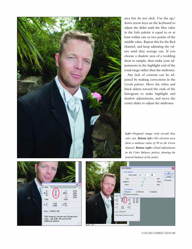
area but do not click. Use the up/down arrow keys on the keyboard toadjust the slider until the blue valuein the Info palette is equal to or atleast within one or two points of themiddle value. Repeat this for the Redchannel, and keep adjusting the val-ues until they average out. If youchoose a shadow area of a weddingdress to sample, then make your ad-justments in the highlight end of thetonal range rather than the midtones.
Any lack of contrast can be ad-justed by making corrections in theLevels palette. Move the white andblack sliders toward the ends of thehistogram to make highlight andshadow adjustments, and move thecenter slider to adjust the midtones.
COLOR CORRECTION 69
Left—Original image with overall blue
color cast. Bottom left—The selection area
shows a midtone value of 39 in the Green
channel. Bottom right—Final adjustments
in the Color Balance palette, showing the
neutral balance of the jacket.

In previous chapters, we identified the optimum camera settings for en-suring the best-possible images. We also looked at the pros and cons of
JPEG and RAW file formats and mastered the art of RAW file conversion. Wealso learned how to batch process a large number of images in this format.
Regardless of the capture mode we choose, some images will require ad-ditional creative input prior to printing. Our goal in this is to achieve thefinal image we desire as quickly as possible without compromising the qual-ity of the photo. This is where actions come into play.
What Are Actions?Actions are a series of commands that can be recorded in Photoshop andplayed back using a key press or button in the Actions palette. Any numberof commands can be recorded and saved in sets for easy access and recovery.Actions can be simple one- or two-part commands linked together, or com-plicated strings of Actions with controls that let you include variable inputsor user interactions.
Including Actions in our workflow provides us with time savings due tothe repetitive tasks being undertaken in a fraction of the time it takes to doit manually. More importantly, these Actions are repeatable, and maintainconsistency throughout the creative process.
Action BasicsTo create a more efficient workflow, you can set up an action to handle yourrepetitive, time-consuming tasks. On this page, you’ll find a list of the actionswe’ve created for use in our workflow; a detailed, how-to discussion on howto create each is provided later in this chapter. (Note: Photoshop offers de-fault actions, but you’ll want to create custom actions that suit your needs.To save time, you can assign function [“F”] keys so you can play a given ac-tion at the click of a button.)
70 DIGITAL CAPTURE AND WORKFLOW FOR PROFESSIONAL PHOTOGRAPHERS
CHAPTER TWELVE
ACTIONS
Time-Saving Actions
• convert to black & white• add a sepia tint• apply a soft focus• sharpening 1• sharpening 2• pillow emboss• shadows filter• saturate• stroke/drop shadow• rotate left• rotate right

Step 2 from our Mono action.
Conversion to Black & WhiteThere are several ways that you can convert an image to black & white.
Preferred Version. By using the Lab conversion mode, we can create ablack & white image with brighter highlights, good contrast, and detail in theshadows. We’ll create an action so that we may quickly apply our conversiontechnique with the push of a button.
1. First, ensure that the Actions palette is visible (if not, go to Window>Actions).
2. Click the tiny arrow button at the upper-right corner of the palette.When the fly-out menu appears, choose New Set and name the set asyou like. We’ve named this one Adjustment Set.
3. Click the tiny arrow button to access the fly-out menu once more. Thistime, click New Action. Name the action Mono, and make sure that theset name you assigned in step 2 appears in the Set field in this dialogbox. Next, assign the action to the F2 function key. Simply ignore theColor option at this point. Click the Record button in the top-rightcorner of the dialog box. (Note: There is no need to rush once youstart the recording process. Take your time to make sure that you getthe process right.)
4. Next, go to Image>Mode>Lab Color. This will not result in any notice-able change in the image.
ACTIONS 71
Step 3 from our Mono action.

Top row—(Left) The Channels palette
showing Lab mode (step 5). (Right) Creat-
ing a duplicate layer (step 8). Bottom
row—(Left) Creating a bit more life in the
image (step 9). (Right) The Actions palette
showing all the commands used.
5. Open the Channels palette (Window>Channels). Click on the channellabeled Lightness. Your image will be converted to black & white.
6. Next, we will need to go to Image>Mode>Grayscale. A window will appear that asks, Discard other layers? Click OK.
7. Now go to Image>Mode>RGB to prepare the image for printing.(Note that if we did this prior to discarding the color channels in step7, we would have reverted to a color image.) The image looks good butcould be improved by increasing the contrast, so we’ll continue.
8. Next, go to Window>Layers. Click on the background layer and drag itonto the Create a New Layer icon at the bottom of the palette to createa background layer copy.
9. At the top of the palette, change the blending mode to Soft Light andset the layer opacity to about 35 percent.
72 DIGITAL CAPTURE AND WORKFLOW FOR PROFESSIONAL PHOTOGRAPHERS

10. Go to Layer>Flatten Image.11. Finally, click Stop.
You have now created your first action. Note that each stage of the processhas been saved in the Actions palette, and that the entire sequence can nowbe played to duplicate the effect on another image (or group of images).
The image made using the Lab Color conversion has cleaner blacks and alot more “pep” than simply desaturating the image (see “Muddy Version” onpage 74). (If you find that the image requires lightening or darkening, sim-ply open the Levels palette [Ctrl/Cmd+L] and move the center slider rightor left to adjust the midtones in the image.)
In our discovery of Photoshop Actions, we will discuss several alternativetechniques for applying a similar image effect; however, only the preferredtechnique needs to be added to our Actions set. Adding additional versions
ACTIONS 73
Top—Optimized black & white image cre-
ated using our Mono action. Above—The
Original color shows us where we started in
our conversion process.

of the process only provides us with “options” that may only serve to con-fuse and provide marginal benefits to the finished image. You can of courseadd as many variants of the technique as you need.
Muddy Version. We could easily go to Image>Adjustments>Desaturateto quickly convert our image (or use the keyboard shortcut Ctrl/Cmd+Shift+U). This method, however, creates a slightly muddy black & white
Compare the muddy version (top) to the pre-
ferred version (bottom).

image with no sparkle. It does, however, have its uses—this approach doesnot destroy the fine detail between high-contrast areas in the image.
This version of the Mono filter is fairly basic. Since it is infrequently usedand can be easily made from scratch, it does not need to be saved in our adjustment set.
High-Contrast Version. You can use Photoshop’s Channel Mixer to con-trol the tonal conversion and contrast of various colors to produce a betterseparation and a more dramatic black & white image (or in some cases to create a separation between colors). This is an alternative conversion for black & white; it will be used less frequently.
1. Click on the tiny arrow button in the upper-right corner of the Actionspalette. Name this action B&W Channel Mixer. Save this action in theAdjustment Set folder, but don’t assign a function key. Click Record.
2. Create a Channel Mixer adjustment layer via Layer>New AdjustmentLayer>Channel Mixer. In the New Layer dialog box, click OK. A sec-ond dialog box will then appear. Click on the box labeled Mono-chrome, then adjust the Source Channel sliders and Constant slider to
ACTIONS 75
Button Mode
I’ve recommended that you assign function keys for all of your frequently used ac-
tions. However, if this method proves cumbersome, you can simply access the Ac-
tions palette in standard mode and click Play. Better still, you can click on the arrow
in the top-right corner of the Actions palette and scroll up, then select the Button
Mode. Actions are applied by a single click of the required action button. (Note:
When the Button Mode is active, you will not be able to record a new action. De-
select the option and proceed as in step 1 [previous page] to record a new action.)
Left—Channel Mixer settings for a high-contrast mono
image. Above—The Layers palette with the Channel Mixer
adjustment layer.

achieve the look you desire. Moving an individual slider to the right increases brightness and contrast; conversely, moving it to the left decreases contrast. When you are happy with your selection, click OKand stop recording the action.
When you look at the Layers palette, you’ll note that by creating this action,we have created a new layer (Channel Mixer 1). If you are happy with the re-sults at this stage of the process, go to Layer>Flatten Image. If the image istoo contrasty, double click on the new layer and tweak the Contrast slider inthe dialog box that appears. When the result is to your liking, flatten theimage.
Sepia FilterNow let’s add a sepia-tone effect to the monochrome image we just created.With the image open, complete the following steps.
76 DIGITAL CAPTURE AND WORKFLOW FOR PROFESSIONAL PHOTOGRAPHERS
Top—The color settings for adding a sepia
effect to a mono image. Bottom—A sepia
image created from three keystrokes of the F3
action key.

1. To begin, create a new action, name it Sepia, and assign the functionkey F3. Click record.
2. Go to Image>Adjustments>Color Balance (or use the shortcutCtrl/Cmd+B). Click the Midtones radial button and adjust the mid-tones by moving the Cyan/Red slider to a value of +8 and the Yellow/Blue slider to –8. Click OK and stop recording the action.
Now when we press the F3 function key we can apply a slight warming ef-fect to the image. The result is a warm-tone black & white image with justone key press. Press the key two or more times and the image will get pro-gressively warmer. This is not the only way to create sepia images, but it’s oneof the quickest to apply in our workflow.
You may note that the image gets slightly brighter and shows more detailin the shadow areas but loses some extremely fine detail in the highlights.This is the effect of adding yellow to our image. Therefore, this action worksbest on images that are left slightly darker than normal before converting tomono. You may want to use this effect with the “muddy” black & white con-version method outlined above.
This filter also doubles as a “warmer upper.” Sometimes color images canlook a little cold, even when correctly color calibrated. Simply press F3 togive the entire image a warmer feel.
Controlled Tone Conversion. In this toning method, we will record anaction containing an adjustment layer and add it to a new set of actions calledVariants. This is because it essentially does the same as our F3 sepia action butis a variation of the same technique. This variant provides increased controlover the toning effect. You can use this technique to create a variety oftones—sepia, blue, green, or any other tone you desire. If you tend to use avariety of tones when you’re processing a group of images, record separateactions for each and assign a separate function key for each tone.
ACTIONS 77
Hue/Saturation dialog set to value 210 for a blue tone.
You can use this technique to create
a variety of tones—sepia, blue, green,
or any other tone you desire.

1. To begin, create a new action, name it Blue Tone, and start recording. 2. Go to Layer>New Adjustment Layer>Hue/Saturation. In the dialog
box that appears, click OK (the default layer name of Hue/Saturation 1will be applied).
3. A second dialog box will now appear. Click on the check box labeledColorize in the bottom-right corner of the box. A default tone will automatically be applied, but it probably won’t be what you have inmind. If you’d like to add a rich blue tone, simply move the Hue sliderto the right to select a value of about 210. Sepia can be found ataround value 45, and green at 100. Use the Saturation slider to en-hance or diminish the effect.
4. When satisfied with your chosen tone, stop recording.
78 DIGITAL CAPTURE AND WORKFLOW FOR PROFESSIONAL PHOTOGRAPHERS
Top row—(Left) Original monochrome. (Right) Sepia toned using a Hue of 45. Bottom row—(Left) Blue toned using a Hue of 210.
(Right) Green toned using Hue of 100.

Tom’s Soft Focus FilterThe Gaussian Blur filter is a main component of many digital filters and plug-ins created over the years. I’ve found these filters too complex for my tastes,and was often unhappy with the results. I created my own version, of whichI am quite proud. Try this one, and don’t forget to add it to your main ad-justment set.
1. Open an image that would benefit from a soft-focus effect. 2. Name the action, assign a function key, and hit Record.3. Select the background layer in the Layers palette and drag it onto the
Create a New Layer icon. 4. With the background layer copy selected, select Filter>Blur>Radial Blur.5. In the Radial Blur palette, adjust the Amount to approximately 25.
(Some trial and error may be required due to the resolution and size ofyour image. My images are generally formatted at 200dpi, and this
figure works well no matter the finished print size.) Select the Spin blur method and Good quality before clicking OK.
6. Go to Filter>Blur>Radial Bluronce more, but choose theZoom blur method. Do not alterthe other settings. Click OK.
7. With the background copy stillselected in the Layers palette,change the blending mode fromNormal to Screen and reduce thelayer opacity to between 60% and70%. This is just a starting point,
we can adjust it later. We can see
ACTIONS 79
Create new background layer (step 3).

that the filter adjustments have created the spreading of highlightsfound with traditional soft focus filters used in front of the lens.
8. Next, click on the original background layer in the Layers palette andselect Layer>New Adjustment Layer>Curves. The new dialog box doesnot have to be named, just click OK. Grab the center of the curve in
80 DIGITAL CAPTURE AND WORKFLOW FOR PROFESSIONAL PHOTOGRAPHERS
Above—(Left and Center) Successive appli-
cations of Radial Blur (steps 5 and 6).
(Right) Changing the blending mode and
opacity to produce the desired effect. Left—
The final image.

the new palette and drag it down slightly to pull back detail in theshadow areas of the image that have been removed by the spreading ofhighlights.
9. At this point, stop recording the action.
The above selections will give a pleasing soft focus to almost all images. If youare happy with the results, flatten the layers and save the image. If more high-
Top—Adjusting the depth of the shadow
tones. Above—Original image. Right—
Image after soft focus is applied.

light or shadow intensity is required, select the relevant layer and make therequired adjustments. To add more soft focus, select the background copylayer and increase the opacity to apply an additional spread of highlights. Toadjust the amount of shadow detail, double click the graph in the adjust-ment layer to reopen the Curves palette and drag the curve up or down asrequired. Remember that the opposite adjustments can be applied to dimin-ish the effect. When you’re satisfied with the final effect, flatten the layers andsave the image.
SharpeningSome form of sharpening should be applied even if you think the image looksokay. In general, an image with more contrast will require less sharpening
82 DIGITAL CAPTURE AND WORKFLOW FOR PROFESSIONAL PHOTOGRAPHERS
Original image (left) and Smart Sharpen
dialog box (above).

than an image with a flatter look. This is why we turn off the auto sharpen-ing at the capture stage (see chapter 5). Due to the destructive nature ofsharpening, it should always be applied in one step, never in increments.
We are going to record two separate sharpening actions: one that uses thenew Smart Sharpen filter available in CS2 and a more traditional methodthat can be used with older versions of Photoshop. These actions should alsobe recorded at various strengths of adjustment, so that they can be appliedquickly and easily.
Smart Sharpen. The new Smart Sharpen feature in Photoshop CS2 is farsuperior to the Unsharp Mask. We can apply a small amount of sharpeningto crisp up the file using all the original data.
ACTIONS 83
Additional options in the Smart Sharpen dialog are available for fine tuning.
Above—Function keys can be used up to three times for
separate actions. Right—Image artifacts that are caused
by oversharpening.

To begin, open the image you wish to sharpen. (Let’s assume the imagehas been converted from the original RAW file but the file size is exactly asit was captured. Let’s also assume that the image is of average tone and con-trast. Applying the filter on a cropped or resized file may have an adverse ef-fect on the image, so only apply this to an original image.)
1. First, create a new action, remembering to add it to the adjustment set,and name it Smart Sharpen. Assign a function key, then click Record.
2. Choose Filter>Sharpen>Smart Sharpen and apply the default settingspresented in the dialog box by pressing OK. The default setting is neverharsh enough to damage any image and is usually all that is required toproduce excellent results in the majority of images.
3. Stop the recording. That’s all there is to it—nothing more, nothing less.
To produce additional levels of sharpening (Sharpening 2, Sharpening 3),increase the Amount by about 50 units each time. When assigning a func-tion key, use the same “F” key as before, but click on the check box labeledShift or Control (PC; Mac users can choose Shift or Command) to allow theuse of the same key.
The degree of sharpening you apply will depend on the overall contrastrange of the original image. To check the effect of your adjustment alwaysview the image at 100% and check the areas of high contrast. If you can seehalos or artifacts on the fringes of light and dark boundaries, then the imagehas been oversharpened.
The Smart Sharpen dialog box offers a range of options that will allowyou to fine-tune the highlights or shadows, but for most images, this is not necessary.
84 DIGITAL CAPTURE AND WORKFLOW FOR PROFESSIONAL PHOTOGRAPHERS
Left—The original image in Lab mode and with Lightness channel selected. Right—The Unsharp Mask filter settings.
The degree of sharpening you apply
will depend on the overall contrast
range of the original image.

Lab Mode Sharpening. To create a sharpening action with a version ofPhotoshop released prior to CS2, first open your image (which we will as-sume is one with good tonal range and contrast), then proceed through thefollowing steps, adding the action to your Adjustments or Variants set.
1. Create a new action, name it, and assign a function key. Click Record.2. Select Image>Mode>Lab Color. 3. Go to Window>Channels and click on the Lightness layer. You will no-
tice the image turn to black & white, and the eye icon will appear onlyin the Lightness channel indicating that this is the only active channel.
4. Select Filter>Sharpen>Unsharp Mask and apply the following values:Amount = 50, Radius = 1.9, Threshold = 2. Click OK.
5. Next, click on the Lab layer in the Channels palette to activate the fullLab Color layer.
6. Change the mode back to RGB by selecting Image>Mode>RGB andstop the recording. Because we have only applied the Unsharp Mask tothe Lightness channel, the effect of large amounts of sharpening is soft-ened by the other layers, and the noise is reduced.
Adjusting the ShadowsPhotoshop CS2 has a great tool for making adjustments to underexposedimages and bright highlight details. If you adhere to the image capture guide-lines provided earlier in this book, you’ll rarely encounter such an image.However, there are occasions when one gets through, particularly if you’reshooting in JPEG mode.
Shadow/Highlight Palette. Open an image with underexposed shadowareas and proceed with the following steps to create a one-touch solutionfor most images that lack shadow detail.
1. Create a new action, adding it to either the Adjustment or Variant set(depending on your preference), name it, and assign a function key.Click Record.
2. Select Image>Adjustments>Shadow/Highlight from the drop-downmenu. In the dialog box that appears, you’ll see the default settings of50% and 0% in the Shadows and Highlights fields, respectively. The de-fault settings were far too severe for this particular image, so we chose aShadows setting of 22% and left the Highlights setting at 0%. Using thismethod is great for images that only require slight adjustment. How-ever, you may want to create actions with various strengths of correc-tion as we did for the sharpening action. (Note: You can access thepalette’s extended options by checking the Show More Options box.However, this makes heavy going in trying to fine-tune the image andcan introduce unwanted noise in the shadows we are trying so hard tooptimize. Going into this amount of manipulation defeats the objective
ACTIONS 85
Photoshop CS2 has a great tool
for making adjustments to
underexposed images.

86 DIGITAL CAPTURE AND WORKFLOW FOR PROFESSIONAL PHOTOGRAPHERS
Top—Original image with dark shadows due to the influence of bright highlights at the right-hand side of the image. Above—Standard
Shadow/Highlight adjustment dialog box (left) and the advanced palette (right).

of a quick and efficient workflow. If your image needs it, though, thetools are there.)
3. When the image is corrected, stop recording, flatten the layers, and clickSave.
Quick Fix. An alternative to the Shadow/Highlight correction is an easymethod that does not introduce significant noise—unless the image is so fargone that it probably doesn’t deserve saving! To use this option, open theimage and proceed through the following steps.
1. Create a new action, name it, and assign a function key. Click Record.2. Duplicate the background layer by dragging it onto the Create a New
Layer icon in the Layers palette. Change the blending mode to Screenand reduce the layer opacity to about 60%, then stop recording. Chang-ing the blending mode to Screen lightens the entire image, and by re-
ACTIONS 87
Top—Selecting the background layer blending mode and opacity. Center—Layer Mask button. Above—Paint-
ing in the highlights to show the darker tones under the background copy layer.

ducing the opacity, the background layer shows through, reducing theamount of noise in the image.
3. At this point in the process, the individual layers are intact. If everythinglooks good, flatten and save the image. However, because Screen modeis a global solution, some of the highlights may appear blown out. Inthis case, do not flatten the image. Instead, click on the Layer Maskicon (the square with the circle in it at the bottom of the Layers palette)and choose a suitable soft-edged brush, change the foreground color inthe toolbar to black, and “paint” in the highlight areas to bring theoriginal detail back by exposing the background underneath. If youoverdo the painting in of highlights, select a white foreground color inthe toolbar and hide the layer below by painting the shadows out.When you’re satisfied with the results, simply flatten all the layers.
This action can be applied multiple times and can render throw-away im-ages usable. Treat severely underexposed JPEGs with three or more applica-tions of the action, then run the Mono action to produce a grainy but “at-mospheric” image with an artistic feel, similar to that produced with ahigh-speed black & white film.
88 DIGITAL CAPTURE AND WORKFLOW FOR PROFESSIONAL PHOTOGRAPHERS
A “rescued” image using five successful
passes of the Shadows action filter, followed
by conversion to black & white, then sepia
toned.

SaturationPhotographers shooting with transparency film often underexpose by a halfa stop to increase saturation. With digital, we can create an action that em-ploys the Hue/Saturation feature to increase the impact in our images.Here’s how:
1. Open an image, then create a new action. Name the action, assign afunction key, and hit Record.
2. Open the Hue/Saturation palette (Ctrl/Cmd+U) and move the Satura-tion slider to +10. Click OK to apply the setting, and stop recording.
Note that the color saturation can be increased in increments by pressing thefunction key again, but use caution: if your image features subjects with areddish skin tone, they may take on a “beetroot” look, and the image maythen require color compensation (and this defeats our objective of creatinga quick fix!). When you’re satisfied with the results, simply save the image.
RotationRotating an image is one of our most repetitive tasks. Simply record one ac-tion for rotating the image clockwise and another for counterclockwise.
1. Open an image, then create a new action. Name the action, assign afunction key, and hit Record.
2. Go to Image>Rotate Canvas>90º CW, then click Stop.3. Next, repeat step 1, assign the same function key, and click either the
Shift or Control (Command for Macs) check box and click Record.4. Go to Image>Rotate Canvas>90º CCW, then click Stop.
ACTIONS 89
Increase the color saturation in the Hue/Saturation palette.
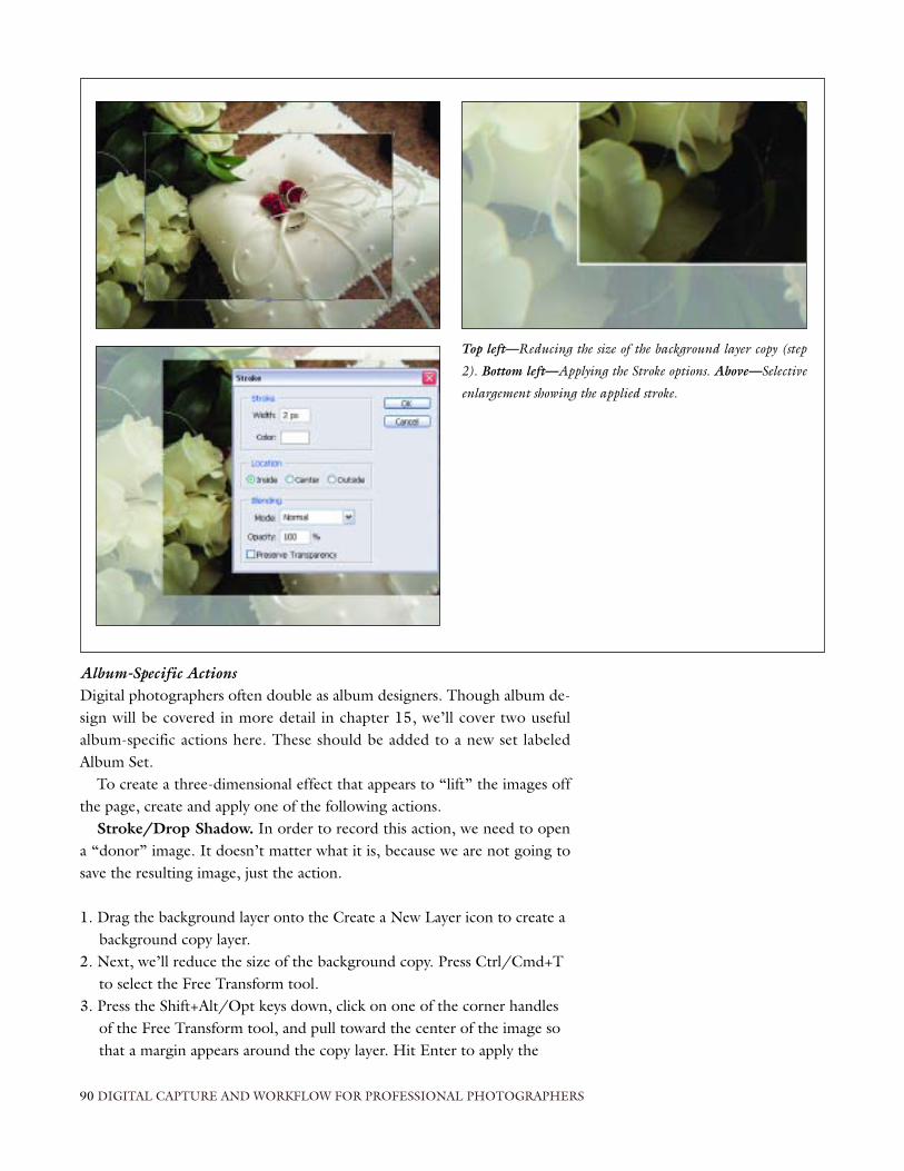
Album-Specific ActionsDigital photographers often double as album designers. Though album de-sign will be covered in more detail in chapter 15, we’ll cover two usefulalbum-specific actions here. These should be added to a new set labeledAlbum Set.
To create a three-dimensional effect that appears to “lift” the images offthe page, create and apply one of the following actions.
Stroke/Drop Shadow. In order to record this action, we need to opena “donor” image. It doesn’t matter what it is, because we are not going tosave the resulting image, just the action.
1. Drag the background layer onto the Create a New Layer icon to create abackground copy layer.
2. Next, we’ll reduce the size of the background copy. Press Ctrl/Cmd+Tto select the Free Transform tool.
3. Press the Shift+Alt/Opt keys down, click on one of the corner handlesof the Free Transform tool, and pull toward the center of the image sothat a margin appears around the copy layer. Hit Enter to apply the
90 DIGITAL CAPTURE AND WORKFLOW FOR PROFESSIONAL PHOTOGRAPHERS
Top left—Reducing the size of the background layer copy (step
2). Bottom left—Applying the Stroke options. Above—Selective
enlargement showing the applied stroke.

change. (In our sample we brightened the background layer so that youcan see the effect more clearly.)
4. At this point, create and name the action, assign a function key, andclick Record.
5. Go to Edit>Stroke and enter a Width of 2 pixels for a thin keyline or 5pixels if a wider line is preferred. Select a color for the stroke. (You canchoose a color to complement the image, but white will suffice for themajority of images. Remember we are trying to build a series of actionsthat are repeatable and fit in with the type and style of our work. Createseparate versions for variants of this action.) The location of the strokeshould be inside the image. This creates crisp, sharply defined cornerswithout rounding of the pixels. Keep the blending mode set to Normaland the opacity at 100%. Click OK to apply the effect.
6. Adding a drop shadow will help to visually lift the image off of the page.Click Add a Layer Style (the curly “f” icon at the bottom of the Layerspalette) and choose Drop Shadow. The style of the shadow is affectedby the various sliders in the Layer Style palette. This is a matter of pref-erence, but softer shadows seem to work best. Try applying the follow-ing combination: Angle = 45, Distance = 25, Spread = 20, and Size =70. Click OK.
ACTIONS 91
Aboe left—Adding the drop shadow layer effect (step 6).
Above right—Drop shadow filter settings. Bottom—The
final stroke and drop shadow effect.

7. Stop the recording. The donor image can now be deleted. The actionhas been successfully recorded and can be applied in your album designworkflow.
Pillow Emboss. To add this effect to your image, open a donor image as de-scribed in the “Stroke/Drop Shadow” section on the preceding page. Sim-ply complete steps 1–3 in that section, and then proceed with the followingsteps.
1. Click on the Add a Layer Style icon and choose Bevel and Emboss fromthe available selections. The Layer Style palette opens again giving us a myriad of sliders and controls to choose from. Make the following selections: Style = Pillow Emboss, Technique = Smooth, Depth = 50,Size = 40, and Soften = 5.
2. Click OK if you’re satisfied with the result, or rerecord the action if youprefer a stronger effect.
3. Stop recording and delete the donor image as we did above.
So now we have all the ingredients for taking, converting, and processing im-ages, without it taking three weeks to complete. We’ve created a lot of ac-
92 DIGITAL CAPTURE AND WORKFLOW FOR PROFESSIONAL PHOTOGRAPHERS
Top left and right—Selecting the Bevel and
Emboss filter and applied settings. Bottom—The
final effect of the Pillow Emboss filter action.

tions and have assigned many function keys. Remembering which key doeswhat can be frustrating, so create a cheat sheet. Make a paper strip label likethe one shown on this page and tape it above the respective function keys.Job done!
ACTIONS 93
Above—Paper label strip above the function
keys. Right—The Actions palette in Button
mode. Note the assignment of function keys.

Actions can be used to turn out high-quality images quickly. Of course, some images may require some special attention. The following tech-
niques can help you create outstanding images that deserve printing at largersizes.
Below, we’ll look at the capture and processing used to produce a low-keyportrait similar to an Old Master painting using a chiaroscuro effect. This willgive you a feel for how a single image can be efficiently captured and finessedpost-capture.
ChiaroscuroThis term comes from the Italian words for light (chiaro-) and dark or shade(-scuro) and basically means the way we create three-dimensional depth froma two-dimensional object or surface. It was used by the Renaissance paintersand often referred to as Rembrandt lighting, after the Dutch painter whoused it extensively.
When we look at the work of the Old Masters, we note that quite oftenthe edges and deep shadows of the paintings tended toward black and darkbrowns, greens, and the like. If we were to apply a histogram to their images,they would be heavily stacked in the shadow areas—yet the paintings are vi-brant and powerful.
Capture and AdjustmentWith the camera set to the RAW mode, we captured a reference image in-corporating the ColorChecker (as described in chapter 7). We then pro-ceeded to create a variety of poses.
Once the session was complete, we download the images into a folder la-beled Vivienne and opened Adobe Bridge, selected all the images, anddragged the files into Photoshop. This automatically opened the AdobeCamera Raw file processing software.
94 DIGITAL CAPTURE AND WORKFLOW FOR PROFESSIONAL PHOTOGRAPHERS
CHAPTER THIRTEEN
ADDITIONAL PHOTOSHOP TECHNIQUES
If we were to apply a histogram to
their images, they would be heavily
stacked in the shadow areas. . . .

As you can see in the screen shot, the auto function of the file processingsoftware assumed the images were underexposed and tried to compensatefor it. Of course, we know that the image is low key and should be darker.Therefore, some adjustments were necessary.
After adjusting the reference image, we chose Select All>Synchronize; asthe lighting in our session remained constant, all the changes to the remain-ing images were identical.
Batch process all the images into 8-bit JPEGs and save them in the samefolder. The batch process automatically creates a new folder called JPEG. Se-lect a suitable file to work on and open it.
VignettingTo create a vignette during image capture, photographers must ensure thatthe aperture of the vignetter suits the focal length of their selected lens. Thisbecomes a problem with zoom lenses, where the focal length can vary fromone end to the other.
ADDITIONAL PHOTOSHOP TECHNIQUES 95
Top row—The portrait selection in Bridge (left)
and reference photo in Camera Raw (right). Bot-
tom—The collection is synchronized to the reference
image after adjustment.

Fortunately, applying vignettes in Photoshop couldn’t be easier, and youcan apply a low or high key vignette in any shape (rectangular, elliptical, star,etc.) in seconds.
1. To begin, choose one of the Marquee tools and select the area of theimage around which you want the vignette to appear. (You can use thearrow keys to move the marquee to the left, right, up or down.) In theOptions bar at the top of the screen, enter a Feather amount of 200.This works well with most images 8x10 to 16x20 inches. A smallerfeather radius is used for smaller images. The maximum feather that canbe applied is 250 pixels, so several concentric vignettes must be appliedto create the effect for very large images (30x40 inches).
2. We must now invert the selection. To do this, simply go to Select>Inverse (Ctrl/Cmd+Shift+I) to select the area where the vignetteshould appear. Note too, that the feather effect, which was initially applied inside of the selection now appears on the outside of the selec-tion marquee.
3. Next, go to Image>Adjustments>Hue/Saturation (Ctrl/Cmd+U) andmove the Lightness slider all the way to the left to create a low-key vignette, or all the way to the right to make a high-key vignette. Whenyou’re satisfied with the results, click OK.
96 DIGITAL CAPTURE AND WORKFLOW FOR PROFESSIONAL PHOTOGRAPHERS
The image has now been selectively vignetted with a soft-edged marquee, giving us a classic low-key portrait.

Face Mask HistogramIn chapter 3, we discussed the relative merits of differing types of histogrambut also outlined the ways in which they can be deceiving. The sample his-togram shown above shows a full range of tones from highlight to shadow.As you can see, the majority of tones in the histogram are concentrated in theshadows. This is what we might expect to see in a Rembrandt-style portrait. The important sections of the image are, however, in the face and surround-ing areas of the head. The darker areas of the image draw the viewer’s gazetoward the center of the frame where the main focal point lies.
In order to check that we have the right exposure and good detail in theimportant areas of the image, we use what is referred to as a face mask his-togram. From the toolbar, select an elliptical Marquee with a feathered edge(say 5 pixels) and draw a selection around the face, taking in some hair, back-ground, and highlight detail.
Open the Levels palette (Ctrl/Cmd+L) and revisit the histogram. In theface mask histogram shown above, we can see that there is a wealth of infor-mation throughout the selection, indicating great tonal range in the area wehave selected.
Though our image is good enough to print at this stage, and the clientwould probably be very happy with the result, we can improve on our por-trait, making it more closely resemble a portrait from the Old Masters.
Plug-in FiltersA carefully chosen plug-in filter can be an asset in your workflow. It’s worthnoting, though, that there are a number of enticing filters on the market thatreally don’t offer much improvement for the time you spend fine-tuning thesliders. Artistic filters are a case in point.
ADDITIONAL PHOTOSHOP TECHNIQUES 97
There are a number of enticing
filters on the market that really
don’t offer much improvement. . . .
Left—(Top) Histogram of the entire image showing a heavy concentration of colors in the shadow areas. (Bottom) Face mask histogram
showing good distribution of color and detail in the main area of the image. Center and right—Comparison of original and vignetted
image.

There is one set of filters that seem to live up to their claims and are gen-erally intuitive in their use. Nik Color Efex Pro’s Midnight filter was used tocreate the image on page 100.
Because the bride is 6 inches taller than the groom, a creative “tilt” wasused in camera to even out their respective heights. Unfortunately, the cam-era tilt is evidenced by the sloping verticals of the window frame in the back-ground. The image was lighted with daylight from the window, supple-mented by a blip of fill-in flash.
To finesse the portrait, we used the Smart Sharpen action created in chap-ter 12, then cropped and resized the image. Next, a vignette was added (aswas described earlier in this chapter).
With these steps complete, we applied the Midnight filter. This filter isapplied much in the way that an action is played when the Button Mode isselected. A simple dialog box opens showing a preview image with the de-fault settings applied. Although there are options for adjusting Blur, Con-trast, Brightness, and Color, we don’t want to spend hours tweaking con-trols, so we just click OK to apply the default settings.
The image does not show any changes at this point, but the Layers paletteshows an adjustment layer ready to apply changes to.
In the Nik filter palette, click the Fill button to show the results of apply-ing the filter. The result is quite dark and dramatic, but lowering the opac-
98 DIGITAL CAPTURE AND WORKFLOW FOR PROFESSIONAL PHOTOGRAPHERS
Top—Nik Color Efex Pro plug-in interface. Left—Original wedding image. Right—Adjusted and vignetted similar to our previous
portrait.

ity of the adjustment layer in the Layers palette can reduce the effect. In thisexample, the opacity was reduced to 80%.
Because the filter has not been finalized, we can paint in areas of high-lights to the layer mask. Return to the Nik palette and click the Erase but-ton. We are now painting in black onto the layer mask, revealing the origi-nal image underneath. Reduce the Brush opacity to about 15% and gentlypaint in areas of highlight or separation (tiara, veil, profiles, rings) to sculptaround the subjects until the desired result is achieved.
Once you’re satisfied with the results, click the Apply button on the Nikdialog box to implement the effect and flatten the image layers. Applyingthe Midnight filter tends to give the image a flat feel, but the problem is eas-
ADDITIONAL PHOTOSHOP TECHNIQUES 99
Top row—(Left) Midnight filter dialog box. (Right) Layers palette showing adjustment
layer. Bottom row—(Left) Clicking the Fill button in the Nik palette changes the layer prop-
erties. (Right) Using the Erase feature in the Nik palette allows painting back detail in the
layer mask.

ily rectified by one click of the Sepia/Warmup and Saturate action functionkeys. We could use the Mono action followed by several clicks of the Sepiaaction key to create yet another version of the image.
Eye MakeoverIf there is one area of a portrait that can make or break an image, it’s the eyes.There are several ways that they can be enhanced, and a combination of tech-niques used by Charles Green and Jane Conner-Ziser works well on almostany image.
We can play around with lights forever to get that perfect modeling, butoccasionally though the main picture looks okay, the eyes have just missedout. Our sample image is going to get the 3-D treatment! The image has twocatchlights, which is generally considered a no-no, and the whites of the eyesare a little dull, so we’ll clean them up.
To begin, enlarge the image so that both eyes are large in the screen.Never work on one eye at a time or you will end up with an imbalance in theimage. Choose the Clone tool and reduce the opacity to around 10%. Usingthe Color Sampler, choose a selection from the pupil and the iris next to theunwanted highlights and begin painting the existing catchlights out.
Select the Create a New Layer icon in the Layers palette and choose asoft-edged brush, just smaller than the size of the iris, set to 100% opacity.Ensure the foreground color in the toolbar is set to white and paint in thewhites of the eyes.
Don’t worry if the overspray covers other sections of the image. Reducethe opacity of the layer so that you can see the iris and outline of the eyelidsand begin erasing the overspray with a soft-edged brush. The brush shouldbe soft enough not to create a hard edge but hard enough for the fill not to
100 DIGITAL CAPTURE AND WORKFLOW FOR PROFESSIONAL PHOTOGRAPHERS
Original (left), midnight (center), and sepia-toned (right) versions of the image.
Never work on one eye at a time
or you will end up with an
imbalance in the image.

look mushy. The layer is then reduced to 0 opacity andslowly brought back to give a pleasing result. It some-times helps to zoom out a little to see the whole of theface in order to get a better impression of the effect.
Zoom back in to see both eyes large again and createanother new layer. Use a soft-edged brush, again set towhite and 100% opacity, about the same size as the pupil,and place a new catchlight in the corner of the pupil andspreading into the iris. Let it go slightly larger than youneed because we are going to shape the catchlight.
To give the catchlight some semblance of realism, weshape the catchlight with a soft-edged Eraser tool as if thelight was coming in from a square-shaped window,slightly curving the top to add shape to the eye. As before,zoom out to see the whole of the face and reduce thelayer opacity to 0. Slowly bring back the layer until thedesired effect is achieved.
The last phase of the makeover gives the eyes the real3-D look. Using the Color Sampler tool, select a color inthe iris opposite the catchlight and go to Window>Color.Increase the saturation and brightness to produce a vividcolor. Using a soft-edged brush again, draw some halfmoons into the iris opposite the catchlights, oversprayinginto the pupil.
ADDITIONAL PHOTOSHOP TECHNIQUES 101
Original image.
Paint out the catchlights. Adding white to the eyes.
Adjust the layer opacity to get the best effect. By adding the ef-
fect on a separate layer you can alter it later in the process.
Place the catchlight in the area where the iris and pupil meet
and shape it with a soft-edged Eraser tool.

We need to shape the iris color again, but this time use a hard-edged brushto erase the area next to the pupil. Use Gaussian Blur set to 1 to knock someof the hard edge off the colored fill. Lower the layer opacity to 0 again, andslowly bring it back until you are happy with the result. Once done, the lay-ers can be flattened.
102 DIGITAL CAPTURE AND WORKFLOW FOR PROFESSIONAL PHOTOGRAPHERS
Select a color from the iris and enhance its
color and saturation.
Shaping the “moons” of the iris.
The transformed image.

Sure, photographers shooting digitally tend to take more images than dofilm photographers. We also tend to experiment more than we ever used
to. Unfortunately, the problems of copyrighting and protecting photogra-phers’ work from theft are more prevalent than ever.
There are a few methods of previewing that allow us to exercise a smallmeasure of control over the distribution of our work, reducing the possibil-ity of clients copying our images. Two immediate solutions to the problemof copyright theft are simply to charge enough for your services up front sothat the theft of your work does not worry you, or simply don’t let the workout of the studio!
Unfortunately, both solutions present problems. Setting high prices tocounter the effect of image theft on your profits can keep clients from using
PRESENTATION 103
CHAPTER FOURTEEN
PRESENTATION
A password-encrypted website allows pur-
chases online and protects the photographer’s
copyrighted work.

your services. An in-studio preview presentation may not be convenient foryou or your client, and generally takes up a lot of precious time. Also, unlessyou arrange multiple preview sessions, the number of people who can at-tend the session will be limited by the size of your studio.
Let’s face it: if someone wants to steal your work badly enough, they willdo it. All we can do is make it as hard as we can for them so it’s not worththe bother.
WebsitesOne of the more popular methods of previewing is to upload your work toan encrypted website, allowing anyone with an access password to viewthumbnail versions of the photos, select their favorite shots, and purchase im-ages. This option offers the advantage of allowing friends and family world-
104 DIGITAL CAPTURE AND WORKFLOW FOR PROFESSIONAL PHOTOGRAPHERS
Pictures to Exe and Proshow Gold Media in-
terfaces allow presentations to be made for
PC in entirety or in separate chapters (ar-
rivals, ceremony, reception, etc.), and the re-
sulting shows can be saved as DVD movies.

wide to view the clients’ images and place their own orders. Depending onthe host site, you may be charged a yearly fee, an upload fee, or an online pur-chase percentage.
Drawbacks of this method of presentation seem to be limited to the qual-ity of the preview images and the size of the image viewed. Facial expres-sions are hard to make out on group shots if the images are not of a reason-able size.
Preview AlbumsPreview sample albums, though generally not favored these days, are still aviable means of previewing images. The most common form of protection isa copyright watermark across the middle of the image. Unfortunately, thistends to diminish the impact of some images and can lead to lost sales. Theclient, however, can take the samples away to view them at leisure and showthem to other family members.
Slide ShowsIn days gone by, studios would have slides made from their negatives andgive audio/visual presentations. The current trend is to create an audio/
PRESENTATION 105
A projected DVD presentation.
Preview sample albums, though
not favored, are still a viable
means of previewing images.

visual presentation comprised of music and images, whether digitally pro-jected onto large viewing screens or played on a laptop computer.
There are a number of programs available for PC and Mac that allow youto burn slide shows to CD or DVD in seconds. Proshow Gold, Pictures toExe, and iMedia are probably the best known of these and allow you to en-crypt the slide shows with a date of expiry and also have them password pro-tected if required. Once the disc expires, the client has no option but to re-turn to the studio for reprint orders.
Images can be previewed at high quality, and the average client has nomeans of copying individual pictures because they are contained in an exe-cutable file. This preview option offers still another benefit: you can makeseveral copies of the disc for distribution to family members. Nonencryptedslide show discs also make a nice add-on to the main order.
The music for the slide show can greatly affect the sale of your images andshould be chosen carefully to suit the mood of your imagery. Remember touse copyright-free music. Fees for copyright-free music and the terms underwhich it can be used vary greatly, but most music can be “previewed” onthe sellers’ websites and purchased online. Probably the best known of thesesites is www.themusicbakery.com. Individual tracks can cost approximately$40, but the music is of a high quality—the days of “plinkety-plonk” MIDIfiles are thankfully gone forever.
106 DIGITAL CAPTURE AND WORKFLOW FOR PROFESSIONAL PHOTOGRAPHERS
Nonencrypted slide show discs
make a nice add-on to the
main order.

Album design has come a long way. Placing an 8x10-inch print behind a card overlay just won’t cut the mustard anymore. Brides just don’t
want what mom and dad had, and the photojournalistic approach to weddingstorytelling is taking off in a big way. Today’s couples demand more pictures,dynamic pages, and exciting album designs.
ALBUM DESIGN 107
CHAPTER FIFTEEN
ALBUM DESIGN
Today’s album designs are more innovative
and individualized than they were in the
past.

The design of modern wedding al-bums is another skill that the hard-pressed digital photographer mustlearn. Though you can hire an indi-vidual or company to design yourclients’ wedding albums for you,there tends to be an impersonal feelto the final product. Of course, youmust also cover the costs of farmingout the work.
There is a satisfaction that comeswith nurturing the images from cre-ative inception to the album, the finalwork of art. When you do youralbum design in-house, you are pro-viding your clients with a little old-fashioned service that many companies lack.
Designing the album in-studio need not mean that you have to sit at yourcomputer and hammer away at the design, employing every artistic effectunder the sun. Why not design the layout and let a competent employee fi-nalize the artwork based on your direction?
Below, we’ll cover an album design workflow that will help you getthrough this process with little pain. In this chapter, we will assume that youintend to do all the design work yourself, and we will run through some ofthe tools to help you design the album.
First, let’s get some computer savvy. It’s important to divide your job fileinto several folders, as shown in the above chart.
108 DIGITAL CAPTURE AND WORKFLOW FOR PROFESSIONAL PHOTOGRAPHERS
Job File Folders
I. RAW FILES
A copy of your original files down-
loaded from the camera storage
cards.
• media card 1
• media card 2
• media card 3, etc.
II. WORKING FILES
Converted RAW files saved as PSD
or JPEG files.
• images from card 1, card 2, etc.
• preview and slide show
III. PAGE LAYOUTS
All in PSD.
• cover
• pages 01–02
• pages 03–04
• pages 05–06, etc.
VI. FINAL FILES
Flattened PSD files ready for final
printing.
• album pages
• reprint orders
A selection of images in Adobe Bridge ready for selection.

Open Adobe Bridge and Photoshop in tandem. Now that the job foldershave been set up, we can convert the RAW files into working images. Processthe separate media card folders into a single working folder of individual im-ages and use Adobe Bridge as a digital lightbox. Images can be clicked anddragged into chronological order within the thumbnail palette, and you canthen add a sequence number to the file names.
Once the client has made the choice of album size, we can set up a blankcanvas. Each album manufacturer will give specific details as to the amountof “bleed” required around each image, so that they can trim back the pagesbefore binding. If the album manufacturer also prints your pages, you willneed to know the exact resolution of the saved page files and the ICC pro-file requirements (Adobe 1998 or sRGB). A resolution of 200dpi is adequatefor the printing process at this size. Our pages are formatted with the Adobe1998 profile.
Next, we will need to determine the center of the double page. We don’twant a portrait subject’s eye positioned in the gutter of the page spread. ClickCtrl/Cmd+R to bring up the rulers at the edge of the image window andsimply click and drag from the ruler across the page. This will position aguide onto the canvas, and the default settings will snap the guide into position when it reaches the center of your double page. If this does not hap-pen, make sure the Snap function is selected in the View>Snap drop-downmenu.
ALBUM DESIGN 109
Design Services
Graphistudio products are popular with many photographers. The company makes
a range of album sizes and also offers a print-and-bind service that allows the pho-
tographer or designer full creative control over the look of the album while leaving
technical aspects of the album production to the company. The company also offers
a full design service (with a limited input from the photographer) for those who are
not inclined to tackle the album design in-studio.
Setting up a canvas template using File>
New from the Photoshop drop-down menu.

We also need to determine the “safe” edges of the page to prevent losingimportant areas of the print that appear too close to the edge. Drag a newguide and position it approximately 3/4 inch off the edge of the canvas. Re-peat the process until you have positioned several guides. Placing the guideswill not be necessary as you become more familiar with laying out pages.
We now have a blank canvas with guides to help us position the individ-ual images. When we open Adobe Bridge, we may find that some of the im-ages from the session or event are not required for the album. To hide theunnecessary images from view, access the Label menu and tag the imageschosen by the client or designer with a color or star rating. To display orhide a group of images, click the Unfiltered button in the top right of AdobeBridge and decide what you require in view.
Next, choose the images you require for your layout. Hold down theCtrl/Cmd key, select the images in Bridge you need for the page layout byclicking, then drag them over to Photoshop as a group, and we can move onto positioning. There are many ways of transferring images, placing images,and resizing within Photoshop, but covering all the different methods wouldrequire another how-to Photoshop book. The methods described here may
110 DIGITAL CAPTURE AND WORKFLOW FOR PROFESSIONAL PHOTOGRAPHERS
Top row—Determine the center of the two-
page spread (left), then create a “safe” space
by dragging guides onto your document
(right). Bottom row—A “tagged” image
with a yellow label (left). Click a “floating”
image and drag it onto the empty canvas
(right).

appear basic, but sometimes simple is best—and the procedure adopted inthe remaining sections of this chapter are used with this in mind.
We now have several “floating” images in Photoshop. To move an imageonto the album page, use the Move tool and click and drag each image ontothe empty canvas. This automatically copies the original image and places itonto a new layer.
We can use the Free Transform tool to resize and position the image onthe page. Press Ctrl/Cmd+T to place a transform box around the image onthe active layer, hold the Shift key and drag one corner of the transform box;the Shift key constrains the proportions of the image during resizing. If thecorners of the bounding box are not visible, press “F” on the keyboard toshow a larger working space around the canvas. Press “F” twice more to getback to the smaller window and reveal the other images to be used on thepage.
This process is repeated for all images to be used in the page spread. A couple of things to note at this point: If you resize an image a second
time, you will undoubtedly get some image degradation. You are better offstarting with a fresh copy of the image and dragging a new version over tothe canvas. Alternatively, you can create a smart object from the transferred
image. Before resizing, click the arrow in the top-rightcorner of the Layers palette and select Group into NewSmart Object. This effectively creates a container that em-beds the image data, allowing you to perform certainfunctions such as resizing nondestructively.
Lining up images couldn’t be easier. Photoshop’s newAuto Align feature snaps images into alignment with oth-ers even in differing layers, based on a center, top, bot-tom, or edge position (this option is turned on as a de-
ALBUM DESIGN 111
Top left—Resize the image using the Free Transform command. Bot-
tom left—The remaining images are added and resized in the same
manner as the first. Bottom right—Creating a Smart Object.

fault setting). Alternatively, just drag another guide onto the page, and thenew image simply snaps into registration.
The background content of our page looks pretty boring in white, so weneed to perk it up a little. There are a few of ways we can do this. A com-mon method is to fill the background canvas with a pastel color and apply atexture to it. Pick a foreground color that complements your image selection,choose the Paint Bucket tool from the toolbar, and then click on the canvas.Next, go to Filter>Texture>Texturizer, select a texture, and apply it to thebackground layer by clicking OK.
Another option for adding some background interest is to drop a photo-graph of champagne bottles, glasses, presents, or the room in which the cer-emony or reception was held onto the background layer and lighten it sothat it doesn’t overpower the other images on the page. With the image inplace, press Ctrl/Cmd+U to bring up the Hue/Saturation palette and ad-
112 DIGITAL CAPTURE AND WORKFLOW FOR PROFESSIONAL PHOTOGRAPHERS
Top—The page with a textured background
added. Bottom—A background image with
the lightness raised to prevent it from over-
powering the main composition.

just the Lightness slider to give an almost transparent view of the image. Ifdesired, a texture pattern can be placed over it as we did with the previousexamples.
My personal preference is to create a blended background. The best wayto achieve color harmony is to select the dominant image on the page andcomplete the following steps.
1. First, identify the layer upon which the selected image appears in theLayers palette and drag the layer onto the Create a New Layer icon.Next, move the new copy layer just above the background layer in thepalette. This will position the image behind the other images in the layout.
2. Using the Free Transform (Ctrl/Cmd+T) tool, resize the image bydragging the handles of the bounding box so that the image completelyfills the background. It doesn’t matter if the proportions aren’t correct,because we are going to distort the entire image beyond recognition.
3. Go to Filter>Blur>Motion Blur and apply a 45-degree blur amount andset the distance to 999. Click OK. This will streak the background be-
ALBUM DESIGN 113
Top—The dominant image copied and
moved above the background layer in the
Layers palette, then resized using the Free
Transform function. Bottom—Blending the
background image using the Motion Blur
filter (step 3).

yond recognition, but the effect is generally too sharp to blend with theother images on the page. Just add a little Gaussian Blur to take theedge off it!
4. To blend the unaltered primary image with the new blended back-ground canvas, select the rectangular Marquee tool and set the featheramount to 200. Select the layer containing the unmodified primary
114 DIGITAL CAPTURE AND WORKFLOW FOR PROFESSIONAL PHOTOGRAPHERS
Top row—(Left) Blending the primary image (step 4). (Right) The
Auto Select Layer function appears in the Options bar when the
Move tool is selected. Bottom—The completed page layout.

image and make a rectangular selection about an inch inside the edge ofthe image. Choose the inverse of the selection (Ctrl/Cmd+Shift+I) andpress the Delete key three times. This gives a soft transition between thedominant image on the page and the background canvas. The primaryimage and the blended background have the same tonal value, creatinga harmonious presentation.
In chapter 12, we created a Stroke/Drop Shadow action. To apply the effect,simply click an image with the Move tool and press the appropriate functionkey. Repeat the process for the remaining images, and suddenly the page istransformed into a custom-made work of art without the need for expensiveplug-ins and design programs.
Finally, we have a finished double page. Remember that sometimes less ismore; keep the number of effects you use to a minimum, and don’t over-crowd your pages because they can look too fussy. Adhere to the KISS prin-cipal (Keep It Simple, Stupid) and you won’t go far wrong.
ALBUM DESIGN 115
Auto Select Layers
With the Move tool selected, you will
find in the Options bar an option to
Auto Select Layer. With this control is
checked, simply clicking on the image
you desire to work on will select the
relevant layer.

In Animal Farm, George Orwell wrote, “All animals are equal, but someanimals are more equal than others.” The same can be said for printing
labs and inkjet printers.Although labs will insist that they are working to the tightest of quality
control, you would be amazed at the difference in quality you can receive de-pending on the machines used, different operators, and the methods bywhich they calibrate their machinery. Based on the assumption that your ownequipment is correctly calibrated, there are a number of precautions you cantake to ensure that what you are getting back from the lab is correct.
If you suspect that color casts are creeping into your finished images, youneed to be sure it isn’t your equipment that is at fault before you complain.The simplest method for doing this is to include a pure black & white imagewith good tonal range with each order (preferably the same image with eachorder).
Open a good quality image that has an average histogram (not high or lowkey) and use your Mono action to create a pure black & white image. Ifthere is no cast on screen, then your monitor is displaying neutral colors.Check this by clicking on the Color Sampler tool and roam over your image.The Info palette should display equal values in the Red, Green, and Bluechannels. Remember that the computer sees numbers and not colors. If theRGB values are equal and your screen has a slight cast, then you are proba-bly to blame and the screen needs recalibrating. It may not, however, be thatobvious due to the fine line between what the computer says is right andwhat our eyes can see.
The real test is the quality of print that comes back from the lab. Checkthe monotone image for a color cast. If the black & white image is off butyour RGB values are okay, then the color problem is the lab’s fault.
You can also evaluate the prints from your inkjet printers to determinewhether a color cast is the fault of an improperly calibrated monitor or
116 DIGITAL CAPTURE AND WORKFLOW FOR PROFESSIONAL PHOTOGRAPHERS
CHAPTER SIXTEEN
PREPARING FOR PRINTING
If the black & white image is off
but your RGB values are okay,
the color problem is the lab’s fault.

printer. Be advised, though, that calibrating an inkjet printer should be leftto those with the correct equipment to build the ICC profiles for each of themedia being printed on. Note that inkjet prints may suffer a little in tonalrange when compared to wet prints, but the technology gets better almostdaily.
To find the tonal range of your printer, make a test print that is 4x6 inchesat 200dpi, then complete the following steps.
1. Create a black strip at the top. This should have RGB values of 0, 0, 0.2. Create a white strip with the RGB values 255, 255, 255.3. Below the black bar, use the Text tool to type in the numbers 10, 20,
30, 40, 50, and 60 at equally spaced intervals.4. Type in the numbers 250, 245, 240, etc., ending with 205, under the
white bar. 5. Next, use the Text tool to add the number 10 in the black box, directly
above the number 10 added in step 3. Select the number, then doubleclick on the foreground color swatch in the toolbar. Next, choose theRGB color mode and enter a value of 10, 10, 10 in the RGB fields.Click OK. Repeat this process, ending with a value of 60, 60, 60 at theright end of the black bar.
6. Finally, using the technique outlined in step 5, enter the number 250 inthe white bar, applying RGB color values of 250, 250, 250. Repeat thisprocess, ending with a value of 205 at the right end of the white bar.
Note the point at which the numbers blend with the black and white strips.The screen image will tend to show more detail in the shadow areas thanyour finished print but will give you an indication of when highlights andshadows will disappear.
When printed, there will be a point at which the numbers are no longerdecipherable. This is the limit at which your inkjet (or lab printer) can definedetail in an image. When numbers can no longer be seen in the black strip,
PREPARING FOR PRINTING 117
Top—A neutral black & white image, con-
firmed by the values of the RGB channels in
the Info palette. Above—A test print for
finding the tonal range of your printer.
Entering the color values in the Color Picker
(steps 5 and 6).

detail just blocks up. Likewise, when the numbers cannot be seen in thewhite strip, detail is blown out. Although detail may be visible on screen, itmay not always be possible to print it (beware the white wedding dress).
Another problem with inkjets is the falloff of ink between areas of highcontrast toward the highlight end. This is characterized by an area of theprint where no ink has been laid on the paper, forming a ridge at the bound-ary of the two areas when held to the light.
Examine your test print and, depending on your printer, you will see thatthe numbers will start to disappear at around value 245. We can make surethat ink is placed on all areas of the image and get rid of the ridge by clip-ping the overall tonal range. To do this, open the Levels palette and clip thehighlight end to 245. The resulting image will be indistinguishable to thenaked eye from the original, and you will banish the problem of lack of inkin the high end of the print.
118 DIGITAL CAPTURE AND WORKFLOW FOR PROFESSIONAL PHOTOGRAPHERS
Below—Clipping the overall tonal range
of your print. Facing page—This image,
called The Cellist, is a studio portrait made
using only two lights. Postproduction work
included vignetting, the application of the
Nik Color Efex Pro Midnight filter, and en-
hanced saturation.


In committing my thoughts to print, I have attempted to keep it simple,imparting as much technical know-how as I can without completely con-
fusing the reader. However, it’s important to keep things in perspective. Theworkflows and techniques included here are simply one man’s opinion, andI cannot say for certain that they are any better than the next author’s meth-ods—but one thing is for sure: they work.
CONCLUSION
Location portrait made at Red Rock Can-
yon, Nevada. The beautiful light is com-
prised of low sunlight and a little fill flash.

I have used the techniques and pursued the workflows included in thispublication over many years, but I wouldn’t dream of trying to tell someonethat my way is best if they already have a good and practical style. There isan old saying, “If it ain’t broke, don’t fix it.” But we can improve on it.
The only way that we improve is to continue to listen (myself included).If I thought I knew it all, there would be no point in attending lectures, net-working with other great photographers, or reading their books! The con-tent of this book is the summation of listening to and learning from otherphotographers of all statures, together with an unshakable self-confidence inthe methodology. I have gained much from my time in photography andwant to give something back that I truly believe will help photographers ofall abilities. I hope that in reading this book you are able to improve in yourown techniques, and I will have moved closer to that goal.
CONCLUSION 121
This stunning bridal portrait was made
using window light only.


AActions, 50, 61, 70–92, 94, 98, 100, 115, 116
sets, 50, 70, 71, 73, 75, 77, 79, 84, 85, 90Adobe Bridge, 15, 38, 43, 47, 48, 49, 50–51, 110Adobe Camera Raw, 20, 21, 43, 44, 48, 51, 58, 62, 95Adobe Photoshop
actions, 50, 61, 70–92, 94, 98, 100, 115, 116adjustment layers, 64, 65, 75, 77, 78, 80, 82, 98, 99batch processing, 49–51, 53, 57, 58, 70, 95blending mode, 72, 79, 80, 87, 91, 113button mode, 75, 93Channels palette, 72, 85Clone tool, 100Color Balance, 66, 68–69, 77Color Picker, 117color to black & white conversion, 71–76Color Sampler tool, 64, 100, 101, 116Curves, 65, 66, 76, 80, 82drop shadow, 90–91Eraser tool, 101Eyedropper tool, 64, 68face mask histogram, 25, 97filters, see FiltersFree Transform, 111Gaussian blur, 79, 102, 114histogram, 23–26, 96Hue/Saturation, 77, 78, 89, 96, 112Info palette, 64–65, 66, 68, 69, 116, 117Lab mode, 85
(Photoshop, cont’d)layers, 64, 65, 70–92, 115Levels palette, 24, 64, 65, 66, 69, 73, 97, 118Marquee tool, 114Motion blur, 113Move tool, 114, 115Options bar, 64, 68, 96, 115Pillow Emboss, 92–93plug-in filters, 51, 97–100preferences, setting, 37–40Radial blur, 77, 79, 80rotation, 89saturation, 77, 78, 89, 96, 101, 102, 112, 118Shadow/Highlight palette, 85, 86, 87sharpening, 17, 82–85Smart Object, 111Smart Sharpen, 83, 84soft focus, 70, 80, 81, 82stroke, 90–91Synchronize, 47, 48, 56, 95texture filters, 112–13toning, 50, 58, 70, 76–78Unsharp Mask, 83, 84, 85version, 11vignetting, 95–96
Album design, 107–15Aperture, see ExposureArtifacts, digital, 15, 17, 28, 83, 84
INDEX 123
INDEX

BBackup files, 14, 53–55, 58Bits/channel, 21, 62–66
8-Bit JPEG, 21, 22, 32, 63–66, 958-Bit PSD, 5612-Bit RAW, 21, 22, 62–63
Blending modes, 72, 79, 80, 87, 91, 113Bridge, see Adobe Bridge
CCamera Raw, see Adobe Camera RawCamera settings, 27–31
factory defaults, 27preferences, 27–30
Calibration, 35, 36, 37, 43, 77, 116–17Capture modes, 13, 14, 28, 29, 42, 70Chiaroscuro, 94Color correction, 62–68Color mode, 117Color casts, 13–14Color management, 35–40, 50, 109, 117Color space, 28, 36, 37, 40, 41, 42, 44, 46, 50, 109Color temperature, 13–14, 55–56, 63Compression, 14–16Contrast, 17, 20, 26, 28, 29–30, 32, 44, 47, 66, 69,
72, 75, 76, 82–83, 84, 98, 118Copyright, 105
EErgonomics, see Workstation ergonomicsExposure, 16, 17, 18–22, 23, 24, 25, 29–30, 31, 33,
43, 44, 45, 46–47, 49, 56, 63, 66–67, 97aperture, 18, 33highlights, 18, 19, 20, 24, 26, 29, 46–47, 53, 65,
66, 70, 77, 80–82, 84, 85, 86, 100, 117histograms, 23–26, 96latitude, 19–20metering, 17, 19, 29–31, 32, 33, 52, 53, 56, 62midtones, 19, 22, 26, 65, 66, 68–69, 73, 77shadows, 19, 20, 24, 26, 27, 43, 44, 46, 47, 62, 64,
65, 66, 70, 71, 84, 85–86, 91, 94, 97, 117shutter speed, 18
Exposure value (EV) compensation, 17, 19, 29, 30–31, 42, 45, 46, 52
Eyes, retouching, 100
FFace mask histogram, 25, 97File formats
JPEG, 13, 14, 15, 16, 18, 19, 20, 21, 22, 28, 32–34, 41, 49, 63–66, 70, 85, 88, 95, 108
PSD, 15, 16, 38, 39, 49–50, 51, 56, 108RAW, 13, 15–16, 18, 19, 20, 21, 22, 32, 41–44, 46,
48, 49, 50, 51, 52, 53, 55, 56, 58, 62–63, 70, 84, 94, 108, 109
TIFF, 13, 15, 16, 29, 49File size, 14–16Filters, 70, 77, 79–82, 84, 97–100
drop shadow, 90–91film, 13Gaussian blur, 79, 102, 114Motion blur, 113plug-ins, 51, 97–100Radial blur, 77, 79, 80Smart Sharpen, 83, 84soft focus, 70, 80, 81, 82texture, 112–13Unsharp Mask, 83, 84, 85
Flash fill, 26Focusing, 33, 53Function keys, 70–71, 75, 77, 79, 84, 85, 87, 89, 91,
92–93, 100
GGrain, 18, 88GretagMacbeth ColorChecker, 35, 41, 45, 94
HHigh-key images, 25, 63, 96, 116Highlights, 18, 19, 20, 24, 26, 29, 46–47, 53, 65,
66, 70, 77, 80–82, 84, 85, 86, 100, 117Histograms, 23–26, 96
IICC profles, 50, 109, 117Image mode, 23, 41, 72, 84, 98, 117Info palette, see Adobe Photoshop
124 DIGITAL CAPTURE AND WORKFLOW FOR PROFESSIONAL PHOTOGRAPHERS

JJPEG, see File formats
LLab mode sharpening, 85 Layers, see Adobe PhotoshopLow-key images, 24, 25, 94, 95, 96, 116
MMidnight filter, see Nik Color Efex ProMidtones, 19
NNik Color Efex Pro, 98, 116Noise, digital, 20
OOptions bar, 64, 68, 96, 115
PPhotojournalism, 107Plug-in filters, 51, 97–100Presentations, 103–6
music, 105preview albums, 105slide shows, 57, 58, 105–6, 108website, 103, 104–5
Printing, 116–19Proofing, see PresentationsPSD, see File formats
RRAW, see File formatsRGB, see Color modeRelative brightness, 21–22Resolution, 14–16, 109
SShadows, 19, 20, 24, 26, 27, 43, 44, 46, 47, 62, 64,
65, 66, 70, 71, 84, 85–86, 91, 94, 97, 117Sharpening, 82–85Shutter speed, see ExposureSlide shows, 57, 58, 105–6, 108
TTIFF, see File formatsTone, 17Toning, 50, 58, 70, 76–78
VVignetting, 95–96
WWacom tablet, 60, 61Websites, 103, 104–5White balance, 13–14Workflow, 52–58, 107–15
album design, 107–15backup, 14, 53–55, 58photography, 52–53presentation, 56–58processing RAW files, 55–56timeline, 58
Workstation ergonomics, 59–61
INDEX 125
THE DIGITAL DARKROOMGUIDE WITH ADOBE®
PHOTOSHOP®
Maurice HamiltonBring the skills and control of the photographicdarkroom to your desktop with this completemanual. $29.95 list, 81⁄2x11, 128p, 140 colorimages, index, order no. 1775.
COLOR CORRECTION ANDENHANCEMENT WITHADOBE® PHOTOSHOP®
Michelle PerkinsMaster precision color correction and artistic colorenhancement techniques for scanned and digitalphotos. $29.95 list, 81⁄2x11, 128p, 300 colorimages, index, order no. 1776.
POSING FOR PORTRAITPHOTOGRAPHYA HEAD-TO-TOE GUIDE
Jeff SmithAuthor Jeff Smith teaches surefire techniques forfine-tuning every aspect of the pose for the mostflattering results. $34.95 list, 81⁄2x11, 128p, 150color photos, index, order no. 1786.
PROFESSIONAL MODEL PORTFOLIOSA STEP-BY-STEP GUIDE FOR PHOTOGRAPHERS
Billy PegramLearn how to create dazzling portfolios that willget your clients noticed—and hired! $29.95 list,81⁄2x11, 128p, 100 color images, index, order no.1789.
THE PORTRAIT PHOTOGRAPHER’SGUIDE TO POSINGBill HurterPosing can make or break an image. Now you canget the posing tips and techniques that havepropelled the finest portrait photographers in theindustry to the top. $34.95 list, 81⁄2x11, 128p, 200color photos, index, order no. 1779.
MASTER LIGHTING GUIDE FOR PORTRAIT PHOTOGRAPHERS
Christopher GreyEfficiently light executive and model portraits,high and low key images, and more. Mastertraditional lighting styles and use creative modi-fications that will maximize your results. $29.95list, 81⁄2x11, 128p, 300 color photos, index, orderno. 1778.
LIGHTING TECHNIQUES FOR
FASHION AND GLAMOURPHOTOGRAPHYStephen A. Dantzig, PsyD.In fashion and glamour photography, light is thekey to producing images with impact. With thesetechniques, you’ll be primed for success! $29.95list, 81⁄2x11, 128p, over 200 color images, index,order no. 1795.
WEDDING AND PORTRAITPHOTOGRAPHERS’ LEGAL HANDBOOKN. Phillips and C. Nudo, Esq.Don’t leave yourself exposed! Sample forms andpractical discussions help you protect yourself andyour business. $29.95 list, 81⁄2x11, 128p, 25 sampleforms, index, order no. 1796.
THE BEST OFPHOTOGRAPHIC LIGHTINGBill HurterTop professionals reveal the secrets behind theirsuccessful strategies for studio, location, andoutdoor lighting. Packed with tips for portraits,still lifes, and more. $34.95 list, 81⁄2x11, 128p, 150color photos, index, order no. 1808.
MARKETING & SELLING TECHNIQUES FOR DIGITAL PORTRAIT PHOTOGRAPHY
Kathleen HawkinsGreat portraits aren’t enough to ensure the successof your business! Learn how to attract clients andboost your sales. $34.95 list, 81⁄2x11, 128p, 150color photos, index, order no. 1804.
OTHER BOOKS FROM
Amherst Media®

DIGITAL PHOTOGRAPHYBOOT CAMPKevin KubotaKevin Kubota’s popular workshop is now a book!A down-and-dirty, step-by-step course in buildinga professional photography workflow and creatingdigital images that sell! $34.95 list, 81⁄2x11, 128p,250 color images, index, order no. 1809.
PROFESSIONAL POSINGTECHNIQUES FOR WEDDING AND
PORTRAIT PHOTOGRAPHERS
Norman PhillipsMaster the techniques you need to pose all of yoursubjects successfully—whether you are workingwith men, women, children, or groups. $34.95list, 81⁄2x11, 128p, 260 color photos, index, orderno. 1810.
THE BEST OF FAMILYPORTRAIT PHOTOGRAPHYBill HurterAcclaimed photographers reveal the secrets behindtheir most successful family portraits. Packed withaward-winning images and helpful techniques.$34.95 list, 81⁄2x11, 128p, 150 color photos, index,order no. 1812.
BLACK & WHITE PHOTOGRAPHYTECHNIQUES WITH ADOBE® PHOTOSHOP®
Maurice HamiltonBecome a master of the black & white digitaldarkroom! Covers all the skills required to perfectyour black & white images and produce dazzlingfine-art prints. $34.95 list, 81⁄2x11, 128p, 150color/b&w images, index, order no. 1813.
PROFESSIONAL MARKETING& SELLING TECHNIQUES FOR DIGITAL WEDDING PHOTOGRAPHERS,SECOND EDITION
Jeff Hawkins and Kathleen HawkinsTaking great photos isn’t enough to ensure suc-cess! In this book, Jeff and Kathleen Hawkins willshow you how to become a master marketer andsalesperson to maximize profits. $34.95 list, 81⁄2x11,128p, 150 color photos, index, order no. 1815.
MASTER COMPOSITIONGUIDE FOR DIGITAL PHOTOGRAPHERS
Ernst WildiComposition can truly make or break an image.Master photographer Ernst Wildi shows you howto analyze your scene or subject and produce thebest-possible image. $34.95 list, 81⁄2x11, 128p, 150color photos, index, order no. 1817.

Amherst Media®
P U B L I S H E R O F P H OTO G R A P H Y B O O K S
PO Box 586Buffalo, NY 14226
www.AmherstMedia.com
$34.95 USA$47.95 Canada
FEATURES:Refining your camera settings to minimize the need for postproduction adjustments
Ensuring accurate, trouble-free exposures, whether you’reworking in the studio or on location
Color management techniques that minimize the time youneed to spend tweaking your images
Step-by-step techniques for designing a customizedJPEG- or RAW-file workflow
Using actions and batch processes to complete common imaging tasks in seconds
Organizing a workstation that maximizes your accuracy andefficiency when editing images
Quick fixes for common image problems
No-fuss techniques for converting to black & white, addingvignettes, retouching, and more
Creating image presentations quickly and efficiently#1835
Digital imaging is a monster, but it can be tamed. Inthis book, Tom Lee shows you how to complete all
your imaging tasks quickly and efficiently—and without sacrificing your artistry. With these techniques, you canstreamline your workflow, spending less time at your com-puter and more time shooting and selling images.