digipak stages
TRANSCRIPT
Drafts Digipaks and Final Digipak
Michelle Richards
• Before designing the digipaks, I had already done a rough sketch of how I wanted the digipaks to be. This is evident on ‘The development of the digipaks’. The first draft digipaks didnt consist of the layout on the development of the digipaks because at this time I didn’t really have an idea of how I wanted our digipak to be.
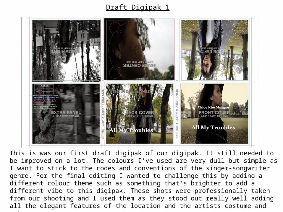
Draft Digipak 1
This is was our first draft digipak of our digipak. It still needed to be improved on a lot. The colours I've used are very dull but simple as I want to stick to the codes and conventions of the singer-songwriter genre. For the final editing I wanted to challenge this by adding a different colour theme such as something that's brighter to add a different vibe to this digipak. These shots were professionally taken from our shooting and I used them as they stood out really well adding all the elegant features of the location and the artists costume and make-up.
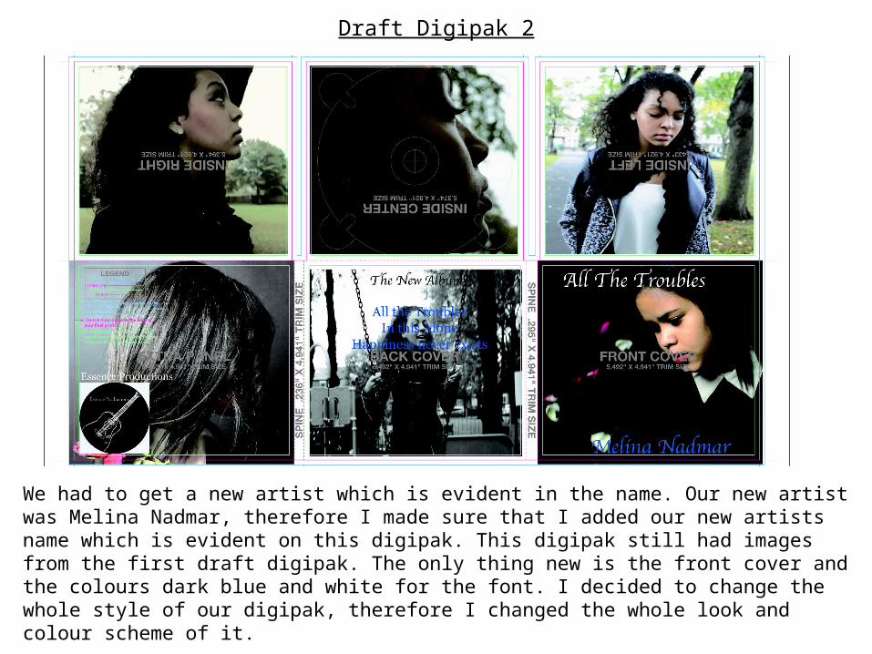
Draft Digipak 2
We had to get a new artist which is evident in the name. Our new artist was Melina Nadmar, therefore I made sure that I added our new artists name which is evident on this digipak. This digipak still had images from the first draft digipak. The only thing new is the front cover and the colours dark blue and white for the font. I decided to change the whole style of our digipak, therefore I changed the whole look and colour scheme of it.
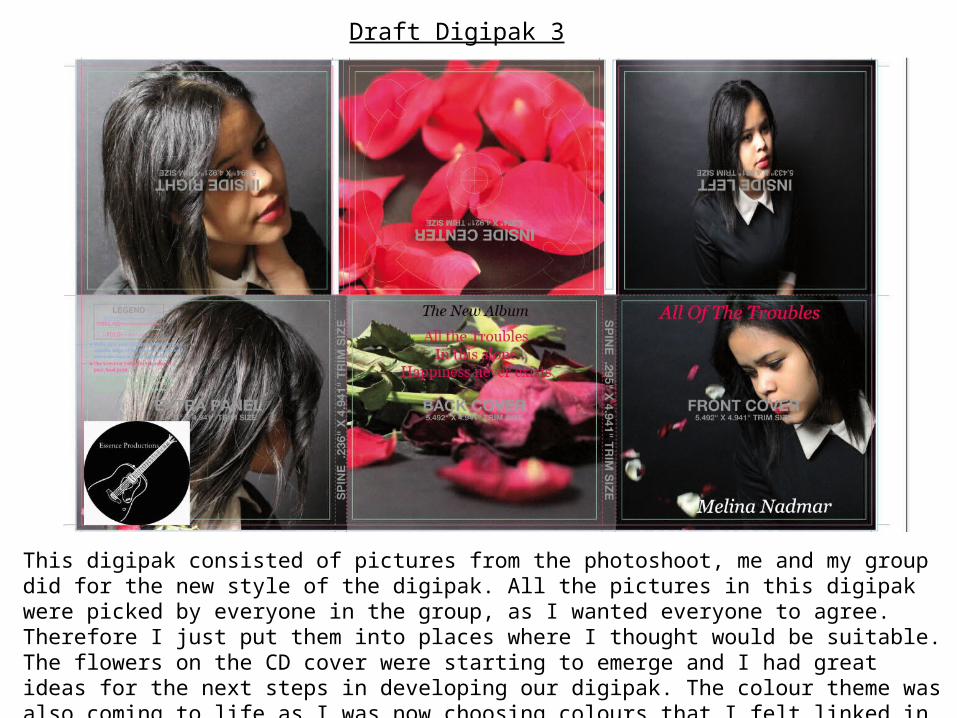
Draft Digipak 3
This digipak consisted of pictures from the photoshoot, me and my group did for the new style of the digipak. All the pictures in this digipak were picked by everyone in the group, as I wanted everyone to agree. Therefore I just put them into places where I thought would be suitable. The flowers on the CD cover were starting to emerge and I had great ideas for the next steps in developing our digipak. The colour theme was also coming to life as I was now choosing colours that I felt linked in well.
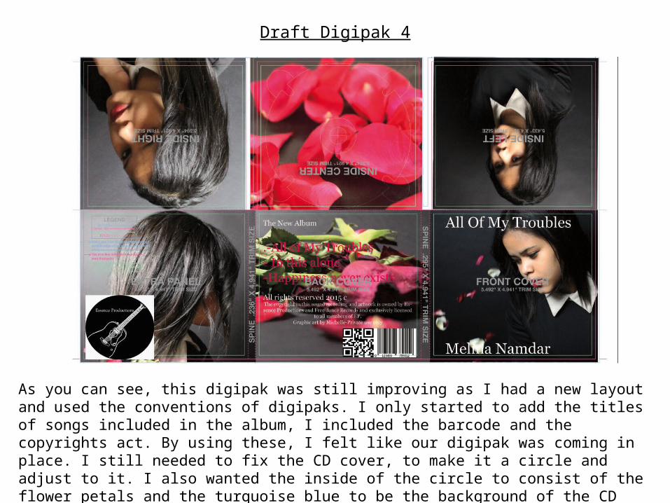
Draft Digipak 4
As you can see, this digipak was still improving as I had a new layout and used the conventions of digipaks. I only started to add the titles of songs included in the album, I included the barcode and the copyrights act. By using these, I felt like our digipak was coming in place. I still needed to fix the CD cover, to make it a circle and adjust to it. I also wanted the inside of the circle to consist of the flower petals and the turquoise blue to be the background of the CD cover.
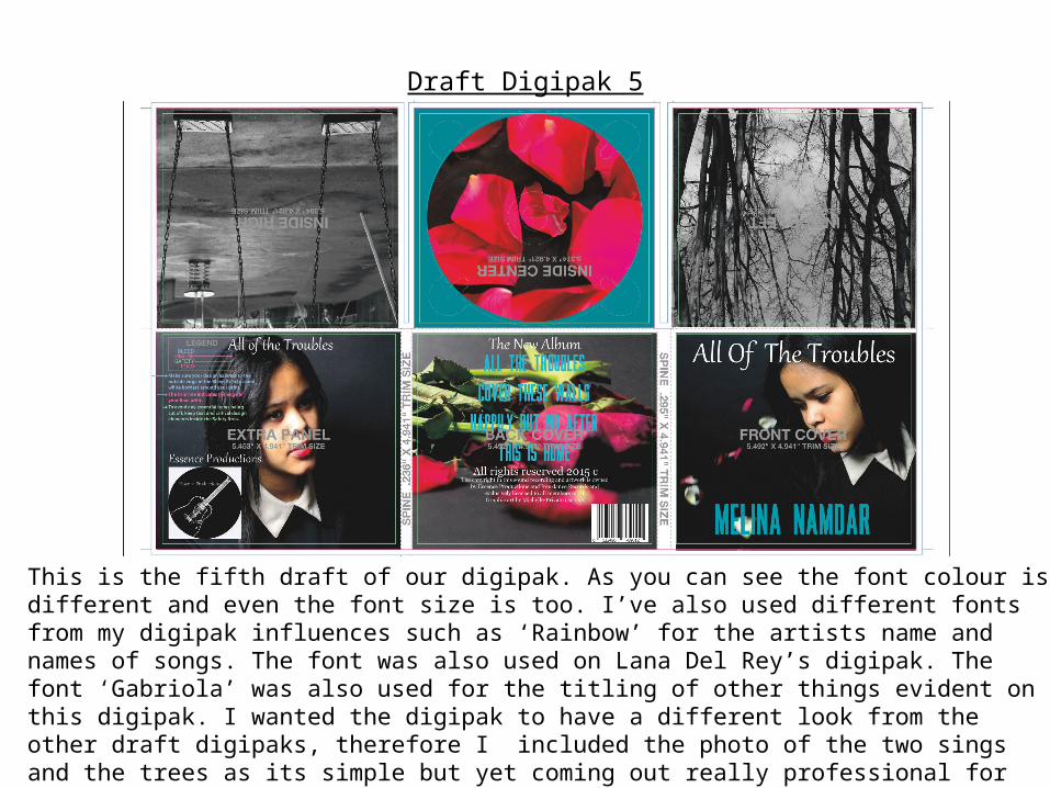
Draft Digipak 5
This is the fifth draft of our digipak. As you can see the font colour is different and even the font size is too. I’ve also used different fonts from my digipak influences such as ‘Rainbow’ for the artists name and names of songs. The font was also used on Lana Del Rey’s digipak. The font ‘Gabriola’ was also used for the titling of other things evident on this digipak. I wanted the digipak to have a different look from the other draft digipaks, therefore I included the photo of the two sings and the trees as its simple but yet coming out really professional for this fifth draft digipak.
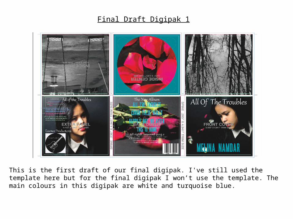
Final Draft Digipak 1
This is the first draft of our final digipak. I've still used the template here but for the final digipak I won’t use the template. The main colours in this digipak are white and turquoise blue.
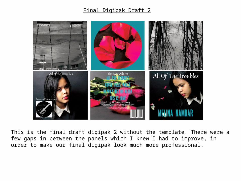
Final Digipak Draft 2
This is the final draft digipak 2 without the template. There were a few gaps in between the panels which I knew I had to improve, in order to make our final digipak look much more professional.
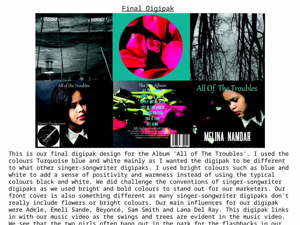
Final Digipak
This is our final digipak design for the Album 'All of The Troubles'. I used the colours Turquoise blue and white mainly as I wanted the digipak to be different to what other singer-songwriter digipaks. I used bright colours such as blue and white to add a sense of positivity and warmness instead of using the typical colours black and white. We did challenge the conventions of singer-songwriter digipaks as we used bright and bold colours to stand out for our marketers. Our front cover is also something different as many singer-songwriter digipaks don't really include flowers or bright colours. Our main influences for our digipak were Adele, Emeli Sande, Beyoncé, Sam Smith and Lana Del Ray. This digipak links in with our music video as the swings and trees are evident in the music video. We see that the two girls often hang out in the park for the flashbacks in our music video. The park symbolizes their friendship as that's the place they were always seen.