digipak advert final
TRANSCRIPT
DIGIPAK ADVERT
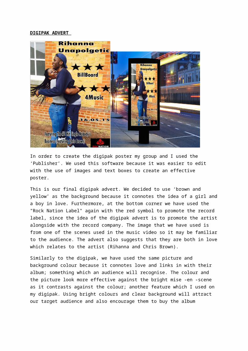
In order to create the digipak poster my group and I used the ‘Publisher’. We used this software because it was easier to edit with the use of images and text boxes to create an effective poster.
This is our final digipak advert. We decided to use ‘brown and yellow’ as the background because it connotes the idea of a girl and a boy in love. Furthermore, at the bottom corner we have used the "Rock Nation Label" again with the red symbol to promote the record label, since the idea of the digipak advert is to promote the artist alongside with the record company. The image that we have used is from one of the scenes used in the music video so it may be familiar to the audience. The advert also suggests that they are both in love which relates to the artist (Rihanna and Chris Brown).
Similarly to the digipak, we have used the same picture and background colour because it connotes love and links in with their album; something which an audience will recognise. The colour and the picture look more effective against the bright mise -en -scene as it contrasts against the colour; another feature which I used on my digipak. Using bright colours and clear background will attract our target audience and also encourage them to buy the album
Also, with my digipak advert we decided to promote their song, we achieved this by promoting our music video and digipak advert on social media such as Facebook, twitter and YouTube so their audience will know. This is also a common feature in digipak adverts; with the aim of them to promote when they are on tour so this increases the tick sales.
Overall I think my group and I have created a professional poster. It is effective as we have used conventions from our Digipak and Music Video to advertise. The use of the bright colours represents the excitement in our video.
Lastly the use of the image on the genre effectively and brings out the text to the audience, which is encouraging for them to purchase the music.