demifer demographic and migratory flows affecting european ... · demographic and migratory flows...
TRANSCRIPT

September 2010
The ESPON 2013 Programme
DEMIFER Demographic and migratory flows
affecting European regions and cities
Applied Research Project 2013/1/3
Deliverable 12/12 Demifer Case Studies
London
Prepared by Phil Rees, John Stillwell, Peter Boden and Adam Dennett
School of Geography University of Leeds
Leeds, UK
EUROPEAN UNION Part-financed by the European Regional Development Fund INVESTING IN YOUR FUTURE

This report presents results of an Applied Research Project conducted within the framework of the ESPON 2013 Programme, partly financed by the European Regional Development Fund. The partnership behind the ESPON Programme consists of the EU Commission and the Member States of the EU27, plus Iceland, Liechtenstein, Norway and Switzerland. Each partner is represented in the ESPON Monitoring Committee. This report does not necessarily reflect the opinion of the members of the Monitoring Committee. Information on the ESPON Programme and projects can be found on www.espon.eu The web site provides the possibility to download and examine the most recent documents produced by finalised and ongoing ESPON projects. This basic report exists only in an electronic version. © ESPON & CNR, 2010. Printing, reproduction or quotation is authorised provided the source is acknowledged and a copy is forwarded to the ESPON Coordination Unit in Luxembourg.


2
Table of contents 1. Introduction ........................................................................................... 4
2. Study area definition and data availability................................................... 5
3. A summary of population change............................................................... 7
4. Fertility and mortality ............................................................................ 10
5. Internal migration ................................................................................. 18
6. International migration .......................................................................... 25
7. Changing age profile of London’s population.............................................. 29
8. The impact of the DEMIFER scenarios on London ....................................... 36
9. Concluding comments............................................................................ 45
Abbreviations...................................................................................... 47
References ......................................................................................... 48
Appendix............................................................................................ 49
Figures Figure 1 Components of population change, Inner and Outer London 2001-2008 ... 8 Figure 2 Total fertility rate (TFR), London’s NUTS2 and NUTS3 sub-regions, 1990-2008
10 Figure 3 Standardised mortality ratios, London NUTS2 and NUTS3 regions, 1990-2006
13 Figure 4 Life Expectancy at birth, London’s NUTS 2 and 3 regions, 2006-08, ....... 16 Figure 5 Net migration and net migration rates, London’s NUTS3 regions, 1999-2008
19 Figure 6 Net migration exchanges, within London and with rest of the UK, 1999-2008
22 Figure 7 Net migration rates by age for London, 2008 ...................................... 23 Figure 8 Population profiles, England and London’s NUTS2 regions, 2006 ............ 30 Figure 9 Population profiles, England and London’s NUTS2 regions, 2031 ............ 31 Figure 10 Non-White ethnic groups as a percentage of total population, UK and London’s
NUTS2 regions, 2006 ...................................................................... 32 Figure 11 Location quotients of ethnic groups, London’s NUTS2 regions, 2006....... 33 Figure 12 Scenario summary, Inner London, 2005-2050 .................................... 37 Figure 13 Scenario summary, Outer London, 2005-2050 .................................... 38 Figure 14 – Demifer scenarios – Inner London .................................................. 39 Figure 15 DEMIFER scenarios, Outer London, 2005-2050.................................... 40 Figure 16 Age-profiles under alternative scenarios, Inner London, 2005-2050 ....... 42 Figure 17 Dependency ratios under alternative scenarios, Inner London, 2005-205042 Figure 18 Age-profiles under alternative scenarios, Outer London, 2005-2050 ....... 43 Figure 19 Dependency ratios under alternative scenarios, Outer London, 2005-205043
3
Maps
Map 1 NUTS regions within London............................................................... 6 Map 2 Total fertility rate (TFR), London boroughs, 2007 ................................ 12 Map 3 Standardised mortality ratios, , London boroughs, 2007 ....................... 15 Map 4 Life Expectancy at birth, London boroughs, 2006-08............................ 17 Map 5 Internal migration, , London boroughs, 2008 ...................................... 20 Map 6 Immigration and emigration rates, London boroughs, 2007 .................. 26 Map 7 Net international migration, London boroughs, 2007............................ 28 Map 8 Index of diversity, London boroughs, 2006......................................... 35
4
1 Introduction
The DEMIFER project aims to examine the historical and future impact of
demographic change upon the 27 members of the European Union (EU) plus the
four additional European states that have a close relationship with the EU (EEA
plus Switzerland). To achieve this aim, a comprehensive database of
demographic statistics has been constructed, capturing information about trends
and patterns of fertility, mortality, internal migration and international migration
for each NUTS2 region in the 31 ‘ESPON’ countries.
These data have been used to examine how the components of demographic
change combine to exert different impacts upon population change, the size of
the labour force and the ageing of the population in each of the NUTS2 regions.
Historical analysis, coupled with multi-regional forecasting methods, has been
used to assess how future developments in fertility, mortality and migration
might affect population growth or decline and drive changes in the age structure
in different types of regions. The impact of migration, both internal and
international, has been a particular focus of the study, in order to establish its
influence upon the labour force, to establish how migration between European
countries and migration to Europe compensate or reinforce each other, and to
consider how climate change may drive migration flows within, between and into
countries and regions.
A key part of the project has been a more detailed examination of the complexity
of the demographic process within a series of ‘Case Studies’ that draw together
the various strands of analysis undertaken in the DEMIFER project; from
connecting the historical analysis, developing the regional typology, building
scenarios and formulating policy implication, to illustrating the results and
impacts at a more disaggregate, NUTS3 regional geography. Case Study areas
have been selected from DEMIFER’s regional typology, with at least one region
from each cluster selected. Two Case Studies have been prepared for the UK:
West Yorkshire and Greater London. This paper reports on the London Case
Study.
5
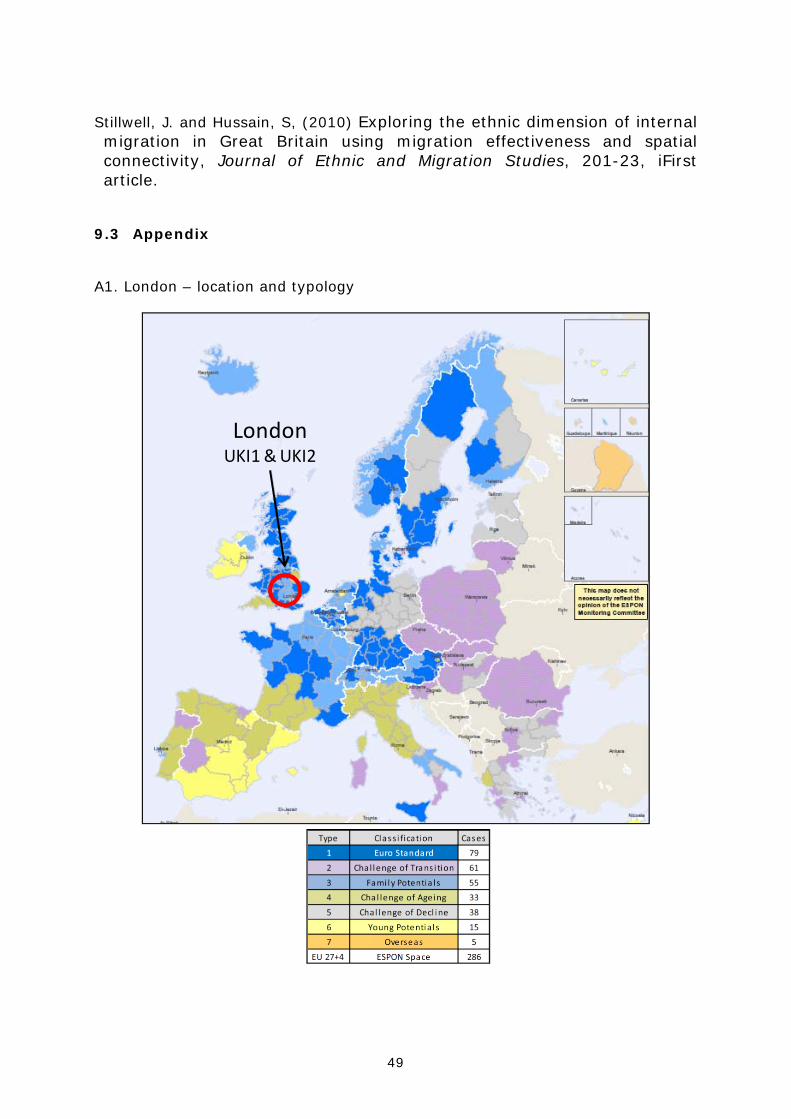
London is split into two NUTS2 regions, Inner London and Outer London. Each is
classified as ‘Family Potentials’ in the DEMIFER typology (see Appendix 1) but
each is identified as an ‘outlier’ because of its unique position as a global city.
Areas with the ‘Family Potentials’ classification typically have a labour force
population in the younger adult ages (aged 20-39) of average size, lower than
average population beyond retirement (65+) and higher than average growth
due to both natural increase and net migration. This study examines how well
this profile fits London and its immense variety of geographical areas. Two other
‘Family Potentials’ regions have been selected for more detailed Case Studies:
Alsace (FR42) and Stockholm (SE4).
Section 2 of this report provides the geographical context for the London study
and briefly summarises the nature of the demographic data available for study in
the UK. Section 3 reviews some of the more recent studies of demographic
change in London, drawing in particular on the excellent and substantial analyses
produced by the Data Management and Analysis Group (DMAG) at the Greater
London Authority (GLA). Section 4 summarises the historical picture of
population change and its key components, with Sections 5 and 6 taking a more
detailed look at the importance of migration in this process. Section 7 examines
how demographic change is likely to impact upon the profile of the population:
its age-structure, the labour force, the elderly and its ethnic composition. Section
8 indicates how the DEMIFER scenarios would impact upon London and a
concluding section draws together the analysis and policy-relevant findings of the
Case Study.
2 Study area definition and data availability
London is a large and diverse area. This study uses data at a number of
different spatial scales to produce a picture of demographic change across the
city (Map 1).
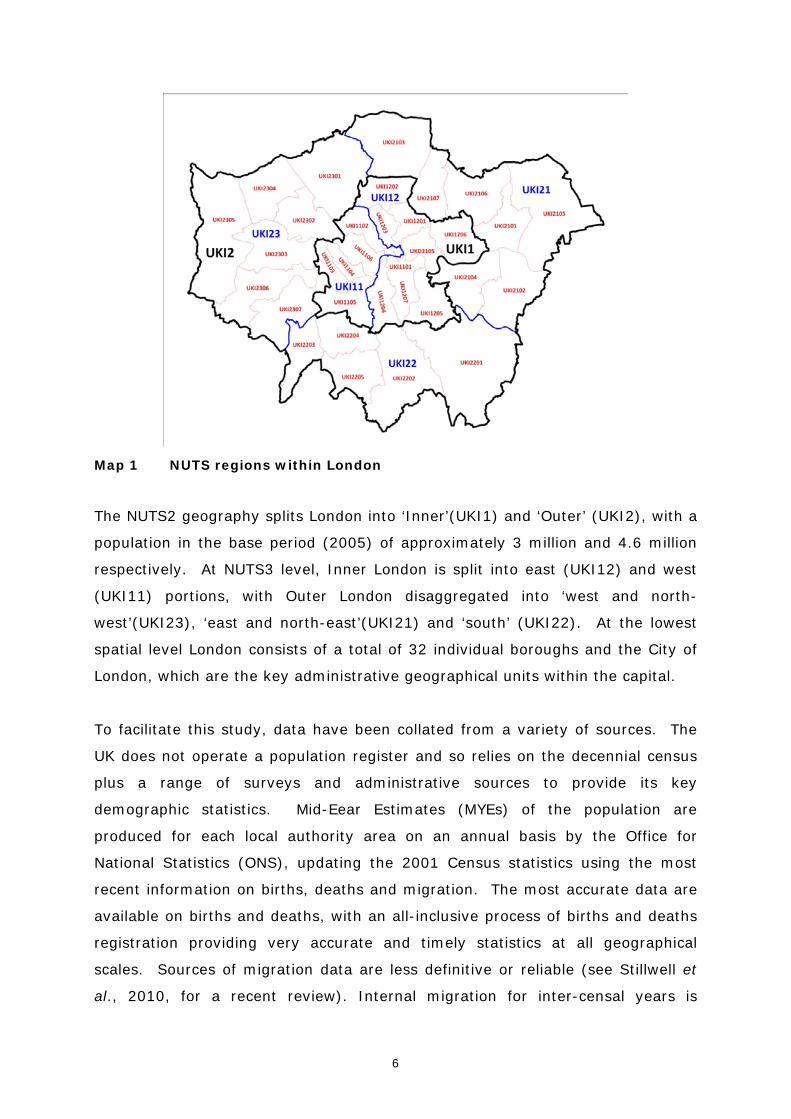
6
Map 1 NUTS regions within London
The NUTS2 geography splits London into ‘Inner’(UKI1) and ‘Outer’ (UKI2), with a
population in the base period (2005) of approximately 3 million and 4.6 million
respectively. At NUTS3 level, Inner London is split into east (UKI12) and west
(UKI11) portions, with Outer London disaggregated into ‘west and north-
west’(UKI23), ‘east and north-east’(UKI21) and ‘south’ (UKI22). At the lowest
spatial level London consists of a total of 32 individual boroughs and the City of
London, which are the key administrative geographical units within the capital.
To facilitate this study, data have been collated from a variety of sources. The
UK does not operate a population register and so relies on the decennial census
plus a range of surveys and administrative sources to provide its key
demographic statistics. Mid-Eear Estimates (MYEs) of the population are
produced for each local authority area on an annual basis by the Office for
National Statistics (ONS), updating the 2001 Census statistics using the most
recent information on births, deaths and migration. The most accurate data are
available on births and deaths, with an all-inclusive process of births and deaths
registration providing very accurate and timely statistics at all geographical
scales. Sources of migration data are less definitive or reliable (see Stillwell et
al., 2010, for a recent review). Internal migration for inter-censal years is

7
derived primarily from patient registration statistics, captured as individuals
move and re-register with their local doctor (Scott and Kilbey, 1999; Chappell et
al., 2000). These data are collected on a rolling basis and provide
disaggregation by age and local authority area; they do, however, suffer from
issues of under-registration, particularly for young adult males who are least
likely to register with a doctor when they move.
International migration statistics are the least robust. The UK relies upon the
International Passenger Survey (IPS) as the primary source of its data on
immigration and emigration, combining it with a number of other sources to
produce estimates for local areas (ONS, 2008). These estimation methods have
been subject to considerable scrutiny and comment (House of Commons, 2008;
Rees et al., 2009) at a time when net immigration has been a dominant driver of
population change in the UK. Alternative estimates of immigration have been
produced using a variety of administrative sources (Boden and Rees, 2009;
2010) and the ONS has recently completed a consultation process on its own
methodological revisions (using administrative data) which will see local
authority population estimates revised for 2001-2008. In the absence of
definitive statistics on international migration, local authorities have been
encouraged to use alternative sources to gather information (Audit Commission,
2007; Green et al., 2008) with administrative sources such as the Department of
Works and Pensions’ (DWP) National Insurance Number (NINo) statistics,
Workers Registration Scheme (WRS) data from the UK Borders Agency and the
registration of foreign nationals with the UK health service, providing useful, if
incomplete, evidence on this key element of local population change.
In completing this Case Study the analysis has drawn on the excellent ‘Focus on
London’ publication produced by the Greater London Authority (GLA, 2009), an
essential reference for those attempting to understand the socio-demographic
patterns and trends in one of the world’s most diverse cities.
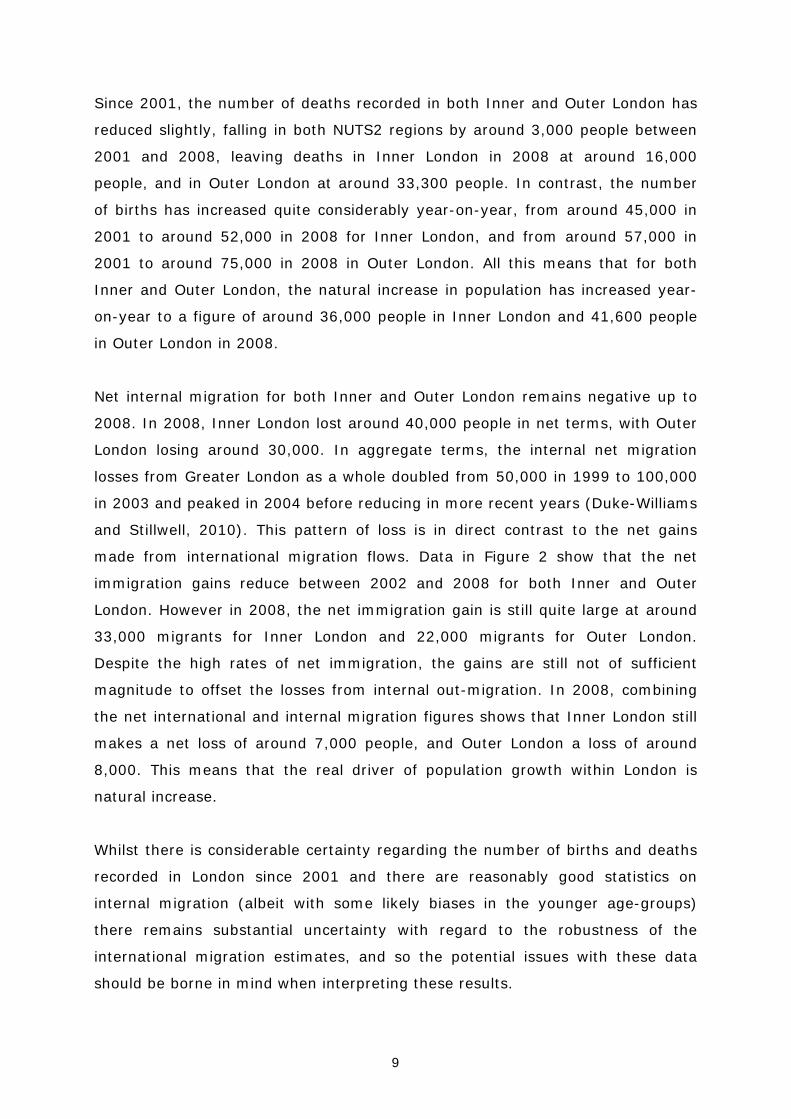
3 A summary of population change Since 2001, the populations of both Inner and Outer London have increased
considerably. In Inner London the population rose from just over 2.8 million to

8
over 3 million people. In Outer London the population has risen from around 4.4
million to almost 4.6 million people over the same period – an increase of around
400,000 people in London overall. The components of demographic change are
exerting different influences on this growth and there remains particular
uncertainty regarding the true impact of international migration (Figure 1).
(a) Inner London
2,750
2,800
2,850
2,900
2,950
3,000
3,050
01 02 03 04 05 06 07 08
Popu
latio
n (000
s)
Year
Population
‐
5,000
10,000
15,000
20,000
25,000
30,000
35,000
40,000
01 02 03 04 05 06 07 08
Natural In
crease
Year
Natural increase
(65,000)
(55,000)
(45,000)
(35,000)
(25,000)
(15,000)
(5,000)
01 02 03 04 05 06 07 08Net M
igratio
nYear
Net internal migration
‐
10,000
20,000
30,000
40,000
50,000
60,000
01 02 03 04 05 06 07 08
Net im
migratio
n
Year
Net immigration
(b) Outer London
4,350
4,400
4,450
4,500
4,550
4,600
4,650
01 02 03 04 05 06 07 08
Popu
latio
n (000
s)
Year
Population
‐
5,000
10,000
15,000
20,000
25,000
30,000
35,000
40,000
01 02 03 04 05 06 07 08
Natural In
crease
Year
Natural increase
(65,000)
(55,000)
(45,000)
(35,000)
(25,000)
(15,000)
(5,000)
01 02 03 04 05 06 07 08
Net M
igratio
n
Year
Net internal migration
‐
10,000
20,000
30,000
40,000
50,000
60,000
01 02 03 04 05 06 07 08
Net im
migratio
n
Year
Net immigration
Source:
Figure 1 Components of population change, Inner and Outer London 2001-2008
9
Since 2001, the number of deaths recorded in both Inner and Outer London has
reduced slightly, falling in both NUTS2 regions by around 3,000 people between
2001 and 2008, leaving deaths in Inner London in 2008 at around 16,000
people, and in Outer London at around 33,300 people. In contrast, the number
of births has increased quite considerably year-on-year, from around 45,000 in
2001 to around 52,000 in 2008 for Inner London, and from around 57,000 in
2001 to around 75,000 in 2008 in Outer London. All this means that for both
Inner and Outer London, the natural increase in population has increased year-
on-year to a figure of around 36,000 people in Inner London and 41,600 people
in Outer London in 2008.
Net internal migration for both Inner and Outer London remains negative up to
2008. In 2008, Inner London lost around 40,000 people in net terms, with Outer
London losing around 30,000. In aggregate terms, the internal net migration
losses from Greater London as a whole doubled from 50,000 in 1999 to 100,000
in 2003 and peaked in 2004 before reducing in more recent years (Duke-Williams
and Stillwell, 2010). This pattern of loss is in direct contrast to the net gains
made from international migration flows. Data in Figure 2 show that the net
immigration gains reduce between 2002 and 2008 for both Inner and Outer
London. However in 2008, the net immigration gain is still quite large at around
33,000 migrants for Inner London and 22,000 migrants for Outer London.
Despite the high rates of net immigration, the gains are still not of sufficient
magnitude to offset the losses from internal out-migration. In 2008, combining
the net international and internal migration figures shows that Inner London still
makes a net loss of around 7,000 people, and Outer London a loss of around
8,000. This means that the real driver of population growth within London is
natural increase.
Whilst there is considerable certainty regarding the number of births and deaths
recorded in London since 2001 and there are reasonably good statistics on
internal migration (albeit with some likely biases in the younger age-groups)
there remains substantial uncertainty with regard to the robustness of the
international migration estimates, and so the potential issues with these data
should be borne in mind when interpreting these results.
10
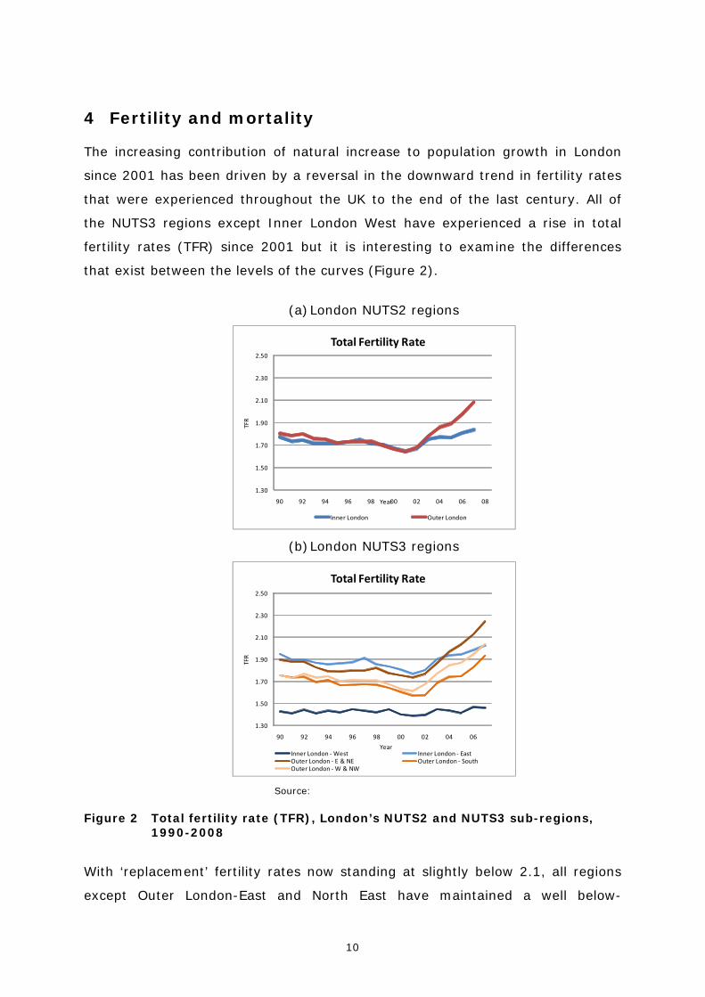
4 Fertility and mortality The increasing contribution of natural increase to population growth in London
since 2001 has been driven by a reversal in the downward trend in fertility rates
that were experienced throughout the UK to the end of the last century. All of
the NUTS3 regions except Inner London West have experienced a rise in total
fertility rates (TFR) since 2001 but it is interesting to examine the differences
that exist between the levels of the curves (Figure 2).
(a) London NUTS2 regions
1.30
1.50
1.70
1.90
2.10
2.30
2.50
90 92 94 96 98 00 02 04 06 08
TFR
Year
Total Fertility Rate
Inner London Outer London
(b) London NUTS3 regions
1.30
1.50
1.70
1.90
2.10
2.30
2.50
90 92 94 96 98 00 02 04 06
TFR
Year
Total Fertility Rate
Inner London ‐West Inner London ‐ EastOuter London ‐ E & NE Outer London ‐ SouthOuter London ‐W & NW
Source:
Figure 2 Total fertility rate (TFR), London’s NUTS2 and NUTS3 sub-regions, 1990-2008
With ‘replacement’ fertility rates now standing at slightly below 2.1, all regions
except Outer London-East and North East have maintained a well below-
11
replacement TFR since the 1990s. It is only in 2005 that Outer London-East and
North East creeps above replacement level. Inner London-West has had a
consistently low TFR (around 1.4) since the 1990s. This is undoubtedly a function
of the region being one of the primary internal in-migration locations for young
migrants attracted to the city by job prospects – not an area where these career
driven migrants would generally consider beginning a family. All other NUTS3
regions in the capital display a marked decrease in the TFRs between 1990 and
2001. Lower rates are consistently displayed in Outer London-South and Outer
London-West and North West; slightly higher rates in Outer London-East and
North East and Inner London-East.
Since the turnaround in 2001, however, there has been a continual rise in TFRs
in all NUTS3 regions except Inner London-West. This rise has been somewhat
sharper in Outer London than in Inner London. London has a higher proportion of
women of childbearing age in the population compared with the UK in total.
Across the UK, the rise in the number of births since 2001 has been underpinned
by the trend towards late childbearing that has led to an increase in fertility for
females in older age-groups and by the increasing percentage of births to
mothers born outside the UK. The increase in births in London since 2001 has
been entirely due to mothers born outside the UK; births to mothers born in the
UK has fallen since 2001 (GLA, 2009). Births to women born outside the UK now
account for approximately 54% of the London total.
12
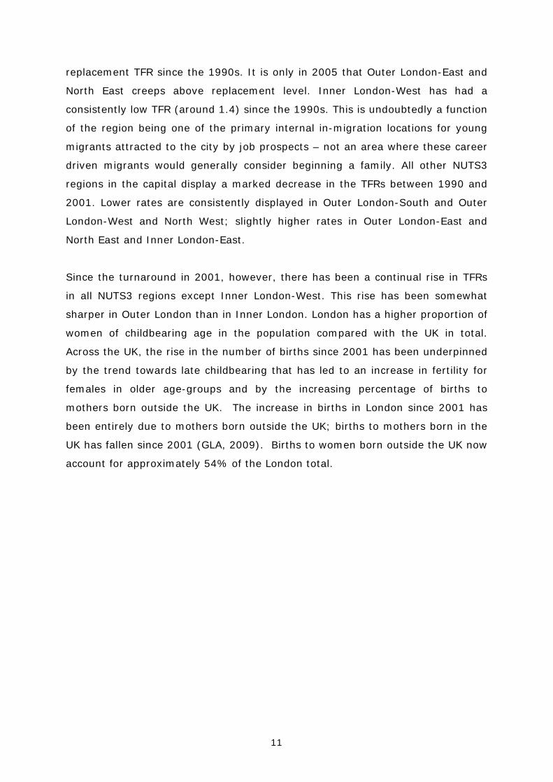
Map 2 Total fertility rate (TFR), London boroughs, 2007
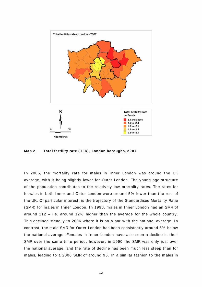
In 2006, the mortality rate for males in Inner London was around the UK
average, with it being slightly lower for Outer London. The young age structure
of the population contributes to the relatively low mortality rates. The rates for
females in both Inner and Outer London were around 5% lower than the rest of
the UK. Of particular interest, is the trajectory of the Standardised Mortality Ratio
(SMR) for males in Inner London. In 1990, males in Inner London had an SMR of
around 112 – i.e. around 12% higher than the average for the whole country.
This declined steadily to 2006 where it is on a par with the national average. In
contrast, the male SMR for Outer London has been consistently around 5% below
the national average. Females in Inner London have also seen a decline in their
SMR over the same time period, however, in 1990 the SMR was only just over
the national average, and the rate of decline has been much less steep than for
males, leading to a 2006 SMR of around 95. In a similar fashion to the males in

13
Outer London, the SMR has remained relatively consistent SMR at around 95
from 1990 to 2006.
(a) London NUTS2 regions
80.00
85.00
90.00
95.00
100.00
105.00
110.00
115.00
120.00
90 92 94 96 98 00 02 04 06
SMR
Year
Standardised Mortality Ratio ‐male
Inner London Outer London
80.00
85.00
90.00
95.00
100.00
105.00
110.00
115.00
120.00
90 92 94 96 98 00 02 04 06SM
R
Year
Standardised Mortality Ratio ‐ female
Inner London Outer London
(b) London NUTS3 regions
80.00
85.00
90.00
95.00
100.00
105.00
110.00
115.00
120.00
91 93 95 97 99 01 03 05 07
SMR
Year
Standardised Mortality Ratio ‐male
Inner London ‐West Inner London ‐ EastOuter London ‐ E & NE Outer London ‐ SouthOuter London ‐W & NW
80.00
85.00
90.00
95.00
100.00
105.00
110.00
115.00
120.00
91 93 95 97 99 01 03 05 07
SMR
Year
Standardised Mortality Ratio ‐male
Inner London ‐West Inner London ‐ EastOuter London ‐ E & NE Outer London ‐ SouthOuter London ‐W & NW
Note: SMR for England & Wales = 100 Source:
Figure 3 Standardised mortality ratios, London NUTS2 and NUTS3 regions, 1990-2006
Disaggregating SMRs by NUTS3 regions reveals some very interesting variations
within Inner and Outer London. Inner London-East, in fact, has continuously and
consistently high SMRs for both males (15% higher than average) and females
(5% higher than average) between 1991 and 2007. The drop in both female and
male SMRs seen at the NUTS2 level is driven entirely by the marked reduction in
SMRs in Inner London-West to between 20-25% lower than average in 2007. Of

14
the Outer London NUTS3 regions, Outer London-East and North East displays a
worsening SMR for both males and females between 1991 and 2007. Below the
NUTS3 level is the the or borough level (LAU 1). Figure 6 displays clearly the
considerable variation in SMRsacross London in 2007, with deprived Inner
London boroughs such as Tower Hamlets displaying high SMRs for both males
and females and affluent boroughs such as Westminster and Kensington and
Chelsea exhibiting very low SMRs.
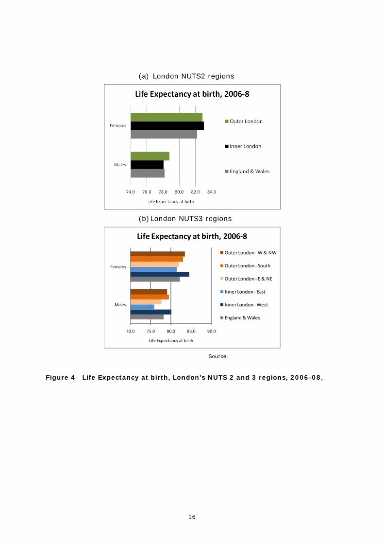
Statistics on life expectancy at birth reflect these SMR differences across the city
with males in Inner London-East living on average two years less than the
England and Wales mean, and males in Inner London-West living two years more
than the national mean (Figure 4). The population in Outer London for both
males and females lives around a year longer than the average for England and
Wales, but Outer London-East and North East does have a slightly lower life
expectancy than other areas in Outer London and England and Wales as a whole.
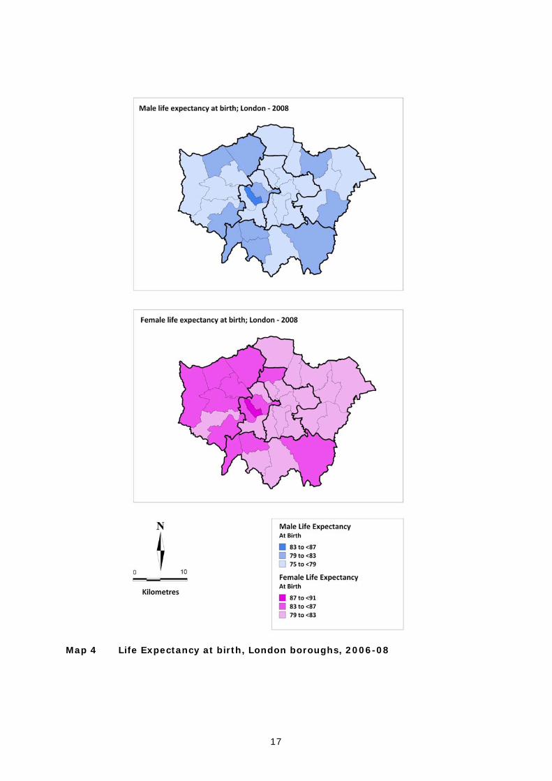
Figure 8 shows how the variations in life expectancy at birth for both males and
females plays out across the boroughs of London in 2008, with females born in
the west end of the city enjoying a slightly higher life expectancy than those in
the east. The pattern for males is less dichotomous, but for both males and
females, the highest life expectancy at birth is found in Westminster –
interestingly one of the boroughs with the lowest fertility rates in the city, but
unsurprisingly one of the wealthiest.

15
Map 3 Standardised mortality ratios, , London boroughs, 2007
16
(a) London NUTS2 regions
(b) London NUTS3 regions
70.0 75.0 80.0 85.0 90.0
Males
Females
Life Expectancy at birth
Life Expectancy at birth, 2006‐8
Outer London ‐W & NW
Outer London ‐ South
Outer London ‐ E & NE
Inner London ‐ East
Inner London ‐West
England & Wales
Source:
Figure 4 Life Expectancy at birth, London’s NUTS 2 and 3 regions, 2006-08,
17
Map 4 Life Expectancy at birth, London boroughs, 2006-08
18
5 Internal migration
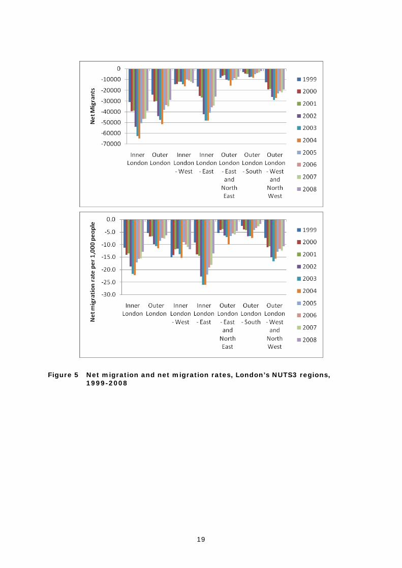
In the decade leading up to 2008, London has been a consistent net loser of
internal migrants to the rest of the UK. Figure 5 shows the extent of this loss
with a peak in 2004 when Inner and Outer London combined making a net loss
of some 116,000 migrants. Whilst the rate of internal migrant loss to the rest of
the country has reduced somewhat since the 2004 zenith, the nation’s capital
still lost almost 70,000 migrants in net terms in 2008. Of course, there is
variation in this pattern within London, with data at the NUTS3 level showing
that Inner-London East is the biggest net-loser of migrants, followed then by
Outer-London West and North West. Inner London West, whilst a relatively low
volume net-loser of migrants actually exhibits a rate of net loss similar to that of
Outer LondonWest and North West over the ten year period.
19
Figure 5 Net migration and net migration rates, London’s NUTS3 regions, 1999-2008

20
Map 5 Internal migration, , London boroughs, 2008
Greater insight into the patterns of net migration is gained when the exchanges
within London and between London and the rest of the country are examined
separately. The maps in Map 5 depict the net migration exchanges (a) between
boroughs within London and (b) between exc boroughs within the London and

21
elsewhere in the UK in 2008 (the most recent year for which data are available).
The contrast between the two sets of net migration balances is stark. Where
flows are between boroughs within London, all but one borough within the Inner
London NUTS2 region is a net loser of internal migrants to boroughs in Outer
London. In contrast, all but three boroughs in Outer London are net gainers of
population from Inner London. This is evidence of a strong movement away
from the centre of the city to the peripery of the city. On the other hand, where
the flows are between boroughs in London and the rest of the country the
pattern is almost reversed. The only boroughs that are net gainers of population
are in Inner London. All boroughs in Outer London are net losers of population to
the rest of the country.
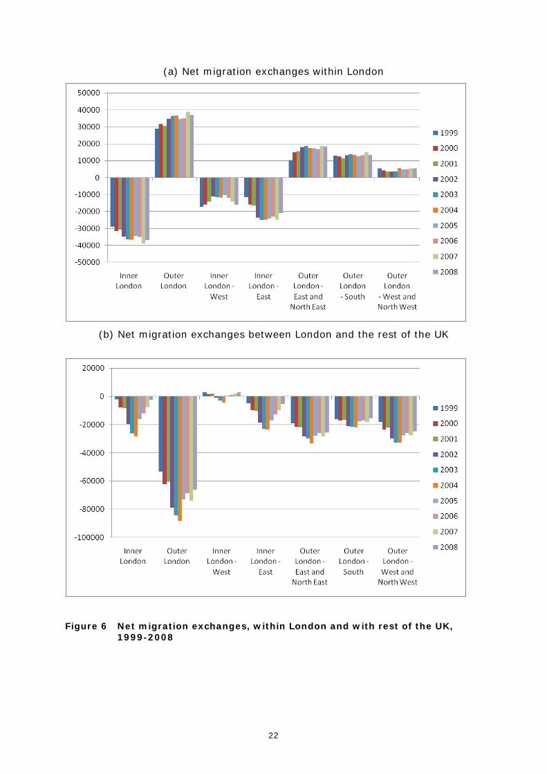
This pattern is maintained over time, as is demonstrated at NUTS2 and NUTS3
scales in Figure 6. Within London, it is possible to see that over a ten year
period, the net exchanges between Inner and Outer London remain more or less
constant, with a slight increase in net moves into Outer London over the decade.
When this is broken down into NUTS3 regions, it is apparent that Outer London-
East and North East is largest net gainer, with Outer London-West and North
West gaining least in net terms. Examining the net exchanges between London
and the rest of the UK, it is very clear that Outer London is consistently over
time losing far more migrants in net terms than Inner London. Inner London
shows the most variation over the decade with only a very small net loss in 1999
and 2008. Drilling down through the hierarchy to the NUTS3 level, it is possible
to see that part of the reason for this modest net loss at the beginning and end
of the decade is because in Inner London-West, there is actually a net gain of
migrants – the only region within Inner and Outer London where this is the case.
22
(a) Net migration exchanges within London
(b) Net migration exchanges between London and the rest of the UK
Figure 6 Net migration exchanges, within London and with rest of the UK, 1999-2008
23
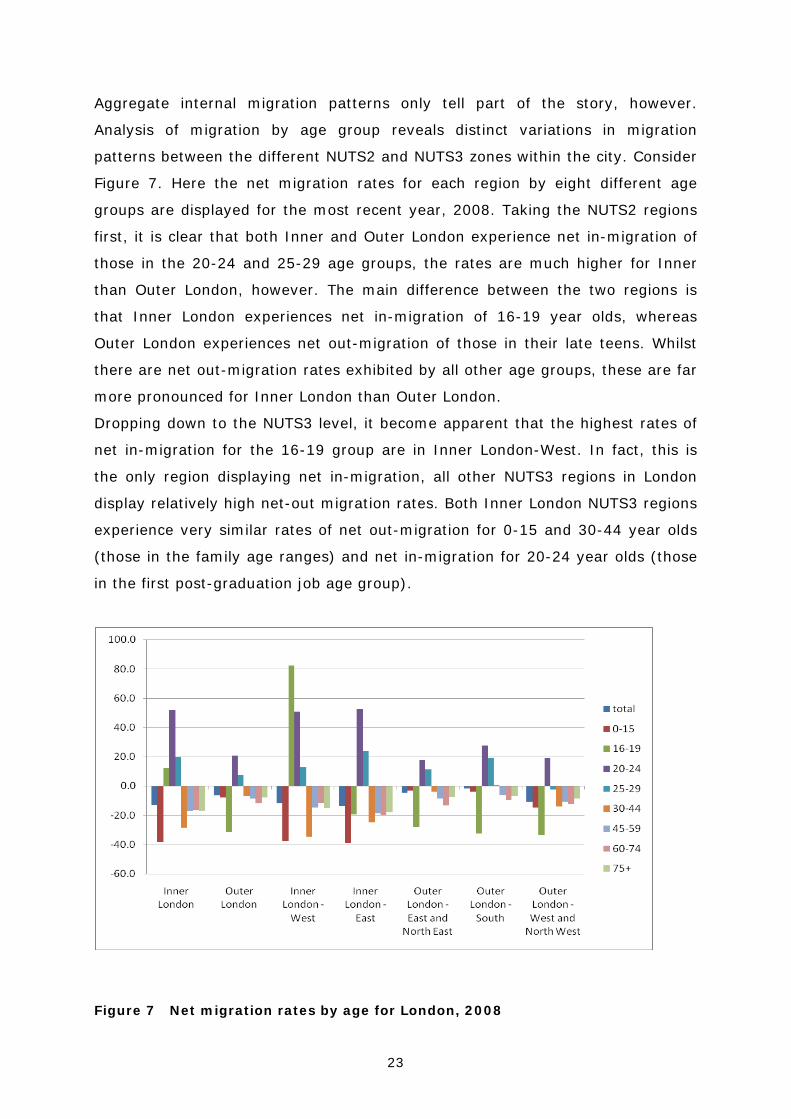
Aggregate internal migration patterns only tell part of the story, however.
Analysis of migration by age group reveals distinct variations in migration
patterns between the different NUTS2 and NUTS3 zones within the city. Consider
Figure 7. Here the net migration rates for each region by eight different age
groups are displayed for the most recent year, 2008. Taking the NUTS2 regions
first, it is clear that both Inner and Outer London experience net in-migration of
those in the 20-24 and 25-29 age groups, the rates are much higher for Inner
than Outer London, however. The main difference between the two regions is
that Inner London experiences net in-migration of 16-19 year olds, whereas
Outer London experiences net out-migration of those in their late teens. Whilst
there are net out-migration rates exhibited by all other age groups, these are far
more pronounced for Inner London than Outer London.
Dropping down to the NUTS3 level, it become apparent that the highest rates of
net in-migration for the 16-19 group are in Inner London-West. In fact, this is
the only region displaying net in-migration, all other NUTS3 regions in London
display relatively high net-out migration rates. Both Inner London NUTS3 regions
experience very similar rates of net out-migration for 0-15 and 30-44 year olds
(those in the family age ranges) and net in-migration for 20-24 year olds (those
in the first post-graduation job age group).
Figure 7 Net migration rates by age for London, 2008

24
In all, the internal migration flows associatied with London produce a distinct and
very intersting pattern – one that varies in volume but very little in composition
over the ten years between 1999 and 2008. The main story is one of the city
losing large number of migrants to the rest of the UK, in net terms. The heaviest
net-loses are from Outer London, with fewer from Inner London. When migration
patterns are examined within the city though, there is a clear and consistent
dispersal of migrants from Inner London to Outer London . Aggregate flows only
tell part of the story – disaggregating the flows by age reveals that all areas of
the city are gaining very large numbers of migrants in their early twenties. These
flows are particuarly concentrated in Inner London – the location of many of the
jobs which are pulling these migrants in from elsewhere in the UK. Across the
board, the city is losing migrants, in net terms, in the pre and post-twenties age
groups – a city of young in-migrants and family out-migrants. There is, of
course, very significant ethnic diversity in London’s population and the migration
flow patterns of different ethnic groups have been examined at borough level by
Stillwell and Hussain (2010) and at ward level by Stillwell (2010a),
demonstrating that the outward dispersal from inner to outer suburbs is
behaviour not confined to the White population. Stillwell (2010b) shows that
while migration is concentrating the White population in outer suburban areas,
the migration of the major Black and Asian populations is a deconcentration
movement, with migrants leaving wards with higher concentrations of their own
ethnic group and moving to areas with low own-group representation.
25
6 International migration
Since 2001 international migration has been a dominant driver of population
change yet it remains the most difficult component to estimate accurately. In
the absence of a population register, the UK relies upon a combination of census
and survey data to estimate immigration and emigration flows at a local level.
But in the face of much public scrutiny of its data and methods, ONS has
continued to evaluate alternative approaches to the measurement and estimation
of international migration, with administrative data sources now an important
component of the process.
Existing approaches to estimation have been shown to be less than robust
(Boden and Rees, 2009) but these methods still underpin the population
estimates produced for local authority areas in the UK. Notwithstanding these
estimation issues, international migration flows into London, whether short-term
or longer-term, and the development of its ethnic communities, sets London
apart as one of the most diverse city communities in the world. The growth in
this diversity continues apace as net outflows of ‘internal’ migrants is balanced
by a large net inflow due to ‘international’ migration. Despite their limitations,
the ONS estimates of international migration by London borough provide a
picture of the importance of these flows to population growth in the city. The
pattern of balances between immigration and emigration rates (based upon
resident population) for individual London boroughs is illustrated in Map 6, with
the resulting net picture in Map 7. Particularly high churn is experienced in the
Inner London-West with a diverse profile of economic migrants coming to the
global city for varying lengths of stay. Westminster and Kensington and Chelsea
have the highest immigration rates, balanced by the highest emigration rates.
Camden also shows evidence of very high immigration rates although its
estimates are subject to significant downward adjustment in the revised
estimates to be produced in 2010.
26
Map 6 Immigration and emigration rates, London boroughs, 2007
27
Newham and Southwark experienced very high rates of net immigration as did
Brent, Tower Hamlets, Wandsworth and Lewisham. These are all areas of
significant ethnic diversity, whose populations continue to evolve through the
dynamics of internal net out-migration, net immigration and relatively high levels
of fertility that drive natural change.
These ‘official’ statistics on international migration hide the additional influence of
‘short-term’ migration, the inflow of workers, students and dependents for
durations of stay that are typically less than 12 months in duration. Short-term
flows have been particularly influenced by the enlargement of the EU in 2004
that has seen the unprecedented inflow of migrants from newly integrated states
of Central and Eastern Europe. Measuring and monitoring the inflow, outflow
and duration of stay of the ‘Accession’ migrants has been extremely problematic;
made increasingly difficult by the economic downturn, with little hard evidence
on the impact of the recession upon resident migrants, although a downturn in
new ‘national insurance number’ (NINo) registrations has been evident since late
2009, following a peak inflow in 2007. Accession migrants have added to the
existing diversity of London’s ethnic communities. In 2008, there were a total of
88,000 NINo registrations across London, with a further 183,000 to non-
Accession migrants.

28
Map 7 Net international migration, London boroughs, 2007
London boroughs are the most ethnically diverse in the UK. In 2008, one third of
all London residents were estimated to have been born outside the UK, compared
to just 11% across the rest of the country (GLA, 2009). In 2008, over 50% of
the residents of Brent and Westminster were born outside the UK (DMAG, 2009).
The effect of these demographic drivers upon the age profile and the ethnic mix
of London is explored further in the next section.
29
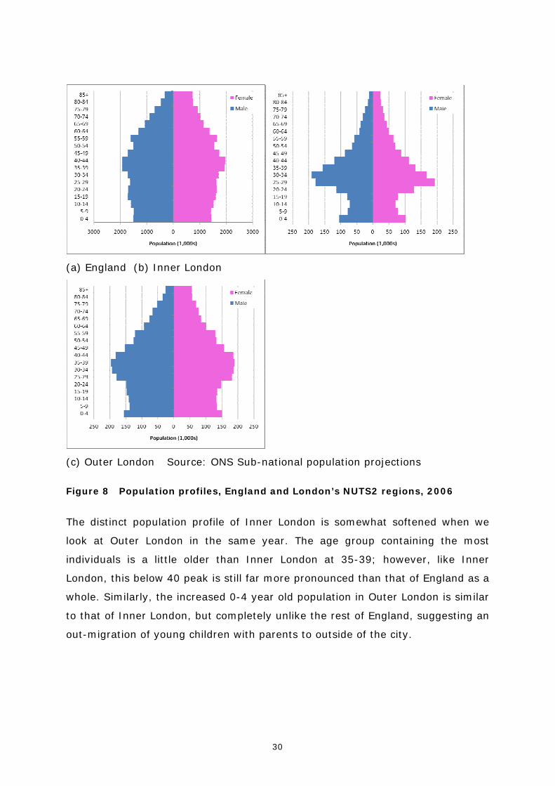
7 Changing age profile of London’s population The age profile of London is distinct and somewhat different to that of the rest of
England. Figure 8a displays a population pyramid for England in 2006, using data
from the ONS. The pyramid shows the age groups containing the most people
are the 35-39 and 40-44 groups, with successively fewer people contained in
each age group above and below these ages, leading to the characteristic ‘bulge’
seen in many post-demographic transition countries. Contrast this profile with
that of Inner London (Figure 8b). This population pyramid is dramatically
different in shape, and indeed more akin to the age profile shown when
examining migrants. This is perhaps not a surprise when one considers that a
very large proportion of the population of Inner London are recent migrants –
either internal migrants from the rest of the UK, or international migrants from
elsewhere in the world. The population of both males and females declines from
0-4 until the mid teens, from which point it grows steeply to a peak at 25-29 for
Females and 30-34 for Males. From this peak at these young adult ages, the
population declines quite rapidly in each subsequent age group until the 50s
when the decline slows.
30
(a) England (b) Inner London
(c) Outer London Source: ONS Sub-national population projections
Figure 8 Population profiles, England and London’s NUTS2 regions, 2006
The distinct population profile of Inner London is somewhat softened when we
look at Outer London in the same year. The age group containing the most
individuals is a little older than Inner London at 35-39; however, like Inner
London, this below 40 peak is still far more pronounced than that of England as a
whole. Similarly, the increased 0-4 year old population in Outer London is similar
to that of Inner London, but completely unlike the rest of England, suggesting an
out-migration of young children with parents to outside of the city.

31
(a) England (b) Inner London
(c) Outer London Source: ONS Sub-national population projections
Figure 9 Population profiles, England and London’s NUTS2 regions, 2031
In the 25 years between 2006 and 2031, the age structure of the population of
both England and London is set to change. An aging population means that in
2031 in England, a higher proportion of the population will occupy the older age
groups (Figure 9). This ageing has some effect on Inner London, with the sharp
decline in the number people in each age group after 30-34 in 2006 becoming
less sharp in 2031. In Outer London, there is a shift in the age structure of the
population with considerably fewer people in the 15-19 age range in 2031, with
the largest proportion of the population in the 25-29 and 30-34 age groups – a
profile far more akin to that of Inner London than that of England.
Whilst the age profile of the London population can be seen as a special case
when compared to England as a whole, so too can the ethnic makeup of the city.
32
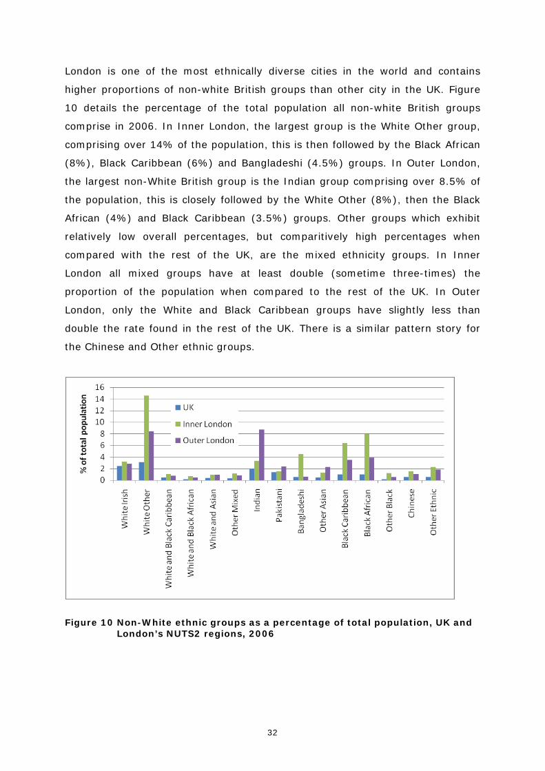
London is one of the most ethnically diverse cities in the world and contains
higher proportions of non-white British groups than other city in the UK. Figure
10 details the percentage of the total population all non-white British groups
comprise in 2006. In Inner London, the largest group is the White Other group,
comprising over 14% of the population, this is then followed by the Black African
(8%), Black Caribbean (6%) and Bangladeshi (4.5%) groups. In Outer London,
the largest non-White British group is the Indian group comprising over 8.5% of
the population, this is closely followed by the White Other (8%), then the Black
African (4%) and Black Caribbean (3.5%) groups. Other groups which exhibit
relatively low overall percentages, but comparitively high percentages when
compared with the rest of the UK, are the mixed ethnicity groups. In Inner
London all mixed groups have at least double (sometime three-times) the
proportion of the population when compared to the rest of the UK. In Outer
London, only the White and Black Caribbean groups have slightly less than
double the rate found in the rest of the UK. There is a similar pattern story for
the Chinese and Other ethnic groups.
Figure 10 Non-White ethnic groups as a percentage of total population, UK and London’s NUTS2 regions, 2006
33
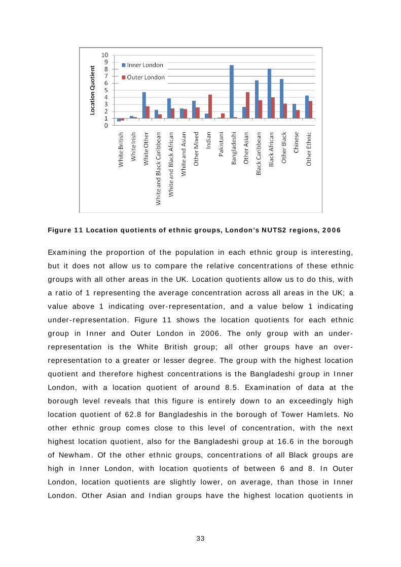
Figure 11 Location quotients of ethnic groups, London’s NUTS2 regions, 2006
Examining the proportion of the population in each ethnic group is interesting,
but it does not allow us to compare the relative concentrations of these ethnic
groups with all other areas in the UK. Location quotients allow us to do this, with
a ratio of 1 representing the average concentration across all areas in the UK; a
value above 1 indicating over-representation, and a value below 1 indicating
under-representation. Figure 11 shows the location quotients for each ethnic
group in Inner and Outer London in 2006. The only group with an under-
representation is the White British group; all other groups have an over-
representation to a greater or lesser degree. The group with the highest location
quotient and therefore highest concentrations is the Bangladeshi group in Inner
London, with a location quotient of around 8.5. Examination of data at the
borough level reveals that this figure is entirely down to an exceedingly high
location quotient of 62.8 for Bangladeshis in the borough of Tower Hamlets. No
other ethnic group comes close to this level of concentration, with the next
highest location quotient, also for the Bangladeshi group at 16.6 in the borough
of Newham. Of the other ethnic groups, concentrations of all Black groups are
high in Inner London, with location quotients of between 6 and 8. In Outer
London, location quotients are slightly lower, on average, than those in Inner
London. Other Asian and Indian groups have the highest location quotients in

34
Outer London, with particularly high concentrations of these groups (LQ of
around 12) in the borough of Harrow.
Another metric which is useful in the study of ethnic group populations is the
index of diversity. Rather than measuring the concentration of the ethnic group,
the index of diversity measures how mixed an area is – i.e. the likelihood that
two people who bumped into each other in the street in an area would differ by
ethnicity. An index of 1 would mean diversity is complete, i.e.it is 100% likely
that they would differ; a value of 0 means that it is 100% likely they will not
differ. Of course, with large areas, the indices close to 1 or 0 will not occur. In
2006, the index of diversity for the whole of the UK was 0.27 – in Inner London
the figure was 0.72, and in Outer London, it was 0.60. Figure 19 shows the
indices of diversity calculated for each London borough in 2006. The increased
diversity in Inner London is clear to see, with Newham the most diverse borough
with an index of 0.86. However, of note is the area of low diversity on the
eastern edge of London, with the boroughs of Havering and Bexley actually less
diverse than the national average with indices of 19 and 26 respectively.
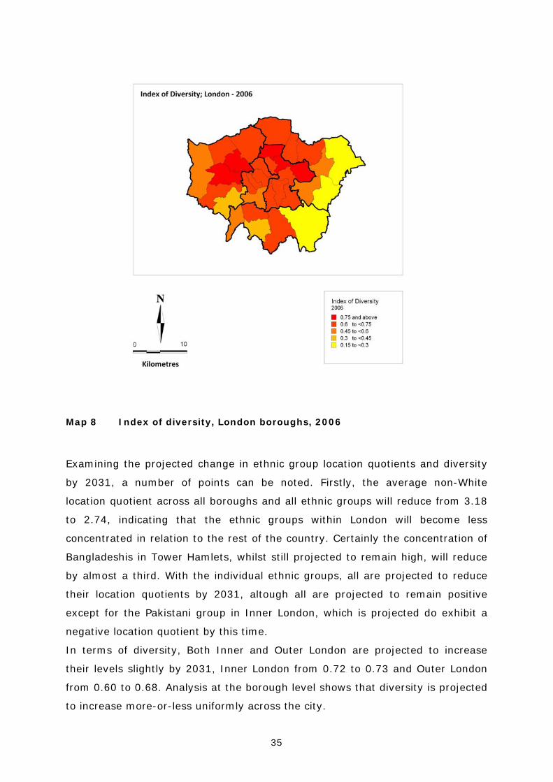
35
Map 8 Index of diversity, London boroughs, 2006
Examining the projected change in ethnic group location quotients and diversity
by 2031, a number of points can be noted. Firstly, the average non-White
location quotient across all boroughs and all ethnic groups will reduce from 3.18
to 2.74, indicating that the ethnic groups within London will become less
concentrated in relation to the rest of the country. Certainly the concentration of
Bangladeshis in Tower Hamlets, whilst still projected to remain high, will reduce
by almost a third. With the individual ethnic groups, all are projected to reduce
their location quotients by 2031, altough all are projected to remain positive
except for the Pakistani group in Inner London, which is projected do exhibit a
negative location quotient by this time.
In terms of diversity, Both Inner and Outer London are projected to increase
their levels slightly by 2031, Inner London from 0.72 to 0.73 and Outer London
from 0.60 to 0.68. Analysis at the borough level shows that diversity is projected
to increase more-or-less uniformly across the city.

36
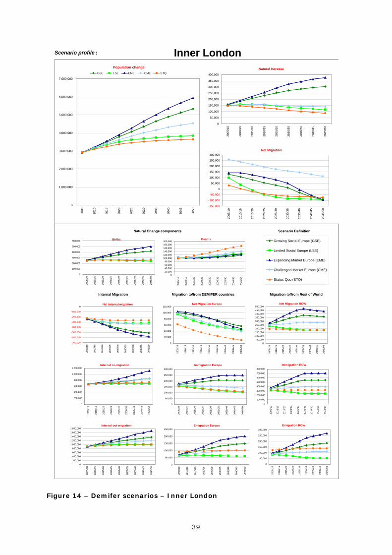
8 The impact of the DEMIFER scenarios on London 8.1 Scenario definition
Five scenarios have been defined as a generic framework to evaluate alternative
projections of demographic change between 2005 and 2050. These scenarios
are driven by alternative assumptions on fertility, mortality, internal migration,
international migration within Europe and international migration to/from outside
Europe.
STQ Status Quo
GSE Growing Social Europe
LSE Limited Social Europe
EME Expanding Market Europe
CME Challenged Market Europe
The Status Quo scenario retains the components of demographic change for the
base period throughout the projection horizon and acts as a benchmark against
which the four alternative growth scenarios are compared.
8.2 Scenario summary A summary of the key outcomes of the five alternative scenarios in Inner London
and Outer London is presented in Figures 12 and 13 with more detail in the
charts contained in Figure 22 and 23. Maintaining the Status Quo (STQ) would
result in a projected 25% increase in population in Inner London to 2050 and a
19% increase in Outer London. There are significant differences in the positive
and negative contributions that each of the components of change provide to the
overall growth figures. Net out-migration to other regions of the UK would
increase substantially under the STQ assumptions in both Inner and Outer
London, particularly from Inner London. Natural increase would reduce as
deaths rose relative to births. The balance of international migration would
remain inward but the inflow from within Europe reduces over the projection
period, whilst net in-flows from outside Europe are maintained as the dominant
driver of population growth.
37
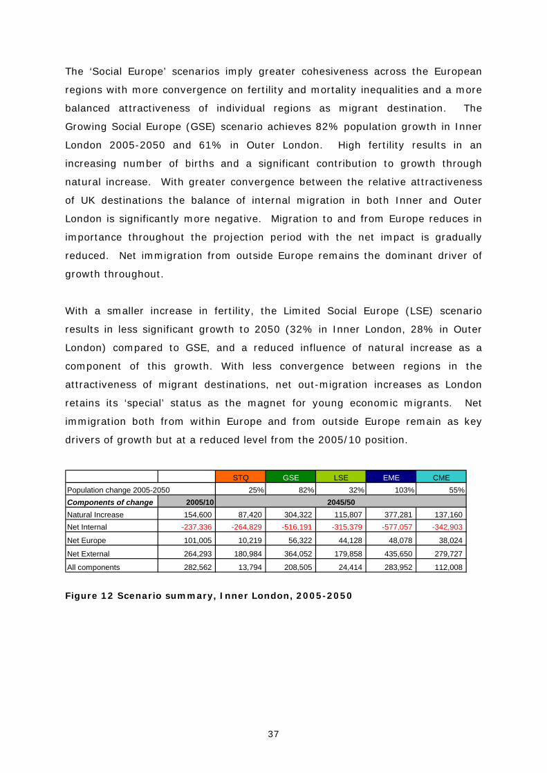
The ‘Social Europe’ scenarios imply greater cohesiveness across the European
regions with more convergence on fertility and mortality inequalities and a more
balanced attractiveness of individual regions as migrant destination. The
Growing Social Europe (GSE) scenario achieves 82% population growth in Inner
London 2005-2050 and 61% in Outer London. High fertility results in an
increasing number of births and a significant contribution to growth through
natural increase. With greater convergence between the relative attractiveness
of UK destinations the balance of internal migration in both Inner and Outer
London is significantly more negative. Migration to and from Europe reduces in
importance throughout the projection period with the net impact is gradually
reduced. Net immigration from outside Europe remains the dominant driver of
growth throughout.
With a smaller increase in fertility, the Limited Social Europe (LSE) scenario
results in less significant growth to 2050 (32% in Inner London, 28% in Outer
London) compared to GSE, and a reduced influence of natural increase as a
component of this growth. With less convergence between regions in the
attractiveness of migrant destinations, net out-migration increases as London
retains its ‘special’ status as the magnet for young economic migrants. Net
immigration both from within Europe and from outside Europe remain as key
drivers of growth but at a reduced level from the 2005/10 position.
STQ GSE LSE EME CMEPopulation change 2005-2050 25% 82% 32% 103% 55%Components of change 2005/10Natural Increase 154,600 87,420 304,322 115,807 377,281 137,160Net Internal -237,336 -264,829 -516,191 -315,379 -577,057 -342,903
Net Europe 101,005 10,219 56,322 44,128 48,078 38,024
Net External 264,293 180,984 364,052 179,858 435,650 279,727
All components 282,562 13,794 208,505 24,414 283,952 112,008
2045/50
Figure 12 Scenario summary, Inner London, 2005-2050
38
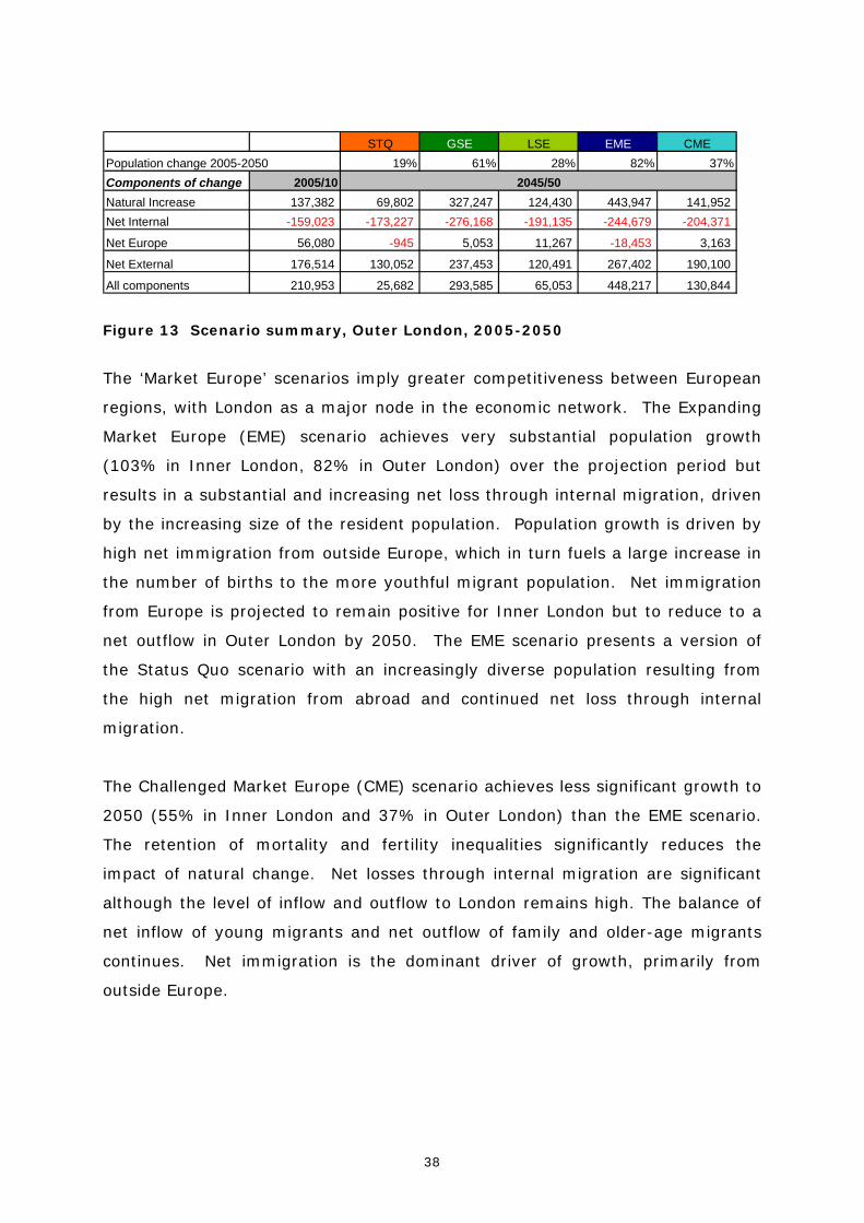
STQ GSE LSE EME CMEPopulation change 2005-2050 19% 61% 28% 82% 37%Components of change 2005/10Natural Increase 137,382 69,802 327,247 124,430 443,947 141,952Net Internal -159,023 -173,227 -276,168 -191,135 -244,679 -204,371
Net Europe 56,080 -945 5,053 11,267 -18,453 3,163
Net External 176,514 130,052 237,453 120,491 267,402 190,100
All components 210,953 25,682 293,585 65,053 448,217 130,844
2045/50
Figure 13 Scenario summary, Outer London, 2005-2050
The ‘Market Europe’ scenarios imply greater competitiveness between European
regions, with London as a major node in the economic network. The Expanding
Market Europe (EME) scenario achieves very substantial population growth
(103% in Inner London, 82% in Outer London) over the projection period but
results in a substantial and increasing net loss through internal migration, driven
by the increasing size of the resident population. Population growth is driven by
high net immigration from outside Europe, which in turn fuels a large increase in
the number of births to the more youthful migrant population. Net immigration
from Europe is projected to remain positive for Inner London but to reduce to a
net outflow in Outer London by 2050. The EME scenario presents a version of
the Status Quo scenario with an increasingly diverse population resulting from
the high net migration from abroad and continued net loss through internal
migration.
The Challenged Market Europe (CME) scenario achieves less significant growth to
2050 (55% in Inner London and 37% in Outer London) than the EME scenario.
The retention of mortality and fertility inequalities significantly reduces the
impact of natural change. Net losses through internal migration are significant
although the level of inflow and outflow to London remains high. The balance of
net inflow of young migrants and net outflow of family and older-age migrants
continues. Net immigration is the dominant driver of growth, primarily from
outside Europe.
39
Scenario profile :
Scenario Definition
Inner London
Internal Migration Migration to/from DEMIFER countries Migration to/from Rest of World
Natural Change components
Population change
0
1,000,000
2,000,000
3,000,000
4,000,000
5,000,000
6,000,000
7,000,00020
05
2010
2015
2020
2025
2030
2035
2040
2045
2050
GSE LSE EME CME STQNatural Increase
0
50,000
100,000
150,000
200,000
250,000
300,000
350,000
400,000
2005
/10
2010
/15
2015
/20
2020
/25
2025
/30
2030
/35
2035
/40
2040
/45
2045
/50
Net Migration
-150,000
-100,000
-50,000
0
50,000
100,000
150,000
200,000
250,000
300,000
2005
/10
2010
/15
2015
/20
2020
/25
2025
/30
2030
/35
2035
/40
2040
/45
2045
/50
Births
0
100,000
200,000
300,000
400,000
500,000
600,000
2005
/10
2010
/15
2015
/20
2020
/25
2025
/30
2030
/35
2035
/40
2040
/45
2045
/50
Deaths
020,00040,00060,00080,000
100,000120,000140,000160,000180,000200,000
2005
/10
2010
/15
2015
/20
2020
/25
2025
/30
2030
/35
2035
/40
2040
/45
2045
/50
Growing Social Europe (GSE)
Limited Social Europe (LSE)
Expanding Market Europe (EME)
Challenged Market Europe (CME)
Status Quo (STQ)
Net Internal migration
-700,000
-600,000
-500,000
-400,000
-300,000
-200,000
-100,000
0
2005
/10
2010
/15
2015
/20
2020
/25
2025
/30
2030
/35
2035
/40
2040
/45
2045
/50
Net Migration Europe
0
20,000
40,000
60,000
80,000
100,000
120,000
2005
/10
2010
/15
2015
/20
2020
/25
2025
/30
2030
/35
2035
/40
2040
/45
2045
/50
Net Migration ROW
050,000
100,000150,000200,000250,000300,000350,000400,000450,000500,000
2005
/10
2010
/15
2015
/20
2020
/25
2025
/30
2030
/35
2035
/40
2040
/45
2045
/50
Internal in-migration
0
200,000
400,000
600,000
800,000
1,000,000
1,200,000
2005
/10
2010
/15
2015
/20
2020
/25
2025
/30
2030
/35
2035
/40
2040
/45
2045
/50
Internal out-migration
0
200,000
400,000
600,000
800,000
1,000,000
1,200,000
1,400,000
1,600,000
1,800,000
2005
/10
2010
/15
2015
/20
2020
/25
2025
/30
2030
/35
2035
/40
2040
/45
2045
/50
Immigration Europe
0
50,000
100,000
150,000
200,000
250,000
300,000
2005
/10
2010
/15
2015
/20
2020
/25
2025
/30
2030
/35
2035
/40
2040
/45
2045
/50
Emigration Europe
0
50,000
100,000
150,000
200,000
250,000
2005
/10
2010
/15
2015
/20
2020
/25
2025
/30
2030
/35
2035
/40
2040
/45
2045
/50
Immigration ROW
0
100,000
200,000
300,000
400,000
500,000
600,000
700,000
800,000
2005
/10
2010
/15
2015
/20
2020
/25
2025
/30
2030
/35
2035
/40
2040
/45
2045
/50
Emigration ROW
0
50,000
100,000
150,000
200,000
250,000
300,000
2005
/10
2010
/15
2015
/20
2020
/25
2025
/30
2030
/35
2035
/40
2040
/45
2045
/50
Figure 14 – Demifer scenarios – Inner London

40
Scenario profile :
Scenario Definition
Outer London
Internal Migration Migration to/from DEMIFER countries Migration to/from Rest of World
Natural Change components
Population change
0
1,000,000
2,000,000
3,000,000
4,000,000
5,000,000
6,000,000
7,000,000
8,000,000
9,000,00020
05
2010
2015
2020
2025
2030
2035
2040
2045
2050
GSE LSE EME CME STQNatural Increase
0
50,000
100,000
150,000
200,000
250,000
300,000
350,000
400,000
450,000
500,000
2005
/10
2010
/15
2015
/20
2020
/25
2025
/30
2030
/35
2035
/40
2040
/45
2045
/50
Net Migration
-100,000
-50,000
0
50,000
100,000
150,000
200,000
250,000
2005
/10
2010
/15
2015
/20
2020
/25
2025
/30
2030
/35
2035
/40
2040
/45
2045
/50
Births
0
100,000
200,000
300,000
400,000
500,000
600,000
700,000
2005
/10
2010
/15
2015
/20
2020
/25
2025
/30
2030
/35
2035
/40
2040
/45
2045
/50
Deaths
0
50,000
100,000
150,000
200,000
250,000
300,000
2005
/10
2010
/15
2015
/20
2020
/25
2025
/30
2030
/35
2035
/40
2040
/45
2045
/50
Growing Social Europe (GSE)
Limited Social Europe (LSE)
Expanding Market Europe (EME)
Challenged Market Europe (CME)
Status Quo (STQ)
Net Internal migration
-300,000
-250,000
-200,000
-150,000
-100,000
-50,000
0
2005
/10
2010
/15
2015
/20
2020
/25
2025
/30
2030
/35
2035
/40
2040
/45
2045
/50
Net Migration Europe
-30,000 -20,000 -10,000
010,00020,00030,00040,00050,00060,00070,000
2005
/10
2010
/15
2015
/20
2020
/25
2025
/30
2030
/35
2035
/40
2040
/45
2045
/50
Net Migration ROW
0
50,000
100,000
150,000
200,000
250,000
300,000
350,000
2005
/10
2010
/15
2015
/20
2020
/25
2025
/30
2030
/35
2035
/40
2040
/45
2045
/50
Internal in-migration
0
200,000
400,000
600,000
800,000
1,000,000
1,200,000
1,400,000
1,600,000
1,800,000
2005
/10
2010
/15
2015
/20
2020
/25
2025
/30
2030
/35
2035
/40
2040
/45
2045
/50
Internal out-migration
0200,000400,000600,000800,000
1,000,0001,200,0001,400,0001,600,0001,800,0002,000,000
2005
/10
2010
/15
2015
/20
2020
/25
2025
/30
2030
/35
2035
/40
2040
/45
2045
/50
Immigration Europe
0
50,000
100,000
150,000
200,000
250,000
2005
/10
2010
/15
2015
/20
2020
/25
2025
/30
2030
/35
2035
/40
2040
/45
2045
/50
Emigration Europe
0
50,000
100,000
150,000
200,000
250,000
2005
/10
2010
/15
2015
/20
2020
/25
2025
/30
2030
/35
2035
/40
2040
/45
2045
/50
Immigration ROW
0
100,000
200,000
300,000
400,000
500,000
600,000
2005
/10
2010
/15
2015
/20
2020
/25
2025
/30
2030
/35
2035
/40
2040
/45
2045
/50
Emigration ROW
0
50,000
100,000
150,000
200,000
250,000
300,000
350,000
2005
/10
2010
/15
2015
/20
2020
/25
2025
/30
2030
/35
2035
/40
2040
/45
2045
/50
Figure 15 DEMIFER scenarios, Outer London, 2005-2050

41
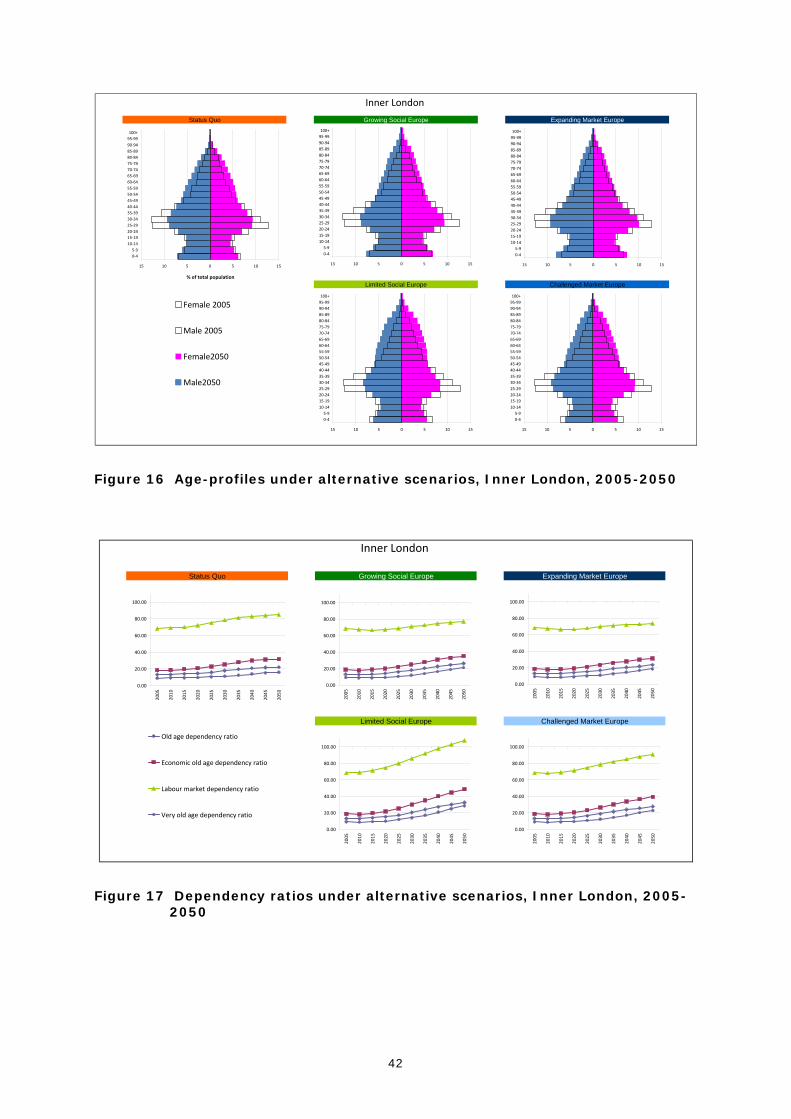
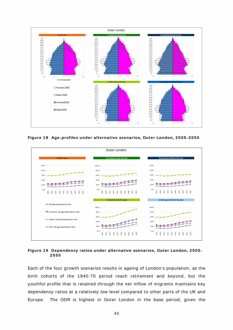
The effect of the various scenarios upon the age profile of Inner and Outer
London’s population are illustrated in Figures 16 and Figure 18, with a
complementary illustration of these temporal shifts provided by the change over
time in the key dependency ratios (Figures 17 and 19). The old-age dependency
ratio (ODR) is defined as the ratio of population aged 65+ to population aged 15-
64 years. This is a demographic indicator of ageing which provides the number of
individuals above retirement age relative to the number of people in the
economically active age-groups. An increase in the ODR suggests that more
elderly people will need to be supported by the same number of people in the
labour age. The very-old-age dependency ratio (VODR) provides an additional
measure of how the increase of the most elderly will impact upon the population.
It is the ratio between those aged 85+ and those aged 15-64 years, so, with the
same denominator but a smaller numerator, will always be lower than the ODR.
Demographic change is the key driver of the dynamics of labour markets;
however, it does not take into account variations in labour force participation.
The economic old-age dependency ratio (EODR) is the ratio of the economically
inactive population above retirement age (65+) to the active population aged 15
+or more. The EODR measures the burden of the inactive population of
pensionable age on the working population and is an indicator that could be used
to assess the sustainability of state pension systems.
Finally, the labour market dependency ratio (LMDR) is defined as the ratio of the
total economically inactive population to the total active population. This
indicator measures the overall economic burden of the inactive population on the
labour market. The LMDR value depends not only on the size of the retired
population, but also on the labour market participation of young people who may
be in higher education rather than actively employed in the labour force.
42
Limited Social Europe Challenged Market Europe
Inner London
Status Quo Growing Social Europe Expanding Market Europe
15 10 5 0 5 10 15
0‐45‐9
10‐1415‐1920‐2425‐2930‐3435‐3940‐4445‐4950‐5455‐5960‐6465‐6970‐7475‐7980‐8485‐8990‐9495‐99100+
15 10 5 0 5 10 15
0‐45‐9
10‐1415‐1920‐2425‐2930‐3435‐3940‐4445‐4950‐5455‐5960‐6465‐6970‐7475‐7980‐8485‐8990‐9495‐99100+
15 10 5 0 5 10 15
0‐45‐9
10‐1415‐1920‐2425‐2930‐3435‐3940‐4445‐4950‐5455‐5960‐6465‐6970‐7475‐7980‐8485‐8990‐9495‐99100+
15 10 5 0 5 10 15
0‐45‐9
10‐1415‐1920‐2425‐2930‐3435‐3940‐4445‐4950‐5455‐5960‐6465‐6970‐7475‐7980‐8485‐8990‐9495‐99100+
15 10 5 0 5 10 15
0‐45‐9
10‐1415‐1920‐2425‐2930‐3435‐3940‐4445‐4950‐5455‐5960‐6465‐6970‐7475‐7980‐8485‐8990‐9495‐99100+
% of total population
Female 2005
Male 2005
Female2050
Male2050
Figure 16 Age-profiles under alternative scenarios, Inner London, 2005-2050
Inner London
Status Quo Growing Social Europe Expanding Market Europe
Limited Social Europe Challenged Market Europe
0.00
20.00
40.00
60.00
80.00
100.00
2005
2010
2015
2020
2025
2030
2035
2040
2045
2050
Old age dependency ratio
Economic old age dependency ratio
Labour market dependency ratio
Very old age dependency ratio
0.00
20.00
40.00
60.00
80.00
100.00
2005
2010
2015
2020
2025
2030
2035
2040
2045
2050
0.00
20.00
40.00
60.00
80.00
100.00
2005
2010
2015
2020
2025
2030
2035
2040
2045
2050
0.00
20.00
40.00
60.00
80.00
100.00
2005
2010
2015
2020
2025
2030
2035
2040
2045
2050
0.00
20.00
40.00
60.00
80.00
100.00
2005
2010
2015
2020
2025
2030
2035
2040
2045
2050
Figure 17 Dependency ratios under alternative scenarios, Inner London, 2005-2050
43
Limited Social Europe Challenged Market Europe
Outer London
Status Quo Growing Social Europe Expanding Market Europe
10 5 0 5 10
0‐45‐9
10‐1415‐1920‐2425‐2930‐3435‐3940‐4445‐4950‐5455‐5960‐6465‐6970‐7475‐7980‐8485‐8990‐9495‐99100+
10 5 0 5 10
0‐45‐9
10‐1415‐1920‐2425‐2930‐3435‐3940‐4445‐4950‐5455‐5960‐6465‐6970‐7475‐7980‐8485‐8990‐9495‐99100+
10 5 0 5 10
0‐45‐9
10‐1415‐1920‐2425‐2930‐3435‐3940‐4445‐4950‐5455‐5960‐6465‐6970‐7475‐7980‐8485‐8990‐9495‐99100+
10 5 0 5 10
0‐45‐9
10‐1415‐1920‐2425‐2930‐3435‐3940‐4445‐4950‐5455‐5960‐6465‐6970‐7475‐7980‐8485‐8990‐9495‐99100+
10 5 0 5 10
0‐45‐9
10‐1415‐1920‐2425‐2930‐3435‐3940‐4445‐4950‐5455‐5960‐6465‐6970‐7475‐7980‐8485‐8990‐9495‐99100+
% of total population
Female 2005
Male 2005
Female2050
Male2050
Figure 18 Age-profiles under alternative scenarios, Outer London, 2005-2050
Outer London
Status Quo Growing Social Europe Expanding Market Europe
Limited Social Europe Challenged Market Europe
0.00
20.00
40.00
60.00
80.00
100.00
2005
2010
2015
2020
2025
2030
2035
2040
2045
2050
Old age dependency ratio
Economic old age dependency ratio
Labour market dependency ratio
Very old age dependency ratio
0.00
20.00
40.00
60.00
80.00
100.00
2005
2010
2015
2020
2025
2030
2035
2040
2045
2050
0.00
20.00
40.00
60.00
80.00
100.00
2005
2010
2015
2020
2025
2030
2035
2040
2045
2050
0.00
20.00
40.00
60.00
80.00
100.00
2005
2010
2015
2020
2025
2030
2035
2040
2045
2050
0.00
20.00
40.00
60.00
80.00
100.00
2005
2010
2015
2020
2025
2030
2035
2040
2045
2050
Figure 19 Dependency ratios under alternative scenarios, Outer London, 2005-2050
Each of the four growth scenarios results in ageing of London’s population, as the
birth cohorts of the 1940-70 period reach retirement and beyond, but the
youthful profile that is retained through the net inflow of migrants maintains key
dependency ratios at a relatively low level compared to other parts of the UK and
Europe. The ODR is highest in Outer London in the base period, given the
44
concentration of young adults in Inner London. Across all scenarios, the ODR in
Inner London increases from 13% in 2005/10 to reach 23-32% by 2050. In
Outer London, the increase is from 20% to 28-38% in 2050. The LSE and CME
scenarios present the most extreme impacts of demographic ageing in both
areas. The effect of increased longevity is emphasised by the VODR statistics
which increases threefold in the LSE scenario, from 12% to 30% in Inner London
and 9-29% in Outer London. Less extreme increases are evident in the EME,
owing to the higher levels of net immigration that result from this scenario
throughout the projection period, maintaining a more youthful age profile.
The LMDR provides a more effective illustration of the impact of demographic
ageing through the application of participation rates that might result from
alternative scenarios of competitiveness or cohesion. In a Limited Social Europe
(LSE) and a Challenged Market Europe (CME) with lower rates of labour force
participation the level of dependency rises most sharply, exceeding 100% in the
LSE scenario for Inner London and over 90% in Outer London, from a base of
70% and 60% respectively in 2005. This means that the size of the active
labour force would be equal in size to the dependent population, taking into
account inactivity in the labour force ages, including students, in addition to the
inactivity of the elderly. With higher levels of participation in the GSE and EME
scenarios, LMDR are maintained below 80%, lowest for the more competitive
Expanding Market Europe scenario.
45
9 Concluding comments
London is a global economic hub and a magnet for international tourism,
business and migration. Within its borders it has some of the most ethnically
diverse communities in the UK, probably within the world. Internal migration
continues to redistribute its population with a net inflow to Inner London,
primarily of young mobile individuals seeking employment in the capital. Out-
migration is typically of family age-groups, aged 30+, with movement from Inner
to Outer London and from Outer London to the rest of the UK. International
migration is acting as a replacement for net losses due to internal migration with
areas of Inner London gaining significantly through net immigration, driving
greater ethnic diversity and the growth of minority ethnic populations. Fertility
and mortality inequalities exist across the city. Fertility rates are highest in
areas with a large ethnic population and recent statistics suggests that
approximately 54% of births in London were to mothers whose country of birth
was outside the UK. The rise in London’s fertility since 2001 has been solely due
to this factor. Mortality rates differ sharply between boroughs with levels of
relative affluence driving the differences that are experience in life expectancy.
London represents approximately 21% of the country’s GVA and remains the
engine of economic development for the UK. The alternative demographic
scenarios have presented a challenging picture of growth for the capital,
regardless of the degree of competitiveness or cohesiveness of market
economies. London will remain a magnet for economic and demographic growth.
The Expanding Market Europe (EME) and Growing Social Europe (GSE) scenarios
suggest that London could be a city of 14 million inhabitants by 2050, a
significant growth in an already over-crowded metropolis. This growth would
need to be achieved through increasing diversity, fuelled by continued net
immigration, a net outflow to other parts of the UK and high natural change.
Growth on this scale presents enormous challenges to London and to the rest of
the UK as population disperses outwards, seeking housing whilst maintaining an
economic link to the capital through employment.
Tighter controls on immigration are likely to be a feature of UK policy with the
new Conservative-Liberal Coalition GovernmentCaps on immigration were
46
propoes in the Conservative party manifesto which would limit immigration to
‘tens of thousands’ rather than ‘hundreds of thousands’. Achieving this level
control when a large proportion of migrants have freedom of movement within
the EU is unlikely to be possible. The Labour Party have stressed the need to
‘tighten’ immigration controls without the use of a cap which could constrain
economic growth. The UK is slowly moving itself out of recession. In the last
two years the level of migration, both internal and international has reduced.
The speed and scale of recovery of these migrations flows will determine the
scale of London’s growth over the next 25 years and the increasingly diverse
nature of its population. London will remain a ‘competitive’ hub in the UK,
European and wider international economy. It will continue to attract migrants
and its diverse communities will continue to evolve but the scale of growth will
be very much dependent upon the level of ‘control’ that is placed upon future
immigration from outside the countries of the EU.

47
9.1 Abbreviations ASFR Age Specific Fertility Rate
CLG Communities and Local Government
DEMIFER Demographic and Migratory Flows affecting European
Regions and Cities
DMAG Data Management and Analysis Group
DWP Department for Works and Pensions
EODR Economic Old Age Dependency Ratio
EU European Union
GAD Government Actuary Department
GLA Greater London Authority
GOR Government Office Regions
LLTI Limiting Long-Term Illness
LMDR Labour Market Dependency Ratio
LSOA Lower Super Output Area
NPP National Population Projections
NUTS2 Nomenclature of Territorial Units for Statistics, level 2
ODR Old Age Dependency Ratio
ONS Office for National Statistics
PBS Points Based System
SMR Standardised Mortality Ratios
SNPP Sub-national Population Projections
SPA State Pension Age
TFR Total Fertility Rate
VODR Very Old Age Dependency Ratio

48
9.2 References
Audit Commission (2007) Crossing Borders. Responding to the Local Challenges of Migrant Workers. http://www.audit-commission.gov.uk/nationalstudies/localgov/crossingborders/Pages/Default.aspx
Boden, P. & Rees, P. (2009) Using administrative data to improve the estimation of immigration to local areas in England. Journal of the Royal Statistical Society, Series A (Statistics in Society). Submitted. http://arxiv.org/ftp/arxiv/papers/0903/0903.0507.pdf
Data Management and Analysis Group (2009) Population by Country of Birth and Nationality.
http://legacy.london.gov.uk/gla/publications/factsandfigures/DMAG-02-2009-cob-nationality.pdf
Duke-Williams, O. and Stillwell, J. (2010) Temporal and spatial consistency, In Stillwell, J., Duke-Williams, O. and Dennett, A. (eds.) Technologies for Migration and Commuting Analysis: Spatial Interaction Data Applications, IGI Glbal, Hershey, pp. 89-110.
Greater London Authority (2009) Focus on London, 2009. http://www.london.gov.uk/focusonlondon/
Green, A. E., Owen, D. and Adam, D. (2008) A Resource Guide on Local Migration Statistics. Report prepared for the Local Government Association. http://www.lga.gov.uk/lga/publications/publication-display.do?id=1308025
House of Commons Treasury Committee (2008) Counting the Population, The Stationery Office, London. http://www.publications.parliament.uk/pa/cm200708/cmselect/cmtreasy/183/183.pdf
ONS (2008). 2006-based Subnational Population Projections for England - methodology guide. Office for National Statistics. http://www.statistics.gov.uk/downloads/theme_population/SNPP-2006/2006_Methodology_Guide.pdf
Rees, P., Stillwell, J. and Boden, P. (2009) Migration Statistics. The Way Ahead? Report produced for the UK Statistics Authority. http://www.statisticsauthority.gov.uk/reports---correspondence/reports/index.html
Stillwell, J. (2010a) Internal migration propensities and patterns of London’s ethnic groups, Chapter 9 in Stillwell, J., Duke-Williams, O. and Dennett, A. (eds.) Technologies for Migration and Commuting Analysis: Spatial Interaction Data Applications, IGI Global, Hershey, pp. 175-195.
Stillwell, J. (2010b) Ethnic population concentration and net migration in London, Environment and Planning A, 42: 1439-1456.
49
Stillwell, J. and Hussain, S, (2010) Exploring the ethnic dimension of internal migration in Great Britain using migration effectiveness and spatial connectivity, Journal of Ethnic and Migration Studies, 201-23, iFirst article.
9.3 Appendix
A1. London – location and typology
LondonUKI1 & UKI2