css notes for professionals - kickercss css notes for professionals notes for professionals...
TRANSCRIPT

CSSNotes for ProfessionalsCSS
Notes for Professionals
GoalKicker.comFree Programming Books
DisclaimerThis is an unocial free book created for educational purposes and is
not aliated with ocial CSS group(s) or company(s).All trademarks and registered trademarks are
the property of their respective owners
200+ pagesof professional hints and tricks

ContentsAbout 1 ...................................................................................................................................................................................
Chapter 1: Getting started with CSS 2 .................................................................................................................... Section 1.1: External Stylesheet 2 ..................................................................................................................................... Section 1.2: Internal Styles 3 ............................................................................................................................................ Section 1.3: CSS @import rule (one of CSS at-rule) 4 ................................................................................................... Section 1.4: Inline Styles 4 ................................................................................................................................................. Section 1.5: Changing CSS with JavaScript 4 ................................................................................................................. Section 1.6: Styling Lists with CSS 5 .................................................................................................................................
Chapter 2: Structure and Formatting of a CSS Rule 7 .................................................................................. Section 2.1: Property Lists 7 ............................................................................................................................................. Section 2.2: Multiple Selectors 7 ...................................................................................................................................... Section 2.3: Rules, Selectors, and Declaration Blocks 7 ...............................................................................................
Chapter 3: Comments 8 ................................................................................................................................................. Section 3.1: Single Line 8 ................................................................................................................................................... Section 3.2: Multiple Line 8 ...............................................................................................................................................
Chapter 4: Selectors 9 ................................................................................................................................................... Section 4.1: Basic selectors 9 ........................................................................................................................................... Section 4.2: Attribute Selectors 9 .................................................................................................................................... Section 4.3: Combinators 12 ............................................................................................................................................ Section 4.4: Pseudo-classes 13 ....................................................................................................................................... Section 4.5: Child Pseudo Class 15 ................................................................................................................................. Section 4.6: Class Name Selectors 16 ............................................................................................................................ Section 4.7: Select element using its ID without the high specificity of the ID selector 17 ....................................... Section 4.8: The :last-of-type selector 17 ...................................................................................................................... Section 4.9: CSS3 :in-range selector example 17 .......................................................................................................... Section 4.10: A. The :not pseudo-class example & B. :focus-within CSS pseudo-class 18 ......................................... Section 4.11: Global boolean with checkbox:checked and ~ (general sibling combinator) 19 .................................. Section 4.12: ID selectors 20 ............................................................................................................................................ Section 4.13: How to style a Range input 21 .................................................................................................................. Section 4.14: The :only-child pseudo-class selector example 21 .................................................................................
Chapter 5: Backgrounds 22 ......................................................................................................................................... Section 5.1: Background Color 22 ................................................................................................................................... Section 5.2: Background Gradients 24 ........................................................................................................................... Section 5.3: Background Image 25 ................................................................................................................................. Section 5.4: Background Shorthand 26 .......................................................................................................................... Section 5.5: Background Size 27 ..................................................................................................................................... Section 5.6: Background Position 31 .............................................................................................................................. Section 5.7: The background-origin property 32 .......................................................................................................... Section 5.8: Multiple Background Image 34 .................................................................................................................. Section 5.9: Background Attachment 35 ....................................................................................................................... Section 5.10: Background Clip 36 .................................................................................................................................... Section 5.11: Background Repeat 37 ............................................................................................................................... Section 5.12: background-blend-mode Property 37 ..................................................................................................... Section 5.13: Background Color with Opacity 38 ...........................................................................................................
Chapter 6: Centering 39 ................................................................................................................................................. Section 6.1: Using Flexbox 39 ........................................................................................................................................... Section 6.2: Using CSS transform 40 ..............................................................................................................................
Section 6.3: Using margin: 0 auto; 41 ............................................................................................................................. Section 6.4: Using text-align 42 ....................................................................................................................................... Section 6.5: Using position: absolute 42 ......................................................................................................................... Section 6.6: Using calc() 43 ............................................................................................................................................. Section 6.7: Using line-height 43 ..................................................................................................................................... Section 6.8: Vertical align anything with 3 lines of code 44 ......................................................................................... Section 6.9: Centering in relation to another item 44 ................................................................................................... Section 6.10: Ghost element technique (Michał Czernow's hack) 45 ........................................................................... Section 6.11: Centering vertically and horizontally without worrying about height or width 46 ............................... Section 6.12: Vertically align an image inside div 47 ..................................................................................................... Section 6.13: Centering with fixed size 47 ....................................................................................................................... Section 6.14: Vertically align dynamic height elements 49 .......................................................................................... Section 6.15: Horizontal and Vertical centering using table layout 49 ........................................................................
Chapter 7: The Box Model 51 ...................................................................................................................................... Section 7.1: What is the Box Model? 51 .......................................................................................................................... Section 7.2: box-sizing 52 .................................................................................................................................................
Chapter 8: Margins 55 .................................................................................................................................................... Section 8.1: Margin Collapsing 55 .................................................................................................................................... Section 8.2: Apply Margin on a Given Side 57 ............................................................................................................... Section 8.3: Margin property simplification 58 .............................................................................................................. Section 8.4: Horizontally center elements on a page using margin 58 ...................................................................... Section 8.5: Example 1: 59 ................................................................................................................................................ Section 8.6: Negative margins 59 ...................................................................................................................................
Chapter 9: Padding 61 .................................................................................................................................................... Section 9.1: Padding Shorthand 61 ................................................................................................................................. Section 9.2: Padding on a given side 62 ........................................................................................................................
Chapter 10: Border 63 ..................................................................................................................................................... Section 10.1: border-radius 63 ......................................................................................................................................... Section 10.2: border-style 64 ........................................................................................................................................... Section 10.3: Multiple Borders 65 .................................................................................................................................... Section 10.4: border (shorthands) 66 ............................................................................................................................. Section 10.5: border-collapse 66 ..................................................................................................................................... Section 10.6: border-image 67 ........................................................................................................................................ Section 10.7: Creating a multi-colored border using border-image 67 ...................................................................... Section 10.8: border-[left|right|top|bottom] 68 ..............................................................................................................
Chapter 11: Outlines 69 ................................................................................................................................................... Section 11.1: Overview 69 .................................................................................................................................................. Section 11.2: outline-style 69 ............................................................................................................................................
Chapter 12: Overflow 71 ................................................................................................................................................ Section 12.1: overflow-wrap 71 ........................................................................................................................................ Section 12.2: overflow-x and overflow-y 72 ................................................................................................................... Section 12.3: overflow: scroll 73 ....................................................................................................................................... Section 12.4: overflow: visible 73 ..................................................................................................................................... Section 12.5: Block Formatting Context Created with Overflow 74 .............................................................................
Chapter 13: Media Queries 76 ...................................................................................................................................... Section 13.1: Terminology and Structure 76 ................................................................................................................... Section 13.2: Basic Example 77 ........................................................................................................................................ Section 13.3: mediatype 77 .............................................................................................................................................. Section 13.4: Media Queries for Retina and Non Retina Screens 78 ...........................................................................

Section 13.5: Width vs Viewport 79 ................................................................................................................................. Section 13.6: Using Media Queries to Target Dierent Screen Sizes 79 ..................................................................... Section 13.7: Use on link tag 80 ....................................................................................................................................... Section 13.8: Media queries and IE8 80 ...........................................................................................................................
Chapter 14: Floats 81 ...................................................................................................................................................... Section 14.1: Float an Image Within Text 81 ................................................................................................................... Section 14.2: clear property 82 ........................................................................................................................................ Section 14.3: Clearfix 83 .................................................................................................................................................... Section 14.4: In-line DIV using float 84 ............................................................................................................................ Section 14.5: Use of overflow property to clear floats 86 ............................................................................................ Section 14.6: Simple Two Fixed-Width Column Layout 86 ............................................................................................ Section 14.7: Simple Three Fixed-Width Column Layout 87 ......................................................................................... Section 14.8: Two-Column Lazy/Greedy Layout 88 ......................................................................................................
Chapter 15: Typography 89 ......................................................................................................................................... Section 15.1: The Font Shorthand 89 ............................................................................................................................... Section 15.2: Quotes 90 .................................................................................................................................................... Section 15.3: Font Size 90 ................................................................................................................................................. Section 15.4: Text Direction 90 ......................................................................................................................................... Section 15.5: Font Stacks 91 ............................................................................................................................................ Section 15.6: Text Overflow 91 ......................................................................................................................................... Section 15.7: Text Shadow 91 .......................................................................................................................................... Section 15.8: Text Transform 92 ...................................................................................................................................... Section 15.9: Letter Spacing 92 ........................................................................................................................................ Section 15.10: Text Indent 93 ............................................................................................................................................ Section 15.11: Text Decoration 93 ..................................................................................................................................... Section 15.12: Word Spacing 94 ....................................................................................................................................... Section 15.13: Font Variant 94 ..........................................................................................................................................
Chapter 16: Flexible Box Layout (Flexbox) 96 ..................................................................................................... Section 16.1: Dynamic Vertical and Horizontal Centering (align-items, justify-content) 96 ...................................... Section 16.2: Sticky Variable-Height Footer 102 ........................................................................................................... Section 16.3: Optimally fit elements to their container 103 .......................................................................................... Section 16.4: Holy Grail Layout using Flexbox 104 ........................................................................................................ Section 16.5: Perfectly aligned buttons inside cards with flexbox 105 ........................................................................ Section 16.6: Same height on nested containers 107 ....................................................................................................
Chapter 17: Cascading and Specificity 109 .......................................................................................................... Section 17.1: Calculating Selector Specificity 109 ........................................................................................................... Section 17.2: The !important declaration 111 ................................................................................................................. Section 17.3: Cascading 112 ............................................................................................................................................. Section 17.4: More complex specificity example 113 ....................................................................................................
Chapter 18: Colors 115 .................................................................................................................................................... Section 18.1: currentColor 115 .......................................................................................................................................... Section 18.2: Color Keywords 116 ................................................................................................................................... Section 18.3: Hexadecimal Value 122 ............................................................................................................................. Section 18.4: rgb() Notation 122 ...................................................................................................................................... Section 18.5: rgba() Notation 123 ................................................................................................................................... Section 18.6: hsl() Notation 123 ....................................................................................................................................... Section 18.7: hsla() Notation 124 .....................................................................................................................................
Chapter 19: Opacity 126 ................................................................................................................................................. Section 19.1: Opacity Property 126 .................................................................................................................................. Section 19.2: IE Compatibility for `opacity` 126 ..............................................................................................................

Chapter 20: Length Units 127 ...................................................................................................................................... Section 20.1: Creating scalable elements using rems and ems 127 ........................................................................... Section 20.2: Font size with rem 128 .............................................................................................................................. Section 20.3: vmin and vmax 129 ................................................................................................................................... Section 20.4: vh and vw 129 ............................................................................................................................................ Section 20.5: using percent % 129 ..................................................................................................................................
Chapter 21: Pseudo-Elements 131 ............................................................................................................................. Section 21.1: Pseudo-Elements 131 ................................................................................................................................. Section 21.2: Pseudo-Elements in Lists 131 ....................................................................................................................
Chapter 22: Positioning 133 .......................................................................................................................................... Section 22.1: Overlapping Elements with z-index 133 ................................................................................................... Section 22.2: Absolute Position 134 ................................................................................................................................ Section 22.3: Fixed position 135 ...................................................................................................................................... Section 22.4: Relative Position 135 ................................................................................................................................. Section 22.5: Static positioning 135 ................................................................................................................................
Chapter 23: Layout Control 137 ................................................................................................................................. Section 23.1: The display property 137 ........................................................................................................................... Section 23.2: To get old table structure using div 139 .................................................................................................
Chapter 24: Grid 141 ........................................................................................................................................................ Section 24.1: Basic Example 141 .....................................................................................................................................
Chapter 25: Tables 143 ................................................................................................................................................... Section 25.1: table-layout 143 ......................................................................................................................................... Section 25.2: empty-cells 143 ......................................................................................................................................... Section 25.3: border-collapse 143 .................................................................................................................................. Section 25.4: border-spacing 144 ................................................................................................................................... Section 25.5: caption-side 144 ........................................................................................................................................
Chapter 26: Transitions 145 ......................................................................................................................................... Section 26.1: Transition shorthand 145 ........................................................................................................................... Section 26.2: cubic-bezier 145 ......................................................................................................................................... Section 26.3: Transition (longhand) 147 ........................................................................................................................
Chapter 27: Animations 148 ......................................................................................................................................... Section 27.1: Animations with keyframes 148 ................................................................................................................ Section 27.2: Animations with the transition property 149 .......................................................................................... Section 27.3: Syntax Examples 150 ................................................................................................................................ Section 27.4: Increasing Animation Performance Using the `will-change` Attribute 151 ..........................................
Chapter 28: 2D Transforms 152 ................................................................................................................................. Section 28.1: Rotate 152 ................................................................................................................................................... Section 28.2: Scale 153 .................................................................................................................................................... Section 28.3: Skew 153 ..................................................................................................................................................... Section 28.4: Multiple transforms 153 ............................................................................................................................ Section 28.5: Translate 154 ............................................................................................................................................. Section 28.6: Transform Origin 155 ................................................................................................................................
Chapter 29: 3D Transforms 156 ................................................................................................................................. Section 29.1: Compass pointer or needle shape using 3D transforms 156 ................................................................ Section 29.2: 3D text eect with shadow 157 ................................................................................................................ Section 29.3: backface-visibility 158 ............................................................................................................................... Section 29.4: 3D cube 159 ...............................................................................................................................................
Chapter 30: Filter Property 161 ................................................................................................................................. Section 30.1: Blur 161 ........................................................................................................................................................

Section 30.2: Drop Shadow (use box-shadow instead if possible) 161 ...................................................................... Section 30.3: Hue Rotate 162 .......................................................................................................................................... Section 30.4: Multiple Filter Values 162 .......................................................................................................................... Section 30.5: Invert Color 163 .........................................................................................................................................
Chapter 31: Cursor Styling 164 .................................................................................................................................... Section 31.1: Changing cursor type 164 .......................................................................................................................... Section 31.2: pointer-events 164 ..................................................................................................................................... Section 31.3: caret-color 165 ............................................................................................................................................
Chapter 32: box-shadow 166 ....................................................................................................................................... Section 32.1: bottom-only drop shadow using a pseudo-element 166 ...................................................................... Section 32.2: drop shadow 167 ....................................................................................................................................... Section 32.3: inner drop shadow 167 ............................................................................................................................. Section 32.4: multiple shadows 168 ................................................................................................................................
Chapter 33: Shapes for Floats 170 ........................................................................................................................... Section 33.1: Shape Outside with Basic Shape – circle() 170 ........................................................................................ Section 33.2: Shape margin 171 ......................................................................................................................................
Chapter 34: List Styles 173 ........................................................................................................................................... Section 34.1: Bullet Position 173 ...................................................................................................................................... Section 34.2: Removing Bullets / Numbers 173 ............................................................................................................ Section 34.3: Type of Bullet or Numbering 173 .............................................................................................................
Chapter 35: Counters 175 .............................................................................................................................................. Section 35.1: Applying roman numerals styling to the counter output 175 ............................................................... Section 35.2: Number each item using CSS Counter 175 ............................................................................................. Section 35.3: Implementing multi-level numbering using CSS counters 176 .............................................................
Chapter 36: Functions 178 ............................................................................................................................................. Section 36.1: calc() function 178 ...................................................................................................................................... Section 36.2: attr() function 178 ...................................................................................................................................... Section 36.3: var() function 178 ...................................................................................................................................... Section 36.4: radial-gradient() function 179 .................................................................................................................. Section 36.5: linear-gradient() function 179 ..................................................................................................................
Chapter 37: Custom Properties (Variables) 180 ................................................................................................ Section 37.1: Variable Color 180 ...................................................................................................................................... Section 37.2: Variable Dimensions 180 .......................................................................................................................... Section 37.3: Variable Cascading 180 ............................................................................................................................ Section 37.4: Valid/Invalids 181 ...................................................................................................................................... Section 37.5: With media queries 182 .............................................................................................................................
Chapter 38: Single Element Shapes 184 ................................................................................................................ Section 38.1: Trapezoid 184 ............................................................................................................................................. Section 38.2: Triangles 184 .............................................................................................................................................. Section 38.3: Circles and Ellipses 187 ............................................................................................................................. Section 38.4: Bursts 188 ................................................................................................................................................... Section 38.5: Square 190 ................................................................................................................................................. Section 38.6: Cube 190 ..................................................................................................................................................... Section 38.7: Pyramid 191 ...............................................................................................................................................
Chapter 39: Columns 193 ............................................................................................................................................... Section 39.1: Simple Example (column-count) 193 ....................................................................................................... Section 39.2: Column Width 193 .....................................................................................................................................
Chapter 40: Multiple columns 195 ............................................................................................................................ Section 40.1: Create Multiple Columns 195 ....................................................................................................................

Section 40.2: Basic example 195 ....................................................................................................................................
Chapter 41: Inline-Block Layout 196 ........................................................................................................................ Section 41.1: Justified navigation bar 196 ......................................................................................................................
Chapter 42: Inheritance 197 ........................................................................................................................................ Section 42.1: Automatic inheritance 197 ........................................................................................................................ Section 42.2: Enforced inheritance 197 ..........................................................................................................................
Chapter 43: CSS Image Sprites 198 ......................................................................................................................... Section 43.1: A Basic Implementation 198 ......................................................................................................................
Chapter 44: Clipping and Masking 199 .................................................................................................................. Section 44.1: Clipping and Masking: Overview and Dierence 199 ............................................................................. Section 44.2: Simple mask that fades an image from solid to transparent 201 ....................................................... Section 44.3: Clipping (Circle) 201 .................................................................................................................................. Section 44.4: Clipping (Polygon) 202 .............................................................................................................................. Section 44.5: Using masks to cut a hole in the middle of an image 203 .................................................................... Section 44.6: Using masks to create images with irregular shapes 204 ....................................................................
Chapter 45: Fragmentation 206 ................................................................................................................................ Section 45.1: Media print page-break 206 .....................................................................................................................
Chapter 46: CSS Object Model (CSSOM) 207 ....................................................................................................... Section 46.1: Adding a background-image rule via the CSSOM 207 ........................................................................... Section 46.2: Introduction 207 .........................................................................................................................................
Chapter 47: Feature Queries 208 .............................................................................................................................. Section 47.1: Basic @supports usage 208 ...................................................................................................................... Section 47.2: Chaining feature detections 208 ..............................................................................................................
Chapter 48: Stacking Context 209 ........................................................................................................................... Section 48.1: Stacking Context 209 .................................................................................................................................
Chapter 49: Block Formatting Contexts 212 ....................................................................................................... Section 49.1: Using the overflow property with a value dierent to visible 212 ........................................................
Chapter 50: Vertical Centering 213 .......................................................................................................................... Section 50.1: Centering with display: table 213 .............................................................................................................. Section 50.2: Centering with Flexbox 213 ...................................................................................................................... Section 50.3: Centering with Transform 214 ................................................................................................................. Section 50.4: Centering Text with Line Height 214 ........................................................................................................ Section 50.5: Centering with Position: absolute 214 ..................................................................................................... Section 50.6: Centering with pseudo element 215 ........................................................................................................
Chapter 51: Object Fit and Placement 217 ........................................................................................................... Section 51.1: object-fit 217 ................................................................................................................................................
Chapter 52: CSS design patterns 220 ..................................................................................................................... Section 52.1: BEM 220 .......................................................................................................................................................
Chapter 53: Browser Support & Prefixes 222 ...................................................................................................... Section 53.1: Transitions 222 ............................................................................................................................................ Section 53.2: Transform 222 ...........................................................................................................................................
Chapter 54: Normalizing Browser Styles 223 ..................................................................................................... Section 54.1: normalize.css 223 ....................................................................................................................................... Section 54.2: Approaches and Examples 223 ...............................................................................................................
Chapter 55: Internet Explorer Hacks 226 .............................................................................................................. Section 55.1: Adding Inline Block support to IE6 and IE7 226 ....................................................................................... Section 55.2: High Contrast Mode in Internet Explorer 10 and greater 226 ............................................................... Section 55.3: Internet Explorer 6 & Internet Explorer 7 only 227 .................................................................................

Section 55.4: Internet Explorer 8 only 227 .....................................................................................................................
Chapter 56: Performance 228 ..................................................................................................................................... Section 56.1: Use transform and opacity to avoid trigger layout 228 ........................................................................
Credits 231 ............................................................................................................................................................................
You may also like 236 ......................................................................................................................................................
GoalKicker.com – CSS Notes for Professionals 1
About
Please feel free to share this PDF with anyone for free,latest version of this book can be downloaded from:
https://goalkicker.com/CSSBook
This CSS Notes for Professionals book is compiled from Stack OverflowDocumentation, the content is written by the beautiful people at Stack Overflow.Text content is released under Creative Commons BY-SA, see credits at the end
of this book whom contributed to the various chapters. Images may be copyrightof their respective owners unless otherwise specified
This is an unofficial free book created for educational purposes and is notaffiliated with official CSS group(s) or company(s) nor Stack Overflow. All
trademarks and registered trademarks are the property of their respectivecompany owners
The information presented in this book is not guaranteed to be correct noraccurate, use at your own risk
Please send feedback and corrections to [email protected]

GoalKicker.com – CSS Notes for Professionals 2
Chapter 1: Getting started with CSSVersion Release Date1 1996-12-17
2 1998-05-12
3 2015-10-13
Section 1.1: External StylesheetAn external CSS stylesheet can be applied to any number of HTML documents by placing a <link> element in eachHTML document.
The attribute rel of the <link> tag has to be set to "stylesheet", and the href attribute to the relative or absolutepath to the stylesheet. While using relative URL paths is generally considered good practice, absolute paths can beused, too. In HTML5 the type attribute can be omitted.
It is recommended that the <link> tag be placed in the HTML file's <head> tag so that the styles are loaded beforethe elements they style. Otherwise, users will see a flash of unstyled content.
Example
hello-world.html
<!DOCTYPE html><html> <head> <meta charset="utf-8" /> <link rel="stylesheet" type="text/css" href="style.css"> </head> <body> <h1>Hello world!</h1> <p>I ♥ CSS</p> </body></html>
style.css
h1 { color: green; text-decoration: underline;}p { font-size: 25px; font-family: 'Trebuchet MS', sans-serif;}
Make sure you include the correct path to your CSS file in the href. If the CSS file is in the same folder as your HTMLfile then no path is required (like the example above) but if it's saved in a folder, then specify it like thishref="foldername/style.css".
<link rel="stylesheet" type="text/css" href="foldername/style.css">
External stylesheets are considered the best way to handle your CSS. There's a very simple reason for this: whenyou're managing a site of, say, 100 pages, all controlled by a single stylesheet, and you want to change your link

GoalKicker.com – CSS Notes for Professionals 3
colors from blue to green, it's a lot easier to make the change in your CSS file and let the changes "cascade"throughout all 100 pages than it is to go into 100 separate pages and make the same change 100 times. Again, ifyou want to completely change the look of your website, you only need to update this one file.
You can load as many CSS files in your HTML page as needed.
<link rel="stylesheet" type="text/css" href="main.css"><link rel="stylesheet" type="text/css" href="override.css">
CSS rules are applied with some basic rules, and order does matter. For example, if you have a main.css file withsome code in it:
p.green { color: #00FF00; }
All your paragraphs with the 'green' class will be written in light green, but you can override this with another .cssfile just by including it after main.css. You can have override.css with the following code follow main.css, forexample:
p.green { color: #006600; }
Now all your paragraphs with the 'green' class will be written in darker green rather than light green.
Other principles apply, such as the '!important' rule, specificity, and inheritance.
When someone first visits your website, their browser downloads the HTML of the current page plus the linked CSSfile. Then when they navigate to another page, their browser only needs to download the HTML of that page; theCSS file is cached, so it does not need to be downloaded again. Since browsers cache the external stylesheet, yourpages load faster.
Section 1.2: Internal StylesCSS enclosed in <style></style> tags within an HTML document functions like an external stylesheet, except thatit lives in the HTML document it styles instead of in a separate file, and therefore can only be applied to thedocument in which it lives. Note that this element must be inside the <head> element for HTML validation (though itwill work in all current browsers if placed in body).
<head> <style> h1 { color: green; text-decoration: underline; } p { font-size: 25px; font-family: 'Trebuchet MS', sans-serif; } </style></head><body> <h1>Hello world!</h1> <p>I ♥ CSS</p></body>
GoalKicker.com – CSS Notes for Professionals 4
Section 1.3: CSS @import rule (one of CSS at-rule)The @import CSS at-rule is used to import style rules from other style sheets. These rules must precede all othertypes of rules, except @charset rules; as it is not a nested statement, @import cannot be used inside conditionalgroup at-rules. @import.
How to use @import
You can use @import rule in following ways:
A. With internal style tag
<style> @import url('/css/styles.css'); </style>
B. With external stylesheet
The following line imports a CSS file named additional-styles.css in the root directory into the CSS file in which itappears:
@import '/additional-styles.css';
Importing external CSS is also possible. A common use case are font files.
@import 'https://fonts.googleapis.com/css?family=Lato';
An optional second argument to @import rule is a list of media queries:
@import '/print-styles.css' print;@import url('landscape.css') screen and (orientation:landscape);
Section 1.4: Inline StylesUse inline styles to apply styling to a specific element. Note that this is not optimal. Placing style rules in a <style>tag or external CSS file is encouraged in order to maintain a distinction between content and presentation.
Inline styles override any CSS in a <style> tag or external style sheet. While this can be useful in somecircumstances, this fact more often than not reduces a project's maintainability.
The styles in the following example apply directly to the elements to which they are attached.
<h1 style="color: green; text-decoration: underline;">Hello world!</h1><p style="font-size: 25px; font-family: 'Trebuchet MS';">I ♥ CSS</p>
Inline styles are generally the safest way to ensure rendering compatibility across various email clients, programsand devices, but can be time-consuming to write and a bit challenging to manage.
Section 1.5: Changing CSS with JavaScriptPure JavaScript
It's possible to add, remove or change CSS property values with JavaScript through an element's style property.
GoalKicker.com – CSS Notes for Professionals 5
var el = document.getElementById("element");el.style.opacity = 0.5;el.style.fontFamily = 'sans-serif';
Note that style properties are named in lower camel case style. In the example you see that the css property font-family becomes fontFamily in javascript.
As an alternative to working directly on elements, you can create a <style> or <link> element in JavaScript andappend it to the <body> or <head> of the HTML document.
jQuery
Modifying CSS properties with jQuery is even simpler.
$('#element').css('margin', '5px');
If you need to change more than one style rule:
$('#element').css({ margin: "5px", padding: "10px", color: "black"});
jQuery includes two ways to change css rules that have hyphens in them (i.e. font-size). You can put them inquotes or camel-case the style rule name.
$('.example-class').css({ "background-color": "blue", fontSize: "10px"});
See also
JavaScript documentation – Reading and Changing CSS Style.jQuery documentation – CSS Manipulation
Section 1.6: Styling Lists with CSSThere are three different properties for styling list-items: list-style-type, list-style-image, and list-style-position, which should be declared in that order. The default values are disc, outside, and none, respectively. Eachproperty can be declared separately, or using the list-style shorthand property.
list-style-type defines the shape or type of bullet point used for each list-item.
Some of the acceptable values for list-style-type:
disccirclesquaredecimallower-romanupper-romannone
(For an exhaustive list, see the W3C specification wiki)

GoalKicker.com – CSS Notes for Professionals 6
To use square bullet points for each list-item, for example, you would use the following property-value pair:
li { list-style-type: square;}
The list-style-image property determines whether the list-item icon is set with an image, and accepts a value ofnone or a URL that points to an image.
li { list-style-image: url(images/bullet.png);}
The list-style-position property defines where to position the list-item marker, and it accepts one of two values:"inside" or "outside".
li { list-style-position: inside;}
GoalKicker.com – CSS Notes for Professionals 7
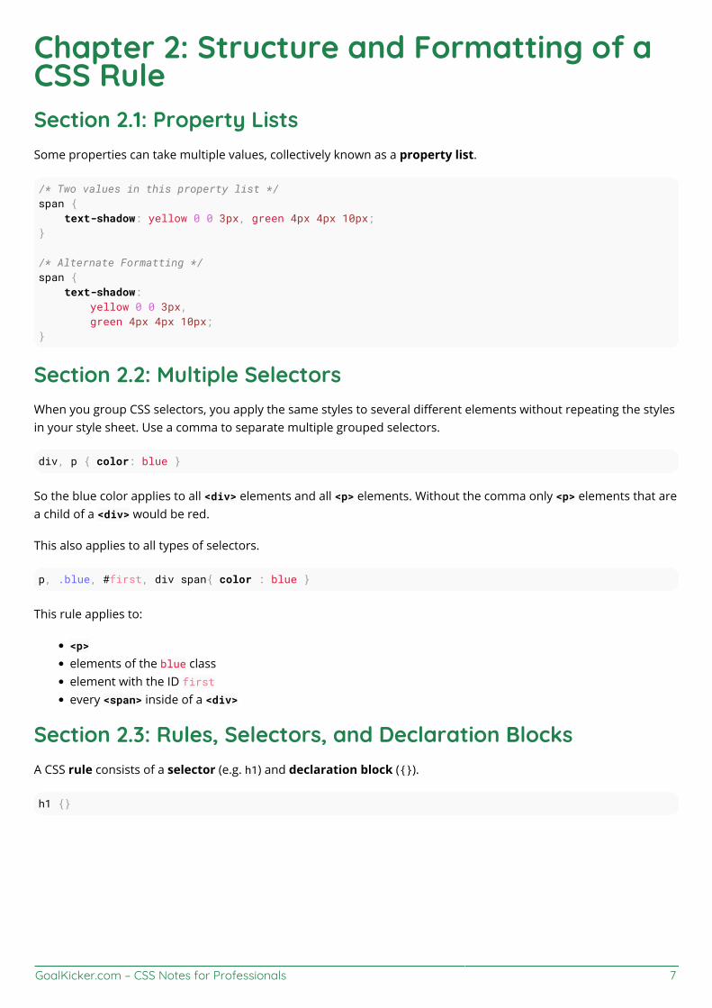
Chapter 2: Structure and Formatting of aCSS RuleSection 2.1: Property ListsSome properties can take multiple values, collectively known as a property list.
/* Two values in this property list */span { text-shadow: yellow 0 0 3px, green 4px 4px 10px;}
/* Alternate Formatting */span { text-shadow: yellow 0 0 3px, green 4px 4px 10px;}
Section 2.2: Multiple SelectorsWhen you group CSS selectors, you apply the same styles to several different elements without repeating the stylesin your style sheet. Use a comma to separate multiple grouped selectors.
div, p { color: blue }
So the blue color applies to all <div> elements and all <p> elements. Without the comma only <p> elements that area child of a <div> would be red.
This also applies to all types of selectors.
p, .blue, #first, div span{ color : blue }
This rule applies to:
<p>
elements of the blue classelement with the ID firstevery <span> inside of a <div>
Section 2.3: Rules, Selectors, and Declaration BlocksA CSS rule consists of a selector (e.g. h1) and declaration block ({}).
h1 {}
GoalKicker.com – CSS Notes for Professionals 8
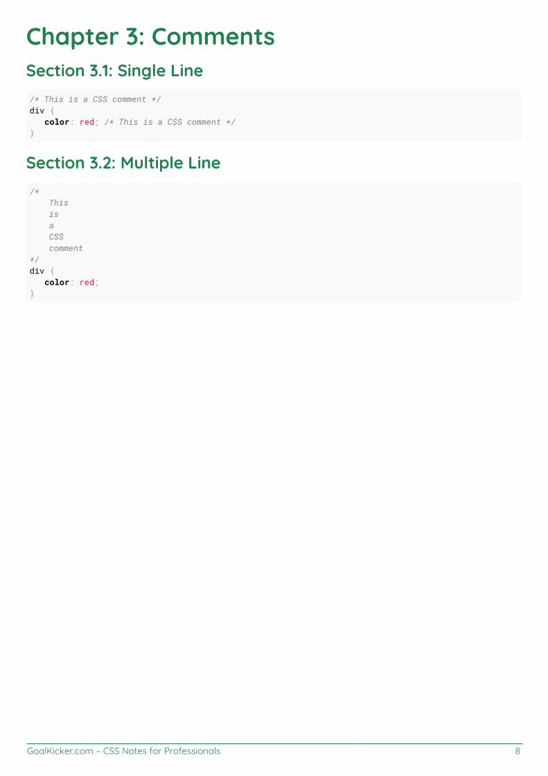
Chapter 3: CommentsSection 3.1: Single Line/* This is a CSS comment */div { color: red; /* This is a CSS comment */}
Section 3.2: Multiple Line/* This is a CSS comment*/div { color: red;}

GoalKicker.com – CSS Notes for Professionals 9
Chapter 4: SelectorsCSS selectors identify specific HTML elements as targets for CSS styles. This topic covers how CSS selectors targetHTML elements. Selectors use a wide range of over 50 selection methods offered by the CSS language, includingelements, classes, IDs, pseudo-elements and pseudo-classes, and patterns.
Section 4.1: Basic selectorsSelector Description
* Universal selector (all elements)div Tag selector (all <div> elements).blue Class selector (all elements with class blue).blue.red All elements with class blue and red (a type of Compound selector)#headline ID selector (the element with "id" attribute set to headline):pseudo-class All elements with pseudo-class::pseudo-element Element that matches pseudo-element:lang(en) Element that matches :lang declaration, for example <span lang="en">div > p child selector
Note: The value of an ID must be unique in a web page. It is a violation of the HTML standard to use thevalue of an ID more than once in the same document tree.
A complete list of selectors can be found in the CSS Selectors Level 3 specification.
Section 4.2: Attribute SelectorsOverview
Attribute selectors can be used with various types of operators that change the selection criteria accordingly. Theyselect an element using the presence of a given attribute or attribute value.
Selector(1) Matched element Selects elements... CSS Version[attr] <div attr> With attribute attr 2
[attr='val'] <div attr="val"> Where attribute attr has value val 2
[attr~='val'] <div attr="val val2 val3"> Where val appears in thewhitespace-separated list of attr 2
[attr^='val'] <div attr="val1 val2"> Where attr's value begins with val 3[attr$='val'] <div attr="sth aval"> Where the attr's value ends with val 3[attr*='val'] <div attr="somevalhere"> Where attr contains val anywhere 3
[attr|='val'] <div attr="val-sth etc">Where attr's value is exactly val,or starts with val and immediatelyfollowed by - (U+002D)
2
[attr='val' i] <div attr="val"> Where attr has value val,ignoring val's letter casing. 4(2)
Notes:
The attribute value can be surrounded by either single-quotes or double-quotes. No quotes at all may also1.work, but it's not valid according to the CSS standard, and is discouraged.
GoalKicker.com – CSS Notes for Professionals 10
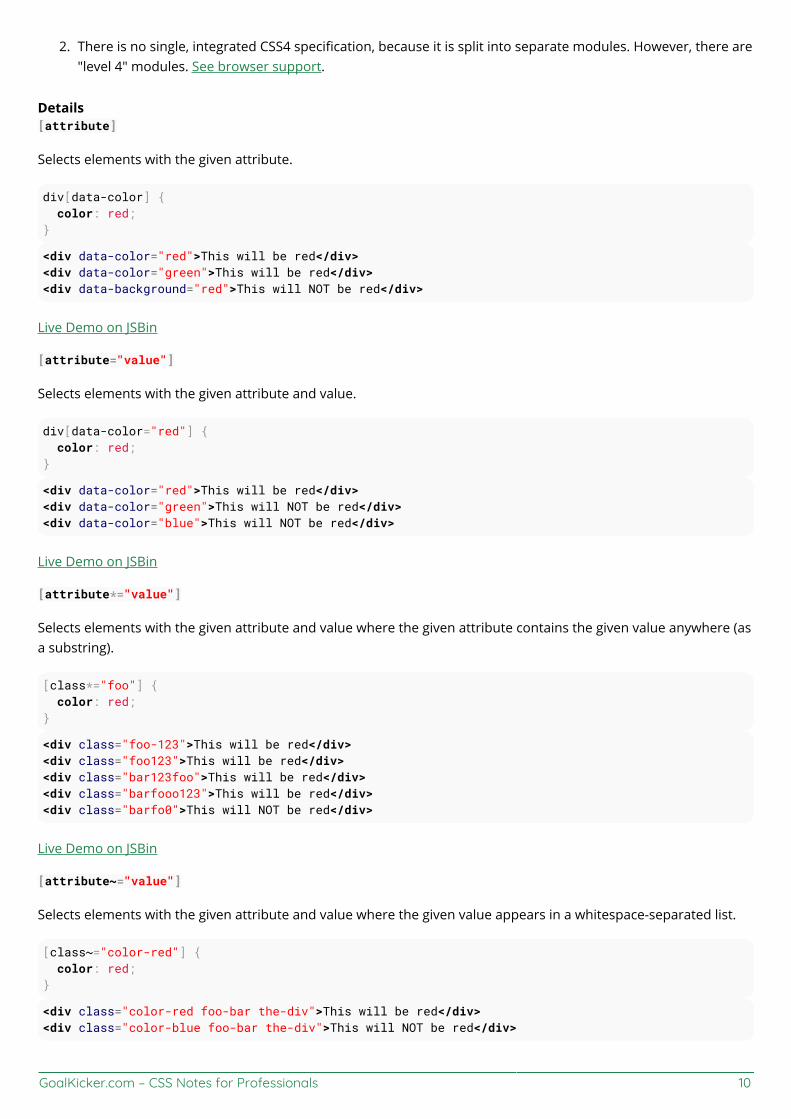
There is no single, integrated CSS4 specification, because it is split into separate modules. However, there are2."level 4" modules. See browser support.
Details[attribute]
Selects elements with the given attribute.
div[data-color] { color: red;}
<div data-color="red">This will be red</div><div data-color="green">This will be red</div><div data-background="red">This will NOT be red</div>
Live Demo on JSBin
[attribute="value"]
Selects elements with the given attribute and value.
div[data-color="red"] { color: red;}
<div data-color="red">This will be red</div><div data-color="green">This will NOT be red</div><div data-color="blue">This will NOT be red</div>
Live Demo on JSBin
[attribute*="value"]
Selects elements with the given attribute and value where the given attribute contains the given value anywhere (asa substring).
[class*="foo"] { color: red;}
<div class="foo-123">This will be red</div><div class="foo123">This will be red</div><div class="bar123foo">This will be red</div><div class="barfooo123">This will be red</div><div class="barfo0">This will NOT be red</div>
Live Demo on JSBin
[attribute~="value"]
Selects elements with the given attribute and value where the given value appears in a whitespace-separated list.
[class~="color-red"] { color: red;}
<div class="color-red foo-bar the-div">This will be red</div><div class="color-blue foo-bar the-div">This will NOT be red</div>

GoalKicker.com – CSS Notes for Professionals 11
Live Demo on JSBin
[attribute^="value"]
Selects elements with the given attribute and value where the given attribute begins with the value.
[class^="foo-"] { color: red;}
<div class="foo-123">This will be red</div><div class="foo-234">This will be red</div><div class="bar-123">This will NOT be red</div>
Live Demo on JSBin
[attribute$="value"]
Selects elements with the given attribute and value where the given attribute ends with the given value.
[class$="file"] { color: red;}
<div class="foobar-file">This will be red</div><div class="foobar-file">This will be red</div><div class="foobar-input">This will NOT be red</div>
Live Demo on JSBin
[attribute|="value"]
Selects elements with a given attribute and value where the attribute's value is exactly the given value or is exactlythe given value followed by - (U+002D)
[lang|="EN"] { color: red;}
<div lang="EN-us">This will be red</div><div lang="EN-gb">This will be red</div><div lang="PT-pt">This will NOT be red</div>
Live Demo on JSBin
[attribute="value" i]
Selects elements with a given attribute and value where the attribute's value can be represented as Value, VALUE,vAlUe or any other case-insensitive possibility.
[lang="EN" i] { color: red;}
<div lang="EN">This will be red</div><div lang="en">This will be red</div><div lang="PT">This will NOT be red</div>
Live Demo on JSBin

GoalKicker.com – CSS Notes for Professionals 12
Specificity of attribute selectors0-1-0
Same as class selector and pseudoclass.
*[type=checkbox] // 0-1-0
Note that this means an attribute selector can be used to select an element by its ID at a lower level of specificitythan if it was selected with an ID selector: [id="my-ID"] targets the same element as #my-ID but with lowerspecificity.
See the Syntax Section for more details.
Section 4.3: CombinatorsOverview
Selector Descriptiondiv span Descendant selector (all <span>s that are descendants of a <div>)div > span Child selector (all <span>s that are a direct child of a <div>)a ~ span General Sibling selector (all <span>s that are siblings after an <a>)a + span Adjacent Sibling selector (all <span>s that are immediately after an <a>)
Note: Sibling selectors target elements that come after them in the source document. CSS, by its nature(it cascades), cannot target previous or parent elements. However, using the flex order property, aprevious sibling selector can be simulated on visual media.
Descendant Combinator: selector selector
A descendant combinator, represented by at least one space character (), selects elements that are a descendant ofthe defined element. This combinator selects all descendants of the element (from child elements on down).
div p { color:red;}
<div> <p>My text is red</p> <section> <p>My text is red</p> </section></div>
<p>My text is not red</p>
Live Demo on JSBin
In the above example, the first two <p> elements are selected since they are both descendants of the <div>.
Child Combinator: selector > selector
The child (>) combinator is used to select elements that are children, or direct descendants, of the specifiedelement.
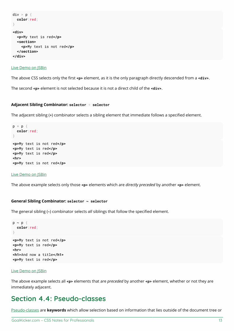
GoalKicker.com – CSS Notes for Professionals 13
div > p { color:red;}
<div> <p>My text is red</p> <section> <p>My text is not red</p> </section></div>
Live Demo on JSBin
The above CSS selects only the first <p> element, as it is the only paragraph directly descended from a <div>.
The second <p> element is not selected because it is not a direct child of the <div>.
Adjacent Sibling Combinator: selector + selector
The adjacent sibling (+) combinator selects a sibling element that immediate follows a specified element.
p + p { color:red;}
<p>My text is not red</p><p>My text is red</p><p>My text is red</p><hr><p>My text is not red</p>
Live Demo on JSBin
The above example selects only those <p> elements which are directly preceded by another <p> element.
General Sibling Combinator: selector ~ selector
The general sibling (~) combinator selects all siblings that follow the specified element.
p ~ p { color:red;}
<p>My text is not red</p><p>My text is red</p><hr><h1>And now a title</h1><p>My text is red</p>
Live Demo on JSBin
The above example selects all <p> elements that are preceded by another <p> element, whether or not they areimmediately adjacent.
Section 4.4: Pseudo-classesPseudo-classes are keywords which allow selection based on information that lies outside of the document tree or

GoalKicker.com – CSS Notes for Professionals 14
that cannot be expressed by other selectors or combinators. This information can be associated to a certain state(state and dynamic pseudo-classes), to locations (structural and target pseudo-classes), to negations of the former(negation pseudo-class) or to languages (lang pseudo-class). Examples include whether or not a link has beenfollowed (:visited), the mouse is over an element (:hover), a checkbox is checked (:checked), etc.
Syntaxselector:pseudo-class { property: VALUE;}
List of pseudo-classes:Name Description
:active Applies to any element being activated (i.e. clicked) by the user.
:any Allows you to build sets of related selectors by creating groups that theincluded items will match. This is an alternative to repeating an entire selector.
:target Selects the current active #news element (clicked on a URLcontaining that anchor name)
:checked Applies to radio, checkbox, or option elements that are checkedor toggled into an "on" state.
:default Represents any user interface element that is the default among a group ofsimilar elements.
:disabled Applies to any UI element which is in a disabled state.:empty Applies to any element which has no children.:enabled Applies to any UI element which is in an enabled state.
:first Used in conjunction with the @page rule, this selects the first page in aprinted document.
:first-child Represents any element that is the first child element of its parent.
:first-of-type Applies when an element is the first of the selected element typeinside its parent. This may or may not be the first-child.
:focus Applies to any element which has the user's focus. This can be given by theuser's keyboard, mouse events, or other forms of input.
:focus-within Can be used to highlight a whole section when one element inside it is focused. It matchesany element that the :focus pseudo-class matches or that has a descendant focused.
:full-screen Applies to any element displayed in full-screen mode. It selects the whole stackof elements and not just the top level element.
:hover Applies to any element being hovered by the user's pointing device, butnot activated.
:indeterminateApplies radio or checkbox UI elements which are neither checked norunchecked, but are in an indeterminate state. This can be due to anelement's attribute or DOM manipulation.
:in-range
The :in-range CSS pseudo-class matches when an element hasits value attribute inside the specified range limitations for this element.It allows the page to give a feedback that the value currently definedusing the element is inside the range limits.
:invalid Applies to <input> elements whose values are invalid according tothe type specified in the type= attribute.
:langApplies to any element who's wrapping <body> element has a properlydesignated lang= attribute. For the pseudo-class to be valid, it mustcontain a valid two or three letter language code.
:last-child Represents any element that is the last child element of its parent.
:last-of-type Applies when an element is the last of the selected element type insideits parent. This may or may not be the last-child.
GoalKicker.com – CSS Notes for Professionals 15
:left Used in conjunction with the @page rule, this selects all the leftpages in a printed document.
:link Applies to any links which haven't been visited by the user.
:not()
Applies to all elements which do not match the value passed to(:not(p) or :not(.class-name) for example. It must have a value to bevalid and it can only contain one selector. However, you can chain multiple :not selectorstogether.
:nth-childApplies when an element is the n-th element of its parent, where ncan be an integer, a mathematical expression (e.g n+3) or the keywordsodd or even.
:nth-of-typeApplies when an element is the n-th element of its parent of thesame element type, where n can be an integer, a mathematicalexpression (e.g n+3) or the keywords odd or even.
:only-child
The :only-child CSS pseudo-class represents any elementwhich is the only child of its parent. This is the same as:first-child:last-child or :nth-child(1):nth-last-child(1),but with a lower specificity.
:optionalThe :optional CSS pseudo-class represents any elementthat does not have the required attribute set on it. This allowsforms to easily indicate optional fields and to style them accordingly.
:out-of-range
The :out-of-range CSS pseudo-class matches when an element has itsvalue attribute outside the specified range limitations for this element.It allows the page to give a feedback that the value currently defined using theelement is outside the range limits. A value can be outside of a range if it iseither smaller or larger than maximum and minimum set values.
:placeholder-shown Experimental. Applies to any form element currently displaying placeholder text.:read-only Applies to any element which is not editable by the user.:read-write Applies to any element that is editable by a user, such as <input> elements.
:right Used in conjunction with the @page rule, this selects all the right pages in aprinted document.
:root matches the root element of a tree representing the document.
:scope CSS pseudo-class matches the elements that are a referencepoint for selectors to match against.
:target Selects the current active #news element (clicked on a URLcontaining that anchor name)
:visited Applies to any links which have has been visited by the user.
The :visited pseudoclass can't be used for most styling in a lot of modern browsers anymore becauseit's a security hole. See this link for reference.
Section 4.5: Child Pseudo Class
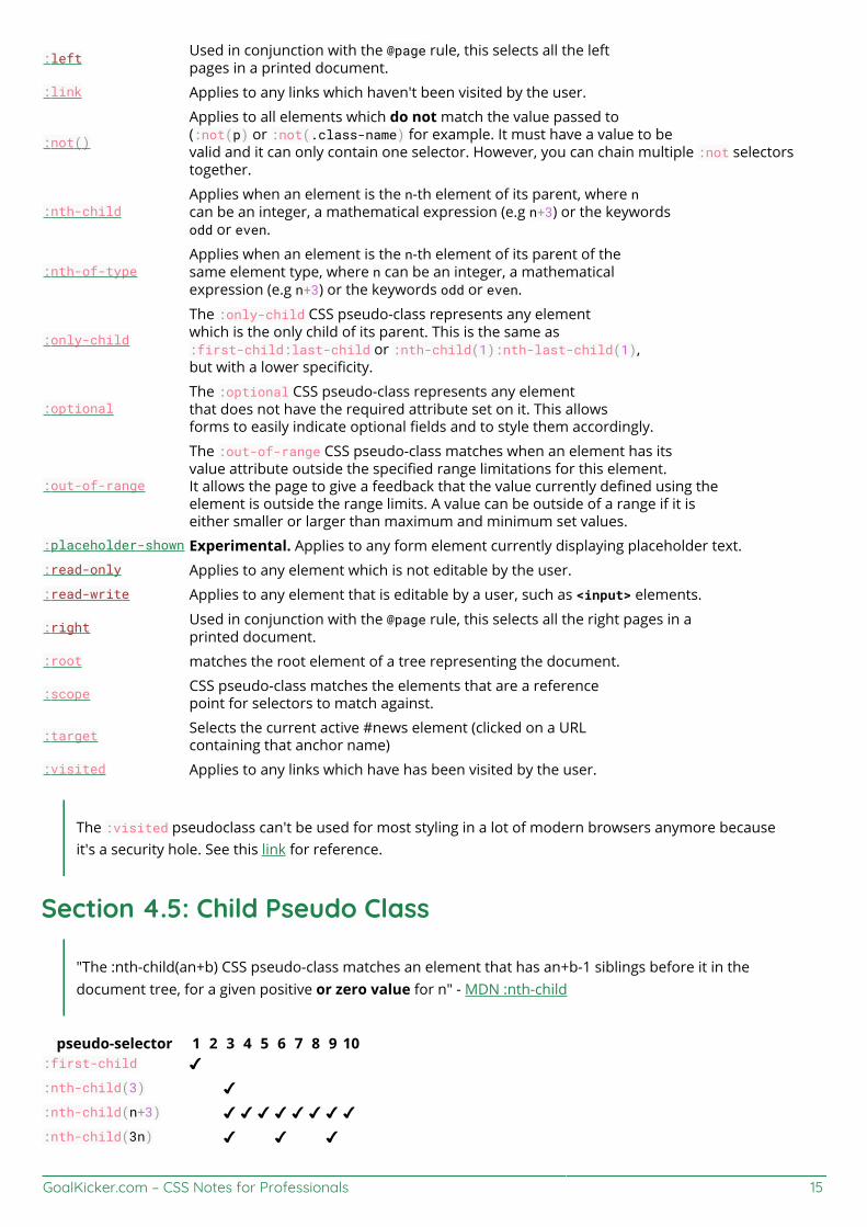
"The :nth-child(an+b) CSS pseudo-class matches an element that has an+b-1 siblings before it in thedocument tree, for a given positive or zero value for n" - MDN :nth-child
pseudo-selector 1 2 3 4 5 6 7 8 9 10:first-child ✔:nth-child(3) ✔:nth-child(n+3) ✔ ✔ ✔ ✔ ✔ ✔ ✔ ✔:nth-child(3n) ✔ ✔ ✔

GoalKicker.com – CSS Notes for Professionals 16
:nth-child(3n+1) ✔ ✔ ✔ ✔:nth-child(-n+3) ✔ ✔ ✔:nth-child(odd) ✔ ✔ ✔ ✔ ✔:nth-child(even) ✔ ✔ ✔ ✔ ✔:last-child ✔:nth-last-child(3) ✔
Section 4.6: Class Name SelectorsThe class name selector select all elements with the targeted class name. For example, the class name .warningwould select the following <div> element:
<div class="warning"> <p>This would be some warning copy.</p></div>
You can also combine class names to target elements more specifically. Let's build on the example above toshowcase a more complicated class selection.
CSS
.important { color: orange;}.warning { color: blue;}.warning.important { color: red;}
HTML
<div class="warning"> <p>This would be some warning copy.</p></div>
<div class="important warning"> <p class="important">This is some really important warning copy.</p></div>
In this example, all elements with the .warning class will have a blue text color, elements with the .important classwith have an orange text color, and all elements that have both the .important and .warning class name will have ared text color.
Notice that within the CSS, the .warning.important declaration did not have any spaces between the two classnames. This means it will only find elements which contain both class names warning and important in their classattribute. Those class names could be in any order on the element.
If a space was included between the two classes in the CSS declaration, it would only select elements that haveparent elements with a .warning class names and child elements with .important class names.

GoalKicker.com – CSS Notes for Professionals 17
Section 4.7: Select element using its ID without the highspecificity of the ID selectorThis trick helps you select an element using the ID as a value for an attribute selector to avoid the high specificity ofthe ID selector.
HTML:
<div id="element">...</div>
CSS
#element { ... } /* High specificity will override many selectors */
[id="element"] { ... } /* Low specificity, can be overridden easily */
Section 4.8: The :last-of-type selectorThe :last-of-type selects the element that is the last child, of a particular type, of its parent. In the example below,the css selects the last paragraph and the last heading h1.
p:last-of-type { background: #C5CAE9;}h1:last-of-type { background: #CDDC39;}
<div class="container"> <p>First paragraph</p> <p>Second paragraph</p> <p>Last paragraph</p> <h1>Heading 1</h1> <h2>First heading 2</h2> <h2>Last heading 2</h2></div>
jsFiddle
Section 4.9: CSS3 :in-range selector example<style>input:in-range { border: 1px solid blue;}</style>
<input type="number" min="10" max="20" value="15">

GoalKicker.com – CSS Notes for Professionals 18
<p>The border for this value will be blue</p>
The :in-range CSS pseudo-class matches when an element has its value attribute inside the specified rangelimitations for this element. It allows the page to give a feedback that the value currently defined using the elementis inside the range limits.[1]
Section 4.10: A. The :not pseudo-class example & B. :focus-within CSS pseudo-classA. The syntax is presented above.
The following selector matches all <input> elements in an HTML document that are not disabled and don't have theclass .example:
HTML:
<form> Phone: <input type="tel" class="example"> E-mail: <input type="email" disabled="disabled"> Password: <input type="password"></form>
CSS:
input:not([disabled]):not(.example){ background-color: #ccc;}
The :not() pseudo-class will also support comma-separated selectors in Selectors Level 4:
CSS:
input:not([disabled], .example){ background-color: #ccc;}
Live Demo on JSBin
See background syntax here.
B. The :focus-within CSS pseudo-class
HTML:
<h3>Background is blue if the input is focused .</p> <div> <input type="text"> </div>
CSS:
div { height: 80px;}input{ margin:30px;
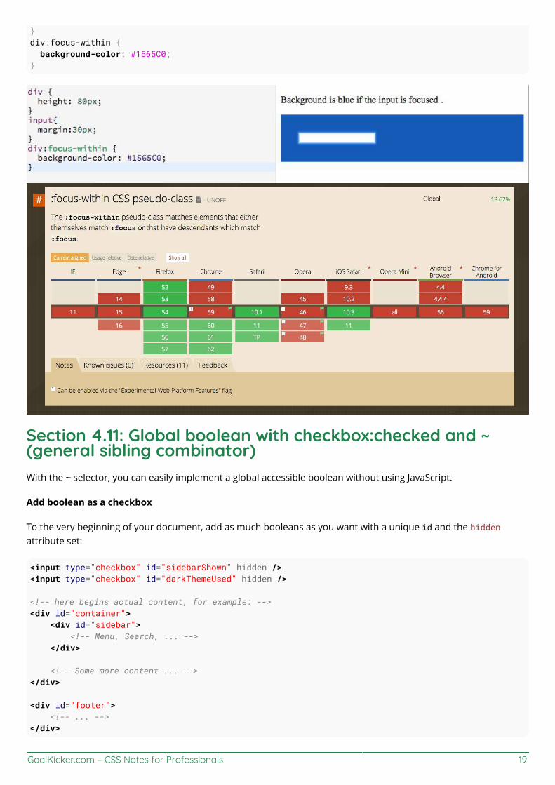
GoalKicker.com – CSS Notes for Professionals 19
}div:focus-within { background-color: #1565C0;}
Section 4.11: Global boolean with checkbox:checked and ~(general sibling combinator)With the ~ selector, you can easily implement a global accessible boolean without using JavaScript.
Add boolean as a checkbox
To the very beginning of your document, add as much booleans as you want with a unique id and the hiddenattribute set:
<input type="checkbox" id="sidebarShown" hidden /><input type="checkbox" id="darkThemeUsed" hidden />
<!-- here begins actual content, for example: --><div id="container"> <div id="sidebar"> <!-- Menu, Search, ... --> </div>
<!-- Some more content ... --></div>
<div id="footer"> <!-- ... --></div>
GoalKicker.com – CSS Notes for Professionals 20
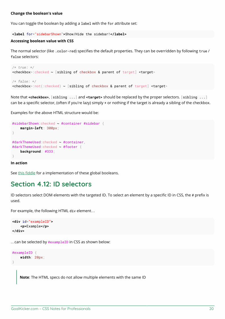
Change the boolean's value
You can toggle the boolean by adding a label with the for attribute set:
<label for="sidebarShown">Show/Hide the sidebar!</label>
Accessing boolean value with CSS
The normal selector (like .color-red) specifies the default properties. They can be overridden by following true /false selectors:
/* true: */<checkbox>:checked ~ [sibling of checkbox & parent of target] <target>
/* false: */<checkbox>:not(:checked) ~ [sibling of checkbox & parent of target] <target>
Note that <checkbox>, [sibling ...] and <target> should be replaced by the proper selectors. [sibling ...]can be a specific selector, (often if you're lazy) simply * or nothing if the target is already a sibling of the checkbox.
Examples for the above HTML structure would be:
#sidebarShown:checked ~ #container #sidebar { margin-left: 300px;}
#darkThemeUsed:checked ~ #container,#darkThemeUsed:checked ~ #footer { background: #333;}
In action
See this fiddle for a implementation of these global booleans.
Section 4.12: ID selectorsID selectors select DOM elements with the targeted ID. To select an element by a specific ID in CSS, the # prefix isused.
For example, the following HTML div element…
<div id="exampleID"> <p>Example</p></div>
…can be selected by #exampleID in CSS as shown below:
#exampleID { width: 20px;}
Note: The HTML specs do not allow multiple elements with the same ID
GoalKicker.com – CSS Notes for Professionals 21
Section 4.13: How to style a Range inputHTML
<input type="range"></input>
CSS
Effect Pseudo Selector
Thumb input[type=range]::-webkit-slider-thumb, input[type=range]::-moz-range-thumb,input[type=range]::-ms-thumb
Track input[type=range]::-webkit-slider-runnable-track, input[type=range]::-moz-range-track,input[type=range]::-ms-track
OnFocus input[type=range]:focus
Lower part ofthe track
input[type=range]::-moz-range-progress, input[type=range]::-ms-fill-lower (not possiblein WebKit browsers currently - JS needed)
Section 4.14: The :only-child pseudo-class selector exampleThe :only-child CSS pseudo-class represents any element which is the only child of its parent.
HTML:
<div> <p>This paragraph is the only child of the div, it will have the color blue</p></div>
<div> <p>This paragraph is one of the two children of the div</p> <p>This paragraph is one of the two children of its parent</p></div>
CSS:
p:only-child { color: blue;}
The above example selects the <p> element that is the unique child from its parent, in this case a <div>.
Live Demo on JSBin

GoalKicker.com – CSS Notes for Professionals 22
Chapter 5: BackgroundsWith CSS you can set colors, gradients, and images as the background of an element.
It is possible to specify various combinations of images, colors, and gradients, and adjust the size, positioning, andrepetition (among others) of these.
Section 5.1: Background ColorThe background-color property sets the background color of an element using a color value or through keywords,such as transparent, inherit or initial.
transparent, specifies that the background color should be transparent. This is default.
inherit, inherits this property from its parent element.
initial, sets this property to its default value.
This can be applied to all elements, and ::first-letter/::first-line pseudo-elements.
Colors in CSS can be specified by different methods.
Color names
CSS
div { background-color: red; /* red */}
HTML
<div>This will have a red background</div>
The example used above is one of several ways that CSS has to represent a single color.
Hex color codes
Hex code is used to denote RGB components of a color in base-16 hexadecimal notation. #ff0000, for example, isbright red, where the red component of the color is 256 bits (ff) and the corresponding green and blue portions ofthe color is 0 (00).
If both values in each of the three RGB pairings (R, G, and B) are the same, then the color code can be shortenedinto three characters (the first digit of each pairing). #ff0000 can be shortened to #f00, and #ffffff can beshortened to #fff.
Hex notation is case-insensitive.
body { background-color: #de1205; /* red */}
.main {
GoalKicker.com – CSS Notes for Professionals 23
background-color: #00f; /* blue */}
RGB / RGBa
Another way to declare a color is to use RGB or RGBa.
RGB stands for Red, Green and Blue, and requires of three separate values between 0 and 255, put betweenbrackets, that correspond with the decimal color values for respectively red, green and blue.
RGBa allows you to add an additional alpha parameter between 0.0 and 1.0 to define opacity.
header { background-color: rgb(0, 0, 0); /* black */}
footer { background-color: rgba(0, 0, 0, 0.5); /* black with 50% opacity */}
HSL / HSLa
Another way to declare a color is to use HSL or HSLa and is similar to RGB and RGBa.
HSL stands for hue, saturation, and lightness, and is also often called HLS:
Hue is a degree on the color wheel (from 0 to 360).Saturation is a percentage between 0% and 100%.Lightness is also a percentage between 0% and 100%.
HSLa allows you to add an additional alpha parameter between 0.0 and 1.0 to define opacity.
li a { background-color: hsl(120, 100%, 50%); /* green */}
#p1 { background-color: hsla(120, 100%, 50%, .3); /* green with 30% opacity */}
Interaction with background-image
The following statements are all equivalent:
body { background: red; background-image: url(partiallytransparentimage.png);}
body { background-color: red; background-image: url(partiallytransparentimage.png);}
body { background-image: url(partiallytransparentimage.png); background-color: red;

GoalKicker.com – CSS Notes for Professionals 24
}
body { background: red url(partiallytransparentimage.png);}
They will all lead to the red color being shown underneath the image, where the parts of the image are transparent,or the image is not showing (perhaps as a result of background-repeat).
Note that the following is not equivalent:
body { background-image: url(partiallytransparentimage.png); background: red;}
Here, the value of background overrides your background-image.
For more info on the background property, see Background Shorthand
Section 5.2: Background GradientsGradients are new image types, added in CSS3. As an image, gradients are set with the background-image property,or the background shorthand.
There are two types of gradient functions, linear and radial. Each type has a non-repeating variant and a repeatingvariant:
linear-gradient()
repeating-linear-gradient()
radial-gradient()
repeating-radial-gradient()
linear-gradient()
A linear-gradient has the following syntax
background: linear-gradient( <direction>?, <color-stop-1>, <color-stop-2>, ...);
Value Meaning
<direction>Could be an argument like to top, to bottom, to right or to left; or an angle as 0deg,90deg... . The angle starts from to top and rotates clockwise. Can be specified in deg, grad, rad,or turn. If omitted, the gradient flows from top to bottom
<color-stop-list> List of colors, optionally followed each one by a percentage or length to display it at. Forexample, yellow 10%, rgba(0,0,0,.5) 40px, #fff 100%...
For example, this creates a linear gradient that starts from the right and transitions from red to blue
.linear-gradient { background: linear-gradient(to left, red, blue); /* you can also use 270deg */}
You can create a diagonal gradient by declaring both a horizontal and vertical starting position.
.diagonal-linear-gradient { background: linear-gradient(to left top, red, yellow 10%);

GoalKicker.com – CSS Notes for Professionals 25
}
It is possible to specify any number of color stops in a gradient by separating them with commas. The followingexamples will create a gradient with 8 color stops
.linear-gradient-rainbow { background: linear-gradient(to left, red, orange, yellow, green, blue, indigo, violet)}
radial-gradient().radial-gradient-simple { background: radial-gradient(red, blue);}
.radial-gradient { background: radial-gradient(circle farthest-corner at top left, red, blue);}
Value Meaningcircle Shape of gradient. Values are circle or ellipse, default is ellipse.
farthest-corner Keywords describing how big the ending shape must be. Values are closest-side, farthest-side, closest-corner, farthest-corner
top left Sets the position of the gradient center, in the same way as background-position.
Repeating gradients
Repeating gradient functions take the same arguments as the above examples, but tile the gradient across thebackground of the element.
.bullseye { background: repeating-radial-gradient(red, red 10%, white 10%, white 20%);}.warning { background: repeating-linear-gradient(-45deg, yellow, yellow 10%, black 10%, black 20% );}
Value Meaning
-45deg Angle unit. The angle starts from to top and rotates clockwise. Can be specified in deg, grad, rad, orturn.
to left Direction of gradient, default is to bottom. Syntax: to [y-axis(top OR bottom)] [x-axis(left ORright)] ie to top right
yellow 10% Color, optionally followed by a percentage or length to display it at. Repeated two or more times.
Note that HEX, RGB, RGBa, HSL, and HSLa color codes may be used instead of color names. Color names were usedfor the sake of illustration. Also note that the radial-gradient syntax is much more complex than linear-gradient,and a simplified version is shown here. For a full explanation and specs, see the MDN Docs
Section 5.3: Background ImageThe background-image property is used to specify a background image to be applied to all matched elements. Bydefault, this image is tiled to cover the entire element, excluding margin.
.myClass { background-image: url('/path/to/image.jpg');}

GoalKicker.com – CSS Notes for Professionals 26
To use multiple images as background-image, define comma separated url()
.myClass { background-image: url('/path/to/image.jpg'), url('/path/to/image2.jpg');}
The images will stack according to their order with the first declared image on top of the others and so on.
Value Result
url('/path/to/image.jpg') Specify background image's path(s) or an image resource specified with data URIschema (apostrophes can be omitted), separate multiples by comma
none No background imageinitial Default valueinherit Inherit parent's value
More CSS for Background Image
This following attributes are very useful and almost essential too.
background-size: xpx ypx | x% y%;background-repeat: no-repeat | repeat | repeat-x | repeat-y;background-position: left offset (px/%) right offset (px/%) | center center | left top | rightbottom;
Section 5.4: Background ShorthandThe background property can be used to set one or more background related properties:
Value Description CSS Ver.background-image Background image to use 1+background-color Background color to apply 1+background-position Background image's position 1+background-size Background image's size 3+background-repeat How to repeat background image 1+
background-origin How the background is positioned (ignored when background-attachment isfixed) 3+
background-clip How the background is painted relative to the content-box, border-box, or thepadding-box 3+
background-attachment How the background image behaves, whether it scrolls along with its containingblock or has a fixed position within the viewport 1+
initial Sets the property to value to default 3+inherit Inherits property value from parent 2+
The order of the values does not matter and every value is optional
Syntax
The syntax of the background shorthand declaration is:
background: [<background-image>] [<background-color>] [<background-position>]/[<background-size>][<background-repeat>] [<background-origin>] [<background-clip>] [<background-attachment>][<initial|inherit>];
GoalKicker.com – CSS Notes for Professionals 27
Examplesbackground: red;
Simply setting a background-color with the redvalue.
background: border-box red;
Setting a background-clip to border-box and a background-color to red.
background: no-repeat center url("somepng.jpg");
Sets a background-repeat to no-repeat, background-origin to center and a background-image to an image.
background: url('pattern.png') green;
In this example, the background-color of the element would be set to green with pattern.png, if it is available,overlayed on the colour, repeating as often as necessary to fill the element. If pattern.png includes anytransparency then the green colour will be visible behind it.
background: #000000 url("picture.png") top left / 600px auto no-repeat;
In this example we have a black background with an image 'picture.png' on top, the image does not repeat in eitheraxis and is positioned in the top left corner. The / after the position is to be able to include the size of thebackground image which in this case is set as 600px width and auto for the height. This example could work wellwith a feature image that can fade into a solid colour.
NOTE: Use of the shorthand background property resets all previously set background property values,even if a value is not given. If you wish only to modify a background property value previously set, use alonghand property instead.
Section 5.5: Background SizeGeneral overview
The background-size property enables one to control the scaling of the background-image. It takes up to twovalues, which determine the scale/size of the resulting image in vertical and and horizontal direction. If the propertyis missing, its deemed auto in both width and height.
auto will keep the image's aspect ratio, if it can be determined. The height is optional and can be considered auto.Therefore, on a 256 px × 256 px image, all the following background-size settings would yield an image with heightand width of 50 px:
background-size: 50px;background-size: 50px auto; /* same as above */background-size: auto 50px;background-size: 50px 50px;
So if we started with the following picture (which has the mentioned size of 256 px × 256 px),

GoalKicker.com – CSS Notes for Professionals 28
we'll end up with a 50 px × 50 px on the user's screen, contained in the background of our element:
One can also use percentage values to scale the image with respect of the element. The following example wouldyield a 200 px × 133 px drawn image:
#withbackground { background-image: url(to/some/background.png);
background-size: 100% 66%; width: 200px; height: 200px;
padding: 0; margin: 0;}
The behaviour depends on the background-origin.
Keeping the aspect ratio
The last example in the previos section lost its original aspect ratio. The circle got into an ellipse, the square into arectangle, the triangle into another triangle.
The length or percentage approach isn't flexible enough to keep the aspect ratio at all times. auto doesn't help,since you might not know which dimension of your element will be larger. However, to cover certain areas with an

GoalKicker.com – CSS Notes for Professionals 29
image (and correct aspect ratio) completely or to contain an image with correct aspect ratio completely in abackground area, the values, contain and cover provide the additional functionality.
Eggsplanation for contain and cover
Sorry for the bad pun, but we're going to use a picture of the day by Biswarup Ganguly for demonstration. Lets saythat this is your screen, and the gray area is outside of your visible screen. For demonstration, We're going toassume a 16 × 9 ratio.
We want to use the aforementioned picture of the day as a background. However, we cropped the image to 4x3 forsome reason. We could set the background-size property to some fixed length, but we will focus on contain andcover. Note that I also assume that we didn't mangle the width and/or height of body.
contain
contain
Scale the image, while preserving its intrinsic aspect ratio (if any), to the largest size such that both itswidth and its height can fit inside the background positioning area.
This makes sure that the background image is always completely contained in the background positioning area,however, there could be some empty space filled with your background-color in this case:
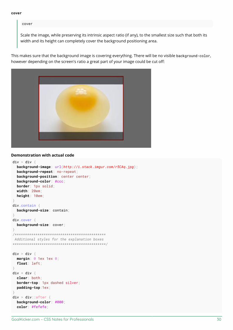
GoalKicker.com – CSS Notes for Professionals 30
cover
cover
Scale the image, while preserving its intrinsic aspect ratio (if any), to the smallest size such that both itswidth and its height can completely cover the background positioning area.
This makes sure that the background image is covering everything. There will be no visible background-color,however depending on the screen's ratio a great part of your image could be cut off:
Demonstration with actual codediv > div { background-image: url(http://i.stack.imgur.com/r5CAq.jpg); background-repeat: no-repeat; background-position: center center; background-color: #ccc; border: 1px solid; width: 20em; height: 10em;}div.contain { background-size: contain;}div.cover { background-size: cover;}/******************************************** Additional styles for the explanation boxes*********************************************/
div > div { margin: 0 1ex 1ex 0; float: left;}div + div { clear: both; border-top: 1px dashed silver; padding-top:1ex;}div > div::after { background-color: #000; color: #fefefe;

GoalKicker.com – CSS Notes for Professionals 31
margin: 1ex; padding: 1ex; opacity: 0.8; display: block; width: 10ex; font-size: 0.7em; content: attr(class);}
<div> <div class="contain"></div> <p>Note the grey background. The image does not cover the whole region, but it's fully<em>contained</em>. </p></div><div> <div class="cover"></div> <p>Note the ducks/geese at the bottom of the image. Most of the water is cut, as well as a partof the sky. You don't see the complete image anymore, but neither do you see any background color;the image <em>covers</em> all of the <code><div></code>.</p></div>
Section 5.6: Background PositionThe background-position property is used to specify the starting position for a background image or gradient
.myClass { background-image: url('path/to/image.jpg'); background-position: 50% 50%;}
The position is set using an X and Y co-ordinate and be set using any of the units used within CSS.
Unit Description
GoalKicker.com – CSS Notes for Professionals 32
value% value%
A percentage for the horizontal offset is relative to (width of background positioning area - width ofbackground image).A percentage for the vertical offset is relative to (height of background positioning area - height ofbackground image)The size of the image is the size given by background-size.
valuepx valuepx Offsets background image by a length given in pixels relative to the top left of the backgroundpositioning area
Units in CSS can be specified by different methods (see here).
Longhand Background Position Properties
In addition to the shorthand property above, one can also use the longhand background properties background-position-x and background-position-y. These allow you to control the x or y positions separately.
NOTE: This is supported in all browsers except Firefox (versions 31-48) 2. Firefox 49, to be releasedSeptember 2016, will support these properties. Until then, there is a Firefox hack within this StackOverflow answer.
Section 5.7: The background-origin propertyThe background-origin property specifies where the background image is positioned.
Note: If the background-attachment property is set to fixed, this property has no effect.
Default value: padding-box
Possible values:
padding-box - The position is relative to the padding boxborder-box - The position is relative to the border boxcontent-box - The position is relative to the content boxinitial
inherit
CSS
.example { width: 300px; border: 20px solid black; padding: 50px; background: url(https://static.pexels.com/photos/6440/magazines-desk-work-workspace-medium.jpg); background-repeat: no-repeat;}
.example1 {}
.example2 { background-origin: border-box; }
.example3 { background-origin: content-box; }
HTML
<p>No background-origin (padding-box is default):</p>

GoalKicker.com – CSS Notes for Professionals 33
<div class="example example1"> <h2>Lorem Ipsum Dolor</h2> <p>Lorem ipsum dolor sit amet, consectetuer adipiscing elit, sed diam nonummy nibh euismodtincidunt ut laoreet dolore magna aliquam erat volutpat.</p> <p>Ut wisi enim ad minim veniam, quis nostrud exerci tation ullamcorper suscipit lobortis nisl utaliquip ex ea commodo consequat.</p></div>
<p>background-origin: border-box:</p><div class="example example2"> <h2>Lorem Ipsum Dolor</h2> <p>Lorem ipsum dolor sit amet, consectetuer adipiscing elit, sed diam nonummy nibh euismodtincidunt ut laoreet dolore magna aliquam erat volutpat.</p> <p>Ut wisi enim ad minim veniam, quis nostrud exerci tation ullamcorper suscipit lobortis nisl utaliquip ex ea commodo consequat.</p></div>
<p>background-origin: content-box:</p><div class="example example3"> <h2>Lorem Ipsum Dolor</h2> <p>Lorem ipsum dolor sit amet, consectetuer adipiscing elit, sed diam nonummy nibh euismodtincidunt ut laoreet dolore magna aliquam erat volutpat.</p> <p>Ut wisi enim ad minim veniam, quis nostrud exerci tation ullamcorper suscipit lobortis nisl utaliquip ex ea commodo consequat.</p></div>
Result:
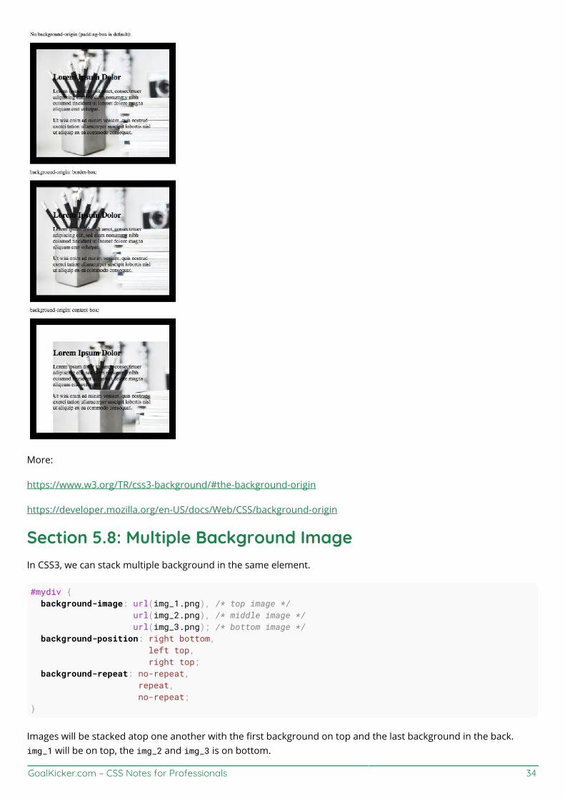
GoalKicker.com – CSS Notes for Professionals 34
More:
https://www.w3.org/TR/css3-background/#the-background-origin
https://developer.mozilla.org/en-US/docs/Web/CSS/background-origin
Section 5.8: Multiple Background ImageIn CSS3, we can stack multiple background in the same element.
#mydiv { background-image: url(img_1.png), /* top image */ url(img_2.png), /* middle image */ url(img_3.png); /* bottom image */ background-position: right bottom, left top, right top; background-repeat: no-repeat, repeat, no-repeat;}
Images will be stacked atop one another with the first background on top and the last background in the back.img_1 will be on top, the img_2 and img_3 is on bottom.
GoalKicker.com – CSS Notes for Professionals 35
We can also use background shorthand property for this:
#mydiv { background: url(img_1.png) right bottom no-repeat, url(img_2.png) left top repeat, url(img_3.png) right top no-repeat;}
We can also stack images and gradients:
#mydiv { background: url(image.png) right bottom no-repeat, linear-gradient(to bottom, #fff 0%,#000 100%);}
Demo
Section 5.9: Background AttachmentThe background-attachment property sets whether a background image is fixed or scrolls with the rest of the page.
body { background-image: url('img.jpg'); background-attachment: fixed;}
Value Descriptionscroll The background scrolls along with the element. This is default.
fixed The background is fixed with regard to the viewport.
local The background scrolls along with the element's contents.
initial Sets this property to its default value.
inherit Inherits this property from its parent element.
Examplesbackground-attachment: scroll
The default behaviour, when the body is scrolled the background scrolls with it:
body { background-image: url('image.jpg'); background-attachment: scroll;}
background-attachment: fixed
The background image will be fixed and will not move when the body is scrolled:
body { background-image: url('image.jpg'); background-attachment: fixed;}
background-attachment: local
The background image of the div will scroll when the contents of the div is scrolled.
div {

GoalKicker.com – CSS Notes for Professionals 36
background-image: url('image.jpg'); background-attachment: local;}
Section 5.10: Background ClipDefinition and Usage: The background-clip property specifies the painting area of the background.
Default value: border-box
Values
border-box is the default value. This allows the background to extend all the way to the outside edge of theelement's border.padding-box clips the background at the outside edge of the element's padding and does not let it extendinto the border;content-box clips the background at the edge of the content box.inherit applies the setting of the parent to the selected element.
CSS
.example { width: 300px; border: 20px solid black; padding: 50px; background: url(https://static.pexels.com/photos/6440/magazines-desk-work-workspace-medium.jpg); background-repeat: no-repeat;}
.example1 {}
.example2 { background-origin: border-box; }
.example3 { background-origin: content-box; }
HTML
<p>No background-origin (padding-box is default):</p>
<div class="example example1"> <h2>Lorem Ipsum Dolor</h2> <p>Lorem ipsum dolor sit amet, consectetuer adipiscing elit, sed diam nonummy nibh euismodtincidunt ut laoreet dolore magna aliquam erat volutpat.</p> <p>Ut wisi enim ad minim veniam, quis nostrud exerci tation ullamcorper suscipit lobortis nisl utaliquip ex ea commodo consequat.</p></div>
<p>background-origin: border-box:</p><div class="example example2"> <h2>Lorem Ipsum Dolor</h2> <p>Lorem ipsum dolor sit amet, consectetuer adipiscing elit, sed diam nonummy nibh euismodtincidunt ut laoreet dolore magna aliquam erat volutpat.</p> <p>Ut wisi enim ad minim veniam, quis nostrud exerci tation ullamcorper suscipit lobortis nisl utaliquip ex ea commodo consequat.</p></div>
<p>background-origin: content-box:</p><div class="example example3"> <h2>Lorem Ipsum Dolor</h2>
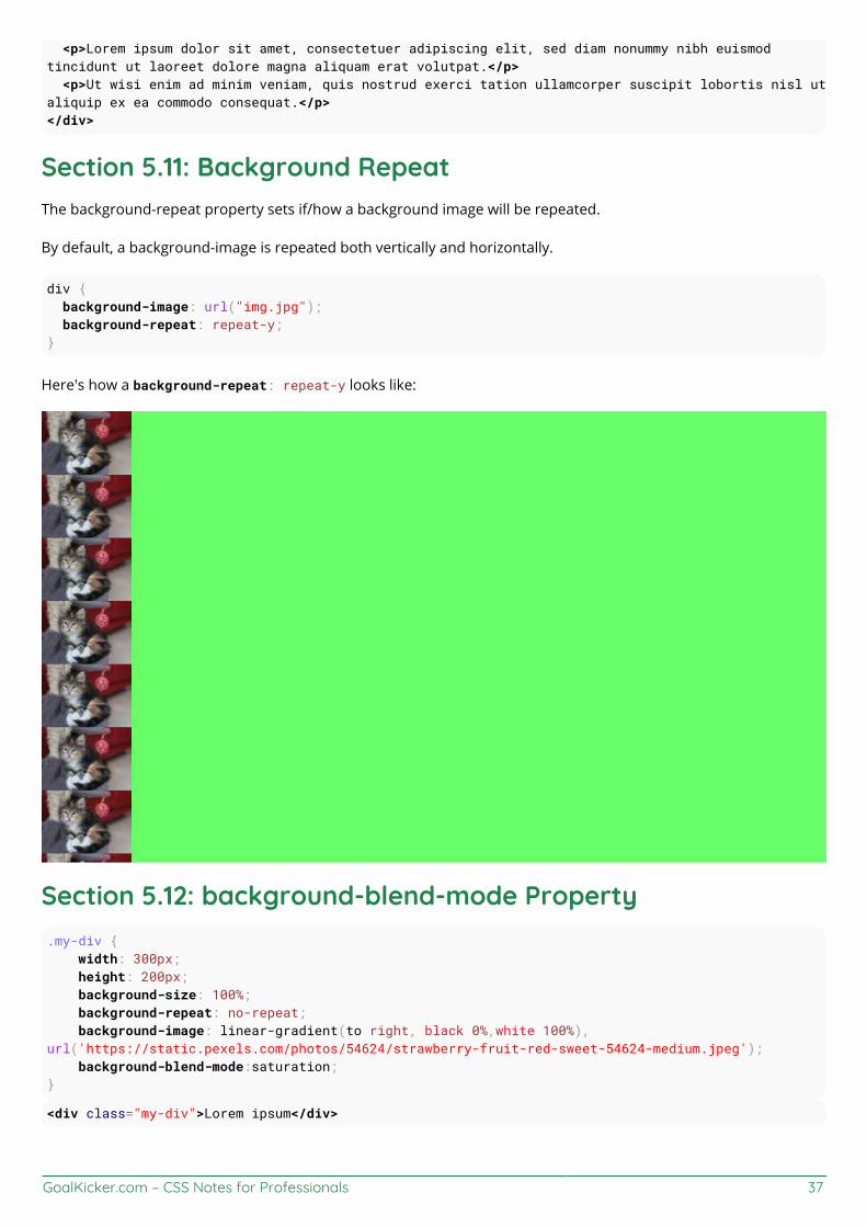
GoalKicker.com – CSS Notes for Professionals 37
<p>Lorem ipsum dolor sit amet, consectetuer adipiscing elit, sed diam nonummy nibh euismodtincidunt ut laoreet dolore magna aliquam erat volutpat.</p> <p>Ut wisi enim ad minim veniam, quis nostrud exerci tation ullamcorper suscipit lobortis nisl utaliquip ex ea commodo consequat.</p></div>
Section 5.11: Background RepeatThe background-repeat property sets if/how a background image will be repeated.
By default, a background-image is repeated both vertically and horizontally.
div { background-image: url("img.jpg"); background-repeat: repeat-y;}
Here's how a background-repeat: repeat-y looks like:
Section 5.12: background-blend-mode Property.my-div { width: 300px; height: 200px; background-size: 100%; background-repeat: no-repeat; background-image: linear-gradient(to right, black 0%,white 100%),url('https://static.pexels.com/photos/54624/strawberry-fruit-red-sweet-54624-medium.jpeg'); background-blend-mode:saturation;}
<div class="my-div">Lorem ipsum</div>

GoalKicker.com – CSS Notes for Professionals 38
See result here: https://jsfiddle.net/MadalinaTn/y69d28Lb/
CSS Syntax: background-blend-mode: normal | multiply | screen | overlay | darken | lighten | color-dodge |saturation | color | luminosity;
Section 5.13: Background Color with OpacityIf you set opacity on an element it will affect all its child elements. To set an opacity just on the background of anelement you will have to use RGBA colors. Following example will have a black background with 0.6 opacity.
/* Fallback for web browsers that don't support RGBa */background-color: rgb(0, 0, 0);
/* RGBa with 0.6 opacity */background-color: rgba(0, 0, 0, 0.6);
/* For IE 5.5 - 7*/filter: progid:DXImageTransform.Microsoft.gradient(startColorstr=#99000000, endColorstr=#99000000);
/* For IE 8*/-ms-filter: "progid:DXImageTransform.Microsoft.gradient(startColorstr=#99000000,endColorstr=#99000000)";

GoalKicker.com – CSS Notes for Professionals 39
Chapter 6: CenteringSection 6.1: Using FlexboxHTML:
<div class="container"> <img src="http://lorempixel.com/400/200" /></div>
CSS:
html, body, .container { height: 100%;} .container { display: flex; justify-content: center; /* horizontal center */}img { align-self: center; /* vertical center */}
View Result
HTML:
<img src="http://lorempixel.com/400/200" />
CSS:
html, body { height: 100%;} body { display: flex; justify-content: center; /* horizontal center */ align-items: center; /* vertical center */}
View Result
See Dynamic Vertical and Horizontal Centering under the Flexbox documentation for more details on flexbox andwhat the styles mean.
Browser Support
Flexbox is supported by all major browsers, except IE versions before 10.
Some recent browser versions, such as Safari 8 and IE10, require vendor prefixes.
For a quick way to generate prefixes there is Autoprefixer, a third-party tool.
For older browsers (like IE 8 & 9) a Polyfill is available.
For a more detailed look at flexbox browser support, see this answer.

GoalKicker.com – CSS Notes for Professionals 40
Section 6.2: Using CSS transformCSS transforms are based on the size of the elements so if you don't know how tall or wide your element is, you canposition it absolutely 50% from the top and left of a relative container and translate it by 50% left and upwards tocenter it vertically and horizontally.
Keep in mind that with this technique, the element could end being rendered at a non-integer pixel boundary,making it look blurry. See this answer in SO for a workaround.
HTML
<div class="container"> <div class="element"></div></div>
CSS
.container { position: relative;}
.element { position: absolute; top: 50%; left: 50%; transform: translate(-50%, -50%);}
View example in JSFiddle
CROSS BROWSER COMPATIBILITY
The transform property needs prefixes to be supported by older browsers. Prefixes are needed for Chrome<=35,Safari<=8, Opera<=22, Android Browser<=4.4.4, and IE9. CSS transforms are not supported by IE8 and olderversions.
Here is a common transform declaration for the previous example:
-webkit-transform: translate(-50%, -50%); /* Chrome, Safari, Opera, Android */ -ms-transform: translate(-50%, -50%); /* IE 9 */ transform: translate(-50%, -50%);
For more information see canIuse.
MORE INFORMATION
The element is being positioned according to the first non-static parent (position: relative, absolute, orfixed). Explore more in this fiddle and this documentation topic.
For horizontal-only centering, use left: 50% and transform: translateX(-50%). The same goes for vertical-only centering: center with top: 50% and transform: translateY(-50%).
Using a non-static width/height elements with this method of centering can cause the centered element toappear squished. This mostly happens with elements containing text, and can be fixed by adding: margin-right: -50%; and margin-bottom: -50%;. View this fiddle for more information.

GoalKicker.com – CSS Notes for Professionals 41
Section 6.3: Using margin: 0 auto;Objects can be centered by using margin: 0 auto; if they are block elements and have a defined width.
HTML
<div class="containerDiv"> <div id="centeredDiv"></div></div>
<div class="containerDiv"> <p id="centeredParagraph">This is a centered paragraph.</p></div>
<div class="containerDiv"> <img id="centeredImage"src="https://i.kinja-img.com/gawker-media/image/upload/s--c7Q9b4Eh--/c_scale,fl_progressive,q_80,w_800/qqyvc3bkpyl3mfhr8all.jpg" /></div>
CSS
.containerDiv { width: 100%; height: 100px; padding-bottom: 40px;}
#centeredDiv { margin: 0 auto; width: 200px; height: 100px; border: 1px solid #000;}
#centeredParagraph { width: 200px; margin: 0 auto;}
#centeredImage { display: block; width: 200px; margin: 0 auto;}
Result:
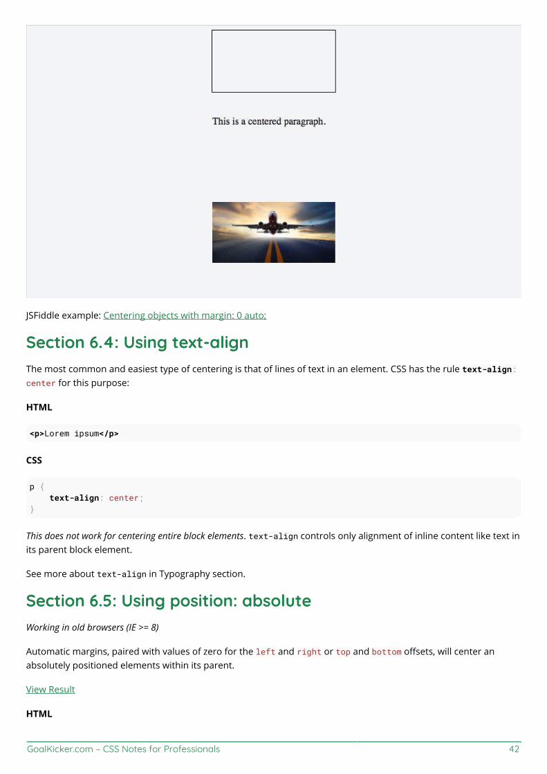
GoalKicker.com – CSS Notes for Professionals 42
JSFiddle example: Centering objects with margin: 0 auto;
Section 6.4: Using text-alignThe most common and easiest type of centering is that of lines of text in an element. CSS has the rule text-align:center for this purpose:
HTML
<p>Lorem ipsum</p>
CSS
p { text-align: center;}
This does not work for centering entire block elements. text-align controls only alignment of inline content like text inits parent block element.
See more about text-align in Typography section.
Section 6.5: Using position: absoluteWorking in old browsers (IE >= 8)
Automatic margins, paired with values of zero for the left and right or top and bottom offsets, will center anabsolutely positioned elements within its parent.
View Result
HTML
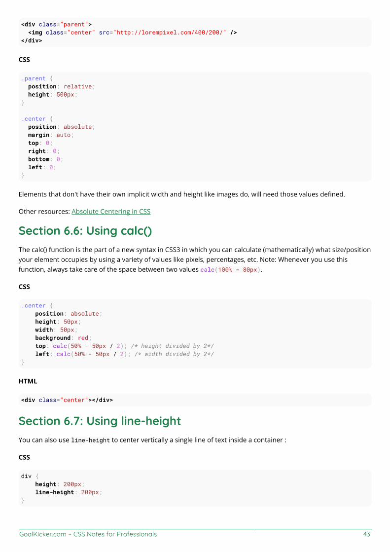
GoalKicker.com – CSS Notes for Professionals 43
<div class="parent"> <img class="center" src="http://lorempixel.com/400/200/" /></div>
CSS
.parent { position: relative; height: 500px;}
.center { position: absolute; margin: auto; top: 0; right: 0; bottom: 0; left: 0;}
Elements that don't have their own implicit width and height like images do, will need those values defined.
Other resources: Absolute Centering in CSS
Section 6.6: Using calc()The calc() function is the part of a new syntax in CSS3 in which you can calculate (mathematically) what size/positionyour element occupies by using a variety of values like pixels, percentages, etc. Note: Whenever you use thisfunction, always take care of the space between two values calc(100% - 80px).
CSS
.center { position: absolute; height: 50px; width: 50px; background: red; top: calc(50% - 50px / 2); /* height divided by 2*/ left: calc(50% - 50px / 2); /* width divided by 2*/}
HTML
<div class="center"></div>
Section 6.7: Using line-heightYou can also use line-height to center vertically a single line of text inside a container :
CSS
div { height: 200px; line-height: 200px;}

GoalKicker.com – CSS Notes for Professionals 44
That's quite ugly, but can be useful inside an <input /> element. The line-height property works only when thetext to be centered spans a single line. If the text wraps into multiple lines, the resulting output won't be centered.
Section 6.8: Vertical align anything with 3 lines of codeSupported by IE11+
View Result
Use these 3 lines to vertical align practically everything. Just make sure the div/image you apply the code to has aparent with a height.
CSS
div.vertical { position: relative; top: 50%; transform: translateY(-50%);}
HTML
<div class="vertical">Vertical aligned text!</div>
Section 6.9: Centering in relation to another itemWe will see how to center content based on the height of a near element.
Compatibility: IE8+, all other modern browsers.
HTML
<div class="content"> <div class="position-container"> <div class="thumb"> <img src="http://lorempixel.com/400/200/"> </div> <div class="details"> <p class="banner-title">text 1</p> <p class="banner-text">content content content content content content content contentcontent content content content content content</p> <button class="btn">button</button> </div> </div></div>
CSS
.content * { box-sizing: border-box;}.content .position-container { display: table;}.content .details { display: table-cell; vertical-align: middle;
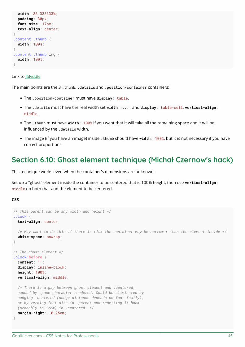
GoalKicker.com – CSS Notes for Professionals 45
width: 33.333333%; padding: 30px; font-size: 17px; text-align: center;}.content .thumb { width: 100%;}.content .thumb img { width: 100%;}
Link to JSFiddle
The main points are the 3 .thumb, .details and .position-container containers:
The .position-container must have display: table.
The .details must have the real width set width: .... and display: table-cell, vertical-align:middle.
The .thumb must have width: 100% if you want that it will take all the remaining space and it will beinfluenced by the .details width.
The image (if you have an image) inside .thumb should have width: 100%, but it is not necessary if you havecorrect proportions.
Section 6.10: Ghost element technique (Michał Czernow's hack)This technique works even when the container's dimensions are unknown.
Set up a "ghost" element inside the container to be centered that is 100% height, then use vertical-align:middle on both that and the element to be centered.
CSS
/* This parent can be any width and height */.block { text-align: center;
/* May want to do this if there is risk the container may be narrower than the element inside */ white-space: nowrap;} /* The ghost element */.block:before { content: ''; display: inline-block; height: 100%; vertical-align: middle;
/* There is a gap between ghost element and .centered, caused by space character rendered. Could be eliminated by nudging .centered (nudge distance depends on font family), or by zeroing font-size in .parent and resetting it back (probably to 1rem) in .centered. */ margin-right: -0.25em;}
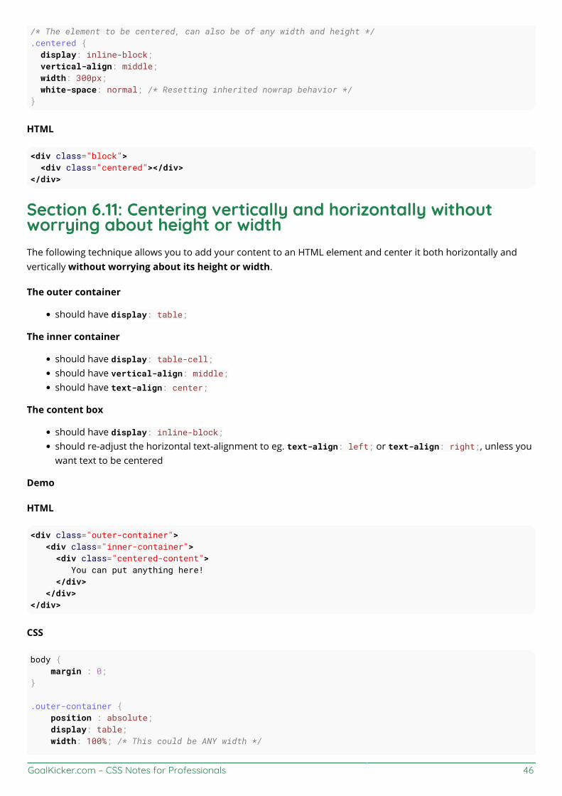
GoalKicker.com – CSS Notes for Professionals 46
/* The element to be centered, can also be of any width and height */.centered { display: inline-block; vertical-align: middle; width: 300px; white-space: normal; /* Resetting inherited nowrap behavior */}
HTML
<div class="block"> <div class="centered"></div></div>
Section 6.11: Centering vertically and horizontally withoutworrying about height or widthThe following technique allows you to add your content to an HTML element and center it both horizontally andvertically without worrying about its height or width.
The outer container
should have display: table;
The inner container
should have display: table-cell;should have vertical-align: middle;should have text-align: center;
The content box
should have display: inline-block;should re-adjust the horizontal text-alignment to eg. text-align: left; or text-align: right;, unless youwant text to be centered
Demo
HTML
<div class="outer-container"> <div class="inner-container"> <div class="centered-content"> You can put anything here! </div> </div></div>
CSS
body { margin : 0;}
.outer-container { position : absolute; display: table; width: 100%; /* This could be ANY width */

GoalKicker.com – CSS Notes for Professionals 47
height: 100%; /* This could be ANY height */ background: #ccc;}
.inner-container { display: table-cell; vertical-align: middle; text-align: center;}
.centered-content { display: inline-block; text-align: left; background: #fff; padding: 20px; border: 1px solid #000;}
See also this Fiddle!
Section 6.12: Vertically align an image inside divHTML
<div class="wrap"> <img src="http://lorempixel.com/400/200/" /></div>
CSS
.wrap { height: 50px;/* max image height */ width: 100px; border: 1px solid blue; text-align: center;}.wrap:before { content:""; display: inline-block; height: 100%; vertical-align: middle; width: 1px;}
img { vertical-align: middle;}
Section 6.13: Centering with fixed sizeIf the size of your content is fixed, you can use absolute positioning to 50% with margin that reduces half of yourcontent's width and height:
HTML
<div class="center"> Center vertically and horizontally</div>
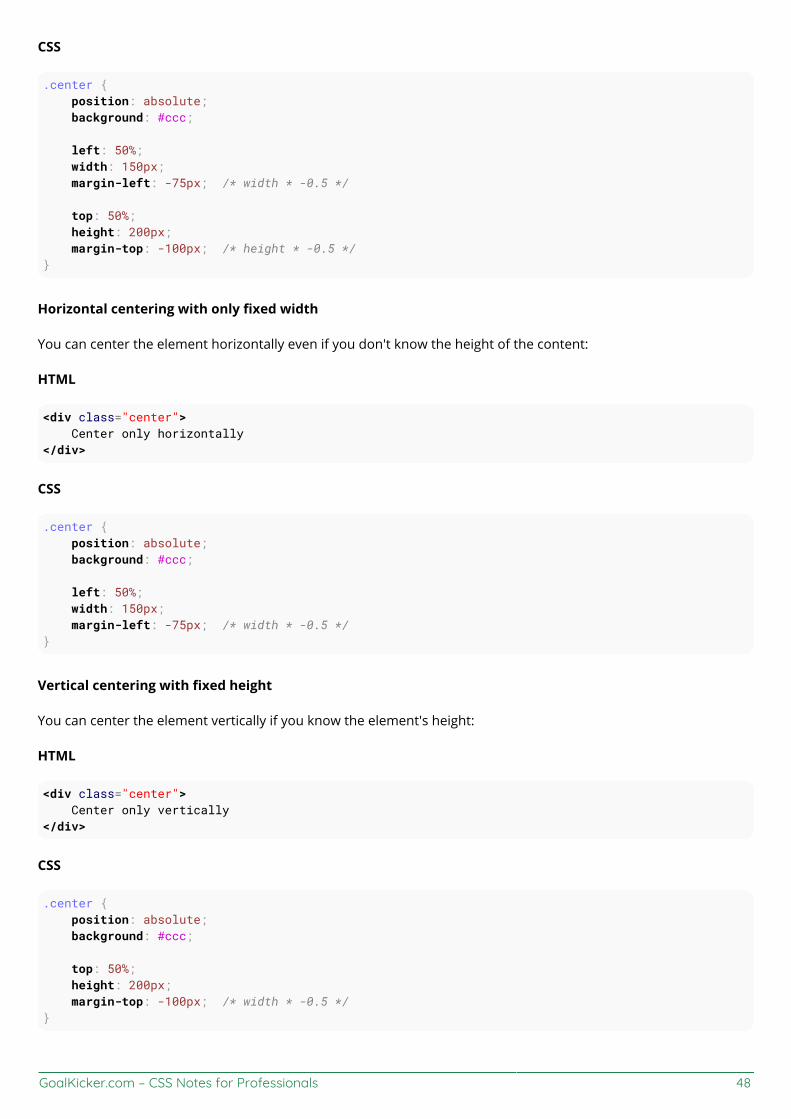
GoalKicker.com – CSS Notes for Professionals 48
CSS
.center { position: absolute; background: #ccc;
left: 50%; width: 150px; margin-left: -75px; /* width * -0.5 */
top: 50%; height: 200px; margin-top: -100px; /* height * -0.5 */}
Horizontal centering with only fixed width
You can center the element horizontally even if you don't know the height of the content:
HTML
<div class="center"> Center only horizontally</div>
CSS
.center { position: absolute; background: #ccc;
left: 50%; width: 150px; margin-left: -75px; /* width * -0.5 */}
Vertical centering with fixed height
You can center the element vertically if you know the element's height:
HTML
<div class="center"> Center only vertically</div>
CSS
.center { position: absolute; background: #ccc;
top: 50%; height: 200px; margin-top: -100px; /* width * -0.5 */}

GoalKicker.com – CSS Notes for Professionals 49
Section 6.14: Vertically align dynamic height elementsApplying css intuitively doesn't produce the desired results because
vertical-align:middle isn't applicable to block-level elementsmargin-top:auto and margin-bottom:auto used values would compute as zeromargin-top:-50% percentage-based margin values are calculated relative to the width of containing block
For widest browser support, a workaround with helper elements:
HTML
<div class="vcenter--container"> <div class="vcenter--helper"> <div class="vcenter--content"> <!--stuff--> </div> </div></div>
CSS
.vcenter--container { display: table; height: 100%; position: absolute; overflow: hidden; width: 100%;}.vcenter--helper { display: table-cell; vertical-align: middle;}.vcenter--content { margin: 0 auto; width: 200px;}
jsfiddle from original question. This approach
works with dynamic height elementsrespects content flowis supported by legacy browsers
Section 6.15: Horizontal and Vertical centering using tablelayoutOne could easily center a child element using table display property.
HTML
<div class="wrapper"> <div class="parent"> <div class="child"></div> </div></div>

GoalKicker.com – CSS Notes for Professionals 50
CSS
.wrapper { display: table; vertical-align: center; width: 200px; height: 200px; background-color: #9e9e9e;}.parent { display: table-cell; vertical-align: middle; text-align: center;}.child { display: inline-block; vertical-align: middle; text-align: center; width: 100px; height: 100px; background-color: teal;}

GoalKicker.com – CSS Notes for Professionals 51
Chapter 7: The Box ModelParameter Detailcontent-box Width and height of the element only includes content area.padding-box Width and height of the element includes content and padding.border-box Width and height of the element includes content, padding and border.initial Sets the box model to its default state.inherit Inherits the box model of the parent element.
Section 7.1: What is the Box Model?The Edges
The browser creates a rectangle for each element in the HTML document. The Box Model describes how thepadding, border, and margin are added to the content to create this rectangle.
Diagram from CSS2.2 Working Draft
The perimeter of each of the four areas is called an edge. Each edge defines a box.
The innermost rectangle is the content box. The width and height of this depends on the element'srendered content (text, images and any child elements it may have).Next is the padding box, as defined by the padding property. If there is no padding width defined, thepadding edge is equal to the content edge.Then we have the border box, as defined by the border property. If there is no border width defined, theborder edge is equal to the padding edge.The outermost rectangle is the margin box, as defined by the margin property. If there is no margin widthdefined, the margin edge is equal to the border edge.
Examplediv { border: 5px solid red; margin: 50px; padding: 20px;

GoalKicker.com – CSS Notes for Professionals 52
}
This CSS styles all div elements to have a top, right, bottom and left border of 5px in width; a top, right, bottom andleft margin of 50px; and a top, right, bottom, and left padding of 20px. Ignoring content, our generated box will looklike this:
Screenshot of Google Chrome's Element Styles panel
As there is no content, the content region (the blue box in the middle) has no height or width (0px by 0px).The padding box by default is the same size as the content box, plus the 20px width on all four edges we'redefining above with the padding property (40px by 40px).The border box is the same size as the padding box, plus the 5px width we're defining above with the borderproperty (50px by 50px).Finally the margin box is the same size as the border box, plus the 50px width we're defining above with themargin property (giving our element a total size of 150px by 150px).
Now lets give our element a sibling with the same style. The browser looks at the Box Model of both elements towork out where in relation to the previous element's content the new element should be positioned:
The content of each of element is separated by a 150px gap, but the two elements' boxes touch each other.
If we then modify our first element to have no right margin, the right margin edge would be in the same position asthe right border edge, and our two elements would now look like this:
Section 7.2: box-sizingThe default box model (content-box) can be counter-intuitive, since the width / height for an element will notrepresent its actual width or height on screen as soon as you start adding padding and border styles to the
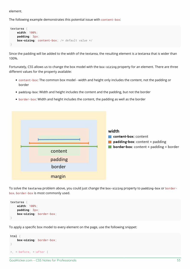
GoalKicker.com – CSS Notes for Professionals 53
element.
The following example demonstrates this potential issue with content-box:
textarea { width: 100%; padding: 3px; box-sizing: content-box; /* default value */}
Since the padding will be added to the width of the textarea, the resulting element is a textarea that is wider than100%.
Fortunately, CSS allows us to change the box model with the box-sizing property for an element. There are threedifferent values for the property available:
content-box: The common box model - width and height only includes the content, not the padding orborder
padding-box: Width and height includes the content and the padding, but not the border
border-box: Width and height includes the content, the padding as well as the border
To solve the textarea problem above, you could just change the box-sizing property to padding-box or border-box. border-box is most commonly used.
textarea { width: 100%; padding: 3px; box-sizing: border-box;}
To apply a specific box model to every element on the page, use the following snippet:
html { box-sizing: border-box;}
*, *:before, *:after {
GoalKicker.com – CSS Notes for Professionals 54
box-sizing: inherit;}
In this coding box-sizing:border-box; is not directly applied to *, so you can easily overwrite this property onindividual elements.

GoalKicker.com – CSS Notes for Professionals 55
Chapter 8: MarginsParameter Details
0 set margin to none
auto used for centering, by evenly setting values on each side
units (e.g. px) see parameter section in Units for a list of valid units
inherit inherit margin value from parent element
initial restore to initial value
Section 8.1: Margin CollapsingWhen two margins are touching each other vertically, they are collapsed. When two margins touch horizontally,they do not collapse.
Example of adjacent vertical margins:
Consider the following styles and markup:
div{ margin: 10px;}
<div> some content</div><div> some more content</div>
They will be 10px apart since vertical margins collapse over one and other. (The spacing will not be the sum of twomargins.)
Example of adjacent horizontal margins:
Consider the following styles and markup:
span{ margin: 10px;}
<span>some</span><span>content</span>
They will be 20px apart since horizontal margins don't collapse over one and other. (The spacing will be the sum oftwo margins.)
Overlapping with different sizes
.top{ margin: 10px;}.bottom{ margin: 15px;}
<div class="top"> some content

GoalKicker.com – CSS Notes for Professionals 56
</div><div class="bottom"> some more content</div>
These elements will be spaced 15px apart vertically. The margins overlap as much as they can, but the largermargin will determine the spacing between the elements.
Overlapping margin gotcha
.outer-top{ margin: 10px;}.inner-top{ margin: 15px;}.outer-bottom{ margin: 20px;}.inner-bottom{ margin: 25px;}
<div class="outer-top"> <div class="inner-top"> some content </div></div><div class="outer-bottom"> <div class="inner-bottom"> some more content </div></div>
What will be the spacing between the two texts? (hover to see answer)
The spacing will be 25px. Since all four margins are touching each other, they will collapse, thus using thelargest margin of the four.
Now, what about if we add some borders to the markup above.
div{ border: 1px solid red;}
What will be the spacing between the two texts? (hover to see answer)
The spacing will be 59px! Now only the margins of .outer-top and .outer-bottom touch each other, andare the only collapsed margins. The remaining margins are separated by the borders. So we have 1px +10px + 1px + 15px + 20px + 1px + 25px + 1px. (The 1px's are the borders...)
Collapsing Margins Between Parent and Child Elements:
HTML:
GoalKicker.com – CSS Notes for Professionals 57
<h1>Title</h1><div> <p>Paragraph</p></div>
CSS
h1 { margin: 0; background: #cff;}div { margin: 50px 0 0 0; background: #cfc;}p { margin: 25px 0 0 0; background: #cf9;}
In the example above, only the largest margin applies. You may have expected that the paragraph would be located60px from the h1 (since the div element has a margin-top of 40px and the p has a 20px margin-top). This does nothappen because the margins collapse together to form one margin.
Section 8.2: Apply Margin on a Given SideDirection-Specific Properties
CSS allows you to specify a given side to apply margin to. The four properties provided for this purpose are:
margin-left
margin-right
margin-top
margin-bottom
The following code would apply a margin of 30 pixels to the left side of the selected div. View Result
HTML
<div id="myDiv"></div>
CSS
#myDiv { margin-left: 30px; height: 40px; width: 40px; background-color: red;}
Parameter Detailsmargin-left The direction in which the margin should be applied.
30px The width of the margin.
Specifying Direction Using Shorthand Property
The standard margin property can be expanded to specify differing widths to each side of the selected elements.The syntax for doing this is as follows:
GoalKicker.com – CSS Notes for Professionals 58
margin: <top> <right> <bottom> <left>;
The following example applies a zero-width margin to the top of the div, a 10px margin to the right side, a 50pxmargin to the left side, and a 100px margin to the left side. View Result
HTML
<div id="myDiv"></div>
CSS
#myDiv { margin: 0 10px 50px 100px; height: 40px; width: 40px; background-color: red;}
Section 8.3: Margin property simplificationp { margin:1px; /* 1px margin in all directions */ /*equals to:*/ margin:1px 1px; /*equals to:*/ margin:1px 1px 1px; /*equals to:*/ margin:1px 1px 1px 1px;}
Another exapmle:
p{ margin:10px 15px; /* 10px margin-top & bottom And 15px margin-right & left*/ /*equals to:*/ margin:10px 15px 10px 15px; /*equals to:*/ margin:10px 15px 10px; /* margin left will be calculated from the margin right value (=15px) */}
Section 8.4: Horizontally center elements on a page usingmarginAs long as the element is a block, and it has an explicitly set width value, margins can be used to center blockelements on a page horizontally.

GoalKicker.com – CSS Notes for Professionals 59
We add a width value that is lower than the width of the window and the auto property of margin then distributesthe remaining space to the left and the right:
#myDiv { width:80%; margin:0 auto;}
In the example above we use the shorthand margin declaration to first set 0 to the top and bottom margin values(although this could be any value) and then we use auto to let the browser allocate the space automatically to theleft and right margin values.
In the example above, the #myDiv element is set to 80% width which leaves use 20% leftover. The browserdistributes this value to the remaining sides so:
(100% - 80%) / 2 = 10%
Section 8.5: Example 1:It is obvious to assume that the percentage value of margin to margin-left and margin-right would be relative toits parent element.
.parent { width : 500px; height: 300px;}
.child { width : 100px; height: 100px; margin-left: 10%; /* (parentWidth * 10/100) => 50px */}
But that is not the case, when comes to margin-top and margin-bottom. Both these properties, in percentages,aren't relative to the height of the parent container but to the width of the parent container.
So,
.parent { width : 500px; height: 300px;}
.child { width : 100px; height: 100px; margin-left: 10%; /* (parentWidth * 10/100) => 50px */ margin-top: 20%; /* (parentWidth * 20/100) => 100px */}
Section 8.6: Negative marginsMargin is one of a few CSS properties that can be set to negative values. This property can be used to overlapelements without absolute positioning.
div{

GoalKicker.com – CSS Notes for Professionals 60
display: inline;}
#over{ margin-left: -20px;}
<div>Base div</div><div id="over">Overlapping div</div>
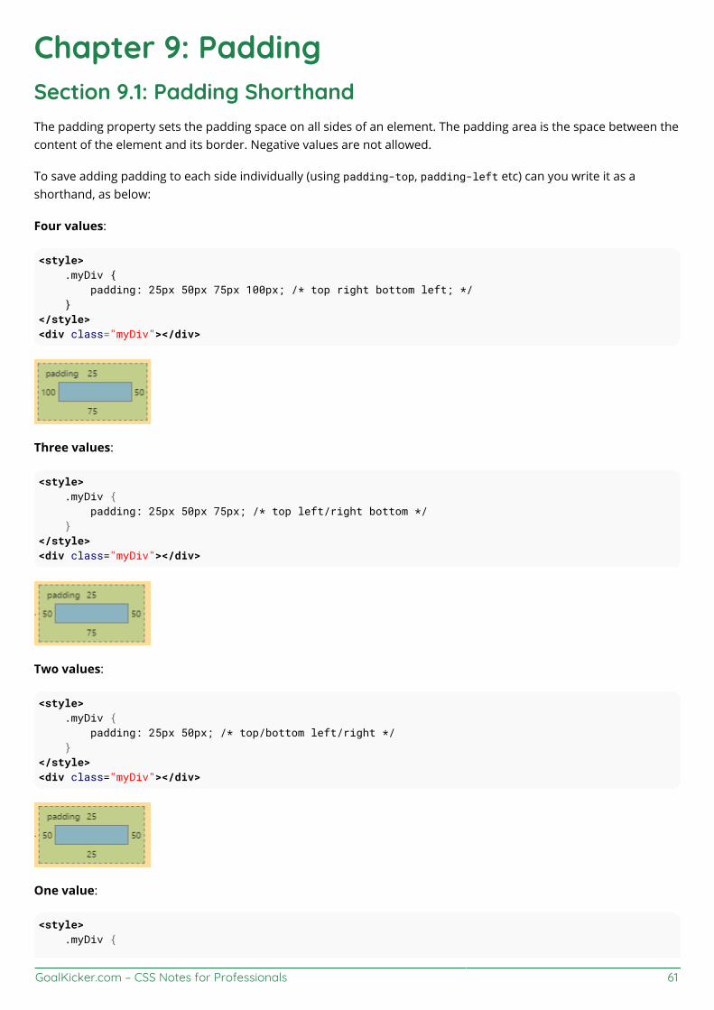
GoalKicker.com – CSS Notes for Professionals 61
Chapter 9: PaddingSection 9.1: Padding ShorthandThe padding property sets the padding space on all sides of an element. The padding area is the space between thecontent of the element and its border. Negative values are not allowed.
To save adding padding to each side individually (using padding-top, padding-left etc) can you write it as ashorthand, as below:
Four values:
<style> .myDiv { padding: 25px 50px 75px 100px; /* top right bottom left; */ }</style><div class="myDiv"></div>
Three values:
<style> .myDiv { padding: 25px 50px 75px; /* top left/right bottom */ }</style><div class="myDiv"></div>
Two values:
<style> .myDiv { padding: 25px 50px; /* top/bottom left/right */ }</style><div class="myDiv"></div>
One value:
<style> .myDiv {
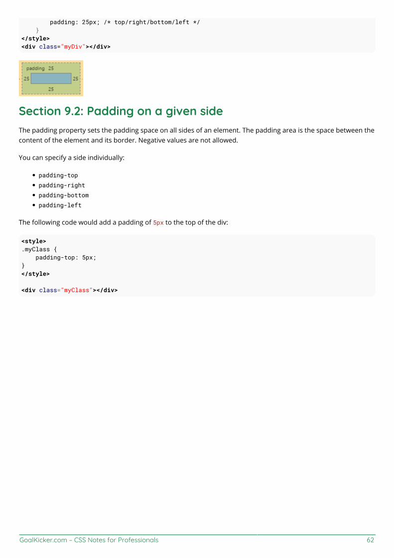
GoalKicker.com – CSS Notes for Professionals 62
padding: 25px; /* top/right/bottom/left */ }</style><div class="myDiv"></div>
Section 9.2: Padding on a given sideThe padding property sets the padding space on all sides of an element. The padding area is the space between thecontent of the element and its border. Negative values are not allowed.
You can specify a side individually:
padding-top
padding-right
padding-bottom
padding-left
The following code would add a padding of 5px to the top of the div:
<style>.myClass { padding-top: 5px;}</style>
<div class="myClass"></div>

GoalKicker.com – CSS Notes for Professionals 63
Chapter 10: BorderSection 10.1: border-radiusThe border-radius property allows you to change the shape of the basic box model.
Every corner of an element can have up to two values, for the vertical and horizontal radius of that corner (for amaximum of 8 values).
The first set of values defines the horizontal radius. The optional second set of values, preceded by a ‘/’ , defines thevertical radius. If only one set of values is supplied, it is used for both the vertical and horizontal radius.
border-radius: 10px 5% / 20px 25em 30px 35em;
The 10px is the horizontal radius of the top-left-and-bottom-right. And the 5% is the horizontal radius of the top-right-and-bottom-left. The other four values after '/' are the vertical radii for top-left, top-right, bottom-right andbottom-left.
As with many CSS properties, shorthands can be used for any or all possible values. You can therefore specifyanything from one to eight values. The following shorthand allows you to set the horizontal and vertical radius ofevery corner to the same value:
HTML:
<div class='box'></div>
CSS:
.box { width: 250px; height: 250px; background-color: black; border-radius: 10px;}
Border-radius is most commonly used to convert box elements into circles. By setting the border-radius to half ofthe length of a square element, a circular element is created:
.circle { width: 200px; height: 200px; border-radius: 100px;}

GoalKicker.com – CSS Notes for Professionals 64
Because border-radius accepts percentages, it is common to use 50% to avoid manually calculating the border-radius value:
.circle { width: 150px; height: 150px; border-radius: 50%;}
If the width and height properties are not equal, the resulting shape will be an oval rather than a circle.
Browser specific border-radius example:
-webkit-border-top-right-radius: 4px; -webkit-border-bottom-right-radius: 4px; -webkit-border-bottom-left-radius: 0; -webkit-border-top-left-radius: 0; -moz-border-radius-topright: 4px; -moz-border-radius-bottomright: 4px; -moz-border-radius-bottomleft: 0; -moz-border-radius-topleft: 0; border-top-right-radius: 4px; border-bottom-right-radius: 4px; border-bottom-left-radius: 0; border-top-left-radius: 0;
Section 10.2: border-styleThe border-style property sets the style of an element's border. This property can have from one to four values(for every side of the element one value.)
Examples:
border-style: dotted;
border-style: dotted solid double dashed;
border-style can also have the values none and hidden. They have the same effect, except hidden works forborder conflict resolution for <table> elements. In a <table> with multiple borders, none has the lowest priority(meaning in a conflict, the border would show), and hidden has the highest priority (meaning in a conflict, theborder would not show).
GoalKicker.com – CSS Notes for Professionals 65
Section 10.3: Multiple BordersUsing outline:
.div1{ border: 3px solid black; outline: 6px solid blue; width: 100px; height: 100px; margin: 20px;}
Using box-shadow:
.div2{ border: 5px solid green; box-shadow: 0px 0px 0px 4px #000; width: 100px; height: 100px; margin: 20px;}
Using a pseudo element:
.div3 { position: relative; border: 5px solid #000; width: 100px; height: 100px; margin: 20px;}.div3:before { content: " "; position: absolute; border: 5px solid blue; z-index: -1; top: 5px; left: 5px; right: 5px; bottom: 5px;}

GoalKicker.com – CSS Notes for Professionals 66
http://jsfiddle.net/MadalinaTn/bvqpcohm/2/
Section 10.4: border (shorthands)In most cases you want to define several border properties (border-width, border-style and border-color) for allsides of an element.
Instead of writing:
border-width: 1px;border-style: solid;border-color: #000;
You can simply write:
border: 1px solid #000;
These shorthands are also available for every side of an element: border-top, border-left, border-right andborder-bottom. So you can do:
border-top: 2px double #aaaaaa;
Section 10.5: border-collapseThe border-collapse property applies only to tables (and elements displayed as display: table or inline-table) and sets whether the table borders are collapsed into a single border or detached as in standard HTML.
table { border-collapse: separate; /* default */ border-spacing: 2px; /* Only works if border-collapse is separate */}
Also see Tables - border-collapse documentation entry
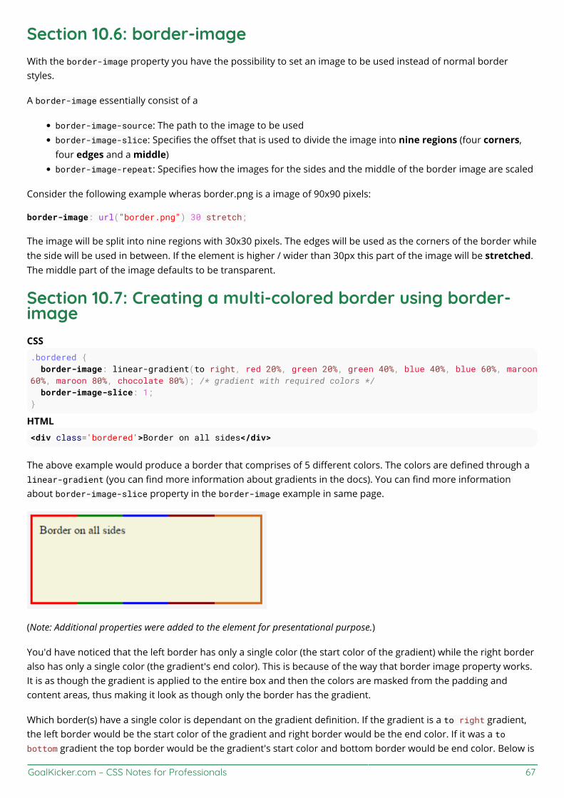
GoalKicker.com – CSS Notes for Professionals 67
Section 10.6: border-imageWith the border-image property you have the possibility to set an image to be used instead of normal borderstyles.
A border-image essentially consist of a
border-image-source: The path to the image to be usedborder-image-slice: Specifies the offset that is used to divide the image into nine regions (four corners,four edges and a middle)border-image-repeat: Specifies how the images for the sides and the middle of the border image are scaled
Consider the following example wheras border.png is a image of 90x90 pixels:
border-image: url("border.png") 30 stretch;
The image will be split into nine regions with 30x30 pixels. The edges will be used as the corners of the border whilethe side will be used in between. If the element is higher / wider than 30px this part of the image will be stretched.The middle part of the image defaults to be transparent.
Section 10.7: Creating a multi-colored border using border-imageCSS.bordered { border-image: linear-gradient(to right, red 20%, green 20%, green 40%, blue 40%, blue 60%, maroon60%, maroon 80%, chocolate 80%); /* gradient with required colors */ border-image-slice: 1;}
HTML<div class='bordered'>Border on all sides</div>
The above example would produce a border that comprises of 5 different colors. The colors are defined through alinear-gradient (you can find more information about gradients in the docs). You can find more informationabout border-image-slice property in the border-image example in same page.
(Note: Additional properties were added to the element for presentational purpose.)
You'd have noticed that the left border has only a single color (the start color of the gradient) while the right borderalso has only a single color (the gradient's end color). This is because of the way that border image property works.It is as though the gradient is applied to the entire box and then the colors are masked from the padding andcontent areas, thus making it look as though only the border has the gradient.
Which border(s) have a single color is dependant on the gradient definition. If the gradient is a to right gradient,the left border would be the start color of the gradient and right border would be the end color. If it was a tobottom gradient the top border would be the gradient's start color and bottom border would be end color. Below is
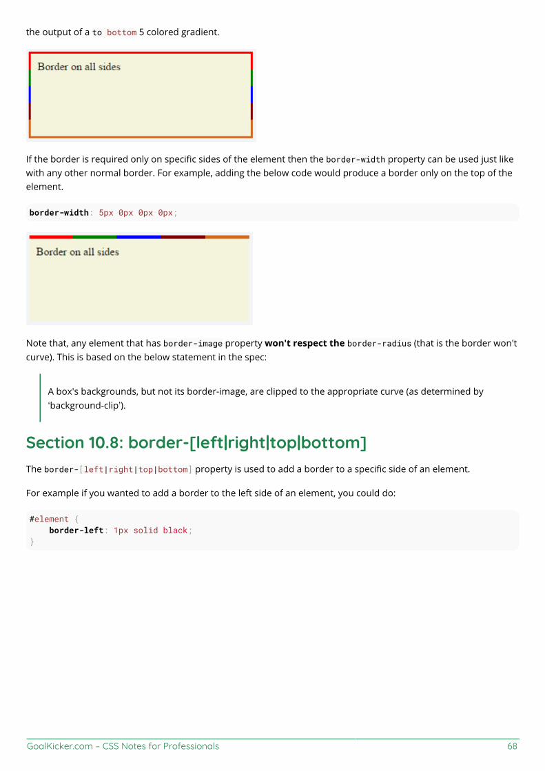
GoalKicker.com – CSS Notes for Professionals 68
the output of a to bottom 5 colored gradient.
If the border is required only on specific sides of the element then the border-width property can be used just likewith any other normal border. For example, adding the below code would produce a border only on the top of theelement.
border-width: 5px 0px 0px 0px;
Note that, any element that has border-image property won't respect the border-radius (that is the border won'tcurve). This is based on the below statement in the spec:
A box's backgrounds, but not its border-image, are clipped to the appropriate curve (as determined by‘background-clip’).
Section 10.8: border-[left|right|top|bottom]The border-[left|right|top|bottom] property is used to add a border to a specific side of an element.
For example if you wanted to add a border to the left side of an element, you could do:
#element { border-left: 1px solid black;}
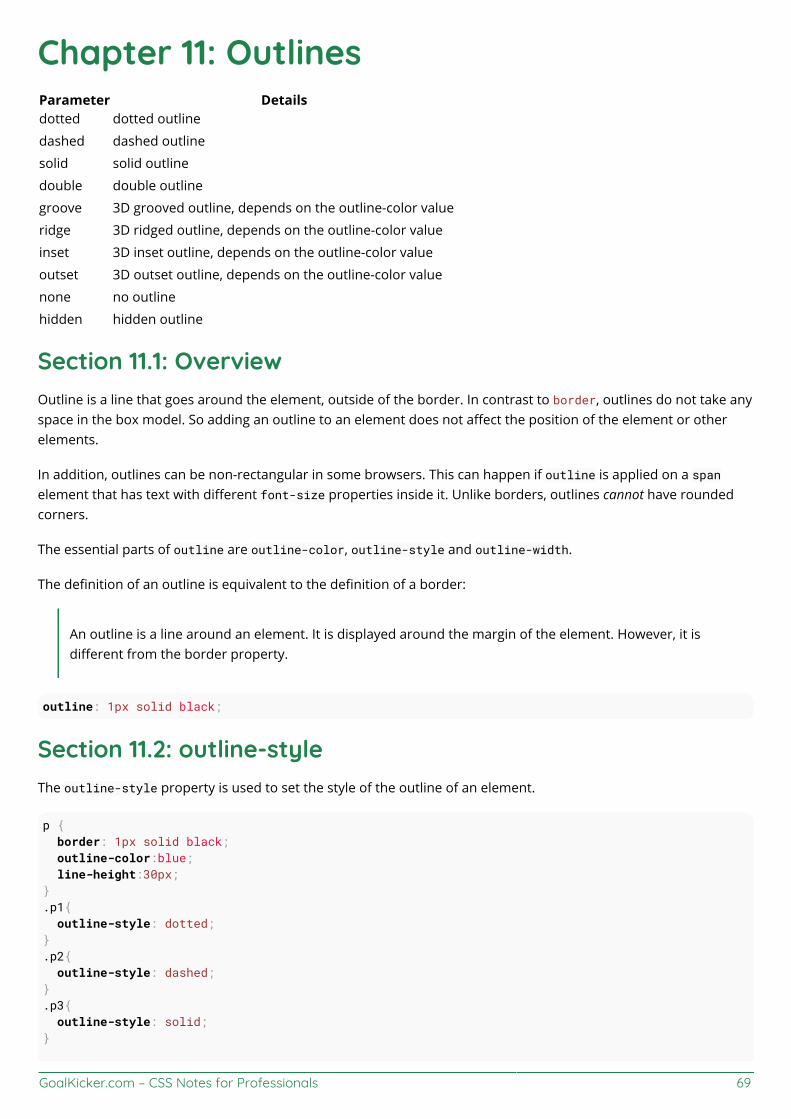
GoalKicker.com – CSS Notes for Professionals 69
Chapter 11: OutlinesParameter Detailsdotted dotted outline
dashed dashed outline
solid solid outline
double double outline
groove 3D grooved outline, depends on the outline-color value
ridge 3D ridged outline, depends on the outline-color value
inset 3D inset outline, depends on the outline-color value
outset 3D outset outline, depends on the outline-color value
none no outline
hidden hidden outline
Section 11.1: OverviewOutline is a line that goes around the element, outside of the border. In contrast to border, outlines do not take anyspace in the box model. So adding an outline to an element does not affect the position of the element or otherelements.
In addition, outlines can be non-rectangular in some browsers. This can happen if outline is applied on a spanelement that has text with different font-size properties inside it. Unlike borders, outlines cannot have roundedcorners.
The essential parts of outline are outline-color, outline-style and outline-width.
The definition of an outline is equivalent to the definition of a border:
An outline is a line around an element. It is displayed around the margin of the element. However, it isdifferent from the border property.
outline: 1px solid black;
Section 11.2: outline-styleThe outline-style property is used to set the style of the outline of an element.
p { border: 1px solid black; outline-color:blue; line-height:30px;}.p1{ outline-style: dotted;}.p2{ outline-style: dashed;}.p3{ outline-style: solid;}
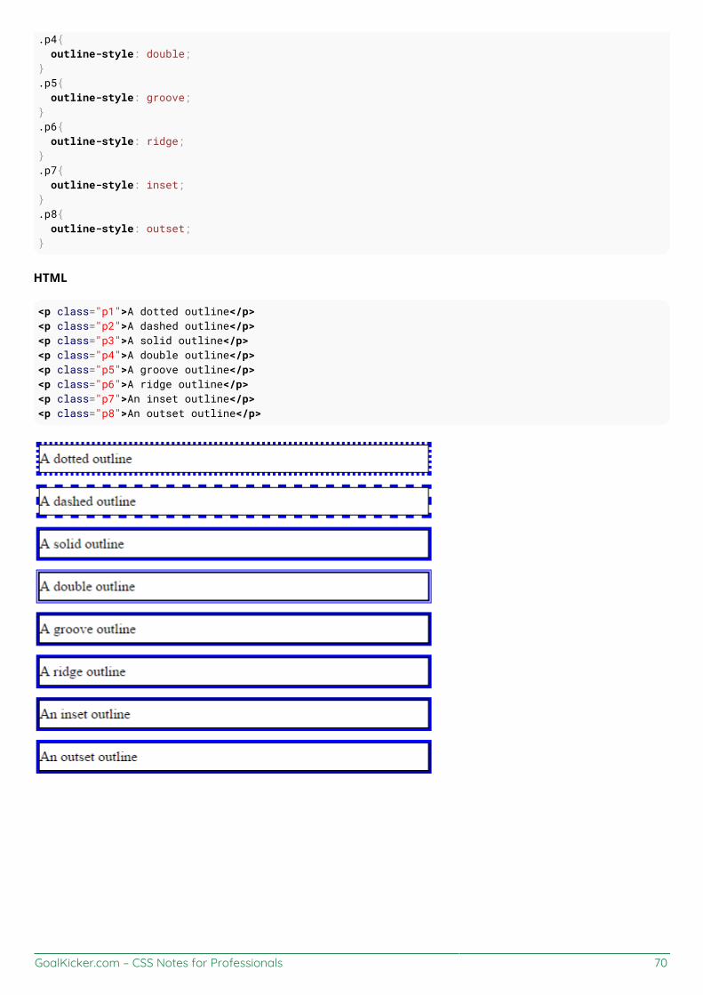
GoalKicker.com – CSS Notes for Professionals 70
.p4{ outline-style: double;}.p5{ outline-style: groove;}.p6{ outline-style: ridge;}.p7{ outline-style: inset;}.p8{ outline-style: outset;}
HTML
<p class="p1">A dotted outline</p><p class="p2">A dashed outline</p><p class="p3">A solid outline</p><p class="p4">A double outline</p><p class="p5">A groove outline</p><p class="p6">A ridge outline</p><p class="p7">An inset outline</p><p class="p8">An outset outline</p>

GoalKicker.com – CSS Notes for Professionals 71
Chapter 12: OverflowOverflow Value Detailsvisible Shows all overflowing content outside the elementscroll Hides the overflowing content and adds a scroll barhidden Hides the overflowing content, both scroll bars disappear and the page becomes fixedauto Same as scroll if content overflows, but doesn't add scroll bar if content fitsinherit Inherit's the parent element's value for this property
Section 12.1: overflow-wrapoverflow-wrap tells a browser that it can break a line of text inside a targeted element onto multiple lines in anotherwise unbreakable place. Helpful in preventing an long string of text causing layout problems due tooverflowing it's container.
CSS
div { width:100px; outline: 1px dashed #bbb;}
#div1 { overflow-wrap:normal;}
#div2 { overflow-wrap:break-word;}
HTML
<div id="div1"> <strong>#div1</strong>: Small words are displayed normally, but a long word like <spanstyle="red;">supercalifragilisticexpialidocious</span> is too long so it will overflow past theedge of the line-break</div>
<div id="div2"> <strong>#div2</strong>: Small words are displayed normally, but a long word like <spanstyle="red;">supercalifragilisticexpialidocious</span> will be split at the line break and continueon the next line.</div>
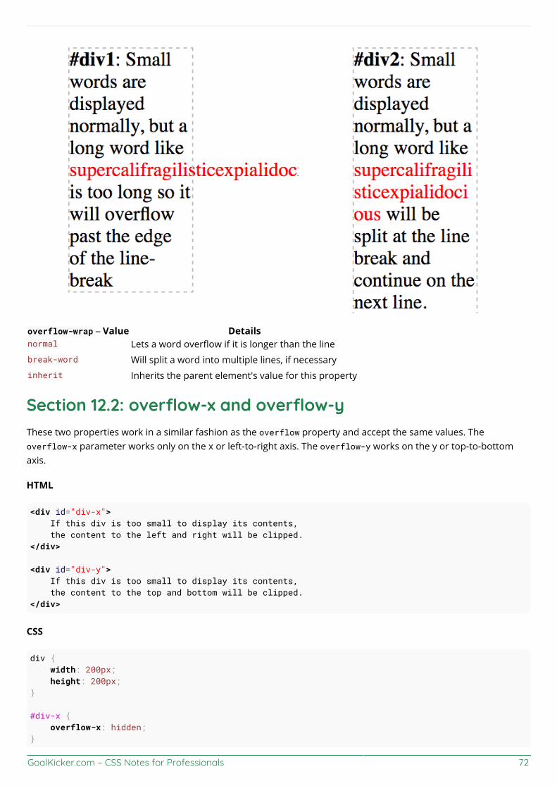
GoalKicker.com – CSS Notes for Professionals 72
overflow-wrap – Value Detailsnormal Lets a word overflow if it is longer than the linebreak-word Will split a word into multiple lines, if necessaryinherit Inherits the parent element's value for this property
Section 12.2: overflow-x and overflow-yThese two properties work in a similar fashion as the overflow property and accept the same values. Theoverflow-x parameter works only on the x or left-to-right axis. The overflow-y works on the y or top-to-bottomaxis.
HTML
<div id="div-x"> If this div is too small to display its contents, the content to the left and right will be clipped.</div>
<div id="div-y"> If this div is too small to display its contents, the content to the top and bottom will be clipped.</div>
CSS
div { width: 200px; height: 200px;}
#div-x { overflow-x: hidden;}
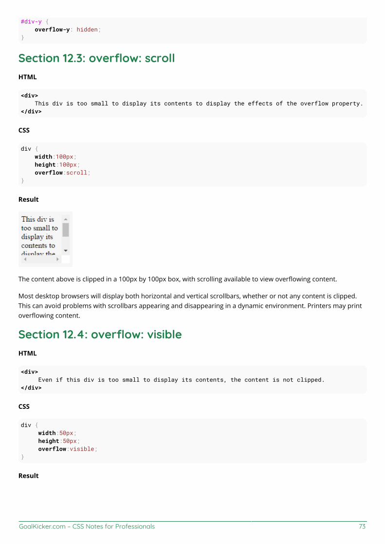
GoalKicker.com – CSS Notes for Professionals 73
#div-y { overflow-y: hidden;}
Section 12.3: overflow: scrollHTML
<div> This div is too small to display its contents to display the effects of the overflow property.</div>
CSS
div { width:100px; height:100px; overflow:scroll;}
Result
The content above is clipped in a 100px by 100px box, with scrolling available to view overflowing content.
Most desktop browsers will display both horizontal and vertical scrollbars, whether or not any content is clipped.This can avoid problems with scrollbars appearing and disappearing in a dynamic environment. Printers may printoverflowing content.
Section 12.4: overflow: visibleHTML
<div> Even if this div is too small to display its contents, the content is not clipped.</div>
CSS
div { width:50px; height:50px; overflow:visible;}
Result

GoalKicker.com – CSS Notes for Professionals 74
Content is not clipped and will be rendered outside the content box if it exceeds its container size.
Section 12.5: Block Formatting Context Created with OverflowUsing the overflow property with a value different to visible will create a new block formatting context. This isuseful for aligning a block element next to a floated element.
CSS
img { float:left; margin-right: 10px;} div { overflow:hidden; /* creates block formatting context */}
HTML
<img src="http://placehold.it/100x100"><div> <p>Lorem ipsum dolor sit amet, cum no paulo mollis pertinacia.</p> <p>Ad case omnis nam, mutat deseruisse persequeris eos ad, in tollit debitis sea.</p></div>
Result

GoalKicker.com – CSS Notes for Professionals 75
This example shows how paragraphs within a div with the overflow property set will interact with a floated image.
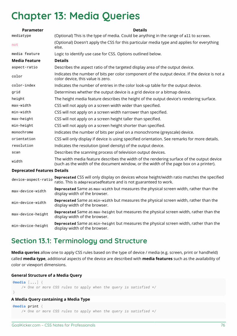
GoalKicker.com – CSS Notes for Professionals 76
Chapter 13: Media QueriesParameter Details
mediatype (Optional) This is the type of media. Could be anything in the range of all to screen.
not (Optional) Doesn't apply the CSS for this particular media type and applies for everythingelse.
media feature Logic to identify use case for CSS. Options outlined below.
Media Feature Detailsaspect-ratio Describes the aspect ratio of the targeted display area of the output device.
color Indicates the number of bits per color component of the output device. If the device is not acolor device, this value is zero.
color-index Indicates the number of entries in the color look-up table for the output device.grid Determines whether the output device is a grid device or a bitmap device.height The height media feature describes the height of the output device's rendering surface.max-width CSS will not apply on a screen width wider than specified.min-width CSS will not apply on a screen width narrower than specified.max-height CSS will not apply on a screen height taller than specified.min-height CSS will not apply on a screen height shorter than specified.monochrome Indicates the number of bits per pixel on a monochrome (greyscale) device.orientation CSS will only display if device is using specified orientation. See remarks for more details.resolution Indicates the resolution (pixel density) of the output device.scan Describes the scanning process of television output devices.
width The width media feature describes the width of the rendering surface of the output device(such as the width of the document window, or the width of the page box on a printer).
Deprecated Features Details
device-aspect-ratio Deprecated CSS will only display on devices whose height/width ratio matches the specifiedratio. This is adeprecatedfeature and is not guaranteed to work.
max-device-width Deprecated Same as max-width but measures the physical screen width, rather than thedisplay width of the browser.
min-device-width Deprecated Same as min-width but measures the physical screen width, rather than thedisplay width of the browser.
max-device-height Deprecated Same as max-height but measures the physical screen width, rather than thedisplay width of the browser.
min-device-height Deprecated Same as min-height but measures the physical screen width, rather than thedisplay width of the browser.
Section 13.1: Terminology and StructureMedia queries allow one to apply CSS rules based on the type of device / media (e.g. screen, print or handheld)called media type, additional aspects of the device are described with media features such as the availability ofcolor or viewport dimensions.
General Structure of a Media Query@media [...] { /* One or more CSS rules to apply when the query is satisfied */}
A Media Query containing a Media Type@media print { /* One or more CSS rules to apply when the query is satisfied */

GoalKicker.com – CSS Notes for Professionals 77
}
A Media Query containing a Media Type and a Media Feature@media screen and (max-width: 600px) { /* One or more CSS rules to apply when the query is satisfied */}
A Media Query containing a Media Feature (and an implicit Media Type of "all")@media (orientation: portrait) { /* One or more CSS rules to apply when the query is satisfied */}
Section 13.2: Basic Example@media screen and (min-width: 720px) { body { background-color: skyblue; }}
The above media query specifies two conditions:
The page must be viewed on a normal screen (not a printed page, projector, etc).1.The width of the user's view port must be at least 720 pixels.2.
If these conditions are met, the styles inside the media query will be active, and the background color of the pagewill be sky blue.
Media queries are applied dynamically. If on page load the conditions specified in the media query are met, the CSSwill be applied, but will be immediately disabled should the conditions cease to be met. Conversely, if theconditions are initially not met, the CSS will not be applied until the specified conditions are met.
In our example, if the user's view port width is initially greater than 720 pixels, but the user shrinks the browser'swidth, the background color will cease to be sky blue as soon as the user has resized the view port to less than 720pixels in width.
Section 13.3: mediatypeMedia queries have an optional mediatype parameter. This parameter is placed directly after the @mediadeclaration (@media mediatype), for example:
@media print { html { background-color: white; }}
The above CSS code will give the DOM HTML element a white background color when being printed.
The mediatype parameter has an optional not or only prefix that will apply the styles to everything except thespecified mediatype or only the specified media type, respectively. For example, the following code example willapply the style to every media type except print.
@media not print { html { background-color: green; }

GoalKicker.com – CSS Notes for Professionals 78
}
And the same way, for just showing it only on the screen, this can be used:
@media only screen { .fadeInEffects { display: block; }}
The list of mediatype can be understood better with the following table:
Media Type Descriptionall Apply to all devicesscreen Default computersprint Printers in general. Used to style print-versions of websiteshandheld PDA's, cellphones and hand-held devices with a small screenprojection For projected presentation, for example projectorsaural Speech Systemsbraille Braille tactile devicesembossed Paged braille printerstv Television-type devicestty Devices with a fixed-pitch character grid. Terminals, portables.
Section 13.4: Media Queries for Retina and Non RetinaScreensAlthough this works only for WebKit based browsers, this is helpful:
/* ----------- Non-Retina Screens ----------- */@media screen and (min-width: 1200px) and (max-width: 1600px) and (-webkit-min-device-pixel-ratio: 1) {}
/* ----------- Retina Screens ----------- */@media screen and (min-width: 1200px) and (max-width: 1600px) and (-webkit-min-device-pixel-ratio: 2) and (min-resolution: 192dpi) {}
Background Information
There are two types of pixels in the display. One is the logical pixels and the other is the physical pixels. Mostly, thephysical pixels always stay the same, because it is the same for all the display devices. The logical pixels changebased on the resolution of the devices to display higher quality pixels. The device pixel ratio is the ratio betweenphysical pixels and logical pixels. For instance, the MacBook Pro Retina, iPhone 4 and above report a device pixelratio of 2, because the physical linear resolution is double the logical resolution.
The reason why this works only with WebKit based browsers is because of:
GoalKicker.com – CSS Notes for Professionals 79
The vendor prefix -webkit- before the rule.This hasn't been implemented in engines other than WebKit and Blink.
Section 13.5: Width vs ViewportWhen we are using "width" with media queries it is important to set the meta tag correctly. Basic meta tag looks likethis and it needs to be put inside the <head> tag.
<meta name="viewport" content="width=device-width,initial-scale=1">
Why this is important?
Based on MDN's definition "width" is
The width media feature describes the width of the rendering surface of the output device (such as thewidth of the document window, or the width of the page box on a printer).
What does that mean?
View-port is the width of the device itself. If your screen resolution says the resolution is 1280 x 720, your view-portwidth is "1280px".
More often many devices allocate different pixel amount to display one pixel. For an example iPhone 6 Plus has1242 x 2208 resolution. But the actual viewport-width and viewport-height is 414 x 736. That means 3 pixels areused to create 1 pixel.
But if you did not set the meta tag correctly it will try to show your webpage with its native resolution which resultsin a zoomed out view (smaller texts and images).
Section 13.6: Using Media Queries to Target Dierent ScreenSizesOften times, responsive web design involves media queries, which are CSS blocks that are only executed if acondition is satisfied. This is useful for responsive web design because you can use media queries to specifydifferent CSS styles for the mobile version of your website versus the desktop version.
@media only screen and (min-width: 300px) and (max-width: 767px) { .site-title { font-size: 80%; }
/* Styles in this block are only applied if the screen size is atleast 300px wide, but no morethan 767px */}
@media only screen and (min-width: 768px) and (max-width: 1023px) { .site-title { font-size: 90%; }
/* Styles in this block are only applied if the screen size is atleast 768px wide, but no morethan 1023px */}
@media only screen and (min-width: 1024px) {

GoalKicker.com – CSS Notes for Professionals 80
.site-title { font-size: 120%; }
/* Styles in this block are only applied if the screen size is over 1024px wide. */}
Section 13.7: Use on link tag<link rel="stylesheet" media="min-width: 600px" href="example.css" />
This stylesheet is still downloaded but is applied only on devices with screen width larger than 600px.
Section 13.8: Media queries and IE8Media queries are not supported at all in IE8 and below.
A Javascript based workaround
To add support for IE8, you could use one of several JS solutions. For example, Respond can be added to addmedia query support for IE8 only with the following code :
<!--[if lt IE 9]><script src="respond.min.js"></script><![endif]-->
CSS Mediaqueries is another library that does the same thing. The code for adding that library to your HTML wouldbe identical :
<!--[if lt IE 9]><script src="css3-mediaqueries.js"></script><![endif]-->
The alternative
If you don't like a JS based solution, you should also consider adding an IE<9 only stylesheet where you adjust yourstyling specific to IE<9. For that, you should add the following HTML to your code:
<!--[if lt IE 9]><link rel="stylesheet" type="text/css" media="all" href="style-ielt9.css"/><![endif]-->
Note :
Technically it's one more alternative: using CSS hacks to target IE<9. It has the same impact as an IE<9 onlystylesheet, but you don't need a separate stylesheet for that. I do not recommend this option, though, as theyproduce invalid CSS code (which is but one of several reasons why the use of CSS hacks is generally frowned upontoday).

GoalKicker.com – CSS Notes for Professionals 81
Chapter 14: FloatsSection 14.1: Float an Image Within TextThe most basic use of a float is having text wrap around an image. The below code will produce two paragraphsand an image, with the second paragraph flowing around the image. Notice that it is always content after thefloated element that flows around the floated element.
HTML:
<p>Lorem ipsum dolor sit amet, consectetur adipiscing elit. Integer nec odio. Praesent libero. Sedcursus ante dapibus diam. Sed nisi. Nulla quis sem at nibh elementum imperdiet. Duis sagittisipsum. Praesent mauris. Fusce nec tellus sed augue semper porta. Mauris massa. Vestibulum laciniaarcu eget nulla. </p>
<img src="http://lorempixel.com/200/100/" />
<p>Class aptent taciti sociosqu ad litora torquent per conubia nostra, per inceptos himenaeos.Curabitur sodales ligula in libero. Sed dignissim lacinia nunc. Curabitur tortor. Pellentesquenibh. Aenean quam. In scelerisque sem at dolor. Maecenas mattis. Sed convallis tristique sem. Proinut ligula vel nunc egestas porttitor. Morbi lectus risus, iaculis vel, suscipit quis, luctus non,massa. Fusce ac turpis quis ligula lacinia aliquet. </p>
CSS:
img { float:left; margin-right:1rem;}
This will be the output

GoalKicker.com – CSS Notes for Professionals 82
Codepen Link
Section 14.2: clear propertyThe clear property is directly related to floats. Property Values:
none - Default. Allows floating elements on both sidesleft - No floating elements allowed on the left sideright - No floating elements allowed on the right sideboth - No floating elements allowed on either the left or the right sideinitial - Sets this property to its default value. Read about initialinherit - Inherits this property from its parent element. Read about inherit
<html><head><style>img { float: left;
GoalKicker.com – CSS Notes for Professionals 83
}
p.clear { clear: both;}</style></head><body>
<img src="https://static.pexels.com/photos/69372/pexels-photo-69372-medium.jpeg" width="100"><p>Lorem ipsoum Lorem ipsoum Lorem ipsoum Lorem ipsoum Lorem ipsoum Lorem ipsoum Lorem ipsoum Loremipsoum Lorem ipsoum Lorem ipsoum Lorem ipsoum Lorem ipsoum </p><p class="clear">Lorem ipsoum Lorem ipsoum Lorem ipsoum Lorem ipsoum Lorem ipsoum Lorem ipsoumLorem ipsoum Lorem ipsoum Lorem ipsoum Lorem ipsoum Lorem ipsoum Lorem ipsoum </p>
</body></html>
Section 14.3: Clearfix
The clearfix hack is a popular way to contain floats (N. Gallagher aka @necolas)
Not to be confused with the clear property, clearfix is a concept (that is also related to floats, thus the possibleconfusion). To contain floats, you've to add .cf or .clearfix class on the container (the parent) and style this classwith a few rules described below.
3 versions with slightly different effects (sources :A new micro clearfix hack by N. Gallagher and clearfix reloaded byT. J. Koblentz):
Clearfix (with top margin collapsing of contained floats still occurring).cf:after { content: ""; display: table;}
.cf:after { clear: both;}
Clearfix also preventing top margin collapsing of contained floats/** * For modern browsers * 1. The space content is one way to avoid an Opera bug when the * contenteditable attribute is included anywhere else in the document. * Otherwise it causes space to appear at the top and bottom of elements * that are clearfixed. * 2. The use of `table` rather than `block` is only necessary if using * `:before` to contain the top-margins of child elements. */.cf:before,.cf:after { content: " "; /* 1 */ display: table; /* 2 */}
.cf:after { clear: both;

GoalKicker.com – CSS Notes for Professionals 84
}
Clearfix with support of outdated browsers IE6 and IE7.cf:before,.cf:after { content: " "; display: table;}
.cf:after { clear: both;}
/** * For IE 6/7 only * Include this rule to trigger hasLayout and contain floats. */.cf { *zoom: 1;}
Codepen showing clearfix effect
Other resource: Everything you know about clearfix is wrong (clearfix and BFC - Block Formatting Context whilehasLayout relates to outdated browsers IE6 maybe 7)
Section 14.4: In-line DIV using floatThe div is a block-level element, i.e it occupies the whole of the page width and the siblings are place one below theother irrespective of their width.
<div> <p>This is DIV 1</p></div><div> <p>This is DIV 2</p></div>
The output of the following code will be
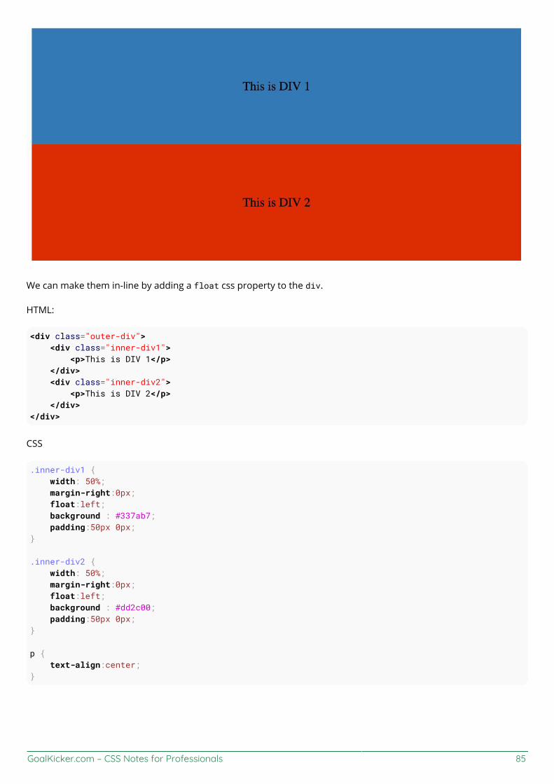
GoalKicker.com – CSS Notes for Professionals 85
We can make them in-line by adding a float css property to the div.
HTML:
<div class="outer-div"> <div class="inner-div1"> <p>This is DIV 1</p> </div> <div class="inner-div2"> <p>This is DIV 2</p> </div></div>
CSS
.inner-div1 { width: 50%; margin-right:0px; float:left; background : #337ab7; padding:50px 0px;} .inner-div2 { width: 50%; margin-right:0px; float:left; background : #dd2c00; padding:50px 0px;} p { text-align:center;}

GoalKicker.com – CSS Notes for Professionals 86
Codepen Link
Section 14.5: Use of overflow property to clear floatsSetting overflow value to hidden,auto or scroll to an element, will clear all the floats within that element.
Note: using overflow:scroll will always show the scrollbox
Section 14.6: Simple Two Fixed-Width Column LayoutA simple two-column layout consists of two fixed-width, floated elements. Note that the sidebar and content areaare not the same height in this example. This is one of the tricky parts with multi-column layouts using floats, andrequires workarounds to make multiple columns appear to be the same height.
HTML:
<div class="wrapper">
<div class="sidebar"> <h2>Sidebar</h2>
<p>Lorem ipsum dolor sit amet, consectetur adipiscing elit. Integer nec odio.</p></div>
<div class="content"> <h1>Content</h1>
<p>Class aptent taciti sociosqu ad litora torquent per conubia nostra, per inceptos himenaeos.Curabitur sodales ligula in libero. Sed dignissim lacinia nunc. Curabitur tortor. Pellentesquenibh. Aenean quam. In scelerisque sem at dolor. Maecenas mattis. Sed convallis tristique sem. Proinut ligula vel nunc egestas porttitor. Morbi lectus risus, iaculis vel, suscipit quis, luctus non,massa. Fusce ac turpis quis ligula lacinia aliquet. </p></div>
</div>
CSS:
.wrapper { width:600px; padding:20px; background-color:pink;
/* Floated elements don't use any height. Adding "overflow:hidden;" forces the parent element to expand to contain its floated children. */ overflow:hidden;}
.sidebar { width:150px; float:left; background-color:blue;
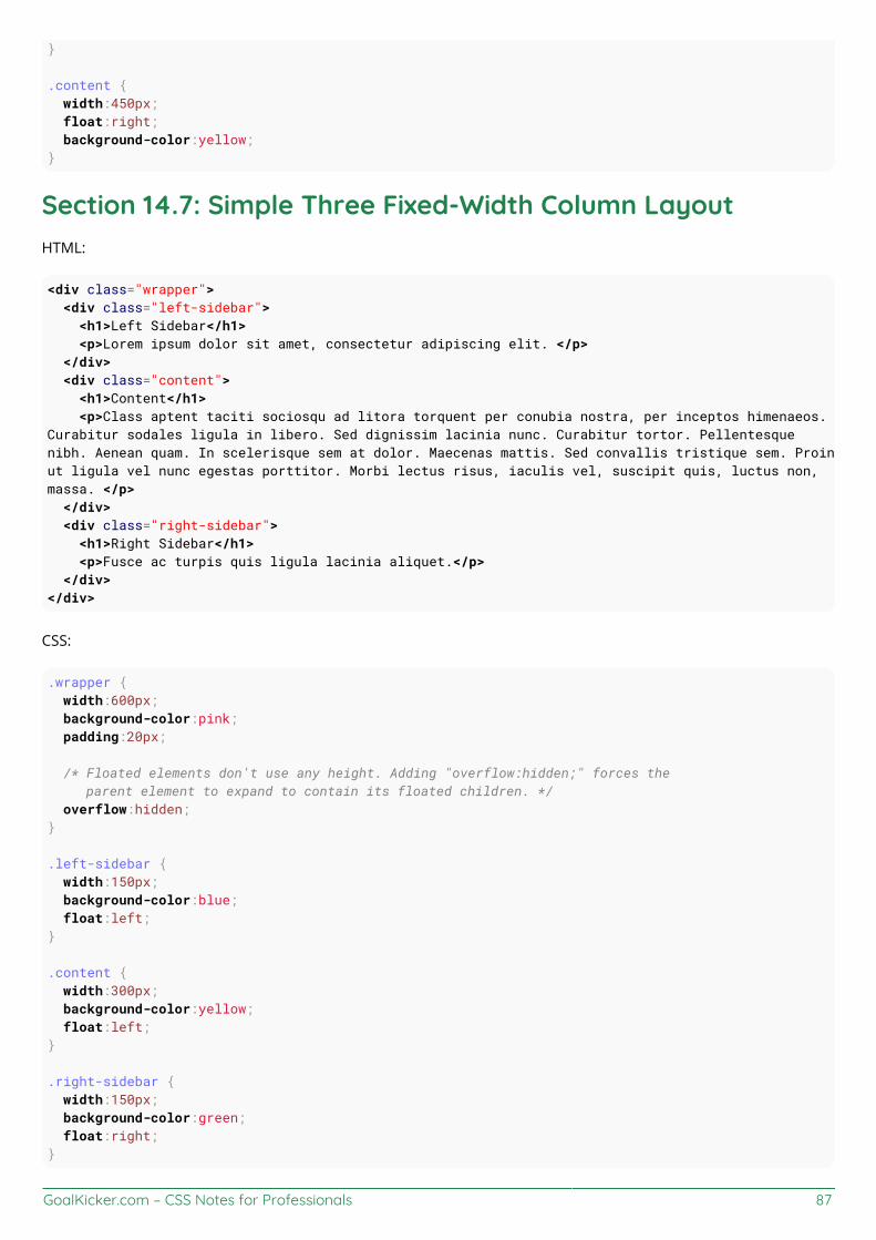
GoalKicker.com – CSS Notes for Professionals 87
}
.content { width:450px; float:right; background-color:yellow;}
Section 14.7: Simple Three Fixed-Width Column LayoutHTML:
<div class="wrapper"> <div class="left-sidebar"> <h1>Left Sidebar</h1> <p>Lorem ipsum dolor sit amet, consectetur adipiscing elit. </p> </div> <div class="content"> <h1>Content</h1> <p>Class aptent taciti sociosqu ad litora torquent per conubia nostra, per inceptos himenaeos.Curabitur sodales ligula in libero. Sed dignissim lacinia nunc. Curabitur tortor. Pellentesquenibh. Aenean quam. In scelerisque sem at dolor. Maecenas mattis. Sed convallis tristique sem. Proinut ligula vel nunc egestas porttitor. Morbi lectus risus, iaculis vel, suscipit quis, luctus non,massa. </p> </div> <div class="right-sidebar"> <h1>Right Sidebar</h1> <p>Fusce ac turpis quis ligula lacinia aliquet.</p> </div></div>
CSS:
.wrapper { width:600px; background-color:pink; padding:20px;
/* Floated elements don't use any height. Adding "overflow:hidden;" forces the parent element to expand to contain its floated children. */ overflow:hidden;}
.left-sidebar { width:150px; background-color:blue; float:left;}
.content { width:300px; background-color:yellow; float:left;}
.right-sidebar { width:150px; background-color:green; float:right;}

GoalKicker.com – CSS Notes for Professionals 88
Section 14.8: Two-Column Lazy/Greedy LayoutThis layout uses one floated column to create a two-column layout with no defined widths. In this example the leftsidebar is "lazy," in that it only takes up as much space as it needs. Another way to say this is that the left sidebar is"shrink-wrapped." The right content column is "greedy," in that it takes up all the remaining space.
HTML:
<div class="sidebar"><h1>Sidebar</h1><img src="http://lorempixel.com/150/200/" /></div>
<div class="content"><h1>Content</h1><p>Lorem ipsum dolor sit amet, consectetur adipiscing elit. Integer nec odio. Praesent libero. Sedcursus ante dapibus diam. Sed nisi. Nulla quis sem at nibh elementum imperdiet. Duis sagittisipsum. Praesent mauris. Fusce nec tellus sed augue semper porta. Mauris massa. Vestibulum laciniaarcu eget nulla. </p><p>Class aptent taciti sociosqu ad litora torquent per conubia nostra, per inceptos himenaeos.Curabitur sodales ligula in libero. Sed dignissim lacinia nunc. Curabitur tortor. Pellentesquenibh. Aenean quam. In scelerisque sem at dolor. Maecenas mattis. Sed convallis tristique sem. Proinut ligula vel nunc egestas porttitor. Morbi lectus risus, iaculis vel, suscipit quis, luctus non,massa. Fusce ac turpis quis ligula lacinia aliquet. Mauris ipsum. Nulla metus metus, ullamcorpervel, tincidunt sed, euismod in, nibh. </p></div>
CSS:
.sidebar { /* `display:table;` shrink-wraps the column */ display:table; float:left; background-color:blue;}
.content { /* `overflow:hidden;` prevents `.content` from flowing under `.sidebar` */ overflow:hidden; background-color:yellow;}
Fiddle
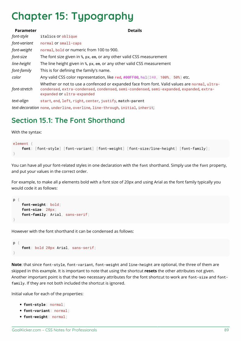
GoalKicker.com – CSS Notes for Professionals 89
Chapter 15: TypographyParameter Details
font-style italics or oblique
font-variant normal or small-caps
font-weight normal, bold or numeric from 100 to 900.
font-size The font size given in %, px, em, or any other valid CSS measurement
line-height The line height given in %, px, em, or any other valid CSS measurement
font-family This is for defining the family's name.
color Any valid CSS color representation, like red, #00FF00, hsl(240, 100%, 50%) etc.
font-stretchWhether or not to use a confenced or expanded face from font. Valid values are normal, ultra-condensed, extra-condensed, condensed, semi-condensed, semi-expanded, expanded, extra-expanded or ultra-expanded
text-align start, end, left, right, center, justify, match-parent
text-decoration none, underline, overline, line-through, initial, inherit;
Section 15.1: The Font ShorthandWith the syntax:
element { font: [font-style] [font-variant] [font-weight] [font-size/line-height] [font-family];}
You can have all your font-related styles in one declaration with the font shorthand. Simply use the font property,and put your values in the correct order.
For example, to make all p elements bold with a font size of 20px and using Arial as the font family typically youwould code it as follows:
p { font-weight: bold; font-size: 20px; font-family: Arial, sans-serif;}
However with the font shorthand it can be condensed as follows:
p { font: bold 20px Arial, sans-serif;}
Note: that since font-style, font-variant, font-weight and line-height are optional, the three of them areskipped in this example. It is important to note that using the shortcut resets the other attributes not given.Another important point is that the two necessary attributes for the font shortcut to work are font-size and font-family. If they are not both included the shortcut is ignored.
Initial value for each of the properties:
font-style: normal;
font-variant: normal;
font-weight: normal;
GoalKicker.com – CSS Notes for Professionals 90
font-stretch: normal;
font-size: medium;
line-height: normal;
font-family – depends on user agent
Section 15.2: QuotesThe quotes property is used to customize the opening and closing quotation marks of the <q> tag.
q { quotes: "«" "»";}
Section 15.3: Font SizeHTML:
<div id="element-one">Hello I am some text.</div><div id="element-two">Hello I am some smaller text.</div>
CSS:
#element-one { font-size: 30px; }
#element-two { font-size: 10px;}
The text inside #element-one will be 30px in size, while the text in #element-two will be 10px in size.
Section 15.4: Text Directiondiv { direction: ltr; /* Default, text read read from left-to-right */}.ex { direction: rtl; /* text read from right-to-left */}.horizontal-tb { writing-mode: horizontal-tb; /* Default, text read from left-to-right and top-to-bottom. */}.vertical-rtl { writing-mode: vertical-rl; /* text read from right-to-left and top-to-bottom */}.vertical-ltr { writing-mode: vertical-rl; /* text read from left-to-right and top to bottom */}
The direction property is used to change the horizontal text direction of an element.
Syntax: direction: ltr | rtl | initial | inherit;
The writing-mode property changes the alignment of text so it can be read from top-to-bottom or from left-to-right,depending on the language.

GoalKicker.com – CSS Notes for Professionals 91
Syntax: direction: horizontal-tb | vertical-rl | vertical-lr;
Section 15.5: Font Stacksfont-family: 'Segoe UI', Tahoma, sans-serif;
The browser will attempt to apply the font face "Segoe UI" to the characters within the elements targeted by theabove property. If this font is not available, or the font does not contain a glyph for the required character, thebrowser will fall back to Tahoma, and, if necessary, any sans-serif font on the user's computer. Note that any fontnames with more than one word such as "Segoe UI" need to have single or double quotes around them.
font-family: Consolas, 'Courier New', monospace;
The browser will attempt to apply the font face "Consolas" to the characters within the elements targeted by theabove property. If this font is not available, or the font does not contain a glyph for the required character, thebrowser will fall back to "Courier New," and, if necessary, any monospace font on the user's computer.
Section 15.6: Text OverflowThe text-overflow property deals with how overflowed content should be signaled to users. In this example, theellipsis represents clipped text.
.text { overflow: hidden; text-overflow: ellipsis;}
Unfortunately, text-overflow: ellipsis only works on a single line of text. There is no way to support ellipsis onthe last line in standard CSS, but it can be achieved with non-standard webkit-only implementation of flexboxes.
.giveMeEllipsis { overflow: hidden; text-overflow: ellipsis; display: -webkit-box; -webkit-box-orient: vertical; -webkit-line-clamp: N; /* number of lines to show */ line-height: X; /* fallback */ max-height: X*N; /* fallback */}
Example (open in Chrome or Safari):
http://jsfiddle.net/csYjC/1131/
Resources:
https://www.w3.org/TR/2012/WD-css3-ui-20120117/#text-overflow0
Section 15.7: Text ShadowTo add shadows to text, use the text-shadow property. The syntax is as follows:
text-shadow: horizontal-offset vertical-offset blur color;
Shadow without blur radius
GoalKicker.com – CSS Notes for Professionals 92
h1 { text-shadow: 2px 2px #0000FF;}
This creates a blue shadow effect around a heading
Shadow with blur radius
To add a blur effect, add an option blur radius argument
h1 { text-shadow: 2px 2px 10px #0000FF;}
Multiple Shadows
To give an element multiple shadows, separate them with commas
h1 { text-shadow: 0 0 3px #FF0000, 0 0 5px #0000FF;}
Section 15.8: Text TransformThe text-transform property allows you to change the capitalization of text. Valid values are: uppercase,capitalize, lowercase, initial, inherit, and none
CSS
.example1 { text-transform: uppercase;}.example2 { text-transform: capitalize;}.example3 { text-transform: lowercase;}
HTML
<p class="example1"> all letters in uppercase <!-- "ALL LETTERS IN UPPERCASE" --></p><p class="example2"> all letters in capitalize <!-- "All Letters In Capitalize (Sentence Case)" --></p><p class="example3"> all letters in lowercase <!-- "all letters in lowercase" --></p>
Section 15.9: Letter Spacingh2 { /* adds a 1px space horizontally between each letter; also known as tracking */ letter-spacing: 1px;

GoalKicker.com – CSS Notes for Professionals 93
}
The letter-spacing property is used to specify the space between the characters in a text.
! letter-spacing also supports negative values:
p { letter-spacing: -1px;}
Resources: https://developer.mozilla.org/en-US/docs/Web/CSS/letter-spacing
Section 15.10: Text Indentp { text-indent: 50px;}
The text-indent property specifies how much horizontal space text should be moved before the beginning of thefirst line of the text content of an element.
Resources:
Indenting only the first line of text in a paragraph?https://www.w3.org/TR/CSS21/text.html#propdef-text-indenthttps://developer.mozilla.org/en-US/docs/Web/CSS/text-indent
Section 15.11: Text DecorationThe text-decoration property is used to set or remove decorations from text.
h1 { text-decoration: none; }h2 { text-decoration: overline; }h3 { text-decoration: line-through; }h4 { text-decoration: underline; }
text-decoration can be used in combination with text-decoration-style and text-decoration-color as a shorthandproperty:
.title { text-decoration: underline dotted blue; }
This is a shorthand version of
.title { text-decoration-style: dotted; text-decoration-line: underline; text-decoration-color: blue;}
It should be noted that the following properties are only supported in Firefox
text-decoration-colortext-decoration-linetext-decoration-styletext-decoration-skip
GoalKicker.com – CSS Notes for Professionals 94
Section 15.12: Word SpacingThe word-spacing property specifies the spacing behavior between tags and words.
Possible values
a positive or negative length (using em px vh cm etc.) or percentage (using %)the keyword normal uses the font's default word spacingthe keyword inherit takes the value from the parent element
CSS
.normal { word-spacing: normal; }
.narrow { word-spacing: -3px; }
.extensive { word-spacing: 10px; }
HTML
<p> <span class="normal">This is an example, showing the effect of "word-spacing".</span><br> <span class="narrow">This is an example, showing the effect of "word-spacing".</span><br> <span class="extensive">This is an example, showing the effect of "word-spacing".</span><br></p>
Online-Demo
Try it yourself
Further reading:
word-spacing – MDNword-spacing – w3.org
Section 15.13: Font VariantAttributes:
normal
Default attribute of fonts.
small-caps
Sets every letter to uppercase, but makes the lowercase letters(from original text) smaller in size than the lettersthat originally uppercase.
CSS:
.smallcaps{ font-variant: small-caps;}
HTML:
<p class="smallcaps"> Documentation about CSS Fonts

GoalKicker.com – CSS Notes for Professionals 95
<br> aNd ExAmpLe</p>
Output:
Note: The font-variant property is a shorthand for the properties: font-variant-caps, font-variant-numeric, font-variant-alternates, font-variant-ligatures, and font-variant-east-asian.

GoalKicker.com – CSS Notes for Professionals 96
Chapter 16: Flexible Box Layout (Flexbox)The Flexible Box module, or just 'flexbox' for short, is a box model designed for user interfaces, and it allows usersto align and distribute space among items in a container such that elements behave predictably when the pagelayout must accommodate different, unknown screen sizes. A flex container expands items to fill available spaceand shrinks them to prevent overflow.
Section 16.1: Dynamic Vertical and Horizontal Centering (align-items, justify-content)Simple Example (centering a single element)HTML<div class="aligner"> <div class="aligner-item">…</div></div>
CSS.aligner { display: flex; align-items: center; justify-content: center;}
.aligner-item { max-width: 50%; /*for demo. Use actual width instead.*/}
Here is a demo.
ReasoningProperty Value Description
align-items centerThis centers the elements along the axis other than the one specified by flex-direction,i.e., vertical centering for a horizontal flexbox and horizontal centering for a verticalflexbox.
justify-content centerThis centers the elements along the axis specified by flex-direction. I.e., for ahorizontal (flex-direction: row) flexbox, this centers horizontally, and for a verticalflexbox (flex-direction: column) flexbox, this centers vertically)
Individual Property Examples
All of the below styles are applied onto this simple layout:
<div id="container"> <div></div> <div></div> <div></div></div>
where #container is the flex-box.
Example: justify-content: center on a horizontal flexbox
CSS:

GoalKicker.com – CSS Notes for Professionals 97
div#container { display: flex; flex-direction: row; justify-content: center;}
Outcome:
Here is a demo.
Example: justify-content: center on a vertical flexbox
CSS:
div#container { display: flex; flex-direction: column; justify-content: center;}
Outcome:
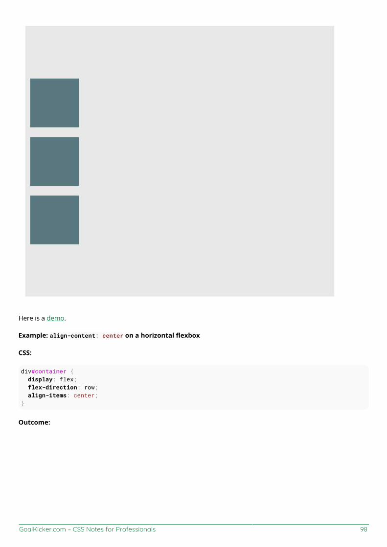
GoalKicker.com – CSS Notes for Professionals 98
Here is a demo.
Example: align-content: center on a horizontal flexbox
CSS:
div#container { display: flex; flex-direction: row; align-items: center;}
Outcome:

GoalKicker.com – CSS Notes for Professionals 99
Here is a demo.
Example: align-content: center on a vertical flexbox
CSS:
div#container { display: flex; flex-direction: column; align-items: center;}
Outcome:
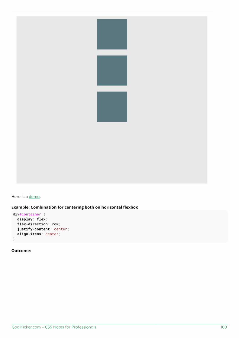
GoalKicker.com – CSS Notes for Professionals 100
Here is a demo.
Example: Combination for centering both on horizontal flexboxdiv#container { display: flex; flex-direction: row; justify-content: center; align-items: center;}
Outcome:

GoalKicker.com – CSS Notes for Professionals 101
Here is a demo.
Example: Combination for centering both on vertical flexboxdiv#container { display: flex; flex-direction: column; justify-content: center; align-items: center;}
Outcome:
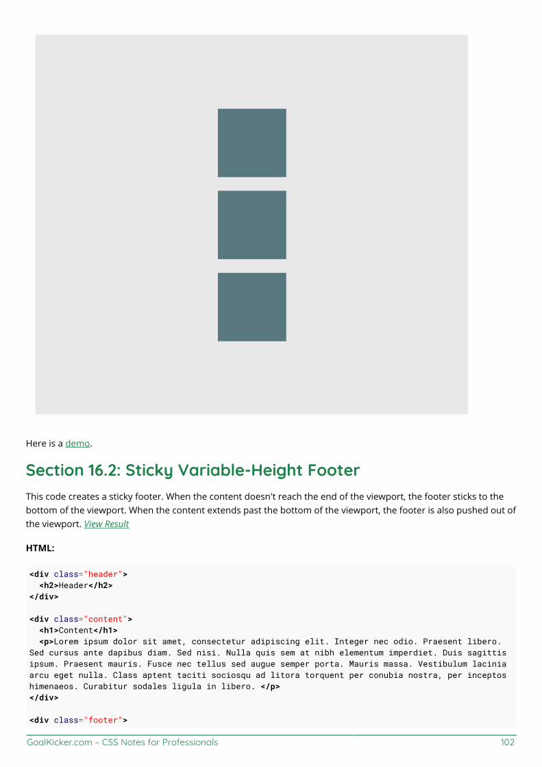
GoalKicker.com – CSS Notes for Professionals 102
Here is a demo.
Section 16.2: Sticky Variable-Height FooterThis code creates a sticky footer. When the content doesn't reach the end of the viewport, the footer sticks to thebottom of the viewport. When the content extends past the bottom of the viewport, the footer is also pushed out ofthe viewport. View Result
HTML:
<div class="header"> <h2>Header</h2></div>
<div class="content"> <h1>Content</h1> <p>Lorem ipsum dolor sit amet, consectetur adipiscing elit. Integer nec odio. Praesent libero.Sed cursus ante dapibus diam. Sed nisi. Nulla quis sem at nibh elementum imperdiet. Duis sagittisipsum. Praesent mauris. Fusce nec tellus sed augue semper porta. Mauris massa. Vestibulum laciniaarcu eget nulla. Class aptent taciti sociosqu ad litora torquent per conubia nostra, per inceptoshimenaeos. Curabitur sodales ligula in libero. </p></div>
<div class="footer">

GoalKicker.com – CSS Notes for Professionals 103
<h4>Footer</h4></div>
CSS:
html, body { height: 100%;}
body { display: flex; flex-direction: column;}
.content { /* Include `0 auto` for best browser compatibility. */ flex: 1 0 auto;}
.header, .footer { background-color: grey; color: white; flex: none;}
Section 16.3: Optimally fit elements to their containerOne of the nicest features of flexbox is to allow optimally fitting containers to their parent element.
Live demo.
HTML:
<div class="flex-container"> <div class="flex-item">1</div> <div class="flex-item">2</div> <div class="flex-item">3</div> <div class="flex-item">4</div> <div class="flex-item">5</div></div>
CSS:
.flex-container { background-color: #000; height: 100%; display:flex; flex-direction: row; flex-wrap: wrap; justify-content: flex-start; align-content: stretch; align-items: stretch;}
.flex-item { background-color: #ccf; margin: 0.1em; flex-grow: 1; flex-shrink: 0;

GoalKicker.com – CSS Notes for Professionals 104
flex-basis: 200px; /* or % could be used to ensure a specific layout */}
Outcome:
Columns adapt as screen is resized.
Section 16.4: Holy Grail Layout using FlexboxHoly Grail layout is a layout with a fixed height header and footer, and a center with 3 columns. The 3 columnsinclude a fixed width sidenav, a fluid center, and a column for other content like ads (the fluid center appears first inthe markup). CSS Flexbox can be used to achieve this with a very simple markup:
HTML Markup:
<div class="container"> <header class="header">Header</header> <div class="content-body"> <main class="content">Content</main> <nav class="sidenav">Nav</nav> <aside class="ads">Ads</aside> </div> <footer class="footer">Footer</footer></div>
CSS:
body { margin: 0; padding: 0;}
.container { display: flex; flex-direction: column; height: 100vh;}
.header { flex: 0 0 50px;

GoalKicker.com – CSS Notes for Professionals 105
}
.content-body { flex: 1 1 auto; display: flex; flex-direction: row;}
.content-body .content { flex: 1 1 auto; overflow: auto;}
.content-body .sidenav { order: -1; flex: 0 0 100px; overflow: auto;}
.content-body .ads { flex: 0 0 100px; overflow: auto;}
.footer { flex: 0 0 50px;}
Demo
Section 16.5: Perfectly aligned buttons inside cards withflexboxIt's a regular pattern in design these days to vertically align call to actions inside its containing cards like this:
This can be achieved using a special trick with flexbox
HTML
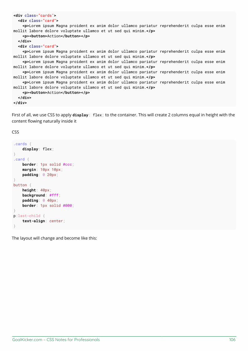
GoalKicker.com – CSS Notes for Professionals 106
<div class="cards"> <div class="card"> <p>Lorem ipsum Magna proident ex anim dolor ullamco pariatur reprehenderit culpa esse enimmollit labore dolore voluptate ullamco et ut sed qui minim.</p> <p><button>Action</button></p> </div> <div class="card"> <p>Lorem ipsum Magna proident ex anim dolor ullamco pariatur reprehenderit culpa esse enimmollit labore dolore voluptate ullamco et ut sed qui minim.</p> <p>Lorem ipsum Magna proident ex anim dolor ullamco pariatur reprehenderit culpa esse enimmollit labore dolore voluptate ullamco et ut sed qui minim.</p> <p>Lorem ipsum Magna proident ex anim dolor ullamco pariatur reprehenderit culpa esse enimmollit labore dolore voluptate ullamco et ut sed qui minim.</p> <p>Lorem ipsum Magna proident ex anim dolor ullamco pariatur reprehenderit culpa esse enimmollit labore dolore voluptate ullamco et ut sed qui minim.</p> <p><button>Action</button></p> </div></div>
First of all, we use CSS to apply display: flex; to the container. This will create 2 columns equal in height with thecontent flowing naturally inside it
CSS
.cards { display: flex;}.card { border: 1px solid #ccc; margin: 10px 10px; padding: 0 20px;}button { height: 40px; background: #fff; padding: 0 40px; border: 1px solid #000;}p:last-child { text-align: center;}
The layout will change and become like this:
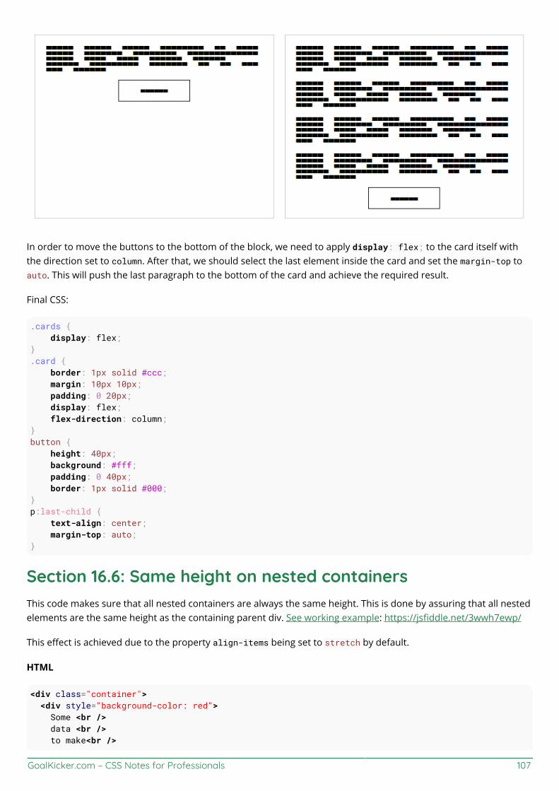
GoalKicker.com – CSS Notes for Professionals 107
In order to move the buttons to the bottom of the block, we need to apply display: flex; to the card itself withthe direction set to column. After that, we should select the last element inside the card and set the margin-top toauto. This will push the last paragraph to the bottom of the card and achieve the required result.
Final CSS:
.cards { display: flex;}.card { border: 1px solid #ccc; margin: 10px 10px; padding: 0 20px; display: flex; flex-direction: column;}button { height: 40px; background: #fff; padding: 0 40px; border: 1px solid #000;}p:last-child { text-align: center; margin-top: auto;}
Section 16.6: Same height on nested containersThis code makes sure that all nested containers are always the same height. This is done by assuring that all nestedelements are the same height as the containing parent div. See working example: https://jsfiddle.net/3wwh7ewp/
This effect is achieved due to the property align-items being set to stretch by default.
HTML
<div class="container"> <div style="background-color: red"> Some <br /> data <br /> to make<br />
GoalKicker.com – CSS Notes for Professionals 108
a height <br /> </div> <div style="background-color: blue"> Fewer <br /> lines <br /> </div></div>
CSS
.container { display: flex; align-items: stretch; // Default value}
Note: Does not work on IE versions under 10

GoalKicker.com – CSS Notes for Professionals 109
Chapter 17: Cascading and SpecificitySection 17.1: Calculating Selector SpecificityEach individual CSS Selector has its own specificity value. Every selector in a sequence increases the sequence'soverall specificity. Selectors fall into one of three different specificity groups: A, B and c. When multiple selectorsequences select a given element, the browser uses the styles applied by the sequence with the highest overallspecificity.
Group Comprised of ExamplesA id selectors #foo
Bclass selectorsattribute selectorspseudo-classes
.bar[title], [colspan="2"]:hover, :nth-child(2)
c type selectorspseudo-elements
div, li::before, ::first-letter
Group A is the most specific, followed by Group B, then finally Group c.
The universal selector (*) and combinators (like > and ~) have no specificity.
Example 1: Specificity of various selector sequences#foo #baz {} /* a=2, b=0, c=0 */
#foo.bar {} /* a=1, b=1, c=0 */
#foo {} /* a=1, b=0, c=0 */
.bar:hover {} /* a=0, b=2, c=0 */
div.bar {} /* a=0, b=1, c=1 */
:hover {} /* a=0, b=1, c=0 */
[title] {} /* a=0, b=1, c=0 */
.bar {} /* a=0, b=1, c=0 */
div ul + li {} /* a=0, b=0, c=3 */
p::after {} /* a=0, b=0, c=2 */
*::before {} /* a=0, b=0, c=1 */
::before {} /* a=0, b=0, c=1 */
div {} /* a=0, b=0, c=1 */
* {} /* a=0, b=0, c=0 */
Example 2: How specificity is used by the browser
Imagine the following CSS implementation:
#foo { color: blue;}

GoalKicker.com – CSS Notes for Professionals 110
.bar { color: red; background: black;}
Here we have an ID selector which declares color as blue, and a class selector which declares color as red andbackground as black.
An element with an ID of #foo and a class of .bar will be selected by both declarations. ID selectors have a Group Aspecificity and class selectors have a Group B specificity. An ID selector outweighs any number of class selectors.Because of this, color:blue; from the #foo selector and the background:black; from the .bar selector will beapplied to the element. The higher specificity of the ID selector will cause the browser to ignore the .bar selector'scolor declaration.
Now imagine a different CSS implementation:
.bar { color: red; background: black;}
.baz { background: white;}
Here we have two class selectors; one of which declares color as red and background as black, and the otherdeclares background as white.
An element with both the .bar and .baz classes will be affected by both of these declarations, however theproblem we have now is that both .bar and .baz have an identical Group B specificity. The cascading nature of CSSresolves this for us: as .baz is defined after .bar, our element ends up with the red color from .bar but the whitebackground from .baz.
Example 3: How to manipulate specificity
The last snippet from Example 2 above can be manipulated to ensure our .bar class selector's color declaration isused instead of that of the .baz class selector.
.bar {} /* a=0, b=1, c=0 */
.baz {} /* a=0, b=1, c=0 */
The most common way to achieve this would be to find out what other selectors can be applied to the .bar selectorsequence. For example, if the .bar class was only ever applied to span elements, we could modify the .bar selectorto span.bar. This would give it a new Group C specificity, which would override the .baz selector's lack thereof:
span.bar {} /* a=0, b=1, c=1 */.baz {} /* a=0, b=1, c=0 */
However it may not always possible to find another common selector which is shared between any element whichuses the .bar class. Because of this, CSS allows us to duplicate selectors to increase specificity. Instead of just .bar,we can use .bar.bar instead (See The grammar of Selectors, W3C Recommendation). This still selects any elementwith a class of .bar, but now has double the Group B specificity:
.bar.bar {} /* a=0, b=2, c=0 */
.baz {} /* a=0, b=1, c=0 */

GoalKicker.com – CSS Notes for Professionals 111
!important and inline style declarations
The !important flag on a style declaration and styles declared by the HTML style attribute are considered to havea greater specificity than any selector. If these exist, the style declaration they affect will overrule other declarationsregardless of their specificity. That is, unless you have more than one declaration that contains an !important flagfor the same property that apply to the same element. Then, normal specificity rules will apply to those propertiesin reference to each other.
Because they completely override specificity, the use of !important is frowned upon in most use cases. One shoulduse it as little as possible. To keep CSS code efficient and maintainable in the long run, it's almost always better toincrease the specificity of the surrounding selector than to use !important.
One of those rare exceptions where !important is not frowned upon, is when implementing generic helper classeslike a .hidden or .background-yellow class that are supposed to always override one or more properties whereverthey are encountered. And even then, you need to know what you're doing. The last thing you want, when writingmaintainable CSS, is to have !important flags throughout your CSS.
A final note
A common misconception about CSS specificity is that the Group A, B and c values should be combined with eachother (a=1, b=5, c=1 => 151). This is not the case. If this were the case, having 20 of a Group B or c selector wouldbe enough to override a single Group A or B selector respectively. The three groups should be regarded asindividual levels of specificity. Specificity cannot be represented by a single value.
When creating your CSS style sheet, you should maintain the lowest specificity as possible. If you need to make thespecificity a little higher to overwrite another method, make it higher but as low as possible to make it higher. Youshouldn't need to have a selector like this:
body.page header.container nav div#main-nav li a {}
This makes future changes harder and pollutes that css page.
You can calculate the specificity of your selector here
Section 17.2: The !important declarationThe !important declaration is used to override the usual specificity in a style sheet by giving a higher priority to arule. Its usage is: property : value !important;
#mydiv { font-weight: bold !important; /* This property won't be overridden by the rule below */}
#outerdiv #mydiv { font-weight: normal; /* #mydiv font-weight won't be set to normal even if it has a higher specificity because of the !important declaration above */}
Avoiding the usage of !important is strongly recommended (unless absolutely necessary), because it will disturbthe natural flow of css rules which can bring uncertainty in your style sheet. Also it is important to note that whenmultiple !important declarations are applied to the same rule on a certain element, the one with the higherspecificity will be the ona applied.

GoalKicker.com – CSS Notes for Professionals 112
Here are some examples where using !important declaration can be justified:
If your rules shouldn't be overridden by any inline style of the element which is written inside style attributeof the html element.To give the user more control over the web accessibility, like increasing or decreasing size of the font-size, byoverriding the author style using !important.For testing and debugging using inspect element.
See also:
W3C - 6 Assigning property values, Cascading, and Inheritance -- 6.4.2 !important rules
Section 17.3: CascadingCascading and specificity are used together to determine the final value of a CSS styling property. They also definethe mechanisms for resolving conflicts in CSS rule sets.
CSS Loading order
Styles are read from the following sources, in this order:
User Agent stylesheet (The styles supplied by the browser vendor)1.User stylesheet (The additional styling a user has set on his/her browser)2.Author stylesheet (Author here means the creator of the webpage/website)3.
Maybe one or more .css filesIn the <style> element of the HTML document
Inline styles (In the style attribute on an HTML element)4.
The browser will lookup the corresponding style(s) when rendering an element.
How are conflicts resolved?
When only one CSS rule set is trying to set a style for an element, then there is no conflict, and that rule set is used.
When multiple rule sets are found with conflicting settings, first the Specificty rules, and then the Cascading rulesare used to determine what style to use.
Example 1 - Specificity rules.mystyle { color: blue; } /* specificity: 0, 0, 1, 0 */div { color: red; } /* specificity: 0, 0, 0, 1 */
<div class="mystyle">Hello World</div>
What color will the text be? (hover to see the answer)
blue
First the specificity rules are applied, and the one with the highest specificity "wins".
Example 2 - Cascade rules with identical selectors
External css file
.class {

GoalKicker.com – CSS Notes for Professionals 113
background: #FFF;}
Internal css (in HTML file)
<style>.class { background: #000;}<style>
In this case, where you have identical selectors, the cascade kicks in, and determines that the last one loaded"wins".
Example 3 - Cascade rules after Specificity rulesbody > .mystyle { background-color: blue; } /* specificity: 0, 0, 1, 1 */.otherstyle > div { background-color: red; } /* specificity: 0, 0, 1, 1 */
<body class="otherstyle"> <div class="mystyle">Hello World</div></body>
What color will the background be?
red
After applying the specificity rules, there's still a conflict between blue and red, so the cascading rules are appliedon top of the specificity rules. Cascading looks at the load order of the rules, whether inside the same .css file or inthe collection of style sources. The last one loaded overrides any earlier ones. In this case, the .otherstyle > divrule "wins".
A final note
Selector specificity always take precedence.Stylesheet order break ties.Inline styles trump everything.
Section 17.4: More complex specificity examplediv { font-size: 7px; border: 3px dotted pink; background-color: yellow; color: purple;}
body.mystyle > div.myotherstyle { font-size: 11px; background-color: green;}
#elmnt1 { font-size: 24px; border-color: red;}

GoalKicker.com – CSS Notes for Professionals 114
.mystyle .myotherstyle { font-size: 16px; background-color: black; color: red;}
<body class="mystyle"> <div id="elmnt1" class="myotherstyle"> Hello, world! </div></body>
What borders, colors, and font-sizes will the text be?
font-size:
font-size: 24;, since #elmnt1 rule set has the highest specificity for the <div> in question, everyproperty here is set.
border:
border: 3px dotted red;. The border-color red is taken from #elmnt1 rule set, since it has the highestspecificity. The other properties of the border, border-thickness, and border-style are from the div ruleset.
background-color:
background-color: green;. The background-color is set in the div, body.mystyle > div.myotherstyle,and .mystyle .myotherstyle rule sets. The specificities are (0, 0, 1) vs. (0, 2, 2) vs. (0, 2, 0), so the middleone "wins".
color:
color: red;. The color is set in both the div and .mystyle .myotherstyle rule sets. The latter has thehigher specificity of (0, 2, 0) and "wins".

GoalKicker.com – CSS Notes for Professionals 115
Chapter 18: ColorsSection 18.1: currentColorcurrentColor returns the computed color value of the current element.
Use in same element
Here currentColor evaluates to red since the color property is set to red:
div { color: red; border: 5px solid currentColor; box-shadow: 0 0 5px currentColor;}
In this case, specifying currentColor for the border is most likely redundant because omitting it should produceidentical results. Only use currentColor inside the border property within the same element if it would beoverwritten otherwise due to a more specific selector.
Since it's the computed color, the border will be green in the following example due to the second rule overridingthe first:
div { color: blue; border: 3px solid currentColor; color: green;}
Inherited from parent element
The parent's color is inherited, here currentColor evaluates to 'blue', making the child element's border-color blue.
.parent-class { color: blue;}
.parent-class .child-class { border-color: currentColor;}
currentColor can also be used by other rules which normally would not inherit from the color property, such asbackground-color. The example below shows the children using the color set in the parent as its background:
.parent-class { color: blue;}
.parent-class .child-class { background-color: currentColor;}
Possible Result:

GoalKicker.com – CSS Notes for Professionals 116
Section 18.2: Color KeywordsMost browsers support using color keywords to specify a color. For example, to set the color of an element to blue,use the blue keyword:
.some-class { color: blue;}
CSS keywords are not case sensitive—blue, Blue and BLUE will all result in #0000FF.
Color KeywordsColor name Hex value RGB values Color
AliceBlue #F0F8FF rgb(240,248,255)
AntiqueWhite #FAEBD7 rgb(250,235,215)
Aqua #00FFFF rgb(0,255,255)
Aquamarine #7FFFD4 rgb(127,255,212)
Azure #F0FFFF rgb(240,255,255)
Beige #F5F5DC rgb(245,245,220)
Bisque #FFE4C4 rgb(255,228,196)
Black #000000 rgb(0,0,0)
BlanchedAlmond #FFEBCD rgb(255,235,205)
Blue #0000FF rgb(0,0,255)
BlueViolet #8A2BE2 rgb(138,43,226)
Brown #A52A2A rgb(165,42,42)

GoalKicker.com – CSS Notes for Professionals 117
BurlyWood #DEB887 rgb(222,184,135)
CadetBlue #5F9EA0 rgb(95,158,160)
Chartreuse #7FFF00 rgb(127,255,0)
Chocolate #D2691E rgb(210,105,30)
Coral #FF7F50 rgb(255,127,80)
CornflowerBlue #6495ED rgb(100,149,237)
Cornsilk #FFF8DC rgb(255,248,220)
Crimson #DC143C rgb(220,20,60)
Cyan #00FFFF rgb(0,255,255)
DarkBlue #00008B rgb(0,0,139)
DarkCyan #008B8B rgb(0,139,139)
DarkGoldenRod #B8860B rgb(184,134,11)
DarkGray #A9A9A9 rgb(169,169,169)
DarkGrey #A9A9A9 rgb(169,169,169)
DarkGreen #006400 rgb(0,100,0)
DarkKhaki #BDB76B rgb(189,183,107)
DarkMagenta #8B008B rgb(139,0,139)
DarkOliveGreen #556B2F rgb(85,107,47)
DarkOrange #FF8C00 rgb(255,140,0)
DarkOrchid #9932CC rgb(153,50,204)
DarkRed #8B0000 rgb(139,0,0)
DarkSalmon #E9967A rgb(233,150,122)
DarkSeaGreen #8FBC8F rgb(143,188,143)
DarkSlateBlue #483D8B rgb(72,61,139)
DarkSlateGray #2F4F4F rgb(47,79,79)
DarkSlateGrey #2F4F4F rgb(47,79,79)
DarkTurquoise #00CED1 rgb(0,206,209)
DarkViolet #9400D3 rgb(148,0,211)
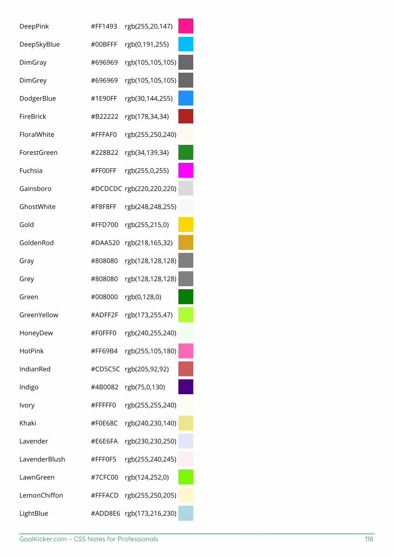
GoalKicker.com – CSS Notes for Professionals 118
DeepPink #FF1493 rgb(255,20,147)
DeepSkyBlue #00BFFF rgb(0,191,255)
DimGray #696969 rgb(105,105,105)
DimGrey #696969 rgb(105,105,105)
DodgerBlue #1E90FF rgb(30,144,255)
FireBrick #B22222 rgb(178,34,34)
FloralWhite #FFFAF0 rgb(255,250,240)
ForestGreen #228B22 rgb(34,139,34)
Fuchsia #FF00FF rgb(255,0,255)
Gainsboro #DCDCDC rgb(220,220,220)
GhostWhite #F8F8FF rgb(248,248,255)
Gold #FFD700 rgb(255,215,0)
GoldenRod #DAA520 rgb(218,165,32)
Gray #808080 rgb(128,128,128)
Grey #808080 rgb(128,128,128)
Green #008000 rgb(0,128,0)
GreenYellow #ADFF2F rgb(173,255,47)
HoneyDew #F0FFF0 rgb(240,255,240)
HotPink #FF69B4 rgb(255,105,180)
IndianRed #CD5C5C rgb(205,92,92)
Indigo #4B0082 rgb(75,0,130)
Ivory #FFFFF0 rgb(255,255,240)
Khaki #F0E68C rgb(240,230,140)
Lavender #E6E6FA rgb(230,230,250)
LavenderBlush #FFF0F5 rgb(255,240,245)
LawnGreen #7CFC00 rgb(124,252,0)
LemonChiffon #FFFACD rgb(255,250,205)
LightBlue #ADD8E6 rgb(173,216,230)

GoalKicker.com – CSS Notes for Professionals 119
LightCoral #F08080 rgb(240,128,128)
LightCyan #E0FFFF rgb(224,255,255)
LightGoldenRodYellow #FAFAD2 rgb(250,250,210)
LightGray #D3D3D3 rgb(211,211,211)
LightGrey #D3D3D3 rgb(211,211,211)
LightGreen #90EE90 rgb(144,238,144)
LightPink #FFB6C1 rgb(255,182,193)
LightSalmon #FFA07A rgb(255,160,122)
LightSeaGreen #20B2AA rgb(32,178,170)
LightSkyBlue #87CEFA rgb(135,206,250)
LightSlateGray #778899 rgb(119,136,153)
LightSlateGrey #778899 rgb(119,136,153)
LightSteelBlue #B0C4DE rgb(176,196,222)
LightYellow #FFFFE0 rgb(255,255,224)
Lime #00FF00 rgb(0,255,0)
LimeGreen #32CD32 rgb(50,205,50)
Linen #FAF0E6 rgb(250,240,230)
Magenta #FF00FF rgb(255,0,255)
Maroon #800000 rgb(128,0,0)
MediumAquaMarine #66CDAA rgb(102,205,170)
MediumBlue #0000CD rgb(0,0,205)
MediumOrchid #BA55D3 rgb(186,85,211)
MediumPurple #9370DB rgb(147,112,219)
MediumSeaGreen #3CB371 rgb(60,179,113)
MediumSlateBlue #7B68EE rgb(123,104,238)
MediumSpringGreen #00FA9A rgb(0,250,154)
MediumTurquoise #48D1CC rgb(72,209,204)
MediumVioletRed #C71585 rgb(199,21,133)
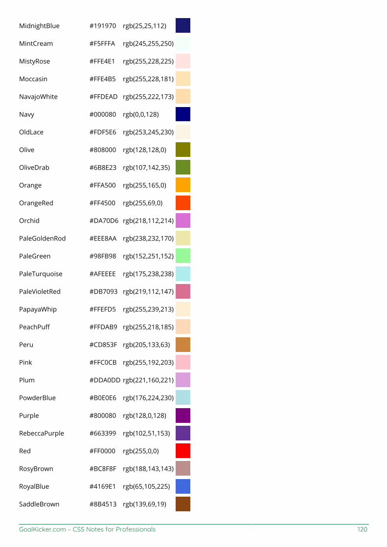
GoalKicker.com – CSS Notes for Professionals 120
MidnightBlue #191970 rgb(25,25,112)
MintCream #F5FFFA rgb(245,255,250)
MistyRose #FFE4E1 rgb(255,228,225)
Moccasin #FFE4B5 rgb(255,228,181)
NavajoWhite #FFDEAD rgb(255,222,173)
Navy #000080 rgb(0,0,128)
OldLace #FDF5E6 rgb(253,245,230)
Olive #808000 rgb(128,128,0)
OliveDrab #6B8E23 rgb(107,142,35)
Orange #FFA500 rgb(255,165,0)
OrangeRed #FF4500 rgb(255,69,0)
Orchid #DA70D6 rgb(218,112,214)
PaleGoldenRod #EEE8AA rgb(238,232,170)
PaleGreen #98FB98 rgb(152,251,152)
PaleTurquoise #AFEEEE rgb(175,238,238)
PaleVioletRed #DB7093 rgb(219,112,147)
PapayaWhip #FFEFD5 rgb(255,239,213)
PeachPuff #FFDAB9 rgb(255,218,185)
Peru #CD853F rgb(205,133,63)
Pink #FFC0CB rgb(255,192,203)
Plum #DDA0DD rgb(221,160,221)
PowderBlue #B0E0E6 rgb(176,224,230)
Purple #800080 rgb(128,0,128)
RebeccaPurple #663399 rgb(102,51,153)
Red #FF0000 rgb(255,0,0)
RosyBrown #BC8F8F rgb(188,143,143)
RoyalBlue #4169E1 rgb(65,105,225)
SaddleBrown #8B4513 rgb(139,69,19)
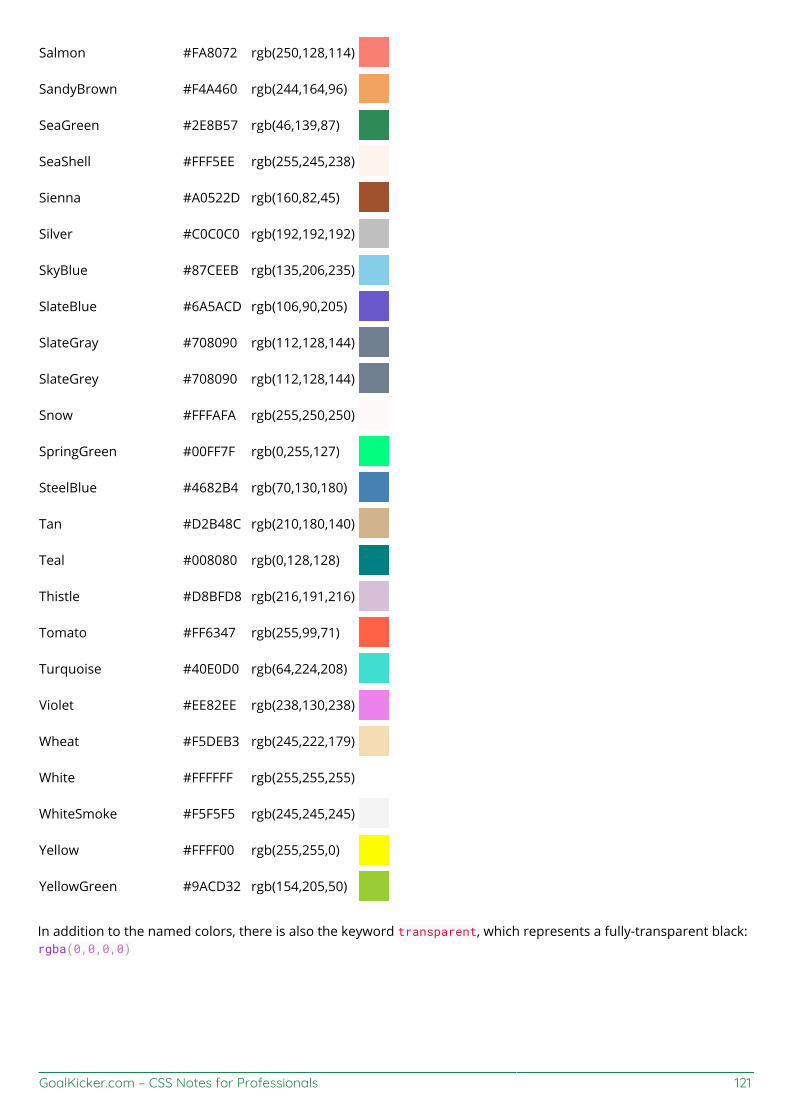
GoalKicker.com – CSS Notes for Professionals 121
Salmon #FA8072 rgb(250,128,114)
SandyBrown #F4A460 rgb(244,164,96)
SeaGreen #2E8B57 rgb(46,139,87)
SeaShell #FFF5EE rgb(255,245,238)
Sienna #A0522D rgb(160,82,45)
Silver #C0C0C0 rgb(192,192,192)
SkyBlue #87CEEB rgb(135,206,235)
SlateBlue #6A5ACD rgb(106,90,205)
SlateGray #708090 rgb(112,128,144)
SlateGrey #708090 rgb(112,128,144)
Snow #FFFAFA rgb(255,250,250)
SpringGreen #00FF7F rgb(0,255,127)
SteelBlue #4682B4 rgb(70,130,180)
Tan #D2B48C rgb(210,180,140)
Teal #008080 rgb(0,128,128)
Thistle #D8BFD8 rgb(216,191,216)
Tomato #FF6347 rgb(255,99,71)
Turquoise #40E0D0 rgb(64,224,208)
Violet #EE82EE rgb(238,130,238)
Wheat #F5DEB3 rgb(245,222,179)
White #FFFFFF rgb(255,255,255)
WhiteSmoke #F5F5F5 rgb(245,245,245)
Yellow #FFFF00 rgb(255,255,0)
YellowGreen #9ACD32 rgb(154,205,50)
In addition to the named colors, there is also the keyword transparent, which represents a fully-transparent black:rgba(0,0,0,0)
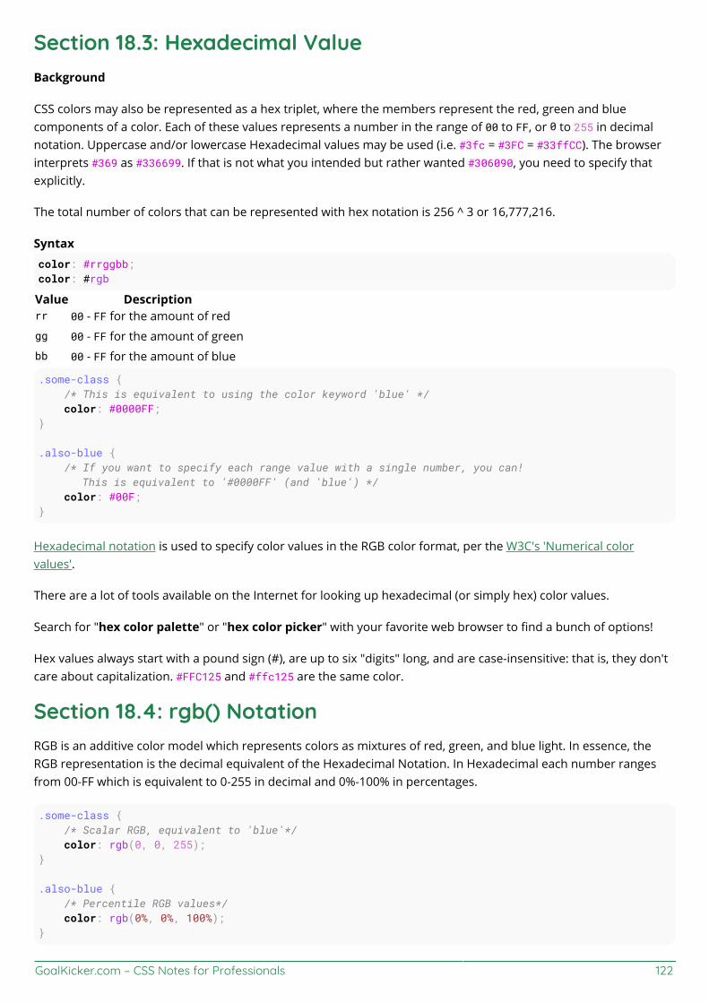
GoalKicker.com – CSS Notes for Professionals 122
Section 18.3: Hexadecimal ValueBackground
CSS colors may also be represented as a hex triplet, where the members represent the red, green and bluecomponents of a color. Each of these values represents a number in the range of 00 to FF, or 0 to 255 in decimalnotation. Uppercase and/or lowercase Hexadecimal values may be used (i.e. #3fc = #3FC = #33ffCC). The browserinterprets #369 as #336699. If that is not what you intended but rather wanted #306090, you need to specify thatexplicitly.
The total number of colors that can be represented with hex notation is 256 ^ 3 or 16,777,216.
Syntaxcolor: #rrggbb;color: #rgb
Value Descriptionrr 00 - FF for the amount of redgg 00 - FF for the amount of greenbb 00 - FF for the amount of blue
.some-class { /* This is equivalent to using the color keyword 'blue' */ color: #0000FF;}
.also-blue { /* If you want to specify each range value with a single number, you can! This is equivalent to '#0000FF' (and 'blue') */ color: #00F;}
Hexadecimal notation is used to specify color values in the RGB color format, per the W3C's 'Numerical colorvalues'.
There are a lot of tools available on the Internet for looking up hexadecimal (or simply hex) color values.
Search for "hex color palette" or "hex color picker" with your favorite web browser to find a bunch of options!
Hex values always start with a pound sign (#), are up to six "digits" long, and are case-insensitive: that is, they don'tcare about capitalization. #FFC125 and #ffc125 are the same color.
Section 18.4: rgb() NotationRGB is an additive color model which represents colors as mixtures of red, green, and blue light. In essence, theRGB representation is the decimal equivalent of the Hexadecimal Notation. In Hexadecimal each number rangesfrom 00-FF which is equivalent to 0-255 in decimal and 0%-100% in percentages.
.some-class { /* Scalar RGB, equivalent to 'blue'*/ color: rgb(0, 0, 255);}
.also-blue { /* Percentile RGB values*/ color: rgb(0%, 0%, 100%);}
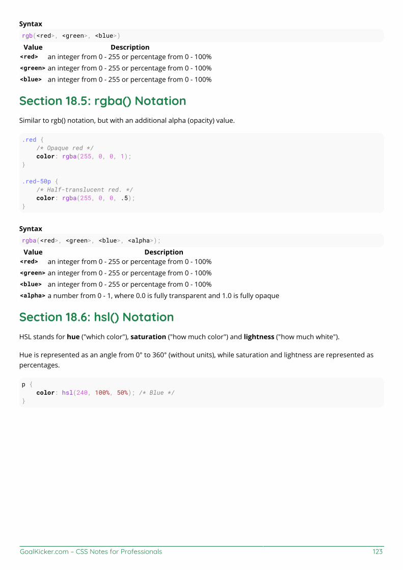
GoalKicker.com – CSS Notes for Professionals 123
Syntaxrgb(<red>, <green>, <blue>)
Value Description<red> an integer from 0 - 255 or percentage from 0 - 100%<green> an integer from 0 - 255 or percentage from 0 - 100%<blue> an integer from 0 - 255 or percentage from 0 - 100%
Section 18.5: rgba() NotationSimilar to rgb() notation, but with an additional alpha (opacity) value.
.red { /* Opaque red */ color: rgba(255, 0, 0, 1);}
.red-50p { /* Half-translucent red. */ color: rgba(255, 0, 0, .5);}
Syntaxrgba(<red>, <green>, <blue>, <alpha>);
Value Description<red> an integer from 0 - 255 or percentage from 0 - 100%<green> an integer from 0 - 255 or percentage from 0 - 100%<blue> an integer from 0 - 255 or percentage from 0 - 100%<alpha> a number from 0 - 1, where 0.0 is fully transparent and 1.0 is fully opaque
Section 18.6: hsl() NotationHSL stands for hue ("which color"), saturation ("how much color") and lightness ("how much white").
Hue is represented as an angle from 0° to 360° (without units), while saturation and lightness are represented aspercentages.
p { color: hsl(240, 100%, 50%); /* Blue */}

GoalKicker.com – CSS Notes for Professionals 124
Syntaxcolor: hsl(<hue>, <saturation>%, <lightness>%);
Value Description
<hue> specified in degrees around the color wheel (without units), where 0° is red, 60° is yellow, 120° isgreen, 180° is cyan, 240° is blue, 300° is magenta, and 360° is red
<saturation> specified in percentage where 0% is fully desaturated (grayscale) and 100% is fully saturated (vividlycolored)
<lightness> specified in percentage where 0% is fully black and 100% is fully white
Notes
A saturation of 0% always produces a grayscale color; changing the hue has no effect.
A lightness of 0% always produces black, and 100% always produces white; changing the hue or saturationhas no effect.
Section 18.7: hsla() NotationSimilar to hsl() notation, but with an added alpha (opacity) value.
hsla(240, 100%, 50%, 0) /* transparent */hsla(240, 100%, 50%, 0.5) /* half-translucent blue */hsla(240, 100%, 50%, 1) /* fully opaque blue */
Syntax

GoalKicker.com – CSS Notes for Professionals 125
hsla(<hue>, <saturation>%, <lightness>%, <alpha>);
Value Description
<hue> specified in degrees around the color wheel (without units), where 0° is red, 60° is yellow, 120° isgreen, 180° is cyan, 240° is blue, 300° is magenta, and 360° is red
<saturation> percentage where 0% is fully desaturated (grayscale) and 100% is fully saturated (vividly colored)<lightness> percentage where 0% is fully black and 100% is fully white<alpha> a number from 0 - 1 where 0 is fully transparent and 1 is fully opaque
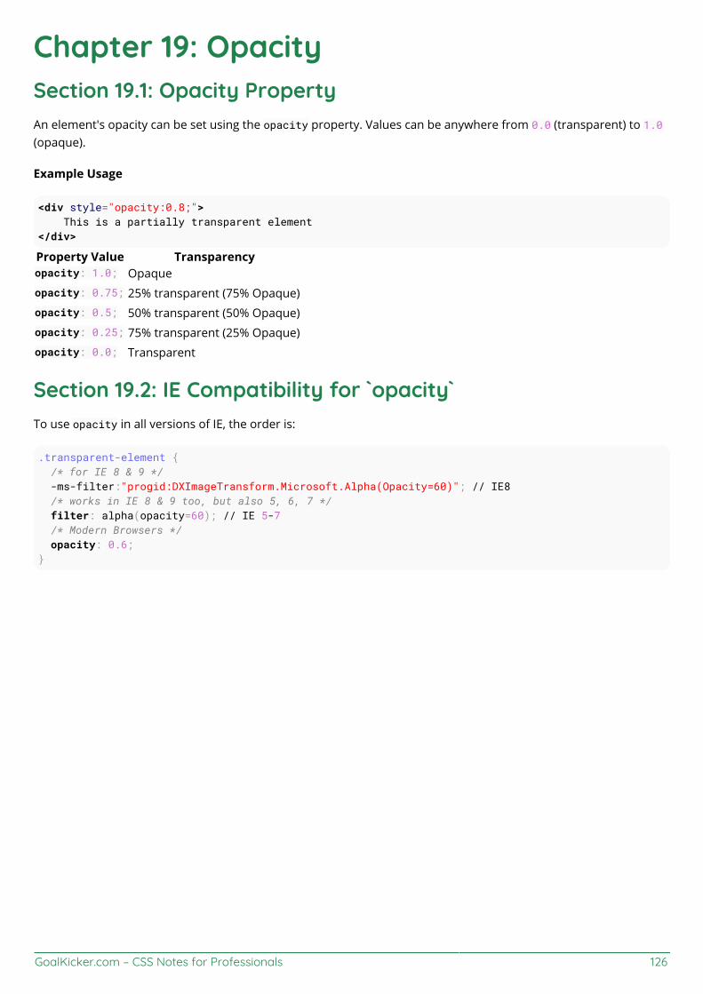
GoalKicker.com – CSS Notes for Professionals 126
Chapter 19: OpacitySection 19.1: Opacity PropertyAn element's opacity can be set using the opacity property. Values can be anywhere from 0.0 (transparent) to 1.0(opaque).
Example Usage
<div style="opacity:0.8;"> This is a partially transparent element</div>
Property Value Transparencyopacity: 1.0; Opaqueopacity: 0.75; 25% transparent (75% Opaque)opacity: 0.5; 50% transparent (50% Opaque)opacity: 0.25; 75% transparent (25% Opaque)opacity: 0.0; Transparent
Section 19.2: IE Compatibility for `opacity`To use opacity in all versions of IE, the order is:
.transparent-element { /* for IE 8 & 9 */ -ms-filter:"progid:DXImageTransform.Microsoft.Alpha(Opacity=60)"; // IE8 /* works in IE 8 & 9 too, but also 5, 6, 7 */ filter: alpha(opacity=60); // IE 5-7 /* Modern Browsers */ opacity: 0.6;}
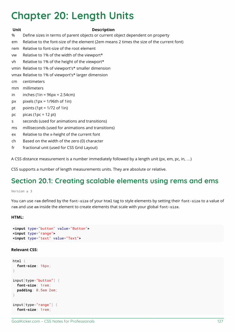
GoalKicker.com – CSS Notes for Professionals 127
Chapter 20: Length UnitsUnit Description% Define sizes in terms of parent objects or current object dependent on property
em Relative to the font-size of the element (2em means 2 times the size of the current font)
rem Relative to font-size of the root element
vw Relative to 1% of the width of the viewport*
vh Relative to 1% of the height of the viewport*
vmin Relative to 1% of viewport's* smaller dimension
vmax Relative to 1% of viewport's* larger dimension
cm centimeters
mm millimeters
in inches (1in = 96px = 2.54cm)
px pixels (1px = 1/96th of 1in)
pt points (1pt = 1/72 of 1in)
pc picas (1pc = 12 pt)
s seconds (used for animations and transitions)
ms milliseconds (used for animations and transitions)
ex Relative to the x-height of the current font
ch Based on the width of the zero (0) character
fr fractional unit (used for CSS Grid Layout)
A CSS distance measurement is a number immediately followed by a length unit (px, em, pc, in, …)
CSS supports a number of length measurements units. They are absolute or relative.
Section 20.1: Creating scalable elements using rems and emsVersion ≥ 3
You can use rem defined by the font-size of your html tag to style elements by setting their font-size to a value ofrem and use em inside the element to create elements that scale with your global font-size.
HTML:
<input type="button" value="Button"><input type="range"><input type="text" value="Text">
Relevant CSS:
html { font-size: 16px;}
input[type="button"] { font-size: 1rem; padding: 0.5em 2em;}
input[type="range"] { font-size: 1rem;

GoalKicker.com – CSS Notes for Professionals 128
width: 10em;}
input[type=text] { font-size: 1rem; padding: 0.5em;}
Possible Result:
Section 20.2: Font size with remCSS3 introduces a few new units, including the rem unit, which stands for "root em". Let's look at how rem works.
First, let's look at the differences between em and rem.
em: Relative to the font size of the parent. This causes the compounding issuerem: Relative to the font size of the root or <html> element. This means it's possible to declare a single fontsize for the html element and define all rem units to be a percentage of that.
The main issue with using rem for font sizing is that the values are somewhat difficult to use. Here is an example ofsome common font sizes expressed in rem units, assuming that the base size is 16px :
10px = 0.625rem12px = 0.75rem14px = 0.875rem16px = 1rem (base)18px = 1.125rem20px = 1.25rem24px = 1.5rem30px = 1.875rem32px = 2rem
CODE:
Version ≥ 3
html { font-size: 16px;}
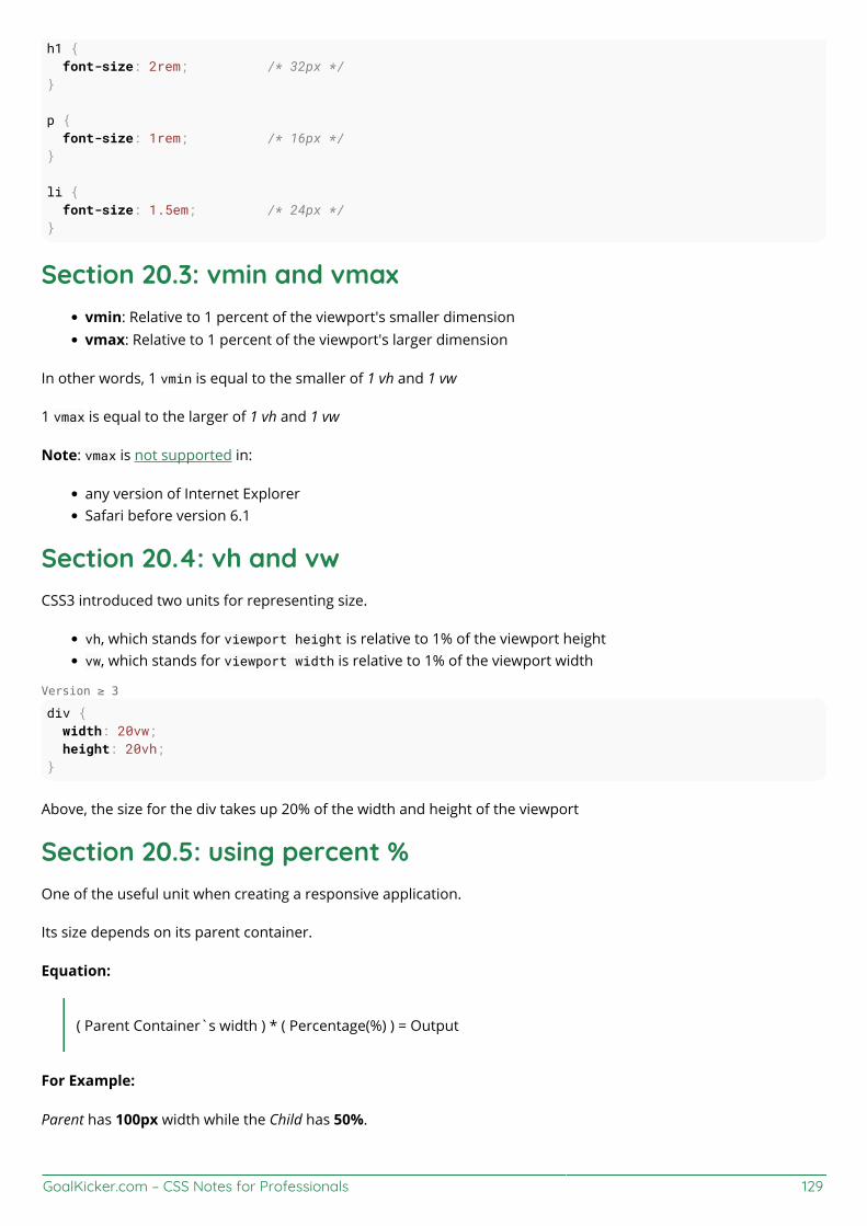
GoalKicker.com – CSS Notes for Professionals 129
h1 { font-size: 2rem; /* 32px */}
p { font-size: 1rem; /* 16px */}
li { font-size: 1.5em; /* 24px */}
Section 20.3: vmin and vmaxvmin: Relative to 1 percent of the viewport's smaller dimensionvmax: Relative to 1 percent of the viewport's larger dimension
In other words, 1 vmin is equal to the smaller of 1 vh and 1 vw
1 vmax is equal to the larger of 1 vh and 1 vw
Note: vmax is not supported in:
any version of Internet ExplorerSafari before version 6.1
Section 20.4: vh and vwCSS3 introduced two units for representing size.
vh, which stands for viewport height is relative to 1% of the viewport heightvw, which stands for viewport width is relative to 1% of the viewport width
Version ≥ 3
div { width: 20vw; height: 20vh;}
Above, the size for the div takes up 20% of the width and height of the viewport
Section 20.5: using percent %One of the useful unit when creating a responsive application.
Its size depends on its parent container.
Equation:
( Parent Container`s width ) * ( Percentage(%) ) = Output
For Example:
Parent has 100px width while the Child has 50%.

GoalKicker.com – CSS Notes for Professionals 130
On the output, the Child's width will be half(50%) of the Parent's, which is 50px.
HTML
<div class="parent"> PARENT <div class="child"> CHILD </div></div>
CSS
<style>
*{ color: #CCC;}
.parent{ background-color: blue; width: 100px;}
.child{ background-color: green; width: 50%;}
</style>
OUTPUT

GoalKicker.com – CSS Notes for Professionals 131
Chapter 21: Pseudo-Elementspseudo-element Description::after Insert content after the content of an element::before Insert content before the content of an element::first-letter Selects the first letter of each element::first-line Selects the first line of each element::selection Matches the portion of an element that is selected by a user
::backdrop Used to create a backdrop that hides the underlying document for an element in the top layer'sstack
::placeholder Allows you to style the placeholder text of a form element (Experimental)::marker For applying list-style attributes on a given element (Experimental)::spelling-error Represents a text segment which the browser has flagged as incorrectly spelled (Experimental)
::grammar-error Represents a text segment which the browser has flagged as grammatically incorrect(Experimental)
Pseudo-elements, just like pseudo-classes, are added to a CSS selectors but instead of describing a special state,they allow you to scope and style certain parts of an html element.
For example, the ::first-letter pseudo-element targets only the first letter of a block element specified by theselector.
Section 21.1: Pseudo-ElementsPseudo-elements are added to selectors but instead of describing a special state, they allow you to style certainparts of a document.
The content attribute is required for pseudo-elements to render; however, the attribute can have an empty value(e.g. content: "").
div::after { content: 'after'; color: red; border: 1px solid red;}
div { color: black; border: 1px solid black; padding: 1px;}
div::before { content: 'before'; color: green; border: 1px solid green;}
Section 21.2: Pseudo-Elements in ListsPseudo-elements are often used to change the look of lists (mostly for unordered lists, ul).

GoalKicker.com – CSS Notes for Professionals 132
The first step is to remove the default list bullets:
ul { list-style-type: none;}
Then you add the custom styling. In this example, we will create gradient boxes for bullets.
li:before { content: ""; display: inline-block; margin-right: 10px; height: 10px; width: 10px; background: linear-gradient(red, blue);}
HTML
<ul> <li>Test I</li> <li>Test II</li></ul>
Result

GoalKicker.com – CSS Notes for Professionals 133
Chapter 22: PositioningParameter Details
static Default value. Elements render in order, as they appear in the document flow. The top, right, bottom,left and z-index properties do not apply.
relative The element is positioned relative to its normal position, so left:20px adds 20 pixels to the element'sLEFT position
fixed The element is positioned relative to the browser window
absolute The element is positioned relative to its first positioned (not static) ancestor element
initial Sets this property to its default value.
inherit Inherits this property from its parent element.
sticky Experimental feature. It behaves like position: static within its parent until a given offset thresholdis reached, then it acts as position: fixed.
unset Combination of initial and inherit. More info here.
Section 22.1: Overlapping Elements with z-indexTo change the default stack order positioned elements (position property set to relative, absolute or fixed), usethe z-index property.
The higher the z-index, the higher up in the stacking context (on the z-axis) it is placed.
Example
In the example below, a z-index value of 3 puts green on top, a z-index of 2 puts red just under it, and a z-index of 1puts blue under that.
HTML<div id="div1"></div><div id="div2"></div><div id="div3"></div>
CSSdiv { position: absolute; height: 200px; width: 200px;}div#div1 { z-index: 1; left: 0px; top: 0px; background-color: blue;}div#div2 { z-index: 3; left: 100px; top: 100px; background-color: green;}div#div3 { z-index: 2; left: 50px;
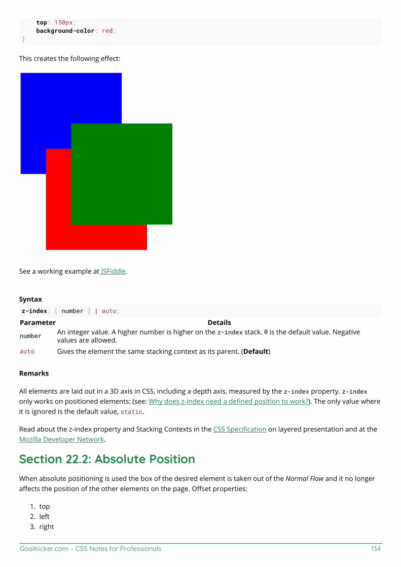
GoalKicker.com – CSS Notes for Professionals 134
top: 150px; background-color: red;}
This creates the following effect:
See a working example at JSFiddle.
Syntaxz-index: [ number ] | auto;
Parameter Details
number An integer value. A higher number is higher on the z-index stack. 0 is the default value. Negativevalues are allowed.
auto Gives the element the same stacking context as its parent. (Default)
Remarks
All elements are laid out in a 3D axis in CSS, including a depth axis, measured by the z-index property. z-indexonly works on positioned elements: (see: Why does z-index need a defined position to work?). The only value whereit is ignored is the default value, static.
Read about the z-index property and Stacking Contexts in the CSS Specification on layered presentation and at theMozilla Developer Network.
Section 22.2: Absolute PositionWhen absolute positioning is used the box of the desired element is taken out of the Normal Flow and it no longeraffects the position of the other elements on the page. Offset properties:
top1.left2.right3.

GoalKicker.com – CSS Notes for Professionals 135
bottom4.
specify the element should appear in relation to its next non-static containing element.
.abspos{ position:absolute; top:0px; left:500px;}
This code will move the box containing element with attribute class="abspos" down 0px and right 500px relative toits containing element.
Section 22.3: Fixed positionDefining position as fixed we can remove an element from the document flow and set its position relatively to thebrowser window. One obvious use is when we want something to be visible when we scroll to the bottom of a longpage.
#stickyDiv { position:fixed; top:10px; left:10px;}
Section 22.4: Relative PositionRelative positioning moves the element in relation to where it would have been in normal flow .Offset properties:
top1.left2.right3.bottom4.
are used to indicate how far to move the element from where it would have been in normal flow.
.relpos{ position:relative; top:20px; left:30px;}
This code will move the box containing element with attribute class="relpos" 20px down and 30px to the right fromwhere it would have been in normal flow.
Section 22.5: Static positioningThe default position of an element is static. To quote MDN:
This keyword lets the element use the normal behavior, that is it is laid out in its current position in theflow. The top, right, bottom, left and z-index properties do not apply.
.element{ position:static;


GoalKicker.com – CSS Notes for Professionals 137
Chapter 23: Layout ControlValue Effectnone Hide the element and prevent it from occupying space.
block Block element, occupy 100% of the available width, break after element.inline Inline element, occupy no width, no break after element.
inline-block Taking special properties from both inline and block elements, no break, but can have width.inline-flex Displays an element as an inline-level flex container.inline-table The element is displayed as an inline-level table.
grid Behaves like a block element and lays out its content according to the grid model.flex Behaves like a block element and lays out its content according to the flexbox model.
inherit Inherit the value from the parent element.
initial Reset the value to the default value taken from behaviors described in the HTML specifications orfrom the browser/user default stylesheet.
table Behaves like the HTML table element.table-cell Let the element behave like a <td> element
table-column Let the element behave like a <col> elementtable-row Let the element behave like a <tr> elementlist-item Let the element behave like a <li> element.
Section 23.1: The display propertyThe display CSS property is fundamental for controlling the layout and flow of an HTML document. Most elementshave a default display value of either block or inline (though some elements have other default values).
Inline
An inline element occupies only as much width as necessary. It stacks horizontally with other elements of thesame type and may not contain other non-inline elements.
<span>This is some <b>bolded</b> text!</span>
As demonstrated above, two inline elements, <span> and <b>, are in-line (hence the name) and do not break theflow of the text.
Block
A block element occupies the maximum available width of its' parent element. It starts with a new line and, incontrast to inline elements, it does not restrict the type of elements it may contain.
<div>Hello world!</div><div>This is an example!</div>
The div element is block-level by default, and as shown above, the two block elements are vertically stacked and,unlike the inline elements, the flow of the text breaks.

GoalKicker.com – CSS Notes for Professionals 138
Inline Block
The inline-block value gives us the best of both worlds: it blends the element in with the flow of the text whileallowing us to use padding, margin, height and similar properties which have no visible effect on inline elements.
Elements with this display value act as if they were regular text and as a result are affected by rules controlling theflow of text such as text-align. By default they are also shrunk to the the smallest size possible to accommodatetheir content.
<!--Inline: unordered list--><style>li { display : inline; background : lightblue; padding:10px;
border-width:2px; border-color:black; border-style:solid; }</style>
<ul><li>First Element </li><li>Second Element </li><li>Third Element </li></ul>
<!--block: unordered list--><style>li { display : block; background : lightblue; padding:10px;
border-width:2px; border-color:black; border-style:solid; }</style>
<ul><li>First Element </li><li>Second Element </li><li>Third Element </li></ul>
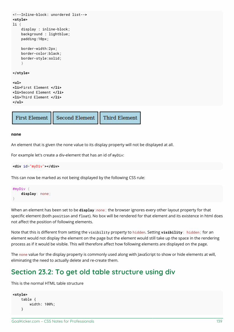
GoalKicker.com – CSS Notes for Professionals 139
<!--Inline-block: unordered list--><style>li { display : inline-block; background : lightblue; padding:10px;
border-width:2px; border-color:black; border-style:solid; }
</style>
<ul><li>First Element </li><li>Second Element </li><li>Third Element </li></ul>
none
An element that is given the none value to its display property will not be displayed at all.
For example let's create a div-element that has an id of myDiv:
<div id="myDiv"></div>
This can now be marked as not being displayed by the following CSS rule:
#myDiv { display: none;}
When an element has been set to be display:none; the browser ignores every other layout property for thatspecific element (both position and float). No box will be rendered for that element and its existence in html doesnot affect the position of following elements.
Note that this is different from setting the visibility property to hidden. Setting visibility: hidden; for anelement would not display the element on the page but the element would still take up the space in the renderingprocess as if it would be visible. This will therefore affect how following elements are displayed on the page.
The none value for the display property is commonly used along with JavaScript to show or hide elements at will,eliminating the need to actually delete and re-create them.
Section 23.2: To get old table structure using divThis is the normal HTML table structure
<style> table { width: 100%; }
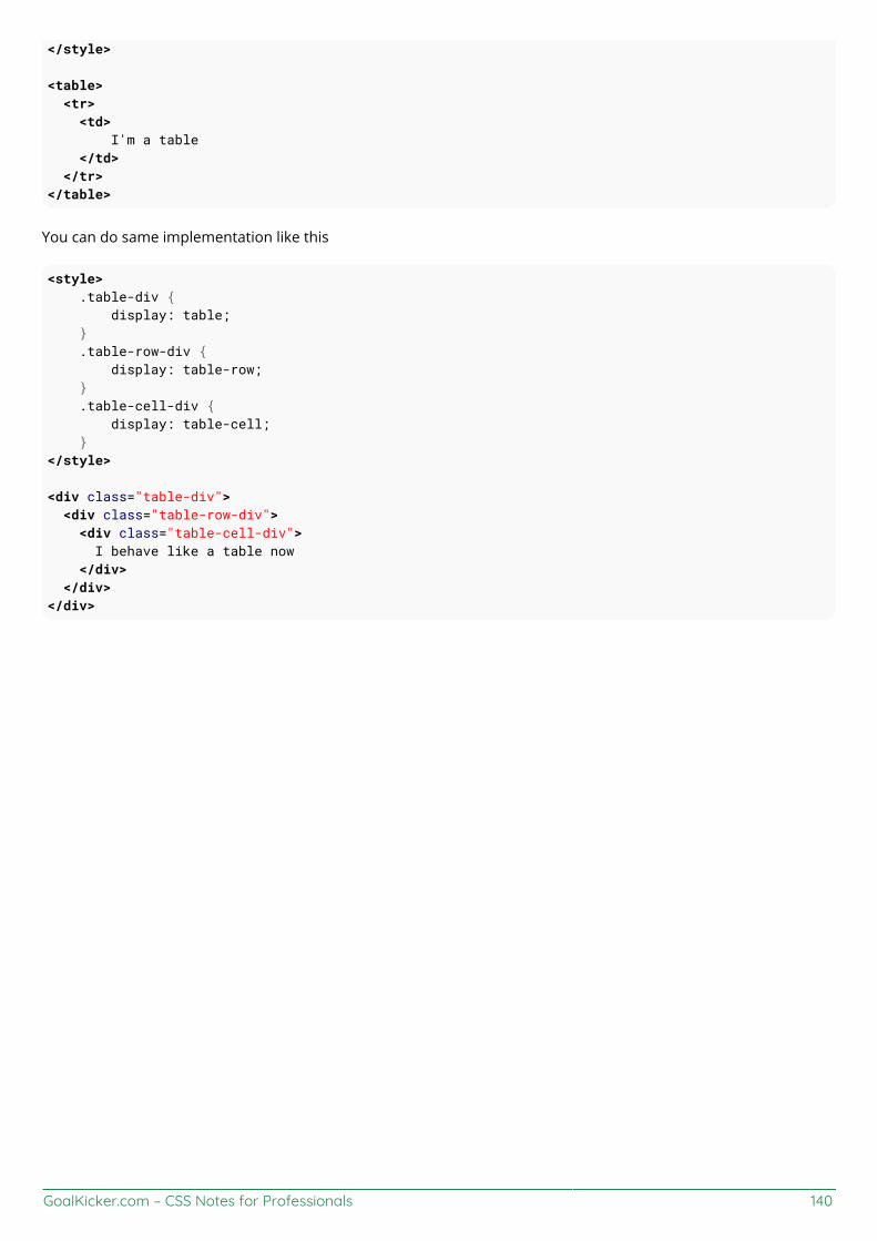
GoalKicker.com – CSS Notes for Professionals 140
</style>
<table> <tr> <td> I'm a table </td> </tr></table>
You can do same implementation like this
<style> .table-div { display: table; } .table-row-div { display: table-row; } .table-cell-div { display: table-cell; }</style>
<div class="table-div"> <div class="table-row-div"> <div class="table-cell-div"> I behave like a table now </div> </div></div>
GoalKicker.com – CSS Notes for Professionals 141
Chapter 24: GridGrid layout is a new and powerful CSS layout system that allows to divide a web page content into rows andcolumns in an easy way.
Section 24.1: Basic ExampleProperty Possible Valuesdisplay grid / inline-grid
The CSS Grid is defined as a display property. It applies to a parent element and its immediate children only.
Consider the following markup:
<section class="container"> <div class="item1">item1</div> <div class="item2">item2</div> <div class="item3">item3</div> <div class="item4">item4</div></section>
The easiest way to define the markup structure above as a grid is to simply set its display property to grid:
.container { display: grid; }
However, doing this will invariably cause all the child elements to collapse on top of one another. This is becausethe children do not currently know how to position themselves within the grid. But we can explicitly tell them.
First we need to tell the grid element .container how many rows and columns will make up its structure and wecan do this using the grid-columns and grid-rows properties (note the pluralisation):
.container { display: grid; grid-columns: 50px 50px 50px; grid-rows: 50px 50px;}
However, that still doesn't help us much because we need to give an order to each child element. We can do this byspecifying the grid-row and grid-column values which will tell it where it sits in the grid:
.container .item1 { grid-column: 1; grid-row: 1;}.container .item2 { grid-column: 2; grid-row: 1;}.container .item3 { grid-column: 1; grid-row: 2;}.container .item4 { grid-column: 2;

GoalKicker.com – CSS Notes for Professionals 142
grid-row: 2;}
By giving each item a column and row value it identifies the items order within the container.
View a working example on JSFiddle. You'll need to view this in IE10, IE11 or Edge for it to work as these arecurrently the only browsers supporting Grid Layout (with vendor prefix -ms-) or enable a flag in Chrome, Opera andFirefox according to caniuse in order to test with them.

GoalKicker.com – CSS Notes for Professionals 143
Chapter 25: TablesSection 25.1: table-layoutThe table-layout property changes the algorithm that is used for the layout of a table.
Below an example of two tables both set to width: 150px:
The table on the left has table-layout: auto while the one on the right has table-layout: fixed. The former iswider than the specified width (210px instead of 150px) but the contents fit. The latter takes the defined width of150px, regardless if the contents overflow or not.
Value Descriptionauto This is the default value. It defines the layout of the table to be determined by the contents of its' cells.
fixed This value sets the table layout to be determined by the width property provided to the table. If the contentof a cell exceeds this width, the cell will not resize but instead, let the content overflow.
Section 25.2: empty-cellsThe empty-cells property determines if cells with no content should be displayed or not. This has no effect unlessborder-collapse is set to separate.
Below an example with two tables with different values set to the empty-cells property:
The table on the left has empty-cells: show while the one on the right has empty-cells: hide. The former doesdisplay the empty cells whereas the latter does not.
Value Descriptionshow This is the default value. It shows cells even if they are empty.
hide This value hides a cell altogether if there are no contents in the cell.
More Information:
https://www.w3.org/TR/CSS21/tables.html#empty-cellshttps://developer.mozilla.org/en-US/docs/Web/CSS/empty-cellshttp://codepen.io/SitePoint/pen/yfhtqhttps://css-tricks.com/almanac/properties/e/empty-cells/
Section 25.3: border-collapseThe border-collapse property determines if a tables' borders should be separated or merged.
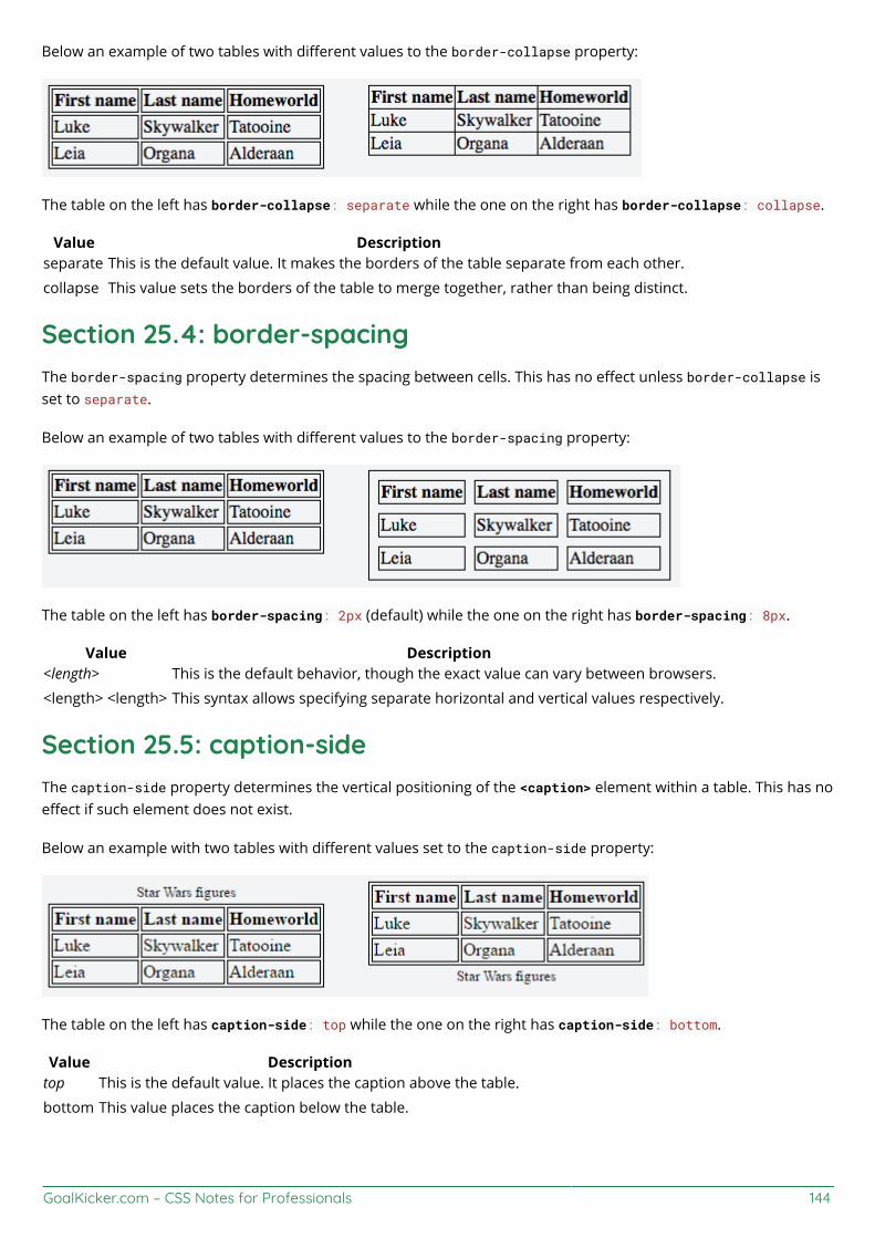
GoalKicker.com – CSS Notes for Professionals 144
Below an example of two tables with different values to the border-collapse property:
The table on the left has border-collapse: separate while the one on the right has border-collapse: collapse.
Value Descriptionseparate This is the default value. It makes the borders of the table separate from each other.
collapse This value sets the borders of the table to merge together, rather than being distinct.
Section 25.4: border-spacingThe border-spacing property determines the spacing between cells. This has no effect unless border-collapse isset to separate.
Below an example of two tables with different values to the border-spacing property:
The table on the left has border-spacing: 2px (default) while the one on the right has border-spacing: 8px.
Value Description<length> This is the default behavior, though the exact value can vary between browsers.
<length> <length> This syntax allows specifying separate horizontal and vertical values respectively.
Section 25.5: caption-sideThe caption-side property determines the vertical positioning of the <caption> element within a table. This has noeffect if such element does not exist.
Below an example with two tables with different values set to the caption-side property:
The table on the left has caption-side: top while the one on the right has caption-side: bottom.
Value Descriptiontop This is the default value. It places the caption above the table.
bottom This value places the caption below the table.
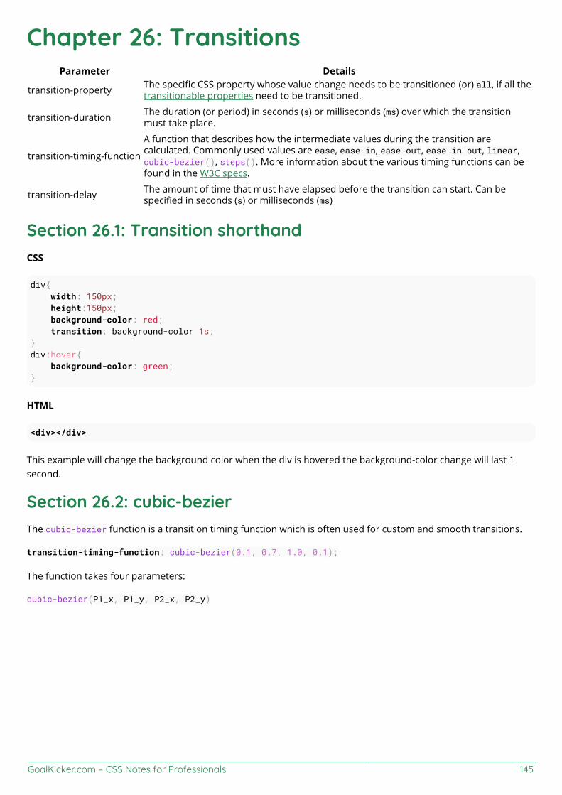
GoalKicker.com – CSS Notes for Professionals 145
Chapter 26: TransitionsParameter Details
transition-property The specific CSS property whose value change needs to be transitioned (or) all, if all thetransitionable properties need to be transitioned.
transition-duration The duration (or period) in seconds (s) or milliseconds (ms) over which the transitionmust take place.
transition-timing-function
A function that describes how the intermediate values during the transition arecalculated. Commonly used values are ease, ease-in, ease-out, ease-in-out, linear,cubic-bezier(), steps(). More information about the various timing functions can befound in the W3C specs.
transition-delay The amount of time that must have elapsed before the transition can start. Can bespecified in seconds (s) or milliseconds (ms)
Section 26.1: Transition shorthandCSS
div{ width: 150px; height:150px; background-color: red; transition: background-color 1s;}div:hover{ background-color: green;}
HTML
<div></div>
This example will change the background color when the div is hovered the background-color change will last 1second.
Section 26.2: cubic-bezierThe cubic-bezier function is a transition timing function which is often used for custom and smooth transitions.
transition-timing-function: cubic-bezier(0.1, 0.7, 1.0, 0.1);
The function takes four parameters:
cubic-bezier(P1_x, P1_y, P2_x, P2_y)
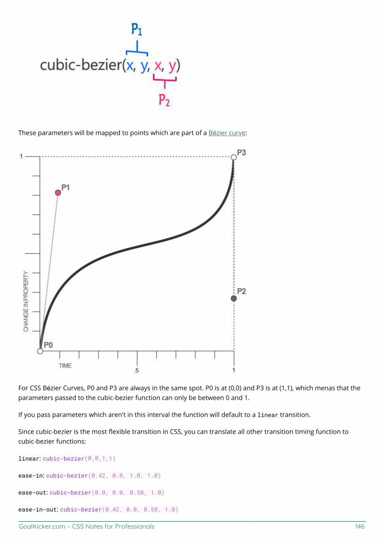
GoalKicker.com – CSS Notes for Professionals 146
These parameters will be mapped to points which are part of a Bézier curve:
For CSS Bézier Curves, P0 and P3 are always in the same spot. P0 is at (0,0) and P3 is at (1,1), which menas that theparameters passed to the cubic-bezier function can only be between 0 and 1.
If you pass parameters which aren't in this interval the function will default to a linear transition.
Since cubic-bezier is the most flexible transition in CSS, you can translate all other transition timing function tocubic-bezier functions:
linear: cubic-bezier(0,0,1,1)
ease-in: cubic-bezier(0.42, 0.0, 1.0, 1.0)
ease-out: cubic-bezier(0.0, 0.0, 0.58, 1.0)
ease-in-out: cubic-bezier(0.42, 0.0, 0.58, 1.0)

GoalKicker.com – CSS Notes for Professionals 147
Section 26.3: Transition (longhand)CSSdiv { height: 100px; width: 100px; border: 1px solid; transition-property: height, width; transition-duration: 1s, 500ms; transition-timing-function: linear; transition-delay: 0s, 1s;}div:hover { height: 200px; width: 200px;}
HTML<div></div>
transition-property: Specifies the CSS properties the transition effect is for. In this case, the div will expandboth horizontally and vertically when hovered.transition-duration: Specifies the length of time a transition takes to complete. In the above example, theheight and width transitions will take 1 second and 500 milliseconds respectively.transition-timing-function: Specifies the speed curve of the transition effect. A linear value indicates thetransition will have the same speed from start to finish.transition-delay: Specifies the amount of time needed to wait before the transition effect starts. In this case,the height will start transitioning immediately, whereas the width will wait 1 second.
GoalKicker.com – CSS Notes for Professionals 148
Chapter 27: AnimationsTransition
Parameter Details
property Either the CSS property to transition on, or all, which specifies all transition-ableproperties.
duration Transition time, either in seconds or milliseconds.
timing-functionSpecifies a function to define how intermediate values for properties are computed.Common values are ease, linear, and step-end. Check out the easing function cheat-sheet for more.
delay Amount of time, in seconds or milliseconds, to wait before playing the animation.
@keyframes
[ from | to | <percentage> ] You can either specify a set time with a percentage value, or two percentage values, ie10%, 20%, for a period of time where the keyframe's set attributes are set.
block Any amount of CSS attributes for the keyframe.
Section 27.1: Animations with keyframesFor multi-stage CSS animations, you can create CSS @keyframes. Keyframes allow you to define multiple animationpoints, called a keyframe, to define more complex animations.
Basic Example
In this example, we'll make a basic background animation that cycles between all colors.
@keyframes rainbow-background { 0% { background-color: #ff0000; } 8.333% { background-color: #ff8000; } 16.667% { background-color: #ffff00; } 25.000% { background-color: #80ff00; } 33.333% { background-color: #00ff00; } 41.667% { background-color: #00ff80; } 50.000% { background-color: #00ffff; } 58.333% { background-color: #0080ff; } 66.667% { background-color: #0000ff; } 75.000% { background-color: #8000ff; } 83.333% { background-color: #ff00ff; } 91.667% { background-color: #ff0080; } 100.00% { background-color: #ff0000; }}
.RainbowBackground { animation: rainbow-background 5s infinite;}
View Result
There's a few different things to note here. First, the actual @keyframes syntax.
@keyframes rainbow-background{
This sets the name of the animation to rainbow-background.

GoalKicker.com – CSS Notes for Professionals 149
0% { background-color: #ff0000; }
This is the definition for a keyframe within the animation. The first part, the 0% in the case, defines where thekeyframe is during the animation. The 0% implies it is 0% of the total animation time from the beginning.
The animation will automatically transition between keyframes. So, by setting the next background color at 8.333%,the animation will smoothly take 8.333% of the time to transition between those keyframes.
.RainbowBackground { animation: rainbow-background 5s infinite;}
This code attaches our animation to all elements which have the .RainbowBackground class.
The actual animation property takes the following arguments.
animation-name: The name of our animation. In this case, rainbow-backgroundanimation-duration: How long the animation will take, in this case 5 seconds.animation-iteration-count (Optional): The number of times the animation will loop. In this case, theanimation will go on indefinitely. By default, the animation will play once.animation-delay (Optional): Specifies how long to wait before the animation starts. It defaults to 0 seconds,and can take negative values. For example, -2s would start the animation 2 seconds into its loop.animation-timing-function (Optional): Specifies the speed curve of the animation. It defaults to ease,where the animation starts slow, gets faster and ends slow.
In this particular example, both the 0% and 100% keyframes specify { background-color: #ff0000; }. Wherevertwo or more keyframes share a state, one may specify them in a single statement. In this case, the two 0% and 100%lines could be replaced with this single line:
0%, 100% { background-color: #ff0000; }
Cross-browser compatibility
For older WebKit-based browsers, you'll need to use the vendor prefix on both the @keyframes declaration and theanimation property, like so:
@-webkit-keyframes{}
-webkit-animation: ...
Section 27.2: Animations with the transition propertyUseful for simple animations, the CSS transition property allows number-based CSS properties to animatebetween states.
Example.Example{ height: 100px; background: #fff;}
.Example:hover{ height: 120px;
GoalKicker.com – CSS Notes for Professionals 150
background: #ff0000;}
View Result
By default, hovering over an element with the .Example class would immediately cause the element's height tojump to 120px and its background color to red (#ff0000).
By adding the transition property, we can cause these changes to occur over time:
.Example{ ... transition: all 400ms ease;}
View Result
The all value applies the transition to all compatible (numbers-based) properties. Any compatible property name(such as height or top) can be substituted for this keyword.
400ms specifies the amount of time the transition takes. In this case, the element's change in height will take 400milliseconds to complete.
Finally, the value ease is the animation function, which determines how the animation is played. ease means startslow, speed up, then end slow again. Other values are linear, ease-out, and ease-in.
Cross-Browser Compatibility
The transition property is generally well-supported across all major browsers, excepting IE 9. For earlier versionsof Firefox and Webkit-based browsers, use vendor prefixes like so:
.Example{ transition: all 400ms ease; -moz-transition: all 400ms ease; -webkit-transition: all 400ms ease;}
Note: The transition property can animate changes between any two numerical values, regardless of unit. It canalso transition between units, such as 100px to 50vh. However, it cannot transition between a number and a defaultor automatic value, such as transitioning an element's height from 100px to auto.
Section 27.3: Syntax ExamplesOur first syntax example shows the animation shorthand property using all of the available properties/parameters:
animation: 3s ease-in 1s 2 reverse both paused slidein; /* duration | timing-function | delay | iteration-count | direction | fill-mode | play-state | name */
Our second example is a little more simple, and shows that some properties can be omitted:
animation: 3s linear 1s slidein; /* duration | timing-function | delay | name */

GoalKicker.com – CSS Notes for Professionals 151
Our third example shows the most minimal declaration. Note that the animation-name and animation-durationmust be declared:
animation: 3s slidein; /* duration | name */
It's also worth mentioning that when using the animation shorthand the order of the properties makes a difference.Obviously the browser may confuse your duration with your delay.
If brevity isn't your thing, you can also skip the shorthand property and write out each property individually:
animation-duration: 3s;animation-timing-function: ease-in;animation-delay: 1s;animation-iteration-count: 2;animation-direction: reverse;animation-fill-mode: both;animation-play-state: paused;animation-name: slidein;
Section 27.4: Increasing Animation Performance Using the`will-change` AttributeWhen creating animations and other GPU-heavy actions, it's important to understand the will-change attribute.
Both CSS keyframes and the transition property use GPU acceleration. Performance is increased by offloadingcalculations to the device's GPU. This is done by creating paint layers (parts of the page that are individuallyrendered) that are offloaded to the GPU to be calculated. The will-change property tells the browser what willanimate, allowing the browser to create smaller paint areas, thus increasing performance.
The will-change property accepts a comma-separated list of properties to be animated. For example, if you planon transforming an object and changing its opacity, you would specify:
.Example{ ... will-change: transform, opacity;}
Note: Use will-change sparingly. Setting will-change for every element on a page can cause performanceproblems, as the browser may attempt to create paint layers for every element, significantly increasing the amountof processing done by the GPU.
GoalKicker.com – CSS Notes for Professionals 152
Chapter 28: 2D TransformsFunction/Parameter Detailsrotate(x) Defines a transformation that moves the element around a fixed point on the Z axistranslate(x,y) Moves the position of the element on the X and Y axistranslateX(x) Moves the position of the element on the X axistranslateY(y) Moves the position of the element on the Y axisscale(x,y) Modifies the size of the element on the X and Y axisscaleX(x) Modifies the size of the element on the X axisscaleY(y) Modifies the size of the element on the Y axis
skew(x,y) Shear mapping, or transvection, distorting each point of an element by a certain angle ineach direction
skewX(x) Horizontal shear mapping distorting each point of an element by a certain angle in thehorizontal direction
skewY(y) Vertical shear mapping distorting each point of an element by a certain angle in the verticaldirection
matrix() Defines a 2D transformation in the form of a transformation matrix.
angle
The angle by which the element should be rotated or skewed (depending on the functionwith which it is used). Angle can be provided in degrees (deg), gradians (grad), radians (rad)or turns (turn). In skew() function, the second angle is optional. If not provided, there will beno (0) skew in Y-axis.
length-or-percentageThe distance expressed as a length or a percentage by which the element should betranslated. In translate() function, the second length-or-percentage is optional. If notprovided, then there would be no (0) translation in Y-axis.
scale-factorA number which defines how many times the element should be scaled in the specified axis.In scale() function, the second scale-factor is optional. If not provided, the first scale-factorwill be applied for Y-axis also.
Section 28.1: RotateHTML
<div class="rotate"></div>
CSS
.rotate { width: 100px; height: 100px; background: teal; transform: rotate(45deg);}
This example will rotate the div by 45 degrees clockwise. The center of rotation is in the center of the div, 50% fromleft and 50% from top. You can change the center of rotation by setting the transform-origin property.
transform-origin: 100% 50%;
The above example will set the center of rotation to the middle of the right side end.

GoalKicker.com – CSS Notes for Professionals 153
Section 28.2: ScaleHTML
<div class="scale"></div>
CSS
.scale { width: 100px; height: 100px; background: teal; transform: scale(0.5, 1.3);}
This example will scale the div to 100px * 0.5 = 50px on the X axis and to 100px * 1.3 = 130px on the Y axis.
The center of the transform is in the center of the div, 50% from left and 50% from top.
Section 28.3: SkewHTML
<div class="skew"></div>
CSS
.skew { width: 100px; height: 100px; background: teal; transform: skew(20deg, -30deg);}
This example will skew the div by 20 degrees on the X axis and by - 30 degrees on the Y axis.The center of the transform is in the center of the div, 50% from left and 50% from top.
See the result here.
Section 28.4: Multiple transformsMultiple transforms can be applied to an element in one property like this:
transform: rotate(15deg) translateX(200px);
This will rotate the element 15 degrees clockwise and then translate it 200px to the right.
In chained transforms, the coordinate system moves with the element. This means that the translation won't behorizontal but on an axis rotate 15 degrees clockwise as shown in the following image:
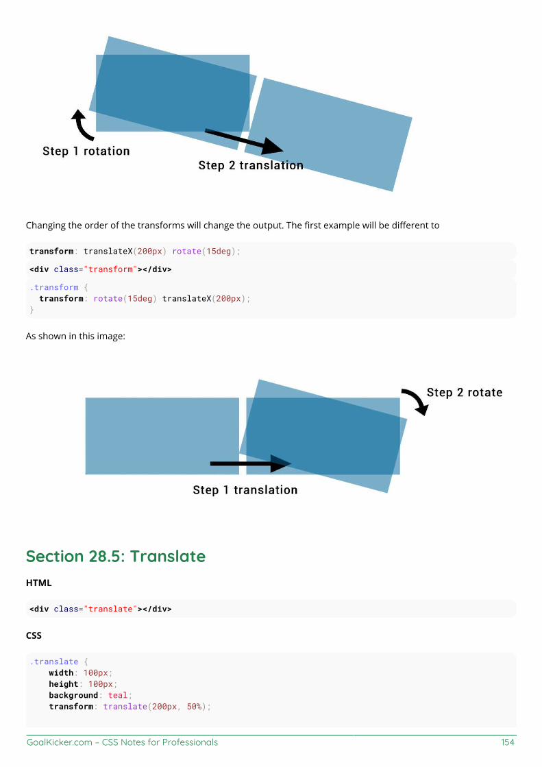
GoalKicker.com – CSS Notes for Professionals 154
Changing the order of the transforms will change the output. The first example will be different to
transform: translateX(200px) rotate(15deg);
<div class="transform"></div>
.transform { transform: rotate(15deg) translateX(200px);}
As shown in this image:
Section 28.5: TranslateHTML
<div class="translate"></div>
CSS
.translate { width: 100px; height: 100px; background: teal; transform: translate(200px, 50%);

GoalKicker.com – CSS Notes for Professionals 155
}
This example will move the div by 200px on the X axis and by 100px * 50% = 50px on the Y axis.
You can also specify translations on a single axis.
On the X axis:
.translate { transform: translateX(200px);}
On the Y axis:
.translate { transform: translateY(50%);}
Section 28.6: Transform OriginTransformations are done with respect to a point which is defined by the transform-origin property.
The property takes 2 values : transform-origin: X Y;
In the following example the first div (.tl) is rotate around the top left corner with transform-origin: 0 0; andthe second (.tr)is transformed around it's top right corner with transform-origin: 100% 0. The rotation is appliedon hover :
HTML:
<div class="transform originl"></div><div class="transform origin2"></div>
CSS:
.transform { display: inline-block; width: 200px; height: 100px; background: teal; transition: transform 1s;}
.origin1 { transform-origin: 0 0;}
.origin2 { transform-origin: 100% 0;}
.transform:hover { transform: rotate(30deg);}
The default value for the transform-origin property is 50% 50% which is the center of the element.
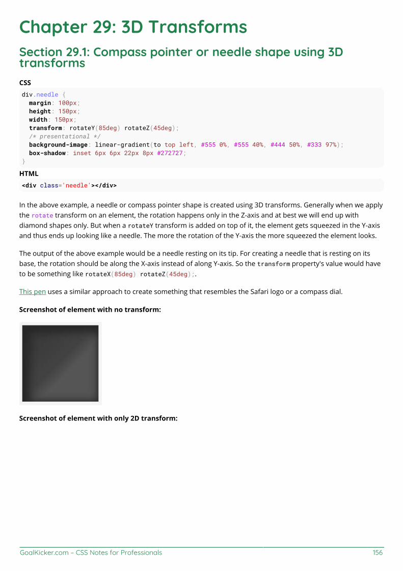
GoalKicker.com – CSS Notes for Professionals 156
Chapter 29: 3D TransformsSection 29.1: Compass pointer or needle shape using 3DtransformsCSSdiv.needle { margin: 100px; height: 150px; width: 150px; transform: rotateY(85deg) rotateZ(45deg); /* presentational */ background-image: linear-gradient(to top left, #555 0%, #555 40%, #444 50%, #333 97%); box-shadow: inset 6px 6px 22px 8px #272727; }
HTML<div class='needle'></div>
In the above example, a needle or compass pointer shape is created using 3D transforms. Generally when we applythe rotate transform on an element, the rotation happens only in the Z-axis and at best we will end up withdiamond shapes only. But when a rotateY transform is added on top of it, the element gets squeezed in the Y-axisand thus ends up looking like a needle. The more the rotation of the Y-axis the more squeezed the element looks.
The output of the above example would be a needle resting on its tip. For creating a needle that is resting on itsbase, the rotation should be along the X-axis instead of along Y-axis. So the transform property's value would haveto be something like rotateX(85deg) rotateZ(45deg);.
This pen uses a similar approach to create something that resembles the Safari logo or a compass dial.
Screenshot of element with no transform:
Screenshot of element with only 2D transform:

GoalKicker.com – CSS Notes for Professionals 157
Screenshot of element with 3D transform:
Section 29.2: 3D text eect with shadowHTML:
<div id="title"> <h1 data-content="HOVER">HOVER</h1></div>
CSS:
*{margin:0;padding:0;}html,body{height:100%;width:100%;overflow:hidden;background:#0099CC;}#title{ position:absolute; top:50%; left:50%; transform:translate(-50%,-50%); perspective-origin:50% 50%; perspective:300px;}h1{ text-align:center; font-size:12vmin; font-family: 'Open Sans', sans-serif; color:rgba(0,0,0,0.8); line-height:1em; transform:rotateY(50deg); perspective:150px; perspective-origin:0% 50%;

GoalKicker.com – CSS Notes for Professionals 158
}h1:after{ content:attr(data-content); position:absolute; left:0;top:0; transform-origin:50% 100%; transform:rotateX(-90deg); color:#0099CC;}#title:before{ content:''; position:absolute; top:-150%; left:-25%; width:180%; height:328%; background:rgba(255,255,255,0.7); transform-origin: 0 100%; transform: translatez(-200px) rotate(40deg) skewX(35deg); border-radius:0 0 100% 0;}
View example with additional hover effect
In this example, the text is transformed to make it look like it is going into the screen away from the user.
The shadow is transformed accordingly so it follows the text. As it is made with a pseudo element and the dataattribute, it inherits the transforms form it's parent (the H1 tag).
The white "light" is made with a pseudo element on the #title element. It is skewed and uses border-radius for therounded corner.
Section 29.3: backface-visibilityThe backface-visibility property relates to 3D transforms.
With 3D transforms and the backface-visibility property, you're able to rotate an element such that the originalfront of an element no longer faces the screen.

GoalKicker.com – CSS Notes for Professionals 159
For example, this would flip an element away from the screen:
JSFIDDLE
<div class="flip">Loren ipsum</div><div class="flip back">Lorem ipsum</div>
.flip { -webkit-transform: rotateY(180deg); -moz-transform: rotateY(180deg); -ms-transform: rotateY(180deg); -webkit-backface-visibility: visible; -moz-backface-visibility: visible; -ms-backface-visibility: visible;}
.flip.back { -webkit-backface-visibility: hidden; -moz-backface-visibility: hidden; -ms-backface-visibility: hidden;}
Firefox 10+ and IE 10+ support backface-visibility without a prefix. Opera, Chrome, Safari, iOS, and Android allneed -webkit-backface-visibility.
It has 4 values:
visible (default) - the element will always be visible even when not facing the screen.1.hidden - the element is not visible when not facing the screen.2.inherit - the property will gets its value from the its parent element3.initial - sets the property to its default, which is visible4.
Section 29.4: 3D cube3D transforms can be use to create many 3D shapes. Here is a simple 3D CSS cube example:
HTML:
<div class="cube"> <div class="cubeFace"></div> <div class="cubeFace face2"></div></div>
CSS:
body { perspective-origin: 50% 100%; perspective: 1500px; overflow: hidden;}.cube { position: relative; padding-bottom: 20%; transform-style: preserve-3d; transform-origin: 50% 100%; transform: rotateY(45deg) rotateX(0);}.cubeFace {

GoalKicker.com – CSS Notes for Professionals 160
position: absolute; top: 0; left: 40%; width: 20%; height: 100%; margin: 0 auto; transform-style: inherit; background: #C52329; box-shadow: inset 0 0 0 5px #333; transform-origin: 50% 50%; transform: rotateX(90deg); backface-visibility: hidden;}.face2 { transform-origin: 50% 50%; transform: rotatez(90deg) translateX(100%) rotateY(90deg);}.cubeFace:before, .cubeFace:after { content: ''; position: absolute; width: 100%; height: 100%; transform-origin: 0 0; background: inherit; box-shadow: inherit; backface-visibility: inherit;}.cubeFace:before { top: 100%; left: 0; transform: rotateX(-90deg);}.cubeFace:after { top: 0; left: 100%; transform: rotateY(90deg);}
View this exampleAdditional styling is added in the demo and a transform is applied on hover to view the 6 faces of the cube.
Should be noted that:
4 faces are made with pseudo elementschained transforms are applied
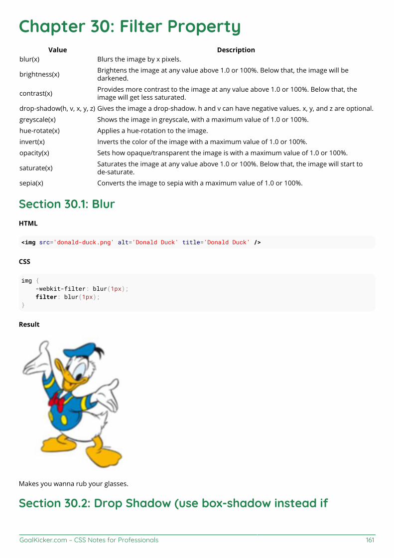
GoalKicker.com – CSS Notes for Professionals 161
Chapter 30: Filter PropertyValue Description
blur(x) Blurs the image by x pixels.
brightness(x) Brightens the image at any value above 1.0 or 100%. Below that, the image will bedarkened.
contrast(x) Provides more contrast to the image at any value above 1.0 or 100%. Below that, theimage will get less saturated.
drop-shadow(h, v, x, y, z) Gives the image a drop-shadow. h and v can have negative values. x, y, and z are optional.
greyscale(x) Shows the image in greyscale, with a maximum value of 1.0 or 100%.
hue-rotate(x) Applies a hue-rotation to the image.
invert(x) Inverts the color of the image with a maximum value of 1.0 or 100%.
opacity(x) Sets how opaque/transparent the image is with a maximum value of 1.0 or 100%.
saturate(x) Saturates the image at any value above 1.0 or 100%. Below that, the image will start tode-saturate.
sepia(x) Converts the image to sepia with a maximum value of 1.0 or 100%.
Section 30.1: BlurHTML
<img src='donald-duck.png' alt='Donald Duck' title='Donald Duck' />
CSS
img { -webkit-filter: blur(1px); filter: blur(1px);}
Result
Makes you wanna rub your glasses.
Section 30.2: Drop Shadow (use box-shadow instead if

GoalKicker.com – CSS Notes for Professionals 162
possible)HTML
<p>My shadow always follows me.</p>
CSS
p { -webkit-filter: drop-shadow(10px 10px 1px green); filter: drop-shadow(10px 10px 1px green);}
Result
Section 30.3: Hue RotateHTML
<img src='donald-duck.png' alt='Donald Duck' title='Donald Duck' />
CSS
img { -webkit-filter: hue-rotate(120deg); filter: hue-rotate(120deg);}
Result
Section 30.4: Multiple Filter ValuesTo use multiple filters, separate each value with a space.
HTML
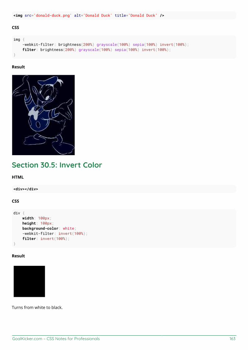
GoalKicker.com – CSS Notes for Professionals 163
<img src='donald-duck.png' alt='Donald Duck' title='Donald Duck' />
CSS
img { -webkit-filter: brightness(200%) grayscale(100%) sepia(100%) invert(100%); filter: brightness(200%) grayscale(100%) sepia(100%) invert(100%);}
Result
Section 30.5: Invert ColorHTML
<div></div>
CSS
div { width: 100px; height: 100px; background-color: white; -webkit-filter: invert(100%); filter: invert(100%);}
Result
Turns from white to black.
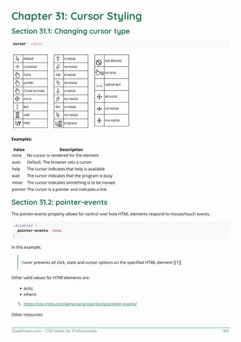
GoalKicker.com – CSS Notes for Professionals 164
Chapter 31: Cursor StylingSection 31.1: Changing cursor typecursor: value;
Examples:
Value Descriptionnone No cursor is rendered for the element
auto Default. The browser sets a cursor
help The cursor indicates that help is available
wait The cursor indicates that the program is busy
move The cursor indicates something is to be moved
pointer The cursor is a pointer and indicates a link
Section 31.2: pointer-eventsThe pointer-events property allows for control over how HTML elements respond to mouse/touch events.
.disabled { pointer-events: none;}
In this example,
'none' prevents all click, state and cursor options on the specified HTML element [[1]]
Other valid values for HTMl elements are:
auto;inherit.
https://css-tricks.com/almanac/properties/p/pointer-events/1.
Other resources:
GoalKicker.com – CSS Notes for Professionals 165
https://developer.mozilla.org/en-US/docs/Web/CSS/pointer-events
https://davidwalsh.name/pointer-events
Section 31.3: caret-colorThe caret-color CSS property specifies the color of the caret, the visible indicator of the insertion point in anelement where text and other content is inserted by the user's typing or editing.
HTML
<input id="example" />
CSS
#example { caret-color: red;}
Resources:
https://developer.mozilla.org/en-US/docs/Web/CSS/caret-color
GoalKicker.com – CSS Notes for Professionals 166
Chapter 32: box-shadowParameters Details
inset by default, the shadow is treated as a drop shadow. the inset keyword draws the shadow inside theframe/border.
offset-x the horizontal distance
offset-y the vertical distance
blur-radius 0 by default. value cannot be negative. the bigger the value, the bigger and lighter the shadowbecomes.
spread-radius 0 by default. positive values will cause the shadow to expand. negative values will cause the shadowto shrink.
color can be of various notations: a color keyword, hexadecimal, rgb(), rgba(), hsl(), hsla()
Section 32.1: bottom-only drop shadow using a pseudo-elementJSFiddle: https://jsfiddle.net/UnsungHero97/80qod7aL/2/
HTML
<div class="box_shadow"></div>
CSS
.box_shadow { background-color: #1C90F3; width: 200px; height: 100px; margin: 50px;}
.box_shadow:after { content: ""; width: 190px; height: 1px; margin-top: 98px; margin-left: 5px; display: block; position: absolute; z-index: -1; -webkit-box-shadow: 0px 0px 8px 2px #444444; -moz-box-shadow: 0px 0px 8px 2px #444444; box-shadow: 0px 0px 8px 2px #444444;}

GoalKicker.com – CSS Notes for Professionals 167
Section 32.2: drop shadowJSFiddle: https://jsfiddle.net/UnsungHero97/80qod7aL/
HTML
<div class="box_shadow"></div>
CSS
.box_shadow { -webkit-box-shadow: 0px 0px 10px -1px #444444; -moz-box-shadow: 0px 0px 10px -1px #444444; box-shadow: 0px 0px 10px -1px #444444;}
Section 32.3: inner drop shadowHTML
<div class="box_shadow"></div>
CSS
.box_shadow { background-color: #1C90F3; width: 200px; height: 100px; margin: 50px; -webkit-box-shadow: inset 0px 0px 10px 0px #444444; -moz-box-shadow: inset 0px 0px 10px 0px #444444; box-shadow: inset 0px 0px 10px 0px #444444;}
Result:

GoalKicker.com – CSS Notes for Professionals 168
JSFiddle: https://jsfiddle.net/UnsungHero97/80qod7aL/1/
Section 32.4: multiple shadowsJSFiddle: https://jsfiddle.net/UnsungHero97/80qod7aL/5/
HTML
<div class="box_shadow"></div>
CSS
.box_shadow { width: 100px; height: 100px; margin: 100px; box-shadow: -52px -52px 0px 0px #f65314, 52px -52px 0px 0px #7cbb00, -52px 52px 0px 0px #00a1f1, 52px 52px 0px 0px #ffbb00;}
GoalKicker.com – CSS Notes for Professionals 169
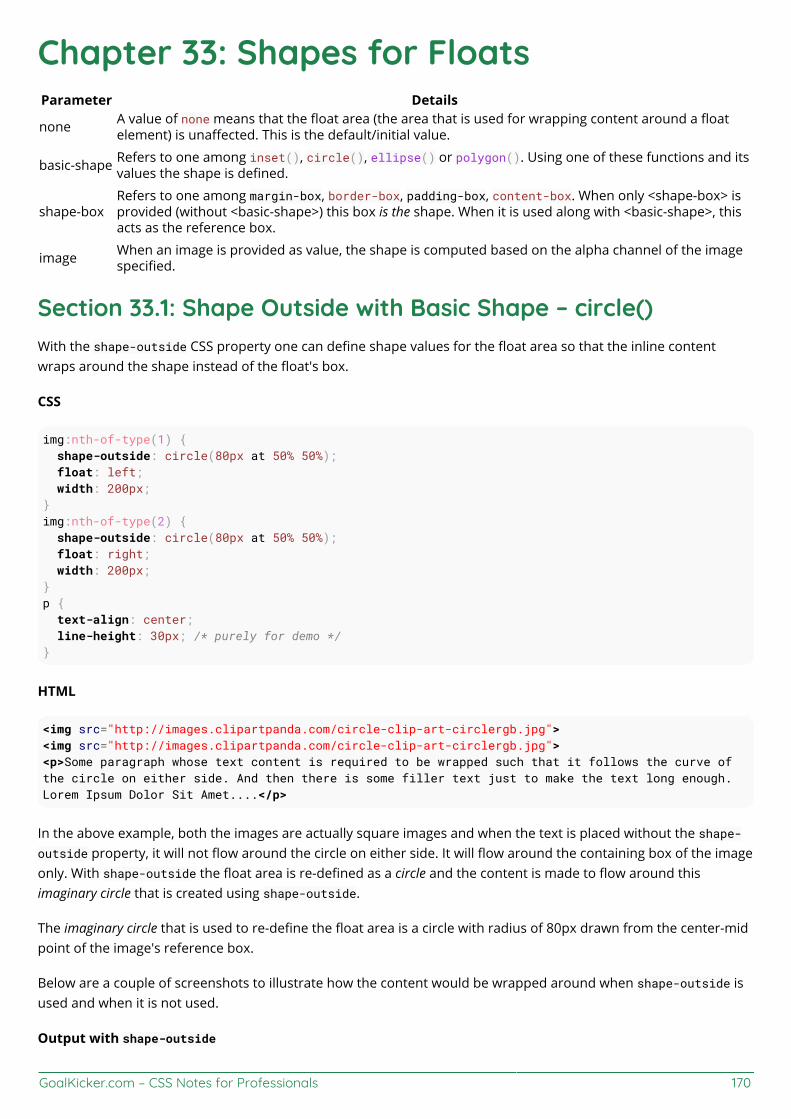
GoalKicker.com – CSS Notes for Professionals 170
Chapter 33: Shapes for FloatsParameter Details
none A value of none means that the float area (the area that is used for wrapping content around a floatelement) is unaffected. This is the default/initial value.
basic-shape Refers to one among inset(), circle(), ellipse() or polygon(). Using one of these functions and itsvalues the shape is defined.
shape-boxRefers to one among margin-box, border-box, padding-box, content-box. When only <shape-box> isprovided (without <basic-shape>) this box is the shape. When it is used along with <basic-shape>, thisacts as the reference box.
image When an image is provided as value, the shape is computed based on the alpha channel of the imagespecified.
Section 33.1: Shape Outside with Basic Shape – circle()With the shape-outside CSS property one can define shape values for the float area so that the inline contentwraps around the shape instead of the float's box.
CSS
img:nth-of-type(1) { shape-outside: circle(80px at 50% 50%); float: left; width: 200px;}img:nth-of-type(2) { shape-outside: circle(80px at 50% 50%); float: right; width: 200px; }p { text-align: center; line-height: 30px; /* purely for demo */}
HTML
<img src="http://images.clipartpanda.com/circle-clip-art-circlergb.jpg"><img src="http://images.clipartpanda.com/circle-clip-art-circlergb.jpg"><p>Some paragraph whose text content is required to be wrapped such that it follows the curve ofthe circle on either side. And then there is some filler text just to make the text long enough.Lorem Ipsum Dolor Sit Amet....</p>
In the above example, both the images are actually square images and when the text is placed without the shape-outside property, it will not flow around the circle on either side. It will flow around the containing box of the imageonly. With shape-outside the float area is re-defined as a circle and the content is made to flow around thisimaginary circle that is created using shape-outside.
The imaginary circle that is used to re-define the float area is a circle with radius of 80px drawn from the center-midpoint of the image's reference box.
Below are a couple of screenshots to illustrate how the content would be wrapped around when shape-outside isused and when it is not used.
Output with shape-outside

GoalKicker.com – CSS Notes for Professionals 171
Output without shape-outside
Section 33.2: Shape marginThe shape-margin CSS property adds a margin to shape-outside.
CSS
img:nth-of-type(1) { shape-outside: circle(80px at 50% 50%); shape-margin: 10px; float: left; width: 200px;}img:nth-of-type(2) { shape-outside: circle(80px at 50% 50%); shape-margin: 10px; float: right; width: 200px; }p { text-align: center; line-height: 30px; /* purely for demo */}
HTML
<img src="http://images.clipartpanda.com/circle-clip-art-circlergb.jpg"><img src="http://images.clipartpanda.com/circle-clip-art-circlergb.jpg"><p>Some paragraph whose text content is required to be wrapped such that it follows the curve ofthe circle on either side. And then there is some filler text just to make the text long enough.Lorem Ipsum Dolor Sit Amet....</p>
In this example, a 10px margin is added around the shape using shape-margin. This creates a bit more spacebetween the imaginary circle that defines the float area and the actual content that is flowing around.
Output:

GoalKicker.com – CSS Notes for Professionals 172

GoalKicker.com – CSS Notes for Professionals 173
Chapter 34: List StylesValue Description
list-style-type the type of list-item marker.
list-style-position specifies where to place the marker
list-style-image specifies the type of list-item marker
initial sets this property to its default value
inherit inherits this property from its parent element
Section 34.1: Bullet PositionA list consists of <li> elements inside a containing element (<ul> or <ol>). Both the list items and the container canhave margins and paddings which influence the exact position of the list item content in the document. The defaultvalues for the margin and padding may be different for each browser. In order to get the same layout cross-browser, these need to be set specifically.
Each list item gets a 'marker box', which contains the bullet marker. This box can either be placed inside or outsideof the list item box.
list-style-position: inside;
places the bullet within the <li> element, pushing the content to the right as needed.
list-style-position: outside;
places the bullet left of the <li> element. If there is not enough space in the padding of the containing element, themarker box will extend to the left even if it would fall off the page.
Showing the result of inside and outside positioning: jsfiddle
Section 34.2: Removing Bullets / NumbersSometimes, a list should just not display any bullet points or numbers. In that case, remember to specify marginand padding.
<ul> <li>first item</li> <li>second item</li></ul>
CSS
ul { list-style-type: none;}li { margin: 0; padding: 0;}
Section 34.3: Type of Bullet or NumberingSpecific for <li> tags within an unordered list (<ul>):
GoalKicker.com – CSS Notes for Professionals 174
list-style: disc; /* A filled circle (default) */list-style: circle; /* A hollow circle */list-style: square; /* A filled square */list-style: '-'; /* any string */
Specific for <li> tags within an ordered list (<ol>):
list-style: decimal; /* Decimal numbers beginning with 1 (default) */list-style: decimal-leading-zero;/* Decimal numbers padded by initial zeros (01, 02, 03, … 10) */list-style: lower-roman; /* Lowercase roman numerals (i., ii., iii., iv., ...) */list-style: upper-roman; /* Uppercase roman numerals (I., II., III., IV., ...) */list-style-type: lower-greek; /* Lowercase roman letters (α., β., γ., δ., ...) */list-style-type: lower-alpha; /* Lowercase letters (a., b., c., d., ...) */list-style-type: lower-latin; /* Lowercase letters (a., b., c., d., ...) */list-style-type: upper-alpha; /* Uppercase letters (A., B., C., D., ...) */list-style-type: upper-latin; /* Uppercase letters (A., B., C., D., ...) */
Non-specific:
list-style: none; /* No visible list marker */list-style: inherit; /* Inherits from parent */
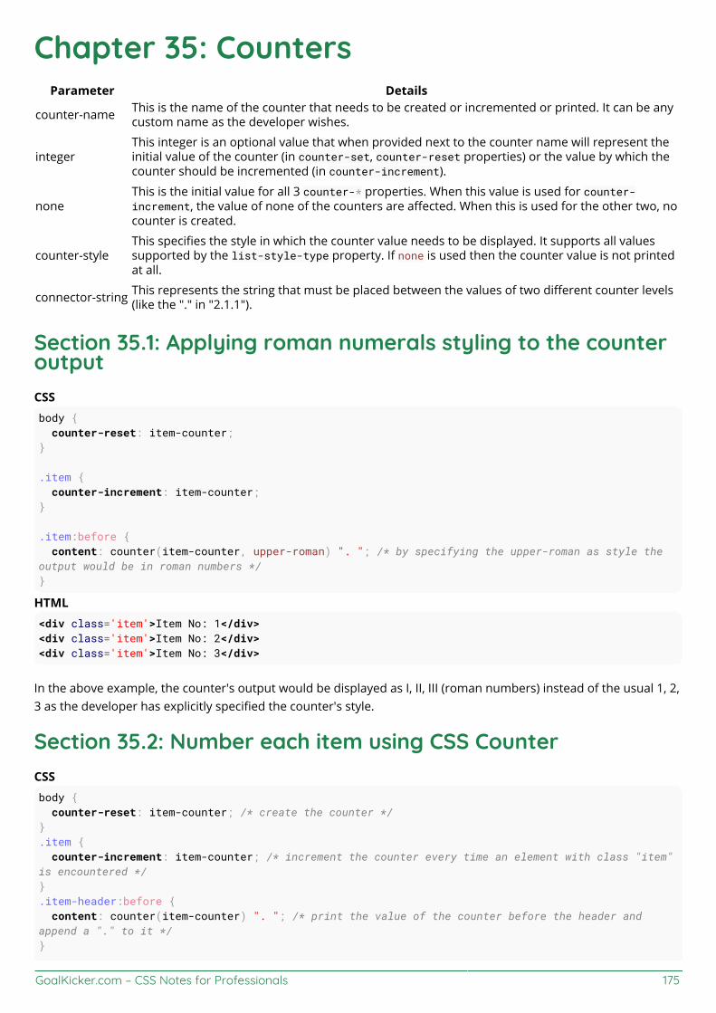
GoalKicker.com – CSS Notes for Professionals 175
Chapter 35: CountersParameter Details
counter-name This is the name of the counter that needs to be created or incremented or printed. It can be anycustom name as the developer wishes.
integerThis integer is an optional value that when provided next to the counter name will represent theinitial value of the counter (in counter-set, counter-reset properties) or the value by which thecounter should be incremented (in counter-increment).
noneThis is the initial value for all 3 counter-* properties. When this value is used for counter-increment, the value of none of the counters are affected. When this is used for the other two, nocounter is created.
counter-styleThis specifies the style in which the counter value needs to be displayed. It supports all valuessupported by the list-style-type property. If none is used then the counter value is not printedat all.
connector-string This represents the string that must be placed between the values of two different counter levels(like the "." in "2.1.1").
Section 35.1: Applying roman numerals styling to the counteroutputCSSbody { counter-reset: item-counter;}
.item { counter-increment: item-counter;}
.item:before { content: counter(item-counter, upper-roman) ". "; /* by specifying the upper-roman as style theoutput would be in roman numbers */}
HTML<div class='item'>Item No: 1</div><div class='item'>Item No: 2</div><div class='item'>Item No: 3</div>
In the above example, the counter's output would be displayed as I, II, III (roman numbers) instead of the usual 1, 2,3 as the developer has explicitly specified the counter's style.
Section 35.2: Number each item using CSS CounterCSSbody { counter-reset: item-counter; /* create the counter */}.item { counter-increment: item-counter; /* increment the counter every time an element with class "item"is encountered */}.item-header:before { content: counter(item-counter) ". "; /* print the value of the counter before the header andappend a "." to it */}

GoalKicker.com – CSS Notes for Professionals 176
/* just for demo */
.item { border: 1px solid; height: 100px; margin-bottom: 10px;}.item-header { border-bottom: 1px solid; height: 40px; line-height: 40px; padding: 5px;}.item-content { padding: 8px;}
HTML<div class='item'> <div class='item-header'>Item 1 Header</div> <div class='item-content'>Lorem Ipsum Dolor Sit Amet....</div></div><div class='item'> <div class='item-header'>Item 2 Header</div> <div class='item-content'>Lorem Ipsum Dolor Sit Amet....</div></div><div class='item'> <div class='item-header'>Item 3 Header</div> <div class='item-content'>Lorem Ipsum Dolor Sit Amet....</div></div>
The above example numbers every "item" in the page and adds the item's number before its header (using contentproperty of .item-header element's :before pseudo). A live demo of this code is available here.
Section 35.3: Implementing multi-level numbering using CSScountersCSSul { list-style: none; counter-reset: list-item-number; /* self nesting counter as name is same for all levels */}li { counter-increment: list-item-number;}li:before { content: counters(list-item-number, ".") " "; /* usage of counters() function means value ofcounters at all higher levels are combined before printing */}
HTML<ul> <li>Level 1 <ul> <li>Level 1.1 <ul> <li>Level 1.1.1</li> </ul> </li> </ul>
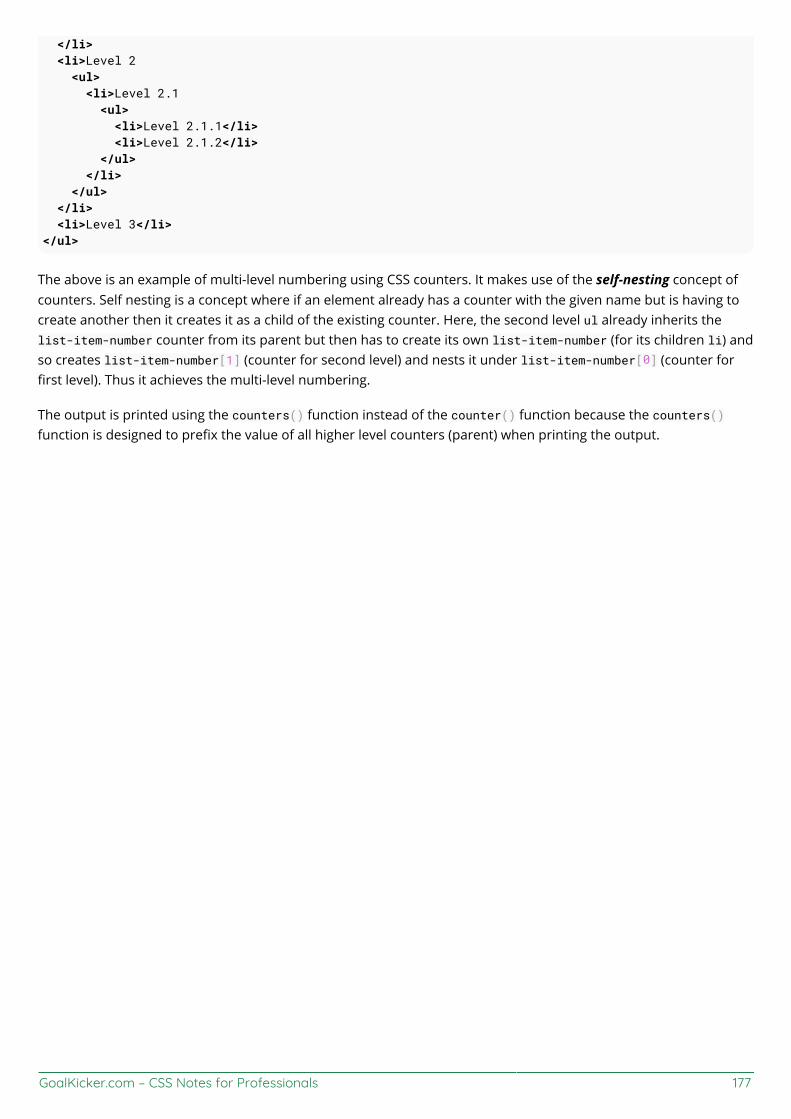
GoalKicker.com – CSS Notes for Professionals 177
</li> <li>Level 2 <ul> <li>Level 2.1 <ul> <li>Level 2.1.1</li> <li>Level 2.1.2</li> </ul> </li> </ul> </li> <li>Level 3</li></ul>
The above is an example of multi-level numbering using CSS counters. It makes use of the self-nesting concept ofcounters. Self nesting is a concept where if an element already has a counter with the given name but is having tocreate another then it creates it as a child of the existing counter. Here, the second level ul already inherits thelist-item-number counter from its parent but then has to create its own list-item-number (for its children li) andso creates list-item-number[1] (counter for second level) and nests it under list-item-number[0] (counter forfirst level). Thus it achieves the multi-level numbering.
The output is printed using the counters() function instead of the counter() function because the counters()function is designed to prefix the value of all higher level counters (parent) when printing the output.
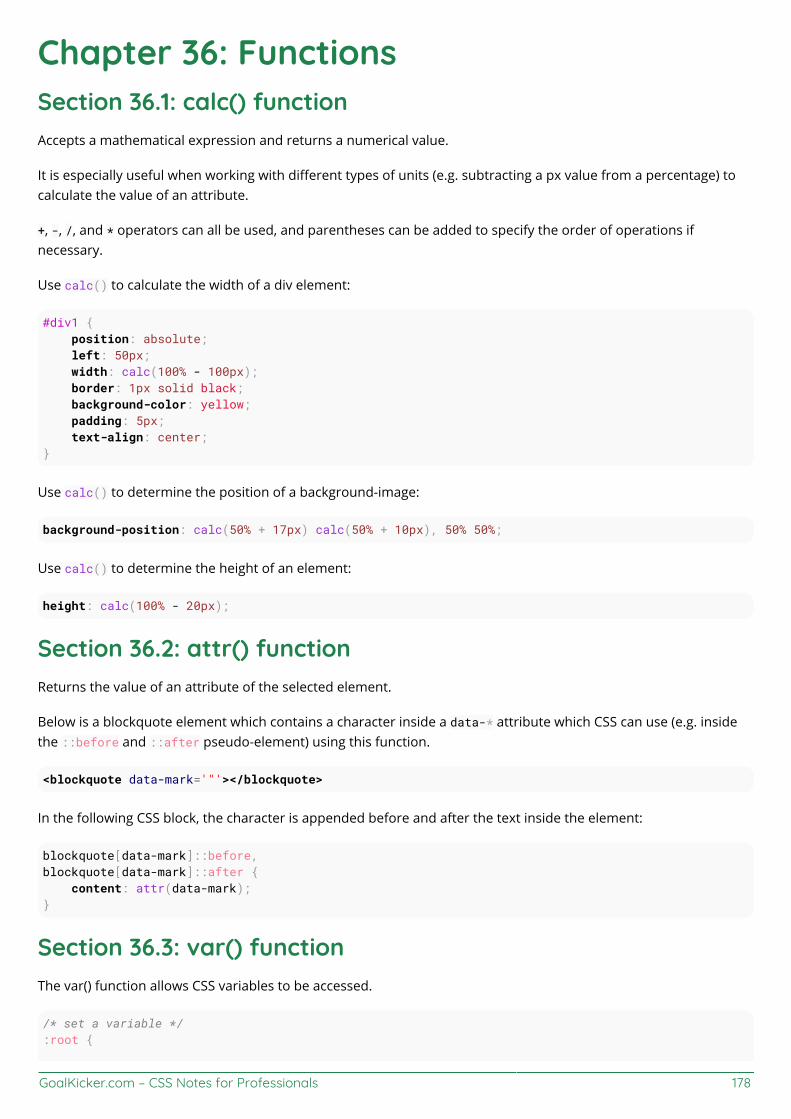
GoalKicker.com – CSS Notes for Professionals 178
Chapter 36: FunctionsSection 36.1: calc() functionAccepts a mathematical expression and returns a numerical value.
It is especially useful when working with different types of units (e.g. subtracting a px value from a percentage) tocalculate the value of an attribute.
+, -, /, and * operators can all be used, and parentheses can be added to specify the order of operations ifnecessary.
Use calc() to calculate the width of a div element:
#div1 { position: absolute; left: 50px; width: calc(100% - 100px); border: 1px solid black; background-color: yellow; padding: 5px; text-align: center;}
Use calc() to determine the position of a background-image:
background-position: calc(50% + 17px) calc(50% + 10px), 50% 50%;
Use calc() to determine the height of an element:
height: calc(100% - 20px);
Section 36.2: attr() functionReturns the value of an attribute of the selected element.
Below is a blockquote element which contains a character inside a data-* attribute which CSS can use (e.g. insidethe ::before and ::after pseudo-element) using this function.
<blockquote data-mark='"'></blockquote>
In the following CSS block, the character is appended before and after the text inside the element:
blockquote[data-mark]::before,blockquote[data-mark]::after { content: attr(data-mark);}
Section 36.3: var() functionThe var() function allows CSS variables to be accessed.
/* set a variable */:root {

GoalKicker.com – CSS Notes for Professionals 179
--primary-color: blue;}
/* access variable */selector { color: var(--primary-color);}
This feature is currently under development. Check caniuse.com for the latest browser support.
Section 36.4: radial-gradient() functionCreates an image representing a gradient of colors radiating from the center of the gradient
radial-gradient(red, orange, yellow) /*A gradient coming out from the middle of thegradient, red at the center, then orange, until it is finally yellow at the edges*/
Section 36.5: linear-gradient() functionCreates a image representing a linear gradient of colors.
linear-gradient( 0deg, red, yellow 50%, blue);
This creates a gradient going from bottom to top, with colors starting at red, then yellow at 50%, and finishing inblue.
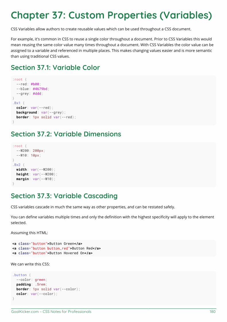
GoalKicker.com – CSS Notes for Professionals 180
Chapter 37: Custom Properties (Variables)CSS Variables allow authors to create reusable values which can be used throughout a CSS document.
For example, it's common in CSS to reuse a single color throughout a document. Prior to CSS Variables this wouldmean reusing the same color value many times throughout a document. With CSS Variables the color value can beassigned to a variable and referenced in multiple places. This makes changing values easier and is more semanticthan using traditional CSS values.
Section 37.1: Variable Color:root { --red: #b00; --blue: #4679bd; --grey: #ddd;}.Bx1 { color: var(--red); background: var(--grey); border: 1px solid var(--red);}
Section 37.2: Variable Dimensions:root { --W200: 200px; --W10: 10px;}.Bx2 { width: var(--W200); height: var(--W200); margin: var(--W10);}
Section 37.3: Variable CascadingCSS variables cascade in much the same way as other properties, and can be restated safely.
You can define variables multiple times and only the definition with the highest specificity will apply to the elementselected.
Assuming this HTML:
<a class="button">Button Green</a><a class="button button_red">Button Red</a><a class="button">Button Hovered On</a>
We can write this CSS:
.button { --color: green; padding: .5rem; border: 1px solid var(--color); color: var(--color);}
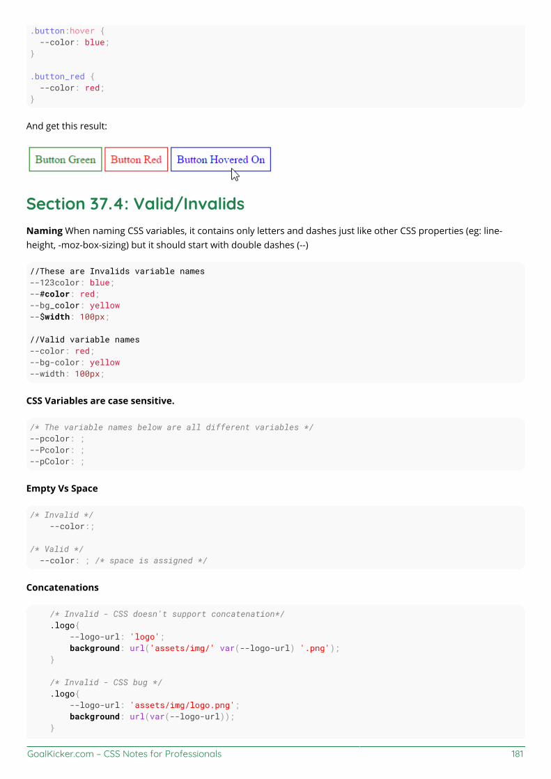
GoalKicker.com – CSS Notes for Professionals 181
.button:hover { --color: blue;}
.button_red { --color: red;}
And get this result:
Section 37.4: Valid/InvalidsNaming When naming CSS variables, it contains only letters and dashes just like other CSS properties (eg: line-height, -moz-box-sizing) but it should start with double dashes (--)
//These are Invalids variable names--123color: blue;--#color: red;--bg_color: yellow--$width: 100px;
//Valid variable names--color: red;--bg-color: yellow--width: 100px;
CSS Variables are case sensitive.
/* The variable names below are all different variables */--pcolor: ;--Pcolor: ;--pColor: ;
Empty Vs Space
/* Invalid */ --color:;
/* Valid */ --color: ; /* space is assigned */
Concatenations
/* Invalid - CSS doesn't support concatenation*/ .logo{ --logo-url: 'logo'; background: url('assets/img/' var(--logo-url) '.png'); }
/* Invalid - CSS bug */ .logo{ --logo-url: 'assets/img/logo.png'; background: url(var(--logo-url)); }

GoalKicker.com – CSS Notes for Professionals 182
/* Valid */ .logo{ --logo-url: url('assets/img/logo.png'); background: var(--logo-url); }
Careful when using Units
/* Invalid */ --width: 10; width: var(--width)px;
/* Valid */ --width: 10px; width: var(--width);
/* Valid */ --width: 10; width: calc(1px * var(--width)); /* multiply by 1 unit to convert */ width: calc(1em * var(--width));
Section 37.5: With media queriesYou can re-set variables within media queries and have those new values cascade wherever they are used,something that isn't possible with pre-processor variables.
Here, a media query changes the variables used to set up a very simple grid:
HTML
<div></div><div></div><div></div><div></div>
CSS
:root{ --width: 25%; --content: 'This is desktop';}@media only screen and (max-width: 767px){ :root{ --width:50%; --content: 'This is mobile'; }}@media only screen and (max-width: 480px){ :root{ --width:100%; }}
div{ width: calc(var(--width) - 20px); height: 100px;}div:before{ content: var(--content);

GoalKicker.com – CSS Notes for Professionals 183
}
/* Other Styles */body { padding: 10px;}
div{ display: flex; align-items: center; justify-content: center; font-weight:bold; float:left; margin: 10px; border: 4px solid black; background: red;}
You can try resizing the window in this CodePen Demo
Here's an animated screenshot of the resizing in action:
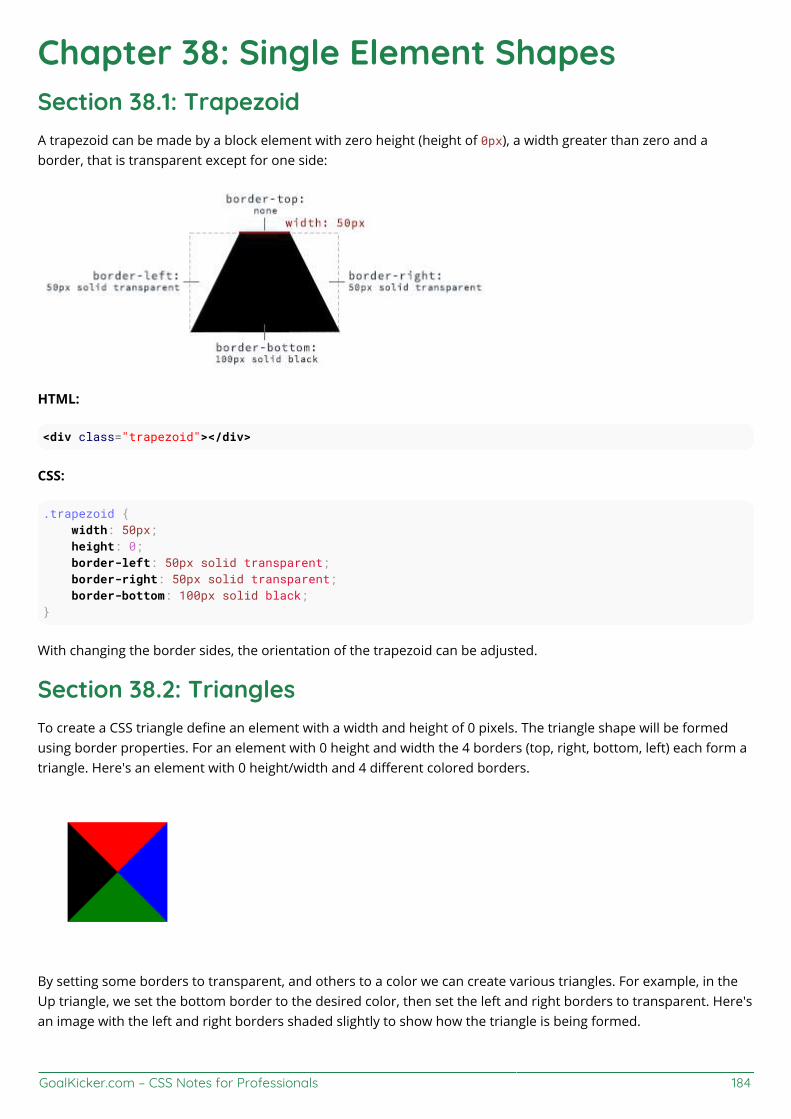
GoalKicker.com – CSS Notes for Professionals 184
Chapter 38: Single Element ShapesSection 38.1: TrapezoidA trapezoid can be made by a block element with zero height (height of 0px), a width greater than zero and aborder, that is transparent except for one side:
HTML:
<div class="trapezoid"></div>
CSS:
.trapezoid { width: 50px; height: 0; border-left: 50px solid transparent; border-right: 50px solid transparent; border-bottom: 100px solid black;}
With changing the border sides, the orientation of the trapezoid can be adjusted.
Section 38.2: TrianglesTo create a CSS triangle define an element with a width and height of 0 pixels. The triangle shape will be formedusing border properties. For an element with 0 height and width the 4 borders (top, right, bottom, left) each form atriangle. Here's an element with 0 height/width and 4 different colored borders.
By setting some borders to transparent, and others to a color we can create various triangles. For example, in theUp triangle, we set the bottom border to the desired color, then set the left and right borders to transparent. Here'san image with the left and right borders shaded slightly to show how the triangle is being formed.

GoalKicker.com – CSS Notes for Professionals 185
The dimensions of the triangle can be altered by changing the different border widths - taller, shorter, lopsided, etc.The examples below all show a 50x50 pixel triangle.
Triangle - Pointing Up
<div class="triangle-up"></div>
.triangle-up { width: 0; height: 0; border-left: 25px solid transparent; border-right: 25px solid transparent; border-bottom: 50px solid rgb(246, 156, 85);}
Triangle - Pointing Down
<div class="triangle-down"></div>
.triangle-down { width: 0; height: 0; border-left: 25px solid transparent; border-right: 25px solid transparent; border-top: 50px solid rgb(246, 156, 85);}
Triangle - Pointing Right

GoalKicker.com – CSS Notes for Professionals 186
<div class="triangle-right"></div>
.triangle-right { width: 0; height: 0; border-top: 25px solid transparent; border-bottom: 25px solid transparent; border-left: 50px solid rgb(246, 156, 85);}
Triangle - Pointing Left
<div class="triangle-left"></div>
.triangle-left { width: 0; height: 0; border-top: 25px solid transparent; border-bottom: 25px solid transparent; border-right: 50px solid rgb(246, 156, 85);}
Triangle - Pointing Up/Right
<div class="triangle-up-right"></div>
.triangle-up-right { width: 0; height: 0; border-top: 50px solid rgb(246, 156, 85); border-left: 50px solid transparent;}
Triangle - Pointing Up/Left
<div class="triangle-up-left"></div>
.triangle-up-left {

GoalKicker.com – CSS Notes for Professionals 187
width: 0; height: 0; border-top: 50px solid rgb(246, 156, 85); border-right: 50px solid transparent;}
Triangle - Pointing Down/Right
<div class="triangle-down-right"></div>
.triangle-down-right { width: 0; height: 0; border-bottom: 50px solid rgb(246, 156, 85); border-left: 50px solid transparent;}
Triangle - Pointing Down/Left
<div class="triangle-down-left"></div>
.triangle-down-left { width: 0; height: 0; border-bottom: 50px solid rgb(246, 156, 85); border-right: 50px solid transparent;}
Section 38.3: Circles and EllipsesCircle
To create a circle, define an element with an equal width and height (a square) and then set the border-radiusproperty of this element to 50%.
HTML
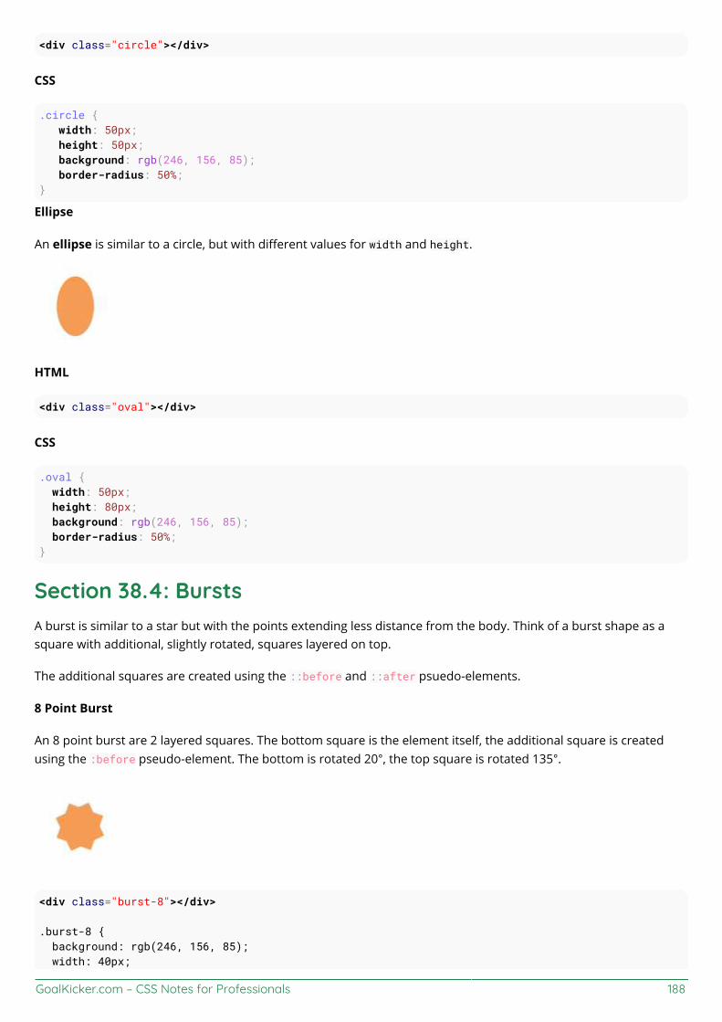
GoalKicker.com – CSS Notes for Professionals 188
<div class="circle"></div>
CSS
.circle { width: 50px; height: 50px; background: rgb(246, 156, 85); border-radius: 50%;}
Ellipse
An ellipse is similar to a circle, but with different values for width and height.
HTML
<div class="oval"></div>
CSS
.oval { width: 50px; height: 80px; background: rgb(246, 156, 85); border-radius: 50%;}
Section 38.4: BurstsA burst is similar to a star but with the points extending less distance from the body. Think of a burst shape as asquare with additional, slightly rotated, squares layered on top.
The additional squares are created using the ::before and ::after psuedo-elements.
8 Point Burst
An 8 point burst are 2 layered squares. The bottom square is the element itself, the additional square is createdusing the :before pseudo-element. The bottom is rotated 20°, the top square is rotated 135°.
<div class="burst-8"></div>
.burst-8 { background: rgb(246, 156, 85); width: 40px;
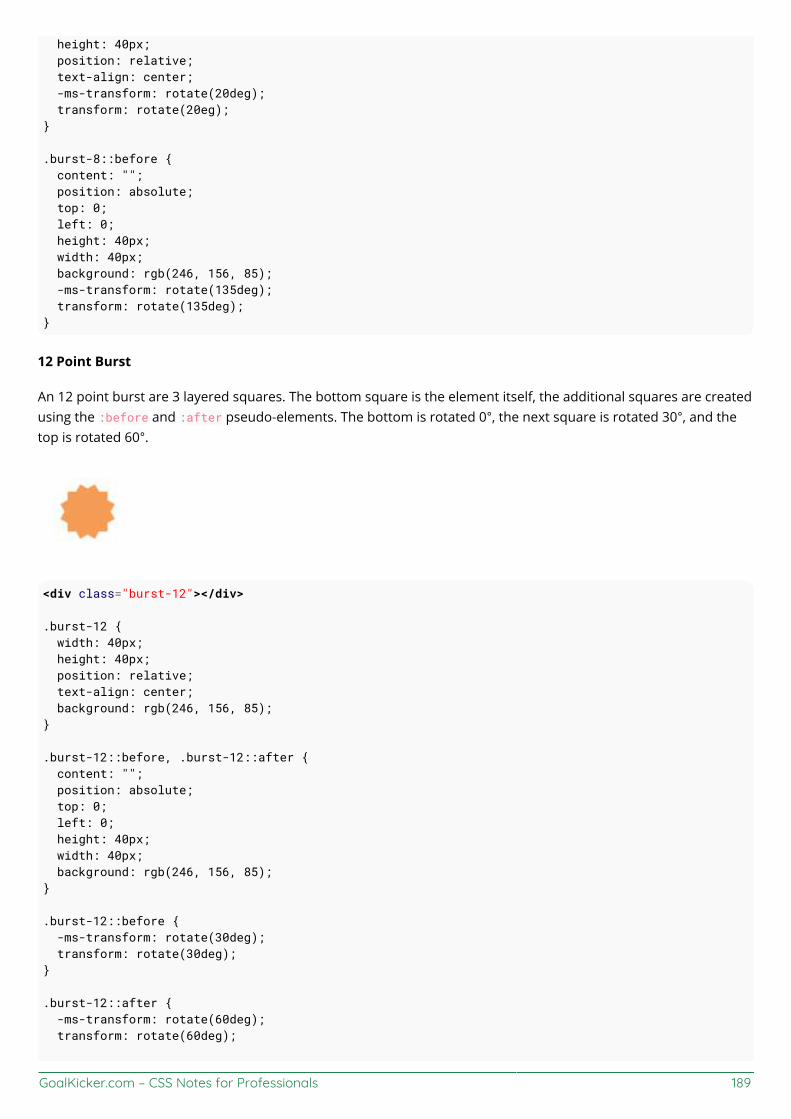
GoalKicker.com – CSS Notes for Professionals 189
height: 40px; position: relative; text-align: center; -ms-transform: rotate(20deg); transform: rotate(20eg);}
.burst-8::before { content: ""; position: absolute; top: 0; left: 0; height: 40px; width: 40px; background: rgb(246, 156, 85); -ms-transform: rotate(135deg); transform: rotate(135deg);}
12 Point Burst
An 12 point burst are 3 layered squares. The bottom square is the element itself, the additional squares are createdusing the :before and :after pseudo-elements. The bottom is rotated 0°, the next square is rotated 30°, and thetop is rotated 60°.
<div class="burst-12"></div>
.burst-12 { width: 40px; height: 40px; position: relative; text-align: center; background: rgb(246, 156, 85);}
.burst-12::before, .burst-12::after { content: ""; position: absolute; top: 0; left: 0; height: 40px; width: 40px; background: rgb(246, 156, 85);}
.burst-12::before { -ms-transform: rotate(30deg); transform: rotate(30deg);}
.burst-12::after { -ms-transform: rotate(60deg); transform: rotate(60deg);

GoalKicker.com – CSS Notes for Professionals 190
}
Section 38.5: SquareTo create a square, define an element with both a width and height. In the example below, we have an elementwith a width and height of 100 pixels each.
<div class="square"></div>
.square { width: 100px; height: 100px; background: rgb(246, 156, 85);}
Section 38.6: CubeThis example shows how to create a cube using 2D transformation methods skewX() and skewY() on pseudoelements.
HTML:
<div class="cube"></div>
CSS:
.cube { background: #dc2e2e; width: 100px; height: 100px; position: relative; margin: 50px;}
.cube::before { content: '';
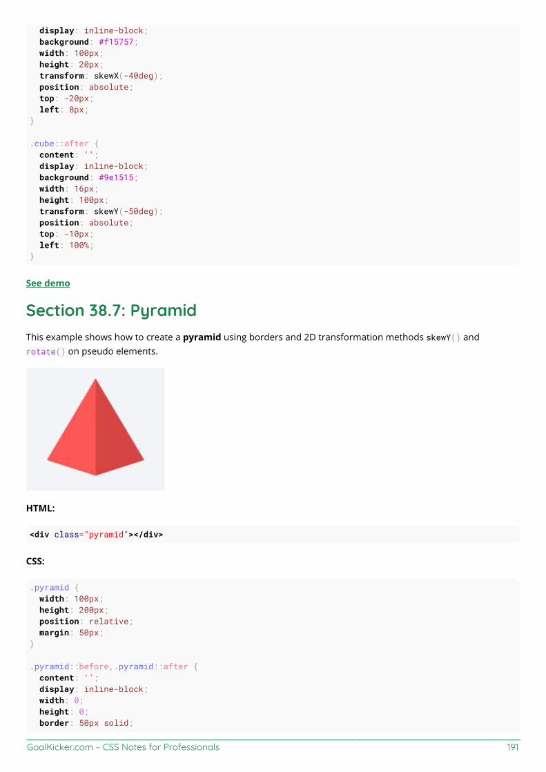
GoalKicker.com – CSS Notes for Professionals 191
display: inline-block; background: #f15757; width: 100px; height: 20px; transform: skewX(-40deg); position: absolute; top: -20px; left: 8px;}
.cube::after { content: ''; display: inline-block; background: #9e1515; width: 16px; height: 100px; transform: skewY(-50deg); position: absolute; top: -10px; left: 100%;}
See demo
Section 38.7: PyramidThis example shows how to create a pyramid using borders and 2D transformation methods skewY() androtate() on pseudo elements.
HTML:
<div class="pyramid"></div>
CSS:
.pyramid { width: 100px; height: 200px; position: relative; margin: 50px;}
.pyramid::before,.pyramid::after { content: ''; display: inline-block; width: 0; height: 0; border: 50px solid;

GoalKicker.com – CSS Notes for Professionals 192
position: absolute;}
.pyramid::before { border-color: transparent transparent #ff5656 transparent; transform: scaleY(2) skewY(-40deg) rotate(45deg);}
.pyramid::after { border-color: transparent transparent #d64444 transparent; transform: scaleY(2) skewY(40deg) rotate(-45deg);}
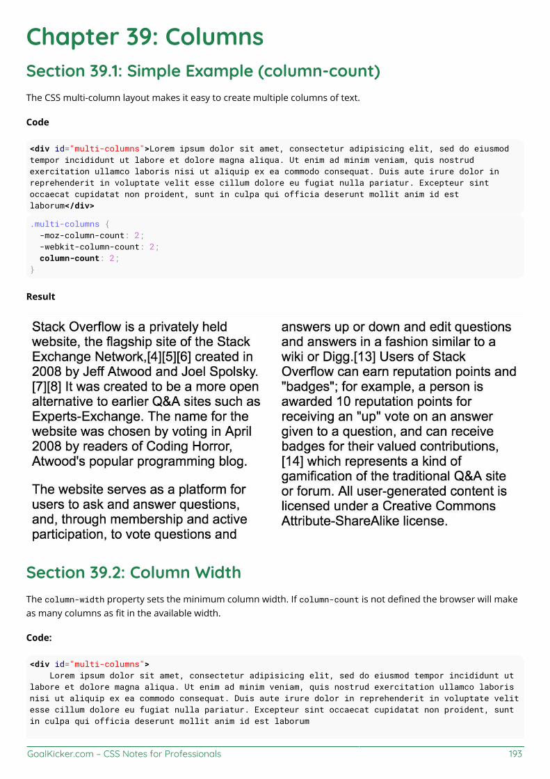
GoalKicker.com – CSS Notes for Professionals 193
Chapter 39: ColumnsSection 39.1: Simple Example (column-count)The CSS multi-column layout makes it easy to create multiple columns of text.
Code
<div id="multi-columns">Lorem ipsum dolor sit amet, consectetur adipisicing elit, sed do eiusmodtempor incididunt ut labore et dolore magna aliqua. Ut enim ad minim veniam, quis nostrudexercitation ullamco laboris nisi ut aliquip ex ea commodo consequat. Duis aute irure dolor inreprehenderit in voluptate velit esse cillum dolore eu fugiat nulla pariatur. Excepteur sintoccaecat cupidatat non proident, sunt in culpa qui officia deserunt mollit anim id estlaborum</div>
.multi-columns { -moz-column-count: 2; -webkit-column-count: 2; column-count: 2;}
Result
Section 39.2: Column WidthThe column-width property sets the minimum column width. If column-count is not defined the browser will makeas many columns as fit in the available width.
Code:
<div id="multi-columns"> Lorem ipsum dolor sit amet, consectetur adipisicing elit, sed do eiusmod tempor incididunt utlabore et dolore magna aliqua. Ut enim ad minim veniam, quis nostrud exercitation ullamco laborisnisi ut aliquip ex ea commodo consequat. Duis aute irure dolor in reprehenderit in voluptate velitesse cillum dolore eu fugiat nulla pariatur. Excepteur sint occaecat cupidatat non proident, suntin culpa qui officia deserunt mollit anim id est laborum

GoalKicker.com – CSS Notes for Professionals 194
</div>
.multi-columns { -moz-column-width: 100px; -webkit-column-width: 100px; column-width: 100px;}
Result
GoalKicker.com – CSS Notes for Professionals 195
Chapter 40: Multiple columnsCSS allows to define that element contents wrap into multiple columns with gaps and rules between them.
Section 40.1: Create Multiple Columns<div class="content">Lorem ipsum dolor sit amet, consectetuer adipiscing elit, sed diam nonummy nibheuismod tincidunt ut laoreet dolore magna aliquam erat volutpat. Ut wisi enimad minim veniam, quis nostrud exerci tation ullamcorper suscipit lobortis nislut aliquip ex ea commodo consequat. Duis autem vel eum iriure dolor inhendrerit in vulputate velit esse molestie consequat, vel illum dolore eufeugiat nulla facilisis at vero eros et accumsan et iusto odio dignissim quiblandit praesent luptatum zzril delenit augue duis dolore te feugait nullafacilisi. Nam liber tempor cum soluta nobis eleifend option congue nihilimperdiet doming id quod mazim placerat facer possim assum.</div>
CSS
.content {-webkit-column-count: 3; /* Chrome, Safari, Opera */-moz-column-count: 3; /* Firefox */column-count: 3;}
Section 40.2: Basic exampleConsider the following HTML markup:
<section> <p>Lorem ipsum dolor sit amet, consetetur sadipscing elitr, sed diam nonumy eirmod temporinvidunt ut labore et dolore magna aliquyam erat, sed diam voluptua. At vero eos et accusam etjusto duo dolores et ea rebum.</p> <p> Stet clita kasd gubergren, no sea takimata sanctus est Lorem ipsum dolor sit amet. Loremipsum dolor sit amet, consetetur sadipscing elitr, sed diam nonumy eirmod tempor invidunt ut laboreet dolore magna aliquyam erat, sed diam voluptua. At vero eos et accusam et justo duo dolores et earebum. Stet clita kasd gubergren, no sea takimata sanctus est Lorem ipsum dolor sit amet.</p> <p>Lorem ipsum dolor sit amet, consetetur sadipscing elitr, sed diam nonumy eirmod temporinvidunt ut labore et dolore magna aliquyam erat, sed diam voluptua. At vero eos et accusam etjusto duo dolores et ea rebum. Stet clita kasd gubergren, no sea takimata sanctus est Lorem ipsumdolor sit amet.</p></section>
With the following CSS applied the content is split into three columns separated by a gray column rule of two pixels.
section { columns: 3; column-gap: 40px; column-rule: 2px solid gray;}
See a live sample of this on JSFiddle.
GoalKicker.com – CSS Notes for Professionals 196
Chapter 41: Inline-Block LayoutSection 41.1: Justified navigation barThe horizontally justified navigation (menu) bar has some number of items that should be justified. The first (left)item has no left margin within the container, the last (right) item has no right margin within the container. Thedistance between items is equal, independent on the individual item width.
HTML<nav> <ul> <li>abc</li> <li>abcdefghijkl</li> <li>abcdef</li> </ul></nav>
CSSnav { width: 100%; line-height: 1.4em;}ul { list-style: none; display: block; width: 100%; margin: 0; padding: 0; text-align: justify; margin-bottom: -1.4em;}ul:after { content: ""; display: inline-block; width: 100%;}li { display: inline-block;}
Notes
The nav, ul and li tags were chosen for their semantic meaning of 'a list of navigation (menu) items'. Othertags may also be used of course.The :after pseudo-element causes an extra 'line' in the ul and thus an extra, empty height of this block,pushing other content down. This is solved by the negative margin-bottom, which has to have the samemagnitude as the line-height (but negative).If the page becomes too narrow for all the items to fit, the items will break to a new line (starting from theright) and be justified on this line. The total height of the menu will grow as needed.

GoalKicker.com – CSS Notes for Professionals 197
Chapter 42: InheritanceSection 42.1: Automatic inheritanceInheritance the a fundamental mechanism of CSS by which the computed values of some properties of an elementare applied to its' children. This is particularly useful when you want to set a global style to your elements ratherthan having to set said properties to each and every element in your markup.
Common properties that are automatically inherited are: font, color, text-align, line-height.
Assume the following stylesheet:
#myContainer { color: red; padding: 5px;}
This will apply color: red not only to the <div> element but also to the <h3> and <p> elements. However, due tothe nature of padding its value will not be inherited to those elements.
<div id="myContainer"> <h3>Some header</h3> <p>Some paragraph</p></div>
Section 42.2: Enforced inheritanceSome properties are not automatically inherited from an element down to its' children. This is because thoseproperties are typically desired to be unique to the element (or selection of elements) to which the property isapplied to. Common such properties are margin, padding, background, display, etc.
However, sometimes inheritance is desired anyway. To achieve this, we can apply the inherit value to the propertythat should be inherited. The inherit value can be appied to any CSS property and any HTML element.
Assume the following stylesheet:
#myContainer { color: red; padding: 5px;}#myContainer p { padding: inherit;}
This will apply color: red to both the <h3> and <p> elements due to the inheritance nature of the color property.However, the <p> element will also inherit the padding value from its' parent because this was specified.
<div id="myContainer"> <h3>Some header</h3> <p>Some paragraph</p></div>

GoalKicker.com – CSS Notes for Professionals 198
Chapter 43: CSS Image SpritesSection 43.1: A Basic ImplementationWhat's an image sprite?
An image sprite is a single asset located within an image sprite sheet. An image sprite sheet is an image file thatcontains more than one asset that can be extracted from it.
For example:
The image above is an image sprite sheet, and each one of those stars is a sprite within the sprite sheet. Thesesprite sheets are useful because they improve performance by reducing the number of HTTP requests a browsermight have to make.
So how do you implement one? Here's some example code.
HTML
<div class="icon icon1"></div><div class="icon icon2"></div><div class="icon icon3"></div>
CSS
.icon { background: url(“icons-sprite.png”); display: inline-block; height: 20px; width: 20px;}.icon1 { background-position: 0px 0px;}.icon2 { background-position: -20px 0px;}.icon3 { background-position: -40px 0px;}
By using setting the sprite's width and height and by using the background-position property in CSS (with an x and yvalue) you can easily extract sprites from a sprite sheet using CSS.
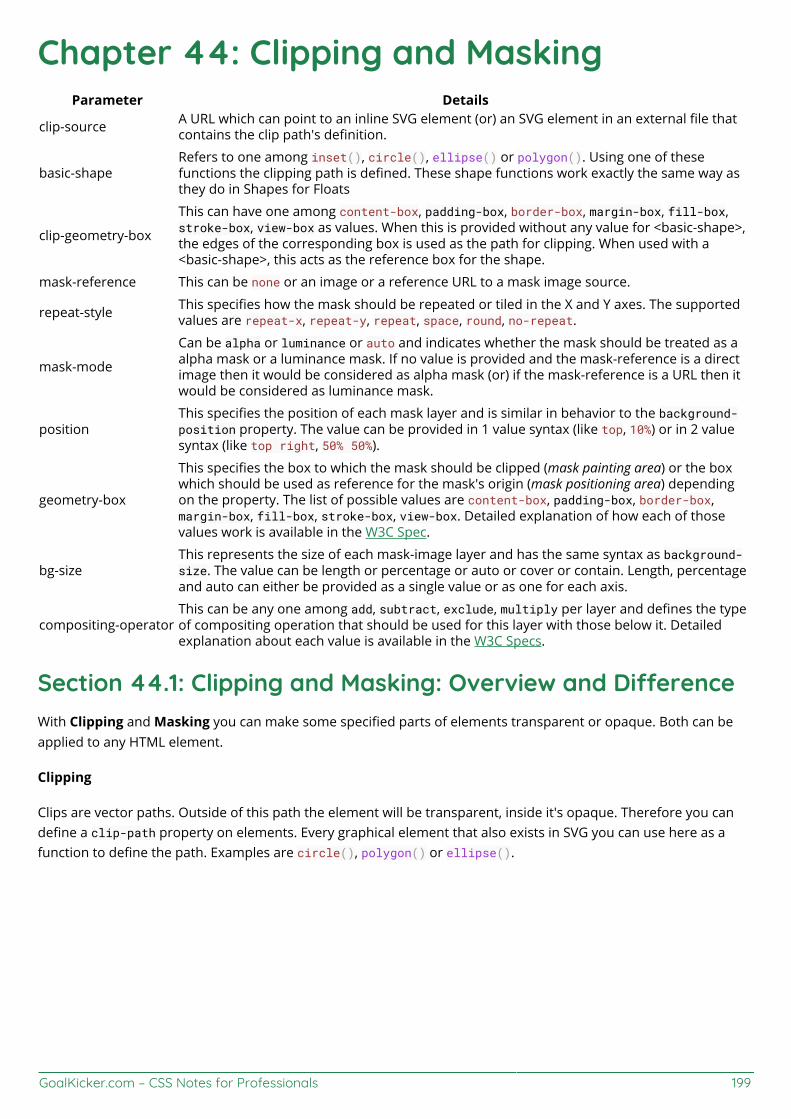
GoalKicker.com – CSS Notes for Professionals 199
Chapter 44: Clipping and MaskingParameter Details
clip-source A URL which can point to an inline SVG element (or) an SVG element in an external file thatcontains the clip path's definition.
basic-shapeRefers to one among inset(), circle(), ellipse() or polygon(). Using one of thesefunctions the clipping path is defined. These shape functions work exactly the same way asthey do in Shapes for Floats
clip-geometry-box
This can have one among content-box, padding-box, border-box, margin-box, fill-box,stroke-box, view-box as values. When this is provided without any value for <basic-shape>,the edges of the corresponding box is used as the path for clipping. When used with a<basic-shape>, this acts as the reference box for the shape.
mask-reference This can be none or an image or a reference URL to a mask image source.
repeat-style This specifies how the mask should be repeated or tiled in the X and Y axes. The supportedvalues are repeat-x, repeat-y, repeat, space, round, no-repeat.
mask-mode
Can be alpha or luminance or auto and indicates whether the mask should be treated as aalpha mask or a luminance mask. If no value is provided and the mask-reference is a directimage then it would be considered as alpha mask (or) if the mask-reference is a URL then itwould be considered as luminance mask.
positionThis specifies the position of each mask layer and is similar in behavior to the background-position property. The value can be provided in 1 value syntax (like top, 10%) or in 2 valuesyntax (like top right, 50% 50%).
geometry-box
This specifies the box to which the mask should be clipped (mask painting area) or the boxwhich should be used as reference for the mask's origin (mask positioning area) dependingon the property. The list of possible values are content-box, padding-box, border-box,margin-box, fill-box, stroke-box, view-box. Detailed explanation of how each of thosevalues work is available in the W3C Spec.
bg-sizeThis represents the size of each mask-image layer and has the same syntax as background-size. The value can be length or percentage or auto or cover or contain. Length, percentageand auto can either be provided as a single value or as one for each axis.
compositing-operatorThis can be any one among add, subtract, exclude, multiply per layer and defines the typeof compositing operation that should be used for this layer with those below it. Detailedexplanation about each value is available in the W3C Specs.
Section 44.1: Clipping and Masking: Overview and DierenceWith Clipping and Masking you can make some specified parts of elements transparent or opaque. Both can beapplied to any HTML element.
Clipping
Clips are vector paths. Outside of this path the element will be transparent, inside it's opaque. Therefore you candefine a clip-path property on elements. Every graphical element that also exists in SVG you can use here as afunction to define the path. Examples are circle(), polygon() or ellipse().
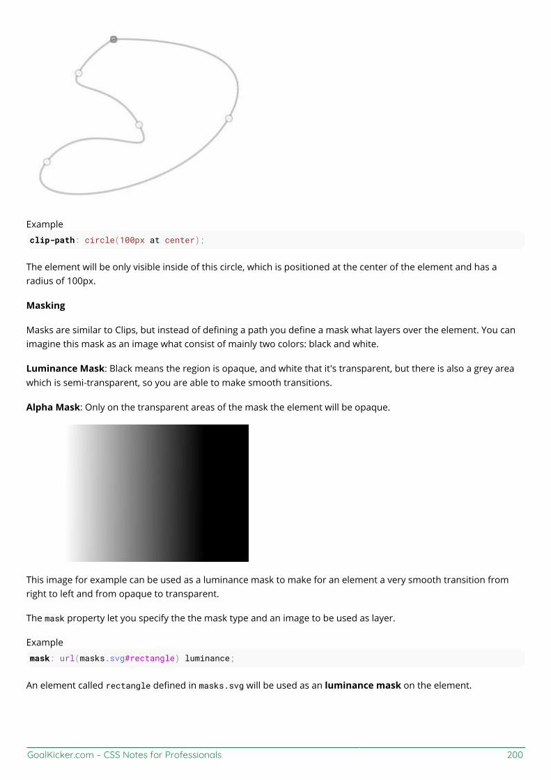
GoalKicker.com – CSS Notes for Professionals 200
Example
clip-path: circle(100px at center);
The element will be only visible inside of this circle, which is positioned at the center of the element and has aradius of 100px.
Masking
Masks are similar to Clips, but instead of defining a path you define a mask what layers over the element. You canimagine this mask as an image what consist of mainly two colors: black and white.
Luminance Mask: Black means the region is opaque, and white that it's transparent, but there is also a grey areawhich is semi-transparent, so you are able to make smooth transitions.
Alpha Mask: Only on the transparent areas of the mask the element will be opaque.
This image for example can be used as a luminance mask to make for an element a very smooth transition fromright to left and from opaque to transparent.
The mask property let you specify the the mask type and an image to be used as layer.
Example
mask: url(masks.svg#rectangle) luminance;
An element called rectangle defined in masks.svg will be used as an luminance mask on the element.

GoalKicker.com – CSS Notes for Professionals 201
Section 44.2: Simple mask that fades an image from solid totransparentCSSdiv { height: 200px; width: 200px; background: url(http://lorempixel.com/200/200/nature/1); mask-image: linear-gradient(to right, white, transparent);}
HTML<div></div>
In the above example there is an element with an image as its background. The mask that is applied on the image(using CSS) makes it look as though it is fading out from left to right.
The masking is achieved by using a linear-gradient that goes from white (on the left) to transparent (on the right)as the mask. As it is an alpha mask, image becomes transparent where the mask is transparent.
Output without the mask:
Output with the mask:
Note: As mentioned in remarks, the above example would work in Chrome, Safari and Opera only when used withthe -webkit prefix. This example (with a linear-gradient as mask image) is not yet supported in Firefox.
Section 44.3: Clipping (Circle)CSS:div{
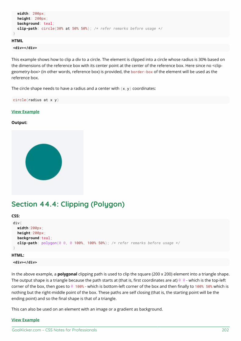
GoalKicker.com – CSS Notes for Professionals 202
width: 200px; height: 200px; background: teal; clip-path: circle(30% at 50% 50%); /* refer remarks before usage */}
HTML<div></div>
This example shows how to clip a div to a circle. The element is clipped into a circle whose radius is 30% based onthe dimensions of the reference box with its center point at the center of the reference box. Here since no <clip-geometry-box> (in other words, reference box) is provided, the border-box of the element will be used as thereference box.
The circle shape needs to have a radius and a center with (x,y) coordinates:
circle(radius at x y)
View Example
Output:
Section 44.4: Clipping (Polygon)CSS:div{ width:200px; height:200px; background:teal; clip-path: polygon(0 0, 0 100%, 100% 50%); /* refer remarks before usage */}
HTML:<div></div>
In the above example, a polygonal clipping path is used to clip the square (200 x 200) element into a triangle shape.The output shape is a triangle because the path starts at (that is, first coordinates are at) 0 0 - which is the top-leftcorner of the box, then goes to 0 100% - which is bottom-left corner of the box and then finally to 100% 50% which isnothing but the right-middle point of the box. These paths are self closing (that is, the starting point will be theending point) and so the final shape is that of a triangle.
This can also be used on an element with an image or a gradient as background.
View Example

GoalKicker.com – CSS Notes for Professionals 203
Output:
Section 44.5: Using masks to cut a hole in the middle of animageCSSdiv { width: 200px; height: 200px; background: url(http://lorempixel.com/200/200/abstract/6); mask-image: radial-gradient(circle farthest-side at center, transparent 49%, white 50%); /* checkremarks before using */}
HTML
In the above example, a transparent circle is created at the center using radial-gradient and this is then used as amask to produce the effect of a circle being cut out from the center of an image.
Image without mask:
Image with mask:

GoalKicker.com – CSS Notes for Professionals 204
Section 44.6: Using masks to create images with irregularshapesCSSdiv { /* check remarks before usage */ height: 200px; width: 400px; background-image: url(http://lorempixel.com/400/200/nature/4); mask-image: linear-gradient(to top right, transparent 49.5%, white 50.5%), linear-gradient(to topleft, transparent 49.5%, white 50.5%), linear-gradient(white, white); mask-size: 75% 25%, 25% 25%, 100% 75%; mask-position: bottom left, bottom right, top left; mask-repeat: no-repeat;}
HTML<div></div>
In the above example, three linear-gradient images (which when placed in their appropriate positions wouldcover 100% x 100% of the container's size) are used as masks to produce a transparent triangular shaped cut at thebottom of the image.
Image without the mask:
Image with the mask:

GoalKicker.com – CSS Notes for Professionals 205
GoalKicker.com – CSS Notes for Professionals 206
Chapter 45: FragmentationValue Descriptionauto Default. Automatic page breaks
always Always insert a page break
avoid Avoid page break (if possible)
left Insert page breaks so that the next page is formatted as a left page
right Insert page breaks so that the next page is formatted as a right page
initial Sets this property to its default value.
inherit Inherits this property from its parent element.
Section 45.1: Media print page-break@media print { p { page-break-inside: avoid; } h1 { page-break-before: always; } h2 { page-break-after: avoid; }}
This code does 3 things:
it prevents a page break inside any p tags, meaning a paragraph will never be broken in two pages, ifpossible.it forces a page-break-before in all h1 headings, meaning that before every h1 occurrence, there will be apage break.it prevents page-breaks right after any h2

GoalKicker.com – CSS Notes for Professionals 207
Chapter 46: CSS Object Model (CSSOM)Section 46.1: Adding a background-image rule via the CSSOMTo add a background-image rule via the CSSOM, first get a reference to the rules of the first stylesheet:
var stylesheet = document.styleSheets[0].cssRules;
Then, get a reference to the end of the stylesheet:
var end = stylesheet.length - 1;
Finally, insert a background-image rule for the body element at the end of the stylesheet:
stylesheet.insertRule("body { background-image:url('http://cdn.sstatic.net/Sites/stackoverflow/img/favicon.ico'); }", end);
Section 46.2: IntroductionThe browser identifies tokens from stylesheet and coverts them into nodes which are linked into a tree structure.The entire map of all the nodes with their associated styles of a page would be the CSS Object Model.
To display the webpage, a web browser takes following steps.
The web browser examines your HTML and builds the DOM (Document Object Model).1.The web browser examines your CSS and builds the CSSOM (CSS Object Model).2.The web browser combines the DOM and the CSSOM to create a render tree. The web browser displays your3.webpage.
GoalKicker.com – CSS Notes for Professionals 208
Chapter 47: Feature QueriesParameter Details
(property: value) Evaluates true if the browser can handle the CSS rule. The parenthesis around the rule arerequired.
and Returns true only if both the previous and next conditions are true.not Negates the next conditionor Returns true if either the previous or next condition is true.(...) Groups conditions
Section 47.1: Basic @supports usage@supports (display: flex) { /* Flexbox is available, so use it */ .my-container { display: flex; }}
In terms of syntax, @supports is very similar to @media, but instead of detecting screen size and orientation,@supports will detect whether the browser can handle a given CSS rule.
Rather than doing something like @supports (flex), notice that the rule is @supports (display: flex).
Section 47.2: Chaining feature detectionsTo detect multiple features at once, use the and operator.
@supports (transform: translateZ(1px)) and (transform-style: preserve-3d) and (perspective: 1px) { /* Probably do some fancy 3d stuff here */}
There is also an or operator and a not operator:
@supports (display: flex) or (display: table-cell) { /* Will be used if the browser supports flexbox or display: table-cell */}@supports not (-webkit-transform: translate(0, 0, 0)) { /* Will *not* be used if the browser supports -webkit-transform: translate(...) */}
For the ultimate @supports experience, try grouping logical expressions with parenthesis:
@supports ((display: block) and (zoom: 1)) or ((display: flex) and (not (display: table-cell))) or(transform: translateX(1px)) { /* ... */}
This will work if the browser
Supports display: block AND zoom: 1, or1.Supports display: flex AND NOT display: table-cell, or2.Supports transform: translateX(1px).3.

GoalKicker.com – CSS Notes for Professionals 209
Chapter 48: Stacking ContextSection 48.1: Stacking ContextIn this example every positioned element creates its own stacking context, because of their positioning and z-indexvalues. The hierarchy of stacking contexts is organized as follows:
RootDIV #1DIV #2DIV #3DIV #4DIV #5DIV #6
It is important to note that DIV #4, DIV #5 and DIV #6 are children of DIV #3, so stacking of those elements iscompletely resolved within DIV#3. Once stacking and rendering within DIV #3 is completed, the whole DIV #3element is passed for stacking in the root element with respect to its sibling's DIV.
HTML:
<div id="div1"> <h1>Division Element #1</h1> <code>position: relative;<br/> z-index: 5;</code></div><div id="div2"> <h1>Division Element #2</h1> <code>position: relative;<br/> z-index: 2;</code></div><div id="div3"> <div id="div4">

GoalKicker.com – CSS Notes for Professionals 210
<h1>Division Element #4</h1> <code>position: relative;<br/> z-index: 6;</code> </div> <h1>Division Element #3</h1> <code>position: absolute;<br/> z-index: 4;</code> <div id="div5"> <h1>Division Element #5</h1> <code>position: relative;<br/> z-index: 1;</code> </div> <div id="div6"> <h1>Division Element #6</h1> <code>position: absolute;<br/> z-index: 3;</code> </div></div>
CSS:
* { margin: 0;}html { padding: 20px; font: 12px/20px Arial, sans-serif;}div { opacity: 0.7; position: relative;}h1 { font: inherit; font-weight: bold;}#div1,#div2 { border: 1px dashed #696; padding: 10px; background-color: #cfc;}#div1 { z-index: 5; margin-bottom: 190px;}#div2 { z-index: 2;}#div3 { z-index: 4; opacity: 1; position: absolute; top: 40px; left: 180px; width: 330px; border: 1px dashed #900; background-color: #fdd; padding: 40px 20px 20px;}#div4,
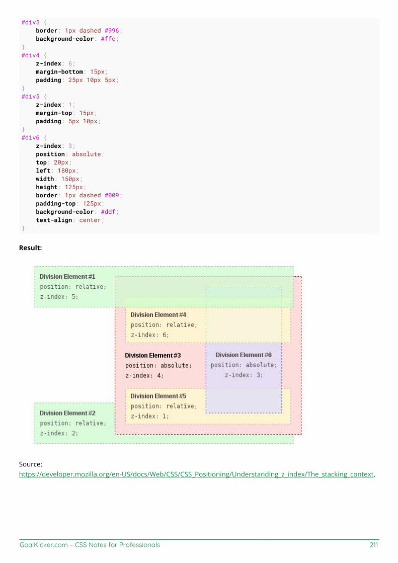
GoalKicker.com – CSS Notes for Professionals 211
#div5 { border: 1px dashed #996; background-color: #ffc;}#div4 { z-index: 6; margin-bottom: 15px; padding: 25px 10px 5px;}#div5 { z-index: 1; margin-top: 15px; padding: 5px 10px;}#div6 { z-index: 3; position: absolute; top: 20px; left: 180px; width: 150px; height: 125px; border: 1px dashed #009; padding-top: 125px; background-color: #ddf; text-align: center;}
Result:
Source:https://developer.mozilla.org/en-US/docs/Web/CSS/CSS_Positioning/Understanding_z_index/The_stacking_context.

GoalKicker.com – CSS Notes for Professionals 212
Chapter 49: Block Formatting ContextsSection 49.1: Using the overflow property with a valuedierent to visibleimg{ float:left; width:100px; margin:0 10px;}.div1{ background:#f1f1f1; /* does not create block formatting context */}.div2{ background:#f1f1f1; overflow:hidden; /* creates block formatting context */}
https://jsfiddle.net/MadalinaTn/qkwwmu6m/2/
Using the overflow property with a value different to visible (its default) will create a new block formattingcontext. This is technically necessary — if a float intersected with the scrolling element it would forciblyrewrap the content.
This example that show how a number of paragraphs will interact with a floated image is similar to this example, oncss-tricks.com.
2: https://developer.mozilla.org/en-US/docs/Web/CSS/overflow MDN

GoalKicker.com – CSS Notes for Professionals 213
Chapter 50: Vertical CenteringSection 50.1: Centering with display: tableHTML:
<div class="wrapper"> <div class="outer"> <div class="inner"> centered </div> </div></div>
CSS:
.wrapper { height: 600px; text-align: center;}.outer { display: table; height: 100%; width: 100%;}.outer .inner { display: table-cell; text-align: center; vertical-align: middle;}
Section 50.2: Centering with FlexboxHTML:
<div class="container"> <div class="child"></div></div>
CSS:
.container { height: 500px; width: 500px; display: flex; // Use Flexbox align-items: center; // This centers children vertically in the parent. justify-content: center; // This centers children horizontally. background: white;}
.child { width: 100px; height: 100px; background: blue;}
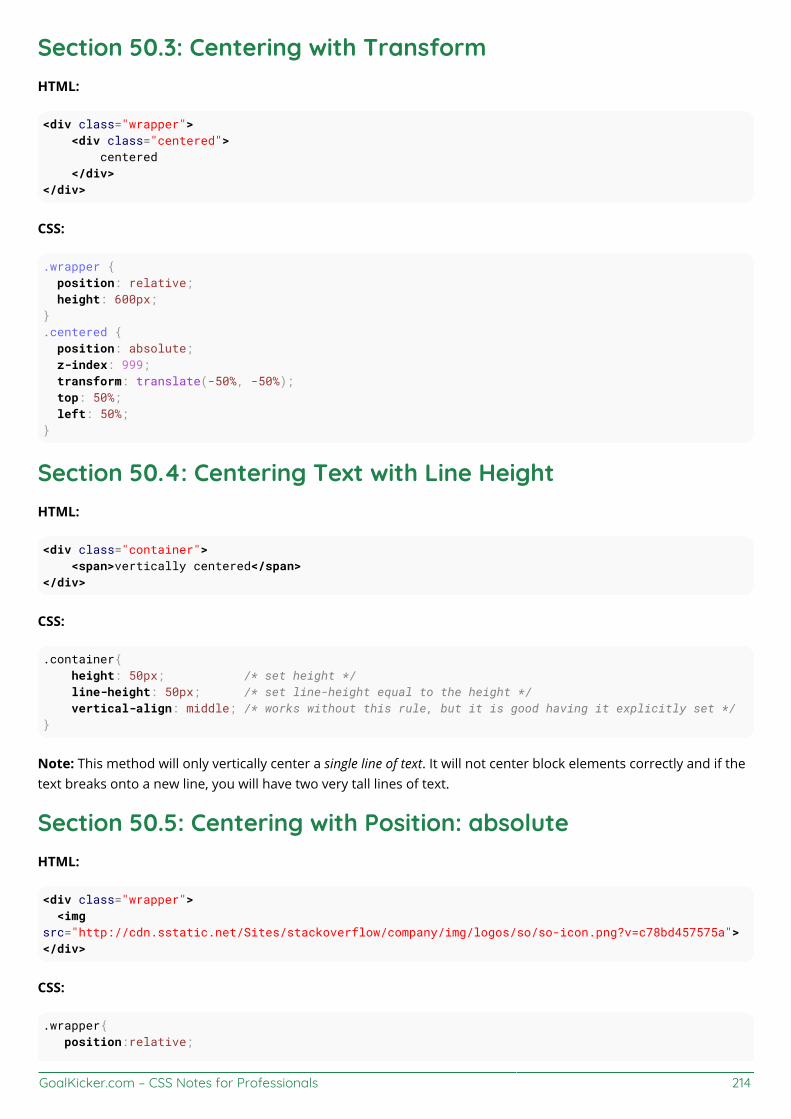
GoalKicker.com – CSS Notes for Professionals 214
Section 50.3: Centering with TransformHTML:
<div class="wrapper"> <div class="centered"> centered </div></div>
CSS:
.wrapper { position: relative; height: 600px;}.centered { position: absolute; z-index: 999; transform: translate(-50%, -50%); top: 50%; left: 50%;}
Section 50.4: Centering Text with Line HeightHTML:
<div class="container"> <span>vertically centered</span></div>
CSS:
.container{ height: 50px; /* set height */ line-height: 50px; /* set line-height equal to the height */ vertical-align: middle; /* works without this rule, but it is good having it explicitly set */}
Note: This method will only vertically center a single line of text. It will not center block elements correctly and if thetext breaks onto a new line, you will have two very tall lines of text.
Section 50.5: Centering with Position: absoluteHTML:
<div class="wrapper"> <imgsrc="http://cdn.sstatic.net/Sites/stackoverflow/company/img/logos/so/so-icon.png?v=c78bd457575a"></div>
CSS:
.wrapper{ position:relative;

GoalKicker.com – CSS Notes for Professionals 215
height: 600px;}.wrapper img { position: absolute; top: 0; left: 0; right: 0; bottom: 0; margin: auto;}
If you want to center other then images, then you must give height and width to that element.
HTML:
<div class="wrapper"> <div class="child"> make me center </div></div>
CSS:
.wrapper{ position:relative; height: 600px;}.wrapper .child { position: absolute; top: 0; left: 0; right: 0; bottom: 0; margin: auto; width: 200px; height: 30px; border: 1px solid #f00;}
Section 50.6: Centering with pseudo elementHTML:
<div class="wrapper"> <div class="content"></div></div>
CSS:
.wrapper{ min-height: 600px;}
.wrapper:before{ content: ""; display: inline-block; height: 100%; vertical-align: middle;}
GoalKicker.com – CSS Notes for Professionals 216
.content { display: inline-block; height: 80px; vertical-align: middle;}
This method is best used in cases where you have a varied-height .content centered inside .wrapper; and youwant .wrapper's height to expand when .content's height exceed .wrapper's min-height.

GoalKicker.com – CSS Notes for Professionals 217
Chapter 51: Object Fit and PlacementSection 51.1: object-fitThe object-fit property will defines how an element will fit into a box with an established height and width. Usuallyapplied to an image or video, Object-fit accepts the following five values:
FILL
object-fit:fill;
Fill stretches the image to fit the content box without regard to the image's original aspect ratio.
CONTAIN
object-fit:contain;
Contain fits the image in the box's height or width while maintaining the image's aspect ratio.
COVER
object-fit:cover;

GoalKicker.com – CSS Notes for Professionals 218
Cover fills the entire box with the image. The image aspect ratio is preserved, but the image is cropped to thedimensions of the box.
NONE
object-fit:none;
None ignores the size of the box and is not resized.
SCALE-DOWN
object-fit:scale-down;
Scale-down either sizes the object as none or as contain. It displays whichever option results in a smaller imagesize.

GoalKicker.com – CSS Notes for Professionals 219

GoalKicker.com – CSS Notes for Professionals 220
Chapter 52: CSS design patternsThese examples are for documenting CSS-specific design patterns like BEM, OOCSS and SMACSS.
These examples are NOT for documenting CSS frameworks like Bootstrap or Foundation.
Section 52.1: BEMBEM stands for Blocks, Elements and Modifiers. It's a methodology initially conceived by Russian tech companyYandex, but which gained quite some traction among American & Western-European web developers as well.
As the same implies, BEM metholology is all about componentization of your HTML and CSS code into three typesof components:
Blocks: standalone entities that are meaningful on their own
Examples are header, container, menu, checkbox & textbox
Elements: Part of blocks that have no standalone meaning and are semantically tied to their blocks.
Examples are menu item, list item, checkbox caption & header title
Modifiers: Flags on a block or element, used to change appearance or behavior
Examples are disabled, highlighted, checked, fixed, size big & color yellow
The goal of BEM is to keep optimize the readability, maintainability and flexibility of your CSS code. The way toachieve this, is to apply the following rules.
Block styles are never dependent on other elements on a pageBlocks should have a simple, short name and avoid _ or - charactersWhen styling elements, use selectors of format blockname__elementnameWhen styling modifiers, use selectors of format blockname--modifiername and blockname__elementname--modifiernameElements or blocks that have modifiers should inherit everything from the block or element it is modifyingexcept the properties the modifier is supposed to modify
Code example
If you apply BEM to your form elements, your CSS selectors should look something like this:
.form { } // Block
.form--theme-xmas { } // Block + modifier
.form--simple { } // Block + modifier
.form__input { } // Block > element
.form__submit { } // Block > element
.form__submit--disabled { } // Block > element + modifier
The corresponding HTML should look something like this:
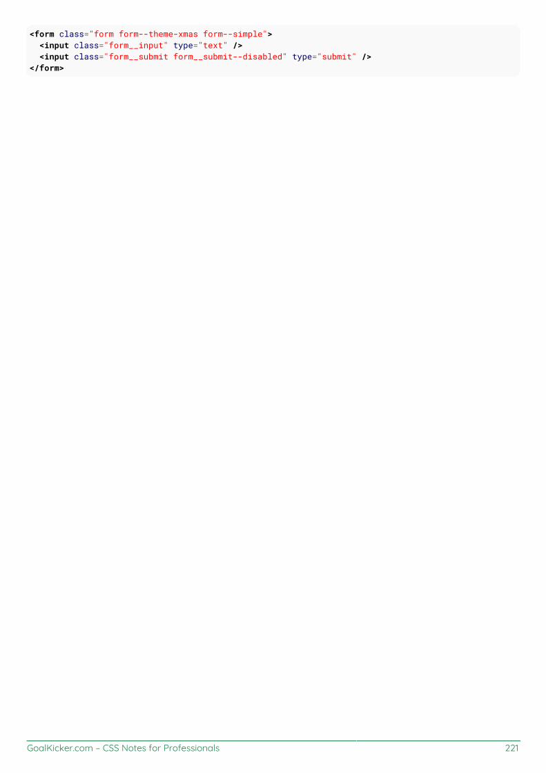
GoalKicker.com – CSS Notes for Professionals 221
<form class="form form--theme-xmas form--simple"> <input class="form__input" type="text" /> <input class="form__submit form__submit--disabled" type="submit" /></form>
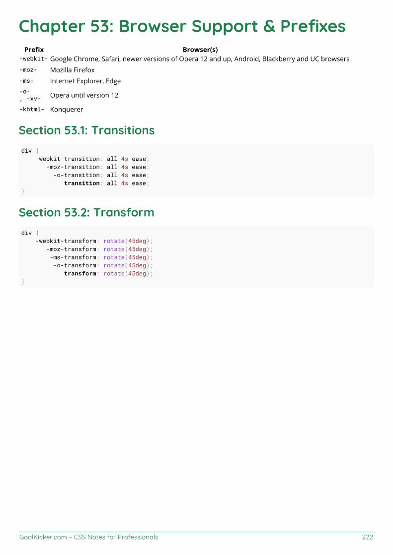
GoalKicker.com – CSS Notes for Professionals 222
Chapter 53: Browser Support & PrefixesPrefix Browser(s)
-webkit- Google Chrome, Safari, newer versions of Opera 12 and up, Android, Blackberry and UC browsers-moz- Mozilla Firefox-ms- Internet Explorer, Edge-o-, -xv- Opera until version 12
-khtml- Konquerer
Section 53.1: Transitionsdiv { -webkit-transition: all 4s ease; -moz-transition: all 4s ease; -o-transition: all 4s ease; transition: all 4s ease;}
Section 53.2: Transformdiv { -webkit-transform: rotate(45deg); -moz-transform: rotate(45deg); -ms-transform: rotate(45deg); -o-transform: rotate(45deg); transform: rotate(45deg);}

GoalKicker.com – CSS Notes for Professionals 223
Chapter 54: Normalizing Browser StylesEvery browser has a default set of CSS styles that it uses for rendering elements. These default styles may not beconsistent across browsers because: the language specifications are unclear so base styles are up forinterpretation, browsers may not follow specifications that are given, or browsers may not have default styles fornewer HTML elements. As a result, people may want to normalize default styles across as many browsers aspossible.
Section 54.1: normalize.cssBrowsers have a default set of CSS styles they use for rendering elements. Some of these styles can even becustomised using the browser's settings to change default font face and size definitions, for example. The stylescontain the definition of which elements are supposed to be block-level or inline, among other things.
Because these default styles are given some leeway by the language specifications and because browsers may notfollow the specs properly they can differ from browser to browser.
This is where normalize.css comes into play. It overrides the most common inconsistencies and fixes known bugs.
What does it do
Preserves useful defaults, unlike many CSS resets.Normalizes styles for a wide range of elements.Corrects bugs and common browser inconsistencies.Improves usability with subtle modifications.Explains what code does using detailed comments.
So, by including normalize.css in your project your design will look more alike and consistent across differentbrowsers.
Difference to reset.css
You may have heard of reset.css. What's the difference between the two?
While normalize.css provides consistency by setting different properties to unified defaults, reset.css achievesconsistency by removing all basic styling that a browser may apply. While this might sound like a good idea at first,this actually means you have to write all rules yourself, which goes against having a solid standard.
Section 54.2: Approaches and ExamplesCSS resets take separate approaches to browser defaults. Eric Meyer’s Reset CSS has been around for a while. Hisapproach nullifies many of the browser elements that have been known to cause problems right off the back. Thefollowing is from his version (v2.0 | 20110126) CSS Reset.
html, body, div, span, applet, object, iframe,h1, h2, h3, h4, h5, h6, p, blockquote, pre,a, abbr, acronym, address, big, cite, code,del, dfn, em, img, ins, kbd, q, s, samp,small, strike, strong, sub, sup, tt, var,b, u, i, center,dl, dt, dd, ol, ul, li,fieldset, form, label, legend,table, caption, tbody, tfoot, thead, tr, th, td,

GoalKicker.com – CSS Notes for Professionals 224
article, aside, canvas, details, embed,figure, figcaption, footer, header, hgroup,menu, nav, output, ruby, section, summary,time, mark, audio, video { margin: 0; padding: 0; border: 0; font-size: 100%; font: inherit; vertical-align: baseline;}
Eric Meyer's Reset CSS
Normalize CSS on the other and deals with many of these separately. The following is a sample from the version(v4.2.0) of the code.
/** * 1. Change the default font family in all browsers (opinionated). * 2. Correct the line height in all browsers. * 3. Prevent adjustments of font size after orientation changes in IE and iOS. */
/* Document ========================================================================== */
html { font-family: sans-serif; /* 1 */ line-height: 1.15; /* 2 */ -ms-text-size-adjust: 100%; /* 3 */ -webkit-text-size-adjust: 100%; /* 3 */}
/* Sections ========================================================================== */
/** * Remove the margin in all browsers (opinionated). */
body { margin: 0;}
/** * Add the correct display in IE 9-. */
article,aside,footer,header,nav,section { display: block;}
/** * Correct the font size and margin on `h1` elements within `section` and * `article` contexts in Chrome, Firefox, and Safari. */

GoalKicker.com – CSS Notes for Professionals 225
h1 { font-size: 2em; margin: 0.67em 0;}
Normalize CSS
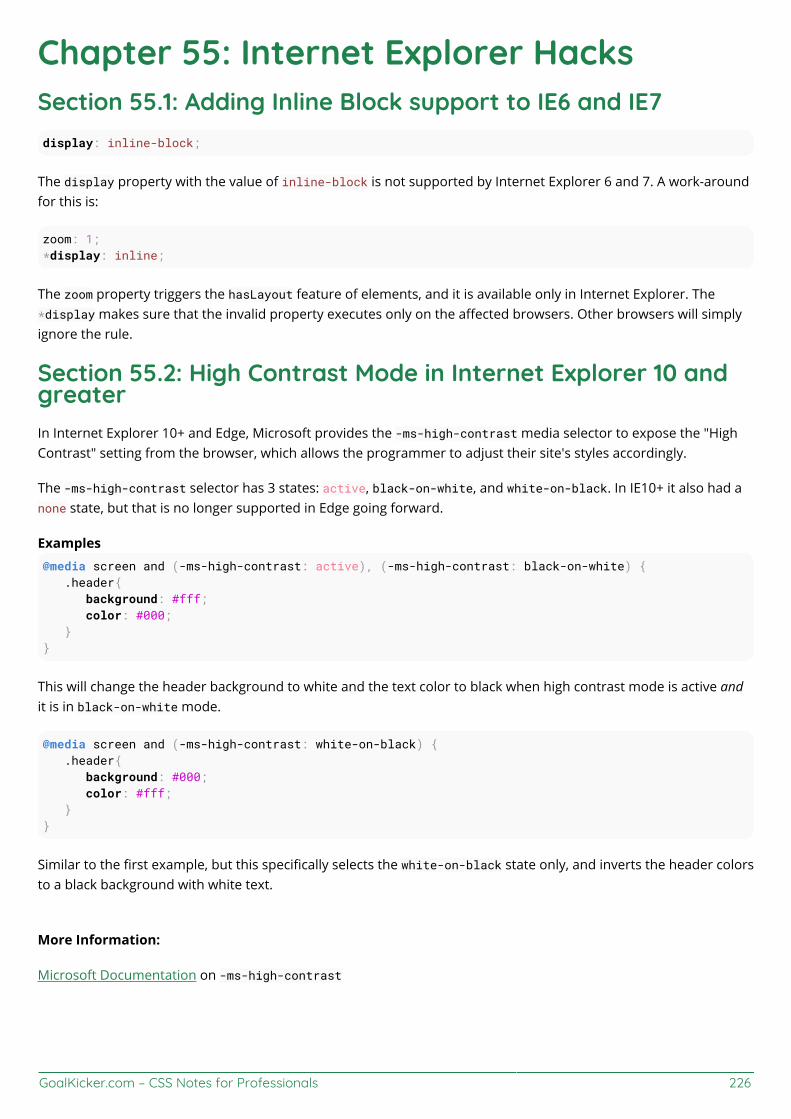
GoalKicker.com – CSS Notes for Professionals 226
Chapter 55: Internet Explorer HacksSection 55.1: Adding Inline Block support to IE6 and IE7display: inline-block;
The display property with the value of inline-block is not supported by Internet Explorer 6 and 7. A work-aroundfor this is:
zoom: 1;*display: inline;
The zoom property triggers the hasLayout feature of elements, and it is available only in Internet Explorer. The*display makes sure that the invalid property executes only on the affected browsers. Other browsers will simplyignore the rule.
Section 55.2: High Contrast Mode in Internet Explorer 10 andgreaterIn Internet Explorer 10+ and Edge, Microsoft provides the -ms-high-contrast media selector to expose the "HighContrast" setting from the browser, which allows the programmer to adjust their site's styles accordingly.
The -ms-high-contrast selector has 3 states: active, black-on-white, and white-on-black. In IE10+ it also had anone state, but that is no longer supported in Edge going forward.
Examples@media screen and (-ms-high-contrast: active), (-ms-high-contrast: black-on-white) { .header{ background: #fff; color: #000; }}
This will change the header background to white and the text color to black when high contrast mode is active andit is in black-on-white mode.
@media screen and (-ms-high-contrast: white-on-black) { .header{ background: #000; color: #fff; }}
Similar to the first example, but this specifically selects the white-on-black state only, and inverts the header colorsto a black background with white text.
More Information:
Microsoft Documentation on -ms-high-contrast
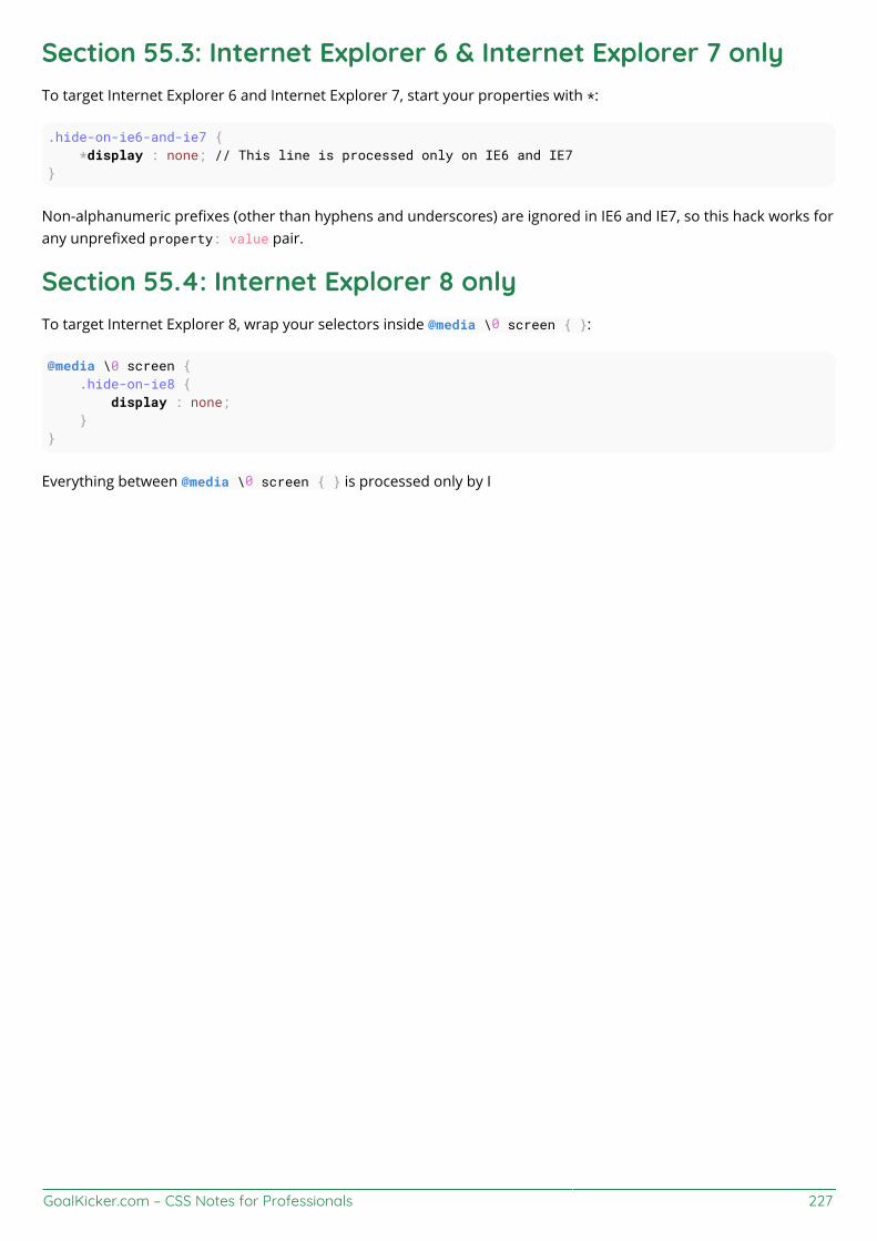
GoalKicker.com – CSS Notes for Professionals 227
Section 55.3: Internet Explorer 6 & Internet Explorer 7 onlyTo target Internet Explorer 6 and Internet Explorer 7, start your properties with *:
.hide-on-ie6-and-ie7 { *display : none; // This line is processed only on IE6 and IE7}
Non-alphanumeric prefixes (other than hyphens and underscores) are ignored in IE6 and IE7, so this hack works forany unprefixed property: value pair.
Section 55.4: Internet Explorer 8 onlyTo target Internet Explorer 8, wrap your selectors inside @media \0 screen { }:
@media \0 screen { .hide-on-ie8 { display : none; }}
Everything between @media \0 screen { } is processed only by I
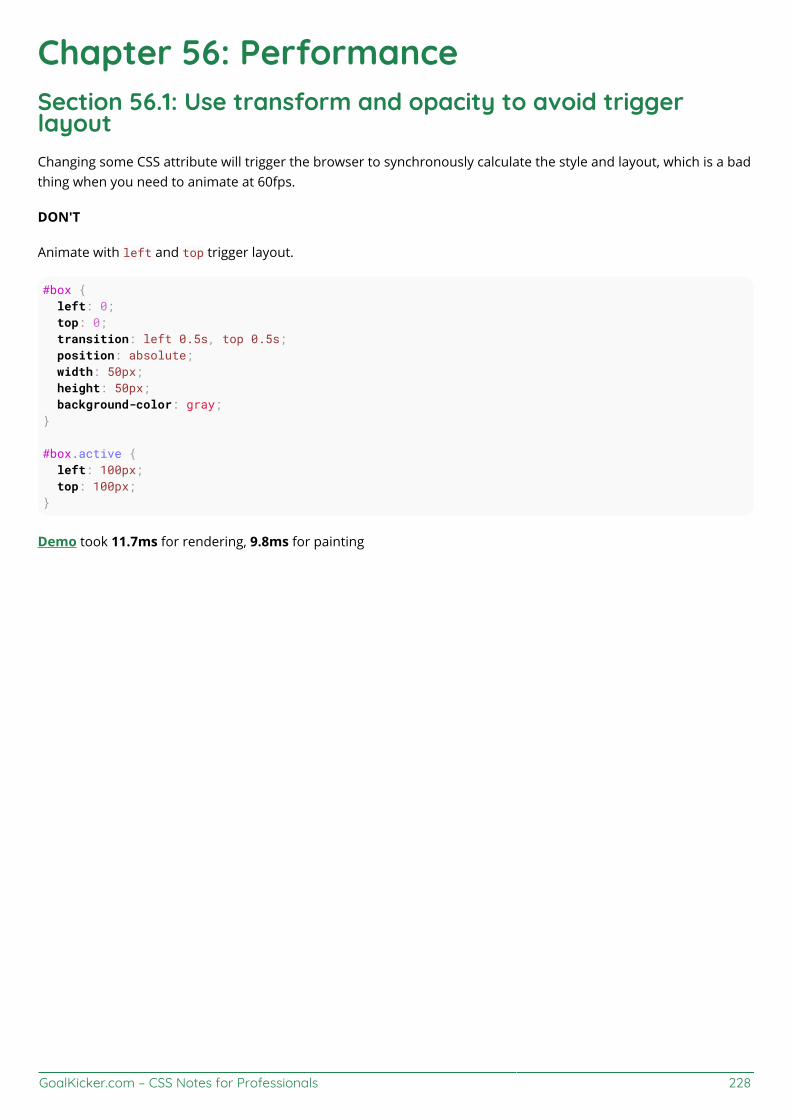
GoalKicker.com – CSS Notes for Professionals 228
Chapter 56: PerformanceSection 56.1: Use transform and opacity to avoid triggerlayoutChanging some CSS attribute will trigger the browser to synchronously calculate the style and layout, which is a badthing when you need to animate at 60fps.
DON'T
Animate with left and top trigger layout.
#box { left: 0; top: 0; transition: left 0.5s, top 0.5s; position: absolute; width: 50px; height: 50px; background-color: gray;}
#box.active { left: 100px; top: 100px;}
Demo took 11.7ms for rendering, 9.8ms for painting

GoalKicker.com – CSS Notes for Professionals 229
DO
Animate with transform with the same animation.
#box { left: 0; top: 0; position: absolute; width: 50px; height: 50px; background-color: gray;
transition: transform 0.5s; transform: translate3d(0, 0, 0);}
#box.active {
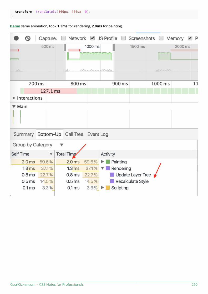
GoalKicker.com – CSS Notes for Professionals 230
transform: translate3d(100px, 100px, 0);}
Demo same animation, took 1.3ms for rendering, 2.0ms for painting.
GoalKicker.com – CSS Notes for Professionals 231
CreditsThank you greatly to all the people from Stack Overflow Documentation who helped provide this content,
more changes can be sent to [email protected] for new content to be published or updated
A B Chapter 20A.J Chapter 4Aaron Chapter 4abaracedo Chapter 4Abhishek Singh Chapter 22adamboro Chapter 1Aeolingamenfel Chapters 27 and 55Ahmad Alfy Chapters 4, 5 and 16Alohci Chapter 15amflare Chapters 13 and 17Andre Lopes Chapter 44andre mcgruder Chapter 54andreas Chapters 15 and 38Andrew Chapters 12, 19 and 53Andrew Myers Chapter 47Anil Chapter 4animuson Chapters 4, 50 and 53apaul Chapters 6 and 27Araknid Chapter 4Arif Chapter 11Arjan Einbu Chapters 4, 7, 8, 15 and 17Ashwin Ramaswami Chapters 1 and 4Asim K T Chapters 5 and 16AVAVT Chapter 50awe Chapter 1bdkopen Chapter 3Ben Rhys Chapter 5Bipon Chapter 40BiscuitBaker Chapter 7Boris Chapter 5Boysenb3rry Chapter 1brandaemon Chapter 17Brett DeWoody Chapters 18, 38 and 39CalvT Chapters 5 and 9Casey Chapter 11Cassidy Williams Chapters 10 and 22cdm Chapters 5 and 8Charlie H Chapters 4 and 28Chathuranga Jayanath Chapters 11, 13 and 23Chiller Chapter 38Chris Chapters 1, 4, 23, 25, 42 and 50Chris Spittles Chapters 8 and 24Christiaan Maks Chapter 28CocoaBean Chapter 5coderfin Chapter 3cone56 Chapters 31 and 36CPHPython Chapter 4

GoalKicker.com – CSS Notes for Professionals 232
csx.cc Chapter 1cuervoo Chapter 18Daniel G. Blázquez Chapter 5Daniel Käfer Chapter 6Daniel Stradowski Chapter 5DarkAjax Chapter 17darrylyeo Chapters 2, 13 and 18Darthstroke Chapter 5Dave Everitt Chapter 4David Fullerton Chapter 4Demeter Dimitri Chapter 4demonofthemist Chapter 14designcise Chapters 4, 5 and 18Devid Farinelli Chapters 4 and 6Devon Bernard Chapter 4Dex Star Chapter 27Diego V Chapter 6Dinidu Hewage Chapter 4dippas Chapters 4, 17 and 21doctorsherlock Chapter 10dodopok Chapters 13, 36 and 45Elegant.Scripting Chapter 43Eliran Malka Chapter 6Emanuele Parisio Chapter 6Evgeny Chapter 15Farzad YZ Chapter 6fcalderan Chapter 5feeela Chapters 46 and 55FelipeAls Chapters 1, 5, 10, 11, 14, 16, 24 and 25Felix A J Chapter 15Felix Edelmann Chapter 4Felix Schütz Chapter 4Forty Chapter 4fracz Chapter 4fzzylogic Chapter 16G Chapters 1 and 17Gabriel R. Chapter 1gandreadis Chapter 4geek1011 Chapter 21geeksal Chapter 17Gerardas Chapter 1Gnietschow Chapter 10GoatsWearHats Chapter 1Gofilord Chapter 21Grant Palin Chapter 54H. Pauwelyn Chapters 4, 18 and 36HansCz Chapter 4Harish Gyanani Chapter 1Harry Chapters 10, 26, 28, 29, 33, 35 and 44henry Chapter 4Horst Jahns Chapter 5Hristo Chapter 32Hugo Buff Chapter 4
GoalKicker.com – CSS Notes for Professionals 233
Hynes Chapters 4, 5 and 15insertusernamehere Chapter 15J Atkin Chapters 1 and 4J F Chapters 4 and 20Jacob Gray Chapters 4, 5 and 22James Donnelly Chapters 7 and 17James Taylor Chapter 5jaredsk Chapters 10, 36 and 50JedaiCoder Chapter 6Jef Chapter 16Jeffery Tang Chapter 30jehna1 Chapter 6jgh Chapter 12JHS Chapter 25Jmh2013 Chapters 13, 23 and 43joejoe31b Chapters 4 and 13JoelBonetR Chapter 4joe_young Chapters 1 and 15John Slegers Chapters 4, 5, 6, 13, 17, 18, 28, 52 and 55Jon Chan Chapters 5 and 15Jonathan Argentiero Chapter 6Jonathan Lam Chapters 1, 6, 7, 16 and 22Jonathan Zúñiga Chapter 5Jose Gomez Chapter 1Just a student Chapter 1Kevin Katzke Chapter 23kingcobra1986 Chapter 17Kuhan Chapter 18Kyle Ratliff Chapter 6leo_ap Chapter 50LiLacTac Chapter 55Luka Kerr Chapter 29Luke Taylor Chapter 28Madalina Taina Chapters 4, 5, 6, 8, 9, 10, 11, 12, 14, 15, 19, 25, 29, 31, 32, 34, 39, 45 and 49Marc Chapter 20Marcatectura Chapter 21Marjorie Pickard Chapter 2Mark Perera Chapter 4Marten Koetsier Chapters 34 and 41Matas Vaitkevicius Chapters 4 and 13Mattia Astorino Chapter 22Maximillian Laumeister Chapters 5 and 13Maxouhell Chapter 6Michael Moriarty Chapters 5, 15 and 18Michael_B Chapters 4 and 6Mifeet Chapter 6Mike McCaughan Chapter 24Miles Chapters 12 and 51Miro Chapter 18MMachinegun Chapter 54mmativ Chapter 50Mod Proxy Chapter 6Mr. Alien Chapter 5
GoalKicker.com – CSS Notes for Professionals 234
Mr. Meeseeks Chapter 29Mr_Green Chapter 8Muthu Kumaran Chapter 37Naeem Shaikh Chapter 4Nate Chapter 5Nathan Arthur Chapters 1, 4, 6, 8, 13, 14, 15 and 16Nemanja Trifunovic Chapter 48Niek Brouwer Chapter 23niyasc Chapter 18Nobal Mohan Chapter 10o.v. Chapter 6Obsidian Chapters 37 and 53Ortomala Lokni Chapters 6, 7 and 17Pat Chapter 21patelarpan Chapters 1 and 50Paul Kozlovitch Chapter 6Paul Sweatte Chapter 46Persijn Chapters 4 and 5Phil Chapter 50pixelbandito Chapter 9Praveen Kumar Chapters 4, 6, 13, 15, 26, 28, 50 and 55Qaz Chapter 12Rahul Nanwani Chapter 22RamenChef Chapter 43rdans Chapter 4RedRiderX Chapter 37rejnev Chapter 8Richard Hamilton Chapters 4, 5, 15, 18, 20 and 27Rion Williams Chapter 4rishabh dev Chapter 46rmondesilva Chapters 15 and 20Robotnicka Chapter 20Rocket Risa Chapter 1Sandeep Tuniki Chapter 6Saroj Sasmal Chapter 1ScientiaEtVeritas Chapters 1, 4, 6, 7, 10, 11, 18, 20, 21, 23, 26, 31, 33, 44 and 53Sebastian Zartner Chapter 40SeinopSys Chapters 18, 23, 36 and 54Sergey Denisov Chapters 5 and 26Shaggy Chapters 5, 21 and 53Siavas Chapter 6Someone Chapter 6Sourav Ghosh Chapters 5 and 22Squazz Chapters 16 and 31srikarg Chapter 13StefanBob Chapter 9Stewartside Chapters 4, 5, 6, 18, 20 and 21Stratboy Chapter 5sudo bangbang Chapter 4Sumner Evans Chapter 4Sun Qingyao Chapter 8Sunnyok Chapters 4, 6 and 8Sverri M. Olsen Chapter 1

GoalKicker.com – CSS Notes for Professionals 235
takeradi Chapter 16Taylor Chapter 6Ted Goas Chapters 12, 15, 34 and 43Teo Dragovic Chapters 1 and 13ThatWeirdo Chapter 4TheGenie OfTruth Chapter 36Theodore K. Chapter 22think123 Chapter 5Timothy Miller Chapter 55Toby Chapters 15 and 20Todd Chapter 1ToniB Chapter 15Tot Zam Chapter 8Trevor Clarke Chapters 5, 8, 10 and 15TrungDQ Chapter 56TylerH Chapters 1, 4, 5, 36 and 53Ulrich Schwarz Chapter 43user007 Chapter 18user2622348 Chapter 20vishak Chapter 14vkopio Chapter 7Vlusion Chapter 15Volker E. Chapter 15web Chapters 6, 26, 28, 29 and 44Will DiFruscio Chapter 9Wolfgang Chapter 18X Chapter 18Xinyang Li Chapter 1xpy Chapter 4Yury Fedorov Chapter 4Zac Chapters 5 and 12Zaffy Chapter 4Zakaria Acharki Chapter 20Zaz Chapter 4Ze Rubeus Chapter 4zeel Chapter 6zer00ne Chapter 20Zeta Chapter 5Zze Chapter 5

You may also like