crack deconstruction
TRANSCRIPT
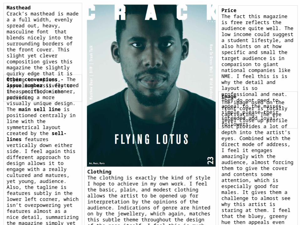
MastheadCrack’s masthead is made a a full width, evenly spread out, heavy, masculine font that blends nicely into the surrounding borders of the front cover. This slight yet clever composition gives this magazine the slightly quirky edge that it is trying to express, appealing massively to the specific, niche audience.
ImageThe image used on the front cover is totally captivating. The eye level close up profile shot provides a lot of depth into the artist’s eyes. Combined with the direct mode of address, I feel it engages amazingly with the audience, almost forcing them to give the cover and contents some attention, which is especially good for males. It gives them a challenge to almost see why this artist is staring at them. I feel that the bluey, greeny hue then appeals even further to the male audience by having the low key lighting as well. It provides a darker, almost cold feeling that could appeal quite cool to the target audience.
PriceThe fact this magazine is free reflects the audience quite well. The low income could suggest a student lifestyle, and also hints on at how specific and small the target audience is in comparison to giant national companies like NME. I feel this is is why the detail and layout is so professional and neat. They do not need to appeal to the masses, simple please their intended and loyal followers.Other conventions - The issue
number is featured in a unorthodox manner, providing a more visually unique design. The main sell line is positioned centrally in line with the symmetrical layout created by the sell-lines features vertically down either side. I feel again this different approach to design allows it to engage with a really cultured and matures, yet young, audience. Also, the tagline is features subtly in the lower left corner, which isn’t overpowering yet features almost as a nice detail, summarizing the magazine simply yet effectively. Overall, I feel it maintains basic magazine conventions yet with a real contemporary spin on them, which works fantastically to create this amazing finished design. This is what I similarly hope to achieve with my design.
ClothingThe clothing is exactly the kind of style I hope to achieve in my own work. I feel the basic, plain, and modest clothing allows the artist to be opened up for interpretation by the opinions of the audience. Indications of genre are hinted on by the jewellery, which again, matches this subtle theme throughout the design of the page itself. I feel this is much more appealing than a more tacky, mainstream approach, similarly to what I went for last year.
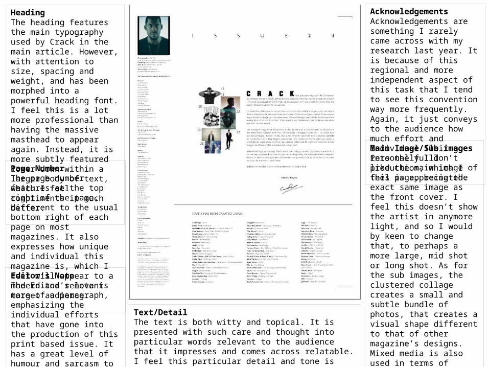
HeadingThe heading features the main typography used by Crack in the main article. However, with attention to size, spacing and weight, and has been morphed into a powerful heading font. I feel this is a lot more professional than having the massive masthead to appear again. Instead, it is more subtly featured lower down within a larger body of text, which I feel compliments it much better.
Main Image/Sub imagesPersonally I don’t like the main image of this page, being the exact same image as the front cover. I feel this doesn’t show the artist in anymore light, and so I would by keen to change that, to perhaps a more large, mid shot or long shot. As for the sub images, the clustered collage creates a small and subtle bundle of photos, that creates a visual shape different to that of other magazine’s designs. Mixed media is also used in terms of photography and illustration, which I feel again works well to create a well rounded and engaging magazine to fans of art and culture, who this magazine is specifically aimed at.
Text/DetailThe text is both witty and topical. It is presented with such care and thought into particular words relevant to the audience that it impresses and comes across relatable. I feel this particular detail and tone is definitely something to take note from.
AcknowledgementsAcknowledgements are something I rarely came across with my research last year. It is because of this regional and more independent aspect of this task that I tend to see this convention way more frequently. Again, it just conveys to the audience how much effort and individual flair goes into the fulll production, which I feel is appreciated.
Editor’s NoteThe Editor’s note is more of a paragraph, emphasizing the individual efforts that have gone into the production of this print based issue. It has a great level of humour and sarcasm to it, which engages and entertained the reader well.
Page NumberThe page number features at the top right of the page, different to the usual bottom right of each page on most magazines. It also expresses how unique and individual this magazine is, which I feel will appear to a modern and relevant target audience.
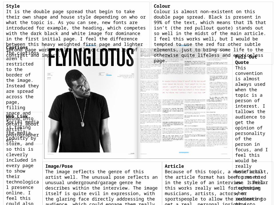
StyleIt is the double page spread that begin to take their own shape and house style depending on who or what the topic is. As you can see, new fonts are introduced for example, the heading, which competes with the dark black and white image for dominance in the first initial page. I feel the difference between this heavy weighted first page and lighter second page works really well to create a lot of contrast and impact.
ColourColour is almost non-existent on this double page spread. Black is present in 99% of the text, which means that 1% that isn’t (the red pullout quote) stands out so well in the midst of the main article. I feel this works well, but I would be tempted to use the red for other subtle elements, just to bring some life to the otherwise quite lifeless and emotionless page.
Pull Out QuoteThis convention is almost always used when the topic is a person of interest. I tallows the audience to get the opinion of personality of the person in focus, and I feel this would be really beneficial for me to use similar technique when recreating mine.
CaptionsThe captions aren’t restricted to the border of the image. Instead they are spread across the page, filling space and going into detail about artist, photographer etc.
Web LinkSocial media is taking the media industry by storm, and so this is cleverly included in every page to show their technological presence online. I feel this could also feature on the front cover, which is an improvement I would make.
Image/PoseThe image reflects the genre of this artist well. The unusual pose reflects an unusual underground/garage genre he describes within the interview. The image itself is quite evil in expression, with the glaring face directly addressing the audience, which could engage them really well. It follows on the nerving connotations of the front image quite well.
ArticleBecause of this topic, a music artist, the article format has been presented in the style of an interview. I feel this works really well for upcoming musicians, artists, actors, or sportspeople to allow the audience to get a real, personal insight into their ideas and attitudes, and so this is the format I will most likely use.