conceptual data visualization in archival finding aids ... · 2.0” tools, meant to counteract...
TRANSCRIPT
Anne Bahde 485
portal: Libraries and the Academy, Vol. 17, No. 3 (2017), pp. 485–506. Copyright © 2017 by Johns Hopkins University Press, Baltimore, MD 21218.
Conceptual Data Visualization in Archival Finding Aids: Preliminary User Responses Anne Bahde
abstract: This paper explores possibilities for marrying data visualization to online archival finding aids, which have continually suffered from usability issues in their long history. This paper describes a project in which two different data visualization models were built to replace sections of an archival finding aid. Users were then shown the models, and they reflected on their experiences and possible enhancements in small, informal focus groups. After situating these user responses within information-seeking activities of archival research, this paper explores potential methods of improving and expanding finding aids and archival search systems through data visualization.1
Introduction
A rchival finding aids have been presented online for almost two decades, yet researchers still struggle to understand and use them. Several studies con-firm the user comprehension problems noted by archivists for years: many
users of archives experience diffi-culty following large blocks of text in online finding aids, and they find archival jargon difficult to decipher. Researchers are also perplexed by archival hierarchies within finding aids. They struggle to see connec-tions between archival collections both within repositories and outside them. The difference between the item-level description of digital collections and the aggregate-level description in most archival
. . . many users of archives experience difficulty following large blocks of text in online finding aids, and they find archival jargon difficult to decipher.
This m
ss. is
peer
review
ed, c
opy e
dited
, and
acce
pted f
or pu
blica
tion,
porta
l 17.3
.
Conceptual Data Visualization in Archival Finding Aids: Preliminary User Responses 486
collections is also a major point of confusion for users.2 Along with these problems in the finding aids themselves, users face frustration when attempting to locate relevant collections within archival search systems.3
Though several of these studies are over a decade old, many of these problems persist, even in redesigned finding aids and search systems. The integration of “Web 2.0” tools, meant to counteract common problems with comprehension and encourage user interaction, has had decidedly mixed results for finding aids.4 Ciaran Trace and Andrew Dillon note that user problems with archival finding aids may be rooted in the paradigm of power inherent in these tools. According to Trace and Dillon, the finding aid has always “reflected, privileged, enabled, and given control to the writer (archivist) more so than to the receiver (researcher).”5 The authors note that “it is within archivists’ capability to remove some of the constraints of this genre, as well as to shift and change the roles in this relationship.”
Within the field of digital humanities, many scholars have explored ways to deliver more power to the user in the research experience. Tim Sherratt, for example, has advo-cated for the development of digital collection interfaces that enable users to visualize, augment, problematize, and critique collections and collections data.6 Appeals such as his invite questions about how users might respond to finding aids that present archival information in newly visual ways. What happens for the user when archival finding aids move beyond traditional formats to invite new interpretations of collections?
This article reflects on this question by exploring user responses to visualizations included in finding aids. The author created experimental, proof-of-concept models of visualizations for three sections of a finding aid and broadly explored preliminary user response and reaction to these models through small, informal focus groups. After situating these user responses within information-seeking activities of archival research, the author reflects on potential methods of improving finding aids and archival search systems through data visualization.
Visualization and the Archives
Visualization of data has long been central to the digital humanities. Visualizations allow users to see both quantitative and qualitative data differently, and they encour-age interpretation of data in ways that textual representation does not allow. Charts,
diagrams, graphs, and other forms of visu-alization promote comparative interpreta-tions; model new ways of understanding; suggest categories, patterns, and deviations from patterns; and enable new insights. Data visualizations can both “illustrate findings or serve as the distillation of an argument” and prompt further question-ing and analysis.7 David Berry suggests that “visualizations render certain aspects of a phenomenon more visible than others, thereby presenting a condensed or reduced
Charts, diagrams, graphs, and other forms of visualization pro-mote comparative interpretations; model new ways of understand-ing; suggest categories, patterns, and deviations from patterns; and enable new insights.
This m
ss. is
peer
review
ed, c
opy e
dited
, and
acce
pted f
or pu
blica
tion,
porta
l 17.3
.
Anne Bahde 487
representation.”8 This stance empowers viewers to perform data mining or “distant reading” of data in useful ways.
Instead of reading sources in the traditional way, called “close reading,” distant reading involves graphing, mapping, or otherwise visualizing texts to better understand them. Joanna Drucker differentiates between “visualizations that are representations of information already known and those that are knowledge generators capable of creating new information through their use.”9 In contrast to static visualizations, such as bar charts or line graphs, knowledge-generating visualizations include elements of interactivity that encourage dynamic, flexible interpretations. Such visualizations enable users to participate in the process of analysis, to probe and explore further, and to remix and play with the data to achieve new understanding.
Archival data (defined here as the pieces of information present within a finding aid or collection of finding aids) invite endless opportunities for visual analysis. Visu-alizing archival data may allow the researcher (and the archivist) to compare, match, recognize, distinguish, arrange, combine, construct, and organize data across a constellation of data points in ways that textual find-ing aids cannot. Presenting ar-chival data in a way that enables “distant reading” of a finding aid or a corpus of finding aids can entice users to identify patterns over time or space, relationships between collections, or propor-tions between categories of data. Such insights can empower the researcher at various stages of the archival research process, whether deciding on a research topic, identifying relevant collections, or establishing context and background.
Possibilities for visualizing archival data, and ideas for data visualization techniques applied to archival environments, have been present in the literature for more than 10 years, yet tools and research experimenting with these concepts have been slow to emerge. Robert B. Allen’s brief but visionary 2005 article suggests several possible approaches to visualization of archival records, including timelines, maps, networks, and tools to explore and articulate institutional hierarchies. Though his suggestions were specific to government archives, Allen’s ideas easily translate to nongovernment environments.10 In 2007, a Digital Humanities Start-Up Grant from the National Endowment for the Humanities (NEH) supported a project called ArchivesZ at the University of Maryland in College Park, which aspired to “support search, understanding, and exploration” of archival records through visual means. Videos of an early prototype suggest the capability to see overlapping collections through bar charts showing temporal periods and dual-sided histograms showing prevalence of search terms across multiple collec-tions.11 The Visible Archive project, also launched in 2009, visualizes the holdings of the National Archives of Australia through the Series Browser and the A1 Explorer. The Series Browser is an interactive tree map, a representation of hierarchical data using color and size to denote relationships, of all 65,000 archival series in the repository. The
Visualizing archival data may allow the researcher (and the archivist) to compare, match, recognize, distinguish, arrange, combine, construct, and organize data across a constellation of data points in ways that textual finding aids cannot.
This m
ss. is
peer
review
ed, c
opy e
dited
, and
acce
pted f
or pu
blica
tion,
porta
l 17.3
.
Conceptual Data Visualization in Archival Finding Aids: Preliminary User Responses 488
browser facilitates looking through these series based on their distribution and overlap. The A1 Explorer is an interactive search system and a word cloud (an image composed of words in which the size of each word indicates its frequency or importance) showing connections between certain keywords across collections.12
The Terms Explorer of the New York Public Library Labs’ Archives and Manuscripts Division, which debuted in 2013, is one of the most notable recent projects to marry visualization and archival research aids. This project enables researchers to search for and browse archival and manuscript collections in a vast, interconnected network of subject terms, people, and organizations. This powerful visualization allows users to browse collections to see people, organizations, and other collections related to specific terms and even multiple terms.13 The Social Networks and Archival Context (SNAC) project is a collaborative demonstration project funded by the NEH and the Andrew W. Mellon Foundation. The project has, since 2012, allowed users to see collections across institutions related to one person by using the international standard for Encoded Ar-chival Context—Corporate Bodies, Persons, and Families (EAC-CPF). A radial graph for each entity enables browsing and exploration of connections between people, families, and corporate bodies in a visual representation of the social and intellectual networks between them.14
Each of these tools seeks to more powerfully show relationships between pieces of archival information, whether those relationships are present within a finding aid or within a repository’s total collections. These tools are all, to some extent, knowledge-generating visualizations that allow users more dynamic and flexible ways to explore, interact with, and activate archival content. They disrupt the power paradigm of the typi-cal finding aid by giving the user more freedom to manipulate the information presented.
Because many of these archival visualization projects are still developing, little has been written regarding the ways that researchers actually react to these visualization tools. In 2009, the WGBH Media Library and Archives in Boston designed an integrated system to visually represent the relationships among and between items in their media collections in several different ways, in the hopes that their researchers would gain new understandings of their collections through interactions with the visualizations. Preliminary user testing suggests “users are excited by the idea of visually browsing the relationships between items in the collection” and “generally understand the basic idea and quickly get acclimated once they start exploring,” but the full picture of how researchers utilize these tools is unknown.15
In the present project, the author developed two visualizations to dynamically ex-press three types of information typically found in archival finding aids: (1) biographical/historical notes, (2) related archival materials, and (3) subject headings. These visualiza-tions were intended to provide opportunity for user interaction and exploration of these fields within the finding aid, and to explore how visualization may help or hinder the information-seeking behaviors of archival researchers. Intended to serve simply as proof-of-concept visualizations instead of actual working prototypes, these three models are nevertheless instructive for examining how researchers might respond to and interact with visualizations within finding aids.
This m
ss. is
peer
review
ed, c
opy e
dited
, and
acce
pted f
or pu
blica
tion,
porta
l 17.3
.
Anne Bahde 489
Description of the Models
Model 1: Biographical/Historical Notes as Geographic Timeline
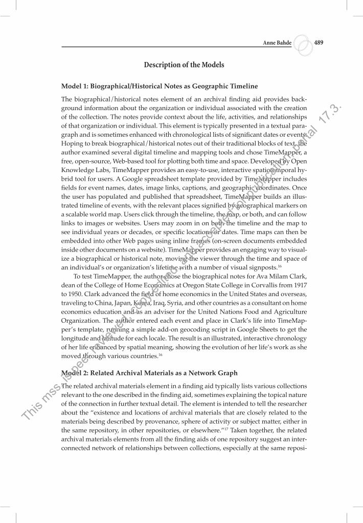
The biographical/historical notes element of an archival finding aid provides back-ground information about the organization or individual associated with the creation of the collection. The notes provide context about the life, activities, and relationships of that organization or individual. This element is typically presented in a textual para-graph and is sometimes enhanced with chronological lists of significant dates or events. Hoping to break biographical/historical notes out of their traditional blocks of text, the author examined several digital timeline and mapping tools and chose TimeMapper, a free, open-source, Web-based tool for plotting both time and space. Developed by Open Knowledge Labs, TimeMapper provides an easy-to-use, interactive spatiotemporal hy-brid tool for users. A Google spreadsheet template provided by TimeMapper includes fields for event names, dates, image links, captions, and geographic coordinates. Once the user has populated and published that spreadsheet, TimeMapper builds an illus-trated timeline of events, with the relevant places signified by geographical markers on a scalable world map. Users click through the timeline, the map, or both, and can follow links to images or websites. Users may zoom in on both the timeline and the map to see individual years or decades, or specific locations or dates. Time maps can then be embedded into other Web pages using inline frames (on-screen documents embedded inside other documents on a website). TimeMapper provides an engaging way to visual-ize a biographical or historical note, moving the viewer through the time and space of an individual’s or organization’s lifetime with a number of visual signposts.16
To test TimeMapper, the author chose the biographical notes for Ava Milam Clark, dean of the College of Home Economics at Oregon State College in Corvallis from 1917 to 1950. Clark advanced the field of home economics in the United States and overseas, traveling to China, Japan, Korea, Iraq, Syria, and other countries as a consultant on home economics education and as an adviser for the United Nations Food and Agriculture Organization. The author entered each event and place in Clark’s life into TimeMap-per’s template, running a simple add-on geocoding script in Google Sheets to get the longitude and latitude for each locale. The result is an illustrated, interactive chronology of her life enhanced by spatial meaning, showing the evolution of her life’s work as she moved through various countries.16
Model 2: Related Archival Materials as a Network Graph
The related archival materials element in a finding aid typically lists various collections relevant to the one described in the finding aid, sometimes explaining the topical nature of the connection in further textual detail. The element is intended to tell the researcher about the “existence and locations of archival materials that are closely related to the materials being described by provenance, sphere of activity or subject matter, either in the same repository, in other repositories, or elsewhere.”17 Taken together, the related archival materials elements from all the finding aids of one repository suggest an inter-connected network of relationships between collections, especially at the same reposi-
This m
ss. is
peer
review
ed, c
opy e
dited
, and
acce
pted f
or pu
blica
tion,
porta
l 17.3
.
Conceptual Data Visualization in Archival Finding Aids: Preliminary User Responses 490
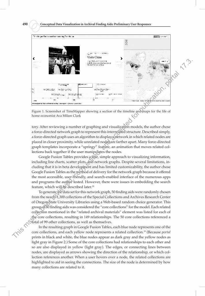
tory. After reviewing a number of graphing and visualization models, the author chose a force-directed network graph to represent this interrelated structure. Described simply, a force-directed graph uses an algorithm to display a network in which related nodes are placed in closer proximity, while unrelated nodes are farther apart. Many force-directed graph templates incorporate a “springy” feature, an animation that moves related col-lections back together if the user manipulates the nodes.
Google Fusion Tables provides a free, simple approach to visualizing information, including line charts, scatter plots, and network graphs. Despite several limitations, in-cluding that it is in beta development and has limited customizability, the author chose Google Fusion Tables as the method of delivery for the network graph because it offered the most accessible, user-friendly, and search-enabled interface of the numerous apps and programs the author tested. However, there were issues in embedding the search feature, which will be described later.18
To generate the data set for this network graph, 50 finding aids were randomly chosen from the nearly 1,300 collections of the Special Collections and Archives Research Center of Oregon State University Libraries using a Web-based random choice generator. This group of 50 finding aids was considered the “core collections” for the model. Each related collection mentioned in the “related archival materials” element was listed for each of the core collections, resulting in 149 relationships. The 50 core collections referenced a total of 99 other collections, as well as themselves.
In the resulting graph in Google Fusion Tables, each blue node represents one of the core collections, and each yellow node represents a related collection.19 (Because portal prints in black and white, the blue nodes appear as dark gray and the yellow nodes as light gray in Figure 2.) Some of the core collections had relationships to each other and so are also displayed in yellow (light gray). The edges, or connecting lines between nodes, are displayed as arrows showing the direction of the relationship, or which col-lection references another. When a user hovers over a node, the related collections are highlighted to aid in seeing the connections. The size of the node is determined by how many collections are related to it.
Figure 1. Screenshot of TimeMapper showing a section of the timeline and maps for the life of home economist Ava Milam Clark
This m
ss. is
peer
review
ed, c
opy e
dited
, and
acce
pted f
or pu
blica
tion,
porta
l 17.3
.
Anne Bahde 491
Changing the scale of this graph can prompt different understandings of the data. When a user zooms out to see the full network, the graph shows a large, loose cluster of collections in the center of the network. This cluster represents the collections that have a high degree of relatedness. The larger cluster is surrounded by several smaller clusters of collections that have a lower degree of relatedness, possessing only one connection or no connections to the larger set. Zooming in, one can explore the many smaller clusters and navigate the structure to see the overlaps between collections. Users can also “pull” clusters away from the group by clicking on a node, holding it, and moving it with their mouse. This ability to rearrange clusters allows users to reorganize the graph in a way that is useful to them, though the animated graph does spring back after a few moments.
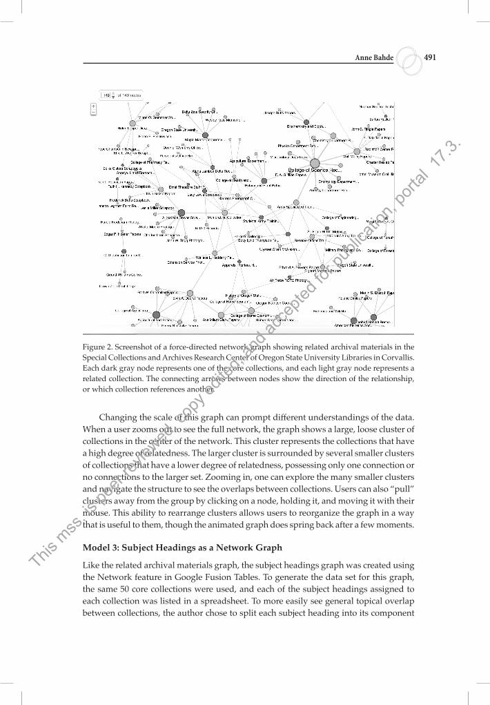
Model 3: Subject Headings as a Network Graph
Like the related archival materials graph, the subject headings graph was created using the Network feature in Google Fusion Tables. To generate the data set for this graph, the same 50 core collections were used, and each of the subject headings assigned to each collection was listed in a spreadsheet. To more easily see general topical overlap between collections, the author chose to split each subject heading into its component
Figure 2. Screenshot of a force-directed network graph showing related archival materials in the Special Collections and Archives Research Center of Oregon State University Libraries in Corvallis. Each dark gray node represents one of the core collections, and each light gray node represents a related collection. The connecting arrows between nodes show the direction of the relationship, or which collection references another.
This m
ss. is
peer
review
ed, c
opy e
dited
, and
acce
pted f
or pu
blica
tion,
porta
l 17.3
.
Conceptual Data Visualization in Archival Finding Aids: Preliminary User Responses 492
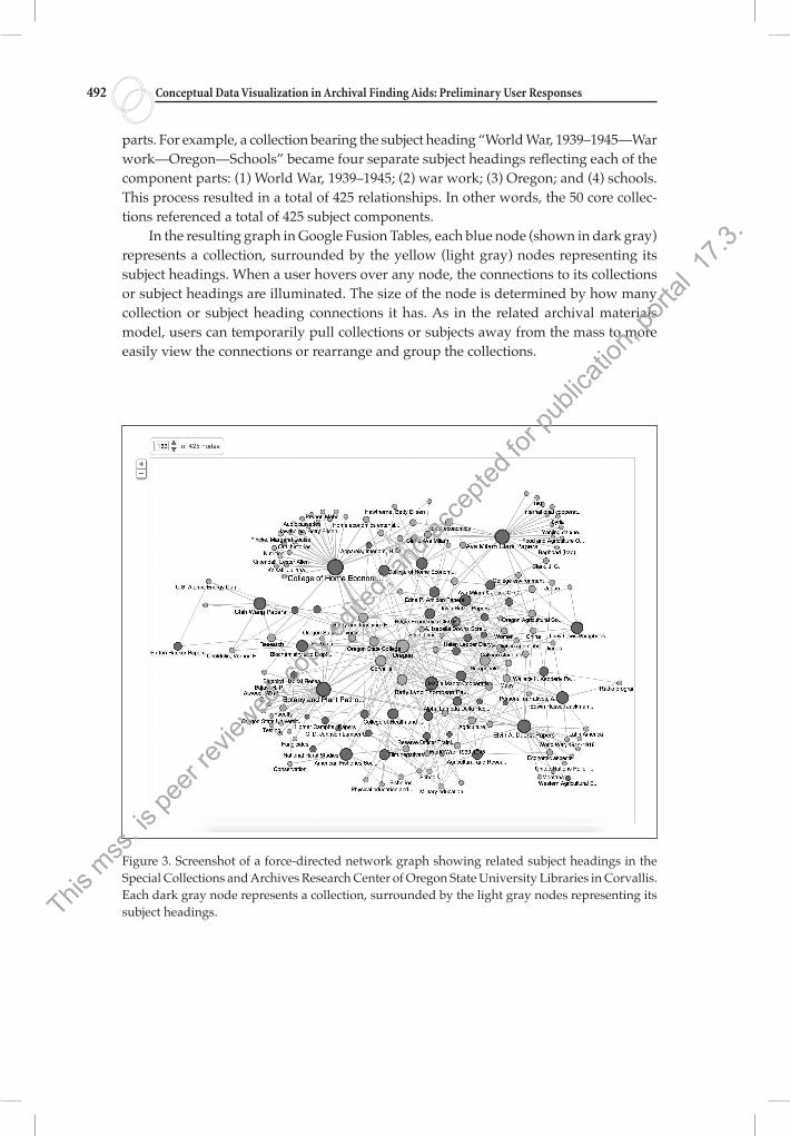
parts. For example, a collection bearing the subject heading “World War, 1939–1945—War work—Oregon—Schools” became four separate subject headings reflecting each of the component parts: (1) World War, 1939–1945; (2) war work; (3) Oregon; and (4) schools. This process resulted in a total of 425 relationships. In other words, the 50 core collec-tions referenced a total of 425 subject components.
In the resulting graph in Google Fusion Tables, each blue node (shown in dark gray) represents a collection, surrounded by the yellow (light gray) nodes representing its subject headings. When a user hovers over any node, the connections to its collections or subject headings are illuminated. The size of the node is determined by how many collection or subject heading connections it has. As in the related archival materials model, users can temporarily pull collections or subjects away from the mass to more easily view the connections or rearrange and group the collections.
Figure 3. Screenshot of a force-directed network graph showing related subject headings in the Special Collections and Archives Research Center of Oregon State University Libraries in Corvallis. Each dark gray node represents a collection, surrounded by the light gray nodes representing its subject headings.This
mss
. is pe
er rev
iewed
, cop
y edit
ed, a
nd ac
cepte
d for
publi
catio
n, po
rtal 1
7.3.
Anne Bahde 493
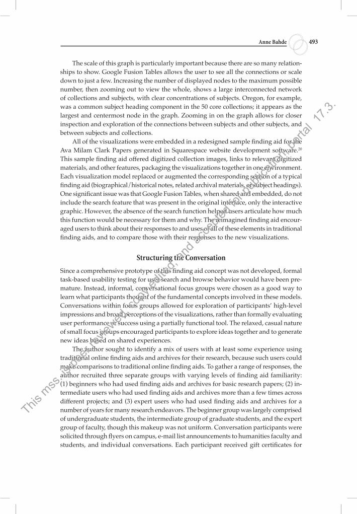
The scale of this graph is particularly important because there are so many relation-ships to show. Google Fusion Tables allows the user to see all the connections or scale down to just a few. Increasing the number of displayed nodes to the maximum possible number, then zooming out to view the whole, shows a large interconnected network of collections and subjects, with clear concentrations of subjects. Oregon, for example, was a common subject heading component in the 50 core collections; it appears as the largest and centermost node in the graph. Zooming in on the graph allows for closer inspection and exploration of the connections between subjects and other subjects, and between subjects and collections.
All of the visualizations were embedded in a redesigned sample finding aid for the Ava Milam Clark Papers generated in Squarespace website development software.20 This sample finding aid offered digitized collection images, links to relevant digitized materials, and other features, packaging the visualizations together in one environment. Each visualization model replaced or augmented the corresponding section of a typical finding aid (biographical/historical notes, related archival materials, or subject headings). One significant issue was that Google Fusion Tables, when shared and embedded, do not include the search feature that was present in the original interface, only the interactive graphic. However, the absence of the search function helped users articulate how much this function would be necessary for them and why. The reimagined finding aid encour-aged users to think about their responses to and uses of all of these elements in traditional finding aids, and to compare those with their responses to the new visualizations.
Structuring the Conversation
Since a comprehensive prototype of this finding aid concept was not developed, formal task-based usability testing for user search and browse behavior would have been pre-mature. Instead, informal, conversational focus groups were chosen as a good way to learn what participants thought of the fundamental concepts involved in these models. Conversations within focus groups allowed for exploration of participants’ high-level impressions and broad perceptions of the visualizations, rather than formally evaluating user performance or success using a partially functional tool. The relaxed, casual nature of small focus groups encouraged participants to explore ideas together and to generate new ideas based on shared experiences.
The author sought to identify a mix of users with at least some experience using traditional online finding aids and archives for their research, because such users could make comparisons to traditional online finding aids. To gather a range of responses, the author recruited three separate groups with varying levels of finding aid familiarity: (1) beginners who had used finding aids and archives for basic research papers; (2) in-termediate users who had used finding aids and archives more than a few times across different projects; and (3) expert users who had used finding aids and archives for a number of years for many research endeavors. The beginner group was largely comprised of undergraduate students, the intermediate group of graduate students, and the expert group of faculty, though this makeup was not uniform. Conversation participants were solicited through flyers on campus, e-mail list announcements to humanities faculty and students, and individual conversations. Each participant received gift certificates for
This m
ss. is
peer
review
ed, c
opy e
dited
, and
acce
pted f
or pu
blica
tion,
porta
l 17.3
.
Conceptual Data Visualization in Archival Finding Aids: Preliminary User Responses 494
campus food establishments as compensation. Fifteen users participated from a number of majors and disciplinary programs, including history, history of science, engineering, pharmacy, international studies, and English.
After an explanation of the study at the start of each group discussion, the author defined the term “finding aid” for participants to ensure that they knew the focus group was centered only on this genre and did not involve other library tools such as catalogs or consortium databases. We looked at several examples of online finding aids from different institutions, concentrating on the biographical/historical notes, related archival materials, and subject headings spaces so that participants had in mind a typical presentation of these elements.
To supplement data gathered from the focus groups, participants completed a short survey (see Appendix) which collected basic demographic information, such as major or discipline and education level (undergraduate, graduate, or faculty). The survey also asked participants to describe whether searching or browsing in a finding aid system was more useful to them in their archival research process, or whether both functions were equally useful. Finally, participants were asked whether they typically used components such as the biographical/historical notes, related archival materials, or subject headings.
The focus group sessions were semi-structured and informal. After reviewing the examples, the author demonstrated each individual data visualization model. After thor-oughly exploring each model and its features, participants were asked a set of questions designed to allow open-ended conversation about their impressions and to discuss how such a tool might fit into their existing research habits and preferences:
• How does this tool facilitate or hinder your comprehension of the information? • What are the potential advantages or disadvantages to this tool? • Would you use a tool such as this in your own research? Why or why not?
As participants discussed these questions, the author encouraged elucidation and elaboration on some responses. After the models were explored, the sample site was demonstrated and this general form was discussed. Each group conversation was audio recorded, and notes and partial transcripts were later derived from these recordings. After all focus groups were completed, transcripts were compiled, analyzed, and coded to identify prominent or repeating themes and trends.
User Responses to Visualizations
Each focus group yielded a wealth of user responses to and impressions of the visualiza-tions. Many of the informal conversations quickly turned to how the models could be improved for the user. Every participant gave feedback regarding enhancements they thought would make the models more useful. In this section, responses from the survey and themes from coded user responses are discussed. User-suggested enhancements and their relationships to archival information-seeking activities are explored after this discussion.
Three of the five beginner users found searching and browsing functions equally helpful in a finding aid system. Two beginner users preferred to deal only with searching functions, one of them noting, “I’d prefer to just use searching but I often don’t find what
This m
ss. is
peer
review
ed, c
opy e
dited
, and
acce
pted f
or pu
blica
tion,
porta
l 17.3
.
Anne Bahde 495
I want that way, so I have to browse.” Intermediate users were split the same way, with three finding both searching and browsing equally helpful, and two preferring searching over browsing. Brief comments from intermediate users on the searching and browsing functions revealed that they relied on different functions depending on their stage of the research process and what they were trying to do. For example, one intermediate user who thought both searching and browsing were useful said, “It depends on what I’m using it for—if I am at the beginning of a specific project then searching is the easi-est to find exactly what I need, but if I am working with a broader research question it’s good to know what is available in a whole archive.” All five expert users noted that they used both searching and browsing functions, but emphasized that searching is crucial for them at every stage of their research. For example, one expert user said, “I need to be able to both get an overview through browsing, and to get straight to what I’m looking for through search.” In varying degrees, each category of user utilized both searching and browsing functions within databases and interfaces of the archival find-ing aid. These survey results inform and augment the responses gathered about each visualization model in the focus groups. Each discussion generated several recurring themes, including exploration and discovery, potential utility, and usability issues.
Responses to Biographical/Historical Notes as Geographic Timeline
Beginner users were particularly enthusiastic about this tool, and many commented that they especially appreciated the ability to explore a life or a history in a non-textual way. This group enjoyed the TimeMapper feature, although it lacks a search function, which, for users who prefer searching over browsing, can be a limitation. However, the tool’s browsing nature seemed to encourage exploration. Several beginner users noted that seeing Ava Milam Clark’s biographical information presented in this manner enhanced their ability to remember the order of events in her life. Nearly every user in this group said that the tool sparked their curiosity and increased their desire to use the collection for research. However, beginners also cited potential impatience with clicking through everything on the timeline to see the full picture of a person’s life, and they noted that it would take longer to find a specific piece of information than it would to simply skim a block of text. Several users observed that this presentation could visually overwhelm someone expecting the information in textual form but also predicted that, for some users, this presentation would be less overwhelming and more visually attractive.
In varying degrees, each category of user utilized both searching and browsing functions within databases and interfaces of the archival finding aid.
Several users indicated that the timeline format enhanced their ability to remem-ber the order of events and noted that this feature would be particularly helpful with large collections or for people and organizations with complex histories.This
mss
. is pe
er rev
iewed
, cop
y edit
ed, a
nd ac
cepte
d for
publi
catio
n, po
rtal 1
7.3.
Conceptual Data Visualization in Archival Finding Aids: Preliminary User Responses 496
Intermediate users responded somewhat positively to this tool, and most found it visually inviting and straightforward to use. Several users indicated that the timeline format enhanced their ability to remember the order of events and noted that this feature would be particularly helpful with large collections or for people and organizations with complex histories. However, all users in this group agreed that having the textual form in addition to the timeline would be crucial to enable skimming. One intermediate user shrewdly noticed that the tool’s geographic element would provide little added value for a person or organization who remained in the same place for long periods. Some intermediate users explained that they frequently skip perusing the biographical or historical notes, preferring direct keyword searching of the full finding aid.
Expert users were conflicted about this tool. They noted that it did provide interest-ing visual context for a history or biography that a researcher might want to explore. Some stated, however, that they would probably not use this element because they infre-quently consult a biographical or historical note in their research process. Expert users who were instructors or professors of history or who incorporated historical research into their classes said they would want their students to see this tool, citing its potential for sparking curiosity, but few said they would use the timeline and map in their own research. Some expert users explained that they might doubt the completeness of the information in timeline form and wondered whether some elements of the biographical/historical notes could have been lost or overlooked in this format.
Responses to Related Archival Materials as a Network Graph
Beginner users were somewhat uncertain about this model. Several found it visually overwhelming at first, stating that they would probably not use it unless there was an introduction to effective use. Some beginners were drawn to the tool, stating that it would be a fun way to explore an institution’s collections and noting its potential usefulness for finding related materials without scrolling through search results. Some beginners stated they would not use this model simply because they typically do not look at the related collections section of finding aids, preferring to skip straight to a box list through keyword searching.
Intermediate users were more keen on this model, and many noted its potential utility for their research right away. Though some found it visually overwhelming at first, these same users warmed to it as they saw it in use, noting that they liked it better once they understood how it worked. These users stated that they would need an initial
introduction or tutorial but that they would then find it easy to understand and manipulate. Several intermedi-ate users praised the way the model demonstrated interconnectedness of collections and noted enthusiastically that they would use this tool in plan-ning research and finding relevant collections. One user stated that he would not use this tool because there
Several intermediate users praised the way the model demonstrated intercon-nectedness of collections and noted enthusiastically that they would use this tool in planning research and finding relevant collections.
This m
ss. is
peer
review
ed, c
opy e
dited
, and
acce
pted f
or pu
blica
tion,
porta
l 17.3
.
Anne Bahde 497
was no way to proceed through the network in an organized or methodical way. An-other user said that he would not use it because he typically did not consult the related collections section of a finding aid, never having found it useful; but he suggested that if the model were adjusted to enhance certain capabilities (discussed later), he would use this tool in his research process.
Expert users were decidedly enthusiastic about this model. Nearly all stated that something like this model would have been helpful to them in planning previous research and immediately described the model’s potential usefulness in helping them understand the strengths of a repository’s collections and whether to visit an institution based on how many relevant collections were present. Though these users noted that the model had to be explained, they generally did not see that as a hindrance to use. One expert user asked for it to be implemented on the department’s website immediately, stating that just during the demonstration of the tool she had seen a previously unknown related collection she wanted to consult for her own research. Several affirmed that the model would save time in their research. Expert users who were also instructors or professors indicated that they would eagerly direct their students toward such a model, noting that a researcher could spot potential projects just by studying clusters of collections within the model. All of the users in this group stated that they would use such a tool in their own research.
Responses to Subject Headings as a Network Graph
The beginner group was more interested in the subject headings model than the related archival materials model, though they again found it visually overwhelming at the start. All of these participants stated that they liked this model better, indicating that a collection-to-subject relationship was easier for them to understand than a collection-to-collection relationship. All beginner participants said that they would want to play with this model when browsing for potential research topics and that this would be simpler than making sense of keyword search results.
Intermediate users found this model more visually overwhelming than the previous one and stated that the multiple relationships represented could hinder their ability to use the model effectively. Several said they would use such a model only in the beginning stages of a research project as they were identifying potentially relevant collections. Most in this group said that they would not want to find new collections or subject heading relationships at a later stage in their research, and would avoid this tool out of fear of uncovering previously overlooked collections! Several said they would probably not use the model as it was currently presented in their own research but would use it with enhancements at an early stage of their process.
Expert users were largely enthusiastic about this model but initially hesitant to say whether they would use it in their own research. Several found it visually crowded and difficult to parse, especially when all relationships were displayed together without faceting or narrowing of any kind, but they warmed to it as different ways to narrow and isolate results were demonstrated. All of the expert users who were also instructors said that they would want their students to begin with such a tool. One expert user believed that this tool would spark “research creativity” in her students and would be the perfect
This m
ss. is
peer
review
ed, c
opy e
dited
, and
acce
pted f
or pu
blica
tion,
porta
l 17.3
.
Conceptual Data Visualization in Archival Finding Aids: Preliminary User Responses 498
tool for undergraduates new to historical research. Another expert user said that because there was no methodical way to explore the network, he would not spend time doing so. At the end of this discussion, several expert users decided that they would use the model in their own research as it was currently presented, some were undecided, and several decided that they would not use the model at all.
Suggested Enhancements and Discussion
As noted earlier, many of the focus group conversations moved quickly in the direc-tion of desired enhancements to the data visualizations. Once participants grasped the
potential of a visualization, they quickly extended those possibilities to augment its functionality, voicing such sentiments as “I would use this feature more if . . . ” or “It would be so cool if . . . ” Participants often built upon others’ initial ideas, and the
group would discuss the potential use of the imagined functionality.Many users suggested enhancements in the context of their broader information-
seeking habits in archival research. It is useful to think about their suggestions within the frame proposed by Wendy Duff and Catherine Anne Johnson in 2002. The authors identified four separate but often simultaneous information-seeking behaviors for ar-chival research: (1) orienting oneself to archives, finding aids, sources, or a collection; (2) seeking known material; (3) building contextual knowledge, and (4) identifying relevant material.21 Duff and Johnson found that these information-seeking behaviors occur in no particular order, are nonlinear, and are iterative. When the participants in these focus groups were asked how these data visualization models might figure into their research behaviors, they nearly always sought to consolidate and systematize all four information-seeking activities, desiring ways to more fully and efficiently control and manipulate the finding aids.
Beginner Users
Many enhancements to the visualizations suggested by the beginner group emphasized orientation activities. These activities, according to Duff and Johnson, include examining finding aids to get an overall view of collections and deciding which collections will yield the greatest returns for their research. Several beginners suggested adding links from the timeline directly to related content in the box list, noting that this would streamline their orientation process of deciding whether the collection was relevant to their research and if it was worth pursuing. Instead of reading the biographical/historical events in a textual format, noting details of interest, and remembering those in their examination of the box list, these users wanted to be guided directly to associated content in the col-lection while perusing the biographical/ historical notes.
Once participants grasped the potential of a visualization, they quickly extended those possibilities to augment its functionality, voicing such sentiments as “I would use this feature more if . . . ”
This m
ss. is
peer
review
ed, c
opy e
dited
, and
acce
pted f
or pu
blica
tion,
porta
l 17.3
.
Anne Bahde 499
In their comments on the related archival materials model, beginner users also sug-gested enhancements related to improved guidance and navigation within the model and the entire finding aid, as part of the orientation act of familiarizing themselves with a repository’s holdings. Several users indicated that the ability to select how many degrees of related collections are shown in the model would help them orient themselves within the repository as they move toward planning a research strategy. One user indicated that “if the home collection was denoted by a star, and you could see just the home collec-tion’s related collections first, then click to reveal their related collections and so on, that would be more helpful than seeing them all at once.” Others agreed with this sugges-tion. Another user proposed the ability to switch between a network model for related archival materials and a tree model, showing the root collection branching outward to related collections, which would help her more clearly understand what the repository had to offer on her topic. The ability to select how many degrees are shown was also suggested for the subject headings network model. Beginners indicated a desire for more orientation guidance in both of the network models, suggesting that the models prompt users toward certain directions after “learning” their interests. For example, a pop-up box might read, “I see you are researching [sample collection or subject]. You may also want to look at [related collections or subjects].”
Other suggestions from beginners emphasized context-building behaviors. Duff and Johnson describe this information-seeking activity as gaining general background information, looking for relationships between records, identifying and researching gaps, and ascertaining relative significance of collections to research. Beginner users suggested adding the ability to “stack” different timelines next to one another to see spatial and temporal relationships between indi-viduals or organizations. One user indicated that having this function would allow her to “step back and see where they do and don’t match up, so I can see connections.” This would increase the utility of the visualization significantly, encouraging more efficient comparison and evaluation of collections. In the related archival materials and subject head-ings models, beginner users wanted to see more about each collection within the visualization and to combine these networks to see both related collections and subjects in one place. Having this capability, said one user, would “help me decide at a glance which ones are significant to my own topic.” Beginner users also wanted the capability to add context for the benefit of themselves and others, as they explored the physical collection. For example, one user asked, “Can I go back and add an event and a document if I find something that isn’t already in the timeline?” Building on this idea, another suggested adding the capability for users to personally augment and extend subject areas for collections.
Beginner users suggested adding the ability to “stack” different timelines next to one another to see spatial and temporal relationships between individuals or organizations.
This m
ss. is
peer
review
ed, c
opy e
dited
, and
acce
pted f
or pu
blica
tion,
porta
l 17.3
.
Conceptual Data Visualization in Archival Finding Aids: Preliminary User Responses 500
Intermediate Users
Intermediate users also suggested enhancements related to orientation and context-building activities, but in addition they wanted to see improvements that would help them seek known material and identify other relevant resources. Intermediate users suggested some of the same enhancements as beginner users, such as linking each model to relevant sections of the box list. After observing the biographical/historical timeline in action, one intermediate user proposed the ability to “grab” events on the timeline as they were discovered and save them to what she called a “red string wall,” referencing the familiar TV and movie scene of detectives trying to make connections by stringing together disparate pieces of information and evidence on a wall. This user wanted the ability to save and document her research, including biographical facts, digital images, and documents, enabling her to construct her own arguments and narratives within the archival search system. Others in this focus group strongly agreed that this functional-ity would help their research dramatically and linked it to the network models as well, stating that the ability to “grab” groups of collections or subjects to save in a personal research space would be “amazing” and “really useful.”
To help them build context in their research process, intermediate users had several suggestions, including the ability to stack timelines and layer networks as the begin-ners suggested. Intermediate users suggested the ability to color code nodes within the related archival materials and subject headings networks according to different facets or features, such as gender, occupation, geographic place, or physical size of the collec-tion. For both models, intermediate users also suggested the ability to control degrees of relation from the main collection, graying out those collections or subjects not in use. One user noted that she “would play with [the model] a lot if there were more ability to manipulate what you could and couldn’t see.” Another user said that this feature would allow her to “identify and interpret patterns” in the collections. One user stated that if there was a more methodical way of moving through the information in both networks, in the form of “suggested paths” or “recommended research paths,” the network models would be much more appealing and useful.
Intermediate users placed more emphasis on increasing the ability to find known material, stating that they would want to search across all models and through the rest of a finding aid or system at any time through a keyword search box prominently placed on every page. They also wanted to find relevant material more efficiently as they built context through faceted search capabilities and filter settings for the related archival materials and subject headings networks.
Expert Users
The enhancements suggested by expert users de-emphasized orientation and context-building activities, instead highlighting improvements that would affect their ability to seek known materials and identify further relevant resources. Expert users agreed that the most important enhancement for the biographical/historical timeline would be the ability to toggle it on and off. They also wanted to layer timelines and networks to build context, and one user stated that if there were links to related content in the box list from a biographical/historical note, he would more likely use the content. As they discussed
This m
ss. is
peer
review
ed, c
opy e
dited
, and
acce
pted f
or pu
blica
tion,
porta
l 17.3
.
Anne Bahde 501
the ability to control what parts of the finding aid they would see, one user mentioned that he “just wanted to be able to get to the ‘business button’—where can I search right away?” This functionality came up again as they explored the related archival materials and subject headings models.
Expert users also wished to control the degrees shown in the related archival mate-rials and subject headings visualization but suggested that it would be useful to build one’s own networks, pulling in collections and items from other repositories. Building on that idea, another member of this group proposed a “suggest” function that would identify relevant material at other institutions and allow a user to pull in other finding aids to this institutional archival environment. One focus group member who teaches said that such a feature would allow him to demonstrate his own research and inquiry process to his students more effectively, so that they might learn the iterative and adap-tive nature of the historical research process with more visual examples.
Most expert users focused on enhancements to search capabilities for the models, including the use of facets that would suggest more layers of granularity for subject headings. Expert users wanted to be able to “grab” clusters and compare them, and to search within these clusters alone. They also indicated that a “keyword refinement” prompt would be of great use and that seeing networks of related terms near the search box would help them determine more effective search methods.
Two conclusions emerge from user responses to the surveys and the focus groups. First, users generally supported visualizations in finding aids if they include both search-ing and browsing functions to aid a variety of information-seeking behaviors. Beginner users sought functions that corresponded to the research activities that they have the most exposure to in their limited research experi-ences: orientation to collections and context-building for discovered content. These users also emphasized the need for search functions and enhanced navigation in the finding aid to help them easily seek known material. Intermediate users, who have had to work through all information-seeking activities in their archival research experience, wanted visualizations to have functions that would help them in each of these activities. These users emphasized ways to evaluate holdings broadly and to zero in on the most relevant items, skills they are still building at their level of research proficiency. Expert users focused on seeking known information and quickly identifying relevant materials, and de-emphasized functionalities related to orientation and context building, feeling that they usually already have this information or that they already have developed their own methods for these activities.
Second, users wanted more functionality from finding aids generally, and they wanted to engage more fully within a cross-institutional archival discovery system. In the suggestions for enhancements to these visualizations, each user group expressed the desire to expand the original functionality of the finding aid element. Their ideas extended and augmented the biographical/historical, related archival materials, and
. . . users generally supported visualizations in finding aids if they include both searching and browsing functions to aid a variety of information-seeking behaviors.
This m
ss. is
peer
review
ed, c
opy e
dited
, and
acce
pted f
or pu
blica
tion,
porta
l 17.3
.
Conceptual Data Visualization in Archival Finding Aids: Preliminary User Responses 502
subject headings sections far beyond their original purposes, adding numerous func-tions that give more power and control to the user and enable the consolidation and
centralization of their information-seeking activities, whatever their skill level. The features they brain-stormed enable microanalysis and macroanalysis, allowing for remixing and reinterpretation of information across a repository’s collections and beyond. The functional concepts the users propose adding to each visual-
ization are flexible, dynamic, and adaptable, melding searching and browsing activities into a personalized and participatory research experience.
Looking Ahead
This study tested two visualization models applied to three separate elements of an archival finding aid. Through demonstration and experimentation with these visualiza-tions in focus groups, users from three groups with varying levels of skill with archival research offered their broad impressions of the models’ potential utility. What emerged collectively from these impressions and their ideas for improvement is a vision for a highly flexible and customizable archival research environment that adapts to users’ in-
dividual research needs, infor-mation-seeking behaviors, and skill levels, and that allows for varying levels of interaction and control of information. Us-ers were generally supportive of data visualizations in the finding aid, and the presence of visualizations in the find-ing aid prompted ambitious
concepts of how archival information could be visually presented to the researcher to enhance comprehension of terminology, navigation, structure, and more. Users were especially receptive to the visualizations after demonstration and experimentation with them (although fully developed models would ideally be intuitive enough to not require demonstration). The user responses to these proof-of-concepts models suggest that including visualizations in a finding aid could be a way to integrate and streamline the research process for users. Responses also indicate that visualizations of archival data in finding aids are useful but provide only part of what modern users need from finding aids and search systems.
The project had notable limitations, including a lack of a second researcher to en-sure thematic coding accuracy and completeness, and amateur-built visualizations. The inability to carry over a primary function of a tool (Google Fusion Tables) into another tool (Squarespace) limited the possibility of showing the true capabilities of the tool.
. . . users wanted more functionality from finding aids generally, and they wanted to engage more fully within a cross-institutional archival discovery system.
. . .the finding aid prompted ambitious concepts of how archival information could be visually presented to the researcher to enhance comprehension of terminology, navigation, structure, and more.
This m
ss. is
peer
review
ed, c
opy e
dited
, and
acce
pted f
or pu
blica
tion,
porta
l 17.3
.
Anne Bahde 503
Further explorations using fully working prototypes would enable formal, task-based usability research. Requiring researchers to actually perform research tasks would open new understanding to how users would use these tools in the archival research envi-ronment. Including a repository’s full inventory of finding aids, rather than a sample set, in a working prototype could be an opportunity to introduce some of the exciting functionalities suggested by users here, including facets for easy dis-coverability or other immediate ways to limit the number of relevant finding aids the researcher sees. Subsequent studies should introduce a team of researchers possessing more technical ingenuity than the current author. Further studies might also examine the same visualization models with users who have little to no exposure to archival research or might expose different groups of users to working prototypes including the additional features suggested in this study for actual usability testing.
Bringing the users’ suggestions to life would require addressing a number of stum-bling blocks. The technical developer and the archivist would need to work closely together to speak the same “language” of usability and ensure the same commitment to user success. Many of the user suggestions map onto functionalities that already ex-ist in other tools and projects, and developer/archivists would need to decide whether these could be repurposed or must be developed from scratch.22 Accessibility and com-pliance with the Americans with Disabilities Act would need to be a core value from the beginning. To build a truly universal tool, libraries would need to resist the urge to custom-build interfaces for repository finding aids and instead work together to design a shared, sustainable, open-source, adaptable archival discovery environment.
Redesigned interfaces for finding aids, digital collections, and archival research environments have the potential to become indispensable handmaidens to the new humanistic discourse emerging at the intersection of digital media, computing, and the humanities. By representing archival data in different ways, such as in time-lines, network graphs, topic modeling, or tree maps, we can invite new inter-pretations of these collections, encour-age experimenting and development of new methods for archival discovery, and plant new seeds of inspiration for our users. Pairing new paradigms of visualization with recently proposed concepts of arrangement and descrip-tion—for example, rhizomatic orga-nization, which interrupts traditional hierarchy and structure for a dynamic, acentric finding aid with multiple entry and access points—can open exciting possibilities for access to archival materials in the coming decades.23
To build a truly universal tool, libraries would need to resist the urge to custom-build interfaces for repository finding aids and instead work together to design a shared, sustainable, open-source, adaptable archival discovery environment.
We can upset the traditional power paradigm of the archival finding aid and enable users to participate in knowledge creation, to manipulate systems according to their own needs, and to form new connections among materials.This
mss
. is pe
er rev
iewed
, cop
y edit
ed, a
nd ac
cepte
d for
publi
catio
n, po
rtal 1
7.3.
Conceptual Data Visualization in Archival Finding Aids: Preliminary User Responses 504
The archival profession has come a long way from the suggestion in 2005 that “it is unlikely that online finding aids will ever make the chaotic nature of archival systems wholly understandable to archives users.”24 Many in the profession maintain hope that we can produce an age of radical access to archival materials—giving users search, exploration, discovery, and even play environments that open historical materials to new audiences with ease. We can upset the traditional power paradigm of the archival finding aid and enable users to participate in knowledge creation, to manipulate systems according to their own needs, and to form new connections among materials. Though accomplishing this requires a shift in the way we look at archival data, a willingness to redefine our core skill sets, and a significant reallocation of labor and resources to programming, interface design, and usability studies, the rewards to our users and to the scholarship we support would be truly invaluable.
Anne Bahde is an assistant professor and the rare books and history of science librarian in the Special Collections and Archives Research Center of Oregon State University Libraries in Corvallis; she may be reached by e-mail at: [email protected].
This m
ss. is
peer
review
ed, c
opy e
dited
, and
acce
pted f
or pu
blica
tion,
porta
l 17.3
.
Anne Bahde 505
Appendix
Survey
How many times have you used archival finding aids in your research?
• I have used them for a few research papers.• I have used them more than a few times for several different research projects.• I have used them many times for a number of research projects.
When doing archival research using finding aids, what is more helpful to you, search-ing for specific keywords or browsing collection descriptions and contents? Or are both equally helpful? Why?
• Searching. Why?• Browsing. Why?• Both. Why?
I am an:
• Undergraduate• Graduate student• Faculty member
Notes
1. The author is grateful for support from the Robert Lundeen Library Faculty Development Award at Oregon State University Libraries in Corvallis.
2. Some of the best of these studies include Christopher Prom, “User Interactions with Electronic Finding Aids in a Controlled Setting,” American Archivist 67, 2 (2005): 234–68; Wendy Scheir, “First Entry: Report on a Qualitative Exploratory Study of Novice User Experience with Online Finding Aids,” Journal of Archival Organization 3, 4 (2005): 49–85; Cory Nimer and J. Gordon Daines III, “What Do You Mean It Doesn’t Make Sense? Redesigning Finding Aids from the User’s Perspective,” Journal of Archival Organization 6, 4 (2008): 216–32; Joyce Celeste Chapman, “Observing Users: An Empirical Analysis of User Interaction with Finding Aids,” Journal of Archival Organization 8, 1 (2010): 4–30; and Tracy M. Jackson, “I Want to See It: A Usability Study of Digital Content Integrated into Finding Aids,” Journal for the Society of North Carolina Archivists 9, 2 (2012): 20–77.
3. In addition to the examples in endnote 2, see also Morgan Daniels and Elizabeth Yakel, “Seek and You May Find: Successful Search in Online Finding Aid Systems,” American Archivist 73, 2 (2010): 535–68.
4. See, for example, Pamela Mayer, “Like a Box of Chocolates: A Case Study of User-Contributed Content at Footnote,” American Archivist 76, 1 (2013): 19–46.
5. Ciaran B. Trace and Andrew Dillon, “The Evolution of the Finding Aid in the United States: From Physical to Digital Document Genre,” Archival Science 12, 4 (2012): 514.
6. Tim Sherratt, “It’s All about the Stuff: Collections, Interfaces, Power, and People,” Journal of Digital Humanities 1, 1 (2011), accessed October 15, 2015, http://journalofdigitalhumanities.org/1-1/its-all-about-the-stuff-by-tim-sherratt/.
This m
ss. is
peer
review
ed, c
opy e
dited
, and
acce
pted f
or pu
blica
tion,
porta
l 17.3
.
Conceptual Data Visualization in Archival Finding Aids: Preliminary User Responses 506
7. Anne Burdick, Johanna Drucker, Peter Lunenfeld, Todd Presner, and Jeffrey Schnapp, Digital Humanities (Cambridge, MA: MIT Press, 2012), 43.
8. David Berry, Understanding Digital Humanities (London: Palgrave Macmillan, 2012), 73. 9. Johanna Drucker, Graphesis: Visual Forms of Knowledge Production (Cambridge, MA: Harvard
University Press, 2014), 65.10. Robert B. Allen, “Using Information Visualization to Support Access to Archival Records,”
Journal of Archival Organization 3, 1 (2005): 37–49.11. ArchivesZ, “What Is ArchivesZ?” accessed June 7, 2016, www.archivesz.com. 12. See Mitchell Whitelaw, “Visualising Archival Collections: The Visible Archive Project,”
Archives and Manuscripts 37, 2 (2009): 22–40.13. Archives & Manuscripts, New York Public Library, “Beta Tools & Experiments: Terms
Explorer,” http://archives.nypl.org/terms/.14. Institute for Advanced Technology in the Humanities, University of Virginia, “SNAC
[Social Networks and Archival Context],” 2016, accessed June 7, 2016, http://socialarchive.iath.virginia.edu/snac/search.
15. Mayo Todorovic, Courtney Michael, and Chris Beer, “Visualizing Media Archives: A Case Study,” Code4Lib Journal 6 (2009), accessed October 15, 2015, http://journal.code4lib.org/articles/1119.
16. The full timeline can be viewed at: http://timemapper.okfnlabs.org/anon/9pbnqt-timemapper-clark.
17. Society of American Archivists, Describing Archives: A Content Standard (Chicago: Society of American Archivists, 2013), 69.
18. I generated force-directed graphs with these data in a number of programs, including Gephi, Many Eyes, Quadrigram, SylvaDB, Palladio, Jigsaw, and Cytoscape. Though many of these programs do provide more control and customization in the interface, the graph in Google Fusion Tables was ultimately the easiest (for this amateur) to create, embed, and search.
19. The full network graphs for both related archival materials and subject headings can be viewed at https://ava-milam-clark.squarespace.com/related-collections/.
20. The full sample finding aid can be viewed at ava-milam-clark.squarespace.com. This site is best viewed in Safari.
21. Wendy Duff and Catherine Anne Johnson, “Accidentally Found on Purpose: Information-Seeking Behavior of Historians in Archives,” Library Quarterly 72, 4 (2002): 472–96. Though Duff and Johnson applied these behaviors to expert historians in their article, I suggest that the behaviors apply to any researchers using archival collections for research. The information-seeking activities they describe can be seen in any attempt to use archives, but researchers display varying levels of skill based on their previous experience with and use of archival collections.
22. Allison Jai O’Dell of the University of Florida Libraries in Gainesville is suggesting exciting work in this area. See http://www.allisonjai.com/hack/index.html.
23. Wendy M. Duff and Jessica Haskell, “New Uses for Old Records: A Rhizomatic Approach to Archival Access,” American Archivist 78, 1 (2015): 37–57.
24. Prom, “User Interactions with Electronic Finding Aids in a Controlled Setting.”
This m
ss. is
peer
review
ed, c
opy e
dited
, and
acce
pted f
or pu
blica
tion,
porta
l 17.3
.