comparing the effectiveness of alternative approaches for displaying edit-error messages in web...
TRANSCRIPT

Comparing the Effectiveness of Alternative Approaches for
Displaying Edit-Error Messages in Web Forms
Bill Mockovak
Office of Survey Methods Research
Bureau of Labor Statistics

What is an edit message?
• Automated message presented to a user.
• The message may point out something wrong with an entry or ask the user to check or explain an entry.
• Display of the message could be automatic or under the control of the user.
• Hard vs soft


Why bother with this study?
Usability testing showed that users did not see (missed) edit messages

And even when they saw them, some users did not, or were not able to, follow instructions

High-Level Research Questions
• How big a problem is this?
• What factors are important?

If a problem … what can we do about it?

Basic Assumption
• Online edits will lead to higher quality data under the principle “get it right at the source.”

Characteristics of a Good Edit Message
1. User sees and understands the message.
2. The message points out:– Where the problem is (which item)– What the problem is– How to fix it

What factors might affect the usability of an edit message?
• Hard or soft• Position on screen/page & timing• User control (for initiating and closing message)• Delivered “One at a time” vs. “All at once”• In same or different window (pop-up)• Visual characteristics (e.g., font size/type, color,
layout, use of graphics)• Complexity of message/readability/formatting• Tone of message• Scrolling page vs. page-by-page design

What was varied in this study?
1. Location of message – At top of page/screen, or– Under item that triggered message
2. Timing of message – When user clicks Continue– When user moves to next item in sequence

Three Approaches Were Used
• Approach 1. Top of page/screen, after all items on page were completed, & user clicked Continue
• Approach 2. Under the item that triggered the edit, after all items on page completed, & user clicked Continue.
• Approach 3. Under the item that triggered the edit, as soon as user moved to next item


Why study these design features?
• Includes an approach already used (Approach 1)
• Second approach (under item) is relatively easy to implement
• Third approach, more difficult to implement, programmers wanted experimental support to justify its use

What was kept constant in this experiment?
• Same visual design (and “wording”) of edit message.
• Message appears in same text box & on same page.
• Same items/questions.
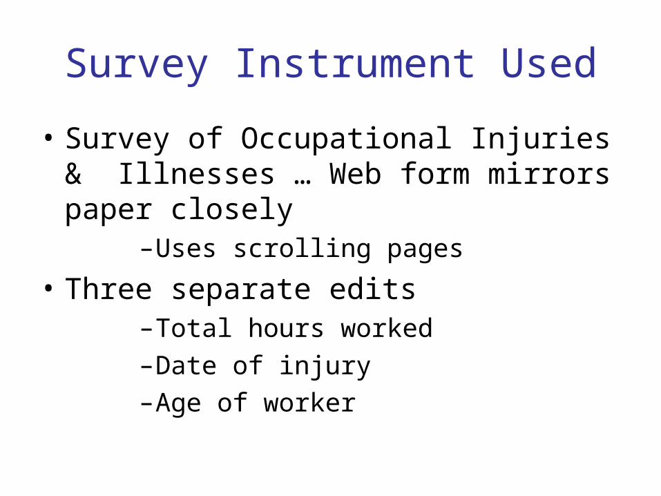
Survey Instrument Used
• Survey of Occupational Injuries & Illnesses … Web form mirrors paper closely
–Uses scrolling pages
• Three separate edits–Total hours worked–Date of injury–Age of worker
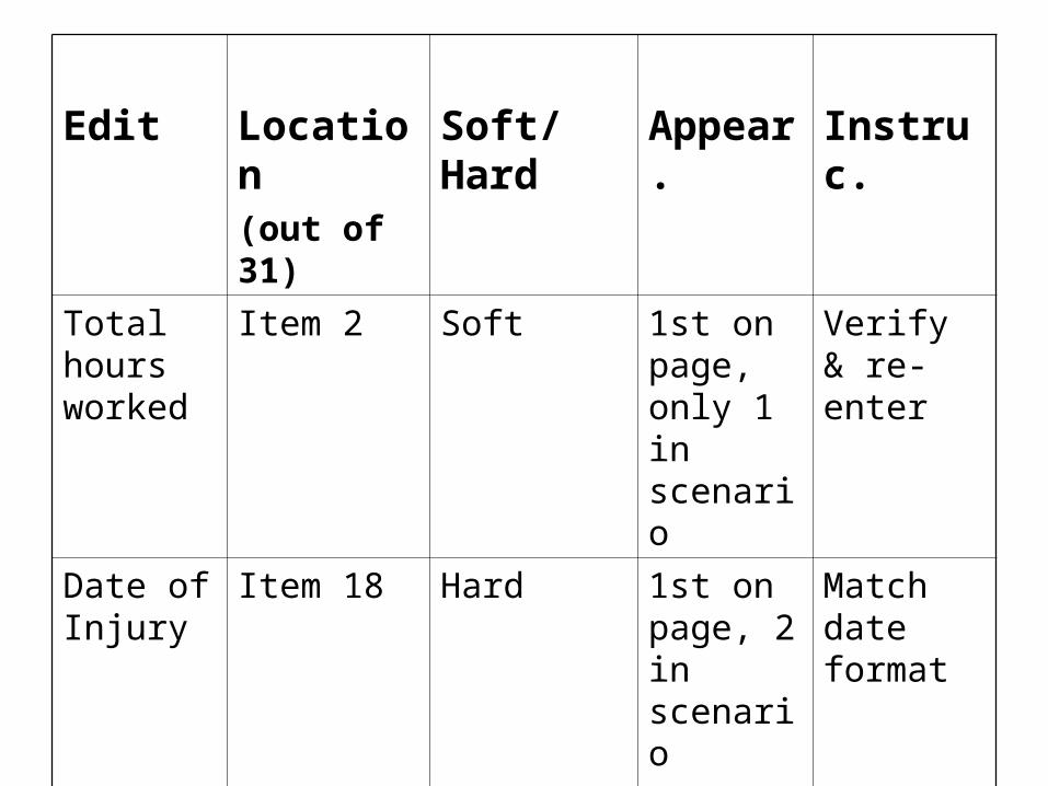
Edit Location(out of 31)
Soft/Hard Appear. Instruc.
Total hours worked
Item 2 Soft 1st on page, only 1 in scenario
Verify & re-enter
Date of Injury
Item 18 Hard 1st on page, 2 in scenario
Match date format
Age of Worker
Item 23 Hard 2nd on page, 2 in scenario
Enter new value

Experimental Procedure
• Each user completed 3 scenarios
• In a single scenario, either one soft or two hard edits appeared:
1. “Total hours worked” soft edit, or
2. “Date of injury” and “ Age of worker” hard edits.
• Order of approaches and edits was counterbalanced

Procedure (continued)
• Since same edit could appear twice in one session, used different item values in scenarios
• Basic user task: transfer data from paper form to Web form
• “Talk aloud” procedure used• 42 paid participants, recruited by asking:
– Experienced with Internet?– Comfortable using keyboard & mouse?

Procedural “Glitches”
• “Total hours worked” edit always triggered
But …
• “Date of injury” edit could be avoided
• “Age of worker” edit could be avoided on second appearance in same session

Key Variables
• Did the user notice the edit message on its first appearance?
If noticed …• Was the proper corrective action taken on
the first attempt? Also,–User preference –How did the approaches vary in terms of
completion time?

What proportion missed the edit?
Approach
1
Total Hrs
2
Date of Injury
3
Age of Worker
1 0.43 0.27 0.05
2 0.33 0.23 0.00
3 0.45 0.10 0.18
Overall 0.40 0.21 0.07
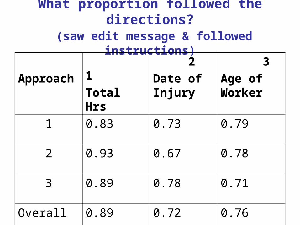
What proportion followed the directions? (saw edit message & followed instructions)
Approach
1
Total Hrs
2
Date of Injury
3
Age of Worker
1 0.83 0.73 0.79
2 0.93 0.67 0.78
3 0.89 0.78 0.71
Overall 0.89 0.72 0.76

Overall Effectiveness of Edit(based on all appearances of the edit)
Approach
1
Total Hrs
2
Date of Injury
3
Age of Worker
1 0.48 0.53 0.75
2 0.62 0.50 0.78
3 0.44 0.70 0.59
Overall 0.52 0.57 0.71

Time to Advance to Next Page(Edit 1 – the soft edit)
Approach Saw message & took correct action
Missed edit message
1 79.3 94.3
2 100.2 113.4
3 71.2 59.3
Overall 84.2 87.1

Which Version Did Users Prefer?Approach Av. Rating
(3-pt scale)
SD N
2Under item, after click
Continue
1.67 0.621 39
3Under item, after move
to next field
1.85 0.812 39
1Top of page, after click
Continue
2.46 0.822 39

User Ratings(where 10 is most “positive”)
Question Av. SD N
Q1. How easy was it to enter the
survey data?
9.0 1.61 42
Q2. How easy was it to understand
the edit message?
8.6 1.81 42
Q3. How helpful were the edit
messages?
9.1 1.52 42

Some Conclusions
• When a soft edit appears very early in a Web form, it can be frequently missed
• Varying the location and timing of edit messages did not have a significant effect (Caveats)
• As edit instructions become more complex, “success” decreases
• Detection of edit messages improves with increased experience with interface?

More Conclusions
• Rating scales are rough measures of usability
–Biased toward being overly positive–Not a complete picture
–Observational data point out important problems
• “Change Blindness” can affect results

What is “Change Blindness?”
• The failure to detect what should be a very obvious visual change
• Very large changes can be made to a picture without observers noticing them
• Good experimental literature on this and how it occurs in a variety of situations
• http://nivea.psycho.univ-paris5.fr/Mudsplash/Nature_Supp_Inf/Movies/Movie_List.html


Theoretical Explanation
• Our eyes receive and send over 10 million signals to our brains each second
• The most liberal estimate is that people can process 40 pieces of information per second
• The rich visual environment we perceive is an illusion
• There is a major processing “bottleneck”

Theoretical background (continued)
• “Change Blindness” first noticed when change occurred during eye movement saccade, but effect is not limited to eye movements alone
• Necessary condition for “Change Blindness” – Change occurs simultaneously with disruption
in visual continuity– “Flicker effect”

What happens in edit messages?
• “Flicker” effect:– Screen is displayed with survey questions– Screen is refreshed with edit message now
displayed, but some users fail to notice the change: the edit message

What Can Be Done About It?
• Use a hard edit• Place edit message on a separate screen• Some other suggestions. Use:
– Contrasting color– Small, blinking change markers (to draw user’s
attention)• Results of this study suggest that:
– Experience (general computer & with interface) is important
– Scrolling page may contribute to effect (test page-by-page format?)

If I could repeat the study
• Get a better measure of user expertise with the Web and general computer skill
• Run more subjects
• Measure user literacy– Higher literacy users tend to scan– Lower literacy users tend to read word by
word, take more time, and have a narrower field of view

The End!


Some Other Links
• http://www.syntagm.co.uk/design/articles/cb.htm
• http://www.cs.bris.ac.uk/~cater/PhD/ChangeBlindInfo/Examples.html